Analysis of Airport Performance using Surface
Surveillance Data: A Case Study of BOS
The MIT Faculty has made this article openly available. Please share
how this access benefits you. Your story matters.
Citation
Khadilkar, Harshad, Hamsa Balakrishnan, and Brendan Reilly.
“Analysis of Airport Performance Using Surface Surveillance
Data: A Case Study of BOS.” American Institute of Aeronautics and
Astronautics, 2011.
As Published
http://dx.doi.org/10.2514/6.2011-6986
Publisher
American Institute of Aeronautics and Astronautics
Version
Author's final manuscript
Citable link
http://hdl.handle.net/1721.1/80339
Terms of Use
Creative Commons Attribution-Noncommercial-Share Alike 3.0
Detailed Terms
http://creativecommons.org/licenses/by-nc-sa/3.0/
Analysis of Airport Performance using Surface
Surveillance Data: A Case Study of BOS
Harshad Khadilkar
∗and Hamsa Balakrishnan
†Massachusetts Institute of Technology, Cambridge, MA 02139, USA
Brendan Reilly
‡Federal Aviation Administration
Detailed surface surveillance datasets from sources such as the Airport Surface Detec-tion Equipment, Model-X (ASDE-X) have the potential to be used for analysis of airport operations, in addition to their primary purpose of enhancing safety. In this paper, we describe how airport performance characteristics such as departure queue dynamics and throughput can be analyzed using surface surveillance data. We also propose and evaluate several metrics to measure the daily operational performance of an airport, and present them for the specific case of Boston Logan International Airport.
Nomenclature
ASDE-X Airport Surface Detection Equipment, Model-XASPM Aviation System Performance Metrics
ASQP Airline Service Quality Performance system
I.
Introduction
Airports form the critical nodes of the air transportation network, and their performance is a key driver of the capacity of the system as a whole.1 With several major airports operating close to their capacity, the smooth and efficient operation of airports is essential for the efficient functioning of the air transportation system.
Studies of airport operations have traditionally focused on airline operations and on the aggregate estima-tion of airport capacity envelopes.2–5 Most of this research is based on data from a combination of Aviation System Performance Metrics (ASPM)6 and the Airline Service Quality Performance (ASQP) databases. These databases, when in individual aircraft format, provide the times at which flights pushback from their gates, their takeoff and landing times, and the gate-in times, as reported by the airlines. ASPM also provides airport-level aggregate data, which enumerates the total number of arrivals and departures in 15-minute in-crements. Such data can be used to develop queuing models of airport operations7, 8 or empirically estimate airport capacity envelopes.4 However, this level of detail is typically insufficient to investigate other factors that affect surface operations, such as interactions between taxiing aircraft, runway occupancy times, etc. Recent availability of data from the Airport Surface Detection Equipment, Model-X (ASDE-X) offers the opportunity to continuously track each aircraft on the surface, thus allowing analysis of surface operations in unprecedented detail. In this paper, we describe the ways in which ASDE-X data can be leveraged to characterize airport surface operations, and propose methods to track airport operational performance.
∗Graduate Student, Department of Aeronautics and Astronautics, Massachusetts Institute of Technology, Cambridge, MA 02139. harshadk@mit.edu
†Assistant Professor, Department of Aeronautics and Astronautics, Massachusetts Institute of Technology, Cambridge, MA 02139. hamsa@mit.edu. AIAA Member.
A. Overview of ASDE-X Data
ASDE-X is primarily a safety tool designed to mitigate the risk of runway collisions.9 It incorporates real-time tracking of aircraft on the surface to detect potential conflicts. There is potential, however, to use the data generated by it for the analysis of surface operations and airport performance, and for the prediction of quantities such as taxi times. ASDE-X data is generated by sensor fusion from three primary sources: (i) Surface movement radar, (ii) Multilateration using onboard transponders, and (iii) GPS-enabled Automatic Dependent Surveillance Broadcast (ADS-B). Reported parameters include each aircraft’s position, velocity, altitude and heading. The update rate is of the order of 1 second for each individual track. For this study, we used ASDE-X data from Boston Logan International Airport (BOS), drawn from the months of August-December 2010, as collected by the MIT Lincoln Laboratory’s Runway Status Lights (RWSL) system. A flight track begins when the onboard transponder is turned on: while the timing of this event varies from airport to airport, our analysis shows that at BOS, transponder capture typically occurs while the flight is still in the ramp area, on average about 5 minutes after the aircraft is cleared for pushback.10 The ASDE-X coverage extends approximately 20 miles out from the airport.
B. Data Analysis Methods
We have developed algorithms that analyze ASDE-X flight tracks, one day at a time. Raw ASDE-X tracks contain a significant amount of noise. In addition, they also include exogenous hits such as ground vehicles and inactive aircraft being towed on the surface. Therefore, preprocessing of the data is required before it can be used for analysis. We do this using a multi-modal unscented Kalman filter that produces estimates of aircraft position, velocity and heading.11 These filtered quantities are then used to tag each valid flight track with a departure/arrival time and runway. By tracking each aircraft from pushback to wheels-off, various airport states such as the active runway configuration, location and size of the departure queue, and departure/arrival counts are measured. In addition, airport-level performance metrics such as average taxi-out times, runway usage and departures spacing statistics are also tracked. The definitions of these metrics and the algorithms proposed for measuring them are described in subsequent sections of this paper.
II.
Characterization of Surface Operations
A. Departure Queue Characteristics
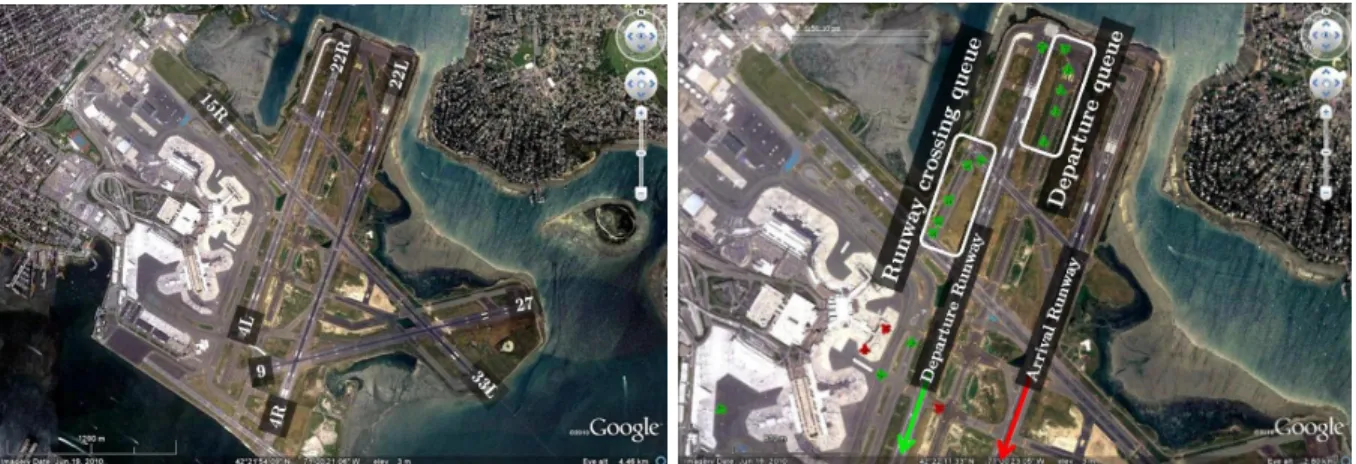
Visualization of the filtered ASDE-X data gives insights into the dynamics of airport operations. For example, locations on the surface where aircraft typically queue up for departure can be determined. These locations depend on the runway configuration and operational procedures. For example, Figure 1 (left) shows the layout of BOS. Figure 1 (right) shows the departure queues formed on a day in September 2010 in the 22L | 22R configuration, i.e., when runway 22L (on the east side) was being used for arrivals and 22R (on the west side) was being used for departures.
Figure 1: (Left) Layout of Boston Logan International Airport. (Right) Visualization of airport operations. Aircraft in green are departures and the ones in red are arrivals. A previously arrived aircraft can be seen at the bottom of the picture, waiting to cross the departure runway on the way to its gate.
There is a primary departure queue at the runway threshold, and a secondary one before it. The secondary queue is composed of aircraft waiting to cross the departure runway on their way to the primary queue. During the months of August and September 2010, there was taxiway construction at BOS, which closed the taxiway area denoted by white in the the figure.
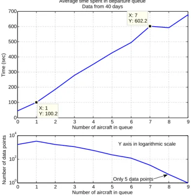
Observing operations over several days of data allowed us to identify typical queue formation areas. These areas were then designated in the analysis codes for automatic tracking of departure queues and calculation of statistics such as time spent by individual aircraft in the queue and the variation of queue length over each day. Figure 2 shows the variation of mean time spent in the primary departure with the queue length. It is based on 40 days of data from all runway configurations. We define queue length as the number of aircraft in the primary departure queue as seen by a new aircraft just joining it. It can be seen that on average, each additional aircraft in queue entails a penalty of 83 seconds for all the aircraft behind it. This value seems to be reasonable when compared to the standard departure separations described in the Section III-C.
0 1 2 3 4 5 6 7 8 9 0 100 200 300 400 500 600 700 X: 7 Y: 602.2 Average time spent in departure queue
Data from 40 days
Number of aircraft in queue
Time (sec) X: 1 Y: 100.2 0 1 2 3 4 5 6 7 8 9 100 102 104
Number of data points
Number of aircraft in queue Only 5 data points
Y axis in logarithmic scale
Figure 2: Variation of mean time spent in the departure queue with departure queue length at the time of a flight joining it.
B. Departure Throughput Characteristics
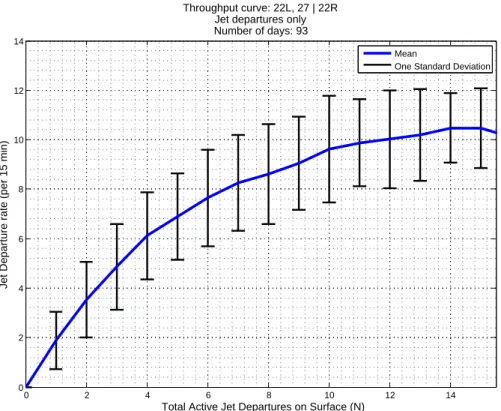
Departure queue characterization offers an insight into surface operations from an aircraft’s perspective. In order to analyze airport-level operational performance, we also looked at the variation of departure throughput (defined as the number of takeoffs in a 15-minute interval) with the number of active departing aircraft on the surface. Aircraft were defined to be active from the time of first transponder capture (first detection with ASDE-X) to wheels-off time. Previous studies8, 12 have shown, using ASPM data, that the increment in departure throughput decreases with the addition of aircraft to the surface, finally leading to saturation. This is corroborated by the results produced using ASDE-X data. Figure 3 shows the departure throughput curve for a specific configuration at Boston. Note that only jet aircraft are counted in this analysis. This is because propeller-driven aircraft are fanned out via separate departure fixes at Boston, thus not affecting the jet departure process. The throughput curves for other configurations are similar in nature to Figure 3, differing only in the point of saturation and maximum throughput. These differences can be attributed to configuration-specific procedures, such as closely spaced departures on intersecting runways.
0 2 4 6 8 10 12 14 0 2 4 6 8 10 12 14
Total Active Jet Departures on Surface (N)
Jet Departure rate (per 15 min)
Throughput curve: 22L, 27 | 22R Jet departures only Number of days: 93
Mean
One Standard Deviation
Figure 3: Departure throughput saturation: 22L, 27 | 22R configuration.
III.
Operational Performance Metrics
Building on the results described in the previous section, we can develop metrics to measure an air-port’s operational performance. The motivation is not to scrutinize controller performance, but to look for systematic inefficiencies and try to find opportunities for improvement. The basic concepts used to define these metrics are generalizable to any airport. However, each airport has local rules, regulations and pro-cedures that must be considered in order to be consistent across different configurations and time periods. For example, there are subtle variations in the strategies used by different airports to accommodate both arrivals and departures on the same runway or on intersecting runways. At Boston, arrivals have to cross the departure runway in the 22L, 27 | 22R configuration. On the other hand, in the 27 | 33L configuration, it is the departures that have to cross the arrival runway. Arrivals at Boston are controlled by the Boston Center, and consequently, they receive priority over departures, and their sequence and separation is not controlled by the tower.
In the following discussion, we present the performance metrics as we have defined them, accounting for as many of these complexities as possible while keeping the computational effort at a reasonable level.
A. Average Taxi-out Times
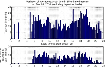
The most natural performance measure from the point of view of passengers is the average taxi-out time for departures. This is an important quantity that affects not only flight delays but also taxi-out fuel consumption. In general, taxi-out times are highest in the peak congestion periods. At Boston, these are the morning departure push at around 0600 hours local, and the evening push between 1900 and 2000 hours local time. Figure 4 shows the variation of average taxi-out times on a sample day. The averages are calculated over 15 minute intervals for the entire day. Each bar in the upper plot represents the average taxi-out time experienced by the aircraft pushing back in that 15 minute interval. The number of pushbacks in the corresponding interval are shown in the lower plot. The peaks in both pushbacks and taxi-out times around 0600 and 2000 can be seen clearly. Note that in the calculation of this metric, we remove the time spent by flights at the typical holding pads where long delays are absorbed. These aircraft usually have specified departure times known as Expected Departure Clearance Times (EDCTs), decided by constraints elsewhere
in the National Airspace System (NAS). While it is desirable to have aircraft absorb these delays at the gate, it is not always possible because of conflicts with arrivals that are scheduled to dock at the same gate. Figure 5 shows a similar plot as Figure 4, but with flights with EDCTs included in the data. A comparison of the two plots illustrates the effect of excluding these flights.
0 2 4 6 8 10 12 14 16 18 20 22 24 0 5 10 15 20 25
Variation of average taxi−out time in 15−minute intervals on Dec 09, 2010 (excluding departure holds)
Taxi−out time (min)
Local time at start of taxi−out
0 2 4 6 8 10 12 14 16 18 20 22 24
0 10 20
No. of aircraft counted in each interval
Figure 4: Variation of average taxi-out times on Dec 09, 2010. Flights with long holds due to EDCTs have been removed from the calculation of average taxi-out times.
0 2 4 6 8 10 12 14 16 18 20 22 24 0 5 10 15 20 25
Variation of average taxi−out time in 15−minute intervals on Dec 09, 2010 (including departure holds)
Taxi−out time (min)
Local time at start of taxi−out
0 2 4 6 8 10 12 14 16 18 20 22 24
0 10 20
No. of aircraft counted in each interval
Increase due to aircraft holding on surface
Figure 5: Variation of average taxi-out times on Dec 09, 2010, including flights with EDCTs.
B. Runway Utilization
The most capacity constrained element in departure operations is the runway.13 Therefore, it is important to ensure that an airport’s runway system is used as efficiently as possible. To look at the current usage characteristics of runways at Boston, we define a metric called Runway Utilization. The utilization is expressed as a percentage, calculated for every 15 minute interval. It is given by the fraction of time in the 15 minute interval for which a particular runway is being used for active operations. The types of active operations we consider are as follows:
1. Departure: Counted from the start of takeoff roll to wheels off
3. Approach: Counted from the time an aircraft is on short final (within 2.5 nm of runway threshold) to the time of touchdown
4. Arrival: Counted from the moment of touchdown to the time when the aircraft leaves the runway 5. Crossings/Taxi: Counted when aircraft are either crossing an active runway, or taxiing on an inactive
runway
Each of these operating modes was detected using the filtered states from ASDE-X tracks for each aircraft. The ‘approach’ phase was included in the runway utilization because no other operations can be carried out on a runway when an aircraft is on short final. Even though, technically, the aircraft is not on the runway, ignoring this operational constraint would give an erroneously low utilization figure for an arrival runway.
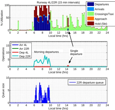
Figures 6-8 show the utilization plots for a sample day, for three different runways. The topmost plot in each figure shows the breakup of utilization for the runway over the course of the day. The plot in the middle shows operational counts in each 15 minute interval, for both ends of the runway. Finally, the lowermost plot shows the variation of queue length over the day. It should be noted that the queue length is calculated for every second, while the top two plots are aggregate figures over the 15 minute interval. Details such as configuration changes can be seen immediately from the utilization plots. For example, we can see from Figures 7 and 8 that departure operations shifted from runway 22R to runway 33L at 1000 hours.
0 2 4 6 8 10 12 14 16 18 20 22 24
0 50 100
Runway 9/27 (15 min intervals)
Local time (hrs) % Utilization Departures Arrivals Crossings/Taxi Approach Hold 0 2 4 6 8 10 12 14 16 18 20 22 24 0 5 10 Local time (hrs) Queue size 27 departure queue 9 threshold queue Queue to cross 27 on way to 33L 0 2 4 6 8 10 12 14 16 18 20 22 24 0 5 10 15 Local time (hrs) Operations Arr 27 Arr 9 Dep 27 Dep 9
Figure 6: Utilization of Runway 9/27 on Dec 09, 2010. Runway 27 was used for arrivals for the entire day. An occasional departure can be seen in the second plot, accompanied by a dip in the number of arrivals and the utilization for the time period. In the bottom plot, queue formation can be seen, composed of aircraft waiting to cross the runway for departure on 33L.
Ideally, it is desirable to have the utilization figures be 100% for the active runways in times of peak demand. The sample figures show that while this figure is achieved for much of the peak period, it is difficult to sustain. Disruptions may be caused by off-nominal events such as runway closures due to foreign objects, arrivals requesting a departure runway for landing, or gaps in the arrival sequence. It should be noted that the utilization for the departure runway is always higher than that for the arrival runway. This is because the departures can be packed close together, with the next aircraft in queue holding on the runway while the previous aircraft starts its climb-out. On the other hand, tightly packed arrivals would increase the risk of frequent go-arounds caused by aircraft not vacating the runway quickly enough to allow the next arrival to land. Therefore, the arrival stream has a buffer over the minimum spacing dictated by standard procedures.
0 2 4 6 8 10 12 14 16 18 20 22 24 0
50 100
Runway 15R/33L (15 min intervals)
Local time (hrs) % Utilization Departures Arrivals Crossings/Taxi Approach Hold 0 2 4 6 8 10 12 14 16 18 20 22 24 0 5 10 Local time (hrs) Queue size 33L departure queue 15R departure queue 0 2 4 6 8 10 12 14 16 18 20 22 24 0 5 10 15 Local time (hrs) Operations Arr 33L Arr 15R Dep 33L Dep 15R Heavy arrivals
Figure 7: Utilization of Runway 15R/33L on Dec 09, 2010. Runway 33L was inactive until 1000 hours, after which it was used for departures. Occasional arrivals seen in the second plot are heavy aircraft requesting this runway for landing due to its greater length. Arrivals in the peak period between 1800 and 2000 cause a noticeable dip in the utilization.
C. Departure Spacing Efficiency
As noted earlier, departures can be spaced more tightly compared to arrivals. However, the minimum departure spacing is still governed by a set of standards, customized to each airport depending on the runway and airspace layout. It is generally recommended to maintain a minimum spacing of 120 seconds for a departure following a heavy aircraft.14 At Boston, the target separations, based on a combination of regulatory requirements and historical performance, are as given in Table 1.
To compare the actual inter-departure separation with these target values, we defined a metric called the Departure Spacing Efficiency. As with runway utilization, this metric is calculated for each 15 minute interval. However, the Departure Spacing Efficiency is not runway-specific, but addresses departure operations at the airport as a whole. To calculate it, the difference between the wheels-up times of each pair of consecutive departures is compared to the target level of separation for that pair, based on the aircraft classes of the leading and trailing aircraft. Each additional second more than the target level is counted as a second lost. Time is counted as ‘lost’ only if there are other aircraft in queue, waiting for departure. This ensures that the efficiency figure does not fall simply because of low demand. On the other hand, controllers can also sometimes manage to depart aircraft with a separation less than the target level, depending on factors such as the availability of multiple runways for departure. In this case, each second less than the target separation level is counted as a second gained. Then, the Departure Spacing Efficiency in each 15 minute interval is given by:
η = 1.00 + Total seconds gained in the interval − Total seconds lost in the interval Length of interval
It should be noted that the use of multiple runways does not always allow departures to take place with less than the target level of spacing. For example, at Boston, departure operations on runways 22R and 22L have to take place as on a single runway, because both sets of departures have to use the same departure
0 2 4 6 8 10 12 14 16 18 20 22 24 0
50 100
Runway 4L/22R (15 min intervals)
Local time (hrs) % Utilization Departures Arrivals Crossings/Taxi Approach Hold (5kt) 0 2 4 6 8 10 12 14 16 18 20 22 24 0 5 10 Local time (hrs) Queue size 22R departure queue 0 2 4 6 8 10 12 14 16 18 20 22 24 0 5 10 15 Local time (hrs) Operations Arr 4L Arr 22R Dep 4L Dep 22R
Morning departures Single departure
Figure 8: Utilization of Runway 4L/22R on Dec 09, 2010. Runway 22R was used for departures during the morning peak period. Note the longer queue lengths seen here, compared to those for runway 33L. This is because the morning demand is concentrated into two banks at 0600 and 0745 hours.
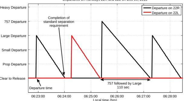
fixes. However, when runways 4R and 9 are used for departures, aircraft can be spaced more closely, thus boosting the airport’s efficiency.15 Figure 9 demonstrates the calculation procedure for counting the time lost in a 15 minute interval. The local time is shown on the x−axis. Each spike denotes the wheels-off time for a departure, with the height of the spike corresponding to the weight class of the aircraft. The spike then tapers off, reaching the ‘clear to release’ line when the target separation interval elapses. The gap from this point to the next departure spike counts towards the total number of seconds lost in the current 15 minute interval.
There is, however, a caveat associated with calculation of the total time lost. As described previously, arrival spacing is not under the discretion of Boston Tower. In configurations where arrivals take place on a runway that is the same as or that intersects the departure runway, this can cause a dip in the efficiency. We account for this effect by discounting the idle time of a departure runway when an arrival is on short final (within 2.5 nm of threshold) to an intersecting runway or to the same runway. Figures 10 and 11 show the variation of Departure Spacing Efficiency with the time of day for December 09, 2010, with and
P S L 757 H P 40 40 40 40 40 S 40 65 65 65 65 L 40 65 65 65 65 757 110 110 110 110 110 H 120 120 120 120 120
Table 1. Target departure separations. The columns correspond to the weight class of the trailing aircraft, while the rows correspond to the weight class of the leading aircraft. All figures are in seconds.
06:23:00 06:24:00 06:25:00 06:26:00 06:27:00 06:28:00 Clear to Release Prop Departure Small Departure Large Departure 757 Departure Heavy Departure Local time (hrs)
Departures on Runways 22R and 22L on Dec 09, 2010
Departure on 22R Departure on 22L Completion of standard separation requirement Departure time 757 followed by Large 110 sec
Figure 9: Visualization of departures.
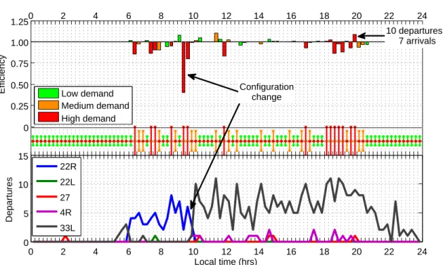
without accounting for the arrival effect, respectively. In each figure, the plot on the top shows the efficiency in each 15 minute interval, while the plot on the bottom shows the departure count in the corresponding intervals. The colored bars in the middle indicate the departure demand level at the airport, calculated using a combination of the departure counts and queue lengths. We note that there are several time periods (for example, between 1630 and 2015 hours), when not including the impact of arrivals would lead to the erroneous conclusion that the efficiency was lower than it actually was. A comparison of Figures 10 and 11 suggests that the efficiency during this time was above 85% when accounting for arrivals, whereas it was as low as 75% when the effect of arrivals was ignored.
Note the large dip in efficiency just prior to the configuration change at 1000 hours. A few intervals with net efficiency more than 1.0 can also be seen. These intervals correspond to spikes in the departure count, since consistent separation values less than the target level result in a large number of departures. The most notable high-efficiency interval is the one from 1945 to 2000, which is in the middle of a period with high demand. The bottom plot shows that the controllers managed 10 departures in this interval (nine on runway 33L and one on runway 27), while a comparison with Figure 6 shows that 7 arrivals were also achieved. In this way, a combination of different performance metrics offers insights into the intricacies of surface operations, that result in the net operational counts that are the traditional measure of airport performance.
IV.
Conclusion
This paper presented several ways in which surface surveillance data could be used for the detailed analysis of airport surface operations. In addition to showing how directly measurable quantities like departure queue statistics and airport departure throughput characteristics, we also proposed three metrics to quantify airport performance, namely, average taxi-out times, runway utilization and departure spacing efficiency. We also discussed these metrics in detail for the case of Boston Logan International Airport, and showed how they could be used to gain insight into the performance of the airport.
Acknowledgement
We would like to thank James Kuchar, Jim Eggert and Daniel Herring of MIT Lincoln Laboratory for their support and help with the ASDE-X data.
0 2 4 6 8 10 12 14 16 18 20 22 24 0 0.25 0.50 0.75 1.00 1.25 Efficiency
Departure spacing efficiency on Dec 09, 2010 − arrivals accounted for
Low demand Medium demand High demand 0 2 4 6 8 10 12 14 16 18 20 22 24 0 5 10 15 Local time (hrs) Departures 22R 22L 27 4R 33L Configuration change 10 departures, 7 arrivals
Figure 10: Departure spacing efficiency on Dec 09, 2010, accounting for the effect of arrivals on the same/crossing runway. 0 2 4 6 8 10 12 14 16 18 20 22 24 0 0.25 0.50 0.75 1.00 1.25
Efficiency Low demand
Medium demand High demand 0 2 4 6 8 10 12 14 16 18 20 22 24 0 5 10 15 Local time (hrs) Departures 22R 22L 27 4R 33L
Figure 11: Departure spacing efficiency on Dec 09, 2010, not accounting for the effect of arrivals on the same/crossing runway.
References
1Idris, H. R., Delcaire, B., Anagnostakis, I., Hall, W. D., Pujet, N., Feron, E., Hansman, R. J., Clarke, J. P., and Odoni, A. R., “Identification of flow constraint and control points in departure operations at airport systems,” AIAA Guidance, Navigation and Control Conference, August 1998.
2Pels, E., Nijkamp, P., and Rietveld, P., “Inefficiencies and scale economies of European airport operations,” Transportation Research Part E , Vol. 39, Issue 5, September 2003.
3Gillen, D. and Lall, A., “Developing measures of airport productivity and performance: an application of data envelopment analysis,” Transportation Research Part E , Vol. 33, Issue 4, December 1997.
4Gilbo, E., “Airport capacity: representation, estimation, optimization,” IEEE Transactions on Control Systems Tech-nology, Vol. 1, no.3, September 1993.
5Ramanujam, V. and Balakrishnan, H., “Estimation of Arrival-Departure Capacity Tradeoffs in Multi-Airport Systems,” Proceedings of the 48th IEEE Conference on Decision and Control , December 2009.
6Federal Aviation Organization, “Aviation System Performance Metrics Database,” http://aspm.faa.gov/main/aspm.asp. 7Pujet, N., Delcaire, B., and Feron, E., “Input-output modeling and control of the departure process of congested airports,” AIAA Guidance, Navigation, and Control Conference and Exhibit, Portland, OR, 1999, pp. 1835–1852.
8Simaiakis, I. and Balakrishnan, H., “Queuing Models of Airport Departure Processes for Emissions Reduction,” AIAA Guidance, Navigation and Control Conference and Exhibit , August 2009.
9Sensis Corporation, East Syracuse, NY, ASDE-X Brochure - ASDE-X 10/05.qxd , 2008.
10Simaiakis, I., Khadilkar, H., Balakrishnan, H., Reynolds, T. G., Hansman, R. J., Reilly, B., and Urlass, S., “Demonstration of reduced airport congestion through pushback rate control,” Tech. rep., Massachusetts Institute of Technology, 2011, No. ICAT-2011-2.
11Khadilkar, H. and Balakrishnan, H., “A multi-modal Unscented Kalman Filter for inference of aircraft position and taxi mode from surface surveillance data,” 11th AIAA Aviation Technology, Integration, and Operations (ATIO) Conference, September 2011, submitted.
12Simaiakis, I. and Balakrishnan, H., “Impact of Congestion on Taxi Times, Fuel Burn and Emissions at Major Airports,” Transportation Research Record: Journal of the Transportation Research Board , Vol. No. 2184, December 2010.
13de Neufville, R. and Odoni, A., Airport Systems: Planning, Design, and Management , McGraw-Hill, 2003. 14Federal Aviation Administration, Pilot and Air Traffic Controller Guide to Wake Turbulence.
15Simaiakis, I., Khadilkar, H., Balakrishnan, H., Reynolds, T. G., Hansman, R. J., Reilly, B., and Urlass, S., “Demonstra-tion of Reduced Airport Conges“Demonstra-tion Through Pushback Rate Control,” USA/Europe Air Traffic Management Research and Development Seminar , Berlin, Germany, June 2011.