by Jung S. Yu
B.S., Electrical Engineering, Massachusetts Institute of Technology (1994)
Submitted to the Department of Civil and Environmental Engineering in Partial Fulfillment of the Requirements
of the Degree of
MASTER OF SCIENCE IN TRANSPORTATION at the
Massachusetts Institute of Technology September 1996
© Jung S. Yu 1996. All Rights Reserved.
Signature of Author
Department of il1
The uho ee>g@ oM
p61MIsx On 1xo ror " s adt
dstiibuft- pub-1iiy, Par d
electronic copics of "t% th';': . aocumernvit in whole or in pct. ad d E nmental Engineering June 10, 1996 Certified by Certified by Accepted by/Step ian E.olitz The Charles Stark Draper Labo-ratozy4Inc. Technical Supervisor
/ Cynthia Barnhart Associate Professor of Civil and Environmental Engineering Thesis Supervisor
Joseph M.- Sussman Chairman, Departmental Committee on Graduate Studies
OF -TECHNOLOGY
OCT 1 51996
by Jung S. Yu
Submitted to the Department of Civil and Environmental Engineering on June 10, 1996 in Partial Fulfillment of the Requirements
of the Degree of Master of Science in Transportation
Abstract
Airport weather variables, including cloud ceiling, horizontal visibility, and wind, significantly influence the capacity of an airport. In this thesis, the sawtooth wave model, a statistical weather model with the capability to generate synthetic weather observations useful in air traffic flow management simulations, is presented. The sawtooth wave model uses historical weather data as input and produces synthetic weather observations that preserve the spatial correlation values of weather observations among sites, temporal correlation values of weather variables at each site, and cross-correlation values between weather variables.
Four capacity models that are driven by weather observations, either historical or those generated by the sawtooth wave model, are also presented. None of the models are ideal in that all of them have some weakness but each of the models also have strengths that should be captured in an ideal model. In spite of the limitations of the individual models, the capacity information gathered from simulation runs using these models allows us to draw conclusions about airport capacities from airport characteristics.
Thesis Supervisor: Professor Cynthia Barnhart
Title: Associate Professor of Civil and Environmental Engineering Technical Supervisor: Stephan E. Kolitz, Ph.D.
I would like to thank the following people who have all helped me complete this thesis in one way or another.
First, I thank Dr. Stephan Kolitz of Draper Lab for giving me the opportunity to work on a worthwhile project as the ATC Simulation Testbed. I am grateful for his technical guidance and support.
I would also like to thank Professor Cindy Barnhart of MIT. Her unending support and dedication to her students has made my experience as a graduate student an excellent one. She is a great advisor, professor and person.
I also thank Professor Amedeo Odoni of MIT for all of the help he has given me in understanding airside capacity.
I am also grateful to Al Boehm for his kindness and time explaining the intricacies of the sawtooth wave model; to Bryan Bourgoin for the many trips to the FAA tower at Logan airport; and to Eugene Gilbo, Bill Swedish, and Dave Lee for their cooperation in helping me get data and software.
Next, I would like to recognize The Charles Stark Draper Laboratory and the Massachusetts Institute of Technology for providing this great educational opportunity
I must thank the fellow students of MIT's Center for Transportation Studies and the members of the Large Scale Optimization Group for all of the fine memories including the excellent softball games (broken bones and all), food from Boston Market and the debate between Bertucci's and Pizza Hut.
I thank my roommates Kevin Mills and Jordan Vinarub for keeping me sane, introducing me to the culinary expertise of the college graduate, and sitting around the table talking about things ranging from Fred Fred to the shoulder surprise. Aw Yeah!
Thanks to Diana Dorinson for a great four years of friendship and many more to come. The Friday night dinners, the Must See TV, the a capella concerts, the Bruins/Flyers game, the
Avalanche playoff games and just sitting and talking were all important in keeping me going I would-like to thank my family, for their unconditional love and support, through this program and through life.
Finally and most importantly, I would like to thank Kathy Tan, for always being there and hanging in there while we have been apart. This thesis would not have been possible without her love and patience. I look forward to our life together again.
not constitute approval by Draper or the Massachusetts Institute of Technology of the findings or conclusions contained herein. It is published solely for the exchange and stimulation of ideas.
I hereby assign copyright of this thesis to The Charles Stark Draper Laboratory, Cambridge, Massachusetts.
A
/
6Jung S. Yu
Permission is hereby granted by The Charles Stark Draper Laboratory to the Massachusetts Institute of Technology to reproduce any or all of this thesis.
ABSTRACT ... 3
ACKNOW LEDGEMENTS...5
TABLE OF CONTENTS...7
LIST OF FIGURES AND TABLES...10
1. INTRODUCTION...13
1.1. BACKGROUND... 13
1.2. THESIS OBJECTIVE AND CONTENT... 14
2. WEATHER MODELING...17
2.1. AIRPORT WEATHER ... 17
2.1.1. Cloud Ceiling and Visibility... 17
2.1.2. Wind Speed and Direction... 19
2.1.3. Precipitation ... 21
2.2. CORRELATION... 21
2.2.1. Pearson Product Moment vs. Tetrachoric... 22
2.2.2. Spatial Correlation... 24
2.2.3. Temporal Correlation... 26
2.2.4. Cross-Variable Correlation... 27
2.3. SAWTOOTH WAVE MODEL... 27
2.3.1. Overview of How SWM Works... 28
2.3.2. Appropriateness of the Sawtooth Wave Model... 28
2.3.3. Implementation ... 29
2.3.3.1. Preprocess NOAA Weather Data... 3 1 2.3.3.2. Generate Input File ... 33
2.3.3.3. Calculate Spatial Wavelength... 33
2.3.3.4. Calculate Temporal Wavelength... 34
2.3.3.5. Generate Sawtooth Waves and Sum Heights... 34
2.3.3.6. Inverse Transnormalization ... 34
2.3.3.7. Postprocess Synthetic Output ... ... 35
2.4. WEATHER GENERATION RESULTS ... 36
2.5. REGIONAL COVERAGE CONSTRAINT ... 36
3. AIRPORT CAPACITY M ODELING...39
3.1. EMPIRICAL DATA CAPACITY FRONTIERS... 39
3.1.1. Inputs...39
3.1.2. EDCF Estimation Method...40
3.2. ENGINEERED PERFORMANCE STANDARDS...13
3.2.1. Background...44
3.2.2. Calculation Methods...44
3.2.2.1. Calculating Theoretical Capacity... ... 45
3.2.2.2. Comparison of Ideal Capacity with Facility Opinion...46
3.2.2.3. Derivation of EPSs ... 46
3.3. FAA AIRFIELD CAPACITY MODEL ... 47
3.3.1. Overview... 47
3.3.2. Capacity Calculations... 47
3.3.2.1. Single Runway ... 48
3.3.2.2. Closely Spaced Parallel Runways... 51
3.3.2.3. Intermediate Spaced Parallel Runways... 51
3.3.2.4. Intersecting Runways... 52
3.3.3. Inputs to the FAAACM ... 52
3.4. LMI AIRFIELD CAPACITY MODEL... 53
3.4.1. Overview... 54
3.4.2. FAAACM vs. LMIACM ... 54
3.4.3. Specific to an Airport ... 55
4. RESULTS AND ANALYSIS...5 7 4.1. SIMULATION RESULTS... 58
4.1.1. Configuration Usage... 59
4.1.2. Capacity Coverage ... 63
4.1.3. Capacity Utilization ... 69
4.1.4. Time Series Results ... 70
4.2. AIRPORT CHARACTERISTIC ANALYSIS ... 72
4.2.1. Geographic Location... 72
4.2.2. Runways Available ... 73
4.2.3. Primary Use of Airport ... 74
4.3.1. Empirical Data Capacity Frontiers... 76
4.3.2. Engineered Performance Standards ... 77
4.3.3. FAA Airfield Capacity M odel... 79
4.3.4. LMI Airfield Capacity Model ... 80
4.4. RECOMM ENDATIONS...81
5. CONCLUSIONS AND AREAS FOR FUTURE RESEARCH... 83
5.1. SAWTOOTH W AVE M ODEL... 83
5.2. C APACITY M ODELS... 84
APPENDIX A: SAMPLE INPUT FILES... 87
A. 1. SAMPLE INPUT FILE FOR WEATHER GENERATION ... 87
A.2. SAMPLE INPUT FILE FOR SIMULATION... 88
APPENDIX B: TABLE OF CONFIGURATIONS...91
Figure 2.1: IFR and VFR Thresholds... 19
Figure 2.2: W ind Vector Components... 20
Figure 2.3: Data Partitions... 23
Figure 2.4: Ceiling Spatial Correlations -Midwestern States... 25
Figure 2.5: Temporal Auto-Correlation for Ceiling at DCA ... 27
Figure 2.6: 4-D and 5-D Correlation Curves... 29
Figure 2.7: Implementation Flow Chart ... 30
Figure 3.1: Historical Counts of Hourly Arrivals and Departures... 41
Figure 3.2: Deriving EDCFs from Historical Counts... 42
Figure 3.3: Arrival Runway Diagram ... 48
Figure 3.4: Opening and Closing Airborne Separations ... 49
Figure 3.5: BOS Configuration Using Runways 4L, 4R, and 9... 56
Figure 4.1: Simulation Flow Diagram ... 57
Figure 4.2: BOS Configuration Usage Distributions... .... 59
Figure 4.3: EWR Configuration Usage Distribution ... 61
Figure 4.4: EWR Configuration Usage with Empirical Data... 63
Figure 4.5: 1990 BOS Capacity Coverage Chart ... 64
Figure 4.6: BOS Capacity Coverage Charts -W inter and Summer... 65
Figure 4.7: BOS Capacity Coverage Chart with High Departures ... 66
Figure 4.8: Capacity Probability Distributions for DFW , LAX, and SFO... 67
Figure 4.9: Capacity Probability Distributions for BOS and LGA ... 68
Figure 4.10: EWR Capacity Utilization Chart ... 69
Figure 4.11: BOS Time Series Plot... 70
Figure 4.12: BOS One-Week Time Series Plot ... 71
Figure 4.13: Capacity Coverage Charts for LAX and LGA... 74
Figure 4.14: Capacity Coverage Chart for DFW ... 75
Figure 4.15: Configuration Usage Distribution for DFW ... 75
Table 2-1: Correlation Calculation Methods ... 24
Table 2-2: Old NOAA Weather Data Sample ... 31
Table 2-3: New NOAA Weather Data Sample... 32
Table 2-4: Sample Ceiling Observation at Boston Logan... 35
Table 3-1: Sample Data for Calculating EDCFs ... 40
1. Introduction
1.1.
Background
The United States has the largest and most concentrated airspace system in the world. The National Airspace System (NAS) and the demand for its resources is continuing to grow. Flights in the United States are regularly experiencing unacceptable levels of delay. Some predict that by the year 2000, there will be 800 million passengers a year [1]. This is nearly twice the number of passengers in 1990. Thus, delays are not going to disappear but could get worse if the situation is not addressed.
Due to high density of traffic in terminal areas, airports are arguably the most important element in flow management strategies. For example, when an airport such as Chicago's O'Hare or New York's LaGuardia becomes saturated, the delays caused by this saturation result in a propagation of delay throughout the system. When these airports, called pacing airports, experience congestion and capacity problems, the effects are generally felt by the entire system. Similarly, if all of the pacing airports are operating smoothly, the entire system does well. By focusing on ways to improve efficiency, increase capacity and reduce delay at these pacing airports, we can greatly improve the overall efficiency of the entire system.
Empirical evidence shows that weather is the dominant factor in influencing an airport's capacity. The FAA maintains that 65% of all delays in the air traffic system are weather related
[2]. The parameters that are used to describe airport weather are cloud ceiling, horizontal visibility and wind. Low ceiling and/or visibility observations require increased spacing intervals between operations, both arrivals and departures, and thus decrease the capacity of an airport. Maximum crosswind constraints eliminate the choice of certain runways and subsequently eliminate some runway configurations. It is therefore essential to consider airport weather in any analysis of the air traffic system.
There is not much in the literature on weather models suitable for use in the analysis of the NAS. Often when air traffic simulations are run and weather data is needed as input,
historical weather data has been used. Instead, the focus of work has been development of new airport capacity models and upgrading older models.
In the past, arrival capacity was the focus of airside capacity models. It was assumed that departures could be inserted in between arrivals to meet departure demand. Arrival capacity was considered the bottleneck that caused congestion and delays. With deregulation and the incorporation of hub and spoke systems, many airlines have large arrival and departure banks at the pacing airports. This means that there are times when a pacing airport may undergo a wave of arrivals followed by departures. Therefore, it has become important to consider departure capacity and the tradeoff between arrivals and departures in analyzing capacity. This type of capacity analysis must be considered in developing air traffic flow management strategies.
1.2. Thesis Objective and Content
The research and models presented in this thesis provide a basis for future air traffic flow analysis. This thesis summarizes two components which will be included in a simulation environment for air traffic flow analysis - weather and capacity.
Chapter 2 presents the first area of research - airport weather. The first part of the chapter describes the weather elements that affect an airport's operations and can limit its capacity. In the second part we provide an overview of different statistical functions is given. These functions are needed to implement the sawtooth wave model, a statistical weather model developed by the United States Air Force [12], described in the third part of the chapter. In the model description we summarize the basic elements of the model as well as extensions made to the model to incorporate new weather elements. Next, data observations synthetically generated are compared with historical data to validate the model. Finally, a limitation of the weather model as well as possible solutions to this limitation are discussed.
Chapter 3 presents four different capacity models. The capacity models use weather observations as input in a simulation environment and provide insight about capacity levels at an airport. The four models examined are: Empirical Data Capacity Frontiers developed by E. Gilbo at the Volpe Center [15], Engineered Performance Standards compiled by the Federal
Aviation Administration (FAA) [18], the FAA Airfield Capacity Model created by W. Swedish at the MITRE Corporation [17], and the LMI Airfield Capacity Model developed at the Logistics Management Institute [20].
Chapter 4 describes the process used to compare and evaluate the different capacity models. Different metrics used to compare the models are presented. Information about the capacity of an airport may be inferred by the airport's characteristic based on the results of simulation runs used to evaluate the different capacity models. These results and inferences are presented also presented in the chapter. Strengths and weaknesses of each of the different models are discussed. Finally, a design for a future capacity model is described.
In Chapter 5, conclusions from the results of analyses using the combined weather/capacity simulation capability are presented and topics for future related research are discussed.
2. Weather Modeling
One goal of this project is to implement an accurate weather model to produce synthetic weather observations at pacing airports. An accurate weather model is one in which synthetic data produced by the model are statistically indistinguishable from historical data for the same region and time interval.
We extended the weather model in Hocker[3] to use the tetrachoric correlation method (discussed later in subsection 2.2.1 Pearson Product Moment vs. Tetrachoric) and to generate synthetic wind observations. This model was implemented in C and is portable.
In section 1, we describe the elements that compose airport weather. In section 2, we present two different techniques for measuring correlation and when to use each one. Section 3 provides a description of the sawtooth wave model. In section 4, we analyze the results of using the sawtooth wave model. Section 5 describes a limitation of the sawtooth wave model and how to circumvent this limitation. Section 6 concludes the chapter.
2.1. Airport Weather
The term airport weather will refer to those components of weather that most affect airport capacity. These components are cloud ceiling, visibility, wind speed, wind direction and precipitation. All of the historical weather data used was procured from the National Oceanic
and Atmospheric Administration (NOAA). 2.1.1. Cloud Ceiling and Visibility
Cloud ceiling, or simply ceiling, is defined as the base height of the lowest cloud that is more than 1/2 opaque in an airport area. Ceiling measurements are taken to the nearest 100 feet up to 5000 feet, to the nearest 500 feet from 5000 to 10000 feet, and to the nearest 1000 feet for observations above 10000 feet [4].
Visibility refers to the prevailing horizontal visibility, usually measured at an elevation of 6 feet above the ground. These measurements are taken to the nearest sixteenth of a mile up to 3/8 mile, to the nearest eighth of a mile up to 1 3/4 mile, to the nearest fourth of a mile up to 3
miles, and to the nearest mile after three miles [4]. There is also an unlimited classification, used when the visibility is greater than 10 miles.
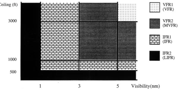
The values for ceiling and visibility determine the flight rules classification of an airport. Low ceiling and/or low visibility result in an Instrument Flight Rules or IFR classification. During IFR operation, aircraft may conduct landings only on runways with special landing equipment. Both the aircraft and its crew must also be IFR rated. In good weather conditions, where there is a high ceiling and high visibility, the airport will be given a classification of Visual Flight Rules or VFR. In general, the capacity of an airport under IFR conditions is much less than the capacity of the airport under VFR conditions because landing and departure intervals tend to be greater under IFR conditions. These basic classifications also have sub-classifications that further differentiate weather conditions. IFR conditions are broken up into IFR1 and IFR2. IFR2 (also be referred to as Low IFR or LIFR) refers to severe weather conditions where visibility and/or ceiling is extremely low. Some airports shut down completely when this occurs and no aircraft are allowed to land or depart. VFR conditions are broken into VFR1 and VFR2 (sometimes called Marginal VFR or MVFR). The division between VFR1 and VFR2 is different for each airport and is determined by obstructions in the vicinity of the airport. Marginal VFR conditions require a ceiling of at least 1000 feet and a visibility of three nautical miles. VFR1 conditions occur when the cloud ceiling is at least 1000 feet higher than the height of the tallest structure in the vicinity of the airport and the visibility is at least 5 nautical miles [21]. The figure below illustrates these classifications for an example airport.
i::::
VFR1
(VFR) VFR2 (MVFR) Ceiling (ft) 3000 1000 500...
1 3 5 Visibility(nm)Figure 2.1: IFR and VFR Thresholds
2.1.2. Wind Speed and Direction
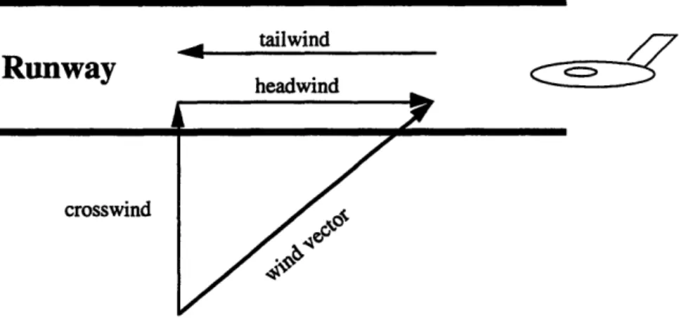
Wind is another important weather element in determining the capacity of an airport. Wind conditions, both speed and direction, can restrict the availability of runways. Given a particular runway, the prevailing wind vector can be decomposed into two components, a headwind component and a crosswind component. The headwind component blows against the direction of the runway. For example, if an aircraft will be landing on a runway from east to west, the headwind would be the component that blows from west to east. If the wind were blowing in the direction of the runway, it would have a negative value for the headwind component and would simply be referred to as a tailwind (with positive value). The crosswind, on the other hand, is the portion of the wind that blows across the runway; this would be the north-south or south-north component in the previous example. Figure 2.2 illustrates the
different wind vector components.
IFR2 (LIFR) IFRI (IFR)
Ruway
tailwind headwindFigure 2.2: Wind Vector Components
Each airport has a maximum crosswind, regardless of direction, allowed for an active runway. Usually this value is somewhere between 15 and 20 knots and sometimes varies based on flight rule conditions. For example, a runway may have a 20 knot maximum allowable crosswind during VFR conditions but only a 15 knot maximum allowable crosswind during IFR conditions. When a runway is not allowed to be used, it is inactive. All airport configurations that include inactive runways are considered inactive, limiting the airport's capacity.)
When considering headwinds, direction is important. With a headwind, the effective stopping distance of a plane is shorter than when there is no headwind. Planes can then move off the runways more quickly, freeing the runway for other operations and reducing the time spent on an active runway. Similarly, throughput is increased when planes take off into a headwind because shorter runway distances are needed for lift. Therefore, operating with a headwind improves both the arrival and departure capacities and increases safety. In fact, at many airports no tailwind is allowed; at some of the busier airports a five knot tailwind is allowed.
Depending on the composition of airport demand, tower controllers can designate runways with headwinds as arrival or departure runways to increase overall throughput of the airport. For example, if the demand composition was 80% arrivals and 20% departures, then an air traffic controller might choose to use a runway with a strong headwind as the arrival runway.
2.1.3. Precipitation
Precipitation impacts the capacity of an airport in many ways making it difficult to model. Increased runway length is needed when the runways are wet. When de-icing of a plane is required, departure rates decrease. The current weather model does not include precipitation but may be included in the future after several issues are addressed. For example, it is unclear whether the amount of precipitation or the mere presence of precipitation is the most important factor in airport capacity analysis. Similarly, we must determine what the effects of different types of precipitation (e.g. rain, snow, ice) have on capacity. One final issue of concern is the duration of the precipitation. Longer landing distances are needed for pavement which has just become wet than on pavement which has been wet for some time. Thus, capacity may be less at the beginning of a rainstorm than in the middle of one.
It is clear that precipitation limits an airport's capacity but until we identify which components of precipitation affect capacity, incorporation of precipitation into the model is not practical.
2.2. Correlation
Correlation is a measure of the relatedness or association among variables. Statistically, correlation can be quantified by the theoretical coefficient of correlation pxr between two random variables X and Y [5]. This corresponds to the ellipticity parameter in the bivariate normal distribution. In other words, if two random variables are joint, normally distributed, then
pxy measures the strength of the linear relationship between the two random variables. Given X
and Y are two random variables with respective means of #x and py and standard deviations of
ax and ey, then
Pxy = x- (2.1)
where the covariance
Equations (1) and (2) can reflect both positive and negative correlation. If related values of X and Y vary from their respective means in the same direction, the resulting covariance will be positive. Conversely, if X and Y vary in opposite directions from their means, the covariance will be negative resulting in negative correlation.
2.2.1. Pearson Product Moment vs. Tetrachoric
In generating synthetic weather using the weather model described in this paper, accurate estimates of the ellipticity parameters are needed. These correlation coefficients are estimated using one of two methods: Pearson Product Moment (PPM) or tetrachoric.
When estimating a correlation coefficient of joint, normally distributed random variables X and Y, one can use the PPM formula
=
x
Y I(Xi - X)(Y - T) )2(2.3)
where Xi and Yi are sample observations, and Y and 7 are sample means. Both p and r can vary between -1.0 (perfect negative correlation), and 1.0 (perfect positive correlation). When the random variables X and Y are joint, normally distributed, rxy is an unbiased estimator for pxy. In other words, the expected value of rxy is equal to the value pxy.
The PPM formula, however, produces a biased estimator rxy when the random variables are not joint, normally distributed. Cloud ceiling is a random variable which is not normally distributed since its lower limit is zero. Also, the precision of ceiling data decreases as ceiling measurements increase (i.e. a true ceiling of 10600 feet and 11400 feet would both be recorded as 11000 feet whereas a true ceiling of 600 feet and 1400 would be recorded as 600 feet and 1400 feet) and thus the data is subject to quantization error.
In this case, a more accurate estimator of pxy is the tetrachoric correlation. The
tetrachoric correlation is defined as the correlation in a bivariate normal distribution that would
be produced if the continuous normal variables observed were reduced to binary variables by dichotomizing observed values as either above or below a given threshold [6].
To obtain the tetrachoric correlation, a threshold value is chosen for random variable X and a threshold value is chosen for random variable Y. Usually median values are good choices for thresholds, but any value in the 20th to 80th percentile will produce relatively accurate results. Given the thresholds, one then counts the number of data points in the different quadrants defined by the thresholds as shown in Figure 2.3.
YL
Ythresh ICD
A'
B
I
XthreshX
IFigure 2.3: Data Partitions
A is the number of data points whose X-value is below the threshold for X and whose Y-value is less than the threshold Y-value for Y; B is the number of data points whose X-Y-value is above the threshold for X but whose Y-value is below the threshold value for Y. Similarly, C is the number of data points whose X-value is below the threshold for X but whose Y-value is above the threshold for Y. Finally, D is the number of data points whose X- and Y-values are above their respective thresholds. Given these four counts one can get an approximation of the tetrachoric correlation. A simple approximation is given by:
p
=
sin
2
+
ff
(2.4)
This equation was derived from the first term of a Taylor series (Johnson and Katz [7] or Castellan [8]) and is accurate when both variables are dichotomized at the median. Because
. . . . .. . . . .. . .. . .. . .. .. ... .... ... .... . . .. ... . . . ... ... .... .. .. .. . ... . ... .... . .. . ... . . . ..
choosing the median as a threshold is not always easy or feasible, a more robust approximation able to use various threshold values is desired. Boehm [6] added additional terms to the above
approximation to yield a highly accurate estimated correlation for threshold values anywhere between the 20th and 80th percentile of the observed data. Boehm's more accurate approximation was used to compute the correlation statistics for this study.
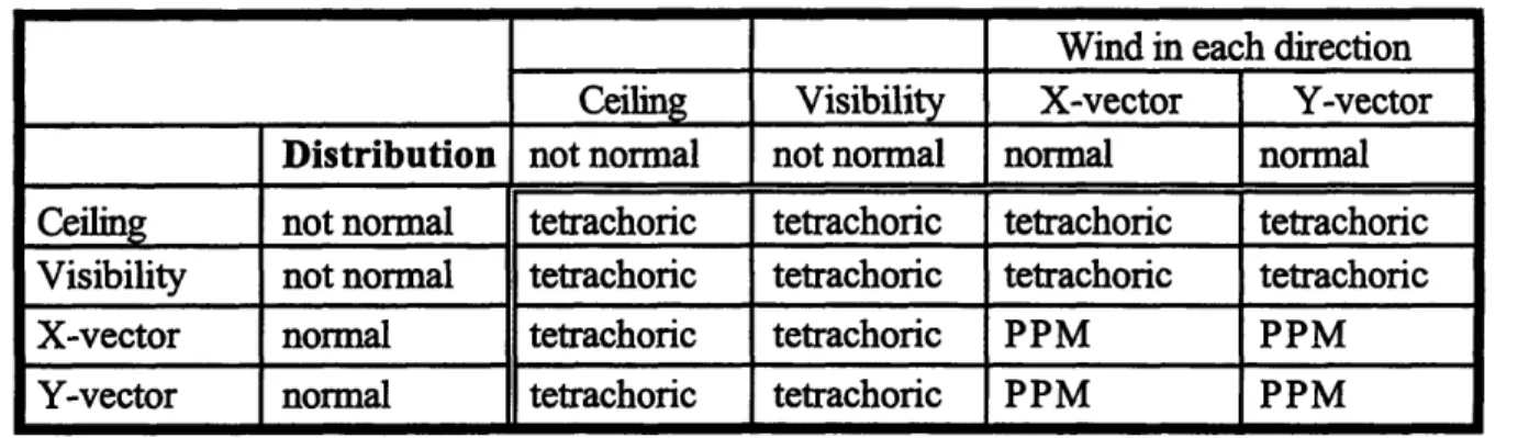
Table 2-1 shows which method to use to estimate correlation between airport weather variables.
Table 2-1: Correlation Calculation Methods
Wind in each direction Ceiling Visibility X-vector Y-vector
Distribution not normal not normal normal normal
Ceiling not normal tetrachoric tetrachoric tetrachoric tetrachoric
Visibility not normal tetrachoric tetrachoric tetrachoric tetrachoric
X-vector normal tetrachoric tetrachoric PPM PPM
Y-vector normal tetrachoric tetrachoric PPM PPM
Because ceiling and visibility observations are not normally distributed, the tetrachoric method of estimating correlation is used when either of these variables is used. Only when correlating two normally distributed variables such as x-vectors with y-vectors should PPM be used.
2.2.2. Spatial Correlation
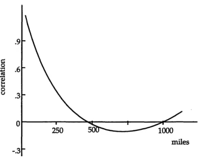
Spatial correlation between two sites is the correlation of the observations of a given weather variable as a function of the separation distance between the sites. The correlation among different geographic regions will vary according to the stability of the weather patterns and seasonal aspects. Figure 2.4 depicts a 30-year, average spatial correlation curve (using the tetrachoric correlation estimator) for cloud ceiling for sample sites in midwestern states for the month of July, compiled by the Air Force [9].
0 .4.
Figure 2.4: Ceiling Spatial Correlation - Midwestern States
For sites which are within 500 miles, a positive correlation exists for ceiling observations. This correlation is weaker as the sites are further apart. Between 500 and 1000 mile separation distances there exists a negative, albeit weak, correlation. This may be attributed to fronts that move over a region and produce severe stormy conditions followed by favorably clear weather conditions and vice versa [22]. For sites over 1000 miles apart, there was some indication of positive correlation due to this same effect. However, because of the variability in weather according to geographic regions, correlation values for sites with separation distances over 1000 miles or even 500 miles should not be used.
Spatial correlation is an important component of an accurate weather model because it reflects the relatedness of weather conditions--and thus capacity problems--at neighboring airports. Accounting for simultaneous capacity problems at neighboring airports makes it easier to develop an air traffic flow management (ATFM) strategy that improves the overall efficiency of the air traffic system. Consider the congestion and capacity problems that occur along the northeast corridor specifically at the New York, Boston, and Washington airports. These airports often operate at high levels of demand close to their maximum throughput capacity. When weather conditions are poor and cause problems at one airport, operations at the other two airports can also be adversely affected due to flight interdependencies. Also, if the weather is the
reason for capacity decreases at one of these airports, it is not unlikely that airports at the other two sites are also influenced by the same weather pattern. Therefore, it is advantageous to evaluate ATFM strategies in a simulation environment which preserves correlation values.
2.2.3. Temporal Correlation
Temporal correlation, also referred to as serial correlation, refers to the auto-correlation of weather observations in the time domain. One way to model the transient and dynamic aspects
of weather is to capture the relationship between time-series values of a variable.
Temporal auto-correlation for a weather variable can be measured by calculating the lag s auto-correlation of sample observations, where s represents the time interval between observations [Hocker]. The Pearson Product Moment formula in equation (2.3) or the tetrachoric formulation in equation (2.4) can be used to calculate auto-correlation. Instead of pairing X- and Y-values at the same time such as ceiling observation in Boston at time t vs. ceiling observation in New York at time t, the X- and Y-values will be at the same site but at different times. For example, if the temporal correlation for visibility in Boston with a lag of s is desired, Y-values would be visibility observations in Boston at time t and X-values would be visibility observations in Boston at time t-s. If there are N discrete observations then Y-values would have a time range of (s + 1, N) while X-values would have a time range of (1, N-s).
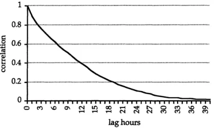
Figure 5 displays the temporal auto-correlation for ceiling at Washington National Airport, for s=0 to 40. The sample data consisted of actual, hourly observations for the months of January and February over a five year period [10].
· I 0.8 . 0.6 S0.4 0 0.2 0 CO~ CN M. r- 00 M~ -4r4 V~4 -4 g4 N 0 M4 MO \o MO MO MOC;\ lag hours
Figure 2.5: Temporal Auto-correlation for Ceiling at DCA
The graph in Figure 2.5 suggests an exponential decay in ceiling auto-correlation as observations are further apart. Observations taken 30 hours apart or greater have correlation values which are not statistically significant and can be considered approximately independent.
2.2.4. Cross-Variable Correlation
Cross-variable correlation, or simply cross-correlation, refers to the correlation between two weather variables at the same site. Cross-correlation is high between sets of airport weather variables. Cross-correlation between ceiling and visibility observations at Boston Logan Airport was calculated for the months of January and February using five years of historical data [3]. The sample cross-correlation coefficient, using the tetrachoric correlation estimator, was 0.83 for Boston.
Because both ceiling and visibility influence an airport's classification, modeling cross-correlation would provide more realistic scenarios for testing and evaluation of air traffic flow management strategies. It would be unrealistic for a model to produce a synthetic ceiling observation of zero feet, while simultaneously generating a favorable observation for visibility.
2.3. Sawtooth Wave Model
In this report we present the sawtooth wave model (SWM), a weather model created for the United States Air Force by Boehm [12]. Originally, the SWM was developed to support
wargaming efforts in different regions of the world This was done by simulating cloud cover ceiling and visibility observations at the sites of interest. This model provided a good foundation and we extended it to produce synthetic wind speed and wind direction. We also incorporated tetrachoric correlation into the model.
2.3.1. Overview of How SWM Works
The heart of the SWM consists of superimposing randomly generated, multidimensional sawtooth waves within a time and space coordinate system [5]. A sawtooth wave, like all other cyclic waves, is characterized by four parameters: wavelength, amplitude, phase shift, and direction. The wavelengths are chosen appropriately as to preserve the spatial temporal and cross-variable correlation values. The amplitude of the sawtooth waves is one for all cases and the phase shift and direction of each wave are chosen randomly. For a detailed description of the sawtooth wave geometry, refer to Hocker [3].
At sites of interest within the coordinate system, the heights of the random waves are summed together. From the Central Limit Theorem, these sums will be approximately normally distributed if a sufficient number of waves (more than 12 ) are used in the model [11]. These sums are then transformed into standard normally distributed values with a mean of zero and variance of one, i.e., N(0,1).
The N(0,1) values are referred to as Equivalent Normal Deviates, or ENDs [11]. They are also sometimes referred to as z-statistics. The ENDs are converted into observations of weather variables, through a process known as inverse transnormalization. Time-series data are generated by adjusting the sawtooth waves in the time dimension and repeating the process.
2.3.2. Appropriateness of the Sawtooth Wave Model
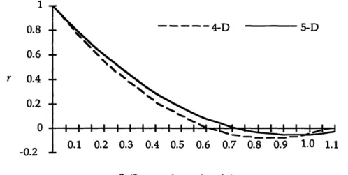
So why should sawtooth waves be used? By choosing appropriate input values for the sawtooth wave model, the correlational behavior of weather variables can easily be reproduced. Previously from figure 2.4, one can see that the spatial correlation of weather parameters initially exhibit an exponential decay; as distances are further apart the correlation drops exponentially
and even turns negative. The correlation then increases again. Similarly, the SWM exhibits the following correlation behavior [2]. Figure 2.6 illustrates the correlation curve using 4-dimensional and 5-4-dimensional sawtooth waves:
1 0.8
0.6
-r 0.4 0.2 -0 S4-D 5-D 0.1 0.2 0.3 0.4 0.5 0.6 0.7 0.8 0.9 1.0 1.1 8 (Sawtoooth wavelengths)Figure 2.6: 4-D and 5-D Correlation Curves
Temporal correlation, on the other hand, behaves purely as an exponential decay as shown previously in Figure 2.5. This exponential decay can also be simulated by using sawtooth waves. Instead of having wavelengths that are the same for all of the sawtooth waves as is the case to model spatial correlation, empirical testing shows that using wavelengths in the ratio of 1:2:3:4:5:6:7 for every seven sawtooth waves will produce results with an exponential decay [16]. Although the ratio of wavelengths has been predetermined to produce exponential decay behavior, the initial wavelengths must still be chosen properly--using historical data--to produce the correct time constant of decay. This is done by finding the lag time which produces an auto-correlation of 0.368 or el. This value is the first temporal wavelength. Subsequent wavelengths are calculated by taking integer multiples of the first wavelength as described above.
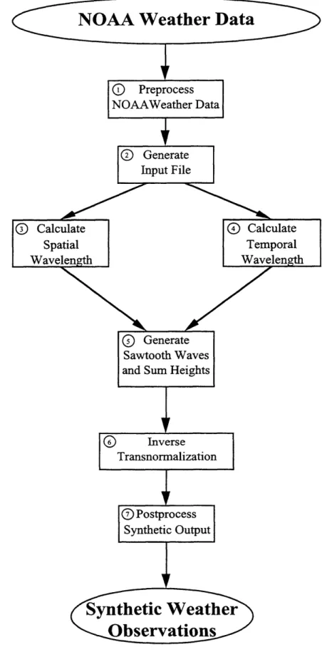
2.3.3. Implementation
There are seven general steps (see figure 2.7) involved in the current implementation of the SWM to model ceiling, visibility, and wind; these are described in the following subsections.
o
Preprocess NOAAWeather DataQ
GenerateSawtooth Waves and Sum Heights
-Synthetic Weather
Observations
2.3.3.1. Preprocess NOAA Weather Data
Historical weather data is needed for input; we used the NOAA weather data. NOAA weather data comes in two forms: old NOAA weather data as used by Hocker in his implementation of the SWM and new NOAA weather data on CD-ROM. In either case, the data in its raw form cannot be used directly; it must be preprocessed into a usable form. An example of the old weather data for Boston is shown in Table 2-2.
Table 2-2: Old NOAA Weather Data Sample
C 86 01 01 00046 00046 00046 00046 00080 00055 00120 00050 H 86 01 01 01000 01000 01000 01000 01000 01000 01000 01000 W 86 01 01 22013 22011 23013 24011 25012 25011 26010 27009 C 86 01 02 99999 99999 99999 00070 00065 00065 99999 99999 W 86 01 02 27009 29005 23008 22009 24008 24007 25012 24010 H 86 01 02 01500 01500 01500 01500 01500 01500 01500 01500 W 86 01 03 23008 23008 21008 19007 15005 16006 10009 21007 H 86 01 03 01500 01500 01500 01500 01500 01500 01200 01200 C 86 01 03 00060 00060 00080 00035 00033 00031 00019 00015
The first column of data designates the variable observed (C = Cloud Ceiling; H = Horizontal Visibility; W = Wind ). The next three columns of data designate the date of the observation in the form of year, month, day. In the actual data, there are 24 columns of data after the date, as opposed to the eight columns shown here, each corresponding to an hourly observation of the weather variable. The ceiling data is given in hundreds of feet and thus the 00046 entry in the first row represents a ceiling of 4600 feet. Horizontal Visibility data is given in hundredths of a mile. Therefore, the 01000 entry in the second row represents a visibility observation of 10 miles; an observation of 99999 represents unlimited visibility. Wind data is given in the form of direction and speed. The first two digits of a wind observation is the direction in tens of degrees and the last three digits provide the magnitude of the wind in knots. The 22013 entry in row three of the data indicates winds from 220 degrees at 13 knots.
The newer NOAA data is much easier to use and requires less preprocessing than the older NOAA weather data. There is an entry for each hour which lists the wind direction, wind speed, visibility and ceiling. Table 2-3 illustrates how this data might look.
Table 2-3: New NOAA Weather Data Sample
86 1 11 1 290 5.7 16.1 1310
86 1 11 2 320 5.2 16.1 1310
86 1 11 3 350 5.2 16.1 1160
The first four columns of data indicate the time of the observation. For example, the first row of the sample data corresponds to January 11, 1986 with hourly observations ending at 1:00 am. The next four columns give the wind direction in degrees, wind speed in miles per hour, visibility in kilometers, and ceiling height in meters.
The NOAA weather data is first separated by the different weather variables. Cumulative distribution functions (CDFs) are then created for each variable at each site for use in the inverse transnormalization process described later. Also, the spatial and temporal correlation values for each variable as well as the cross-correlation values between variables are calculated.
Additional preprocessing on the wind data is also needed. The NOAA data provides the wind data in the form of wind direction and speed. Correlating wind speed and directions is difficult for two reasons. First, wind speed and wind direction are not independent; there is cross-variable correlation between the two. Second, it is difficult to model circularity of wind direction. For example, there exists a strong correlation between wind blowing at 3590 and wind blowing at 00. We chose to avoid these difficulties by converting the wind vector given by speed and direction into an x-vector (east-west component) and a y-vector (north-south component). Previous studies have shown that these x-vectors and y-vectors are independent and normally distributed random variables[13]. Thus, the PPM can be used to calculate correlation values. To do this, the wind speed and direction data are converted to x- and y-vector values during the preprocessing stage.
2.3.3.2. Generate Input File
Our implementation of the sawtooth wave model takes as input a file of parameters. A sample input file is given in the appendix. These parameters fall into one of two categories: site parameters and correlation parameters. Site parameters are those parameters that are specific to a site of interest. This includes location, latitude and longitude, as well as cumulative distributions of each of the variables being modeled at each of the sites of interest. Correlation parameters are the inputs that are necessary to assure that the spatial and temporal correlation of the synthetic data is consistent with that of the historical data. These parameters are a reference correlation distance and its corresponding reference correlation, as well as the lag time when the temporal auto-correlation is 1/e or 0.368 (the reasoning for this is described in subsection "Calculate Temporal Wavelength") [22]. For example, if the spatial correlation between sites 400 nm away should be 0.65 then the reference correlation distance is 400 nm and the corresponding reference correlation is 0.65.
2.3.3.3. Calculate Spatial Wavelength
Once the parameters have been read in, the process works as follows. First of all, from the reference correlation distance and its corresponding correlation we can determine the spatial wavelength needed for the SWM as described in Hocker [Hocker]. For instance, suppose we are generating weather along the east coast and two of our sites of interest are LaGuardia Airport and Logan Airport. The distance between New York and Boston is roughly 200 nm. From historical weather data, we have determined that the tetrachoric correlation of cloud ceiling in the two cities is 0.85. This is also true for the tetrachoric correlation of visibility. Our 5-D correlation curve as shown in Figure 2.6 is represented by the following equation derived by Boehm[13]
r5 =1-2.25- 6+1.2-82 V8<1 (2.5)
r5 is the correlation we wish to preserve using the 5-D SWM. 6 is the separation distance
between two points in time and space, in units of wavelength. Solving for 8 as a function of correlation, we get
6 = 0.9375- 0.833. r5 +0.0459 (2.6)
For our example where r5 = 0.85, we get 0.069 for the value 5. This means that 200 nm is
equal to 0.069 spatial wavelengths and thus we determine that one spatial wavelength is equal to 200/0.069 or 2890 nm.
2.3.3.4. Calculate Temporal Wavelength
The temporal wavelength required by the SWM is derived in a different matter. In fact, it is determined in the preprocessing stage. When looking at the temporal auto-correlation of a weather variable, the time corresponding to the correlation equal to 1/e or 0.368 is temporal wavelength A, for the first sawtooth wave. A2 for the second sawtooth wave is twice that of the first; A3 for the third sawtooth wave is three times that of the first and continues as described
earlier. With this, we have all of the elements to produce the sawtooth waves. 2.3.3.5. Generate Sawtooth Waves and Sum Heights
Given all of the spatial and temporal wavelengths as well as the x-, y-, and z-coordinates for each site of interest, waves are iteratively generated incrementing the value of t and randomizing the direction cosines for each wave. Our implementation utilizes a Monte Carlo technique involving a unit hyper-cube, that generates the direction cosines for each wave [14]. For example, in generating two data points using 14 waves each, one would have random direction cosines for each of the 28 different waves. The value of t for the first 14 waves would be 0 and for the second 14 waves would be 1. The spatial wavelength would be the same for all 28 waves and the temporal wavelength changes in the ratio of 1:2:3:4:5:6:7 every seven waves. From this, we calculate the sum of sawtooth wave heights at each site of interest at each time point and subsequently calculate the ENDs.
2.3.3.6. Inverse Transnormalization
The final step is transforming the ENDs into raw synthetic observations and forecasts using the process of inverse transnormalization. The first step in inverse transnormalizing an
END, is determining the normal cumulative probability from -*- to the END value according to the standard normal distribution, i.e., N(0,1). In other words, the z-statistic must be transformed to a cumulative probability. For its facility in implementation, a polynomial approximation from the Handbook of Mathematical Functions was employed to get the cumulative probabilities.
Next, referencing the input CDFs for each variable, the cumulative probabilities are converted into raw weather observations. For example, assume our sawtooth wave sum for synthetically producing ceiling data is 5.84 as in Table 2-4. The END is then calculated to be -1.074. From this, we gather that the normal cumulative probability corresponding to a z-value of -1.074 is 0.141. We then go to the ceiling cumulative distribution function and find the ceiling value that corresponds to a cumulative probability of 0.141.
F
Table 2-4: Sample Ceiling Observation at Boston Logan
wBos ZBos P(Z < zos) Csos
5.84 -1.074 0.141 1916 ft
I
I I . .
Because the CDFs are computed based on discrete thresholds, it is necessary to use linear approximations in between the thresholds, in order to complete the continuous functions.
2.3.3.7. Postprocess Synthetic Output
Before using the synthetically generated values immediately, some minor postprocessing is done. The wind values produced by the SWM are still in terms of x-vectors and y-vectors. These values are changed back to speed and direction so that data is in the NOAA format. This allows applications designed to use NOAA data to use the synthetic data without further processing.
Also, the lags that were calculated for the temporal correlation need to be incorporated into the data. This is done by "slipping" the data to meet the lag requirement. For example, suppose 1000 data points were produced for Boston and New York and that the lag between the
two sites was determined to be 4. This means that weather values produced at time 0 synthetically can represent time 0 for New York but represent time 4 for Boston. We do this for all times for which the data was produced and write to output files accordingly.
2.4. Weather Generation Results
The SWM was used to generate synthetic weather observations at Boston's Logan International (BOS), New York's LaGuardia (LGA), and Washington D.C.'s National (DCA) airports. The separation distance between BOS and LGA of 160.06 nautical miles and corresponding correlation values of 0.76 for ceiling and visibility, 0.71 for x-vectors, and 0.74 for y-vectors were used as the reference correlation distance and reference correlation values, respectively, as inputs to the SWM.
The resulting weather observations supported the validity of the SWM as an accurate weather model. The correlation values of the synthetically generated weather data were calculated in the same manner as they were for the historical weather data. In most cases, these correlation values were identical or very close. Consider, for example, the correlation between x-vector values at the three airports. The input given to the SWM for x-x-vectors was the correlation of 0.71 between BOS and LGA. The synthetic weather data produced a correlation of 0.75 between the two sites. Similarly, the historical data also shows that the correlation between x-vectors at BOS and those at DCA is 0.52 while the synthetic weather data indicates a correlation level of 0.51. The largest difference exists for correlation data between LGA and DCA where the historical data indicates a correlation of 0.61 but the synthetic data resulted in a correlation of 0.71.
For purposes of the air traffic control simulation testbed, this accuracy is sufficient. 2.5. Regional Coverage Constraint
The accuracy of the SWM is only good for a single region. Different regions have different climate conditions and thus using one reference correlation, or one sawtooth wave model for that matter, to generate weather for a large area such as the United States would not be extremely accurate.
How does one produce accurate synthetic weather observations and solve the problem of regionality? There are two techniques to compensate for the problem. The first technique is to use the "breathing earth" model described in Hocker. In essence, the radius of the Earth is changed to preserve different sets of correlation values. For example, consider two sites SI and
S2 which are D 1 nautical miles apart and have a spatial correlation R. Next, consider another site S3 that also has a spatial correlation R with site S1 but is D2 nautical miles apart. Generate observations for S I and S2 as normal. To generate observations for site S3, reduce the value for the radius of the earth so that the distance between S 1 and S3 is D1 nautical miles and proceed as normal. This concept of the "breathing earth" works by varying the effective radius of the earth so that locations will have the required distance between them to get the desired correlation. These techniques can be used to achieve desired correlation values between any pair of sites.
Another approach to the problem is to use two or more sawtooth wave generators which are sufficiently far apart that they would be considered independent and using weighted values to generate observations for sites in between. For example, suppose one wanted to generate weather observations for BOS, LGA, DCA, Chicago's O'Hare International Airport (ORD), Minneapolis-St.Paul International Airport (MSP), and Pittsburgh International Airport (PIT). One sawtooth wave generator, call it the east coast generator, can be used to produce weather observations for BOS, LGA, and DCA. Another sawtooth wave generator, call it the north central generator, can be used to produce weather observations for ORD and MSP. These two generators can be considered independent because of the distance between ORD and the three east coast airports. Observations at PIT can be generated from the east coast generator but because of the distance between PIT and the three east coast airports, the observation may not be completely accurate. Similarly, observations for PIT can be generated by the north central generator but accuracy problems may also arise. A compromise can be made by weighting observations from the east coast generator and observations from the north central generator dependent on the correlation between PIT and sites in the two regions. Summing these two
2.6. Conclusion
In conclusion, the SWM is a statistical weather model that is appropriate for use in air traffic flow simulations. With this model, we can generate synthetic weather variables that preserve the spatial correlation among sites, the temporal auto-correlation inherent in weather, and the cross-variable correlation between weather variables such as cloud ceiling and visibility. The model is based on historical weather data at the various sites of interest but historical data at all sites is not essential. For example, if we were attempting to generate weather synthetically at Boston, New York, and Washington, DC but only had weather data for Boston and Washington, we could still generate weather in New York. The sawtooth wave sums would come from the sawtooth waves generated based on data from Boston and Washington. For cumulative distribution functions for New York, one may use an average of cumulative distribution functions for Washington and Boston.
One must, however, use discretion when using the SWM. The SWM should be used for a local region. Using one SWM to generate weather for the entire United States is not advised. When the region is not localized, the homogeneity of spatial and temporal correlation is lost and the SWM loses accuracy. If one is trying to generate weather across the United States, the "breathing earth" model or multiple SWMs should be used.
The SWM's properties that make it appealing for use in air traffic control flow management research are simplicity and flexibility.
3. Airport Capacity Modeling
To develop an effective ATFM strategy, it is essential to have reliable and accurate values for airport capacity. In the past, these capacity values were simply the maximum number of arrivals that a particular airport could accommodate depending on the weather or meteorological conditions at the time and the runway configuration being used. Arrivals were considered to be the bottleneck of the system and the main reason for delays. It was assumed that departures could be inserted whenever needed and thus only arrival capacities were desired. As air traffic demands have increased and with airlines using hubs and flight banks, the demand for departure capacity has also become significant. For this reason, it is important to consider not only the arrival capacity of an airport but also the departure capacity as well as the interaction or tradeoff between the two in implementing effective strategic flow management programs.
In this chapter, we will introduce and compare four models that have been used to model airport capacity. From this point, whenever the word capacity is used it will refer to the total (both arrival and departure) capacity unless specified otherwise.
3.1. Empirical Data Capacity Frontiers
The first model to be introduced is one developed by Eugene Gilbo under the FAA's Advanced Traffic Management System (ATMS) program [15]. Because this approach uses historical counts of arrivals and departures, the capacity estimates from this model are both realizable and easy to estimate.
3.1.1. Inputs
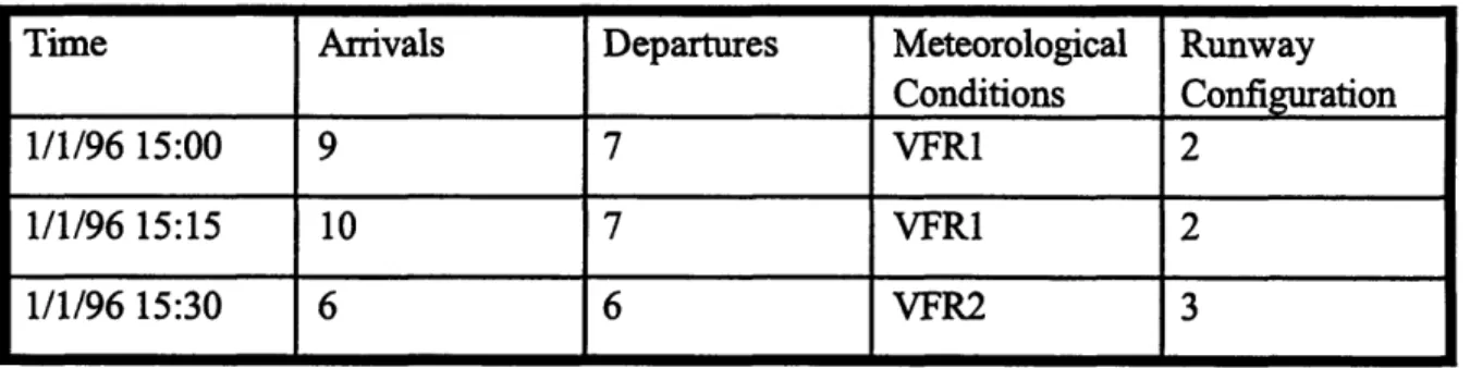
The inputs needed to get empirical data capacity frontiers (EDCFs) are historical counts of arrivals and departures at an airport along with the associated meteorological conditions and runway configurations. Data should be taken for consecutive time intervals over a long period of time. For each time interval, the number of arrivals, the number of departures, the meteorological
conditions (i.e. VFR or Visual Flight Rules) and runway configuration should be noted. For example, sample data might look like:
Table 3-1: Sample Data for Calculating EDCFs
Time Arrivals Departures Meteorological Runway
Conditions
Configuration
1/1/96 15:00 9 7 VFR1 2
1/1/96 15:15 10 7 VFR1 2
1/1/96 15:30 6 6 VFR2 3
In the sample data, counts were taken every fifteen minutes. During the first fifteen-minute interval which ended at 3:00 PM the arrival count was 9 and the departure count was 7. These can be standardized to arrival rates and departure rates of 36 per hour and 28 per hour respectively. Also, during the 3:15-3:30 PM interval there was a configuration change as well as a change in meteorological conditions.
3.1.2. EDCF Estimation Method
Gilbo states that it has been established that arrival and departure capacities are connected with each other through a convex, nonlinear functional relationship [15] and this is supported by Newell [16] and Swedish [17]. Assuming the validity of this statement, an EDCF is easily estimated given the historical arrival and departure counts over a long period of time.
- Gilbo's method assumes that during the period of time considered, the observed peak arrival and departure counts reflect the airport performance at or near the airport's capacity. This seems to be a reasonable assumption for pacing airports considering that they are known to experience congestion and delay during peak hours. This congestion and delay is an indication that these airports operate close to or near their capacity limits. We can then consider that curves that envelope these peak departure and arrival counts are valid airport capacity estimates.
Because capacity calculations are derived for a given runway configuration and meteorological condition, the data needs to be organized by these operation conditions. Each airport has a set of runway configurations that are used with enough frequency that empirical
data can be collected to estimate curves for it. For each of these runways the weather conditions are generally grouped into the four categories described in the previous chapter based on ceiling and visibility: VFR1, VFR2, IFR1, and IFR2. Configuration curves are then derived for each configuration and weather condition.
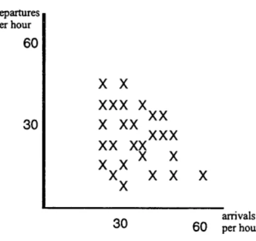
To extract an EDCF from a set of historical counts for a given configuration and meteorological condition, first plot every data point on a graph with the horizontal axis being arrivals and the vertical axis being departures as shown in Figure 3.1.
UdepaJrtus per hour 60 30
X x
xxx x
x xx
X
xxx
xx xx
~xx
x
xx x
x
arrivals 30 60 per hourFigure 3.1: Historical Counts of Hourly Arrivals and Departures
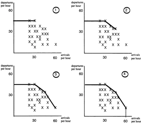
After plotting the historical counts, a piecewise-linear concave curve is stretched around the set of points to form a convex set of feasible operating points. The following figures show how this is done using the sample data in Figure 3.1.
aepartures per hour 60 30
11
per hourG
60
XXX X
xx X XX 30 XXX XX XX XXX X ~xX
Xx
xx
X
0
xx"xxx
xxx
Xxx
x xxx
x K arrivals arrivals30 60 per hour 30 60 per hour
uarpai LUIr per hour 60 30
x xx
xxX
xx xx
~xx
xX
xx
x
arrivals arrivals30 60 per hour 30 60 per hour
Figure 3.2: Deriving EDCFs from Historical Counts
Algorithmically, to develop these curves, one starts with a line of slope equal to zero and connects the point with the greatest number of departures to the vertical axis. This is the first piece of the EDCF as shown in the first part of Figure 3.2. The data point which lies on this line and also has the greatest number of arrivals becomes the pivot point for the next piece of the frontier. From the pivot point, one gradually decreases the slope of the line until another data point is hit. Again, the data point that lies on this line with the greatest arrivals becomes the next pivot point. This process continues until the slope of the line is undefined because there are no more observations with arrivals greater than the last pivot point and then the final piece is drawn by connecting the last pivot point to the arrivals axis.
This method is extremely sensitive to possible outliers in the data. For example, suppose there was one data point that showed 100 arrivals per hour and 30 departures per hour but all other data did not have arrivals per hour value greater than 60. One would suspect that this data
point may have been miscalculated or merely a unique occurrence when the airport operates beyond its normal capacity limits for a short period of time. For all practicality, this data point
is not very useful to us and should not be used for generating EDCFs.
To mitigate the sensitivity to outliers, capacity estimates should be made after rejecting some extreme observations. To do this, one can use only data points that occur at least twice or three times. If a data point occurs more than once or twice, it is reasonable to assume that the data point represents a capacity at which the airport can operate.
Using this rejection criterion does pose one problem. Longer time intervals generally mean more data points are needed and much more time is needed to collect data. For example, suppose one was collecting data in hourly intervals. Arrival and departure data of (45 arrivals, 35 departures) and (46 arrivals, 37 departures) may be collected. Suppose another person collects data in fifteen minute intervals. Values such as (11 arrivals, 9 departures) and (11 arrivals, 9 departures) may be recorded. The person collecting data in hourly intervals may be getting very detailed data; however, because the data is so finely grained many observations will be needed to get multiple occurrences of the data. On the other hand, the person collecting data every fifteen minutes may be getting less detailed hourly data, getting more observations in a one hour period, and should be getting more multiple occurrences than the person taking data hourly.
One way to validate the rejection criterion used for deriving the curves is to give the percentage of data used when using the rejection criterion. A good rejection criterion will still use 90% of the original data [23]. For all of these reasons, the curves derived for this thesis used data taken in fifteen minute intervals and used only data points that occurred at least twice.
3.2. Engineered Performance Standards
The idea of Engineered Performance Standards (EPSs) was introduced in early 1974 in an effort undertaken by the Operations Research Branch of the Executive Staff, Air Traffic Service to develop a system for measuring performance of major airports. Previous to this effort, the only indicators of an airport's performance were delay statistics maintained by airlines [18]. The problem with the use of delays is that these statistics give no indication of how well an airport