A Comprehensive Assessment of Variations in
Electrocardiogram Morphology in Risk Assessment of
Cardiovascular Death post-Acute Coronary Syndrome
by MASSACHUSETTS INSTITU
y OF TECHNOLOG4Y
Priya Parayanthal
2
1 2 TJUNS.B., Massachusetts Institute of Technology (2010)
LBRA
_ES
Submitted to the Department of Electrical Engineering and Computer Science
in Partial Fulfillment of the Requirements for the Degree of ARCHWES Master of Engineering in Electrical Engineering and Computer Science
at the
MASSACHUSETTS INSTITUTE OF TECHNOLOGY May 2011
0 2011 Massachusetts Institute of Technology. All rights reserved.
Author ... .... ... ... ... . . .... .. ... Department o lectrical i/gneedig andComputer Science
May 20, 2011
A A A
Certified by ... . ...
Collin M. Stultz Associate Professor of Electrical Engineering and Computer Science and Associate Professor of Health Sciences Technology Thesis Supervisor
A ccepted by ... ... .. . . . . CaraDr. Christopher J. Terman Chairman, Masters of Engineering Thesis Committee
A Comprehensive Assessment of Variations in Electrocardiogram
Morphology in Risk Assessment of Cardiovascular Death post-Acute
Coronary Syndrome
by
Priya Parayanthal
Submitted to the Department of Electrical Engineering and Computer Science May 20, 2011
In Partial Fulfillment of the Requirements for the Degree of Master of Engineering in Electrical Engineering and Computer Science
ABSTRACT
Millions of patients worldwide are hospitalized each year due to an acute coronary syndrome (ACS). Patients who have had an acute coronary syndrome are at higher risk for developing future adverse cardiovascular events such as cardiovascular death, congestive heart failure, or a repeat ACS. Currently, there have been several electrocardiographic metrics used to assess the risk of ACS patients for a future cardiovascular death including heart rate variability, heart rate turbulence, deceleration capacity, T-wave alternans, and morphologic variability.
This thesis introduces new ECG-based metrics that can be used to risk-stratify post-ACS patients for future cardiovascular death and evaluates the clinical utility of the existing
electrocardiogram based metric known as morphologic variability (MV). We first analyze a metric called weighted morphologic variability (WMV) which is based on assessment of beat-to-beat morphology changes in the ECG. In addition, we introduce machine learning methods with morphology based features to separate post-ACS patients into high risk or low risk for
cardiovascular death. Finally, we aim to increase the clinical utility of MV by creating a metric that can achieve good risk stratification when applied to a small amount of data. The body of this work suggests that morphologic variability is an effective metric in prognosticating post-ACS patients into high risk and low risk for cardiovascular dearth.
Thesis Supervisor: Collin M. Stultz
Title: Associate Professor of Electrical Engineering and Computer Science and Associate Professor of Health Sciences Technology
ACKNOWLEDGEMENTS
I would like to express my sincerest gratitude to Professor Collin Stultz for all of the support, advice, and encouragement he has given me. I would not be where I am today if it wasn't for him. He has contributed significantly to my development and his keen insight has allowed me to evolve into a more effective researcher. His dedication, perseverance, and passion for science will always be a source of inspiration for me.
I am also indebted to Professor John Guttag and his students, Jenna Wiens, Anima Singh, and Garthee Ganeshapillai, for their continuous help and suggestions. In addition, I want to thank all my wonderful lab mates: Dr. Sophie Walker, Dr. Sarah Bowman, and the to-be doctors Charles Fisher, Orly Ullman, and Elaine Gee for making the lab so much fun.
I would like to extend a very special word of thanks to my friends. I am incredibly fortunate to have found such an amazing group of friends who have been there for me and have provided me with much laughter throughout my time at MIT. I would especially like to thank Shlee and Derka for their tremendous support in NYC, North America, Earfs, Milky Way Galaxy, Universe.
Finally, this work would not have been possible without the support of my family. I would like dedicate my efforts over the past couple of years to my parents, Asha and Padman Parayanthal. I am truly at a loss for words to express how thankful I am for all of their love, patience, and support. Their own determination and successes have inspired me to come this far and I am eternally indebted for everything that they have empowered me to achieve.
CONTENTS
A B ST R A C T ... 3 ACKNOWLEDGEMENTS... 5 Chapter 1: INTRODUCTION... 15 A . B ackg round ... 16 1. Cardiovascular Physiology... 16 2. Cardiac Electrophysiology... 17 3. E lectrocardiogram ... 19 4. A therosclerosis... 205. Acute Coronary Syndromes... 21
B. Risk Stratification Measures... 22
1. Non ECG-Based, Non-Invasive Risk-Stratification Measures... 22
2. Electrocardiographic Risk-Stratification Measures... 23
a. Heart Rate Variability... 23
b. Heart Rate Turbulence... 25
c. Deceleration Capacity... 27
d. T-Wave Alternans... 29
Chapter 2: EXTENSIONS OF THE MORPHOLGIC VARIABILITY METRIC... 31
A. Morphologic Variability... 31
1. M eth o ds ... 3 1 a. Morphologic Distance Time Series... 31
b. Deriving a Morphologic Variability Measurefrom the MD Time Series... 33
2 . R esu lts ... 3 7 a. Weighted Morphologic Variability... 38
i. Weighted Morphologic Variability Results (n = 600)... 39
ii. Weighted Morphologic Variability Results (n = 3)... 41
Chapter 3: MACHINE LEARNING APPLICATIONS TO MORPHOLOGIC V A R IA B IL ITY ... 45
A . Sup ervised L earning ... 45
1. Support Vector Machines... 46
2. Support Vector Machines with Linear Kernels... 46
3. Support Vector Machines with Non-Linear Kernels... 50
B. Linear SVMs with Morphology-Based Features... 53
1. Normalization of the Power Spectrum... 54
2. Valida tion ... 55
3. Evaluation of Linear SVM's with Morphology Based Features... 55
Chapter 4: INCREASING THE CLINICAL UTILITY OF MORPHOLOGIC V A R IA B IL IT Y ... 59
A. Morphologic Variability Performance over Time... 59
B. Morphologic Variability Performance using less Data... 61
1. 1St H our A nalysis... 6 1 a. Varied Thresholds... 61
b. Sliding 5-Minute Windows... 66
Chapter 5: SUMMARY AND CONCLUSIONS... 73
A. Morphologic Variability... 73
B. Weighted Morphologic Variability... 74
C. Linear Support Vector Machines with Morphology-Based Features... 76
D. Increasing the Clinical Utility of Morphologic Variability... 77
B IB L IO G R A PH Y ... 79
LIST OF FIGURES
Figure I-1. Physiology of the Cardiovascular System... 17
Figure 1-2. Electrical Conduction Pathway of the Heart... 18
Figure 1-3. Electrocardiogram... 20
Figure 1-4. Heart Rate Turbulence Calculation... 27
Figure 1-5. Anchor and Segment Selection for Deceleration Capacity... 28
Figure 1-6. T-wave Power Spectrumfor Electrical Alternans... 30
Figure II-1. Dynamic Time Warping Beat Alignment... 32
Figure 11-2. Morphologic Variability Heat Map... 36
Figure 11-3. Weights for Various Frequencies in WMV(n=600) Risk Stratification... 40
Figure III-1. Linear SVMSeparating Positive and Negative Examples ... 47
Figure 111-2. Linear SVM with Slack... 49
Figure 111-3. SVM with Non-Linear Kernels... 51
Figure 111-4. S VMwith Radial Basis Function Kernel... 52
Figure 111-5. Linear SVM Test vs. Train Results (60 Bands)... 56
Figure 111-6. AIV vs. Linear SVM Results (60 Bands)... 57
Figure IV- 1. MV Performance Over Time... 60
Figure IV-2. MV- Ihr using Threshold 11 vs. MV C-Statistic Results... 63
Figure IV-3. MV-lhr Averaging Threshold 1] & 12 vs. MV C-Statistic Results... 64
Figure IV-4. MV-i hr vs. MV 90-day Hazard Ratio Results... 66
Figure IV-6. MV-ihr with Sliding 5-min Windows vs. MV 90-day Hazard Ratio Results.. Figure IV-7. MV-ihr with Sliding 5-min Windows and Threshold 45 vs. MV C-Statistic
R esults... . . Figure IV-8. MV-lhr with Sliding 5-min Windows and Threshold 45 vs. MV 90-day
Hazard Ratio Results...
Figure A-1. Linear SVM (30 Band Power Spectrum) Test vs. Train F-Score and 90-Day
Hazard Ratio Results...
Figure A-2. MV vs. Linear SVM (30 Band Power Spectrum) F-Score and 90-day Hazard
R atio R esults... . Figure A-3. Linear SVM (10 Band Power Spectrum) Test vs. Train F-Score and 90-Day
H azard R atio R esults...
Figure A-4. MV vs. Linear SVM (10 Band Power Spectrum) F-Score and 90-day Hazard
LIST OF TABLES
Table I-1. Summary of Statistical HR V Measures... 25
Table 11-1. MV Train vs. Test Hazard Ratio Results... 38
Table 11-2. WMV(n = 600) Train vs. Test Hazard Ratio Results... 41
Table 11-3. WMV(n = 3) Train vs. Test C-Statistic Results... 43
Table 11-4. WMV(n = 3) vs. MV Training Results... ... ... 44
Table 11-5. WMV(n = 3) vs. MV Test Results... 44
Table IV-1. MV-lhr with Varying Thresholds vs. MV... 64
Table IV-2. MV-ihr with Sliding 5-min Windows vs. MV... 68
Chapter I:
INTRODUCTION
Millions of Americans are hospitalized every year with an Acute Coronary Syndrome (ACS) -a clinical event in which blood supply to part of the heart muscle (myocardium) is severely reduced. Acute Coronary Syndromes are classified into two groups: unstable angina, a state in which there is no evidence that the myocardium is permanently damaged, and a heart attack in which it is. Patients who are diagnosed with an Acute Coronary Syndrome have increased risk of future adverse cardiovascular events which could include death from fatal arrhythmias, a repeat ACS, or congestive heart failure. As a result, it is very important to be able to accurately identify patients who are at high risk of developing such events. Risk assessment enables physicians to decide what type of treatments patients should receive. For example high risk patients usually benefit from more invasive treatments (e.g., coronary angiography), which may entail some risk, while low risk patients can be treated with lower risk therapies (oral medications alone).
Currently, there are several techniques that are used to predict risk for adverse
cardiovascular outcomes in post-ACS patients. Some non-invasive tests used to help risk stratify patients include Cardiac Magnetic Resonance -Imaging (MRI), Cardiac Computed Tomography (CT), and Cardiac Ultrasound, however these tests may not be readily available in a number of rural settings. By contrast, Electrocardiographic (ECG) -based risk metrics are relatively
efficient, inexpensive, and readily available. This thesis introduces new ECG-based metrics that can be used to risk-stratify post-ACS patients for future adverse cardiovascular events and evaluates the clinical utility of the existing ECG-based metric known as morphologic variability (MV).
This thesis is organized as follows: Chapter 1 focuses on background information on the cardiovascular system, electrocardiogram, and existing risk-stratification techniques. Chapter 2 describes the MV metric and introduces a new variation to the MV metric, known as weighted morphologic variability (WMV). Chapter 3 evaluates the application of linear support vector machines (SVM) with morphology based features in post-ACS risk stratification. Chapter 4 provides an analysis of several methods used to increase the clinical utility of the MV metric. Finally, Chapter 5 concludes with a summary of the findings and conclusions in the thesis.
A. Background
1. Cardiovascular Physiology
The main function of the cardiovascular system is to provide cells with oxygen and nutrients as well as the transport of hormones to target cells and organs. The main components of the cardiovascular system are the heart and blood vessels which can be further subdivided into two separate circulations connected in series. First there is the pulmonary circulation, which carries blood through the lungs for oxygenation, and second there is the systemic circulation which delivers oxygenated blood to the rest of the body (Figure I-1).
The heart pumps blood to various parts of the body through rhythmic contractions. The heart itself has four separate chambers: the left and right atria, and the left and right ventricles (Figure I-1). The left atrium collects oxygenated blood from the lungs and passes it through the mitral valve to the left ventricle which then passes the blood through the aortic valve to the aorta which distributes blood to the rest of the body. Then, the deoxygenated blood flows into the right atrium which delivers the blood through the tricuspid valve to the right ventricle. Finally, the right ventricle passes the blood through the pulmonic valve to the lungs for oxygenation.
The heart beat is formed by contraction of the atria followed by contraction of the ventricles [Error! Reference source not found.].
Figure 0-1. Physiology of the Cardiovascular System. The heart pumps blood carrying essential
nutrients and oxygen throughout the body. Oxygenated blood from the lungs is sent to the left atrium and then to the left ventricle which sends the blood to the rest of the body. The deoxygenated blood is then passed to the left atrium and then to the left ventricle where is again sent to the lungs for oxygenation. Image courtesy of Daily Dose of Fitness [2].
2. Cardiac Electrophysiology
In order for the heart to pump blood through the vasculature, different parts of the heart must be electrically stimulated to contract. A depolarization front which consists of electrical impulses that stimulate muscle contraction originates at the sinoatrial (SA) node and then is conducted to the entire myocardium in a specific, timed sequence such that the atria contract before the ventricles. The electrical impulses are conducted through the heart by the
17
depolarization and repolarization of myocardial cells. At rest, a myocardial cell, or myocyte, remains at a negative potential relative to the outside of the cell. If the myocyte is stimulated, it becomes depolarized as positive ions flow into the cell. The cell then repolarizes and returns to its normal, resting state.
In normal sinus rhythm, the depolarization front is initiated at the sinoatrial node which serves as the pacemaker (Figure 1-2). These electrical impulses then spread to the right and left atria, then to the atrioventricular (AV) node, the bundle of His, the left and right bundle branches, the smaller bundles of the Purkinje system, and finally to the myocardium itself [Error! Reference source not found.].
Sinus Node ATRIUM RIGH T AT RIUM Atrioventricular VENTRICLE Node His Bundle RG H V ENT RICL E Left Right JBundle Bundle Branch Branch
Figure 1-2: Electrical Conduction Pathway of the Heart. Electrical impulses begin at the SA node and
spread through the atria, stimulating them to contract and pump blood into the right and left ventricles. The impulses then enter the atrioventricular (AV) node, and then spread though the ventricles, thus also
stimulating them to contract. This conduction system determines the timing of the heart beat and causes the heart to contract in a coordinated manner. Image courtesy of Up To Date [3].
---3. Electrocardiogram
The electrocardiogram measures potential differences on the surface of the body that correspond to the electrical activity of the heart. Electrocardiographic data can be collected through the use of Holter monitors. Holter monitors involve the placement of 3 to 12 leads which are electrodes, placed on various parts of the body, that measure and record voltage changes along specific axes. Holter monitors typically collect ECG data for at least 24 hours. Many risk stratification methods, including the one discussed in this thesis, only require data from a single lead.
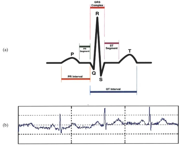
A heart beat is typically divided into segments as shown in Figure 1-3a. The P wave corresponds to right and left atrial depolarization. The PR interval is the time from initial depolarization of the atria to initial depolarization of the ventricles and within this, the PR segment is an isoelectric region that corresponds to conduction of the electrical signal from the atria to the AV node (see Figure 1-2). The QRS complex corresponds to right and left ventricular depolarization. The magnitude of the QRS complex is much larger than that of the P-wave because the ventricles are much larger in size than the atria. Atrial repolarization also occurs during this time however it is not seen on a normal ECG because its amplitude is much smaller and generally "buried" in the QRS complex. Finally, the T wave indicates ventricular repolarization [1].
(b) Ofts
R
HT
S
OT I1MavFigure 1-3. Electrocardiogram. Figure I-3a depicts the parts of a single heartbeat in the electrocardiogram. The P-wave corresponds to the depolarization of the atria, the QRS complex corresponds to the depolarization of the ventricles (the repolarization of the atria are hidden within the QRS complex), and the T-wave corresponds to the repolarization of the ventricles. Image courtesy of Skipping Hearts [4]. Figure I-3b shows a sample electrocardiogram recording. Image courtesy of Malarvilli [5].
4. Atherosclerosis
Atherosclerosis is a condition in which there is an aggregation of lipids, cells, and other substances within the arterial wall. A discrete localization of these substances within the arterial wall is called an atherosclerotic plaque. When this build-up occurs in a patient's coronary artery, the patient is diagnosed with coronary artery disease. If the plaques become large with respect to
20
... .... ... ...- ... I ...
the lumen of the vessel, or if they rupture leading to the formation of a clot in the vessel lumen, blood flow through the artery can be severely reduced and this results in an acute coronary syndrome [5].
5. Acute Coronary Syndromes
An acute coronary syndrome (ACS) is an event in which the blood supply to the heart is severely reduced. Some common symptoms of an ACS are angina (chest pain), nausea, dyspnea (shortness of breath), and diaphoresis (sweating). An ACS is usually caused by atherosclerotic plaque rupture.
ACS is generally classified into either unstable angina in which myocardium is not permanently damaged, or a myocardial infarction, in which the tissue is permanently damaged. In addition, ACS's are further classified based on the extent of the occlusion of an artery. When the ECG shows elevation of the ST segment, this indicates complete occlusion of an artery. This is known as a ST-elevation myocardial infarction (STEMI). Non-ST elevation is less severe and indicates a partial occlusion of an artery. If necrosis also occurs, which is when the myocardium is permanently damaged, the patient is diagnosed with non-ST elevation myocardial infarction (NSTEACS) [6]. Patients diagnosed with an ACS are at higher risk of experiencing a future adverse cardiovascular event including death from fatal arrhythmias, a repeat ACS, or congestive heart failure. Thus, it is important to be able to accurately identify high risk patients so that doctors can offer them more aggressive treatments that may decrease their risk of these future adverse cardiac events.
B. Risk Stratification Measures
There are several existing techniques that can be used to determine the risk that post-ACS patients have of a future adverse cardiovascular outcome. One such technique is cardiac
catheterization, in which a catheter is inserted into an artery and advanced into chambers of the heart or the coronary arteries [7]. This provides a direct visualization of the lumen of the
coronary arteries as well as an assessment of the pressures in the various heart chambers and the overall cardiac function. However, it requires cannulation of the great vessels and therefore does entail some risk, thereby making it somewhat less desirable for low-risk patients.
The following section will describe a few non-invasive methods as well as electrocardiographic techniques for risk stratification of post-ACS patients.
1. Non ECG-Based, Non-Invasive Risk-Stratification Measures
The Thrombolysis in Myocardial Infarction (TIMI) risk score is a simple metric used to asses a patients risk for death and subsequent ischemic events, thereby providing doctors with a better basis for therapeutic decision making. The score is determined from seven independent
factors which include: age > 65 years, presence of at least three risk factors for cardiac heart disease, prior coronary stenosis > 50%, presence of ST segment deviation, at least two anginal episodes in the preceding 24 hours, use of asprin in the preceding 7 days, and elevated serum cardiac markers [8]. One point is given for each of these factors that a patient has, making the total TIMI risk score range from 0 to 7. Patients with a score of 0-2 are classified as low risk, 3-4 as intermediate risk, and 5-7 as high risk for a future adverse cardiovascular event. While the TIMI risk score is an effective and simple prognostication scheme that categorizes patients into high, intermediate, or low risk for death or ischemic events, the score does not provide a
quantitative statement about finer gradations of risk that exist clinically. Therefore, additional methods for accurate risk stratification are needed.
Other non-invasive tests include Cardiac Magnetic Resonance Imaging (MRI), Cardiac Computed Tomography (CT), and Cardiac Ultrasound all of which are techniques used to image the heart. The Cardiac MRI uses powerful magnetic fields and frequency pulses to produce detailed pictures of organs and can be used to evaluate the anatomy and function of the heart. The Cardiac CT involves imaging of the heart through the use of x-rays. Cardiac Ultrasound (Echocardiography) uses ultrasound techniques to image two and three-dimensional views of the heart and therefore can produce an accurate assessment of cardiac function [1]. While these techniques are useful in risk stratification, some are expensive and many are not readily available in rural settings. Electrocardiographic (ECG) -based methods have proven to be much more efficient and practical as they are routinely acquired for all patients for monitoring purposes and they are also non-invasive and inexpensive.
2. Electrocardiographic Risk-Stratification Measures a. Heart Rate Variability
Heart rate variability (HRV) is a measure of variations in a patient's heart rate and indirectly enables one to assess the health of the autonomic nervous system. More precisely, the heart rate is primarily modulated by the autonomic nervous system, which can be subdivided into the sympathetic and parasympathetic nervous systems. In healthy people, the body continuously compensates for changes in metabolism by varying the heart rate through regulation by the autonomic nervous system. Thus, if the heart rate is not very variable, it indicates decreased modulation by the sympathetic and parasympathetic nervous systems, meaning the heart control
systems are not appropriately responding to stimuli. Lower heart rate variability is associated with a higher risk for developing a future adverse cardiovascular event [9].
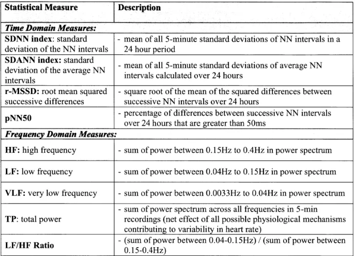
HRV is a measure of the variability in RR intervals, which are the difference in time between successive R waves in the ECG. Normal RR intervals (also called NN intervals) are the difference in time between adjacent QRS complexes in beats that begin at the sino-atrial node and follow a normal conduction path through the myocardium (Figure 1-2). The NN interval corresponds to the instantaneous heart rate. Simple time domain measures of HRV include the mean NN interval, difference between the longest and shortest NN intervals, and the mean heart rate, the difference between night and day heart rate, etc. Statistical time domain measures can also be calculated when working with signals recorded over longer periods of time. The first of these statistical measures is the standard deviation of NN intervals (SDNN) which is the mean of all 5-minute standard deviations of NN intervals during a 24-hour period. However, this is not a particularly good measure because it is dependent on the length of the recording. Another commonly used statistical measure is the standard deviation of the average NN intervals (SDANN) which is the standard deviation of the mean NN interval in a five-minute window. Additional time domain measures are introduced in Table 1-1.
The frequency domain metrics use the power spectral density of the series of NN
intervals. The LF/HF metric is the ratio of the total power in a low frequency (LF) band to a high frequency (HF) band. This metric is defined as:
Power between 0.04 and 0.15Hz HRV(LF/HF) =
Power between 0.15 and 0.4 Hz
The ratio is computed for all 5-minute windows and the median across all windows is the LF/HF value for a particular patient. Patients with high LF/HF ratios are considered to be at high risk of death post-ACS [10]. Additional frequency domain measures are mentioned in Table I-1.
Statistical Measure Description
Time Domain Measures: _________________________
SDNN index: standard - mean of all 5-minute standard deviations of NN intervals in a deviation of the NN intervals 24 hour period
SDANN index: standard
dviatindftare N - mean of all 5-minute standard deviations of average NN deviation of the average NN itrascluae vr2 or
intevalsintervals calculated over 24 hours intervals
r-MSSD: root mean squared - square root of the mean of the squared differences between successive differences successive NN intervals over 24 hours
pNN50 -percentage of differences between successive NN intervals
over 24 hours that are greater than 50ms Frequency Domain Measures:
HF: high frequency - sum of power between 0.15Hz to 0.4Hz in power spectrum LF: low frequency - sum of power between 0.04Hz to 0.15Hz in power spectrum VLF: very low frequency - sum of power between 0.0033Hz to 0.04Hz in power spectrum
- sum of power spectrum across all frequencies in 5-min
TP: total power recordings (net effect of all possible physiological mechanisms contributing to variability in heart rate)
LF/HF Ratio - (sum of power between 0.04-0.15Hz) / (sum of power between
0.15-0.4Hz)
Table I-1. Summary of Statistical HRVMeasures.
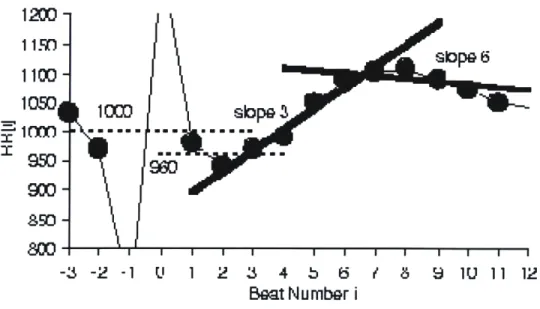
b. Heart Rate Turbulence
Heart rate turbulence (HRT) is another metric assessing the risk of patient's status post-ACS. This metric is based on changes in the heart rate in that it assesses the response of the heart rate following a premature ventricular contraction (PVC). A PVC is an abnormal heart
rhythm in which a beat originates from the ventricles rather than the sino-atrial node. The premature beat results in a reduction in the amount of blood ejected from the heart (a lower ejection fraction) leading to a lower blood pressure than expected. As a result, the autonomous nervous system increases the heart rate in an attempt to raise blood pressure. Following this phase, the heart returns to the baseline heart rate. If the heart takes too long to return to this homeostatic level, it may indicate some problem with baroreflex (mechanism for controlling blood pressure) sensitivity [11].
HRT is first characterized by the spontaneous initial acceleration or the turbulence onset (TO), which is the relative change of RR intervals immediately preceding and following a PVC. More specifically, the TO is the difference between the mean of the last two normal RR intervals before the PVC (RR-2 and RR-1) and the first two normal RR intervals following the PVC (RRi and RR2):
(RR 1 + RR2) -(RR- 2 + RR_1)
TO = (RL ( RR-z + RR _1)W)x 100
(Equation 1-2) In addition, HRT is characterized by the Turbulence Slope (TS) which is a measure of the slowing of the heart rate as it returns to its baseline value after a PVC. It is quantified as the maximum slope of a regression line over any five consecutive normal RR intervals following a PVC. If a patient has a lower TS, this means that the patient's heart takes a longer period of time to return to its baseline level and may indicate an unhealthy autonomic nervous system [12].
-3 -2 -1 1' 1 2 3 4 b 6 / 8 9 1U 11 12
Beat Number i
Figure 1-4. Heart Rate Turbulence Calculation. Heart rate turbulence (HRT) is characterized by the turbulence onset (TO) and turbulence slope (TS). The TO is quantified as the relative change of the RR intervals from before to after a PVC. In this example, the average of the two RR intervals preceding the PVC is 1000 ms and the average of the 2 RR intervals following the PVC is 960 Ms. Thus, the TO = (960-1000)/1000 x 100 = -4%. The TS is the maximum regression slope of 5 consecutive normal RR intervals within the first 15 RR intervals immediately following a PVC. In this example, the regression line that is fit to beats 3-7 is labeled slope 3 and the line that is fit to beats 6-10 is labeled slope 6. The TS = 36.4 ms/beat because the regression line that is fit to beats 3-7 has the largest slope among all possible regression lines. Image courtesy of Watanabe [13].
Patients are given a final HRT score of 0 if both the TO and TS are normal, 1 if either the TS or the TO is abnormal, and 2 if both the TS and TO are abnormal. Post-ACS patients who are were given a high HRT score of 2 were at much higher risk for future cardiovascular death [14].
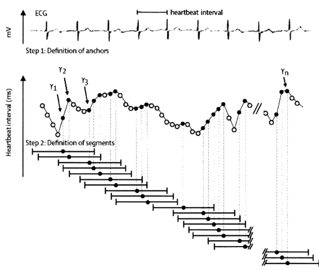
c. Deceleration Capacity
Deceleration capacity (DC) is an extension of HRT and focuses on regions where the heart rate slows down; i.e. regions that correspond to vagal modulation. First, anchors, which are defined as a longer RR interval following a shorter RR interval, are identified along an ECG
recording. Next, segments of data around the anchors, equivalent in size, are selected (Figure
I-5).
ECG
---
heartbeat
interval
>A
Step 1: Definition of anchors
Y2 Y
Tj Y3
Step 2: Definition of segments
-rW
Figure I-5. Anchor and Segment Selection
for
Deceleration Capacity. Anchors are defined by aheartbeat interval that is longer than the preceding interval. These correspond to black circles in the figure. The bars in the figure correspond to segments of data surrounding the anchors. These segments are the same size. The deceleration capacity is defined as the average of the RR interval of the anchor with the RR interval immediately following the anchor and the last two RR intervals immediately preceding the anchor. Image courtesy of Bauer [1515].
The lengths of the two RR intervals immediately preceding the anchor are X(-2) and X(- 1), the length of the anchor is X(0), and the length of the RR interval immediately following the anchor is X(1). The resulting DC metric is defined as:
DC = X(O) + X(1) - X(-1) - X(-2) 4
(Equation 1-3) It has been found that diminished deceleration capacity is an important prognostic marker for death after myocardial infarction [15].
d. T-WaveAlternans
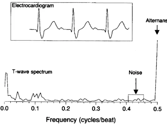
T-wave alternans (TWA) is a measure of beat-to-beat variations in the amplitude of the T-wave in the electrocardiogram. These variations are very subtle and are often only discovered at the microvolt level. It has been found that electrical alternans affecting the T-wave and even the ST-segment are associated with increased risk for ventricular arrhythmias as well as sudden cardiac death. Alternation between successive beats in the ECG morphology is most simply alternation in time aligned sampled values of successive beats of the ECG. However, variation between time aligned beats of the ECG is often confounded by noise, respiratory modulation, muscle artifact, etc., making it difficult to identify every-other-beat variations. As a result, the signal is converted into a power spectrum which is in the frequency domain, to separate out relevant frequency components. This power spectrum is calculated by taking the discrete Fourier transform of the Harming-windowed sample autocorrelation function of the T-wave and ST segments (Figure 1-6) [16].
Alterans
T-wave spectrum
Noise
0.0
0.1
0.2
0.3
0.4
0.5
Frequency (cycles/beat)
Figure 1-6. T-wave Power Spectum for Electrical Alternans. The power spectrum of the T-wave is
shown above. T-wave alternans is the amplitude of the peak of the power spectrum at the 0.5 frequency which corresponds to every-other-beat variations. Because alternans are typically subtle changes on the microvolt level, they are very difficult to detect by simply looking at the electrocardiogram. This is why the T-wave power spectrum is created. The spectrum at 0.5 cycles per beat in this figure shows a clear peak and thus the presence of alternans variation. Image courtesy of Rosenbaum [ 17].
A spectral peak at the 0.5 cycle per beat frequency corresponds to beat-to-beat variations
and the magnitude at this peak is a measure of electrical alternans. The alternans ratio is calculated as:
alternans ratio alternans peak - mean(noise)
0noise
(Equation 1-4) Patients with alternans ratios greater than 2.5 in either the T-wave or ST segment are found to be vulnerable to arrhythmias. While there is high correlation between electrical alternans and risk for arrhythmias, electrical alternans require sensitive equipment to detect because they operate at the micro-volt level [17].
Chapter II:
EXTENSIONS OF THE MORPHOLOGIC
VARIABILITY METRIC
A. Morphologic Variability
Morphologic variability (MV) quantifies beat-to-beat changes in the shape of the heartbeat. Because damaged myocardial tissue does not conduct an electrical signal the same way that undamaged tissue does, changes in the morphology of the ECG waveform may indicate some underlying problem with electrical conduction through the heart. In order to calculate the MV of a patient, individual beats of the patients ECG recording must be identified. Analogous to the NN time series used for the HRV metric, MV is calculated from an intermediate time series called the morphologic distance (MD) time series which captures differences between two
successive beats. Similar to what is done for the HRV frequency measures, this time series is then converted into the frequency domain, yielding a power spectrum from which the MV metric is quantified [18].
1. Methods
a. Morphologic Distance Time Series
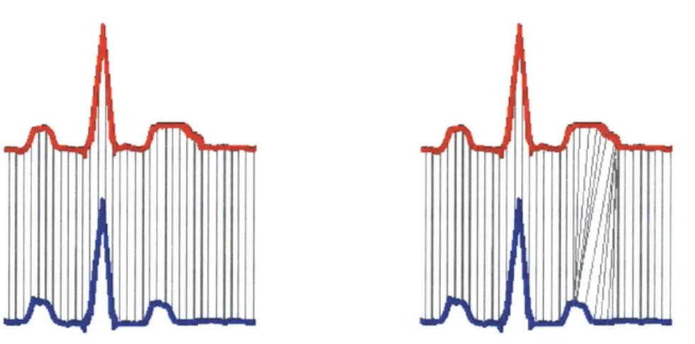
To calculate the morphologic distance (MD) time series, a technique called dynamic time warping (DTW) is used to quantify subtle differences between the shapes of successive beats. The first step in comparing successive beats is to align them to avoid matching segments of one waveform that correspond to a different segment of another waveform. As shown in Figure II-1, if the red and blue beats were simply subtracted, we would be comparing the middle of the T-wave in the red beat to the end of the T-T-wave in the blue beat. The DTW algorithm is used to
match parts of the ECG that correspond to the same physiologic processes so that relevant conduction phases are compared.
Figure H-1. Dynamic Time Warping Beat Alignment. In the figure on the left, samples in the red beat
are directly compared to samples that occur at the same time in the blue beat. However, when beats are directly compared in this manner, regions of one beat might be compared to regions of another beat which correspond to completely different physiological processes. In this example, the middle of the T-wave in the red beat is compared to the end of the T-wave in the blue beat. The figure on the right shows that DTW fixes this issue and aligns the beats in such a way the same points in the conduction path of the two different beats are being compared. Image courtesy of Syed [18].
DTW is performed on successive beats and involves creating an m x n matrix, where m is the length of the first beat and n is the length of the second beat. Each element in the matrix corresponds to the variability, or Euclidean distance (A(i)-Bj))2 between the ith sample of the first beat and the jth sample of the second beat. Any particular alignment corresponds to a path, qp, of length K is defined as:
<pk' = (qA(k ,<ptB k)), 1 k K
(Equation 11-1) Where <A represents the row index and PB represents the column index of the of the distance matrix. The optimal dynamic time warping alignment is the path through this matrix with the
minimum associated cost. The cost is defined as the sum of squares of the differences between pairs of matched elements under all allowable alignments. Given two beats, xA and XB, the cost
of the alignment path is defined as:
K
C pxAxB) =
)
d(xA(pAk)],x Bp Bkk=1
(Equation 11-2) Thus, the DTW between these two beats is:
DTW(xA ,x,)= minC,(xA ,xB
(Equation 11-3) The final DTW energy difference captures both amplitude changes as well as the length K of the alignment path, thus also capturing timing differences between two beats [19].
The MD time series is formed by computing the DTW distance of each beat with the previous beat in a pair-wise manner. First, successive beats of the ECG are aligned using dynamic time warping and then the MD is calculated by taking the sum of squares energy difference, or dynamic time warping cost, between aligned beats. To smooth this sequence a median filter of length 8 is then applied, and the resulting sequence is known as the MD time series [18].
b. Deriving a Morphologic Variability Measure from the MD Time Series As in HRV, frequency domain based measures of morphology differences can also characterize the variability of successive beats. It is believed that frequency-based metrics are more robust because high frequency noise in ECG recordings does not interfere with
measurements of the low frequency components that are physiologically relevant [6]. Power spectra are calculated for a given patient and these power spectra are used to quantify MV for
that particular patient. The final MV metric is calculated as the sum of powers across a particular frequency band in a patient's power spectrum.
Similar to HRV, a patient's MD time series is broken up into 5-minute intervals and a power spectrum is calculated for each of these intervals. The power spectrum is the energy in
the MD time series for each of these 5-minute intervals and in order to characterize the
morphologic changes in each of these intervals, the power in a particular diagnostic frequency band is summed:
HF
MV = ZPower(v)
v=LF
(Equation 11-4) Where 0 represents a particular 5-minute interval and v is the frequency which ranges from a low frequency (LF) to a high frequency (HF) cutoff. The final MV value for each patient is taken as the 90th percentile value across the sums for all 5-minute intervals, or the 90th percentile value of the MVO's for each patient. A threshold of 90% was found to have improved risk stratification and discrimination quality while avoiding the effects of noise.
In order to find the optimal diagnostic frequency band, all combinations of low frequency and high frequency thresholds between 0.10Hz and 0.60Hz in intervals of 0.01Hz were used to calculate the MV value for each patient. The combination of thresholds that resulted in the highest correlation between MV and cardiovascular death as represented by the c-statistic, was taken to be the optimal frequency band. The c-statistic is the area under the receiver operating
characteristic (ROC) curve. The ROC curve measures the true positive rate, or sensitivity, versus the false positive rate, or 1-specificity. In this case, the curve would be the proportion of
correctly identified patients at high risk of future adverse cardiovascular outcomes versus the rate of incorrectly identifying patients at high risk. Thus, the goal is to maximize both sensitivity and
specificity. Ultimately, the area under the ROC curve, or the c-statistic, is a measure of the predictive capability of a metric. A larger c-statistic indicates that a metric holds more predictive power and generally, a c-statistic of 0.7 or greater is adequate to distinguish between two
outcomes [18].
To determine the frequency band with the largest c-statistic for MV-based risk
assessment, we used data from the DISPERSE-2 (TIM133) trial. This trial enrolled patients who were admitted to the hospital following a non-ST segment elevation acute coronary syndrome (NSTEACS). Patients who were entered into the trial were hospitalized within 48 hours of the NSTEACS incident, experienced ischemic symptoms greater than 10 minutes in duration at rest, and had evidence of myocardial infarction (MI) or ischemia. Patients were followed up for the endpoints of death and MI and there were 15 deaths in this group during the follow up period [20]. A total of 990 patients were enrolled in this trial and after excluding patients with less than 24 hours of ECG data, 764 patients remained. To carry out noise removal, first the ECG signal was median filtered in order to make an estimate of baseline wander, and this wander was subtracted out from the original signal [21]. Next, a wavelet de-noising filter with a soft threshold was applied to the ECG signal to remove any additional noise [22]. Segments of the ECG signal where the signal to noise ratio was significantly low after noise removal were discarded. Parts of the signal with a low signal quality index as well as ectopic beats were removed using the Physionet Signal Quality Index (SQI) package [23]. Finally, the remaining data was segmented into 30-minute intervals and the standard deviation of R-wave amplitudes was calculated. If this standard deviation was greater than 0.2887, the 30 minute interval was discarded. A standard deviation greater than 0.2887 corresponds to the R-wave amplitude
changing uniformly by more than 50% of its mean value and these outliers are thrown out because this is physiologically unlikely [18].
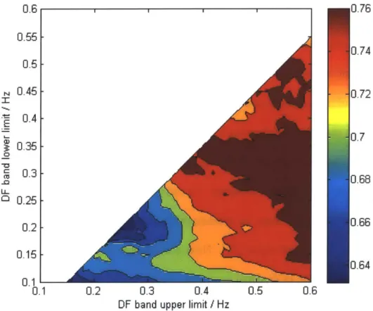
For each combination of thresholds, the c-statistic was calculated and the results were combined to form a heat map (Figure 11-2) which graphically shows which combination of low and high frequency thresholds results in best predictive value.
0.6 0.55 -0.5 0.45 0.4 - 0.350.3 0.25 0.2 0.15 0.1 -0.1 ,0.76
I I
J.74 ).72 3.7 J.68 J.66 ).64 0.2 0.3 0.4 0.5 0.6DF band upper limit / Hz
Figure 11-2. Morphologic Variability Heat Map. The MV heat map is created by calculating the
c-statistic for all combinations of low frequency and high frequency cutoffs. The optimal diagnostic frequency range was found to be 0.3 Hz -0.55 Hz .
The optimal frequency band for MV in DISPERSE-2 was found to be 0.30Hz to 0.55Hz which resulted in a c-statistic of 0.771. The quartile cutoff of MV was found to be 52.5, and was used to dichotomize patients into a high risk (MV>52.5) or low risk (MV<52.5) group. Patients
36
in the top quartile of morphologic variability had a 90-day hazard ratio of 8.46 and a 30-day hazard ratio of 12.30, indicating that a high MV value is significantly associated with
cardiovascular death in post-ACS patients [18].
2. Results
Morphologic variability methods were tested on data from the MERLIN (TIMI 36) trial which, like the DISPERSE-2 trial, comprised of patients who were admitted to the hospital following a non-ST segment elevation acute coronary syndrome (NSTEACS). The goal of the MERLIN trial was to determine the safety and efficacy of ranolazine in patients with
NSTEACS. Patients admitted to this trial were at least 18 years of age, experienced ischemic symptoms greater than 10 minutes at rest, and had either indication of risk for death or ischemic events, evidence of necrosis, at least 1mV of ST-segment depression, diabetes mellitus, or a TIMI risk score of at least 3. There were 6,560 patients in the MERLIN trial who were followed up for a period of two years. After excluding the patients with too little data, 2301 patients remained in the MERLIN Placebo group. There were 102 deaths in the MERLIN Placebo group during the follow up period [2424].
Hazard ratio results for MV when trained on the DISPERSE-2 data and tested on the MERLIN Placebo data are presented in Table 11-1. While the morphologic variability metric is found to be highly correlated with the prediction of death in post-ACS patients, it only uses a single frequency band to estimate each patient's risk. It may be that there is information in the other frequencies that could aid in estimating risk and thus the weighted morphologic variability (WMV) measure was created. This measures uses information in all frequencies of the power spectrum to determine a patient's risk.
Dataset 30-Day Hazard 90-Day Hazard 1-Year Hazard
Ratio Ratio Ratio
Training Results 12.30 8.46
8.46 (DISPERSE -2 data)
Test Results
(MERLIN Placebo data) 4.84 5.16 3.29
Table II-1. MV Train vs. Test Hazard Ratio Results. The MV metric was trained on the DISPERSE-2 data and tested on the MERLIN Placebo data.
a. Weighted Morphologic Variability
WMV is computed in a similar manner to MV however, rather than selecting a single diagnostic frequency band, WMV allows for multiple bands in the power spectrum and applies weights to each of these bands. To quantify WMV, the MD time series is calculated and divided into 5-minute intervals and converted into the power spectrum. The power spectrum, which ranges from 0.001Hz to 0.60Hz, is then divided into n intervals. The WMV value for each of the n intervals, WMVi, is the 90th percentile value of the sum of the power in that particular interval.
HFi
WMVj = Power,(v)
v=LF
(Equation 11-5) The final WMV value is the sum of the weighted WMVI's:
n n HF,
WMV= a -WMV, = a I Power,(v)
i=1 i=1 v=LF
(Equation 11-6) where n is the number of intervals that the power spectrum is divided into, ai is the weight
associated with the particular band i, and Powero is the sum of powers for a particular 5-minute interval. In addition, the weights that multiply each interval must sum to 1.
i=1
(Equation 11-7)
i. Weighted Morphologic Variability Results (n = 600)
WMV was first investigated using the smallest possible frequency bands in the power spectrum. The power spectral density of the MD time series ranges from 0.001Hz to 0.60 Hz with a resolution of 0.001Hz. Thus, if we consider each single frequency as a band, we are left with n = 600 different single frequency bands. The morphologic variability for a single
frequency (MVSF) is the 9 0th percentile power from the MD time series for that particular
frequency. 600 WMV(n = 600) = a -MVSi i=1 MVSF = Power(v) where o = i -10 Hz (Equation 11-8) In the WMV with n = 600 measure, an optimal set of weights for each of the 600 single
frequencies must be chosen to maximize the c-statistic. This is an NP-hard optimization problem, and thus, simulated annealing can be used to determine the set of weights that best predict cardiovascular death. Simulated annealing is a method of optimization analogous to crystal optimization in which there is a control parameter called temperature that is used to heat and cool an energy function which, in this problem, is the negative of the c-statistic. The
algorithm ultimately finds the global minimum which corresponds to the combination of weights that gives the maximum c-statistic [25].
0.018 0.016 0.014 0.012 S0.01 ( 0.008 0.006 0.004 0.002 1 % IY IIV 0 0.1 0.2 0.3 0.4 0.5 0.6 Frequency (Hz)
Figure 11-3. Weights for Various Frequencies in WMV(n = 600) Risk Stratification. The optimum
combination of weights is determined using the simulated annealing algorithm. The weights in this figure are derived from the MERLIN Placebo dataset and are smoothed using a window size of 0.007 Hz. Image courtesy of Sarker [25].
The WMV metric with n = 600 was derived from the MERLIN Placebo data set and its performance was assessed using data from the DISPERSE-2 data set. The cutoff used to dichotomize patients into high risk and low risk groups was determined by finding the point which maximized specificity (rate of correctly identifying patients at low risk) and sensitivity (rate at correctly identifying patients at high risk) on the MERLIN Placebo training data. This
40
cutoff value was determined to be 1.356 where patients were dichotomized into low-risk (WMV(n=600) < 1.356) and high risk (WMV(n=600) > 1.356).
The training and test results are shown in Table 11-2. As shown in these tables, WMV with n = 600 performs better than MV on the training results but fails to perform as well as MV on the test results. The problem with WMV when n = 600 is that all the data in the power spectrum is used and a weight is assigned to every single frequency in the spectrum making it very easy for metric to over-fit to the training data. The metric is not very generalizable as it does not perform as well on other data sets from which it was not developed from. To counter
this problem and find a balance between performance and generalizability, we decrease the value of n (number of bands) in the WMV metric as described in the next section.
Risk Stratification Metric Training Results: 90-day Test Results: 90-day Hazard
Hazard Ratio Ratio
(MERLIN Placebo) (DISPERSE-2)
WMV(n = 600) 6.24 7.15
MV 5.12 8.46
Table 11-2. WMV(n = 600) Train vs. Test Hazard Ratio Results. The WMV(n = 600) metric was trained
on the MERLIN Placebo data and tested on the DISPERSE-2 data. The metric did not perform as well as MV on the test data.
ii. Weighted Morphologic Variability Results (n = 3)
Three-band weighted morphologic variability, is a subset of WMV in which the power spectrum is divided into n = 3 bands, each with an associated weight. As mentioned, each 5-minute power spectrum is computed from 0.001 Hz to 0.60 Hz in 0.001 increments. In the three-band WMV measure, there are two variable cutoffs,
l
andp32, which can take on all possiblevalues between 0.001 Hz and 0.60 Hz in 0.01 Hz increments under the condition that #2 > #.
Thus, the power spectrum is divided into three bands where bandi = 0 -
p8
Hz, band2 =I1 -#2Hz, and band3 = #2 - 0.06 Hz. As in MV, for each patient, the final energy in each band is taken
as the 90th percentile value across all 5-minute intervals. In addition, each band has an
associated weight, a,, a2, and a3, which range from 0 to 1 in 0.1 increments under the condition
that all weights sum to 1. The three-band WMV measure is the weighted sum of energy in each band.
i1 12 0.6Hz
Three-Band WMV = a, E Power9 (v) + a2 1 Power, (u) + a3 1 Power,
v=OHz v=1 U=#82
(Equation 11-9) The c-statistics were then calculated for three-band WMV under all possible
combinations of the cutoffs, $% and32, and the weights, a,, a2, and a3. The optimal combination
of cutoffs and weights was defined as that which resulted in the highest c-statistic. The best cutoffs and best weights were found using an exhaustive search method.
As in WMV with n = 600, WMV with n = 3 was derived from the MERLIN Placebo data
set. An exhaustive search was performed on the training group to find which set of cutoffs and weights maximized the c-statistic. This combination of cutoffs and weights was then applied to the DISPERSE-2 data which served as the test group. The final three-band WMV measure is defined as:
0.03Hz 0.22Hz 0.6Hz
WMV (n=3) 0.3 ZPower (v) +0 1 Power (u) +07 JPower
u=OHz v=0.03Hz v=0.22Hz
(Equation 11-10) It is important to note that the c-statistic of the three-band WMV must perform at least as well as the MV metric in predicting cardiovascular death in post-ACS patients. When /p =
0.30Hz,
#32
= 0.55Hz, a, = 0, a2 = 1, and a3 = 0, the three-band WMV measure is exactly thesame dataset as previous studies. Table 11-3 shows the c-statistic results for the three-band WMV metric on the training and test data. On both data sets, the c-statistic was larger than 0.7,
indicating good predictive performance.
Data B2 ai aZ a3 c-statistic
Training cebo 0.03 0.22 0.3 0 0.7 0.709
(MERLIN Placebo) 0.3.203
Test Data 0.03 0.22 0.3 0 0.7 0.781
(DISPERSE)
Table 11-3. WMV(n = 3) Train vs. Test C-Statistic Results. The c-statistic resulting from the three-band WMV measure was greater than 0.7 on both the training and test data indicating good performance.
In the previous work done with MV, the upper quartile cutoff was determined to be optimal in risk stratifying patients [1818]. Similarly, for the three-band WMV metric, the quartile marker was used to determine the cutoff between high risk and low risk groups. The three-band WMV values of the all patients in the MERLIN Placebo data set were sorted in ascending order and the upper quartile cutoff was determined to be 253.8. Patients were dichotomized into low-risk (WMV(n=3) < 253.8) and high risk (WMV(n=3) > 253.8).
The hazard ratios at several points in time are shown in Table 11-4 and Table 11-5 for the training and test data. The test results in Table 11-5 show that the MV metric gives a higher hazard ratio for 30 days following the start of the study while the three-band WMV metric outperforms the MV metric in the 90-day and 1-year hazard ratios. From the results, it seems that the WMV with n = 3 metric is on par with the MV metric performance but does not result in any major improvements.
Table 11-4. WMV(n = 3) vs. MV Training Results. The three-band WMV metric was trained on the
MERLIN Placebo data. The measure outperforms the MV measure with regards to the 1-year hazard ratio, however the MV metric performs better with respect to the 30-day hazard ratio and 90-day hazard ratios. Test Results WMV(n = 3) MV 30-Day Hazard Ratio 10.00 12.30
I
90-Day Hazard Ratio 9.42 8.46 1-Year Hazard Ratio 9.42 8.46 Table 11-5. WMV(n = 3) vs. MV Test Results. The three-band WVMV measure was tested on theDISPERSE-2 data. The measure outperforms the MV measure with regards to 90-day and 1-year hazard ratios, however the MV metric performs better with respect to the 30-day hazard ratio.
Chapter III:
MACHINE LEARNING APPLICATIONS TO
MORPHOLOGIC VARIABILITY
In this chapter, we tackle the binary classification problem of dichotomizing post-ACS patients into either a high-risk or low risk group through the use of support vector machines with morphology-based features.
A. Supervised Learning
Supervised learning infers input/output relationships from training data. Generally, the input/output pairings in the training data reflect an underlying functional relationship mapping of inputs to outputs and this functional relationship is the decision function for a supervised
learning problem. The decision function, also known as the classifier, classifies inputs into certain output groups. When the learning problem has two output classifications, as is the one described in this thesis, it is referred to as a binary classification problem. It is important that the classifier not only perform well on that training data, but also generalize reasonably well to unseen data.
While supervised learning can be a powerful method of classification, there are a number of issues to consider, the first is the dimensionality of the feature vector. Typically, inputs are represented by a vector of features that are descriptive of the input. When the dimensionality of
the feature vectors is large, the learning problem can become much more difficult. For example, if our feature vector is of length 1,000, we are trying to find a classification function that can separate out examples in 1,000-dimensional space. In this case, it is very difficult to find an accurate classification function which correctly maps the inputs to outputs in the training data.
Another important issue is the amount of training data needed to correctly infer a classification function. If the true classification function does not have high degree of complexity, then it can be learned from a small amount of data. However, if the true classification function is highly complex, meaning it involves complex interactions among many different input features, a large amount of training data is needed to learn the function [26].
1. Support Vector Machines
Support vector machines (SVM's) constitute a set of supervised learning methods used for classification. The learning machine is given a set of inputs, or training examples, with associated labels that are the output values. The input examples are in the form of feature vectors which are vectors containing a set of attributes of that particular input. Following this a classification function which optimally separates examples of different labels is chosen. Support vector machines incorporate several different types of classification functions or kernels,
including linear kernels as well as non-linear functions such as radial basis kernels [27].
2. Support Vector Machines with Linear Kernels
The linear SVM is a method which represents examples as points in space mapped so that the examples that belong to separate categories are divided by a clear gap that is as wide as possible. As shown in Figure III-1, the positively labeled blue examples and the negatively
labeled red examples are separated by a linear boundary. In addition, the two lines that border the decision boundary create a geometric margin which is the largest possible separation between the positive and negative examples. The goal of the linear SVM is to find the largest possible geometric margin that separates differently labeled examples.
I
I-Figure III-1. Linear SVM Separating Positive and Negative Examples. The blue positively labeled examples and the red negatively labeled examples are separated by a linear decision boundary and geometric margin. Image courtesy of Jaakkola [28].
The linear SVM is an optimization problem that is solved by directly maximizing the geometric margin. Many times, it is difficult to separate the labeled training examples using a linear SVM and thus slack is introduced into the optimization problem which allows for examples to fall within the margin. The linear support vector machine relaxed quadratic programming problem that needs to be solved is:
4n
1*, 0 = ' (r
|2
+ C ( subject toyi(6-x, +0)0 1( where i=,.,n
(,20 where i = ,.,n
The underscored variables in the optimization problem above indicate that they are vectors. The parameter 0 is a vector that is normal to the decision boundary while the 00term is the offset parameter which makes the decision boundary more flexible as it no longer needs to pass through the origin. The C term in the problem represents the penalty that is given to examples that violate the margin constraint and the