Daylight Variability and Contrast-Driven
Architectural Effect
bySiobhan Rockcastle
Bachelor's of Architecture 2009 Cornell UniversityIthaca, New York
MASSACHUSETTS INSTITUTE OF TECHNOLOGY
JUN
20?i
LIBRARIES
ARCHIVES
Submitted to the Department of Architecture in partial fulfillment of the Requirements for the degree of
Master of Science in Architecture Studies
at the
Massachusetts Institute of Technology June 2011
@ 2011 Massachusetts Institute of Technology All Rights Reserved
Signature of Author... ... ... Department of Architecture May 20, 2011 Certified by ...
/7
Terry Knight Professor of Design and Computation Thesis Co-Supervisor Certified by ... ..V..s Marilyne Andersen
Associate Professor of Sustainable Construction Technologies, EPFL Thesis Co-Supervisor
A cc ptee
d
b
.t ..
.by.. ...
...-.-...
.----..-.--
.--
..-
..--
.--
..-
..--
.--
..-
..--
.--
..-
..--.--.
Takehiko Nagakura Associate Professor of Design and Computation, Chair of the Department Committee on Graduate StudentsDaylight Variability and Contrast-Driven
Architectural Effect
by
Siobhan Rockcastle
Submitted to the Department of Architecture on May 20, 2011*
in Partial Fulfillment of the Requirements for the Degree of Master of Science in Architecture Studies
Abstract:
Natural light is a dynamic and ephemeral tool for expressing the quality of architectural space. As a compliment to more traditional avenues of daylighting research that assess performance in terms of quantitative illuminance goals and glare-based discomfort, my thesis defines light vari-ability and contrast as a finely tuned architectural effect. Under the rapidly growing context of en-ergy conscious research, my thesis attempts to re balance our definition of "performance" to include those perceptual and aesthetic aspects of light that are often disregarded by the world of simulation. Contrast is important to the definition of space and it is essential in understanding how architec-ture is enhanced and transformed over time by the dynamic and variable characteristics of daylight. Through an analysis of contemporary architecture from around the world, this thesis has developed a new typological language that categorizes architectural space in terms of contrast and temporal varia-tion. Using this system of categorization, my thesis proposes three new metrics for the quantification of contrast and light variability to provide a more holistic analysis of daylight performance.
Thesis Co-Supervisor: Marilyne Andersen
Title: Associate Professor of Sustainable Construction Technologies, EPFL Thesis Co-Supervisor: Terry Knight
Title: Professor of Design & Computation, MIT Reader: Sheila Kennedy
Acknowledgements
I would like to begin by thanking Doctor Marilyne Andersen, whose unwavering dedication to the pursuit of interdisciplinary research gave rise to the many conversations that inspired this thesis. I would also like to thank Terry Knight and Sheila Kennedy, whose thoughtful contributions provided me with a broader frame of reference and support. A special thanks goes out to Andrea Love, for always providing a network of support between architecture and building technology. Thanks also to the Daylight Illuminati; Jaime Gagne, Shreya Dave, and Kevin Thuot for inspiring me with your diverse research interests.
I would like to thank my family for their unconditional support of my education, and Adam, for his love and patience.
Table of Contents
Abstract 3
Acknowledgements 5
Table of Contents 7
1 Introduction
1.1 Architecture: the Interaction Between Geometry & Light 9
1.2 A Typological Approach to Architectural Daylighting 10
1.3 Contrast and its Role in Spatial Definition 11
1.4 Time-based Variability and the Ephemeral Quality of Daylit Space 15
1.5 The Power of the Perspective Image 15
1.6 Structure of Thesis 16
2 Research Context
2.1 Introduction 17
2.2 The Expression of Contrast in Architecture 17
2.3 Existing Daylight Performance Metrics 20
2.3.1 Commonly Used Daylighting Metrics 20
2.3.2 Annual Illuminance-Based Metrics 22
2.3.3 Glare 23
2.4 Digital Images and the Quantification of Light 24
2.5 Visualizing Temporal Data 25
2.6 Summary 27
3 Architectural Context
3.1 Introduction 29
3.2 Developing an Architectural Typology Regarding Contrast 29
3.2.1 The Preliminary Matrices 30
3.2.2 The Final Matrix 34
3.2.3 The Typological Matrix 38
3.3 Summary 40
4 Thesis Method
4.1 Introduction 41
4.2 Learning from the Typological Matrix 41
4.3 The New Metrics 44
4.3.1 Spatial Contrast 44
4.3.3 Annual Luminance Variability 52
4.4 Summary 55
5
Application of Metrics to Case-Study Spaces5.1 Introduction
57
5.2
Production of Annual Image Sets57
5.3 Case Study Results 61
5.4 Summary 72
6 Application of Metrics to Existing Architecture
6.1 Introduction 73
6.2 Modeling Assumptions 73
6.3 2002 Serpentine Pavilion 74
6.4 First Unitarian Church 80
6.4.1 The Photographic Method 86
6.5 Summary 87 7 Conclusion 7.1 Thesis Achievements 89 7.2 Future Research 90 Appendix A 93 Appendix B 111 References 127
Chapter 1
Introduction
1.1 Architecture: the Interaction between Geometry & Light
"A building speaks through the silence of perception orchestrated by light. Luminosity is as integral to its spatial experience as porosity is integral to urban experience" [Holl, 2006].
If architectural space can be defined as the interaction between geometry and light, then daylit space can be defined as the choreography between these two elements and their perceptual qualities. Most architects would agree that daylight is an important asset to the design of good architecture, but what aspects of light quantify or qualify the design performance of a space? How does an architect determine how much light is acceptable and how best to integrate that light into a set of design intentions? Many of today's metrics that quantify daylighting "performance" do not address factors of perceptual appeal because they define light as a biological requirement rather than an element of emotional and experiential delight. Although there is an understanding of the minimum amount of illumination that is required for the human eye to perform visual tasks, there is little consensus on how much contrast or brightness makes that space more or less exciting. We, as architects, have been designing visually dynamic and perceptually engaging buildings for centuries, but the invention of the computer has transformed the past 20 years of contemporary practice in both positive and negative ways. The computer has facilitated our development of metrics that quantify daylight performance, but we have pushed these metrics in a singular and often non objective direction. Task-plane illuminance requirements and energy-efficiency have dominated the contemporary field of daylight performance, but "This blind worship of specific levels of illumination is all too often directly responsible for the defeat and compromise of good designs [Lam,
1977]-In the contemporary context of heightened environmental awareness, we feel more pressure to evaluate architecture in terms of sustainable performance criteria [Reinhart, et al, 2006].
Although as designers, we are trained to place value in the concept of spatial experience, we are now required to quantify our design intentions in terms of net energy balance and human health. As these requirements become more pervasive in our architectural education and the justification of design quality, we must position the term 'environmental' to include those perceptual qualities of light that have become secondary in our dialogue about performance. Architecture must 'perform' in both qualitative and quantitative criteria and we must work to re-establish the role of emotional and perceptual indicators in our language about performance [Steane and Steemers 2004]. Architects use light to illuminate surface and draw our attention toward elements of spatial and material significance. It can be staged as a series of dramatic moments or patterns, or it might be read as a diffuse and subtle set of tones that draw our eyes upwards in personal reflection. In the larger context of the discipline, Light is only one aspect of architecture, but it reveals the meaning and intentions of space. "Light reveals architecture, and in return architecture must reveal light" [Millet,
1996].
The very character and purpose of light is dependent on a set of design principles which are revealed to the observer through experience, and not though a planar map of illumination levels. In that case, what types of information do begin to distinguish these varied characteristics of light and how might we develop a typological understanding of their architectural effects? How does daylight vary from location to location and how do hourly and seasonal changes in quantity and orientation alter its effects within space? This thesis aims to establish the role of daylight as a fundamental element of visual interest through a typological approach to the design intentions of architectural lighting, the role of contrast in describing spatial definition, and the impacts of light as a dynamic natural source.
1.2 A Typological Approach to Architectural Daylighting
Visual interest in architectural daylighting refers to the aesthetic and perceptual aspects of illumination that render a space interesting. The subjective nature of design makes indicators such as visual interest difficult to define, but a closer look at contemporary architecture from around the world suggests that there are certain similarities in how architects choose to choreograph daylight for varied programmatic needs and experiential effects. These "types" of daylight could be organized to represent a categorization of strategies that can foster a language about the qualitative effects of illumination in architectural space. For example, the direct and dramatic penetration of sunlight through the courtyard roof of the Smithsonian Institute highlights the intended ephemerality of
its use (Figure 1.1). The courtyard is intended for occasional occupation by its visitors who are moving through the space en route from one location to another. They have no need for controlled illumination levels or protection from direct sunlight. Some may argue that this fleeting connection to the harsh perceptual effects of light and shadow evokes a certain delight in the human subject, who spends the rest of his day trapped within the monotony of his office cubicle [Steane and Steemers 2004].
On the opposite side of the spectrum, the north-facing monitors that illuminate the Dia Beacon Museum (Figure 1.2) in upstate New York cast an even and unfaltering light onto the tightly climatized environment of the galleries. These spaces were designed to maintain an even distribution of daylight without drawing attention away from the artwork or the scale and uniformity of the appropriated warehouse. In this case, contrast and light variability are best kept at a minimum to achieve the intended spatial effects of the architectural design.
Figure 1.1: Smithsonian Courtyard, Washington Figure 1.2.: Dia Beacon Museum.
D.C. Image courtesy of Dmytro Kosenkov. Image courtesy of urban75
Through an analysis of these spaces and others, it becomes clear that there is a need for more comprehensive classifications of architectural daylight so that we may communicate more effectively about the formal intentions of space and evaluate them alongside existing daylight metrics to provide a more holistic analysis. "This vocabulary of lights can provide a tool that enables the emergence of a typology of daylighting in architecture. The typological approach, already part of the design practice in architecture, favors a relationship between qualitative and quantitative aspects of daylighting
[Demers, 2007]." This thesis will strive for a vocabulary of daylight-driven effects to further our understanding of perceptual performance in architecture.
1.3 Contrast and its Role in Spatial Definition
In order to develop a typological understanding of daylight-driven effects in architecture, it is necessary to first define the role of daylight in generating contrast and spatial definition.
Spatial definition depends on the balance between light and dark, the eye's ability to perceive those differences, and the brains ability to extract that information to formulate an understanding of depth and complexity [Liljefors, 1997]. In a sense, this notion of space is entirely dependent on the photo sensors in the human eye and the brain's interpretation of that information into a kind of spatial map. In daylighting, illumination levels determine whether we can see our surroundings, while contrast and luminance determine the complexity and richness of its perceived composition. The luminous effect can be described as a combination of four factors: "the source (its intensity, its directional characteristics, its color); the geometry (its relationship between source and the receiver or receiving surfaces); the surfaces that receive or modify light, becoming secondary light sources in themselves by reflecting, redirecting, and coloring light; and the person who views the source and illuminated surfaces as he or she moves around [Millet, 1996]."
The evaluation of these four elements into universal aesthetic preference or design criteria is not, however, a simple task. We can experience pleasure in a diverse mix of spaces that represent both high and low contrast, dynamic and static lighting conditions. The human brain is subjective in its response to formal composition and the use of light and contrast in the disciplines of art and architectural design is varied.
In the 17th century, the Dutch painter Johann Vermeer became known for his ability to render light and color with a richness that had not yet been achieved. In his painting entitled Young Woman with a Water Pitcher (Figure 1.2), Vermeer captured the tonal variations in light as it was filtered by the stained glass window and absorbed by the fabric and skin of the female subject. What was most impressive about Vermeer's work was the way in which he could capture diffuse light as it was transmitted through or bounced off of objects in the surrounding scene. His paintings came alive through the thin and arduous layering of pigments which describe the tonal complexity of each surface [Alpers, 1983]. In the 18th century, the Italian painter Antonio Canaletto pushed the perception of spatial depth through the blurring of objects located farthest away from the foreground of the visual field and the projection of shadows out into the perspectival view. Using a camera obscura to simulate the depth of a given scene, he was able to more accurately render the effects of illumination and detail as it would be experienced from the perspective of an observer [Canaletto,
1983]. Figure 1.3 shows this effect through The Rotunda of Ranelagh House.
The difficulty these painters faced over 300 years ago with the task of accurately representing light and its perceived visual effects continue to challenge architects and daylighting designers today. We still struggle with the accuracy and time intensive nature of rendering light as well as our methods for describing and calculating the quantitative and qualitative nature of that light. As the
Figure 1.3: Woman with a Water Figure 1.4 The Rotunda of Ranelagh House,
Pitcher, Johann Vermeer (1662) Antonio Canaletto (1754)
techniques of painting continued to evolve towards more realistic methods of light rendering and spatial representation in the 19th century, artists in the 20th century began to unpack the notion of space as a compositional map of color and contrast. The work of Piet Mondrian represents this departure from object and field to an abstracted 2-dimensional space [Ching & Jarzombek, 2011]. Painted in 1908, Red Tree Oil on Canvas (Figure 1.5) shows Mondrian's evolution from an impressionistic style to a more detached and compositionally rigid notion of flat space in Composition II (Figure 1.6) and No. 9 (Figure 1.7).
Figure 1.5: Red Tree Oil on Canvas, Figure 1.6: Composition II, Piet Figure 1.7: No. 9, Piet
Piet Mondrian (1908) Mondrian (1922) Mondrian (1939)
The architecture of the modern movement followed this same trend as the aesthetic expectations of architectural expression began to change. The order of architectural language moved away from the voluptuous and ornamental and towards a more orthogonal and reductive organization. If we discuss the architectural intentions of 17th century Baroque architecture with those of 20th century Modernism, we can see a dramatic shift in the expression of volume and the choreography of light. Baroque architecture embraced the volumetric massing of bold elements and curved domes, employing light as a figure that emphasized the geometry of space [Ching & Jarzombek, 2007]. This expression can be seen in Francesco Borromini's San alle Quattro Fontane in Rome in Figure 1.8 (a). Modern architecture, however, reduced the amount of ornamental stimuli in the field and drew attention to the ordered composition of orthogonal elements and a minimalist
expression of space. The Barcelona Pavilion, by Mies can der Rohe exemplifies these qualities in Figure 1.8 (b). An attitude about transparency and modulation began to develop alongside this abstracted reduction of elements, thus freeing architecture from the mass and volume of past generations [Ching & Jarzombek, 2007; Curtis, 1996].
Figure 1.8: a) San Carlo alle Quattro Fontane in Rome, Italy (1638-1646). Image courtesy of flikr.com, Francesco Borromini b) Barcelona Pavilion, Mies Van Der Rohe (1929). Image courtesy of Scandinavian-berry.blogspot
In today's context, we can look back and reflect upon the shifting pressures that have affected our attitude towards daylight and architectural design. Although there is and always will be an evolving attitude toward aesthetic preference, it can be determined that light, contrast and its role in defining space is a highly charged topic in architectural expression. In the last two decades, we've experienced an emergence of more complex surface geometry and a renewed sense of delight in the interaction between elements of the natural and built environments. Contemporary architecture could be described as a hybrid between monolithic, minimal, and complex pattern-driven design. Styles have grown increasingly more diverse as geometric modelling software have liberated the architect from a dependency on flat or regular surfaces and modes of fabrication. The result of this liberation includes some highly dramatic and articulated spaces whose interaction with direct sunlight brings the question of contrast and its role in spatial definition to the foreground of the discussion on daylighting design. Some spaces are designed for task-oriented activities and require an even distribution of light, but those that do not require this level of control should not be subjected to the same performance restrictions that are imposed by an orthographic analysis grid. Contrast and spatial definition must be analyzed through a perspectival view of space and evaluated against its intended programmatic use to determine whether the effects are appropriate and whether they support the architects original intention. Likewise, architects must become aware of the impacts of contrast and direct light penetration over time and learn how to manipulate these elements to achieve their desired intent.
1.4 Time-based Variability and the Ephemeral Quality of Daylit Space
Unlike artificial light sources, which can be adjusted to meet a desired visual effect regardless of location and time, daylight is sensitive to an array of influences. The latitude of a given location affects the length and intensity of daylight hours across the year while climate affects its strength and variability on an hourly scale. Surrounding site conditions can amplify or diminish the sun's ability to penetrate within an interior space and its often difficult to predict how these conditions will change over time, especially within the plastic and transformative fabric of an urban environment. "As light passes through small holes, it spreads out, frays and bends. The resulting shadows do not necessarily look like the silhouettes of the objects that cast them. Light bends in ways that yield shadows with bright bands, dark bands, or no sharp edges [Holl, 2006]." How then, can we inform our designs with a richer understanding of this dynamic and variable source of illumination so that we can exploit its perceptual effects?
In their book titled Environmental Diversity in Architecture, Mary Anne Steane and Koen Steemers discuss the importance of environmental and visual diversity in the built environment, describing the need for both temporal and spatial diversity in architecture. Steane describes a number of ways in which a building can encourage temporal diversity through its orientation, the size and location of its apertures, and the spectral quality of its finishes. In a study conducted on the relationship between luminance diversity and the perceived quality of interior space, "The more diverse the luminance in the field of view, the more 'pleasant', 'cheerful', 'bright', 'radiant', 'clear', 'visually warm', and 'strong' the space was reported to appear." The same study reported that students in a library were turning on individual task lights even though illuminance levels measure
1500 lux at the work plane [Steane and Steemers, 2004]. It was inferred that the student's desire for more light was not related to inadequate illuminance levels, but to a desire for diversity within their visual field. This raises an important issue in the discussion on contrast and temporal diversity in architecture. Although our codes and recommendations are concerned with task-based illuminance levels, occupants seem to be more interested in the visual diversity of their surroundings, establishing a need for new metrics that can quantify and place value in perceptual qualities.
1.5 The Power of the Perspective Image
In order to analyze these qualities of light described by Stean and Steemers, we must establish a medium for representing contrast and luminous diversity. The digital images is a medium that can support both qualitative and quantitative analysis as it is, after all, a physical record of light exposure within space [Demers, 2007]. Furthermore, architects often choose to represent and communicate
design intentions through an image or set of images that express a vision of space. Although these images can and often do unveil some phenomenal qualities of abstract representation, it can be agreed that the selection of light sources and the sharpness of their rendered contrast and distribution is inherent to how we describe an architectural bias. "'The image, already used as a design tool and representation support by architects, should be considered as a tool for the analysis of light. Digitally, images have potential of transformation but also support a lot of quantitative information [Demers, 2007]." Demers proposes that photographs and renderings provide a detailed map of information that can be used to analyze both qualitative and quantitative aspects of light. Unlike the orthographic plan or section, the perspective represents a vision of space that we can directly relate to in our own perceptual experience. In order to capture these perceptual qualities over time, however, one must introduce a method for capturing multiple renderings or photographs so that a single view may be analyzed through multiple frames. This temporal view of space would allow us to quantify and compare the visual effects between different architectural environments to develop a vocabulary about contrast-driven daylight design.
1.6 Structure of Thesis
This thesis will introduce the need for visually dynamic metrics through a critical analysis of existing daylight performance tools in the context of contemporary architecture. Through a survey of existing spaces, this thesis will develop a new typology for contrast and temporal diversity in daylight design. Using this typological study, this thesis will then propose three new metrics for describing and quantifying contrast and temporal diversity through the use of digital images. These metrics will then be applied to a series of abstract case studies to test their adequacy in describing and ranking those qualitative visual effects discovered in the typological study. In the final chapter, these metrics will be applied to a series of existing architectural spaces and compared against current daylight performance metrics to discuss the need for a more objective and holistic approach to analysis.
Chapter 2
Research Context
2.1 Introduction
As the previous chapter made clear, contrast is an important element in the expression of architectural space, yet there is a lack of existing metrics that qualify contrast as an indicator of performance in daylighting design. In this chapter, we will introduce a series of architectural examples that explore the use of contrast in opposing ways, thus pointing to the need for a more typological and objective approach to our analysis of their daylight performance. A review of the existing metrics that quantify daylight performance will include an analysis of their limitations in describing the nuanced qualities that arise out of this series of existing architectural examples.
2.2 The Expression of Contrast in Architecture
From the evolution of historical light-rendering techniques in the field of painting, to the expression of volumetric forms in Baroque architecture and the abstraction of functional elements in the modern movement, contrast has played a pivotal role in our evolving aesthetic preferences regarding spatial definition. Spatial definition in architecture depends on the balance between light and dark, the eye's ability to perceive those differences, and the brains ability to extract that information in order to understand the depth and complexity of our surroundings [Liljefors, 1997]. There is no doubt that architectural language has and will continue to evolve over time, but for the purpose of discussion, we will look at four contemporary examples and examine the differences inherent in their expression of contrast and spatial differentiation.
The first example is Norman Foster's renovation of the Smithsonian Institute Courtyard in Washington, D.C (Figure 2.1). The articulated glass roof structure of the courtyard allows for a dramatic penetration of direct sunlight, imposing strong patterns of contrast onto the walls and floor of the enclosed space. Designed for temporary occupation and public gathering, the space's programmatic use does not require a controlled lighting strategy. On the contrary, it takes advantage of its surroundings and the dynamic nature of sunlight through transparency to create a diverse
and visually engaging environment for its occupants.
The second example, Herzog and De Meuron's Dominus Winery located in Yountville, California (Figure 2.2), differs in its attitude toward the surrounding environment, allowing light to filter in through an exterior gabion wall. The architects sought to create a unified
Figure 2. 1: Smithsonian Courtyard, Washington D.C. relationship to the landscape, using local
Image courtesy of Dmytro Kosenkov.
stones to provide a naturally cool thermal environment with visually engaging effects
[Ursprung, 2002]. The interior spaces maintain a variable relationship to incoming light, but the overall lighting levels are dim in comparison to the Smithsonian Courtyard. Occasional spots of direct sunlight on the floors and walls of the circulation corridor create an abruptly contrasted environment. This daylight strategy filters direct sunlight
Figure 2.2: Dominus Winery, Yountville, CA from the South-facing fasade, while drawing
Image courtesy of Hege Homb Dedichen. attention to the materiality of its exterior
wall, highlighting the seemingly organic non-uniformity of its composition. One could argue that this strategy produces a highly contrasted interior like that of the Smithsonian Courtyard, but with more controlled variations over the course of the day and a darker base composition, overall.
For the third example we will consider Steven Holl's Church of St. Ignatius in Seattle, Washington (Figure 2.3). This space is vastly different in character from the two previous examples, composing sunlight into a series of carved, indirect figures which accentuate its volumetric qualities
[Holl, 1999]. The light within this church could be described as more selectively diffuse, with compositional lines and volumes being defined through distinct spatial geometries. This example represents less extreme contrast than that of the Smithsonian Courtyard or the Dominus Winery, but still maintains a dynamic relationship to the exterior as shifting light levels cause figural volumes of light to change over time [Holl, 1999].
Figure 2.3: Church of St. Ignatius, Seatile, WA. Image courtesy of Architecture Revived.
The final example, Renzo Piano's High Museum of Art in Atlanta, Georgia (Figure 2.4), employs an indirect daylighting strategy similar to that in the Church of St. Ignatius, although it differs in the stability of its internal illumination as the light tubes that compose the roof collect and distribute diffuse Northern light. The programmatic use of this space as a gallery necessitates an even distribution of internal lighting levels, while preventing any direct sunlight that may damage or distract from the artwork. As a result, the presence of strong contrast and temporal instability is minimized across the space.
These four contemporary examples represent varied site conditions, both urban and rural; varied latitudes, from Georgia to Seattle; and varied programmatic uses from art gallery to public atrium. They represent
Figure 24 High Museum of Art, Atlanta, GA. Image cour- dramatically different compositions of
tesy of Michael Schwartz contrast and temporal light stability, and
yet they all produce visually stimulating environments that enhance the architectural expression of interior space. In considering this diverse range of architectural examples, our goals are to define the daylighting characteristics that distinguish them and determine what that tells us about the nature of contrast and luminous diversity. Although the notion of 'quality' is, admittedly, a difficult element to quantify due to its subjective nature, it seems very possible that there are metrics that could account for the perceptual aspects of daylight illumination. If it's possible to define certain distinguishing characteristics such as spatial contrast and to understand how this contrast varies
within a larger categorization of lighting 'types,' then this definition and categorization could help architects communicate their objectives more comprehensively. In turn, this typological approach can serve as a foundation for a new set of metrics that would compare contrast and light variability on a temporal scale.
2.3 Existing Daylight Performance Metrics
Using these examples as context, we will now transition into a critical analysis of existing daylighting performance metrics to expose the need for more visually dynamic and objective
methods as they relate to spatial contrast and daylight variability. There are substantive limitations to Illuminance-based metrics such as Daylight Factor (DF) and Daylight Autonomy (DA), and Luminance-based metrics such as Daylight Glare Probability (DGP). Most of these illuminance-based-metrics is that they were developed to analyze minimum threshold levels in task-oriented spaces such as offices, libraries, and schools [Lam, 1977]. As such, they do not address a larger spectrum of programmatic uses in architecture and often encourage uniformity rather than diversity
in daylighting design. Spaces such as the Dominus Winery (Figure 2.2) are intentional in their high-contrast, low-light strategy and require an objective metric that accounts for those design
intentions in the analysis of their performance. Luminance-based daylight metrics, on the other hand, were primarily designed for the assessment of discomfort in side-lit office environments
[Weinhold & Christoffersen, 2006] and hold little relevance for the performance of other
programmatic uses such as those introduced in the previous section. The methods explored in this thesis do not seek to discount existing metrics, but rather to contribute to a more holistic definition of performance. We should consider existing metrics in the context of annual daylight analysis, contrast analysis, and temporal data visualizations alongside new methods for evaluating temporal performance in order to reaffirm the importance of spatial definition in daylighting design.
2.3.1 Commonly Used Daylight Metrics
Before we can discuss those multi-layered metrics that define daylighting performance on an annual scale, it's important first to define the units of measurement used to quantify light.
Illumination or 'Illuminance' is a physical measurement that describes the total luminous flux that falls on a surface, per unit area [Lam, 1977]. Illuminance is, perhaps, the most widely applied measurement of light and creates the foundation upon which most other metrics such as Daylight
Factor and Daylight Autonomy are based. Codes and standards most commonly reference
illuminance measurements across a work plane to determine the amount of light recommended for various tasks [IESNA, 2000]. Luminance is a physical measure of the luminous intensity per unit of
surface, travelling in the direction of a specific angle [Lam, 1977]. It describes the amount of light that is emitted from a surface within a solid angle of emergence. Both illuminance and luminance are photometric measurements that quantify light as it relates to the spectral sensitivity of the human eye [CIE, 1926].
Daylight Factor (DF) may be the most ubiquitous and wide-spread illuminance-based metric. Using illuminance measurements, daylight factor measures the ratio between the amount of diffuse light that reaches a surface within a space and an external reading under overcast sky conditions (Figure 2.5). In other words, it is defined as a ratio between the illuminance at an internal point within a building and the external, un-shaded horizontal illuminance under a CIE overcast sky [Moon & Spencer, 1942]. This strategy was originally created to address the amount of light that enters a building, while avoiding the difficulties associated with fluctuating sky conditions and the dynamic nature of sunlight [Waldram, 1950]. From an architectural standpoint, the insufficient information available in Daylight Factor only decreases awareness about the dynamic nature of daylight and its performative capabilities. Because daylight factor calculates a ratio between
Figure 2.5: Daylight Factor Simulation in ECOTECT
interior illuminance and what is measured under overcast sky conditions, it serves as a worst-case-scenario in daylight quantification [Reinhart, Mardaljevic & Rogers, 2006]. As all other sky conditions emit more light, it can be assumed that a given sensor point will achieve the recorded DF% or higher. Although logical, this assumption assumes a 'more-is-better' attitude towards daylight and promotes the implementation of fully glazed building envelopes regardless of climate or programmatic use [Reinhart, Mardaljevic & Rogers, 2006]. DF is useful when a maximum amount of light is desirable, but it cannot be successfully applied to spaces like the Dominus Winery, where high-contrast, low-light conditions are preferred.
If we were solely concerned with bringing light into a building, then we could maximize our design with daylight factor, but many of the problems we approach in architectural design deal with controlling, animating, and understanding the impacts of sunlight under varied conditions [Steane & Steemers, 2004]. In the case of the High Museum by Renzo Piano, the use of DF would provide little value to the optimization of its daylighting strategy, which seeks to control the penetration of direct sunlight. This static metric must be complimented with more dynamic and visually engaging data about the temporal nature of space so that architecture may seek to 'perform' in multiple ways.
2.3.2 Annual Illuminance-Based Metrics
Annual illuminance-based metrics such as Daylight Autonomy include a more dynamic range of information about the performance of a surface, but are still limited to a static representation of space that is based on a plane of sensors. Daylight autonomy was first referred to as a percentage of the year when the minimum
illuminance threshold was met by daylight Figure 2.6: Daylight Autonomy Simulation in
alone and did not require supplemental ECOTECT/Daysim
electric lighting. In 2001 it was redefined as the percentage of occupied time throughout
the year when the minimum illuminance requirements at a sensor were met by daylight alone [Reinhart & Walkenhorst, 2001; Reinhart, Mardaljevic &Walkenhorst, 2006]. As a metric, daylight autonomy can evaluate annual illuminance thresholds, taking into account building orientation and climate-driven sky types. It is useful in determining whether a surface within a space achieves a minimum threshold of illuminance and what percentage of the year it's maintained (Figure 2.6). Continuous Daylight Autonomy (DAcon) is a similar method of evaluating annual performance through illuminance thresholds across a sensor plane, but it awards partial credit for illuminance levels that fall below the minimum threshold [Rogers, 2006]. Although the minimum illuminance threshold may be 500 lux, the metric awards partial credit for those sensors reading less than 500 on a weighted scale, supporting the notion that some daylight is still better than no daylight [Reinhart, Mardaljevic & Rogers, 2006]. This approach allows for a smoother gradient of threshold compliance and accommodates the research that concluded that many people work comfortably at illuminance levels below the standard minimum threshold of 500 or even 300 lux [Reinhart & Voss, 2003].
Neither of these metrics, however, is capable of expressing the temporal variations that occur across the year or visualizing the dynamic nature of daylight as represented by examples such as the Smithsonian Courtyard (Figure 2.1) or the Dominus Winery (Figure 2.2). It is important to consider them, however, because they accommodate a broader and more climate-specific range of annual data than DF, but they do not address the presence of temporal light variability. This thesis seeks to introduce a more visually dynamic method for analyzing contrast in order to accurately represent the characteristics displayed within architectural space.
2.3.3 Glare
Unlike daylight factor and daylight autonomy that measure illuminance across a surface, glare metrics are based on luminance, which measures the amount of light that is emitted from a surface in the direction of our eye. In the context of the architectural examples and illuminance-based metrics such as DF and DA that were introduced earlier in this chapter, luminance-based metrics would initially appear to be more appropriate for quantifying characteristics such as contrast because they describe light as we envision it perspectively. Most luminance-based metrics such as glare, however, were developed to describe human discomfort due to high levels of contrast within the visual field and do not provide a method for visualizing the luminous diversity of space. As luminance, brightness, and contrast are subjectively evaluated, those methods that do describe glare are
fragmented across no less than seven established metrics and lack wide-spread consensus among daylighting designers [Kleindienst, 2010].
Daylight Glare Probability (DGP) is the most ubiquitous metric within this group and represents a percentage of people that are disturbed by daylight-based glare in a side-lit office environment [Weinold & Christofferson, 2006]. The resulting value, a percentage from 0-100%, has only been validated for 20% DGP or higher and like other glare metrics, it was developed to calculate discomfort in
task-Figure 2.7: Daylight Glare Probability oriented settings [Weinhold & Christofferson,
Simulated by DIVA for Rhinoceros
comfort-based metrics must be used objectively as many architectural spaces do not require
low-glare tolerance in their programmatic use. Figure 2.7 shows an example DGP analysis produced inthe DIVA for Rhinoceros toolbar, an analysis plug-in developed by the Harvard Graduate School of Design.
For the purpose of this research, it is important to remember that spaces such as the Smithsonian Courtyard use direct light to impose an intentionally dramatic set of temporal effects. Luminance may serve as an appropriate unit of measurement for the quantification of contrast within our field of view, but we need a new set of metrics that can assess those contrast-driven characteristics of architectural space to encourage objective indicators of performance that compliment design intentions.
2.4 Digital Images & the Quantification of Light
It has been established that ilbased metrics such as daylight factor and luminance-based metrics such as glare do not provide a dynamic or visual understanding of those contrast-luminance-based characteristics seen in the architectural examples presented earlier in this chapter. It was determined, however, that luminance can serve as an appropriate unit of measurement for the study of contrast as it measures the amount of light that is emitted from a surface in the direction of the eye. Other areas of research have established contrast as a qualifier of daylight performance, using the digital image as a medium through which multiple layers of information can be abstracted.
In order to gain photometric measurements such as luminance, the lighting designer traditionally depended on photocell equipment to acquire readings within an existing space or a scaled physical model. Computer programs with ray trace rendering engines such as Radiance
now allow us to gain luminance values through the production of high-dynamic-range (HDR) images [Greg Ward, 1994, 2005]. Renderings and digital photographs are used by architects to communicate design intent because they can be adjusted to capture visual effects within space the way they would appear to an occupant. This makes them a suitable medium for luminance-based
metrics that involve contrast analysis [Demers 2000, 2007].
In her work on contrast and brightness analysis through the use of digital images, Demers used histograms to identify the dominance of bright, dark and middle-range pixel values [Demers, 2007]. These values were then codified to develop a typological classification of daylight strategies, which break each image into a four-part quadrant that quantify the dominance of white, black, and
four white quadrants to black, white, and grey hybrids. Each typology can be determined by the mean value of pixels (brightness) and their standard deviation (contrast) [Demers, 2007]. Creating a typological understanding of contrast in daylit space is valuable to the architectural community because it can help to generate a visual dialogue about daylight design strategies.
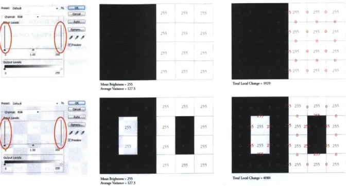
This thesis embraces the need for a typological approach while maintaining a critical attitude towards the use of histograms in contrast analysis. Although a histogram can analyze variations in pixel brightness across an image, it removes each value from the context of its composition and places it in a gradient from low 0 to high 255, as seen in Figure 2.8. The image on top shows a highly articulated wall of structure through which direct sunlight casts large patterns on the floor. The image on the bottoms shows a much denser pattern of direct sunlight with a greater optical sense
of contrast, but the histograms appear quite similar. This allows us to compare the number of grey pixels to that of black or white and identify dominant levels of brightness, but it does not quantify the contrast generated when black and white pixels are located side-by-side. Images represent space through the perspective of the occupant, but translating those images into rgb histograms removes individual pixels from their composition and tells us nothing about the contrast we see. This thesis builds upon Demers work to provide a typological representation of contrast, but proposes the need for a new metric that differentiates between compositional changes in brightness.
Figure 2.8: Rendered Images with Associated Histograms in Photoshop, Showing the Range of Pixel Brightness between 0 and 255
2.5 Visualizing Temporal Data
It has been determined that an analysis of luminance can be used to explore contrast through digital images, and contrast can be used to describe spatial diversity in architecture. When applied to the temporal complexity of real space under changing sky conditions, however, multiple images over the year would need to be studied in order to understand the dynamic qualities of architecture as it is experienced over time. One of the most challenging aspects of annual daylight analysis, whether it be luminance or illuminance-based, is representing the large quantity of resulting data
into both quantitative and simultaneously visual information. Daylight autonomy compresses annual illuminance data into a single map that represents the percentage of time in which successful threshold levels are achieved.
The next step beyond these visually compressed annual metrics is the inclusion of temporal maps and associated renderings which allow the designer to visualize the daylight variation in space over time [Kleindienst et al, 2008 ; Lee, 2009]. Spatio-Temporal Irradiation Maps (STIMAPS) were proposed as a way of representing annual data across a single graph that shows days of the year on a horizontal scale and hours of the day on the vertical [Glaser, 1999](Figure 2.9). This method provided the designer with annual data and some indication of when that data changed throughout the year, allowing the designer to address performance goals with more accuracy. Although the 'smoothness' of the map depends on the number of annual instances and the interpolation method between each data point, the method has been validated for illuminance readings with 56 annual
24 5 22- 20D-12 - - -- - - - -I k 10 2 - ' 51 9 - ~0 24 -2 - - - -4 - . . .. . . ... .4 E 4' 1 03 1 49 2 40 289 6 3
Figure 2.9: The Location of Data Points on a Temporal Map, 56
Based on the Temporal Grid Used in Lightsolve [Kleindienst et al, 2008]
periods representing 7 daily and 8 annual intervals [Kleindienst et al, 2008]. This mapping
technique was used in the development of Lightsolve for Google Sketchup, which generates temporal maps for illuminance alongside associated renderings at each of the
56
annual instances [Kleindienst et al, 2008; Lee, 2009] (Figure 2.10). Each of the intervals represents symmetrical moments during the year. This simulation method provides the designer with goal-based illuminance thresholds and allows him or her to navigate the resulting temporal maps with associated renderings to provide a clear visualization of both the quality and quantity of light in the space over time [Kleindienst et al, 2008; Lee, 2009]. This method is valuable in its combined approach for representing annual data alongside associated renderings to provide both quantitative and qualitative readings of space.Figure 2.10: The Lightsolve Interface, Showing a Default Room with Temporal Tlluminance Maps on the Top and Annual Renderings on the Bottom [Kleindienst et al, 2008 ; Lee, 2009; Lu, 2008]
When approaching the analysis of temporal contrast, it becomes necessary to consider what will be measured in each image (luminance) as well as how it will be quantified over a series of images to produce a more dynamic reading of the architectural space. The approach must include images and temporal maps to communicate a visual and simultaneously numeric set of information so that spaces can be compared
2.6 Summary
A great deal of research has been completed in the fields of annual daylight analysis, contrast analysis, and temporal data visualization. There is a well-established need for more dynamic annual metrics as well as a typological and visual approach to understanding the variable nature of light and the importance of contrast as a qualitative indicator. Elements of the Lightsolve project have provided a platform for this research simulation and visualization method, while Demers' work has helped to support the use of brightness and contrast as a typological platform for quantitative and qualitative analysis [Kleindienst et al, 2008; Demers, 2007]. The next chapter in this thesis will introduce a broader range of architectural examples that will develop a new typological language for classifying various aspects of contrast and light variability. This approach will be used to generate a new set of metrics that help to complement our existing tools for quantifying daylight performance.
Chapter
3
Architectural Context
3.1 Introduction
The previous chapter began with a critical look at existing daylighting metrics and strategies for contrast evaluation within architectural space. We then presented the need for more visually dynamic and spatially dependent methods for quantifying contrast and temporal variability in order to develop a broader scope of daylight performance criteria. We will now turn to existing architectural examples to develop a more effective typological vocabulary about the range of daylight strategies that represent various applications of contrast. Given the interdisciplinary nature of this project and its aim of transcending the boundaries between design and environmental analysis, we will begin with architecture and work backwards toward a quantitative method of analysis. A survey of existing architectural spaces from around the world let to the development of a classification strategy for the degree of contrast and hypothesized temporal variability present in each space. These categories were then distilled down into a series of case study spaces and digitally modeled to create a set of annual renderings. The quantitative methods for evaluating contrast and temporal variability, which will be introduced in more depth in the following chapter, emerged out of a range of perspectives about the distinguishing characteristics of each space.
3.2 Developing an Architectural Typology Regarding Contrast
In order to understand the various characteristics of contrast that occur within space, a number of contemporary examples were analyzed to produce a matrix of typological conditions. Each example was studied using the trained intuition of an architect and then positioned within a
gradient to represent various levels of perceived contrast within architectural space and the degree to which those levels were determined to change over time. The left side of this gradient was meant to contain highly variable and contrasted daylight strategies while the right side was reserved for minimally variable, low-contrast strategies. This typological approach was necessary to establish an eventual method for quantifying contrast, because it allowed us to understand the gradient of possible daylight strategies and to develop a numerical scale against which each space could be valued and compared.
3.2.1 The Preliminary Matrices
The first architectural examples illustrate clearly opposed contrast characteristics that establish a high and low for each end of the contrast spectrum. The first example to emerge on the far left or 'high contrast' side of the spectrum is Santiago Calatrava's Milwaukee Art Museum (Figure 3.1). The atrium located beneath the central structural 'wings' allows for the direct penetration of sunlight through a highly articulated glass roof. This space represents a high degree of contrast and temporal variability as light moves constantly across the overhead structure, adjusting the pattern of incoming light on the floor. On the far right or 'low contrast' side of the spectrum, is the Modern Art Gallery in Renzo Piano's addition onto the Chicago Art Institute (Figure 3.2). The double layered roof that covers this gallery consists of a top layer of reflective metal louvers that blocks direct sunlight and a second layer of translucent glass that diffuses incoming light into an evenly distributed luminous glow. This space represents a low level of contrast as well as a low level of temporal variability due to the diffusing characteristics of its top-lighting strategy.
Figure 3.1: Milwaukee Art Institute, Atrium. Figure 3.2: Chicago Art Institute, Modern Gallery. Image courtesy of ellauniverse.blogspot Image courtesy of Renzo Piano Building Workshop
The initial matrix positioned these two examples at each end of the spectrum and was composed of eight total categories that ranged from high contrast on the left to low contrast on the right (Figure 3.3). The titles for these categories were, in this rendition, a work-in-progress, but describe the qualitative differences between each column. At this time, we developed the term 'spatial
ub.i~u~
~
eau~ s 1It 11 "S*N* W80OU04Oi 6019K PSiL&W hFm~wm
~
~
Vag Vam gb~ SUb~
iI 1ipft~.eS.' -~ p~p -
-own~~~ XWAWAW*uWadhNaw
~
~~
Vb04, IO"UOWdWMO ",WIW4*W~ S. AW~1~4WVOW& Wth u W S VpSUuh uAurlp ub
mod fMWWakobdm- wV~wdd~mw~baftym
a p --PO Wdmcf s*
Figure 3.3: Prelimianry Contrast Matrix
contrast' to distinguish between various daylight characteristics; it is illustrated through a comparison of the Zollverein School of Management (Figure 3.4), the Sun Slice House (Figure 3.5), and the Dia Beacon Museum (Figure 3.6). All three spaces show some level of contrast between dark and bright areas within the image, although the Zollverein School of Management has sharper and more frequent spatial subdivisions or 'peaks' in the brightness between light and dark areas. The Sun Slice House contains a more 'linear' or figural division between light and dark, whereas the Dia Beacon Museum has much smoother gradation and fewer spatial subdivisions.
Figure 3.4: Zollverein School of Management. Image courtesy of Thomas Mayer
Figure 3.5: Sun Slice House. Image courtesy of Steven Holl
Figure 3.6: Dia Beacon Museum. Image courtesy of urban75
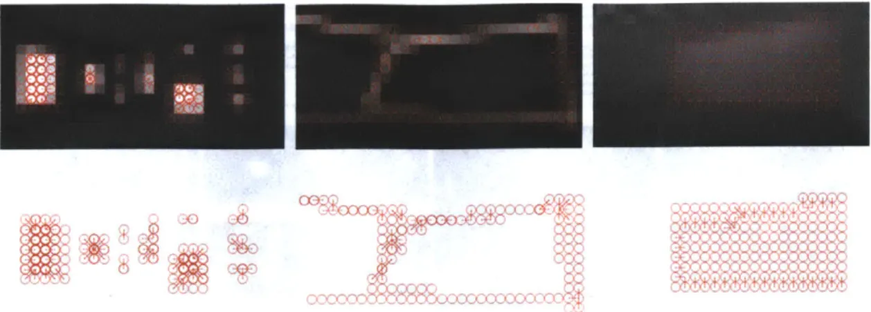
This concept is described in figure 3.7, which abstracts each space into a simplified model and each model into a map of enlarged pixels to represent the distinction between 'peaks,' 'lines,' and 'gradients.' Each cluster of contrast is conveyed by a field of circles that represents the strength in brightness of each pixel from 0 to 255. The thick red circles represent pixels whose brightness is closer to 255, while the thin circles represent values closer to 0. Spatial contrast is determined by the difference in brightness between neighboring pixels and can be seen by how sharply the values drop
cv
Figure 3.7: Spatial Contrast, (from left to right) 'Peaks', 'Lines,' and 'Gradients'
off, creating more abrupt figural breaks or smoother gradients. When a cluster of thick red pixels is surrounded by a perimeter of thin red circles, then 'peaks' of contrast are present. When a field of circles shows little variation in thickness, then it represents a smooth 'gradient' of contrast. The spaces that populate the left side of this initial matrix display sharper 'peaks' of contrast while those on the right side show smoother 'gradients' between areas of brightness. The spaces that occupy the middle set of categories represent some combination of the two, including more figural 'lines' or distinct and isolated shapes of light.
This preliminary attempt at categorizing architectural space through its daylight
characteristics represents a certain amount of intuition from the perspective of a trained architect. The goal was not to place value on either side of the contrast spectrum, but to distinguish between contrast-driven effects to better understand how they might be defined more explicitly. The naked eye can analyze a photograph and identify the presence and location of contrast within space, but in order to understand the magnitude and stability of contrast as it changes over time, it is necessary to establish a framework through which spaces can be compared. This allows the designer a scale on which to locate and describe a desired effect, giving them a comprehensive understanding of contrast and its dynamic impacts. A typological approach to categorizing these effects brings us one step closer to quantifying the conditions they represent.
Due to the limited number of examples represented in the initial matrix, a reiterative strategy unpacked and expanded it to accommodate a broader set of categories. The addition of new examples helped to test and strengthen each category, raising the need for additional columns when new strategies emerged. This second matrix represents a more in-depth survey of architectural spaces, doubling the number of examples to forty two and adjusting the total range of categories from eight to eleven (Figure 3.8). This expanded matrix shifted examples from within its organization
.4,06'a.#-,
Figure 3.8: Second Preliminary Matrix
to develop a more resolved set of categories. Some spaces that were originally located on the left
side of the spectrum, were moved closer to the right as our notion of 'spatial contrast' began to
distinguish between boundary conditions within the image. For example, the column containing
the Poli House by Pezo Von Ellrichausen, originally located on the right side of the initial matrix,
moved toward the center of the second matrix. This adjustment occurred when it was determined
that the bright window openings did not create sharp peaks or hard boundaries of contrast against
the interior space, as was seen in the Royal Ontario Museum. On the contrary, the thickness of the
wall cavity in which the openings are set creates a smoother gradient of light as it enters the space.
This can be seen by the tonal variations surrounding each window opening. The effect is a 'Direct
and Indirect' penetration of light, which is more similar in contrast to the First Unitarian Church,
located in column seven, than it is to the Royal Ontario Museum, located in column two. This
expanded matrix represents a process of trial and error that occurred throughout the development
of this typological study. In order to define a set of qualitative and subjective principles, such as
contrast, we must anticipate a certain level of resistance and a healthy degree of debate. This spirit
of collaboration enables us to transcend the boundaries between architecture and technology to
establish a new set of metrics that are dedicated to the values of both disciplines.
The most difficult spaces to define in this second matrix are located within the third column,
which is titled 'Indirect and Selectively Direct.' Upon further review, we determined that this
category could be divided into two separate columns, each of which should be located toward the center of the matrix. Glen Murcutt's Magney House (Figure 3.9), with its distinctive louvers and direct pattern of resulting sunlight represents more spatial contrast than others that were originally located within the same category. Jean Nouvel's 11th Avenue building (Figure 3.10) employs a combined strategy of direct and indirect light penetration, similar to the Magney House, but it uses screens rather than louvers, which emit light in a softer set of gradients. These middle categories, many of which represent hybrid daylight strategies and combined contrast effects, are often difficult to distinguish and even harder to define. While it is impossible to categorize all examples
of architecture through such explicit terms, the intention of this thesis is to generate a gradient of typological conditions against which similar characteristics can be compared. An overall range of contrast is established, despite some flexibility between adjacent categories. This typological comparison, however subjective through the development of each category, establishes an original attitude towards the use of contrast and temporal diversity in evaluating daylight in architecture. This approach may be used to establish more objective criteria for the analysis of environmental performance in architecture as design intentions must be taken into consideration before metrics can be applied for evaluation.
Figure 3.9: Magney House. Image Figure 3. 10: 100 11th Avenue. courtesy of Nature In Buildings Image courtesy of redchalksketch
3.2.2 The Final Matrix
Using the first two matrices as grounds for discussion and refinement, we created the third and final matrix of existing architectural spaces. The matrix contains seventy five examples and spans fifteen categories, creating a more articulated gradient of contrast-driven effects (Figure 3.11). An increase in the overall number of examples allows for more accurate differentiation between columns, although there are an uneven number of examples in each category as some typologies are more common than others.
1 2 3 4 5 6 7 8 9 10 11 12
U-6 410.&- - dfoba &5- I
-13 14 15
5-b 5-b 5&D8
The first three categories, referred to (from left to right) as 'Direct and Exaggerated,'
'Selectively Direct and Exaggerated,' and 'Direct and Dramatic' represent the far left or high contrast end of the spectrum. The 'Direct and Exaggerated' column contains those spaces with transparent, top-lit daylighting strategies in which the direct penetration of sunlight plays a dominant role in the choreography of visual effects. It includes the Smithsonian Courtyard by Norman Foster and the Serpentine Pavilion by Toyo Ito. The next column, referred to as 'Selectively Direct and Exaggerated' describes similar contrast characteristics, but accommodates those spaces that have some opacity in their structure as can be seen in the Millennium Church by Richard Meier. The third column, known as 'Direct and Dramatic,' includes spaces like the Prada Store by Herzog and De Meurc-and the Zollverein School of Management by SANAA. The architecture in this category is defiu by direct sunlight through an articulated transparent faqade and displays high spatial contrar. 'T obvious differences between the first and third column are due to the orientation of the transpa light-emitting surface. When unobstructed sunlight is allowed in through the roof, it creates contrast on all four walls as well as on the floor. When it enters through the wall, it can only af three vertical surfaces and the floor, reducing the overall contrast perceived within the space.
The next three categories, (from left to right) 'Direct and Screened,' 'Direct and Filtered and 'Partially Direct and Partially Screened,' represent the high-to-middle portion of the contra. spectrum. The fourth column, 'Direct and Screened,' contains the Centrifugal Pavilion by Obi Architects which represents those spaces with smaller gauge surface openings, resulting in some
direct and some indirect light. The fifth column, 'Direct and Filtered,' is similar in definition tc the previous column, except that it contains spaces such as the Dominus Winery by Herzog anc Meuron which is defined by a smaller and less frequent pattern of incoming light. The sixth column, 'Partially Direct and Partially Screened,' is characterized by the presence of a fully glazed fagade which filters light through a set of louvers such as the Magney House by Glen Murcutt.
The middle three categories are labeled (from left to right) 'Direct,' 'Partially Direct and Partially Filtered,' and 'Linear Direct.' While the column labels are self-explanatory, they are difficult to populate as the spaces that fall within them represent some form of hybrid contrast. The seventh column, 'Direct,' includes spaces such as the fully glazed Bombala Farmhouse by Collins and Turner. This category is defined by fully-glazed, side-lit conditions that allow for maximum sun exposure with minimal obstruction. Category eight is distinguished by the presence of a fully glazed fasade which filters light through a smaller gauge screen such as the Nestle Social Building by Guillermo Hevia Architects. The last category in this group, 'Linear Direct,' is composed of spaces like Daniel Libeskind's Imperial War Museum, which emits light through clearly define slit(s) in the wall which result in dramatic and figural shapes.


![Figure 2.9: The Location of Data Points on a Temporal Map, 56 Based on the Temporal Grid Used in Lightsolve [Kleindienst et al, 2008]](https://thumb-eu.123doks.com/thumbv2/123doknet/14541563.535492/26.918.135.442.485.765/figure-location-points-temporal-based-temporal-lightsolve-kleindienst.webp)
![Figure 2.10: The Lightsolve Interface, Showing a Default Room with Temporal Tlluminance Maps on the Top and Annual Renderings on the Bottom [Kleindienst et al, 2008 ; Lee, 2009; Lu, 2008]](https://thumb-eu.123doks.com/thumbv2/123doknet/14541563.535492/27.918.119.794.132.386/lightsolve-interface-showing-default-temporal-tlluminance-renderings-kleindienst.webp)