HAL Id: hal-02876986
https://hal-pjse.archives-ouvertes.fr/hal-02876986
Preprint submitted on 21 Jun 2020
HAL is a multi-disciplinary open access
archive for the deposit and dissemination of sci-entific research documents, whether they are pub-lished or not. The documents may come from teaching and research institutions in France or abroad, or from public or private research centers.
L’archive ouverte pluridisciplinaire HAL, est destinée au dépôt et à la diffusion de documents scientifiques de niveau recherche, publiés ou non, émanant des établissements d’enseignement et de recherche français ou étrangers, des laboratoires publics ou privés.
Lucas Chancel, Denis Cogneau, Amory Gethin, Alix Myczkowski
To cite this version:
Lucas Chancel, Denis Cogneau, Amory Gethin, Alix Myczkowski. How large are African inequalities? Towards Distributional National Accounts in Africa, 1990 - 2017. 2019. �hal-02876986�
"How large are African inequalities? Towards Distributional National
Accounts in Africa, 1990-2017"
Lucas Chancel, Denis Cogneau, Amory Gethin, Alix Myczkowski
Keywords : Africa, Inequalities, Income inequality; Distributional National
Accounts; DINA
1990-2017
∗Lucas Chancel
Denis Cogneau
Amory Gethin
Alix Myczkowski
This version: Tuesday 1stOctober, 2019 AbstractThis paper makes a first attempt to estimate the evolution of income inequality in Africa from 1990 to 2017 by combining surveys, tax data and national accounts in a systematic manner. The low quality of the raw data calls for a lot of caution. Results suggest that income inequality in Africa is very high, and stands at par with Latin America or India in that respect. Southern and Central Africa are particularly unequal. The bulk of continent-wide income inequality comes from the within country component, and the between country component was even slightly reduced in the two last decades, due to higher growth in poorer countries. Inequality was rather stable over the period, with the exception of Southern Africa. Dualism between agriculture and other sectors and mining rents seem to be important determinants of inequality.
∗We thank Thomas Blanchet, L´eo Czajka, Ignacio Flores and Thanasak Jenmana for their useful advices
indicators have not progressed as expected. This phenomenon has fueled a renewed interest for the study of inequality in Africa: it was seen as one of the main causes of the weak poverty-alleviation elasticity of growth.
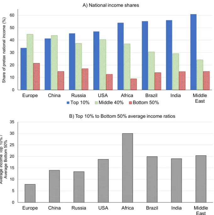
Is Africa a high-inequality developing region? It has long been thought that Africa was too poor to be unequal, based on its expected position in a worldwide Kuznetsian inverted U-curve. Even if the Kuznets curve is no longer considered as a well-grounded regularity, African inequality levels are still debated today2 Analyses on African inequality levels are typically made on the basis of household surveys, which provide a rich set of socio-economic information on inequality but also have several important limitations when it comes to comparing actual income inequality levels across countries. From one country to another, household suveys may inform on different types of welfare concepts (e.g. disposable income, taxable income or consumption) and may use different ranking concepts (individual, household or equivalence scales). Moving from one concept to another might radically modify the income distribution in a country and the level of inequality observed. While studying inequality across countries or regions, it is thus necessary to compare distributions as systematically as possible. In addition, household surveys tend to misreport top incomes due to sampling and non-sampling errors, which typically leads to underestimation of inequality levels. Average income or consumption levels reported in surveys are often at odds with values reported in the national accounts. In order to compare inequality levels between Africa and other regions, relying on household surveys only may be too limited (Alvaredo et al. (2016)). Using a combination of sources is likely to provide a better approximation of Africa’s true inequality levels and how it compares to other regions. This paper makes a first attempt in that direction, by estimating the evolution of pretax income inequality in the continent from 1990 to 2017, combining surveys, tax data and national accounts in a systematic manner. Our main finding is that Africa stands out as an extreme income inequality region by international standards: with a top 10% national income share of 54% and a bottom 50% share below 10%, Africa has the highest gap between average incomes of the top 10% and incomes of the bottom 50% (Figure 1)3. This overall
2According to Bhorat and Naidoo (2017), the average Gini coefficient in Africa, based on household surveys, is 0.43
in 2014, whereas it is 0.39 in the rest of the developing world. There is high heterogeneity across countries however, and this high average figure is driven by seven highly unequal countries, (with a Gini above 0.55), located mostly in Southern Africa: Angola, Central African Republic, Botswana, Zambia, Namibia, Comoros, South Africa. In terms of trends, the reported average African Gini has declined (it was 0.48 in the early 1990s), but this fall is largely due to trends in relatively low-inequality countries.
3Appendix Figure A.1 presents Gini coefficient values for the same regions. The African Gini stands out as the
second highest in the world at 0.67, after the Middle East (Gini of 0.69), but above Ginis in Brazil and India (0.63 and 0.60, respectively)
high inequality level masks relatively large regional variations, which can partly be explained by a limited set of factors, namely differences in productivity and employment in the agriculture and the service sector. One can think of several structural mechanisms explaining why African inequality (as measured by the top 10% to bottom 50% average income ratio) appears to stem at a higher level than other high-inequality world regions, including India and Brasil. In particular, one should emphasize the role played by the high-income mining and extractive sector, together with the existence of a very low productivity sector in agriculture. The legacy of colonialism, both in terms of property structure (particularly in Southern Africa) and in terms of educational stratification, should also be stressed. We hope future research will be better able to disentangle the exact weight played by these different factors in accounting for the very high levels of African inequality. The rest of this paper is organized as follows. We provide a brief overview of the literature on the distribution of income in Africa (section 2). We then explain and implement a statistical methodology for combining (noisy) household survey data with (scarce) income tax data and with (imperfect) national accounts (section 3). This allows us to compare inequality in Africa to the rest of the world, look at regional patterns within Africa, explore structural determinants of African inequality, assess the (absence of) link between redistribution policies and inequality, and finally describe individual countries trajectories during the two last decades (section 4). Let us warn the reader that this is still exploratory work. Data availability, quality and comparability are still very unsatisfactory.
2
Existing literature on the distribution of income and growth in Africa
Research on the drivers of inequality in African countries is hindered by the lack of good-quality data, both on the distribution of welfare and on other economic or society indicators, but a few potential lines of explanations have been tackled.
A first strand of the literature explores the links between the so-called “sub-optimal” structural transformation experienced by the vast majority of African countries and the evolutions of welfare inequality. In theory, it can be expected that the growth of labor-intensive sectors, such as manufac-turing or labor-intensive services activities will boost wage employment and reduce the spread of the income distribution (Bhorat and Naidoo, 2017). But unlike Europe during the Industrial Revolution or East Asia more recently, African economies didn’t experience a gradual shift from agriculture to manufacturing. Instead, the decline of the share of agriculture in the Gross Domestic Product (GDP) was absorbed by services or mining industries and less productive sectors4. This implied that the decrease in agricultural employment was entirely absorbed in services or in urban
4See the World Development Indicators, 2014; McMillan, Rodrik, and Inigo (2014) estimated that structural change in
Figure 1: Inequality levels across world regions, 2017 0 10 20 30 40 50 60
Europe China Russia USA Africa Brazil India Middle East S ha re o f p re ta x na tio na l in co m e (% )
A) National income shares
Top 10% Middle 40% Bottom 50%
0 5 10 15 20 25 30 35
Europe China Russia USA Africa Brazil India Middle East A ve ra ge in co m e To p 10 % / A ve ra ge B ot to m 5 0%
B) Top 10% to Bottom 50% average income ratios
Source: Authors’ computations based on WID.world (2019), see WID.world/methodology for region specific data series and notes. Distribution of pretax income per adult. Growth is assumed to be distribution-neutral between 2016 and 2017 in Africa.
unemployment, as mining industries are very capital-intensive. Polarization of the services sector increased because of the development of informal activities, with very poor working conditions and low income. Overall, it resulted in a gradual “urbanization of poverty”, as informal employment or urban unemployment spread (Ravallion, 2002). The urban-rural gap didn’t really decrease, because of the persistent urban bias of public spending, and because skilled urban residents were more able
to exploit the opportunities brought about by liberalization. Besides, inequalities increased within the rural and within the urban sectors even when they decreased between sectors (Cornia, 2017). The impact of African growth models on income inequality was previously studied by looking at the joint evolution of sectoral value-added shares and Gini coefficients (Cornia, 2017). Gini fell where the value-added share of modern agriculture, labor-intensive manufacturing and modern services stagnated or rose (for example in Ethiopia, Cameroon, Madagascar); it increased in countries with stagnant land yields, a drop in manufacturing, a rise of the resource enclave and skill-intensive services, and urban informalization.
Focusing on agriculture, a strand of the literature argues that raising agricultural productivity could reduce inequality, through the increase of rural income, and because it would lead to a diversifica-tion of rural activities towards non-agricultural activities, and consequently favor industrializadiversifica-tion (Gollin, 2010; Pingali, 2010; Estudillo and Otsuka, 2010). Indeed, a series of empirical papers underline the role of agricultural modernization in triggering growth, development, and reducing poverty and inequality (Imai and Gaiha, 2014; Bourguignon and Morrisson, 2002; Christiaensen, Demery, and Kuhl, 2011). This can be particularly relevant for Africa, which hasn’t fully completed its agricultural transition yet. However, some authors underline that agricultural modernization has more impact on poverty than on inequality (Imai and Cheng, 2016; Herault and Thurlow, 2009). Some stress that equal land distribution is key to enable agriculture to reduce poverty and inequality Lipton (2009), Griffin, Khan, and Ickowitz (2002), and Manji (2006).
The influence of extractive industries on inequality has been extensively tackled. In theory, ex-tractive industries favor income inequality, through both economic and institutional channels. According to Bhorat and Stanwix (2017), extractive industries yield limited employment creation, and only for skilled labor. Besides, the high cost of entry leads to monopolistic or oligopolistic market structures, that favor higher pricing and excessive profits. A boom in the resource price can lead to the appreciation of the local currency, which can then disadvantage employment-intensive and often export-reliant sectors, or attract the best workers, draining them from the other sectors (the so-called “Dutch disease”). This sector can also lead to the crowding out of non-resource investment (Papyrakis and Gerlagh, 2004), or hamper financial sector growth (Isham et al., 2003), and it tends to fuel an urbanization process without industrialization, by sustaining the existence of “consumption cities” (Gollin, Jedwab, and Vollrath, 2016).
The debate on the relationship between governance quality and resource dependence is not settled: a first strand of literature argues that resource abundance is a blessing for countries with good institutions and a curse for the others (Mehlum, Moene, and Torvik, 2006). But several works underline that resource dependence can have a negative impact on democratic consolidation (Jensen and Wantchekon, 2004). Other papers show the opposite causality: a country with weak institutions is more likely to become resource-dependent (Brunnschweiler and Bulte, 2008). According to Bhorat
and Stanwix (2017), the limited quantity of resources can either lead to political capture of resource rents, if the granting process is not transparent, or to monopolists with high influence over economic policies, in particular multinationals with the bargaining power to secure tax incentives. Besides, resources revenues are at high risk of being taken out through illicit channels, very often trade mispricing, even more with financial globalization and liberalization.
According to the same authors, in Africa many countries recorded a rise in the mining rents/GDP ratio and can now be qualified as “resource dependents”, meaning that 25% or more of export revenue is derived from natural resources5. This natural resource boom has helped to jump-start an infrastructure and construction boom, and in turn created many jobs that require low-level skills, but there are concerns about the temporary nature of these jobs. When they explore the link between resources rents and Gini coefficients, these authors find that there are a handful of resource-dependent countries with very high levels of inequality, which implies that resource-resource-dependent countries have a higher risk of being highly unequal. However, focusing on the correlation between Gini coefficients and resource-dependency over all African countries yields weak or inconclusive empirical evidence.
The links between institutions, public policies and inequality, was also explored by the literature. In this regard, colonial legacy is a central issue (Walle, 2009). In colonial societies, a minority of settlers held a very large fraction of the wealth and lied at the top of income distribution (Alvaredo, Cogneau, and Piketty, 2019). High wages were paid in a tiny formal sector formed by administra-tions and a few firms specialized in the trading of natural resources exports (Cogneau, Dupraz, and Mespl´e-Somps, 2018). This dualistic structure partly survived after independence, even after set-tlers’ departure, giving rise to an ’oligarchic bourgeoisie’. Comparing five countries with household survey data carefully made comparable, Cogneau et al. (2007) find that income dualism between agriculture and other sectors accounts for a large part of the difference in inequality between them; dualism is higher in the three former French colonies (Cote d’Ivoire, Guinean and Madagascar) compared to the two former British (Ghana and Uganda); on the same data, Bossuroy and Cogneau (2013) show that intergenerational mobility between agriculture and other sectors is also lower in former French colonies, because of employment dualism, i.e. the concentration of non-agricultural occupations in large cities. Cogneau (2007) argues that the decentralized management of colonial empires also produced large spatial inequalities.
In terms of redistribution policies, available data studied by Odusola (2017) shows that fiscal space (tax revenue as a share of GDP) has been increasing over time. Institutions played a significant role in this increase: the Open Budget Index6is highly correlated to fiscal space, which was also boosted
5See in particular the World Development Indicators and the United Nations Conference on Trade and Development
(UNCTAD)
6The Open Budget Index is issued from the Open Budget Survey, which measures budget transparency, participation
by debt relief. However, fiscal space remains low compared to the rest of the developing world, and the distributional effectiveness of fiscal policy remains highly questionable in most countries. Indeed, Odusola shows that the difference between the gross Gini (before taxes and transfers) and the net Gini (after taxes and transfers) decreased for most countries, implying that the redistribution system has lost efficiency. The author found other hints of tax regressivity, in particular a positive correlation between fiscal space and Gini coefficients. He concludes that African governments still lack fiscal space and economy-wide institutions to ensure social protection and have a positive distributional impact.
According to Bhorat and Steenkamp (2017), there has been a general increase in social protection ex-penditure according to available data, but social protection coverage, quality and level of assistance still remain very limited. It is more pronounced in Southern African countries. The expenditure increase was very variable across countries and was not correlated to economic growth. Current social protection expenditure is highly related to the quality of democratic governance (as captured by the Mo Ibrahim Index7) and to resource-dependence (non-resource dependent countries spend more on average).
The comprehensive review of social protection in Africa by the African Development Bank et al. (2011) has shown the positive impact of many specific transfer programs on poverty and inequality reduction, suggesting that social protection can be a key driver of inequality reduction. Bhorat and Steenkamp (2017) look at the correlation between inequality reduction (measured by the variation between pre-transfer and post-transfer Gini coefficients) and various characteristics of social protection. They find no clear impact of public social spending on inequality, but a positive impact of both pro-poor coverage of social protection, and transfer average amount on inequality reduction.
Regarding educational inequalities, the quality of education is still low, despite a general progress in primary schooling enrolment rates (Bhorat and Naidoo, 2017). In addition, except in some Southern and Northern African countries, there has been no substantial progress in terms of secondary education, and important enrolment differentials by income groups persist. Consequently, the stock of human capital is still inadequate, whereas the demand for skilled labor increased. This implies high wage premiums for a few skilled workers, which fuels income inequality.
7The overall Ibrahim Index of African Governance score aggregates four categories: safety and rule of law,
participa-tion and human rights, sustainable economic opportunity and human development. A score of “0” indicates autocracy, whereas a score of “100” indicates democracy (Mo Ibrahim Foundation, 2014).
3
Data and methodology
In this section, we present the data sources used to estimate income inequality in Africa and our methodology to combine them in a systematic way. Section 2.1 presents our data sources. Section 2.2 develops our method for converting consumption inequality estimates into income inequality estimates. Section 2.3 explains how we correct for under-representation of top incomes in surveys. Section 2.4 outlines how we reconcile our results with national accounts.
3.1 Data sources
3.1.1 Survey data
Our primary source of data consists in survey tabulations from the World Bank which are made publicly available on the PovcalNet website.8 These tabulations provide information on the distribution of consumption per capita for various groups of the national population. We use the Generalized Pareto Interpolation techniques developed by Blanchet, Fournier, and Piketty (2017) to harmonize these tabulations and obtain information on consumption at the percentile level. We complete our database with eight surveys from C ˆote d’Ivoire, which have been used by Czajka (2017) for his study on the evolution of income inequality in the country since the mid-1980s9. Finally, we use additional surveys conducted in Ghana (1988, 1998), Guinea (1994), Madagascar (1993) and Uganda (1992), which were compiled by Cogneau et al. (2007) and are especially useful to model the relationship between consumption inequality and income inequality (see section 2.2). In order to have a broader vision of the latter in developing countries, we complete our model by exploiting surveys available from Jenmana (2018) for Thailand (2001-2016) and from Chancel and Piketty (2017) for India (2005, 2011).
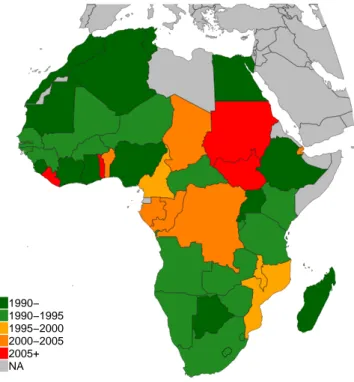
Figure 2 shows that there are large variations in data coverage across African countries. In Morocco, Nigeria and Madagascar, surveys have been more or less conducted on a regular basis since the early 1980s. In countries of central Africa, by contrast, only one or two surveys are available, generally after 2000. Overall, if we pool together our surveys and interpolate between years, we are able to cover about 60% of the continental population in the early 1990s, 80-90% from 1995 to the early 2010s.
8http://iresearch.worldbank.org/PovcalNet/povOnDemand.aspx
Figure 2: Time and space coverage of survey data sources 1990− 1990−1995 1995−2000 2000−2005 2005+ NA
Source: authors’ computations. Surveys providing information on the national distribution of consumption or income before 1980 are only available in Morocco, Nigeria and Madagascar.
3.1.2 Fiscal data
Contrary to Europe, where fiscal data can be used to correct for the under-representation of top incomes in a number of countries (Alvaredo et al., 2018), publicly available tax tabulations are close to non-existent in Africa. We use South African tax tabulations covering the 2002-2014 period provided by Alvaredo and Atkinson (2010) and updates, as well as a similar tabulation covering the formal sector in 2014 C ˆote d’Ivoire available from Czajka (2017), to study to what extent accounting for the “missing rich” affects income inequality estimates. We complete our study of top incomes by extending our analysis to other developing countries thanks to Thai and Indian tax tabulations provided by Jenmana (2018) and Chancel and Piketty (2017) respectively. Given the lack of income tax data in many African countries, we make strong but transparent assumptions in order to correct survey data on the basis of comparable countries where both fiscal and survey data are available. As additional tax data becomes available, we will revise the series accordingly. In the meantime, given that top-end corrections associated to tax data have a comparable and sizable magnitude in most countries, we feel that it is more adequate to apply a simple and transparent correction method to countries with missing tax data rather than to make no correction at all. Our correction
procedure is described in a more detailed manner.
3.1.3 National accounts
We account for inequalities between African countries by using macroeconomic series available from the World Inequality Database (http://wid.world) and covering the 1950-2017 period. These series were constructed by Blanchet and Chancel (2016) by combining various sources of historical data. In line with the Distributional National Accounts approach to income inequality (Alvaredo et al., 2016), we use these series to make our estimates consistent with the national income per adult in purchasing power parity.
3.2 From survey consumption to survey income
The first issue with available inequality statistics in Africa is that they rely almost exclusively on consumption. This makes systematic comparisons between developed and developing countries difficult, since inequalities of economic resources are most often measured by pre-tax or post-tax income in the former. From a theoretical perspective, it makes sense to believe that income inequalities are likely to be higher than consumption inequalities, as (i) high-income earners tend to spend a lower share of their earnings on household expenditures than poorer individuals; (ii) income has a transient component that some households are able to smooth in order to maintain a stable level of consumption; (iii) in many surveys income is measured less accurately than consumption and measurement errors can inflate inequality. This gap is likely to be large at the bottom of the distribution where (i) households incurring transient negative income shocks can be found; (ii) households with understated incomes can be found. It is also likely to be important at the top of the distribution, since (i) the very rich tend to save a large proportion of their current earnings; (ii) households benefitting from transient positive income shocks can be found; (iii) households with overstated incomes can be found. Yet, very little is known on how income-consumption profiles vary across countries and across time.
Our primary objective is to make consumption and income inequality estimates comparable. As such, we are interested in comparing income distributions rather than individual behaviours. If we know to what extent consumption is higher or lower than income for all quantiles of a given distribution, then we can exploit this relationship to “transform” consumption inequality estimates into income inequality estimates. In other words, our aim is to model income-consumption profiles c1(.)of the form:
c1(p) =
QI(p) QC(p)
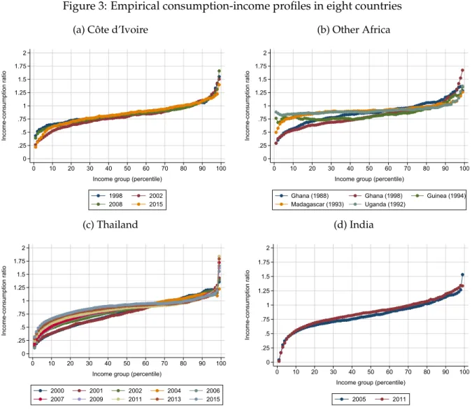
Figure 3: Empirical consumption-income profiles in eight countries
(a) C ˆote d’Ivoire
0 .25 .5 .75 1 1.25 1.5 1.75 2 Income-consumption ratio 0 10 20 30 40 50 60 70 80 90 100
Income group (percentile)
1998 2002 2008 2015 (b) Other Africa 0 .25 .5 .75 1 1.25 1.5 1.75 2 Income-consumption ratio 0 10 20 30 40 50 60 70 80 90 100
Income group (percentile)
Ghana (1988) Ghana (1998) Guinea (1994) Madagascar (1993) Uganda (1992) (c) Thailand 0 .25 .5 .75 1 1.25 1.5 1.75 2 Income-consumption ratio 0 10 20 30 40 50 60 70 80 90 100
Income group (percentile)
2000 2001 2002 2004 2006 2007 2009 2011 2013 2015 (d) India 0 .25 .5 .75 1 1.25 1.5 1.75 2 Income-consumption ratio 0 10 20 30 40 50 60 70 80 90 100
Income group (percentile)
2005 2011
Source: authors’ computations.
quantile function associated with a given distribution of consumption, and p∈ [0, 1]. If, given c1(p),
we only have access to a consumption distribution ˆQC(p), we can then impute a corresponding income distribution defined by ˆQI(p) =c1(p) ∗QˆC(p).
We start by looking at the empirical shape of c1(p)for all percentiles in countries and years for
which we have reliable data. Following our definition of c1(p), computing income-consumption
ratios is straightforward: it simply consists in dividing the bracket average of each percentile of the income distribution by its consumption counterpart. In order to make profiles comparable, we systematically normalize average income or consumption to 1. Notice that since our aim is to use c1(p)as a multiplicative factor, the ratio of aggregate consumption to aggregate income is
Figure 3 plots income-consumption profiles in C ˆote d’Ivoire, Ghana, Guinea, Madagascar, Uganda, Thailand and India for various years. In nearly all surveys, the relationship between income inequality and consumption inequality is distinctively S-shaped. Average income is generally substantially lower than average consumption for the bottom quintile of the population. The ratio of income to consumption then increases more or less linearly up to percentiles 80 and 90, before rising exponentially at the top of the distribution. This is fully consistent with the intuitive mechanisms outlined above: poorer individuals tend to smooth their consumption, while the very rich tend to save a significant proportion of their current earnings. As a result, consumption inequalities are generally lower than income inequalities.
In order to study more precisely how consumption-income profiles vary across surveys, we propose to formulate c1(.)parametrically by using a scaled logit function of the form:
c1(p) =α+βlog( p
1−p) (1)
For p ∈ (0, 1). α is a constant which determines the starting point of the curve. It is completely irrelevant to our imputation problem, since multiplying the quantile function by α only affects the overall mean of the distribution. β is our parameter of interest: it determines how fast the ratio of income to consumption increases with p and is therefore a direct measure of the extent to which consumption inequalities are lower than income inequalities.
Table A.1 reports the results of ˆα and ˆβ estimated by least squares, along with the corresponding adjusted R-squared. In nearly all cases, our scaled logistic function provides an excellent fit of income-consumption profiles, explaining more than 90% of variations in the data. Strikingly, our coefficient of interest ˆβ is always positive and varies moderately across surveys. Consumption series underestimate income inequalities most in Thailand at the beginning of the 2000s ( ˆβ=0.16), and underestimates them least in Madagascar and Uganda at the beginning of the 1990s ( ˆβ=0.05 in Madagascar and ˆβ=0.06 in Uganda). Yet, beyond these two extremes, a majority of correction profiles range between 0.1 and 0.14.
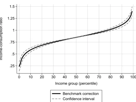
Our objective is to provide a reasonable approximation of income inequality in Africa by trans-forming all available consumption distributions into income distributions. As such, it makes sense to define three theoretical profiles reflecting the variability in ˆλ(.)observed in the data. We thus define three scenarios which provide ”confidence intervals” for our income inequality estimates. In our benchmark scenario (scenario A henceforth), we use ˆβA =0.12; in scenario B, we correct
inequalities more moderately by imposing ˆβB =0.1; and we correct them more strongly in scenario
C by using ˆβC = 0.14. Figure 4 plots our three correction profiles (setting α = 0.85 to make
them easily comparable with observed profiles). Moving from consumption inequality to income inequality amounts to reducing the income of bottom 10% earners by 25% to 50%, while increasing
Figure 4: Theoretical income-consumption profiles .25 .5 .75 1 1.25 1.5 Income-consumption ratio 0 10 20 30 40 50 60 70 80 90 100 Income group (percentile)
Benchmark correction Confidence interval
Source: authors’ computations. Theoretical consumption-income profiles correspond to logistic functions of the form Qi(p) = α+βilog1−pp for i ∈ A, B, C. We set
α=0.85 and βA=0.12, βB=0.08, βC=0.14.
the average earnings of the top 1% in similar proportions.
3.3 From survey income to fiscal income
The second correction we apply to our survey distributions consists in correcting the average income of top earners. It is well-known that the rich are under-represented in surveys, for both sampling and misreporting issues. Many researchers have attempted to correct for this bias by combining surveys with tax tabulations or microdata, which only cover a limited part of the population but generally provide better coverage of the very top of the distribution. While corrections based on fiscal data systematically yield higher inequality levels, little is known on the typical shapes of these corrections and their variations across countries.
Following the method used for consumption, our aim is to use existing data to define “plausible” profiles correcting income levels at the top of the distribution. In the African case, correcting for the under-representation of the rich in surveys is particularly challenging. To our knowledge, the only research paper combining surveys and tax data at the time of writing is Czajka (2017). The paper exploits recently released tax tabulations from C ˆote d’Ivoire, and shows that the average income of the top 1% is typically underestimated by about 75% in the private sector. In other developing countries, the correction profiles of top incomes obtained from matching surveys with
fiscal data vary greatly across studies. In Brazil, Morgan (2017) has found that the average fiscal income of the top 1% is typically 1.5 to 3 times higher than in surveys, with variations across years. Corresponding figure were found to be between 1.5 and 2.5 in Thailand (Jenmana, 2018) and as high as 3.5 in Lebanon (Assouad, 2017).
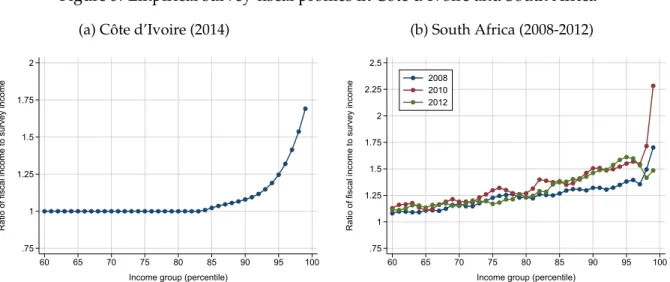
We look at variations in the underestimation of top incomes in Africa by bringing together surveys and fiscal tabulations from C ˆote d’Ivoire (Czajka, 2017) and South Africa (Alvaredo and Atkinson, 2010). For South Africa, we match the 2008, 2010 and 2012 surveys compiled in the Luxembourg Income Study (LIS) with the fiscal income series provided by Alvaredo and Atkinson (2010) and subsequent updates available from the World Inequality Database. We then use the method developed by Blanchet, Flores, and Morgan (2018) to combine surveys and tax data in order to get corrected survey income distributions. The method essentially compares the distributions of survey income and fiscal income, and finds a merging point where they cross. It then reweighs survey observations so that the information on top incomes in the survey matches that observed in the fiscal data.
Exactly as in the case of consumption and income, our objective is to study “survey-fiscal” profiles c2(.)of the form:
c2(p) =
QF(p) QI(p)
Where QI(p)is the quantile function associated with the distribution of income observed in the survey, and QF(p) is the quantile function of the distribution obtained after correcting for the
under-representation of top incomes. The South African profiles can be computed by dividing the average incomes observed in the corrected distributions by their corresponding values in the surveys. In C ˆote d’Ivoire, the ratio of fiscal income to survey income by percentile is obtained from Chancel and Czajka (2017).
Figure 5 plots the survey-fiscal profiles in our two countries of interest. In Cote d’Ivoire, the ratio of corrected income to survey income is close to 1 before the 90th percentile, and then increases exponentially. In South Africa, the correction starts much earlier (before the 80thpercentile), but
rises more moderately. In both countries, surveys tend to largely underestimate top incomes, especially at the very top of the distribution. Correcting for this bias amounts to increasing the average of the top 1% by between 50% and 125%.
The correction profile of top incomes can be formally conceptualised as depending upon two dimensions: the size of the group which is corrected, and differences in the corrections applied to top earners within this group. One way to formulate these two dimensions parametrically is to
Figure 5: Empirical survey-fiscal profiles in C ˆote d’Ivoire and South Africa
(a) C ˆote d’Ivoire (2014)
.75 1 1.25 1.5 1.75 2
Ratio of fiscal income to survey income
60 65 70 75 80 85 90 95 100
Income group (percentile)
(b) South Africa (2008-2012) .75 1 1.25 1.5 1.75 2 2.25 2.5
Ratio of fiscal income to survey income
60 65 70 75 80 85 90 95 100
Income group (percentile) 2008
2010 2012
Source: authors’ computations.
Figure 6: Theoretical survey-fiscal profile
.8 1 1.2 1.4 1.6 1.8 2
Fiscal to survey income ratio
80 81 82 83 84 85 86 87 88 89 90 91 92 93 94 95 96 97 98 99 Income group (percentile)
Benchmark Correction Confidence interval
Source: authors’ computations.
model survey-fiscal profiles by the quantile function of the Lomax (or Pareto Type II) distribution: c2(p) =µ+σ(p1/γ−1)
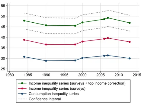
Figure 7: Top 10% income share in Morocco, 1984-2014: from consumption inequality to corrected income inequality
25 30 35 40 45 50 55 1980 1985 1990 1995 2000 2005 2010 2015 Income inequality series (surveys + top income correction)
Income inequality series (surveys) Consumption inequality series Confidence interval
Source: authors’ computations.
consumption-income profiles, it is irrelevant to our problem. Since it makes sense to let c2(p)take 1
before a certain percentile p0, one can set µ=1+σ, so that c2(0) =1 and:
c2(p) =1+σ p1/γ
σis the scale parameter. It controls the slope of the curve: the higher σ, the higher top incomes are underestimated by surveys. γ is the shape parameter: as it decreases, the slope becomes more convex, so that a smaller fraction of top incomes is corrected.
While it is difficult to find regularities in the correction of top incomes given the lack of comparable data across countries and across years, it is still our belief that some sort of correction is better than no correction at all. In our benchmark scenario, we set σ = 0.9 and γ = 0.05. We then let σvary from 0.6 to 1.2. As figure 6 shows, this approximately corresponds to rescaling incomes exponentially above the 80thpercentile (γ) and multiplying the average income of the top 1% by between 1.5 and 2 (σ). These bounds are in line with the different corrections observed in C ˆote d’Ivoire and South Africa. They are arguably sufficiently large to represent plausible variations in the correction of top incomes in Africa across countries and across time. If anything, this correction profile is likely to be a lower bound: in other developing countries such as Brazil, Lebanon or Thailand, it was not uncommon to find that the top 1% average was underestimated by a factor of
2 to 3 (Morgan, 2017; Assouad, 2017; Jenmana, 2018).
Figure 7 plots the evolution of the top 10% share in Morocco before and after correcting for con-ceptual discrepancies and underestimation of inequality at the top. According to consumption inequality estimates provided by PovcalNet, the highest decile received about 30% of total con-sumption every year between 1984 and 2013, with no clear trend over the period. Moving from consumption inequality to income inequality increases this value to 35-40%, and correcting top incomes increases it further to above 45% in our benchmark scenario. Hence, consumption-based measures from PovcalNet tend to underestimate the share of national income accruing to top 10% earners by as much as 40%.
3.4 From fiscal income to the national income
Under the assumption that our method for improving the measurement of income inequality is correct, the resulting dataset we obtain corresponds to the distribution of household income – that is, the sum of compensation of employees, mixed income and property income received by the household sector in the national accounts. To reach the national income and obtain figures on individual incomes which are consistent with macroeconomic growth, we have to make as-sumptions on the distribution of unreported income components. These mainly include the taxes on production received by the general governments and the retained earnings of corporations, which can constitute a significant fraction of the national income in both developed and developing economies Alvaredo et al. (2017).
In developed countries, and in some emerging economies, the levels of unreported income com-ponents can generally be observed from national accounts, and various methods can be used to impute these components indirectly on the basis of household surveys. Unfortunately, this is not the case for most African countries, where national accounts are still in their infancy. As a result, we do not have access to reliable data on unreported income. We choose to distribute the gap between surveys and the national income proportionally to individual income. This has the advantage of keeping the overall distribution unchanged, while making average incomes and growth rates more comparable across countries and over time. We stress that this is a conservative assumption: in most existing distributional national accounts studies, the imputation of unreported income leads to higher inequality levels, mainly because retained earnings are concentrated at the top the distribution (e.g. Blanchet, Chancel, and Gethin, 2018; Piketty, 2018; Jenmana, 2018; Morgan, 2017). As better national accounts data, survey microdata and tax data become more systematically available, our estimates can easily be improved and updated to account for such discrepancies.
4
The distribution of income and growth in Africa, 1990-2017
4.1 How unequal is Africa ?
4.1.1 Inequality in African countries
Is Africa a low or high inequality continent? The question, as simple as it may be, is difficult to answer due to the lack of comparability between data sources. Applying, to the extent possible, Distributional National Accounts methods to Africa yields estimates that are more in line with those recently developed for rich and emerging countries. We should stress at the onset that such estimates are still far from perfect and will greatly be improved thanks to the release of administrative data, as has already been the case in a few African countries (namely C ˆote d’Ivoire, S´en´egal, Tunisia and South Africa).
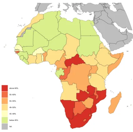
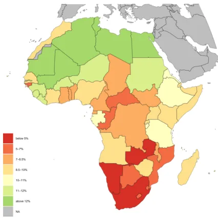
Novel estimates suggest inequality remains very high in most African countries. The income earned by the top 10% of the distribution ranges from 37% in Algeria to 67% in Botswana (Figure 8), while the bottom 40% is at most 14% in Algeria, and is about 4% in South Africa (Figure 9). Significant regional differences appear across the African continent. Southern Africa is clearly the most unequal region: the share of national income earned by the top 10% is the highest in South Africa and Botswana, where it respectively amounted to 65% (in 2014) and 67% (in 2009), while the bottom 40% earned 4% of national income in these two countries.
Income inequality is on average less stringent in Central Africa, but it remains very high: 56% of national income accrued to the top 10% income earners in Congo in 2011 for instance, while the bottom 40%’s share was 7%. Eastern Africa’s countries appear a bit less unequal, especially at the bottom: in Kenya in 2015 for example, the top 10% owned 48% of national income and the bottom 40% owned 9%.
Income inequality tends to decrease as we move towards the North and the West of the continent. In Sierra Leone in 2011, the top 10% owned 42% of national income, and the bottom 40% owned 12%, and its neighbors display similar income shares. The lowest inequality levels can be found in Northern Africa: in Algeria, the least unequal country in Africa, in 2011 37% of national income was captured by the top 10% of the distribution, while the bottom 40% owned 14%. However, one must here take into account data quality and data limitations, the publication of tax data and better households surveys might unveil higher inequality levels in North African countries, more comparable to the Middle East countries (in particular for Algeria, Lybia and Egypt).
Before discussing potential drivers of such regional differences, we focus on African-wide inequali-ties.
Figure 8: Top 10% income shares in Africa, most recent available years (2006-2017) above 60% 55−60% 50−55% 48−50% 45−48% below 45% NA
Source: WID.world (2019). Estimates combine survey, fiscal and national accounts data.
4.1.2 Inequality among Africans
Africa stands out as one of the regions with the highest level of income inequality. According to our methodology, top 10% of Africans capture 54% of national income vs. 9% for the bottom 50% (Figure 10). In an international perspective, the top 10% income share is of 34% in Europe (550m individuals), 41% in China (1.4bn individuals), 47% in the US (330m individuals), 55% in Brazil and the rest of Latin America (640m individuals), 56% in India (1.3bn individuals), 61% in the Middle East (420m individuals). A particularly striking fact of the pan-African distribution is the extent of the gap between the top 10% and the bottom 50% income share. Average incomes of the top 10% are about 30 times higher than those of the bottom 50%, well above the value found in other extreme inequality regions (the gap is around 20x in other exteme inequality regions such as the Middle East, India or Brazil. This particularity sheds light on the dual nature of the pan-African income distribution, with extremely low incomes at the bottom and relatively high incomes at the top. Preliminary work using similar correction methods for Pan-Asian and Pan-Latino American regions suggest that top 10% to bottom 50% average income ratios are around 20-25 in these regions.
Figure 9: Bottom 40% income shares in Africa, most recent available years (2006-2017) below 5% 5−7% 7−8.5% 8.5−10% 10−11% 11−12% above 12% NA
Source: WID.world (2019). Estimates combine survey, fiscal and national accounts data.
While there are uncertainties surrounding such comparisons, the high continental inequality level found in Africa as compared to other emerging world regions seems to hold with or without corrections applied to household surveys and described in Sections 3.2 and 3.3. Upcoming work on regional inequality levels in Asia and Latin America will allow us to better investigate this issue. We find that the high level of inequality in Africa seems relatively stable over time. At the pan-African level, inequality has only slightly decreased over the past decades. The top 10% income share was 56% and the bottom 50% income share was 9% in 1995. As we discuss below, little movements in inequality levels at the pan-African level mask significant evolutions within countries.
What contributes to African inequality: is it mostly inequality within African countries or mostly inequality in average income levels? If we decompose overall inequality between what is imputable to national average income disparities (between-country inequality) and what is due to inequality within countries, it clearly stands out that inequality within countries explain most of pan-African inequalities. If there were no inequality between countries, but keeping constant current
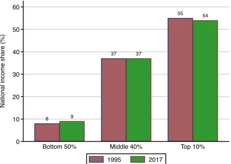
within-Figure 10: Evolution of the pan-African distribution 8 9 37 37 55 54 0 10 20 30 40 50 60 N a ti o n a l in co me sh a re (% )
Bottom 50% Middle 40% Top 10% 1995 2017
Source: WID.world (2019). Estimates combine survey, fiscal and national accounts data.
country inequality levels, the top 10% income share in Africa would be only slightly different from what it actually is (it would be 50%, vs. 55% in reality). Conversely, if within each country, all individuals were perfectly equal, but keeping national average income differences as they currently can be observed across Africa, the top 10% income share would substantially drop, to 21%. A Theil decomposition of African inequality levels shows that 25% of African inequality can be attributed to between-country differences and as much as 75% to within-country inequality.
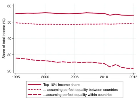
Interestingly, the slight decline in overall inequality is entirely due to the dynamics of between-country inequality (Figure 11). Since 1995, there has been a tendency towards less average income inequalities between countries. This reduction is caused by several phenomena. Since the years 1990, several countries, located at the middle of the African ladder of national income per capita, such as Nigeria, Morocco, Ghana, Angola, Tunisia, Namibia or Lesotho, saw their average income increase significantly (we discuss the growth strategies followed by some of these countries below). On the other hand, the average income of Africa’s richest countries (Algeria, South Africa, Libya for example), stagnated in the years 1990, and increased moderately in the years 2000. However, the poorest countries didn’t experience any significant average income rise. This is why, assuming perfect equality within countries, the top 10% share decreased more than the bottom 50% increased. The dynamics of between and within country inequality in Africa contrast sharply to what can be observed at the global level, in Europe or in Asia. At the global level (see section 2), within-country
Figure 11: Decomposition of Pan-African Inequality: top 10% income share (1995-2015) 20 30 40 50 60 Sh a re o f to ta l in co me (% ) 1995 2000 2005 2010 2015
Top 10% income share
... assuming perfect equality between countries ...assuming perfect equality within countries
Source: WID.world (2019). Estimates combine survey, fiscal and national accounts data.
dynamics dominate country evolutions since 1980 and since the early 1990s: between-country convergence is not sufficient to cancel the impact of rising within between-country-inequality on global inequality. In Europe, contrary to Africa, most of the evolution in pan-European inequalities stems from within-country dynamics. Turning to Asia, the huge rise of inequality recorded in China and India (which amount to about two-thirds of the regional population) over the past four decades also meant that a very large share of total inequality explained by within-country evolutions. The relative stagnation of within-country inequality at the pan-African level in fact masks a large array of inequality trajectories followed by African countries over the past decades. Part of this stagnation could also be due to noisy survey data and national income estimates, which would make it more difficult to detect marginal variations. Before assessing these individual trajectories, we analyze potential drivers of the significant variation of inequality levels across countries and their regional patterns underlined above.
4.2 How to account for different inequality patterns across Africa?
What causes such high inequality levels in Africa as compared to the rest of the world? This issue remains open and it is particularly challenging to address because of strong data limitations, as well as of the specificity and diversity of Africa’s economic and political structures, shaped by its
recent history and colonial heritage. In the following section, our objective is not to explain the diversity of inequality levels found in Africa, but merely confront theories regarding growth and inequality to available data. We explore the role of structural economic factors and growth patterns on the one hand, and public redistribution policies on the other.
4.2.1 Growth models and income inequality
Unlike Europe during the Industrial Revolution or East Asia more recently, African economies did not experience a gradual shift from agriculture to manufacturing. Instead, the decline of the share of agriculture in the Gross Domestic Product (GDP) was absorbed by services (whether formal or informal) or mining industries. This type of structural transformation is considered to be a major symptom of Africa’s shortcomings in terms of economic development by many researchers. The impact of African growth models on income inequality was previously studied by looking at the joint evolution of sectoral value-added shares and Gini coefficients (Cornia, 2017). Gini coefficients appeared to be positively correlated with mining and services activities’, suggesting a rise in inequality associated to mining activities. Conversely, such analyses highlighted a reduction of inequality with the rise of agriculture, labor-intensive services (trade, restaurants, hotels), transportation and construction activities.
We propose to re-examine these relationships with a new approach. On the one hand, we use the new African income inequality dataset, which addresses some of the limitations of existing distri-butional data (and yet which remains largely imperfect). Instead of focusing on Gini coefficients, which can mask important inequality dynamics, we also prefer to focus on top and bottom (or middle) income group shares. On the other hand, we focus on sectoral productivity and sectoral employment, rather than solely at value-added shares, as this provides a richer set of information on the structure of African economies.
In Africa, the decrease in agricultural employment is almost entirely absorbed in services or in urban unemployment, as mining industries are much less labor-intensive than manufacturing. Natural resources exports rather “fuel” an urbanization process without industrialization, by sustaining the existence of “consumption cities” (Gollin, Jedwab, and Vollrath, 2016). The process comes with a gradual “urbanization of poverty”, as informal employment or urban unemployment spread (Ravallion, 2002).
We base our theoretical expectations on a quite standard Kuznets curve (Robinson, 1976). The three sectors are ranked according to their productivity of labor: agriculture has the lowest, and industry the highest, with services lying in between — keeping in mind that services is perhaps the most polarized sector between informal subsistence activities and skilled white collar jobs. For a given relative productivity of labor in agriculture, inequality should be the highest at intermediate
Figure 12: Evolution of sectorial value-added shares in Africa (1965-2012) 10 20 30 40 50 60 V a lu e a d d e d sh a re (% G D P) 1965 1970 1975 1980 1985 1990 1995 2000 2005 2010 Industry other than Manufacturing Agriculture Manufacturing Services
Source: Authors’ computations based on Africa Development Indicators (World Bank)
levels of employment. For a given level of employment, inequality should also be higher the lower agricultural productivity. Besides, the agricultural sector itself can be equal or unequal depending on the way land is distributed10. Yet relative productivity and employment are not independent, and demand linkages complicate the Kuznets process, as the internal term of trade between agriculture and services endogeneously adjusts (Bourguignon, 1990). Besides, the degree of dualism in urban labor markets can make things even more complex: a large low productivity service sector can be a source of inequality as well as a small highly productive one. Last, according to previous research, extractive industries should in theory favor income inequality, even though for the moment empirical evidence is mixed (see section 2).
In order to better investigate the interplay between income inequality and economic structure, we analyzed the relationship between the top 10% income share and agricultural employment share, productivity of labor in agriculture relative to the non-agricultural sector, an indicator of informality11, unemployment, and the share of mining rents on GDP. We first use principal
component analysis to identify which components are mostly related to the top 10% income
10On relative agricultural productivity and land size distribution see Bourguignon and Morrisson (1998)
11Our indicator of informality is constructed as the residual of a regression of the share of self-employed on the share
share (see Figure A.2). We retain the two first components12, and use automatic hierarchical tree classification to form groups of countries based on these components (see Figure A.3).
Three groups of countries emerge from the classification. The most unequal one — with an average top 10% share of 58% — is mostly composed of ten countries from Southern and Central Africa13. Most have a large services sector (42% of employment on average), as well as high levels of informal employment and open unemployment (21% on average). Mining rents are substantial in many countries (18% of GDP on average) and agricultural productivity is relatively low (except in Namibia and South Africa). The second group of 22 countries14is less unequal, with an average top 10% share of 51%. These are countries where agriculture makes a very large share of employment (72% on average) but has very low relative productivity, and where conversely the service sector is small and shows relatively high remunerations, which often corresponds to administration workers. The third and last group of 16 countries displays even lower inequality levels, with an average top 10% share of 45%.15. Like the first group, these countries are relatively urbanized and the service sector gathers 43% of employment. In contrast with the first group however, mining rents are limited, as well as open unemployment, and the relative productivity of agriculture is much higher (more than threefold the one of the first group and of the second group). The second and third groups roughly correspond to two different sides of the Kuznets curve: high share of agriculture in employment combined with rather low productivity, or conversely intermediate share combined with higher productivity.
These findings confirm the important role of dualism in explaining inequality, and they are again suggestive that mining rents are also inequality increasing. Yet they have two important limitations. First, the analysis might partly capture regional effects: the most unequal categories are also the ones with a majority of countries from Southern and Central Africa. Inequality variation across African regions are also the results of various historical factors, such as specific colonial legacies, past land distribution, or the lasting impact of strong racial inequalities in Southern Africa. Historical causes and structural economic factors should not be confused, and distinguishing their respective role should be undertaken in future research.
Moreover, sectoral structure is not able to account for within-country inequality variation over time. A potential reason for that might be the lack of substantial variation over time of these structural factors in many countries. Most importantly, the quality of income shares, employment and productivity data remains questionable: the lack of historical data, combined with potentially
12These two components account for 56% of the information in the correlation matrix.
13Angola, Botswana, Congo, Gabon, Lesotho, Mozambique, Namibia, South Africa, Swaziland, Zambia
14Burkina Faso, Burundi, Cabo Verde, Cameroon, Central African Republic, Chad, Comoros, Djibouti, DR Congo,
Ethiopia, Guinea, Guinea-Bissau, Madagascar, Malawi, Mauritania, Morocco, Niger, Rwanda, Senegal, Tanzania, Uganda, Zimbabwe
15Algeria, Benin, Cote d’Ivoire, Egypt, Gambia, Ghana, Kenya, Liberia, Mali, Mauritius, Nigeria, Sao Tome, Sierra
recurrent measurement error, prevents satisfying analysis of within-country evolutions. The collection of good quality welfare and economic data should thus be given full priority.
Re-examining the link between African growth models and inequality can have several implications for public policies. They support the call for a renewed interest in agricultural productivity enhancement. Its impact on inequality is indeed also tightly linked to the distribution of land rights. Property rights and land access reforms are thus needed and the proper articulation of these two types of policy is a central issue. Access to land is a particularly serious problem in Zimbabwe and South Africa for instance, where the agrarian reform failed to solve the issue.
However, the impact of agricultural productivity enhancement on inequality might itself be miti-gated by unequal urbanization process and by the development of a large informal services sector. This is why making services growth more egalitarian should also be a major concern of policy-makers. In particular, two major causes of high inequality in this sector should be tackled: its high degree of informality, and the poor performances of the schooling system, especially at the secondary and tertiary levels, which enable the development of high human capital inequality. Other dimensions of the “African” structural transformation, such as the growth of extractive industries, are also likely to contribute to unequal growth. Among the most resources-dependent countries, some have indeed experienced an inequality increase, like Angola or Chad, others, like Algeria followed the opposite pattern. This issue is thus complex, and should be tackled in more depth. To that purpose, better quality data is needed: data cover only a short time period in Chad, Angola, or Nigeria for instance, and thus limits our understanding of the impact of extractive industries on inequality.
Working on the redistribution of the unequal benefits of growth should also be on the agenda, especially in a continent where tax and redistribution systems are mostly regressive. There is indeed no easy way to develop equitable growth patterns, especially in sectors with high capital intensity like extractive industries.
4.2.2 Redistribution Policies and Inequalities in Africa
Taxation and redistribution policies can have a significant impact on the distribution of income. Most African countries have a substantial margin of improvement in this respect, in terms of fiscal space and tax progressivity on the one hand, and on the redistributive efficiency of government expenditure on the other hand.
In terms of government revenue, Africa is clearly lagging behind all developed and many devel-oping world regions (Figure 13). However, this average figure hides a wide variety of situations (Figures 13 and 14).
Figure 13: General Government Revenue in 2018 (% of GDP)
(a) In the world
22 26 26 31 37 44 0 10 20 30 40
Africa Eastern Asia South America USA Eastern Europe Western Europe
(b) In Africa 19.3 19.5 19.5 31 32.5 0 10 20 30
Middle Africa Eastern Africa Western Africa Southern Africa Northern Africa
Source: World Economic Outlook (International Monetary Fund)
Note: General government revenue consists of taxes, social contributions, grants receivable, and other revenue
A first group of countries, in Central and Eastern Africa, is characterized by a very low government revenue (below 15% of GDP). In a second group, composed of most Western and Eastern African countries, the total government revenue lies between 15 and 25%, around the region’s average. The majority of Southern and Northern countries constitutes a third group, where government revenue is above 25% of GDP, and for a handful of countries (such as Namibia and Algeria), it is higher than 35% of GDP.
In spite of this diversity, most African countries have low government revenue, and consequently limited fiscal space. This hinders their capacity to provide good quality public services, such as health services or education, and to finance social protection and social transfers, and thus limits importantly their influence over income inequality. Fiscal space can be improved through several channels, among which more efficient fight against tax evasion, better inclusion of informal activities into the tax system, or progressive taxation.
Looking simultaneously at the income captured owned by the bottom 40% (Figure 15) and total revenue, it appears that there is no clear correlation between governments’ affluence and low income inequality.
Odusola (2017) studied the relationship between Gini coefficients and tax revenue, and concluded that most African tax systems were actually regressive. Indeed, looking at personal income tax top rates (Figure 16), one can see that they are lower than in the developed world in most African countries. For a quarter of the countries for which data is available, personal income top tax rates amount to 25% or less: this concerns many Western African countries, as well as Angola, Guinea, Egypt, and Madagascar, among others. For half of countries studied, top personal income tax rates
Figure 14: General government revenue in Africa in 2018 (%GDP) less than 5% 5−9% 10−14 15−19% 20−24% 25−29% above 30% NA
Source: World Economic Outlook (International Monetary Fund)
Note: General government revenue consists of taxes, social contributions, grants receivable, and other revenue
lie between 30 and 40%. Eight countries only, located in Central, Southern and Northern Africa, have top rates equal to 40% or higher, that is to say similar to top rates in rich countries (such as France, the United Kingdom, and the United States since the beginning of the 2010s).
The lack of historical data on African tax systems prevents us from analyzing precisely the rela-tionship between the evolution of taxation and inequality. Figure 16 provides a map of personal income tax top rates in 2018. No particular relationship can be found between personal top income tax rates and inequality.
The contribution of governments’ revenue to inequality reduction also heavily relies upon the efficient use of public resources, but most African governments have still a substantial margin of improvement in this respect. Public resources can be used to provide good quality public services and to fund of a social assistance and protection system that reaches the poorest parts of the population. From what can be seen on Figure 17, social protection and assistance coverage, as well as public services funding, still remain limited in many of the region’s countries. In the majority of countries, total government expenditure on education is below 5% of GDP, its average
Figure 15: General Revenue and Income Inequality
(a) General Government Revenue (%GDP)
less than 5% 5−9% 10−14 15−19% 20−24% 25−29% above 30% NA
(b) Bottom 40% income shares in Africa
below 5% 5−7% 7−8.5% 8.5−10% 10−11% 11−12% above 12% NA
Source: World Economic Outlook (International Monetary Fund) and authors’ computations.
Note: General government revenue consists of taxes, social contributions, grants receivable, and other revenue. Data is from 2018 for government revenue, from most recent available years for bottom 40% shares.
level in developed countries. This is particularly true in Central and Eastern Africa, but also in comparatively rich countries like Egypt or Algeria. Regarding social protection, only a fifth of countries where data is available, mostly located in the South and the North, provide social insurance, social safety nets, or unemployment benefits to more than 45% of their population. This figure was 54% in Brazil in 2015, and 63% in China in 2013 for instance16.
Redistribution remains very limited in African countries. This issue should be given full atten-tion, because redistribution systems can be key to reduce income inequality. On the one hand, progressive taxation can strongly influence post-tax and pre-tax income inequality, especially at the top of the distribution. Its impact on post-tax income distribution is straightforward, but its role in shaping pre-tax income distribution is often overlooked. Progressive tax systems can limit capital accumulation, and consequently reduce future capital income flows. Besides, they can have a strong influence on top income earners incentives to bargain for high remunerations: when top income tax rates are high, it becomes less worth it for top income earners to bargain for high wages (Piketty, Saez, and Stantcheva, 2014).
On the other hand, public services and social protection, when they are accessible to the poorest part of the population, can have a significant incidence on the distribution of income, especially at the middle and the bottom. This impact can be either direct, through the increase of poor people’s
Figure 16: Personal Income Tax Top Rates in 2018 15−19% 20−24% 25−29% 30−34% 35−39% 40−44% 45−49% 50−54% above 55% NA
Source: Source: Deloitte, Guide to fiscal information: Key economies in Africa, 2018; Ernst & Young, 2018-19 Worldwide Personal Tax and Immigration Guide, 2019
income by social transfers for instance, or indirect, through the formation of human capital thanks to the provision of medical care, education, and other public services. In previous research, African Development Bank et al. (2011) provided a comprehensive review of social protection in Africa, and demonstrated that it can have a significant impact on poverty and inequality. In South Africa, among other examples, the implementation of a comprehensive system of social grants has helped to reduce post-tax inequality, while the implementation of cash transfers reduced poverty incidence by 4.3% in Namibia. These encouraging results underline the strong potential of social protection, and the urgent need to improve its quality in Africa.
The quality of public services can strongly impact income inequality through its influence on education and health inequalities. Recent works have shed light again on the interplay between educational and economic inequalities in developed countries (Chetty et al., 2014). This issue is particularly interesting in Africa, where despite a substantial rise of primary enrolment rates in the last decades, the low post-primary education enrolment rates and the poor quality of educational systems remain important (Bhorat and Naidoo, 2017). They are likely to fuel strong human capital inequalities, that result in high wage premiums for the few qualified workers, and thus increase
Figure 17: Social protection and public services in Africa
(a) Coverage of social transfers (% population)
less than 5% 5−9% 10−14% 15−24% 25−34% 35−44% 45−54% 55−64% above 65% NA
(b) Government expenditure on education (% GDP)
less than 1% 1−1.9% 2−2.9% 3−3.9% 4−4.9% 5−5.9% 6−6.9% 7−7.9% above 8% NA
Source: World Development Indicators (World Bank)
Note: - Coverage of social protection and labor programs (SPL) shows the percentage of popula-tion participating in social insurance, social safety net, and unemployment benefits and active labor market programs. Estimates include both direct and indirect beneficiaries.
- Government expenditure on education (current, capital, and transfers) corresponds to all expenditure by the general government (general government usually refers to local, regional and central governments), including expenditure funded by transfers from international sources to government.
- Data is from the most recent year available for each country.
income inequality, especially in the service sector. The provision of good quality education, not only at primary level, should thus be given full priority.
Overall, it appears that most African countries have still significant progress to make regarding income redistribution, from the increase of fiscal space to the improvement of the progressivity of taxes, the implementation of efficient social protection systems and the provision of good quality public services. These issues are all the more pressing as existing research suggests that improvements along these margins could be key drivers of inequality reduction in Africa.
Beside these potential common factors, current inequality levels are shaped by each country’s specific economic, political, and social history. We focus now on these individual trajectories and their diversity, bearing in mind data limitations.
Figure 18: Evolution of regional top 10% income shares in Africa 40 45 50 55 60 65 70 Sh a re o f to ta l in co me (% ) 1995 2000 2005 2010 2015 Northern Africa Western Africa Eastern Africa Middle Africa Southern Africa
Source: Authors’ computations.
Note: Weighted averages using total population as weight
4.3 Heterogeneous trajectories: income inequality dynamics since the mid-1990s
There is no unique African trend in terms of inequality, not even clear regional common trends. On the contrary, income distributions evolved in a wide variety of ways between countries, which underlines the role of national institutions and policies in shaping inequality. Given the important differences in terms of data quality between African countries, and the lack of harmonization of data collection instruments and welfare concepts, and the irregularity of survey availability17,
comparing inequality trends is a perilous exercise. We stress that these results must be interpreted with great caution.
Looking at average regional trends (Figures 18 and 19), it appears that inequality increased dramat-ically in Southern Africa, while it decreased importantly in Eastern Africa in the years 1990 (before stabilizing in the years 2000), and stagnated in Northern, Middle, and Western Africa, despite small fluctuations.
In Southern Africa, the drastic rise of the income share received by the top 10% was largely, though not exclusively, driven by a strong increase of the income of the very top of the distribution (the share received by the top 1% increased by 6 percentage points between 1995 and 2015). This rise
17In the following section, countries with an asterix (*) are countries where data only enables to discuss trends from