HAL Id: hal-01162238
https://hal.inria.fr/hal-01162238
Submitted on 9 Jun 2015
HAL is a multi-disciplinary open access
archive for the deposit and dissemination of
sci-entific research documents, whether they are
pub-lished or not. The documents may come from
teaching and research institutions in France or
abroad, or from public or private research centers.
L’archive ouverte pluridisciplinaire HAL, est
destinée au dépôt et à la diffusion de documents
scientifiques de niveau recherche, publiés ou non,
émanant des établissements d’enseignement et de
recherche français ou étrangers, des laboratoires
publics ou privés.
Pierre Dragicevic
To cite this version:
Pierre Dragicevic. HCI Statistics without p-values. [Research Report] RR-8738, Inria. 2015, pp.32.
�hal-01162238�
0249-6399 ISRN INRIA/RR--8738--FR+ENG
RESEARCH
REPORT
N° 8738
June 2015p-values
Pierre Dragicevic
RESEARCH CENTRE SACLAY – ÎLE-DE-FRANCE Parc Orsay Université
Pierre Dragicevic
∗Project-Team AVIZ
Research Report n° 8738 — June 2015 — 32 pages
Abstract: Statistics are tools to help end users (here, researchers) accomplish their task (advance scientific knowledge). Science is a collective and cumulative enterprise, so to be qualified as usable, statistical tools should support and promote clear thinking as well as clear and truthful communication. Yet areas such as human-computer interaction (HCI) have adopted tools – i.e., p-values and statistical significance testing – that have proven to be quite poor at supporting these tasks. The use and misuse of p-values and significance testing has been severely criticized in a range of disciplines for several decades, suggesting that tools should be blamed, not end users. This article explains why it would be beneficial for HCI to switch from statis-tical significance testing to estimation, i.e., reporting informative charts with effect sizes and confidence intervals, and offering nuanced interpretations of our results. Advice is offered on how to communicate our empirical results in a clear, accurate, and transparent way without using any p-value.
Key-words: Human-computer interaction, information visualization, statistics, user studies, p-value, sta-tistical testing, confidence intervals, estimation
à accomplir leur tâche (faire avancer le savoir scientifique). La science étant un processus collectif et cumulatif, pour être qualifiés d’utilisables, les outils statistiques doivent faciliter et promouvoir une pen-sée cohérente ainsi qu’une communication claire et honnête. Pourtant des domaines tels que l’IHM (l’interaction homme-machine) ont adopté des outils (les valeurs-p et les tests de signification statistique) qui se sont montrés clairement insuffisants pour ces tâches. L’utilisation abusive des valeurs p et des tests statistiques a été violemment critiquée dans de nombreuses disciplines depuis plusieurs décennies, suggérant que la faute en revient aux outils, et non aux utilisateurs. Cet article explique pourquoi il serait bénéfique pour l’IHM de passer des tests statistiques à l’estimation, c’est à dire à la production de graphiques informatifs avec des tailles d’effet et des intervalles de confiance, et à des interprétations nuancées de nos résultats. Cet article explique comment communiquer nos résultats empiriques de façon claire, précise, et transparente sans utiliser aucune valeur-p.
Mots-clés : Interaction homme-machine, visualisation d’information, statistiques, études utilisateur, valeur-p, tests statistiques, intervalles de confiance, estimation
This report is a draft version of a book chapter currently in preparation.
1
Introduction
A common analogy for statistics is the toolbox. As it turns out, researchers in human-computer interac-tion (HCI) study computer tools. A fairly uncontroversial posiinterac-tion among them is that tools should be targeted at end users, and that we should judge them based on how well they support users’ tasks. This applies to any tool. Also uncontroversial is the idea that the ultimate task of a scientific researcher is to contribute useful scientific knowledge by building on already accumulated knowledge. Science is a collective enterprise that heavily relies on the effective communication of empirical findings. Effective means clear, accurate, and open to peer scrutiny. Yet the vast majority of HCI researchers (including myself in the past, as well as researchers from many other disciplines) fully endorse the use of statisti-cal procedures whose usability has proven to be poor, and that are able to guarantee neither clarity, nor accuracy, nor verifiability in scientific communication.
One striking aspect of orthodox statistical procedures is their mechanical nature: data is fed to a magic black box, called “statistics”, and a binary answer is produced: the effect exists or (perhaps) not. The idea is that for the work to qualify as scientific, human judgment should be put aside and the procedure should be as objective as possible. Few HCI researchers see the contradiction between this idea and the values they have been promoting – in particular, the notion that humans+algorithms are more powerful than algorithms alone (Beaudouin-Lafon, 2008). Similarly, researchers in information visualization (infovis) went to great lengths to explain why data analysis cannot be fully delegated to algorithms (Fekete et al, 2008): computing should be used to augment human cognition, not act as substitutes for human judgment. Every year infovis researchers contribute new interactive data analysis tools for augmenting human cog-nition. Yet when analyzing data from their own user studies, they strangely resort to mechanical decision procedures.
Do HCI and infovis researchers suffer from multiple personality disorder? A commonly offered ex-planation for this contradiction is that there are two worlds in data analysis: i) exploratory analysis, meant to generate hypotheses, and where human judgment is crucial and ii) confirmatory analysis, meant to test hypotheses, and where human judgment is detrimental. This article focuses on confirmatory analysis, and challenges the view that human judgment can be left out in the process.
By “orthodox statistical ritual” and “mechanical decision procedures” I refer to a family of statistical procedures termed null hypothesis significance testing (NHST). I will compare NHST with estimation, an alternative that consists in reporting effect sizes with confidence intervals and offering nuanced interpre-tations. I will skip many technical details, widely available elsewhere. The key difference between the two approaches lies in their usability, and it can be summarized as follows:
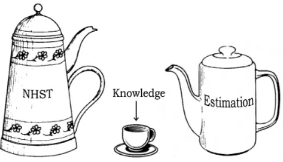
Figure 1: A picture summarizing the practical difference between null hypothesis significance testing (NHST) and estimation. Drawing inspired from Norman (2002).
NHST proceeds in several steps among which i) computing quantities called p-values and ii) apply-ing a cut-off to these p-values to determine “statistical significance”. Discussions about NHST often conflate the two, but it is better to address them separately. Section 2 focuses on the notion of p-value divorced from the notion of statistical testing. Confidence intervals will be used both to explain p-values informally, and as a baseline of comparison. Section 3 discusses the notion of statistical significance and compares it with estimation. Section 4 offers practical advice on how to achieve clear and truthful statistical communication through estimation.
2
Choosing a Pill: p-values, Effect Sizes and Confidence Intervals
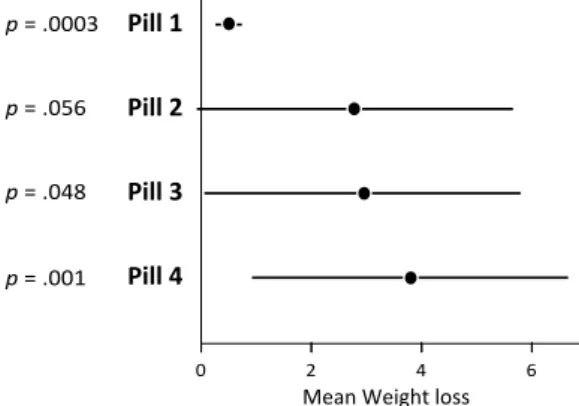
The following problem is adapted from Ziliak and McCloskey (2008, p.2303). Suppose your best friend wants to buy a pill to loose weight, but she cannot make up her mind. As a proponent of evidence-based decision making, you search for publications online, find four different studies testing different pills, write down the results and compile them into a single chart:
Pill 1 Pill 2 Pill 3 Pill 4
0 2 4 6
Mean Weight loss
p = .0003
p = .056
p = .048
p = .001
Figure 2: Chart showing the results from four (imaginary) studies on the effectiveness of different weight-loss pills. Error bars are 95% confidence intervals and p-values assume a null hypothesis of no effect.
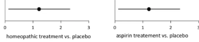
Let us pause and make sure we understand what the figure shows1. In any clinical trial, there is uncertainty as to the true efficacy of a drug, partly because the drug has only been tested on a few people. Ideally, these people constitute a random sample from a population of interest (e.g., all overweight US citizens). The mean weight loss only informs us about the sample, but a better measure would be the weight loss averaged across the entire population. Neither measure will tell us for sure what will happen to your friend, but the population average (to which we assume your friend belongs) would be much more reliable. Thus we decide it is really our quantity of interest, even though it can only be guessed.
Each black dot in the chart shows our best bet for this population mean. It corresponds to the aver-age weight loss for the study participants, i.e., the sample means2. The bars are 95% confidence inter-vals. Roughly speaking, they show other plausible values for the population-wise weight loss (Cumming, 2012). The numbers to the left are the p-values for a null hypothesis of no effect (zero weight loss). Briefly, p-values capture the strength of evidence against this null hypothesis3. The closer the value is to 0, the more evidence that the pill has at least some effect on the population overall (since p is between 0 and 1, the zero from the integer part is typically omitted).
1What follows is the most widespread interpretation of statistical inference, but alternatives exist (Frick, 1998). In this article we stick to the classical interpretation for convenience.
2Other slightly different methods for estimating the population mean will be briefly mentioned in Section 4.3.
3This is consistent with a Fisherian interpretation of p-values (Goodman, 1999, p.997; Gigerenzer, 2004, p.593). It is not the same as the fallacy of the transposed conditional, which will be discussed in Section 2.2.2.
Anyone familiar with stats will have immediately noticed the enormous amount of uncertainty in the data (except maybe for pill 1 – perhaps the sample was much larger?) and should not feel compelled to make any definitive statement. But here you need to make a decision. Given the data you have, which pill would you recommend?
I have shown this problem to different audiences and most people would choose pill 4. And it is indeed a sensible answer: it is reasonable to favor a pill that yields the maximum expected utility – here, weight loss. Each black dot, i.e., sample mean, shows your friend’s most likely weight loss with that pill – a black dot is actually about seven times more plausible than the confidence interval’s endpoints (Cumming, 2013, p.17). For your friend, pill 4 is the best bet, and it is certainly a much better bet than pill 1.
Now assume pill 4 does not exist. Which pill would you pick among the remaining ones? Look at Figure 2 on the previous page carefully. With some hesitation, most people reply pill 3. Then, with a bit more hesitation, pill 2. Some people would pick pill 1 on the way, but the most reasonable choice is really pill 4, then 3, then 2, then 1. The expected weight loss with pill 1 is way lower than with any other. Unless your friend had bet her life that she will lose at least some weight (even one gram), there is no logical reason to favor pill 1 over any other.
2.1
How Useful is the Information Conveyed by p?
Not very much. When presented with the pill problem, many researchers will ignore p-values, despite using them in their papers4. This stems from a correct intuition: the p-values are not only largely irrelevant to the decision, but also redundant. If needed, a p-value can be roughly inferred from a confidence interval by looking at how far it is from zero (Cumming and Finch, 2005; Cumming, 2012, pp.106–108).
But suppose we get rid of all confidence intervals and only report the p-values:
Pill 1 p= .0003
Pill 2 p= .056
Pill 3 p= .048
Pill 4 p= .001
Table 1: The p-value for each pill
Ranking the pills based on this information yields a quite different outcome: pill 1 appears to give the most impressive results, with a hugely “significant” effect of p = .0003. Then comes pill 4 (p = .001), then pills 3 and 2, both close to .05. Such a ranking assumes that losing some weight (even a single gram) is the only thing that matters, which is absurd, both in research and in real-world decision making (Gelman, 2013b). We should obviously acount for the black dots in Figure 2 (i.e., our best bets) at the very least. 2.1.1 The Importance of Conveying Effect Sizes
The black dots are what methodologists generally mean by “effect sizes”. Many researchers are intimi-dated by this term, thinking it involves some fancy statistical concept. But the most general meaning is simply anything that might be of interest (Cumming, 2012, p.34), and these are often means, or differ-ences between means. More elaborate measures of effect size do exist (Coe, 2002) – among which stan-dardized effect sizes– but they are not always necessary, nor are they necessarily recommended (Baguley, 2009; Wilkinson, 1999, p.599).
4Several HCI researchers find it hard to relate to this example because they are used to compute p-values to compare techniques, not to assess each technique individually. If that can help, think of the reported weight losses as differences between pills and a common baseline (e.g., placebo). Regardless, our decision maker cannot run more analyses to compare results. The point of the scenario is to capture how results from already published studies are communicated and used to inform decisions.
p-values capture what is traditionally termed statistical significance, while effect sizes capture prac-tical significance(Kirk, 2001). Results for pill 1, for example, can be said to exhibit a high statistical significance (with zero as the null hypothesis) but only a moderate practical significance compared to others. The term statistical significance is regularly and misleadingly contracted to significance, leading some to recommend dropping the word significance (Tryon, 2001, pp.373–374; Kline, 2004, p.86).
Practical significance is our focus, both in research and in real-world decision making. But as men-tioned previously, we are really interested in population effect sizes. A black dot only conveys our best guess, and it is thus crucial to also convey information on uncertainty. Here are two ways of doing this:
Pill 1 Pill 2 Pill 3 Pill 4
0 2 4
Mean Weight loss
p = .0003 p = .056 p = .048 p = .001 Pill 1 Pill 2 Pill 3 Pill 4 0 2 4 6
Mean Weight loss
a b
Figure 3: Showing the most plausible effect sizes and their associated uncertainty using a) p-values with sample means (here shown as bar charts); b) confidence intervals around sample means.
Each black dot has been replaced by a purple bar, but this is really only a matter of presentation (see Figure 8 in Section 4). The option a (left) follows the orthodoxy and the common recommenda-tion to report p-values with effect sizes (Thompson, 1998). The oprecommenda-tion b (right) follows an estimarecommenda-tion approach (Cumming, 2012) that consists in only reporting effect sizes with confidence intervals. In the simplest cases assuming symmetric confidence intervals, a and b are theoretically equivalent (Cumming, 2012). However, it is easier for a reader to convert from b to a (as discussed previously) than from a to b. Conversion is especially hard when confidence intervals are asymmetrical (e.g., confidence intervals on proportions, correlations, transformed data, or bootstrap confidence intervals). But most importantly, which of the two figures above is the clearest and the most informative?
Methodologists who remain attached to NHST (APA, 2010; Abelson, 1995; Levine et al, 2008b) suggest to report everything: p-values, effect sizes, and confidence intervals. No clear explanation has been offered on why p-values are needed, as the same information is already provided by confidence intervals. The recommendation to “complement” p-values with effect sizes and 95% confidence intervals also misleadingly suggests that effect sizes and their associated uncertainty are secondary information.
Some may still find it useful to complement a confidence interval with a p-value that captures precisely how far it is from zero. Later I offer arguments against this idea, which can be summarized as follows:
2.1.2 The Importance of Conveying Effect Similarity
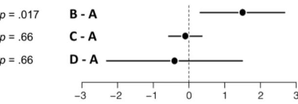
The following (imaginary) chart shows the differences between three interactive information visualization techniques in terms of average number of insights. We can safely say that B outperforms A. We can also say that A and C are similar in that they may yield a different number of average insights across the population, but the difference is likely less than 0.5. We have less information on A versus D, but we can be reasonably confident that the mean population difference is less than 2.
Figure 5: 95% confidence intervals showing differences between conditions.
Since the confidence interval for C − A is roughly centered at zero, its p-value is quite high (p = .66). It is common knowledge that we cannot conclude anything from a high p-value: it only tells us that zero is plausible, and says nothing about other plausible values – the confidence interval could be of any size. In fact, the p-value for D − A is exactly the same: p = .66. Knowing the sample mean in addition to the p-value does not help, unless it is used to reconstruct the confidence interval (assuming it is possible). Had you only focused on p-values and effect sizes in your study, you could have thrown almost all of your data away. Had you not tested technique B, you probably wouldn’t have submitted anything.
Knowing that two conditions are similar is very useful. In medicine, it is important to know when a drug is indistinguishable from a placebo. In HCI, if two techniques perform similarly for all practical purposes, we want to know it. Medicine has developed equivalence testing procedures, but confidence intervals also support formal (Dienes, 2014, p.3; Tryon, 2001) as well as informal (see above) inferences on equivalence.
We can often conclude something from a confidence interval. Arguably, if an experiment does not have enough participants and/or the effect is small (i.e., the experiment has low power), confidence in-tervals can be disappointingly wide as with D − A, making it hard to conclude anything really useful. Confidence intervals just faithfully show the uncertainty in the experimental data. This is crucial infor-mation.
2.2
Usability Problems with p-values
So far we have mostly focused on the amount of exploitable information conveyed by p (i.e., on its usefulness), but a lot has been also written on how ineffective p is at conveying that information (i.e., on its poor usability). Recall that the task is to communicate empirical findings clearly and accurately.
2.2.1 General Interpretation Difficulties
It is safe to assume that the general public can grasp confidence intervals more easily than p-values. Confidence intervals simply convey the uncertainty around a numerical estimate, and they are used by the media, for example to report opinion polls (Cumming and Williams, 2011). Another important difference is that confidence intervals can be represented visually while p-values cannot.
One issue specific to confidence intervals is their lack of standardization. They are typically shown by the way of error bars, which can stand for many things, including standard errors (typically half the
size of 95% CIs) and standard deviations. Researchers simply need to get used to clearly indicating what error bars refer to, and if possible, consistently use 95% confidence intervals (Cumming et al, 2007).
As evidenced by numerous studies on statistical cognition (Kline, 2004; Beyth-Marom et al, 2008), even trained scientists have a hard time interpreting p-values, which frequently leads to misleading or wrong conclusions. Decades spent educating researchers have had little or no influence on beliefs and practice (Schmidt and Hunter, 1997, pp.20–22). Below we review common misinterpretations and falla-cies. Confidence intervals being theoretically connected with p-values, they can also be misinterpreted and misused (Fidler and Cumming, 2005). We will discuss these issues as well, and why they may be less prevalent.
2.2.2 Misinterpretations Regarding Probabilities
pis the probability of seeing results as extreme (or more extreme) as those actually observed if the null hypothesis were true. So p is computed under the assumption that the null hypothesis is true. Yet it is common for researchers, teachers and even textbooks to instead interpret p as the probability of the null hypothesis being true (or equivalently, of the results being due to chance), an error called the “fallacy of the transposed conditional” (Haller and Krauss, 2002; Cohen, 1994, p.999).
Confidence intervals being theoretically connected with p-values, they are subject to the same fallacy: stating that a 95% confidence interval has a 0.95 probability of capturing the population mean is com-mitting the fallacy of the transposed conditional. But confidence intervals do not convey probabilities as explicitly as p-values, and thus they do not encourage statements involving precise numerical probabili-ties that give a misleading impression of scientific rigor despite being factually wrong. Shown visually, confidence intervals look less rigorous. They appropriately make the researcher feel uncomfortable when making inferences about data.
A lot has been written on the fallacy of the transposed conditional, but a widespread and equally worrisome fallacy consists in ascribing magical qualities to p by insisting on computing and reporting p-values as rigorously as possible, as if they conveyed some objective truth about probabilities. This is despite the fact that the probability conveyed by p is only a theoretical construct that does not corre-spond to anything real. Again, p is computed with the assumption that the null hypothesis is true – i.e, that the population effect size takes a precise numerical value (typically zero) – which is almost always false (Cohen, 1994; Gelman, 2013a).
Reasoning with probabilities is possible, using Bayesian statistical methods (Downey, 2013; Barry, 2011). In particular, tools exist for computing confidence intervals that convey probabilities. This article does not address Bayesian methods and focuses on classical confidence intervals due to their simplicity, and to the fact that they need less contextual information to be interpreted. Nevertheless, several of this article’s recommendations about truthful statistical communication can be combined with Bayesian data analysis.
2.2.3 Misinterpretation of High p-values
Although strictly speaking, p-values do not capture any practically meaningful probability, we can use them as an informal measure of strength of evidence against the null hypothesis (Goodman, 1999, p.997; Gigerenzer, 2004, p.593). The closer a p-value is to 0, the stronger the evidence that the null hypothesis is false. If the null hypothesis is the hypothesis of zero effect and p is very low, we can be reasonably confident that there is an effect. But unfortunately, the closer p is to 1 the less we know. As seen before (see Figure 5), we cannot conclude anything from a high p-value, because it tells us that zero is plausible, but says nothing about other plausible values. Despite this, few researchers can resist the temptation to conclude that there is no effect, a common fallacy called “accepting the null” which had frequently led to misleading or wrong scientific conclusions (Dienes, 2014, p.1). Plotting confidence intervals such as in see Figure 5 eliminates the problem.
2.2.4 Misinterpretations Regarding Reliability
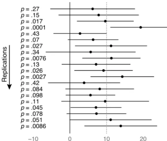
Many researchers fail to appreciate that p-values are unreliable and vary wildly across replications. This can be shown with simple simulations such as in the dance of p-values video (Cumming, 2009a):
p = .0086 p = .051 p = .078 p = .045 p = .11 p = .098 p = .084 p = .42 p = .0027 p = .026 p = .13 p = .0076 p = .34 p = .027 p = .07 p = .43 p = .0001 p = .017 p = .15 p = .27 −10 0 10 20 Replications
Figure 6: p-values and confidence intervals obtained by simulating replications of an experiment whose population effect size is 10, with a power of 0.56 (after Cumming (2009a) and Dienes (2014)).
Running an experiment amounts to closing your eyes and picking one of the p-values (and confi-dence interval) above. With a statistical power of about 0.5 common in psychology (Rossi, 1990) and HCI (Kaptein and Robertson, 2012), about any p-value can be obtained. The behavior of p-values across replications is well understood (Cumming, 2008). If an experiment yields p = .05 and is repeated with different participants, it will have 80% chances of yielding a p-value between .00008 and .44 (Cumming, 2008). This means a 1/5 chance the new p-value is outside. Even if the initial experiment yielded an impressive p = .001, the 80% p-interval would still be (.000006, .22). Sure p will remain appropriately low most of the time, but with such a wide range of possible values, reporting and interpreting p values with up to three decimal places should strike us as a futile exercise.
Many find it hard to believe that “real” p-values can exhibit such a chaotic behavior. Suppose you run a real study and get a set of observations, e.g., differences in completion times. You compute a mean difference, a standard deviation, and do a one-sample t-test. Now suppose you decide to re-run the same study with different participants, again for real. Would you expect the mean and standard deviation to come up identical? Hopefully not. Yet p is nothing else but a function of the mean and the standard deviation (and sample size, if not held constant). Thus p would come up different for the exact same reasons: sampling variability.
Anystatistical calculation is subject to sampling variability. This is also true for confidence intervals, which “jump around” across replications (see Figure 6). Being fully aware of this is certainly an important prerequisite for the correct use and interpretation of confidence intervals. Watching simulated replications (e.g., from Cumming (2009a)) is enough to get a good intuition, and one can hardly claim to understand sampling variability (and thus inferential statistics) without being equipped with such an intuition. p-values add another layer of complexity. It is easier to remember and picture a typical dance of confidence intervals (they are all alike) than to recall all possible replication p-intervals. Any single confidence interval gives useful information about its whole dance, in particular where a replication is likely to land (Cumming, 2008; Cumming, 2012, Chap. 5). Any single p-value gives virtually no such information. There are also perceptual and cognitive differences: confidence intervals, especially shown graphically, do not give the same illusion of certainty and truth as p-values reported with high numerical precision.
2.3
Conclusion
There seems to be no reason to report p-values in a research paper, since confidence intervals can present the same information and much more, and in a much clearer (usable) manner. Perhaps the only remaining argument in favor of p-values is that they are useful to formally establish statistical significance. But as we will now see, the notion of statistical significance testing is a terrible idea for those who care about good statistical communication.
3
Statistical Significance Testing vs. Estimation
We previously mentioned that statistical significance can be quantified with p-values. Roughly speaking, p-values tell us how confident we can be that the population effect size differs from some specific value of interest – typically zero. We also explained why this notion is less useful than the orthodoxy suggests. As if the current overreliance on p-values was not enough, a vast majority of researchers see fit to apply a conventional (but nonetheless arbitrary) cut-off of α = .05 on p-values. If p is less than .05, then the “results” are declared significant, otherwise they are declared non-significant (the term “statistically” is typically omitted). This is, in essence, null hypothesis significance testing (NHST).
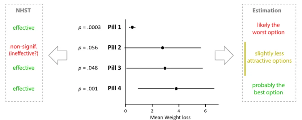
The insights yielded by NHST procedures can be assessed by returning to our first scenario and considering again the respective merits of our four pills:
Pill 1 Pill 2 Pill 3 Pill 4
0 2 4 6
Mean Weight loss p = .0003 p = .056 p = .048 p = .001 NHST effective effective effective non-signif. (ineffective?) probably the best option likely the worst option slightly less attractive options Estimation
Figure 7: The same four pills, ranked based on the outcome of statistical tests (left), and based on an examination of effect sizes and confidence intervals (right).
As we saw previously, a sensible ranking scheme (shown to the right) would give a preference to pill 4, then pills 2–3 (almost identical), then pill 1. Nothing is for certain and we may well be wrong, especially about pills 2, 3 and 4 for which very little data is available. But since we need to decide on a pill we are forced to rank. In a scientific paper one would be typically way more conservative and would perhaps only comment on the likely superiority of pill 4 over pill 1. Regardless, doing statistical inference is always betting. There are good bets and bad bets.
Good bets require relevant information. The left part of the Figure shows how our decision maker would have summarized the studies had the authors focused on NHST analyses: pills 1, 3 and 4 had a statistically significant effect on weight loss (p < .05): they would have been presented as effective. Pill 2, on the other hand, would have been presented as having a non-significant effect5and despite textbook warnings against “accepting the null”, the message would have almost certainly become that the pill may not be effective at all.
5This may seem caricatural but it is not: many traditionalists consider it is a serious fault to even point out that a non-significant p-value is very close to .05. More on this in Section 3.2.3.
A large amount of information is thrown away by the use of a cut-off. Statistical significance in its continuous form – i.e., reporting exact p-values – already did not carry much useful information (compared to confidence intervals). It is only logical to assume that statistical significance in its binary form cannot carry more.
3.1
Note on Doing NHST using Confidence Intervals
Importantly, confidence intervals can be used to carry out statistical tests without the need for p-values: examining whether or not a 95% CI contains zero is equivalent to doing a statistical test of the null hypothesis of no effect at the .05 level. This can be verified in all previous figures6. Thus one could perform such tests visually and then focus all discussions on statistical significance. This approach being essentially NHST, it inherits all of NHST’s drawbacks. Using confidence intervals to carry out binary tests does not achieve much, and several methodologists strongly recommend nuanced interpretations that do not emphasize confidence limits (Schmidt and Hunter, 1997, p.13; Cumming, 2012). This is what estimation really refers to (Cumming, 2012), and more details will be provided in Section 4. For now, keep in mind that doing NHST using confidence intervals is not doing estimation.
Now, we know that both p-values and confidence intervals can be interpreted in a nuanced way or in a crude, binary fashion. It is a major limitation of confidence intervals that they are commonly interpreted in a binary fashion (Lai et al, 2010). This may partly stem from a design issue (an interval is black-or-white), and partly from NHST being deeply ingrained in researchers’ minds (Lai et al, 2010). This is another topic on which more researcher education is needed, e.g., through exposure to alternative visual representations that show how plausibility smoothly decreases with the distance to the point estimate (Cumming, 2013, p.17; Correll and Gleicher, 2014). With this issue in mind, we now turn to usability problems with NHST as it is traditionally carried out (i.e., by computing p-values), and contrast it with estimation.
3.2
Usability Problems with Statistical Significance Testing
Statistical testing is based on p-values and therefore inherit their usability problems. The use of a binary decision rule based on a cut-off also brings a range of additional usability problems that we discuss here.
3.2.1 Misjudgments of Uncertainty
p-values give a seducing illusion of certainty and truth (Cumming, 2012, Chap.1). The sacred α = .05 criterion amplifies this illusion, since results end up being either “significant” or “non-significant”. In a researcher’s mind, significant results have passed the rigorous test of statistics and are declared “valid” – uncertainty almost ceases to exist, and sample means often end up being interpreted as being exact (Vicente and Torenvliet, 2000, pp.252–258). This amounts to say that in Figure 3a, for example, each bar with p < .05 should be trusted fully. On the other hand, non-significant results are interpreted either as no effect or no information whatsoever, both of which are incorrect. Potential misjudgments abound and are easily dispelled by plotting confidence intervals, as in Figure 3b.
The use of a cut-off on p is especially problematic in studies with low statistical power, given how widely p-values vary across replications (see Section 2.2.4). Thus many HCI experiments really amount to tossing a coin (Dragicevic et al, 2014).
6Any point null hypothesis (not only zero) can be visually tested this way. One way to see confidence intervals is that they show the outcomes of all possible null hypothesis tests.
3.2.2 Misinterpretations Regarding Comparisons
The use of a cut-off yields disturbing paradoxes regarding comparisons of findings. The results for pills 2 and 3, for example, appear very different despite being virtually identical (Figure 7). In fact, pill 2 has close to 50% chances of coming up better than pill 3 on the next replication (remember the dance in Figure 6). This paradox causes erroneous inferences both within studies and across studies. Within studies, two conditions can be wrongly interpreted as being different, simply because one happened to pass a test while the other one did not (Gelman and Stern, 2006; Abelson, 1995, p.111). Across studies, research can appear inconsistent or controversial for the same reasons (Cumming, 2012, Chap.1). Although it has been recognized that statistical significance cannot be used as a criterion of comparison (Gelman and Stern, 2006), refraining from comparing entities that are given very different labels goes against the most basic human intuitions. The problem clearly lies not in researchers’ mind, but in the tool design. With estimation, results are labeled with confidence intervals, whose comparison is not always trivial (Cumming, 2012, Chap. 6) but is certainly much less problematic7.
3.2.3 Misinterpretations Regarding Type I Error Rates
Due to sampling error, any statistical analysis is error-prone. The key theoretical underpinning of NHST is the idea of controlling for type I error rates. NHST guarantees that when a null hypothesis is true (e.g., if a pill has no effect), its test will come up statistically significant – thus causing a type I error – in only 1 out of 20 experiments (with α = .05). The idea that we can take control over the likelihood of coming to wrong conclusions is appealing, but just like p and for the same reasons (see Section 2.2.2), the type I error rate is only a theoretical convenience. Contrary to common interpretations, it rarely corresponds to a real frequency or probability (Pollard and Richardson, 1987).
Some methodologists – among whom Fisher (Gigerenzer, 2004, p.593) – also reject the rationale for α on epistemological grounds, arguing that it is relevant for repeated decision making (e.g., doing quality controls in a production line), but not for assessing evidence in individual experiments (Perneger, 1998, p.1237). The notion of type I error is certainly a useful theoretical construct that can help understand key aspects of statistical inference (see Section 4.5), but there is no reason why research practice and statistical communication should be based on this theoretical framework.
3.2.4 Multiple Levels of Significance
A practice that became less popular in HCI though still advocated is the use of multiple levels of signif-icance by the way of “post-hoc” α values (.001, .01, .05, .1), stars (***, **, *), or codified signifsignif-icance terminology (“highly significant”, “marginally significant”, etc.). This categorical approach suffers from the same problems as binary approaches, and is inconsistent with both Fisher’s approach of using exact p-values as a measure of strength of evidence, and the Type I error rate approach seen above (Gigerenzer, 2004). No serious methodologist seems to endorse the use of multiple levels of significance.
3.2.5 Issues Regarding Publication Bias
Since statistical significance is a major criterion for publishing study papers, conference proceedings and journals can give a very distorted image of reality. This issue, termed publication bias or the file drawer problem, is harming science’s credibility (The Economist, 2013; Goldacre, 2012). In HCI, publication bias can hamper scientific progress because results on ineffective techniques never get published, and
7For example, instead of simply saying “we were not able to replicate previous work by Schmidt (2010) and John (2012) who found a significant improvement on task completion time”, a conscientious researcher could say “we found a mean improvement of 1.9 s, 95% CI [-0.7, 4.4], consistent with the improvement of 3.1 s, 95% CI [1.7, 4.7] reported by Schmidt (2010) but lower than the improvement of 5.2 s, 95% CI [4.1, 6.6] reported by John (2012)”.
those that get published because of statistical luck or flawed analyses never get disproved. By legitimizing negative and (to some extent) inconclusive results and making publication criteria more flexible (Ander-son, 2012), estimation can reduce publication bias, advance our knowledge of what does not work, and encourage replication (Hornbæk et al, 2014) and meta-analysis (Cumming, 2012).
3.2.6 Issues Regarding p-Hacking
Another damaging consequence of the NHST ritual is the widespread use of “statistical convolutions
[...]to reach the magic significance number”(Giner-Sorolla, 2012). These include selectively removing outliers, and trying different testing procedures until results come up significant (Abelson, 1995, p.55). They go by various names such as p-hacking, torturing data, data dredging, or researcher degrees of freedom(Nuzzo, 2014; Lakens et al, 2014; Simmons et al, 2011; Brodeur et al, 2012). Information ob-fuscation can also occur after p-values have been computed, e.g., by selectively reporting results, using post-hoc α cut-offs (Gigerenzer, 2004), or elaborating evasive narratives (Abelson, 1995, p.55). Such practices differ from the legitimate practice of exploratory data analysis (Tukey, 1980) because their goal is to obtain the results one wishes for, not to learn or to inform. They are unscientific despite their ap-pearance of objectivity and rigor. Humans excel at taking advantage of the fuzzy line between honest and dishonest behavior without being fully aware of it (Mazar et al, 2008). Thus merely promoting scientific integrity is likely counter-productive. To be usable, statistical tools should be designed so that they do not leave too much space for questionable practices fueled by self-deception. Estimation approaches do not draw a sharp line between interesting and uninteresting results, and thus make “torturing” data much less useful. As will be later discussed, planned analyses are another very effective safeguard.
3.2.7 Dichotomous Thinking
Humans like to think in categories. Categorical thinking is a useful heuristic in many situations, but can be intellectually unproductive when researchers seek to understand continuous phenomena (Dawkins, 2011). A specific form of categorical thinking is dichotomous thinking, i.e., thinking in two categories. Some dichotomies are real (e.g, pregnant vs. non-pregnant), some are good approximations (e.g., male vs. female, dead vs. alive), and some are convenient decision making tools (e.g., guilty vs. not guilty, legal vs. illegal drug). Many dichotomies are however clearly false dichotomies, and statistical thinking is replete with these. For example:
1. there is an effect or not. 2. there is evidence or not.
3. an analysis is either correct or wrong8.
Statistical testing promotes the second dichotomy by mapping statistical significance to conclusive evidence, and non-significance to no evidence. This dichotomy is false because the degree of evidence provided by experimental data is inherently continuous. NHST procedures also promote the first di-chotomy by forcing researchers to ask questions such as “is there an effect?”. This didi-chotomy is false because with human subjects, almost any manipulation has an effect (Cohen, 1994).
There is a more insidious form of false dichotomy concerning effects. In HCI, researchers generally do not test for the mere presence of an effect, but instead ask directional questions such as “is A faster than B?”. Since there is likely a difference, A can only be faster than B or the other way around. Thus the dichotomy is formally correct, but it conceals the importance of magnitude. For example, if A takes one second on average and B takes two, A is clearly better than B. But the situation is very different if B takes only a millisecond longer. To deal with such cases, some recommend the use of equivalence testing procedures (e.g., Dienes, 2014, p.3; Tryon, 2001). However, this does little more than turn an
8Space is lacking for addressing this particular dichotomy, but for elements of discussion see Stewart-Oaten (1995); Norman (2010); Velleman and Wilkinson (1993); Wierdsma (2013); Abelson (1995, Chap. 1) and Gigerenzer (2004, pp. 587–588).
uninformative dichotomy into a false trichotomy, as there is rarely a sharp boundary between negligible and non-negligible effects.
Thinking is fundamental to research. A usable research tool should support and promote clear think-ing. Statistical significance tests encourage irrational beliefs in false dichotomies that hamper research progress – notably regarding strength of evidence and effect sizes – and their usability is therefore low. Estimation is more likely to promote clear statistical thinking.
3.2.8 Misinterpretations of the Notion of Hypothesis
Although the term hypothesis testing may sound impressive, there is some confusion about the meaning of a hypothesis in research. Most methodologists insist on distinguishing between research (or substan-tive) hypotheses and statistical hypotheses (Meehl, 1967; Hager, 2002). Briefly, research hypotheses are general statements that follow from a theory, i.e., a model with some explanatory or predictive power. Statistical hypotheses are experiment-specific statements derived from research hypotheses in order to assess the plausibility of a theory. Juggling between theories and statistical hypotheses is a difficult task that requires considerable research expertise (Meehl, 1967; Vicente and Torenvliet, 2000, pp.252–258).
Many research hypotheses are dichotomous: the acceleration of a falling object is either a function of its mass or it is not. An input device either follows Fitts’ Law or some other (say, Schmidt’s) law. Such dichotomies are understandable: although there is the possibility that a device follows a mix of Fitts’ and Schmidt’s laws, it is sensible to give more weight to the simplest models. In such situations, asking dichotomous questions and seeking yes/no answers can be sensible, and Bayesian approaches (rather than NHST) can be considered (Downey, 2013; Barry, 2011). That said, in many cases choosing a theory or a model is a decision that is partly based on data and partly based on extraneous information, so estimation methods (e.g., estimating goodness of fit) may still be beneficial in this context.
Regardless, the majority of HCI studies are not conducted to test real research hypotheses. That technique A outperforms technique B on task X may have practical implications, but this information is far from having the predictive or explanatory power of a theory. Using the term “hypothesis” in such situations is misleading: it presents a mere hunch (or hope) as something it is not, a scientific theory that needs to be tested. And as we have seen before, the respective merits of two techniques cannot be meaningfully classified into sharp categories. Estimation is enough and appropriate to assess and communicate this information, in a way that does not require the concept of hypothesis.
3.2.9 End User Dissatisfaction
NHST has been severely criticized for more than 50 years by end users to whom truthful statistical communication matters. Levine et al (2008a) offer a few quotes: “[NHST] is based upon a fundamental misunderstanding of the nature of rational inference, and is seldom if ever appropriate to the aims of scientific research (Rozeboom, 1960)”; “Statistical significance is perhaps the least important attribute of a good experiment; it is never a sufficient condition for claiming that a theory has been usefully corroborated, that a meaningful empirical fact has been established, or that an experimental report ought to be published (Likken, 1968)”. Some go as far as saying that “statistical significance testing retards the growth of scientific knowledge; it never makes a positive contribution”(Schmidt and Hunter, 1997). Ten years ago, Kline (2004) reviewed more than 300 articles criticizing the indiscriminate use of NHST and concluded that it should be minimized or eliminated. Even Fisher – who coined the terms “significance testing” and “null hypothesis” – soon rejected mindless testing. In 1956 he wrote that “no scientific worker has a fixed level of significance at which from year to year, and in all circumstances, he rejects hypotheses; he rather gives his mind to each particular case in the light of his evidence and his ideas.”(Gigerenzer, 2004). The damaging side effects of NHST use (publication bias and p-hacking in particular) have even led some researchers to conclude that “most published research findings are false”(Ioannidis, 2005).
3.3
Conclusion
The notions of p-value and of statistical significance are interesting theoretical constructs that can help reflect on difficult notions in statistics, such as the issues of statistical power and of multiple comparisons (both briefly covered in the next Section). However, it is widely understood that they are not good tools for scientific investigation. I – as many others before – have pointed out a range of usability problems with such tools. HCI researchers may think they can ignore these issues for the moment, because they are currently being debated. In reality, the debate mostly opposes strong reformists who think NHST should be banned (e.g., Schmidt and Hunter, 1997; Cumming, 2013) with weak reformists who think it should be i) de-emphasized and ii) properly taught and used (e.g., Abelson, 1995; Levine et al, 2008b). I already gave arguments against i) by explaining that p-values (and therefore NHST) are redundant with confidence intervals (Section 2). Concerning ii), I suggested that the problem lies in the tool’s usability, not in end users. This view is consistent with decades of observational data (Schmidt and Hunter, 1997, pp.3-20) and empirical evidence (Beyth-Marom et al, 2008; Haller and Krauss, 2002; Fidler and Cumming, 2005). There is no excuse for HCI to stay out of the debate. Ultimately, everyone is free to choose a side, but hopefully HCI researchers will find the usability argument compelling.
4
Truthful Statistical Communication Through Estimation
What do we do now? There are many ways data can be analyzed without resorting to NHST or p-values. Two frequently advocated alternatives are estimation and Bayesian methods, although the two actually address different issues and are not incompatible. There is a Bayesian version of estimation, based on credible intervals (Downey, 2013), and much of the justification and discussion of interpretation of CIs can be transferred to these methods. Here we focus on a non-Bayesian (or frequentist) estimation approach, because it is simple and accessible to a wide audience of investigators and readers (thus it emphasizes clarity as discussed next). Keep in mind, however, that some Bayesians strongly reject any kind of frequentist statistics, including confidence intervals (Lee, 2014; Trafimow and Marks, 2015).
From a theoretical standpoint, confidence intervals have been studied extensively, and statistical pack-ages like R offer extensive libraries for computing them. But there is a lack of pedagogical material that brings all methods together in a coherent fashion. Currently there is also a lack of guidance on how to use estimation in practice, from the experiment design stage to the final scientific communication. Cumming (2012) is a good place to start for those already familiar with NHST, and hopefully we will see intro textbooks in the near future. Since the topic is extremely vast, in this section we will only discuss a few principles and pitfalls of estimation.
4.1
General Principles
Adopting better tools is only part of the solution: we also need to change the way we think about our task. Many researchers’ tasks require expertise, judgment, and creativity. The analysis and communication of empirical data is no exception. This task is necessarily subjective (Thompson, 1999), but it is our job.
While we cannot be fully objective when writing a study report, we can give our readers the freedom to decide whether or not they should trust our interpretations. To quote Fisher, “we have the duty of
[...] communicating our conclusions in intelligible form, in recognition of the right of other free minds to utilize them in making their own decisions.”(Fisher, 1955). This is the essence of truthful statistical communication. From this general principle can be derived a set of more basic principles:
Clarity. Statistical analyses should be as easy to understand as possible, because as implied by Fisher, one cannot judge without understanding. The more accessible an analysis is, the more the readers who can judge it, and the more free minds. Thus a study report should be an exercise of pedagogy as much as an exercise of rhetoric.
Transparency. All decisions made when carrying out a statistical analysis should be made as ex-plicit as possible, because the results of an analysis cannot be fairly assessed if many decisions remain concealed (see p-hacking in Section 3.2.6).
Simplicity. When choosing between two analysis options, the simplest one should be preferred even if it is slightly inferior in other respects. This follows from the principle of clarity. In other words, the KISS principle (Keep It Simple, Stupid) is as relevant in statistical communication as in any other domain. Robustness. A statistical analysis should be robust to sampling variability, i.e., it should be designed so that similar experimental outcomes yield similar results and conclusions9. This is a corollary of the principle of clarity, as any analysis that departs from this principle is misleading about the data.
Unconditionality. Ideally, no decision subtending an analysis should be conditional on experimental data, e.g., “if the data turns out like this, compute this, or report that”. This principle may seem less trivial than the previous ones but it follows from all of them. It is a corollary of the principles of clarity, transparency and simplicity, because conditional procedures are hard to explain and easy to leave unex-plained. It is also a corollary of the principle of robustness because any dichotomous decision decreases a procedure’s robustness to sampling variability.
Precision. Even if all the above precautions are taken, a study report where nothing conclusive can be said would be a waste of readers’ time, and may prompt them to seek inexistent patterns. High statistical power(Cohen, 1990), which in the estimation world translates to statistical precision (Cumming, 2012, Chap.5), should also be a goal to pursue.
4.2
Before Analyzing Data
Experiment design and statistical analysis are tightly coupled. A bad experiment cannot be saved by a good analysis (Drummond and Vowler, 2011, p.130). Many textbooks provide extensive advice on how to conduct research and design experiments, and most of it is relevant to estimation research. Here are a few tips that are particularly relevant to estimation methods and can help ensure truthful statistical communication.
Tip 1: Ask focused research questions. Ask clear and focused research questions, ideally only one or a few, and design an experiment that specifically answers them (Cumming, 2012). This should result in a simple experiment design (see Tip 2), and make the necessary analyses straightforward at the outset (see Tip 5).
Tip 2: Prefer simple designs. Except perhaps in purely exploratory studies and when building quan-titative models, complex experiment designs – i.e., many factors or many conditions per factor – should be avoided. These are hard to analyze, grasp and interpret appropriately (Cohen, 1990). There is no perfect method for analyzing complex designs using estimation (Franz and Loftus, 2012; Baguley, 2012), and even NHST procedures like ANOVAthat have been specifically developed for such designs are not without issues (Smith et al, 2002; Baguley, 2012; Kirby and Gerlanc, 2013, p.28; Rosnow and Rosen-thal, 1989, p.1281; Cumming, 2012, p.420). Faithfully communicating results from complex designs is simply hard, no matter which method is used. Best is to break down studies in separate experiments, each answering a specific question. Ideally, experiments should be designed sequentially, so that each experiment addresses the questions and issues raised by the previous one.
Tip 3: Prefer within-subjects designs. While not always feasible, within-subjects designs yield more statistical precision, and also facilitate many confidence interval calculations (see Tip 10).
Tip 4: Prefer continuous measurement scales. Categorical and ordinal data can be hard to analyze and communicate, with the exception of binary data for which estimation is routinely used (Newcombe, 1998a,b). Binary data, however, does not carry much information and thus suffers from low statistical
9The meaning of robust here differs from its use in robust statistics, where it refers to robustness to outliers and to departures from statistical assumptions.
precision (Rawls, 1998). For measurements such as task errors or age, prefer continuous metrics to binary or categorical scales10.
Tip 5: Plan all analyses using pilot data. It is very useful to collect initial data, e.g, from co-authors and family, and analyze it. This makes it possible to debug the experiment, refine predictions, and most importantly, plan the final analysis (Cumming, 2013). Planned analyses meet the unconditionality princi-ple and are way more convincing than post-hoc analyses because they leave less room for self-deception and prevent questionable practices such as “cherry picking” (see Section 3.2.6). An excellent way to achieve this is to write scripts for generating all confidence intervals and plots, then collect experimental data and run the same scripts. Pilot data should be naturally thrown away. If all goes well, the re-searcher can announce in her article that all analyses were planned. Additional post-hoc analyses can still be conducted and reported in a separate “Exploratory Analysis” subsection.
Tip 6: Twenty participants is a safe bet. The idea that there is a “right” number of participants in HCI is part of the folklore and has no theoretical basis. If we focus on meeting statistical assumptions and ignore statistical precision (discussed next), about twenty participants put the researcher in a safe zone for analyzing numerical data with about any distribution (see Tip 13). If all scales are known to be approximately normal (e.g., logged times, see Tip 12), exact confidence intervals can be used and the lower limit falls to two participants (Forum, 2015).
Tip 7: Anticipate precision. High precision means small confidence intervals (Cumming, 2012, Chap.5). When deciding on an appropriate number of participants, the most rudimentary precision analy-sis is preferable to wishful thinking. One approach conanaly-sists in duplicating participants from pilot data (see Tip 5) until confidence intervals get small enough. How small is small enough? At the planning stage, considering whether or not an interval is far enough from zero is a good rule of thumb. This criterion has so much psychological influence on reviewers that it is not unreasonable to try to meet it. But cursing the fate in case it fails is not worthy of an estimation researcher.
Tip 8: Hypotheses are optional. Hypotheses have their place in research, when they are informed by a theory or by a careful review of the past literature. However, it is often sufficient to simply ask questions. Reporting investigators’ initial expectations does benefit transparency, especially since these can bias results (Rosenthal and Fode, 1963; Rosenthal, 2009). But they do not need to be called hypotheses. Also, expectations can change, for example after a pilot study (see Tip 5). This is part of the research process and does not need to be concealed. Finally, having no hypothesis or theory to defend departs from typical narratives such as used in psychology (Abelson, 1995), but admitting one’s ignorance and taking a neutral stance seems much more acceptable than fabricating hypotheses after the fact (Kerr, 1998).
4.3
Calculating Confidence Intervals
About any statistical test can be replaced with the calculation of a confidence interval. The counterpart of a classic t-test is termed (a bit misleadingly) an exact confidence interval (Cumming, 2012). There is not much to say about calculation procedures, as they are extensively covered by textbooks and on the Web. Here are a few tips that are not systematically covered by theoretical material on confidence intervals. Some of them are in contradiction with orthodox practices as popularized by textbooks, but they are in better accordance with truthful statistical communication and are supported by compelling arguments from the methodology literature. I have also tried to include common pitfalls I have observed while working with students.
10There is considerable debate on how to best collect and analyze questionnaire data, and I have not gone through enough of the literature to provide definitive recommendations at this point. Likert scales are easy to analyze if they are measured as they should, i.e., by combining responses from multiple items (Carifio and Perla, 2007). If responses to individual items are of interest, it is often sufficient to report all responses visually (see Tip 22). Visual analogue scales seem to be a promising option to consider if inferences need to be made on individual items (Reips and Funke, 2008). However, analyzing many items individually is not recommended (see Tips 1, 5 and 30).
Tip 9: Always as many observations as participants. Perhaps the only serious mistake that can be made when computing confidence intervals is by using more observations than participants. Often HCI experiments involve multiple successive observations, such as completion times across many trials. These need to be aggregated (e.g., averaged) so that each participant ends up with a single value (Lazic, 2010). This is because – except in rare cases – the purpose of statistical inference in HCI is to generalize data to a population of people, not of trials11(see Section 2). NHST has developed notations that make it possible for statistics-savvy readers to spot such mistakes, but estimation has not. Thus it is good practice to mention the number of observations involved in the computation of confidence intervals, either in the text or in figure captions (e.g., n=20).
Tip 10: Feel free to process data. As long as Tip 9 is observed, it does not matter how the per-participant values were obtained. Raw observations can be converted into different units (see Tip 12) and be aggregated in any way: arithmetic means, geometric means, sums, or percentages. With within-subject designs, new data columns can be added to capture averages across several conditions, differences between conditions, differences between differences (i.e., interactions), or even regression coefficients for learning effects. There is nothing sacred about raw measurements (Velleman and Wilkinson, 1993, pp.8-9), and these can be processed in any way as long as the numbers reflect something meaningful about participants’ performance, answer a relevant research question (Tip 1), and all calculations have been planned (Tip 5).
Tip 11: Avoid throwing data away. Data can be discarded for good reasons, e.g., when a re-searcher ignores certain effects to achieve a more focused analysis (Tip 1). But data can also be discarded pointlessly, e.g., by turning continuous measurements into discrete or binary values through binning (see Tip 4). This results in a loss of information, and therefore of statistical precision, and possibly biased results (Rawls, 1998; MacCallum et al, 2002). Discarding observations beyond a certain range (trunca-tion, see Ulrich and Miller (1994)) or based on standard deviation (restric(trunca-tion, see Miller (1991)) can help eliminate spurious observations, but can also result in a loss of precision or in bias (Miller, 1991; Ulrich and Miller, 1994). Discarding observations based on rank (trimming, see Wilcox (1998), of which the medianis a special case) can in some cases increase precision (Wilcox, 1998), but for approximately nor-mal distributions nothing beats the mean (Wilcox, 1998). In general there is considerable disagreement on how to discard observations, and whether this should be done at all (see Osborne and Overbay (2004) for a favorable stance), but the simplicity principle would suggest to simply ignore such procedures.
Tip 12: Consider the log transform. The log transform corrects for positive skewness in comple-tion time data and gives less weight to extreme measurements, thus rendering outlier removal unneces-sary (Sauro and Lewis, 2010). Another nice consequence is that it yields asymmetric confidence intervals, which better convey the underlying distributions and prevents the embarrassing situation where a confi-dence interval extends to negative values. The procedure consists in turning all raw measurements into logs, doing all analyses as usual, then converting back (antilogging) the means and interval limits at the very end, when they need to be presented numerically or graphically (Gardner and Altman, 1986, p.749). All means will indicate geometric (instead of arithmetic) means, and differences between means become ratios between geometric means (Gardner and Altman, 1986, p.750). As it turns out, ratios between com-pletion times are often more meaningful than differences (Dragicevic, 2012). No justification or test is needed for using a log transform on time measurements (Keene, 1995) (see also Tip 14).
Tip 13: Consider bootstrapping. One extremely useful method that has not received enough atten-tion is bootstrapping, which produces bootstrap confidence intervals (Kirby and Gerlanc, 2013; Wood, 2005, 2004). This method is recent in the history of statistics because it requires computers, but it is very general and works for all kinds of distributions (Kirby and Gerlanc, 2013). Most importantly, boot-strapping has many benefits in terms of truthful communication, as the basic method is algorithmically trivial. Thus it promotes computational transparency in statistical reports (Kirby and Gerlanc, 2013, p.6;
11Both types of inference can be combined by using hierarchical (or multi-level) models (Gelman and Hill, 2006, Chap. 11). Thanks to Maurits Kaptein for pointing this out.
Wood, 2005, p.455), and also shows remarkable promise in statistics teaching (Ricketts and Berry, 1994; Duckworth and Stephenson, 2003). The focus on simulation rather than analytical calculation should be particularly compelling to the computer scientists in HCI. Bootstrap confidence intervals are generally accurate with about 20 observations or more (Kirby and Gerlanc, 2013, p.8), but tend to be a bit narrow with 10 or less (Wood, 2005, p.467).
Tip 14: Do not test for normality. The world is not sharply divided into normal and non-normal distributions. This false dichotomy has been largely promoted by normality testing procedures, which violate the unconditionality principle and are both logically and practically unsound (Wierdsma, 2013; Stewart-Oaten, 1995, p.2002). It is enough to keep in mind that i) normality is not such a big deal: like the t-test, exact confidence intervals are robust against departures from normality (Norman, 2010), and methods for non-normal distributions are obviously able to accommodate normal distributions; ii) distri-butions are rarely entirely unknown: measurements that are strictly positive (e.g., time) or bounded (e.g, percents) cannot be normally distributed. Strictly positive scales are almost always positively skewed and approximate a normal distribution once logged (Tip 12); iii) when in doubt, use bootstrapping (Tip 13).
Tip 15: Report confidence intervals for about everything. Any statistic is subject to sampling variability, not only sample means. A report should complement all statistics from which inferences are made – including standard deviations, correlation coefficients, and linear regression coefficients – with confidence intervals that convey the numerical uncertainty around those estimates. Many sources are available in textbooks and online on how to compute such confidence intervals.
4.4
Plotting Confidence Intervals
Confidence intervals can be conveyed numerically, or graphically by the way of error bars. There exists a standard numerical notation (APA, 2010, p.117), but no well-established standard for representing con-fidence intervals graphically. The tips I include here emphasize truthful statistical communication and most of them are, I believe, based on common sense. As before, I have tried to include common pitfalls.
Tip 16: Prefer pictures. Graphic formats for confidence intervals effectively convey magnitudes and patterns (Fidler and Loftus, 2009). Some would consider this as a disadvantage as many such patterns can be spurious, but in reality, plotting confidence intervals greatly facilitates judgment. For example, how different is 2.9 kg, 95% CI [0.02, 5.8] from 2.8 kg, 95% CI [-0.08, 5.7]? Or from 4.5 kg, 95% CI [2.5, 6.5]? The answers are in Figure 2. Graphical representations are not inherently more misleading, they just conceal less. Moreover, visual inference appropriately suggests imprecision.
Tip 17: Use numbers wisely. If plots are already provided, numerical values are not very useful. However, the numerical format being more compact, it can be useful for reporting secondary results. Key effect sizes can also be restated numerically to facilitate comparison with future studies. Similarly, a complete list of numerical confidence intervals can be included in the accompanying material to facilitate replication and meta-analysis. But in the article itself, refrain from reporting an absurdly high number of significant digits, e.g., 2.789 kg, 95% CI [-0.0791, 5.658].
Tip 18: Stick to classical CIs. Avoid showing standard errors (SEs) in your plots. As Cumming and Finch (2005, p.177) pointed out, “if researchers prefer to publish SE bars merely because they are shorter, they are capitalizing on their readers’ presumed lack of understanding of SE bars, 95% CIs, and the relation between the two.”. When plotting confidence intervals, aim for simplicity and stick to the few existing conventions. Figures should be interpretable with as little contextual information as possible. Changing the level of confidence to 50% or 99% does not help. The same can be said about procedures that “adjust” or “correct” the length of confidence intervals. Several such procedures have been described to facilitate visual inference or reinforce the equivalence with classical NHST procedures (Baguley, 2012; Tryon, 2001; Bender and Lange, 2001), but their downside is that they change the meaning of confidence intervals and increase the amount of contextual information required to interpret them.
Figure 8: Seven ways of plotting effect sizes with confidence intervals.
Tip 19: Be creative. The absence of well-established visual standards should be taken as an op-portunity to explore alternative representations, within the limits suggested by Tip 18. Figure 8 shows a number of options for displaying error bars: the error bars in (1) are perhaps the most widely used. (2) is a common alternative that has the advantage of de-emphasizing confidence limits (and has been adopted by Geoff Cumming). (3) is a variant that increases the legibility of point estimates. Confidence intervals can also be combined with bar charts (4). Bars help compare magnitudes on a ratio scale (Zacks and Tversky, 1999) but introduce visual asymmetry (Newman and Scholl, 2012; Correll and Gleicher, 2014) and tend to de-emphasize confidence intervals. The option (5) called “dynamite plot” certainly does not help. The design (6) supports ratio comparison while maintaining emphasis on confidence intervals. Finally, confi-dence intervals can be combined with line charts (7) to show temporal data (Zacks and Tversky, 1999), but line connectors are also a convention for conveying within-subject data (Cumming, 2012, p.172).
Figure 9: Left: the effects of three animation complexity metrics (one per row) on visual tracking accu-racy. The left plot shows mean subject accuracy depending on whether animations are low or high on that metric, while the right plot shows mean within-subject improvement when switching from high to low (after Chevalier et al (2014)). Right: map reading accuracy for three terrain visualization techniques. Below, each row shows mean within-subject improvement when switching from the left technique to the right one (the scale has been magnified) (after Willett et al (2015)). All error bars are 95% CIs, n=20.
Tip 20: Emphasize effects of interest. When choosing what to plot, focus on the effects that an-swer your research questions (Cumming, 2012). These are typically differences between means, e.g., differences in average task average completion times. In within-subject designs, differences are typically computed on a per-participant basis, as with the paired t-test (Cumming, 2012, pp.168–175) (also see Tip 10). For multiple comparisons (see Tips 30 and 31), stick to the most informative pairs. For a nice example of informative pairwise comparisons, see the second experiment in (Jansen, 2014, Chap. 5). Even though individual means are rarely the researcher’s focus, it can be very informative to show them alongside the differences (Franz and Loftus, 2012). Doing so also has an explanatory value, and thus contributes to clarity. See Figure 9 for two examples.