Data Visualization and Optimization Techniques for
Urban Planning
by
Asa Oines
Submitted to the Department of Electrical Engineering and Computer
Science
in partial fulfillment of the requirements for the degree of
Master of Engineering in Electrical Engineering and Computer Science
at the
MASSACHUSETTS INSTITUTE OF TECHNOLOGY
June 2015
c
○ Massachusetts Institute of Technology 2015. All rights reserved.
Author . . . .
Department of Electrical Engineering and Computer Science
May 22, 2015
Certified by . . . .
Dr. Sepandar D. Kamvar
Associate Professor
Thesis Supervisor
Accepted by . . . .
Dr. Albert R. Meyer
Chairman, Masters of Engineering Thesis Committee
Data Visualization and Optimization Techniques for Urban
Planning
by
Asa Oines
Submitted to the Department of Electrical Engineering and Computer Science on May 22, 2015, in partial fulfillment of the
requirements for the degree of
Master of Engineering in Electrical Engineering and Computer Science
Abstract
In this thesis we describe a number of data visualization and optimization techniques for urban planning. Many of these techniques originate from contributions to the Social Computing Group’s "You Are Here" project, which publishes maps intended to be viewed as a blend between art and urban planning tools. In particular these maps and this thesis focus on the topics of education and transportation. Eventually we hope to evolve these maps into social technologies that make it easier for communities to create the change they seek.
Thesis Supervisor: Dr. Sepandar D. Kamvar Title: Associate Professor
Acknowledgments
First and foremost I would like to thank my thesis supervisor, Sep Kamvar, for the enthusiasm, help, and guidance he has provided me during my time with the Social Computing Group. I could not imagine having a better advisor and mentor for my postgraduate education.
I would also like to thank the other members of Social Computing, specifically Yonatan Cohen, Stephen Rife, and Jia Zhang, for their feedback and mentorship while working alongside me on the You Are Here project.
Thank you to the friends I’ve made during my time here for helping make my five years at MIT the time of my life.
Finally I would like to thank my parents for their unconditional love and support. This thesis is the direct result of their fostering my curiosity and interests in science and technology from an early age, for which I will be forever grateful.
Contents
1 Introduction 15
1.1 Data Visualization . . . 15
1.2 Optimization techniques for Urban Planning . . . 16
1.3 Thesis Outline . . . 16
2 Children 17 2.1 Motivation . . . 17
2.2 Data . . . 17
2.3 Design and Visualization . . . 18
2.3.1 Design . . . 18
2.3.2 Visualization . . . 18
2.4 Challenges and Improvements . . . 19
2.4.1 Inconsistencies . . . 19
2.4.2 Causes . . . 20
2.4.3 Prediction . . . 20
3 Bike Sharing Traffic 21 3.1 Motivation . . . 21
3.2 Data . . . 21
3.2.1 Google Directions API . . . 22
3.2.2 Simulated Riders . . . 22
3.3 Design and Implementation . . . 23
3.3.2 Implementation . . . 23
3.4 Challenges and Improvements . . . 24
3.4.1 Route Subsections . . . 24
4 Bike Sharing Stations 25 4.1 Motivation . . . 25 4.2 Data . . . 26 4.3 Design . . . 26 4.4 Implementation . . . 27 4.4.1 Traffic Volume . . . 27 4.4.2 Traffic Direction . . . 27 4.4.3 Efficiency Metric . . . 27
4.4.4 Initial Bike Distribution . . . 28
4.5 Challenges and Improvements . . . 28
4.5.1 Initial Bike Distribution . . . 28
4.5.2 Dock Capacity . . . 29 5 Urban Pyramids 31 5.1 Motivation . . . 31 5.2 Data . . . 31 5.3 Design . . . 31 5.4 Implementation . . . 32 6 Bike Lanes 33 6.1 Motivation . . . 33 6.2 Data . . . 33 6.3 Design . . . 34 6.4 Implementation . . . 35 6.4.1 Graph . . . 35 6.4.2 Population Distribution . . . 35
6.4.4 Optimizing for Points of Interest . . . 36
6.4.5 Incremental Optimization for Points of Interest . . . 36
6.4.6 Visualization . . . 37
6.5 Challenges and Improvements . . . 38
6.5.1 Incremental City Wide Optimization . . . 38
6.5.2 Smarter Path Weights . . . 39
6.5.3 Existing Infrastructure . . . 39
6.5.4 Accidents . . . 39
6.5.5 Costs . . . 40
7 Information Diffusion in Social Networks 41 7.1 Motivation . . . 41
7.2 Data . . . 42
7.2.1 Twitter API . . . 42
7.2.2 "search/tweets" . . . 42
7.2.3 "friends/ids" . . . 43
7.3 Design and Visualization . . . 43
7.4 Implementation . . . 43
7.4.1 Finding Users . . . 44
7.4.2 PageRank . . . 44
7.5 Challenges and Improvements . . . 45
7.5.1 Streaming API . . . 45 7.5.2 Personalized PageRank . . . 45 8 School Locations 47 8.1 Motivation . . . 47 8.2 Data . . . 47 8.3 Design . . . 48 8.4 Implementation . . . 48 8.4.1 k-means . . . 48
8.5.1 Available Spaces . . . 49
8.5.2 School Capacity . . . 49
9 An Automated Valuation Model for Real Estate 51 9.1 Motivation . . . 51
9.2 Data . . . 51
9.2.1 Web Scraping . . . 52
9.2.2 Additional Features . . . 53
9.2.3 Missing Feature Imputation . . . 53
9.3 Valuation . . . 54
9.3.1 Feature Selection . . . 54
9.3.2 Linear Regression . . . 54
9.4 Challenges and Improvements . . . 54
9.4.1 Data . . . 55
9.4.2 Finding Undervalued Property . . . 55
A Tables 57
List of Figures
B-1 Children in Manhattan . . . 60
B-2 Bike Share Traffic in Cambridge . . . 61
B-3 Pseudocode for street segmentation . . . 62
B-4 Bike Share Efficiency in Cambridge . . . 63
B-5 Urban Pyramid for Boston . . . 64
B-6 Bike Lane Optimization for Cambridge . . . 65
B-7 Social Network Influence Cambridge . . . 66
List of Tables
Chapter 1
Introduction
Over 54% of the worlds population live in urban areas, a number which will continue to grow for the foreseeable future [11]. Cities are in constant flux as urban planners attempt to accommodate an ever increasing and evolving population. Unfortunately many citizens can feel divorced from the decision making process that helps plan the very cities they live in. This thesis describes visualizations that help make complex urban planning problems more understandable. The hope is that more informed citizens are more likely and better equipped to effect the change in their communities that they wish to see. Furthermore this thesis describes optimization techniques in order to offer more concrete suggestions for city planning.
1.1
Data Visualization
In a world driven by an increasingly information based economy more data is being generated now than ever before [5]. Smart phones and online social networks track our movements and communications, smart watches and other wearables monitor our health and fitness, and street cameras analyze our traffic and commuting patterns. This cornucopia of data is more accessible today than it has ever been. A recent push for open data from both the private and public sector means that information that has been unavailable for generations is now just a few key strokes away. The volume and widespread availability of this data brings the potential for a greater
understanding of how we interact with and shape the people and things in our daily lives. With that potential come new challenges. The sheer amount of data we are bombarded with can be overwhelming and difficult to understand or put into context. Data visualization is a field that attempts to make sizable amounts of complex data accessible and understandable. This thesis presents a number of data visualization techniques to help citizens further comprehend the cities in which they live.
1.2
Optimization techniques for Urban Planning
Just as data visualization techniques can be used to show, optimization can be used to plan. Visualizations can be a powerful method of presenting data but actionable conclusions can be difficult to draw from them. By approaching visualizations as optimization problems we are able to offer concrete suggestions of how cities should better accommodate a changing population. In these optimizations we leverage com-puter science techniques so that we can make stronger statements about how to plan the cities in which we live.
1.3
Thesis Outline
The primary concern of the first four chapters of this thesis is data visualization. Chapter 2 maps the concentration and distribution of children in urban spaces. Chap-ters 3 and 4 present data from bike sharing networks. Chapter 5 describes a visualiza-tion that gives a sense of how much life happens in a city at various heights. The focus of the remaining chapters shifts to optimization. Chapter 6 proposes a framework for finding the ideal layout of protected bike lanes in a city. Chapter 7 analyzes social network activity in a city and how an understanding of that network can be used to spread ideas. Chapter 8 presents an algorithm for optimizing the locations of new schools in a city. Finally, in chapter 9 we present an automated valuation model for real property that leverages what we learned from our work in the previous chapters.
Chapter 2
Children
2.1
Motivation
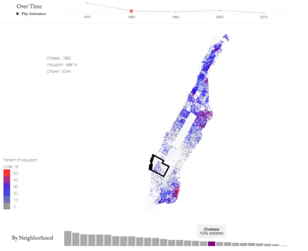
The distribution of school-aged children in cities and neighborhoods is something that changes over time. This series of maps helps show how the distribution of that population has evolved over the past four decades. The hope is that this visualization will help expose patterns that can be used to make smarter decisions about where to place schools, parks, and other resources for children. This series of maps (fig B-1) shows a common trend towards a decreasing number of school-aged children in cities even as the overall population increased, suggesting a trend of families moving out of cities to nearby suburbs.
2.2
Data
Most of the data for this series of maps comes from the National Historical Geographic Information System (NHGIS) [7]. NHGIS provides aggregate census data and geo-graphic boundary files from 1970 to 2010. This series of maps used the "Sex by Age" tables for each decade from 1970 to 2010, which detail the distribution of population by age and gender for each census block in the United States. The corresponding GIS boundary layer was also used. This layer contains geographical information about each census block. Neighborhood boundary layers were taken from Zillow [22],
allow-ing us to present areas of the city in a more natural way.
2.3
Design and Visualization
The following section discusses front-end design choices and the implementation of that design.
2.3.1
Design
As discussed in section 2.1, the motivation behind this series of maps was to expose patterns over time in the population and distribution of school-aged children in cities. The design allows for users to explore these patterns on three levels: city, year, and neighborhood.
Each dot on the map represents a fixed number of school-aged children. The density of these dots in a particular area indicates the concentration of school-aged children. These dots are also colored to show the relative concentration of school-aged children in that area with respect to the total population. Thus the dots are able to collectively capture these two aspects of school-aged populations.
To show these patterns over time the user has the option to choose to display maps for individual years or play an animation that takes them from 1970 to the present. The total number of children for each decade is also displayed in a line graph.
Users can also view the distribution of children on a smaller scale. Each city is divided into neighborhoods. Users can hover over a neighborhood to view the total population and number of children in that neighborhood. A histogram also displays each neighborhood by concentration of children so users can better understand where the highest and lowest relative densities of children are in the city.
2.3.2
Visualization
Like many of these maps this visualization was written in Javascript and HTML5. The visualization is rendered using the HTML5 Scalable Vector Graphics (SVG) element.
The D31 library is used to manipulate the SVG and add the neighborhoods and children points. Unlike the HTML5 Canvas element, every element rendered by the SVG is available to the document object model (DOM). This means that JavaScript event handlers can be attached to specific elements such as the ’mouseover’ handler for neighborhoods, which allows the user to view neighborhood specific statistics by hovering over the desired area.
2.4
Challenges and Improvements
This section discusses the challenges faced for this series of maps and suggests possible improvements or future work.
2.4.1
Inconsistencies
As the nature of cities evolve, so too do the methods for collecting census data. Naming conventions change and the boundaries census blocks and tracts are reshaped and redefined. This proved to be one of the biggest challenges for creating this series of maps. Inconsistent census block boundaries meant that directly comparing the population of one block in one decade to the same block in another decade was not meaningful.
Rather than compare different census blocks we decided to use neighborhoods as our geographic unit. For every census block in every decade we used the python package Shapely to compute the size of the block and the size of the intersection between the census block and each neighborhood in that city. The population of each census block was then divided amongst the neighborhoods proportional to the relative size of the intersection.
2.4.2
Causes
Many of the maps in this series showed a pattern of a decreasing number of children living in cities but offers no explanation for why this is happening. Families may be deciding that they would prefer to live in the suburbs, increasing real estate prices and cost of living may be forcing families out of the cities, or this pattern could merely be the result of an aging US population [37]. A natural extension of this project would be to determine if school-aged children really are disappearing from cities at an unusual rate and if so, investigate the driving forces behind this trend. Possible areas of interest include determining in which areas the concentration if school-aged children is increasing, crime rates in cities, and real estate and cost of living changes.
2.4.3
Prediction
Another extension of this project would be to develop a model for predicting where future generations of school-aged children are likely to live. This would necessitate looking at larger metro areas as the city boundaries themselves do not provide enough context.
Chapter 3
Bike Sharing Traffic
3.1
Motivation
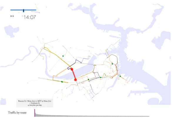
Transportation, specifically bicycling, has been a theme of You Are Here since the project’s inception. Biking has health and environmental benefits and a vibrant cycling culture can help transform a city. One of the earliest maps was a visualization of bicycle accidents in order to better understand which areas of a city needed bicycle infrastructure upgrades [12]. Since that time, bike sharing programs such as Hubway in the Boston area and Bay Area Bicycle in San Francisco have grown astronomically both in subscribers and use [43]. Bike sharing programs make cycling more accessible by removing the large upfront cost of purchasing a bike as well as the maintenance costs of keeping the bike running and mitigating the inconveniences of bicycle storage. The increasing bicycle traffic in cities poses new infrastructure problems and makes existing problems more urgent. The goal of this series of maps (fig B-2) was to expose the urban commuting patterns of bike share users so that cities may better plan for safe and effective cycling infrastructure.
3.2
Data
The data for this series of maps comes from various bike sharing systems owned and operated by Alta Bike Share across the United States and the United Kingdom
[4, 14–17, 24, 25]. Many of these programs have opened up their data to the public in recent years. Those that have provide CSV files detailing the location and names of each of their docking stations, as well as the start time, end time, start station, and end station of each trip taken by an Alta Bike Share program user. GIS layers for water bodies were taken from MIT GeoWeb [1].
3.2.1
Google Directions API
With up to 100 bike sharing stations in a given city the number of possible station pairings was often more than was reasonable to display. To make the data digestible to viewers we instead opted to only show traffic between the 250 most common station pairings. Once these pairings were identified we used the Google Directions API1 to compute the most likely route taken between each station pairing. The Google Directions API takes a start point, end point, and mode of transportation and returns a sequence of latitude longitude pairs that describe the optimal route between these two points. This allowed for an estimate of the actual paths traveled for each trip by a bike share program user.
3.2.2
Simulated Riders
This series of maps displays a simulation of individual riders during typical day in the bike sharing network. To create this simulation we found the trip length distribution for each of the top 250 pairings using all of the rides in our dataset. We removed rides that were more than three standard deviations away from the mean time for that route, as these riders likely took different paths than those returned by the Google Directions API. We then aggregated every ride during 20 random days in our dataset and randomly selected each of these rides to be in our simulation with probability 𝑝 = 1
20.
3.3
Design and Implementation
The following sections discuss front-end design choices and the implementation of that design.
3.3.1
Design
As discussed in section 3.1, the primary motivation behind this series of maps was to uncover commuting patterns in order to plan infrastructure. Intrinsically, bike share traffic ebbs and flows throughout the day as riders commute to and from work. We decided that the best way to capture the temporal nature of bike share traffic was to animate a typical day of bike sharing in the city. Individual riders are represented by green dots based on their imputed location and speed. The line width and opacity of each route represent the volume of bike share traffic traveling at a given time between that station pair. A histogram also displays station pairings by decreasing traffic volume. Hovering over the histogram bars allows the user to highlight the route between that pair as computed by the Google Directions API. This allows users to see where on the map the most heavily trafficked routes lie.
3.3.2
Implementation
Like many of these maps most of the visualization was written in Javascript/HTML5. The visualization is rendered using the HTML5 Scalable Vector Graphics (SVG) element. The D3 library is used to manipulate the SVG and draw the bike stations, routes, and simulated riders. Information regarding the total traffic on each route and the position of each simulated cyclist is stored in a JSON encoded dictionary keyed by time. As the animation plays this information is retrieved and the map is updated accordingly.
3.4
Challenges and Improvements
This section discusses the challenges faced for this series of maps and suggests possible areas of improvement or future work.
3.4.1
Route Subsections
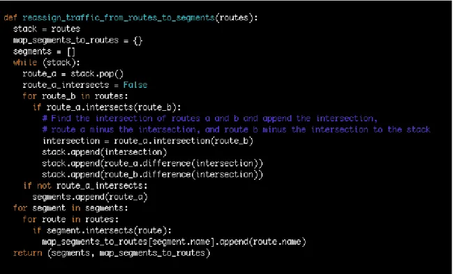
Though this series of maps shows the volume of traffic on a given route, what is more interesting is the volume of traffic on a given road. Because many of the routes between the most popular station pairs overlap, segments of road common to many of these routes may be more heavily trafficked than the visualization lets on. A possible extension to this project would to be reexamine bike sharing traffic from this perspective. Each route would be decomposed into segments. The total traffic for a given segment would then be the sum of the traffic on the routes containing that segment. Naturally, road segments that belong to multiple routes would see an increase in traffic. Pseudocode to generate these segments and provide a mapping from each segment to it’s overlapping routes is provided in figure B-3.
Chapter 4
Bike Sharing Stations
4.1
Motivation
Though bike sharing programs have grown exponentially in subscribers and use, many of these programs still operate at a deficit [38]. In the current model up front costs are high; the specialized bikes are more expensive than many consumer models and the docking stations can cost several thousands of dollars [10]. This initial investment would be recouped were it not for the costs of running the program. Though many of these costs such as maintenance and repairs are unavoidable, careful planning can help reduce the largest expense, rebalancing.
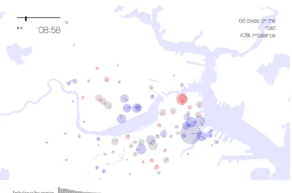
When stations are unbalanced, due, for example, to commuting patterns, sight-seeing riders, or public transit usage, the system must restock depleted stations by hauling bikes from ’sinks’ to ’sources’ using cargo bikes and vans. This rebalancing problem is intrinsic to the service but can be mitigated by carefully planning the size and locations of bike stations. The motivation behind this series of maps (fig B-4) is to illustrate this rebalancing problem with the hope that it can be used as a tool to make bike share networks more efficient.
4.2
Data
This is the second series of maps comes to make use of the open data published by various bike share programs owned and operated by Alta Bike Share across the United States and the United Kingdom [4, 14–17, 24, 25]. This series of maps again used the CSV files detailing the location and names of each of their docking stations, as well as the start time, end time, start station, and end station of each trip taken by an Alta Bike Share program user. GIS layers for water bodies were taken from MIT GeoWeb [1].
4.3
Design
Much like the bike share traffic maps discussed in chapter 3, station efficiency is inextricably tied to the time of day. Once again we decided that the best way to present the station rebalancing problem was with an animation showing the load on each station. Each bike sharing station is represented by a circle. Data for the animation is stored in a JSON encoded dictionary keyed by time of day. At each step of the animation the total traffic volume, efficiency metric, and traffic direction vector is displayed for each station. As the animation progresses, the circles expand and contract to show the number of bikes arriving and departing within a 60 minute time-window. Blue circles represent more departures than arrivals while red circles indicate more arrivals than departures. For each station a dial points in the net direction of bicycle flow. The expected number of bikes on the road and the total efficiency of the network (a metric discussed in section 4.4.3) appear in the upper right hand corner. A histogram also displays each station by decreasing order of efficiency. We also show estimates of the proportion of bike trips that need to occur manually in order to rebalance the network given the fullness of each bike station at the start of the day.
4.4
Implementation
The following section discusses the implementation of some of the metrics discussed in section 4.3.
4.4.1
Traffic Volume
Expected traffic volume for each station was calculated for each minute of the day. Each station maintained a dictionary storing departures and arrivals keyed by time. For each trip in the database the departure count for the start time of the starting station and the arrival count for the end time of the ending station were each increased by one. Total traffic for each minute is the sum of the arrival and departure counts. To remove high frequency elements from the data we used a moving average to find the mean traffic for each station within a 60 minute window of the current time.
4.4.2
Traffic Direction
Traffic direction was also calculated using a dictionary of every departure and arrival keyed by time and station. The normalized vector for each station pair was calculated by subtracting the start station location from the end station location and dividing by the magnitude. To calculate the traffic direction vector for a station 𝑠 at time 𝑡 we took the sum of the station pair vectors representing each trip departing from or arriving at 𝑠 within a 60 minute window of 𝑡 and normalized it to have a magnitude of one.
4.4.3
Efficiency Metric
The efficiency metric measures how "balanced" each station is. For station 𝑠 at time 𝑡 the efficiency metric 𝑒𝑠𝑡 can be expressed as 𝑒 =
|𝑑−𝑎|
𝑑+𝑎 where 𝑎 and 𝑑 are the number
4.4.4
Initial Bike Distribution
To estimate the number of bikes that needed to be rebalanced manually we ran a simulation of every day for which we had data. Each bike station 𝑠 has a known capacity 𝑠𝑐 of bikes that it can dock. We assumed each of these stations to be 𝑖 full
to start the day, where 0 ≤ 𝑖 ≤ 1. For each trip in a given day we kept track of the number of bikes 𝑠𝑏 at each station 𝑠. As bikes arrived at and departed from 𝑠 we
incremented and decremented 𝑠𝑏. Every time a bike arrived at a station and 𝑠𝑏 > 𝑠𝑐
we incremented the number of bikes that needed to be manually hauled that day, 𝑚. Likewise, 𝑚 was incremented whenever a bike departed a station and 𝑏𝑠 ≤ 0. Finally,
at the end of the day, we added |𝑠𝑏− 𝑖 * 𝑠𝑐| to 𝑚 for each station 𝑠 in order to account
for the bikes that needed to be hauled in order to reset the network. After simulating each day of our data, we divide 𝑚 by the total number of trips 𝑡 in order to estimate the number of bikes that must be manually hauled for each use of the network. Each map displays this metric 𝑚𝑡 for 𝑖 = .5, .75.
4.5
Challenges and Improvements
This series of maps does a great job of visualizing the bike station rebalancing problem but offers little in the way of concrete suggestions for fixing it. The following sections describe approaches that can be used to decrease the number of bikes that must be manually rebalanced in the network.
4.5.1
Initial Bike Distribution
The initial distribution of bikes across stations can have a measurable influence on the efficiency of the network. Our simulations show that tweaks to the parameter 𝑖 can markably improve the number of bikes that need to be hauled. However not all stations are the same and the number of bikes at each station as the day begins should reflect this. Intuitively, stations that will act as sources of bikes at the beginning of the day should start the day more full than stations that will act as sinks. One
possible extension for this project is to develop an algorithm to optimize the initial distribution of bikes within a network given station capacities, locations, commuting patterns, and the total number of bikes in the system.
4.5.2
Dock Capacity
Readers will correctly infer that increasing the capacity of each bike station will increase the efficiency of the network. After a certain point the problem of stations becoming too full disappears and vans only need to run to resupply empty stations. Just as the optimal initial distribution of bikes can be computed as a function of station traffic patterns, so too can the optimal capacities for each of these stations. Intuitively, stations that are more heavily trafficked and less balanced would benefit from more spaces for bikes. A second possible extension of this project is to develop an algorithm to optimize station dock capacities given station locations, commuting patterns, and the total number of bikes in the system.
Chapter 5
Urban Pyramids
5.1
Motivation
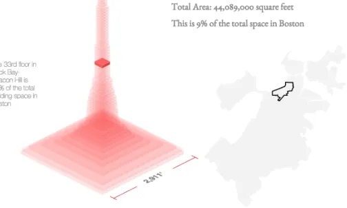
The character of a city is often reflected or even defined by the buildings that populate it. The goal of this series of maps (fig B-5) was to present the architectural landscape of each city in a unique and interesting way, as well as illustrate the differences between different neighborhoods as reflected by the buildings that inhabit them.
5.2
Data
This series of maps uses GIS layers of the buildings in a given city. These files are often available from their respective city’s open data website but sometimes needed to be pulled from other sources [3, 9, 18]. From these layers we use the building footprint, location, and height. Building height was generally measured in stories or in feet. This series of maps also made use of GIS layers containing city neighborhood boundaries, which are available from Zillow [22].
5.3
Design
This map visualizes the estimated sum of the building-volume in a city stacked as floors. Each layer in the pyramid shows the total square footage in a city at a given
height. Taken as a whole, the pyramid gives a sense of how much life happens in a city on different stories. Users can use the map of the city to the right of the pyramid to view information for a given neighborhood. Mousing over a floor of the pyramid displays how much of the total building area in the city is on that story.
5.4
Implementation
For each neighborhood in the city we kept a dictionary storing building area keyed by floor. For every building in the city we calculated the area of the building footprint. If height of the building in stories was given in the GIS layer, we used that. Otherwise if the height was given in meters we calculated the number of stories by assuming an average floor height of four meters. We then computed which neighborhood in the city the building belonged to, and added the area of the building footprint to the dictionary for each story that the building spanned. In the end we calculated area by floor for the entire city by summing over each of the neighborhoods.
Chapter 6
Bike Lanes
6.1
Motivation
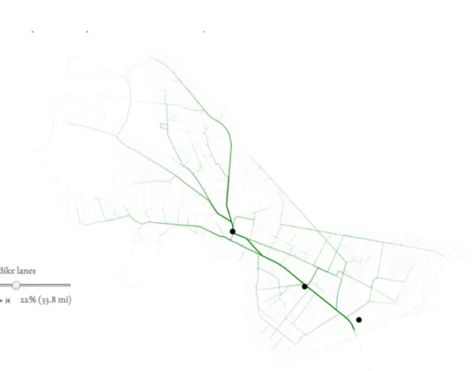
Bicycle ridership in cities is growing as gradually roads are being redesigned to accom-modate riders, bike-share hubs, and racks. While bike lanes that are made of paint are straightforward and inexpensive, protected bike lanes can take more time to de-ploy. Due to the investment needed to create protected bike lanes, careful planning is needed to make sure that these lanes are installed in the areas that need them most. The motivation behind this series of maps (fig B-6) was to develop an algorithmic approach for the design and prioritization of a riding network and as a starting point for a discussion on deployment strategies for protected bike lanes.
6.2
Data
This series of maps makes use of two sets of data; street centerlines and popula-tion distribupopula-tions. Street centerline files were available from their respective city’s open data website [20, 21, 31]. Population distributions were taken from the National Historical Geographic Information System [7].
6.3
Design
Several designs were explored for this series of maps. In the first design, we allow users to choose points of interest in the city. The map then shows the bike lane network that optimizes the average commute time to each of these points of interest, using Dijkstra’s algorithm [33] to compute the shortest paths from each point of interest to every intersection in the city. Street segments that were selected as bike lanes are colored green, and the opacity of these segments is proportional to the estimated traffic on each segment. A slider allows the user to select how much of the city’s total roads should be turned into protected bike lanes, both as a percentage of the total road length in the city and as an absolute length. For each point of interest we show the estimated average commute time by bike, which decreases more and more bike lanes are added to the network.
The second design does not allow users to choose points of interest. Instead, the map displays locations for protected bike lanes chosen using a global optimization, minimizing the commute time from each person in the city to every other person. This optimization used the Floyd-Warshall algorithm [34] to compute the shortest path between each pair of intersections in the city. Once again a slider allows the user to select what proportion of the city’s streets should be protected bike lanes and the opacity of each bike lane is proportional to the estimated use. Average commute times are not shown as each of the analogous metrics we considered were deemed too abstract for our users.
The third and final design was similar to the first design except the points of interest were preselected and fixed. This allowed us to do most of the computation beforehand rather than in the browser, which gave us more flexibility and allowed us to make our optimization algorithm more complex. The algorithmic approach behind these designs, specifically the second and third, are discussed in the following sections.
6.4
Implementation
The following section discusses the implementation of our bike-lane optimization al-gorithms.
6.4.1
Graph
The first step for each of these optimizations was to turn the street centerlines file into an undirected weighted graph in order to run our shortest path algorithms. Street segments and their lengths represent edges and edge weights in the graph . The end points of each street segment represent the vertices corresponding to that edge. Vertices were named using the MD5 hash of their latitude and longitude coordinates. We used a dictionary 𝑑 to map each vertex 𝑣 to a list of neighboring vertices 𝑢 ∈ 𝑁𝑣.
Each value in this list also contained data about the edge 𝑒𝑢𝑣 connecting 𝑢 and
𝑣 including the name of the edge as computed by the MD5 hash of 𝑢 and 𝑣, the human readable name of the corresponding street, and the length in meters of the corresponding segment. After the graph was built each vertex 𝑣 was given a human readable name by combining the names of two adjacent edges.
6.4.2
Population Distribution
The next step in each of these optimizations was to augment each vertex of the graph with a population. Geographic population distribution data was taken from the National Historical Geographic Information System website. The NHGIS provides a CSV file containing the population of each census block in a given state and a GIS layer with the boundaries of each census block in that state. In order to filter out census blocks that were not in our city of interest we used a neighborhood GIS layer taken from Zillow. A census block was considered within the boundaries of our city if and only if it intersected with one of the neighborhoods from this layer. We then computed the distance from each census block in the city to every vertex in our graph. The population of a census block was finally divided amongst the vertices inversely proportional to the distance from the centroid of the census block to that vertex.
6.4.3
City Wide Optimization
The second of our three designs optimized bike lanes at a city level. We determined which street segments should be a priority for bike lanes by estimating the total traffic along that segment. To do this we used the Floyd-Warshall algorithm to compute the shortest paths between each vertex 𝑢 in our graph and every other vertex 𝑣. If an edge 𝑒 appeared in the shortest path 𝑝𝑢𝑣 from 𝑢 to 𝑣, the estimated traffic for that
edge was increased by the sum of the augmented populations of 𝑢 and 𝑣. The edges were then sorted by estimated traffic to determine which street segments should be prioritized as bike lanes. Readers may note that the prioritization of street segments should take into account which bike lanes already exist, as nearby street segments should then be of a lesser priority. The methods we discussed for this proved to be computationally intractable for the city wide optimization, and will be discussed in section 6.4.5 as they apply to optimization for points of interest.
6.4.4
Optimizing for Points of Interest
Our initial and final design optimized the layout of protected bike lanes to minimize the distance to points of interest. Once again we prioritized street segments by estimated traffic. For each point of interest 𝑝 we found the closest vertex 𝑣𝑝 in our
graph 𝐺. We then computed the shortest path from 𝑣𝑝 to every other vertex 𝑢 in 𝐺
using Dijkstra’s algorithm. When an edge 𝑒 appeared in the shortest path 𝑝𝑣𝑝𝑢 we
incremented the estimated traffic on that edge by the population of vertex 𝑢. Edges were then prioritized as bike lanes proportional to the estimated traffic associated with that edge.
6.4.5
Incremental Optimization for Points of Interest
As mentioned in section 6.4.3, the addition of bike lanes to the network should change the prioritization of which street segments should be next added to the network. Intuitively, segments in close proximity to newly created bike lanes should see their priority decreased. To reflect this in our optimization, we incrementally add bike
lanes to the network, decreasing the weight of their associated edges by 25%. This number was chosen arbitrarily and reflects our estimate of the increased speed at which bikers are able to travel in protected bike lanes. We then rerun Djikstra’s algorithm to compute the shortest paths between each point of interest and every vertex in the graph, providing a new traffic estimate for each edge.
Converting just one edge to a bike lane per iteration would be ideal, but cities of interest often have tens of thousands of edges in their graph, making this approach infeasible. Instead for each iteration we convert 𝑛 edges to bike lanes, where the total length of the 𝑛 segments is equal to one percent of the total length of all street segments in the city. This keeps the number of calls to Dijkstra’s algorithm constant with respect to the number of vertices and edges in our graph, and allows us to precompute data for our visualization as part of the optimization, as discussed in section 6.4.6.
6.4.6
Visualization
This series of maps visualizes which street segments should be retrofitted with pro-tected bike lanes. The user has a slider to select the percent of the city’s total road to turn into protected bike lanes and the map is updated accordingly. As discussed in section 6.4.5, our incremental optimization algorithm turns exactly one percent of the city into bike lanes after each iteration. For each edge the corresponding feature in the street centerlines GIS layer is augmented with the iteration at which that segment was selected to be a bike lane. Similarly each corresponding feature is augmented with the estimated traffic for that and all future iterations. When a street segment is rendered in the DOM the iteration at which that segment was turned into a bike lane is added as an attribute of that element. When the user changes the value of the slider from 𝑖 to 𝑗 ,0 ≤ 𝑖 < 𝑗 ≤ 100, we use d3 to select all segments that were turned into bike lanes during an iteration 𝑘 for which 𝑖 < 𝑘 ≤ 𝑗. Each of these segments are then marked as bike lanes by turning them green. To show which segments are being used the most, the opacity of each of these segments is set proportional to the estimated traffic on that segment during iteration 𝑗. A play button allows the user to
view an animation of the city’s bike lane network going from nothing to every street in the city.
6.5
Challenges and Improvements
This series of maps provides a strong approach to the bike lane optimization problem but there is a lot of work to be done before the suggestions given by our algorithms can be seriously considered. The following sections describe methods for improving these algorithms.
6.5.1
Incremental City Wide Optimization
A major weakness of the algorithm described in section 6.4.5 is the reliance on good points of interest. A city wide optimization using Floyd-Marshall may make more sense if the goal is to increase the overall "connectedness" of the city with respect to cycling. Unfortunately Floyd-Warshall takes a long time to run on the graphs for large cities and an incremental approach to this problem like the one described in section 6.4.5 isn’t tractable given the current implementation. Parallelizing Floyd-Warshall may make the incremental approach computable within a reasonable amount of time. The algorithm can be further sped up by increasing the number of segments turned into bike lanes at each iteration. Changing a segment into a bike lane is much more likely to effect the traffic estimates for segments in close proximity. Guaranteeing that each segment in the set of segments being added during the current iteration be no closer than 𝑧 meters from each other may allow for fewer iterations. Further improvements could be made by increasing 𝑧 as a function of the number of iterations. This prioritizes computation for earlier iterations at the expense of later iterations, which makes sense given that decisions made early on may have a butterfly effect.
6.5.2
Smarter Path Weights
Currently our optimization computes shortest paths with edge weights taken directly from the length of the corresponding street segment. This ignores the reality that properties like street type, the number of lanes, and typical traffic speeds all play a meaningful role in determining how quickly a street segment can be traversed by bicycle. A logical extension of this project is to incorporate all of this information into the edge weights in the graph.
Similarly there is no penalty for traffic lights, stop signs, or left hand turns, in any of our shortest paths algorithms. Unfortunately these ideas can not be implemented solely by modifying edge weights as all of them require context. For example, an edge can only be determined to be a left hand turn when the previous edge is known. This problem can be solved by using a modified shortest path algorithm which levies a penalty whenever a path would cause the rider to turn left or pass through a stop sign or light.
6.5.3
Existing Infrastructure
This series of maps does not take into account existing bike lanes. In order to turn our optimization into a useful tool the algorithm must be aware of what infrastructure is currently in place. This can be reflected in our optimization by decreasing the edge weights of street segments with existing bike lanes.
6.5.4
Accidents
Safety is one of the primary motivators behind building protected bike lanes. By placing physical barriers between bicycle and automobile traffic the frequency and severity of cycling accidents can be greatly reduced. Bicycle accident data is publicly available for most cities and has been featured in a different series of maps for the You Are Here project [12]. This data could be incorporated into our algorithms to prioritize street segments where many bicycle accidents have taken place.
6.5.5
Costs
Our optimization algorithms consider only the benefits of building protected bike lanes and ignore the costs. Protected bike lanes cost time and money to build and reduce available street, parking or sidewalk space. These factors must also be considered when deciding which street segments should given protected bike lanes. The financial cost and increased automobile traffic incurred by adding protected bike lanes to each segment should be weighed against the estimated decrease in accidents and commute times for cyclists.
Chapter 7
Information Diffusion in Social
Networks
7.1
Motivation
The Social Computing Group works to foster social processes through technological innovation. This procedure typically consists of three distinct steps; create a social process, create a model for that process, and create technology that can help others replicate and shape that process. The goal is for this process to then spread in an organic, decentralized fashion. By providing examples and resources for others that are interested in this process it can scale in a way that could never happen if lab members needed to be directly involved.
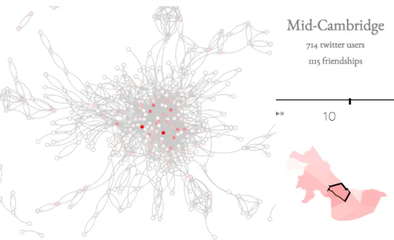
The natural spreading of the social process is intrinsic to this model. The group counts on others to observe the work we have done, to replicate it for themselves, and to spread this idea on to others who may be interested. Much about how this spreading occurs is unknown. The purpose of this series of maps (fig B-7) is to model the diffusion of information and ideas in a social network to better understand how the processes fostered by the Social Computing Group can spread. The hope is that understanding this mechanism will allow the group to better effect the spread of the social processes it creates.
7.2
Data
This series of maps makes use of data obtained through Twitter’s REST API1. This
series of maps also makes use of GIS layers containing city neighborhood boundaries, which are available from Zillow [22].
7.2.1
Twitter API
This section discusses the functions used in the Twitter API and the limitations of this service. Calls to Twitter’s REST API were used to gather the majority of the data for this series of maps. The REST API provides access to Twitter data and allows users to read and write to Twitter with much of the same functionality as they would have in a browser. Data gathering for this series of maps was a two step process; first, discover who was using Twitter in the city of interest and second, look up which other users they are following.
7.2.2
"search/tweets"
Users were found calling the "GET search/tweets" 2 function. The Twitter Search
API, a part of version 1.1 of the REST API, allows users to query against the indices of recent or popular Tweets. This particular function takes a query and a number of optional parameters and returns matching Tweets in the index. Only two of these optional parameters were necessary for our purposes. The first, "geocode", takes coordinates in latitude and longitude and a radius in kilometers, restricting the search to Tweets from within that radius. "GET search/tweets" was the only search function that could be restricted by location, which is why seemingly more relevant functions such as "GET users/search" were not considered. The "count" parameter dictates how many results to return and was set to the maximum of 100 every time. Matching tweets were returned in a JSON encoded array. Though we recorded and saved all of the information about each matching Tweet we ultimately only required the user ID.
1https://dev.twitter.com/rest/public
This particular function was rate limited to 180 requests per 15 minute window.
7.2.3
"friends/ids"
The list of users a specified user is following, otherwise known as their "friends", was obtained using the "GET friends/ids" 3 function. Inputs to this function included "user_id" or "screen_name" to specify the user, "cursor" for pagination, and "count" to limit the maximum number of friends returned per page. This particular function was rate limited to 15 requests per 15 minute window.
7.3
Design and Visualization
This series of maps attempts to visualize the interaction between Twitter users in a given city. Users are displayed as nodes in D3’s force-directed graph layout4. Directed
edges in this graph show the "following" relation. If a user 𝑎 follows a user 𝑏 then there is a directed edge pointing from 𝑎 to 𝑏. Hovering over the node for a given user displays the user’s screen name and highlights the incoming edges adjacent to that user. A map on the right shows the neighborhoods in the city. The opacity of each neighborhood is proportional to the number of active Twitter users found in that neighborhood. Clicking on a neighborhood displays a graph of it’s Twitter users. A slider on the right is used to control iterations of the PageRank algorithm [42], which is used as a proxy for measuring a user’s influence on the social network. The values returned by the PageRank algorithm are reflected in the graph by varying the opacity of each node.
7.4
Implementation
The following sections discusses the methodology for finding users and measuring social influence using PageRank.
3https://dev.twitter.com/rest/reference/get/friends/ids 4https://github.com/mbostock/d3/wiki/Force-Layout
7.4.1
Finding Users
Twitter users in a particular city were found using the "search/tweets" function in the Twitter REST API. First, we divided the city up into neighborhoods using the boundaries defined by the Zillow neighborhood GIS layer. For each neighborhood we computed a square grid of latitude and longitude pairs spaced one hundred meters apart. Then for each of these points we queried the API for indexed Tweets within a radius of one hundred meters using one of the top 50 most tweeted words [35]. The limit of at most 100 results meant that we would sometimes miss matching Tweets for particularly popular locations or queries. To uncover tweets that may have been missed by the original query we recursively divided the geographic area being searched into seven hexagonally packed circles with a diameter one third that of the original query, re-querying the original search term on each of these seven areas. The recursion continued until all queries returned fewer than the maximum of 100 results. Once each of the 50 most tweeted words were searched for every point in a given neighborhood we iterated through each tweet to find the set of active user IDs in the region. For each user ID we used the "friends/ids" function to query the list of screen names followed by that user.
7.4.2
PageRank
We then used the PageRank algorithm to model the influence of Twitter users within the network of their neighborhood. PageRank uses a directed graph to simulate a Markov process. A "surfer" navigates the graph by choosing to traverse an edge at random. PageRank takes this graph as an input and returns the long term probability distribution that the random surfer winds up at each particular node. By using PageRank on the directed graph of Twitter users in a neighborhood we get the long term probabilities that this "surfer" ends up on each particular user, which we use as a proxy for measuring that user’s influence on the network as a whole.
7.5
Challenges and Improvements
The following sections discuss possible improvements that could be made to this series of maps.
7.5.1
Streaming API
Our ability to accurately represent the Twitter graph of a particular neighborhood is limited by the data made available in the Twitter REST API. Twitter only makes particularly recent or popular Tweets available in the index, meaning the users dis-covered using "search/tweets" are but a small subset of the active users in Cambridge. This subset also contains a bias towards users who exert a strong influence on the network given that more popular Tweets are more likely to be indexed. Collecting data over a longer period of time using the Twitter Streaming API 5, which provides real time access to a location specific Twitter feed, could be used to create a more complete model of user activity in a neighborhood.
7.5.2
Personalized PageRank
Personalized PageRank [36] extends the PageRank algorithm by biasing the location of the random "surfer" to a predefined subset of users. By tweaking the algorithm that chooses this subset we can find the Twitter users who are influential in certain fields. This is of particular interest when looking for ways to spread the awareness of projects in the Social Computing Group, which tend to be concentrated in just a few topics. While it was our original intention to use Personalized PageRank, the limited number of users we were able to find using "search/tweets" would have kept the results from being meaningful.
Chapter 8
School Locations
8.1
Motivation
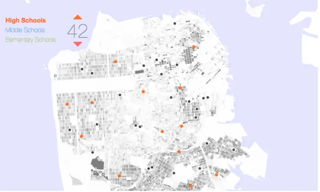
The process of building a new school is complex and lengthy, and once built it is constantly challenged by the natural process of aging neighborhoods and shifts in demographic dynamics. We view this map as a tool for an urban reality where school-making is an agile process. In this reality, schools would be smaller, and they would assembled when needed, and change use just as easily when neighborhoods change. The motivation behind this series of maps (fig B-8) is to algorithmically suggest locations for new High, Middle, and Elementary schools. These maps are an extension of work done by Wesam Manassra and Pranav Ramkrishnan [39, 41].
8.2
Data
This series of maps makes use of two sets of data, population distribution by age and the locations of existing schools. Population distribution by age was taken from the National Historical Geographic Information System [7]. GIS layers for water bodies were taken from MIT GeoWeb [1]. The location and types of schools were often available from their respective city’s open data website [2, 6, 8, 13, 19, 23, 26–28].
8.3
Design
This series of maps visualizes potential locations for new public schools. The user can choose between three different school types; High, Middle, and Elementary. Existing schools are shown on the map as black dots. The user can use the arrows to add or remove new schools, which appear on the map as colored dots. The new school locations move around before settling, showing iterations of the k-means algorithm. Census block groups are shown on the map as gray polygons. The opacity of each census block is directly proportional to the number of children in the age bracket of interest living in that area per the 2010 census. Hovering over existing schools displays the name of that school and hovering over potential new schools displays the address of the suggested location.
8.4
Implementation
The following section discusses the implementation of the k-means algorithm for sug-gesting school locations.
8.4.1
k-means
Potential new school locations are found using a modified implementation of the k-means clustering algorithm. In our implementation of k-k-means the centroid of each census block serve as our observations. Here, the 𝑚 existing schools act as fixed means, while the remaining 𝑛 = 𝑘 − 𝑚 means are free to move as normal. In each iteration of the algorithm, each census block is assigned to one of the 𝑘 means. The 𝑛 variable means are then recomputed as an average of the centroids of the census blocks found to be closest to it, with each centroid weighted by the population of school-aged children in that block. This modified k-means algorithm will suggest points that are local minima for the total distance students must travel to the closest school in the city.
8.5
Challenges and Improvements
The following sections describe methods for improving our school locations suggestion algorithm.
8.5.1
Available Spaces
The modified k-means algorithm currently used for suggesting school locations does not consider where building schools is actually practical. Zoning laws and existing buildings are just some of the factors that can make the lots suggested by our algo-rithm infeasible. We believe that this problem is best approached by supplying the algorithm with a list of locations to be considered. A simple way to incorporate this list is to reassign the 𝑛 variable means the closest location in this list at each iteration of the algorithm. This would insure that only realistic locations are suggested.
8.5.2
School Capacity
School capacity is another factor currently ignored by our algorithm. Schools are built to accommodate a particular number or range of students and our algorithm ignores the effect that new schools would have on enrollment in existing ones. One approach for solving this problem would be to set capacities for each of the 𝑘 means. For each iteration of the k-means algorithm we then assign the population of each census block to the nearest school until the capacity of the nearest school is full. The remaining population would then be assigned to the nearest mean below capacity.
Chapter 9
An Automated Valuation Model for
Real Estate
9.1
Motivation
Estimating the value of real property is an important process in a number of fields. Real estate financing, investing, insuring, and taxation all rely on accurate valuations. The uniqueness of each piece of real property makes valuation a complicated task. In many cases the preferred method of real estate valuation is a licensed appraiser. Hiring an appraiser is a slow and expensive process, and is impractical for those who need to value a large number of properties. In these cases automated models are often the preferred method of real estate valuation. Automated models are faster and cheaper, often at the expense of accuracy. The motivation behind this project was to explore automated valuation for real estate using machine learning techniques with the hopes of beating or competing with existing technologies.
9.2
Data
The majority of the data for this project comes from Zillow [30]. More specifically this data is scraped from recently sold homes in various neighborhoods along the
Jersey Shore1. Other sources include the National Historical Geographic Information System [7] for census data, the Google Directions API 2, the Google Places API 3,
and MIT GeoWeb [1].
9.2.1
Web Scraping
Zillow listings for recently sold properties in the Jersey Shore towns of Bel Mar, Avon by the Sea, Bradley Beach, and Ashbury Park were used as sources of data for this project. Features from these listings were extracted automatically using the Selenium WebDriver 4 in conjunction with the Selenium Python API 5. This API allowed us
to interact with a browser in the same way that a user would, including navigating to different URLs, searching through the DOM using XPath syntax, and controlling mouse actions.
The first step in gathering data for this project was to make a list of each listing we wished to extract features from. We used Selenium to open the list of recently sold homes in each of the four cities and navigate through each page of results, recording the URLs of each listing. We then opened each individual listing with Selenium and scraped the page for interesting features. Since much of the content on Zillow listings is created dynamically we had to ensure that the information we were interested in was present in the DOM. This was usually accomplished by automatically scrolling to the "div" element containing the information in question or clicking a button to expand the table we wished to scrape.
The most time consuming feature to scrape was the "Zestimate" [29], the results of Zillow’s automated valuation for that listing. This information is viewable as an image which shows a graph of the Zestimate with respect to time. Mousing over the graph reveals a box with the actual value of the Zestimate as well as the date for which it was generated. In order to capture all of the Zestimate information we used
1Chosen due to our familiarity with the area
2https://developers.google.com/maps/documentation/directions/ 3https://developers.google.com/places/
4http://www.seleniumhq.org/projects/webdriver/
Selenium to slowly mouse over the width of the graph, saving the text from the box at each movement of the mouse. Other interesting features scraped from each listing were the street address, number of beds and baths, size of the property, sales history, the location of nearby schools, and a measure of how walkable the surrounding area is.
9.2.2
Additional Features
To improve our automated valuation model we also used features from sources other than Zillow. Many of these features came from census data. To determine which census tract a given listing was in we used the Nominatim geocoder6to turn the street address taken from the Zillow listing into a pair of latitude and longitude coordinates. We then used the GIS layer of census tracts from the NHGIS to determine which census tract had a non-empty intersection with that point. We then added features computed from census data to each listing. Most of these features were related to age distribution and income. Some of these features included the percent changes in median income over the past three decades and the percent change in population in the 0-18, 18-35, 35-65, and 65+ age groups. We also added other features based on the location of the property. One such feature, proximity to the beach, proved to be especially useful signal.
9.2.3
Missing Feature Imputation
We then generated input to our valuation model from each listing we scraped. Each sale of a property was used as an input to our model. The sale price was our de-pendent variable while the features described in sections 9.2.1 and 9.2.2 acted as the independent variables. For time dependent features such as tax valuation and Zesti-mate we used the value at the date of the sale. Unfortunately many of the features we scraped from Zillow were not present for every listing. To fill in missing features we used a technique known as KNNimpute [40]. KNNimpute uses data from the
k-nearest neighbors of a given sample to fill in missing features. Because nearest neighbors are computed using Euclidean distance we first normalized each feature to ensure that certain features were not valued more highly due to their magnitude. Missing features for a sample were then filled in as an average of the nearest samples containing that feature weighted by Euclidean distance.
9.3
Valuation
The following sections discuss the methods used to model real property prices.
9.3.1
Feature Selection
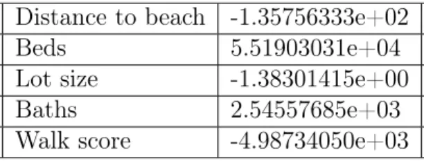
A method known as Recursive Feature Elimination (RFE) was used to select the features we used in our valuation model. RFE is an iterative algorithm in which the feature determined to have the least influence on the output is eliminated at each step until the desired number of features is obtained [32]. The five most predictive features for our valuation model as computed using RFE were distance to the beach, number of beds, lot size, number of baths, and walkability. Encouragingly Zestimate is absent from this list of features. This suggests to us that the Zestimate is a poor predictor of final sale price.
9.3.2
Linear Regression
A linear regression was used to predict sale price from our feature set. The weights for the five features named in section 9.3.1 are shown in table A.1.
9.4
Challenges and Improvements
9.4.1
Data
The accuracy of our model is limited by the data available. Many of the listings discovered on Zillow are still being scraped and more are added to the list of recently sold homes every day. Simply continuing to scrape Zillow for recently sold properties could meaningfully improve our model.
9.4.2
Finding Undervalued Property
One important feature of our valuation model for the purposes of real estate invest-ment is the ability to find undervalued property. A potential extension of this project is to assess our model’s capacity to do so. This could be accomplished by scraping Zillow listings currently listed for sale and feeding them into our model to estimate sale price. Listings that are estimated to be a certain threshold higher than their listed price would then be tracked so that the final sale price could be recorded and compared against our estimate. If our model is able to consistently find undervalued homes further work on this project could focus on adapting our model to be used as a tool for real estate investment.
Appendix A
Tables
Table A.1: Real Estate Feature Weights Distance to beach -1.35756333e+02 Beds 5.51903031e+04 Lot size -1.38301415e+00 Baths 2.54557685e+03 Walk score -4.98734050e+03
Appendix B
Figures
Bibliography
[1] Mit geoweb. arrowsmith.mit.edu/.
[2] Colorado.gov web developer center data. http://www.colorado.gov/data/ dataHome.html, 2009 (accessed February 23, 2015).
[3] Sf opendata building footprints. https://data. sfgov.org/Geographic-Locations-and-Boundaries/
Building-Footprints-Zipped-Shapefile-Format-/jezr-5bxm, 2011 (ac-cessed March 21, 2015).
[4] Bay area bikeshare open data. http://hubwaydatachallenge.org/ trip-history-data/, 2012 (accessed January 8, 2015).
[5] Big data, for better or worse: 90 percent of world’s data generated over last two years. Technical report, SINTEF, May 2013.
[6] Cambridge gis. http://cambridgegis.github.io/gisdata.html, 2013 (ac-cessed February 17, 2015).
[7] Nhgis data finder. https://data2.nhgis.org/main/, 2013 (accessed March 10, 2015).
[8] San francisco public schools. https://data. sfgov.org/Geographic-Locations-and-Boundaries/
San-Francisco-Public-Schools-Points/sert-rabb, 2013 (accessed March 18, 2015).
[9] City of chicago data portal - building footprints. https://data. cityofchicago.org/Buildings/Building-Footprints/qv97-3bvb, 2013 (ac-cessed March 19, 2015).
[10] Bike share public participation report. Technical report, Lincoln/Lancaster County Planning Department, 2014.
[11] World’s population increasingly urban with more than half living in urban areas. Technical report, United Nations, July 2014.
[12] Youarehere - bicycle crashes. http://youarehere.cc/#/maps/by-topic/ bicycle_crashes, 2014.
[13] Detroit schools 2013-14. http://portal.datadrivendetroit.org/datasets/ cc983c00c2614615bddf88a8e5337ac0_0, 2014 (accessed February 19, 2015). [14] Bay area bikeshare open data. http://www.bayareabikeshare.com/
datachallenge/, 2014 (accessed January 12, 2015).
[15] Divvy data challenge. https://www.divvybikes.com/datachallenge/, 2014 (accessed January 13, 2015).
[16] Capital bikeshare system data. http://www.capitalbikeshare.com/ system-data/, 2014 (accessed January 14, 2015).
[17] Nice ride minnesota. https://www.niceridemn.org/, 2014 (accessed January 9, 2015).
[18] Boston maps: Open data - buildings. http://bostonopendata.boston. opendata.arcgis.com/datasets/492746f09dde475285b01ae7fc95950e_1, 2014 (accessed March 20, 2015).
[19] Nyc opendata school point locations. https://data.cityofnewyork.us/ Education/School-Point-Locations/jfju-ynrr, 2014 (accessed March 3, 2015).
[20] City of cambridge geographic information system. http://www.cambridgema. gov/GIS/gisdatadictionary/Trans/TRANS_Centerlines.aspx, 2014 (ac-cessed May 19, 2015).
[21] Civic apps for greater portland. http://www.civicapps.org/datasets/ street-centerlines, 2014 (accessed May 19, 2015).
[22] Zillow neighborhood boundaries. http://www.zillow.com/howto/api/ neighborhood-boundaries.htm/, 2015.
[23] District of columbia open data - public schools. http://opendata.dc.gov/ datasets/4ac321b2d409438ebd76a6569ad94034_5, 2015 (accessed February 25, 2015).
[24] Citi bike system data. http://www.citibikenyc.com/system-data/, 2015 (ac-cessed January 15, 2015).
[25] Transportation for london data feeds. https://api-portal.tfl.gov.uk/docs, 2015 (accessed January 20, 2015).
[26] City of chicago data portal - chicago public school lo-cations. https://data.cityofchicago.org/Education/ Chicago-Public-Schools-School-Locations-2014-2015-/3fhj-xtn5, 2015 (accessed March 4, 2015).
[27] Open data philly - schools. https://www.opendataphilly.org/dataset/ schools, 2015 (accessed March 5, 2015).