HAL Id: hal-01022250
https://hal-enac.archives-ouvertes.fr/hal-01022250
Submitted on 23 Jul 2014
HAL is a multi-disciplinary open access
archive for the deposit and dissemination of
sci-entific research documents, whether they are
pub-lished or not. The documents may come from
teaching and research institutions in France or
abroad, or from public or private research centers.
L’archive ouverte pluridisciplinaire HAL, est
destinée au dépôt et à la diffusion de documents
scientifiques de niveau recherche, publiés ou non,
émanant des établissements d’enseignement et de
recherche français ou étrangers, des laboratoires
publics ou privés.
Accumulation as a tool for efficient visualization of
geographical and temporal data
Christophe Hurter, Benjamin Tissoires, Stéphane Conversy
To cite this version:
Christophe Hurter, Benjamin Tissoires, Stéphane Conversy. Accumulation as a tool for efficient
visual-ization of geographical and temporal data. AGILE 2010, 13th International Conference on Geographic
Information Science, May 2010, Guimarães, Portugal. pp xxx. �hal-01022250�
Accumulation as a tool for efficient visualization of geographical
and temporal data
Christophe Hurter, Benjamin Tissoires and Stéphane Conversy
Fig. 1. One-day accumulation of aircraft Radar positions over Paris, France
Abstract— In this paper, we describe a set of visualization methods with an accumulation tool to perform interactive data exploration. Accumulation maps or Kernel Density Estimation (KDE) maps, count the amount of data accumulated at a certain location. The accumulation tool addresses the cluttering issues when displaying large amounts of data. But the accumulation tool can also be used to unveil patterns, to detect outliers and flaws in datasets. Through these applied examples, we show how the accumulation tool and its real time applications take advantage of human vision and are therefore assets for data exploration and validation. As the accumulation tool uses GPU techniques, it can be used in real-time with large datasets.
Index Terms—Accumulation, Kernel Density Estimation, Information Visualisation, Data exploration, data validation.
1 IN TR O DU C T IO N
Thanks to recent progress in computer power, data storage, and recording technologies, data of various kinds are collected in growing amounts. Analysis of such data is an issue due to their quantity. Users need efficient visualizations to optimize the use of human perception skills, before subsequently speeding up the analysis process.
When transforming data into graphical marks, a regular visualization system draws each graphical mark independently of the others: if the last mark to be drawn happens to be at the same position as a previously drawn mark, the system replaces (or merges, when using translucent colors) the pixels in the resulting image. As a result, a lot of cluttering occurs and hinders the data analysis process. Accumulation maps (or their generalization, Kernel Density Estimation (KDE) maps) address the cluttering issue by retaining the number of marks that fill a particular pixel. A typical use of an accumulation map is the so-called "illuminated height map" where users perceive and interpret mountains and valleys as data accumulation values.
In this paper, we explore a geographical and temporal dataset: a one-day record of aircraft positions over France. With the accumulation tool, the produced KDE maps can be used for different purposes:
pattern detection, outlier detection, dataset flaw detection.
The remainder of this paper is organized as follows. Firstly, we list relevant previous works referring to accumulation maps. Secondly, we present some applications of the accumulation tool to perform the analysis of a geographical and temporal dataset. Finally, we discuss the product design efficiency and future applications.
2 RE L AT ED WO RK
The Semiology of Graphics was introduced by J. Bertin [1]. Visualizations use seven visual variables that form the most basic elements of graphic composition. These are position (the spatial variables), size, value (luminosity), texture, orientation, shape, and
hue. Each of these visual variables has a perceptible length which
corresponds to the number of distinguishable variations that a visual variable possesses. For instance, size has a theoretical infinite length whereas luminosity has a smaller length than size.
Each of these visual variables also has a combination property. A visual variable is associative when its use doesn’t alter the perception of other visual variables. For instance position is associative with
size, because the user will perceive the same size whatever the
position.
Large numbers of items with numerous attributes are difficult to display. The use of the popular method of the scatterplot [2] is not sufficient to display all the information because of lots of
Christophe Hurter is with DSNA/DTI R&D, ENAC and IRIT/IHCS
E-Mail: [email protected].
Benjamin Tissoires is with DSNA/DTI R&D, ENAC and IRIT/IHCS
E-Mail: [email protected].
Stéphane Conversy is with ENAC and IRIT/IHCS
E-Mail: [email protected].
Manuscript received 31 March 2009; accepted 27 July 2009; posted online 11 October 2009; mailed on 5 October 2009.
For information on obtaining reprints of this article, please send email to: [email protected] .
overlapping occurs. Kernel Density Estimation (KDE) maps address the overlapping issue [7] of scatterplots. Data distribution is represented by apparent density. KDE is a mathematical method that computes density by smoothing data points to reduce sampling artefacts. Three standard data visualization techniques can be used to visualize KDE maps:
• Color coding. The KDE value is mapped to a colors scale used in turn to fill shapes. These views are also called heat maps • Illuminated height maps, on which users perceive mountains and
valleys and interpret them as data accumulation values
• Isovalue contours. Contours can be used to show the boundary of specific clusters [9].
Landscape visualizations with hills and valleys have been shown to be “easy” to interpret [8]. The visualization of illuminated height maps is an efficient technique for the scientific visualisation of the scalar functions of two variables [9] : for information visualization [8], and for movement visualization [10].
KDE map generation is computationally costly; we therefore implemented a GPU KDE map generation with the extension of the data exploration software FromDaDy [5]. We designed FromDaDy, a trajectory visualization tool that tackles the difficulties of exploring the visualization of multiple trails. This multidimensional data exploration is based on scatterplots, brushing, pick and drop, juxtaposed views and rapid visual design. Users can organize the workspace composed of multiple juxtaposed views. They can define the visual configuration of the views by connecting data dimensions from the dataset to Bertin’s visual variables. They can then brush trajectories or KDE maps, and with a pick and drop operation they can spread the brushed information across views. They can then repeat these interactions, until they extract a set of relevant data, thus formulating complex queries
3 AC CUM U L AT I ON T O O LS APP L IC AT I O NS
Our GPU implementation allows direct manipulation and real time animation of KDE maps which extend the accumulation tool features regarding data exploration. In this paper, we present three examples where the accumulation helps to unveil relevant information with the detection of noticeable patterns. In the first example, accumulation helps to detect stationary trails. In the second example, the accumulation reveals a flaw in the dataset. Finally, the last example shows an animated accumulation map which helps to discover outliers.
3.1 Pattern detection
This example illustrates how the accumulation tool can be used to detect relevant aircraft trajectories.
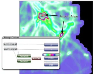
With the recording of one day’s flights over France, each datum represents the position of an aircraft at a certain time. Such a datum is called a “radar plot”. If many aircraft have a similar location (on the screen axes) during the day, shapes representing a plot accumulate. The KDE map (Figure 1) is the result of the accumulation of plots with a triangular kernel. Here, the Latitude and Longitude position of each plot is mapped on the X and Y dimensions of the KDE map and on the X and Y dimensions of the resulting image. KDE values are used as an index in a color map to yield pixel colors. As such, this visualization is a standard colorscale KDE visualization. The image produced shows very dense areas over the main airports in France (Roissy, Orly, Lyon...) which was expected. However, the dense areas exhibit few details.
When using accumulation value as “heights” maps and with illumination, circular shapes emerge (Figure 2) that were not noticeable in the first accumulation view (Figure 1): low accumulation values appear as valleys and high accumulation values appear as hills. It is well known that shading works as a gradient detector: it emphasises strong accumulation value variations between adjacent points. This is the reason why these circular hills pop out.
Figure 1: Design configuration and accumulation maps without shading
Figure 2: accumulation map with shading
To push forward the investigation in order to identify the source of these circular shapes, the user can take advantage of tools provided by FromDaDy [5].Thus the user brushes the circular patterns, isolates and edits them with “pick and drop”. Finally, the user finds out that these circles correspond to stationary trails which are emitted by the radar station which monitors them.
3.2 Data stream failure detection
In this example, we use the accumulation as a tool to highlight flaws in the one-day record of aircraft positions dataset. Our main concern is to check the validity of the radar recorded data: radars send data over networks with a constant stream rate (one radar position of each aircraft every 4 to 8 minutes in our dataset) and we want to check that the data stream is not interrupted.
Due to the large number of records, a lot of cluttering occurs (Figure 3) when displaying the time series of the aircraft’s identifier. The cluttering hides the areas where, during a small time period, no data are recorded. Hence the user is unable to discover this flaw in the database, unless he or she zooms over the specific areas to reduce the cluttering of points, which is unlikely.
Zoom
Data discontinuity
Figure 3: time series of the incremental number of aircraft (Y axis)
over time (X axis)
To notice this flaw without serendipity, the user can use the accumulation tool with the same design configuration (the visualization of the time series of aircraft identifiers). Continuous data stream over time produces flat accumulation (the same amount of data are accumulated over time), whereas discontinuous data stream produces ridges (increase of the data stream rate) or furrows (decrease of the data stream rate).
Here, because during a specific time-span, no data are recorded, the produced accumulation view displays many furrows (Figure 4). Each of these furrows indicates that during the time corresponding to the thickness of furrows no data where recorded. Thus, the accumulation unveils continuous and discontinuous data stream.
Data discontinuities
Figure 4: time series of the incremental number of aircraft (Y axis)
over time (X axis) with the accumulation tool
This design is very efficient: since the data stream rate remains roughly constant over time, flaws in the data rate will produce furrows that pop out from the design. Again, the shading magnifies valleys because it acts as an edge detector (like a Sobel or high pass filter).
This design helped to identify a flaw in the aggregation algorithm that produced our dataset from eight different sources.
3.3 Outlier detection with an animated histogram In image processing, histograms are a sequence of bars which corresponds to the count of pixels of the same color in the image. If we consider the histogram of the red color of a picture, it is ordered from the lower red intensity to the higher red intensity (Figure 5). Histograms can be considered as an accumulation tool which counts
accumulated values over one dimension (in this example, the red color dimension).
Figure 5: 1 Dimension histogram (Red color histogram)
A “2-dimensional histogram” represents the accumulation of pairs of values. For instance, a visualisation of semi-transparent aircraft trails (with the latitude and longitude respectively on the screen X and Y axis) is a 2D histogram since color blending creates a color accumulation when trails use the same screen pixel. In Figure 6, dark points represent an area of high accumulation, whereas white areas represent areas with very few trails. A 3-dimensional visualization shows the accumulation value for each latitude/longitude pair (Figure 6, right): instead of mapping the accumulation count on intensity, one can map the accumulation count on height in a 3D visualization of a histogram.
Figure 6: a 2 dimensional (latitude, longitude) histogram of aircraft
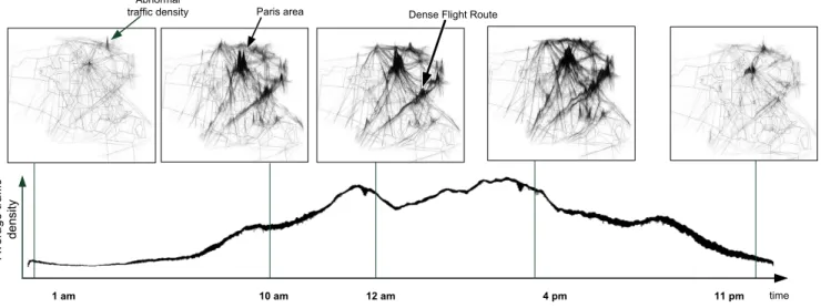
trails with a gray color scale (left) and its visualization in 3D (right). Until now, we only considered the geographical nature of the dataset. But one-day records of aircraft are geographical and temporal datasets. To explore a geographical and temporal dataset with the accumulation tool, users employed the 2-dimensional (latitude, longitude) accumulation tool with a dynamic filter on the time parameter. The visualization produced is a movie-like animation of traffic density over time.
The sequence of the evolution of the traffic remains roughly the same with records of different days (Figure 7):
from midnight to 5 AM, only a few areas show accumulation (few aircraft,)
from 5 AM to 8 AM only the Paris areas (the main French airport) show accumulation,
from 8AM to 12 noon, various Flight Routes are recurrently salient,
from 12 noon to 1 PM we observe a slowdown in the accumulation value,
from 1 PM to 10 PM, various Flight Routes are recurrently salient,
from 10PM to midnight, only a few trajectories are accumulated. The result of the animated histogram is not surprising, but it is nonetheless very efficient and “intuitive” to explain the traffic density evolution when shown to users. It gives a basis for further investigation and it is a very good overview of the traffic density and perfectly illustrates Shneiderman’s mantra “Overview first...” [6].
Nevertheless, when playing the traffic density animation in February 2008, the user noticed an abnormal accumulation. At 2 AM only few aircraft usually fly, but the animation shows that for 2 hours, a heap appears at the French and Belgium border, which is unusual. This heap indicated that many aircraft were flying at the same location for a long period. After a deeper investigation with the standard tools provided by FromDaDy [5], the user deduced that for 2 hours, 12 aircraft were unable to land due to very bad weather conditions in Belgium. Some of these aircraft waited by performing ellipsis cycle trails (called “stacking” in Air Traffic Controller vocabulary) at various altitudes for two hours until being able to land.
In this example, the animation helps practitioners to compare dynamically the evolution of the histogram, thus detecting unexpected information, and producing data analysis.
4 CO NC L US I ON AN D DI SC US SI ON
In this paper, we used accumulation as a new tool to enhance data analysis. The different applications illustrated are:
To detect patterns with the accumulation of stationary points, To detect flaws in the data base, with the detection of a break
in the data rate of aircraft positions,
To illustrate the traffic density evolution over time with a dynamic histogram and to detect outliers (i.e. stacking in Belgium at 2 AM).
We think that the visualizations produced with the accumulation tool are ecological. Ecological design was introduced by Gibson [3]. He based his work on human perception regarding the living environment. Gibson thinks that direct (or pre-attentive) perception concerns not only basic visual clues like color or luminosity. High level characteristics, such as invariants and affordances, can also be perceived. Invariants, like grass field texture or atmospheric light filters, help the user to evaluate his distance from perceived objects. Affordances [4] are the relations between a human and his environment and give clues to indicate how an action can be performed.
The accumulation tool and its associated lighting produce furrows and ridges. As a result, the design is ecological since heaps mean more accumulated data and a higher data stream rate, whereas furrows imply less accumulated data and a lower data stream rate. Hence the interpretation of accumulated data is facilitated because the user is used to managing them. The human perceptual system is attuned to these high-level features: it perceives them directly. We call this kind of representation that improves these features “ecological”, or “natural”.
Furthermore, the shading can be considered as a new visual variable with associative [1] properties since the bump mapping will not alter other visual variables. The color is still perceivable even if shading is applied. The shading also enhances the color length because it acts as an edge detector. The shading magnifies the color variation and helps to perceive greater detail.
The accumulation tool and its visualization take advantage of human vision. Therefore, this design is easy to understand and reduces the cognitive workload involved in the analysis and are assets for data exploration and validation.
RE FE RE NC ES
[1] J. Bertin, Graphics and Graphic Information Processing deGruyter Press, Berlin, 1977.
[2] Cleveland, W.S . The Elements of Graphing Data (revised ed.). Murray Hill, NJ, 1994.
[3] J.J. Gibson, The Ecological Approach to Visual Perception. Houghton Mifflin, Boston. 1979.
[4] J. J. Gibson. The theory of affordances. In R. Shaw and J. Bransford, editors, Perceiving, Acting, and Knowing: Toward an Ecological Psychology. Lawrence Erlbaum Associates, Hillsdale, NJ, 1977. [5] Hurter, C., Tissoires, B., and Conversy, S. 2009. FromDaDy: Spreading
Aircraft Trajectories Across Views to Support Iterative Queries. IEEE
Transactions on Visualization and Computer Graphics 15, 6 (Nov.
2009), 1017-1024.
[6] Shneiderman, B. 1996. The Eyes Have It: A Task by Data Type Taxonomy for Information Visualizations. In Proceedings of the 1996
IEEE Symposium on Visual Languages (September 03 - 06, 1996). VL.
IEEE Computer Society, Washington, DC, 336.
[7] Silverman B. W.: Density Estimation for Statistics and Data Analysis. No. 26 in Monographs on Statistics and Applied Probability. Chapman & Hall, 1992.
[8] Van Wijk, J. J. and van de Wetering, H. 1999. Cushion Treemaps: Visualization of Hierarchical Information. In Proceedings of the 1999 IEEE Symposium on information Visualization (October 24 - 29, 1999). INFOVIS. IEEE Computer Society, Washington, DC, 73.
[9] Van Wijk, J. J. and Telea, A. 2001. Enridged contour maps. In Proceedings of the Conference on Visualization '01 (San Diego, California, October 21 - 26, 2001). VISUALIZATION. IEEE Computer Society, Washington, DC, 69-74.
[10] Willems, N., H. van de Wetering, J.J. van Wijk. Visualization of Vessel Movements. Computer Graphics Forum, 28(3), p.959-966, 2009. Proceedings EuroVis 2009, Berlin, Germany.
Abnormal
traffic density Paris area Dense Flight Route
Ave ra g e t ra ff ic d e n si ty 1 am 10 am 12 am 4 pm 11 pm time