HAL Id: hal-00844878
https://hal.inria.fr/hal-00844878
Submitted on 26 Sep 2013
HAL is a multi-disciplinary open access
archive for the deposit and dissemination of
sci-entific research documents, whether they are
pub-lished or not. The documents may come from
teaching and research institutions in France or
abroad, or from public or private research centers.
L’archive ouverte pluridisciplinaire HAL, est
destinée au dépôt et à la diffusion de documents
scientifiques de niveau recherche, publiés ou non,
émanant des établissements d’enseignement et de
recherche français ou étrangers, des laboratoires
publics ou privés.
Hybrid-Image Visualization for Large Viewing
Environments
Petra Isenberg, Pierre Dragicevic, Wesley Willett, Anastasia Bezerianos,
Jean-Daniel Fekete
To cite this version:
Petra Isenberg, Pierre Dragicevic, Wesley Willett, Anastasia Bezerianos, Jean-Daniel Fekete.
Hybrid-Image Visualization for Large Viewing Environments.
IEEE Transactions on Visualization and
Computer Graphics, Institute of Electrical and Electronics Engineers, 2013, 19 (12), pp.2346–2355.
�10.1109/TVCG.2013.163�. �hal-00844878�
Hybrid-Image Visualization for Large Viewing Environments
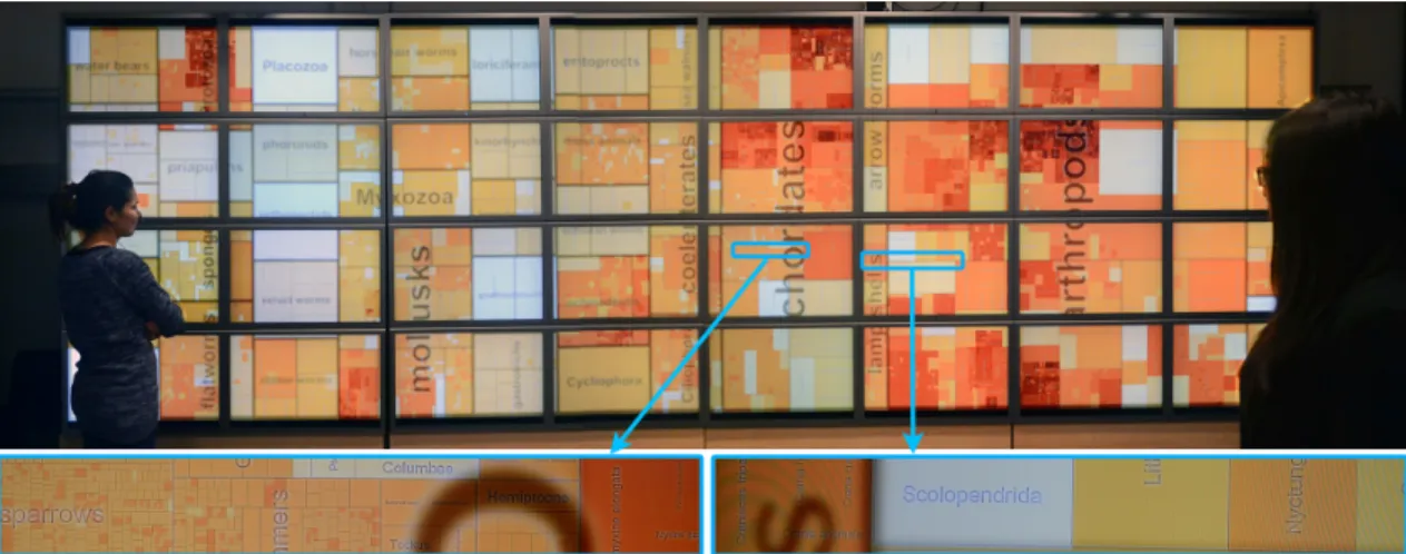
Petra Isenberg, Pierre Dragicevic, Wesley Willett, Anastasia Bezerianos, Jean-Daniel FeketeFig. 1. Two viewers looking at a hybrid-image treemap and two close-up views from the center of the display.
Abstract—We present a first investigation into hybrid-image visualization for data analysis in large-scale viewing environments.
Hybrid-image visualizations blend two different visual representations into a single static view, such that each representation can be perceived at a different viewing distance. Our work is motivated by data analysis scenarios that incorporate one or more displays with sufficiently large size and resolution to be comfortably viewed by different people from various distances. Hybrid-image visual-izations can be used, in particular, to enhance overview tasks from a distance and detail-in-context tasks when standing close to the display. By using a perception-based blending approach, hybrid-image visualizations make two full-screen visualizations accessible without tracking viewers in front of a display. We contribute a design space, discuss the perceptual rationale for our work, provide examples, and introduce a set of techniques and tools to aid the design of hybrid-image visualizations.
Index Terms—Multi-scale, large displays, hybrid images, collaboration, visualization
1 INTRODUCTION
We explore the use of hybrid-image visualization for data analysis in large-scale viewing environments. These environments incorporate a display of large size and resolution (wall display, billboard, or large poster) that can be comfortably viewed from different distances. In such an environment, a hybrid-image visualization can show two rep-resentations such that—in the same view and without tracking viewers in the space—viewers close to the display seen detailed information while viewers at a distance instead see a global overview. Hybrid-image visualizations are based on a technique called hybrid Hybrid-images [30] that blends two images after applying frequency filters to achieve distance-dependent perception.
Our work is primarily motivated by collaborative viewing situations with several viewers situated in front of high-resolution wall-sized dis-plays. Wall-sized displays (e. g. [8]) offer several benefits for data analysis: their large viewing space and high pixel count allow for the simultaneous view, comparison, and exploration of large amounts of data in one shared view, while being well suited to collaborative data analysis due to the large physical viewing space that can be
comfort-• Petra Isenberg, Pierre Dragicevic, Wesley Willett, and Jean-Daniel Fekete
are with INRIA, E-mail:(petra.isenberg| pierre.dragicevic | wesley.willett | jean-daniel.fekete)@inria.fr.
• Anastasia Bezerianos is with LRI (Univ. Paris-Sud & CNRS) & INRIA E-mail: [email protected].
Manuscript received 31 March 2013; accepted 1 August 2013; posted online 13 October 2013; mailed on 5 October 2013.
For information on obtaining reprints of this article, please send e-mail to: [email protected].
ably shared. In particular, our hybrid-image visualization techniques are motivated by findings on the importance of physical navigation in front of wall displays [2]. Physical navigation allows viewers to pan and zoom through locomotion. During a physical pan a viewer can inspect a new subset of the data by re-orienting his or her viewpoint. During physical zoom, a viewer steps closer to or farther away from a display while keeping the viewpoint steady. This zoom changes the perception of the visual variables encoding the data. Imagine a viewer stepping back from a close viewing distance to a far one while keep-ing his/her eyes fixed at the same position on the display. This physical zoom-out can have several effects on the perception of the data encod-ings: (a) some parts of the data will begin to form visible clusters and will be perceived as a unit ([19, Chapter 7]), (b) some parts of the data previously visible will be lost as they reach the limits of vi-sual acuity or contrast sensitivity [40], and (c) the perception of color [36] and quantitative estimation of magnitude of visual variables can change [10]. Given these changes in perception, it is clear that the effectiveness of visualizations viewed from afar hinges on the visual aggregation of particular data encodings and whether the data analysis task can benefit from visually aggregated data.
Several techniques are available for designing view-distance-dependent (henceforth: distant-view-distance-dependent) information visualizations. Our design space in Section 3 details different options. We focus on hy-brid images as a still underexplored technique for information visual-ization. We show how hybrid images can be used to overlay visualiza-tions designed for near and far viewing distances such that, from close to the display, the encodings for far viewing distances practically dis-appear. Meanwhile, the information meant for close inspection does not hinder the overview from afar. Hybrid images have the advantage that the whole display space can be used for drawing both local and
global information. They also do not require interactivity to work and thus are different from techniques that require the tracking of viewers in a space. Our paper makes four main contributions:
• A design space of view-distance dependent encodings,
• A detailed discussion of the perceptual background and rationale for using hybrid images for creating distance-dependent views, • Example visualizations and a summary of encoding techniques, • A set of tools to aid the design of hybrid-image visualizations.
2 RELATEDWORK
Hybrid-image visualizations, as a distance-dependent visual encoding, belong to a family of images that can be seen in more than one way. We review this family of images and its related work in Section 3. Here we focus on related research on distance-dependent viewing and interaction most closely related to our main motivation.
The idea to encode information differently based on a viewer’s phys-ical position has been used in recent work [21, 25] on color perception properties of LCD screens. Using specific renderings the authors cre-ated images such that multiple viewers sitting at different locations around the screen could see different information. Although relevant to our motivation, this work takes advantage of specific hardware char-acteristics and is thus difficult to generalize. Zoomable interfaces [9] or in general multi information resolution interfaces [26] are another approach related to distance-dependent viewing. While with zoom-ing a viewer’s virtual rather than the physical viewpoint changes, tech-niques such as semantic zooming still display different information or representations of the data depending on the virtual distance (zoom level). In contrast to our motivation, however, zoom-based techniques are not well suited for collaborative scenarios as they typically change the whole view. Nevertheless the idea to encode different informa-tion for different viewing distances and the idea to display different resolutions of data side-by-side [26] has inspired several of our ex-amples in Section 5.1. Similarly, recent work applying proxemics to the design of interfaces has been influenced by the idea of semantic zoom. Greenberg et al. [20] describe a set of five proxemic dimensions (distance, orientation, movement, identity, location) that help to mea-sure proxemics—ways in which people mediate their interactions with other people through interpersonal distance—when applied to ubiqui-tous computing environments. Distance is the dimension most related to our work. Distance between humans and devices can be measured continuously or discretely through zones. The idea of zoning has been previously used in HCI to render content on a display depending on viewers’ physical location. In Vogel and Balakrishnan’s [39] ambient display, content is rendered depending on which of a set of four zones a viewer is located in. In an application for a video player Ballendat et al. [3] combine both continuous and discrete distance measures to dis-play a different media dis-player interface to a viewer. This work adapts content interactively based on tracking viewers in contrast to ours that encodes information in one view for multiple viewing distances.
In information visualization, the role of distance of humans to a dis-play has been explored in relation to perception. Yost and North [45] found their visualizations to scale well for both detailed and overview finding tasks on wall displays, and noted that spatial encoding of in-formation was particularly important for performance. They hypoth-esized that the resulting visual aggregation led to reduced need for physical navigation, which improved performance. In a follow-up ex-periment Yost et al. [44] studied how scaling visualizations beyond vi-sual acuity affected user performance. For almost all tested tasks they found performance improvements and argue for design guidelines that take visual aggregation and physical navigation into account. More re-cently, Endert et al. [16] explored how a viewer’s distance from a large display influences the visual aggregation of displayed information, and found encodings based on a color ramp to visually aggregate particu-larly well across viewing distances for a visual search task. Finally, Bezerianos and Isenberg [10] examined how basic visual encodings are perceived under different viewing distances and angles and found large discrepancies in a simple comparison task when viewers were po-sitioned close to a large wall display. They observed that comparison errors tended to decrease if appropriate physical navigation was used.
images with multiple interpretations
global & global interpretation global & local
interpretation
global & local features separated global & local
features overlap
visual aggregation The
sine wave o r sinusoid is a m athematical cu thrve
at d es crib es a sm oo th re peti tive o sc illa tio n. example: ambiguous figures global example: radar view nesting blending example: hybrid images example: NodeTrix example: calligram mix juxtaposition example: maps
Fig. 2. Design space of images that can be seen in more than one way. The left branch includes viewing-distance dependent encodings. Bullet points refer to hierarchy levels in analogy to Section 3.
This body of work stresses the importance of physical movement in front of wall-sized displays and how different viewing distances are appropriate for different tasks. As this past work mainly studied the effect of viewing distance and visual aggregation, it is orthogonal to the work presented here that attempts to explicitly take advantage of different viewing distances to encode additional information.
3 IMAGES THAT CAN BE SEEN IN MORE THAN ONE WAY:
A DESIGN SPACE
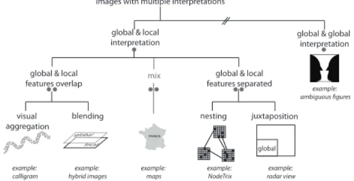
Hybrid-image visualizations are related to other images that can be seen in more than one way. There is a large body of work in this area, and many types of information visualizations and many art pieces are susceptible to different perceptual interpretation. Fig. 2 gives an overview of our design space. In the following subsections bullet points encode the hierarchy level as shown in the figure:
• Several global interpretations: On the highest-level we distinguish images based on the type of perceptual interpretation they support. A large set of optical illusions fall into the category of images that have several global interpretations. That is, the whole image can be viewed as showing one object or another. Ambiguous figures are a typical example. The Rubin’s reversible face-vase shown in Fig. 2 is one fa-mous example. These images have long been known in perceptual psychology and are used to study perceptual reversal (the alternation between two mutually exclusive perceptual states) [15]. Gestalt psy-chologists studied these images to understand how humans distinguish between figure and ground [19]. Reversible or ambiguous figures do not seem to favour interpretations based on viewing distance which distinguishes them from the remainder of images in our design space. • Local and a global interpretations: The group that includes hy-brid images offers both a local and a global interpretation. That is, in-formation at a fine spatial scale (local inin-formation) is available when viewing an image up-close and coarse-scale (global) information is available when viewing it from afar. Thus, images in this category of-fer the possibility to encode information for distance-dependent view-ing. We focus here on single-view techniques and specifically exclude several others that are related such as: (a) interactive techniques, e. g. (semantic) zoom, (b) multi-display environments with separate dis-plays for local and global information, and (c) techniques that have no information-carrying units on a fine spatial scale. For example, ASCII art, maze images [32], Artistic Screening [31], and other draw-ing techniques (e. g., hatchdraw-ing or half-tondraw-ing) make up larger images from many small visual components that are only visible up-close. Close-up inspection, however, does not reveal additional information and, thus we exclude these images and techniques in this design space. •• Global and local features overlap: How global and local features are mixed on the display is the distinguishing factor in the category of images with both a local and global interpretation.
The first group of techniques takes advantage of perceptual aggregation—local features forming global patterns when seen from afar. These global patterns appear naturally based on properties of vi-sual perception such as the laws of grouping from Gestalt theory [19], visual acuity, or contrast sensitivity. For example, in a scatterplot, indi-vidual dots—given a correctly chosen background contrast and size—
will begin to form clusters naturally at a distance. In information visu-alization several projects have made use of such natural aggregations. Wong et al. [42], for example, encode extra information on node-link diagrams by using specifically laid out text labels to represent both the links and the nodes of the graph. Afzal et al. [1] presented automatic typographic maps where typography forms certain map features. Na-centa et al.’s FatFonts [28] can be used to fill regions with numbers that represent the data while the typeface of the numbers is such that their area (amount of ’ink’) is proportional to the represented number. Natural groupings and aggregations have also been extensively used in art. Examples are the paintings “All is Vanity” by C. Allan Gilbert or the famous Arcimboldo paintings of heads made up of vegetables or fruits. Several of these artistic dual perception images “favour” one type of interpretation depending on viewing distance—for example in Gilbert’s work the woman is more prominent when viewed up close, while the scull appears more strongly when viewed from further away. Photomosaics [6] are another artistic example of images obtained by putting together small colored fragments that are themselves images (tiles). From afar the tiles blend visually to create a coherent image— when seen close together the images on each individual tile form the local information. Related to photomosaics are Word Pictures where the stylized text of tag clouds is arranged to form images, as well as tra-ditional Calligrams or Micrography—the use of stylized text arranged in a way that creates a visual image usually related to the text. One disadvantage of visual aggregation-based techniques is that the encod-ings are hard to control. For example, while points in a scatterplot may form large clusters, viewing outliers can become impossible from afar limiting the effectiveness of the encoding for this type of overview task. Furthermore, as several researchers have pointed out [16, 36], we need more research on how features visually aggregate.
The second group of techniques in this category overlap visual fea-tures by blending both global and local information. A simple ap-proach is alpha-blending. Maps sometimes use this technique to place large labels for distant viewing on top of the local topology layer. Ex-tensions of alpha-blending have been proposed to selectively blend color components and features from two images in order to improve legibility, although not for multiple viewing distances [7, 23, 27]. Hy-brid images—which we discuss in detail in Section 4—are an exam-ple where local and global information is frequency-filtered and then blended in order to ensure distance-dependent viewing.
•• Global and local features separated: Images in this category have specifically assigned regions for fine and coarse-scale informa-tion. One set of techniques nests local information inside features that form the global view. NodeTrix [22], for example, encodes small ma-trix visualizations inside the nodes of a large network graph. Given the right rendering size and color choices, the larger network graph forms the global view while the local connectivity encoded inside the nodes forms local information available for close inspection. A second group of techniques uses juxtaposition to place both local and global informa-tion. A large number of focus-(and/in)-context techniques fall into this category. Radar views, for example, provide small windows showing a global view next to a viewing area with local information. Other tech-niques interweave information even more strongly. Imagine a bulletin board or poster layout with large title and large slogans to draw atten-tion from afar and detailed informaatten-tion in the form of text boxes and smaller images for close inspection. The amount of interweaving may make a practical difference when it comes to the property of distance-dependence: when spaces for local and global information are clearly separated, one viewer could stand close to the detailed display and an-other could stand further to get a global view. When local and global spaces are interwoven across the display, navigating between pieces of local information may be practically much more difficult. A general disadvantage of all techniques in this category is that parts of the dis-play are reserved for either close or far viewing distances reducing the display space for either type of information.
•• Mixed: Several examples use more than one of the techniques de-scribed above. In maps, for example, countries are often color-coded and blended with local information while global and local labels are juxtaposed across the map. Pixel Bar Charts [24] are another mixed
encoding that can be made distance-dependent. It renders individual data items as pixels nested inside the bars and colors the pixels accord-ing to data properties. When pixels are sorted accordaccord-ing to color, they visually aggregate from afar into regions that give overview or global information. An example from HCI is the ambient display by Vogel and Balakrishnan [39]. Here data to be viewed from afar is alpha-blended with local information but local information is also restricted just to the lower portion of a display to afford easy interaction.
In summary, with this design space we have shown that there is a large number of techniques available for creating distance-dependent information visualizations. Many of these have already been explored, although not always under the umbrella of distance-dependent encod-ing. We chose to focus on hybrid images as one under-explored tech-nique for information visualization.
4 RATIONALEFORHYBRID-IMAGEVISUALIZATIONS
In this section, we present background information on hybrid images and motivate their use in the context of information visualization in large viewing environments.
4.1 Spatial Frequency Analysis
Key to the creation of hybrid images is the notion that any image can be represented as a 2D-array of color values (the spatial domain) and also as a weighted sum of sines and cosines of different frequencies (the frequency domain) [11]. With a Fourier transform, we can convert images from the spatial domain into a 2D frequency domain. Comput-ing the rotational average of the 2D frequency representation produces a 1D frequency series, which can be plotted as a power spectrum.
To express spatial frequencies we use two units: the unit pixels per cycle(ppc) is the spatial period expressed in pixels. For example, a series of gradually-varying black and white stripes (a sinusoidal grat-ing) where each stripe is 4 pixel wide corresponds to a period of 8 ppc. We also use the standard unit of cycles per degree (cpd) to capture what the observer sees. This corresponds to the number of periods per degree of visual angle. For a display of pixel size p and a viewer at distance d facing the image, ppc can be converted into cpd using the following formula: cpd = π/(360 · tan−1(2dp · ppc)).
Frequency-domain representations can be used to measure the fre-quencies present in an image and determine when they are likely to be visible. Moreover, certain image filters can be described as operations in the frequency domain. For example, blurring an image amounts to applying a low-pass filter, i.e., attenuating its high-frequency compo-nents while leaving its low-frequency compocompo-nents mostly intact. A high-pass filteris the opposite operation, while a band-pass filter at-tenuates frequencies both above and below a certain frequency range.
4.2 Origins of Hybrid Images
A body of literature in psychology suggests that the human perceptual system analyzes images at multiple scales through a collection of band-pass filters, each narrowly tuned to a specific frequency band [12, 29]. As part of this body of work, Oliva and Schyns introduced hybrid stimulias an experimental tool for studying multi-scale perception pro-cesses during scene recognition [34]. Hybrid stimuli were created by blending a low-pass filtered image with a high-pass filtered image. Us-ing recognition tasks on hybrid stimuli, they showed that visual in-formation is first extracted from large-scale features then refined with small-scale features, but that humans can also selectively attend to spe-cific frequency ranges depending on the task [29, 34, 35].
In these studies hybrid stimuli were only presented from a fixed dis-tance and for brief periods of time. Oliva and colleagues later coined the term hybrid image in a short computer graphics paper, where they discuss the use of hybrid stimuli as images that can be perceived differ-ently depending on viewing distance [30]. They provide basic psycho-logical grounding, briefly discuss how to design effective hybrid im-ages and mention a few applications. Since their introduction, hybrid images have been used in other contexts, showing differently morphed faces on ambient displays for the elderly [43] or to improve image morphing [17]. We know of no information visualization applications.
Campbell-Robson Diagram
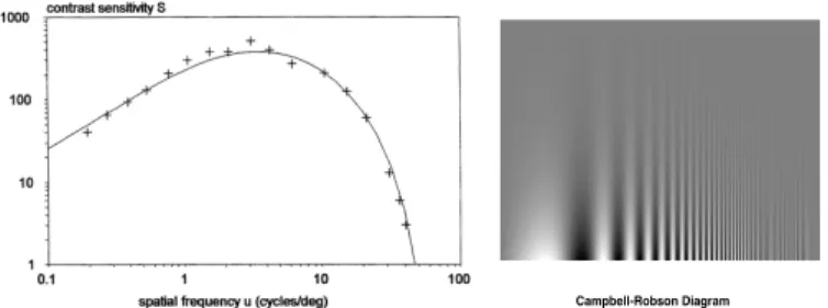
Fig. 3. Left: a typical contrast sensitivity function (CSF), after [4]. Right: Sinusoidal gratings varying in frequency and contrast.
Although Oliva et al.’s [30] article is our main source of inspira-tion, it hardly provides enough details to help designers create effec-tive hybrid-image visualizations. The article mostly focuses on the entertaining potential of hybrid images and of the possible use cases mentioned, only one (text obfuscation) captures an actual application. Design considerations are very general and mostly focus on how to have the two percepts entirely exclude each other.
4.3 Visual Perception in Large Viewing Environments
Next, we provide basic theoretical grounding for the use of hybrid-image visualizations. We explain how viewers perceive visual content in large viewing environments depending on their location. Since we are only interested in the effect of distance we assume viewers facing the display and we ignore issues related to perspective distortion [10]. 4.3.1 Feature Visibility
The visibility of a particular object depends on many factors; one among these is the observer’s visual acuity. Visual acuity can be as-sessed by vision tests like Snellen Charts, which measure the visual angle below which objects such as letters become invisible or illeg-ible [38]. These models do not capture essential features of human vision, such as the fact that low-contrast objects are harder to perceive than high-contrast objects, or that very large-scale features are per-ceived less strongly than medium-scale features (lateral inhibition [4]). A widely-accepted model of visual sensitivity is the contrast sen-sitivity function (CSF). It models the response of the human visual system with spatial frequency and the contrast of visual stimuli [4]. Fig. 3-left shows the shape of a typical CSF, where the x-axis is the frequency and the y-axis is the visual sensitivity for that frequency. The higher the sensitivity the higher the visual response generated by the stimulus, or equivalently, the less contrasted a stimulus needs to be to be seen. Although the exact shape of the CSF depends also on environmental factors, humans generally exhibit a peak of sensitivity at 3–4 cpd. Sensitivity rapidly decreases as spatial frequency increases, and stimuli become invisible at about 60 cpd due to limits in visual acu-ity. Below 3–4 cpd, sensitivity decreases due to lateral inhibition. The types of stimuli captured by the CSF are illustrated by the sinusoidal gratings in Fig. 3 right, also known as Campbell-Robson Diagram.
Fig. 4 puts CSFs in context by showing the visibility of small- and large-scale features as a function of viewer distance. We applied Barten’s [4] computational model of CSF for an average subject1 to the WILD display.2 [8]. The x-axis on Fig. 4 is the viewer’s distance to the display and the y-axis is the visibility of the feature (correspond-ing to the output of the CSF function shown on a linear scale). Features are high-contrast sinusoidal gratings whose size varies from 2 ppc (cor-responding to single-pixel black and white stripes) to 256 ppc. It can be seen that gratings of 2 ppc, i. e., the smallest displayable feature, are visible from close by but rapidly become hard to see and finally disap-pear around 1.5 m. Features of 4 ppc disapdisap-pear at about 3 m. In con-trast, large features of 128 or 256 ppc are more prominent from far and
1We used Barten’s default constants and p = 1.240 × 10⁶, X
0= 30 deg and
L= 100 cd/ m2.
2The WILD wall (Fig. 1) has 8 × 4 30" Apple Cinema displays of
2560 × 1600 px each (100ppi). It has a maximum viewing distance of 4 m.
8 pixels 4 pixels 2 pixels 16 pixels 32 pixels 64 pixels 128 pixels 256 pixels 100% 0% 75% 50% 25% 50 cm 1 m 1.5 m 2 m 2.5 m 3 m 3.5 m 4 m Visibility
Distance to the display
Fig. 4. Visibility of high-contrast gratings on the WILD display as a func-tion of grating size (2–256 ppc) and viewer distance (20cm–4m).
the closer the viewer gets, the fainter they become. Finally, medium-sized features of 8–64 ppc have individual “ideal” viewing distances. Fig. 4 clearly shows that different image features are salient at differ-ent distances, and that the pattern is more complex than the common notion that small details disappear from far. When moving away from the ideal viewing distance, feature visibility actually decreases more rapidly when moving towards the display than away from the display. 4.3.2 Feature Information Capacity
Fig. 4 suggests that large-scale features may need very large distances to be seen under ideal conditions (e. g., about 4 m for 128 ppc). These features can be easily displayed on a single computer screen and yet, users of desktop computers rarely feel compelled to step back 4 m to attend to large-scale features.3 Note however that within a given dis-play area, much less information can be shown with large-scale fea-tures than with small-scale feafea-tures. Consider a glyph-based visualiza-tion. If each glyph uses a frequency band of 2–32 ppc, doubling glyph size (yielding periods of 4–64 ppc) divides the number of displayable glyphs by 4. More generally, a feature of period p/k can convey visual content that is 2kdenser on the display than a feature of period p.
However, the area of a large display that can be effectively used to convey information also depends on viewing distance. Zooming on a regular display provides an analogy: when zooming in, more details can be seen but the same amount of visual information moves outside the viewport [18]. Although when moving in natural settings there is no clear viewport beyond which visual information gets abruptly “cropped”, a similar phenomenon occurs.
The human field of view spans a wide angle, but only a tiny fraction can be used for inspecting details. Visual inspection therefore requires eye movements, as well as head movements when the visual angle sub-tented by the object is large enough. Head movements are uncomfort-able and are usually avoided when reading text—visual angles of 20 to 40° are considered comfortable for reading text on paper [37], and also correspond to typical viewing distances on computer screens [14]. It is reasonable to assume that viewers of large display environments will also try to have their region of interest span a visual angle of no more than 40°, and when this region becomes too wide, they will likely move away from the display in order to avoid repetitive head move-ments and possible perspective distortion [10].
When a large display covers more than 40° of visual angle, the area of the display that can be used to show information is proportional to d2, d being the viewer’s distance. When the whole display area is visible, moving further does not add more display surface.
For a given feature seen from a given distance, we define informa-tion capacityas the product of the feature’s density on the display and the usable display area from this distance. Fig. 5 shows feature visibil-ities from Fig. 4 corrected for information capacity.4The dashed
enve-3The largest grating a single Apple Cinema Display can show is 2560 ppc,
for which the ideal viewing distance would be more than 100 meters!
4The CSF functions were multiplied by information capacity. We
8 pixels 4 pixels 2 pixels 16 pixels 32 pixels 64 pixels 128 pixels 100% 0% 75% 50% 25% 50 cm 1 m 1.5 m 2 m 2.5 m 3 m 3.5 m 4 m Information V isible
Distance to the display
256 pixels
Fig. 5. Visibility of high-contrast gratings on the WILD display corrected for information capacity as a function of grating size and viewer distance.
8 pixels 4 pixels 2 pixels 16 pixels 32 pixels 100% 0% 75% 50% 25% 50 cm 1 m 1.5 m 2 m 2.5 m 3 m 3.5 m 4 m Information V isible
Distance to the display
64 pixels 128 pixels 256 pixels
Fig. 6. Visibility of high-contrast gratings on a desktop display corrected for information capacity, as a function of grating size and distance.
lope gives the value of the feature yielding the best tradeoff between visibility and information capacity. The stable region between 60 cm and 2.2 m is due to the effects of feature density on the display and of usable display area cancelling out. Beyond 2.2 m, moving further re-duces the quantity of perceivable visual information due to the unused visual space above and below the display.5 Still, features larger than 32 ppc become easier to see. At 60 cm, getting closer does not provide clear benefits, since the viewable area keeps decreasing while the LCD display cannot show more details.
As a basis for comparison, Fig. 6 shows the same simulation on a 30” desktop display. Here, no stable region exists where different in-formation can be conveyed at different distances. Instead, it exhibits a single peak for 2-pixel features at about 60 cm (a typical viewing dis-tance in desktop settings [14]). For inspecting features of 8–16 pixels, standing at 80 cm seems preferrable since less head movements are re-quired while the features are still clearly visible. Larger features are in principle easier to see from large distances (see Fig. 4) but the amount of information they can convey on a single display is too negligible to provide clear benefits. When standing closer than 60 cm, features of 2–4 ppc may also be easier to see (see Fig. 4), but the display area that can be comfortably inspected also gets much smaller.
In summary, high-resolution large viewing environments lend them-selves well to information visualization because they can convey dif-ferent, complementary visual information at different distances. Not only can a large amount of visual information be displayed in terms of total amount of pixels, but viewers can also integrate and absorb this large quantity of information through locomotion. That being said, not all visualizations are equally effective at conveying information in these environments. Visualizations must be designed to convey legible, useful and possibly complementary information at different distances. 4.3.3 Two Suboptimal Visualizations
Visualization designers are used to setups involving fixed viewing distances and limited display resolution. Given the extremely large
5The curve decreases faster starting from 7 m (not shown in Fig. 5) due to
the fact that the display’s horizontal visual angle also falls below 40 deg.
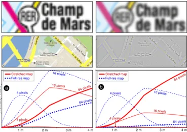
4 pixels 16 pixels 64 pixels 2 m 1 m 3 m 4 m Information Visible 16 pixels 64 pixels 4 pixels 16 pixels 64 pixels 2 m 1 m 3 m 4 m 16 pixels 64 pixels 4 pixels 4 pixels Full-res map Stretched map a b Full-res map Stretched map
Fig. 7. A stretched subway map and full-resolution city map before fil-tering (left) and after (right). Charts show the frequency content of the stretched map (red) and a full-resolution map (blue) as a function of viewing distance both before filtering (a) and after (b).
number of pixels available on high-resolution wall-sized displays (20,480×6,400 for WILD) and the possibility of viewer locomotion, it is not easy at first to know how to exploit these capabilities.
To illustrate this, suppose we need to show a map on a wall-sized display for demonstration purposes. A naive approach takes an exist-ing map and enlarges it to the entire wall. Although from far the map could appear more impressive than on a desktop screen (a “movie the-ater” effect), viewers have no incentive to come closer because no ad-ditional detail is shown. This is illustrated by the red curves on Fig. 7a. These curves reproduce three of the functions from Fig. 5 but correct them for the amount of features present in a stretched map image.6
We can see that no extra information can be gathered when getting closer than 2 m. An alternative approach is to stitch together multiple full-resolution map images to create a ultra-high-resolution map that occupies the entire wall. This approach may also produce impressive results, but it does not fully exploit the potential of the large display environment either. This is illustrated by the dashed blue curves in Fig. 7a7: Features of 16 ppc (rivers and parks) are clearly visible from far, but features of 4 ppc (street names) are illegible.
4.3.4 A Better Visualization
Re-designing maps from scratch for multiple viewing distances is hard. The same is true for other visualizations. Hybrid-image visualizations can be used as a generic solution to this problem, as they make it pos-sible to combine two visualizations designed for different viewing dis-tances into a single image. Hybrid-image visualizations employ the same basic technique as the original hybrid images [30, 34]:
1. An image we refer to as the near image is high-pass filtered. 2. A different image, the far image, is low-pass filtered. 3. After filtering, the two images are alpha-blended.
In contrast with Oliva et al. [30, 34] who use frequency-domain filters, we perform high-pass and low-pass filtering using Gaussian convolution. We define the radius r of the high-pass and low-pass filters as three times their standard deviation: r = 3σ .
Fig. 7b shows the spatial frequencies of the same map images be-fore alpha-blending: the red curve shows the subway map after apply-ing a 10-pixel high-pass filter while the dashed blue curve shows the full-resolution map after applying a 15-pixel low-pass filter. The key features of the subway map such as text (about 30 ppc) are visible from far, the details of the full-resolution map are visible from close, and the two images don’t overlap much in spatial frequencies. If alternatively the two images from Fig. 7a were blended, the large overlap would
6We performed a spatial frequency analysis of a 1024×855 subway map
stretched to a resolution of 7680×6400.
7We assembled detailed map views of the same city (1.6m / pixel) into a
make them mostly illegible from both near and far viewing distances. Note, that in hybrid images there is no single distance at which the two percepts suddenly switch. As shown in Fig. 4, visual features do not abruptly transition from being visible to being invisible. Rather, the transition is progressive and there are a range of distances at which both images are visible, although one image typically stands out while the other one appears faint or washed out.
In addition to the basic hybrid-image technique, our implementa-tion of hybrid-image visualizaimplementa-tions provides the opimplementa-tion to add an un-processed background image layer, and has a few additional settings: 1. Background image layer: (no settings)
2. Near image layer:
• Radius: the radius of the high-pass filter.
• Transparent: if activated, this option makes the near image trans-parent in the regions where most frequencies have been filtered out by the high-pass (i.e., 50% gray pixels).
• Contrast & brightness: since high-pass filtering often washes out images (see Fig. 7b), these parameters allow to enhance the im-age contrast after filtering.
• Opacity: opacity used to blend the near image with the back-ground image.
3. Far image layer:
• Radius: the radius of the low-pass filter.
• Opacity: opacity used to blend the near image with the back-ground image.
4. Global settings:
• Contrast & brightness: optional final contrast enhancement. Note that, in principle, hybrid images can combine more than two images using band-pass filters, but these may then require very large viewing distances and display sizes. For Fig. 7b, for example, the main features of the far image (about 30 ppc) only disappear at a viewing distance of 25–30 m, beyond which a third image could be displayed.
5 HYBRID-IMAGEVISUALIZATIONS
When creating visualizations for large viewing environments, design-ers can use hybrid-image techniques to produce a wide range of dif-ferent effects. Near and far images can show difdif-ferent versions of the same visualization, use different visual representations, or even en-tirely different datasets. Moreover, there are a multitude of different ways to generate and combine the near and far images depending on intended tasks. In this section we first describe four example hybrid-image visualizations that illustrate a range of different applications of the approach. All of these visualizations use hybrid images, but each employs a different combination of techniques to address a specific us-age scenario. In the second half of this section we give an overview of some of the distant-dependent data encoding techniques we found most useful in our designs and discuss general recommendations.
5.1 Example Designs
Next we demonstrate a range of possible applications of hybrid-image visualizations. Our examples have been tailored to the viewing dis-tances and display configuration of the WILD display, however, de-signers can use the tools we describe in Section 6 to extend and adapt them to other environments. Full-sized versions of all of the visualiza-tions can be viewed at http://aviz.fr/hybridvis/.
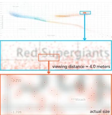
5.1.1 Dual-Scale Scatterplot
Large viewing environments can make it possible to display and ex-plore considerable amounts of quantitative data at once. In Fig. 8 we use a hybrid visualization to plot a Hertzsprung-Russell diagram com-paring the color index (x) and absolute magnitude (y) of the 30,000 stars closest to Earth. From close to the display, it is possible to exam-ine the dataset at the level of individual stars. However axes and point sizes that are appropriate for close viewing are difficult to see from further away and gaining an overview of the data becomes difficult.
We add a far view in which the properties of the scatterplot are changed to help viewers understand the global structure of the dataset.
actual size viewing distance = 4.0 meters
Fig. 8. A dual-scale scatterplot comparing the magnitude and color in-dex of 30,000 stars. Fine points, grids, and labels are visible from close to the display, while larger-scale points and grids support perceptual grouping from a distance.
In the far image, we render stars using larger points that can be visu-ally aggregated when viewed from several meters back (reinforcing perceptual grouping). Fig. 8-bottom shows the combined near and far images as seen from close to the display. The far image’s larger points and labels are clearly visible from a 4 m distance, but recede as the viewer approaches the wall and do not distract from reading the points, grid lines, and star labels in the near image.
When plotting this many data points on a large surface, important valueslike outliers can be easily missed. To address this, we also use the far image to highlight outliers by scaling the size of each point in the far image based on the distance to its nearest on-screen neighbor. The top image in Fig. 8 includes several such points towards the bot-tom right. This scaling makes it possible to search for and examine isolated stars that might have been difficult to discover otherwise.
To support viewing at both distances, we also add an aligned dual-scale grid, that allows both near and far viewers to read axis values and use a grid to compare points. In addition to finer, more closely-spaced gridlines, the near image contains axis labels at the edge of each screen in the display, allowing close viewers to read values without having to look all the way to the edge of the wall display.
5.1.2 Dual-Scale Network Diagram
The dual-scale network visualization in Fig. 9 shows the co-authorship network of our research center (INRIA Saclay). When close to the dis-play, the visualization shows the full network, including about 3,400 authors, 47 research groups, and 21,300 links. Each author in the net-work is connected to another if they co-authored at least one publica-tion together. Viewed from afar such a network graph becomes quickly unreadable as it consists mostly of small nodes that represent authors and thin links representing the connections between them.
We experimented with different approaches to enhance the visual-ization for far viewing. Initially, we drew larger versions of all nodes and edges to support visual aggregation (similar to our approach for the hybrid scatterplot). However, drawing thicker lines led to edge con-gestion and made it difficult to discriminate clusters. Instead, we opted to show only the meta-structure of the network in the far view, plotting only the names of research groups and the connections between them. This layer is optimized to be seen from afar and is designed so that it will not visually interfere with the dense graph. The far visualization
actual size viewing distance = 4.0 meters
Fig. 9. A dual-scale network diagram showing the co-authorship net-work within an organization. From a distance, viewers see the ships between groups, while from close by, they can see the relation-ships between individual authors.
is visually aligned with the complete co-authorship network, allowing viewers to transition smoothly between the two views.
5.1.3 Wall-Scale TreeMap
In theory, the layout of hierarchical structures in treemaps can automat-ically generate a representation that is amenable to distance-dependent viewing. Rendering appropriate frames around groups of nodes, can further enhance the reading of the structure [41]. Unfortunately, hi-erarchically nested visualizations like TreeMaps often suffer from oc-clusion problems, where the labels and borders of higher-level nodes can hide details deeper in the tree. One way to solve this problem is to add additional space around each node and render labels into the frame. While this would make the overall hierarchical structure more visible from afar, labels would be practically invisible. Our wall-scale TreeMap uses a hybrid-image rendering to address these labeling and grouping problems without the use of framing space. Our design sup-ports progressive reveal, where high-level labels and node borders are salient from a distance but become less visible close to the display.
The TreeMap in Fig. 10 shows scientific classifications of living organisms (classifA data from the infovis benchmark repository[13]). With 15 levels and 190,265 nodes the tree is very large. We rendered the borders for nodes in the first four levels and labels for the first two levels into the far image so they could be seen from a distance. Mean-while, the borders and labels (where possible) for all deeper nodes were rendered in the near image. Because color is used to communi-cate the depth of leaves at all levels, we rendered filled nodes into the separate background image layer to avoid distortion due to blending and frequency filtering. As Fig. 10-middle shows, the borders and la-bels of higher level nodes overlap deeper nodes but, due to the blur and blending, this overlay does not hinder the readability of the leaves. 5.1.4 Small-Multiple Bars with Time Series
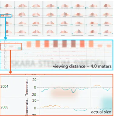
The near and far images can also contain very different representations of the data. In Fig. 11 we demonstrate mixing multiple visualizations by overlaying two different renderings of historical temperature data from 32 European cities. From a distance, viewers see small multi-ple bar charts showing the change in the average temperature between 1990 and 2012 for each month of the year. However, from closer to the display, the bar charts become less salient and are replaced by small
actual size viewing distance = 4.0 meters
Fig. 10. In a wall-scale treemap, high-level edges and labels are ren-dered so that they are visible from a distance but become less visible close to the display. These larger marks support navigation from afar, but do not occlude finer details.
time series showing the individual daily temperature readings in that city for every day and year. Viewers can examine the bar charts from a distance to identify larger temperature trends and identify cities which are outliers, then move closer to inspect and compare the raw data. Us-ing a representation with mostly low spatial frequencies (bar charts) for the far image and one with mostly high frequencies (small line charts) for the near image minimizes the interference between the two.
5.2 Techniques for Hybrid-Image Encoding
When generating hybrid-image visualizations, designers need to en-sure that the information carrying components in each image are not removed by frequency-based filtering or distorted by blending the two images. However, the quality of hybrid-image visualizations depends not only on the filtering parameters used to combine the two images, but also on the properties of the visual marks that make up each image and on the tasks they are designed to support. As a result, it is difficult to give universal recommendations on how to combine visual represen-tations. Nevertheless, from our examples, we have identified a number of techniques that employ hybrid images to support common tasks: Supporting Perceptual Grouping: One of the chief benefits of large displays is the ability to plot large numbers of data points at once. For viewers who are close to the display, small marks are often desirable because they increase the amount of information that can be explored. However, for viewers further from the display, larger marks are easier to see and may support perceptual aggregation. Rendering the same marks at different sizes for near and far viewing can support both tasks, and allows users to transition between them fluidly.
Highlighting Important Values: When rendering datasets using small marks on a large display, outliers may be difficult to notice. For tasks like visual search where locating outliers may be important, they can be accentuated in the far image.
Reference structures: Grids, axes, and labels are important for in-terpreting many standard visualizations such as scatterplots and bar charts. However, labels and grids that are readable far from the dis-play may be too large when viewed from close by. Overlaying aligned grids and axis labels at two scales provides both near and far viewers with reference marks at a scale appropriate to their viewing distance. In our experience, dual-scale grids can often be rendered such that both the near and far gridlines effectively disappear when viewed from the
actual size viewing distance = 4.0 meters
Fig. 11. A hybrid-image visualization containing different representa-tions at each scale. From a distance, viewers see bar charts showing the average temperature shift by month between 1990 and 2012 for 32 major cities in Europe. From close by, they can inspect and compare the individual temperature measurements by day for each of the 22 years.
other distance. The technique of dual-scale grids corresponds to Oliva et al.’s recommendation of aligning edges (see also Fig. 8).
Navigation aids and summaries: The representation for the far view-ing distance can be chosen such that it provides entry points to the data, such as regional summaries, data aggregations, or highlights. Adding overlays with summary information on top of existing visualizations can also provide information that would be difficult to mentally inte-grate (e.g. accurate mean values).
Unobtrusive Labeling Sometimes labels and other textual annota-tions can interfere with important visual variables. For example, la-bels on a scatterplot can give a misleading impression of high data density, since they may be much bigger than the points they annotate. In a hybrid-image visualization, details like labels can be effectively hidden by placing them in the near image. This prevents them from interfering with other visual variables when viewed from afar, but still permits them to be easily accessed by approaching the display. Progressive Reveal: Visualizations such as TreeMaps that are already multi-scale lend themselves well to large-viewing environments. How-ever, features like the labels and boundaries of high-level nodes, which are necessary for navigation from a distance, may actually occlude smaller features that are relevant when close to the display. Splitting the data to show low-resolution data [26] in the far image and high-resolution in the near image can mitigate occlusion problems. Mixing Multiple Visualizations: In some cases, overview and detail views of a dataset may call for different representations to be blended. Frequencies and colors present in both representations need to have minimal overlap so that both can be perceived effectively. Visual map-pings that contain mostly fine-grained details (thin lines, small points, and glyphs) and use less color are typically more appropriate for the near image, while those with large features make for better far images.
6 TOOLS FORAUTHORINGHYBRID-IMAGEVISUALIZATIONS
As illustrated by the examples above, designing visualizations that work well at multiple scales requires considerable care. In addition to controlling the frequency content of the near and far images, design-ers must also tailor the color, type, size, marks, and other aspects of the visualization to ensure that it serves the intended task. This work requires strong intuition about what information will and will not be visible at various distances. However, building that intuition can be
a
b
c
Fig. 12. Interactive preview tools for reviewing and refining hybrid-image visualizations. Designers can preview the image as seen from different distances (a) and can use the control panel (b) and power spectrum visualizer (c) to refine their visualizations and tune how images are pro-cessed and blended composited.
difficult, especially because design and development often take place on small displays rather than in large viewing environments.
As a result, visualization designers must carefully balance the trade-offs between different representations and may need to iteratively tune the parameters of the visualizations and the compositing process. To address this need, we have built a set of tools to support the construc-tion of hybrid-image visualizaconstruc-tions. These include (1) a hybrid-image visualization rendering framework, (2) a set of interactive profiling tools for tuning visualizations, and (3) libraries for dynamically sizing common visualization elements like labels text and gridlines.
6.1 Hybrid-Image Rendering Framework
We provide a Java-based framework that handles the bulk of the work required to create hybrid visualizations and that we plan to release as an open-source package. It is compatible with a range of existing Java-based visualization toolkits. To generate a visualization, designers ex-tend the base HybridImageRenderer class and implement two draw-ing methods—one to render the near visualization (seen from close to the display) and one to render the far visualization (seen from further away). When rendering the visualization, the framework performs a low-pass filter on the far image to remove high-frequency information and a high-pass filter on the near image to remove low-frequency infor-mation. The framework then composites the two layers together and adjusts their contrast to produce a final visualization.
The tool provides an interactive preview of the final image (Fig. 12a), along with a slider for simulating a range of viewing dis-tances. Designers working on smaller displays can dynamically adjust the simulated viewing distance to understand how the visualization will appear on a large-scale display. Designers can also use an interac-tive control panel (Fig. 12b) to dynamically tune the parameters of the high- and low-pass filters and adjust the contrast of the composited im-age. Once the final parameters have been chosen, designers can export the visualization for viewing on a large-scale display.
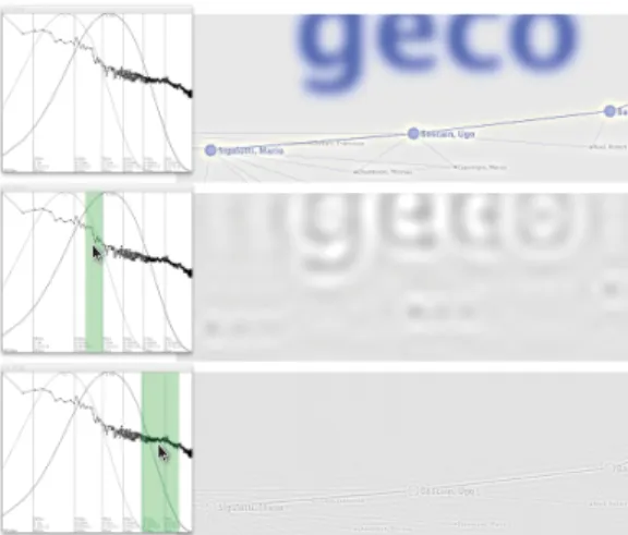
6.2 Interactive Profiling
To help designers tune hybrid-image parameters and make adjustments to their visualizations, we also provide interactive profiling tools. A power spectrum visualizer (Fig. 12c) shows the range of frequencies present in the near and far images, as well as in the final image.
To generate this view, we examine the frequency content of the near and far images both before and after they are filtered. In each case, we perform a Fast-Fourier Transform to convert the image from the spatial domain into the frequency domain. We then radially bin the frequencies to produce a 1-D distribution of the frequencies present in the image, regardless of orientation. The power spectrum visualizer displays the log-scaled distribution of frequencies in each image, with low frequencies at the left of the chart and high frequencies at the right.
Fig. 13. Clicking on the power spectrum visualizer highlights correspond-ing frequencies in the visualization preview. Designers can use this to inspect a hybrid-image visualization (top) and identify components that contribute high-frequency (middle) or low-frequency detail (bottom).
The power spectrum of the far image is shown in light blue (before low-pass filtering) and dark blue (after), while the near image is shown in light red (before high-pass filtering) and dark red (after). The power spectrum of the final, composited image is shown in black. These allow designers to better understand the impact of high and low-pass filtering on the frequency content of the image.
Power spectra are also overlaid with plots showing the theoretical contrast-sensitivity response of the human eye at various viewing dis-tances (as described in Section 4.3.1). Using these curves as a refer-ence, designers can interactively refine the high- and low-pass filters, as well as the parameters of their visualizations, in order to make them more or less visible from a given distance.
Often, designers need to adjust aspects of the visualizations themselves—changing the weights of lines and glyphs or altering pat-terns in order to tailor them to a particular viewing distance. However, determining which components of a visualization contain high- and low-frequency detail is often unintuitive. For example, blocks of text may contain many different frequencies, corresponding to the sizes of individual strokes, words, and even paragraphs rather than just the size of individual letters. This can make it difficult for a designer to deter-mine which aspects of a visualization should be changed in order to alter its frequency distribution. To help designers identify the parts of the image that contain a particular frequency, we also provide a frequency-highlight mode (Fig. 13). In this mode, designers can inter-actively click on the power spectrum visualizer to highlight a range of frequencies. The system then applies a band-pass filter to the image, re-moving information from all frequencies outside of the selected range. A designer can use the resulting image to quickly identify which pieces of the visualization might need to be adjusted.
6.3 Libraries for Common Visualization Components
A fully automated hybrid-image visualization method is impossible be-cause CSFs and other perceptual models only capture the visibility of spatial frequencies, not the legibility of the features that are important for a given task. We can, however provide tools that predict the legi-bility of well-known and stable features like text and grids and adjust them with minimal designer input.
6.3.1 Text Legibility
Through informal experimentation while building hybrid-image visu-alizations, we discovered that the ratio between the blur radius and letter width (more specifically the average advance of all lower-case letters of the font) was an excellent predictor of text legibility. Al-though lower-case letter height is occasionally used as a measure of font legibility [33], we found letter width to be a much better predictor across different typefaces.
More specifically, a ratio between blur radius and letter width above 0.25 produces illegible text. A ratio between 0.10 to 0.15 produces text
that can be comfortably read. A ratio below 0.10 increases sharpness but does not yield much difference. Based on this, we implemented a library that allows designers to compute the optimum font size for a given font, blur radius and target legibility (typically between 0.10 or 0.15). It also allows designers to compute the optimum blur radius for a given font, font size and target legibility, and can dynamically derive hybrid-image settings for visualizations like word clouds where the minimum font size is not known in advance.
6.3.2 Dual-Scale Grids
Even more so than text, reference structures like grids contain pre-dictable ranges of frequencies and tend to support the same basic tasks. Good settings for the grid alpha and contrast to produce usable and un-obtrusive grids are also well-established [5]. Thus, when viewing dis-tances and the parameters of the high- and low-pass filters are known, we can use a CSF to dynamically adjust the size and weight of the grid and ensure that appropriate grids will be visible from each distance. Based on this observation, we provide a library for generating aligned dual-scale grids and labels. Designers specify grid boundaries, the de-sired density of gridlines, and formatting of the axes. The library then handles grid rendering for both the near and far images.
7 CONCLUSION
While the phenomenon of hybrid images has been known for quite some time, this work presents new practical applications of the technique for information visualization. In large-viewing environ-ments where physical locomotion is common, hybrid-image visualiza-tions represent a solution for providing viewing distance dependent overview+detail views in a single image. As such, they support collab-oration on a single visualization and leverage implicit, physical interac-tion through locomointerac-tion to change views, without requiring technical equipment such as motion capturing systems.
That said, there are also some limitations to the technique. Depend-ing on the chosen image size as well as filter implementation and filter settings, one view can take considerable time to compute. For our 131 million pixel display, each visualization can take up to 10 min-utes to compute using a current desktop or laptop computer. To sup-port more rapid design cycles, we provide tools that simulate viewing distances and let designers tune parameters quickly. Employing hard-ware acceleration should make it easier to render such images in real-time, but for now slow render times make these images best-suited for static viewing scenarios. In addition, as with many other visual-ization techniques, there is no one-size-fits all solution for creating effective hybrid-image visualizations. That means, in domains where data representations need to change quickly based on incoming data or due to changing data characteristics, the use of hybrid-image visual-izations would likely be less appropriate and other detail-and-context techniques should be examined.
Our work provides a perceptual background for using hybrid-images to visualize data and provides a detailed rationale to aid others in designing them. Our set of example visualizations also highlights the technique’s wide range of applications. Many of the techniques we describe can be used to enhance existing wall-size display visualiza-tion without interfering with existing context, for example by adding reference structures for far viewing. More generally, the techniques are also applicable to non-digital, non-collaborative, and non-work en-vironments. For example, hybrid-image visualizations can be used on posters or billboards in public places where the progressive reveal of content could entice passers-by to examine the display more closely and spend more time with it than they would have otherwise. We hope our work has laid the foundation for a range of future applications.
ACKNOWLEDGMENTS
This work is sponsored by the French Research Organization, project grant ANR-11-JS02-003.
REFERENCES
[1] S. Afzal, R. Maciejewski, Y. Jang, N. Elmqvist, and D. Ebert. Spatial Text Visualization Using Automatic Typographic Maps. Transactions on
Visualization and Computer Graphics, 18(12):2556–2564, 2012. doi> 10. 1109/TVCG.2012.264
[2] C. Andrews, A. Endert, B. Yost, and C. North. Information Visualiza-tion on Large, High-resoluVisualiza-tion Displays: Issues, Challenges, and Oppor-tunities. Information Visualization, 10(4):341–355, 2011. doi> 10.1177/ 1473871611415997
[3] T. Ballendat, N. Marquardt, and S. Greenberg. Proxemic Interaction: De-signing for a Proximity and Orientation-Aware Environment. In Proc. Interactive Tabletops and Surfaces (ITS), pp. 121–130. ACM, 2010. doi> 10.1145/1936652.1936676
[4] P. Barten. Contrast Sensitivity of the Human Eye and its Effects on Image Quality. SPIE Press Series. SPIE Optical Engineering Press, 1999. [5] L. Bartram and M. Stone. Whisper, Don’t Scream: Grids and
Trans-parency. IEEE Transactions on Visualization and Computer Graphics, 17(10):1444–1458, 2011. doi> 10.1109/TVCG.2010.237
[6] S. Battiato, G. Di Blasi, G. M. Farinella, and G. Gallo. Digital Mosaic Frameworks – An Overview. Computer Graphics Forum, 26(4):794–812, 2007. doi> 10.1111/j.1467-8659.2007.01021.x
[7] P. Baudisch and C. Gutwin. Multiblending: Displaying Overlapping Win-dows Simultaneously without the Drawbacks of Alpha Blending. In Proc. Human Factors in Computing Systems (CHI), pp. 367–374. ACM, 2004. doi> 10.1145/985692.985739
[8] M. Beaudouin-Lafon, O. Chapuis, J. Eagan, T. Gjerlufsen, S. Huot, C. Klokmose, W. Mackay, M. Nancel, E. Pietriga, C. Pillias, R. Primet, and J. Wagner. Multi-surface Interaction in the WILD Room. Computer, 45(4):48–56, 2012. doi> 10.1109/MC.2012.110
[9] B. B. Bederson and J. D. Hollan. Pad++: A Zooming Graphical Inter-face for Exploring Alternate InterInter-face Physics. In Proc. User InterInter-face Software and Technology (UIST), pp. 17–26. ACM, 1994. doi> 10.1145/ 192426.192435
[10] A. Bezerianos and P. Isenberg. Perception of Visual Variables on Tiled Wall-Sized Displays for Information Visualization Applications. IEEE Transactions on Visualization and Computer Graphics, 18(12):2516– 2525, 2012. doi> 10.1109/TVCG.2012.251
[11] R. N. Bracewell. Fourier Analysis and Imaging. Springer, 2003. [12] F. W. Campbell and J. G. Robson. Application of Fourier Analysis to the
Visibility of Gratings. The Journal of Physiology, 197(3):551–566, 1968.
[13] Catherine Plaisant and Jean-Daniel Fekete. Information
Visualiza-tion Repository. Online article, http://www.cs.umd.edu/hcil/
InfovisRepository/, visited: 2013.
[14] A. Dillon. Reading from Paper versus Screens: A Critical Review of the Empirical Literature. Ergonomics, 35(10):1297–1326, 1992. doi> 10. 1080/00140139208967394
[15] D. M. Eagleman. Visual Illusions and Neurobiology. Nature Reviews Neuroscience, 2(12):920–926, 2001. doi> 10.1038/35104092
[16] A. Endert, C. Andrews, Y. H. Lee, and C. North. Visual Encodings that Support Physical Navigation on Large Displays. In Proc. Graphics Inter-face (GI), pp. 103–110. CHCCS, 2011.
[17] M. S. Farid and A. Mahmood. Image Morphing in Frequency Domain. Journal of Mathematical Imaging and Vision, 42(1):50–63, 2012. doi> 10.1007/s10851-011-0273-3
[18] G. W. Furnas. A Fisheye Follow-up: Further Reflections on Focus + Context. In Proc. Human Factors in Computing Systems (CHI), pp. 999– 1008. ACM, 2006. doi> 10.1145/1124772.1124921
[19] E. B. Goldstein. Sensation and Perception. Brooks/Cole Publishing, Pa-cific Grove, USA, 5thedition, 1999.
[20] S. Greenberg, N. Marquardt, T. Ballendat, R. Diaz-Marino, and M. Wang.
Proxemic Interactions: The new Ubicomp? Interactions, 18(1):42–50,
2011. doi> 10.1145/1897239.1897250
[21] C. Harrison and S. E. Hudson. A New Angle on Cheap LCDs: Making Positive Use of Optical Distortion. In Proc. User Interface Software and Technology (UIST), pp. 537–540. ACM, 2011. doi> 10.1145/2047196. 2047266
[22] N. Henry, J.-D. Fekete, and M. J. McGuffin. NodeTrix: A Hybrid Visual-ization of Social Networks. Transactions on VisualVisual-ization and Computer Graphics, 13(6):1302–1309, 2007. doi> 10.1109/TVCG.2007.70582 [23] E. W. Ishak and S. K. Feiner. Interacting with Hidden Content using
Content-aware Free-space Transparency. In Proc. User Interface Soft-ware and Technology (UIST), pp. 189–192. ACM, 2004. doi> 10.1145/ 1029632.1029666
[24] D. Keim, M. Hao, U. Dayal, M. Hsu, and J. Ladisch. Pixel Bar Charts: A New Technique for Visualizing Large Multi-Attribute Data Sets without Aggregation. In Proc. Symposium on Information Visualization (InfoVis),
volume 0, pp. 113–120. IEEE, 2001. doi> 10.1109/INFVIS.2001.963288
[25] S. Kim, X. Cao, H. Zhang, and D. Tan. Enabling Concurrent Dual
Views on Common LCD Screens. In Proc. Human Factors in Comput-ing Systems (CHI), pp. 2175–2184. ACM, 2012. doi> 10.1145/2207676. 2208369
[26] H. Lam, T. Munzner, and R. Kincaid. Overview Use in Multiple Visual Information Resolution Interfaces. IEEE Transactions on Visualization and Computer Graphics, 13(6):1278–1285, 2007. doi> 10.1109/TVCG. 2007.70583
[27] H. Lieberman. Powers of Ten Thousand: Navigating in Large Informa-tion Spaces. In Proceedings of the Symposium on User Interface Software and Technology (UIST), pp. 15–16. ACM, New York, NY, USA, 1994. doi> 10.1145/192426.192434
[28] M. Nacenta, U. Hinrichs, and S. Carpendale. FatFonts: Combining
the Symbolic and Visual Aspects of Numbers. In Proc. Advanced Vi-sual Interfaces (AVI), pp. 407–414. ACM, 2012. doi> 10.1145/2254556. 2254636
[29] A. Oliva and P. G. Schyns. Coarse Blobs or Fine Edges? Evidence that In-formation Diagnosticity Changes the Perception of Complex Visual Stim-uli. Cognitive Psychology, 34(1):72–107, 1997. doi> 10.1006/cogp.1997. 0667
[30] A. Oliva, A. Torralba, and P. G. Schyns. Hybrid Images. ACM
Transactions on Graphics, 25(3):527–532, 2006. doi> 10.1145/1141911. 1141919
[31] V. Ostromoukhov and R. D. Hersch. Artistic Screening. In Proc. Com-puter Graphics and Interactive Techniques (SIGGRAPH), pp. 219–228. ACM, 1995. doi> 10.1145/218380.218445
[32] H. Pedersen and K. Singh. Organic Labyrinths and Mazes. In Proc. Non-Photorealistic Animation and Rendering (NPAR), pp. 79–86. ACM, 2006. doi> 10.1145/1124728.1124742
[33] V. Rossum. Measuring Font Legibility. Unpublished manuscript,
http://homepages.inf.ed.ac.uk/mvanross/reprints/ legibility.pdf, 1998. visited: 2012.
[34] P. G. Schyns and A. Oliva. From Blobs to Boundary Edges: Evidence for Time and Spatial Scale Dependent Scene Recognition. Psychological Science, 5:195–200, 1994. doi> j.1467-9280.1994.tb00500.x
[35] P. G. Schyns and A. Oliva. Dr. Angry and Mr. Smile: When Categoriza-tion Flexibly Modifies the PercepCategoriza-tion of Faces in Rapid Visual Presen-tations. Cognition, 69(3):243–265, 1999. doi> 10.1016/S0010-0277(98) 00069-9
[36] M. Stone. In Color Perception, Size Matters. IEEE Computer Graphics and Applications, 32(2):8–13, 2012. doi> 10.1109/MCG.2012.37 [37] K. Swaminathan and S. Sato. Interaction Design for Large Displays.
in-teractions, 4(1):15–24, 1997. doi> 10.1145/242388.242395
[38] USD Internet Psychology Laboratory. The Contrast Sensitivity
Func-tion (CSF). Online article,http://sunburst.usd.edu/~schieber/
coglab/CSFIntro.html, visited: 2013.
[39] D. Vogel and R. Balakrishnan. Interactive Public Ambient Displays: Tran-sitioning from Implicit to Explicit, Public to Personal, Interaction with Multiple Users. In Proc. User Interface Software and Technology (UIST), pp. 137–146. ACM, 2004. doi> 10.1145/1029632.1029656
[40] C. Ware. Information Visualization – Perception for Design. Morgan
Kaufmann Publishers, Amsterdam, 2ndedition, 2004.
[41] M. Wattenberg and D. Fisher. Analyzing Perceptual Organization in In-formation Graphics. InIn-formation Visualization, 3(2):123–133, 2004. doi> 10.1057/palgrave.ivs.9500070
[42] P. C. Wong, P. Mackey, K. Perrine, J. Eagan, H. Foote, and J. Thomas. Dynamic Visualization of Graphs with Extended Labels. In Proc. Sympo-sium on Information Visualization (InfoVis), pp. 73–80. IEEE, 2005. doi> 10.1109/INFOVIS.2005.11
[43] Y.-J. Yoon, H.-S. Ryu, J.-M. Lee, S.-J. Park, S.-J. Yoo, and S.-M. Choi. An Ambient Display for the Elderly. In Proc. Universal Access in Human-Computer Interaction (UAHCI), pp. 1045–1051. Springer-Verlag, 2007. doi> 10.1007/978-3-540-73281-5_114
[44] B. Yost, Y. Haciahmetoglu, and C. North. Beyond Visual Acuity: The Per-ceptual Scalability of Information Visualizations for Large Displays. In Proc. Human Factors in Computing Systems (CHI), pp. 101–110. ACM, 2007. doi> 10.1145/1240624.1240639
[45] B. Yost and C. North. The Perceptual Scalability of Visualization. IEEE Transactions on Visualization and Computer Graphics, 12(5):837–844, 2006. doi> 10.1109/TVCG.2006.184