HAL Id: hal-01144163
https://hal.inria.fr/hal-01144163
Submitted on 21 Apr 2015
HAL is a multi-disciplinary open access
archive for the deposit and dissemination of
sci-entific research documents, whether they are
pub-lished or not. The documents may come from
teaching and research institutions in France or
abroad, or from public or private research centers.
L’archive ouverte pluridisciplinaire HAL, est
destinée au dépôt et à la diffusion de documents
scientifiques de niveau recherche, publiés ou non,
émanant des établissements d’enseignement et de
recherche français ou étrangers, des laboratoires
publics ou privés.
An Evaluation of Interactive Map Comparison
Techniques
María-Jesús Lobo, Emmanuel Pietriga, Caroline Appert
To cite this version:
María-Jesús Lobo, Emmanuel Pietriga, Caroline Appert. An Evaluation of Interactive Map
Compar-ison Techniques. CHI 2015 - Proceedings of the 33rd Annual ACM Conference on Human Factors in
Computing Systems, ACM, Apr 2015, Seoul, South Korea. pp.3573-3582, �10.1145/2702123.2702130�.
�hal-01144163�
An Evaluation of Interactive Map Comparison Techniques
Mar´ıa-Jes ´us Lobo
INRIA ; INRIA Chile
(CIRIC)[email protected]
Emmanuel Pietriga
INRIA ; INRIA Chile
(CIRIC)[email protected]
Caroline Appert
Univ Paris-Sud ; CNRS ; INRIA
[email protected]
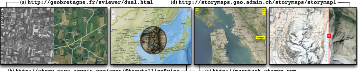
(a) http://geobretagne.fr/sviewer/dual.html
(b) http://story.maps.arcgis.com/apps/StorytellingSwipe (c) http://mapstack.stamen.com
(d) http://storymaps.geo.admin.ch/storymaps/storymap1
Figure 1. The four main composition strategies: (a) synchronized juxtaposed views, (b) magic lens, (c) translucent overlay, (d) swipe. ABSTRACT
Geovisualization applications typically organize data into layers. These layers hold different types of geographical fea-tures, describe different characteristics of the same feafea-tures, or represent those features at different points in time. Lay-ers can be composited in various ways, most often employing a juxtaposition or superimposition strategy, to produce maps that users can explore interactively. From an HCI perspective, one of the main challenges is to design interactive composi-tions that optimize the legibility of the resulting map and that ease layer comparison. We characterize five representative techniques, and empirically evaluate them using a set of real-world maps in which we purposefully introduce six types of differences amenable to inter-layer visual comparison. We discuss the merits of these techniques in terms of visual in-terference, user attention and scanning strategy. Our results can help inform the design of map-based visualizations for supporting geo-analysis tasks in many application areas.
Author Keywords
Geovisualization, Composite Visualization, Interference
ACM Classification Keywords
H.5.2 : User Interfaces - Graphical user interfaces.
General Terms
Human Factors; Design
INTRODUCTION
Geographic Information Systems (GIS) have applications in numerous domains, including: emergency response & man-agement, transportation, environmental studies, weather fore-cast and climatology, urban planning, real-estate, hiking and
Mar´ıa-Jes´us Lobo, Emmanuel Pietriga & Caroline Appert. An Evaluation of Interactive Map Comparison Techniques. In CHI ’15: Proceedings of the 33rd Annual ACM Conference on Human Factors in Computing Systems, 3573–3582, ACM, April 2015.
c
ACM, 2015. This is the author’s version of the work. It is posted here by
permission of ACM for your personal use. Not for redistribution. The definitive version will be published in CHI ’15, April 18–23 2015, Seoul, South Korea.
http://dx.doi.org/10.1145/2702123.2702130
traveling. Maps play a central role in these systems, as the primary means to display data to users. Maps are used as visual thinking and analysis tools, as well as visual commu-nication tools. They take advantage of people’s spatial rea-soning abilities [35], serving four primary goals: exploration, confirmation, synthesis, and presentation to an audience [20]. GIS organize data into thematic layers that offer different per-spectives on the real-world. Base maps can be schematic, showing only essential data that provide strong orientation cues such as administrative boundaries, relief and water bod-ies. Or they can use orthoimages, providing a more realistic – but possibly less useful [35] – background. Additional lay-ers complement the base map. They can hold any type of geo-located data, ranging from cloud cover to road networks and live traffic conditions. Distinct layers may hold differ-ent types of features (e.g., roads, topographic contour lines), but may also show the same features, emphasizing different characteristics thereof (e.g., road type vs. traffic conditions). GIS users often have to correlate data from several layers. Geovisualization tools must thus offer means to composite layers. Considering the simple case of one additional layer that features sparse content, as in many Web-based mashups, compositing can be as straightforward as placing the corre-sponding symbols on the base map. But when combining denser layers or comparing featurich maps of the same re-gion, this simple method no longer works. More elaborate visual composition strategies [14, 9] are called for.
We identify and characterize techniques for the interactive composition of image layers in geovisualization applications (Figure 1). We empirically evaluate representative techniques on map comparison tasks using a set of 20 orthoimages and corresponding topographic maps, in which we purposefully introduced six types of differences with respect to the refer-ence orthoimage. We present our operationalization strategy, and discuss the relative merits of these techniques in terms of visual interference, user attention and scanning strategy.
BACKGROUND AND MOTIVATION
Interface design for GIS is studied in two communities that approach the problem from complementary angles: Geo-graphic Information Science & Human Computer Interaction.
The Geographic Information Science Perspective
Geographic Information Scientists investigate how to best render maps based on the properties of geographic features and on the styling strategy. Grounded in seminal work such as Bertin’s S´emiologie Graphique [2], topics of active research include the process of map generalization [34] for multi-scale interfaces, and the static composition of layers or base maps of different nature [12]. The overall goal is to generate repre-sentations that best answer a given user demand. GI science is also increasingly investigating interactive cartography (see, e.g., [31, 32] for representative examples). User studies in GI science tend to rely on realistic experimental tasks and to yield mostly qualitative measures. Examples of such studies include assessing the legibility of alternative renderings and static composition strategies [27, 33]).
The Human-Computer Interaction Perspective
Human-Computer Interaction researchers focus on how users interact with maps such as, e.g., techniques to select specific items in dense sets [37], techniques to visualize offscreen content [10], and techniques to navigate more efficiently in both space and scale. The latter topic, termed multi-scale nav-igation, has received a lot of attention and is most closely re-lated to our problem. Three main interface schemes exist [6]. Classical pan & zoomuses time multiplexing to present users with different views (possibly at different scales) on the map. Only one view is shown at a time, putting some burden on users’ memory. Overview + detail interfaces use spatial mul-tiplexing. They show both a detailed view and an overview of the map simultaneously, but in distinct presentation spaces, possibly causing problems of divided attention. Finally, fo-cus+contextinterfaces seamlessly integrate detail and context views into a single display, minimizing problems of divided attention. Other problems arise, however, such as those due to spatial distortion, which is employed to achieve smooth tran-sitions but can impede interpretation and target selection [1, 24]. User studies in HCI tend to rely on more abstract empir-ical tasks with more controlled conditions, yielding mostly quantitative measures (see, e.g., [1, 13, 23, 26, 28, 29]). Recent developments include: PolyZoom [15], a technique that creates hierarchies of related windows displaying dif-ferent regions of the same map at increasing zoom factors; JellyLenses [25], a locally-bounded magnification-lens tech-nique that dynamically adapts its shape to match the geom-etry of objects of interest; and M´elange [8], a space folding technique that shows distant focus regions simultaneously.
Design and Evaluation of Map Comparison Techniques
The techniques mentioned just above provide users with mul-tiple views on the same space (map or image) and can help them compare the content of these different views. But they are designed to show the same region at different scales, or different regions but of the same map. They are not adapted
to our problem, which is to composite heterogenous repre-sentations of the same geographical region at the same scale so as to help users relate and compare features across them. Map composition plays an essential role in geo-analysis tasks. It supports the exploratory visualization of geo-located data coming from multiple sources, unifying those data in a sin-gle representation. It can yield powerful insights, and it can help users identify patterns and anomalies [20]. Successful examples date as far back as 1854, when John Snow traced the source of a cholera outbreak to a water pump by plotting deaths on a map of London [16].
Geovisualization tools are now used in a broad range of ap-plication areas, by both professionals and lay users whose tasks often involve correlating data from different maps and layers [7, 21, 27]. Examples include emergency response & crisis management, where multiple data sources have to be correlated for damage assessment and coordination of field agents; studying the evolution of urban areas or melt-ing glaciers; updatmelt-ing geographical databases such as Ar-cGIS1or OpenStreetMap2, creating new content or adjusting the geometry of features by direct manipulation of map ele-ments superimposed on the most recent orthoimagery. Build-ing on top of initiatives such as OpenStreetMap, various tools also make it easy for a broad audience to make their own maps [7] by combining pre-rendered layers3(Figure 1-c) and even customizing the rendering of features with declarative stylesheets4. Thanks to these tools, map composition is actu-ally no longer limited to professional cartographers.
As more and more data become available, and as the level of sophistication of geovisualization tools increases, design-ing efficient interactive composition techniques has become a critical issue. Such techniques should enable compositions of base maps and data layers that optimize the legibility of the end result and that ease inter-layer comparison. So far, this problem has received relatively little attention. Several tech-niques exist, some of them are even widely used (Figure 1), but at this point most are little more than ad-hoc designs whose strengths and weaknesses are not well-understood. In their list of research challenges for geovisualization, MacEachren & Kraak advocate for a more human-centered approach [21], noting that: “While visual representation re-mains a fundamental issue, the focus of both cartographic design and cartographic research now extends to problems in human-computer interaction and in enabling dynamic map and map object behaviors”, further calling for “[the devel-opment of] a better understanding of how ordinary users in-teract with geospatial displays [...] and formal methods for usability assessment applicable to geovisualization use”. Our work makes contributions in this direction. We survey inter-action techniques that enable image and map comparisons. We select 5 of them, characterize them in terms of composite visualization strategy [14], and report on a comparative
eval-1http://www.esri.com/software/arcgis 2http://www.openstreetmap.org 3http://mapstack.stamen.com 4https://www.mapbox.com/tilemill
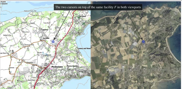
The two cursors on top of the same facility F in both viewports
Figure 2. TechniqueJX: The two images are juxtaposed, showing the same geographical region in both viewports. Any pan and zoom action applies to both of them. Cursors are instantiated in each viewport. Their position is synchronized to help relate features in the two images.
uation of their performance on a set of 6 representative map comparison tasks. The tasks are based on an operationaliza-tion that favors external validity, involving a set of 140 cus-tomized real-world maps that we make available publicly.
MAP COMPARISON TECHNIQUES
We surveyed existing techniques by reading the literature, talking with GI science experts and reviewing prominent Web sites. A first observation is that those techniques do not only apply to geographical maps, but to any images that are spa-tially aligned. Some techniques are used in Medical Imaging to explore brain scans, in Exogeology to compare surveys of, e.g., planet Mars, made at different times or in different parts of the electromagnetic spectrum. The same applies to Astron-omy, where comparisons also include looking at two images generated from the same FITS file (a high-dynamic-range for-mat) using different transfer functions and color mappings. Map and image comparison techniques predominantly em-ploy two operators from Javed & Elmqvist’s composite vi-sualization design space [14]: juxtaposition and superimpo-sition, which are called juxtaposition and superposition in Gleicher et al.’s taxonomy of visual designs for compari-son [9]. As overview + detail interfaces for multi-scale visu-alization, juxtaposition uses spatial multiplexing, partitioning the screen in non-overlapping windows that each show one representation. As classical pan & zoom, the simplest case of superimposition, termed blitting, uses temporal multiplex-ing, overlaying the two representations and enabling users to toggle between them. More elaborate forms of superimposi-tion employ adjustable translucence to show both representa-tions simultaneously, an alternative termed depth multiplex-ing[11]. The following four techniques are the most com-monly used in map and image comparison tools.
Juxtapose (JX)
As illustrated in Figures 1-a & 2, the two images can be jux-taposed, showing the same geographical region in both view-ports. This technique does not cause any problem of visual in-terference, but suffers from problems of divided attention [11] as users have to repeatedly inspect each viewport. In addition, this technique can only display half the geographical area that superimposition techniques can show, requiring users to pan the view more often. Additional motor actions include mov-ing the dual cursor to relate both views (Figure 5).
Translucent Overlay (OV)
Techniques that use a superimposition strategy can display a geographical region twice as large, but have their own draw-backs. The first technique consists in overlaying both maps and enabling users to adjust the opacity of the upper layer, so as to see the lower layer through it (Figures 1-c & 3). As the Macroscope [18], OV can cause significant visual interfer-ence depending on the maps’ content and translucency set-tings, but it avoids the problems of divided attention from which JX suffers. Motor actions are limited to translucency control, enabling users to adopt a mostly vision-driven scan-ning strategy (Figure 5). Supporting image blitting is a simple matter of adding shortcuts to 0 and 100% opacity.
Swipe (SW)
Another popular superimposition technique consists in swip-ing between the two maps (Figures 1-d & 4). As with OV, the two layers are superimposed, but in this case both remain fully opaque. Users “swipe” (or push and pull) the upper layer above the lower one, revealing more of one or the other layer. This technique minimizes both divided attention and visual interference (Figure 5). However, even if, as with OV, motor actions are limited to a simple uni-dimensional control,
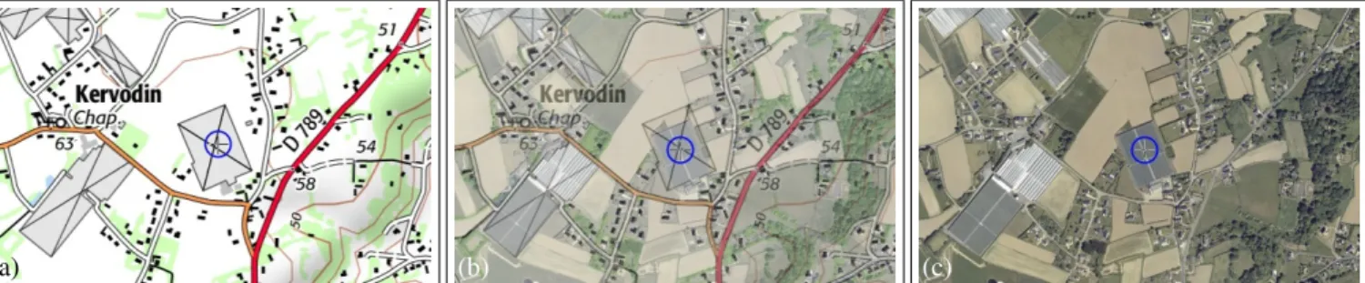
(a) (b) (c)
Figure 3. TechniqueOV: The two images are overlaid in the same viewport. Users can see the image in the bottom layer through the image in the upper layer by adjusting the latter’s opacity. (a) Upper layer fully opaque: only the topographic map is visible. (b) At 50% translucency (adjusted using the mouse wheel), the orthoimagery is made partially visible through the map. This time, the two representations of facility F (the same as in Figure 2, under the cursor) are spatially aligned. (c) Upper layer fully transparent: the orthoimagery is fully revealed.
(a) (b) (c)
Figure 4. TechniqueSW: The two images are overlaid in the same viewport. Users can see the image in the bottom layer by swiping horizontally. (a) Moving the separator to the left reveals more of the orthoimagery. (b) & (c) Moving the separator to the right reveals more of the topographic map. Comparing a feature such as facility F across the two layers requires moving the separator back and forth in its vicinity (b).
the nature of the composition creates a stronger dependency between motor actions and visual scanning.
Blending Lens (BL)
Yet another strategy when the two images are superimposed consists of using a magic lens [3] to show the lower layer in a locally-bounded region around the cursor (Figure 1-b). Figure 6 shows a somewhat more elaborate variant called a Blending Lens [24]. This variant features a smooth transi-tion between the lens’ focus and the context thanks to a trans-parency gradient. As most of the upper layer remains fully opaque, providing a stable context, this technique does not suffer from visual interference as much as OV. There is no problem of divided attention. However, users have to place the lens directly on top of the region in which they want to compare the maps, which forces them to adopt a mostly motor-driven scanning strategy (Figure 5).
Offset Lens (OL)
The last technique, called OffsetLens, is a variant of the Drag-Mag [36]. We identified it as a potentially interesting solution in the design space. OL combines the juxtaposition and nest-ing operators [14], trynest-ing to strike a balance between visual interference and divided attention. As illustrated in Figure 7, it follows the same general approach as BL, except that the two images are juxtaposed instead of being spatially aligned. This makes it possible to look at fully opaque renderings of the region of interest from both maps, minimizing visual in-terference compared to BL. However, OL reintroduces the problem of divided attention, though less so than JX since the distance between the two viewports is much smaller. As with BL, users have to adopt a mostly motor-driven scan-ning strategy (Figure 5). As a side note, a typical DragMag
would not have the secondary viewport follow the lens au-tomatically, and would allow users to manually reposition it independently. But this additional flexibility would impose more motor actions on users to minimize divided attention.
Specialized Techniques
Several other visual composition techniques exist, but were not considered in the following user study as they have a nar-rower scope and do not necessarily support general map parison tasks. B¨ottger et al. [5] describe a technique that com-posites schematic metro maps with a distorted geographic rendering. Reilly & Inkpen [28] study morphing animations to keep track of entities between incongruent maps. Hoarau et al.[12] describe two techniques, patchwork and camouflage, for blending layers in mostly-static cartographic representa-tions. Finally, WetPaint [4] enables users to scrape through
Divided Attention Visual interference JX OL OV BL SW Motor-driven scan Vision-driven scan High Low Low High
Figure 5. Coarse characterization of the techniques evaluated in the following study, in terms of visual interference and divided attention (which should both be minimized) and type of scanning. A motor-driven scanning strategy requires users to reposition elements on screen with their pointing device to compare different regions. A vision-driven strat-egy relies more on visual search and does not require so much interac-tion. This is a continuum: none of the techniques is either purely vision-driven or purely motor-vision-driven.
(a)
(b)
(c)
(d)
Figure 6. TechniqueBL: When the two images are overlaid in the same viewport, the lower layer can be revealed in a locally-bounded region only – instead of the entire viewport – using a Blending Lens. The lens punches a hole through the upper layer, revealing the lower layer. (a) & (b) The lens approaches from the left the same facility F as in previous figures. (c) The lens is centered above it, revealing its appearance in the orthoimagery. (d) The lens’ translucency can be adjusted using alpha blending, so that both images are visible simultaneously, as with the overlay technique (OV).
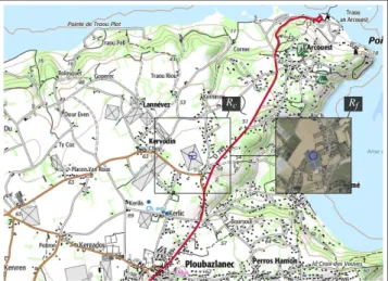
Rc Rf
Figure 7. TechniqueOL(Offset Lens): Users see one representation in the main viewport (here the map). A fixed-size rectangleRc, always
centered on the cursor, delimits a region of interest (showing here the same facility F as in previous figures). A similar rectangle,Rf, offset to
the right side ofRc, displays the same region in the orthoimagery.Rf
gets smoothly offset to the left ofRcwhen it comes too close to the main
viewport’s right edge.
multi-layered images on a touch-sensitive surface. Consid-ering the case of only two layers, the technique is relatively similar to our blending lens (BL), except that WetPaint leaves a temporary trace that gradually fades away, whereas a blend-ing lens leaves no trace on its trail.
USER STUDY
To our knowledge, the five techniques introduced above have never been compared empirically on well-defined map com-parison tasks. The following studies are related to our work, but try to answer other questions. Luz and Masoodian evalu-ated the readability of maps when translucent layers contain-ing widgets (sliders) were superimposed on them [19],
build-ing upon Harrisson et al.’s study of the effect of transparent overlays on user attention [11]. WetPaint [4] was compared to OV on a path following task mixing satellite imagery and a schematic subway map. Plumlee & Ware compared zooming vs. multiple DragMags for multi-scale comparison tasks [26]. Finally, Raposo & Brewer [27] compared eight different topo-graphic designs that statically overlay orthoimages and maps. Our goal here is to better understand the strengths and weak-nesses of comparison techniques based on their characteriza-tion in terms of visual interference, user attencharacteriza-tion and scan-ning strategy. To this end, we designed a controlled exper-iment in which users had to compare orthoimagery with to-pographic maps. We chose this particular configuration be-cause it is representative of many scenarios [7], including map making (in, e.g., OpenStreetMap), cadastral & land man-agement [17], and crisis manman-agement after a natural disaster, where satellite imagery can provide up-to-date views of the situation but is not sufficient on its own to perform analyses.
Maps
We used 1:25000 topographic maps (SCAN25) and the corre-sponding orthoimagery (ORTHO), both produced by IGN (In-stitut National de l’Information G´eographique et Foresti`ere, in France), to create 20 perfectly-aligned pairs amenable to comparison; see Figure 2 for a representative example. In each case, we used the orthoimagery as the reference im-age, and customized the map, purposefully introducing er-rors, as detailed below. This produced a total of 120 maps. AllSCAN25maps were manually edited in Adobe Illustrator, carefully removing features, introducing new ones, or modi-fying the geometry of existing ones so that those edits could not be detected without comparison to a reference. While us-ing real maps in our study makes it much more challengus-ing to control precisely all relevant factors, it is also essential in terms of external validity, as discussed later.
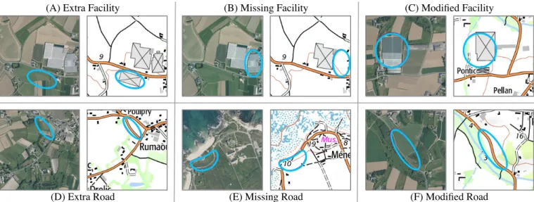
(A) Extra Facility (B) Missing Facility (C) Modified Facility
(D) Extra Road (E) Missing Road (F) Modified Road
Figure 8. Six types of differences: (A) the map contains a facility not present in the orthoimage; (B) a facility in the orthoimage is missing on the map; (C) a facility shows a geometry mismatch between the map and the orthoimage. (D), (E) and (F) illustrate the same three differences for roads.
Tasks
Elias et al. observed that many queries require correlation of multiple maps, and identified three main user-task cate-gories in their taxonomy [7]: familiarization (“relating the primary features of a map to a context understood by the map user”), evolution (“[synthesis of] maps in a common cate-gory across time periods”), fusion (“synthesis of two maps from categories that are both unfamiliar to the user”). Many of their examples involve some sort of geometric comparison performed on either lines or surfaces. We position our tasks at this latter level of abstraction, so as to make our findings as generalizable as possible (given the map types considered). Our tasks test the compare objective primitive in Roth’s tax-onomy of primitives for interactive cartography and geovisu-alization [30]. These tasks are aimed at operationalizing com-parisons performed on the two main map drawing primitives: surfaces and paths, using buildings and roads as representa-tive instances, as detailed below. We believe the chosen tasks are reasonably close to actual comparison tasks such as, e.g., a cartographer updating an outdated topographic map from recent orthoimagery (photomapping).
We propose a set of 3 tasks, performed on 2 distinct types of geographic features: road (line), and large man-made facility (surface). There are thus 6 distinct types of differences, illus-trated in Figure 8. All are separately instantiated on each of the 20 map pairs. To limit task difficulty, any facility involved in a difference is displayed as a gray polygon, at least1cm2
on screen, with a black stroke and cross inside them (Fig-ure 8-A). Modified facilities (Fig(Fig-ure 8-C) can be either of the correct size, but offset in position (at least 1.5cm), or they can have an incorrect size (by a factor of at least 1.5x). Roads to inspect are those painted orange (routes d´epartementales). Missing roads (Figure 8-E) are always connected to an orange road at one junction, and are at least3cm long. The distance between the modified segment of a road and the original one is at least1cm (Figure 8-F). All these indications were explic-itly given to participants. All 120 differences were evaluated
in a pilot study, which helped us identify and replace a sub-set of trials that were too difficult to perform, no matter the technique used to achieve the task.
Hypotheses
Figure 5 summarizes the positioning of all five techniques considered in the experiment, with respect to how much di-vided attention and visual interference they cause relative to one another, and whether users’ scanning strategy is predom-inantly motor- or vision-driven. This characterization of tech-niques led to the following hypotheses:
• H1: Techniques that superimpose images (BL, OV, SW)
will perform better than those that juxtapose them (JX,OL) because problems of divided attention will be more detri-mental to task performance than problems of visual inter-ference, even more so given that the latter can be mitigated via interactive parameter adjustments.
• H2: This difference will be stronger for tasks that require
precise geometrical comparisons (DIFF = modified) than for the other tasks (DIFF= extra or missing).
• H3: Vision-driven scanning should be more efficient than
motor-driven scanning, implying thatOVwill perform best.
• H4: OLwill provide a good compromise for tasks that do not require precise geometry comparison, as it tries to mit-igate problems of divided attention and visual interference.
Participants and Apparatus
Fifteen unpaid volunteers (six females), daily computer users, age 20 to 37 year-old (average 28.5, median 28), served in the experiment. All had normal or corrected-to-normal vision and did not suffer from color blindness. We conducted the experiment on an HP workstation running Linux Fedora 19, equipped with a 3.2 GHz Intel Xeon CPU, 16GB RAM, and an NVidia Quadro 4000 driving a 27” LCD (2560x1440, 100 dpi). We used a standard HP optical mouse set to 400 dpi resolution and default system acceleration. The experiment was implemented in Java 1.7 using the ZVTM toolkit [22].
. . .
Figure 9. Counterbalancing example: blocking by TECH; the same 4 maps are used for all 6 tasks (1 training + 3 measures) in the same block. Procedure
We followed a[5×2×3] within-subject design with 3 primary factors: TECH∈ [BL,JX,OL,OV,SW], and the type of task, decomposed into two factors: the type of feature GEOENT ∈ [road, facility], and the type of difference DIFF ∈ [extra,
missing, modified]. Measures include task completion Time and incorrect selections, treated as Errors.
We grouped trials into 5 blocks, one per TECH. TECH pre-sentation order was counterbalanced using a Latin square (5 orders). Within each TECH, trials were organized into 6 sub-blocks, one per task (GEOENT× DIFF). Task presentation or-der was counterbalanced independently for each block, using 15× 6 = 90 orders randomly picked out from the !6 = 720 possible ones. Within each sub-block, participants performed 1 training trial followed by a series of 3 measures. Maps were grouped in batches of 4 per TECH, always presented in the same order. Using this counterbalancing strategy, illustrated in Figure 9, we ensured that every GEOENT× DIFF combi-nation was performed on every map with every technique by 3 distinct participants. Proper counterbalancing is important: using real-world data means that we cannot fully control the content – and thus the complexity – of our maps and orthoim-ages. We thus have to handle this potential source of bias. Participants could rest as long as they wanted between tri-als, but were asked to perform the task as fast as possible once a trial had started, while avoiding errors. To complete a trial, they had to put the mouse cursor on top of the difference (within 100 pixels from its center), and validate their answer by pressing the space bar. They were reminded about the type of difference before the start of each trial (DIFF+GEOENT, with the corresponding image pair from Figure 8) to avoid any confusion. After each series of 4 trials, participants had to call the experimenter, who asked them to rate the difficulty of the task with each technique using a 5-point Likert scale. The experimenter then made sure participants understood that the task was about to change, and what the new task was. A correct answer was indicated by a large green tick mark; an incorrect one by a large red cross. To avoid participants rush-ing through the experiment, incorrect answers were counted as errors, but did not end the trial; participants still had to identify the right feature. To avoid participants getting stuck, we set a 90-second timeout for each trial. The average dura-tion of the experiment was 75 minutes on average.
Results
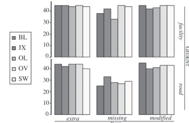
A total of 1071 trials were successfully completed out of the 1350 performed, i.e., participants identified the differ-ence within the 90s time limit in 79.3% of all trials. Fig-ure 10 shows the distribution of successful trials that remain for analysis. We can see that, despite our initially-balanced
40 30 20 20 10 10 0
0 extra missing modified DIFF facility road G EO E NT BL OL OV SW JX 40 30
Figure 10. Number of successful trials per TECH× GEOENT× DIFF.
design, collected measures are not properly balanced among TECH× GEOENT× DIFFconditions. While successful trials are equally distributed among the different TECHconditions,
their number is much lower in the road× missing than in all other GEOENT × DIFFconditions. Finding a missing road (Figure 8-E) was too difficult a task for some participants. In order to conduct analyses on datasets having approximately-equal sample sizes per condition, we filtered out all road× missingtrials and considered the following two datasets:
• Df acility, containing the 642 successful trials in conditions
GEOENT= facility and DIFF={extra, missing, modified};
• Droad, containing the 426 successful trials in conditions
GEOENT= road and DIFF={extra, modified}.
In 43 of the 642 trials inDf acility, participants made at least
one error before finding the right difference (error rate = 6.5%). AnANOVAon TECH× DIFFreveals that there is no significant effect on Errors, showing that no condition is more error-prone than others. On the contrary, both TECH and DIFF have a significant effect on Time (F4,56 = 4, p = 0.005, η2
G = 0.08 and F2,28 = 39, p =< 0.001, ηG2 = 0.28,
respec-tively). First, finding a missing facility (avg=22.6s) takes sig-nificantly longer than finding a modified facility (avg=15s), which takes significantly longer than finding an extra facil-ity (avg=10s). Second,OV(avg=12s) is the fastest technique, significantly different fromSW(avg=16s) andOL(avg=20s), but not fromJX(avg=14s) and BL(avg=14s). OLis signif-icantly slower than all other techniques. Finally, anANOVA
reveals a significant TECH× DIFFinteraction effect on Time. Figure 11-a illustrates the results of post-hoc paired t-tests on the different pairs of conditions. For missing tasks,BLandOL
perform much worse than the three other techniques, with no significant difference in-between those. However, for mod-ifiedand extra tasks, the comparative performance between techniques changes. For extra tasks,BLandOLare the fastest techniques, although the difference is significant only forSW, which performs particularly poorly. For modified tasks, BL
performs better than all other techniques. The difference is significant for all of them, exceptOV.
In 18 of the 426 trials inDroad, participants made at least one
error before finding the right difference (error rate is 4.2%). As forDf acility, an ANOVAon TECH × DIFFreveals that
there is no significant effect on Errors. Regarding Time, only TECHhas a significant effect (F4,56= 2.8, p = 0.03, η2G= 0.06).
tech-Time 0 10 20 30 40 extra missing modified BL JX OL OV SW TECH BL JX TOLECH OV SW Time extra modified 0 10 20 30 40
extra missing modified facility BL JX OL OV SW 1 2 3 4 difficult
very easy extra missing modifiedroad
(a) (b) (c)
Figure 11. (a) Time per TECH× DIFFfor GEOENT= facility trials (error bars represent the 95% confidence intervals). (b) Time per TECH× DIFFfor GEOENT= road trials (error bars represent the 95% CIs). (c) Perceived Difficulty per TECH× TASK(error bars represent the standard errors).
nique, the difference being significant withOL(avg=28s) and
JX(avg=26s), but not withSW(avg=23s) andOV(avg=22s). Additional insights can be gained by performing anANOVA
on TECH× DIFF, without removing the road × missing trials that were filtered out in the above analysis. Results indicate that TECH(F4,57.43= 5.01, p = 0.0015), DIFF(F2,26.65= 71.57, p < 0.0001), and TECH × DIFF(F8,108.3 = 6.31, p < 0.0001)
all have a significant effect on Time. OVis the fastest tech-nique on average (avg=16s), followed byBL (avg=18s), JX
(avg=20s), SW(21s) andOL (avg=25s). ButBL is actually the best technique in the DIFF=extra and DIFF=modified con-ditions. However the difference withOVis significant only in the DIFF=modified condition.
Finally, Figure 11-c reports the perceived Difficulty, from 1 (very easy) to 5 (very difficult), of using a technique for com-pleting each task (TASKs are the 6 GEOENT× DIFF combi-nations). AnANOVAreveals effects consistent with the mea-sured quantitative performance. TECHhas a significant effect
(F4,56= 4, p = 0.006, ηG2 = 0.1461859).OL, which performs the
worst on average, was perceived as significantly more diffi-cult to use than all other techniques, which do not signifi-cantly differ from each other. TASKalso has a significant ef-fect (F5,70= 69, p =< 0.001, η2G= 0.73). Finding a missing road
was rated as significantly more difficult than any other task. Finding a modified or an extra facility was significantly eas-ier than other tasks (extra × facility being the easiest). Using
BL, all tasks were perceived as easy or very easy, except for tasks in which DIFF= missing. UsingOV, all tasks were con-sidered as easy or very easy, except finding a missing road, which was rated as difficult, no matter the technique.
DISCUSSION
A first general observation is that, as expected, the three types of differences (DIFF) have a strong impact on task comple-tion time: finding missing features takes longer than finding modified ones, which takes longer than finding extra ones. This observation can be explained by the strategy employed to find the three types of differences. It is important to recall that orthoimagery (ORTHO) was used as the reference image, with errors introduced in the topographic map (SCAN25). In
the extra and modified conditions, participants would simply look at the different features on theSCAN25 map and
com-pare them againstORTHO. Eligible features were quite easy to identify visually on SCAN25. But in the missing condi-tions, participants had to do the opposite: look for features in theORTHOimage and check whether they existed on the
SCAN25map or not. In this case, eligible features were less easy to identify, which partially explains the strong task com-pletion time difference between extra and missing conditions in Figure 11-a. Finding modified features took longer than finding extra features because it involved more elaborate ge-ometrical comparisons. Still, participants were faster at this than at finding missing features, as eligible features could be identified onSCAN25maps, as in the extra conditions. Regarding our hypotheses, H1 is only partially supported. When comparing roads, BL, OV andSW do perform better thanJXandOLindeed, but only significantly so forBL. Also,
OL performs significantly more poorly than all other tech-niques. When comparing facilities, OV andBL are the two best techniques, along withJX. SWperforms poorly overall, as discussed later. Thus, superimposition (as opposed to jux-taposition) does seem to be the right strategy, when combined with other properties. But it is not a determinant factor. H2is also partially supported. When looking for modified roads or facilities, the three techniques based on superimposi-tion (BL,OVandSW) indeed perform consistently better than those based on juxtaposition (JXandOL). However, the task-time difference is not systematically significant. As for H1, our results provide empirical evidence only for specific tech-niques (BL); not for the whole class of superimposition tech-niques. Thus, our results only suggest that superimposition works best when looking for subtle differences, such as the path of a road portion being slightly different or a building’s position being offset. Subjective ratings are in accordance with these quantitative measures (Figure 11-c), reflecting the higher difficulty of performing such comparisons on juxta-posed representations as opjuxta-posed to aligned ones.
OV features the best overall task completion time, signifi-cantly shorter than those ofSWandOL. H3 is thus supported, though this should probably be attributed more to the low level of divided attention rather than to the vision-driven scan-ning strategy, sinceBL(which employs a more motor-driven strategy) performs as well – if not better – in many task con-ditions. This actually raises the question of whether a
motor-driven scan could actually have positive side-effects. While it prevents users from performing fast visual searches, motor-driven scanning might actually help structure the exploration, making users less prone to performing random jumps be-tween arbitrary locations, potentially reducing the number of revisits. Additional studies are required to confirm this. H4is rejected. By displaying the two representations closer together thanJXdoes (thus limiting the amplitude of saccadic eye movements) while rendering both of them fully opaque (thus minimizing visual interference), we were expecting that
OLwould mitigate these two problems, but it does not. As illustrated in Figure 5, techniques Translucent Overlay (OV) and Juxtapose (JX) can be seen as extreme points in the design space of composition techniques, with Blending Lens (BL), Offset Lens (OL) and Swipe (SW) trying to find compromises between those two extremes. OV is the most versatile technique, featuring good performance for all tasks. As expected, divided attention proved to be more detrimen-tal than visual interference. While it looked promising,SW
turned out to be surprisingly inefficient for most tasks. We tentatively attribute this poor performance to the tight cou-pling between motor actions and visual comparison, which forces users to adopt a very constrained scanning strategy if they want to avoid too many micro-swipes back and forth.OL
was a DragMag-inspired [36] attempt at mitigating problems of both divided attention and visual interference, which failed for the most part, except for the identification of extra fea-tures. Somewhat surprisingly,BLturned out to perform quite well on both extra and modified tasks. Its bad performance in missing tasks is partly explained by the earlier-discussed higher difficulty of finding features inORTHOimages. Perfor-mance should improve drastically by allowing dynamic tog-gling of what layer is assigned to focus and context regions.
Validity
Many HCI experiments that involve techniques for interact-ing with maps are based on highly-abstracted experimental tasks [8, 15, 19, 23, 24, 28]. Even when seeking a higher-level of ecological validity, the base maps and overlaid fea-tures tend to be simplified, either in terms of rendering or layout, so as to minimize the influence of factors that would be otherwise difficult to control [4, 10, 13, 25, 26, 29, 37]. While this is a generally sound approach, our study warranted the use of real-world maps. Abstract representations, or even simplified maps, would have strongly altered the end-result of the different map composition strategies in terms of vi-sual complexity, which would have significantly threatened the external validity of our experiment.
As a result, we had to address several potential threats to in-ternal validity. First, orthoimagery and the corresponding to-pographic maps cannot easily be synthesized. We thus have to use actual maps, which entails that we cannot fully control the visual complexity of our base maps. As a consequence, we had to pay careful attention to our experiment design, so as to minimize this potential source of bias. In addition to the counterbalancing strategy we described earlier, we also tried to minimize differences between maps with respect to the par-ticular geographical features considered. Some topographic
maps were also customized by hand before the introduction of differences, changing the type of some roads so as to have a relatively equivalent length of eligible roads in all 20 map pairs. Producing these maps took significant effort, and we make them available to the community5, both for the purpose
of replication, and for possible use in other studies.
Another threat to internal validity is the lack of control over participants stumbling upon the correct feature earlier rather than later. While some operationalizations address this is-sue [23, 25, 15], these elaborate strategies rely on synthetic data and are incompatible with the use of real maps. But with 3 replications per participant per TECH× GEOENT× DIFF
condition, and a total of 1071 successful trials analyzed over our 15 participants, this threat should be minimal.
Our focus on external validity does not mean that our findings generalize to the comparison of arbitrary types of images. As mentioned earlier, these techniques are used in a wide range of application areas. This includes astronomy and medical imaging, i.e., domains in which the two images are going to be visually much more similar than topographic maps and orthoimages are. Even in geovisualization, results may be different when comparing visually-similar maps. Indeed, the nature and impact of visual interference caused by the su-perimposition of such images is likely to be very different. Results might also differ in the case of topographic map & orthoimage comparison performed in highly-urbanized geo-graphical regions, as we used maps of predominantly rural areas. Evaluating the influence of different map types would have required introducing additional factors such as object density. Doing so would have made the experiment’s com-plexity unmanageable, and was left as future work.
SUMMARY
We characterized and evaluated five techniques for perform-ing interactive map comparison, usperform-ing real-world maps. The study’s results suggest the following guidelines to UI design-ers: (1) Translucent Overlay (OV) is the best technique over-all, which makes it a good choice when only one comparison technique should be provided to users. (2) Even if its over-all performance is not as good as that of OV, Blending Lens (BL) performs as well as or better than OV when the task con-sists of identifying extra or modified entities. We tentatively attribute this to BL’s mostly motor-driven scanning strategy, which helps structure inspection of candidate features in the upper layer. The combination of OV and BL should be fa-vored by UI designers when possible, as the two are quite complementary. (3) Swipe (SW) and Offset Lens (OL) per-form poorly. This is an interesting finding given that SW is a technique commonly encountered in Web mapping applica-tions. Its use should probably be reconsidered.
ACKNOWLEDGMENTS
This research was partly supported by ANR project MapMux-ing (ANR-14-CE24-0011-02). We wish to thank Charlotte Hoarau, as well as Sidonie Christophe and Guillaume Touya from IGN for sharing their GI science expertise with us.
REFERENCES
1. Appert C., Chapuis O. & Pietriga E. High-precision magnification lenses. CHI ’10, ACM (2010), 273–282. 2. Bertin J. Semiology of Graphics. University of
Wisconsin Press, 1983.
3. Bier E. A., Stone M. C., Pier K., Buxton W. & DeRose T. D. Toolglass and magic lenses: The see-through interface. SIGGRAPH ’93, ACM (1993), 73–80. 4. Bonanni L., Xiao X., Hockenberry M., Subramani P.,
Ishii H., Seracini M. & Schulze J. Wetpaint: Scraping through multi-layered images. CHI ’09, ACM (2009), 571–574.
5. B¨ottger J., Brandes U., Deussen O. & Ziezold H. Map warping for the annotation of metro maps. IEEE Computer Graphics & Applications 28, 5 (2008), 56–65. 6. Cockburn A., Karlson A. & Bederson B. B. A review of
overview+detail, zooming, and focus+context interfaces. ACM Comput. Surv. 41, 1 (2009), 2:1–2:31.
7. Elias M., Elson J., Fisher D. & Howell J. Do I Live in a Flood Basin?: Synthesizing Ten Thousand Maps. CHI ’08, ACM (2008), 255–264.
8. Elmqvist N., Riche Y., Henry-Riche N. & Fekete J.-D. M´elange: Space folding for visual exploration. IEEE TVCG 16, 3 (2010), 468–483.
9. Gleicher M., Albers D., Walker R., Jusufi I., Hansen C. D. & Roberts J. C. Visual comparison for information visualization. Information Visualization 10, 4 (2011), 289–309.
10. Gustafson S., Baudisch P., Gutwin C. & Irani P. Wedge: Clutter-free visualization of off-screen locations. CHI ’08, ACM (2008), 787–796.
11. Harrison B. L., Ishii H., Vicente K. J. & Buxton W. A. S. Transparent layered user interfaces: An evaluation of a display design to enhance focused and divided attention. CHI ’95, ACM Press/Addison-Wesley (1995), 317–324. 12. Hoarau C., Christophe S. & Musti`ere S. Mixing,
blending, merging or scrambling topographic maps and orthoimagery in geovisualizations? In International Cartographic Conference(2013).
13. Hornbæk K., Bederson B. B. & Plaisant C. Navigation patterns and usability of zoomable user interfaces with and without an overview. ACM ToCHI 9, 4 (2002), 362–389.
14. Javed W. & Elmqvist N. Exploring the design space of composite visualization. PacificVis, IEEE (2012), 1–8. 15. Javed W., Ghani S. & Elmqvist N. Polyzoom:
Multiscale and Multifocus Exploration in 2D Visual Spaces. CHI ’12, ACM (2012), 287–296.
16. Koch T. The map as intent: variations on the theme of John Snow. Cartographica: Int. Jour. for Geographic Information and Geovisualization 39, 4 (2004), 1–14. 17. Lee H., Lee S., Kim N. & Seo J. JigsawMap:
Connecting the Past to the Future by Mapping Historical Textual Cadasters. CHI ’12, ACM (2012), 463–472. 18. Lieberman H. Powers of ten thousand: Navigating in
large information spaces. UIST, ACM (1994), 15–16.
19. Luz S. & Masoodian M. Readability of a background map layer under a semi-transparent foreground layer. AVI ’14, ACM (2014), 161–168.
20. MacEachren A. M. The roles of maps. In The Map Reader. Wiley & Sons, 2011, 244–251.
21. MacEachren A. M. & Kraak M.-J. Research Challenges in Geovisualization. Cartography and Geographic Information Science 28, 1 (2001), 3–12.
22. Pietriga E. A Toolkit for Addressing HCI Issues in Visual Language Environments. VLHCC ’05, IEEE (2005), 145–152.
23. Pietriga E., Appert C. & Beaudouin-Lafon M. Pointing and beyond: An operationalization and preliminary evaluation of multi-scale searching. CHI ’07, ACM (2007), 1215–1224.
24. Pietriga E., Bau O. & Appert C.
Representation-Independent In-Place Magnification with Sigma Lenses. IEEE TVCG 16, 3 (2010), 455–467. 25. Pindat C., Pietriga E., Chapuis O. & Puech C. Jellylens: content-aware adaptive lenses. UIST ’12, ACM (2012), 261–270.
26. Plumlee M. D. & Ware C. Zooming versus multiple window interfaces: Cognitive costs of visual comparisons. ACM ToCHI 13, 2 (2006), 179–209. 27. Raposo P. & Brewer C. Comparison of topographic map
designs for overlay on orthoimage backgrounds. In International Cartographic Conference(2011), 3–8. 28. Reilly D. F. & Inkpen K. M. Map morphing: Making
sense of incongruent maps. GI ’04 (2004), 231–238. 29. Rønne Jakobsen M. & Hornbæk K. Sizing up
visualizations: Effects of display size in focus+context, overview+detail, and zooming interfaces. CHI ’11, ACM (2011), 1451–1460.
30. Roth R. E. An empirically-derived taxonomy of interaction primitives for interactive cartography and geovisualization. IEEE TVCG 19, 12 (2013), 2356–2365.
31. Roth R. E. Interactive maps: What we know and what we need to know. Journal of Spatial Information Science, 6 (2013), 59–115.
32. Slingsby A., Dykes J., Wood J. & Radburn R. Designing an exploratory visual interface to the results of citizen surveys. International Journal of Geographical Information Science 28, 10 (2014), 2090–2125.
33. Touya G. Social welfare to assess the global legibility of a generalized map. In International Conference on Geographic Information, Springer (2012), 198–211. 34. Touya G. & Girres J.-F. ScaleMaster 2.0: a ScaleMaster
extension to monitor automatic multi-scales generalizations. Cartography and Geographic Information Science 40, 3 (2013), 192–200. 35. Tversky B. Some ways that maps and diagrams
communicate. In Spatial Cognition II. Springer-Verlag, 2000, 72–79.
36. Ware C. & Lewis M. The DragMag Image Magnifier. CHI ’95 companion, ACM (1995), 407–408.
37. Yatani K., Partridge K., Bern M. & Newman M. W. Escape: A target selection technique using visually-cued gestures. CHI ’08, ACM (2008), 285–294.