Cascading Style Sheets
CSS describes how HTML elements are to be displayed on screen, paper, or in other media CSS saves a lot of work. It can control the layout of multiple web pages all at once
External style sheets are stored in CSS files
CSS is used to define styles for your web pages, including the design, layout and variations in display for different devices and screen sizes.
CSS Solved a Big Problem
HTML was NEVER intended to contain tags for formatting a web page! HTML was created to describe the content of a web page, like:
<h1>This is a heading</h1> <p>This is a paragraph.</p>
When tags like <font>, and colour attributes were added to the HTML 3.2 specification, it started a nightmare for web developers. Development of large websites, where fonts and color information were added to every single page, became a long and expensive process.
To solve this problem, the World Wide Web Consortium (W3C) created CSS. CSS removed the style formatting from the HTML page
The style definitions are normally saved in external .css files.
With an external stylesheet file, you can change the look of an entire website by changing just one file! CSS Syntax
A CSS rule-set consists of a selector and a declaration block:
The selector points to the HTML element you want to style.
The declaration block contains one or more declarations separated by semicolons. Each declaration includes a CSS property name and a value, separated by a colon.
A CSS declaration always ends with a semicolon, and declaration blocks are surrounded by curly braces. In the following example all <p> elements will be center-aligned, with a red text color:
p {
color: red;
text-align: center; }
CSS Selectors
CSS selectors are used to "find" (or select) HTML elements based on their element name, id, class, attribute, and more.
The element Selector
The element selector selects elements based on the element name.
You can select all <p> elements on a page like this (in this case, all <p> elements will be center-aligned, with a red text color):
p {
text-align: center; color: red;
}
The id Selector
The id selector uses the id attribute of an HTML element to select a specific element.
The id of an element should be unique within a page, so the id selector is used to select one unique element! To select an element with a specific id, write a hash (#) character, followed by the id of the element.
The style rule below will be applied to the HTML element with id="para1": #para1 {
text-align: center; color: red;
}
Note: An id name cannot start with a number The class Selector
The class selector selects elements with a specific class attribute.
To select elements with a specific class, write a period (.) character, followed by the name of the class. In the example below, all HTML elements with class="center" will be red and center-aligned:
.center {
text-align: center; color: red;
}
You can also specify that only specific HTML elements should be affected by a class. In the example below, only <p> elements with class="center" will be center-aligned:
p.center {
text-align: center; color: red;
}
HTML elements can also refer to more than one class.
In the example below, the <p> element will be styled according to class="center" and to class="large": <p class="center large">This paragraph refers to two classes.</p>
Grouping Selectors
If you have elements with the same style definitions, like this: h1 { text-align: center; color: red; } h2 { text-align: center; color: red; } p { text-align: center; color: red; }
It will be better to group the selectors, to minimize the code. To group selectors, separate each selector with a comma.
In the example below we have grouped the selectors from the code above: h1, h2, p {
text-align: center; color: red;
}
CSS Comments
Comments are used to explain the code, and may help when you edit the source code at a later date. Comments are ignored by browsers.
A CSS comment starts with /* and ends with */. Comments can also span multiple lines: p {
color: red;
/* This is a single-line comment */ text-align: center;
/* This is a multi-line comment */ Exercise 1 <!DOCTYPE html> <html> <head> <style> </style> </head> <body> <h1>This is a Heading</h1> <p>This is a paragraph.</p> <p>This is another paragraph.</p> </body> </html> Exercise 2 <!DOCTYPE html> <html> <head> <style> </style> </head> <body> <h1>This is a Heading</h1> <p id="para1">This is a paragraph.</p> <p>This is another paragraph.</p> </body> </html> Exercise 3 <!DOCTYPE html> <html> <head> <style> </style> </head>
<body>
<h1>This is a Heading</h1> <p>This is a paragraph.</p>
<p class="colortext">This is another paragraph.</p> <p class="colortext">This is also a paragraph.</p> </body> </html> Exercise 4 <!DOCTYPE html> <html> <head> <style> </style> </head> <body> <h1>This is a heading</h1>
<h2>This is a smaller heading</h2> <p>This is a paragraph.</p>
<p>This is another paragraph.</p> </body>
</html>
When a browser reads a style sheet, it will format the HTML document according to the information in the style sheet.
Three Ways to Insert CSS
There are three ways of inserting a style sheet: • External style sheet
• Internal style sheet • Inline style
External Style Sheet
With an external style sheet, you can change the look of an entire website by changing just one file! Each page must include a reference to the external style sheet file inside the <link> element. The <link> element goes inside the <head> section:
<head>
<link rel="stylesheet" type="text/css" href="mystyle.css"> </head>
An external style sheet can be written in any text editor. The file should not contain any html tags. The style sheet file must be saved with a .css extension.
Here is how the "mystyle.css" looks: body { background-color: lightblue; } h1 { color: navy; margin-left: 20px; } Note:
Do not add a space between the property value and the unit (such as margin-left: 20 px;). The correct way is: margin-left: 20px;
Internal Style Sheet
An internal style sheet may be used if one single page has a unique style.
Internal styles are defined within the <style> element, inside the <head> section of an HTML page: <head> <style> body { background-color: linen; } h1 { color: maroon; margin-left: 40px; } </style> </head> Inline Styles
An inline style may be used to apply a unique style for a single element.
To use inline styles, add the style attribute to the relevant element. The style attribute can contain any CSS property.
The example below shows how to change the color and the left margin of a <h1> element: <h1 style="color:blue;margin-left:30px;">This is a heading</h1>
Multiple Style Sheets
If some properties have been defined for the same selector (element) in different style sheets, the value from the last read style sheet will be used.
Assume that an external style sheet has the following style for the <h1> element: h1 {
color: navy; }
then, assume that an internal style sheet also has the following style for the <h1> element: h1 {
color: orange; }
If the internal style is defined after the link to the external style sheet, the <h1> elements will be "orange": <head>
<link rel="stylesheet" type="text/css" href="mystyle.css"> <style> h1 { color: orange; } </style> </head>
However, if the internal style is defined before the link to the external style sheet, the <h1> elements will be "navy": <head> <style> h1 { color: orange; } </style>
<link rel="stylesheet" type="text/css" href="mystyle.css"> </head>
Cascading Order
What style will be used when there is more than one style specified for an HTML element?
Generally speaking we can say that all the styles will "cascade" into a new "virtual" style sheet by the following rules, where number one has the highest priority:
1. Inline style (inside an HTML element)
2. External and internal style sheets (in the head section) 3. Browser default
So, an inline style (inside a specific HTML element) has the highest priority, which means that it will override a style defined inside the <head> tag, or in an external style sheet, or a browser default value. Exercise
<!DOCTYPE html> <html>
<link rel="stylesheet" type="text/css" href="mystyle.css"> <style> p { color: red; } </style> </head>
<body style="background-color: lightcyan"> <h1>This is a Heading</h1>
<p>This is a paragraph.</p> <p>This is another paragraph.</p> </body>
</html>
Colors in CSS are most often specified by: • a valid color name - like "red" • an RGB value - like "rgb(255, 0, 0)" • a HEX value - like "#ff0000"
• Color names are case-insensitive: "Red" is the same as "red" or "RED". • HTML and CSS supports 140 standard color names.
RGB (Red, Green, Blue)
• RGB color values can be specified using this formula: rgb(red, green, blue).
• Each parameter (red, green, blue) defines the intensity of the color between 0 and 255.
• For example, rgb(255,0,0) is displayed as red, because red is set to its highest value (255) and the others are set to 0. Experiment by mixing the RGB values below:
Hexadecimal Colors
RGB values can also be specified using hexadecimal color values in the form: #RRGGBB, where RR (red), GG (green) and BB (blue) are hexadecimal values between 00 and FF (same as decimal 0-255).
For example, #FF0000 is displayed as red, because red is set to its highest value (FF) and the others are set to the lowest value (00). Note: HEX values are case-insensitive: "#ff0000" is the same as "FF0000". Background Color
The background-color property specifies the background color of an element. The background color of a page is set like this:
body {
background-color: lightblue; }
With CSS, a color is most often specified by: • a valid color name - like "red"
• a HEX value - like "#ff0000" • an RGB value - like "rgb(255,0,0)"
Look at CSS Color Values for a complete list of possible color values.
In the example below, the <h1>, <p>, and <div> elements have different background colors: h1 { background-color: green; } div { background-color: lightblue; } p { background-color: yellow; } Background Image
The background-image property specifies an image to use as the background of an element. By default, the image is repeated so it covers the entire element.
The background image for a page can be set like this: body {
background-image: url("paper.gif"); }
Below is an example of a bad combination of text and background image. The text is hardly readable: body {
background-image: url("bgdesert.jpg"); }
Background Image - Repeat Horizontally or Vertically
By default, the background-image property repeats an image both horizontally and vertically. Some images should be repeated only horizontally or vertically, or they will look strange, like this: body {
background-image: url("gradient_bg.png"); }
If the image above is repeated only horizontally (background-repeat: repeat-x;), the background will look better: body { background-image: url("gradient_bg.png"); background-repeat: repeat-x; }
Background Image - Set position and no-repeat
Showing the background image only once is also specified by the background-repeat property: body {
background-image: url("img_tree.png"); background-repeat: no-repeat;
}
In the example above, the background image is shown in the same place as the text. We want to change the position of the image, so that it does not disturb the text too much.
The position of the image is specified by the background-position property: body {
background-image: url("img_tree.png"); background-repeat: no-repeat;
background-position: right top; }
Background Image - Fixed position
To specify that the background image should be fixed (will not scroll with the rest of the page), use the background-attachment property:
body {
background-image: url("img_tree.png"); background-repeat: no-repeat;
background-position: right top; background-attachment: fixed; }
Background - Shorthand property
To shorten the code, it is also possible to specify all the background properties in one single property. This is called a shorthand property.
The shorthand property for background is background: body {
background: #ffffff url("img_tree.png") no-repeat right top; }
When using the shorthand property the order of the property values is: • background-color
• background-image • background-repeat
• background-attachment • background-position
It does not matter if one of the property values is missing, as long as the other ones are in this order.
All CSS Background Properties
Property Description
background Sets all the background properties in one declaration
background-attachment Sets whether a background image is fixed or scrolls with the rest of the page
background-color Sets the background color of an element
background-image Sets the background image for an element
background-position Sets the starting position of a background image
background-repeat Sets how a background image will be repeated
CSS Border Properties
The CSS border properties allow you to specify the style, width, and color of an element's border. I have borders on all sides.
I have a red bottom border I have rounded borders. I have a blue left border. Border Style
The following values are allowed: • dotted - Defines a dotted border • dashed - Defines a dashed border • solid - Defines a solid border • double - Defines a double border
• groove - Defines a 3D grooved border. The effect depends on the border-color value • ridge - Defines a 3D ridged border. The effect depends on the border-color value • inset - Defines a 3D inset border. The effect depends on the border-color value • outset - Defines a 3D outset border. The effect depends on the border-color value • none - Defines no border
• hidden - Defines a hidden border
The border-style property can have from one to four values (for the top border, right border, bottom border, and the left border).
Example
p.dotted {border-style: dotted;} p.dashed {border-style: dashed;} p.solid {border-style: solid;} p.double {border-style: double;} p.groove {border-style: groove;} p.ridge {border-style: ridge;} p.inset {border-style: inset;} p.outset {border-style: outset;} p.none {border-style: none;} p.hidden {border-style: hidden;}
p.mix {border-style: dotted dashed solid double;} Result:
A dotted border. A dashed border. A solid border. A double border.
A groove border. The effect depends on the border-color value. A ridge border. The effect depends on the border-color value. An inset border. The effect depends on the border-color value. An outset border. The effect depends on the border-color value. No border.
A mixed border. Border Width
The border-width property specifies the width of the four borders.
The width can be set as a specific size (in px, pt, cm, em, etc) or by using one of the three pre-defined values: thin, medium, or thick.
The border-width property can have from one to four values (for the top border, right border, bottom border, and the left border).
5px border-width Example p.one { border-style: solid; border-width: 5px; } p.two { border-style: solid; border-width: medium; } p.three { border-style: solid; border-width: 2px 10px 4px 20px; } Border Color
The border-color property is used to set the color of the four borders. The color can be set by:
• name - specify a color name, like "red" • Hex - specify a hex value, like "#ff0000"
• RGB - specify a RGB value, like "rgb(255,0,0)" • transparent
The border-color property can have from one to four values (for the top border, right border, bottom border, and the left border).
If border-color is not set, it inherits the color of the element. Red border p.one { border-style: solid; border-color: red; } p.two { border-style: solid;
border-color: green; }
p.three {
border-style: solid;
border-color: red green blue yellow; }
Border - Individual Sides
From the examples above you have seen that it is possible to specify a different border for each side. In CSS, there is also properties for specifying each of the borders (top, right, bottom, and left): Different Border Styles
p { border-top-style: dotted; border-right-style: solid; border-bottom-style: dotted; border-left-style: solid; }
The example above gives the same result as this: p {
border-style: dotted solid; }
So, here is how it works:
If the border-style property has four values:
• border-style: dotted solid double dashed; o top border is dotted
o right border is solid o bottom border is double o left border is dashed
If the border-style property has three values: • border-style: dotted solid double;
o top border is dotted
o right and left borders are solid o bottom border is double If the border-style property has two values:
• border-style: dotted solid;
o top and bottom borders are dotted o right and left borders are solid If the border-style property has one value:
• border-style: dotted;
o all four borders are dotted
The border-style property is used in the example above. However, it also works with border-width and border-color.
Border - Shorthand Property
As you can see from the examples above, there are many properties to consider when dealing with borders. To shorten the code, it is also possible to specify all the individual border properties in one property. The border property is a shorthand property for the following individual border properties:
• border-width
• border-style (required) • border-color
p {
border: 5px solid red; }
Result: Some text
You can also specify all the individual border properties for just one side: Left Border
p {
border-left: 6px solid red; background-color: lightgrey; } Result: Some text Bottom Border p {
border-bottom: 6px solid red; background-color: lightgrey; }
Result: Some text
Rounded Borders
The border-radius property is used to add rounded borders to an element: Normal border
Round border Rounder border Roundest border p {
border: 2px solid red; border-radius: 5px; }
Note: The border-radius property is not supported in IE8 and earlier versions. All CSS Border Properties
Property Description
border Sets all the border properties in one declaration
border-bottom Sets all the bottom border properties in one declaration
border-bottom-color Sets the color of the bottom border
border-bottom-style Sets the style of the bottom border
border-bottom-width Sets the width of the bottom border
border-color Sets the color of the four borders
border-left-color Sets the color of the left border
border-left-style Sets the style of the left border
border-left-width Sets the width of the left border
border-radius Sets all the four border-*-radius properties for rounded corners
border-right Sets all the right border properties in one declaration
border-right-color Sets the color of the right border
border-right-style Sets the style of the right border
border-right-width Sets the width of the right border
border-style Sets the style of the four borders
border-top Sets all the top border properties in one declaration
border-top-color Sets the color of the top border
border-top-style Sets the style of the top border
border-width Sets the width of the four borders
CSS Margins
The CSS margin properties are used to generate space around elements. The margin properties set the size of the white space outside the border.
With CSS, you have full control over the margins. There are CSS properties for setting the margin for each side of an element (top, right, bottom, and left).
Margin - Individual Sides
CSS has properties for specifying the margin for each side of an element: • margin-top
• margin-right • margin-bottom • margin-left
All the margin properties can have the following values: • auto - the browser calculates the margin
• length - specifies a margin in px, pt, cm, etc.
• % - specifies a margin in % of the width of the containing element
• inherit - specifies that the margin should be inherited from the parent element Tip: Negative values are allowed.
The following example sets different margins for all four sides of a <p> element: p { margin-top: 100px; margin-bottom: 100px; margin-right: 150px; margin-left: 80px; }
Margin - Shorthand Property
To shorten the code, it is possible to specify all the margin properties in one property. The margin property is a shorthand property for the following individual margin properties:
• margin-top • margin-right • margin-bottom • margin-left p { margin: 100px 150px 100px 80px; }
So, here is how it works:
If the margin property has four values: • margin: 25px 50px 75px 100px;
o top margin is 25px o right margin is 50px o bottom margin is 75px o left margin is 100px If the margin property has three values:
• margin: 25px 50px 75px; o top margin is 25px
o right and left margins are 50px o bottom margin is 75px
If the margin property has two values: • margin: 25px 50px;
o top and bottom margins are 25px o right and left margins are 50px If the margin property has one value:
• margin: 25px;
o all four margins are 25px The auto Value
You can set the margin property to auto to horizontally center the element within its container.
The element will then take up the specified width, and the remaining space will be split equally between the left and right margins:
div {
width: 300px; margin: auto;
border: 1px solid red; }
The inherit Value
This example lets the left margin be inherited from the parent element: div.container {
border: 1px solid red; margin-left: 100px; } p.one { margin-left: inherit; } Margin Collapse
Top and bottom margins of elements are sometimes collapsed into a single margin that is equal to the largest of the two margins.
This does not happen on left and right margins! Only top and bottom margins! Look at the following example:
h1 { margin: 0 0 50px 0; } h2 { margin: 20px 0 0 0; }
In the example above, the <h1> element has a bottom margin of 50px. The <h2> element has a top margin set to 20px.
Common sense would seem to suggest that the vertical margin between the <h1> and the <h2> would be a total of 70px (50px + 20px). But due to margin collapse, the actual margin ends up being 50px.
All CSS Margin Properties
Property Description
margin A shorthand property for setting the margin properties in one declaration
margin-bottom Sets the bottom margin of an element
margin-left Sets the left margin of an element
margin-right Sets the right margin of an element
margin-top Sets the top margin of an element
CSS Padding
The CSS padding properties are used to generate space around content.
With CSS, you have full control over the padding. There are CSS properties for setting the padding for each side of an element (top, right, bottom, and left).
Padding - Individual Sides
CSS has properties for specifying the padding for each side of an element: • padding-top
• padding-right • padding-bottom • padding-left
All the padding properties can have the following values: • length - specifies a padding in px, pt, cm, etc.
• % - specifies a padding in % of the width of the containing element
• inherit - specifies that the padding should be inherited from the parent element The following example sets different padding for all four sides of a <p> element: p { padding-top: 50px; padding-right: 30px; padding-bottom: 50px; padding-left: 80px; }
Padding - Shorthand Property
To shorten the code, it is possible to specify all the padding properties in one property. The padding property is a shorthand property for the following individual padding properties:
• padding-top • padding-right • padding-bottom • padding-left p { padding: 50px 30px 50px 80px; }
So, here is how it works:
If the padding property has four values: • padding: 25px 50px 75px 100px;
o top padding is 25px o right padding is 50px o bottom padding is 75px o left padding is 100px If the padding property has three values:
o top padding is 25px
o right and left paddings are 50px o bottom padding is 75px
If the padding property has two values: • padding: 25px 50px;
o top and bottom paddings are 25px o right and left paddings are 50px If the padding property has one value:
• padding: 25px;
o all four paddings are 25px div.ex1 { padding: 25px 50px 75px 100px; } div.ex2 { padding: 25px 50px 75px; } div.ex3 { padding: 25px 50px; } div.ex4 { padding: 25px; }
All CSS Padding Properties
Property Description
padding A shorthand property for setting all the padding properties in one declaration
padding-bottom Sets the bottom padding of an element
padding-left Sets the left padding of an element
padding-top Sets the top padding of an element
Setting height and width
The height and width properties are used to set the height and width of an element.
The height and width can be set to auto (this is default. Means that the browser calculates the height and width), or be specified in length values, like px, cm, etc., or in percent (%) of the containing block. This element has a height of 200 pixels and a width of 50%
div {
height: 200px; width: 50%;
background-color: powderblue; }
This element has a height of 100 pixels and a width of 500 pixels. div {
height: 100px; width: 500px;
background-color: powderblue; }
Note: The height and width properties do not include padding, borders, or margins; they set the height/width of the area inside the padding, border, and margin of the element!
Setting max-width
The max-width property is used to set the maximum width of an element.
The max-width can be specified in length values, like px, cm, etc., or in percent (%) of the containing block, or set to none (this is default. Means that there is no maximum width).
The problem with the <div> above occurs when the browser window is smaller than the width of the element (500px). The browser then adds a horizontal scrollbar to the page.
Using max-width instead, in this situation, will improve the browser's handling of small windows. Tip: Drag the browser window to smaller than 500px wide, to see the difference between the two divs! This element has a height of 100 pixels and a max-width of 500 pixels.
Note: The value of the max-width property overrides width.
The following example shows a <div> element with a height of 100 pixels and a max-width of 500 pixels: div {
max-width: 500px; height: 100px;
}
CSS Dimension Properties
Property Description
height Sets the height of an element
max-height Sets the maximum height of an element
max-width Sets the maximum width of an element
min-height Sets the minimum height of an element
min-width Sets the minimum width of an element
width Sets the width of an element
The CSS Box Model
All HTML elements can be considered as boxes. In CSS, the term "box model" is used when talking about design and layout.
The CSS box model is essentially a box that wraps around every HTML element. It consists of: margins, borders, padding, and the actual content. The image below illustrates the box model:
Explanation of the different parts:
• Content - The content of the box, where text and images appear
• Padding - Clears an area around the content. The padding is transparent • Border - A border that goes around the padding and content
• Margin - Clears an area outside the border. The margin is transparent
The box model allows us to add a border around elements, and to define space between elements. div {
width: 300px;
padding: 25px; margin: 25px; }
Width and Height of an Element
In order to set the width and height of an element correctly in all browsers, you need to know how the box model works.
Important: When you set the width and height properties of an element with CSS, you just set the width and height of the content area. To calculate the full size of an element, you must also add padding, borders and margins.
Assume we want to style a <div> element to have a total width of 350px: div {
width: 320px; padding: 10px;
border: 5px solid gray; margin: 0;
}
Here is the math:
320px (width) + 20px (left + right padding) + 10px (left + right border)+ 0px (left + right margin) = 350px
The total width of an element should be calculated like this:
Total element width = width + left padding + right padding + left border + right border + left margin + right margin
The total height of an element should be calculated like this:
Total element height = height + top padding + bottom padding + top border + bottom border + top margin + bottom margin
Note for old IE: Internet Explorer 8 and earlier versions, include padding and border in the width property. To fix this problem, add a <!DOCTYPE html> to the HTML page.
CSS Outline
The CSS outline properties specify the style, color, and width of an outline.
An outline is a line that is drawn around elements (outside the borders) to make the element "stand out". However, the outline property is different from the border property - The outline is NOT a part of an element's dimensions; the element's total width and height is not affected by the width of the outline. This element has a thin black border and an outline that is 10px wide and green.
Outline Style
The outline-style property can have one of the following values: • dotted - Defines a dotted outline
• dashed - Defines a dashed outline • solid - Defines a solid outline • double - Defines a double outline
• groove - Defines a 3D grooved outline. The effect depends on the outline-color value • ridge - Defines a 3D ridged outline. The effect depends on the outline-color value • inset - Defines a 3D inset outline. The effect depends on the outline-color value • outset - Defines a 3D outset outline. The effect depends on the outline-color value • none - Defines no outline
• hidden - Defines a hidden outline
The following example first sets a thin black border around each <p> element, then it shows the different outline-style values:
p {
border: 1px solid black; outline-color: red; }
p.dotted {outline-style: dotted;} p.dashed {outline-style: dashed;} p.solid {outline-style: solid;} p.double {outline-style: double;} p.groove {outline-style: groove;} p.ridge {outline-style: ridge;} p.inset {outline-style: inset;} p.outset {outline-style: outset;} Result:
A dotted outline. A dashed outline. A solid outline. A double outline.
A groove outline. The effect depends on the outline-color value. A ridge outline. The effect depends on the outline-color value. An inset outline. The effect depends on the outline-color value. An outset outline. The effect depends on the outline-color value.
Note: None of the OTHER CSS outline properties described below will have ANY effect unless the outline-style property is set!
Outline Color
The color can be set by:
• name - specify a color name, like "red"
• RGB - specify a RGB value, like "rgb(255,0,0)" • Hex - specify a hex value, like "#ff0000"
• invert - performs a color inversion (which ensures that the outline is visible, regardless of color background)
p {
border: 1px solid black; outline-style: double; outline-color: red; } Result: A colored outline. Outline Width
The outline-width property specifies the width of the outline.
The width can be set as a specific size (in px, pt, cm, em, etc) or by using one of the three pre-defined values: thin, medium, or thick.
p {border: 1px solid black;} p.one { outline-style: double; outline-color: red; outline-width: thick; } p.two { outline-style: double; outline-color: green; outline-width: 3px; } Result: A thick outline. A thinner outline.
Outline - Shorthand property
To shorten the code, it is also possible to specify all the individual outline properties in one property. The outline property is a shorthand property for the following individual outline properties:
• outline-width
• outline-style (required) • outline-color
p {
border: 1px solid black; outline: 5px dotted red; }
Result: An outline.
All CSS Outline Properties
Property Description
outline Sets all the outline properties in one declaration
outline-color Sets the color of an outline
outline-offset Specifies the space between an outline and the edge or border of an element
outline-style Sets the style of an outline
outline-width Sets the width of an outline
Text Color
The color property is used to set the color of the text. With CSS, a color is most often specified by:
• a color name - like "red" • a HEX value - like "#ff0000" • an RGB value - like "rgb(255,0,0)"
Look at CSS Color Values for a complete list of possible color values. The default text color for a page is defined in the body selector. body {
color: blue; }
h1 {
color: green; }
Note: For W3C compliant CSS: If you define the color property, you must also define the background-color. Text Alignment
The text-align property is used to set the horizontal alignment of a text. A text can be left or right aligned, centered, or justified.
The following example shows center aligned, and left and right aligned text (left alignment is default if text direction is left-to-right, and right alignment is default if text direction is right-to-left):
h1 { text-align: center; } h2 { text-align: left; } h3 { text-align: right; }
When the text-align property is set to "justify", each line is stretched so that every line has equal width, and the left and right margins are straight (like in magazines and newspapers):
div {
text-align: justify; }
Text Decoration
The text-decoration property is used to set or remove decorations from text. The value text-decoration: none; is often used to remove underlines from links: a {
text-decoration: none; }
The other text-decoration values are used to decorate text: h1 { text-decoration: overline; } h2 { text-decoration: line-through; }
h3 {
text-decoration: underline; }
Note: It is not recommended to underline text that is not a link, as this often confuses the reader. Text Transformation
The text-transform property is used to specify uppercase and lowercase letters in a text.
It can be used to turn everything into uppercase or lowercase letters, or capitalize the first letter of each word: p.uppercase { text-transform: uppercase; } p.lowercase { text-transform: lowercase; } p.capitalize { text-transform: capitalize; } Text Indentation
The text-indent property is used to specify the indentation of the first line of a text: p {
text-indent: 50px; }
Letter Spacing
The letter-spacing property is used to specify the space between the characters in a text.
The following example demonstrates how to increase or decrease the space between characters: h1 { letter-spacing: 3px; } h2 { letter-spacing: -3px; } Line Height
The line-height property is used to specify the space between lines: p.small {
line-height: 0.8; }
p.big {
}
Text Direction
The direction property is used to change the text direction of an element: div {
direction: rtl; }
Word Spacing
The word-spacing property is used to specify the space between the words in a text.
The following example demonstrates how to increase or decrease the space between words: h1 { word-spacing: 10px; } h2 { word-spacing: -5px; } Text Shadow
The text-shadow property adds shadow to text.
The following example specifies the position of the horizontal shadow (3px), the position of the vertical shadow (2px) and the color of the shadow (red):
h1 {
text-shadow: 3px 2px red; }
All CSS Text Properties
Property Description
color Sets the color of text
direction Specifies the text direction/writing direction
line-height Sets the line height
text-align Specifies the horizontal alignment of text
text-decoration Specifies the decoration added to text
text-indent Specifies the indentation of the first line in a text-block
text-shadow Specifies the shadow effect added to text
text-transform Controls the capitalization of text
text-overflow Specifies how overflowed content that is not displayed should be signaled to the user
unicode-bidi Used together with the direction property to set or return whether the text should be overridden to support multiple languages in the same document
vertical-align Sets the vertical alignment of an element
white-space Specifies how white-space inside an element is handled
word-spacing Increases or decreases the space between words in a text
The CSS font properties define the font family, boldness, size, and the style of a text. Difference Between Serif and Sans-serif Fonts
CSS Font Families
In CSS, there are two types of font family names:
• generic family - a group of font families with a similar look (like "Serif" or "Monospace") • font family - a specific font family (like "Times New Roman" or "Arial")
Generic family
Font family Description
Serif Times New Roman
Georgia
Serif fonts have small lines at the ends on some characters
Sans-serif Arial
Verdana
"Sans" means without - these fonts do not have the lines at the ends of characters
Monospace Courier New
Lucida Console
All monospace characters have the same width
Note: On computer screens, sans-serif fonts are considered easier to read than serif fonts. Font Family
The font family of a text is set with the font-family property.
The font-family property should hold several font names as a "fallback" system. If the browser does not support the first font, it tries the next font, and so on.
Start with the font you want, and end with a generic family, to let the browser pick a similar font in the generic family, if no other fonts are available.
Note: If the name of a font family is more than one word, it must be in quotation marks, like: "Times New Roman".
More than one font family is specified in a comma-separated list: p {
font-family: "Times New Roman", Times, serif; }
Font Style
The font-style property is mostly used to specify italic text. This property has three values:
• normal - The text is shown normally • italic - The text is shown in italics
• oblique - The text is "leaning" (oblique is very similar to italic, but less supported) p.normal { font-style: normal; } p.italic { font-style: italic; } p.oblique { font-style: oblique; } Font Size
The font-size property sets the size of the text.
Being able to manage the text size is important in web design. However, you should not use font size adjustments to make paragraphs look like headings, or headings look like paragraphs.
Always use the proper HTML tags, like <h1> - <h6> for headings and <p> for paragraphs. The font-size value can be an absolute, or relative size.
Absolute size:
• Sets the text to a specified size
• Does not allow a user to change the text size in all browsers (bad for accessibility reasons) • Absolute size is useful when the physical size of the output is known
Relative size:
• Sets the size relative to surrounding elements • Allows a user to change the text size in browsers
Note: If you do not specify a font size, the default size for normal text, like paragraphs, is 16px (16px=1em). Set Font Size With Pixels
Example h1 { font-size: 40px; } h2 { font-size: 30px; } p { font-size: 14px; }
Tip: If you use pixels, you can still use the zoom tool to resize the entire page. Set Font Size With Em
To allow users to resize the text (in the browser menu), many developers use em instead of pixels. The em size unit is recommended by the W3C.
1em is equal to the current font size. The default text size in browsers is 16px. So, the default size of 1em is 16px.
The size can be calculated from pixels to em using this formula: pixels/16=em h1 {
font-size: 2.5em; /* 40px/16=2.5em */ }
h2 {
font-size: 1.875em; /* 30px/16=1.875em */ }
p {
font-size: 0.875em; /* 14px/16=0.875em */ }
In the example above, the text size in em is the same as the previous example in pixels. However, with the em size, it is possible to adjust the text size in all browsers.
Unfortunately, there is still a problem with older versions of IE. The text becomes larger than it should when made larger, and smaller than it should when made smaller.
Use a Combination of Percent and Em
The solution that works in all browsers, is to set a default font-size in percent for the <body> element: Example
body {
font-size: 100%; }
h1 { font-size: 2.5em; } h2 { font-size: 1.875em; } p { font-size: 0.875em; }
Our code now works great! It shows the same text size in all browsers, and allows all browsers to zoom or resize the text!
Font Weight
The font-weight property specifies the weight of a font: Example p.normal { font-weight: normal; } p.thick { font-weight: bold; } Font Variant
The font-variant property specifies whether or not a text should be displayed in a small-caps font. In a small-caps font, all lowercase letters are converted to uppercase letters. However, the converted uppercase letters appears in a smaller font size than the original uppercase letters in the text.
p.normal { font-variant: normal; } p.small { font-variant: small-caps; }
All CSS Font Properties
Property Description
font-family Specifies the font family for text
font-size Specifies the font size of text
font-style Specifies the font style for text
font-variant Specifies whether or not a text should be displayed in a small-caps font
font-weight Specifies the weight of a font
How To Add Icons
The simplest way to add an icon to your HTML page, is with an icon library, such as Font Awesome. Add the name of the specified icon class to any inline HTML element (like <i> or<span>).
All the icons in the icon libraries below, are scalable vectors that can be customized with CSS (size, color, shadow, etc.)
Font Icons
To use the Font Awesome icons, add the following line inside the <head> section of your HTML page: <link rel="stylesheet"
href="https://cdnjs.cloudflare.com/ajax/libs/font-awesome/4.7.0/css/font-awesome.min.css">
Note: No downloading or installation is required! <!DOCTYPE html> <html> <head> <link rel="stylesheet"href="https://cdnjs.cloudflare.com/ajax/libs/font-awesome/4.7.0/css/font-awesome.min.css"> </head> <body>
<i class="fa fa-cloud"></i> <i class="fa fa-heart"></i> <i class="fa fa-car"></i> <i class="fa fa-file"></i> <i class="fa fa-bars"></i>
</body> </html> Result:
Bootstrap Icons
To use the Bootstrap glyphicons, add the following line inside the <head> section of your HTML page: <link rel="stylesheet" href="https://maxcdn.bootstrapcdn.com/bootstrap/3.3.7/css/bootstrap.min.css"> Note: No downloading or installation is required!
<!DOCTYPE html> <html>
<head>
<link rel="stylesheet" href="https://maxcdn.bootstrapcdn.com/bootstrap/3.3.7/css/bootstrap.min.css"> </head>
<body>
<i class="glyphicon glyphicon-cloud"></i> <i class="glyphicon glyphicon-remove"></i> <i class="glyphicon glyphicon-user"></i> <i class="glyphicon glyphicon-envelope"></i> <i class="glyphicon glyphicon-thumbs-up"></i> </body>
</html> Result:
Google Icons
To use the Google icons, add the following line inside the <head> section of your HTML page: <link rel="stylesheet" href="https://fonts.googleapis.com/icon?family=Material+Icons"> Note: No downloading or installation is required!
<!DOCTYPE html> <html>
<head>
<link rel="stylesheet" href="https://fonts.googleapis.com/icon?family=Material+Icons"> </head> <body> <i class="material-icons">cloud</i> <i class="material-icons">favorite</i> <i class="material-icons">attachment</i> <i class="material-icons">computer</i> <i class="material-icons">traffic</i>
</body> </html> Styling Links
Links can be styled with any CSS property (e.g. color, font-family,background, etc.). Example
a {
color: hotpink; }
In addition, links can be styled differently depending on what state they are in. The four links states are:
• a:link - a normal, unvisited link • a:visited - a link the user has visited
• a:hover - a link when the user mouses over it • a:active - a link the moment it is clicked Example /* unvisited link */ a:link { color: red; } /* visited link */ a:visited { color: green; }
/* mouse over link */ a:hover { color: hotpink; } /* selected link */ a:active { color: blue; }
When setting the style for several link states, there are some order rules: • a:hover MUST come after a:link and a:visited
• a:active MUST come after a:hover Text Decoration
The text-decoration property is mostly used to remove underlines from links: Example
text-decoration: none; } a:visited { text-decoration: none; } a:hover { text-decoration: underline; } a:active { text-decoration: underline; } Background Color
The background-color property can be used to specify a background color for links: Example a:link { background-color: yellow; } a:visited { background-color: cyan; } a:hover { background-color: lightgreen; } a:active { background-color: hotpink; }
Advanced - Link Buttons
This example demonstrates a more advanced example where we combine several CSS properties to display links as boxes/buttons: a:link, a:visited { background-color: #f44336; color: white; padding: 14px 25px; text-align: center; text-decoration: none; display: inline-block; } a:hover, a:active { background-color: red; }
HTML Lists and CSS List Properties In HTML, there are two main types of lists:
• unordered lists (<ul>) - the list items are marked with bullets
• ordered lists (<ol>) - the list items are marked with numbers or letters The CSS list properties allow you to:
• Set different list item markers for ordered lists • Set different list item markers for unordered lists • Set an image as the list item marker
• Add background colors to lists and list items Different List Item Markers
The list-style-type property specifies the type of list item marker. The following example shows some of the available list item markers: Example ul.a { list-style-type: circle; } ul.b { list-style-type: square; } ol.c { list-style-type: upper-roman; } ol.d { list-style-type: lower-alpha; }
Note: Some of the values are for unordered lists, and some for ordered lists. An Image as The List Item Marker
The list-style-image property specifies an image as the list item marker: ul {
list-style-image: url('sqpurple.gif'); }
Position The List Item Markers
The list-style-position property specifies whether the list-item markers should appear inside or outside the content flow:
Example ul {
list-style-position: inside; }
Remove Default Settings
The list-style-type:none property can also be used to remove the markers/bullets. Note that the list also has default margin and padding. To remove this, add margin:0 and padding:0 to <ul> or <ol>:
Example ul { list-style-type: none; margin: 0; padding: 0; }
List - Shorthand property
The list-style property is a shorthand property. It is used to set all the list properties in one declaration: ul {
list-style: square inside url("sqpurple.gif"); }
When using the shorthand property, the order of the property values are:
• list-style-type (if a list-style-image is specified, the value of this property will be displayed if the image for some reason cannot be displayed)
• list-style-position (specifies whether the list-item markers should appear inside or outside the content flow)
• list-style-image (specifies an image as the list item marker)
If one of the property values above are missing, the default value for the missing property will be inserted, if any.
Styling List With Colors
We can also style lists with colors, to make them look a little more interesting.
Anything added to the <ol> or <ul> tag, affects the entire list, while properties added to the <li> tag will affect the individual list items:
Example ol { background: #ff9999; padding: 20px; } ul { background: #3399ff; padding: 20px; } ol li { background: #ffe5e5;
padding: 5px; margin-left: 35px; } ul li { background: #cce5ff; margin: 5px; } Result: 1. Coffee 2. Tea 3. Coca Cola • Coffee • Tea • Coca Cola
All CSS List Properties
Property Description
list-style Sets all the properties for a list in one declaration
list-style-image Specifies an image as the list-item marker
list-style-position Specifies if the list-item markers should appear inside or outside the content flow
list-style-type Specifies the type of list-item marker
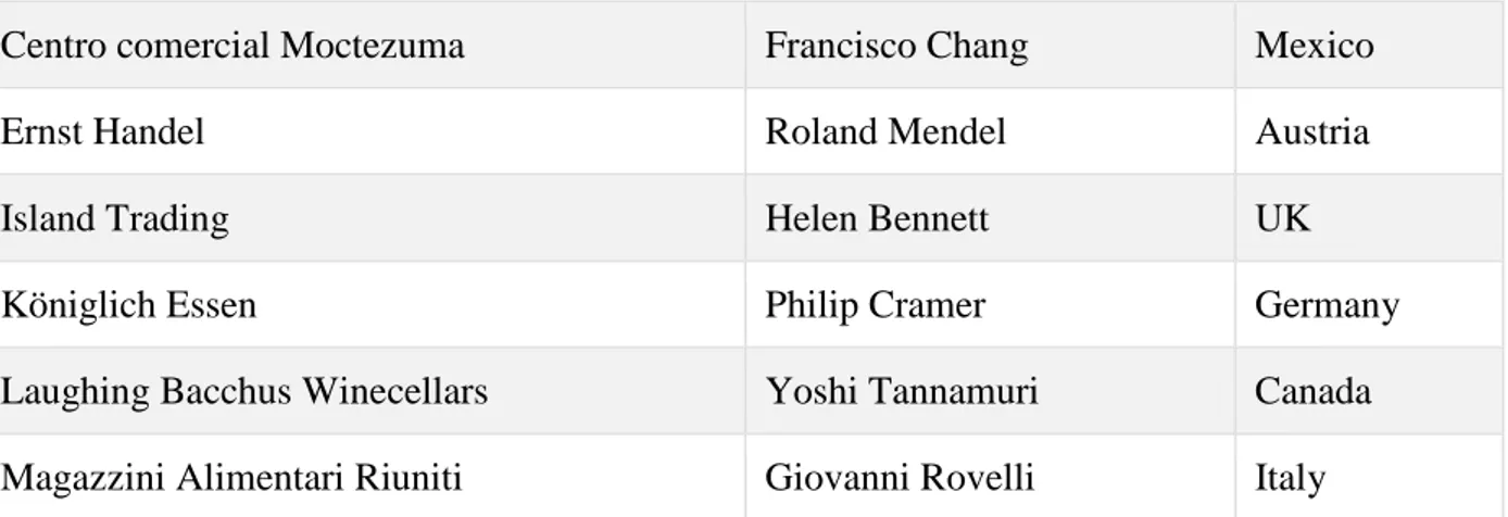
The look of an HTML table can be greatly improved with CSS:
Company Contact Country
Alfreds Futterkiste Maria Anders Germany
Centro comercial Moctezuma Francisco Chang Mexico
Ernst Handel Roland Mendel Austria
Island Trading Helen Bennett UK
Königlich Essen Philip Cramer Germany
Laughing Bacchus Winecellars Yoshi Tannamuri Canada
Magazzini Alimentari Riuniti Giovanni Rovelli Italy
Table Borders
To specify table borders in CSS, use the border property.
The example below specifies a black border for <table>, <th>, and <td> elements: Example
table, th, td {
border: 1px solid black; }
Notice that the table in the example above has double borders. This is because both the table and the <th> and <td> elements have separate borders.
Collapse Table Borders
The border-collapse property sets whether the table borders should be collapsed into a single border: Example
table {
border-collapse: collapse; }
table, th, td {
border: 1px solid black; }
If you only want a border around the table, only specify the border property for <table>: Example
table {
border: 1px solid black; }
Table Width and Height
Width and height of a table are defined by the width and height properties.
Example table { width: 100%; } th { height: 50px; } Horizontal Alignment
The text-align property sets the horizontal alignment (like left, right, or center) of the content in <th> or <td>.
By default, the content of <th> elements are center-aligned and the content of <td> elements are left-aligned. The following example left-aligns the text in <th> elements:
Example th {
text-align: left; }
Vertical Alignment
The vertical-align property sets the vertical alignment (like top, bottom, or middle) of the content in <th> or <td>.
By default, the vertical alignment of the content in a table is middle (for both <th> and <td> elements). The following example sets the vertical text alignment to bottom for <td> elements:
Example td { height: 50px; vertical-align: bottom; } Table Padding
To control the space between the border and the content in a table, use thepadding property on <td> and <th> elements: Example th, td { padding: 15px; text-align: left; } Horizontal Dividers
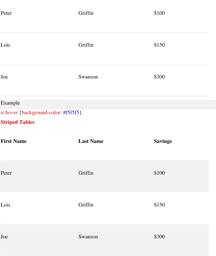
First Name Last Name Savings
Peter Griffin $100
Lois Griffin $150
Joe Swanson $300
Add the border-bottom property to <th> and <td> for horizontal dividers: Example
th, td {
border-bottom: 1px solid #ddd; }
Hoverable Table
Use the :hover selector on <tr> to highlight table rows on mouse over:
Peter Griffin $100 Lois Griffin $150 Joe Swanson $300 Example tr:hover {background-color: #f5f5f5} Striped Tables
First Name Last Name Savings
Peter Griffin $100
Lois Griffin $150
Joe Swanson $300
For zebra-striped tables, use the nth-child() selector and add a background-color to all even (or odd) table rows:
Example
tr:nth-child(even) {background-color: #f2f2f2}
Table Color
First Name Last Name Savings Peter Griffin $100 Lois Griffin $150 Joe Swanson $300 Example th { background-color: #4CAF50; color: white; } Responsive Table
A responsive table will display a horizontal scroll bar if the screen is too small to display the full content:
First Name Last Name Points Points Points Points Points Points Points Points Point
Jill Smith 50 50 50 50 50 50 50 50 50
Eve Jackson 94 94 94 94 94 94 94 94 94
Adam Johnson 67 67 67 67 67 67 67 67 67
Add a container element (like <div>) with overflow-x:auto around the <table> element to make it responsive: Example <div style="overflow-x:auto;"> <table> ... table content ... </table> </div>
CSS Table Properties
Property Description
border Sets all the border properties in one declaration
border-collapse Specifies whether or not table borders should be collapsed
border-spacing Specifies the distance between the borders of adjacent cells
caption-side Specifies the placement of a table caption
empty-cells Specifies whether or not to display borders and background on empty cells in a table
table-layout Sets the layout algorithm to be used for a table
CSS Layout - The display Property
The display property is the most important CSS property for controlling layout. The display Property
The display property specifies if/how an element is displayed.
Every HTML element has a default display value depending on what type of element it is. The default display value for most elements is block or inline.
Click to show panel
Block-level Elements
A block-level element always starts on a new line and takes up the full width available (stretches out to the left and right as far as it can).
The <div> element is a block-level element. Examples of block-level elements:
• <div> • <h1> - <h6> • <p> • <form> • <header> • <footer> • <section> Inline Elements
An inline element does not start on a new line and only takes up as much width as necessary. This is an inline <span> element inside a paragraph.
Examples of inline elements: • <span>
• <a> • <img> Display: none;
display: none; is commonly used with JavaScript to hide and show elements without deleting and recreating them. Take a look at our last example on this page if you want to know how this can be achieved.
The <script> element uses display: none; as default. Override The Default Display Value
As mentioned, every element has a default display value. However, you can override this.
Changing an inline element to a block element, or vice versa, can be useful for making the page look a specific way, and still follow the web standards.
A common example is making inline <li> elements for horizontal menus: Example
li {
display: inline; }
Note: Setting the display property of an element only changes how the element is displayed, NOT what kind of element it is. So, an inline element with display: block; is not allowed to have other block elements inside it.
Example span {
display: block; }
The following example displays <a> elements as block elements: Example
a {
display: block; }
Hide an Element - display:none or visibility:hidden? display:none
Remove
Hide Reset
Reset All
Hiding an element can be done by setting the display property to none. The element will be hidden, and the page will be displayed as if the element is not there:
Example h1.hidden { display: none; }
visibility:hidden; also hides an element.
However, the element will still take up the same space as before. The element will be hidden, but still affect the layout: Example h1.hidden { visibility: hidden; } CSS Display/Visibility Properties Property Description
display Specifies how an element should be displayed
visibility Specifies whether or not an element should be visible
Using width, max-width and margin: auto;
Setting the width of a block-level element will prevent it from stretching out to the edges of its container. Then, you can set the margins to auto, to horizontally center the element within its container. The element will take up the specified width, and the remaining space will be split equally between the two margins: This <div> element has a width of 500px, and margin set to auto.
Note: The problem with the <div> above occurs when the browser window is smaller than the width of the element. The browser then adds a horizontal scrollbar to the page.
Using max-width instead, in this situation, will improve the browser's handling of small windows. This is important when making a site usable on small devices:
This <div> element has a max-width of 500px, and margin set to auto.
Tip: Resize the browser window to less than 500px wide, to see the difference between the two divs! Here is an example of the two divs above:
Example div.ex1 {
margin: auto;
border: 3px solid #73AD21; }
div.ex2 {
max-width: 500px; margin: auto;
border: 3px solid #73AD21; }
Using width, max-width and margin: auto;
As mentioned in the previous chapter; a block-level element always takes up the full width available (stretches out to the left and right as far as it can).
Setting the width of a block-level element will prevent it from stretching out to the edges of its container. Then, you can set the margins to auto, to horizontally center the element within its container. The element will take up the specified width, and the remaining space will be split equally between the two margins: This <div> element has a width of 500px, and margin set to auto.
Note: The problem with the <div> above occurs when the browser window is smaller than the width of the element. The browser then adds a horizontal scrollbar to the page.
Using max-width instead, in this situation, will improve the browser's handling of small windows. This is important when making a site usable on small devices:
This <div> element has a max-width of 500px, and margin set to auto.
Tip: Resize the browser window to less than 500px wide, to see the difference between the two divs! Here is an example of the two divs above:
div.ex1 {
width: 500px; margin: auto;
border: 3px solid #73AD21; }
div.ex2 {
max-width: 500px; margin: auto;
border: 3px solid #73AD21; }
CSS Layout - The position Property
The position property specifies the type of positioning method used for an element (static, relative, fixed or absolute).
The position Property
There are four different position values: • static
• relative • fixed • absolute
Elements are then positioned using the top, bottom, left, and right properties. However, these properties will not work unless the position property is set first. They also work differently depending on the position value. position: static;
HTML elements are positioned static by default.
Static positioned elements are not affected by the top, bottom, left, and right properties.
An element with position: static; is not positioned in any special way; it is always positioned according to the normal flow of the page:
This <div> element has position: static; Here is the CSS that is used:
Example div.static { position: static;
border: 3px solid #73AD21; }
position: relative;
An element with position: relative; is positioned relative to its normal position.
Setting the top, right, bottom, and left properties of a relatively-positioned element will cause it to be adjusted away from its normal position. Other content will not be adjusted to fit into any gap left by the element.
This <div> element has position: relative; Here is the CSS that is used:
Example div.relative { position: relative; left: 30px;
border: 3px solid #73AD21; }
position: fixed;
An element with position: fixed; is positioned relative to the viewport, which means it always stays in the same place even if the page is scrolled. The top, right, bottom, and left properties are used to position the element.
A fixed element does not leave a gap in the page where it would normally have been located. Notice the fixed element in the lower-right corner of the page. Here is the CSS that is used: Example div.fixed { position: fixed; bottom: 0; right: 0; width: 300px;
border: 3px solid #73AD21; }
This <div> element has position: fixed; position: absolute;
An element with position: absolute; is positioned relative to the nearest positioned ancestor (instead of positioned relative to the viewport, like fixed).
However; if an absolute positioned element has no positioned ancestors, it uses the document body, and moves along with page scrolling.
Note: A "positioned" element is one whose position is anything except static. Here is a simple example:
This <div> element has position: relative; This <div> element has position: absolute; Here is the CSS that is used:
Example div.relative { position: relative; width: 400px; height: 200px;
border: 3px solid #73AD21; } div.absolute { position: absolute; top: 80px; right: 0; width: 200px; height: 100px;
border: 3px solid #73AD21; }
Overlapping Elements
The z-index property specifies the stack order of an element (which element should be placed in front of, or behind, the others).
An element can have a positive or negative stack order: This is a heading
Because the image has a z-index of -1, it will be placed behind the text. Example img { position: absolute; left: 0px; top: 0px; z-index: -1; }
An element with greater stack order is always in front of an element with a lower stack order. All CSS Positioning Properties
Property Description
bottom Sets the bottom margin edge for a positioned box
clip Clips an absolutely positioned element
cursor Specifies the type of cursor to be displayed
left Sets the left margin edge for a positioned box