HAL Id: hal-01773882
https://hal.inria.fr/hal-01773882
Submitted on 23 Apr 2018
HAL is a multi-disciplinary open access
archive for the deposit and dissemination of
sci-entific research documents, whether they are
pub-lished or not. The documents may come from
teaching and research institutions in France or
abroad, or from public or private research centers.
L’archive ouverte pluridisciplinaire HAL, est
destinée au dépôt et à la diffusion de documents
scientifiques de niveau recherche, publiés ou non,
émanant des établissements d’enseignement et de
recherche français ou étrangers, des laboratoires
publics ou privés.
Animation Plans for Before-and-After Satellite Images
María-Jesús Lobo, Caroline Appert, Emmanuel Pietriga
To cite this version:
María-Jesús Lobo, Caroline Appert, Emmanuel Pietriga. Animation Plans for Before-and-After
Satel-lite Images. IEEE Transactions on Visualization and Computer Graphics, Institute of Electrical and
Electronics Engineers, 2019, 25 (2), pp.1347-1360. �10.1109/TVCG.2018.2796557�. �hal-01773882�
Animation Plans for
Before-and-After Satellite Images
María-Jesús Lobo, Caroline Appert, and Emmanuel Pietriga
Abstract—Before-and-after image pairs show how entities in a given region have evolved over a specific period of time. Satellite images are a major source of such data, that capture how natural phenomena or human activity impact a geographical area. These images are used both for data analysis and to illustrate the resulting findings to diverse audiences. The simple techniques used to display them, including juxtaposing, swapping and monolithic blending, often fail to convey the underlying phenomenon in a meaningful manner. We introduce Baia, a framework to create advanced animated transitions, called animation plans, between before-and-after images. Baia relies on a pixel-based transition model that gives authors much expressive power, while keeping animations for common types of changes easy to create thanks to predefined animation primitives. We describe our model, the associated animation editor, and report on two user studies. In the first study, advanced transitions enabled by Baia were compared to monolithic blending, and perceived as more realistic and better at focusing viewer’s attention on a region of interest than the latter. The second study aimed at gathering feedback about the usability of Baia’s animation editor.
Index Terms—Animation; blending; staging; remote sensing images.
F
1
I
NTRODUCTIONB
EFORE-and-after satellite images are pairs or longersequences of remote sensing images1 from the same geographical area, taken at different points in time and spatially aligned using image registration techniques [1]. They show how an area has been impacted by natural phenomena such as earthquakes and tsunamis [2], or by human activity: construction projects [3], drying lakes [4], sea level rise [5]. Both government agencies2 and commer-cial businesses3provide this type of imagery, offering past and recent data that cover a large part of the planet.
Before-and-after images are used both for the purpose of data analysis and for illustration of the resulting findings to diverse audiences. Such illustrations will typically display the images juxtaposed on screen, or superposed on top of one another. The latter option tends to be favored when dealing with satellite images, as these images usually share a common spatialization [6].
Illustrations based on superposition of before-and-after images are typically organized as slideshows. The simplest type of slideshow will simply swap images abruptly. The transition can also be animated [7], using what we call here monolithic blending, i.e., the now-classic technique that consists in smoothly transitioning between two images by gradually increasing the transparency of the source image drawn on top of the destination image. Swapping and monolithic blending both consider the entire image as a single, uniform block. They are thus limited in their capacity to draw the audience’s attention on specific changes when
• M.-J. Lobo, C. Appert and E. Pietriga are with Univ. Paris-Sud, CNRS, INRIA, Université Paris-Saclay.
E-mail: [email protected], [email protected], [email protected]
Author version. Manuscript accepted and published online 2018-01-23. 1. Images of the ground obtained from satellites or aircrafts. 2. For instance NASA - http://earthobservatory.nasa.gov 3. For instance DigitalGlobe - https://www.digitalglobe.com
multiple differences exist between the two images. They are also limited in their capacity to provide a meaningful illustration of the observed phenomena’s dynamics, as all pixels get blended in the same manner regardless of the images’ contents.
We introduce Baia, a framework to create more meaning-ful animated transitions between before-and-after images: animations that better illustrate specific changes, and that help focus the audience’s attention on those changes. Fig-ure 1 illustrates the difference between monolithic blending and an animation generated with Baia on a simple example. Figure 6 does the same on a more elaborate example.
The approach relies on animation plans, a pixel-based transition model that gives authors much flexibility in the specification of transitions between images. We describe this model, as well as the accompanying set of predefined ani-mation primitives that capture common types of changes. Next, we report on a user study in which transitions cre-ated with Baia, while noticeably artificial, were perceived as more realistic and better at focusing viewer’s attention on specific changes than monolithic blending. Finally, we describe a prototype animation plan authoring tool inspired by timeline-based video editing applications, and report on a small study that gathered feedback about its usability.
2
B
ACKGROUND ANDM
OTIVATION2.1 Visual Comparison
Gleicher et al. [6] categorize visual comparison for infor-mation visualization into juxtaposition, superposition and explicit encoding techniques. All categories are relevant to the comparison of maps and satellite images. They can be juxtaposed, or superposed, in which case interactive wid-gets and animations are used to reveal the image below us-ing different interaction techniques [8] such as transparency adjustment, swiping or hole drilling using lenses [9].
... ... ... ...
... ... ... ...
Automatically generated animation frames
Before image After image
Automatically generated animation frames
Before image After image
Monolithic Blending
Custom Baia
Animation Plan
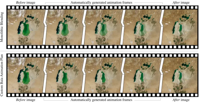
Fig. 1. Keyframes from the Aral sea animation generated using a before image from 2000 and an after image from 2010. Top row: keyframes of an animation generated using classic monolithic blending. In the intermediate keyframes, both states of the sea in 2000 and 2010 co-exist, visually interfering with one another as 2010 fades in and 2000 fades out. Bottom row: keyframes of a Baia animation plan (Figure 5). There is no such visual interference, and the sea actually gives the impression of shrinking. Source: NASA.
Juxtaposition relies on working memory for comparison and is effective only if objects can easily be matched be-tween images. When objects are difficult to match, or when differences are difficult to identify, an alternative approach consists of detecting them automatically and exposing them to users. For instance, VAICo [10], an interactive tool that enables users to explore differences detected between im-ages. Some techniques go further in this direction, explicitly encoding the differences visually. Such techniques (see, e.g., [11], [12], [13], [14]) can be very effective at showing differ-ences, but these are often domain-specific, and support more analytical forms of comparisons aimed at expert audiences. Superposition techniques work well in the case of satel-lite images, as those images are spatially registered. This makes the process of matching objects and visually com-paring them easier for users [6]. Abruptly swapping images can be an effective means to detect changes in the analysis phase. But superposition also makes it possible to display changes in images by sequencing them in time using ani-mated transitions, which can be more effective at conveying those changes to an audience, as discussed below.
2.2 Slideshow-style Animations
Animations have been used in visualization to convey dif-ferent kinds of changes: changes to the data themselves, such as the addition, modification or removal of data ele-ments in the representation [15], changes of viewpoint on the representation [16], and even changes of representation type [17]. Animations provide strong support for object constancy [16] and can also suggest chains of causality. They thus play an important role in visually-illustrated narratives [17], [18].
Animations have also proven to be useful in geographi-cal applications, as they are natural candidates for represent-ing spatio-temporal data and processes [19]. They are par-ticularly useful to animate changes over time [20]. Early ex-ploratory visualization applications such as HealthViz [21] have been using basic forms of animation to visualize time-series, swapping between snapshots sequentially. More re-cent examples, such as the wildfire simulation by Kim et al. [22], interpolate between snapshots to create smoother animations. However, most animations focus on abstract vector data. Authoring animations for remote sensing im-agery is more challenging, as the content of raster images cannot be manipulated as easily as vector graphics.
When authoring presentations that involve sequences of raster images, authors have to choose from a limited set of options in terms of transitions. One image will be replaced by the next, either abruptly swapping or gradually blending between them (what we called monolithic blending earlier, illustrated in the top row of Figure 1). Such temporal composition can work better than static representations [23], and online tools such as MODIS-VIIRS GIF Creation4make their construction easy.
This type of slideshow-style animation has been used to show, e.g., seasonal changes [24], to illustrate the effect of climate change [4] and major construction projects [3], or to show predictions of future conditions such as sea-level rise [25]. But according to Lobben [7], these slideshows are not real animations, as the audience can clearly detect the moment when a new slide (or frame) replaces the previous one. Animations are supposed to generate smoother
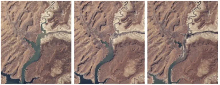
Fig. 2. Images showing Lake Powell’s evolution between 2002 and 2004. The only area that varies significantly across the three images is the lake itself, making it relatively easy to track changes. Source: NASA.
Fig. 3. Before & after the 2015 Nepal earthquake. When swapping or blending between the two images, changes in color histograms, shadows, and the shelters set up on the Tundikhel field (located on the right) make it difficult to focus attention on damaged areas such as the one highlighted in the red circle. Source: Airbus/Pléiades.
tions, in which the audience does not detect such discrete transitions that break the temporal continuum.
2.3 Supporting Process Animations
Simple transitions can be effective when the different snap-shots are very homogeneous, only differing in the actual element of interest (Figure 2), and when the evolution of that element is straightforward to understand. However, if the evolution is complex, as is often the case when dealing with what Lobben calls process animations [7], simple tran-sitions might not convey the nature of the corresponding changes in the most meaningful manner. For instance, the before-and-after images might differ too much, or miss key intermediate steps, making it difficult for the audience to understand the transformation.
To our knowledge, process animations have not received much attention in the context of remote sensing imagery, ex-cept for some image-morphing-based techniques designed for highly-specific types of data [26]. Generally-speaking, morphing techniques are used to transition between two raster images, one image being smoothly warped and blended into the other based on user-specified keypoints or subareas [27]. Some algorithms use morphological image operations, entirely removing the need for keypoint spec-ification [28], [29]. Morphing has been used to transition between maps featuring incongruent projections [30], as is typically the case when historical maps are involved. Morphing does not play a central role in our approach, but is rather used as a means to compute some of the more elaborate pixel-based animations generated by Baia’s deformation primitives.
Another important issue to consider is that before-and-after image pairs may also feature changes unrelated to
the elements of interest, such as, e.g., varying cloud cover, large differences in color histograms, other elements appear-ing, disappearing or moving. Simple transitions might then make it difficult for the audience to focus their attention on the evolution of the elements of interest, as multiple areas will be changing concurrently, interfering with them (Figure 3). As Tversky et al. state, transitions should be kept as simple as possible, creating animations that are “[...] slow and clear enough for observers to perceive movements, changes, and their timing, and to understand the changes in relations be-tween the parts and the sequence of events" [31]. But they should also be effective at focusing the audience’s attention, and at conveying the nature of changes following the principle of congruence also from Tversky et al. [31], which in this case advocates for establishing “a natural correspondence between change over time [. . . ] and the essential conceptual information to be conveyed" (here, the phenomenon to be illustrated).
3
B
AIA’
SA
NIMATIONM
ODELChevalier et al. define an animation as “a (usually perceptually continuous) sequence of intermediary images that give the illusion of a smooth progression from a transition’s initial visual state to its final visual state” [32], where a transition is a “pair of visual states - an initial one and a final one.” The animation model that provides the foundation of our framework, Baia, automatically generates sequences of intermediate images (Figure 1), enabling smooth transitions between before im-ages (initial state) and after imim-ages (final state).
Baia’s animation model is based on what we term an-imation plans. An anan-imation plan is a pair of matrices S (for start) and E (for end) whose dimensions match that of the before-and-after images. The two matrices respectively specify, for each pixel in the before image: (S) at which moment in the course of the whole animated transition does that pixel start to be gradually composited with the corre-sponding pixel in the after image, and (E) at which moment does this gradual compositing stop, the pixel from the after image having fully replaced the pixel from the before image. Values in the matrices can thus be seen as time stamps that mark, independently for each individual pixel at coordi-nates i, j, the beginning (si,j) and end (ei,j) of their
transi-tion. These time stamps are encoded as normalized values, and the end time stamp can be equal to, but not less than, the start time stamp (∀i, j : si,j ∈ [0, 1], ei,j ∈ [0, 1], si,j≤ ei,j).
If si,j= ei,j, then the before pixel gets swapped with the after
pixel at the specified moment, instantaneously. If si,j < ei,j,
then the before pixel gets smoothly blended with the after pixel using OVER alpha compositing [33], the value of α being linearly interpolated from 0 to 1 between times si,j
and ei,j. As interpreting the visual rendering of animation
plans is not straightforward, we illustrate in Figure 4 how they work on a schematic example. We then discuss more realistic examples.
Values in S and E close to 0 mean that corresponding events happen early in the animation. Conversely, values closer to 1 correspond to events that occur late. When mapped to a grayscale gradient: dark pixels in S start blending early, while bright pixels start blending late; dark pixels in E finish blending early, while bright pixels finish blending late. See Figure 4-b for a simple example.
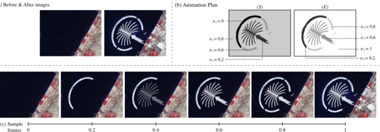
(a) Before & After images (b) Animation Plan 0.2 0.4 0.6 0.8 1 0 (c) (S) (E) si,j = 0 ei,j = 0,2 si,j = 0,2 ei,j = 0,6 si,j = 0,6 si,j = 0,8 ei,j = 0,8 ei,j = 1 Sample frames
Fig. 4. Example illustrating how animation plans work: (a) before-and-after image pair showing land reclamation in Dubai (construction of the Palm Islands); (b) animation plan matricesSandEspecify that: the pixels from the before image that belong to the outer island arc start blending at the very beginning of the animation (si,j = 0) and have been fully replaced by the corresponding pixels in the after image at 20% of the animation’s
course (ei,j = 0.2); pixels in the palm-tree itself start blending when the animation reaches 20% of its course (si,j = 0.2), and have been fully
replaced when it reaches 60%(ei,j= 0.6); the two lower arcs are animated next, between 60% (si,j= 0.6) and 80% (ei,j= 0.8); finally the rest of
the image starts blending at 80% (si,j= 0.8) and gets fully replaced at the very end of the animation (ei,j= 1). (c) Keyframes from the animation.
This pixel-based model is flexible. It makes it possible to create more meaningful transitions than what can be achieved with a monolithic blending function between the before and after images. In particular, it enables the creation of animations that can focus users’ attention on a specific re-gion of interest, and that can convey the changes’ dynamics in a manner that better reflects the temporal evolution of the actual phenomenon that impacted the region, as we discuss in the next section.
Focusing on a region of interest.As mentioned earlier, two images of the same geographical area can feature many differences (Figure 3), making it difficult to focus on changes of actual interest. The corresponding areas in the image can be emphasized using visual highlighting techniques (e.g., [34]). Complementary to such techniques, staged an-imations can guide viewers’ attention to a particular area by first animating changes of interest and then all other areas; or conversely, starting with the other areas first. Both options can make sense, depending on the context in which the animation author wants to reveal those changes. As mentioned by Heer and Robertson [17], staging a complex transition to break it up into a series of simple transitions can help support Tversky’s apprehension principle [31] by drawing the audience’s attention on one single change at a time. Animation plans make it easy to define such stages. Coming back to the example in Figure 4, the animation is broken down in four stages: first the upper island arc appears, then the palm-tree itself, then the lower arcs, and finally the coast gets updated.
Conveying changes’ dynamics.By controlling the order in which before pixels get swapped or blended with after pixels, an animation plan can approximate the dynamics of some changes, better illustrating how the corresponding en-tity has evolved over time. Figure 1 shows some keyframes from an animation that gradually blends (inward) pixels that belonged to the Aral sea in 2000 but that were no longer part of it in 2010. Figure 5 shows the matrices that define the corresponding animation plan, which approximates the phenomenon and was created using the DEFORMATION
an-(S) (E)
Fig. 5. MatricesS andE of the animation plan created using Baia’s DEFORMATIONprimitive to generate the transition in Figure 1. The land surrounding the sea gets blended first, then the sea gradually shrinks.
imation primitive (discussed later). The grayscale gradient specifies that the closer the pixel to the 2010 contour, the later its animation will start. Figure 6 illustrates another way of conveying dynamics by approximating the actual phenomenon in the animation plan, comparing it to mono-lithic blending. Figure 7 shows the corresponding animation plan. In this case, before pixels get swapped with after pixels instantaneously, but at different times, determined by a digital elevation model (DEM) of the geographical region.
In our prototype implementation, animation plans are encoded as TIFF files, matrices S and E being stored in bands R and G (band B remaining unused for now). This way, animation plans can be displayed using any general-purpose image viewer that supports selecting and rendering RGB bands separately. Raw animation plans can actually be modified and even created from scratch directly with an im-age editor. However, this is tedious in most cases. We have thus designed and implemented a prototype animation plan authoring tool as part of the Baia framework, whose user interface is described later in the paper. The tool features the predefined animation primitives described next, that build on top of the core pixel-based animation model to make animation plans easy-to-author for a wide range of users.
Before image Automatically generated animation frames After image
... ... ... ...
... ... ... ...
Automatically generated animation frames
Before image After image
Monolithic Blending
Custom Baia
Animation Plan
Fig. 6. Animated transitions based on one single before-and-after image pair (NASA Blue Marble Next Generation – August & December 2004) showing seasonal snow cover over northern Middle East. The top row shows keyframes generated using basic monolithic blending. Snow fades in gradually but uniformly, regardless of altitude. The bottom row shows keyframes generated using a Baia animation plan (Figure 7) derived from a Digital Elevation Model. Snow fades in gradually, but this time spreading from high-altitude to low-altitude areas. Source: NASA.
(S) (E)
Fig. 7. MatricesSandEof the animation plan derived from a digital elevation model (METI/NASA ASTER GDEM V2, 2011), that was used to generate the transition in Figure 6. Values in the two matrices cor-responding to snow-covered areas are identical: pixels get swapped in-stantaneously, but following a spatial pattern based on terrain elevation.
Predefined Animation Primitives
In order to keep transitions for common types of changes easy to create, Baia features a set of predefined animation primitives that can generate the corresponding animation plans automatically. This set is based on the following prim-itive changes from Claramunt and Thériault’s modelling of temporal GIS [35]: APPEARANCE, DISAPPEARANCE, CON
-TRACTION, EXPANSION, DEFORMATION. Several of these
primitives, such as APPEARANCE and DISAPPEARANCE, are straightforward to map to locally-bounded blending operations. Other primitives require more explanation.
• CONTRACTION corresponds to shapes that become
smaller, such as a glacier retreating. We approxi-mate contraction phenomena by generating anima-tion plans that progressively blend pixels that fall inside the shape’s contour in the before image. To achieve this, we define two binary masks for the shape, one in the before image (Ms) and the other in the after image (Me). We apply an erosion filter to Ms with a structuring element of 3 × 3 until it matches Me. Start values si,j and end values ei,j are set proportionally to the pixel’s distance to the new contour in the after image, this distance corre-sponding to the minimum number of erosion steps
that need to be performed on Msfor it to no longer contain the considered pixel. In the absence of an end mask Me, the shape contracts until it disappears. Ek is the matrix obtained after applying the erosion filter at iteration k. For each iteration, we add the matrix to the animation plan, resulting in:
si,j= ei,j= n X
k=1 (Eki,j)
where n is the total number of iterations. Finally, we normalize the matrices’ values. Pixels that belong to the intersection of both masks or that belong only to end mask Meare set to: si,j = 0 and ei,j= 1.
• EXPANSION corresponds to shapes that become
larger, such as a river flooding. We approximate expansion phenomena in a similar manner: we gen-erate animation plans that progressively blend pixels that fall inside the shape’s contour in the after image. To achieve this, we define the same two binary masks as above. We apply a dilation filter to Ms with a structuring element of 3 × 3 until it matches Me, and call Dk the matrix obtained after applying the erosion filter at iteration k. Start values si,jand end values ei,j are set proportionally to the pixel’s dis-tance (minimum number of dilation steps performed on Ms for it to contain the considered pixel) to the new contour in the after image. For each iteration, we add the matrix to the animation plan, resulting in:
si,j = ei,j = n X
k=1 (Di,jk )
where n is the total number of iterations. Finally, we invert the gradient in the animation plan (simply re-versing its direction) and we normalize the matrices’ values. Pixels that belong to the intersection of both masks, that belong to Msonly, or that belong to Me only and are not connected to Ms, are set as follows: si,j= 0 and ei,j= 1.
• DEFORMATION corresponds to shapes that present
changes that are not a simple contraction or expan-sion. We propose two approaches to generate anima-tion plans for this kind of transianima-tion. The first one superimposes the shape’s contour in the before image on the shape’s contour in the after image. It leaves the intersection between both contours untouched, contracts the parts that disappear, and expands the parts that appear using the filters described above for CONTRACTION and EXPANSION. However, this approach does not always provide convincing re-sults, especially when non-convex shapes are in-volved, as these filters do not necessarily preserve the topology. Our second approach, MORPH, addresses such cases. It is based on shape morphing [36] and enables more elaborate deformations. We adopt the approach described in [36] to compute vertex correspondences between the two contours based on local neighborhood similarity. We then generate linear vertex paths for each pair of matched vertices between the start (P0) and end (P1) polygons. We use OpenCV to extract mask contours. The matrix Hk corresponding to each iteration k holds polygon Pk
, generated according to the previous linear paths: Pk = (1 − k)P0+ kP1. For each iteration k, we add the matrix Hk to our animation plan:
si,j = ei,j = n X
k=1 (Hi,jk )
where n is the total number of iterations. Finally, as in the case of EXPANSION, we invert the gradient (where the shape has expanded), and we normalize the matrices’ values.
Baia features additional generic primitives for radial and directional progression, that visually translate to radial and linear gradients in animation plan matrices. As hinted at earlier, animation plans can be generated by any means, as long as the result is normalized and encoded in the first two bands of a TIFF file. For instance, Figure 7 shows the two matrices S and E of an animation plan derived from terrain elevation data fetched from the Web and pre-processed before import.
4
U
SERS
TUDYAnimation plans make it possible to control a transition between two images at the pixel level, where each pixel can blend independently from one another. We hypothesize that this fine-grained control enables the design of custom animations that can convey a more elaborate semantics than monolithic animations can. Because animations can serve different purposes, a measure of their efficiency is depen-dent on what the animation’s author wants to communicate. We ran a study in the scenario where the goal of the ani-mation’s author is to illustrate a geographical phenomenon in a realistic manner. In this specific context, an animation can be considered as effective when it puts the emphasis on the region that is affected by the phenomenon, and when it illustrates how the region got affected over time. We hypothesize that, in this context, animation plans can be
used to design custom transitions that should be effective because of the following two properties.
• Custom animations can delineate the region of inter-est (RoI) from the background (BG)5by putting the animation of the RoI and that of the BG in sequence. This should help draw the audience’s attention to the region of interest in comparison with transitions that animate both regions concurrently (Hf ocus).
• Custom animations can gradually reveal pixels in the RoI. Depending on the author’s knowledge of the progression of the actual phenomenon, this can help provide a more accurate illustration of that phenomenon. Such illustrations should be perceived as more realistic of how the RoI got modified over time, in comparison with animations that consider the RoI as a uniform area (Hrealism).
In order to operationalize the above hypotheses, our experiment involves animations that differ according to two main factors, RoIanim∈ {BG_CONCURRENT,BG_SEPARATE},
and RoIreveal ∈ {UNIFORM, PROGRESSIVE}, and the ex-perimental task requires participant to rate the different animations according to their capacity to Focus attention on the RoI, and according to their Realism.
4.1 Participants and Apparatus
Sixteen unpaid volunteers (seven females), daily computer users, age 24 to 41 (average: 29.6, median 28), served in the experiment. All had normal or corrected-to-normal vision and did not suffer from color blindness. The experiment was implemented using OpenGL in Java (JOGL), and ran on a MacBook Pro Retina equipped with an NVIDIA GeForce GT 750M 2048 MB graphics card connected to an external 2560×1440 pixels Apple Thunderbolt display.
4.2 Procedure
We followed a 2 × 2 × 5 within-subject design with 3 factors: RoIanim, RoIreveal and geographic Change. Geographic Change corresponds to one of the five types of entity evolu-tion detailed earlier, taken from [35]: [APPEARANCE, DISAP
-PEARANCE, CONTRACTION, EXPANSION, DEFORMATION].
In order to collect enough measures for statistical analysis, we sought three pairs of before and after images for each Change using online sources. Figure 8 lists all image pairs, along with their source. All fifteen pairs were shown to each participant. The presentation order was randomized.
For each before-and-after image pair, participants com-pleted a 3-step trial. Figure 9 illustrates the trial correspond-ing to image pair (11) in Figure 8. In each step, the interface features: a textual description of the phenomenon (top),6 two animations presented side by side (center)7, and a set of input widgets (bottom). Each animation is displayed in a 1270×1138 pixels panel. Participants are free to play each animation as many times as they want, and can navigate through the animations’ frames using a slider. For each of
5. Background refers to all areas in the image not affected by the geographic phenomenon of interest that the audience should focus on. 6. All fifteen descriptions are available on the Web page provided as supplemental material. See details in the note below Figure 8.
DEFORMATION EXPANSION DISAPPEARANCE CONTRACTION APPEARANCE (1) (2) (3) (4) (5) (6) (7) (8) (9) (10) (11) (12) (13) (14) (15)
(1) http://professionnels.ign.fr/orthoimages (48◦42’46.1"N 2◦09’57.3"E), (2) http://earthobservatory. nasa.gov/Features/WorldOfChange/dubai.php, (3) http://climate.nasa.gov/images-of-change? id=541#541, (4) https://www.planet.com/gallery/ Lower Se San 2 dam, Cambodia, (5) http: //earthobservatory.nasa.gov/Features/WorldOfChange/larsenb.php, (6) http://earthobservatory. nasa.gov/Features/WorldOfChange/aral_sea.php, (7) http://www.nytimes.com/interactive/2015/ 07/30/world/asia/what-china-has-been-building-in-the-south-china-sea-2016.html?_r=0, (8) http://earthobservatory.nasa.gov/Features/WorldOfChange/hobet.php, (9) http://climate.nasa. gov/images-of-change?id=335#335, (10) http://climate.nasa.gov/images-of-change?id=555#555, (11) https://www.google.fr/intl/en/earth/ (21◦06’17"S 175◦08’26"W), (12) http://climate.nasa.gov/ images-of-change?id=565#565, (13) http://earthobservatory.nasa.gov/IOTD/view.php?id=86746, (14) http://earthobservatory.nasa.gov/Features/WorldOfChange/columbia_glacier.php, (15) http: //climate.nasa.gov/images-of-change?id=535#535
Fig. 8. The fifteen before-and-after image pairs used in the experiment.
All before-and-after image pairs are made available, along with videos of all (60) tested animation plans, at the following location: http://ilda.saclay.inria.fr/mapmuxing/baia/study
Step 1: Realism Steps 2 & 3: Capacity to focus users’ attention
PROGRESSIVE UNIFORM PROGRESSIVEX CONCURRENT PROGRESSIVEX SEPARATE
(presentation order of Custom-* and Blend-* is counterbalanced across trials and participants) (always presented first, for each image pair)
For Step 2 & 3, the description is accompanied by a thumbnail representing the region of interest, marked in light blue
UNIFORMX CONCURRENT UNIFORMX SEPARATE
Fig. 9. User interface shown two participants in each of the three steps of trial. Users were first asked to rate two animations that differ in their way of revealing the region of interest (RoIreveal) according to their Realism, and then rate two animations that act on the RoI and the background either concurrently or in sequence (RoIanim) according to their capacity to Focus users’ attention. Custom-* and Blend-* labels were not shown to participants, and have been added here only to facilitate understanding of the experiment’s design and interface.
the three steps, they indicate, between the two animations, which one they find most pleasant to watch. Then, they rate both animations according to a criterion that depends on the step they are completing, as described below.
Step 1 aims at testing Hrealism by comparing
anima-tions that reveal the RoI using aUNIFORMorPROGRESSIVE
blending. In this step, participants are asked to read the textual description of the phenomenon to be illustrated in the animation, and to rate each animation according to how realistically they illustrate the phenomenon using five-point Likert scales (from 1: very poor, to 5: very good). To iso-late the effect of animation factor RoIrevealfrom RoIanim,
step 1 considers only single-stage animations (RoIanim =
BG_CONCURRENT).
The next two steps of each trial then test Hf ocus by
comparing, for each RoIreveal strategy, the case where
the animation of the region of interest is separate from the animation of the background (BG_SEPARATE) with the case where the two animations are played concurrently
(BG_CONCURRENT). In steps 2 and 3, the textual
descrip-tion is complemented by a thumbnail of the before image featuring a light-blue stroke that highlights the region of in-terest, so as to ensure that participants consistently identify this region. Participants are asked to carefully look at the region before rating each animation according to how well it focuses their attention on it, using a five-point Likert scale.
4.3 Results
We used the Aligned Rank Transform procedure for non-parametric data [37] to analyze participants’ ratings for both
Realism and capacity to Focus attention. As Figure 10-a illustrates, the collected data support hypothesis Hrealism.
Participants foundPROGRESSIVEanimations, which gradu-ally reveal the changes, more realistic than UNIFORM ani-mations. TheANOVAtest actually detects a significant effect of RoIreveal on Realism (F1,455 = 121.9, p < 0.0001). The
effect size between UNIFORMand PROGRESSIVEconditions is estimated as large (-1.007) using Cohen’s d. Change does not have a significant effect on Realism (p = 0.07). Neither does the interaction between Change and RoIreveal(p = 0.2).
RoIanim BG_CONCURRENT BG_SEPARATE
PROGRESSIVE UNIFORM 0 1 2 3 4 RoIreveal 0 1 2 3 4 PROGRESSIVE UNIFORM RoIreveal (a) (b)
Fig. 10. (a) Average Realism rating per strategy for revealing the RoI. (b) Average Focus rating perRoIrevealandRoIanim. Error bars repre-sent the 95% confidence intervals.
Over 240 trials, participants preferred the PROGRESSIVE
revealing strategy 172 times, and the UNIFORMstrategy 47 times. In order to test whether PROGRESSIVE animations were preferred for specific types of geographic Change, we ran an ANOVA (using the Aligned Rank Transform procedure) to analyze the effect of Change on the
Pro-gressive_Preferred binary measure, which is computed as follows: 1 ifPROGRESSIVEis more pleasant, 0 otherwise (i.e.,
UNIFORM is the most pleasant or participant found them
indifferently pleasant). We find that Change does not have a significant effect on Progressive_Preferred (p = 0.33), suggesting that participants tend to prefer PROGRESSIVE
animations regardless of the type of Change.
In order to test Hf ocus, we analyzed the effect of RoIanim
on the animation’s capacity to Focus participants’ attention. In this case, the results do not support our hypothesis.
RoIanim has a significant effect on the rating (F1,925 = 4.9,
p = 0.025). However, the analysis also reveals an
interac-tion effect of RoIanim × Change on Focus (F4,925 = 4.13,
p = 0.0025). Looking at the details, we observe that image
effect (F1,47 = 40.4, p < 0.0001), with BG_CONCURRENT
being rated higher than BG_SEPARATE. It may be because, for this particular image pair (as well as for image pair (11)), we animate pixels in the background first; as opposed to all other image pairs, for which we animate pixels in the RoI first. We made this choice because the old contour of the modified entity (the lake from the before image of pair (6)) would have remained visible during the contraction pro-cess. However, participants commented that it had the effect of drawing their attention to areas that were not part of the RoI. For all other changes, BG_SEPARATE animations were rated slightly better thanBG_CONCURRENTanimations, but the difference is not significant.
Surprisingly, as Figure 10-b illustrates, RoIrevealalso has a significant effect on the capacity to Focus participants’ attention (F1,925= 187.5, p < 0.0001). The effect size between
UNIFORMandPROGRESSIVEconditions is estimated as large
(-0.88) using Cohen’s d. Participants actually reported that movement in PROGRESSIVE animations was drawing their attention. This made them rate this kind of animation better at focusing their attention than UNIFORM animations. An
ANOVAtest also revealed an interaction effect of RoIreveal×
RoIanim(F4,925 = 13.7, p = 0.0002), withBG_CONCURRENT
being significantly better thanBG_SEPARATE (F1,455 = 17.5,
p < 0.0001) only for PROGRESSIVE trials. According to participants, in thePROGRESSIVEcondition, animations that put changes in the RoI and changes in the background in sequence seemed unnecessarily slow for some image pairs in comparison with animations that concurrently change both regions. The perceived lack of changes during the animation of the background might have led users’ attention to wander to other areas of the image.
Over 480 trials, participants preferredBG_CONCURRENT
122 times, and BG_SEPARATE 99 times. As in the case of
Realism, we looked for an effect of Change on binary measures indicating preference, Concurrent_Preferred and
Separate_Preferred. AnANOVAand multiple pairwise com-parisons tests only revealed that Concurrent_Preferred was significantly higher for DEFORMATIONtrials in comparison with CONTRACTION and DISAPPEARANCE trials (F4,60 =
3.67, p = 0.01). This is also likely due to the ordering of stages in image pair (6) mentioned earlier.
4.4 Discussion
Participants perceivedPROGRESSIVEanimations as more re-alistic thanUNIFORManimations because they better convey the evolution between the images. They also found PRO
-GRESSIVE animations more pleasant thanUNIFORM
anima-tions. A participant acknowledged that even ifPROGRESSIVE
animations are noticeably computer generated, this type of animation would be good for teaching and demonstrating changes. These results support our initial hypothesis. How-ever, image characteristics and the geographical processes depicted might influence the realism of the animation. For example, some participants mentioned that PROGRESSIVE
animations work especially well for evolution of natural entities, such as rivers and lakes evolving, but are less effective in the case of changes caused by human activity, such as building construction.
We also hypothesized that animations that separate the RoI from the rest of the image would be effective at
focus-ing viewers’ attention. The analysis of participants’ ratfocus-ings cannot fully support this, and rather suggest that usingPRO
-GRESSIVEanimations is more important than making use of
staging for drawing viewers’ attention to specific regions of interest. Nevertheless, several participants mentioned that staging was useful for animating changes in images whose backgrounds differed significantly. This was not the case when the region of interest was large and located at the center of the image, or when the region of interest and the background were highly contrasted such as in, e.g., image pairs 2 and 9.
The findings from this experiment suggest that PRO
-GRESSIVE animations yield more realistic results, and help
viewers focus their attention on the region of interest. DesigningPROGRESSIVEanimations requires some flexibil-ity. Different types of changes call for different animation strategies. This is the case even when considering only one specific type of change: no single strategy is always the most effective. Indeed, a wide range of image pairs fall in the same general change category, as the examples chosen for the experiment show (Figure 8). Collecting representative examples for each Change was actually not trivial, and we make our data publicly available to the community as a compilation of all image pairs and animation plans, for replication of this study or use in other studies. We also want to emphasize that, as in other experiments involving remote sensing imagery [8], we could not resort to unrealistic, synthetic data, as this would have threatened the external validity of our study.
5
A
UTHORINGT
OOLThe above empirical results indicate that animations that go beyond monolithic blending can indeed be effective at illustrating changes between before-and-after images. As discussed above, these results also indicate that there is a need for flexibility in how to achieve animated transitions depending on the nature of the change and the actual im-agery. Animation plans provide a framework for expressing a broad variety of staged, locally-bounded blending transi-tions. However, authoring raw animation plans is a difficult task. It could even be argued that the visual interpretation of some animation plans’ matrices is not straightforward, at least not for a non-expert audience. To address this issue, the Baia framework features an authoring tool that enables users to create elaborate sequences of animation plans, hiding the raw plans (which are of little interest to most users) behind a user interface inspired by timeline-based video editing applications such as, e.g., Apple iMovie or the more advanced Adobe Premiere.
5.1 User Interface
Figure 11 shows a screenshot of this prototype authoring tool. The user interface features two main panels: one dis-playing the current before-and-after image pair (Figure 11-a), the other displaying the timeline of animated transitions between image pairs (Figure 11-b). The former is used to edit the masks (Msand Me) that correspond to the locally-bounded regions to be blended using one of the available animation primitives. The latter is used to arrange individ-ual transition clips into a sequence, similar to the tracks
a
b
c
d Fig. 11. Baia authoring tool. (a) Current before (left) and after (right) image pair. (b) Editable timeline holding the sequence of image pairs and associated animation primitives. (c) Toolbar for mask creation and adjustment. (d) Animation preview window.
found in the above-mentioned timeline-based video editing software applications.
Masks are edited using tools familiar to image editing software users, such as lasso selection or magic wand (Fig-ure 11-c). Selections can be transferred between both sides (before and after images), and refined iteratively and in-dependently. This is particularly useful when, for example, creating a two-stage transition: one that blends the region of interest and another that blends the background. Users can create the mask for the region in one stage, copy it to the following stage, and then invert it to restrict the animation to the background. The magic wand tool can operate in either the HSV or CIELab color space, and will consider as input either all pixels in an image, or only contiguous pixels. Once the type of transition specified (e.g., contraction, or directional progression), the animated transition clip can be generated and inserted in the timeline.
Baia can manage sequences that involve more than one image pair, where the after image of pair n is the before image of pair n + 1. For instance, the images used in Figure 11 come from a New York Times article [3] that features a total of 9 satellite images, i.e., 8 before-and-after pairs. As an animation plan between the two images of a given before-and-after pair can be composed of more than one stage, the editable timeline is structured as a two-level hierarchy. The parent level contains the sequence of image pairs (top blocks in Figure 11-b labeled fieryc. . .). Each parent block can contain one or more child blocks (the last parent block contains a DEFORMATIONblock and a BLENDblock).
Users can rearrange individual blocks, change their du-ration, and remove them. They also have the possibility to prepend a color-transfer block to any transition, that smoothly modifies the before image’s global color histogram to better match that of the after image, before running the animation plan. This is useful to avoid distraction due to
differences between the two images caused by, e.g., different lighting conditions in the area at the time of data acquisition. Beyond the set of predefined animation primitives dis-cussed earlier, users can also import animation plans gen-erated externally. As discussed earlier, the matrices of an animation plan are stored in the R and G bands of a TIFF file. Any such file can be imported and used as an animation plan, provided that it matches the image pairs’ dimensions. This feature is targeted at more expert audiences, who can for instance derive an animation plan from external data, as illustrated in Figure 7.
The resulting animation sequence can be previewed (Fig-ure 11-d) using VCR-like controls, or navigated frame-by-frame by direct manipulation of the red vertical bar indicat-ing the current frame (Figure 11-b), similar to other video-editing software. Once satisfied with the result, sequences can be exported as videos or animated GIF images.
5.2 Implementation
Baia’s authoring tool is implemented in Java and OpenGL using JOGL. We use OpenCV for image operations such as contour detection. Rendering of both images and animation previews is performed in OpenGL canvases, with animation plans interpreted by shaders to optimize frame rates.
There is one animation plan between each pair of images. Each animation plan is stored as a texture. The time to com-pute an animation plan depends on the image size and on characteristics of the regions to be animated. Morphological operators are applied iteratively, until the mask in the before image matches the mask in the after image. Shape morphing creates intermediate masks for the linear interpolation steps. In both cases, the time to compute animation plans thus depends on the difference in size between the corresponding regions in the two images. Computation time when using shape morphing also depends on the number of points on
TABLE 1
Animation plan computation time for representativeDEFORMATION
animations (apparatus described in Section 4.1).
Image pair in Fig. 8 Image Size Iterations Time (ms)
(5) 720×480 233 515
(2) 720×480 340 643
(9) 1981×1977 259 9,192 (6) 2000×2000 445 15,085 the contours, as calculating vertex correspondence can be time consuming when the contours are complex. As men-tioned earlier, these textures get recomputed individually on a need-to basis, each time users press theUpdatebutton after having made modifications to the corresponding transition in the timeline. Tables 1 and 2 provide performance figures for representative examples of DEFORMATIONand MORPH.
5.3 User Study
We conducted a user study to evaluate whether users are able to create elaborate animation plans using Baia, and to collect feedback to improve it. We created a tutorial8 as a web page that presents a series of short video clips explaining how to use the main editing features, and how to create masks and stages. The tutorial also includes a list of predefined animation primitives, along with illus-trative thumbnails as animated GIF, and short video clips explaining how to use them. With the help of this tutorial, participants had to perform seven tasks where they were presented with target animations that we had created, and that they had to reproduce. Participants ended the experi-ment with one final, more creative task, where they were free to design the animation of their choice to illustrate the transition between a given before-and-after image pair. 5.3.1 Participants and Apparatus
Six unpaid volunteers (two females), daily computer users, age 24 to 31 (avg.: 25.3, med. 24.5), served in the experiment. Four had participated in the first study. All had normal or corrected-to-normal vision and did not suffer from color blindness. We used the same apparatus as in the first study. 5.3.2 Procedure
Participants began the experiment with a training phase. They had access to the Baia authoring tool, and to the tutorial, which was open in a separate window. They were instructed to go through the tutorial, and were invited to test any feature in Baia’s authoring tool with one of the before-and-after image pairs that are used in the tutorial. Participants could stay in the training phase as long as they wanted, but they were also told that they would be free to get back to the tutorial at any moment during the study. All participants watched all the videos related to Baia’s features. They spent 30 minutes on average in the tutorial phase.
During the test phase that followed, a third window was opened to display instructions. For the first seven tasks, the instructions simply consisted of a video clip of the animation to reproduce. Because staging might have
8. The tutorial can be accessed at http://ilda.saclay.inria. fr/mapmuxing/baia/authoringtool/instructions.html
TABLE 2
Animation plan computation time for representativeMORPHanimations (apparatus described in Section 4.1).
Image pair in Fig. 8 Contour points Time (ms)
(11) 332 761
(14) 729 2,395
a subtle effect, instructions also included a tip indicating whether the animation featured more than one stage, in order to encourage participants to use stages, and observe how successful they were at it. Figure 12 shows the sequence of the 7+1 animations participants had to create. These an-imations were always presented in the same order, as their complexity progressively increased, starting with a single-stage monolithic blend, and ending with a 5-single-stage animation that featured varying directions. This set of animations uses all primitives but RADIAL, and involves different staging and ordering strategies.
Finally, participants were asked to create a custom ani-mation to illustrate the construction of an island in Dubai (image pair (2) in Figure 8). Participants could look at the tutorial whenever they wanted to. The experimenter explicitly encouraged them to do so when they seemed to struggle with a specific functionality. Participants were also encouraged to give feedback about the system’s usability and the task’s difficulty at any time during the experiment. 5.3.3 Results
All participants completed the 7 reproduction tasks, taking 7.8 minutes on average per animation (Median=6.9, std dev=4.9). Unsurprisingly, complex animations were longer to reproduce than easy ones. Animations of pairs (5) and (3) were particularly challenging. The former probably because of the higher complexity of the MORPH primitive, and the latter probably because it involved five different stages.
Even though they were not given any indication about which animation primitives to use, participants managed to either choose the ones that we had originally used to create the target animations, or to use other primitives that yielded similar results in most cases. All participants chose the right primitives for animating image pairs (12), (10), (9) and (3). For image pair (7), only one participant did not use the BLENDprimitive for the region of interest, rather choos-ing the CONTRACTION primitive. As he created the same mask in both canvases, the resulting animation effect was equivalent to that of the target animation. For image pair (6), that relies on the DEFORMATIONprimitive, four participants used other primitives: three participants used EXPANSION
and CONTRACTION in parallel, and one participant only used CONTRACTION. As the DEFORMATION primitive is actually implemented as a combination of EXPANSIONand
CONTRACTION, using them in parallel results in the same
visual effect. Participants had more trouble with image pair (5), which uses the MORPH primitive. Half of them tried to use it, but only one managed to do so successfully. As described in Section 3, animations generated by the MORPH primitive are highly dependent on the algorithm that extracts the contour of the two masks, and that matches the points between the two contours. As users create masks through a color-based selection that depends on the pixel
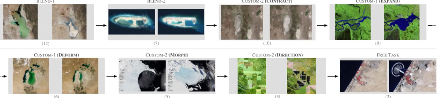
BLEND-1 (12) (7) BLEND-2 (10) CUSTOM-2 (CONTRACT) (9) CUSTOM-1 (EXPAND) (6) CUSTOM-1 (DEFORM) (5) CUSTOM-2 (MORPH) (3) CUSTOM-2 (DIRECTION) (2) FREE TASK
Fig. 12. The eight tasks in the user study: image pairs, animation strategies and primitives for animating the region of interest.
used as a reference, creating a mask that is similar to the one used in the target animation was difficult. After several unsatisfying attempts, two participants gave up using this primitive, preferring the more predictable EXPANSIONand
DEFORMATIONprimitives. The other three participants did
not try to use MORPH, and decided to use either EXPANSION
(two participants) or RADIAL(one participant).
Participants were free to look at the tutorial at will, but did so only a limited number of times. On average, participants referred three times to the tutorial during the test phase. The most watched clips were: “How to Add Masks”, “How to Add Stages”, and “How to create a Morph Animation” (each one three times). Otherwise, they referred to the tutorial mostly to identify the right primitive based on the thumbnails in the list of primitives, and to watch the associated video that details the steps to follow.
In order to collect an unbiased measure of the resem-blance of participants’ animations to the target animations, we asked two external evaluators to watch the target anima-tion, and all animations that our participants had created. Evaluators had to assign a score between 1 and 10 to each animation according to its similarity to the target animation. The mean score was 8.6 (Median= 9, s=1.74). Figure 13 reports these scores, showing that all designed animations received high scores, with the exception of animations for image pair (5). This probably reflects the difficulties that participants encountered when using the MORPHprimitive. Regarding the open task at the end of the experiment, all participants created at least two stages in parallel, isolating the animation of the island from the rest of the image. Beyond that, all participants created different animations using various primitives and strategies to progressively reveal the island. Some of them created quite elaborate animation plans. For example, one participant used four different stages involving the directional progression prim-itive to convey a progression that made sense in terms of construction work. Interestingly, two participants used the
DEFORMATION primitive to make the island appear: even
if the island was not on the before image, they selected a small region on the border of the area covered by the island in the before canvas to create the start mask, and used
DEFORMATION with an end mask delimiting the island in
the after canvas.
5.3.4 Feedback and Possible Improvements
Overall, participants’ qualitative feedback was positive. They found the system easy enough to use, with a smooth
0.0 2.5 5.0 7.5 10.0 (12) Animation Similarity score (7) (11) (9) (6) (5) (3)
Fig. 13. Scores given by the two external raters per animation
learning curve. One participant spontaneously reported that Baia enabled him to quickly produce the target animations, and that the study was entertaining. Another participant particularly appreciated the support for exploring different design alternatives that the tool offers thanks to the possi-bility to test different animation primitives for a given stage. However, participants also faced a few difficulties. Two participants mentioned that understanding the effect of a primitive can be difficult in some cases. Our interpretation is that some problems are due to participants not clearly understanding that the system does not have any semantic knowledge about the geographic data. For example, in some cases, participants tried to use the CONTRACTION or the
EXPANSION primitive with the same mask in both before
and after images, apparently failing to understand that the system cannot automatically infer the evolution of the masked entity. We could add more feedback to prevent such errors with, e.g., warning messages in case mask sizes are not consistent with the type of primitive selected. Another source of confusion comes from the lack of visibility of the automatic pairing between contour points when using the MORPHprimitive. This pairing could be made visible, while also giving users the possibility to manually fix it in order to achieve the effect that they have in mind.
Some of Baia’s pixel-based image processing operations are resource-intensive and cannot be performed on-the-fly, limiting the user interface’s capability to maintain a responsive dialogue between the tool and the user. The authoring tool thus features anUpdatebutton that users must press to apply changes. In some cases, participants forgot to press it after having made changes to masks, generating
some frustration as modifications could get lost if another stage was selected. The existing feedback, which consists of changing the color of this button and adding a colored frame to the preview window to indicate that there are uncommitted changes, seems to be insufficient. We should, at the minimum, pop-up a warning message whenever a stage with uncommitted changes gets unselected. Finally, participants also mentioned that using drag-and-drop ac-tions to change the temporal arrangement of stages would be preferable to the current interaction that requires users to select the stages to put in parallel, invoke a contextual menu, and select theParallelize stagescommand.
6
D
ISCUSSION ANDF
UTUREW
ORKBaia makes it possible to create advanced animated transi-tions between sequences of before-and-after satellite images. For this, it relies on animation plans, a pixel-based model that gives animation authors significant flexibility in how they transition between images. Compared to monolithic blending, this flexibility enables them to create transitions that have the potential to better focus the audience’s atten-tion on specific changes, and that can better approximate the dynamics of the actual changes, as was confirmed by a user study that involved a dataset of 15 real-world before-and-after images. The approach, however, has limitations.
First, no matter how elaborate, these animations will in most cases remain approximations of the phenomenon they are illustrating, as already mentioned. This approximation will be more or less obvious depending on the considered images, nature of the phenomenon, and data available to de-rive the animation plan (if any). On one hand, the animation plan derived from the digital elevation model in Figure 6 is very close to reality; but on the other hand, the animation for image pair (5) in Figure 8 is a rough approximation of what actually happened. While this potential lack of realism is in-deed a limitation, being able to create such approximations is actually the very purpose of Baia. If enough intermediate frames have been captured via remote sensing, or if such frames can be generated via simulations based on relevant physics models, there is no need for authoring transitions. But remote sensing data is typically captured at a low fre-quency, and running computer-intensive simulations is not always possible or cost-effective. Baia offers a trade-off, en-abling a higher degree of realism than monolithic blending at a very low cost. A potential danger in some cases might be that animations are perceived as realistic when they are not actually reflecting reality, possibly misleading the audience. But ultimately, it is the decision and responsibility of animation authors, depending on the context in which they are making their presentation.
Another limitation of animation plans is that they pro-vide poor support for pixel displacement, meaning that it is difficult to depict moving entities. Visual comparison techniques based on the explicit encoding of changes [6] are more effective in such cases. Explicit encoding is also a good means to focus viewers’ attention. While such techniques are not included in Baia at the moment, they are completely orthogonal to, and fully compatible with, our approach as explicit encodings can simply be superimposed on top of
Baia renderings. We chose to focus our efforts on inves-tigating the specific capabilities of Baia’s model, but the integration of explicit encoding techniques and visual high-lighting methods [34] in the tool would be straightforward, providing authors with complementary means to increase the saliency of particular regions during transitions. Future work could investigate the articulation of both approaches.
Finally, there are other types of before-and-after images, beyond remote sensing data. We focused here on satellite images because geographical phenomena yield quite di-verse before-and-after changes, yet enable a relatively struc-tured exploration of the design space thanks to taxonomies of changes like Claramunt & Thériault’s [35]. But anima-tion plans could enable authoring meaningful transianima-tions between other sequences of images that feature some sort of spatial alignments. Examples include: selectively revealing hidden layers in ancient paintings exposed via x-rays for storytelling or critique purposes; enhancing transitions in very-low-frequency time-lapse image sequences; illustrating the evolution of, e.g., urban landscapes photographed from the same street location.
A
CKNOWLEDGMENTSThis research was partly supported by ANR project Map-Muxing (ANR-14-CE24-0011-02).
R
EFERENCES[1] M. Elias, J. Elson, D. Fisher, and J. Howell, “Do i live in a flood basin?: Synthesizing ten thousand maps,” in Proc. of the SIGCHI Conference on Human Factors in Computing Systems, ser. CHI ’08. ACM, 2008, pp. 255–264. [Online]. Available: http://doi.acm.org/10.1145/1357054.1357100
[2] A. McLean, K. Quealy, M. Ericson, and A. Tse, “Satellite photos of japan, before and after the quake and tsunami,” The New York Times, March 2011. [Online]. Available: http://www.nytimes.com/interactive/2011/03/13/ world/asia/satellite-photos-japan-before-and-after-tsunami.html [3] D. Watkins, “What china has been building in the south china sea,” The New York Times, Feb 2016. [Online]. Available: http://www.nytimes.com/interactive/2015/07/30/world/asia/ what-china-has-been-building-in-the-south-china-sea-2016.html [4] N. Casey and J. Haner, “Climate change claims a
lake, and an identity,” The New York Times, July 2016. [Online]. Available: http://www.nytimes.com/interactive/2016/ 07/07/world/americas/bolivia-climate-change-lake-poopo.html [5] B. Marshall, B. Jacobs, and A. Shaw, “Losing ground,” 2014.
[Online]. Available: http://projects.propublica.org/louisiana [6] M. Gleicher, D. Albers, R. Walker, I. Jusufi, C. D. Hansen, and
J. C. Roberts, “Visual comparison for information visualization,” Information Visualization, vol. 10, no. 4, pp. 289–309, 2011. [Online]. Available: https://doi.org/10.1177/1473871611416549
[7] A. Lobben, “Classification and application of cartographic animation,” The Professional Geographer, vol. 55, no. 3, pp. 318–328, 2003. [Online]. Available: http://dx.doi.org/10.1111/0033-0124. 5503016
[8] M.-J. Lobo, E. Pietriga, and C. Appert, “An evaluation of interactive map comparison techniques,” in Proc. of the 33rd ACM Conference on Human Factors in Computing Systems, ser. CHI ’15. ACM, 2015, pp. 3573–3582. [Online]. Available: http://doi.acm.org/10.1145/2702123.2702130
[9] M.-J. Lobo, C. Appert, and E. Pietriga, “Mapmosaic: Dynamic layer compositing for interactive geovisualization,” International Journal of Geographical Information Science, vol. 31, no. 9, pp. 1818–1845, 2017. [Online]. Available: http://dx.doi.org/10.1080/ 13658816.2017.1325488
[10] J. Schmidt, M. E. Gröller, and S. Bruckner, “Vaico: Visual analysis for image comparison,” IEEE Transactions on Visualization and Computer Graphics, vol. 19, no. 12, pp. 2090–2099, Dec 2013. [Online]. Available: http://dx.doi.org/10.1109/TVCG.2013.213