Early Stage Product Design Process: A Case Study of an Educational Building Kit
by
Natalie B. Alper
Submitted to the
Department of Mechanical Engineering
in Partial Fulfillment of the Requirements for the Degree of Bachelor of Science in Mechanical Engineering
at the
Massachusetts Institute of Technology
June 2017 MASSACHUSETTS INSTITUTE OF TECHNOLOGY
AUG 29 2017
LIBRARIES
ARCHIVES
2017 Massachusetts Institute of Technology. All rights reserved.
Signature of Author:
Certified by:
Accepted by:
Signature redacted
Department of Mechanical Engineering January 27, 2017
Signature redacted_
Maria Yang Associate Professor of Mechanical Engineering
Signature redacted
Thesis SupervisorRohit Karnik
Associate Professor of Mechanical Engineering Undergraduate Officer
Early Stage Product Design Process: A Case Study of an Educational Building Kit
by
Natalie Alper
Submitted to the Department of Mechanical Engineering on January 27, 2017 in Partial Fulfillment of the
Requirements for the Degree of
Bachelor of Science in Mechanical Engineering
Abstract
A Science, Technology, Engineering, and Math (STEM) kit for the assembly of a lamp was created to encourage children's interest in mechanical and electrical engineering. To ensure the lamp was intuitive and fun to use, user testing was conducted. As the user interface (UI) for the lamp was designed and developed, tests were conducted with users using a variety of prototypes ranging from paper, cardboard, and plastic to PowerPoint storyboards on the computer. By incorporating user testing throughout the process of identifying possible button layouts as well as proper lamp proportions, a final intuitive UI with a single panel of buttons was converged upon. This UI utilized one button to switch through the four possible light modes instead of having a separate button for each mode.
This UI will be employed in a future prototype that will be further tested with children in the intended age range. These tests will utilize 3D printed pieces for the base and buttons, and will incorporate all the PCBs and LEDs that are intended for use in the final product.
Thesis Supervisor: Maria Yang
Acknowledgements
I would like to thank all those who helped make this thesis possible. Thank you to Professor Maria Yang for the assistance in setting me up with this project. To Tony Hu, thank you for allowing me to take part in the design of this kit. The two of you have been invaluable resources to me and have provided me with much needed guidance and direction over the past term. Thanks also to Tristan McLaurin for the weekly feedback and design suggestions. I've truly enjoyed working with you all over the past few months.
Table of Contents
1. Introduction 11
2. Idea Generation 13
2.1 Preliminary Button Layouts 14
2.2 Icon Usage 19
3. Concept Selection 23
3.1 Base Design 23
3.2 Button Layouts 25
3.3 Lamp Body Proportionality 26
4. Converging on and Evaluating a Final UI 29
List of Figures
Figure 1-1: Figure 1-2: Figure 2-1: Figure 2-2: Figure 2-3: Figure 2-4: Figure 2-5: Figure 2-6: Figure 2-7: Figure 3-1: Figure 3-2: Figure 3-3: Figure 3-4: Figure 4-1: Figure 4-2: Figure 4-3: Figure 4-4: Figure 4-5:Product development process
Steps of the concept development phase Rendering of early prototype of lamp
Options for button layouts in Round 1 of testing Test setup for Round 1 of button layout user testing
Top three preferred options for the mode panel and setting control panel Options for button configurations after rework of panels
Range of different icons presented in the first round of icon testing Icon sets presented in second round of icon testing
Grid of lamp renderings depicting slight changes in base proportions Graph of base preferences from group of 13 test subjects
Laser cut cardboard prototypes of base options to test button layouts Renderings of chosen base with various thicknesses of lamp body Image from PowerPoint depicting old user interface with two panels
Images from PowerPoint depicting new user interface with simplified panel Image of two cardboard UI prototypes
Image of two of the final Uls Final rendering of UI on lamp base
12 12 13 15 16 16 18 19 20 24 25 26 27 29 30 31 32 32
Chapter 1
Introduction
In today's ever advancing society there is becoming more of an emphasis on getting children interested in Science, Technology, Engineering, and Math (STEM) at a young age. The idea behind this is that if kids become excited about these fields while they are young, they will continue to pursue them as they grow up and continue their educations, thus spurring greater interest and advancement in the disciplines. The National Research Council states that "several reports have linked K- 12 STEM education to continued scientific leadership and economic growth in the United States" [1]. One way to get children interested in STEM is through the use of toys and building kits. There are many of these on the market today, ranging from chemistry kits full of beakers and science experiments to modular circuitry kits for mini electronics projects.
To encourage kids to become interested in multiple disciplines at once, a new STEM kit is in development in which a child assembles a toy lamp while learning about mechanical and electrical engineering. To assemble the lamp, the child using the kit must first piece together the base and connect all the electronics. While putting the lamp together, the instructions will prompt the student to learn more about the technology behind how the lamp works as well as the
engineering methods behind its construction. For this lamp kit to succeed on the market, it is important that it has a good user-interface once constructed so that kids will find joy in playing with the finished product.
In developing any product, it is important to follow a process that allows the product to have ideal quality and cost along with development time, development cost, and development capability. One common product development process is depicted below in Figure 1-1.
Phase 0 Phase 1 Phase 2 Phase 3 Phase 4 Phase 5
Planning Concept System-Level Detail Testing and Production Development Design Design Refinement Ramp-Up
Figure 1-1: Product development process. Figure from [2].
The process broadly consists of the six steps depicted in Figure 1-1, starting with planning, and then continuing with concept development, system-level design, detail design, testing and refinement, and finally production ramp up. This case study focuses on the early part of the process for the user interface (UI) development, specifically the concept development stage. In the concept development stage there are many smaller steps that must be done in order to achieve a successful product. These steps are depicted in Figure 1-2 below.
Mission Development
Statement identify Establish Generate Select Test Set Pian Plan
No Customer - Target - Product - Product - Product Final - Downstream 1.
Needs Specifications Concepts Concept(sl, Concept(s) Specifications Development Perform Economic Analysis
Benchmark Competitive Products Build and Test Models and Prototypes
Figure 1-2: Steps of the concept development phase. Figure from [2].
The first step is to identify the customer needs, for the developer must understand this in order to create a product that works for the intended user. Then comes establishing target specifications. These offer a more precise, technical description of what a product has to do. After that the developer starts to generate concepts, select concepts, and test these concepts so that they can set final specifications and plan downstream development. Throughout this process, it is common to perform economic analysis, benchmark with other competitive products, and build and test models and prototypes. It is also common to move back and forth between the steps as new information is gained along the way [2]. This case study follows the process depicted above, focusing on generating ideas for the UI, selecting among them, prototyping, and finally testing and iterating to find the most successful result.
Chapter 2
Idea Generation
Good design enables communication between the object and the user in order to create the most pleasurable experience possible [3]. This design exploration focuses on ensuring that the buttons making up the user interface can create this positive experience in conjunction with the design of the rest of the lamp. Figure 2-1 depicts the lamp in an early prototype stage before button
refinement.
Figure 2-1: Rendering of early prototype of lamp.
The lamp features eight RGB LEDs which provide four main modes for light displays. The first three modes are dynamic and are called "Dance," "Fun," and "Chill." "Dance" mode pulses
through different colors in a strobe fashion, while "Fun" mode circles through the colors so that all are displayed at once, and "Chill" mode slowly transitions from color to color through the rainbow. When in these three modes the user has the option to speed up or slow down the light displays. The final mode is static and is called "Custom". When in "Custom" mode the lamp only displays one color which the user can adjust by changing the amounts of red, green, and blue (RGB) that the LEDs emit. This early prototype used knobs and potentiometers to adjust the mode, speed, and RGB values; however, to keep costs down, a transition to push buttons was necessary for the final prototype.
2.1 Preliminary Button Layouts
Starting in the beginning of the concept development stage means first understanding the customer needs and the accompanying target specifications. With the UI, this means having buttons that allow users to easily control all the settings. A good specification for this is a minimum button size. The MIT Touch Lab specifies that the size of an adult fingertip is
approximately 8 to 10mm [4]. Children's fingers are smaller, but their coordination is worse, so ideally the buttons would still be designed within this 8 to 10mm range.
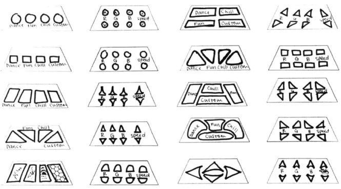
The first UI tested in this case study featured a separate button for each mode. All four mode buttons were grouped together in a mode panel while all the speed and color adjustment buttons were grouped together in a separate setting control panel. In this first test, sixteen options were generated with various button shapes, sizes, spacing, and labeling to get a general sense of how users felt about these different qualities in a UI. The options for this preliminary test are
D 0
LA , QL7A
000
000
F4AEI
Figure 2-2: Options for button layouts in Round 1 of testing.
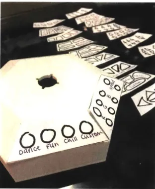
In this first round of button layout user testing the options above were presented to users. The users were told what each of the modes were and how the speed and color adjustment worked and then were asked to discuss each option as they were presented two at a time--one mode panel with one setting control panel. An example of the test setup is shown below in Figure 2-3.
M 03
63 C363
Figure 2-3: Test setup for Round 1 of button layout user testing. Options were presented to users two at a time so that there was always a mode panel on the left and a setting control panel on the right. Options were taped to a 3D printed base prototype and users discussed each option as they were presented.
To present the options to the users, the mockup panels were taped to a 3D printed prototype of the base. There were four users tested in this round aging from 20-22 years old. After each user discussed all the button layout options they were asked to choose their top three preferences. These preferences are displayed below in Figure 2-4.
4Z7.r
VV-
V
ee)
Three users said that the left mode panel was their favorite. Users most preferred this option because they thought it was intuitive and would be easy to learn and remember if the icons represented the light displays well. They also liked the large size of the buttons and felt that this option made the most effective use of the space available. For this reason, the center option for the mode panel was the second most popular. Users also liked the right mode panel pictured in Figure 2-4 because they liked that the "Custom" mode was more separate. Two users also said that the shapes were more exciting and thought this could make the lamp more entertaining.
For the settings control panel, users preferred the triangular options. The somewhat curved triangles pictured in the bottom left of Figure 2-4 were the most preferred. Three of the four users also preferred this option because of the simplicity of using a symbol for speed. Another key takeaway from this round of testing was that users preferred the RGB arrows to be separated slightly from the speed arrows as shown in the bottom right option in Figure 2-4. Some thought this distinction would make using the lamp more intuitive and said that if this were incorporated in with curved arrows that would be their favorite.
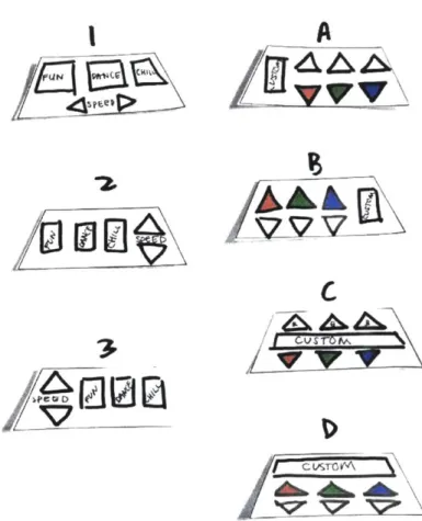
One thing that became clear from preliminary discussions with users on the button layouts from Figure 2-3 was that the grouping of the buttons would be critical for understanding how the lamp worked. Half of the users expressed that if the modes had not been explained they would have had trouble understanding that the "Custom" mode paired with the RGB settings and that the other three modes only paired with speed. To make this clearer, the layout of the panels was redesigned so that one panel would have the three dynamic modes as well as the speed settings, while the other panel would have the custom mode and the RGB settings. The different options for this second round of testing are depicted below in Figure 2-5.
IC
Figure 2-5: Options for button configurations after rework of panels. Dynamic mode panel options are on the left and custom mode panels are on the right.
In this second round of user testing the options were simplified to focus more on button placement and less on button shape. Three options were presented for the dynamic mode panel and four options were presented for the custom mode panel. In this round of testing, six new users ages 18-21 participated. Once again, panels were taped to a 3D printed prototype base and presented to participants for feedback. Users were asked for their top preference for each panel after viewing all the options. For the dynamic mode panel, the results were split. Three users preferred Option 1, with two users preferring Option 2 and one user having no preference between 1 and 2. Three users commented that they liked the functionality of having the speed controls below the three mode options because it showed that the speed corresponds to any of the three modes. Those who preferred Option 2 liked that the up/down speed arrows had a similar
of the button would make it difficult to press, which is why one user chose Option A as their favorite. Overall, the users said as long as the custom button was press-able they would favor Option D.
2.2 Icon Usage
Since the interest in icon usage was strong during the initial button testing discussed in section 2.1, a further investigation was conducted into which icons would be most successful in directing people towards certain light modes. The first step in this investigation was drawing up a multitude of icons and showing them to people along with videos of each light mode in action. In this test, users were asked which light mode they thought the icon best corresponded with and how strong they thought the correspondence was. Each icon was drawn with the intent of it matching with a specific mode, but the subjects were not told which light mode matched with which icon. The icons presented in this test are depicted in Figure 2-6 below organized by mode, but they were shown to subjects in a random order.
(~44
Figure 2-6: Range of different icons presented in the first round of icon testing. The left group was intended to represent "Fun" mode, the middle group "Dance" mode, and the right group "Chill" mode. Users were randomly shown these images without knowing the intended mode, shown videos of the lamp's different light modes, and then asked which light mode each icon best corresponded with.
Three users ages 21-22 were shown these icons and asked for their thoughts. Overall, they thought the disco ball, dancer, sun and moon, and lightning bolt had the strongest
correspondence to the correct light modes. Two of the three users also mentioned that they preferred the simpler icons, so while the sun and the wind to the far right did not correspond to any specific mode, users still thought the icons might be useful in helping to remember which button went with each mode.
In a more refined icon test, additional icons were created and then organized into sets that were presented to another group of users. Most icons were in black and white, but a few were also presented in color to gauge user interest. The sets of icons can be seen below in Figure 2-7.
I'
,'LI
/
2.
/
1/ ~\~\L~~ii
43 /I
~1/
-I
/r~
&
/ ('p~
~\\
ci
A
4eLI#
A
Figure 2-7: Icon sets presented in second round of icon testing.
Four users ages 18-20 were presented the sets of icons. Once again, they were presented one by one, with discussion for each, and the users were asked for their favorite after all the options had been viewed. As each user viewed the icons they were also shown the corresponding light
Option 1, stating that while it might not be obvious what each shape represented at first, it would be easy to learn after playing with the lamp a few times.
In delving into the icon development, it became apparent that larger buttons would be better not only for clearer images, but also to have a larger space for the user to press on. To make the buttons large enough to ensure that users would be comfortable pressing them, the existing lamp base would have to be redesigned.
Chapter 3
Concept Selection
In order to down-select the button options, first some of the lamp's proportions had to be reworked so that the panel would be big enough to accommodate large-enough buttons. To find optimal proportions for the product, some studies were done on the size of the base in
comparison to the rest of the lamp. 3.1 Base Design
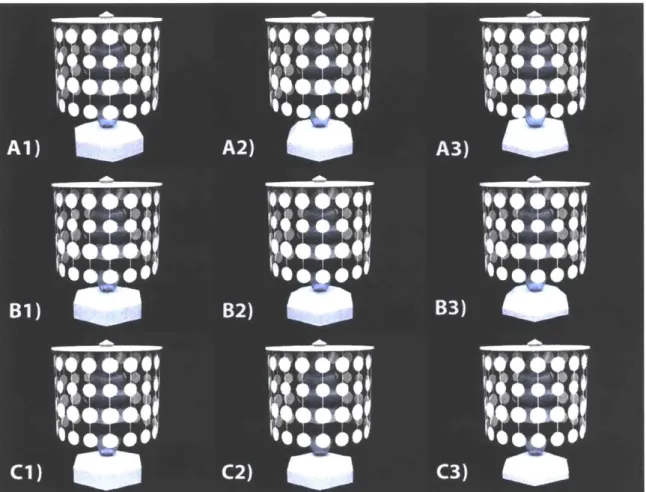
To explore a variety of different sized lamp bases, a grid of rendered options was created. This grid can be seen in Figure 3-1 below.
Figure 3-1: Grid of lamp renderings depicting slight changes in base proportions. Moving down the grid from A to C decreases the size of the top hex. Moving across the grid from 1 to 3 increases the height of the chamfered section of the base and decreases the height of the straight section.
All bases in the grid kept the same bottom hex diameter of 5.8 inches. In going down the grid
from A to C the top hex decreases in size. Going across the grid from 1 to 3 increases the height
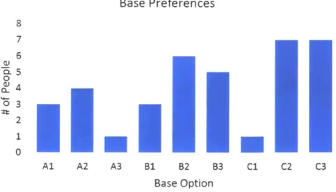
of the chamfered section of the base and decreases the height of the straight section. This grid was shown to 13 test subjects, ages 19-23, and the subjects were asked to choose up to three
Base Preferences 8 7 6 U> 5 03 2 0 Al A2 A3 B1 B2 B3 C1 C2 C3 Base Option
Figure 3-2: Graph of base preferences from group of 13 test subjects.
Base options C2 and C3 were the most popular choices with 7 votes with B2 right behind with 6.
With these results in mind, the button layouts could be enlarged and refined. Since C2 and C3 tied for votes, C3 and B2 were chosen for further button development. C3 had a slightly bigger
surface area for buttons, while B2 offered a slightly different shape for the button configurations.
3.2 Button Layout
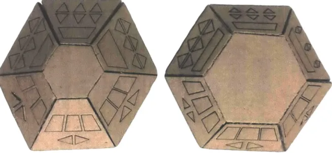
With the base options chosen, the most popular button layouts from section 2.1 were
altered to give a variety of layouts with slightly different sizes and spacing of buttons. These options were laser cut into cardboard and folded to make prototypes which can be seen in Figure 3-3.
AIAD
Figure 3-3: Laser cut cardboard prototypes of base options to test button layouts.
After showing these cardboard prototypes to eight different users, the consensus was the
larger the buttons the better. However, when it came to the triangles for the RGB adjustments, 7
out of 8 people preferred the triangles to be wider. Users did not care so much about spacing, but there was a slight preference for the buttons to be closer together. In terms of maximizing
available space for increasing button sizes, the base pictured in the left of Figure 3-3 was chosen
to move forward.
3.3 Lamp Body Proportionality
With the size of the base chosen, another test was created to analyze whether the lamp
body proportions without the shade on were acceptable. Since the lamp is a toy, one of its
biggest assets is its customizability. The lamp can be used with or without a shade so it is important that it look good in either configuration. To create a range of lamp body sizes, the
original was made both skinnier and thicker as can be seen in Figure 3-4.
6L
Figure 3-4: Renderings of chosen base with various thicknesses of lamp body. The original is pictured in the center with a skinnier version on the left and a thicker version on the right.
These three images were shown to 11 subjects ages 19-23, of whom 7 preferred the skinnier option, 1 the original option and 3 the thicker option. These results do not directly affect the user interface but will be useful to know moving forward with the overall design of the lamp.
Chapter 4
Converging on and Evaluating a Final UI
In the final round of button testing, it was important to test another panel layout to ensure the best possible user interface (UI). The team created two PowerPoints to mimic the lamp's behavior as buttons were pressed. These PowerPoints utilized hyperlinks imbedded in the images to jump to different pages, thus allowing the user to experience a mock lamp interface and enter different modes by pushing the buttons on a touch screen. One PowerPoint mimicked the existing UI, with a panel on the left for the dynamic buttons and a panel on the right for the custom buttons,
as can be seen in Figure 4-1.
1k
A
AAA
speed red green blue
Figure 4-1: Image from PowerPoint depicting old user interface with two panels [3].
The second PowerPoint outlined a new UI with a simplified panel that can be seen in Figure 4-2. The mode button on the left can be pressed to cycle through the four modes, while the arrows to the right only light up when the lamp is in the corresponding mode(s).
El
LIZ
AAZ\A
71
VV7V
V7717
mode speed red green blue mode speed red green blue
Figure 4-2: Images from PowerPoint depicting new idea for user interface with simplified panel. The mode button is pressed to cycle through the four modes. When the lamp is in custom mode (pictured on left) the RGB buttons light up to signal that they can be used. When in any of the dynamic modes (pictured on right), the speed buttons light up instead [2].
For example, when the lamp is in custom mode (pictured on left) the RGB buttons light up to signal that they can be used. When in any of the dynamic modes (pictured on right), the speed buttons light up instead.
These PowerPoints were presented to users along with cardboard prototypes of what the panels might look like on the lamp's base. These cardboard prototypes are pictured in Figure 4-3 below, with the switching mode UI on the left and the separate mode UI on the right.
Figure 4-3: Image of two cardboard UI prototypes.
Each user was presented with the cardboard base options one at a time and then asked to play with the lamp while the PowerPoint displayed each mode they were in. The order of which
UI was shown first was switched for every other test subject to minimize bias. The users were asked to share their thoughts as they were using each UI. Six users were tested ages 18-22. Out of the six, four preferred the switching mode UI. Many stated that they liked the simplicity and neatness of it. The two users who chose the separate mode UI, preferred it because it explicitly showed that there were four different modes. Two of the users got stuck with the one switching mode button because they did not realize they could press the mode button again to enter a different mode. One user made an important distinction between the two UIs. This user said that the switching mode button lends itself to a much cleaner interface, but that more buttons would be better if the product is intended to be used very dynamically-that is if users are going to be pressing multiple buttons at once or pressing buttons in rapid succession. Since the product is not intended to be used that way, and more users preferred the switching mode UI, that is the UI that was pushed forward in the design.
Some of the users during UI testing were drawn to the up and down buttons first. This confused some of them into thinking the lamp only had one mode, because they completely ignored the mode switching button to the left. To mitigate that, all the buttons were combined onto one panel with the mode switching button on top. This visually shows the user that the mode switching button comes before any of the up/down adjustment buttons. In terms of evaluating cost of the product, putting all the buttons on one panel also meant that the lamp
needed one less printed circuit board (PCB) which served to drive the cost of the product down. The final UI is pictured to the right in Figure 4-4 below.
Figure 4-4: Image of two of the final Uls. The right UI with the elliptical mode switching button was chosen for the final product.
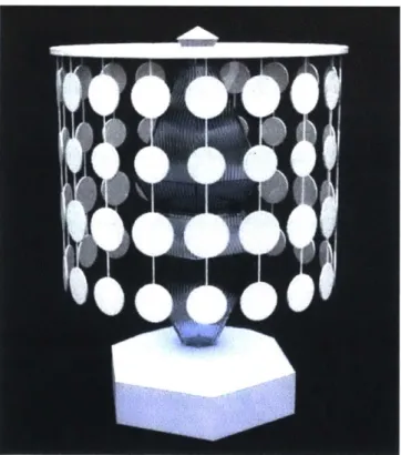
Initially, the UI on the left was chosen because users in the initial button testing phases discussed in section 2.1, preferred for the buttons to maximize the space available. However, after analyzing how the lamp base fit with the lamp as a whole, the UI to the right with the elliptical mode button fit in better with the shapes of the sequins that make up one of the lamp shade options. With the final UI and button layout settled as can be seen in the rendering in Figure 4-5, the lamp is now ready for final rounds of testing.
Chapter
5
Summary and Conclusion
To create a STEM kit for assembling a lamp to encourage children's interest in
mechanical and electrical engineering, it was important that the lamp be intuitive and fun to use. The user interface of the assembled lamp was a critical part of meeting this goal. By
incorporating user testing throughout the process of identifying possible button layouts as well as proper lamp proportions, a final intuitive UT with a single panel of buttons was converged upon.
It is important to note that bigger sample sizes for these tests would have led to more conclusive results. There is also a discrepancy between the ages of those tested in this design exploration and the ages of those who would use the lamp. The lamp is intended for use for children ages 8-12, but those tested in these studies were ages 18-22 due to the availability of the subjects. Future testing will be necessary with children in the intended age range. With the UI and button layout finalized, the lamp will be ready for more comprehensive testing in the next couple of weeks. These tests will utilize 3D printed prototyped pieces for the base, and will incorporate all the PCBs and LEDs intended for use in the final product.
Bibliography
[1] Successful K- 12 STEM education: Identifying effective approaches in science, technology, engineering, and mathematics. National Academies Press, 2011.
[2] Ulrich, K. and Eppinger, S. Product design and development. McGraw-Hill Higher Education, 2008.
[3] Norman, D. The design of everyday things. MIT Press, 2013.
[4] Dandekar, K. et al. 3-D finite-element models of human and monkey fingertips to investigate the mechanics of tactile sense. Journal of Biomechanical Engineering, pp. 682-691, 2003.
![Figure 1-2: Steps of the concept development phase. Figure from [2].](https://thumb-eu.123doks.com/thumbv2/123doknet/14755456.582281/12.917.142.755.439.592/figure-steps-concept-development-phase-figure.webp)