The meaning of Architecture in Information
Architecture: analysis and reflection
Under the supervision of:
Professor René SCHNEIDER
Geneva, 15 August 2018
HES-SO University of Applied Sciences of Western Switzerland Information Science department
Master’s thesis fulfilled by: Megan FUSS
Declaration
This thesis is submitted as part of the examination requirements of the HES-SO University of Applied Sciences of Western Switzerland for obtaining the title of Master of Science in Information Sciences.
The student attests that her work was verified by a plagiarism detection software. The student accepts the terms of the confidentiality agreement, if one has been signed. The use of any conclusions or recommendations made in the thesis, without prejudice to their value, engages neither the responsibility of the authors, nor the Director, nor the University of Applied Sciences of Western Switzerland.
« I attest that I have personally completed this work without using any sources other than those quoted in the references. »
Geneva, 15 August 2018
The meaning of Architecture in Information Architecture: analysis and reflection
Acknowledgements
I wish to thank Professor René Schneider for all his help and advice and his continuous interest in the topic at hand, as well as his assistant, Julien Raemy, for his time and aid whenever it was needed.
I would also like to acknowledge CCdigitallaw for once again allowing their website to be the center of a project.
I want to thank Mrs. Constance Delamadeleine for accepting the position of expert for the defense of this thesis and for the guidance given.
I wish to thank all the usability test participants as well, without their aid some of the findings and conclusions would not have been discovered.
I would like to thank my family and friends as well, for all the support that they gave throughout the course of this thesis.
Abstract
There are various ways of identifying ‘Architecture’. It takes different shapes depending on the circumstances and the field of study, forming distinct disciplines.
Furthermore, they all follow their own set of defined characteristics and principles that are reflective of their good practices and of how they are characterized.
This paper converges both Information Architecture and Architecture, which both share a foundation that is ‘Architecture’. However, other than the segment of appellation they share, other parallels can surely be defined.
With this in mind, this study attempts to identify these principles while pinpointing select architectural periods, with the aim of discovering associations that can be made between Information Architecture and Urban Architecture.
To accomplish this, an in-depth research was undertaken to determine whether others had ventured into this topic or if it is a completely new idea. It also called into question how Urban Architecture can be perceived in web design.
With the use of this information, four mock-ups were designed using specific characteristics attached to certain eras of Architecture. Those chosen were Classicism, Baroque, Modernism and Brutalism. This selection allowed for a wide range of principles and thus, an extensive array of differences among the models.
Hence, they were created as a platform for usability tests, which then helped gather users’ impressions towards the models and their architectural periods.
The usability tests were composed of a set of tasks, survey questions and a debrief. These tests allowed for valuable feedback from the participating individuals as their attitudes and perceptions of the different mock-ups were brought to light, making them key factors to evaluating whether specific features can change how something is seen. Therefore, considering the questions were oriented towards Urban Architecture principles, they helped discover a sense of association. Additionally, as the tests were done with the use of the virtual environments, based on Information Architecture, it helped the prospect of advancing the concept of whether it can be influenced by Urban Architecture.
All aspects of this study were helpful in the creation of a reflection, which supports the understanding of just how Urban Architecture can impact Information Architecture and how much of a perceptible element it is to the visitor and webmaster alike.
Consequently, the tests helped uncover a set of connections amongst the architectural principles and their use in the creation of virtual environments and the undeniable statement that they are both ever-changing.
The meaning of Architecture in Information Architecture: analysis and reflection
Table of content
Declaration... i
Acknowledgements ... ii
Abstract ... iii
List of tables ... viii
List of figures ... ix
1.
Introduction ... 1
1.1 Context ... 1
1.1.1 Research and reflection ... 2
1.1.2 Methods and analysis ... 2
1.2 Methodology ... 3 1.2.1 Research ... 3 1.2.2 Era selection ... 4 1.2.3 Methods ... 4 1.2.4 Website: CCdigitallaw ... 5 1.2.5 Participants ... 5 1.2.6 Reflection ... 5
2.
Information Architecture ... 6
2.1 Components ... 6 2.2 Ecosystem ... 8 2.3 Principles ... 93.
Architecture and Urban Design ... 11
3.1 Placemaking ...11
3.2 Architectural eras and periods ...14
3.2.1 Classical architecture ...14
3.2.2 Baroque architecture ...15
3.2.3 Modern architecture ...15
3.2.4 Brutalist architecture ...16
3.3 Presence in Web Design ...16
3.3.1 Classicism ...17
3.3.2 Baroque ...17
3.3.3 Modernism ...17
3.3.4 Brutalism ...18
3.4 Design principles ...18
3.5 Transition to Information Architecture and Web Design ...19
4.
Parallels between Information Architecture and Urban Architecture . 21
4.1 History and evolution of Architecture in Web Design ...215.
Mock-ups ... 24
5.1 Context ...24
5.1.1 Definition and scope ...24
5.1.2 Study usage ...24
5.2 Methodology ...24
5.2.1 Software: Axure ...25
5.2.2 Era selection ...25
5.2.3 Content and menu structure ...26
5.2.4 Mock-up creation...26 5.3 CCdigitallaw interface ...27 5.3.1 Brutalism ...29 5.3.2 Classicism ...30 5.3.3 Modernism ...31 5.3.4 Baroque ...32 5.4 Limitations ...33
6.
Usability tests ... 34
6.1 Context ...346.1.1 Definition and Scope ...34
6.1.2 Study usage ...34
6.2 Methodology ...35
6.2.1 Software: Morae ...35
6.2.2 Participants ...36
6.2.3 Outline and scenarios ...37
6.2.4 Assessment and observations...38
6.2.4.1 Test scenarios ... 38 6.2.4.2 Survey questions ... 39 6.2.4.3 Debriefs ... 40 6.2.4.4 User impressions ... 41 6.3 Scenario: Brutalism ...41 6.3.1 Tasks ...41 6.3.2 Survey questions...42 6.3.3 Debrief ...43 6.3.4 User impressions ...43 6.4 Scenario: Classicism ...44 6.4.1 Tasks ...44 6.4.2 Survey questions...44 6.4.3 Debrief ...45 6.4.4 User impressions ...46 6.5 Scenario: Modernism ...46 6.5.1 Tasks ...46 6.5.2 Survey questions...47
The meaning of Architecture in Information Architecture: analysis and reflection 6.5.3 Debrief ...47 6.5.4 User impressions ...48 6.6 Scenario: Baroque ...48 6.6.1 Tasks ...48 6.6.2 Survey questions...49 6.6.3 Debrief ...50 6.6.4 User impressions ...50 6.7 Final debriefs ...51 6.8 Limitations ...51
7.
Reflection on findings ... 53
7.1 Impact and influence of Urban Architecture ...53
7.2 Presence in today’s web design ...55
8.
Conclusion ... 57
References ... 59
List form calendar ... 63
Menu structures ... 64
Brutalism mock-up ... 65
Classicism mock-up ... 73
Modernism mock-up ... 80
Baroque mock-up ... 88
Consent form ... 99
Usability test script ... 100
Basic questions ... 101
Raw data Brutalism task completion ... 102
Raw data Classicism task completion ... 103
Raw data Modernism task completion ... 104
Raw data Baroque task completion ... 105
Brutalism tasks ... 106
Brutalism task 1 usability issue and solution ... 107
Brutalism task 2 usability issue and solution ... 108
Brutalism survey scores ... 109
Brutalism word selection ... 110
Classicism tasks ... 111
Classicism task 1 usability issue and solution ... 112
Classicism task 3 usability issue and solution ... 113
Classicism word selection ... 115
Modernism tasks ... 116
Modernism task 1 usability issue and solution ... 117
Modernism task 5 usability issue and solution ... 118
Modernism survey scores ... 119
Modernism word choices ... 120
Baroque tasks ... 121
Baroque task 1 usability issue and solution ... 122
Baroque task 5 usability issue and task ... 123
Baroque survey scores ... 124
The meaning of Architecture in Information Architecture: analysis and reflection
List of tables
Table 1: From Urban Design principles to Web perception ...20
Table 2: Test audience professions ...36
Table 3: Test audience age demographics ...36
List of figures
Figure 1: Google Drive project organization ... 3
Figure 2: Visualization of Information Architecture ... 7
Figure 3: Information Architecture ecosystem ... 8
Figure 4: The Information Architecture iceberg ... 8
Figure 5: Measurable placemaking qualities ...12
Figure 6: Architecture timeline ...14
Figure 7: Axure interface ...25
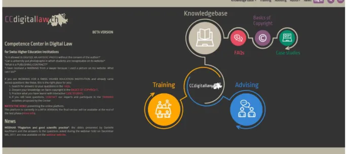
Figure 8: Current CCdigitallaw interface ...27
Figure 9: Brutalism homepage interface ...29
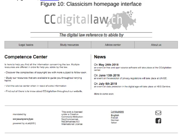
Figure 10: Classicism homepage interface ...30
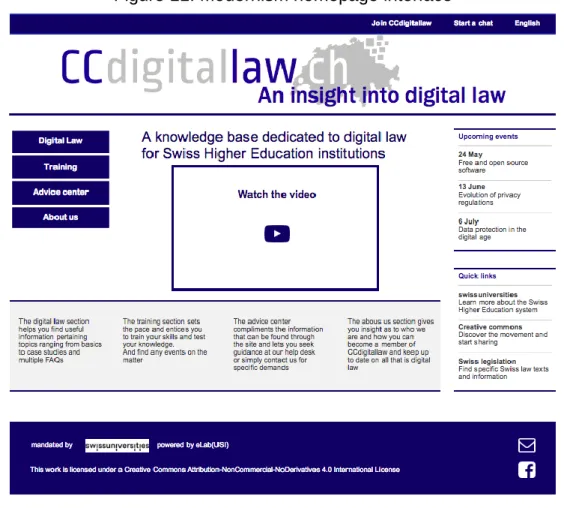
Figure 11: Modernism homepage interface ...31
Figure 12: Baroque homepage interface ...32
Figure 13 : Morae interface ...35
Figure 14: Test scenario task outline ...38
Figure 15: Brutalism survey results ...42
Figure 16: Classicism survey results ...45
Figure 17: Modernism survey results ...47
The meaning of Architecture in Information Architecture: analysis and reflection
1.
Introduction
This thesis was written for the purpose of the Master of Science in Information Science given at the University of Applied Sciences of Western Switzerland1.
The proposition of this paper was formulated with Professor Schneider after the class that was given on the topic of Information Architecture (IA2), it had no official mandate or client.
Consequently, it centered on Information Architecture and Urban Architecture (UA3) and
whether links could be established between the two subjects. Since each architectural period has certain principles that are associated with it, this prompted the thought of whether their use could visibly influence a virtual environment.
Even though they may share a commonality in the term ‘Architecture’, it was necessary to discover how they are really connected. It is natural to see shared elements, such as structure, but establishing whether one can influence the other was a driving force of the paper.
Thus, in order to demonstrate the connections between IA and UA, the thesis aligned around two main paths: the reflection and the methods.
The reflection concentrated on the research needed to help provide ideas on the influences and the impacts Urban Architecture has on a virtual environment today.
The methods, mock-ups and usability tests on the models, then used the information gathered throughout the reflection as a pedestal. They helped determine whether the users’ perceptions and attitudes are affected when they are confronted with websites created with specific UA principles in mind.
1.1 Context
The idea of this thesis stems directly from a class given in the Masters of Information Science: Information Architecture (Cyberlearn 2018). As much as Information Architecture is a wide subject of study, it was perceived differently in said class, giving it a new life.
The angle observed was that of a mixture of Information Architecture and Urban Architecture with one continuous project to redesign a website4 based on an architectural period.
It spanned the course of one semester with the objective to follow along the principles of IA. During the class, multiple topics were approached with each one having a dedicated class:
Content: how to write appropriate online content
Organization and structure: how to create a structure and organize information Navigation: how to determine user navigation
Design: how to apply elements of design
Search engine optimization (SEO): how to optimize website indexation
1 Also known as Haute école de gestion Genève (HEG) 2 Sometimes referred to as IA in this paper
3 Sometimes referred to as UA in this paper
As much as proposing a redesign of the website was the ultimate goal, the underlying one was to do it in a manner that illustrated Urban Architecture in a new virtual light.
Even though the intellectual reflection was also conducted during the course, it remained subtle and on the surface of what the associations could be. The perception and the attitude of the people who participated was not really questioned and did not figure in the project aside from the interface design.
Thus, to further the ideas of the Information Architecture class this study is comprised of two parts, the reflection and then a more practical side.
1.1.1 Research and reflection
The first aspects were those of the research and reflection, a theoretical side to the thesis. The general idea of Urban Architecture influencing a virtual environment through the Information Architecture was a relatively exploratory idea.
Hence, it became important to identify what exactly was out there, more specifically whether others had approached this topic and if so in which ways.
The reflection was indeed impacted by how the research was undertaken as it helped understand the topic at hand as well as its components. It helped define how a comparison of the architectures could be done, how similarities could be compared and how all the elements could be analyzed in general.
Furthermore, as it remained an exploratory idea, collecting the concepts from multiple sources and combining them with new propositions, identified how the links between Information Architecture and Urban Architecture could be spun all the while using formal evidence as a basis.
Subsequently, the reflection melded the compilation of these ideas through the creation of associations that could be extracted from the research. In finding the principles of each architecture the similarities as well as the transitions were developed.
1.1.2 Methods and analysis
The second aspects were the mockups and the usability tests. The creation of website models ensured that there were interfaces to use for the basis of the tests that used the data collected during the research.
Additionally, they also served as a manner to translate Urban Architecture into Information Architecture. This offered the user the ability to see and inspect an architectural period based on the principles set aside, therefore creating a dedicated environment for each chosen era. Specific mock-ups meant feedback was collected separately, making it easier to analyze the results and to help with their assessment.
Thus, to determine the attitude and perception of people when encountering a site that was based on a specific architecture, usability tests were conducted. This entailed testing the interface of each mock-up with specific questions and with multiple participants. This allowed for various points of view.
The meaning of Architecture in Information Architecture: analysis and reflection
1.2 Methodology
In this part of the paper the general methodology is discussed and it is used to establish the general direction and organization the paper followed.
The thesis was conducted over the course of one semester, prior to its commencement, some general organization was set in place.
The main storage and work tool used throughout the project was ‘Google Drive’5, due to the
fact that it allowed easy access from various locations and ensured data was always available. A specific ‘Google Drive’ folder was created (figure 1), the sub-folders reflected the phases of the project.
Figure 1: Google Drive project organization
For an added layer of security, all files and folders were backed up on a personal computer and in a ‘switchDRIVE’6 folder. This meant that if an error occurred in one location, data was
not lost and could be recuperated.
A project calendar (see Annex 1) was created with the use of ‘teamgantt’7, an online software.
It was a tool that guaranteed all steps were followed within a set timeframe. With the use of ‘teamgantt’ multiple functionalities were available to organize the project. Much like in Google Drive, each phase was defined within the software with tasks that had start and end dates, and colors were also implemented to each phase to help situate them.
Therefore, as the project had specific phases it meant that they could be organized as blocks. They all required general organization and research that would lead to a reflection.
Nevertheless, some general methodology is introduced throughout the paper. Some sections also have their own dedicated parts due to their importance and more challenging nature.
1.2.1 Research
The research was undertaken in stages with a list of research terms that was created in order to guide the documentation towards what was needed.
5https://www.google.com/drive/
6https://www.switch.ch/de/drive/
For this reason, it was based on the more general topics such as Information Architecture and Urban Architecture and then focused into more explicit matters.
The more in-depth information was sought after the initial research as its intention was to be complementary to any missing data.
A portion of the research was done within scientific databases that are made available through the HEG library8. Online research (with a browser) also made up a sizable part of the
information that was gathered as there is a considerable Information Architecture online community.
All the research was organized into categories: IA, UA (and eras), web design and website architecture. Each document was perused and annotated, with the less informative ones being set aside. The annotations were for future reference, when the section at hand needed to be started and helped refresh the intention of the document.
As soon as a document was used, a bibliographic reference was created as to avoid overlooking one in the future.
1.2.2 Era selection
With numerous eras being available and the time constraints surrounding this thesis, not all periods were evaluated in absolute detail.
Consequently, a selection was done based on the research results, with the ones prominent in web design being chosen, which insured their usefulness.
Afterwards, different levels of the selected eras were explored, ensuring that the principles and the connections to web design and Information Architecture were outlined.
1.2.3 Methods
The methods, the mock-ups and the usability tests, stemmed directly from the research and part of the reflection.
The former flows directly from the latter; without the research and the beginning of the reflection it is difficult to apprehend the more practical aspects, as one is based on the other.
In order to accomplish them, specific software needed to be used.
With the use of a software that allows the creation of models, Axure9, a mockup was created
for each chosen era. They were all based on the CCdigitallaw website but were each distinct in their own ways according to the architectural period they were allotted to.
Alongside the mock-ups that served as a basis for the usability tests, Morae10 was used to
create the assessment on which the participants were solicited. A test was created for each era so they could be differentiated, and as such they all had a set of tasks that bared some resemblance.
8https://www.hesge.ch/heg/infotheque/collections/bases-donnees-documentaires
The meaning of Architecture in Information Architecture: analysis and reflection
1.2.4 Website: CCdigitallaw
The chosen website was that of CCdigitallaw (2018), as some work had already been done on this website in the context of Professor Schneider’s IA class to improve its structure and visual design. It originated from a partnership with the ‘Università della Svzzera italiana’11 who were
interested in a redesign of their current website.
Therefore, its familiarity helped with the elaboration of the methods, as most of the structure and content had previously been analyzed. Its size, relatively small but with lots of content, meant that not many surface pages necessarily needed to be created to promote a complete looking website.
1.2.5 Participants
Participants were needed for the usability tests, with a goal of six individuals aside from the people carrying out the pre-tests.
Each person performed four tests, one for each era. The sample of participants was made up of people within the target audience of CCdigitallaw, this meant individuals within higher education. Their work functions varied from assistant, secretary or even student, and they also diverged in demographics.
The wide range of profiles allowed for diverse results when it came to the tests.
1.2.6 Reflection
An important aspect and the real heart of this thesis was the reflection, and the ability to be able to contemplate on the impact and influence that architecture can have and how it has evolved throughout the years.
This was an ongoing phase of the paper, as each section added to the information that was intended for it. This also meant it continued to evolve until the final days.
The main influence on the reflection was the research as it shed light on the real meaning of the topic at hand in terms of Information Architecture and Urban Architecture. Then the results from the practical methods helped showcase a more human aspect as well as any connections between physical and virtual environments.
2.
Information Architecture
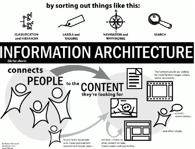
Information Architecture is the process of sorting content to ensure that it is findable and understandable for the user. It helps facilitate finding something specific and in situating oneself in the mass of information.
Consequently, it is used in various virtual environments from apps to websites, but it is also present in the items and places that surround us in forms of physical identification and signage (IAI 2018).
Moreover, important proponents in the implementation of these systems are Information Architects who are in a sense bridge builders, as they create connections between many things such as users and content (Morville 2012).
The process of finding information is made effortless by the use of Information Architecture, this easiness in accessibility is aimed at the users and in making their experience a quintessential aspect.
Thus, how content is structured evolves depending on the nature of the environment it is being created for, as it is developed based on the needs and the goals of the system. The use of Information Architecture acts as a guarantee that fewer issues will arise on the navigation and usability fronts (Tubik Studio 2017).
Furthermore, Information Architecture can also be seen as the assembly of ontology, taxonomy and choreography (Klyn 2010).
Ontology: expresses the framework and guidelines on what is to be communicated Taxonomy: creates structures that explain how everything works
Choreography: knows how the elements will evolve and react
Undoubtedly, IA is an essential part of how virtual environments are built today, but it remains invisible to those who do not need to interact with them.
2.1 Components
According to Lou Rosenfeld, Peter Morville and Jorge Arango (2015, Tubik Studio 2017), the main aspects of Information Architecture are:
Organization Systems: categories and structures of information
This aspect aids the user in deducing what kind of information they will be able to find. It is divided into three kinds: hierarchical, sequential and matrix.
A hierarchical structure illustrates an order of importance with the use of visual differences
such as size or placement.
A sequential structure guides the user through different steps, it has a specific order to it much
like in the purchase of an item.
A matrix structure gives the visitor a choice, the navigation is based on the choice they make,
whether it be to navigate through content sorted by alphabetical order, date, categories or even topics.
The meaning of Architecture in Information Architecture: analysis and reflection
Labeling Systems: representation of information
The labeling system intends to simplify the amount of information that is available to the user from the get-go. Instead of presenting a huge quantity of information in one place, it can be sorted into a label, such as a link, that leads to a more developed section.
The contact information could be behind a simple button, or event details could be shown once the user has clicked on the calendar date.
Navigation Systems: browsing and movement of users
The navigation is the manner in which the content is arranged in order to guide the user into finding the information they seek. It defines how users will peruse content to fulfill their needs.
Search Systems: looking for information
The search system ensures the users will be able to situate themselves in environments containing consequent masses of information. It can be integrated with many functionalities that will help the user search for information.
Figure 2: Visualization of Information Architecture
UX Booth 2015
As illustrated in figure 2, these components are used to sort information and in turn they connect people to that content.
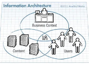
2.2 Ecosystem
With the creation of these Information Systems comes different factors that need to be understood. Rosenfeld, Morville and Arango (2015) characterize this as an Information Ecology (Usability.gov 2018b) as shown in the figure below.
Figure 3: Information Architecture ecosystem
Crawford - HowStuffWorks 2011 Context: under what circumstances the system integrates itself.
Content: what types of data and documents, how much and how it’s structured. Users: who visits the system and what are their needs.
This trilogy takes its place in the lower sections of the Information Architecture iceberg (figure 4). The interface is the part that most people concentrate on or what they see, but it also only a fragment of the system.
Figure 4: The Information Architecture iceberg
Arango, Morville, Rosenfeld 2015
All these layers play a crucial role in Information Architecture and in the success of projects and website development. This caters to the importance of starting from the bottom and
The meaning of Architecture in Information Architecture: analysis and reflection
2.3 Principles
Some fields of work like graphic design have sets of guidelines that are followed. As Information Architecture is still evolving, there is a lack of agreed upon guidelines among experts, Dan Brown (2010) set out to establish some that can be applied to the discipline. Brown uses a set of principles that help create an architecture but are not so strict that they cannot be adapted depending on the nature of the website.
“These principles make an assumption: information architecture is the practice of designing structures.”
Dan Brown 2010
The guidelines in question can be used when the design of the structure is at the forefront of the project, the architect knows how information should be placed in the structure and the amplitude of the data involved is available.
There are eight principles that are examined: 1. Objects: make content alive and dynamic
An object means that content on a particular website has a distinguishable structure and can have behaviors. This information will be sorted and connected to other elements depending on its nature. It can also have behaviors linked to its evolution if a part of it is adapted or if a visitor interacts with the object.
2. Choices: have significant options on pages
‘Less is more’ can be applied to the choices given to the users. When being confronted by a multitude of options it can be difficult to find what is needed, this can lead to abandon, but organizing information and having thought out choices can help amend it.
3. Disclosure: show information that is necessary
A user will normally only process a certain amount of information and then uses what they see to prepare for what is to come. On a website, this is illustrated by presenting content on different levels, the first tier of general information can lead to a more in-depth second tier.
4. Exemplars: give examples to explain content
To help the visitor understand what they will find in different areas of content, examples that express what is found can be given. This puts options at the forefront instead of giving a description of content.
5. Front doors: assume there are multiple ways to enter the site
Not all visitors will enter the website through the homepage, there are many ways in which pages can be accessed. When a user arrives on a random page, different types of content should be available to them, giving them the possibility to discover something else. This also means that the homepage should have concise and useful information, but it does not need to be inundated in content.
6. Multiple classification: propose various categorizations of content
Every individual has a manner in which they perceive and search for information, thus offering the opportunity to categorize information will help in their use of the website. 7. Focused navigation: have navigations that complement each other
The use of multiple navigations needs to be defined by strategies that explain what they do and what their usage is.
8. Growth: understand content will evolve
A website can evolve in many ways and it should be anticipated but it is not an easy task.
It is essential to note that these principles are not standardized in any shape or form but simply propose a direction in which to follow. They can in some way be linked to how Information Architecture is seen as a discipline today.
Although these eight principles come from the ideas of Dan Brown, some parts of them can be seen as elements that are done naturally. They can each affect the path of a website and be strategized in their own way, but this does not necessarily make them crucial to its function.
The meaning of Architecture in Information Architecture: analysis and reflection
3.
Architecture and Urban Design
Urban Design is the design of a building or city and its surrounding spaces. It centers on not only the design of a single structure like in the field of Architecture, but in many urban aspects. The process of Urban Design is one that helps develop the landscape along the needs of the people and the community (UDG 2011).
“Urban design is about how to recapture certain of the qualities (qualities which we experience as well as those we see) that we associate with the traditional city: a sense of order, place, continuity, richness of experience, completeness and belonging.”
Peter Buchanan, UDG 2011
Thus, it is, in a sense, a field of design that allows us to better comprehend the quality of life of the population and to build and mold the design of a city accordingly around the citizens. When it comes to Architecture, as put forward by Vitrivius in De architectura, a structure should undeniably follow three principles (Cox 2011):
Firmatis: it should be solid, and withstand the test of time
Utilitas: it should be useful, and answer demands of functionality
Venustatis: it should be beautiful, and entice people to look and enjoy it
These principles are also true for websites:
• There needs to be a sense of longevity, a site that disappears from one day to the next could leave the user lost and wondering where to find the information they sought. • There needs to be a purpose, the context of the website is crucial to why it is visited. • There needs to be a pleasant visual design that makes people what to delve deeper
into the content.
The focus in this thesis is not only set on the discipline of Architecture but more globally on that of Urban Architecture and the links that can be made to virtual environments.
3.1 Placemaking
Urban design can quite seamlessly tie the use of placemaking in its anatomy with the design of a landscape and all its elements in the efforts to create an environment of quality.
Essentially, placemaking is the reinvention of places and communities with the use of collaboration, a collective vision, and the use of resources available within the community. Placemaking helps define the aspects that create a ‘place’ through the use of its identities, such as the physical, cultural and social ones, ultimately helping the population nurture a sense of belonging.
Therefore, adopting placemaking in urban development projects can help avoid issues. Since building and designing a neighborhood can benefit from the insight of the community, in a sense that constructing a place as a whole leads to a happier environment. A focus is not placed on one object or building but on how the area can evolve as one (PPS 2018).
The Project for Public Spaces developed a graph (figure 5) that helps appraise a place.
Figure 5: Measurable placemaking qualities
PPS 2018
At its core it incorporates the key attributes that are tied to a place, and then declines into their given qualities and how they can be measured.
In his approach to placemaking, Jorge Arango (2017) takes an interesting course, on the basis of Disneyland.
Disneyland is a theme park that has multiple sections and various locations worldwide, yet they have created an environment that allows the visitor to feel at ease and not lost within the enormity of its locations.
They have done so with much of the same techniques as placemaking.
Vision
Before the actual creation of Disneyland, Walt Disney had a specific vision he wished to follow and a set of ideals. His perception of the amusement park was something completely different of what existed at the time.
The Disney team came up with the framework that is still present today, the themes of lands, giving the visitors an outlook into wherever their imaginations would lead them. This is a vision that has transcended time and can still be witnessed in the parks.
The meaning of Architecture in Information Architecture: analysis and reflection
Structure
The visitation of the parks is facilitated due to the sense of order and coherence throughout the different experiences. Taxonomy, topology and language are all fundamental elements within the park structure that all aim to enhance the Disneyland experience.
These aspects are integrated into each worldwide location in the same way, giving guests a similar experience no matter which park they are visiting.
Principles
In this aspect, Jorge Arango, refers to the use traditional principles coined by Kevin Lynch (1960), that define a sense of place and how people experience urban environments (Arango 2017).
When it comes to a place or a city, Kevin Lynch (1960) identifies that they are made up of several components that each serve their own purpose:
Paths: courses along which an individual might move.
They characterize how people move within the city to get from one place to the next, they are usually situated next to other elements.
Edges: boundaries between areas.
Unlike paths, edges are a more unsubtle delimitation, they are progressive breaks that help organize areas of a city.
Districts: sections that make up a city.
These are regions within a city that can be seen as neighborhood or areas that have a specific connotation whether due to cultural aspects or businesses they include.
Nodes: specific locations that can be entered or where a focus is set.
They are elements that can vary in size, from being a street corner to the entrance to a square but they can also be areas that require more concentration for the individual as they have to focus on a choice of what to do.
Landmarks: objects used as reference points.
They are points of interest that vary in size and they are recognizable and identifiable elements within the cityscape.
When compounded, these elements can change the way a city looks and how it is perceived by an individual.
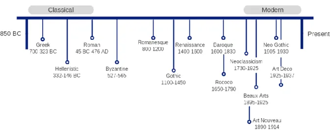
3.2 Architectural eras and periods
Throughout the ages many types of architectures have emerged. Some have taken influence from their predecessors whereas others have completely pushed the boundaries.
Some characteristics can be found in multiple eras, but each architectural period has a clearly defining aspect that sets it apart. Classical architecture has various inclinations, ranging from Greek to the more ‘modern’ take of Neoclassical. They all share common principles that link them together. There are other eras like Neo-futurism that are more of a standalone.
As numerous periods can be identified, not all of which are mentioned in this report, only a focus on a select few was done. As mentioned previously, the selection was based on literature and presence in web design.
Architecture, as a whole, has been transforming and evolving for many centuries, the figure below portrays a simple timeline of some of the most iconic periods (Craven 2018, Ocarroll 2017).
Figure 6: Architecture timeline
A more in-depth explanation of the chosen architectural periods is given below.
3.2.1 Classical architecture
Classical architecture was born in ancient Greece and further developed by the Romans. It has many inclinations and has served as the basis for many architectures throughout the ages (Looking at buildings 2009).
It is most obvious in buildings such as temples with oblong enclosures and columns that support the structure. Columns are a quintessential part of this era as they could be added to many types of constructs, and they were used as an outline to ensure proportion.
Along with columns, other structural elements represent the era such as pediments and balustrades. These are all recognized forms, showing proportion and symmetricity but also the use of order and repetition (RIBA 2017a).
Hence, it’s simple structure and flexibility means it has been used and revised multiple times throughout different architectures (Looking at buildings 2009).
The meaning of Architecture in Information Architecture: analysis and reflection
3.2.2 Baroque architecture
Baroque architecture has its beginnings in 16th century Italy, but it does not stay secluded to this region of the world. It is most notably identified in France and Italy but is not limited to those two countries.
Some noteworthy characteristics of the era are dynamism, a sense of motion and strong curves. The buildings had rounded windows as well as a rich decoration that conveyed a complexity. This meant symmetrical irregularities were common and a sense of grandeur or massiveness was usually portrayed in the design (Britannica 2015, Essential Humanities 2013).
The rich sense of decoration also gave the design a luxurious look that had contrasting surfaces and vivid colors making everything stand out (Britannica 2016).
A more held back approach can be identified towards the late baroque era, with Versailles having a more regal appearance all while retaining the feeling of extravagance. Some of the most extravagant baroque buildings are those of churches and even castle-like ‘chateaux’. Baroque architecture draws the eye, it is dramatic, but it is distinguished by a somewhat ‘in your face’ design.
Consequently, its intention is to seek the attention of the individual and make them question what was in front of them, to incite a reaction that is not necessarily a positive one but that grew on them once they better understood the concept.
Additionally, it used 3D elements instead of staying in the static 2D, they were molded and added to buildings to create an additional characteristic.
Baroque architecture followed an evolution itself, later transforming into the Rococo movement which took influence from the curves and ornaments that were used in the baroque style architecture while thriving off the dramatics (Designing buildings 2017, Essential Humanities 2013).
3.2.3 Modern architecture
Modern architecture was born in the 20th century. It portrayed an analytical approach, placing importance on function, the rational use of materials due to World War I, openness and no excessive ornaments (The Columbia Encyclopedia 2016).
Thus, it encompasses multiple movements, while embracing simplicity and minimalism, making it a far cry from the Baroque and Rococo eras.
Furthermore, it is distinguished by asymmetrical shapes, with cubic, cylindrical, open-plan and flat roofs designs. It went back to the basics with the use of materials like concrete, metal and glass, and color palettes of white and cream ensuring no fancy ‘over the top’ elements were incorporated (RIBA 2017b).
Also embracing ‘form follows function’, the design in fact needed to be based on the purpose for which the structure was being built. With simplicity and clarity, there was no need for fancy details. Although, there was a need to retain ‘truth to the materials’, preservation was sought in giving the deserved value to the material and not hiding it (Designing buildings 2016).
Thus putting the purpose of the building at the forefront, while staying true to characteristics that represented simplicity, clean lines while a ‘less is more’ approach was taken from the minimalistic side (Arora 2017).
3.2.4 Brutalist architecture
Brutalist architecture is emblematic of ‘form follows function’, ensuring every part of the design was useful. It comes from the modernist movement, and although some were unhappy with the direction it took, the aim was to detach itself from modernism and take back the true core values that it was built upon, functionality.
As much as it was controversial, it is back in style due to a sense of nostalgia and respect for socialist principles. It was often used for social housing in places such as the United Kingdom (Hopkins 2014).
The main purpose and value of the buildings was the intent of the inside, not what people could see on the outside. They usually had connecting areas within the structure with other parts, aimed at creating links and relationship among those that inhabited the buildings. Although it can be debated if this purpose was fulfilled as they tended to be dark passageways probably influenced at night by the dreary use of concrete (Watson-Smyth 2013).
Frequently seen as bold, brash and confrontational, it portrayed honesty as it served its ambition, to be functional.
It remains a misunderstood movement that has a misleading and somewhat ‘scary’ name. The name of the movement stems directly from the use of concrete in its structures, giving it its brutish look (Hopkins 2014, Lee 2016).
After World War II, concrete was easy to obtain and was affordable, which gave it popularity. Also, as many parts of the city of London were destroyed, they needed buildings fast, the intentions behind the design was aimed at those in need (Watson-Smyth 2013).
3.3 Presence in Web Design
These architectural periods can undoubtedly be translated into web design as they both follow an evolutionary trend. The evolution of the web is notably carried by the evolution of technology with HTML and CSS, responsive design and mobile tools.
Over the years web design has changed, and it has paved a way for multiple design trends, some of them inspired by architectural eras. Some are more prominent than others, some also creating movements in themselves with ‘out of the norm’ designs, serving as inspiration for the direction the website is to take (Mdesign Media 2012).
When considering specific architectural and art movements that influence web design, some prominent aspects that come into play are visual patterns, efficiency and typography.
Such as website backgrounds that portray ornate patterns which can be reminiscent of Gothic movements, whereas others that use a more flowing design or floral elements will tie into Art Deco and Art Nouveau.
The creation of efficient websites that focus on how the user experiences the content can be attached to the likes of the Bauhaus, where the importance of function was crucial. It not only induces minimalism, but also functionality.
The meaning of Architecture in Information Architecture: analysis and reflection
Some typographic styles feed on this functionality and use it to not only to convey content but also enhance design and style. These elements also use the grid system to place content and text within the page, making placement an important point of how style is illustrated (McNeil 2011).
Many types of Architectures can be found in the likes of web design; some might not be easily attainable, but it is also up to the perception one has of the design they are viewing. It might depend on how the Architecture itself is identified or on which elements are significant. The limits, though, are set by one’s imagination and creativity.
3.3.1 Classicism
Classical Architecture is in a sense difficult to identify in website architecture or design because of its simplicity and commonality, it inspires structure and order. The users and the experience they have are important aspects of web design that can be linked to Classicism in general by giving the visitors consistent and structured content (Bawab 2012).
Obviously the three principles of Vitruvius, put forward at the beginning of chapter 3, play a major part in Classical design. They might not be solely used by Classicism but Firmatis (durability), Utilitas (functionality) and Venustatis (beauty) found their roots in classical antiquity (Cox 2011).
This leaves Classicism as somewhat of an open book when considering it in a virtual environment.
3.3.2 Baroque
The use of Baroque as inspiration in web design is the perfect example of eccentricity. Most graphical elements or statement pieces have an over the top and excessive look. They illustrate ornate, yet flowing elements with pops of color, all attracting the eye (Team Wegraphics 2010).
A close period to Baroque, Rococo, even though less exuberant than its predecessor, still focused on some core elements such as ornateness and curvatures. Some aspects of this movement can be identified in web design, with the use of patterned backgrounds, added visual picture design, cursive fonts, frames set to the carefully selected pictures or even the logo in the form of a ‘sign’ (Moreno 2012).
Whether the designs edge towards Baroque or Rococo, it can be an audacious move to incorporate these elements that can clearly stand out.
3.3.3 Modernism
When it comes to Modernism in web design, a minimal yet practical approach is favored over complicated design, much like Modern Architecture, little adornment is used in its web design counterpart (Elsbury 2017, Loeffler 2012).
There is a rejection of floral embellishments in favor of simple and functional design, portraying a visual hierarchy between the elements on the page.
The structure of content can be depicted in a strict grid-like system as well as with negative space that accentuates content. To show visual importance to the information, pages usually incorporate consistent content with rational typographies that are clear and legible, and that are sans serif-types (Franklin, Helvetica, etc.)
Additionally, colors are used with meaning and few are favored over many, making color palettes important. Primary hues can be favored and occasionally even black and white (Creative bloq staff 2013, Wilshere 2016).
This also puts forward responsive websites that are device-based, as they intend to respond to all needs, whether it be mobile or other devices(Wilshere 2016).
3.3.4 Brutalism
In web design, Brutalism is a bold representation. It often uses bluntness through its colors, unforgiving forms and layouts, and oversized fonts. Obviously, it is inspired by the architectural movement that was seen to have harsh and imposing structures.
The cold colors, austere and concrete browns, use the same types of tones in web design, specifically when it comes to the visual aspects such as pictures and images.
Likewise, the shapes remain bold creating an impact and attracting attention, as concrete allows for unique shapes and can take the form of any mold, giving a 3D aspect to impersonate the movement.
Much like the buildings take a huge space, they give a sinister look with no color leading to the impression of a bland and blunt visual. It is a design that uses big pictures and big typographies even if it tarnishes the legibility of the content.
They are not subtle elements that blend into their surroundings or their environments, they are meant to stand out. This creates a huge visual impact on the visitor, with a layout that is not necessarily what they are used to, whereas superfluous elements are utilized to create an impact (Bate 2017).
Therefore, visual websites can benefit from the use of the brutalist movement as it puts the features forward while favoring upfront design. There are no unnecessary visual elements that crowd the page which gives it a transparent functionality with an easiness in navigating through the content.
Hence it is deemed popular even if it is unpolished, so long as it is functional.
Just like its somewhat bare appearance, it also only gives short definitions for ‘about us’. It can be difficult for the user to navigate or to discover the nature as there is little branding and the purpose is hidden. The brutalist design floats between intrigue and frustration due to this absence of story. It is toned down design compared to some extravagant ones that are currently used (Griffin 2017).
3.4 Design principles
When it comes to the aspects of design, ten principles are put forward by Alan Bigman (2014) that illustrate components that can be used throughout various types of architectural design:
1. Test technology, materials used to construct building
The use of different material and concepts has allowed for structures to evolve and change. Architecture has come from simple constructs to buildings that push boundaries.
The meaning of Architecture in Information Architecture: analysis and reflection
A building can be a structure that defies gravity, instead of going in one direction that is straight up, it can take on different shapes with parts that float in thin air.
3. Stick to your principles, Modernism: integrity, Bauhaus: functionality...
Even when confronted with critics it is important to follow the principles and goals that were set out.
4. Sketch your concepts, drawings and paintings that represent the building before they are built or before technical aspects
This can sometimes turn Architecture into an Art form, giving a sense of direction to where the construct intends to go.
5. Solve problems, think in terms of problem solving, accommodating the space to the users
A design may be a thing of beauty, but it is much more than that. Once integrated into its environment it serves multiple purpose all the while resolving the issues that it set out to.
6. Get noticed, distinctive buildings that identify cities
The creation of memorable structures leads individuals to remember the location where they are found by pinpointing said buildings.
7. Switch gears, adapting your style and sometimes jumping out of your comfort zone Sometimes a certain style is not adapted to the needs and a change in path in required to convey the true motives.
8. Mind your environment, when entering an existing space
With evolving concerns for the world around us, being aware of the impact a new building will have on it and having respect for how the landscape might change is crucial.
9. Repurpose, instead of destroying
Along the lines of preservation, putting objects and buildings to new use can be refreshing and avoid waste. An abandoned structure needs not be destroyed and in certain cases can house something new.
10. Combine new and old, preserving continuity but also coexistence with something already there
The renovation of a structure does not mean losing the identity of what is old but more so not losing the functionality of what is new.
These ten principles invoke a sense of inspiration and encourage creative work, they are not necessarily all encompassing and can function singularly or together.
3.5 Transition to Information Architecture and Web Design
As stated above, these principles can be used throughout many types architectural design, meaning they can also be translated into a virtual design such as that of a website.
Each aspect can be assigned to something that a creator will use when designing the website. Thus revealing the question of whether a webmaster should or could choose an architectural period on which to base their design depending on the nature of the website.
Based on the above design principles, some web design principles can be imagined (Table 1).
Table 1: From Urban Design principles to Web perception
Urban design principle
Web design perception
Technology Using different functionalities to test the limits of what the site can do and what it can offer to the visitors.
Rules Having interesting shapes, with unusual dynamics attracting the eye of the user. Not always having linear information that is available one after the other but in multiple locations on the website.
Principles Staying true to the principles and ideas that were set out for the site at the beginning of the project.
Concepts Conceiving ideas and transcribing them into sketches and models, helping the visualization of what the website could end up being. This also allows the webmaster to see if what was intended is achievable and then adapting the design if needed.
Resolution Resolving any issues that arise throughout the creation as well as being able to determine the severity of any problems.
Noticeable Making the design stand out, having a memorable concept that the visitor will be intrigued by and retain once they have left the website.
Adaptation Being able make a change when it’s needed and not being afraid of it, such as adapting the content or making a change based on user feedback.
Environment Being aware of the environment, not only in the content that is shared but also how the website puts itself in the limelight whether it be partnerships or views
Repurpose Redesign a website instead of starting from scratch. This could mean taking elements from the site that don’t work or underperform and changing how they function or look
Combination Taking the existing content or site and building upon it to ensure that the identity is not lost but that it is rejuvenated.
All these design principles can and generally are used in the creation of a website that would reach the expectations and standards of the modern world.
As much as they each hold their own degree of importance, not all principles will be carried out firsthand. A principle like the concept, with the creation of sketches to illustrate the vision of the website is something that a web design can undertake from the beginning. Meanwhile a principle like adapting the design, is more along the lines of future development as it is a continuity of the website.
Although all principles hold their place, it is important to use them at the right time and place, ensuring longevity.
The meaning of Architecture in Information Architecture: analysis and reflection
4.
Parallels between Information Architecture and Urban
Architecture
Architecture as well as web design can be defined by multiple factors, they both encompass certain features (Sall 2015):
• Are places where people go
Whether you are in a building or on a website, the purpose is to visit and explore your surrounding for a given reason.
• Built to do this specific job
Before being constructed, both entities have a context and a nature that is defined, which will influence its features.
• Are limited by the evolution of technology
Only so much can be done with what exists, and as time passes, more technologically inclined resources become available to make the impossible real
• Can still be considered art
They can represent works of beauty that attract the attention and interest of the people. With these features identified, it can clearly be said that they have both followed a course and adapted to their predecessors. They have evolved using what was already present while creating something new to stand upon.
Just as Architecture can without a doubt be characterized by its various distinctions among the periods, the same can be said for web design.
4.1 History and evolution of Architecture in Web Design
As illustrated by Mike Sall (2015), both architecture and web design have evolved along the same lines, taking from the past to build towards the future.
The beginning of the World Wide Web can be compared to the Neolithic period, where placing simple structures was key, although it was also a challenge to do so.
Then came the Classical period, which brought some refinement and proportion, with slight visual improvements that could be identified.
With Romanesque came a thicker and bulkier look to the items and menus.
The Gothic look of stained glass was captured by the use of CSS (Cascading Style Sheets) and Flash. The core practices of web design were in place, leaving the doorway open for making the most of having ‘more’.
Much as the Renaissance inspired a return to Classical architecture, the same can be identified in recent approach to web design. It inspires the use of the same flat design, with simple and clean aesthetics instead of complexities.
The next step would be Baroque, using the extravagant and the theatrical to change and meld the design into something that it is not. It can be debated whether this stage has been reached yet or not.
The future holds the Neoclassical period, which will tune back into the past, giving retro looks to website without drabness but more of a sense of cool.
After that, many things could happen, revivals are a natural occurrence in Art and Architecture and the same can be said for Web Design (Sall 2015).
Nevertheless, some lessons can be learned by these forms of evolution. The eminence of the Digital Architect, much like a normal Architect, is a person that creates a bond between the website and the perception of the users.
The windows are white space, creating highlights. The color schemes used on buildings relate to colors used on websites, making them different and setting them apart. Thus, similarly to a building, each aspect of a website serves a purpose.
Much like forms of Architecture pop up in different regions of the world, these cultural contrasts are what make for different sets of Architectures and designs. It is common today to justify the use of responsive design that the creation of a website for multiple screen sizes, alas the cultural aspect is sometimes lost (Kowalski 2015).
It is challenging to completely identify the current state of things because they change and evolve extremely quickly but also since characteristics can be taken from multiple eras, forming a melting pot of design.
4.2 Placemaking in a virtual world
The techniques of placemaking are often used in the design and conceptualization of cities and areas. Nevertheless, the components that it puts to work are not secluded to the physical world.
Things in general are influenced by their surrounding and by items that interact or enhance them, thus an individual will have different perceptions depending on those factors.
Just like in Urban Design, placemaking in Information Architecture is creating contexts for visitors and making sense of the information that is available to them. Consequently, it is an important aspect.
A sense of place can be seen as a natural occurrence in human beings, they have an instinctive awareness of their surroundings and what can be done in the places in which they find themselves. People learn the meaning of these places because they evolve with them and form habits around them.
Hence, it is reasonable to imagine that this can then be done in a virtual environment.
The lines of this sense of place become slightly blurred in this predominantly digital world, words and expressions that are normally used to indicate that a person is going somewhere or visiting someplace are used in the context of online spaces.
Because people also encounter these virtual places like they would physical places, they have expectations of what context the content represents, telling the difference between two websites becomes like telling the difference between two buildings.
The meaning of Architecture in Information Architecture: analysis and reflection
Ultimately, both Urban Architecture and Information Architecture try to convey the same message, to serve and communicate based on their social function (Arango, Morville, Rosenfeld 2016).
When putting Lynch’s (1960, see section 3.1) city components into the context of a virtual environment, they can be pinpointed to specific areas of a website (Arango 2017):
Paths, nodes and landmarks
The navigation bars, menus and search bars allow users to navigate throughout the website, helping them go from place to place just like paths and nodes.
The labels and icons indicate special areas that can be visited like landmarks.
Districts
The main areas of a website, which can also sometimes bare distinctions like colors or labelling.
Edges
In some cases, the different sections of the website, like public or private or even intermediate areas that create separation. In other ways, zones that make up recognizable locations. Just like within a city, the user can forge a sense of place with the virtual environment in which they find themselves. They do not necessarily identify these characteristics, but they are a present hidden layer.
5.
Mock-ups
The mock-ups paved the way for the second side of the paper, that of the methods and analysis.
This section puts forward why and how they were used to advance the reflection. It also illustrates the entire process of the mock-up creation and the tie-ins to Information Architecture that were used.
5.1 Context
It was decided from early on that the mock-ups would serve as a means for participants to, in some way, voice their opinion, thus illustrating how a virtual interface based on Urban Architecture could change their perception.
The mock-ups were also meant to identify the attitude the user would have towards a website based on an architectural period.
Undeniably, the elements incorporated into the mock-ups needed to be well balanced. Throughout the creation, as much as the visual design would be the first thing ‘seen’ by the participants, it needed to be handled carefully in order to make sure elements of structure and navigation were also integrated.
5.1.1 Definition and scope
A mock-up is usually a mid to high fidelity creation of a design, they can portray different elements such as the layout, colors, typography and iconography.
They help users see what the final result may resemble and give feedback to how the product might function, all the while leaving room for improvements on the final rendering.
Mock-ups can be created with design tools, specifically designed software, or by using computer coding.
Their creation also allows the designer to gauge whether what is intended is possible (Cao 2018).
5.1.2 Study usage
For this study the mock-ups were created to resemble websites as close to reality as possible. Therefore, specific layouts were elaborated for each one, with structures that allowed for multiple features and content types to be added. The visual aspects were also chosen to reflect realistic portrayals of the colors and fonts.
In terms of imagery, it was kept at a minimum simply due to the nature of the content put forward.
5.2 Methodology
To ensure the process went well, a well thought out organization and methodology was needed.
The meaning of Architecture in Information Architecture: analysis and reflection
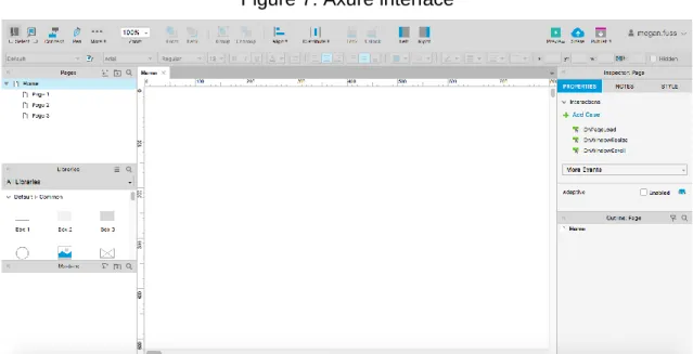
5.2.1 Software: Axure
12As it was decided that mock-ups were to be used, a software to create them needed to be chosen. Multiple computer programs for model creation had been proposed throughout the IA course. They each varied functionality-wise and with what could be achieved with their usage. A more global and thorough tool with all-encompassing functionalities and a wide range of capabilities was chosen: Axure.
Axure is a software that allows the creation of models through the use of a program installed on one’s device. This tool requires a license to work to full capacity once the 30-day free trial is up, but they are also available to students and professors.
Axure offers multiple components with a somewhat complex interface, which did not always render its use intuitive. It demanded the time to get a grasp of the software and all that could be accomplished with its handling (Axure 2018).
Figure 7: Axure interface
The software also allowed an easy way to share the mock-ups through the means of a web browser. This meant that all that was needed to ensure the participant could view the website models was a functional browser and an internet connection.
5.2.2 Era selection
To create a tie in with the theoretical aspect of the paper, the eras that were selected were based on it.
This meant that the models were somewhat based on ideas of how Urban Architecture is translated into a web design but also on how a concept can be developed based on the principles of set architecture.
The four eras that were selected were: Brutalism; Classicism; Modernism and Baroque. They were also chosen as, Classicism represents the core, Brutalism and Modernism are functional and recent pioneers, and Baroque is eccentric and unusual. This gave the proposed models a wide variety.