HAL Id: inria-00533618
https://hal.inria.fr/inria-00533618
Submitted on 8 Nov 2010
HAL is a multi-disciplinary open access
archive for the deposit and dissemination of
sci-entific research documents, whether they are
pub-lished or not. The documents may come from
L’archive ouverte pluridisciplinaire HAL, est
destinée au dépôt et à la diffusion de documents
scientifiques de niveau recherche, publiés ou non,
émanant des établissements d’enseignement et de
Stéphane Ducasse, Simon Denier, Françoise Balmas, Alexandre Bergel, Jannik
Laval, Karine Mordal-Manet, Fabrice Bellingard
To cite this version:
Stéphane Ducasse, Simon Denier, Françoise Balmas, Alexandre Bergel, Jannik Laval, et al..
Visual-ization of Practices and Metrics (Workpackage 1.2). [Research Report] 2010, pp.56. �inria-00533618�
Visualisation graphique des pratiques et
métriques
Workpackage: 1.2
This deliverable is available as a free download.
Copyright c 2008–2010 by S. Ducasse, S. Denier, F. Balmas, A. Bergel, J. Laval, K. Mordal-Manet, F. Bellingard.
The contents of this deliverable are protected under Creative Commons Attribution-Noncommercial-ShareAlike 3.0 Unported license.
You are free:
to Share — to copy, distribute and transmit the work to Remix — to adapt the work
Under the following conditions:
Attribution. You must attribute the work in the manner specified by the author or licensor (but not in any way that suggests that they endorse you or your use of the work).
Noncommercial. You may not use this work for commercial purposes.
Share Alike. If you alter, transform, or build upon this work, you may distribute the resulting work only under the same, similar or a compatible license.
• For any reuse or distribution, you must make clear to others the license terms of this work. The best way to do this is with a link to this web page:creativecommons.org/licenses/by-sa/3.0/
• Any of the above conditions can be waived if you get permission from the copyright holder. • Nothing in this license impairs or restricts the author’s moral rights.
Your fair dealing and other rights are in no way affected by the above. This is a human-readable summary of the Legal Code (the full license):
http://creativecommons.org/licenses/by-nc-sa/3.0/legalcode
Workpackage: 1.2
Title: Software metric for Java and C++ practices Titre: Visualisation graphique des pratiques et métriques Version: 1.1
Authors: S. Ducasse, S. Denier, F. Balmas, A. Bergel, J. Laval, K. Mordal-Manet, F. Bellingard
Planning
• Delivery Date: 28 June 2009 • First Version: 15 November 2008 • Final Version: 31 March 2010
challenge since it is complex to output and present to the user for the following rea-sons: first a lot of data should be presented and at different audience. Second displaying information is one aspect another one is navigating the information. Finally it is im-portant not to overwhelm the users with too much visualizations. This workpackage presents a state of the art in terms of software visualization approaches that are specif-ically designed to display metrics. In addition it sets up the context for the application of such visualization to practices.
Contents
1 Context and Challenges for adapted Metric Visualizations 3
1.1 Overview of existing approaches . . . 3
1.2 Technological Challenges . . . 4
2 Selection Criteria and Template 5 2.1 Visualization Template . . . 5 2.2 An Example: DISTRIBUTIONMAP . . . 7 3 A selection of Visualizations 13 3.1 TREEMAP . . . 14 3.2 TREERING . . . 17 3.3 ICICLEPLOT . . . 20 3.4 POLYMETRICVIEWS . . . 23 3.5 FILEDOT . . . 29 3.6 KIVIATDIAGRAM . . . 33
3.7 DOTPLOT ANDCORRELATIONMATRIXES . . . 37
3.8 EVOLUTIONMATRIX. . . 40
3.9 VERSO . . . 43
Chapter1. Context and Challenges for adapted
Metric Visualizations
1.1
Overview of existing approaches
There is a plethora of program visualizations to support program understanding and their execution [SDBP98, War00, Spe01]. Bertin [Ber74] defines semantics of map and visualizations. Healey shows the importance of preattentive properties [Hea92] — Researchers in psychology and vision have discovered a number of visual properties that are preattentively processed. They are detected immediately by the visual system: viewers do not have to focus their attention on a specific region in an image to deter-mine whether elements with the given property are present or absent. An example of a preattentive task is detecting a filled circle in a group of empty circles. Commonly used preattentive features include hue, curvature, size, intensity, orientation, length, motion, and depth of field. However, combining them can destroy their preattentive ability (in a context of filled squares and empty circles, a filled circle is usually not detected preattentively).
[FJ98, HVvW05, WL07a] use 3D to show static information. [WL07b] uses 3D to show software metrics using a city metaphor. [LSP05] uses constrained 3D to display multiple class properties at the application level. [MFM03] et al. propose an interesting 2D software maps that they generalize in 3D. In their approach one dot represents some property of a line. This way they can visualize entire system.
Several researchers displayed dynamic information [FM86, DPLVW98, EGK+02].
Bertuli et al. used metrics to quantify dynamic execution information [BDL03, DLB04]. Some work focus on object-oriented software and classes [Fyo97, SK98]. For ex-ample, ClassBlueprint offers a way to understand how classes are build from method invocations and attribute accesses and their interaction with their superclasses [LD02]. Schauer et al. present hot-spots on class hierarchy [SK98]. Package fingerprints stress how classes are co-used in a package or how they use other packages [AAD+08]. Pack-age Blueprint displays, in an extremely compact form, how a packPack-age is referencing other classes and how it is used by other classes in a system [DPS+07] and this without edges.
Polymetric views display the conceptual entities that compose software (classes, attributes, methods, ...) but enrich them with software metrics [LD03]. The shapes of the entities reflects some of their properties and from this combination extra meaning emerges. This visualization puts the metrics in context and perspective. In addition, the same metaphor supports the understanding of the entities evolution [GLD05]. One of the important problem when dealing with graph (and software is a graph) is how to deal with edges since they can introduce a lot of noise. Distribution Map is a specialized software maps to represent how properties spread into a system [].
Presenting data got a lot of attention, for example the following web sitehttp://www.
smashingmagazine.com/2007/08/02/data-visualization-modern-approaches/presents some
de-fault visualizations. To deal with such a profusion of approaches, several assessment frameworks have been proposed [GHM05, KM07, Kos03, PRW03, PBS93, SDBP98, TM02, SvG05].
Given the plethora of works on visualization, it is important to be able to describe the ones that are better-suited to be used in software quality analysis.
1.2
Technological Challenges
The key challenges addressed by this workpackage are the following ones: • Plethora of information. Squale generates a lot of either new metrics or refined
ones, practices. Therefore, it is difficult to decide which metrics should be dis-played and how.
• Put in context and navigation. In addition to just displaying information, it is important to present it in the right context and to support its navigation.
• Multiple users. Since different kinds of users (lead developer, manager, project leader) will use the information provided by Squale, the presentation of such information should be adapted to the user.
• A coherent sets of software maps. There are a plethora of visualizations and for each one the user will have to learn and feel confident with it, therefore it is not possible to use a too large set of visualization.
Chapter2. Selection Criteria and Template
Since the amount of works is large, we need to define some criteria that will help us to drive the selection of work that could be used to support software quality presentation. In the context of Squale, visualization primary goal is to convey the quality of the different software artifacts. Here is a list of criteria that visualization should support. Ease of understanding. A given visualization should require a limited training to be
understandable by end-users. We do not aim for zero training else we would remove too much interesting possibilities. In addition, the visualization should be understandable by a wide range of users and not only some researchers on program visualization.
Flexible, adaptable. Some visualizations are good but too specific and difficult to adapt to new data. Since Squale is open in term of tools used to gather in-formation and the kind of practices used to qualify software, we should favor generic visualizations that can be customized at will in the future. In addition the visualization should be adaptable to different audiences.
Scalability. Lot of visualizations are optimized to scale well with the number of nodes or edges. Now the scalability we are looking for in Squale is not just a scalability in terms of millions of nodes displayed on the screen. We are looking at how to convey in a compact way information about software artifacts of different levels of abstractions (folders, systems, packages, classes, methods).
Ease of implementation. The goal of Squale is not to focus on specific algorithms to display information. Therefore the proposed visualization should be either simple to implement or well supported by available libraries.
Navigability. Since software is apprehended at different levels of abstraction, it is im-portant that the visualization not only conveys the quality of the artifacts but that it supports user navigation inside the software abstraction space.
Required information. Since the goal of Squale is to act as a meta-plug that builds up its quality model on top of information provided by available tools, the visu-alization should be dependent as few as possible on requirements related to the kind of information extracted from software artifacts. Still it is important that the information extracted by foreign tools is described in a way that the visualization engine can do something meaningful with it.
Patent free. Since Squale is an open-source project, the visualization algorithms should not be patented.
2.1
Visualization Template
To be able to compare the selected visualizations on a common ground, we define the following description template.
Identification
Name and reference: This section indicates the name of the visualization and its exact references. Alternate names are also given.
Goal: This section stresses the main goal and the key points of the visualization. Principle: This section presents the key underlying mechanisms or layout positioning of the visualization. It may contain a sketch to describe the principle.
Example
This section presents the visualization on a particular case.
Metrics
This section presents the metrics that can be used in the visualization. In particular, this section should stress whether the visualization is targeting experts or managerial level.
Analysis
This section puts the visualization in perspective, especially in the light of the cri-teria exposed before.
Navigation: This section presents how the visualization support the navigation in the software artifacts space.
Applicability: This section presents the information needed to be able to express and apply the given visualization. For example, if we need references between classes, method invocations or any specific information to be extracted from the source code. Algorithm cost/Implementation cost: This section discusses if the visualization is easily reproducible in terms of computational cost. In addition, this criterion also cov-ers whether it is simple to implement the visualization in another environment than the other presented by the referenced paper.
Variability: This section presents possible variations or adaptation strategies of the visualization.
2.2
An Example: D
ISTRIBUTION
M
AP
2.2.1
Identification
Name and reference: DISTRIBUTIONMAP[DGK06]
Goal: Often, the results of software analyses categorize existing software entities (packages, classes,...) into new groups or associates them with mutually exclusive properties, but it is difficult to understand how such new groups or properties relate to the original code structures (packages or classes). DISTRIBUTION MAPsolves this problem. It is a generic visualization showing how properties spread over code en-tities. DISTRIBUTION MAP stresses the focus, which shows whether a property is well-encapsulated or cross-cutting, and spread, which shows whether the property is present in several parts of the system.
Principle: The principle of DISTRIBUTION MAP is to represent containing entities (subsystems, folder, packages, classes...), to spatially nest their elements inside them and to display each element with the color dedicated to its linked property.
part 1 part 2 part 3
part 4 part 5
Figure 2.1: A DISTRIBUTIONMAPshowing five packages and four properties: Red, Blue Green and Yellow.
Figure 2.1 illustrates the DISTRIBUTION MAPprinciple with five containing en-tities, called parts, containing 6, 2, 5, 10 and 14 elements respectively and with four properties: Red, Blue, Green and Yellow. On the visualization, for each part pnthere
is a large rectangle and within that rectangle, for each element si∈ pnthere is a small
square whose color refers to the property qmattributed to that element.
From the visualization we can characterize both the parts with respect to the con-tained properties, and the properties with respect to their distribution over the parts. In Figure 2.1, we say that property Blue is well-encapsulated, that Yellow is cross-cutting and that Green is like an octopus because it has a body (part 1) and tentacles spread over the system. We also say that part 1 and part 5 are self-contained or exhibit the
same properties which are local to them. Note that parts 1 to 5 can be either classes, packages, groups of packages. . .
Two layout strategies are used to reinforce the visual impact of distribution. First, colors (properties) are always grouped and displayed in the same order within each part, which allows to easily count elements of a given property and compare between parts. Second, parts are ordered using a dendogram seriation algorithm, which places similar parts (according to the properties they share) near each other. Thus, properties spread over different parts still appear in the same area, allowing the user to see all touched parts at once and making visual patterns of distribution more visible.
2.2.2
Examples
DISTRIBUTIONMAPcan be applied to show a large variety of information ranging from metrics to semantic information or authorship. Here we show two of them.
Figure 2.2 shows the concepts (which are computed out of vocabulary in the source code) of JEdit and their distribution on the complete system. Red points to classes identified as core classes for JEdit: it is spread across multiple packages, showing which are parts of the core and which are not. Green points to UI classes, which appear in the same packages as core classes. On the contrary, blue classes (scripting) and cyan classes (regular expressions) are more encapsulated in their own packages.
Figure 2.3 shows the number of commits per class for JBoss using a heat scale (red for files with more than 50 commits, yellow for more than 20 commits, light blue for less). The folders plugins, metadata, ejb, and jdbc are the most actively developed. With respect to their number of files, the folders j2ee and ejbgl appear more stable.
Figure 2.3: Number of Commits in JBoss.
2.2.3
Metrics
Metrics: Metrics can be either mapped to color or to dimensions following the poly-metric views principle [LD03]. Figure 2.4 shows the use of the two dimensions of a box to display metrics, complementary to the basic distribution map principles.
so that each element is linked with only one property. Colored metric uses discrete, easy to distinguish colors to show properties. To retain the distinguishing property of colors, there should be few of them (a dozen) hence a small set of significant properties must be chosen.
Color mapping to properties can be chosen randomly, using similar colors to show relationships between some of the properties, or using symbolic values. For example, a class can be green to represent that its quality is ok, orange or red when there is a quality problem.
two different metrics width metric
height metric
Figure 2.4: Displaying metrics as box size.
2.2.4
Analysis
Applicability: While DISTRIBUTIONMAPis flexible and can be applied without any change to folder/file, packages/classes, classes/methods and other groups, there is a strong constraint to get its maximum benefit. The displayed properties should be mu-tually exclusive on an element; in other terms, an element can only show one property. Note that using the border of a box to display an additional property usually does not work since colors get anti-aliased.
Navigation: DISTRIBUTION MAPsupports a good navigability at two levels: First, the part and container metaphor works at any level of abstraction. A container can be a folder with files or subfolders, a package with classes and sub-packages or methods inside a class. So using a single model we can display metrics and quality informa-tion. Second it is possible to nest distribution maps within another layer. Therefore a package may contain other packages which may contain classes and finally methods. Algorithm cost/Implementation cost: DISTRIBUTION MAPalgorithmic complexity is rather low. Two main loops are necessary: one for the part and one for container. To enhance the pre-attentive visual property of the visualization, parts should be sorted by properties inside a container.
In addition parts can also be grouped when having similar properties. However, the overall complexity is still quite low and the visualization can be drawn with a simple toolkit in a couple of hours. Our experience shows that in 3 hours we could get a first version.
The structural shape of DISTRIBUTIONMAPfits well the nested structure of soft-ware static elements (folders, packages, classes, methods...).
The scalability of DISTRIBUTIONMAPis clear when we see JBoss in a single page. Since DISTRIBUTIONMAPdoes not draw edges the noise produced by edge drawing is absent.
Variability: DISTRIBUTION MAP is an interesting visualization because it can be adapted to fit specific intention.
• Part colors. As we show in the metrics section, it is possible to change the dimensions of the elements to reflect one or two measures. In addition it is possible to change the color of the part to reflect a value computed based on its elements. So the part can reinforce the general information or create new one as shown in Figure 2.5.
Two composites and their constituents
Figure 2.5: Using part colors to convey summary.
• Fixed element position vs. color effect. The ordering of the elements can be kept the same using an arbitrary ordering such as a timestamp or filename. However the color grouping effect will be weaken up.
Analysis Pro/Cons.
Distribution map works intuitively at both the macro-reading level and the micro-reading level, making it very easy to grasp by technical and non-technical users. Its layout strategies allows one to easily see distribution patterns at the macro level, while the simple schema of nested boxes and colors allows one to relate and count elements and properties within each part.
DISTRIBUTIONMAPoffers several good properties when applied to software sys-tems:
• Straightforward mapping between source code and visualization. There is a one-to-one mapping between the structural code and the visual elements it represents. The reengineer can easily relate the parts and elements in the visualization with source code structure while investigating.
• Good overview and noise reduction. Edges are not shown but replaced by spatial nesting and it is possible to display large applications as we show with the JBoss case study.
• Navigation. The navigation while limited to structural nesting is adapted to large software systems.
Chapter3. A selection of Visualizations
We describe the following visualizations (the list is not exhaustive). Note that our anal-ysis is focusing on software metrics and can be biased from certain other perspectives. In addition to DISTRIBUTION MAPpresented in the previous chapter we present the following visualizations: • TREEMAP • TREERING • ICICLEPLOT • POLYMETRICVIEWS • FILEDOT • KIVIATDIAGRAM
• DOTPLOT ANDCORRELATIONMATRIXES
• EVOLUTIONMATRIX
• VERSO
Barlow and Neville [BN01] studied four two-dimensional visualizations of hierar-chies: organization chart, icicle plot, treemap, and tree ring and their results suggest that the tree ring or icicle plot is equivalent to an organization tree. Still we present them as they offer way to display information.
3.1
T
REE
M
AP
3.1.1
Identification
Name and reference: TREEMAP[JS91, BDL05] (http://www.cs.umd.edu/hcil/treemap/) Goal: The objective of a treemap is to display tree-based information in a compact form which maximizes use of the screen space.
Principle: Figure 3.1 illustrates the treemap principle. The complete tree is represented as a rectangle. Each sub-tree is represented as a sub-rectangle in its parent rectangle. At the first hierarchy level, the complete rectangle is split vertically. Then, sub-rectangles are split horizontally. Sub-sub-rectangles are split vertically, and so on. Each splitting is done so that the area covered by a rectangle is proportional to the number of nodes it contains. Figure 3.1 compares a tree with a tree map and shows that TREEMAPis more compact. b c a c1 c2 c12 c11 a2 a1 b a1 a1 c2 a2 c11 c12
Figure 3.1: (left) A TREE MAP showing four levels of nesting with six leaf nodes. (right) Comparing a TREEMAPand an organization tree (taken from [BN01]).
3.1.2
Examples
The TREEMAPweb site contains a lot of examples. In the context of software vi-sualization, panopticodehttp://www.panopticode.org/uses treemaps to stress elements with quality problems. Figure 3.3 shows methods grouped into classes from the inte-gration framework CruiseControl. In the figure, elementary boxes are methods, com-posed boxes delimited by white lines are classes. The colors are used to convey four quality level information (black for extreme value, red for bad quality, green for good, and yellow for middle). The complete picture displays a package.
NDepend also uses treemap visualization, highlighting entities resulting from queries. Figure 3.4 shows packages containing classes themselves composed out of methods.
Figure 3.3: TREE MAP showing quality metrics in CruiseControl with methods as elementary boxes and classes as composed boxes.
3.1.3
Metrics
The box color is the primary attribute to convey some information in TREEMAP. Since it provides a space efficient overview of all entities in an organized system, we can get a symbolic idea of a metric values by looking at predominant colors. The size of the leaves can represent two metrics but this makes the computation of the TREE
MAPlayout more complex and can hamper the visualization. However, it is not simple to determine or to represent the metrics of the enclosing entity.
3.1.4
Analysis
Applicability: Treemaps can be applied to quality assessment result as demonstrated by panopticode (Figure 3.3).
Navigation: A treemap is a good support for an overview. In addition, since elements (methods or classes) are contained and grouped in their enclosing entity (classes or packages), a treemap supports navigation. However, navigating through the hierarchy of enclosing elements requires skill and knowledge of TREE MAP layout. It is not straightforward to access the enclosing entity, since space is used by its elements.
Figure 3.5: TreeMap taken fromhttp://www.randelshofer.ch/treeviz/index.html.
Algorithm cost/Implementation cost: Treemap algorithm is simple to implement and lot of implementations are available.
Variability: The basic layout presented in the previous section is called “slice and dice”. Regardless of the shape of the parent rectangle, it is sliced vertically or hori-zontally, depending on the depth of the node. To improve readability, other algorithms have been proposed to enforce an aspect ratio which is as close as possible to 1. Balzer et al [BDL05] uses Voronoi shapes instead of rectangles. Using TREEMAPto show more information than the ones presented in Figures 3.3 or 3.4 seems difficult.
Composite, more complex visualizations such as Verso [LSP05] and CodeCity [WL07a] have used TREE MAPas a general layout for the system structure and
re-fined leaf area with custom shapes to show more metrics.
Analysis Pro/Cons. TREE MAP are used for all kinds of domains. They are pow-erful and group naturally together hierarchical entities. Treemaps have the following limits: they are compact but show mainly leaves of the structure. Therefore it is not obvious to get enclosing entity (class/package) information when looking at element (methods/classes), beside an overview. Figure 3.5 which classifies files (movies, mu-sic...) clearly shows that TREEMAPcan be really blurry and not efficient to support a structural navigation. Finally they have the problem that leaves at different depth lev-els have different size in the representation which arbitrarily gives less “importance” to deeper leaves.
3.2
T
REE
R
ING
3.2.1
Identification
Name and reference: TREERING[AH98]
Goal: The goal is to obtain more compact trees and support a better navigation. Principle: The tree ring is a space-filling visualization approach. TREERINGdisplays tree topology and nodes size. Node size is proportional to the angle swept by a node as shown by Figure 3.6. It may contain empty space contrary to TREEMAP.
Figure 3.6: Tree ring principle (taken from [BN01]).
3.2.2
Examples
We can see Sunburst [SCGM00] (http://www.cc.gatech.edu/gvu/ii/sunburst/) and Sunray visualizations as TREERINGvariations. Figure 3.7 shows two examples.
3.2.3
Metrics
In general two metrics can be displayed: one for the node size and one for their color, except for the root node where the node size cannot be rendered. TREERING
Figure 3.7: (left) Tree ring principle applied in Sunburst — (right) Tree ring principle applied in Sunburst. (taken fromhttp://www.randelshofer.ch/treeviz/index.html)
can be used in the same fashion TREE MAPis used as shown in Figure 3.3 and 3.4 where node colors can convey symbolic information and node size some structural information.
3.2.4
Analysis
Navigation: TREERINGcan support navigation at system level since packages can be used as root and classes and methods as tree elements. One problem is that the visual-ization should offer zooming or interactive facilities to access deep leaves. Therefore the navigation is not optimal.
Applicability: There is no specific constraint for the applicability of TREE RING, besides having a hierarchical structure.
Algorithm cost/Implementation cost: The algorithm is not complex but requires that the widget kit supports arc drawing. Several implementations are available.
Variability: While a large variety of data can be visualized with TREE RING, the potential of variation in presence of several software metrics is not as open as for other representations such as POLYMETRIC VIEWS: A maximum of two metrics can be displayed. In addition it is not clear that comparing two tree rings showing different properties is a simple task and supported by the TREERINGitself.
Summary Pro/Cons: TREERINGis a valuable visualization. The scalability as well as navigability may be an issue for large system. Understanding subpart is easier than in TREEMAPwhere the leaves are nested inside their parents. The metrics application may be limited too since only coloring may be adequate.
3.3
IC
ICLE
P
LOT
3.3.1
Identification
Name and reference: Icicle plot [KH81, BN01]
Goal: Similarly to TREERING, ICICLEPLOTgoal is to offer a compact representation of trees.
Principle: ICICLEPLOT principle is depicted by Figure 3.8: a line represents a tree level. A line is split according to its number of children. Unlike TREERING, the icicle plot may contain empty space. Like the tree ring, ICICLEPLOTmay use node size to convey extra information.
Figure 3.8: ICICLEPLOTprinciple (taken from [BN01]).
3.3.2
Examples
Figure 3.9 shows the same data than Figures 3.5 and 3.7. It is worth mentioning that ICICLE PLOT and TREE RINGprovide a better understanding of the structural relationships between elements than TREEMAP. These examples illustrate that TREE
RINGand ICICLEPLOT are closely related and that having the two visualizations is
not interesting.
3.3.3
Metrics
In general two metrics can be displayed: one using the node size and one using the node color, except for the root node where one cannot use any size (a low value would result in a small top node that would produce a very narrow representation). ICICLE
PLOTcan be used in the same fashion TREEMAPis used as shown in Figure 3.3 and 3.4 where node colors can convey symbolic information and node size some structural information.
Figure 3.9: (left) ICICLE PLOT example — (right) ICicle Plot principle applied in Iceray. (taken fromhttp://www.randelshofer.ch/treeviz/index.html).
3.3.4
Analysis
Navigation: ICICLEPLOTcan support navigation at system level since packages can be used as root and classes and methods as tree elements. One problem is that the visu-alization should offer zooming or interactive facilities to access deep leaves. Therefore the navigation may not be optimal.
Applicability: There is no specific constraint for the applicability of ICICLEPLOT, besides having a hierarchical structure.
Algorithm cost/Implementation cost: The algorithm is not complex. Several imple-mentations are available.
Variability: While a large variety of data can be visualized with ICICLE PLOT, the potential of variation in presence of complex software metrics is not as open. Indeed a maximum of two metrics can be displayed. In addition it is not clear that comparing two ICICLEPLOTs showing different properties is a simple task and supported by the ICICLEPLOTitself.
Summary Pro/Cons: Similarly to TREERING, ICICLEPLOTis a valuable visualiza-tion. Scalability as well as navigability may be an issue for large systems. Understand-ing subparts should be easier than in TREE MAP where the leaves are nested inside their parents. The metrics application may be limited too since only coloring may be adequate.
3.4
P
OLYMETRIC
V
IEWS
3.4.1
Identification
Name and reference: Polymetric Views [LD03, DDL99, LD03, GLD05]
Goal: The idea promoted by polymetric views is to offer a lightweight software visu-alization technique where the graphical representation of a software entity (package, class, method) is enriched with software metrics.
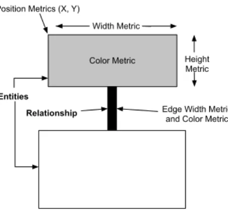
Principle: The visualization uses two-dimensional display to visualize object-oriented software [DDL99]. The nodes represent software entities or abstractions of them, while the edges represent relationships between those entities. We enrich this basic visual-ization by rendering up to five metrics on a single node simultaneously, as shown in Figure 3.10. Additionally, an edge can render up to two metrics.
Color Metric Position Metrics (X, Y)
Width Metric
Height Metric
Edge Width Metric and Color Metric
Entities Relationship
Figure 3.10: Polymetric Principle.
Node Size/Edge Width. The width and the height of a node can each render one metric measurement. The bigger these measurements are, the bigger the node is in one or both of the dimensions.
Node/Edge Color. The color interval between white and black can be used to render another metric measurement. The convention is that the higher the metric value is, the darker the node is. Thus light gray represents a smaller metric measurement than dark gray.
Node Position. The X and Y coordinates of the position of the node can also reflect two metrics measurements. This requires the presence of an absolute origin within a fixed coordinate system. Not all layouts can exploit absolute position metrics, as some of them constrain the position of the nodes (e.g., a tree layout).
Figure 3.11 shows how inheritance trees are rendered using metrics to provide more contents. Nodes represent classes, edges inheritance relationship. Node width repre-sents the number of attributes; node height reprerepre-sents the number of locally defined
methods and node color the number of lines of code.
Figure 3.11: Polymetric view applied to inheritance. Width: NOA (Number of At-tributes). Height: NOM (Number of Methods). Color: LOC (Line of Code).
3.4.2
Examples
Polymetric views embed a versatile visualization principle, which may be declined in a variety of views. We will present here only one example: system complexity. It is used heavily in the Moose environment to get an overview of a system. Literature contains other examples such as checkers to provide overview [LD03].
System Complexity View. System Complexity view decorates class hierarchies with metrics measuring the size of classes (such as number of methods, attributes, and lines of code).
This view is based on the inheritance hierarchies of a system and gives clues on its complexity and structure. For very large systems it is advisable to apply this view first on subsystems, as it takes space.
Signs: (1) Tall, and narrow nodes represent classes with few attributes and many meth-ods. (2) Deep or large hierarchies are definitively subsystems on which the views of the inheritance assessment cluster help to refine understanding. (3) Large, stand alone nodes represent classes with many attributes and methods without subclasses. It may be worth to have a look at the internal structure of the class to learn if the class is well structured or if it could be decomposed or reorganized. (4) Flat, light nodes with a width:height ration of 1:2 often represent data storage classes that define several at-tributes and for each attribute implement two accessor methods. The light color often denotes that a class has very short methods as is the case for accessors.
Figure 3.12: System complexity. Width: NOA. Height: NOM. Color: WLOC.
3.4.3
Metrics
POLYMETRICVIEWShave been designed to display metrics and in particular met-ric combination. Here is another example where the displayed metmet-rics are different. More precisely, we want to understand the relationship between some already identi-fied classes (A to I, in Figure 3.13) and their subclasses. For that purpose we display a portion of the inheritance tree with metrics NMA (number of methods added to the ones defined in the superclass), NMO (number of methods overridden in the subclass) and NME (number of methods extending superclass methods ) to assess the corresponding ratios overridden.
Figure 3.13: Inheritance qualification: node width = NMA (number of method added), height = NMO (Number of methods overridden), and color = NME (number of method extended).
We can see that classes A, F and G are flat nodes: they define much functionality (width), but override only little (height) because they are at the root of their respective hierarchies. For the subclasses two different situations occur: either the subclasses are flat (B), or they are tall (H, I and the subclasses of F).
This graph shows that the inheritance relationship can somehow be qualified: the subclasses of A add a lot of methods and override very little, whereas the subclasses of G tend to override more methods than they add. So we can consider G as a class de-signed to be partly redefined whereas A can be seen as a complete piece of functionality to be reused without modification.
3.4.4
Analysis
A B D C Nodes: Node Height: Node Width: Node Color: Edges: Edge Color: Edge Width: Inheritance Histories AGE of the inheritance history AGE of the inheritance history; Cyan for removed history Class HistoriesENOM of the class history
AGE of the class history; Cyan for removed history ENOS of the class history Legend:
E
Figure 3.14: Principle of polymetric usage for history analysis.
Scalability: POLYMETRIC VIEWS have been successfully applied to analyze large industrial case studies, therefore showing that there is no real scalability issue.
The fact Squale practices are normalized between 0 and 3 ranges implies that the polymetric views are not totally adapted to display practices but would help to put in perspectives the metrics underneath the practices.
Limit: Outliers, with extra large values (such as methods with 6000 lines of code), may flatten other data and really hamper readability. In such a case, one should either uses a logarithmic scale or apply a top cut on outliers (that is, reduce all outliers to a maximum threshold).
Navigation: While the navigation given by polymetric views is good, we believe that for certain views, using a distribution map is more adapted since it shows the enclosing and its elements altogether.
Applicability: There are no specific limit to the applicability of polymetric views. Algorithm cost/Implementation cost: System complexity is rather low: the system complexity algorithm is less than 15 lines.
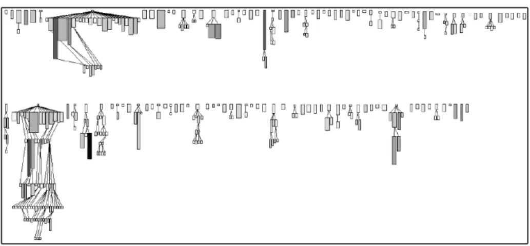
Variability: The essence of polymetric views is to be adaptable to new metrics and to be able to display them in context. An interesting variation which goes much beyond traditional metrics variability is the fact that polymetric views can also be used to show trends or evolution of a given metric. Figure 3.14 gives an example [GLD05]. A node represents the history of a class during development: its width shows the evolution of the number of methods in the class (i.e., the number of methods that have been added and removed in the class) while its height displays the evolution of number of statements in the class. The color shows the age of the class (the number of versions since its creation).
Another example related to evolution is depicted in Figure 3.15. In this figure a part of JBoss is rendered using the same evolution principle. This testifies the scalability of our approach.
JBossTestCase
Stats MetaData SimpleNode
J2EE ManagedObject
Figure 3.15: Overview of the evolution of Jboss.
Summary Pro/Cons:
POLYMETRICVIEWSare a flexible and powerful visualizations to display software metrics. They support also the representation of evolution. Combined with DISTRIBU
-TIONMAPthey can provide most of the need for software metric visualization. They could be applied on packages or system level.
3.5
F
ILE
D
OT
3.5.1
Identification
Name and reference: FILEDOT1[MFM03].
Goal: The objective of a file dot visualization is to give an overview of file contents based on line elements.
Principle: A file is represented as a rectangular grid made of squares. Each square represents a line in the file, arranged in sequence. Figure 3.16 shows two files, fileA and fileB. Square color represents a single property extracted from the line (e.g. depth of indentation, within a control structure, access record or global variable, . . . ).
In the original publication, a square was not only representing a line but also its surrounding context: for example, all the lines involved in a if statement would have the same color even if only the first one contains the actual if statement.
fileA
fileB
a line
Figure 3.16: File Dot Principle: a box represents a line property.
3.5.2
Examples
Figures 3.17 and 3.18 (taken from [MFM03]) illustrate two file dots on the same set of files. The first shows the nesting level at which a line is. The second one shows control flow constructs.
1The name “FILEDOT” is proposed by the author of the current document since the original publication
Figure 3.17: Nesting level (taken from [MFM03]).
3.5.3
Metrics
Only metrics applicable to a line of text may be used. A FILEDOTmap represents a source text file, and a line as a colored box. The indentation may be one simple metric to compute. Indentation is recognized as a proxy for code complexity [HGH08]. Colors may also be associated to keywords for structure control.
3.5.4
Analysis
FILEDOToffers compact representation of a system using its fine grained structural elements. However, FILEDOTis limited because it is constrained to the line elements. It is difficult to identify language elements: methods, classes...
Navigation: One of the most important asset is the natural and direct mapping from the visual metaphor to the source code and back. This in turn leads to a natural navigation between the representations. This makes the visual representation easy to learn and understand, yielding high levels of trust on behalf of the user.
Figure 3.18: Control Flow Instructions (taken from [MFM03]).
Applicability: FILE DOT is applicable to any languages. Its compactness supports large files even if it may lead to problem for large systems.
Algorithm cost/Implementation cost: The implementation requires simple text pro-cessing, for which regular expressions appear to be sufficient in most of the case. Im-plementation remains trivial to realize, which constitute one strength of the map. Variability: Different properties, especially symbolic ones, can be mapped and dis-played using FILEDOT: authors, read/write access, access to global variable, . . . . FILE
DOThas been ported to 3D environment, creating room for a new dimension (Figure 3.19). However, we believe that the 3D version loses the simplicity and readability of the approach.
Summary Pro/Cons: FILEDOToffers a good summary of source code, it can be easy to implement and fast to render. However it is too focused on source code and does not support well metrics of the language entities.
3.6
K
IVIAT
D
IAGRAM
3.6.1
Identification
Name and reference: KIVIATDIAGRAM[Mor74]
Goal: The goal of a kiviat diagram is to display several values at once, describing different properties of the phenomenon considered.
Principle: A kiviat diagram structures a radial space over several axes. On each axis the value of a characteristic is plotted. The minimum value is located in the center, the maximum value at the outer end. The axes are linearly scaled. Values for each plotted characteristic are then joined by a line. The result creates a surface (See Figure 3.20). For example, to compare digital cameras, the axes can be the shutter speed, quality of the lens, weight, zoom quality. In such a case, the camera with the maximum surface is the best.
Figure 3.20: Kiviat Principle.
3.6.2
Example
Figure 3.21 shows a kiviat diagram showing software metrics of a large system taken from http://www.soft.com/TestWorks/Products/Screen/kiviat.html. It shows high and low thresholds for each metric and the system properties values within this context.
3.6.3
Metrics
KIVIATDIAGRAMcan be used to display different metrics as shown by the selected examples.
Figure 3.21: Kiviat Example.
3.6.4
Analysis
Kiviat diagrams are often used to compare digital cameras or other devices. Metric tools also used them to present information focused on an entity.
In the context of software metrics, the interpretation of an axis is not as direct as with digital camera. For certain metrics, having high value is not a good sign, therefore the reader should be aware that for example a high coupling is not something valuable. Therefore the shape of a good entity is not one maximizing the surface.
Navigation: The navigation is not really good since the visualization is focused on a single entity.
Applicability: Figure 3.22 shows an example taken from the SD metrics toolkit. It shows several software metrics of four different software entities. The original web-site does not describe what the diagram is showing, still we can do two observations: several kiviats are displayed together so this is either the evolution of an entity or sev-eral entities displayed at once. In both cases this example could present problems since one cannot see when a value decreases (imagine a light grey value smaller than the dark grey one).
The difficulty with kiviat is to get a design which provides meaningful surfaces. Here are some limits to take into account:
• A kiviat with too few branches or too many branches is difficult to interpret. • Using different scales on the axes may produce wrong perception of the reality
and offer bad proportions to the intended comparison.
• The axes order generates different surfaces and influences the interpretation. Algorithm cost/Implementation cost: The algorithm is simple and an implementation can be obtained in a couple of hours.
Figure 3.22: Kiviat (taken fromhttp://www.sdmetrics.com/manual/BrowseEl.html).
Figure 3.23: A not really readable kiviat diagram — Taken fromhttp://it.toolbox.com/ blogs/enterprise-solutions/better-kiviat-diagrams-19868.
Variability: Figure 3.24 and 3.25 show how kiviat diagram can be use to compare different versions (from two to seven versions [PGFL05]) as well as good and bad example of using kiviat.
Figure 3.24: Kiviat diagram with two versions (taken from [PGFL05]).
Figure 3.25: Kiviat diagram with 20 source code and evolution metrics of 7 subsequent releases of Mozilla’s DOM module. (taken from [PGFL05]).
Kiviat diagrams are well-known and work well to see how multiple properties of a phenomenon happened together. For software metrics, the idea that the more surface, the better is the entity, cannot be applied since some metrics are good when they have small values. Then the scale of the axes may have an impact on the resulting surface. Finally the correlation between one axis and its siblings may produce undesirable visual side effects (creating surface while it should not).
3.7
D
OTPLOT AND
C
ORRELATION
M
ATRIXES
3.7.1
Identification
Name and reference: Dotplot [Hel95] and correlation matrixes [Hel95, BEW95, GFC04] are two different concepts that exhibit the same power.
Goal: Often we need to understand how entities are in relations with a certain number of other entities. The dotplot or correlation matrixes are simple visualizations based on matrixes that stresses relations between entries. They are extremely simple, very powerful and versatile. They were used in a lot of context to understand the dynamic behavior of applications [DPKV94], dependencies between packages [Ste81, SJSJ05], hidden dependencies between bugs.
Principle: Figure 3.26 illustrates the principle. A dotplot or a correlation matrix share the same principle: it is a matrix where the entities (classes, packages) are associated with the rows and columns and where a cell represents a function of both entries.
entities
entities
Figure 3.26: Dotplot Principle: the matching between entities is displayed.
3.7.2
Example
Dotplot was developed more specifically to detect duplicated code [Hel95, DRD99, Rie05]. A dotplot is a correlation matrix where the entries are canonized lines of code and where the cell represents a match. Figure 3.27 shows how two files are compared and how their code is duplicated.
Correlation matrixes are used for example to build tools to show communication between classes or memory consumption. Figure 3.28 shows such an example taken from the work of W. De Pauw [DPHKV93].
Figure 3.27: Dotplot Example: two files compared.
3.7.3
Metrics
From a software point of view, we can use the packages or classes as row entries and the metrics as column entries and assign a color to the value. However, other visualizations presented in this document are more efficient for displaying multiple metrics.
The matrix can still be useful for showing quality marks such as practice marks. The small and uniform range of marks ([0; 3]) can be mapped to a small set of distinc-tive colors (black, red, yellow, green) and makes it easy to interpret as an overview.
3.7.4
Analysis
While correlation matrix are powerful to show hidden relationships and are the basis of Dependency Structural Matrix [Ste81, SJSJ05] or dynamic analysis results, they focus on showing relationships between entities.
Navigation: Correlation matrix allows one to navigate to the entities displayed as columns and rows.
Applicability: In the context of software metrics, the applicability of correlation matrix is low. However, it can be useful to display an overview of quality model.
Algorithm cost/Implementation cost: building a correlation matrix is trivial. Variability: While the matrix is used to display all sort of information, it focuses on stressing entity connection.
Summary Pro/Cons: Correlation matrixes are really powerful. Nevertheless they are clearly less efficient than other visualizations to display software metrics and to be used for static map of software systems. They can still be useful for an overview of system with respect to quality marks.
Figure 3.28: One example of Correlation Matrix (taken from [DPHKV93]). Here the interclass calls are stressed.
3.8
E
VOLUTION
M
ATRIX
3.8.1
Identification
Name and reference: EVOLUTIONMATRIX[Lan01]
Goal: the evolution of a software introduces the dimension of software versions in the visualization. This dimension is important to understand how the software grew following different stages of development and how it evolved over the course of main-tenance, with some subsystems being created, deleted, or refactored while others are kept untouched. The goal of EVOLUTION MATRIX is to show such evolution in a software through a given type of elements (typically class or package).
Figure 3.29: Evolution matrix in action.
Principle: EVOLUTION MATRIX uses a matrix to display elements of the software system along the vertical axis and versions of the software system along the horizontal axis. Each cell represents a version of the element in the target row. For uniformity purpose, only one type of element (class, package. . . ) should be displayed in a matrix (Figure 3.29).
Elements are ordered vertically following their order of creation (first elements appear at the top while last ones appear at the bottom). An empty cell indicates an element which has not been created yet or which has been deleted (depending on the
selected version).
POLYMETRICVIEWSprinciples can be used to display additional metrics for each version of each element.
3.8.2
Example
Figure 3.30: Basic evolution matrix.
3.8.3
Metrics
With evolution matrix we can visualize for example classes and use the metrics number of methods(NOM) for the width and number of instance variables (NIV) for the height, although different metrics may be chosen.
An interesting variability is to use evolution metrics instead of normal metrics (see [GLD05]). Any metric can be transformed in an evolution metric, which computes the cumulative change of the metric over multiple versions.
3.8.4
Analysis
Navigation: Basic navigation is possible since each row correspond to a software ele-ment. However, an evolution matrix cannot display relationships between elements. Applicability: Evolution Matrix is an excellent tool to categorize evolution of classes. A class evolve following one or several types. Common types includes pulsar class
that grows and shrinks repeatedly during its lifetime; supernova is a class that suddenly exploded in size.
Algorithm cost/Implementation cost: Evolution Matrix follows POLYMETRICVIEWS
principles with simple metrics. It is therefore cheap in terms of computations and nec-essary resource when rendering. From our experience, the complexity comes from retrieving historical data on which metrics will be computed on.
Variability: The matrix in itself focuses solely on historical evolution of each enti-ties, however we showed that one can add other metrics using POLYMETRIC VIEWS
principles.
Summary Pro/Cons: It offers a synthetic and compact view of the evolution of the en-tities. On the other hand, it relies on structural elements only (e.g., methods, attributes)
3.9
V
ERSO
3.9.1
Identification
Name and reference: VERSO[LSP05]
Goal: VERSOis a generic framework for visualizing software organization and met-rics. It mixes 2D space and 3D objects to provide efficient large-scale overview of software.
Principle: VERSOuses a 3D perspective to allow rendering a full system in a limited space. The user can then interactively navigate through the visualization to detect interesting patterns and focus on the concerned subparts. VERSO uses a 3D box to represent software entities such as classes. Metrics to be visualized are mapped to visual attributes of the 3D box (Figure 3.31: height, twist, and color). Such attributes are chosen so that they can easily be distinguished from any point of view in the 3D perspective.
Figure 3.31: 3D box representation of an element in VERSO, showing three measures (height, twist, color).
VERSOdoes not use the full 3D space to represent a system. Instead, it displays all entities on the same 2D plane to avoid too much occlusion between the boxes. The system is spatially laid-out in the plane following its structure, such as a hierarchical organization in package and classes. VERSOuses region-based spatial layout such as Treemap and Sunburst [SCGM00] (Figure 3.32).
3.9.2
Example
Figure 3.33 explains the localization of classes in a hierarchical package organi-zation: with Treemap and Sunburst layouts. Figure 3.34 shows a system, using the Treemap layout where each class is represented by a box while the CBO, LCOM5,
Figure 3.32: Tree as viewed with Treemap and Sunburst layouts.
and WMC metrics have been respectively mapped to the color, twist, and height visual attributes. In this last figure, blue boxes have low CBO while red ones have high CBO; vertical boxes (North-South) have low LCOM5 while horizontal ones (East-West) have high LCOM5; and small boxes have low WMC while tall boxes have high WMC. Fi-nally, Figure 3.34 gives an example of the Sunburst layout.
The above mapping of metrics against visual attributes allows one to quickly distin-guish complex classes in the system: they are red, tall classes (high CBO and WMC) and more or less twisted. there is a handful of such classes distributed across a few packages. They all look the same and no outliers with unusual attributes appear, so we can say that the responsibilities seem shared between classes.
3.9.3
Metrics
Up to three metrics can be mapped on the visual attributes of a box. However, attributes differ in the way they render a value. Height allows one to compare relative
Figure 3.33: VERSOTreemap visualization of classes organized by package. values but is also able to mirror absolute values. Twist allows one to compare relative values but can not account for absolute values because of its limited range: it is best for normalized values. Color takes its value in the hue range between blue and red. It can either use a linear range (from blue to red) or discrete values. Discrete colors are best mapped to symbolic values but are limited to five colors for readability.
3.9.4
Analysis
Navigation: Compared to the original Treemap layout, VERSOonly displays the over-all structure as regions and uses regular boxes for leaf elements. This makes the navi-gation simpler at it is easier to distinguish, count, and point to elements. VERSOrelies heavily on interactive navigation by the user, which must be able to navigate in the 3D space to avoid occlusion and focus on interesting elements. Optional features in-clude interactive features, which can highlight some elements based on metric values or relationships between elements.
Applicability: The framework is tailored towards a hierarchical organization of a sys-tem. It can accept any metrics. Some features such as relationship-based filter require a meta-model of the system.
Algorithm cost/Implementation cost: A 3D engine with interaction capabilities is required but only standard shapes and camera moves are necessary. The main cost comes from the modified Treemap and Sunburst layouts. Such layouts must take into account box sizes as well as the number of elements. Existing implementations are efficient although they do not always give an optimal layout.
Variability: The mapping from metrics to visual attributes can be adapted to the task at hand. Custom layouts can be used to show the evolution of a system with animation
Figure 3.34: VERSOSunburst visualization of classes organized by package. or side by side versions. Codecity developed by Wettel and Lanza [WL07a, WL08, WL07c] extend the metaphor of Verso to represent software as cities. Then using this city metaphor they highlight parts having certain threshold and offer large 3D software map as shown by Figure 3.35.
Summary Pro/Cons: VERSO is a versatile framework for software analysis which have been used for program understanding, detection of anti-patterns, evolution analy-sis, inheritance analysis. However, it is targeted towards experts in reverse engineering and its implementation requires a 3D engine with custom layouts, which makes its learning curve go slower.
Chapter4. Conclusion
There is a plethora of software visualizations. To order and classify the visualizations supporting software metrics and practices understanding, we define a set of criteria and evaluate them on a set of simple but powerful visualizations. We analyze the scala-bility, support for understanding navigation, possibility of variation as well as ease of implementation and possible limits. We selected DISTRIBUTION MAP, KIVIAT DI
-AGRAM, TREEMAP, ICICLEPLOT, TREERING, POLYMETRICVIEWS, FILEDOT, DOTPLOT ANDCORRELATIONMATRIXES, and VERSO. The next steps is to provide some visualizations adapted to the Squale project.
Bibliography
[AAD+08] Hani Abdeen, Ilham Alloui, Stéphane Ducasse, Damien Pollet, and Mathieu Suen. Package reference fingerprint: a rich and compact visu-alization to understand package relationships. In European Conference on Software Maintenance and Reengineering (CSMR), pages 213–222. IEEE Computer Society Press, 2008.
[AH98] K. Andrews and H. Heidegger. Information slices: Visualizing and ex-ploring large hierarchies using cascading, semi-circular discs. In IEEE Information Visualization Symposium 1998 Late Breaking Hot Topics, pages 9–12, 1998.
[BDL03] Roland Bertuli, Stéphane Ducasse, and Michele Lanza. Run-time in-formation visualization for understanding object-oriented systems. In Proceedings of WOOR 2003 (4th International Workshop on Object-Oriented Reengineering), pages 10–19. University of Antwerp, 2003. [BDL05] Michael Balzer, Oliver Deussen, and Claus Lewerentz. Voronoi treemaps
for the visualization of software metrics. In SoftVis ’05: Proceedings of the 2005 ACM symposium on Software visualization, pages 165–172, New York, NY, USA, 2005. ACM.
[Ber74] Jacques Bertin. Graphische Semiologie. Walter de Gruyter, 1974. [BEW95] Richard A. Becker, Stephen G. Eick, and Allan R. Wilks. Visualizing
network data. IEEE Transaction on Visualization and Computer Graph-ics, 1(1):16–21, March 1995.
[BN01] Todd Barlow and Padraic Neville. A comparison of 2-d visulization of hierarchies. In Proceedings of the IEEE Symposium on Information Vi-sualization 2001 (INFOVIS’01), 2001.
[DDL99] Serge Demeyer, Stéphane Ducasse, and Michele Lanza. A hybrid reverse engineering platform combining metrics and program visualization. In Francoise Balmas, Mike Blaha, and Spencer Rugaber, editors, Proceed-ings of 6th Working Conference on Reverse Engineering (WCRE ’99). IEEE Computer Society, October 1999.
[DGK06] Stéphane Ducasse, Tudor Gîrba, and Adrian Kuhn. Distribution map. In Proceedings of 22nd IEEE International Conference on Software Main-tenance (ICSM ’06), pages 203–212, Los Alamitos CA, 2006. IEEE Computer Society.
[DLB04] Stéphane Ducasse, Michele Lanza, and Roland Bertuli. High-level poly-metric views of condensed run-time information. In Proceedings of 8th European Conference on Software Maintenance and Reengineering
(CSMR’04), pages 309–318, Los Alamitos CA, 2004. IEEE Computer Society Press.
[DPHKV93] Wim De Pauw, Richard Helm, Doug Kimelman, and John Vlissides. Vi-sualizing the behavior of object-oriented systems. In Proceedings of In-ternational Conference on Object-Oriented Programming Systems, Lan-guages, and Applications (OOPSLA’93), pages 326–337, October 1993. [DPKV94] Wim De Pauw, Doug Kimelman, and John Vlissides. Modeling object-oriented program execution. In M. Tokoro and R. Pareschi, editors, Pro-ceedings of the European Conference on Object-Oriented Programming (ECOOP’94), volume 821 of LNCS, pages 163–182, Bologna, Italy, July 1994. Springer-Verlag.
[DPLVW98] Wim De Pauw, David Lorenz, John Vlissides, and Mark Wegman. Ex-ecution patterns in object-oriented visualization. In Proceedings of Conference on Object-Oriented Technologies and Systems (COOTS’98), pages 219–234. USENIX, 1998.
[DPS+07] Stéphane Ducasse, Damien Pollet, Mathieu Suen, Hani Abdeen, and
Il-ham Alloui. Package surface blueprints: Visually supporting the un-derstanding of package relationships. In ICSM ’07: Proceedings of the IEEE International Conference on Software Maintenance, pages 94–103, 2007.
[DRD99] Stéphane Ducasse, Matthias Rieger, and Serge Demeyer. A language independent approach for detecting duplicated code. In Hongji Yang and Lee White, editors, Proceedings of 15th IEEE International Conference on Software Maintenance (ICSM’99), pages 109–118. IEEE Computer Society, September 1999.
[EGK+02] Stephen Eick, Todd Graves, Alan Karr, Audris Mockus, and Paul Schus-ter. Visualizing software changes. IEEE Transactions on Software Engi-neering, 28(4):396–412, 2002.
[FJ98] Loe Feijs and Roel De Jong. 3d visualization of software architectures. Communication of the ACM, 41(12):73–78, 1998.
[FM86] James D. Foley and C.F. McMath. Dynamic process visualization. IEEE Computer Graphics and Applications, 6(2):16–25, March 1986. [Fyo97] Daniel E. Fyock. Using visualization to maintain large computer
sys-tems. IEEE Computer Graphics and Applications, 17(14):73–75, 1997. [GFC04] Mohammad Ghoniem, Jean-Daniel Fekete, and Philippe Castagliola. A
comparison of the readability of graphs using node-link and matrix-based representations. In Proceedings of the 10th IEEE Symposium on In-formation Visualization (InfoVis’04), pages 17–24, Austin, TX, October 2004. IEEE Press.
[GHM05] Keith Gallagher, Andrew Hatch, and Malcolm Munro. A framework for software architecture visualization assessment. In VISSOFT, pages 76– 81. IEEE CS, September 2005.
[GLD05] Tudor Gîrba, Michele Lanza, and Stéphane Ducasse. Characterizing the evolution of class hierarchies. In Proceedings of 9th European Con-ference on Software Maintenance and Reengineering (CSMR’05), pages 2–11, Los Alamitos CA, 2005. IEEE Computer Society.
[Hea92] C. G. Healey. Visualization of multivariate data using preattentive pro-cessing. Master’s thesis, Department of Computer Science, University of Bristish Columbia, 1992.
[Hel95] Jonathan I. Helfman. Dotplot patterns: a literal look at pattern languages. TAPOS, 2(1):31–41, 1995.
[HGH08] Abram Hindle, Michael W. Godfrey, and Richard C. Holt. Reading be-side the lines: Indentation as a proxy for complexity metrics. In ICPC ’08: Proceedings of the 2008 The 16th IEEE International Conference on Program Comprehension, pages 133–142, Washington, DC, USA, 2008. IEEE Computer Society.
[HVvW05] Danny Holten, Roel Vliegen, and Jarke J. van Wijk. Visual realism for the visualization of software metrics. In VISSOFT, pages 27–32, 2005. [JS91] Brian Johnson and Ben Shneiderman. Tree-maps: a space-filling
ap-proach to the visualization of hierarchical information structures. In VIS ’91: Proceedings of the 2nd conference on Visualization ’91, pages 284– 291, Los Alamitos, CA, USA, 1991. IEEE Computer Society Press. [KH81] B. K. Kleiner and J. A. Hartigan. Representing points in many
dimen-sions by trees and castles. Journal of the American Statistical Associa-tion, pages 260–272, jun 1981.
[KM07] Holger M. Kienle and Hausi A. Muller. Requirements of software visu-alization tools: A literature survey. VISSOFT 2007. 4th IEEE Interna-tional Workshop on Visualizing Software for Understanding and Analy-sis, pages 2–9, 2007.
[Kos03] Rainer Koschke. Software visualization in software maintenance, re-verse engineering, and re-engineering: a research survey. Journal of Software Maintenance and Evolution: Research and Practice, 15(2):87– 109, 2003.
[Lan01] Michele Lanza. The evolution matrix: Recovering software evolution using software visualization techniques. In Proceedings of IWPSE 2001 (International Workshop on Principles of Software Evolution), pages 37– 42, 2001.
[LD02] Michele Lanza and Stéphane Ducasse. Understanding software evolution using a combination of software visualization and software metrics. In Proceedings of Langages et Modèles à Objets (LMO’02), pages 135– 149, Paris, 2002. Lavoisier.
[LD03] Michele Lanza and Stéphane Ducasse. Polymetric views—a lightweight visual approach to reverse engineering. Transactions on Software Engi-neering (TSE), 29(9):782–795, September 2003.
[LSP05] Guillaume Langelier, Houari Sahraoui, and Pierre Poulin. Visualization-based analysis of quality for large-scale software systems. In ASE ’05: Proceedings of the 20th IEEE/ACM international Conference on Auto-mated software engineering, pages 214–223, New York, NY, USA, 2005. ACM.
[MFM03] Andrian Marcus, Louis Feng, and Jonathan I. Maletic. 3d representations for software visualization. In Proceedings of the ACM Symposium on Software Visualization, pages 27–ff. IEEE, 2003.
[Mor74] Michael F. Morris. Kiviat graphs: conventions and "figure of merit". ACM SIGMetrics Performance Evaluation review, 3(3):2–8, 1974. [PBS93] Blaine A. Price, Ronald M. Baecker, and Ian S. Small. A principled
taxonomy of software visualization. Journal of Visual Languages and Computing, 4(3):211–266, 1993.
[PGFL05] Martin Pinzger, Harald Gall, Michael Fischer, and Michele Lanza. Visu-alizing multiple evolution metrics. In Proceedings of SoftVis 2005 (2nd ACM Symposium on Software Visualization), pages 67–75, St. Louis, Missouri, USA, May 2005.
[PRW03] Michael Pacione, Marc Roper, and Murray Wood. A Comparative Eval-uation of Dynamic Visualization Tools. In Proceedings of WCRE ’03, pages 80–89. IEEE Computer Society, November 2003.
[Rie05] Matthias Rieger. Effective Clone Detection Without Language Barriers. PhD thesis, University of Bern, June 2005.
[SCGM00] John T. Stasko, Richard Catrambone, Mark Guzdial, and Kevin Mcdon-ald. An evaluation of space-filling information visualizations for de-picting hierarchical structures. International Journal Humain-Computer Studies, 53(5):663–694, 2000.
[SDBP98] John T. Stasko, John Domingue, Marc H. Brown, and Blaine A. Price, editors. Software Visualization — Programming as a Multimedia Expe-rience. The MIT Press, 1998.
[SJSJ05] Neeraj Sangal, Ev Jordan, Vineet Sinha, and Daniel Jackson. Using de-pendency models to manage complex software architecture. In Proceed-ings of OOPSLA’05, pages 167–176, 2005.
[SK98] R. Schauer and R. Keller. Pattern visualization for software comprehen-sion. In 6th International Workshop on Program Comprehension (Ischia, Italy), pages 4–12, 1998.
[Spe01] Robert Spence. Information Visualization. Adisson-Wesley, 2001. [Ste81] D. Steward. The design structure matrix: A method for managing the
design of complex systems. IEEE Transactions on Engineering Man-agement, 28(3):71–74, 1981.
[SvG05] Margaret-Anne D. Storey, Davor ˇCubrani´c, and Daniel M. German. On the use of visualization to support awareness of human activities in soft-ware development: a survey and a framework. In SoftVis’05: Proceed-ings of the 2005 ACM symposium on software visualization, pages 193– 202. ACM Press, 2005.
[TM02] Melanie Tory and Torsten Möller. A model-based visualization taxon-omy. Technical Report CMPT-TR2002-06, Computing Science Dept., Simon Fraser University, 2002.
[War00] Colin Ware. Information Visualization. Morgan Kaufmann, 2000. [WL07a] Richard Wettel and Michele Lanza. Program comprehension through
software habitability. In Proceedings of ICPC 2007 (15th Interna-tional Conference on Program Comprehension), pages 231–240. IEEE CS Press, 2007.
[WL07b] Richard Wettel and Michele Lanza. Visualizing software systems as cities. In Proceedings of VISSOFT 2007 (4th IEEE International Work-shop on Visualizing Software For Understanding and Analysis), pages 92–99, 2007.
[WL07c] Richard Wettel and Michele Lanza. Visually localizing design problems with disharmony maps. In Proceedings of ICPC 2007 (15th Interna-tional Conference on Program Comprehension), pages 231–240. IEEE CS Press, 2007.
[WL08] Richard Wettel and Michele Lanza. Visual exploration of large-scale system evolution. In Proceedings of Softvis 2008 (4th International ACM Symposium on Software Visualization), pages 155 – 164. IEEE CS Press, 2008.