15
Narrative Form and Iconographic
Sequence: Rockwell Kent’s Candide (1928)
in Text and Image
1
Christina Ionescu
Abstract
In 1928, Random House made its debut in the world of publishing with an edition of Candide that would become a milestone in the history of the twentieth-century American book. This edition was skilfully and copiously illustrated by Rockwell Kent, one of the most important commercial illustrators in the United States. This article deals with the complex parallel between narrative form and iconographic sequence in this celebrated edition of Voltaire’s classic. It contains an in-depth analysis of its iconographic components (ornate capitals, typographical ornaments, in-text vignettes, and paratextual framing) that shows how each one contributes to the visual construction of the narrative.
Résumé
En 1928, Random House fait ses débuts dans le monde de l’édition avec une présentation de Candide qui fera date dans l’histoire du livre américain du vingtième siècle. Cette édition a été habilement et copieusement illustrée par Rockwell Kent, l’un des illustrateurs les plus importants aux États-Unis. Cet article traite du parallèle complexe qui s’établit entre la forme narrative et la séquence iconographique dans cette édition célèbre du classique de Voltaire. Il contient une analyse détaillée de ses composantes iconographiques (lettrines, ornements typographiques, vignettes infratextuelles et encadrement paratextuel), qui montre comment chacune d’elles contribue à la construction visuelle du récit.
Keywords
Voltaire / Candide - Rockwell Kent - American typography and illustration - intermedial translation 1 I owe a debt of gratitude to the peer reviewers of this article, who deeply engaged with its subject matter and provided insightful comments, which I intend to develop in future projects dealing with this edition because space was an issue here. I am particularly grateful to Marine Ganofsky for her careful reading and detailed observations. Moreover, I wish to thank Carole Cambray and Xavier Giudicelli, who organised the very interesting conference “Illustration and Narrative Construction” (Paris, 28/29 March 2014), where a preliminary version of this article was delivered.
16 In the interwar period, editions of Candide circulating in the United States were more often than not illustrated.2 Images provided publishers with a successful means of adapting a canonical text for an audience
separated from the birthplace of Voltaire geographically and culturally by the Atlantic. A year before the Wall Street Crash that led to the Great Depression and forever transformed the fine printing segment of the book market, Random House made its debut in the world of publishing with an edition of Candide that would become a milestone in the history of the twentieth-century American book. This sumptuous 1928 incarnation of Candide was skilfully and copiously illustrated by Rockwell Kent (1882-1971), one of the most important commercial illustrators in the United States.3 A year later, critic Carl Van Doren declared it “the finest piece of
book-making ever achieved in the United States” (5), and throughout the twentieth century historians of the book and collectors of fine editions alike sanctified its reputation as a masterpiece of American typography and illustration. In this study, I focus on the complex parallel between narrative form and iconographic sequence in this celebrated edition of Voltaire’s classic. After a general presentation of this special edition, I propose an in-depth examination of its iconographic components (ornate capitals, typographical ornaments, in-text vignettes, and paratextual framing) in an attempt to show how each one contributes to the visual construction of the narrative. Through an analysis of the syncretic verbal and visual retelling of Candide’s story, I address questions related to rhythm and variation, spatiotemporal progression and character development, as well as the aesthetics of narrative performance in text and iconography.
Verbal and Visual Storytelling in the Random House Edition of Candide
This first edition of Candide published by Random House was a collector’s item with a limited print run of 1,470 copies issued on all rag French paper; on the colophon page, every copy contained an individual number and Kent’s signature. Moreover, there were 95 unique copies featuring the illustrations hand-coloured in the artist’s studio; they were bound in decorated cloth with leather backstrip and sold in custom-made slipcases. For his Candide, Kent transformed the realm of illustration into an arena of style and invention: with great care, he derived visual storylines from the canonical text and configured time, space, and actors to create an iconographic component that frames and focuses the raw narrative of sex, destruction, and violence. In his role of intermedial translator, the artist was careful, however, to remain as detached and neutral as the narrator of the philosophical tale. While portraying a young and naïve protagonist who navigates the complexities of human experience in a quest for enlightenment upon which he has embarked unwittingly, Kent creates a well-structured, layered, and meaningful chain of events and consequences, but his vignettes are never moving or emotionally disturbing despite their often grave subject matter. The black and white line engravings in the ordinary copies perfectly mirror the lack of nuance, depth, and realism of Voltairean description. As Georges Choptrayanov observes, Voltaire “n’analyse pas, ne peint pas; pour lui la couleur n’existe pas; seul le geste de l’homme a de l’importance” [does not analyse, does not paint; for him, colour does not exist; only man’s actions are important] (102). In this context, the copies containing hand-coloured illustrations are particularly intriguing for they bring colour, contrast, and light to a text in which a seemingly endless series of calamities is narrated in a speedy, matter-of-fact way through prose rendered with a descriptive touch that is minimalist and 2 See J. Patrick Lee, “Bibliographie des éditions illustrées américaines des œuvres de Voltaire,” cited in the bibliography. The Universitätsbibliothek Trier maintains a website devoted to illustrated editions of Voltaire’s conte philosophique, “Candide: Illustrationen eines Klassikers,” at the following URL: http://ub-dok.uni-trier.de/ausstellung/candide/index.php?lang=de. 3 For a detailed account of the publication of this edition, see Christina Ionescu, “Candide à New York: éditions illustrées américaines de l’entre-deux-guerres,” cited in the bibliography.
17 lightweight. It would be unwise, however, to reduce the visual storytelling that occurs in the Random House
Candide to the illustrative series alone, for elements of its book design also support the text and communicate
its message. Lorraine Ferguson and Douglass Scott include this edition in their “Time Line of American Typography” (43), thus signalling its importance for the history of book design in the United States. Its sharp, modern, and distinctive typography is the contribution of Lucian Bernhard (1885-1972), a graphic designer and typographer, today renowned as the most important representative of Sachplakat (“object poster”), a style that limits the image to the object being advertised and the brand name. Hand set in a type created by Bernhard, with paragraph designs by Kent, both cast by a foreign company, the Bauersche Giesserei of Frankfurt, this edition was printed under the direction of Elmer Adler (1884-1962) at Pynson Printers in a prestigious locale—The New York Times Annex at 229 West 43rd Street. The iconographic component of this edition is not only copious but also polymorphous. It comprises four categories of images: ornate capitals, dingbats, in-text vignettes, and paratextual illustrations. As they narrate the story of Candide while dramatising the theory of optimism, the images form a complementary and strategic alliance with the verbal component of the edition.
Ornate Capitals
The 30 distinct ornate capitals were designed by Kent to mark the beginning of each chapter. They resemble the decorative initials found in illuminated manuscripts of the Middle Ages in that their function is not merely ornamental: they are part of the visual organisation of the text and enliven it with the illustrator’s touches. The chapters are of uneven length and they do not all begin at the top of a page, thus the ornate capitals impose rhythm and continuity on the reading process. The letter
used the most frequently is, unsurprisingly, C, which is the first initial of both the protagonist and a secondary character, Cacambo, who is active in Chapter XVIII. Kent created eight individual Cs and infused each one with meaning—albeit to a variable degree. The ornate capital placed at the beginning of Chapter II, for example, represents a naked female body in a supine position with her legs bent and crossed, the top of her head facing the reader-viewer in a somewhat unusual manner. Above it, on page 11, Chapter I ends with Baron Thunder-ten-tronckh witnessing the passionate kiss behind the screen between Cunegonde and Candide, the immediate effect of which is the young man’s banishment from “the noblest and most agreeable of all possible castles” (114) (Figure 1).
Kent did not fail to discern the biblical parallel in Voltaire’s narrative and placed the temptation within the ornate capital that he designed for Chapter II, which marks the very beginning of Candide’s journey. Furthermore, the flower climbing up the C is not a gratuitous motif but a visual remnant of the Westphalian Edenic paradise from which Candide has just been expelled. As such, this ornate capital ingeniously provides a semantic link between the two chapters, while suggesting the close and informed reading of Candide 4 In-text references to Candide are to the 1928 Random House original edition published in New York. Even though there is an accent on the first –e in Cunegonde’s name in French, the translation used by Random House does not use it and I am reproducing it as such.
Figure 1. Page 11, Candide (Random House, 1928), copy no. 84. Private collection.
18 performed by the illustrator.
Another striking example is found in Chapter IX, where the initial T is shadowed by a bare support in the same form as the letter, from which Pangloss’s still body hangs (Figure 2). This punishment is inflicted after Pangloss and Candide arrive in Lisbon to see it
first-hand destroyed by a catastrophic earthquake and under the purging control of the Inquisition. At an auto-da-fé, Pangloss is hanged as a heretic and Candide is flogged for having listened with approval to his philosophy. The public spectacle was actually imaged in a vignette accompanying Chapter VIII (Figure 3), in which Cunegonde recounts how she recognised Candide and Pangloss being punished alongside the two Portuguese Jews and the Biscayan who had married his fellow godmother. Pangloss’s body is seen swinging in the background of this vignette, while Candide is lashed in the foreground, as three ecclesiastics hold their crosses high, facing the large crowd and away from this cruel punishment.
Interestingly, to create a visual equilibrium, this infratextual vignette is immediately followed by an intimate scene representing the happy couple now reunited in an amorous embrace on a sofa. By suspending Pangloss in the air in a physical and metaphorical death, the ornate capital T on the adjacent page to this happy scene, where Chapter IX begins, thus recalls the event that prompted Candide’s first intense questioning of his mentor’s philosophy. The reiteration of this graphic detail is significant because it astutely reorients the visual narrative towards the protagonist’s philosophical quest and away from the sentimental subplot.
Less steeped in meaning, other ornate initials feature characters in dynamic or stationary positions against a blue and white backdrop that every so often includes distant villages or towns and minimalist landscapes. “Critical to the success of a visual narrative,” wrote Will Eisner, “is the ability to convey time” (26). Kent fully understood this fundamental aspect of visual storytelling and did not solely rely on his series of infratextual vignettes to indicate progression or change in the storyline and character development. Most of the ornate capitals that fall into the last category effectively connote movement through time and space while
Figure 2. Ornate Capital T, Candide (Random House, 1928), copy no. 84. Private collection.
Figure 3. Vignette for Chapter VIII (p. 27), Candide (Random House, 1928), copy no. 84. Private collection.
19 capturing the emotions that the protagonist experiences during his global journey—anger, fatigue, excitement, determination, terror, and so on.
Typographical Ornaments
The second iconographic category comprises minute typographical ornaments, which specialists commonly refer to as the Candide dingbats. A unique feature of this edition, they replace conventional partitions on the page layout, given that paragraph division and even indentation of dialogue have been eliminated. Every chapter is thus presented as a single block of text, visually unifying all of the events narrated therein under a cohesive heading originating in Voltaire’s text, which is followed by the numbering of the chapter in smaller font using Roman numerals. The inversion of the usual order of chapter number then title suggests that the book designer attached more importance to communicating the diegetic thrust of each unit than to providing its number, the latter’s organisational function being perhaps less valuable to the reader. The eleven dingbats (Figure 4) function as an extension of the Kent imagery that
permeates this edition, suggesting constant movement and increasing narrative flow.
Each dingbat represents a human figure sitting, lying, or stretching in an unusual or unconventional manner, as if posing. Editions of Candide printed during Voltaire’s time generally used typographical ornaments in an unimaginative fashion, without exploiting possible semantic connections between text and image, and instead relied on them to create visual appeal and to mark physical divisions within the text. For the book historian today, they constitute valuable clues that can lead to the identification of the printer or publishing house responsible for an Ancien Régime edition. Infratextual dingbats such as the ones designed by Kent for this edition,
however, were not in use at the time.5 It is interesting to discover that the American artist occasionally finds
tongue-in-cheek uses for these tiny figures that impress his own artistic stamp of originality onto the page layout of Candide in the Random House edition. For example, Doctor Pangloss’s eminent occupation as professor of metaphysico-theologo-cosmonigology and his central belief “that there is no effect without a cause … in this best of all possible worlds” (9) are introduced by a miniature figurine lying down perhaps sleeping, with one hand wrapped around his head suggesting a headache or the desire to shield his eyes from the light. The elaboration on his central theory of optimism—“‘’Tis demonstrated,’ said he, ‘that things cannot be otherwise; for, since everything is made for an end, everything is necessary for the best end’” (9-10), which is accompanied by a series of concrete examples supposedly proving this notion in a convincing fashion— follows an athletic figure with his back turned towards the reader-viewer and ends with another seemingly kicking something back into the air (Figure 5). The glyphs thus provide the artist with an opportunity to insert, from time to time, his own subtle and humorous reflections on the text.
5 Similar effects were achieved by other visual means such as punctuation in Laurence Sterne’s Tristram Shandy (1759-1767). I owe Frédéric Ogée this comparison.
Figure 4. Dingbats, Candide (Random House, 1928), copy no. 84. Private collection.
20 Peter Tucker has failed to notice the functional part played by the Candide dingbats on the page layout or to recognise their occasionally comedic role as metatextual commentary: “More curious [than Kent’s ornate
capital letters] are the miniature human figures, formalized in sitting or lying positions, which are inserted after every two or three sentences in the text. They recall the little hieroglyphs by Rudolph Koch and Fritz Kredel which are used in the Nonesuch Iliad and Odyssey,6 but they lack stylistic meaning, and the lapidary
implications are false to Voltaire’s prose style.” (32) Tucker hence assigns to these figurines a purely formulaic use and a look devoid of iconographic significance, while underlining what he perceives as a stylistic discord between the author’s text and the artist’s vision of it. I argue, however, that in the process of designing this edition Kent likely sought a visual means of transposing the elements of satire that are omnipresent in Candide. As a sharp observer and clever satirist, Voltaire adopts a critical attitude towards human behaviour and institutions, lavishly applying strokes of wit and wisdom onto fast-moving, finely tuned, and eminently readable prose that illustrates them. When one examines the iconographic corpus of illustrated editions of Candide, it becomes apparent that Voltairean satire is especially difficult, if not just plain impossible, to translate through visual language in book illustration. Particularly challenging to transpose intermedially is the stream of Horatian satire, which relies on playful, mild, and good-natured touches to provoke sympathetic laughter and to effect change in individuals. Through their irreverent and unapologetic poses, Kent’s infratextual dingbats incisively punctuate Voltaire’s prose with the visual marks of mockery and mirth. They constantly remind the reader not to take the text at face value, often provoking amusement and inspiring pauses for reflexion. Nonetheless, their limited number and, consequently, frequent repetition throughout the edition limit somewhat their semantic 6 Homer, The Iliad and The Odyssey, trans. Alexander Pope (London: Nonesuch Press, 1931), 2 vol.; I have been unable to find any precursors of the Candide dingbats, which predate by three years the hieroglyphs to which Tucker compares them in the above quote.
21 utility and power. As visual bridges scattered on the page layout, the Candide dingbats energise the stream of prose, momentarily rupturing the reading flow and mirroring the mental journey of the reader engrossed in Voltaire’s satire.
Infratextual Vignettes
The third component consists of 73 infratextual vignettes that visually narrate Candide’s journey. They appear only on the pages lacking decorative chapter initials so as not to clutter or overwhelm the page layout with visual features. The vignettes are inserted at the bottom of pages, in the discreet manner of horizontal panels or inverted typographical head banners, physically accompanying the text in a servile, adjunct fashion, particularly in the editions featuring the line engravings in black and white as opposed to colour. The vignettes are not encapsulated within frames, an artistic choice that hints at the illustrator’s wish to leave the settings of his images unrestrained, to allow peripheries to extend freely beyond representational parameters in the reader-viewer’s imagination. This is no doubt an attempt to import iconographically the wide-open world through which Candide navigates in his erratic, fast-pacing, and at times exotic travels that take him from Westphalia to Propontis. A perfect example is found in Chapter XIV, where the artist spotlights an inconsequential moment in relation to plot and character development: Cacambo feeding the Andalusian horses some oats in Paraguay (Figure 6), when Candide is meeting the reverend father Commandant in his arbour. This choice of scene demonstrates that the representation of open space and continuous motion is a major preoccupation for Kent, who expressively draws the majestic horses and the worldly valet from the side and left to right, while attaching just as much importance to the varied and textured landscape that stretches into the background and expands in all directions.
In his depiction of outdoor scenes, Kent does not seek geographical and cultural accuracy, instead indulging his well-known passion for mountain- and seascapes. A demure Cunegonde and a pretentious Don Fernando d’Ibarra y Figueora y Mascarenes y Lampourdos y Souza, for example, appear as marionettes upon
22 a carefully rendered background formed by two villages that are shadowed by a mountainous chain, with trees of the same species in the intermediary plan strategically distributed to balance the composition (Figure 7). The Governor’s moustache notwithstanding, nothing in this scene is stereotypically Argentinian. Kent could have chosen to represent this encounter in an interior setting because the text is unspecific as to its exact location. We have already seen, nevertheless, that as an illustrator he manifestly understands the primordial importance of conveying the passage of time and the characters’ spatial progression when visually translating
Candide, therefore he situates the scene in wide and unenclosed space that effectively connotes a before and
an after in the spatiotemporal continuum. The horizontal composition is not without its challenges for the artist, but he uses all the resources available to him to find adequate solutions: because the oversize Cunegonde and her suitor almost reach the upper edge of the image, Kent has to compensate by shading triangularly its top corners in order to direct the reader-viewer’s gaze towards the couple, but he leaves completely unshaded the sky above to give the impression of vast, limitless space. Within the book as a whole, the concatenation of the vignettes as a train of horizontal panels allows the artist to further underscore linear movement and character formation throughout the iconographic sequence, which flawlessly reflects the construction of the verbal narrative as a bildungsroman.
In the interior scenes, this spatial openness is amplified by the frequent use of doors and windows, a
trompe-l’œil technique routinely employed in painting to create the illusion of much deeper space than what
can be represented within the frame. Whereas the exterior settings generally feature detailed backgrounds, the interior scenes normally take place in surprisingly bare and plain interiors. The reunion of Candide and Cunegonde in Portugal, for instance, is set in a stark interior that does not distract the reader-viewer from fully grasping the emotional nature of the encounter as well as its exaggerated portrayal, which was inspired by Voltaire’s textual parody of romantic storylines. Without the usual clutter of furniture and other features of home décor that could prove to be distracting, the double significance of the encounter is quickly decoded by the reader-viewer who relies on the text to guide him in his interpretation of the image. In visual terms, this is a conventional scene of recognition and reunion (Figure 8): the focus is on Candide’s dramatic posture, his left hand pointing towards his face, and on the veiled Cunegonde timidly advancing to meet him, under
23 the guidance of the old woman. The discreet insertion of the Romanesque entrance located to the right of this scene, instead of the sofa upon which Cunegonde collapses overwhelmed by emotion in the text, allows a glimpse of a mountainous landscape and suggests the illustrator’s desire to move the narrative beyond the brief romantic interlude. The montage of text and image displayed before the reader-viewer’s eyes is particularly well conceived.
The pendant of this vignette, on the left page, shows a naked and exhausted Candide resting below a windowsill with two cheerful flowerpots, while the old woman is depicted leaving through the doorway. In the hand-coloured vignette that features the interior painted in three distinct shades of peach-orange, the two openings are eye-catching for they are shown in different colours—purple and white. In conjunction with the warm tone of the dominant colour, the embellished and bright window serves a mimetic function, communicating Candide’s joyful state of mind and foreshadowing the happy event depicted on the following page. In other instances in this iconographic sequence, windows appear as aesthetically pleasing components of interiors and as sources of light endowed with significance. In addition to serving a utilitarian purpose, that of facilitating the comings and goings of an army of characters, doors are also skilfully exploited by Kent, who assigns to them an array of functions, the most important arguably being that of trompe-l’œil.
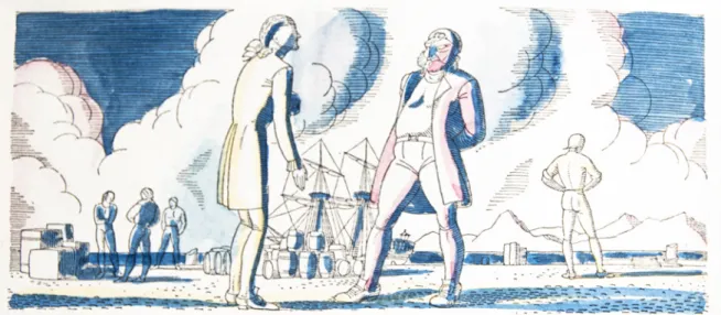
One striking category of infratextual vignettes in Kent’s Candide consists of seascapes, which feature ships of all types as well as broad sea vistas. In Chapter V, the first vignette showcases the shipwreck of the vessel on which Candide, Pangloss, and the Anabaptist were travelling to Portugal. It is interesting to see that the artist freezes the ship with its sails torn and its masts broken, just before it sinks into the tempestuous sea, its human passengers nowhere in sight. That Kent chooses to accentuate the catastrophic effects of natural forces instead of the direct impact of the shipwreck on the plot and the characters of the novel is no surprise to the reader familiar with the artist’s dramatic landscapes of Monhegan Island, Newfoundland, Alaska, Vermont, and Tierra del Fuego, which evoke the striking and mysterious beauty of the natural world as virtually untouched by human presence. Moreover, the visual sequence features ships travelling on the open sea, docked in ports, or engaged in warfare, which reminds the reader-viewer that the Age of Enlightenment was, after all, an era of trade and commerce when imperial powers fought over shares of an increasingly global economy. In Chapter
24 XIX, for example, Candide, then in Suriname, negotiates his passage to Italy with Captain Vanderdendur in the port, while barrels and coffers are loaded onto a large ship in the background (Figure 9).
Ships as moving vehicles also provide the artist with a convenient means of indicating motion and travel. In Chapter XII, Kent represents the old woman telling her story to Cunegonde on the deck of a vessel, given “the custom on board ship to tell stories to pass the time” (39), while two fellow passengers are engaged close by in a casual conversation. The wooden planks and ropes of the vessel are carefully delineated, showing the illustrator’s predilection for this means of transportation and for global travel. Horses, red sheep, a coach, and the machine built by the Eldorado engineers are also featured as means of transportation and emphasise constant motion in this illustrative series.
Of the 102 pages of text devoted to Voltaire’s satire, approximately 72% include a vignette and the rest an ornate capital letter. The recurrence of this substantial iconographic support on every page constantly requires the reader-viewer to exercise both visual and verbal interpretative skills, and it turns the process of reading this canonical work in the Random House presentation into as much an act of aesthetic appreciation as an intellectual pursuit. Like its verbal counterpart, the visual narrative is accumulative in nature: it generally follows the optimist Candide as he participates as a protagonist, witnesses as an observer from a distance, or listens to secondary characters as they recount a wide array of horrors—floggings, shipwrecks, rapes, robberies, executions, betrayals, disease, an earthquake, and even ennui. Embedded stories within Candide’s journey, such as the one told by Cunegonde’s servant, are also illustrated and this gives prominence to secondary characters. Curiously, the events depicted iconographically are not always presented in a manner that perfectly matches their chronological occurrence in the textual narrative, which creates visual analepses and prolepses. Verbally iterated in Chapter VIII, the auto-da-fé, for example, is pictured for the first time as seen through the eyes of Cunegonde (Figure 3, above) and not as experienced by Candide. In a most striking visual arrangement, the scene of the two girls from the country of the Oreillons mourning the death of their monkey lovers, imaged in Chapter XVI (Figure 10), precedes the second occurrence of the unusual couples in this illustrative series in Chapter XXI (Figure 11), which shows how the incident must have looked to Candide before he decided to shoot the violent creatures. The latter is in fact a better choice for Chapter XXI, where Candide recalls the incident during a discussion with Martin in an attempt to defend his point of view, but the chronology of the visual narrative is, nonetheless, disturbed.
25 Unexpectedly, tangential events also receive their fair share of attention: amongst them, the marchioness serving poisoned chocolate to the old woman’s fiancé, the dead actress being dropped into the public sewer, and the decapitation of Ahmet III’s viziers. These choices of scenes were likely inspired by their visual potential and aesthetic appeal to the illustrator. The process of matching text and image must have been painstakingly challenging, but Kent visibly refused to allow the iconographic component to prefigure or foretell textual content that does not appear directly on the pages adjacent to the in-text vignette and displayed before the reader-viewer’s eyes. Voltaire’s words thus acquire primordial importance in this edition, while the visualisation of the scene is secondary or complementary, though it definitely does bring a new and interesting layer to the text.
Most of the chapters contain between one and three vignettes, but there are also two with four images,
Figure 10. Vignette for Chapter XVI (p. 49), Candide (Random House, 1928), copy no. 84. Private collection.
26 three with five, and even one with ten. Visual sub-sequences, with their own internal structure and thematic dynamics, are thus developed throughout this illustrative series. The illustration of Chapter XXII, which details what happened in France, consists of ten scenes with the following subjects: the protagonist sick while Martin chases the doctor away; a dead actress being thrown into the sewer; the invited assembly playing cards around a table at the Marquise; the presentation of the German visitor to the hostess; the illustrious “Fréror” discoursing on tragedy; the conversation that ensues; the marchioness courting the inexperienced but wealthy young man in her boudoir; Candide’s recollection of happy travels with Cunegonde; the trap set by the abbé from Périgord with a pretend Cunegonde, supposedly suffering from a serious disease; and at last, Candide bribing the police officer with diamonds to avoid prison. Loosely connected by its focus on various forms of corruption prevalent in Parisian society and highlighting Candide’s still boundless idealism, this mini-sequence follows the plot but aims for variety.
Paratextual Framing
The fourth iconographic component comprises paratextual illustration: the half-title, the title page, the copyright page, the bibliographical note, and the colophon page all contain images. The title page presents a fascinating example of visual summary, relying on the synchronic nature of the image to convey the linear and accumulative dimensions of the verbal narrative of distress, destruction, and death that underlines Voltaire’s satire. A discreet and ironic textual banner is placed in the clouds—
“La raison suffisante.” This banner is reminiscent of textual inscriptions skilfully employed in medieval and baroque painting, which were generally discarded after the sixteenth century. Curiously, Gottfried Leibnitz’s dictum hangs untranslated, hinting at the literary sophistication of the clientele for whom this edition was intended, namely book collectors and cultured readers, whose familiarity with the phrase was expected. The illustrator’s name appears twice, strangely foreshadowing his permanent association with this commercially successful edition that he designed for Random House: it is at the centre of the title page and, below, playfully carved onto a stone.
The first full-page paratextual image, after the title page, shows a closed garden gate, an iconic reference in our collective memory to Candide’s final words, “il faut cultiver son jardin” [“we must cultivate our gardens,” 111]. Here the famous phrase is interpreted literally, the closed gate hiding what Candide finally discovers at the end of his long journey. It is important to add that even the bibliographical note, written with authority by Charles Edmund Merrill Jr. is accompanied by an iconographic
commentary, which extends over four vignettes. The top vignette on the first page (Figure 13) uses a visual topos, the open book, to mark the beginning. The bottom vignette shows two characters of the opposite sex rushing through a mountainous and treacherous landscape of no identifiable origin; no doubt, this vignette represents visually the symbolic beginning of the voyage undertaken by the two young characters, Cunegonde
Figure 12. Title page, Candide (Random House, 1928), copy no. 84. Private collection.
27 and Candide. Devoid of human presence, the following two vignettes recall advertising images used in tourist pamphlets representing the beautiful castles on the Rhine, which have captured the traveller’s imagination for centuries. Of no narrative importance, these paratextual images
are seductive to the eye and depict the initial setting of Voltaire’s philosophical tale, Westphalia, before the verbal and visual narratives are set in motion on the following page.
Although he judiciously integrates and organises textual information in his iconographic sequence, Kent is by no means a completely faithful intermedial translator. Inspired by his personal travels and artistic interests, he unabashedly indulges his preference for nature and landscape, frequently showing characters in the process of traversing immense and at times adverse space. To depict actions taking place in interior locations, he sets up characters in dramatic poses within stark interiors that rarely feature more than a piece of furniture and a window or door. At first sight, these scenes can seem schematic and creatively impoverished in relation to the text, but they help construct the visual narrative and fulfil one main objective: to delineate constant motion through space and underscore character formation. The illustrator strips the work down to its last fibre and seam to create a truly original series of failed optimism that is distinctive amongst illustrated editions of Candide. Using his artistic imagination, Kent fills in textual gaps to depict a world of
tragedy and destruction that bears his own imprint but still resembles Voltaire’s in technique and vision. Ornate capital letters, dingbats, in-text vignettes, and paratextual illustrations compose an iconographic supplement that is sophisticated and layered. From an affluent background, Kent visibly seeks a means to connect with the wealthy collectors of fine editions on both aesthetic and cultural levels, but his iconographic series and book design surprisingly appealed to a wider readership. The 1928 Random House Candide would in fact be reedited on numerous occasions throughout the twentieth century and leave a permanent mark on the history of the interwar American book.
Bibliography
Choptrayanov, Georges. Essai sur Candide. Paris: A. G. Nizet, 1969. Print.
Eisner, Will. Comics & Sequential Art. 1985. Tamarac, FL: Poorhouse Press, 2001. Print.
Ferguson, Lorraine, and Douglass Scott. “A Time Line of American Typography.” Design Quarterly 148 (1990): 23-54. Print.
Ionescu, Christina. “Candide à New York: éditions illustrées américaines de l’entre-deux-guerres.” Les 250
ans de Candide: lectures et relectures. Ed. Nicholas Cronk and Nathalie Ferrand. Louvain and Paris: Peeters,
2014. 577-603. Print.
Lee, J. Patrick. “Bibliographie des éditions illustrées américaines des œuvres de Voltaire.” Revue Voltaire 5 (2005): 285-307. Print.
Tucker, Peter. The Illustrated Editions of Candide: An Examination & Checklist. Oxford: The Previous Parrot
Figure 13. First page of the “Bibliographical Note,” Candide (Random House, 1928), copy no. 84. Private collection.
28 Press, 1993. Print.
Van Doren, Carl. “Why the Editorial Board Selected ‘Rockwell Kent’s Candide.’” Wings 3.12 (December 1929): 4-5. Print.
Voltaire, Jean François Marie Arouet de. Candide. New York: Random House, 1928. Print.
Christina Ionescu is Associate Professor of French Studies at Mount Allison University in Canada. She is
the editor of Book Illustration in the Long Eighteenth Century: Reconfiguring the Visual Periphery of the
Text (2011) and co-editor of Eighteenth-Century Thing Theory in a Global Context: From Consumerism to Celebrity Culture (2013). Her most recent publications have appeared in the Cahiers du GADGES, Genesis,
and Le Livre et l’estampe. She is a dix-huitiémiste with an interest in book illustration, material and visual cultures, as well as word and image theory.