Data Visualization Literacy: A Feminist Starting
Point
Abstract:
We assert that visual-numeric literacy, indeed all data literacy, must take as its starting point that the human relations and impacts currently produced and reproduced through data are unequal. Likewise, the majority of those who work with data are wealthy, white and male. To address these inequalities
in the ecosystem, we introduce a starting point for teaching data visualization that is grounded in feminist theory, process and design principles. Through three case studies, we examine what feminism may have to offer data visualization literacy, with the
ultimate goals of cultivating self-efficacy for women and underrepresented groups to work with data as well as creating learning spaces where, as Philip et al (2016) state, "groups influence, resist, and transform everyday and formal processes of power that impact their lives".
Keywords: data literacy, feminism, community, inequality, the Arts By Catherine D'Ignazio and Rahul Bhargava
[email protected]@media.mit.edu By Catherine D'Ignazio and Rahul Bhargava
[email protected] [email protected]
There is a growing body of literature arguing that working with data is a key modern skill (Gurstein, 2011; Letouzé et al. 2015; Wolff et al., 2016). And yet, while highly valued as a precursor to evidence-driven insight, data is expensive – to collect, maintain and
mobilize. Corporations, governments, and elite universities are the primary institutions which have the resources to undertake this work. Within those institutions, the great majority of those who work with data are wealthy, white and male (Neuhauser, 2015; Crawford, 2016), which has resulted in a growing literature around bias in data collection (ProPublica, 2017), algorithmic decision-making (O'Neil, 2016), and machine learning training sets (Buolamwini and and Gebru, 2018). Acknowledging these two basic inequalities in the ecosystem – that data and skills to work with it are not evenly distributed – lays the groundwork for how educators can start to discuss data literacy more broadly.
We assert that visual-numeric literacy, indeed all data literacy, must take as its starting point that the human relations and impacts currently produced and reproduced through data are unequal. Thus, educators are faced with a choice. They may either "integrate the younger generation into the logic of the present system" or teach learners how to "participate in the transformation of their world" (Freire, 1968, p.16) through data-driven inquiry. The vast majority of data science programs, trainings, anddata training, and data-focused tools, currently on offer choose the former – to support a status quo based on social exclusion. This choice may not be nefarious or intentional, but rather because alternatives may not be readily apparent. This chapter explores an emancipatory
approach to data visualization literacy based in feminist scholarship and pedagogy, in an attempt to chart an alternate course.
A body of work that owes its emergence to the women’s suffrage movements of the nineteenth century, feminist theory encompasses a range of ideas about how identity is constructed, how power is assigned, and how knowledge is generated, as well as how a range of intersectional forces such as gender, race, class, and ability combine to
influence the experience of being in the world. It is important to note that while feminist scholarship uses gender as a starting point for considerations of social inequality, a feminist approach is not only about cis and trans women, nor only about gender. Deployed as a tool for critical inquiry, feminist thinking seeks to situate knowledge in specific human bodies and to "unmask universalism" (Davis, 2008) – to show how things that appear to be neutral or objective are in fact biased towards the bodies that hold power – typically male, white, abled, heterosexual and well-educated. For example, the quintessential feminist critique of data visualization is Donna Haraway's characterization of it as "the gaze from nowhere" (1989, p. 581). Because the view is not situated in a body or a perspective, it has the aura of neutrality. But, of course, the view from nowhere is always the view from somewhere – more often than not it is the view from a dominant location of power over people whose views and knowledge are suppressed and silenced (Collins, p. 251).
While feminist scholarship is often used as a tool for unmasking unequal power relations (a critique-based approach), it can also be used for the creation of new justice-oriented approaches. When connected to design and making processes, feminist thinking can be a tool for what Shaowen Bardzell (2011, p. 1308) characterizes as a "generative
contribution." For this chapter, we draw specifically on prior work (D'Ignazio and Klein, 2016) that connects feminist theory to the design of data visualizations. Our goal is to demonstrate the relevance of feminist concerns with gender, social difference and power in relationship to the teaching and learning of data visualization. Data visualization is often taught with the idea that data are interchangeable, neutral, and objective; visualizations are methods for depicting those data; and the right method of depiction can be found by understanding the basics of human visual perception and cognition – which is imagined to be universally the same across contexts, culture and history (Kennedy et al., 2016b). Instead, a feminist starting point to data visualization literacy seeks to zoom out and set up different terms to begin the conversation. Wwe wish to craft an alternate starting point that acknowledges the social and political context in which data are collected and communicated, cultivate self-efficacy in women, people of color and other marginalized groups to work with data and visualization, and focus learners' attention on what happens in the world as a result of an act of data communication.
The editors of this volume ask, "What does literacy mean when it comes to data visualization? How can visual-numeric literacy be enhanced?" We assert that because visualizations are outputs of a process, visual-numeric literacy is part of a larger process of data literacy, which itself draws on other approaches such as statistical literacy,
numeracy and critical information literacy. In earlier work, we proposed this that working definition of data literacy "includes the ability to read, work with, analyze and argue with data as part of a larger inquiry process" (D'Ignazio and Bhargava 2016).:
"For our purposes, data literacy includes the ability to read, work with, analyze and argue with data as part of a larger inquiry process. Reading data involves understanding what data is, and what aspects of the world it represents. Working with data involves acquiring, cleaning, and managing it. Analyzing data involves filtering, sorting, aggregating,
comparing, and performing other such analytic operations on it. Arguing with data involves using data to support a larger narrative intended to communicate some message to a particular audience."
– D'Ignazio & Bhargava 2016
While this definition makes it sound like it is an individual ability, integrating feminist thinking opens up questions as to the nature of literacy itself. Is data literacy a set of autonomous skills acquired by an individual? Or, following bell books' notion of an "open learning community" (1994) and proponents of new literacy studies (Street, 1994), is data literacy a set of social practices, learned and practiced in and through a social context such as an organization or community? Or, following feminist computer scientist Lynette Kvasny (2006), is teaching about data a site of ideological transmission, a place where, if we are not careful, we risk reinscribing structural oppression? From our teaching practices we would answer these questions "yes" and "yes" and "yes".
From this complicating ground, then, data literacy cannot begin with technical skills like making and interpreting bar charts and network diagrams. It necessitates a starting point grounded in higher-order critical thinking and making skills that connect data back to the social and political reality from which they were produced.
But what might this look like in practice? In the remainder of this chapter, we outline three short cases of data visualization learning that come from our practice as educators and then analyze them in relation to the design principles laid out by one of us,
Catherine, and Lauren Klein (2016), in our paper "Feminist Data Visualization." In that paper, we created six preliminary principles of feminist data visualization, drawing from work in feminist science and technology studies, feminist human-computer interaction, feminist digital humanities, and critical cartography & GIS. The principles are: (1) Rethink Binaries, (2) Embrace Pluralism, (3) Examine Power and Aspire to Empowerment, (4) Consider Context, (5) Legitimize Affect and Embodiment, and (6) Make Labor Visible. Due to space considerations as well as the exploratory nature of this work, we focus here on analyzing (2), (4) and (5) to analyze as they relate most directly to data visualization literacy.
Three Cases of Data Visualization Learning
The Groundwork Somerville Data MuralOur first case study focuses on the process of working with a community group –
Groundwork Somerville (GW) – and local youth to design and paint a data-driven story as a community mural. This example of a "data mural" documents one approach to an action-oriented, community-situated, activity that builds various data literacies. The partner in this data mural was Groundwork Somerville (GW), a community group Bhargava had a pre-existing relationship with. Part of a larger nationwide (US) network of Groundwork organizations (https://groundworkusa.org/),GWthey focuses on empowering participants to improve environmental, economic, and social well-being, specifically through nature-focused programs. One of their main programs involves youth topays a youth "Green Team" to convert existing unused physical lots in the dense city to urban farms via the construction and planting of raised beds. The youth help create, plant, and maintain gardens as well as sell the produce that results. Immigrants and low-income families are the main beneficiaries. Additionally, many of the vegetables planted are chosen to reflect the immigrant makeup of the community. GW was interested in working with us in order to reinforce their goals of youth development, to beautify an urban
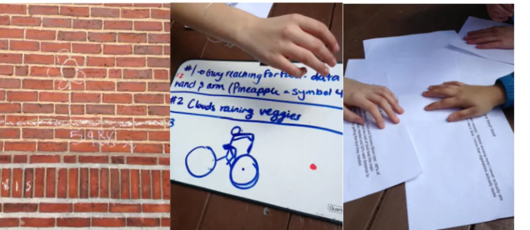
The collaboration followed a process which moved from identifying data, finding a story, collaboratively designing a visual to tell that story, painting the mural, and finally hosting an unveiling event (see Bhargava et al, 2016, for details about this process). GW shared qualitative and quantitative data with our team, and we worked together to narrow in on data to include in a multi-page handout for the youth. In terms of demographics, there were six young women of color, seven young men of color, two young white women and two young white men on the GW team. With the background data in hand, we hosted a brainstorming session with youth to analyze this data and generate a story and visuals to tell it. Based on these handouts, the participants identified a number of facts and quotes in order to tell the GW story. Inspired by some data visualizations we shared with them, the youth then sketched visuals for telling the story. This invitation to sketch concretized the data and helped them bridge into a narrative structure more readily. The youth were responsible for the visual language of the narrative, and decided which elements were central. This ownershipwhich was a key pedagogical goal of ours.
Figure 1. Some of the sketches students created (photos by Emily Bhargava).
The resulting narrative arc told a story about the GW "winning formula" and how it was benefitting the community through "together livin' better"., which included:
Increasing local health problems (millions with pre-diabetes; health a primary local concern)
Unused lots in the city as an opportunity for planting (80-unused lots, almost 6,000 sq ft. converted into beds already)
A mobile market to sell local veggies (serving more than 3000 people)
Green Team members appreciating healthy food ("now I know vegetables taste good") Local school youth working on beds (more than 400 youth)
Adding all that together, in the visual language of the youth, would create more love, money and community ("together livin' better")
The visual designs were stitched together by Emily Bhargava into a consistent mural design that leveraged the cartoon / infographic visual style the youth had sketched in. Painted on the large metal fence behind one of the converted lots, roughly 80 feet long and 10 feet tall, it showcases the GW impact story at the site of one of the reclaimed urban farms; literally telling a story about the space, in the space itself.
Figure 2. The mural being finished udata muralp (photo by Rahul Bhargava).
At the unveiling, viewers and participants alike commented on the impacts. Someone who had never seen it before One attendee said that "What strikes me is that you’ve managed to tell a story with an equation and very simple images". Others commented on the visual encodings and symbolic language - "The bike sticks in my mind". Validating our goal of increasing data literacy with the youth participants, one commented that "I like the numbers", while others said "I learned that by pictures you can also send out a message", and another said, "I learned how to take data and make a story".
This example highlights that people who don't "speak" data or self-identify as "geeks" or "techies" can be effectively involved in data analysis and storytelling by focusing on an arts-based, socially-oriented invitation to the material. Our goals centered on building the
confidence of youth to engage with datadata capacity and enhancing the built environment in an impactful way. The choice of a mural as the medium leveraged the long history of public murals being used to comment on and change the public discourse about a topic. Our The participatory, youth-driven process offers an example of how to engage people in a collaborative meaning-making process to amplify their understanding of how data can
communicate. In this case, data analysis and visualization are methods for
connecting more deeply to the
community, not modeled as end points in themselves.
"Asking Questions" with WTFcsv For the second case of data visualization learning, we introduce an activity called "Asking Questions" from the
DataBasic.io1 suite of tools and activities which we built. DataBasic.io consists of simple, web-based tools for beginners that introduce concepts of working with data ranging from quantitative text analysis to network analysis (D'Ignazio and Bhargava, 2016). For the purposes 1 www.databasic.io
of this case, we focus on the tool WTFcsv and its accompanying learning activity "Asking Questions."
WTFcsv helps learners analyze a comma-separated-values (CSV) file to look for potential data-driven stories to tell. The software analyzes each column from a spreadsheet file uploaded by the learner and returns a data visualization that summarizes the patterns in each column (figure 3). For example, figure 1 depicts data about passengers on the Titanic, one of the sample datasets included in the tool. The column "Sex" is rendered as a column chart that demonstrates, visually, that there were 314 female and 577 male passengers logged on the Titanic.
Newcomers often approach data thinking of it as consisting only of numbers. Two of the primary learning goals for WTFcsv are that 1) learners understand that data has many types, including numbers, categories, text, and dates, and 2) that different types of visualizations are appropriate for summarizing those different types of data. For example, temporal data is shown as a line-chart histogram on a time-series axis. Numeric data is shown as a histogram, with buckets created linearly. Text data is shown as a column chart if there are only a few types (categorical data), or a word cloud if there are many entries (i.e. open text). Learners can "flip" each card from its visualization view to a text view by clicking on the card. The text overview includes descriptive statistics such as the most common value for text columns, or minimum, maximum, and average for numeric columns.
"Asking Questions" is the learning activity that accompanies the WTFcsv tool, based on Tactical Technology Collective's notion of "asking your data some questions" (Tactical Tech 2014). While newcomers to spreadsheet analysis often attribute some wizardry to the data analysis process, this activity tries to introduce them to a simple, inquiry-based process for getting acquainted with a dataset.
Learners break into small groups, choose one of the sample datasets2, examine WTFcsv's summary visualizations and brainstorm questions that they want to ask the data.
Facilitators encourage learners to use the visualizations to generate many types of questions, including context questions ("What's the source of this data? Why did they collect this informationit? Who uses it?"), ethical questions ("Is it ok to publish people's full names? How did sex end up as a binary variable?"), quality questions ("Is this data complete? How was it acquired?"), data formatting questions ("What does the 'Parch' column mean?"), as well as data analysis questions ("Did women survive at a higher rate than men?") After 10 minutes of brainstorming questions and sources for connected data, learners are asked to select the most interesting one to share their most interesting question back to the group. The debrief conversation focuses on how rich questions often involve multiple data sources, the variety of questions that can come from one dataset, how important it is to brainstorm off the screen, and the critical process of recognizing any bias in identified questions.
We have now run more than 30 workshops with WTFcsv and tuned the sample data and question process. In an evaluation of the WTFcsv activity, learners responded well to these choices. One participant commented that the activity "helps you from the
beginning to understand the possibilities of your spreadsheet." The fact that they framed "possibilities" as plural is meaningful, in the sense that it is important for newcomers to 2 Current options for English-language speakers are include Titanic Passengers, UFO Sightings,
and Dogs of NYC, Satellites Orbiting the Earth, and Trees in Somerville, MA, USA. When viewed in other languages, the tool offers different culturally and geographically appropriate examples.
understand the role of exploratory data visualization – the way in which visual aggregation can serve to provoke important questions and next steps towards the formulation of a knowledge claim. Another commented that the tool was "different because usually there are just text and numbers, not lots of images and graphs and the ability to look at them all right away". This fulfills our primary goal that learners
understand that data visualization can play an important role in the exploration and meaning-making process.
"ConvinceMe" with the Data Culture Project
The third case study is an activity we developed to enable people to practice the skill of making arguments with data to convince people to take action, called "ConvinceMe". Many definitions of data literacy focus on the ability to read and write with data; fewer include the idea of arguing with data as a core skill. We believe that this critical for putting data into action in the real world. Without this, data is simply used to quantify a nuanced reality, ends up divorced from the fact that it often represents real people, and is used to make decisions about them. This activity is the final one in our Data Culture Project3, a lightweight self-service curriculum available for free to any organization that wishes to work on building an inclusive data culture.
The activity itself is simple to run, and relies on the creativity of the participants. It begins with a room of at least 10 people. Facilitators share a printed data visualization about some topic. We tend to use one about water conservation, which argues that choosing to consume beef has an extraordinarily high "water cost". After talking through the graphic, we ask the group to identify 3-5 key stakeholder groups that can influence that topic. For example, in the case of water conservation, stakeholders would be anyone that can change water usage, such asmight be farmers, policy makers, a shopping family member, or a restaurant owner,. Volunteers are solicited to role-play those stakeholders, and
invited to stand in the front of the group. The rest of the group is asked to make a short data-driven argument to specific stakeholders, asking them to change some behaviour. For example, this could consist of telling a "shopping parent" stakeholder about the high water cost of meat, andand based on the negative impacts of that for their children, inviteasking them if they want to try a vegetarian diet by joining the "meatless Monday" movement.
The primary learning goal for ConvinceMe is for learners to practice making data communication decisions in a situated environment, with a specific audience in mind. This activity connects data into a real context, embodies the recipients of the data narrative, and supports the development of critical inquiry and argumentation skills. For newcomers, data often appears neutral and abstract, but to practice making arguments with data you have to re-concretize it. The role-playing stakeholders embody those being asked to take action – they physically step forward if they are convinced by the
arguments and step backwards if they are not. Another learning goal for ConvinceMe is to situate data visualizations and data-driven arguments as tools for advocacy and social transformation. The goal for the activity is not to create a picture, but rather to move a particular stakeholder towards a desired action. Inviting participants to use their creative narrative skills connects data with the lived experience of what data mean and how it can be acted upon. The role-playing stakeholders embody those being asked to take action – they physically step forward if they are convinced by the arguments and step backwards if they are not. The act of inviting participants to make a persuasive argument with data breaks down the narrative of data as neutral.This activity connects data into a real 3 http://datacultureproject.org
context, embodies the recipients of the data narrative, and supports the development of critical inquiry and argumentation skills.
A group of 25 non-profit organizations and newsrooms participated in the first cohort of the Data Culture Project in Fall 2017 and ran the ConvinceMe activity for their staff, with positive feedback. One media group noted that their arguments "used a lot of shame and guilt," leading them to reconsider how they frame their calls to action. A mid-sized non-profit valued most the "importance of identifying stakeholders and trying to understand their interests". Another shared that "it did lead to a pretty significant rethink for the communications director for what is coming out in the spring." The act of practicing the arguments with real people impacted their approaches to picking stories to tell, and how to tell them. Another group began rethinking their whole approach to data storytelling, and decided to do this activity "before anyone even collects any data", so they could "think up front about who should be convinced about what."
Learning and Feminist Data Visualization
While mainstream data visualization teaching often starts by instruction in chart types, or learning a specific software tool, or learning about human perception and visual
processing, we argue that we need to begin with a wider lens before zooming into
technical and procedural specifics. In this section, we will consider the three cases of data visualization learning described above in relationship to three design principles of
feminist data visualization outlined by D'Ignazio and Klein (2016) – "Consider Context", "Legitimize Affect & Embodiment" and "Embrace Pluralism" – in order to explore their implications for a feminist starting point for visual numeric literacy.
Consider Context
One of the central tenets of feminist epistemology is that knowledge is "situated" (Haraway, 1989, p.581). What this means is that context matters – What are the social, cultural, historical and material conditions in which knowledge is produced? What are the identities of the humans making the knowledge? Rather than seeing knowledge artifacts – like datasets and data visualizations – as neutral and objective, a feminist perspective advocates for connecting them back to their context, to better understand their
limitations and ethical obligations, and, ultimately, the ways in which power and privilege may obscure truths.
Situating datasets and data visualizations for learners is a particular challenge, since the conventions of both spreadsheets and precise graphics make them appear objective (Kennedy et al, 2016a), particularly for non-technical newcomers. The "Asking Questions" activity illustrates one way to situate data and visualizations. Instead of trying to "find stories", the position of asking questions helps model for learners a process of inquiry and exploration where meaning is not something to be "found" hidden in the dataset, but rather produced through an iterative process of investigation that involves many bits of information that are not included inside of the dataset itself. And encouraging many types of questions, including questions about trust in sources, missing data, and data
formatting, helps learners start to connect the data back to the institutional and historical context where it was collected, emphasizing that those things also matter deeply to any meaning that comes from patterns observed in the data. The fact that learners use visualizations to ask those questions matters as well - this demonstrates the value of visualization not as the definitive, objective word on a subject, but rather as a helpful exploratory step in a process of building meaning.
ConvinceMe functions in a similar way to draw connections back to situated human experience, and grounds data visualization in acts of communication between different
types of stakeholders. While much data visualization research focuses on time to task metrics, such as how well an individual can decode the meaning of a particular chart, there is very little research on how data visualizations or data-driven arguments help move groups from different positions and/or different cultures to action (or not). If you know that your data visualization needs to move farmers to use less water, then you will make different decisions about what data to highlight and what format to use than if you need to convince restaurant ownersparents. ConvinceMe creates a lightweight, bounded playground in which people can begin to understand visualization as acts of situated communication. try out different standpoints and try to imagine whether a particular data-driven argument would resonate with that standpoint or not.
Legitimize Affect & Embodiment
This principle of feminist data visualization derives from the argument by feminist thinkers that experiences that derive from sensation and emotion have been
systematically devalued over quantitative methods of knowing (Clough and Halley, 2007). Patricia Hill Collins notes in her articulation of Black feminist epistemology, that in an ideal knowledge situation "nNeither emotion nor ethics is subordinated to reason" . Instead, emotion, ethics and reason are used as interconnected, essential components in assessing knowledge claims. (Collins, 2009, p. 266)" There has been work on the
rhetorical function of data visualization in narratives (Hullman & Diakopoulos, 2011), art projects (Viégas and Wattenberg, 2007), and persuasion (Pandey et al, 2014). But the role of emotion in data visualization has been understudied, with the exception of work by Kennedy et al (2016b) and several chapters in this book, including those by Gray, Hill and Simpson. All data visualizations have an affective, experiential component which practices like data journalism have begun to leverage for audience engagement. In contrast to learning about data which involves abstraction and distance from the subject matter (or from the subjects themselves), how might we acknowledge embodied and affective experiences in the data visualization learning process? How might an intimate, emotional connection to data be considered an asset to the analysis, visualization and learning process?
The Groundwork SomervilleGW data project mural legitimates affect and embodied experience in several ways. First, the data that the youth analyzed and used to tell a story is data about themselves and their organization of which they were already a part. Data visualization techniques are often discussed as though the subject matter of the data is interchangeable and neutral (Kennedy et al., 2016b). Many teaching examples use so-called "classic" data sets like mtcars (Kosara, 2018), but, as D'Ignazio has stated in prior work, "Cars. Who cares?" (D'Ignazio, 2017, p.8) People will learn better and more deeply from data that they have an experiential understanding of and an emotional connection to (. For example, Kennedy et al. (2016b) point to the importance of subject matter in visualization engagement. The Groundwork SomervilleGW project began with data that was about something intimate and emotionally connected to the youth and their community. Likewise, the project ended with a data visualization that was
emotionally connected to the youth and their communitym – the input and the output were deeply situated.
Both the Groundwork SomervilleGW data mural and the ConvinceMe activity also use embodied, arts-based ways of knowing for learner engagement and think beyond the screen in terms of data visualization. In the case of Groundwork SomervilleGW, the youth not only came up with the iconography for the data-driven story but also painted it onto a giant mural in the garden. The act of assembling the data visualization was itself an embodied, social act, undertaken in community. And ConvinceMe uses performance and narrative to construct a humorous social situation where peers have to use a data graphic
to convince each other to shift their behavior; groups are encourage to applaud when a stakeholder takes a step forward to indicate they are convinced. Data visualization is important to each of these cases, but a 2D screen-based graphic is not modeled as the end point. Significantly, ConvinceMe seeks to value personal testimony in addition to data-driven graphics. Indeed, the graphic is the jumping off point, but needs the embodied personal testimony (the speaker) and custom-tailoring to an audience (the speaking situation) in order to move them to action. Legitimizing Affect and Embodiment may mean seeking the appropriate form for the appropriate audience, as well as
modeling in learning activities how visualizations fit in to an embedded advocacy or community-building process.
Embrace Pluralism
The design principle "Embrace Pluralism" comes from feminist scholarship's long history of challenging claims of objectivity, neutrality and universalism, emphasizing instead how knowledge is always constructed within the context of a specific subject position as well as within a community of knowers (Harding, 1991). Black Feminist scholars like Patricia Hill Collins have demonstrated how discourses of objectivity systematically exclude the voices of women and people of color, among others, with the burden of oppression most heavily borne by those who sit at the intersections of the "matrix of domination" such as Black women (Collins, 2008). A key contribution of this line of feminist thinking has been to recognize how a multiplicity of voices, rather than one single loud, magical or technical voice, often results in a more complete picture of the issue at hand.
Embracing pluralism in data visualization learning can run counter to the narrative propagated through the media about data scientists and designers as "unicorns" or "wizards" – solo technical geniuses who can use advanced analytical or artistic
techniques to tame large data sets into insights. Learning activities for newcomers often have to counteract these preconceptions by modeling an alternative meaning-making process that is social and dialogue-based rather than individual and technicalfocused on technical skill development. While technical and graphic skill development is necessary for data visualization, we would argue that starting with those things reinforces the naive notion that data is about solo technical mastery. It communicates, "if you master [sic] the skills then you, alone, can find the one right answer hidden in the data set". We choose to model a process that communicates that answers are best found in dialogue with a community of knowers, who approach a topic area with many perspectives.
It is significant that all three of the cases discussed above model a process of valuing different voices and producing knowledge through dialogue in group. Rather than
students being positioned as individual learners in front of computer screens, learning to manipulate a software program, the learning situation is social. In the case of the data mural, youth worked in small groups to contextualize the Groundwork SomervilleGW numbers with iconography and narrative, and they workedand in one large group to actually paint the mural. In the case of the WTFcsv activity, learners work in groups of three to brainstorm questions. Some members focus more on questions of data analysis and others may focus more on issues of data formatting or validity, but – people learn from their peers' questions. These different and multiple lines of questioning are held up as positive by the facilitators in the shareback. And ConvinceMe is an activity conducted in a larger group which intentionally centers the idea of multiple stakeholder voices as well as formulating appeals to those particular standpoints. You "win" by making a data-driven appeal to one of those stakeholders, convincing them to move towards the speaker. Participants often build on top of previous arguments, trying to help one that failed by adding more information or a different pitch. While the first two activities model a social, pluralistic process for deriving meaning from data and their visualization, this
last activity embraces pluralism on the reception side of data communication, helping learners understand that different audiences may be moved by different narrative and visual arguments and visuals.
Conclusion
As stated at the beginning, one of the reasons that a feminist approach to data is useful and necessary is because of the power differentials and inequalities in the data
ecosystem. Resources to collect, store and analyze data are not distributed equally, nor are the technical skills to work with data. The cases we have discussed, along with the feminist design principles that guide them, represent a starting point for visual-numeric literacy. This is an area for further research and evaluation: Does a feminist-informed learning program lead to increased self-efficacy around data and its visualization for more women, and people of color and other marginalized groups?
Relatedly, if feminist thought and scholarship is the grounding framework of data
visualization learning, then what are learning activities that explicitly discuss and address the inequities of the current data ecosystem? wWhile many of our learning activities model a feminist process, they do not explicitly tackle issues of power, structural inequality, and bias in the content of what is taught. What might learning activities for the same audience (adult, non-technical newcomers) look like that specifically address concerns of gender and racial bias, the political economy of data, and so on? In order to integrate these conversations into the learning situation, Philip et al (2016) argue that we need to consider cultivating racial literacy and gender literacy side-by-side with data literacy. They write, "Spaces must be facilitated for students to engage with the structural and ideological contexts of data visualizations if these tools are to authentically engage them in democratic deliberations—spaces where they grapple with how groups influence, resist, and transform everyday and formal processes of power that impact their lives."
Bibliography
Bhargava, R. et al., 2016. Data Murals: Using the Arts to Build Data Literacy. Journal of Community Informatics, 12.
Buolamwini, J. and Gebru, T., 2018, January. Gender shades: Intersectional accuracy disparities in commercial gender classification. In Conference on Fairness, Accountability and Transparency (pp. 77-91).
Clough, P.T. & Halley, J.O., 2007. The affective turn : theorizing the social, Duke University Press.
Collins, P.H., 2009. Black Feminist Thought: Knowledge, Consciousness, and the Politics of Empowerment [2nd ed].
Crawford, K., 2016. Artificial Intelligence’s White Guy Problem. The New York Times. D’Ignazio, C., 2017. Creative data literacy: Bridging the gap between the data-haves and
data-have nots. Information Design Journal, 23(1).
D’Ignazio, C. & Bhargava, R., 2016. DataBasic : Design Principles , Tools and Activities for Data Literacy Learners. Journal of Community Informatics, 12, pp.83–107.
D’Ignazio, C. & Klein, L.F., 2016. Feminist Data Visualization. In IEEE VIS Workshop Proceedings.
Davis, K., 2008. Intersectionality as buzzword: A sociology of science perspective on what makes a feminist theory successful. Feminist Theory, 9(1), pp.67–85.
Freire, P., 2015. Pedagogy of the Oppressed 50th Anniv., Bloomsbury Publishing.
Gurstein, M.B., 2011. Open data: Empowering the empowered or effective data use for everyone? First Monday, 16(2).
Haraway, D.J., 1988. Situated Knowledges: The Science Question in Feminism and the Privilege of Partial Perspective. Feminist Studies, 14(3), pp.575–599.
Harding, S.G., 1991. Whose Science? Whose Knowledge?: Thinking from Women’s Lives, Cornell University Press.
hooks, bell, 1994. Teaching to transgress : education as the practice of freedom, Routledge.
Hullman, J., & Diakopoulos, N. (2011). Visualization Rhetoric: Framing Effects in Narrative Visualization. IEEE Transactions on Visualization and Computer Graphics, 17(12), 2231–2240.
Kennedy, Helen, Rosemary Lucy Hill, Giorgia Aiello, and William Allen, 2016. The work that visualisation conventions do. Information, Communication & Society, 19(6), pp.715–735.
Kennedy, Helen, Rosemary Hill, William Allen, and Andy Kirk. 2016. Engaging with (big) data visualizations: Factors that affect engagement and resulting new definitions of effectiveness. First Monday, 21(11).
Kirchner Surya Mattu, J.L.L.J.A., 2016. Machine Bias: There’s Software Used Across the Country to Predict Future Criminals. And it’s Biased Against Blacks. ProPublica. Kvasny, L. (2006). Social Reproduction and its Applicability for Community Informatics.
The Journal of Community Informatics, 2(2).
Kosara, R., 2018. How to Get Excited About Standard Datasets. eagereyes.org.
Letouzé, Emmanuel, Rahul Bhargava, Erica Deahl, Amanda Noonan, David Sangokoya, Natalie Shoup, 2015. Beyond Data Literacy: Reinventing Community Engagement and Empowerment in the Age of Data.
Neuhauser, A., 2015. 2015 STEM Index Shows Gender, Racial Gaps Widen | STEM Solutions | US News. US News & World Report.
O’Neil, C., 2016. Weapons of math destruction : how big data increases inequality and threatens democracy, New York : Crown.
Pandey, A.V. et al., 2014. The Persuasive Power of Data Visualization. IEEE Transactions on Visualization and Computer Graphics, 20(12), pp. 2211–2220.
Philip, T. M., Olivares-Pasillas, M. C., & Rocha, J. (2016). Becoming Racially Literate About Data and Data-Literate About Race: Data Visualizations in the Classroom as a Site of Racial-Ideological Micro-Contestations. Cognition and Instruction, 34(4), 361–388. Street, B., 2003. What’s “new” in New Literacy Studies?: Critical approaches to literacy in
theory and practice. Current Issues in Comparative Education, 5(2), pp.77–91. Tygel, A.F. & Kirsch, R., 2015. Contributions of Paulo Freire for a critical data literacy: a
Popular Education Approach. The Journal of Community Informatics, 12(3), pp.108– 121.
Viégas, F. B., & Wattenberg, M. (2007). Artistic Data Visualization: Beyond Visual Analytics. Online Communities and Social Computing, 182–191.
Wolff, A. et al., 2016. Creating an Understanding of Data Literacy for a Data-driven Society. The Journal of Community Informatics, 12(3), pp.9–26.
Biographical Statement:
Catherine D'Ignazio is Assistant Professor of Civic Media and Data Visualization at Emerson College, a senior fellow at the Emerson Engagement Lab and a research affiliate at the MIT Media Lab. [email protected] Rahul Bhargava is a Research Scientist at the MIT Center for Civic Media and MIT Media Lab. [email protected]