HAL Id: inserm-00133030
https://www.hal.inserm.fr/inserm-00133030
Submitted on 26 Feb 2007
HAL is a multi-disciplinary open access
archive for the deposit and dissemination of
sci-entific research documents, whether they are
pub-lished or not. The documents may come from
teaching and research institutions in France or
abroad, or from public or private research centers.
L’archive ouverte pluridisciplinaire HAL, est
destinée au dépôt et à la diffusion de documents
scientifiques de niveau recherche, publiés ou non,
émanant des établissements d’enseignement et de
recherche français ou étrangers, des laboratoires
publics ou privés.
Evaluation of the 3D visualization of quantitative
stereoelectroencephalographic information: new results
Jean-Louis Dillenseger, Beatriz Sousa Santos, Carlos Ferreira
To cite this version:
Jean-Louis Dillenseger, Beatriz Sousa Santos, Carlos Ferreira. Evaluation of the 3D visualization of
quantitative stereoelectroencephalographic information: new results. Medical Imaging 2001: Image
Perception and Performance;, Feb 2001, San Diego, United States. pp.4324-33, �10.1117/12.431194�.
�inserm-00133030�
Evaluation of the 3D visualization of quantitative
stereoelectroencephalographic information. New results.
Jean-Louis Dillenseger*
a, Beatriz Sousa Santos**
b, Carlos Ferreira
ca
Laboratoire de Traitement du Signal et de l’Image, Université de Rennes 1, Rennes, France;
b
Dept. Electrónica e Telecomunicações, Univ. Aveiro, Portugal;
c
Secção Autónoma de Engenharia e Gestão Industrial, Univ. Aveiro, Portugal.
ABSTRACT
The visual analysis of Stereoeletroencephalographic (SEEG) signals in their anatomical context is aimed at the understanding of the spatio-temporal dynamics of epileptic processes. The magnitude of these signals may be encoded by graphical glyphs, having a direct impact on the perception of the values. Our study is devoted to the evaluation of the quantitative visualization of these signals, specifically to the influence of the coding scheme of the glyphs on the understanding and the analysis of the signals.
This work describes an experiment conducted with human observers in order to evaluate three different coding schemes used to visualize the magnitude of SEEG signals in their 3D anatomical context. We intended to study if any of these coding schemes allows better performances for the human observers in two aspects: accuracy and speed.
A protocol has been developed in order to measure these aspects. The results that will be presented in this work were obtained from 40 human observers. The comparison between the three coding schemes has first been performed through an Exploratory Data Analysis (EDA). The statistical significance of this comparison has then been established using nonparametric methods. The influence on the observers’ performance of some other factors has also been investigated. Keywords: Evaluation, empirical evaluation, 3D visualization, epilepsy, human observers, SEEG, quality, quantitative data.
1. INTRODUCTION
The validation of procedures is one of the crucial points in the medical field. This remains true in the medical imaging field where several approaches to solve a problem are often available. The need of the evaluation of the quality concerns all the steps of the imaging processing sequence from the acquisition, the reconstruction, segmentation,… up to the visualization. For most of these steps, efforts have been completed in terms of evaluation methodologies (see1-3 for some examples of the evaluation of the image processing or interpretation procedures), however only a few studies have been dedicated to the evaluation of the visualization procedure. Especially in the case of the actual three-dimensional (3D) imaging systems where results can be given in the form of 3D visualization images. The scientific visualization community takes more and more the evaluation problem into account4,5, but the inference of the 3D visualization technique to the medical image interpretation is still an open question (even if some research have been oriented in this direction6).
The purpose of this paper is to present a specific evaluation methodology of a 3D visualization technique in a particular medical application, the clinical epilepsy studies. In this medical field, 3D representations are able to provide a real help for the analysis of the temporal and also the spatial relationship of the phenomenon7. The paper will first present the medical context (the medical application and the particular medical task). In a second section, the evaluation methodology including its objectives and delimitation will be specified. The experiment itself has already been exhibited elsewhere8, however the third section will summarize the protocol in order to present the overall methodology. A summary of the first statistical analysis presented in8 and also new results will then be described and discussed in the last sections.
* Jean-Louis.Dillenseger@univ-rennes1.fr; phone +33 2 99 28 14 22; fax +33 2 99 28 69 17; Laboratoire de Traitement du Signal et de l’Image, Bat 22, campus de Beaulieu, Université de Rennes 1, 35042 Rennes Cedex, France ; **bss@ieeta.pt; IEETA, Dept. Electrónica e Telecomunicações, Universidade de Aveiro, Campus de Santiago, 3810 Aveiro, Portugal;
HAL author manuscript inserm-00133030, version 1
HAL author manuscript
2. MEDICAL CONTEXT OF THE EVALUATION METHODOLOGY
Three main points constraint the choice of a particular visualization technique and its evaluation methodology: 1) the specific medical application field and its available data, 2) the medical task of the imaging process and 3) the level of the evaluation phase.
1) In this paper we will illustrate this framework by the evaluation of a visualization methodology used in clinical epilepsy studies. Epilepsy is the result of abnormal brain electric activities that mainly appear as synchronous (paroxystic) discharges within large populations of neurons belonging to brain structures implied during seizures. Investigation methods used in epileptology are aimed at defining and understanding the spatio-temporal organization of the epileptogenic zone. Stereoeletroencephalography (SEEG) provides signals recorded with intra-cerebral electrodes bringing major information on the dynamics of processes inside the brain structures.
2) A 3D representation is able to provide not only the temporal but also the spatial analysis of the phenomenon7 (figure 1). In this representation the SEEG signals are displayed on the 3D location of their measurement points (e.g. on plots along depth electrodes), where the external anatomy and the position of the depth electrodes give the spatial reference. The SEEG signals are graphically encoded by 3D glyphs, which can have a direct impact on the perception of the electrical activity. The goal of the present work will be the evaluation of this 3D glyph in regard to the objectives of the medical task. The evaluation of procedures in scientific visualization is generally known as a difficult task due to the large amount of aspects that interfere on the final interpretation. So, for a simplification purpose, in a first stage, we have constrained our study to the evaluation of the technique for the quantitative visualization of the signals. More specifically, we tried to point out the influence of the glyphs coding scale on the quantitative understanding and the analysis of the signals.
3) The choice of an evaluation methodology is guided by the following aspects9: a) the level of the operation in the visualization technique (or representation level) and b) the level of the evaluation10.
a) According to Brodlie11 et al., there are three distinct operations in a visualization technique: (i) the construction of an empirical model from the data that can act as a representation of the physical phenomenon, (ii) the selection of some schematic means of depicting the model (mapping) and (iii) the rendering of the image on a graphics display. The encoding by 3D glyphs typically belongs to the second operation where the empirical model is represented as some abstract visualization object. The evaluation of this second representation level corresponds to assess what could be called “perceived quality” of visualization. According to the guidelines described in 9 a method involving human observers should be recommended.
b) This point can be simplified in two questions: how well does the final images represent the underlying phenomena? (technical efficacy) and how well do the final images help the physician to understand them? (diagnostic accuracy efficacy). If we use an evaluation method involving human observers, these two situations can be separated by the audience of the observers. An audience of physicians and more specially neurologists would be able to answer the second question. A more general audience would only allow evaluating the technical efficacy.
3. EVALUATION METHODOLOGY
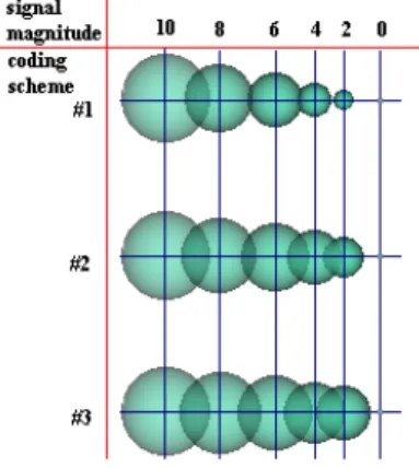
The choice of the visual variables (size, color, texture, form, etc.) coding quantitatively the SEEG value is a critical point of the experiment. Bertin12 suggests that only the variation of size may be used to encode quantitative data, thus in our application the chosen glyph is a sphere (its pattern is invariant with the viewing point) having a size proportional to the magnitude of the signals to encode. The coding scheme of the glyphs must state the same organization level as the values. The 3D characteristics of the sphere allows three types of proportionality between the magnitude of the signal and the size of the sphere (figure 2):
c.s.#1 – the magnitude is proportional to the radius of the sphere (R = k.val); c.s.#2 - the magnitude is proportional to the surface of the sphere (πR2= k.val); c.s.#3 - the magnitude is proportional to the volume of the sphere ((4/3) πR3= k.val); where R is the radius of the sphere.
Through this experiment we intend to study and to evaluate the influence of the coding scheme on the performance for the human observers to perceive quantitative data. We consider that a coding scheme can be compared to the others in two aspects:
• Accuracy. One coding scheme allows a more precise perception of the values. Differently said, an observer will make fewer misunderstandings using one scale than with the others.
• Speed. One coding scheme allows a faster perception of the values.
A coding scheme will be considered better than the others if it allows a more accurate and/or faster “measure” of the magnitude of the signal in a statistically significant way.
Figure 1: SEEG signals in their anatomical context Figure 2: The three coding schemes used in the experiment
In order to restrain the effect of external factors, our evaluation must be very strongly delimited in time, space, visual variables and amount of information:
• Time - time variation of the signals is of great importance for the analysis; however this variation would hold most of the observer’s attention (the human brain is highly specialized in motion understanding). Moreover, the time variable in animations is not perceived as linear. To avoid these facts, our evaluation is performed on static frames;
• Space - SEEG signals are displayed on the 3D location of their measurement points. The external anatomy and the depiction of the depth electrodes give the anatomical location of these points. But, as shown in figure 1, the orientation of the electrodes can induce some perspective or superposition artifacts; thus on our evaluation we use parallel projection and a viewing direction perpendicular to the electrodes (figures 3 and 4);
• Visual variables – only the size of the spheres encodes the values. The other visual variables (color, texture, shape, etc.) remain neutral and constant throughout the experiment;
• Amount of information - this factor interferes in two aspects, on the number of signals displayed simultaneously and on the quantification of these signals. To limit the first factor, only a few spheres (4 at most) are displayed on each evaluation step so the overlapping of spheres is limited. The choice of the quantification of the scale is more crucial. The scale must present some perception step between the values but must still hold a quantitative nature. We chose to quantify the scale of the values to integers in the interval [0,10]. The range of the coding scheme is kept similar for all coding schemes: from 0 to a maximum radius encoding value 10 (see figure 2).
4. EXPERIMENTAL PROTOCOL
The experimental protocol has been described elsewhere8. The main frame of this protocol is the following:
1) All observers receive a simple explanation about the context and aims of the experiment and what is expected from them.
2) The profile of the observer is collected.
3) The protocol is divided in three similar parts (one for each coding scheme).
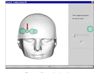
4) For each coding scheme, the observers train themselves before observing all the images corresponding to the same coding scheme (figure 3).
5) The observers are shown three different images containing a certain number of spheres. The magnitude of one of the spheres (figure 4) is asked. The error in magnitude (real magnitude - perceived magnitude) and the reaction time are registered.
In order to minimize the side effects, the order of the 3 coding schemes, the value coded by a sphere and the position of the sphere are chosen randomly for each observer.
Figure 3: Interactive training for one of the coding schemes Figure 4: Size evaluation phase
5. EXPERIMENTAL INVESTIGATIONS
Here we will discuss the results of the two main experimental investigations concerning first the evaluation of the influence of the coding schemes on the observers’ performance and then the influence of some side effects on this performance. All the statistical analysis is performed using the commercial s/w package MINITAB13.
5.1 Collected data
The results presented in this work are obtained applying this first experimental set to 40 human observers. These observers exhibit a relative homogeneous profile (faculty staff and post-graduation students, 25% of females). This restricts the evaluation of only the technical efficacy of the coding scheme.
• For each coding scheme, 120 spheres are evaluated (40 observers evaluating 3 images per coding scheme). This produces 120 error values (E1, E2, E3) and 120 perception times (T1, T2, T3) for each coding scheme with En = (real magnitude – perceived magnitude) for coding scheme #n and Tn = time the observer takes to evaluate the magnitude (approximated by the reaction time) for coding scheme #n. Note that En∈Ζ and Tn is expressed in seconds. In a first stage, we test the assumption of normality of the distributions of the collected data. The goodness-of-fit test rejects this assumption, so we will use rank-based non-parametric hypothesis and procedures for the data analysis.
• For each observer, the following variables are also recorded to establish the observer profile: age (<25; [25,55]; >55), nationality, gender, familiarity with 3D video games or 3D synthetic images; profession; number of years of specialty and familiarity with 3D medical imaging (for medical doctors).
• Some side variables concerning the images: Sequence of coding schemes; order of the task (first, second or third); number of spheres; size of the evaluated spheres are also recorded during the test.
• During the experiment the experimenter surveys the behavior of the observers. After the experiment, each observer is asked if he or she had any preferences about the coding schemes and why.
5.2 Evaluation of the influence of the coding schemes on the observers’ performance The framework of the statistical analysis is the following:
1) The first analysis is an Exploratory Data Analysis (EDA). It allows a preliminary comparison among the three coding schemes and helps on the choice of other statistical techniques to be used to further analyze the obtained data. The EDA results presented here are a summary of the analysis performed in 8. The EDA gives an overview of certain data characteristics (such as ranges, asymmetries, existence of outliers, etc.). Because of the non-normality of the distributions the boxplot technique is used.
2) The equality or differences between the schemes has then to be statistically tested. This consists in stating a hypothesis of equality between the schemes and then verifying it statistically with a certain level of significance.
3) If the equality hypothesis is rejected, we investigate the data in order to determine the cause.
5.2.1 Accuracy: errors
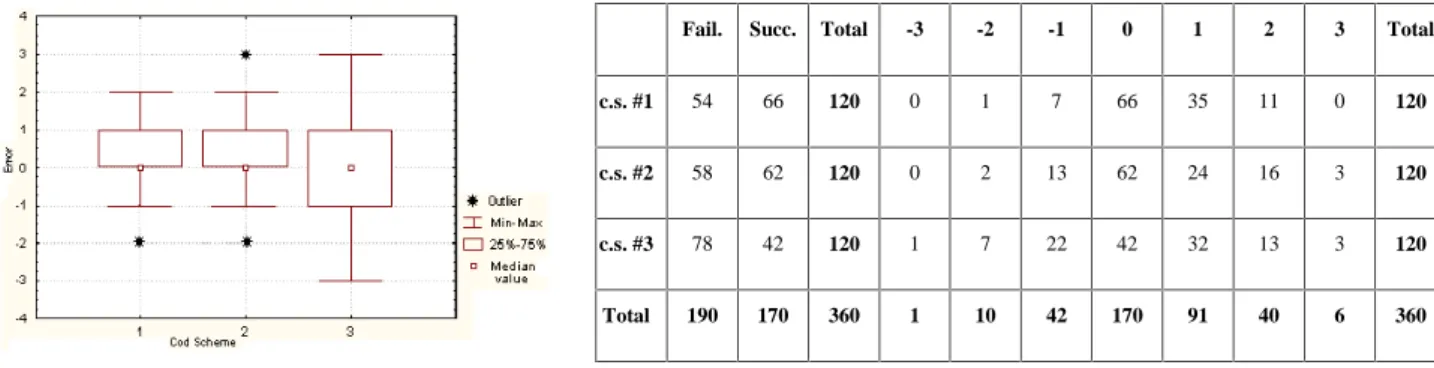
1) Figure 5 presents the boxplot of the distributions of errors for the three coding schemes. The errors corresponding to coding schemes #1 and #2 seem very similar but those corresponding to coding scheme #3 present a larger range
2) The hypothesis can be stated as the following: if the proportion of failures (among the categories) and successes in the perceived magnitude is equal when using any scheme, then it is possible to consider that scheme #1 is as good as scheme #2 and as scheme #3. Statistically this is translated as the null hypothesis: H0e: pe#1=pe#2=pe#3versus H1e: pe#1≠pe#2≠pe#3 (where
pe#n is the proportion of the several categories of failures and successes for coding scheme #n).
Due to the amount of ties between error values, the hypothesis is tested using the
χ
2 test for homogeneity on a contingency table14. The statistic X2=11.06 computed from the value of Table I is greater than the theoretical value χ2(2);0.05=5.99, H0e is rejected with a level of significance α=5%. This confirms the existence of an influence of the coding scheme on the accuracy.We examine also more precisely the distributions by investigating the equality proportions of failures among the categories, i.e. –3, -2, -1, 1, 2 and 3 and successes of the perceived magnitude when using any scheme (see the right part of the contingency table on Table I), H0e is still rejected with an α of 5%, since the statistic X2=28.44>χ2(12);0.05=21.06.
Fail. Succ. Total -3 -2 -1 0 1 2 3 Total
c.s. #1 54 66 120 0 1 7 66 35 11 0 120
c.s. #2 58 62 120 0 2 13 62 24 16 3 120
c.s. #3 78 42 120 1 7 22 42 32 13 3 120
Total 190 170 360 1 10 42 170 91 40 6 360
Figure 5: Box plot for the errors Table I: Contingency table used to test the differences among coding schemes concerning the errors
3) From the analysis of the boxplot and especially of table I, it can be seen that c.s.#3 has more failures than c.s.#2 and c.s.#1 (this is particularly relevant concerning errors of type (-2) and (-1)). So we can conclude that coding scheme #3 seems to be less accurate than the other two.
5.2.2 Speed: perception times
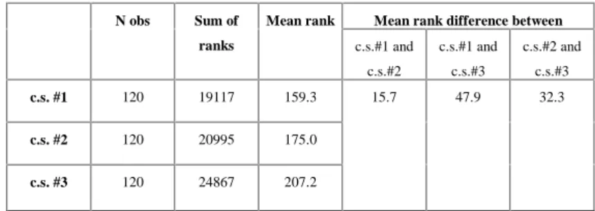
1) On the boxplot on figure 6, we can see that the minimum, maximum and median values of the perception times obtained for coding scheme #1 are smaller than for any of the other coding schemes; this is also the case for the 50% of central values. However the great difference observed in the ranges of the three coding schemes may not be so significant since the (worst) maximum values of coding schemes #2 and #3 are considered as outliers.
2) The comparison between the distributions of the perception times can be stated as following: if the median (me) of perception times is equal when using any scheme, then it is possible to consider that scheme #1 is as good as scheme #2 and as scheme #3 in speed. This can also be stated as the null hypothesis: H0t: met#1=met#2=met#3versus H1t: met#1≠ met#2≠met#3, and tested using the Kruskal-Wallis test15 (a non-parametric analog for the one-way ANOVA). It requires only that the underlying distribution of each of the populations be identical in shape and is primarily designed to detect differences in “location” among the populations.
In our case (Table II), H0t is rejected with an α of 5% since the test statistic H=13.32>
χ
2(2);0.05=5.99.
3) We use a pairwise comparison method based on the average ranks16 to determine where the differences are. We infer that the locations of the distributions differ if the mean rank difference between two coding schemes exceeds the critical value S, which is S=25.9 for this data set. Analyzing table II we can say that there is insufficient evidence to declare different locations between coding schemes #1 and #2 (15.7<25.9). The locations of the distributions of times for coding schemes #1 and #3 (47.9>25.9) and for coding schemes #2 and #3 (32.3>25.9) may be declared different.
Mean rank difference between N obs Sum of ranks Mean rank c.s.#1 and c.s.#2 c.s.#1 and c.s.#3 c.s.#2 and c.s.#3 c.s. #1 120 19117 159.3 c.s. #2 120 20995 175.0 c.s. #3 120 24867 207.2 15.7 47.9 32.3
Figure 6: Box plot for the perception time Table II: Kruskal-Wallis (ANOVA by ranks) to test the differences among coding schemes concerning the Time (T1, T2, T3)
5.2.3 Conclusion on the influence of the coding schemes
For both cases, accuracy and speed, identical conclusions can be drawn. Coding scheme #3 seems to be worth than the two others. This difference seems rather significant also from a practical perspective. The observers not only make more errors with coding scheme #3 but also can make much larger errors; this can be important. Moreover coding scheme #1 is not discriminated from coding scheme #2.
5.3 Influence of some side effects
After the application of the protocol to the observers, most of them proclaimed a preference to one coding scheme. We will try to show if there is a correlation between their preference and their performance using this scheme.
On the other hand, some of the observers have mentioned also that their practice, the size and the location of the spheres displayed on each image, as well as their own preferences to a specific coding scheme, could have influenced their performances. These points will be investigated. In this optic we define the observers’ performance only by the occurrence of errors (failures) or not (successes) regardless to the coding schemes; the failures, successes and times are accumulated for all the observations in the same circumstances. When a different number of observations is registered, we will use relative frequencies of successes, failures and time rates (obtained dividing the former values by the number of observations). We also look for statistical support to establish if the observed proportions of failures and successes could be due to random causes (in which case the suspected influence was not confirmed), or not. With this purpose, equality of proportions tests will be performed on contingency tables14 to test the null hypothesis that the probability of some specified event is the same for each population.
5.3.1 Preferred coding scheme
Thirty-five from the forty observers have expressed a preference by a certain coding scheme (especially for coding scheme #1). From these, twenty have performed better when using the preferred coding scheme (the other fifteen have not). The test of two proportions16 is used to study if the proportion, p1, of the observers who performed better using the preferred scheme is equal to the proportion, p2, of the observers who did not (in other words, to investigate if there is an influence of the preference on the performance). The hypothesis are H0:p1=p2 versus H1:p1≠p2. Since Zobs is 1.21 and Z(0,975)=1.96, the null hypothesis H0 is not rejected for an α of 5%. This means that the proportion of best performances, for this data set, do not differ depending on the preference.
5.3.2 Practice of the observers
We want to verify if the practice accumulated by the observers during the experiments induced better performances. For this, we compute the total number of errors made by all the 40 observers for the first, second and third tasks they have performed. Table III shows the corresponding number of failures and successes, as well as the accumulated times.
Analyzing table III, we can observe that both the number of error and the accumulated times, obtained by all the observers decrease from the first to the second, to the third tasks (specially concerning the times). This seems to imply that they are becoming more familiar with the application and/or the type of task they have to perform. However, the equality of proportions test asserts the independence of the observers’ performances from the order of the task. The differences among performances obtained in the three tasks could not to be due to a learning effect but to random causes. This means that generally we have to be careful with informal analysis of data.
5.3.3 Size of the evaluated spheres
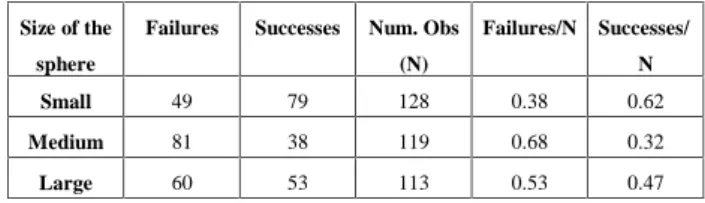
To study the influence of the size on the observers’ performance, we divide the 11 possible values of the spheres into three classes, small, medium and large, accordingly to the signal values they encode (≤3, between 4 and 6, or ≥7). Table IV displays the number of failures and successes, their corresponding rates and number N of evaluated spheres. The overall performance of the observers in the evaluation of small and large spheres is better than in the evaluation of medium spheres. This result has already been anticipated from the observation of the observers’ behavior and remarks during the experiment and has been reinforced by a test of the proportion of failures and successes performed on a contingency table, which rejected the equality of proportions. This confirms the existence of a dependence of the observers’ performances from the size of the spheres.
Failures (errors)
Successes (no errors)
Acc. Times (s) Size of the
sphere
Failures Successes Num. Obs
(N)
Failures/N Successes/
N
First task 67 53 1619 Small 49 79 128 0.38 0.62
Second task 64 56 1327 Medium 81 38 119 0.68 0.32
Third task 59 61 1244 Large 60 53 113 0.53 0.47
Table III: Number of failures, successes and accumulated times for the 40 observers corresponding to the first, second and third tasks
Table IV: Total number of failures and successes obtained for small, medium or large sphere
5.3.4 Conclusions of the influence of some side effects
In several cases the observers claimed some preferences or made remarks (e.g. learning effects, better performances using coding scheme #1), which are not validated by the tests. This reinforces the utility of a real formal evaluation of each human computer interaction, and not just a recording of the users’ comments.
Several books which develop guidelines for producing good visualizations (e.g. Bertin’s12) suggest that observers are more sensible to surfaces for the extraction of quantitative data. This assessment seems to be contradictory to the observers’ preferences and performances. That preference can perhaps be due to the specific way coding schemes are shown to the observers (see figure 2), this could mean that hidden side effects could still influence the results.
6. CONTINUING INVESTIGATIONS
The experimental methodology presented in this paper is a tool involving human observers, which allows analyzing several components of the visualizations of SEEG data. Further directions of evaluation research can be investigated using this framework like the ordinal perception of data, the perception of the time evolution of the signals, the perception of causalities between signals, the perception of some specific spatio-temporal pattern, etc. However the specific study of the evaluation of the quantitative data has still to be improved. The review of the experimental procedure and the interview of the observers give us hints on future short-term improvements:
• The duration of the tasks seems too small when compared to the preparation time. Thus it seems possible to increase significantly the length of the tasks without the risk of producing fatigue or boredom in the observers. Using a greater number of test images per coding scheme could possibly allow the discrimination between coding scheme #1 and #2.
• Some observers have suggested that the chosen point of view (parallel projection and a viewing direction perpendicular to the electrodes) brings the experiment back to a 2D case, which could have an influence on the results.
• The observers’ profile has not been taken into account during this analysis phase. This could increase the number of independent variables (gender, familiarity with 3D images and profession). For instance, a first informal test shows that there is a difference in results between the male and female groups whatever the coding scheme (higher accuracy but slower reaction time for the females). This informal test suggests that other independent variables could influence the results and have to be taken into account for the new experimentation or analysis.
• The homogeneity of the observers’ profile. This first test is conducted on a relatively homogeneous population (University teachers and students). This is not a drawback if we wish to evaluate only the technical efficacy of the visualization. Nevertheless the diagnostic accuracy efficacy evaluation should involve physicians and in particular neurologists.
Two other experiments, using basically the same protocol are currently being performed.
The first new experiment differs from the previous one, mainly in the number of images shown per coding scheme. It will also involve a greater number of observers having different profiles (including neurologists and observers with formal 3D training) and the obtained results are expected to allow the confirmation of the results obtained until now. We also expect that this experiment will allow establish relationships among some of the characteristics of the observers’ profiles and the performances with some of the coding schemes.
A second set of tests, using a similar protocol, but a different viewing direction (analogous to the one shown in fig.1) has been applied to a smaller homogeneous subgroup of observers. Through these tests we expect to clarify the influence of the viewing direction on the observers’ performance.
CONCLUSION
The experiment described in this work was the first from a set of experiments, we intend to perform, concerned with the evaluation of the influence of glyphs on the understanding and analysis of SEEG signals visualized in anatomical context. A specific methodology for the evaluation of a quantitative visualization technique has been designed and an experimental protocol involving human observers has been implemented. The obtained results seem to indicate that one of the three tested coding schemes is worse than the others, both on accuracy and speed. The study performed about the influence, on the observers’ performance, of other factors (as task order and size of the spheres) has indicated that the size of the evaluated spheres has probably an important impact. Some future investigation directions have been exposed.
REFERENCES
1. H. H. Barret, J. Yao, J. P. Rolland, K. J. Myers, “Model observers for assessment of image quality”, proc. National Academy of Sciences, vol. 90, pp. 9758-9765, 1993.
2. J. Van Cleynenbreugel, J. Nuyts, R. Verbeek, M.-H. Smet, G. Marchal, P. Suetens, “On the problem of validating computer assisted medical image interpretation”, Contemporary perspectives in three-dimensional biomedical imaging, chapter XI, IOS Press, 1997.
3. K. Bowyer, “Validation of Medical Image Analysis Techniques”, Handbook of Medical Imaging, Vol 2, Medical Image processing and Analysis, M. Sonka and J. M. Fitzpatrick (eds), SPIE Press, pp. 567-608, 2000.
4. S. Uselton, G. Dorn, C. Farhat, M. Vannier, K. Esbenden, A. Globus, Panel: “Validation, verification and evaluation”, proc. Visualization’94, pp. 414-418, Washington, 1994.
5. G. Nielson, “Challenges in visualization research”, IEEE trans. on Visualization and Computer Graphics, 2, 2, pp. 97-99, 1996.
6. M. Vannier, C.F. Hildebolt, L.A. Gilula, et al. ”Calcaneal and pelvic fractures: diagnostic evaluation by three dimensional Computed Tomography scans”, Journal of Digital Imaging, 4, 3, pp. 143-152, 1991.
7. C. Rocha, J.-L. Dillenseger, J.- L. Coatrieux, “Multi-array EEG signals mapped with 3-dimensional images for clinical epilepsy studies”, Visualization in Biomedical Computing, pp. 467-476, Hamburg, 1996.
8. J.-L. Dillenseger, B. Sousa Santos, P. Texeira, J. Nunes, C. Ferreira, “Evaluation of the 3D visualization of quantitative Stereoelectroencephalographic information”, World Congress 2000, TH-FXH-05, 4 pages, Chicago, 2000.
9. B. Sousa Santos, J.-L. Dillenseger, J.-L. Coatrieux, “Some recurrent concepts of quality evaluation in medical visualization”, Revista do DETUA, 2, 2, pp. 244-247, 1998.
10. I. Buvat et al., “The need to develop guidelines for the evaluation of medical image processing procedures”, SPIE Conf. on Image Processing, SPIE vol. 3661, pp. 1466-1477, San Diego, 1999.
11. K. Brodlie, L. Carpenter, R. Earnshaw, J. Gallop, R. Hubbold, A. Mumford, C. Osland, P. Quarendon, Scientific visualization, techniques and applications, Springer Verlag, 1992.
12. J. Bertin, Sémiologie Graphique, les diagrammes, les reseaux, les cartes. 3me ed., Éditions de l’École des Hautes Études en Sciences Sociales, Paris, 1998. Translated in English: Semiology of graphics, The University of Wisconsin Press, Madison, 1983.
13. Minitab User’s Guide 2: Data analysis and quality tools. MINITAB Inc., Statistical Software, 1998. 14. B. S. Everitt, The analysis of contingency tables, Shapman and Hall, 1977.
15. J. Gibbons, Nonparametric methods for quantitative analysis, 3rd Ed, American Sciences Press, 1997. 16. R. Freund, W. Wilson, Statistical methods, Academic Press, 1993.