Jan Vanhove†
June 2020
Abstract
The average quantitative research report in applied linguistics is needlessly complicated. Articles with over fifty hypothesis tests are no exception, but despite such an onslaught of numbers, the patterns in the data often remain opaque to readers well-versed in quantitative methods, not to mention to colleagues, students, and non-academics without years of experience in navigating results sections. I offer five suggestions for increasing both the transparency and the simplicity of quantitative research reports: (1) round numbers, (2) draw more graphs, (3) run and report fewer significance tests, (4) report simple rather than complex analyses when they yield essentially the same results, and (5) use online appendices liberally to document secondary analyses and share code and data.
∗
Published in ITL - International Journal of Applied Linguistics, https://doi.org/10.1 075/itl.20010.van. The data and code for generating the figures and the table are available from https://osf.io/sg7cv/. I thank the editor, an anonymous reviewer, Isabelle Udry, Malgorzata Barras, Katharina Karges, and Lukas Sönning for their comments.
†
[email protected]. https://janhove.github.io. University of Fribourg, Department of Multilingualism, Rue de Rome 1, 1700 Fribourg, Switzerland.
Krashen (2012) argued that overly long research papers are a disservice to the field. I agree, and I find the average quantitative research report in applied linguistics needlessly complicated. The results sections in particular often feature highly technical passages that most applied linguists may find difficult to understand (Loewen et al. 2019). While this is an argument for more training in quantitative methods, it is also an argument for not making the analyses and their write-up more complicated than needed. If an analysis has to be complex because of the study’s design and subject matter, that is fine; my beef is with needless complications that bury the main findings under a thick layer of numbers and technical vocabulary with little added value.
In the following, I make a number of suggestions for simplifying research reports. Some of these overlap with Larson-Hall and Plonsky’s (2015) recom-mendations for reporting quantitative research, but I plead for the inclusion of less numerical information in the main text than they do. In a nutshell, my recommendations are (1) to round numbers more strongly to reduce the prevalence of uninformative digits; (2) to draw more graphs; (3) to cut down on the number of significance tests that are run and reported; (4) to consider simpler but valid alternatives to sophisticated procedures; and (5) to use online appendices to ensure maximal transparency instead of bloating the text with details. The examples that I discuss are adapted from real but unreferenced studies in applied linguistics, bilingualism research, and second language acquisition.
Round more
False precision abounds. Numbers are falsely precise if they suggest that the information on which they are based is more fine-grained than it actually was, like saying that the Big Bang happened 13,800,000,023 years ago because it has been twenty-three years since you learnt that it happened 13.8 billion years ago. Falsely precise numbers can also imply that an inference beyond the sample can be made with greater accuracy than is warranted by the
uncertainty about that inference, like when a pollster projects that a party will gain 37.14% of the vote but the margin of error is 2 percentage points. False precision is common in summary statistics, with mean ages reported as 41.01 years rather than just 41 years or mean response latencies of 1742.82 milliseconds rather than just 1743 milliseconds. Other than giving off an air of scientific exactitude, there is no reason for reporting the mean age of a sample of participants as 41.01 years rather than as just 41 years. Nothing hinges on the 88 hours implied by .01 years, and people do not report their age to the nearest week anyway. Similarly, response latencies are measured with a precision of about 1 millisecond in lab-based experiments and of about 15–20 milliseconds in realistic online settings (Anwyl-Irvine et al. 2020; Bridges et al. 2020).
False precision is also commonly found in estimates of population statistics (e.g., regression coefficients, correlation coefficients, percentages, or sample means that are used to draw conclusions beyond the sample itself). These are often reported with more digits than the standard error, confidence interval, or credible interval around them licences (see Feinberg & Wainer 2011; Wainer 1992). For instance, when an estimated regression coefficient and its standard error are reported as ˆβ = 12.584 ± 1.047, the .584 part of the estimate is firmly in doubt and no meaningful information is lost by reporting ˆβ = 12.6 ± 1.0 or even ˆβ = 13 ± 1. By the same token, if 31 out of 95 participants answer a question correctly, no meaningful information is lost by reporting the percentage as 33% instead of 32.63%; in fact, the standard error around the estimate is 5 percentage points.
An isolated falsely precise number is easily ignored. But they often come in batches, which clutters the text and makes it harder to spot patterns in the results (Ehrenberg 1977; Ehrenberg 1981). Moreover, they can convey the impression that there is much more certainty about the findings than there really is if they are not accompanied by a measure of uncertainty.
So round more. Average reaction times do not have to be reported to one-hundredth of a millisecond, the outcome of an F -test rarely hinges on
anything after the second digit in the F -statistic (i.e., F (1, 29) = 4.26 and
F(1, 29) = 4.34 give essentially the same result, as do F (1, 29) = 11.1 and F(1, 29) = 10.6), and correlation coefficients and proportions rounded to two
decimal places are probably precise enough already.
To how many digits best to round is partly a matter of taste. To give you some perspective, Ehrenberg (1977) suggests to round values to the first two digits that vary in a comparison. For instance, when comparing 40.73, 72.80, and 145.13, the hundreds and tens are the first two digits that vary. He would round them to 4 × 101, 7 × 101, and 15 × 101. By contrast, when comparing mean values of 140.73, 172.80, and 145.13, the hundreds do not vary, but the tens and units do, so the rounded values would be 141, 173 and 145. In the latter example, readers, editors, and reviewers would not bat an eyelid at the rounded values, but in the former, I suspect that they would. A less extreme interpretation of Ehrenberg’s rule of thumb is Chatfield’s (1983, Appendix D), which is to round to the first two digits that vary over the whole range from 0 to 9 in a comparison. The following are some of my own suggestions that would help authors get rid of the most egregious cases of false precision while still producing rounded values that are inconspicuous.
• For summaries of fairly continuous measurements such as milliseconds, voice onset times, and age, a good rule of thumb is to round to at least the level of precision with which they were measured (typically to the closest unit). For instance, the mean age in a sample of adults can be reported to the nearest year (i.e., 41 instead of 41.01 years). But in a sample of infants, it may be reported to the nearest month if the individual infants’ ages were reported in months.
• For coarser data, such as data collected on a Likert scale or self-assessments on a six-point scale, rounding to the nearest unit may obscure patterns in the data, and rounding to the first decimal may be preferable. For instance, rounding mean responses on a 6-point scale of 4.466 and 3.622 to 4.5 and 3.6, respectively, may be more sensible than rounding them to the nearest integer (i.e., 4 for both).
• For percentages, correlation coefficients, and regression coefficients, a good point of departure is to consider their standard error and to avoid reporting beyond the first non-zero digit of the standard error. For instance, an estimated regression coefficient of ˆβ = 1.7452 can be rounded to 1.7 when its standard error is 0.43 (i.e., ˆβ = 1.7 ± 0.4) and to 1.75 when its standard error is 0.078 (i.e., ˆβ = 1.75 ± 0.08). But values may be rounded more strongly if they are known with a precision that exceeds their practical or theoretical importance. For instance, 42,137 out of 100,000 and 53,742 out of 100,000 correspond to 42.1 ± 0.2% and 53.7 ± 0.2%, respectively, but can probably be rounded to 42% and 54% without affecting any of the conclusions.
• p-values above 0.01 can be rounded to two decimal places, those between 0.001 and 0.01 can be reported as p < 0.01, and those below 0.001 as
p <0.001. Minute differences in p-values are never informative. Test
statistics such as t, F , z, and χ2 almost never have to be reported beyond the first decimal.
But sooner than rigidly follow these suggestions, ask yourself how many digits actually convey information that is both reliable and meaningful in the context of your study. There is nothing unscientific or sloppy about reporting r = 0.23 or even r = 0.2 instead of r = 0.2274 if that better reflects the precision of the measurements and the uncertainty of the inference.
Show the main results graphically
To me, graphs in research reports serve three purposes, which I will discuss in turn. I will then offer some rules of thumb and refer to useful resources for readers who want to expand their arsenal of visualisation techniques.
Help readers get the gist of the results
Expert readers may be able to piece together the trends in the data from an avalanche of tests and a table, but a well-chosen visualisation makes even their lives easier. Most analyses are based on statistical models (t-tests and ANOVA are models, too), and these can be visualised. A nice example of this in our field is Ågren & van de Weijer (2019), whose Figure 1 shows what an interaction between a continuous predictor (language proficiency) and a categorical predictor (modality) in a logistic mixed-effects model actually looks like in terms of the percentage of correctly produced liaisons in L2 French. Even simple line charts showing averages can be useful to highlight the results, though it is often possible to make these more informative, as discussed next.
Show that the numerical results are relevant
The most commonly used statistical tests and models compare means, but these means may poorly reflect the central tendencies in the data. While the outcome of the models and tests may still be technically correct (insofar as they correctly capture the trend in the mean), they may not be relevant (if the mean is not a relevant measure of the data’s central tendency). Line charts and bar charts, with or without error bars, may obscure the test’s or model’s irrelevance as shown in Figure 1. For fairly simple comparisons, plotting not just the summary statistics but also the data that went into them is often a good idea (Loewen et al. 2019; Weissgerber et al. 2015). For some designs, such as within-subjects designs with more than two conditions, sensibly plotting the raw data is admittedly difficult.
A situation where I consider a plot with the raw data mandatory is when the conclusions hinge on correlation coefficients. Figure 2 shows why (also see Anscombe 1973). Any correlation coefficient can correspond to a vast number of data patterns, and a study’s conclusions can change dramatically depending on the shape of the data cloud. I consider correlation coefficients without an accompanying scatterplot useless.
15 20 25 30 35 mean outcome Group 1 Group 2 0 100 200 300 400 500 600 outcome Group 1 Group 2
Figure 1: Most tests and models compare means, but these may be atypical
of the data. Left: A plot showing just the group means. Right: When the individual data points are shown, it becomes clear that the means (blue asterisks) are atypical of most data due to the strong positive skew. (Data from the ‘Gambler’ study in Klein et al. (2014; UFL sample). Because of the skew, Klein et al. transformed these data before running any tests.)
0.0 0.4 0.8 0.0 0.2 0.4 0.6 0.8 1.0 0.0 0.4 0.8 0.0 0.2 0.4 0.6 0.8 1.0 0.0 0.4 0.8 0.0 0.2 0.4 0.6 0.8 1.0 0.0 0.4 0.8 0.0 0.2 0.4 0.6 0.8 1.0 0.0 0.4 0.8 0.0 0.2 0.4 0.6 0.8 1.0 0.0 0.4 0.8 0.0 0.2 0.4 0.6 0.8 1.0 0.0 0.4 0.8 0.0 0.2 0.4 0.6 0.8 1.0 0.0 0.4 0.8 0.0 0.2 0.4 0.6 0.8 1.0
Figure 2: The correlation coefficients for the data in four panels in the
top row are all r(50) = 0.00; those for the panels in the bottom row are all r(50) = 0.70. These correlation coefficients adequately capture the relationship in the first panel of each row. But they understate the strength of the relationship in the second panels; they are strongly influenced by one data point in the third panel; and in the fourth panel, they hide the fact that the dataset comprises two groups, within each of which the relationship may run in the opposite direction of that in the dataset as a whole (Simpson’s paradox). (Figure drawn using the plot_r() function in the cannonball package (Vanhove 2019b) for R.)
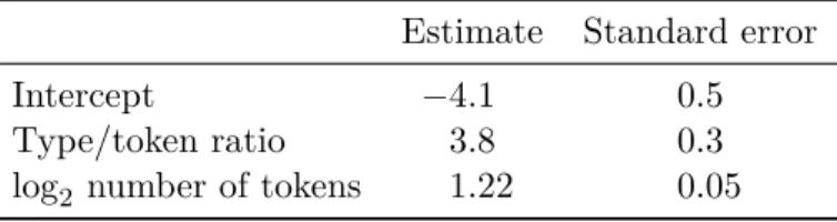
Table 1: A multiple regression model in which human ratings of the lexical
diversity of 1,000 short texts were fitted in terms of their type/token ratio and the number of tokens. What does the 3.8 ± 0.3 estimated coefficient for the type/token ratio mean? (Data from the French corpus published by Vanhove, Bonvin, Lambelet and Berthele (2019).)
Estimate Standard error
Intercept −4.1 0.5
Type/token ratio 3.8 0.3
log2 number of tokens 1.22 0.05 Forestall common misunderstandings
Take a look at Table 1. What does the estimated coefficient for the type/token ratio mean in statistical terms?
Many readers will interpret the positive estimated coefficient of 3.8 ± 0.3 to mean that texts with higher type/token ratios are rated as lexically more diverse. This interpretation is simple, theoretically compelling, and wrong. Figure 3 shows why: If anything, texts with higher type/token ratios are rated as lexically less diverse. The regression model is not wrong, though, but numerical summaries are easily misunderstood: The 3.8 ± 0.3 does not mean that texts with larger type/token ratios are rated as lexically more diverse than texts with lower type/token ratios. It means that texts with higher type/token ratios are rated as lexically more diverse than texts with lower type/token ratios but with the same number of tokens. The correct interpretation of a regression coefficient is always conditional on all the other predictors in the model (see Vanhove 2020), but first interpretation skims over this. The misinterpretation is understandable, however; providing the scatterplot matrix helps to prevent it.
In sum, visualise the main findings and, if possible, show the data that went into the analyses. While they do not cover all the bases, the following guidelines may serve as a useful point of departure. But rather than follow them to the letter, try out several different visualisations and see which ones best highlight the trends and other salient patterns in the data (e.g., outliers,
diversity rating 0.4 0.6 0.8 1.0 -0.17 n = 1000 missing: 0 2 4 6 8 0.58 n = 1000 missing: 0 0.4 0.7 1.0 type/token ratio -0.66 n = 1000 missing: 0 2 4 6 8 4 5 6 7 8 4 5 6 7 8 log-2 tokens
Figure 3: The data underlying the model presented in Table 1. The top
triangle shows scatterplots for the three bivariate relationships. The numbers in the bottom triangle are the corresponding Pearson correlation coefficients. If anything, the unconditional relationship between the type/token ratio and the lexical diversity ratings is negative, not positive (see the scatterplot in the first row, second column, and the correlation coefficient in the second row, first column).
skew, noteworthy differences in the variance):
• For between-group comparisons on a fairly continuous variable, box-plots are a reasonable choice. But they can often be rendered more informative by overlaying the individual data points (see Weissgerber et al. 2015). An interesting new tool is the raincloud plot, which shows the individual data points, the quartiles, and the entire empirical distribution (see Allen et al. 2019).
• For relationships between two more or less continuous variables, scat-terplots are useful (see Figure 2).
• For relationships between several variables, scatterplot matrices (as in Figure 3) and generalised pair plots (see Emerson et al. 2013) are often a good choice. The latter can accommodate non-continuous variables. • For comparing individual numbers (e.g., rates, percentages, summary statistics), Cleveland dotplots are woefully underused (see Jacoby 2006). The upcoming Figure 4 is a simple example of a dotplot, but their true versatility and usefulness in linguistics is showcased by Sönning (2016). • A useful technique for visualising statistical models is drawing effect
plots (see Fox 2003; Healy 2019; Vanhove 2019a). Figure 1 in Ågren & van de Weijer (2019) is an example of such an effect plot. For some models, such as generalised additive models, it is impossible to piece together what the model implies from the numerical output alone and effect plots are not just useful but necessary.
More general resources for researchers who want to up their visualisation game are Healy (2019; available for free from https://socviz.co/), Robbins (2005), and Wilke (2019; available for free from https://serialmentor.com/dataviz/).
Run and report much fewer significance tests
Researchers often make their readers run a gauntlet of F -tests and p-values before letting them be party to the main findings. I did a rough count of the statistical hypotheses tested using p-values or Bayes factors in the empirical
Modern Language Journal
(23 articles) Studies in Second Language Acquisition(36 articles) Applied Linguistics
(41 articles) Language Teaching Research(21 articles)
0 30 60 90 120 150 180 210 240 270 0 30 60 90 120 150 180 210 240 270
hypothesis tests per article
Statistical hypothesis tests in applied linguistics journals in 2019
Figure 4: Each circle represents a research article published in the 2019
volume of one of four journals. Qualitative research articles are also included; theoretical articles, meta-studies, and articles in special issues are not. The dashed vertical lines show the median for each journal.
articles in the regular issues of four journals in our field published in 2019; see Figure 4. Almost all qualitative studies and some quantitative ones did not test any hypotheses statistically, but over a quarter reported 50 or more hypothesis tests. Such overuse indicates that many tests were not used to test genuine a priori hypotheses but that they were used to explore the data or that they were reported just because they appeared in the output of the researchers’ statistical software. Moreover, they also betray that many researchers overestimate the informativeness of p-values. Misinterpretations of p-values are expertly discussed elsewhere (see Gigerenzer & Marewski 2015; Goodman 2008; Greenland et al. 2016). Here, I will go over some types of hypothesis tests that should almost never be carried out or reported. Silly tests
Silly tests (Abelson’s [1995] term) are tests that cannot tell you anything that is both true and new. So-called balance tests in experiments with random assignment are the prime example of silly tests, see Example A.
Example A.
“The forty participants were randomly assigned to the control and intervention groups (both n = 20). These did not differ significantly in terms of mean age (20.07 vs. 20.49, t(38) = 1.27, p = 0.21), proportion of men (0.30 vs. 0.40, χ2(1) = 0.44, p = 0.51), or mean self-assessed German skills (3.5 vs. 3.3, t(38) = 0.31, p = 0.75).”
The problem with these tests is discussed elsewhere (Huitema 2011; Mutz, Pemantle & Pham 2019; Senn 2012; Vanhove 2015), so I will stick to the short version. In a study with random assignment, a non-significant balance test tells you that the study used random assignment, which you knew already, whereas a significant one tells you that it did not, which you know is incorrect. The significance test for the main outcome has its nominal Type-I error rate if you do not act on the outcome of the balance tests (e.g., by deciding to include a covariate in the analysis only if the balance test is significant), but it becomes incorrectly calibrated if you do act on the outcome of the balance tests. Example A can thus be simplified:
Alternative to Example A.
“The forty participants were randomly assigned to the control and intervention groups (both n = 20).”
Moreover, if it makes sense to include a covariate in the analysis if it is unbalanced between the experimental conditions, it also makes sense to include it if it is perfectly balanced. In fact, in experiments with random assignment, the benefits of adjusting for a pretreatment covariate are even
greater when the covariate is balanced than when it is not, so covariate
balance is nice to have though not required. But the appropriate technique to achieve it is ‘blocking’ before the data are collected (Maxwell, Delaney & Hill 1984; McAweeney & Klockars 1998), not running balance tests.
In studies without random assignment, balance tests are not quite as silly, but their use is still misguided. Consider this: If a nonsignificant balance test actually could tell you that the groups were sufficiently balanced with respect
to a covariate, you could achieve balance by randomly throwing away data until the balance test did not have enough power to detect any differences and you obtained a nonsignificant result. A far better solution is to carefully consider whether the covariate is a possible confounder (e.g., by drawing directed acylic graphs; for introductions see Elwert 2013; Rohrer 2018) and, if it is, control for it statistically regardless of balance (Sassenhagen & Alday 2016).
Apart from balance tests, another clear example of silly tests are what I call tautological tests: The researchers split up a sample of participants or stimuli based on some characteristic (e.g., high-proficiency vs. low-proficiency participants or high-frequency vs. low-frequency stimuli) and then run a test to confirm that, yes indeed, the groups so formed differ with respect to this covariate. Apart from tautological tests being silly and cluttering research reports with useless prose, carving up continuous variables into high and low groups is almost invariably a bad idea (e.g., Cohen 1983; MacCallum et al. 2002; Maxwell & Delaney 1993). It is almost always better to respect the continuous nature of the original covariate and to use it in a linear or nonlinear regression model (Baayen 2010; Clark 2019).
Tests in the output that are not relevant to the research ques-tion
Silly tests should never have been run in the first place, but even reasonable analyses typically produce tests with little relevance to the research question. Consider an experiment with three times two conditions. The analysis might involve a 2 × 2 × 2-ANOVA, and your statistics program would output seven significance tests (three main effects, three two-way interactions, and one three-way interaction). But if it is only the three-way interaction that is relevant to the research question, I suggest only it be included in the main text; the remainder of the ANOVA output can be tucked away in the supplementary materials. This, of course, requires that the researchers know and specify beforehand what it is they are actually interested in (Cramer et
al. 2016).
Similarly, tests of ‘control’ and ‘blocking’ variables are rarely of interest. Including these variables in the analysis is often a good idea, however (see Vanhove 2015). But that is because they are already known to account for differences in the outcome. Including them in the analysis then helps to reduce the residual variance, which in turn makes it possible to estimate the effect of interest with greater accuracy. For the purposes of the study, the effect of the covariate itself is rarely interesting, and it does not need to be reported. Moreover, interpreting covariate effects is harder than you might think (see Hünermund & Louw 2020).
Omnibus tests followed by planned comparisons when testing
a priori hypotheses
Consider Example B. Example B.
“An ANOVA showed that the test results differed significantly between the three accent conditions (F (2, 110) = 7.8, p < 0.001). Contrary to expectations, a follow-up t-test revealed that the participants in the ‘native accent’ condition did not score better than those in the ‘different L2 accent’ condition (t(72) = 1.1, p = 0.27). As predicted, participants in the ‘same L2 accent’ condition outperformed those in the ‘native accent’ condition (t(77) = 2.6, p = 0.01).”
Example B is a benign example of common statistical boilerplate: First, an ANOVA is run to check for any differences between the conditions (the omnibus test). Then, follow-up tests are carried out to home in on the source of these differences. More extreme versions of this strategy involve multiway ANOVAs, followed by one-way ANOVAs, followed by t-tests as well as well as names like Bonferroni, Fisher, Tukey, Scheffé or Holm, and a dozen or so tests flung at the reader. Many of these tests can be pruned.
reducing the number of tests that are reported and often gaining some statistical power to boot. The follow-up tests will (or could) often have been planned beforehand, that is, they represent the subset of the possible comparisons that is actually relevant to the research question. For instance, when four conditions are involved, six comparisons are possible, but perhaps only three are relevant to the research questions. When this is the case, the omnibus test can be dispensed with, and only the planned comparisons can be reported (also see Schad et al. 2020 on how to test several planned comparisons in a single regression model). Whether and how the researchers should correct for any multiple comparisons depends on how the statistical tests map onto the research hypotheses. If each tests a different research hypothesis, no correction is called for; if some test the same hypothesis
and finding at least one significant result will be interpreted as support
for this hypothesis, some correction may be in order (see Bender & Lange 2001; Ruxton & Beauchamp 2008). Ideally, the planned comparisons, and hypothesis tests more generally, are preregistered (Chambers 2017).
Pseudo-exploratory significance tests
Many significance tests are reported for which no a priori justification was given. For instance, matrices listing the bivariate correlations between several variables, adorned with asterisks to signify significance at this or that level, are a common sight, but I have never seen any justification for all of these tests. The correlation matrices themselves are fine, if accompanied by scatterplots; it is the barrage of significance tests that I have a problem with. Similarly, articles often contain tests for pairwise comparisons that were not a priori interesting, but that do seem interesting now that the data are in. As long as they are clearly labelled as such and not sold as confirmatory analyses of a priori hypotheses (see Kerr 1998), exploratory analyses have value (but see de Groot 2014; Gelman & Loken 2013; Rubin 2017; Steegen et al. 2016 on the meaning of p-values in exploratory research). But a matrix of correlation coefficients with significance stars and without any graphs hardly represents an exploratory analysis, and I suggest that researchers
show restraint by not testing every single comparison and relationship that they can think of.
Sometimes, simple analyses suffice
There are some situations in which seemingly sophisticated analyses can be replaced by simpler and equally valid techniques. In such cases, I think the simpler approach should be preferred whenever both approaches yield the exact same result. When the two approaches yield similar but not identical results, a workable solution is to report the easier one in the main text and refer to the appendix for the more complex one. In terms of p-values, you could define “similar results” as, for instance, “both p < 0.01”, “both 0.01 < p < 0.05”, “both 0.05 < p < 0.10”, or “both p > 0.10.” In terms of effect sizes (e.g., mean differences and estimated regression coefficients), “similar results” could be defined as yielding the same numerical summary after appropriate rounding. For instance, if the two analyses yield ˆβ = 1.662 ± 0.293 and ˆβ = 1.722 ± 0.341 as their respective outcomes, their results could be considered similar because both are ˆβ = 1.7 ± 0.3 when rounded.
Mixed repeated-measures ANOVA versus t-tests
Results sections of papers reporting on pretest/posttest experiments often read like this:
Example C (from Vanhove 2015).
“A repeated-measures ANOVA yielded a nonsignificant main effect of Condition (F (1, 48) < 1) but a significant main effect of Time (F (1, 48) = 154.6, p < 0.001): In both groups, the posttest scores were higher than the pretest scores. In addition, the Condition × Time interaction was significant (F (1, 48) = 6.2, p = 0.02): The increase in reading scores relative to baseline was higher in the treatment than in the control group.”
This type of analysis is valid, but only the interaction term is actually relevant (Huck & McLean 1975; Vanhove 2015). The significance tests for the main effects are only distractions. One improvement would be to report just the test for the interaction—you do not have to report the full output of your analysis in the article. But the analysis itself could be simplified. Repeated-measures ANOVA is a fairly fancy technique, but you would obtain the exact same result by first calculating the pretest/posttest difference per participant and then submitting these differences to a Student’s t-test:
Alternative to Example C.
“We calculated the difference between the pretest and posttest score for each participant. A two-sample t-test showed that the treatment group showed a higher increase in reading scores than the control group (t(48) = 2.5, p = 0.02).”
The p-values resulting from both analyses will always be identical, and the
t-value in the second analysis will always be the square root of the F -value
for the interaction term in the first analysis.1
Other ‘mixed’ RM-ANOVAs can similarly be simplified. Consider a study that compares bilinguals with monolinguals on the Simon task. This task
1
A slightly more powerful and more generally useful alternative to analysing gain scores in pretest/posttest experiments is to use the pretest score as a covariate in a regression/ANCOVA analysis (Hendrix, Carter & Hintze 1978; Huck & McLean 1975; Maris 1998). One advantage of this approach is that it does not require the pretest to be measured on the same scale as the posttest.
consists of both congruent and incongruent trials, and the idea is that cognitive advantages of bilingualism would be reflected in a smaller effect of congruency in the bilingual than in the monolingual participants. The results of such a study are then typically reported as follows:
Example D.
“A repeated-measures ANOVA showed a significant main effect of Con-gruency, with longer reaction times for incongruent than for congruent items (F (1, 58) = 14.3, p < 0.001). The main effect for Language Group did not reach significance, however (F (1, 58) = 1.4, p = 0.24). The crucial interaction between Congruency and Language Group was significant, with bilingual participants showing a smaller Congruency effect than monolinguals (F (1, 58) = 5.8, p = 0.02).”
If the question of interest is whether the Congruency effect is smaller in bilinguals than in monolinguals, the following analysis will yield the same inferential results but is easier to navigate through:
Alternative to Example D.
“For each participant, we computed the difference between their mean reaction time on congruent and on incongruent items. On average, these differences were smaller for the bilingual than for the monolingual participants (t(58) = 2.4, p = 0.02).”
If three or more groups are compared, a one-way ANOVA could be substituted for the t-test, which is still easier to report and understand than a two-way RM-ANOVA that produces two significance tests that do not answer the research question. Better still, the research questions could be addressed using planned comparisons on the difference scores, as discussed above. To seasoned researchers, the difference the original write-ups and my sugges-tions may not seem like much. This is because they have learnt to ignore the numerical padding. But novices—sensibly but incorrectly—assume that each reported significance test must have its role in a research paper. The two irrelevant significance tests detract them from the paper’s true objective.
Additionally, novices are more likely to be familiar with t-tests than with repeated-measures ANOVA, so the simpler write-up may be considerably less daunting to them.
Multilevel models vs. cluster-level analyses
Cluster-randomised experiments are experiments in which pre-existing groups of participants are assigned in their entirety to the experimental conditions. Importantly, the fact that the participants were not all assigned to the conditions independently of one another needs to be taken into account in the analysis since the inferences can otherwise be spectacularly overconfident (see Vanhove 2015). Applied linguists regularly fail to properly analyse cluster-randomised experiments, in which case their analysis and write-up are simple but invalid. But when they do take clustering into account, the write-up may read as follows:
Example E.
Fourteen classes with 18 pupils each participated in the experiment. Seven randomly picked classes were assigned in their entirety to the intervention condition, the others constituted the control group. (...) To deal with the clusters in the data (pupils in classes), we fitted a multilevel model using the lme4 package for R with class as a random effect. p-values were computed using Satterthwaite’s degrees of freedom method as implemented in the lmerTest package and did show not a significant intervention effect (t(12) = 1.8, p = 0.10).
Technically, this analysis is perfectly valid, but a novice may get sidetracked by the specialised software and the sophisticated vocabulary (multilevel, random effect, Satterthwaite’s degrees of freedom). Compare this to the following write-up:
Alternative to Example E.
Fourteen classes with 18 pupils each participated in the experiment. Seven randomly picked classes were assigned in their entirety to the intervention condition, the others constituted the control group. (...) To deal with the clusters in the data (pupils in classes), we computed the mean outcome per class and submitted these means to a t-test comparing the intervention and the control classes. This did not show a significant intervention effect (t(12) = 1.8, p = 0.10).
Computing means is easy enough, as is running a t-test: The entire analysis could easily be run in a spreadsheet program. Moreover, the result is exactly the same. In fact, if the cluster sizes are all the same, the multilevel approach and the cluster-mean approach yield the exact same result as long as the multilevel model does not obtain a singular fit (also see Murtaugh 2007). If the cluster sizes are not all the same, the results that both approaches yield will not be exactly the same. As far as I know, there are no published comparisons of which approach is best in such cases, but my own simulations indicate that both are equally powerful statistically (see https://janhove.gi thub.io/analysis/2019/10/28/cluster-covariates).
Nonparametrics vs. parametric tests
A fairly common strategy is for researchers to first run significance tests to check whether their data meet the normality or homoskedasticity assumptions (e.g., using the Shapiro–Wilk test or Levene’s test) and to then choose between a parametric (e.g., t-test or ANOVA) and a nonparametric test (e.g., Mann– Whitney or Kruskal–Wallis). The combination of preliminary tests and possibly lesser known procedures represents an increase in complexity in the research report. Rather than adopt an automated strategy (‘If the Shapiro– Wilk is significant, run a Mann–Whitney.’), I think researchers ought to consider the following three points.
useful. Substantial deviations from normality often go undetected in small samples, whereas trivial departures from normality (e.g., when the values are recorded to the nearest unit or decimal, or when the range of the variable is truncated) get flagged in large samples. Hence, graphic assumption checks are recommended rather than hypothesis tests (Gelman & Hill 2007; Zuur et al. 2009).
Second, the main problem with severely nonnormal data is that parametric methods compare means (and usually still do so correctly with nonnormality; see, for instance, Schmider et al. 2010), but that these means may not be relevant. When the means are considered relevant despite assumption violations, researchers should be aware that tools such as the Mann–Whitney or Kruskal–Wallis do not in fact compare means but entire distributions. Substituting a nonparametric test for a parametric one thus changes the hypotheses being tested. Depending on the context, this may be fine or it may be undesirable. For some alternatives when the mean is of interest despite assumption violations, see Delacre, Lakens & Leys (2017), Delacre et al. (2019), Hesterberg (2015), and Zuur et al. (2009).
Third, contrary to some researchers’ convictions, nonparametric tests also make assumptions about the distribution of the data; they just do not assume that this distribution is normal. In fact, the popular notion that nonparametric tests compare medians is only half-true: They compare entire distributions and therefore also often flag differences between distributions other than the median (e.g., mean or variance, see Zimmerman 1998). In sum, numeric tests of normality and homoskedasticity can better be replaced by visual checks, and more transparent alternatives to the off-the-shelf nonparametric tests are often appropriate.
Use appendices liberally
If researchers take my suggestions on board, their results sections should become leaner and more comprehensible. But at the same time, I plead for
maximal transparency; I just do not think that the main text of an article is the best place to achieve it. Instead, the raw data and computer code with which they were analysed (SPSS syntax, R or Python scripts, etc.) can, and in my view should, be put in online repositories such as osf.io alongside any codebooks, technical reports, and experimental materials (see Klein et al. 2018). Not only does this allow other researchers to verify and even build on your results, it also saves you from reporting details that are not important for your research questions. These are some examples:
• I think standardised effect sizes such as Cohen’s d are of limited use in primary studies (also see Baguley 2009; Cohen 1994; Tukey 1969), so I rarely report them. If a meta-analyst needs them, he or she should be able to compute them using the supplementary materials.
• The effects of control variables in an experiment are uninteresting for the purposes of answering the research questions. But they may be useful when planning similar studies. Again, this information is readily available in the appendix.
• I cannot imagine anyone being interested in how many iterations it took for a mixed-effects model to converge, or which optimiser I used, or whether cubic regression splines instead of thin plate regression splines were used. But if someone is, they only need to look at the scripts.
Epilogue
This article’s take-home point is not that applied linguists should stay clear of sophisticated quantitative methods. It is that they should more carefully consider the added value of their analyses and write-ups relative to simpler analyses and write-ups, or to no analysis whatsoever. Appropriately simple analyses and write-ups foster comprehension and hence transparency; rich appendices with code, data, and secondary analyses further ensure that anyone who might be interested in what is ultimately a detail from the authors’ point of view can look it up.
Simplifying an analysis or write-up can be difficult, though. It takes more time, effort, and knowledge to properly outline the precise goals of the study and to think through how the results can best be communicated than to draw a standard line chart, borrow statistical boilerplate from previous articles, and chuck a bunch of F -tests and p-values at the readers. But this is time and effort well spent.
References
Abelson, Robert P. 1995. Statistics as principled argument. New York, NY: Psychology Press.
Allen, Micah, Davide Poggiali, Kirstie Whitaker, Thom Rhys Marshall & Rogier A. Kievit. 2019. Raincloud plots: A multi-platform tool for robust data visualization. Wellcome
Open Research 4. 63. doi:10.12688/wellcomeopenres.15191.1.
Anscombe, Francis J. 1973. Graphs in statistical analysis. The American Statistician 27(1). 17–21. doi:10.2307/2682899.
Anwyl-Irvine, Alexander, Edwin S. Dalmaijer, Nick Hodges & Jo K. Evershed. 2020. Online participants in the wild: Realistic precision & accuracy of platforms, web-browsers, and devices. PsyArxiv Preprints. doi:10.31234/osf.io/jfeca.
Ågren, Malin & Joost van de Weijer. 2019. The production of preverbal liaison in Swedish learners of L2 French. Language, Interaction and Acquisition 10(1). 117–139. doi:10.1075/lia.17023.agr.
Baayen, R. Harald. 2010. A real experiment is a factorial experiment? The Mental Lexicon 5(1). 149–157. doi:10.1075/ml.5.1.06baa.
Baguley, Thom. 2009. Standardized or simple effect size: What should be reported?
British Journal of Psychology 100(3). 603–617. doi:10.1348/000712608X377117.
Bender, Ralf & Stefan Lange. 2001. Adjusting for multiple testing: When and how?
Journal of Clinical Epidemiology 54(4). 343–349. doi:10.1016/S0895-4356(00)00314-0.
Bridges, David, Alain Pitiot, Michael MacAskill & Jonathan Peirce. 2020. The timing mega-study: Comparing a range of experiment generators, both lab-based and online.
PsyArxiv Preprints. doi:10.31234/osf.io/d6nu5.
Chambers, Chris. 2017. The seven deadly sins of psychology: A manifesto for reforming
Chatfield, Christopher. 1983. Statistics for technology: A course in applied statistics. 3rd ed. Boca Raton, FL: Chapman & Hall/CRC.
Clark, Michael. 2019. Generalized additive models. https://m-clark.github.io/generalized-additive-models/.
Cohen, Jacob. 1983. The cost of dichotomization. Applied Psychological Measurement 7. 249–253. doi:10.1177/014662168300700301.
Cohen, Jacob. 1994. The Earth is round (p < .05). American Psychologist 49. 997–1003. doi:10.1037/0003-066X.49.12.997.
Cramer, Angélique O. J., Don van Ravenzwaaij, Dora Matzke, Helen Steingroever, Ruud Wetzels, Raoul P. P. P. Grasman, Lourens J. Waldorp & Eric-Jan Wagenmakers. 2016. Hid-den multiplicity in exploratory multiway ANOVA: Prevalence and remedies. Psychonomic
Bulletin & Review 23(2). 640–647. doi:10.3758/s13423-015-0913-5.
de Groot, Adrianus Dingeman. 2014. The meaning of “significance” for different types of research. Acta Psychologica 148. 188–194. doi:10.1016/j.actpsy.2014.02.001.
Delacre, Marie, Daniël Lakens & Christophe Leys. 2017. Why psychologists should by default use Welch’s t-test instead of Student’s t-test. International Review of Social
Psychology 30(1). 92–101. doi:10.5334/irsp.82.
Delacre, Marie, Christophe Leys, Youri L. Mora & Daniël Lakens. 2019. Taking para-metric assumptions seriously: Arguments for the use of Welch’s F -test instead of the classical F -test in one-way ANOVA. International Review of Social Psychology 32(1). 13. doi:doi.org/10.5334/irsp.198.
Ehrenberg, Andrew S. C. 1977. Rudiments of numeracy. Journal of the Royal Statistical
Society. Series A (General) 140(3). 277–297. doi:10.2307/2344922.
Ehrenberg, Andrew S. C. 1981. The problem of numeracy. The American Statistician 35(2). 67–71. doi:10.2307/2683143.
Elwert, Felix. 2013. Graphical causal models. In Stephen L. Morgan (ed.), Handbook
of causal analysis for social research, 245–273. Dordrecht, The Netherlands: Springer.
doi:10.1007/978-94-007-6094-3_13.
Emerson, John W., Walton A. Green, Barret Schloerke, Jason Crowley, Dianne Cook, Heike Hofmann & Hadley Wickham. 2013. The generalized pairs plot. Journal of Computational
and Graphical Statistics 22(1). 79–91. doi:10.1080/10618600.2012.694762.
Feinberg, Richard A. & Howard Wainer. 2011. Extracting sunbeams from cucumbers.
Fox, John. 2003. Effect displays in R for generalised linear models. Journal of Statistical
Software 8. 1–27. doi:10.18637/jss.v008.i15.
Gelman, Andrew & Jennifer Hill. 2007. Data analysis using regression and
multilevel/hier-archical models. New York, NY: Cambridge University Press.
Gelman, Andrew & Eric Loken. 2013. The garden of forking paths: Why multiple comparisons can be a problem, even when there is no “fishing expedition” or “p-hacking” and the research hypothesis was posited ahead of time. http://www.stat.columbia.edu/~g elman/research/unpublished/p_hacking.pdf.
Gigerenzer, Gerd & Julian M. Marewski. 2015. Surrogate science: The idol of a universal method for scientific inference. Journal of Management 41(2). 421–440. doi:10.1177/0149206314547522.
Goodman, Steven. 2008. A dirty dozen: Twelve p-value misconceptions. Seminars in
Hematology 45. 135–140. doi:10.1053/j.seminhematol.2008.04.003.
Greenland, Sander, Stephen J. Senn, Kenneth J. Rothman, John B. Carlin, Charles Poole, Steven N. Goodman & Douglas G. Altman. 2016. Statistical tests, P values, confidence intervals, and power: A guide to misinterpretations. European Journal of Epidemiology 31. 337–350. doi:10.1007/s10654-016-0149-3.
Healy, Kieran. 2019. Data visualization: A practical introduction. Princeton, NJ: Princeton University Press.
Hendrix, Leland J., Melvin W. Carter & Jerry L. Hintze. 1978. A comparison of five sta-tistical methods for analyzing pretest-posttest designs. Journal of Experimental Education 47(2). 96–102. doi:10.1080/00220973.1978.11011664.
Hesterberg, Tim C. 2015. What teachers should know about the bootstrap: Resampling in the undergraduate statistics curriculum. The American Statistician 69(4). 371–386. doi:10.1080/00031305.2015.1089789.
Huck, S. W. & R. A. McLean. 1975. Using a repeated measures ANOVA to analyze the data from a pretest-posttest design: A potentially confusing task. Psychological Bulletin 82(4). 511–518. doi:10.1037/h0076767.
Huitema, Bradley E. 2011. The analysis of covariance and alternatives: Statistical methods
for experiments, quasi-experiments, and single-case studies. Hoboken, NJ: Wiley.
Hünermund, Paul & Bayers Louw. 2020. On the nuisance of control variables in regression analysis. doi:https://arxiv.org/abs/2005.10314.
Jacoby, William G. 2006. The dot plot: A graphical display for labeled quantitative values.
Kerr, Norbert L. 1998. HARKing: Hypothesizing after the results are known. Personality
and Social Psychology Review 2(3). 196–217. doi:10.1207/s15327957pspr0203\_4.
Klein, Olivier, Tom E. Hardwicke, Frederik Aust, Johannes Breuer, Henrik Danielsson, Alicia Hofelich Mohr, Hans IJzerman, Gustav Nilsonne, Wolf Vanpaemel & Michael C. Frank. 2018. A practical guide for transparency in psychological science. Collabra:
Psychology 4(1). 20. doi:10.1525/collabra.158.
Klein, Richard A., Kate A. Ratliff, Michelangelo Vianello, Reginald B. Adams Jr., Štěpán Bahník, Michael J. Bernstein, Konrad Bocian & others. 2014. Investigating variation in replicability: A “many labs” replication project. Social Psychology 45(3). 142–152. doi:10.1027/1864-9335/a000178.
Krashen, Stephen. 2012. A short paper proposing that we need to write shorter papers.
Language and Language Teaching 1(2). 38–39.
Larson-Hall, Jenifer & Luke Plonsky. 2015. Reporting and interpreting quantitative research findings: What gets reported and recommendations for the field. Language
Learning 65(s1). 127–159. doi:10.1111/lang.12115.
Loewen, Shawn, Talip Gönülal, Daniel R. Isbell, Laura Ballard, Dustin Crowther, Jungmin Lim, Jeffrey Maloney & Magda Tigchelaar. 2019. How knowledgeable are applied linguistics and SLA researchers about basic statistics?: Data from North America and Europe. Studies
in Second Language Acquisition. doi:10.1017/S0272263119000548.
MacCallum, Robert C., Shaobo Zhang, Kristopher J. Preacher & Derek D. Rucker. 2002. On the practice of dichotomization of quantitative variables. Psychological Methods 7(1). 19–40. doi:10.1037/1082-989x.7.1.19.
Maris, Eric. 1998. Covariance adjustment versus gain scores—revisited. Psychological
Methods 3(3). 309–327. doi:10.1037/1082-989X.3.3.309.
Maxwell, Scott E. & Harold D. Delaney. 1993. Bivariate median splits and spurious statis-tical significance. Psychological Bulletin 113(1). 181–190. doi:10.1037/0033-2909.113.1.181. Maxwell, Scott E., Harold Delaney & Charles A. Hill. 1984. Another look at ANCOVA versus blocking. Psychological Bulletin 95(1). 136–147. doi:10.1037/0033-2909.95.1.136. McAweeney, Mary J. & Alan J. Klockars. 1998. Maximizing power in skewed distribu-tions: Analysis and assignment. Psychological Methods 3(1). 117–122. doi:10.1037/1082-989X.3.1.117.
Murtaugh, Paul A. 2007. Simplicity and complexity in ecological data analysis. Ecology 88(1). 56–62. doi:10.1890/0012-9658(2007)88[56:SACIED]2.0.CO;2.
Mutz, Diana C., Robin Pemantle & Philip Pham. 2019. The perils of balance testing in experimental design: Messy analyses of clean data. The American Statistician 73(1).
32–42. doi:10.1080/00031305.2017.1322143.
Robbins, Naomi B. 2005. Creating more effective graphs. Hoboken, NJ: Wiley.
Rohrer, Julia M. 2018. Thinking clearly about correlations and causation: Graphical causal models for observational data. Advances in Methods and Practices in Psychological
Science 1(1). 27–42. doi:10.1177/2515245917745629.
Rubin, Mark. 2017. Do p values lose their meaning in exploratory analyses? It depends how you define the familywise error rate. Review of General Psychology 21(3). 269–275. doi:10.1037/gpr0000123.
Ruxton, Graeme D. & Guy Beauchamp. 2008. Time for some a priori thinking about post hoc testing. Behavioral Ecology 19(3). 690–693. doi:10.1093/beheco/arn020.
Sassenhagen, Jona & Phillip M. Alday. 2016. A common misapplication of statistical inference: Nuisance control with null-hypothesis significance tests. Brain and Language 162. 42–45. doi:10.1016/j.bandl.2016.08.001.
Schad, Daniel J., Shravan Vasishth, Sven Hohenstein & Reinhold Kliegl. 2020. How to capitalize on a priori contrasts in linear (mixed) models: A tutorial. Journal of Memory
and Language 110. doi:10.1016/j.jml.2019.104038.
Schmider, Emanuel, Matthias Ziegler, Erik Danay, Luzi Beyer & Markus Bühner. 2010. Is it really robust? Reinvestigating the robustness of anova against violations of the normal distribution assumption. Methodology 6. 147–151. doi:10.1027/1614-2241/a000016. Senn, Stephen. 2012. Seven myths of randomisation in clinical trials. Statistics in Medicine 32. 1439–1450. doi:10.1002/sim.5713.
Sönning, Lukas. 2016. The dot plot: A graphical tool for data analysis and presentation. In Hanna Christ, Daniel Klenovšak, Lukas Sönning & Valentin Werner (eds.), A blend of
MaLT: Selected contributions from the Methods and Linguistic Theories Symposium 2015,
101–129. Bamberg, Germany: University of Bamberg Press. doi:10.20378/irbo-51101. Steegen, Sara, Francis Tuerlinckx, Andrew Gelman & Wolf Vanpaemel. 2016. Increasing transparency through a multiverse analysis. Perspectives on Psychological Science 11(5). 702–712. doi:10.1177/1745691616658637.
Tukey, John W. 1969. Analyzing data: Sanctification or detective work? American
Psychologist 24. 83–91. doi:10.1037/h0027108.
Vanhove, Jan. 2015. Analyzing randomized controlled interventions: Three notes for applied linguists. Studies in Second Language Learning and Teaching 5. 135–152. doi:10.14746/ssllt.2015.5.1.7.
Vanhove, Jan. 2019a. Visualising statistical uncertainty using model-based graphs. Pre-sentation at the 8th Biennial International Conference on the Linguistics of Contemporary English, Bamberg, Germany. https://janhove.github.io/visualise_uncertainty/.
Vanhove, Jan. 2020. Collinearity isn’t a disease that needs curing. PsyArXiv Preprints. doi:10.31234/osf.io/mv2wx.
Vanhove, Jan. 2019b. cannonball: Tools for teaching statistics. https://github.com/janho ve/cannonball.
Vanhove, Jan, Audrey Bonvin, Amelia Lambelet & Raphael Berthele. 2019. Predicting perceptions of the lexical richness of short French, German, and Portuguese texts using text-based indices. Journal of Writing Research 10(3). 499–525. doi:10.17239/jowr-2019.10.03.04.
Wainer, Howard. 1992. Understanding graphs and tables. Educational Researchers 21(1). 14–23. doi:10.3102/0013189X021001014.
Weissgerber, Tracey L., Natasa M. Milic, Stacey J. Winham & Vesna D. Garovic. 2015. Beyond bar and line graphs: Time for a new data presentation paradigm. PLOS Biology 13(4). e1002128. doi:10.1371/journal.pbio.1002128.
Wilke, Claus O. 2019. Fundamentals of data visualization: A primer on making informative
and compelling figures. Sebastopol, CA: O’Reilly.
Zimmerman, Donald W. 1998. Invalidation of parametric and nonparametric statistical tests by concurrent violation of two assumptions. Journal of Experimental Education 67(1). 55–68. doi:10.1080/00220979809598344.
Zuur, Alain F., Elena N. Ieno, Neil J. Walker, Anatoly A. Saveliev & Graham M. Smith. 2009. Mixed effects models and extensions in ecology with R. New York, NY: Springer.