HAL Id: hal-00738321
https://hal.inria.fr/hal-00738321
Submitted on 4 Oct 2012
HAL is a multi-disciplinary open access
archive for the deposit and dissemination of
sci-entific research documents, whether they are
pub-lished or not. The documents may come from
teaching and research institutions in France or
abroad, or from public or private research centers.
L’archive ouverte pluridisciplinaire HAL, est
destinée au dépôt et à la diffusion de documents
scientifiques de niveau recherche, publiés ou non,
émanant des établissements d’enseignement et de
recherche français ou étrangers, des laboratoires
publics ou privés.
Topology-based Visualization
Lucas Mello Schnorr, Arnaud Legrand, Jean-Marc Vincent
To cite this version:
Lucas Mello Schnorr, Arnaud Legrand, Jean-Marc Vincent. Interactive Analysis of Large Distributed
Systems with Topology-based Visualization. [Research Report] RR-8085, INRIA. 2012, pp.24.
�hal-00738321�
0249-6399 ISRN INRIA/RR--8085--FR+ENG
RESEARCH
REPORT
N° 8085
September 2012Large Distributed
Systems with
Topology-based
Visualization
RESEARCH CENTRE GRENOBLE – RHÔNE-ALPES
Inovallée
Lucas Mello Schnorr, Arnaud Legrand, Jean-Marc Vincent
Project-Team MESCAL
Research Report n° 8085 — September 2012 — 21 pages
Abstract: The performance of parallel and distributed applications is highly dependent on the character-istics of the execution environment. In such environments, the network topology and charactercharacter-istics directly impact data locality and movements as well as contention, which are key phenomena to understand the be-havior of such applications and possibly improve it. Unfortunately few visualization available to the analyst are capable of accounting for such phenomena. In this paper, we propose an interactive topology-based visualization technique based on data aggregation that enables to correlate network characteristics, such as bandwidth and topology, with application performance traces. We claim that such kind of visualization enables to explore and understand non trivial behavior that are impossible to grasp with classical visualiza-tion techniques. We also claim that the combinavisualiza-tion of multi-scale aggregavisualiza-tion and dynamic graph layout allows our visualization technique to scale seamlessly to large distributed systems. We support these claims through a detailed analysis of a high performance computing scenario and of a grid computing scenario. Key-words: Distributed application analysis, interactive analysis, topological visualization
à l’échelle
Résumé : Les performances des applications parallèles et distribuées dépendent fortement des caractéristiques de l’environnement d’exécution. Dans de tels envi-ronnements, la topologie du réseau et ses caractéristiques ont un impact direct sur la localité et les mouvements des données ainsi que sur la contention, qui sont des phénomènes clés pour comprendre le comportement de ces applications et éventuelle-ment les améliorer. Malheureuseéventuelle-ment, peu de visualisation permettent de mettre en évidence ces phénomènes. Dans cet article, nous proposons une technique de visu-alisation interactive et topologique basée sur l’agrégation de données qui permet de corréler les caractéristiques du réseau, telles que la bande passante et la topologie, avec des traces de performances des applications. Ce type de visualisation permet d’explorer et de comprendre des comportements non triviaux qui sont impossibles à appréhender avec les techniques de visualisation classiques. Nous affirmons également que la com-binaison de l’agrégation multi-échelle et l’agencement dynamique du graphe permet à notre technique de visualisation de passer à l’échelle. Nous étayons ces affirmations par l’analyse détaillée d’un scénario de calcul haute performance et d’un scénario de grid computing.
Mots-clés : Analyse des applications distribuées, analyse interactive, visualisation topologique
1
Introduction
To achieve desirable scale, today’s parallel or distributed platforms generally consist of hundreds to millions of processing units interconnected by complex hierarchical net-works. The performance of large scale distributed application is thus highly dependent on the characteristics (bandwidth, latency, topology) of the interconnection network and of the processing nodes. To obtain good performance, application developers need to keep in mind data locality and to organize data movement both in space and time without being harmed by potential congestion arising from the application itself or from other applications competing for resources. To perform such optimization and understand performance issues in such systems it is thus crucial to rely on well-suited analysis tools.
Several visualization techniques have been developed to tackle the issue of per-formance analysis and give a view of the behavior of applications. Besides statistical charts with profiling information, a common technique is called timeline views, based on Gantt-charts [37]. It depicts the individual behavior of processes and the interac-tions among them. Several types of performance problems can be detected: slower processes, late senders, critical path identification and evaluation and so on. In the sit-uations when performance issues might be correlated to the network, this visualization technique fails to link the application state to the actual cause of problem. The main reason is because timelines have no way to depict topology together with application traces. Other visualization techniques share the same problem. Communication ma-trices and statistical charts, for example, present per-process interactions and global summaries, with no network correlation. Existing solutions [14, 1] for a topological analysis of distributed systems suffer from serious scalability problems.
In this paper, we propose a novel scalable technique for interactive analysis of large-scale distributed systems using a topology-based visualization. The method eas-ily correlates network bandwidth and topology with the application behavior. Although topology-based visualization are not new, they are generally difficult to configure and to use in practice and scale generally badly with the amount of information to display. We address these issues with a combination of two techniques:
Multi-scale data aggregation. Some behavior appears only in subtle information scales. Our approach uses a data aggregation policy to reduce and analyze information in different user-defined space and time scales. The space dimension is chosen by the analyst by grouping nodes in the topology-based representation, while the time dimension is configured through the use of time-slices.
Dynamic and interactive graph layout. Dynamic node aggregation requires to dy-namically recompute graph layout, which may confuse the analyst if there is too much changes between the two layouts. Therefore, our topology-based represen-tation relies on a force-directed graph algorithm that enables a smooth evolution of nodes position. The user influences the algorithm by interactively moving and aggregating/disaggregating group of nodes and possibly by adjusting repulsion and attraction parameters.
By letting the analyst a complete control on a few key parameters, we allow him to eas-ily and dynamically explore the application trace in relation with the platform topology. The paper is structured as follows. Section 2 presents the related work and a discus-sion on the differences between our approach and existing solutions. Section 3 details
the main ingredients of our proposal: how traces are mapped to the graph, the multi-scale data aggregation and the dynamic and interactive layout. Section 4 presents some implementation details about the interactivity of our approach. Section 5 presents a detailed analysis of two scenarios. The first case study is derived a from high perfor-mance computing setting and illustrates non-trivial insights that can be obtained with our visualization and that would be impossible to grasp with more classical represen-tations. The second case study is based on a grid computing setting and illustrates the necessity of multi-scale aggregation capabilities and how it can be used to investigate locality and resource sharing between competing applications.
2
Related work
We classify related research in three sections: analysis methodologies, performance visualization techniques, and graph drawing techniques. The first presents the many data analysis methodologies employed to analyze collected information. The second presents interactive visualization techniques used to analyze traces. The third section presents existing graph drawing techniques that could be used in performance analysis. The section ends with a discussion about how our approach combines the techniques of these related research areas to provide a novel way to visualize performance data.
2.1
Data analysis methodologies
Several methodologies exist to do performance analysis. The analysis of profiles, traces and statistics of a given execution may be, for example, text or graphics-based, inter-active or automatic, online versus postmortem and so on. The methodology adopted for a given large-scale application highly depends on the nature of performance issues that are under investigation. Questions such as the characteristics of the application, whether it is CPU or network-bound, among others, must be taken into account and be used to select the best analysis methodology for each case.
Even if there is no single solution in terms of analysis methodology for perfor-mance analysis, a simple approach is to get an overview first, then look for details. The overview can be obtained using profiling techniques, executing either a direct or indirect measurement. After solving high-level performance problems, the analyst can obtain a more detailed behavior by tracing the application with well-chosen instrumen-tation points. Traces from large-scale distributed and parallel applications are usually centralized to allow an interactive analysis of the data. Trace analysis is usually per-formed with the aid of visualization tools, sometimes called trace browsers. Examples of these tools are Vampir [8], Paje [13], ViTE [12] among many others [21, 28, 38, 30]. More recently, automatic trace analysis [26, 18] emerged as a solution where previ-ously known performance problems are harvested by a program. The development of automatic pattern detection appeared to be a more scalable alternative to the interactive and serial analysis done by a human analyst. While there is development to provide intra-process pattern detection [16], the combination of this with inter-process pattern detection is also already explored [23]. The automatic approach for trace analysis is also used to correlate the application-level communication topology with possible per-formance issues [34]. Automatic trace analysis is also implemented in Scalasca to look for known performance problems, such as the source of wait states [5]. Although most of these solutions are used in a postmortem fashion, the online approach with automatic tuning [22] is also found in the literature.
Clustering algorithms [24, 20], sometimes hierarchically organized [2], are also ex-plored in performance analysis. The idea of grouping processes behavior by similarity is used in interactive visualization tools, such as Vampir [8], to decrease the number of processes listed in the time-space view. Although the different techniques of au-tomatic trace analysis previously discussed also employ clustering to group processes patterns, some argue that a subset of clustering algorithms used at a coarse grain level are no longer adequate [18]. Another approach tries to define a similarity metric that gives a good trace size reduction and at the same time keeps enough data for a correct analysis [27].
2.2
Visualization techniques
Visualization techniques for performance analysis have been present since the earliest time of parallel and distributed application analysis. Different visual representations of traces give the analyst the power to observe outliers and look for performance issues by actually seeing what has happened during the execution. We classify the visualization techniques according to how data is presented: behavioral, with data depicted along a timeline; structural, showing how monitored elements are interconnected, without a timeline; and statistical, grouping scatter-plot representations.
The best well-known and intuitive example of a behavioral representation is the timeline view, derived from Gantt-charts [37]. It lists all the observed entities, some-times organized as a hierarchy [13], in the vertical axis. Their behavior is represented along time in the horizontal axis: rectangles represent application states, while links represent communications among the observed entities. Examples of tools providing this type of visualization are Vampir [8], Paje [13] Projections [21] and many oth-ers [28, 12, 38]. The advantage of timeline views is the emphasis on time and event causality, enabling a fine grain performance analysis. Timeline views are, however, naturally limited by the size of the screen. Only a subset of entities can be observed at the same time. Some tools, especially Vampir, already incorporate techniques to turn-around these visualization scalability issues. It has a clustering algorithm [8] to reduce the number of entities in the vertical axis, and a method to hide repetitive patterns in the horizontal axis [23].
Structural techniques is a different kind of trace visualization where the structure of the observed application or system is primarily depicted. Techniques that enter this classification are the topology-based visualization of ParaGraph [19]; a three dimen-sional representation for large-scale grid environments with the network interconnec-tion [29]; the call-graph representainterconnec-tion of ParaProf [6] and Virtue [33]; and communi-cation matrices, implemented in Vampir [8] and others. The main difference of these representations is that they are independent of a timeline; they consider values at a given point in time or time-aggregated data.
Statistical visualization techniques is the most common way of representing data. It consists mainly in statistical charts, scatter-plots and summaries of tracing data. Vam-pir [8] has a number of charts of this type, such as a function, process and message summary. It also has a call tree that fits into this classification. Bar and pie charts also are part of this category, and are present in several visualization tools such as ParaGraph [19], Paradyn [25], and Paje [13]. Kiviat diagram [19] and statistical 3D representations [6] are other examples of statistical representations.
2.3
Graph Drawing
Graph drawing concerns with all the aspects related to the geometric representation of graphs. Several applications makes use of the techniques proposed by graph draw-ing, such as social network analysis, and cartography. Computer network topologies also applies these techniques to create graphical representations of the interconnection. By convention, graph drawings are frequently drawn as bi-dimensional node-link di-agrams. Several quality measures are taken into account when drawing a graph: area used, symmetry, angular resolution (the sharpest angles among edges), and crossing number (maximum number of crossing edges) to cite some of them.
The definition of the nodes position is one of the most important parts for graph drawing. There are many methods to define them: circular, radial, hierarchical, and force-based, for example. Each of these general methods have several specific algo-rithms that may be applied depending on the graph configuration and visualization required. Graphviz [15] and the Open Graph Drawing Framework [10] implement many of these methods, which generally follow a static approach: nodes and edges are given to the algorithm, generating a resulting layout with node position. Some layout algorithms are better adapted to dynamic layouts, which have to evolve due to graph changes. Force-directed algorithms [17] iterate through multiple steps to converge to a stable layout, being well adapted to dynamic graphs.
2.4
Discussion
Our approach proposes a novel interactive graph visualization that considers the net-work topology in the performance analysis. In this comparison with related net-work, we contrast our approach with existing visualization techniques and then compare our methodology with other data analysis approaches.
The traditional timeline view is expected by most of users of high performance computing, as can be observed by the number of visualization tools that implement it. Although useful and well-suited to behavior analysis in homogeneous environments, such as small-scale clusters where network latency and bandwidth heterogeneity is limited, timeline views lack topological information. Contrasting behavior with topo-logical data is sometimes crucial for the comprehension of application behavior in dis-tributed systems and heterogeneous systems. Our graph-based representation can be classified as a structural technique, where the topology, usually that from the logical or physical interconnection, is represented. ParaGraph, Triva and OverView are examples of tools that have topological representations. ParaGraph’s approach differs from ours in two points: the graph representation is fixed according to the physical network topol-ogy, whereas our method gives the analyst the freedom to choose how elements of the graph are going to be connected in the representation; and second point, our graph rep-resentation is capable to represent time and spatial aggregated data, while ParaGraph topological representation [19] only shows instantaneous information. Triva already implemented a three dimensional visualization with the network topology depicted in the base of the visualization [29], but the technique only shows timestamped events along the vertical time axis, without the possibility to aggregating them in space and time and using these aggregated values to customize the graph. Another aspect of our approach is that we employ a dynamic force-directed layout system, improving the in-teractivity of the analyst with the monitored elements. OverView [14] has a topological representation of distributed systems, also with force-directed algorithm for position-ing, but it does not allow to spatial or temporal aggregated data, which turns out to be
an essential feature as we will explain later.
Our analysis methodology is interactive and exploratory [35] in time and space. The idea is to let the analyst freely navigate through the different dimensions of per-formance data to find issues and potential improvements to do. The automatic analysis is a different approach were a computer program searches the traces for known and expected problems. We believe that these automatic techniques are limited to the situ-ations they were conceived to detect, possibly missing unexpected behaviors. An auto-matic methodology should only be applied to guide the analyst through an exploratory and interactive performance analysis. An example of this is Vampir, applying a clus-tering algorithm to increase the scalability of its timeline view.
The use of multi-scale data aggregation with dynamic graph layout to obtain a scalable interactive graph-based visualization that allows to perform exploratory data analysis is the key idea of our contribution. By using such visualization, the analyst is capable to easily navigate through time and space aggregated data, while keeping the ability to correlate such data to the topology at any time. Such feature enables the easy detection of several performance issues such as performance bottlenecks and inefficiencies in the hosts or in the network of a parallel and distributed environment. Next Section details our approach, followed by implementation details and case studies that show the usefulness of our proposal.
3
The Scalable Topology-based Visualization
Our visualization approach proposes an interactive analysis of large-scale distributed systems considering topological information. It tackles complexity in many aspects: the diversity of trace data and how to visually represent them; the multi-scale data aggregation techniques to address scalability issues; and the dynamic updates on the representation caused by changes of trace data in time and space, along with the inter-action from the analyst. Next subsections detail each of these points.
3.1
Mapping trace metrics to the graph
In our approach, the nodes of the graph represent monitored entities, while edges indi-cate only a relationship between two monitored entities. The visualization is enhanced by mapping the metrics of each monitored entity to all available geometric shapes and properties of its corresponding node. For example, a square can be used to represent a host, its size according to its computing power; a diamond to a network link, its size according to the bandwidth utilization, and so on.
The key-point of a certain mapping is how easy the visual differences among the objects are perceived by the analyst. By our experience, we have observed how crucial this is to perceive the data in the visualization. For this reason, we have chosen to limit the amount of geometric shapes and attributes. Only simple shapes and properties are used: square, diamond and circle as representations; node color and size, and an optional filling of the shapes as properties.
Any mapping defined can be dynamically changed at a given point of the analysis. This might be motivated by needs from the analysis, but also by a different set of available metrics in another part of the trace file that should be represented in a different way. We detail next an example of the mapping from trace to graph.
3.1.1 Example of mapping
In this example, traces are composed of timestamped events that represent the available computing power for two hosts and the available bandwidth for one link. The scatter plot of Figure 1 depicts the resource availability (solid lines) and utilization (dashed lines) for them. We map hosts to squares and the link to a diamond shape. The available resource capacity defines the size of each geometric shape at a given timestamp; the resource utilization defines the proportional fill inside each of them. The plot in the left of the Figure 1 contains three cursors (A, B and C) that define the timestamp used to draw the three graph representations.
time HostB MFlops HostA MFlops LinkA Mbits
HostA LinkA HostB
HostA LinkA HostB
HostA LinkA HostB A B C A B C
Figure 1: From Trace metrics (left) to the graph representation (right: with squares as hosts; diamond as link).
How the monitored entities are connected to each other is another information needed for the mapping. This information can be obtained for different sources. First, the traces can be used if we need to connect processes according to the messages ex-changed among them. Second, the connection data can also be fixed, previously de-fined, as in the case when the monitored entities are part of the network topology of a distributed systems. And third, the information can be dynamically provided by the analyst, depending on the needs for the analysis.
Mapping a selected set of trace values to the topological representation enables the analyst to reduce the analysis complexity. Even if an appropriate set is chosen, the amount of data can be significant imposing restrictions on the analysis of large-scale traces containing thousands of elements and a very detailed behavior registered along time. To tackle this complex and large-scale situations, we employ in our approach a data aggregation that works in the space and time dimensions. The techniques em-ployed are described in the next Subsection.
3.2
Multi-scale data aggregation
The observation of large-scale distributed systems over a long period of time usually leads to large amounts of trace data that are particularly hard to understand. Some behavior is present only at small time or space scale, others appear at a larger scale. The understanding of these different phenomena requires an easy navigation in all scales of trace data, especially those related to time and space.
We briefly detail how data aggregation is formally defined in our context. Let us denote by R the set of resources and by T the observation period. Assume we have measured a given quantityρ on each resource:
ρ : (
R × T → R (r, t) 7→ρ(r, t)
In our context,ρ(r, t) could for example represent the computing power availability of resourcer at time t. It could also represent the (instantaneous) amount of computing power allocated to a given project on resourcer at time t. As shown in Figure 1, we may have to depict several types of information at once to investigate their correlation through a topology-based representation.
Assume we have a way to define a neighborhood NΓ,∆(r, t) of (r, t), where Γ
represents the size of the spatial neighborhood and∆ represents the size of the temporal neighborhood. In practice, we could for example chooseNΓ,∆(r, t) = [r − Γ/2, r +
Γ/2] × [t − ∆/2, t + ∆/2], assuming our resources have been ordered. Then, we can define an approximationFΓ,∆ofρ at the scale Γ and ∆ as:
FΓ,∆: R × T → R (r, t) 7→ Z Z NΓ,∆(r,t) ρ(r′, t′).dr′.dt′ (1)
This function averages the behavior ofρ over a given neighborhood of size Γ and ∆. Since both Γ and ∆ can be continuously adjusted by the analyst during a specific analysis, it is possible to choose a specific set of resources and a specific time-slice. Once a set of resources has been defined, we can see its evolution through time by shifting the corresponding frame considering other time intervals.
Now that we have formally defined the data aggregation for our approach consider-ing the space and time dimensions, we detail next how they affect the topology-based representation. For each of them, we detail how the neighborhood is dynamically de-fined by the analyst, and how they are mapped to the properties of the graph represen-tation.
3.2.1 Temporal aggregation
Equation 1 shows that the data aggregation considers a neighborhood for the time and space scales. Taking into account only the time dimension, the temporal neighborhood is represented by a time-slice, defined by the analyst according to the analysis. Figure 2 illustrates an example where one monitored entity (HostA) has two trace metrics: computing power capacity and utilization. The time-slice is represented in the figure by the period of time between the two cursors (A1andA2). Both values associated with
the monitored entity are time-integrated, generating as result two values. These values are finally mapped to the graph representation, defining the size of the nodeHostA (in the right part of the figure) as the value of the time-integrated computing power within the time-slice, and the node filling as the time-integrated resource utilization value.
The analyst has the freedom to choose different time-slices during an analysis. Such feature should be configured with care, since the aggregation as detailed here attenu-ates the behavior of the traces for events that are smaller than the chosen time interval. Although this may lead to a bad interpretation of the topology-based representation, the
HostA MFlops resource utilization HostA MFlops Computing power available HostA HostB LinkA A1 A2 Time-slice
Figure 2: Time-aggregated metrics ofHostA mapped to its representation in the graph.
benefit of freely choosing a time-frame usually leads to a better detection of anoma-lies and unexpected behavior [32] by showing information that would be otherwise unavailable without time aggregation.
3.2.2 Spatial aggregation
For data aggregation in the space dimension, we consider that the analyst is capable to select a proper neighborhood of monitored entities. This neighborhood can be mon-itored entities that are closely interconnected, such as a cluster of hosts, or a pool of workstations in the same physical or virtual location. Depending on trace characteris-tics, neighborhood data can be inherited from them through the definition of groups, possibly hierarchically organized. The choice of neighborhood may also depend on the analysis, depending if the analyst wants to group similar entities to focus on outliers.
Figure 3 shows an example that illustrates how the spatial aggregation affects the topology-based representation. As before, resources are represented by shapes whose size is according to their capacity; utilization is used as filling. For this example, the time-slice is fixed. In the left of the figure,GroupA indicates the first neighborhood taken into account during the first spatial aggregation. All data within this group is space aggregated following the Equation 1. The resulting representation is depicted in the center of the figure, surrounded by the dashed gray line: it combines a square, rep-resenting all hosts, and a diamond, reprep-resenting all links (in this case there is only one link fromGroupA). The properties of these two geometric shapes are calculated ac-cording to the space-aggregated values of the traces, considering all the entities within the group used to do the aggregation. The example ends with a second spatial aggre-gation, considering the wholeGroupB, with all monitored entities. As of result, in the right of the figure, there are only one square and one diamond representing all the hosts and all the links of the initial representation.
1st Space Aggregation 2nd Space Aggregation GroupA
GroupB
Figure 3: Two spatial-aggregation operations and how they affect the topology-based representation.
role in the scalability of the topological-based representation. Graph structures often raise scalability issues as we increase the number of nodes, computing a layout that does not hide correlation patterns becomes more and more difficult. The possibility to interactively aggregate a portion of the graph, while keeping its general behavior through the use of aggregated values, enables the analysis of large-scale scenarios. The next Subsection describes how we dynamically define the position of the nodes of the graph.
3.3
Dynamic graph layout
Another aspect of a graph view is the location of nodes and edges in the representation. In our context, the location of the node in the screen depends on two factors:
• First, the analyst needs to interact with the representation to inspect and under-stand the behavior of the monitored entities. This interaction requires, for in-stance, that some nodes be grouped using aggregated data, making a set of nodes be replaced by an aggregated node, changing their positions.
• Second, the traces we are considering register dynamic distributed systems where monitored elements might be present during a period but not on others. The pres-ence of the different types of events might also change during the observation period, influencing the mapping of those to the graph and finally their location. An existing and widely used solution for graph positioning is a static layout, a tech-nique already present in several graph drawing tools as discussed in Section 2. A static layout might have several types of graph layout algorithms that are selected according to the nature of the graph. It considers a fixed set of nodes and edges, defining their position in a non-interactive step. If a node has to be added or removed, the whole algorithm must be executed again to take it into account.
Static layout techniques are unfitted within our approach mostly because they are non-interactive and do not enable to cope with analyst intervention and needs. Tools such as Graphviz [15], which has a library to provide positioning for nodes and edges, have different layout algorithms that are usually not scalable when a larger graph is provided. These reasons, together with the requirements for our approach, indicate that a dynamic and interactive graph layout is a better solution.
We have opted to use a force-directed algorithm for graph drawing to provide a dynamic and interactive layout. This class of algorithms works by assigning physical forces to nodes and edges, where the most common way of doing this is to assign a spring force to nodes that are connected, and an electrical charge to nodes. When a new node has to be added to the graph, the algorithm keeps iterating and adapting the positions of everybody taking into account the new node. The basic force-directed al-gorithm has severe performance problems on scale –O(n2) – with n being the number
of nodes in the graph. In our approach, we adopt the scalable Barnes-hut algorithm [3] –O(n log n) – combined with the hierarchical information from the traces.
4
Implementing Interactivity
Interactivity plays a major role in our approach because it is the way the analyst has to inspect and change the representation according to the analysis. This section presents implementation decisions regarding interactivity: how multiple data scales are handled,
and how the force-directed algorithm is configured. The implementation is conducted as part of an existing open-source visualization tool called VIVA1, extending its fea-tures.
4.1
Dealing with multiple scales
The analysis of traces from distributed and parallel systems, as well from applications, is generally composed of several types of information. Each type may potentially have metrics with their own scale. Computing power is likely to be measured in Megaflops, network data traffic might be measured in Megabit/second, and so on. Such differ-ences of scale leads to a topology-based visualization with geometric shapes whose sizes might be different, and thereby not comparable. Our implementation defines an independent scaling for each kind of metric present in the traces to define the pixel size of the geometric shapes in the topological representation. This multiple-scaling feature, one for each type of trace data, enables the analysis of monitored entities of different nature. The implementation automatically defines the initial scaling so that the maximum size of all objects are the same.
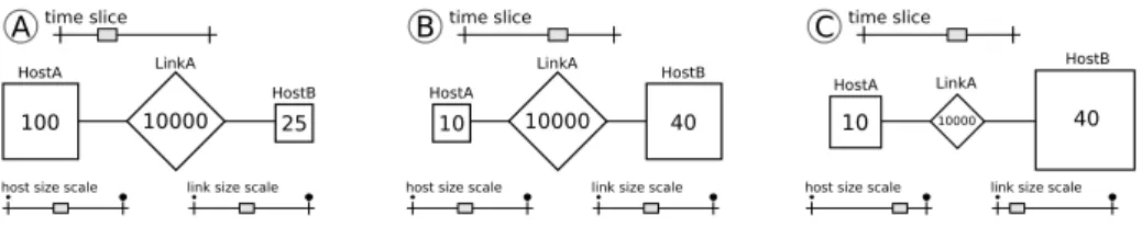
Figure 4 illustrate how the automatic scaling of our implementation works. The values depicted in the figure within the geometric shapes are in Petaflops, for hosts (squares), and in Megabits/second, for links (diamond). For the schemes A and B, the host and link size scales are kept in the middle of their bottom sliders, meaning that the automatic scaling calculated by our implementation is used by default. Consider-ing the data aggregation defined by the time-slice (on top) of scheme A,HostA has a value of 100 Petaflops,HostB is four-times smaller, with 25 Petaflops, and the LinkA has a capacity of 10000 Megabits/second. In scheme B, the change of the time-slice generates different aggregated values for the hosts. This timeHostB has a bigger com-puting power thanHostA. The size of HostB in the representation is the maximum size allowed for objects, meaning that the 40 Petaflops is mapped to a screen size that equals the 100 Petaflops size of scheme A. This is expected since we always map the bigger size of a type of object within a time-slice to the maximum pixel size of objects in the representation. Finally, in scheme C, we show a change in the interactive sliders that configure the independent per-object type scaling. We kept the same time-slice than the one of scheme B, but we configure hosts to be bigger, links to be smaller. The analyst can interactively configured these sliders to focus the analysis on one type of objects, for example, or adjust the scaling according to other requirements.
HostA 100 LinkA 10000 HostB 25 A time slice
host size scale link size scale
HostB 40 LinkA 10000 HostA 10 B time slice
host size scale link size scale
HostB 40 LinkA 10000 HostA 10 C time slice
host size scale link size scale
Figure 4: Three scenarios showing the definition of per-type scales and the operation of scaling interactive sliders.
4.2
Force-directed parameters
As previously discussed in Section 3.3, nodes position are defined by the Barnes-Hut force-directed algorithm. This algorithm has three parameters that affect how fast it converges to a good result:
Charge is a screen size related force value for each nodes. If a node is an aggregated object, its charge is equal to the sum of all nodes it is grouping. These values are used in the Coulomb’s repulsion physical law: higher their value, more disperse the nodes are in the view.
Spring is an attraction force present only between two connected nodes. The value is used by the force-based algorithm in the Hooke’s attraction physical law. There is no difference in the value of this parameter when a node is connected to an aggregated node.
Damping is a value applied after the charge and spring forces are calculated: dimin-ishing the force to calculate the new position of a node. It can be used by the analyst to either make the algorithm converge faster, or to stop it by affecting nodes position.
These parameters are interactively configured through sliders. Figure 5 depicts how charge and spring parameters affect the position of the nodes. They are changed by decreasing the value of charge, making nodes get closer, or decreasing the size of the spring, making only connected nodes get closer. The analyst is able to move nodes using the mouse during the algorithm execution. This is a very important feature since it may for example be important to the analyst to organize nodes according to the their respective locations in the physical world (e.g., machines being on the north of the country would be put on the top of the screen while those being on the south of the country would be put on the bottom of the screen) or to any other convention that makes sense for the situation under investigation. Furthermore, thanks to the dynamic layout algorithm, whenever a node is moved by the analyst, all his neighbors seamlessly follow this node and hence the graph always remains well organized.
charge spring
A Bcharge spring C charge spring
Figure 5: Three situations on how charge and spring parameters affect the layout of the nodes.
5
Case studies and results
In this section, we present two scenarios that illustrate the potential of our visualization technique. The traces used in these case studies were obtained using SMPI [11] in Section 5.1 and the SimGrid simulation toolkit [9] in Section 5.2.
5.1
NAS-DT Benchmark Analysis
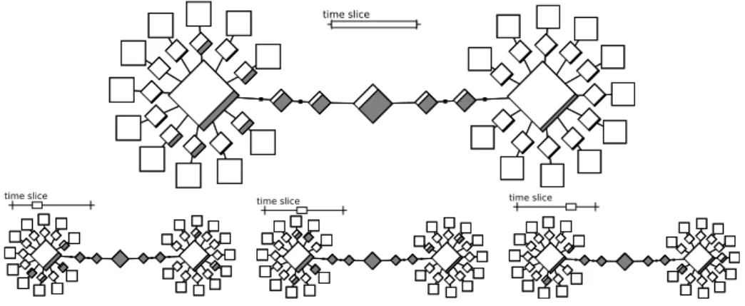
We use the NAS-DT class A benchmark with the White Hole (WH) algorithm to il-lustrate how the topology-based view can be used to detect performance issues in the network. The top-screenshot shown in Figure 6 shows the topology of the resource allo-cation used for the experiment: two homogeneous and interconnected clusters (Adonis, on the left, and Griffon, on the right) each with eleven hosts. Processes are allocated sequentially, starting on the hosts of Adonis cluster.
The top-screenshot of Figure 6 shows the bandwidth used by the DT-A considering the whole execution time. We can see that the links interconnecting the two clusters are almost saturated, suggesting that this might be limiting the benchmark execution. Fur-ther investigation with a smaller time slice (the three smaller screenshots on the bottom) in the beginning, middle and the end of the execution confirms that the interconnecting links are saturated most of the time.
time slice
time slice time slice time slice
Figure 6: Four topology-based views showing the network resource utilization in dif-ferent time slices of the NAS-DT class A White Hole benchmark executed with an ordinary host file.
If we consider more carefully the White Hole algorithm communication pattern and the network topology of resources for this experiment (Figure 6), we can conclude that the sequential process allocation is not the best deployment. In fact, if we bet-ter explore the locality of the communications, we can obtain an overall performance improvement. The communication locality is easy to define for the NAS black hole algorithm by placing the forwarders processes close to the data sources, reducing the communication path and avoiding the interconnection between the two clusters.
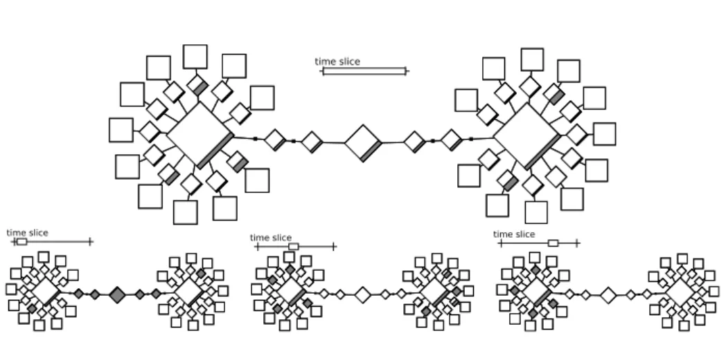
To confirm the locality assumption through the topology-based visualization, we execute again the application using the new deployment. The top-screenshot of Fig-ure 7 already shows a reduced utilization of the links interconnecting the two clusters, which is expected since we are exploring the communication locality within the clus-ters. The small network utilization in the cluster interconnection is caused by the be-ginning of the white hole algorithm execution (as shown by the leftmost screenshot in the bottom of the same figure), when the data for the first levels of white hole hierar-chy are being transmitted. The center and rightmost topologies on the bottom shows the resource utilization for the middle and end of the execution. We can see that the network contention is now placed on the small network links on each of the clusters.
Using the topology-based view, we have reduced the execution time of the NAS-DT class A with the white hole algorithm by 20% with the new deployment. In this small
time slice
time slice time slice time slice
Figure 7: Four topology-based views showing the network resource utilization in dif-ferent time slices of the NAS-DT class A White Hole benchmark executed with a host file designed to explore communication locality.
and known scenario, such an improvement was expected because of the locality char-acteristic of the white hole algorithm and the topology used. Yet, such phenomenon is non-trivial and yet perfectly reflected by such topology-based visualization whereas it would remain invisible in a Gantt-chart visualization.
5.2
Non-Cooperative Master Worker Applications
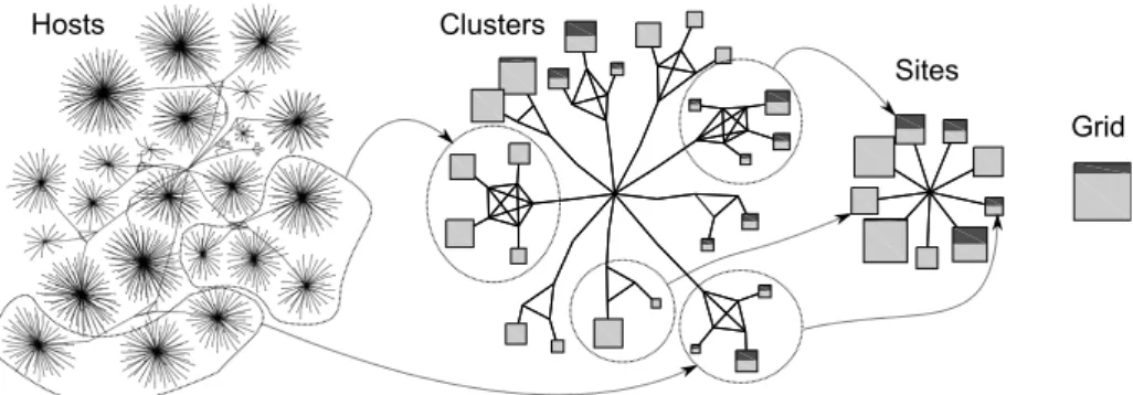
We propose to study the behavior of two master-worker applications competing for resources on a grid. The platform is a realistic model of Grid5000 [7] (with 2170 computing hosts) and the two application servers use the bandwidth-centric optimal strategy described in [4]. More precisely, every time a master communicates a task to a worker, it evaluates the worker’s effective bandwidth and uses this value to prioritize workers’ requests: when several workers request some work, the one with the largest bandwidth is served in priority. Every worker has a prefetch buffer of three tasks that it tries to maintain full to minimize his idleness. In the situation we investigate, the first application is CPU bound while the second has a slightly higher communication to computation ratio. Hence, we expect to observe the following phenomenon: (1) The first application should achieve an overall better resource usage than the second one. (2) We can expect a form of locality from the second application since it will send taks in priority to workers that have a good bandwidth. (3) Although the two applications do not originate from the same sites, they may interfere on computing resources.
Figure 8 illustrates four different levels of spatial aggregation of the Grid5000 plat-form: no aggregation at all with 2170 computing hosts, aggregation of all hosts belong-ing to the same cluster, to the same site, and to the whole grid. These views represent the behavior of the whole platform for a given time slice of the previous scenario. Although none of the three expected phenomena (resource usage in favor of the CPU-bound application, locality of the network-CPU-bound application, interference between the two applications) is visible in the host level representation, they are very visible at the cluster and site level. The site level enables to perfectly quantify how much the CPU-bound performed compared to the network-bound application. This illustrates how essential the multi-scale aggregation technique is to the analysis. The connections we have drawn between the different views to show the aggregation illustrate the fact
Clusters
Sites Hosts
Grid
Figure 8: Four different levels of spatial aggregation of the Grid5000 platform correlat-ing host power, resource usage of both master worker applications and the underlycorrelat-ing network topology (for a fixed time interval).
that layout evolution is smooth when aggregating, which prevents the analyst to get confused when changing scale2.
Clusters
Sites Grid
time slice time slice time slice time slice
t
0t
1t
2t
3A
B C
Figure 9: Evolution across time of platform usage at different scales. Although the sequence of screenshots hinders the perception of evolution compared to a real anima-tion where the graphs are laid out of each others, the workload diffusion across time is visible.
Figure 9 illustrates another feature of the tool, which is the ability to animate through time a given view to follow the temporal evolution of workload distribution. Interestingly, even if the first application is computation bound, one can notice that its resource usage is not uniform through the whole platform. Some sites and cluster are assigned work before others. For example site B is filled quickly in [t0, t2] whereas
site C has to wait until timet2before starting to receive work units. This can easily
be explained by the bandwidth-centric strategy of the servers. Another strategy that would not take such characteristics into account such a simple FIFO mechanism would not exhibit such locality and would exhibit an (inefficient) uniform resource usage all over the time.
2A video footage demonstrating the ease of interaction and the fluidity of such visualization is available
6
Conclusion
With the advent of very large scale distributed systems through complex interconnec-tion network, phenomenon such as locality and resource congesinterconnec-tion have become more and more critical to study and understand the performance of parallel applications. Yet, no visualization tool enables either to handle in a scalable way such workload or to pro-vide deep hindsight into such issues. We think such kind of tool should also need to allow for an interactive and exploratory analysis, knowing how to adapt to the variety of situations that can be investigated. In this article, we explain how we have built a graph-based visualization meeting the previous requirements. We have implemented the technique in an open-source visualization tool called VIVA3and which enables to study the correlation between quantities at a spatial and temporal level. The multiscale capability of this visualization allows the analyst to select the adequate level of de-tails and should be put in relation to what has been done for treemaps [31]. Our new visualization has the same aggregation features but also allows to display topological information. Such multiscale capability is also essential to achieve a scalable visual-ization both in term of fluidity and meaning. Yet, it is not sufficient in itself. The ability to dynamically aggregate and disaggregate groups of resources requires to adjust the layout of the graph, which we have done using a dynamic force-directed graph layout mechanism. Such algorithm allows the analyst to easily reorganize as well readjust the layout in a very efficient way.
Although we have illustrated on non-trivial examples the effectiveness of our pro-posal, a couple of issues still need to be addressed.
• Although the technique we use for aggregating CPU resources is very effective and meaningful since hosts are independent resources, using the same technique for aggregating links is more questionable. Indeed, communication flows typi-cally span several network links and summing non independent resource usage leads to hardly explainable values. Therefore, although locality can be investi-gated, network saturation and bottlenecks are currently difficult to emphasize in aggregated views.
• Aggregating a large amount of values into a single object leads to an important loss of information, which may be harmful. It would thus be interesting to pro-vide additional information (e.g., statistical indicators like the variance our the median) that would allow the analysis to know that particular care should be taken to specific areas that deserve further investigation.
• Currently only a few graphical objects are available in VIVA. Increasing graph-ical object flexibility (e.g.,, pie-charts, histograms, . . . ) would allow to display other kind of information like process states, hardware counters or resource en-ergy consumption. The philosophy of tools like ggplot2 [36] that rely on a gram-mar of graphics to allow the expression of complex views is extremely interesting and is being considered in our future directions.
Acknowledgments
This work is partially funded by the project entitled SONGS (Simulation of Next Gen-eration Systems) under the contract number ANR-11-INFRA-13 of the Agence
tionale de la Recherche(ANR).
References
[1] C. Aguerre, T. Morsellino, M. Mosbah, et al. Fully-distributed debugging and vi-sualization of distributed systems in anonymous networks. In Proceedings of the
International Conference on Information Visualization Theory and Applications, pages 764–767, 2012.
[2] G. Aguilera, P.J. Teller, M. Taufer, and F. Wolf. A systematic multi-step method-ology for performance analysis of communication traces of distributed applica-tions based on hierarchical clustering. In 20th Int. Parallel and Distributed
Pro-cessing Symposium (IPDPS), page 8 pp., April 2006.
[3] J. Barnes and P. Hut. A hierarchical 0 (n log n) force-calculation algorithm.
Nature, 324:4, 1986.
[4] Olivier Beaumont, Larry Carter, Jeanne Ferrante, Arnaud Legrand, and Yves Robert. Bandwidth-Centric Allocation of Independent Tasks on Heterogeneous Platforms. In International Parallel and Distributed Processing Symposium
IPDPS’2002. IEEE Computer Society Press, 2002.
[5] D. Becker, F. Wolf, W. Frings, M. Geimer, B.J.N. Wylie, and B. Mohr. Auto-matic trace-based performance analysis of metacomputing applications. In
Par-allel and Distributed Processing Symposium, 2007. IPDPS 2007. IEEE Interna-tional, pages 1 –10, march 2007.
[6] Robert Bell, Allen Malony, and Sameer Shende. Paraprof: A portable, extensible, and scalable tool for parallel performance profile analysis. In Euro-Par 2003
Parallel Processing, volume 2790 of Lecture Notes in Computer Science, pages 17–26. Springer, 2003.
[7] R. Bolze, F. Cappello, E. Caron, M. Daydé, F. Desprez, E. Jeannot, Y. Jégou, S. Lantéri, J. Leduc, N. Melab, G. Mornet andR. Namyst, P. Primet, B. Quetier, O. Richard, E-G. Talbi, and I. Touche. Grid’5000: a large scale and highly recon-figurable experimental grid testbed. International Journal of High Performance
Computing Applications, 20(4):481–494, November 2006.
[8] Holger Brunst, Daniel Hackenberg, Guido Juckeland, and Heide Rohling. Comprehensive performance tracking with vampir 7. In Matthias S. Müller, Michael M. Resch, Alexander Schulz, and Wolfgang E. Nagel, editors, Tools for
High Performance Computing 2009, pages 17–29. Springer Berlin Heidelberg, 2010.
[9] H. Casanova, A. Legrand, and M. Quinson. Simgrid: a generic framework for large-scale distributed experiments. In 10th IEEE Int. Conference on Computer
Modeling and Simulation, 2008.
[10] M. Chimani, C. Gutwenger, M. Jünger, K. Klein, P. Mutzel, and M. Schulz. The open graph drawing framework. In 15th International Symposium on Graph
[11] Pierre-Nicolas Clauss, Mark Stillwell, Stéphane Genaud, Frédéric Suter, Henri Casanova, and Martin Quinson. Single Node On-Line Simulation of MPI Appli-cations with SMPI. In International Parallel & Distributed Processing
Sympo-sium, Anchorange (AK), United States, May 2011. IEEE.
[12] K. Coulomb, M. Faverge, J. Jazeix, O. Lagrasse, J. Marcoueille, P. Noisette, A. Redondy, and C. Vuchener. Visual trace explorer (vite), 2009.
[13] Jacques Chassin de Kergommeaux, Benhur de Oliveira Stein, and P. E. Bernard. Pajé, an interactive visualization tool for tuning multi-threaded parallel applica-tions. Parallel Computing, 26(10):1253–1274, 2000.
[14] T. Desell, H. Narasimha Iyer, C. Varela, and A. Stephens. Overview: A frame-work for generic online visualization of distributed systems. Electronic Notes in
Theoretical Computer Science, 107:87–101, 2004.
[15] John Ellson, Emden Gansner, Lefteris Koutsofios, Stephen North, and Gordon Woodhull. Graphviz-open source graph drawing tools. In Petra Mutzel, Michael Jünger, and Sebastian Leipert, editors, Graph Drawing, volume 2265 of Lecture
Notes in Computer Science, pages 594–597. Springer Berlin / Heidelberg, 2002. [16] F. Freitag, J. Caubet, and J. Labarta. A trace-scaling agent for parallel application
tracing. In Int. Conference on Tools with Artificial Intelligence, pages 494–499, 2002.
[17] Thomas M. J. Fruchterman and Edward M. Reingold. Graph drawing by force-directed placement. Software: Practice and Experience, 21(11):1129–1164, 1991.
[18] Juan Gonzalez, Judit Gimenez, and Jesus Labarta. Automatic detection of paral-lel applications computation phases. Paralparal-lel and Distributed Processing
Sympo-sium, International, 0:1–11, 2009.
[19] MT Heath and JA Etheridge. Visualizing the performance of parallel programs.
IEEE software, 8(5):29–39, 1991.
[20] Ajay Joshi, Aashish Phansalkar, Lieven Eeckhout, and Lizy Kurian John. Mea-suring benchmark similarity using inherent program characteristics. IEEE
Trans-actions on Computers, 55:769–782, 2006.
[21] Laxmikant V. Kalé, Gengbin Zheng, Chee Wai Lee, and Sameer Kumar. Scaling applications to massively parallel machines using projections performance anal-ysis tool. Future Generation Comp. Syst., 22(3):347–358, 2006.
[22] Thomas Karcher and Victor Pankratius. Run-time automatic performance tun-ing for multicore applications. In Emmanuel Jeannot, Raymond Namyst, and Jean Roman, editors, Euro-Par 2011 Parallel Processing, volume 6852 of
Lec-ture Notes in Computer Science, pages 3–14. Springer Berlin / Heidelberg, 2011. [23] Andreas Knüpfer, Bernhard Voigt, Wolfgang E. Nagel, and Hartmut Mix. Visu-alization of repetitive patterns in event traces. In Proceedings of the 8th
inter-national conference on Applied parallel computing: state of the art in scientific computing, PARA’06, pages 430–439, Berlin, Heidelberg, 2007. Springer-Verlag.
[24] C.W. Lee, C. Mendes, and L.V. Kalé. Towards scalable performance analysis and visualization through data reduction. In IEEE International Symposium on
Parallel and Distributed Processing (IPDPS), pages 1–8. IEEE, 2008.
[25] Barton P. Miller, Mark D. Callaghan, Joanthan M. Cargille, Jeffrey K. Hollingsworth, R. Bruce Irvin, Karen L. Karavanic, Krishna Kunchithapadam, and Tia Newhall. The paradyn parallel performance measurement tool. IEEE
Computer, 28(11):37–46, 1995.
[26] Bernd Mohr and Felix Wolf. Kojak-a tool set for automatic performance analysis of parallel programs. Lecture notes in computer science, 2790:1301–1304, 2003. 10.1007/978-3-540-45209-6_177.
[27] Kathryn Mohror and Karen L. Karavanic. Evaluating similarity-based trace re-duction techniques for scalable performance analysis. In Proceedings of the
Con-ference on High Performance Computing Networking, Storage and Analysis, SC ’09, pages 55:1–55:12, New York, NY, USA, 2009. ACM.
[28] V. Pillet, J. Labarta, T. Cortes, and S. Girona. Paraver: A tool to visualise and analyze parallel code. In Proceedings of Transputer and occam Developments,
WOTUG-18., volume 44 of Transputer and Occam Engineering, pages 17–31, Amsterdam, 1995. [S.l.]: IOS Press.
[29] Lucas Mello Schnorr, Guillaume Huard, and Philippe Olivier Alexandre Navaux. Visual mapping of program components to resources representation: a 3d analysis of grid parallel applications. In Proceedings of the 21st Symposium on Computer
Architecture and High Performance Computing. IEEE, 2009.
[30] Lucas Mello Schnorr, Guillaume Huard, and Philippe Olivier Alexandre Navaux. Triva: Interactive 3d visualization for performance analysis of parallel applica-tions. Future Generation Computer Systems, 26(3):348–358, 2010.
[31] Lucas Mello Schnorr, Guillaume Huard, and Philippe Olivier Alexandre Navaux. A hierarchical aggregation model to achieve visualization scalability in the anal-ysis of parallel applications. Parallel Computing, 38(3):91 – 110, 2012.
[32] Lucas Mello Schnorr, Arnaud Legrand, and Jean-Marc Vincent. Detection and analysis of resource usage anomalies in large distributed systems through multi-scale visualization. Concurrency and Computation: Practice and Experience, 24(15):1792–1816, 2012.
[33] Eric Shaffer, Daniel A. Reed, Shannon Whitmore, and Benjamin Schaeffer. Virtue: Performance visualization of parallel and distributed applications.
Com-puter, 32(12):44–51, 1999.
[34] F. Song, F. Wolf, J. Dongarra, and B. Mohr. Automatic experimental analysis of communication patterns in virtual topologies. In Proceedings of the 2005
In-ternational Conference on Parallel Processing, pages 465–472. IEEE Computer Society, 2005.
[35] John Wilder Tukey. Exploratory Data Analysis. Pearson, Reading, 1977. [36] Hadley Wickham. ggplot2: elegant graphics for data analysis. Springer New
[37] James M. Wilson. Gantt charts: A centenary appreciation. European Journal of
Operational Research, 149(2):430–437, September 2003.
[38] O. Zaki, E. Lusk, W. Gropp, and D. Swider. Toward scalable performance visu-alization with jumpshot. Int. Journal of High Performance Computing
Inovallée