Proceedings of the ASME 2012 International Design Engineering Technical Conferences & Computers and Information in Engineering Conference
IDETC/CIE 2012 August 12-15, 2012, Chicago, IL, USA
DETC2012-70248
REPRESENTATION IN EARLY STAGE DESIGN: AN ANALYSIS OF THE
INFLUENCE OF SKETCHING AND PROTOTYPING IN DESIGN PROJECTS
Catherine Elsen
Department of Mechanical Engineering Massachusetts Institute of Technology
Cambridge, MA 02139 Email: c_elsen@mit.edu
Anders Häggman
Department of Mechanical Engineering Massachusetts Institute of Technology
Cambridge, MA 02139
Email: haggman@mit.edu - contact author
Tomonori Honda
Department of Mechanical Engineering Massachusetts Institute of Technology
Cambridge, MA 02139 Email: tomonori@mit.edu
Maria C. Yang
Department of Mechanical Engineering and Engineering Systems Division Massachusetts Institute of Technology
Cambridge, MA 02139 Email: mcyang@mit.edu
ABSTRACT
Sketching and prototyping of design concepts have long been valued as tools to support productive early stage design. This study investigates previous findings about the interplay between the use and timing of use of such design tools. This study evaluates such tools in the context of team design projects. General trends and statistically significant results about “sketchstorming” and prototyping suggest that, in certain constrained contexts, the focus should be on the quality of information rather than on the quantity of information generated, and that prototyping should begin as soon as possible during the design process. Ramifications of these findings are discussed in the context of educating future designers on the efficient use of design tools.
INTRODUCTION
In the early stages of design, designers and teams of designers are known to employ a range of techniques to represent and explore design concepts, from sketching to physical prototyping and CAD modeling.
Extensive literature can be found on the respective advantages and drawbacks of design tools. For instance, sketches have been shown to be highly useful in supporting the ideation process because of their ability to preserve ambiguity yet allow the expression of key detail, thus enabling designers to explore a spectrum of variants
intuitively. Designers also rely on the development of various types of physical prototypes during early phase design in order to understand a design's functionality, its usability, or its role. In later stages of design, 3D CAD modeling is valued for the dynamic and rendered visualizations it offers as well as the ability to run simulations and computational analysis.
Though research has been conducted on the value of individual design tools and techniques, there is currently no single "best practice" for determining when and how designers should employ these various representations to explore and evaluate design concepts. This paper operates under the assumption that using the wrong representational technique at the wrong phase of design or in the wrong way can lead to decreased design quality and efficiency and poor use of precious design resources during this critical phase.
This paper explores the notion of optimal timing and
guidelines for use of two of these design tools, namely
sketches and physical prototypes.
This study is conducted in the context of design project in a graduate class of mid-career professionals, and examines the interplay of both of these design tools to observe if: • the way students currently use both design tools, in
terms of timing and quantity of information generated, can influence the quality of design outcome;
• we can, as researchers and teachers, develop guidelines for “best practices” in using these design tools.
RELATED WORK
1. Sketches as Design Tools
There is abundant literature on the advantages of sketches (and, to a lesser extent, limitations) since they have always have been considered the most natural, low cost and widely used way to generate concepts during the preliminary design phase.
Sketching is indeed known as a fast, intuitive technique to represent the opportunistic flow of ideas [1]. Sketches reduce cognitive load and provide mnemonic help [2, 3]; they enable efficient and broad problem/solution exploration with minimal content [4, 5] and spur unexpected discoveries by keeping the exploration dynamic (“see-transform-see process”, [6]). They also enable ambiguous, highly personal content [7] that permits adaptability to all kinds of communicative purposes [8, 9]. The contents of sketches can be implicit and have limited structure (making them difficult to interpret); their rigid and static aspects make them “old-fashioned” compared to more reactive representations [7].
Sketches can also be analyzed in regard to their applications or content. Several “types” of drawings are recognized (thinking sketch [10]; communicative or talking sketch [11]; reminder sketch [12]). Do and Gross [13] and Lim [14] define various taxonomies for sketches, while others [15, 16] try to determine underlying principles for sketching. At a more detailed level, McGown, Green and Rodgers [8, 17] are interested in the graphical complexity of traces.
Specific aspects of hand-generated sketches, across all domains, have generally been analyzed separately from those of other design tools like Computer-Aided Design tools or physical prototyping. Some research exists comparing some of these tools [18, 19], but there is little research that considers their respective uses in the context of either design practice or the design classroom.
2. Prototypes as Design Tools
Prototypes may vary from rough to very detailed, and are known to facilitate the progressive exploration of design ideas, the communication of concepts as well as the understanding of user-experiences [20]. They are powerful tools to construct knowledge, to raise issues, and are more and more used inside various professional environments for their potential to maintain motivation through constant learning and sense of progress [21]. These authors observe that “with the increasing widespread adoption and
proliferation of design practices […], low-fidelity prototyping [is] under increased scrutiny by non-designers. Therefore, a more sophisticated and empirically validated explanation for why a practice works, including both anticipated and non-anticipated outcomes is needed” (pp.
78-79), which underline the necessity to quickly foresee if there is, indeed, best practices in generating such types of representations.
When it comes to prototypes, one of the most frequent questions considered concerns their suggested level of fidelity. After categorizing these various levels of fidelity and developing new terminologies [22 – 24], some research underlines how simple prototypes, with fewer parts and requiring less building time, seem to lead to more efficient processes and outcomes [25]. Levels of efficiency in using prototypes in many cases seem to be linked to the type of audience they refer to as well as the time constraints they have to adapt to [23], and phenomena like the “Sunk Cost Effect” (or the “reluctance to choose a different path of action since significant money, time and effort is invested”) may explain fixation on premature concepts [26] and may be avoided by building multiple types of prototypes [27].
As for studies of side-by-side comparisons of prototypes with other design tools, and their respective contributions to the design process, Christensen and Schunn [28] showed that prototypes are more prone to generate within-domain analogies, whereas sketches are better to stimulate between-domain analogies. Without being sure about how these types of analogies impact the nature and quality of design output, the authors nevertheless tentatively suggest “to use sketching and idea generation unsupported
by external representation in the early stages of design and, perhaps, to postpone prototyping until several promising concepts have been developed” (p. 37). These authors do not
offer empirical evidence that such timing is indeed better for the overall quality of the designed object. It seems that more research has to be done to better understand how, when and why prototypes should be used for effective preliminary design.
3. Timing and Instructions of Use
While specific qualities of design tools have been well documented, when is the best time to use those tools is generally less studied. In the area of sketches, Yang found statistically significant, positive correlations between the time students spent on “design” (including the sketching phase) and the final grade they received for their project [25]. Time spent on early sketching of dimensioned drawings was found to correlate with better design outcomes.
In terms of prototyping, Yang suggests that the time spent on early building could correlate positively with design outcome. It is at least the case for one of the classes she studied, while the trend seems less clear for a second group of students. Acuna and Sosa [29], by suggesting that a higher investment on sketching and model-making time tends to be linked to more original solutions, share the same idea but do not mention when this timing should be preferentially scheduled.
In terms of how both representation techniques should be used, design tools’ advantages, as summarized above, tend to encourage some behaviors.
The task- and cost-efficiency of low-fidelity (or throwaway) prototypes during preliminary design, built very quickly with materials at hand, is well known in design practice. The ambiguity, fluidity and range of sketches, on the other hand, are qualities one should try to adopt. In terms
of types of drawings, two-dimensional drawings, such as sections and elevations, are used 80% of the time during ideation in fields like architecture [30], while 3D perspective sketches are more prevalent in fields like product design.
Other design techniques that have been considered include the creative effort a designer should put forth during ideation. Houde and Hill recommend making many rough prototypes, and consider how each of them can respectively support the “look and feel”, “role” or “implementation” aspects of the product being designed [23].
Previous work on sketching and annotation suggests that they are highly efficient ways to generate ideas during creative sessions (individual or collective), and that the more fluidly and quickly ideas are multiplied, the better. However, contradictory results can be found in the literature when it comes to the benefit of generating as many concepts as possible. Much research on productive creative techniques, such as brainstorming or divergent thinking, argue that quantity eventually leads to creative quality during preliminary design (Osborn, 1957; Diehl & Stroebe, 1987; 1991, all quoted by [31]). Other observations suggest caution: Sutton and Hargadon find evidence of trade-offs between quantity and creativity in organizational contexts (1996, quoted by [31]), and further research shows that performance and the number of prototypes cannot immediately be correlated [27]. Reining and Briggs [32] suggest alternative models to link the number of ideas with the number of good ideas (Figure 1).
Figure 1. “THREE POSSIBLE SHAPES FOR THE IDEATION FUNCTION”, SOURCE [32].
Litchfield underlines that several researchers emphasize that some distinction should be made between “ideas” in general and “good ideas,” provided that one can determine a robust way to differentiate context-dependent ideas [31].
RESEARCH QUESTIONS
Previous work was concerned with design tools’ respective characteristics as well as what can be considered “best practices” for using them. We have seen how sketches and annotations are crucial for generating ideas, and how their use early on in the process correlates with good design, but it is still unclear how many ideas should be generated,
and more specifically what type of ideas or information should preferentially be supporting “sketchstorming” (i.e., concept generation through sketching, annotating and brainstorming).
In contrast, more evidence is needed as to when prototypes should be used during preliminary design.
The high level aim of this work is the definition of best practices for using design tools and more specifically, when and how information should be generated. This paper poses the two following research questions:
• does a certain type of information generated during preliminary design correlate with design outcome? • does the time spent on early prototyping correlate with
design outcome?
METHODS 1. Context
This work draws on data generated by 68 engineers and designers with an average of 8 years of work experience enrolled in a semester long, graduate level design course. These students worked in 13 teams and were asked to tackle the general theme of “healthcare and healthy living”. In this specific context, they were asked to define a user need through firsthand observation, to generate design concepts, and to fabricate a working prototype using a budget of $800.
The semester was structured into 7 time periods (or TP’s) of about 2 weeks. These time periods sometimes corresponded to project milestones, including the selection of 3 potential user groups at the end of TP 1, reporting of 3 preliminary concepts at the end of TP 2 and the evaluation of drawings in the middle of TP 5. These milestones structured the design process, though students were still free to proceed as they wished.
2. Type of Collected Data and Final Grading
The evolution of each team's projects was captured through online time sheets, individual sketch notebooks, and brief reports that accompanied built prototypes.
Time sheets were completed every two weeks, and students were asked to describe how they spent their efforts throughout the project (time spent on the various phases of the design process, on prototyping, on working in notebooks, on doing end-users’ analysis and so on).
In addition, students were required to scan and return at least 3 significant (and new) sheets from their personal notebooks every 2 weeks. Some students submitted more than the 3 sheets required, and others sometimes didn’t submit them at all. A total of 512 sheets was collected, bringing together 721 sketches, 23 screen captures of 3D CAD models as well as an uncounted number of diagrams, doodles, annotations and tags.
Brief reports were required each time a team constructed a prototype. These reports aimed at understanding how the prototype helped in pushing the design further on, in understanding functioning as well as errors and omissions or in generating open questions and surprises. Each team built
an average of 3 to 5 prototypes (including the final one) during the semester.
At the end of Time Period 7, the final projects were demonstrated before a panel of 12 industry professionals, 8 of whom had not seen the projects or met the students before. Intermediary and final project presentations counted for 40% of the final grades, another 40% of grading was attributed to team assignments (determining market opportunities; assessing users needs, building prototypes or developing a business case for the design) while the remaining 20% were allotted to individual contribution (notebooks, timesheets, etc.) and team contribution (anonymous peer evaluation throughout the semester).
3. Analysis Methodology
A two-step methodology was followed in analyzing the data. The first step consisted of globally verifying the data consistency. Indeed, we anticipated that students might not have completed and returned their timesheets, reports and notebook sheets as regularly as required, and therefore we expected some irregularities in the way data had been collected, time period by time period. It was thus necessary to sort out which data was really usable. Due to somewhat low agreement between jury members, we also looked at different methods of clustering the teams.
Once the coherence of the data and the evaluation process had been tested, the second step (leading to our main results) included two different approaches.
The first approach consisted of analyzing correlations between time spent on specific activities and whether a team belonged to the “second tier” or “top tier” category.
The second one consisted of clustering and analyzing the type of information generated at each step of the design process in order to test if a positive correlation, in favor of a better design outcome, could be found in regard to a specific behavior. In order to do that, we carefully examined the information provided in the notebooks as they were considered sufficiently representative of the overall work done by each team. A preliminary qualitative analysis of the content of these notebooks showed that the information (i.e. sketches, doodles, check-lists, annotations, calculations, pictures…) mainly related to three types of items:
(i) definition of different types of end-users (clustered in User Groups, or UG);
(ii) definition of different problems these end-users encounter (clustered in Problems, or P); (iii) generation of concepts (products or services)
tackling these end-users’ problems (clustered in Concepts, or C).
Observing this, we decided to structure the notebooks information in hierarchical diagrams (or “trees”) following Kim, Bracell and Wallace’s methodology [33], but focusing on high-level information (User Groups, Problems and Concepts) rather than on the detail design information the authors exploit for their software, DRed. The first three layers of these trees respectively referred to each of the three categories (User Groups, Problems and Concepts), while
further layers would connect information about how the concepts had been developed, the various decisions taken, the issues raised etc. An example of such a tree appears in Annex A. Each item (node) corresponds to a different piece of information, chronologically connected to parent items referring to the same UG, P or C. This way, each tree presents a global view of how and why concepts were generated, explored, sometimes abandoned or further developed.
Complementary information was eventually added to each tree, in order to more precisely reflect the context in which each item had been generated. For instance, a color was assigned to each student of each team, and a type of line to each time period, in order for each item to be easily and visually connected to its author and chronological emergence. When identical items re-appeared in several notebooks, we concluded that the information was generated during a collective work session, and was consequently colored differently. Additional information was also noted next to each item, such as the number of sketches directly referring to it (added in an extra bubble), the fact that the item was issued from end-user feedback (in italics) or the fact that this particular item was part of the final chosen concept (extra-circle around the node).
Creating a chronological tree for each team made it easier for the three researchers to independently and systematically proceed with consecutive analysis and counting of the nodes and connections.
RESULTS AND DISCUSSION 1. Data Consistency
1.1 Ranking of Teams In order to tackle our two research questions (i.e. finding out if the type of information generated during the preliminary design phase and/or the time spent on early prototyping correlate with the design outcome) we had to assess the quality of the final projects for each team. Three sets of data were available: (i) the ratings on many different criteria by each reviewer, (ii) the overall ranking of each team by each reviewer, performed after all ratings had been made (but completely independent from those ratings), and (iii) a final, single set of rankings by the judges as a whole after group discussion (individually ranking changing substantially after they met as a group and discussed).
Ratings showed how each project performed considering different criteria, but to assess the overall performance we needed to determine a weighting for each of those criterion. Simulation of the various possible weightings was performed to determine the sensitivity of the overall rating with respect to the weighting1. However, the
1 Note that aggregating the rating information into a single overall rating for each team requires one additional step to compare it with ranking information. To map the rating of different criteria by each reviewer, we must aggregate the rating to different criteria into a combined rating of each reviewer, followed by aggregating the combined rating of each reviewer into a final single rating. On the other hand, ranking is already implicitly aggregated by the reviewer into a single combined ranking and we just need to combine each reviewer’s ranking into an aggregated ranking. This
consistency for reviewer’s ratings for each of criteria was poor (represented by Krispperdorff’s Alpha values ranging from 0.07 to -0.03), there was no optimal linear weighting that improved inter-rater reliability of the aggregated ratings. This is most likely caused by the difference in reviewers’ expertise and demonstrates the difficulty in assessing the quality of a product. Because the overall rating turns out to be sensitive to the weighting, individual ranking information was used to quantify the quality of the teams in this paper. Note that these ratings and ranking are collected separately from each reviewer.
The rankings reflected each judge's assessment of the teams' overall performance. However, one limitation of using the ranking is that it differed somewhat from the ratings by the reviewers.
For the ranking data, we used the mean, median and two types of Borda counts for each team to sort them. Ideally, this aggregation of rankings should be the same, regardless of which sorting criteria was chosen. For example, if every reviewer picked team A as their first, team B as their second and team C as their third choice, then no matter what the aggregation scheme was applied, the aggregated ranking would always order the teams A, B and C (from best to worst).
However, in this case, such a pattern did not emerge, and the final order of the teams from best to worst depends on which of the four sorting methods is used. This demonstrates that in this particular context of selection, the perceived value of the final product is highly dependent on the panel of judges (because of their inter-personal subjectivity or because of the complexity of the evaluation process).
Given the fact that the aggregated team rankings are so dependent on the aggregation scheme, instead of trying to rank all teams individually, we tried to look for some consensus among clusters of teams, i.e. if the majority of reviewers may have thought, for instance, that teams A and B were ranked as top tier, teams C and D as middle tier, E and F as bottom tier and so on. In order to assess this, we ran a cluster analysis whose results depend on the particular chosen algorithm (K-mean, Ward’s, etc.) and on the definition of distances. We applied sensitivity analysis with respect to each algorithm choice and distance to determine if distinct clusters of teams could emerge. Our results showed that two distinct clusters of teams (“second tier” and “top tier” teams) could indeed be found, while smaller size clustering became too sensitive to the distance definition and algorithm choice. This showed that jury members did agree on which teams were “second tier” and which teams were ”top tier”, but weren’t able to find a consensus on how a particular team performed on an ordinal scale within these two groups.
additional step makes rating more sensitive to aggregation schemes. This aggregation problem can also be linked to the fact that the chosen weighting for each criterion depends on each reviewer.
1.2 Completion of Timesheets The timesheets students completed every two weeks proved to be a rich resource for our research, especially for testing correlations between time spent on different activities and the design outcome. The overall response rate for the timesheets was 85.5%.
Noticing this, we ran a few simulations to evaluate if the missing information could be imputed without impacting the overall results. Two sets of data were made: inside the first one, called “original data”, missing information was just left as “holes” inside the data set. In other words, if students didn’t return information about the time spent on some activities, we just assumed they worked 0 hours on those. In the second set, called “imputed data”, we assigned values for the missing data by calculating an average effort level for each student: comparing each student’s work time to the work times of his/her teammates in general, we were able to extrapolate how much time the fragmentary student must have worked in reality. For example, if a specific student always reported working twice as much as his/her average team members, but didn’t submit a report for the third Time Period, we assumed that this student did twice as much work as the average teammate during this third TP.
We will see below how, by running different correlation tests between time spent and overall success of each team, we were able to confirm that both methods (filling in the timesheets or not) produced similar outcomes and final results were not impacted. Thus, our analysis is robust to imputation methods.
2. Results
2.1 Impact of the type of information on design outcome Once the main concerns about data
consistency were settled, we ran a preliminary, qualitative analysis in order to evaluate how the type of information submitted could impact the overall team success.
The contents of the notebooks were our main data set for this particular question. Could this simple medium, a few sheets of paper, contain the solution to a good design outcome?
The first test we did, before diving deeper into the type of information contained in these notebooks, was to evaluate if the quantity of sketches could be linked to the design outcome. Being such a quick and intuitive activity, preliminary qualitative analyses of timesheets showed that students had difficulties evaluating the time they spent on sketching and drawing tasks. Furthermore, sketches can be created rather quickly, which means that timesheets may not be the optimal way to evaluate sketching effort. Instead, we looked at how many sheets of paper were filled and how many sketches each team generated.
Figure 2 shows the total number of sheets each team submitted (collectively) at each Time Period. The five “top tier” teams are labeled “A” to “E”, while the eight remaining “second tier” teams are respectively labeled “F” to “M”. No specific correlation tests were run in this case: visual inspection indicates that there is no specific link between the
number of sheets returned and the overall success of each team.
Figure 2. TOTAL NUMBER OF NOTEBOOKS SHEETS SUBMITTED BY EACH TEAM, PER TIME PERIOD.
Notebooks contained everything from checklists, text, doodles, quick annotations, to dimensioned drawings and calculations. The quantity of sheets generated could therefore not be linked to any specific type of information generated. In order to refine this approach, we then focused specifically on free-hand sketches, which were in this case mainly obvious representations of generated concepts (with very few sketches of existing products or problems).
Figure 3 shows the total number of sketches submitted by each team, this time during the whole semester. If a minimal number of sketches might contribute to the overall success of the five “top tier” teams, no clear trend could however be found in this graph, either. At least for teams “I”, “K” and “M”, one could underline that generating as many conceptual sketches as possible does not seem to have an impact on the quality of the final design outcome. This is consistent with the findings of Yang [34], which observes that early-dimensioned sketches correlated with outcome, rather than overall sketch quantity.
Figure 3. TOTAL NUMBER OF SKETCHES SUBMITTED BY EACH TEAM, DURING THE WHOLE SEMESTER.
After assessing that quantity (quantity of work done in general, quantity of sketching concepts in particular) does not lead, in our specific case, to a minimum level of quality (contrary to what is suggested by other research), we wanted to analyze more deeply if certain types of information could nevertheless correlate with a good design output.
Starting from the trees built for each team, three researchers independently counted three specific values: (i) the number of User Groups generally considered all along the design process (directly or not directly linked to the final product); (ii) the number of problems (encountered by the chosen end-user group) that were tackled, at least partially, by the final design; and (iii) the number of concepts generated that appeared in the final design. As a specific assignment required the students to quickly focus on one specific User Group (for example, each final product couldn’t expand too much toward other potential end-users), the decision was taken to keep an overall point of view on the number of User Groups generated, in contrary to the Problems and Concepts.
Figure 4 shows the average of the User Groups’ counted by the three independent researchers, for each team.
Figure 4. AVERAGE OF USER GROUPS GENERATED BY EACH TEAM, DURING THE WHOLE DESIGN PROCESS.
The five “top tier” teams (A to E) imagined, on average, between 7 and 22.3 different User-Groups, while the eight “second tier” teams (F to M) rank from 7 to 38.3 different User-Groups.
Considering these preliminary results, we tried to determine an optimal cutoff for the decision boundary for binary classification, between second tier and top tier teams, using the number of User Groups as a single predictor. In other words, we tried to find any cutoff number of User Groups that would separate the teams between “low value” and “high value” and that would create a statistically significant contingency table, this table translating a statistically significant trend.
Results showed that the best Kolmogorov-Smirnov (K-S) statistics we could obtain was 0.35, for a ranking cutoff at 11.67 (Table 1). Even if the K-S value is fairly robust, Fisher's Exact Test shows a p-value of 0.2929 for this particular confusion matrix, and it is thus not statistically significant. No clear trend can be concluded from this approach, certainly because of the limited sample size.
Table 1. BEST CONTINGENCY TABLE FOR A RANKING CUTOFF AT 11.67.
Number of top tier teams
Number of second tier teams
Low value ( < 11.67) 3 2
High value ( > 11.67) 2 6
We then attempted to fit a logistic regression by treating this data as a classification problem again (logistic regression rather than linear regression is used because we are determining the likelihood that a particular team will be classified as a “second tier” team given the number of User Groups generated). We assigned “top tier” teams a “0” value and “second tier” teams a “1” value. As with previous analysis, in this case, the coefficient in front of User Group is 0.07091 (which is positive rather than negative), implying that as more User Groups are explored, the more likely the team will be classified as a lower performing team. When we looked at a 95% confidence interval for the coefficient, it appears to be between [-0.056, 0.276]. Because this confidence interval covers both positive and negative values, this result is not statistically significant in the global direction of the trend.
Although neither cutoff and contingency table or logistic regression approaches showed strong, statistically significant results, the general trend nevertheless tends to go in the opposite direction of the generally accepted theory: the smaller the number of items (here, User Groups) generated, the better the ranking. In coherence to our results in terms of number of sheets and sketches generated, an extensive generative session about all possible end-users in the general field of “healthcare and healthy living” does not necessarily correlate positively with better design outcome.
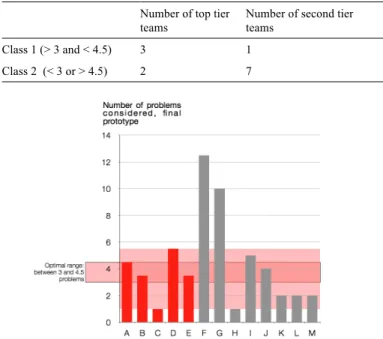
Similar analyses have been conducted considering the number of Problems and Concepts generated (and appearing in the final design). Again, in both cases, there is no statistically significant trend observed. Unlike the number of User Groups, the emergent trend does not seem to be linear, though is not significant. There seems to be an optimal range of problems and concepts to generate (i.e., too few or too many problems or concepts is not good). Thus, rather than having 1 decision boundary, we implemented 2 decision boundaries to determine the expected class for each of the teams.
For the number of Problems, results showed that the best Kolmogorov-Smirnov (K-S) statistics we could obtain was 0.475, for a cutoff inferior or equal to 3, and superior to 4.5 (see Table 2), i.e. results showed that the optimal range of Problems one should generate, in this case, is between 3 to 4.5, anything less or more tending to push the team towards the worse performing group (Figure 5). If we look at Figure 5, there are indeed 3 “top tier” teams and one “second tier” team that are within the range of 3 to 4.5, while two “top tier” teams and 7 “second tier” teams lie outside of that range. This corresponds to the elements in the contingency table (see Table 2).
Table 2. BEST CONTINGENCY TABLE FOR A CUTOFF AT ! 3 AND > 4.5 PROBLEMS
Number of top tier teams
Number of second tier teams
Class 1 (> 3 and < 4.5) 3 1
Class 2 (< 3 or > 4.5) 2 7
Figure 5. AVERAGE OF PROBLEMS GENERATED BY EACH TEAM, OPTIMAL RANGE CALCULATED: BETWEEN 3 AND 4.5
PROBLEMS.
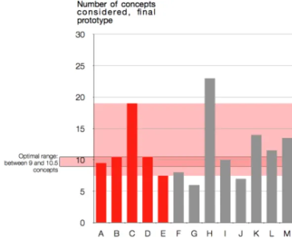
As for the number of Concepts, results showed that the best Kolmogorov-Smirnov (K-S) statistics we could obtain was also equal to 0.475, for a cutoff inferior or equal to 9, and superior to 10.5 (Table 2). Results showed that the optimal range of Concepts one should generate is between 9 to 10.5, anything less or more also pushing the team towards the worse group (see Figure 6).
In these two cases, we did not attempt to fit a logistic regression (because it assumes a monotonic trend) or other nonlinear regression models, because it tends to over-fit due to the limited sample size (only 13 data points). The fractions in the numbers of Problems and Concepts come from the limited disparity between the different author’s accounting. Table 3. BEST CONTINGENCY TABLE FOR A CUTOFF AT ! 9 AND > 10.5 CONCEPTS
Number of top tier teams
Number of second tier teams
Class 1 (> 9 and <= 10.5) 3 1
Figure 6. AVERAGE OF CONCEPTS GENERATED BY EACH TEAM, OPTIMAL RANGE CALCULATED: BETWEEN 9 AND 10.5
CONCEPTS.
For both problems and concepts, it seems that generating higher quantity, as generally observed in literature and taught in design classes, does not systematically lead to the best final ranking. Three suggestions are made to explain these non-traditional trends:
1) given the limited time provided in such specific education contexts, students need to generate a decent number of items (number of Problems potentially encountered by the chosen end-user; number of Concepts) but at the same time, should be weary of wasting time generating meaningless items;
2) there could be a link between the number of Problems/Concepts generated and the level of similarity of those Problems/Concepts, i.e. we can guess that students should not develop too many similar items on similar topics;
3) it has been said that “quantity breeds quality” [35], but it may be that there are diminishing returns on quantity after some minimum value is meant.
Considering the selection of the three preliminary concepts at the end of Time Period 2, two additional results were provided by the analysis of the timesheets. Looking at the imputed data (i.e., the data where missing information was filled-in), there was a negative significant correlation between the percentage of time spent on Concepts’ selection during the second Time Period, and the overall ranking. This significant trend appeared when considering both the percentage of time spent on Concept Selection, in time period 2, out of the total time spent on concept selection throughout the whole semester (Rho -0.634 / P.Val 0.02) and the percentage of time spent on Concept Selection out of the total time spent on all activities during the whole semester (Rho -0.592 / P. Val 0.033).
Overall, teams that spent more time debating and picking their three preliminary concepts did worse than teams who chose more quickly.
2.2 Relationship between the time spent on early prototyping and the design outcome For
both data sets (original, i.e. not filled-in, and imputed, i.e. filled-in) we looked at five different ways to correlate design outcome with the time spent on building prototypes:
1) Absolute time spent on prototyping vs. overall success;
2) Cumulative time spent since the beginning of the course vs. overall success;
3) Percentage of time spent on prototyping out of the total time spent on all activities during a certain time period, vs. overall success. For instance, if a team worked 100h total during Time Period 3, and if they spent 10h on prototyping during the same TP, then we compare “10% of time spent” with the overall success;
4) Timing of prototyping, regardless of how much time they spent on prototyping throughout the course in total. We correlated the percentage of their total prototyping time during a specific time period.
5) Looking at the percentage of total time spent on prototyping during specific time periods, and comparing this ratio with overall success (so if a team spent 4000 hours in total on the project, and if they spent 40 hours on prototyping during Time Period 5, then we compare the 1% of time spent on prototyping with the success of the team).
Considering specifically the time spent on prototyping, we ran a Spearman correlation analysis and compared our results for the times spent in the five different ways mentioned above. We found that, regardless of the chosen data set (original or imputed), prototyping in Time Periods 1, 2 and to some extent 3, correlates with a better overall ranking for the concerned teams (results are positively and statistically significant, see Tables 4 and 5). In other words, the sooner the teams prototype, the better the team performs. This result supports Yang’s previous observations [25]. Table 4. IN BOLD, STATISTICALLY SIGNIFICANT CORRELATION BETWEEN TIME SPENT ON PROTOTYPING (DURING SPECIFIC TIME PERIODS) AND DESIGN OUTCOME. ORIGINAL DATA.
Table 5. IN BOLD, STATISTICALLY SIGNIFICANT CORRELATION BETWEEN TIME SPENT ON PROTOTYPING (DURING SPECIFIC TIME PERIODS) AND DESIGN OUTCOME. IMPUTED DATA.
CONCLUSION
This paper explored whether the type of information generated during preliminary design and/or the time spent on early prototyping correlates with design outcome.
Research in the field of design, architecture, engineering and creativity in general often involves jury members to evaluate the overall quality of a project (in terms of creativity, quality, team efficiency etc.), and in design practice, designs are often evaluated by multiple stakeholders. Our study brought into focus the nuances in assessing the consistency of these ratings and rankings, since it is challenging for humans to objectively deal with complex evaluation processes.
This paper moreover brings several other results in light:
1) In this study, teams that generated the most design information in the form of sketches and potential end-user groups did not also have a better design outcome, contrary to some current literature. In our case, even if results were not strongly statistically significant, the overall trend suggested that the smaller the number of User Groups generated, the better the overall ranking of the teams;
2) Rather than developing as many Problems and Concepts as possible, our results suggests that design teams should focus on meaningful and non-redundant items. In the specific educational context we looked at, there seems to be an optimal range of items one should develop (between 3 to 4.5 Problems and between 9 and 10.5 Concepts);
3) Statistically significant results generated from analyzing the timesheets showed that the more time teams spent on selecting the (in this case, three) preliminary concepts, the worse they performed;
4) Finally, the timesheets also provided statistically significant positive correlations between the time spent early on prototyping and the overall design outcome.
The results in the paper moreover suggest ways to rethink how mid-career professionals are taught design, and more broadly, how students should be guided through project-based design projects.
FUTURE WORK
Future work will consider this type of analysis of design process in other contexts, including controlled studies and in situ studies of design teams in practice. What role does idea generation, sketching, and prototypes play in these other types of contexts? Each of these strategies have their own trade-offs in terms of the amount of data we'll be able to obtain and the realism and length of design tasks that may be tested.
Future work will develop new, finer tuned instruments for collecting data from other design courses as well as from design projects in industry. Of particular interest will be the formulation of approaches for reconciling design assessment by design juries and groups of stakeholders.
Comparisons with future classes will also enable us to consider the impact of the specific contexts with more
granularity, including problem definition, team structure, and the role of different stakeholders on the level of creativity and quality of design output.
Finally, further analysis will be done on this specific set of data. We will try to capture how team cohesion (on User Groups, Problems and Concepts) impacts the design outcome, by looking at how many teammates have explored similar ideas, individually. Further research on the level of similarity between the different items generated will also be done.
ACKNOWLEDGMENTS
The work described in this paper was supported in part by the National Science Foundation under Awards CMMI-1130791 and CMMI- 0830134; by the IK Investment Fund / The League of Finnish American Societies, the Fulbright-Technology Industries of Finland Grant co-funded with the Federation of Finnish Technology Industries, the Finnish Foundation for Technology Promotion, the Finnish Cultural Foundation, the Emil Aaltonen Foundation grant and by the Belgian American Education Foundation fellowship. The opinions, findings, conclusions and recommendations expressed are those of the authors and do not necessarily reflect the views of the sponsors.
REFERENCES
[1] Visser, W. 2006. The cognitive Artifacts of designing. London: Eds Lawrence Erlbaum.
[2] Suwa, M., Purcell, T., and Gero, J. 1998. “Macroscopic analysis of design processes based on a scheme for coding designers' cognitive actions”. Design Studies,
19(4), 455-483.
[3] Bilda, Z., and Gero, J. 2005. “Does sketching off-load visuo-spatial working memory?” Paper presented at the Studying Designers '05, Sidney, Australia.
[4] Cross, N. 2000. Strategies for Product Design, Third
Edition: The open University, Milton Keynes.
[5] Ullman, D. G., Wood, S., and Craig, D. 1990. “The importance of drawing in the mechanical design process”. Computers & Graphics, 14(2), 263-274. [6] Schön, D. A., and Wiggins, G. 1992. “Kinds of seeing
and their functions in designing”. Design Studies, 13(2), 135-156.
[7] Leclercq, P. 2005. “Le concept d'esquisse augmentée”.
Proceedings of SCAN 2005, Séminaire de Conception Architecturale Numérique, 16.
[8] McGown, A., Green, G., and Rodgers, P. A. 1998. “Visible ideas: information patterns of conceptual sketch activity”. Design Studies, 19(4), 431-453.
[9] Détienne, F., Boujut, J., and Hohmann, B. 2004. “Characterization of collaborative design and interaction management activities in a distant engineering design situation”. In F. Darses, R. Dieng, C. Simone & M. Zacklad (Eds.), Cooperative systems design:
scenario-based design of collaborative systems (pp. 83-98): IOS
[10] Tovey, M., and Richards, C. 2004. “Computer representation for concept design and maintenance instruction”. Paper presented at the TMCE 2004, Lausanne.
[11] Ferguson, E. 1992. Engineering and the mind's eye. Cambridge, MA: MIT Press.
[12] Schenk, P. 1991. “The role of drawing in the graphic design process.” Design Studies, 12(3), 168-181.
[13] Do, E., and Gross, M. 1997. “Inferring design intentions from sketches: an investigation of freehand drawing conventions in design”. Paper presented at the CAADRIA 1997, Taiwan.
[14] Lim, C. 2003. “An insight into the freedom of using a pen: Pen-based system and pen-and-paper”. Paper presented at the ACADIA 2003 - 22nd ACADIA Conference: Connecting Crossroads of digital discourse. [15] Do, E. 1995. “What's in a diagram that a computer
should understand”. Paper presented at the CAAD Futures '05, Singapour.
[16] Dessy, J. 2002. De l'emploi des symboles dans les esquisses architecturales. PhD Thesis, Université de Liège, Liège.
[17] Rodgers, P. A., Green, G., and McGown, A. 2000. “Using concept sketches to track design progress”.
Design Studies, 21(5), pp. 451-464.
[18] Wojtczuk, A. and Bonnardel, N. 2010. “Externalisation in design: Impact of different tools on designers’ activities and on the assessment of final design”. Proceedings of ECCE 2010 Conference, 6 p.
[19] Verdonck, E., Weytjens, L., Verbeeck, G., and Froyen, H. 2011. “Design Support Tools in Practice. The Architects' Perspective”. Paper presented at the CAAD Futures 2011: Designing Together, University of Liège. [20] Buchenau, M. and Suri, JF. 2000. “Experience
prototyping”. DIS’00, ACM, New-York, pp. 424-433 [21] Gerber, E., and Carroll, M. 2012. The psychological
experience of prototyping. Design studies 33, pp. 64-84,
Elsevier.
[22] Wong, YY. 1992. “Rough and ready prototypes: lessons from graphic design”. In proceedings of CHI’92, ACM PRESS, pp. 83-84.
[23] Houde, S. and Hill, C. 1997. “What do prototypes prototype?” in Handbook of Human-Computer
Interaction (2nd Ed). M. Helander, T. Landauer and P.
Prabhu (eds), Elsevier Sciences, BV, Amsterdam. [24] Ullman, DG. 2003. The mechanical design process,
McGraw-Hill, New-York, NY.
[25] Yang, MC. 2005. A study of prototypes, design activity,
and design outcome. Design Studies, 26, pp. 649-669,
Elsevier.
[26] Viswanathan, V., and Linsey, J., “Design Fixation in Physical Modeling: An Investigation on the Role of Sunk Cost”, ASME IDETC – Design Theory and Methodology, Washington, DC, 2011
[27] Kiriyaman T., and Yamamoto, T., “Strategic Knowledge Acquisition: A Case Study of Learning through Prototyping” Knowledge-based Systems, 11 (7-8), pp. 399-404, 1998
[28] Christensen, B.T. and Schunn, C.D. 2007. The relationship of analogical distance to analogical function and preinventive structure: the case of engineering design. Memory & Cognition, 35(1), pp. 29-38.
[29] Acuna, A., and Sosa, R., “The Complementary Role of Representations in Design Creativity: Sketches and Models”, Proceedings of Design Creativity, Japan, Springer, 2010.
[30] Leclercq, P. 1994. Environnement de conception architecturale préintégrée – Elements d’une plate-forme d’assistance basée sur une représentation sémantique. PhD thesis, University of Liège.
[31] Litchfield, RC. 2008. Brainstorming Reconsidered: A Goal-Based View. The Academy of Management
Review, Vol. 33, N°3, pp. 649-668, Academy of
Management.
[32] Reinig and Briggs. 2008. On The Relationship Between Idea-Quantity and Idea-Quality During Ideation. Group decision and negotiation. Vol. 17, N°5, pp. 403-420.
[33] Kim, S., Bracewell, R.H., and Wallace, K.M. 2005. “A framework for design rationale retrieval”, Proceedings of the International Conference on Engineering Design ICED’05, 15 p.
[34] Yang, M.C., 2009. Observations of Concept Generation and Sketching in Engineering Design Projects.
Research in Engineering Design, 2009. 20(1): p. 1-11.
[35] Osborn, A.F., Applied Imagination. Third ed. 1963: Charles Scribner and Sons.
ANNEX A
![Figure 1. “THREE POSSIBLE SHAPES FOR THE IDEATION FUNCTION”, SOURCE [32].](https://thumb-eu.123doks.com/thumbv2/123doknet/6450702.171450/3.918.66.395.574.779/figure-possible-shapes-ideation-function-source.webp)