Accessibility-Based Transit Planning
byJeffrey R. Busby B.S., Engineering
Colorado School of Mines, 2002
Submitted to the Department of Civil and Environmental Engineering in partial fulfillment of the requirements for the degree of
Master of Science in Transportation
at the MASSACHUSETTS INSMTUlJTE
OF TECHNOLOGY Massachusetts Institute of Technology
JUN
0 62005
September, 2004 LIBRARIES
C 2004 Massachusetts Institute of Technology. All rights reserved.
Signature of Author
Department 6ofCivil
Certified by
Department of Civil
and Environmental Engineering August 13, 2004
r
/ Mikel Murga Research Associate and Environmental Engineering Thesis Supervisor Accepted by
Professor, Department
Accepted by
Nigel H. M. Wilson
of Civil at)AEnvironmerital Engineering Thesis Reader
Heidi Nepf Chair, Departmental Committee on Graduate Students
Accessibility-Based Transit Planning
by
Jeffrey R. Busby
Submitted to the Department of Civil and Environmental Engineering in partial fulfillment of the requirements for the degree of
Master of Science in Transportation
Abstract
A method for evaluating transit planning proposals using accessibility metrics is
advanced in this research. A transit-accessibility model is developed intended for use
by in-house transit agency planning staff as a preliminary project design and evaluation
tool. It relies on readily available socioeconomic and travel data and a GIS-supported representation of the transit network. It is intended to inform planning decisions using transparent and intuitive models in a less time consuming and expensive manner than more elaborate and comprehensive planning methods. Emphasis is placed on the visualization of changes in transit level of service resulting from major facility
investments. In this capacity, the accessibility metric can assist in identifying the
potential ridership change and development impacts of a project.
The accessibility model relies on the travel-time outputs of a transit network model, socio-economic data and information on current travel patterns. Development of a network model of transit service in the Chicago region with a focus on CTA bus and rapid transit and METRA commuter rail service is documented. The network model is intended to support on-going research, beyond the scope of this thesis, as part of the collaborative Chicago Transit Authority-MIT research effort.
The impact of the proposed Circle Line rail project on employment access and commercial development potential is analyzed to illustrate the potential of the
accessibility metric. The model is also applied as a sketch planning tool for
intermediate stations on proposed Airport Express trains between downtown Chicago
and its two major airports. Findings suggest that much of the improvements in
employment access from the Circle Line occur in early project phases, there is strong potential for increased commercial development in the corridor, and some improvement in regional transit connectivity. The Airport Express train could substantially improve airport accessibility with the addition of an intermediate station on the O'Hare branch. Thesis Supervisor: Mikel Murga
Title: Research Associate, Department of Civil and Environmental Engineering Thesis Reader: Nigel H. M. Wilson
Title: Professor, Department of Civil and Environmental Engineering
ACKNOWLEDGEMENTS
This thesis could not have been completed without the advice support of many people and organizations only a few of which are listed here.
I am very grateful to my thesis advisor, Mikel Murga, who is a valuable addition to the transit
research group at MIT. His optimism and support for my work was unwavering even as I had serious doubts that the model would ever produce reasonable results and that I would ever finish this document. Due in large part to his efforts, his hometown of Bilbao, Spain is a shining example of what I have come to view as the true purpose of our work as transportation planners and engineers - use transportation investments as an excuse to create vibrant, pedestrian friendly cities and improve civic life.
I was extremely fortunate to have studied under Professor Nigel Wilson and Fred Salvucci.
They are models of what can be achieved in academics and public service, respectively, and their teaching will serve me throughout my career.
Sara Goplin, Cynthia Stewart, and especially Ginny Siggia were wonderfully helpful in negotiating the administrative details of MIT graduate experience.
At the Chicago Transit Authority, during and subsequent to my internship in the summer of 2003, I received data and helpful guidance from Peter Foote, Eric Holeman, Jason Lee, Kevin O'Malley, Mark Patzloff, Adam Rahbee, Jeff Sriver, David Urbanczyk and others. CTA President, Frank Kruesi is an inspirational leader and I am grateful for his support of the MIT research program. I am very much looking forward to starting my transit career with all of you.
I very much appreciate the support and encouragement of my friends and colleagues in the
MST program, especially those in the transit research group. They were the reason I looked forward to coming to the office every day. I am particularly grateful for my friendship with Julie Kirschbaum and Diana Dorinson, whose advice on academics, careers and life was always insightful. I would like to thank those outside the numbered buildings of MIT - Jon Buck, Astrid deRidder and others - who listened patiently to my complaints in the spring and summer as deadlines approached (and passed by).
Special thanks to my family and friends at home in Colorado. The love, support and pride of my parents Chuck and Kathy, my brother Scott, our friends the Pas's, and many others is certainly deserving of a permanent record in the MIT library.
This research was generously supported, in part, by the Chicago Transit Authority, the Puerto Rico Department of Highways and Transportation, and the United States Department of Transportation.
TABLE OF CONTENTS
1. INTRODUCTION ... 13
1.1 W hy A ccessibility? ... ... .. ... ... ... . . 13
1.2 R esearch D esign ... . 14
1.3 T h e sis S tru ctu re ... 15
2. LITERATURE AND BACKGROUND... 17
2 .1 T ra n s it B e n e fits ... 17
2.2 Current Transit Planning Practice... 18
2.3 Geographic Information Systems and Transit Network Representations...19
2.4 M easuring A ccessibility ... 20
2 .5 V isualizing R esults... . 24
2.6 Chicago Transit Authority ... 25
2.7 Census Transportation Planning Package Data... 27
2.8 Demographic and Transportation Changes Since 1990...29
2 .9 C o n c lu s io n ... 3 3 3. ACCESSIBILITY MODEL AND M ETHODOLOGY ... 35
3.1 Framework for Selecting a Measure... 35
3.2 Implementation of the Gravity Model...36
3 .3 C o n c lu s io n ... 4 9 4. TRANSIT NETWORK MODEL ... 51
4.1 Model Structure and Scope ... 51
4.2 Transportation Analysis Zones Definition ... 51
4.3 Street and Rail Infrastructure Layer... 52
4 .4 T ransit R oute L ayer ... 55
4.5 S hortest P ath O ptions...57
4 .6 P a rk a nd R id e ... 59
4.7 Conclusion-.-- -... 64
5.1 Interpreting the Accessibility Analysis... 65
5.2 Base Accessibility for Chicago... 72
5.3 Accessibility and Journey-to-Work Mode Split Correlation ... 74
5.4 Description of the Proposed Circle Line ... 77
5.5 Circle Line Change in Accessibility... 79
5.6 Description of Proposed Airport Express Train... 93
5.7 Airport Express Accessibility Analysis ... 95
6. CONCLUSIONS ... 101
6.1 Assessment of the Accessibility metric...101
6.2 Im plications for C hicago ... 10 1 6.3 Enhancing the Usefulness of the Transit Network Model...104
LIST OF FIGURES
Figure 2-1. Trip Length Distribution Comparison between Metropolis 2020 and CATS TDF M o d e ls ... 2 2
Figure 2-2. Mode Choice by Vehicles Available per Household ... 28
Figure 2-3. Mode Split at Work Destinations ... 29
Figure 2-4. Added Population, Vehicles, Workers, and Jobs in Chicago MSA: 1990-2000...30
Figure 2-5. Population Density: 1970-2000 ... 31
Figure 2-6. Means of Transportation To Work: 1980-2000 ... 31
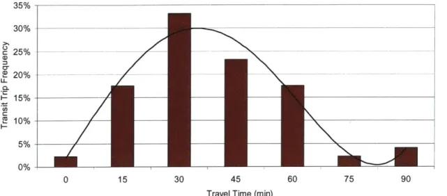
Figure 2-7. Changes in Journey-To-Work Flows Between Central-Suburban-Ex-urban Areas: 1 9 9 0 -2 0 0 0 ... 3 2 Figure 3-1. Frequency of Trips by Mode versus Travel Time ... 39
Figure 3-2. Central Area Transit Travel Time Distribution ... 40
Figure 3-3. Aggregated Central Area Transit Travel Time Distribution... 41
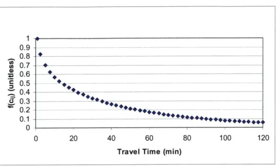
Figure 3-4. Estimated Travel Impedance Curve ... 41
Figure 3-5. Exponential Impedance Curve ... 43
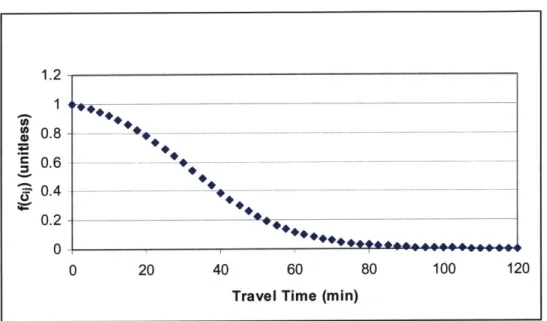
Figure 3-6. Proposed Impedance Curve: Exponential with Cut-off at Maximum ... 43
Figure 3-7. Proposed Impedance Curve: Cumulative Distribution... 44
Figure 3-8. Actual Frequency, Cumulative Distribution, & Fitted Impedance... 45
Figure 3-9. Results of Assignment of 1990 Journey-to-Work Flows ... 48
Figure 4-1. Road and Street Network as Modeled... 55
Figure 4-2. Example of a Shortest Path Calculation ... 58
Figure 4-3. Metra Customer Origins by Access Mode ... 61
Figure 4-4. Park and Ride Locations and Catchment Area ... 64
Figure 5-1. Sum of Travel Time at Origin...67
Figure 5-2. Sum of Travel Time at Destination ... 68
Figure 5-3. Sum of Impedance at Origin... 69
Figure 5-4. Sum of Impedance at Destination ... 70
Figure 5-6. R esidential D ensity... 72
Figure 5-7. Transit Access to Employment ... 73
Figure 5-8. Transit Access to Residents ... 74
Figure 5-9. Accessibility Score Line Fit Plot... 77
Figure 5-10. Circle Line Conceptual Phasing Plan ... 78
Figure 5-11. Circle Line Phase 1 Routing ... 81
Figure 5-12. Travel Time Change from Douglas Branch Rerouting... 82
Figure 5-13. Phase 1 Incremental Change in Access to Jobs ... 84
Figure 5-14. Phase 1 Incremental Change in Access to Customers/Employees...85
Figure 5-15. Circle Line Phase 2 Routing Plan... 86
Figure 5-16. Phase 2 Incremental Change in Access to Employment... 88
Figure 5-17. Phase 2 Incremental Change in Access to Customers/Employees...89
Figure 5-18. Circle Line Phase 3 Routing Plan... 90
Figure 5-19. Phase 3 Change in Access to Employment ... 92
Figure 5-20. Phase 3 Change in Access to Customers/Employees ... 93
Figure 5-21. Airport Access Times from the Loop by Mode and Time of Day ... 94
Figure 5-22. A irport A ccessibility ... 96
Figure 5-23. Incremental Increase in Airport Access ... 97
LIST OF TABLES
Table 2-1. CTA Customer Primary Trip Transfer Behavior...26
T able 3-1. M etric E valuation ... . 36
Table 3-2. CTA Customer Trip Purposes in 2003... 37
Table 3-3. CATS Mode Choice Model Coefficients ... 46
Table 3-4. Implied Value of Time (Dollars per Hour) ... 46
Table 3-5. Implied Travel Time Weights ... 47
Table 3-6. Generalized Cost Weights ... 48
Table 4-1 Geographic Line Layer: Types of Elements and Properties ... 54
Table 4-2. M etra A ccess M ode ... 60
Table 4-3. CTA Park and Ride Facilities... 62
Table 5-1. Accessibility Score and Mode Split Correlation Matrix ... 75
Table 5-2. Transit Access Score Regression Analysis Results ... 76
Table 5-3. Circle Line Aggregate Accessibility Analysis Results ... 80
1.
INTRODUCTION
This research is motivated by the author's belief in the importance of public transit in creating vibrant, livable, and sustainable cities. The benefits from investing public resources in public transit are more fundamentally justified by its ability to address the negative externalities of automobile travel by encouraging travelers to shift from auto to transit and by providing mobility to those who do not have access to a car. Wilson identifies three primary benefits associated with a strong public transit system in addressing the externalities of auto use:
" Equity. Transit provides access and mobility for those who cannot or do not choose to drive. Transit provides potentially life-sustaining access to employment and services for economically disadvantaged, young, elderly and disabled populations whose mobility might otherwise be very limited;
" Congestion mitigation. Transit provides more efficient, higher-capacity service than single-occupant automobiles, which can reduce congestion, particularly on corridors leading into the dense urban core and other major activity centers; and
" Land use influence. Public transport is a necessary, but not sufficient, means of change existing land use patterns. It is most effective at supporting a vibrant, centralized downtown commercial and business district. On a local scale, high-quality transit also contributes to increased property values and mitigates against high parking requirements.
Environmental benefits and reduced energy consumption are also identified as potential reasons to support public transit, but to-date, vehicle, engine and fuel technologies aimed at reducing these auto-use externalities directly have been more effective than encouraging a shift to public transit at leveraging these benefits (Wilson, 2004).
A quality transit system is a worthy goal of any community, but the resources devoted to transit
must compete with other worthy civic investments and are therefore constrained. Recognizing this, transit providers have an obligation to invest their limited resources wisely. Given the complexities of urban transportation patterns, wise choices are not always obvious. This research is intended to aid decision makers in identifying potentially wise investments and prioritizing them for further planning study.
1.1 WHY AcCESSIBILITY?
Many proposals exist to improve transit service. Simultaneously, agency budgets and planning resources are limited. There exist clear needs in the conceptual phase of transit capital improvement projects to assess the network impacts of various proposals. This thesis seeks to inform the design and evaluation of projects providing insights on potential system-wide ridership gains. Furthermore, an easily understood and applied method of ranking capital projects could serve to focus the strategic planning efforts of the agency. Current planning practices often rely on projects "bubbling up" from a number of sources including elected officials, agency officials, and the general public. In this process, where projects advance according to political priorities, limited attention is paid to which projects have the most merit and should be a priority for further study, resulting in potentially wasted planning resources. A
procedure to rapidly evaluate and rank proposals may facilitate a more strategic "top-down" planning approach. This thesis suggests transit accessibility is an appropriate measure of project evaluation and could facilitate strategic planning within a transit agency.
Accessibility, despite being widely referred to in transportation planning, is an abstract concept. Researchers have defined this term in a variety of ways and have developed numerous mathematical formulations to measure its value. Accessibility is an essential concept in
evaluating the relationship between land use and transportation. The planning of a
transportation system depends on the forecasts of land use and land use is impacted by the transportation system. Therefore, indexes of accessibility are of particular interest in assessing the existing transportation system and predicting its future performance.
This thesis proposes to build on the growing interest in using accessibility measures to aid in transportation policy and investment decision-making specifically applied to transit. Traditional evaluation methods make use of mobility measures like travel-time savings or economic measures like net-cost per rider. Accessibility measures combine the notions of system performance of the network as well as the spatial separation of the activities and number of opportunities available. Furthermore, accessibility is more consistent with the notion that travel is a demand derived from the need to pursue activities, and therefore represents an appropriate objective function for transit agencies to use in evaluation.
As this research is intended to be practical for use in the politically charged, fiscally constrained environment of a transit agency emphasis is given to application of the model rather than furthering the academic state of the art. Specifically, the research assesses the performance of two proposed major investments at the Chicago Transit Authority. In so doing, it is the author's hope that this research can inform the ongoing planning for these projects at the CTA, facilitate further CTA strategic planning efforts, and illustrate the potential benefits and challenges to
using this planning tool in other agencies.
In the broadest sense, his thesis presents a mathematical representation of the customer oriented mission statement of the CTA and uses this representation to evaluate how changes to the transit network through major investments might further the agency's mission. The author recognizes that ultimately projects that are implemented will require a more rigorous analysis. The research methodology presented in this thesis does not offer a ridership forecast or calculation of transportation system user benefits as required by the Federal Transit Administration. It is intended to illustrate the potential marginal impacts on the existing transit network by visually displaying and quantitatively assessing changes in transit accessibility. This accessibility change can only suggest where ridership growth or changes in development may occur.
1.2 RESEARCH DESIGN
This thesis seeks to answer three fundamental research questions: What is transit
accessibility? Does transit accessibility matter? and What project or strategies can be pursued to maximize transit accessibility?
Introduction The transportation literature is consulted to explore potential definitions and mathematical representations of accessibility. These accessibility metrics have been used in a variety of applications including econometric analyses, travel demand forecasting models, and policy
research. The various means of measuring accessibility are assessed in light of their
applicability to the goals of this research and one measure is selected for further analysis. The performance of the chosen measure is assessed based on comparisons with other measures of transit effectiveness using census data and existing understanding of travel
behavior. The assessment of the quality of the measure relies heavily on display and
interpretation of its graphical output.
Finally, the strategies for maximizing transit accessibility - that is, for furthering the mission statement of the transit agency - are explored through the application of the model to proposed projects. Considerable effort is devoted to interpreting the performance of these projects and assessing their potential.
1.3 THESIS STRUCTURE
This thesis has six chapters including this first introductory chapter. The second chapter is devoted to a review of the literature on transit benefits generally, measuring accessibility, and visualizing spatial data. This chapter provides background on current transit planning methods, use of geographic information systems and transit network models. An introduction to the Chicago Transit Authority and travel patterns in the Chicago metropolitan region is also provided as background.
The research methodology is presented in chapters three and four. Chapter three is devoted to the development of the accessibility model including the framework used for determining the
appropriate measure and implementation of the selected gravity model.
Considerable effort was expended on the development of a transit network model of the
Chicago region which includes CTA bus, rapid transit and Metra commuter rail. This
collaborative effort of the MIT/CTA research group is documented in chapter four. This network representation continues to be developed incrementally to serve on-going research in addition to this thesis. The accessibility model documented in the third chapter depends on the travel-costs calculated from the transit network model.
Chapter five applies the accessibility model to the CTA and analyzes potential project impacts. The Circle Line and Airport Express projects are introduced. The changes in employment and residential access resulting from the Circle Line are used to evaluate the project phases. The Airport Express train is offered as an example of using the accessibility metric to help design a project still in early planning stages.
Conclusions and future research are presented in the final chapter. The on-going applications of the network model documented in chapter three are showcased, as well as potential applications of the accessibility model to a variety of transit issues facing the CTA and other transit properties. A wide variety of future research questions of importance to the CTA are identified.
2.
LITERATURE AND BACKGROUND
2.1
TRANSIT BENEFITSPublic transportation investments require large expenditure of public funds and often require
ongoing subsidies once operable. These transit investments are made because of their potential benefits to society, and properly identifying and estimating these benefits has been a central concern in rail transit development.
Zhang, Shen, & Sussman (1998) review the potential benefits associated with rail transit development and suggest they can be grouped into four categories. The first category consists "of the direct benefits: transit itself is an enterprise that employs people in its operation and construction. These direct effects of rail transit development are relatively easy to capture and usually quantified during the environment impact studies, but they are not the main reasons for transit investment" (Zhang, Shen, & Sussman, 1998).
The second category is the environmental benefits. "Transit provides an alternative means of travel. A modal shift from automobile to transit will result in a decrease of total vehicle kilometers traveled the shift will reduce road congestion and air pollution, which is beneficial to the environment and to society" (Zhang, Shen, & Sussman, 1998). These benefits can be quantified using some proxies like annual hours of travel time saved.
The potential contribution of transit, particularly rail transit, to urban development has always been perceived as a major benefit. Transit supports regional and local economic growth. It improves access to the land along transit corridors and in transit station areas. Therefore, land values in station areas increase and urban development accelerates. Extensive empirical studies on the land use-urban economic benefits of rail transit exist and are not examined further in this thesis. A summary of these studies can be found in (Covarrubias, 2004). The results provide evidence of the supporting role of rail transit in local and regional economies, as well as its limitations.
Last, transit developments increase social welfare. "Transit provides services to transportation-disadvantaged groups and fosters transport equity. It reduces the social discrepancy between the poor and the rich through mobility provision and improvement" (Zhang, Shen, & Sussman,
1998).
Rail transit investments are also claimed to improve the overall quality of life in urban areas and contribute to creation of a "world class city". These effects, however, are rarely rigorously examined and measured in quantitative terms.
The benefits from major transit investments are varied and some cannot be measured objectively, making it challenging to define a single metric upon which to evaluate various proposals. Faced with finite resources for transit investment, it is nonetheless, important to prioritize projects. This thesis identifies a metric by which projects can be prioritized. It is not al i-encompassing, but it seeks to capture the primary benefits of a transit investment.
2.2
CURRENT TRANSIT PLANNING PRACTICEFTA Section 5309 New Starts Program Evaluation Process
Much of the planning activity for major capital transit investments - the investments which are the subject of this thesis - is conducted in accordance with the Federal Transit Adminstration's planning guidance for applicants to the New Starts program. The simple reason for this is that most major projects are seeking federal funding for the investment. Much of the money invested in new transit facilities is available from what is known as the Section 5309 New Starts Program. The program provides discretionary funds for fixed guideway facilities generally in the categories of rapid rail, light rail, commuter rail, automated guide-way transit, people movers, bus rapid transit, or high occupancy vehicle ways (HOVs).
New Starts policy is designed to proved criteria for FTA recommendations to Congress for discretionary transit funds. Projects under $25 million are exempt from these evaluation criteria although project sponsors are encouraged to follow the guidelines. There are substantially more applicants for New Starts funding than there is funding available so competition for FTA recommendation is fierce although ultimately, funding must be secured in congress as the FTA does not actually control the distribution of New Starts funds.
Much to the frustration of planners seeking New Starts funds across the nation, there is a lack of comprehensive and up-to-date guidance from the FTA. The following description of the project evaluation process was provided by Laurie Hussey of Cambridge Systematics, a consultant on many applications to the FTA.
Evaluation criteria for project justification each receive a 1-5 ranking. Highly recommended projects have an average ranking of 4 on the following criteria.
" Mobility Improvements " Environmental Benefits " Operating Efficiencies " Cost Effectiveness
" Existing land use, transit-supportive land use policies, and future land use patterns
Applicants also receive a project finance rating which evaluates local financial commitment including the non-federal share, capital finance plan and the operating finance plan.
Mobility improvements are measured using the concept of Transportation System User Benefits
(TSUB) using the federally mandated SUMMIT software which processes the output of a
four-step travel demand model. The software, which relies on outputs of a regional travel demand model "produces multimodal measure of traveler utility for all users of the transportation system" expressed in time equivalent units (Hussey, 2003).
Additional quantitative measures include: " Number of low-income households served " Number of jobs near stations
Literature and Background " Change in criteria pollutant and precursor emissions and greenhouse gas emissions using
the Environmental Protection Agency's MOBIE emissions model
" Change in regional energy consumption in the forecast year (in BTUs, using regional VMT) " Current regional air quality designation by EPA
" Change in system-wide operating cost per passenger mile " Incremental cost divided by TSUB
" Incremental cost per incremental rider
All other factors (land use, environmental justice, welfare-to-work, innovative financing,
procurement, and construction, economic development) are assessed qualitatively.
Applications for New Starts funding are the culmination of an extensive planning effort beginning with an Alternatives Analysis which screens a universe of alternatives for a solution to a locally identified transportation problem in the project corridor. The Alternatives Analysis leads to the selection of a Locally Preferred Alternative. If the Alternatives Analysis meets FTA approval the project is given permission to advance into preliminary engineering and a Draft Environmental Impact Statement is crafted in accordance with the National Environmental Policy Act. Another FTA review determines if a project receives a Full Funding Grant Agreement which specifies the Federal financial commitment to the project. Securing a Full Funding Grant Agreement allows an applicant to move to final design of a project. At this point, a project is ready for construction pending congressional appropriation of funds.
The FTA process is time consuming and expensive. In the case of major investments, however, the federal funds available through the program are critical in funding the project and the process is worth the effort. The purpose of introducing the process here is to highlight the difficulty and expense. This thesis suggests a method of system planning which could occur prior to an Alternatives Analysis to assist a transit authority in identifying projects that could perform well. The decision to enter a New Starts application planning process is not one that can be taken lightly given of the years of effort and millions of dollars required to secure federal funding for a project.
2.3
GEOGRAPHIC INFORMATION SYSTEMS AND TRANSITNETWORK REPRESENTATIONS
Geographic information system (GIS) technology is widely used to process statistical and spatial data (e.g., transportation networks) and to facilitate research through visualizing experimental and final results. Broadly defined, a geographic information system is "a class of software tools dedicated to the storage and display of spatially referenced information" (Grayson, 1993). Much
GIS technology is not unique to spatial data and consists of conventional data management
tasks in a relational database system. Relational databases organize data in tables and permit a user to generate new tables based on a querying language. The reader is likely to be familiar with the popular relational database software found in the Microsoft Office Suite known as Access although there are a large number of database packages which track much of the world's information.
GIS is an extension of a relational database to encompass spatially referenced data, which
allows for spatial queries. The ability to manage large amounts of spatial data holds obvious appeal to transit agency staff ranging from planners who are interested in the spatial distribution of jobs and population to signage crews who maintain thousands of individual bus-stop signs. As a result, most large transit properties have GIS capabilities. At the Chicago Transit Authority, for example, the Data Services division has multiple staff members whose job is to maintain the GIS database keeping track of changes to routes, stop locations, bus turnarounds, construction and maintenance projects and many other changes. The system is linked to the City of Chicago's GIS providing information on streets, schools, housing, zoning, and more. The result is a powerful information source used by analysts and managers throughout the agency.
Writing more than a decade ago, Grayson cites Clarke who laments the failure of GIS to expand analytic capabilities claiming GIS is focused on "technological issues relating to data storage, retrieval, and display" arguing that GIS needs to move "from being an end in itself to becoming an enabling device within a broader decision making environment. This will involve practitioners developing a much broader knowledge of the problems and processes that decision makers are involved in, as well as the incorporation of more powerful, value adding, analytical techniques." (Clarke, 1990). Sadly, much of Clarke's criticism remains true a decade later. Much of the functionality of GIS in transit is one of archiving static information.
New transportation software is, however, beginning to answer Clarke's call for adding analytic value to GIS. One of the objectives of this thesis is to exploit this new software and propose a potential decision support tool which exploits already available GIS resources. The primary innovation of the new transportation planning software is the addition of path capabilities to GIS.
By merging representations of transit and road networks with GIS databases, new tools are
available to address questions of fleet routing, scheduling, and - of particular interest in this thesis - passenger response to system changes.
The synthesis of GIS with transportation planning tools is evident in all the major planning software packages. TransCAD, the software used for analysis in this thesis, was the first such integrated package and uses the trademark "Transportation GIS Software" to describe itself. Competing software Emme/2 is developing a relationship with the GIS software package Enif. Cube has a very close relationship with ArcView, part of the almost ubiquitous ArcGIS software family. The next software release from Cube will be fully integrated with ArcView eliminating the need to export the outputs of the transportation modeling software into another package for visualization and interpretation. Clearly, the future of transportation planning is moving away from static archival GIS to dynamic analysis of transportation networks.
2.4 MEASURING AcCESSIBILITY
Accessibility is an abstract concept. It is, in effect, the service that transportation and land use provides - representing the ease with which people can pursue activities and businesses can connect with consumers, employees, goods and services.
Literature and Background
Is o c h ron e
The isochrone (or cumulative opportunity measure) involves the construction of concentric circles of various cost budgets. The opportunities within each band are then counted and used as a measure of accessibility. This is the least sophisticated of the currently used accessibility measures although it is arguably the most intuitive. The opportunities within the cutoff cost are weighted equally, and the measure is not affected by differences of travel cost within the band.
A =DWJ
Where:
i = origin location (often the residence location)
J = destination location
A1 = accessibility at location i
P = equals 1 if Cj < C *, and 0 otherwise
D, = opportunities at location
j
C, = travel cost from i to j
C * = the defined band within which the activity opportunities are counted
The units of the accessibility measure depend on the selection of Dj, but are often expressed as number of jobs within a given time or generalized cost.
Wachs & Kumagai (1973) and Vickerman (1974) provide early examples of this metric in the literature.
Gravity
The gravity measure (so called because it is the denominator of the gravity models used for trip distribution in the classic four-step modeling process) is similar to the isochrone, with the addition that opportunities are weighted by the travel cost of reaching them.
The gravity model is represented as follows:
A, = JDf(C,) Where:
S = origin location (often the residence location)
j
= destination locationA = accessibility at location i
= opportunities at location
j
= travel cost from i to jC.
The impedance function is a declining function of travel cost estimated from observed travel behavior. This measure is grounded in the notion that the benefit of a potential activity declines as it becomes more distant. The accessibility for an opportunity will increase if either it becomes more attractive or the travel cost decreases.
Figure 2-1. Trip Length Distribution Comparison between Metropolis 2020 and CATS TDF Models
Source: The Metropolis Plan: Choices for the Chicago Region, Technical Documentation, 2002 For example, Figure 2-1 shows the declining function of travel cost, f(Cj) as estimated by CATS and by the Metropolis 2020 advocacy group based on the Census Transportation Planning Package (CTPP). The estimated function from Metropolis 2020 labeled as "Log Linear
+ Log" appears to closely match observed travel patterns in metropolitan Chicago. The shape
of this function represents the relative attractiveness of destinations at different travel times.
Cvmpwis an of CTPP TPip L cmg-rh LV- indurmn wj M rrpohl and C4 7Y5 MohdFs
I'~mI--- --- --- ~--- ~--- - - - - - - - - - - - - - -
-1z iiii
- -' - -- --- - -- -- -- -- -- --.... .... .. .... .... ... . ... .. .. .. .. --- w(J ~ cr~ r ~ ~ o ~hLev ~d~~t~ir~i ---i--- aJ uvdb--Literature and Background In practice, the gravity measure is calculated using aggregate data. D, can refer to a range of attributes - of specific interest is population and employment. While clearly an oversimplification of the menu of opportunities available at some location, it can be argued that a transit agency will benefit its constituents if it follows the policy of connecting population and employment centers. The continuing delay in release of Parts 1, 2, and 3 of the CTPP at a fine level of disaggregation by the Census Bureau has unfortunately, delayed full implementation of this measure.
The gravity model is a popular means of measuring accessibility due to its relatively low data requirements and ease of use. At MIT, the gravity model has been used in two instances to evaluate the potential impact of San Juan's new rail system - Tren Urbano. The two studies focused on job accessibility by transit, specifically:
Comparing accessibility to jobs by transit versus accessibility to jobs by auto, and cross-tabulating this information with zonal income data. (Zang, Shen and Sussman, 1999)
* Accessibility of welfare recipients to entry level jobs via transit, and the impact of Tren Urbano on this accessibility (Lane, 1999)
Hansen (1959) and Huff (1963) provide an early example of the gravity metric in the literature.
Expected Maximum Utility
The last commonly used accessibility measure is the Expected Maximum Utility (EMU), or Logsum measure, which is an output from the logit discrete choice model. Logit models predict the choice an individual makes when faced with a set of alternatives assuming the individual associates a utility with each alternative and chooses the alternative with the maximum utility. While utility is not directly measurable (it is always relative to other available alternatives) the expected maximum utility of a choice can be derived from the logit model. If the expected maximum utility derived from a set of opportunities represents the attractiveness of the set then the EMU can be interpreted as the benefit derived from the transportation system and the available opportunities.
Activity-Based Accessibility is defined as the expected maximum utility over a choice situation faced by an individual, and formulated as:
A, = E(maxUin) 1n
Yexp(pV
)where Vin is the systematic component of utility Uinfor individual n considering alternative i, and
choosing one alternative from the choice set C.. p is a scale parameter of the error associated with each alternative. A~ is a disaggregate measure, associated with individual n, and is not comparable across individuals. To compare accessibility across individuals the measure is converted into the units of a variable in the utility function such as time or cost.
The logsum represents the state-of-the-art in measuring accessibility. It is powerful because it recognizes differences in attractiveness of opportunities to various segments of the population. Accessibility measured in this way can vary between people in the same location with different socio-economic characteristics, greatly improving the measure's explanatory power. However, its reliance on disaggregate travel behavior survey data makes data availability a serious concern and limits the application of this measure to the specific case of the CTA.
Ben-Akiva & Lerman, Dong, et al (2002) provide applications of this model in the Portland Metropolitan region assessing the impact of congestion tolls, transit fare hikes, and the Portland MAX light rail system on the accessibility of a variety of population sub-groups.
2.5 VISUALIZING RESULTS
An emphasis of this research is the effective graphical presentation of the accessibility provided
by the transit system, both to the analyst and ultimately the public. Earlier projects were
examined and consideration is given to the theoretical issues underlying good visualization. Tufte (1990; 1997; 2001) provides an excellent critical analysis using successful and failed examples of representing multidimensional data. Grayson (1993) offers a review of the primary computer-aided visualization techniques and divides them into the categories of theme, scaled symbol and charts
The earliest transportation-oriented GIS made use of the thematic map, which remains popular to this day. In this map, regions are shaded with colors, selected to convey some quantitative concept or "theme." The values of the measure are divided into ranges with a color assigned to each. Grayson notes, "The primary disadvantage to thematic maps is that they emphasize regions according to their area, not just theme. This effect is sometimes desirable and is one of the primary 'geographic' aspects of the display. Nevertheless, the effect may not be what was intended." (Grayson, 1993). Tufte (2001) also cautions that use of areas to represent one-dimensional data may lead to misleading maps.
Data related to arcs can be represented by adjusting the thickness, shading and colors of the lines. Network models make extensive use of this technique to distinguish the various elements of the transportation network (walk links, expressways, rail lines, etc.). Often, the only way to identify coding errors in networks with thousands of links is to visualize the network; coding errors appear much more readily on a map than in a list of numbers. A variant on this scheme is to draw boxes of varying width along a link to represent ridership or traffic flow. Again, care must be taken in this display particularly when displaying traffic flow. The display is scaled to the length of the link and does not represent, for example, the length of a queue resulting from
congestion but it can easily be misinterpreted.
Pin maps, or scaled symbols make use of markers of different shapes, sizes or colors to highlight the location of features of different types on the same map. This technique is illustrated in Chapters 3 and 4. The pin map plot overcomes the primary fault of the thematic map as the scale of the marker bears no relation to the underlying region's area. However, at large scales, the symbols can run into one another rendering the meaning less clear. A final variation on the pin map is the "pie chart" graphic in which small pie charts are drawn at
Literature and Background appropriate locations. The size of each chart may correspond to some variable, as well as the magnitude of each of the pie slices. This technique is illustrated in the Chicago Area Mode Split Map in which the size of the pie corresponds to the number of trips in each zone and the pie slices indicate the relative modal split.
2.6
CHICAGO TRANSIT AUTHORITYThe Chicago Transit Authority system and its rail expansion proposals are used for application of the transit accessibility planning and evaluation model. While much of the analysis focuses on the implications of heavy rail expansion proposals on the Chicago region, care is taken to insure the model developed is applicable to any large, multimodal transit system considering a major transit investment.
Operations and Service Area
The CTA operates the nation's second largest public transportation system and covers the City of Chicago and 40 surrounding suburbs. On an average weekday, 1.5 million rides are taken on the CTA.
CTA has approximately 2,000 buses that operate over 148 routes and 2,273 route miles. Buses
provide about 1 million passenger trips a day and serve more than 12,000 posted bus stops. CTA's 1,190 rapid transit cars operate over seven routes and 222 miles of track. CTA trains serve about 500,000 customer trips each day at 144 stations (CTA Website, 2004).
Heavy-rail rapid transit is provided by a radial network centered on the downtown. Four heavy rail lines converge on an elevated loop so identified with the downtown that the CBD is almost universally referred to as "The Loop." Rail service is also provided in two subways which run north-south through the central area. The bus system conforms to the City's regular grid of east-west and north-south arterials with an average spacing of % mile between routes in most of the city and closer spacing close to the downtown. Many bus routes west of the Loop are very long, extending, in some cases, nearly twenty miles. A network of limited stop bus service (branded as "X" service) is being implemented on many of these long corridors. The high-demand lake-shore corridors north and south of the Loop are served by zonal express buses with trip times and ridership that rivals the rail service.
This transit network configuration results in a very high rate of transferring passengers. Recent
CTA market research survey reported 51 % of all customers transfer within the CTA with 54% of
rail trips involving a transfer and 20% of bus trips (Northwest Research Group, 2003). Transfers times are kept short by intensive service levels with off-peak headways rarely exceeding twenty
Bus/Rail Transfer to Rail/Bus 34%
Rail Transfer to Rail 6%
Bus Transfer to Bus 11%
Rail No Transfer 19%
Bus No Transfer 25%
Transfer from Another System 4%
Source: Chicago Transit Authority Customer Satisfaction Survey, Northwest Research Group, June 2004.1 Transfer behavior is reported for a survey respondent's "typical trip" which is defined as the CTA trip which they take most often. Actual transfer volumes may differ significantly.
Public Transportation in the Greater Chicago Region
Region-wide transit service includes radial Metra Commuter Rail which provides service on twelve corridors. Most Metra lines have few stops within the CTA service area beyond the downtown terminals. The exception is the electrified south-shore line which provides in-city service with station spacing more like heavy rail than the other commuter lines. This south-shore line competes for ridership with the CTA south lake south-shore express bus service. For historical reasons, the downtown commuter rail stations are located outside the office core several blocks south and west of the Loop across the Chicago River. The main terminals are more than a mile from the very desirable retail, residential and tourist center along North Michigan Avenue and are also remote from the lakefront attractions. This observation will have important implications in the analysis of the Circle Line rail proposal in Chapter 5.
Suburban bus service is provided by PACE which offers some "grid-like" bus service close to the CTA service area generally on policy headways of thirty minutes or longer and more frequent peak-hour feeder service to Metra commuter rail and CTA heavy rail stations. Pace provides ADA paratransit, demand-responsive "dial-a-ride" transit and vanpools to expand suburban mobility.
1 Transfer behavior is reported for a survey respondent's "typical trip" which is defined as the CTA trip which they take most often. Actual transfer volumes may differ significantly.
Literature and Background The CTA, Metra and PACE are funded through an umbrella agency, the RTA, which is
responsible for regional transit coordination and planning. The political and economic
implications of this arrangement have been the subject of a number of theses and dissertations. Allen (1996) provides a comprehensive historic review of transit service in Chicago, with Kirschbaum (2004) and Schofield (2004) providing more recent updates.
2.7
CENSUS TRANSPORTATION PLANNING PACKAGE DATAThe Census Transportation Planning Package (CTPP) released in the early 1990's provides a wealth of information on the transportation system as it pertains to home-to-work trips. One in six households responds to the census form pertaining to transportation, resulting in an extremely large national sample size. Furthermore, the survey provides finely aggregated socioeconomic characteristics that influence the use of the transportation system including household income and vehicle ownership. Data of this type is crucial to estimating trip generation and mode split models. The census bureau tabulates origin and destination flows based on the residential and workplace locations. These flows are valuable in understanding commuting patterns and estimating trip distribution functions and represent the primary market for transit. Finally, because this extensive data is collected at regular, albeit long, intervals it is possible to observe changing travel trends.
Figure 2-2 shows one example of the census data being used to understand how the market share of transit is impacted by vehicle ownership in the Chicago metropolitan region. The chart holds some interesting insight; commuter rail mode share, for example does not drop substantially with increasing vehicle ownership levels. An important lesson for transit operators is also found in the mode split chart of households without vehicles. While these households are traditionally thought of as transit-dependent "captive riders," the data indicates that nearly one third of work trips made by these households are not by transit. The "captive rider" is really a myth as those without access to cars rely on a number of modes. This suggests an agency can increase ridership by providing competitive service even to markets with large numbers of autoless households.
Figure 2-2. Mode Choice by Vehicles Available per Household 100% 90% 80% - No Commute 70% E Other 60/% Bike/Walk *Com. Rail 50% 0 Rail 40% 6 Bus 30% * Carpool 20% Drive Alone 10% 0% 0 1 2 3 4+ 2
Source: 1990 CTTP, Part 1 with additional calculations by author.
Figure 2-3 displays mode split by destination in Chicago. The dominance of transit into the central business district is very clear. University campuses are revealed by the presence of a large number of walking-trip destinations. Major destinations like O'Hare International Airport and medical complexes reveal themselves as large pies.
2 The presence of drive alone mode split for workers with zero cars available could be explained by
Literature and Background
Figure 2-3. Mode Split at Work Destinations
* . --.. 06 . .. -- . *e.. se, 0.* e 0,.. **** 0000440 *5SU60
red = auto, yellow = walk, blue = rail, and green = bus
The map underlines an important truth for the CTA: maintaining employment concentrations in the downtown is critical as transit plays less and less of a role in dispersed employment centers. The radial nature of the rail network is also evident with the vast majority of rail trips destined for a very concentrated number of locations. Rail extensions further into the suburbs will reinforce this pattern. Rail proposals, like the Circle Line, may help distribute rail passengers over a wider area and increase the number of destinations reachable by high-quality rail transit.
2.8 DEMOGRAPHIC AND TRANSPORTATION CHANGES SINCE
1990
The delayed release of updated data from the 2000 Census at the disaggregate level required
by the method developed in this thesis clearly has an adverse impact on the accuracy of the
results. It will be argued, however, that despite the economic and social changes that have taken place in the last fourteen years these results are still relevant. As more up-to-date data becomes available the analysis should be repeated to understand the impact of the changing spatial patterns on the transit system.
This section attempts to identify the important demographic and transportation changes since the 1990 census at a macroscopic level. The implications of these changes on the findings in this thesis are discussed briefly here and elaborated on in Chapter 5.
The most important change to the transit system since 1990 was the opening, in 1994, of the Orange Line providing service from the elevated loop southwest to Midway Airport. Several
renewal efforts, including the reconstruction of the elevated Green Line and the Douglas Branch of the Blue Line have improved speeds on the rail system.
Chicago is a medium-growth, mid-western city with a traditional development pattern of a strong central core and historic development along rail/transit lines. Population growth in central Cook County has outpaced job growth, much of it coming from new migration. Nearly a million people were added to the Chicago Metropolitan Statistical Area (MSA) between 1990 and 2000
(917,720) and, unlike many central counties throughout the country, Cook County continued to
grow in population. Cook County is one of the most highly populated counties in the nation, and is the place of residence for 59 percent of the Chicago MSA population. However, between
1990 and 2000 Cook County accounted for only about one-third of the added population, and
only kept its number of workers and actually lost jobs (Journey to Work Trends in the US, 2004). The growth in population, vehicles, workers and jobs was not even across the region as shown
in Figure 2-4.
Figure 2-4. Added Population, Vehicles, Workers, and Jobs in Chicago MSA: 1990-2000
700,000-600,000 500,000 400,000 -- Population OHouseholds 300,000- -0Vehicles U Workers 00 Jobs 100.000 H 0 -I - I -_ I
Central Suburban Ex-uiban
100,000
-Source: Journey to Work Trends in the United States and its Major Metropolitan Areas: 1960-2000. Population density in the Chicago MSA shown in Figure 2-5 shows a reversal in the trend of
declining density in central Cook County. This is evidence of the renewal of urban
neighborhoods. The rapid growth in the suburbs shown in Figure 2-4 has translated to steadily increased density shown in Figure 2-5, but not at the levels easily served by transit.
Literature and Background Figure 2-5. Population Density: 1970-2000
7000 , 6000 5000 4000 3000 2000 100 0 1970 1980 1990 0 Central
o
Suburban o Ex-urban 2000Source: Journey to Work Trends in the United States and its Major Metropolitan Areas: 1960-2000. As shown in Figure 2-6, the percent of workers driving alone to work increased irrespective of location of residence from 1980 to 2000. Despite this shift, more than one-fifth of the central county workers still use transit. From 1980 to 2000, carpooling from suburban and ex-urban areas declined substantially perhaps due in part to the conspicuous absence of high-occupancy vehicle lanes in Northeastern Illinois.
Figure 2-6. Means of Transportation To Work: 1980-2000
1980 1990 2000 1980 1990 2000 1980 1990 2000 Centri Submban Ex-Urban
* Drove Alo o Capooied O Tramit Others oAt Honz
1000- 90%/0- 80%- 70%- 60%- 500/40% -
30%--L
Source: Journey to Work Trends in the United States and its Major Metropolitan Areas: 1960-1990. Relative to population growth, there was little job growth in Chicago during the last decade with the suburban counties accounting for 99 percent of the added jobs area-wide. Chicago gained over 270,000 people but only added only 1,500 workers (Journey to Work Trends in the US, 2004). A possible explanation is that the population in Cook County is aging and leaving the labor force, and immigrants to the city are younger and have children.
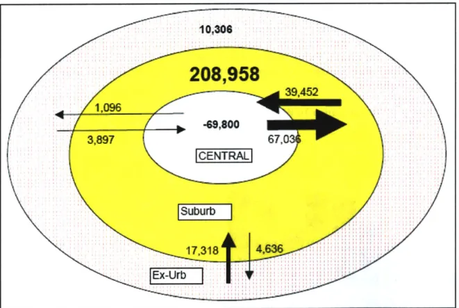
The last decade experienced continued dispersion of employment. Commutes to suburban jobs increased by 275,000 workers. The traditional movement from suburban counties to the central county gained just 43,000 commuters--39,432 from suburban counties and 3,897 from more distant ex-urban counties (Journey to Work Trends in the US, 2004).
Chicago had a traditional pattern of people who both lived and worked in the central county until the late 1970s. Later decades saw a shift to more suburban-to-suburban and reverse commutes. In 2000, both DuPage and Lake County attract more commuters than they generate defying the traditional notion of a suburb. The changes in flows over the last decade are shown in Figure 2-7 with suburb-to-suburb travel capturing the largest share of the growth.
Figure 2-7. Changes in Journey-To-Work Flows Between Central-Suburban-Ex-urban Areas: 1990-2000 1008
208,"958
39,4f2 -09,800 3,897 67,0 PW CENTRAL Suburb 17.318 4,6W6Source: Journey to Work Trends in the United States and its Major Metropolitan Areas: 1960-2000. Font sizes and thickness of arrows are approximately sized to represent the magnitude in change of commuter
Literature and Background The commuting trends in the last decade are likely to have mixed results for the Chicago Transit Authority. Increasing reverse and suburb-to-suburb commuting with its dispersed origins and destinations is difficult to serve by transit, particularly for the CTA with a statutory service boundary entirely within the central county. On the other hand, the city of Chicago appears to be reversing a long decline in population mostly through the arrival of new immigrants. These new city residents along with others returning to the city are revitalizing neighborhoods and often relying on CTA service for much of their mobility.
One such neighborhood of note is along the Lakeshore north of the Loop. In this neighborhood, incomes are high and transit's mode share is also high indicating a large concentration of choice riders. The service levels and neighborhood characteristics of this part of the city of Chicago should be considered a success story for transit in Chicago and an example for regenerating neighborhoods across the city. It raises important questions for public policy makers and planners concerning whether or not current zoning and transportation investment strategies encourage, or even allow, neighborhoods with characteristics like the North Lakeshore to form.
2.9 CONCLUSION
This chapter reviewed the literature and practices which influenced this thesis including assessment of transit investment benefits, the FTA planning process, accessibility modeling, graphic visualization, GIS, demographic data sources and trends.
The Chicago Transit Authority is at a unique time in its history for application of the planning tool developed in the following chapters. In recent years it has been successful at securing state and federal funding for renewal of its century-old elevated rail system. With the system approaching a state of good repair, it is turning its attention to expansion. Analysis of these expansion plans can benefit from the growing synthesis between GIS and transportation planning software. Unsatisfied with planning tools which rely on a "black box" a transparent and intuitive model for understanding impacts of major investments is presented in the next chapter.
3.
ACCESSIBILITY MODEL AND
METHODOLOGY
This chapter describes the framework used for selecting a measure of transit accessibility. Once the appropriate measure is selected, the details of its implementation are presented including estimation of a travel impedance curve and calculation of the generalized cost of travel.
3.1
FRAMEWORK FOR SELECTING A MEASUREThe framework for selecting an appropriate measure to evaluate changes to a transit network can be characterized as a search for a mathematical representation of the CTA's customer-focused mission statement. That is, "The CTA's mission is to deliver quality, affordable transit services that link people, jobs, and communities" (CTA Service Standards, 2001).
An ideal metric contains the following attributes:
" Easy to interpret. The units of the metric should be familiar and easy to compare geographically and across populations
" Transparency in the calculation. A widespread criticism of planning models is the perception of a "black box" understood only by model developers, often dependent on "fudge factors" to replicate actual behavior.
" Easy to present to the public / non-technical audience. Abstract concepts like transportation system user benefits, utility, and multidimensional variables are difficult to communicate to persons outside the transportation profession.
" Utilizes existing data sources. Travel behavior and socio-economic data is expensive to collect and is increasingly so at highly disaggregate levels. A metric which makes use of census, or other widely available data sources, can be implemented broadly.
" Flexible. Transportation investments have a variety of goals ranging from mobility improvements to economic development to environmental justice. Moreover, impacts vary across populations and travel purposes.
" Usable by in-house planning staff. The accessibility model is not intended to replace more sophisticated travel demand forecasting rather it is intended to support system planning and to prioritize proposals for more intensive study.
Figure 3-1 shows a qualitative evaluation of the three dominate accessibility metrics from the literature according to the criteria identified above.