Data Mining, Inference, and Predictive Analytics for the Built Environment with Images, Text, and WiFi Data
by
Rachelle B. Villalon
SMArchS Computation, MIT, 2008
Submitted to the Department of Architecture
in partial fulfillment of the requirements for the degree of
DOCTOR OF PHILOSOPHY IN THE FIELD OF ARCHITECTURE: DESIGN AND COMPUTATION
AT THE MASSACHUSETTS INSTITUTE OF TECHNOLOGY
FEBRUARY 2017
2016 Rachelle B. Villalon. All rights reserved.
MASSACHUSETTS INSTITUTE OF TECHNOLOGY
JUN 2,2Z017
LIBRARIES
ARCHIVES
The author hereby grants to MIT permission to reproduce and to distribute publicly electronic copies of thesis document in whole or in part in any medium now known created. paper and or hereafter Signature of Author: Department of Architecture October 5, 2016 Certified by: V Takehiko Nagakura
Associate Professor of Design and Computation Director, Design and Computation Group
, Thesis Supervisor
M ITLibraes
77 Massachusetts Avenue Cambridge, MA 02139 http://Iibraries.mit.edu/ask
DISCLAIMER NOTICE
The pagination in this thesis reflects how it was delivered to the Institute Archives and Special Collections.
READERS
Takehiko Nagakura
Associate Professor of Design and Computation,
Director of Computation Group, Department of Architecture, MIT Thesis Supervisor
Abel Sanchez
Research Scientist, Civil and Environmental Engineering, Executive Director of the Geospatial Data Center, MIT
Dennis R. Shelden
Associate Professor, Architecture, Georgia Tech Director, Digital Building Laboratory
Data Mining, Inference, and Predictive Analytics for the Built Environment with Images, Text, and WiFi Data
by
Rachelle B. Villalon
SMArchS Design and Computation, MIT, 2008
Submitted To The Department of Architecture on October 5, 2016 in Partial Fulfillment of the Requirements for the Degree of
Doctor of Philosophy in the Field of Architecture: Design and Computation
Abstract
What can campus WiFi data tell us about life at MIT? What can thousands of images tell us about the way people see and occupy buildings in real-time? What can we learn about the buildings that millions of people snap pictures of and text about over time? Crowdsourcing has triggered a dramatic shift in the traditional forms of producing content. The increasing number of people contributing to the Internet has created big data that has the potential to 1) enhance the traditional forms of spatial information that the design and engineering fields are typically accustomed to; 2) yield further insights about a place or building from discovering relationships between the datasets. In this research, I explore how the Architecture, Engineering, and Construction (AEC) industry can exploit crowdsourced and non-traditional datasets. I describe its possible roles for the following constituents: historian, designer/city administrator, and facilities manager - roles that engage with a building's information in the past, present, and future with different goals. As part of this research, I have developed a complete software pipeline for data mining, analyzing, and visualizing large volumes of crowdsourced unstructured content about MIT and other locations from images, campus WiFi access points, and text in batch/real-time using computer vision, machine learning, and statistical modeling techniques. The software pipeline is used for exploring meaningful statistical patterns from the processed data.
Thesis Supervisor: Takehiko Nagakura Title: Professor of Design and Computation
Director of Computation Group, Department of Architecture, MIT
Acknowledgements
I would like to thank my PhD committee: Takehiko Nagakura, Dennis Shelden, and Abel Sanchez for their feedback along the way. Your guidance has not only been invaluable
throughout the dissertation, but has been indispensable since the very beginning when I entered MIT as a Master's degree candidate and/or later as a PhD student. It is my hope to continue our conversations and expand the research into future works. I would also like to thank David Barber of MIT's Security and Emergency Management Office as part of the Facilities
Department, David's feedback and encouragement to use this research to assist security staff on college campuses allowed me to see one of the possible applications of this work beyond academia. I also thank Jim Harrington, Facilities Manager of MIT Architecture Facilities for his early feedback on my research direction before a line of code was ever written down.
I thank Mark Silis, Associate Vice President of the Information Systems and Technology organization at MIT, Mark provided valuable feedback and helped connect me to the gatekeepers of MIT's live WiFi data. I also thank the Big Data at the Computer Science and Artificial Intelligence Laboratory (CSAIL) group for showing and allowing me to tinker around with their tools and databases.
I would like to thank my colleagues and friends in the Computation Group as well as my
non-Computation MIT friends. Thanks for your diverse perspectives and contributing to making MIT a fun place.
Finally, I thank my family. My parents Marie Jane and Olivier Villalon, who always emphasized the importance of an education. To Karen Schoucair, your support and understanding
throughout my years during the PhD has been the greatest of all.
Table of Contents
Part I. Learning from Data
Chapter 1 Introduction... 14
1.1 C o ntributio ns ... . . 15
1.2 R o ad M a p ... . 16
Chapter 2 Related Work, Deliverables, and User Response... 18
2.1 Crowdsourcing in Facilities Management, Architecture, and City Management...18
2.1.1 Crowdsourcing in Facilities Management... 19
2.1.2 Crowdsourcing in Architecture...21
2.1.3 Crowdsourcing in History... 21
2.2 Precedents in Data Analysis and Visualization...23
2.2.1 Finding Patterns in Large Datasets... 23
2.2.2 Image-based 3D Modeling... 26
2.3 Research Deliverables... 29
2.4 User Response... 32
2.4.1 Facilities Management Feedback and Evaluation... 32
2.4.2 A Historian's Feedback and Evaluation... 33
Chapter 3 Exploratory Data Analysis...36
3 .1 Introd uctio n ... . 36
3.2. A Descriptive Analysis of Stata Center through WiFi Access Points and Crowd-Sourced Images... 37
3.2.1 What Types of Devices Photograph MIT?... 38
3.2.2 Raw and Relative Frequency of Documenting Stata Center...39
3.2.3 Stata Center in Time Series... 41
3.2.4 Spatial Point Pattern Analysis of Stata Center...46
3.3. MIT through WiFi Access Points... 56
3.3.1 Stata Center's WiFi Activity... 65
3.3.2 Predicting Crowds...73
3.4 Stata Center through Text... 78
3.5. Analyzing Simmons Hall... 84
3.5.1 Analyzing Simmons Hall Through Text...91
3.5.2 Simmons through W iFi Activity...94
3.6 Analyzing Copley Square... 96
3.6.1 Copley Square as Photographed by the Public... 98
3 .7 S u m m a ry ... 10 2 Chapter 4 A Comparative Data Analysis of Stata, Simmons, and Copley...103
4.1 Device Activity via W iFi Access Points...104
4 .2 T e xt D ata ... 10 6 4.3 Time Series Summary...109
4 .4 C am e ra T ypes...110
4.5 Camera Positions...111
4.6 Mixing Data: Using the Weather API...114
Part II. Research Methods and Algorithms...116
Chapter 5 Exploring Algorithms and Models in Computer Vision, Machine Learning, and Statistical Reasoning...117
5 .1 Intro d u ctio n ... 1 17 5.2 Computer Vision and Machine Learning...119
5.2.1 Scale Invariant Feature Transform (SIFT)...120
5.2.2 Support Vector Machine for Classification...123
5.2.3 Bag of Visual Words...125
5.2.4 K-means Clustering...130
Chapter 6 Taming the W ild: Methods in Data Mining...140
6 .1 In tro d u ctio n ... 14 0 6.2. Data Mining Workflow...142
6.2.1 Content-based Image Search and Retrieval...143
6.3. W rangling with Noisy Data...146
6.3.1 Data Classification...147
6.3.2 Camera Pose Data Cleansing and Extraction...151
6.4 Camera Settings and Scene Information from Images...154
6.5 Exploring W iFi Datasets (4,761 WiFi Access Points)...157
Chapter 7 Summarizing Data for Visualization...160
7.1 Extraction of Multiple Camera Poses from the Web...161
7.2 Image-based Point Cloud...165
Chapter 8 Conclusion and Future Work...169
Appendix A...172
A. 1 Generating Data by the Minute Appendix B...173
B.1 EXIF Data Appendix C...175
C.1 Statistical Reasoning Appendix D...186
D.1 Text Mining and Natural Language Processing with Twitter Appendix E...188
E.1 MeetUp API Integration Bibliography...189
Part I. Learning from Data
Chapter 1
Introduction
Looking around books and the internet on topics about "big data," it's easy to see that the general introduction to the topic begins with the massive amounts of data generated by humans and machines. On social networking websites, a person is one of 1.19 billion users on
Facebook, one of 540 million users on Google Plus, one of 300 million users on Instagram, and one of 288 million users on Twitter. As a minute passes by, Facebook users are sharing 2.5 million pieces of content, YouTube users are sharing 72 hours of new video, or over 1 million hours of video content in a day, email users send 204,000,000 messages, and Google receives over 4 million search queries or 3 billion searches conducted each day'. All of the user uploaded data are thousands of times more than the quantity of all books printed in the U.S. Library of Congress (there's 16 million books at the Library of Congress). This does not yet include the amount of information collected from our mobile devices, my iPhone, for example, tracks my daily sleep patterns, food intake, location, and overall activity level. On top of that, add the physical objects with IP addresses that are already connected to the web from sensors
embedded in manufacturing machinery to the connected temperature and lighting controllers in the home.
There is a massive volume of content, if not clutter. Despite the faddish elements of "big data," the opportunity comes from analyzing and combining the data to extract insights and value2 With all of this information at our disposal, how can professionals in Architecture, Engineering, Construction, Facility Management (AECFM), architectural historians, and city administrators integrate multiple sources of crowd-sourced data into their workflows? This research explores the integration of data analysis and multiple streams of crowd-sourced information inside and outside of an organization as an integral part of the design decision analysis, management of a building, or for learning about a building's historical record as seen through the eyes of the public.
This dissertation explores the use of public and private data sets for the following constituents:
Designer/City Administration:
" Discover what types of buildings and facades attract visitor attention to facilitate the planning of potential future construction projects.
" Track camera positions (foot traffic) from internet photographs over time.
Facilities Management:
" Determine where crowds form and when to anticipate crowds at MIT with predictive
analytics using camera positions, natural language processing for text analysis, and WiFi access points.
" Discover how a building has changed since post production due to time and weather
through the analysis of photographs and the resulting 3D point cloud data/image-based model.
Historian:
" Discover how a building has changed and/or been modified over time through internet photographs and 3D point cloud data for historical documentation.
" Discover how the public perceives a building through tweets and photographs for
historical documentation.
1.1 Contributions
2 In this research, "value" is relative to the goals of each use case persona.
In this thesis, I present a range of semi-automated algorithms and techniques for data mining, analyzing, and visualizing image and text data:
1. Discovering patterns in the image and text datasets about buildings through the three use case goals.
2. A semi-automated software pipeline for a. Pulling images and text datasets b. Data cleaning
c. Input images and text into machine learning classification algorithms
d. Input images into Structure from Motion (SfM) computer vision algorithms for 3D reconstruction
e. Extracting SfM camera matrix for camera pose estimation and 3D point cloud visualization
f. Analyzing results with statistical models
g. Visualizing results in an external web application
3. Understanding crowds formed in and out of buildings through WiFi activity.
1.2 Road Map
Part I of the dissertation, chapters 1 through 4, encompasses an exploratory analysis of the research datasets.
Chapter 1 introduces the research contributions and dissertation roadmap.
Chapter 2 is separated into three sections that address different aspects of the technologies and/or techniques that this thesis builds upon. The first section begins with a review of projects developed by companies and research communities in Design, History, and Facilities
Management that implement crowdsourcing into their workflow. The second section looks at precedents in image-based 3D modeling techniques. Lastly, the chapter includes a survey of
Chapter 3 analyzes the data sets and what has been discovered in the process of data mining multiple camera poses, user uploaded tags/text about MIT's Stata Center and Simmons Hall, Boston's Copley Square, as well as MIT campus WiFi access points to produce meaningful results.
Chapter 4 is a discussion on finding meaningful patterns in a very large dataset and representing information that is visually comprehensive for actionable analysis.
Part 11 is a technical review of the methods and algorithms that were approached for developing the software tools necessary to undertake this research.
Chapter 5 is divided between machine learning and statistical models for computer vision and natural language text processing. I describe the foundation that this research builds upon by discussing the researchers and algorithms that led to the choice in algorithmic techniques for this project such as Structure from Motion, Bag of Visual Features, SIFT, K-Means, Support Vector Machines, Non-Linear Least Squares, Multiple Regression, ARIMA, and others.
In Chapter 6, I describe the process of data mining and the challenges encountered when dealing with rich raw data from the internet. Namely, the pre-processing and data management of images and text. Both information demand a separate approach to produce useable
information for image processing, 3D reconstruction, and statistical analysis.
Chapter 7 is a discussion on data visualization, I first describe the traditional reporting tools found in AEC and related fields, then introduce the custom visualization tools developed for this thesis along with user commentary.
Chapter 8 recaps the thesis contribution and identifies future research areas.
Chapter 2
Related Work
During an earthquake in China, people turned to Twitter in 2008 to share their experiences with the world. What the U.S. Geological Survey (USGS) found intriguing was that Twitter data, or "tweets" sent by users, reported faster information than the USGS sensors on an earthquake occurrence. The majority of earthquake sensors are currently installed in the United States while many "empty space"/sensorless regions around the world still exists. To that effect, USGS now
implements Twitter data as part of their earthquake detection system in many languages3 and
can now receive notifications in an earthquake impacted region. Considering how
crowd-sourced information can enhance existing systems and even provide other insights, how can AEC professionals, city managers, and historians leverage crowd-sourced information to either help make better informed decisions on projects for the built environment and learn about an urban space directly from users? What is there to gain by integrating industry and publicly available information through crowd sourcing? The following section introduces a couple of examples as to how the industries mentioned above have already thought about crowdsourcing in their workflows.
The examples below demonstrate organizations that gather direct input from the general public to arrive at business solutions, gather content, or services. Some industries welcome the idea of crowd participation while others appear threatened, especially in the area of providing
professional services for clients. In either case, the crowdsourcing platforms described in this section allude to solving a particular problem that no one person or organization could have fulfilled on their own.
The notion of crowd participation to solve a problem is not entirely new, the open source software movement is one example where many people can modify source code and fix bugs. According to a survey by Forrester, "the average time to resolve an application problem is 6.9 days for enterprise developers and 6.7 days for software vendors. Ten percent of those problems take 10 days to solve." Contrast that with open source software, the Evans Data Corporation (EDC) reported a survey of "several hundred open-source and Linux
developers... [where] the average time between discovery and solution of a serious bug, for 36 percent of open-source developers is under 8 hours."4 The open source software model does not always align with business models, but the principle of crowd participation can provide project benefits (as well as disadvantages in management and longevity). The following section introduces the crowdsourcing model as seen in other professions.
2.1.1 Crowdsourcing in Facilities Management
At the University of California at Davis, the Facilities Management Energy Conservation Office developed an interactive website so that UC Davis students, staff, and faculty "can provide real-time crowdsourced feedback" as to whether the room temperatures are within thermal comfort levels. Visitors to their Campus Energy Education Dashboard (CEED)5 website offers a campus map and energy use intensity for some of the buildings on campus. The submitted feedback from the community becomes part of the growing database which also tracks UC
4 Asay, Matt. "Open-source vs. Proprietary Software Bugs: Which Get Squashed Fastest?" CNET. CNET,
27 Sept. 2007. Web. 22 Mar. 2016.
http://www.cnet.com/news/open-source-vs-proprietary-software-bugs-which-get-squashed-fastest/
s CEFS HOME. Eco.ucdavis.edu. Retrieved 10 August 2016, http://eco.ucdavis.edu/
Davis' unique energy system that includes electricity, chilled water, pipes to buildings for cooling and steam. UC Davis spends $30 million per year on energy, and the largest segment is
attributed to heating and cooling by 50 to 60 percent. The crowdsourced data helps UC Davis monitor energy usage on campus. Figures 2.1 and 2.2 show the dashboard interface for UC Davis' energy management system.
'~
r ~
Genome & Biomedical Sciences Year, Constuctack 2W0 Squam. Fwae. 22% P1A OIMMI Us"*, 3.WOUKOTqSYEM
ArwW Cost $630 P,*..ary Use: LAS OW S~oondasy Us. OW~erE MW1
xEEGY Un INTENSIfY
If=
C~A=,oAW - ]; wi, Wit
"Impz I'm*, I We" qi, rM 'Alt.
or0.3 IFigure 2.1 Energy usage by intensity across buildings on UC Davis' campus *0
Vr
saw4W
364
Current Demand ?
.11
1
L.Figure 2.2 Demand graph broken down by electricity, steam, and chilled water.
2.1.2 Crowdsourcing in Architecture
Arcbazar' is a design competition website where clients post project proposals for architectural, interior, and landscape designers all over the world (Figure 2.3). The site allows the public to design small and medium scale projects where clients judge and offer cash rewards. The site appeals to some clients because of the multiple design submissions and the significantly lower cost to receive a design instead of hiring services from traditional design firms. Arcbazar is an example of social media changing the marketplace.
6
As, lmdat and Takehiko Nagakura. "Architecture for the Crowd by the Crowd": Architectural Practice in the Digital Age, ArchDesign Conference, 2016, Istanbul, Turkey.
Remodeling 0
c ommecia & Offices Now Buildings
What do you need to be designed? Co ima Size
Figure 2.3 Arcbazar's design competition homepage.
2.1.3 Crowdsourcing in History
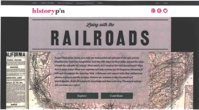
In the humanities realm, the "Living with the Railroads" project was developed to expand information across the American West about the 19th century transcontinental railroads (Figure 2.4). Catered towards railroad enthusiasts, historians, and scholars in partnership with Stanford University, the project lays the groundwork for individuals to upload and contribute data by identifying images, map, and textual content. What is usually a research project carried out by social science researchers, the participants include volunteers to share their accumulated knowledge.
.1
historypin
So
R A
IL
R 0
A
0
S
LIFORNIA
stbroughout the Amere an West. e Oe Aborate and oanedtwidrother rantus ow
ohateas e "p raeewrc* orea s. Cha nes are, someone is als Intereated and
- iJI you stake your clam?
Figure 2.4 Living with the Railroads' homepage invites users to peruse the collection of railroad information or contribute knowledge.
The brief introduction to the projects mentioned above gather the public's input to either expand knowledge as in the Living with the Railroads project, create multiple options as seen in
Arcbazar, or help inform decisions regarding energy usage as seen in UC Davis' efforts. What is proposed in this dissertation is a system that does not directly gather the public's feedback that inputs into a platform, but uses existing open databases to extract information deemed
particularly useful for applications relevant to city management, history, and design -- importing and expanding the relevant pieces of information into existing platforms.
2.2 Precedents in Data Analysis and Visualization
Before introducing the software system for this research, exploring tools that exist in other industries can help inform how other organizations leverage data to create visualization and analysis tools demonstrating 1) the capabilities of extracting useful information from large data sets or 2) implement image based 3D modeling for capturing geometric representations in point
*1
cloud form. The two separate features are necessary to explore particularly because the proposed software system implements data analysis and visualization with 3D point clouds.
2.2.1 Finding Patterns in Large Datasets
3D visualization can convey building components in great detail that 2D drawings cannot, yet some types of 2-dimensional information can help provide quick insights and cite patterns from very large datasets. One example of this can be found in custom business intelligence tools created by big data driven environment companies such as Netflix, where data visualization is crucial to understand the personalization of content for their customers:
Good visualization helps to communicate and deliver insights effectively. As we develop our new insight tools for operational visibility, it is vital that the front-end interface to this system provide dynamic data visualizations that can communicate the insights in a very effective manner. As mentioned earlier, we want to tailor the insights and views to meet the needs of the tool's consumers'.
For instance, to help design and select a cover for an upcoming Netflix Original TV series, Netflix delves into customers insights by finding out and asking questions like, what colors appeal to customers? Do some covers trend more than others? If so, should the personalized recommendation algorithm automatically change? Looking at three title covers (Figure 2.5) illustrates into a color breakdown chart (Figure 2.6).
H
OUS
E
=-71
AtR
0
S
According to Figure 2.6, Hemlock Grove and House of Cards contain similarities while Arrested Development does not. These differences can help quantify any "discemable impact on
subscriber viewing habits, recommendations, ratings, and the like"8 With such high production
costs, knowing subscriber data is crucial. Television covers aside, what stands out in this example is the customized approach (i.e. aside from bar charts and scatter graphs) for learning about subscriber preferences in an easy way to understand.
O olm ok Hus f Arsd
0
rv Ca4ds 0DW 0 APmeANM
NAN
IZAN
Hemlock House of Arrested
Grove Cards Development
Figure 2.6 Color comparison of different cover designs. Source: techblog.netflix.com
A color comparison creates customer insights that can also inform decisions about the next cover design. Netflix uses the information to see what colors appeal to customers and if customers trend toward specific types of covers for viewing. If so, the Netlifx team had considered whether customer preferences in cover types should change personalized
recommendations. Figure 2.3 illustrates the team's visualization goals to help communicate and deliver information effectively:
As we develop our new insight tools for operational visibility, it is vital that the front-end interface to this system provide dynamic data visualizations that can communicate the insights in a very effective manner.. .we want to tailor the insights and views to meet the needs of the tool's consumers. We envision the front-end to our new operational insight
8 Simon, Phil. "Big Data Lessons from Netflix." Wired. March 2014
http://www.wired.com/2014/03/big-data-lessons-netflix/
tool to be an interactive, single-web page application with rich and dynamic data visualizations and dashboards updated in real-time. There are several components within the design: a top level navigation bar to switch between different views in the system, a breadcrumbs component highlighting the selected facets, a main view module (a map in this instance), a key metrics component, a timeline and an incident view, on the right side of the screen. The main view communicates data based on the selected facets (Simon).
-
1l
F.O",:b S VM sta., tswaU USETS
0.
71
h~m~ ,t
TIAELNi&METCS IDEITS
Figure 2.7 (a) Netflix mockup dashboard with dummy data. Source: techblog.netflix.com
ad AP 'I', " $U_ 30 44^ MW_ .Z. I - 20.116 j. , , V*.Wn l .... ..... Aa
3X" -*% OR I S 3.1' SAW.45 22.44 W 74 .- "...-L7 U24 443k 15.N .24 2*-41 34.2% N3.15% 2 .1% -441 42 ---5 4.5 2. 222 5 24 " % ' ..3
AX8 2.2 M45 4% '2.2 IPA"7 .% 4A .44 OLI 24% 3A24234
L . 23*4.3% 335 'AM .2. 31.3 2 M1 2.272 . 311.0 23s .44 ... 52 -',~'44. 21 1% .3.9 22*2 '4.35 J. .1.04 13-.9 --a-~ 22
W223.*4 Lt 4.222SS4 255 05 2 1% I'm.231..2 as -1.% 21111.-1
Ln 2.2% 2.% 4123 -IA 37 401% 4.249% 32.39% 23 -L,34
SO&I2143 -Zf U*2.. 4.7% -9.4 IUD2 .1% a 412 1% 32 W3.3
... ib..- "*22..% 2223 '1A 44am6 .1,% 2" A^I 16-43% 22 .314
u~~~~~'.it'i.~~~~~~~~~~~~ 23 132214 4.7..1 424 2.44 ,,,,4 ..-...- ...
IXL 2.23.% 223 to .33,3 45% 1.3134.% 0340,1% -0-%...4:
lawN.. 4.234.% 432% IiA 411112.51% I'm.4.2.5 U 3.3.% 2..3
1,223. .',.- 224 2s3% 14% 2.1 2SLAIN .2.1% 1.3224A% DO-0 i .3.1
---t45425~2222432211(424 '0" 40- 2.11 8% n'"?7 .4^4.45 J. I'M43.12' 42.9% wou V-5 2%.5201 321S .2.1% 33522. 22.24.4
I-14M14.2422.Mff5IO 22~24E5m 3. 'a' 22~~Ji~
Figure 2.7 (b) Source: techblog.netflix.com
The proposed tool by Netflix illustrates a dashboard with apparent usage of color schemes to immediately identify the overall picture of the system. To illustrate trends, traditional graphs accompany the color coded graphics either in map form or bar chart. In either case, the use of color-coded information and simple traditional plot diagrams are one of the key takeaways from the Netflix example. The next subsection introduces point cloud scanning with LIDAR and image-based 3D modeling at its current state as developed by Autodesk.
2.2.2 Image-based 3D Modeling
Besides 3D geometric and Building Information Modeling software to create 3D models, capturing three-dimensional information in the form of 3D point clouds is brought possible by image-based 3D modeling or LIDAR (laser scanner) scanning of a spatial environment. For best representation and accuracy, a laser scanner measures a large number of 3D coordinates on an object's surface in a very short time (Figure 2.8). The points are then extrapolated to reconstruct a 3D object.
5225.54y 4422d2s2a.3 4.4 u$54 4. Est + C *I .3 J2 "NALL O1412STATUSC240u) 3.% U 27324 .0% 2*7".Is% 14 A2 49,.2 -?.a% 23m-1% ... . _ . Jim _4% - _~' - . ... .. .
I,
-3* -34-3;4522.44.33~.244 53*3344 4%31%31252.1%22 I--23 45453**d4.Im44._1
Figure 2.8 (Left) A laser scanning device in MIT's Lobby 7. (Right) A 3D point cloud of Lobby 7 produced by the laser scanner.
While laser scanning offers greater accuracy and is primarily used by professional contractors, its cost has not yet decreased for everyday consumer consumption. The advances in computer vision algorithms, more specifically, multiple view geometry, however, allow for cost-effective
methods for capturing 3D point clouds - individuals can use their mobile device to capture images of objects that in turn reconstructs into 3D point clouds, albeit with lesser accuracy than laser scanning. The algorithmic process for doing so relies on the Structure from Motion (SfM) technique.
SfM is a computer vision algorithm to take a sequence of two-dimensional images to create a three-dimensional object relying on Epipolar geometry, or a projection process of multiple view geometry (as discussed in Section 5.2.6). That is, an image is processed by computing similar views between one another. If each camera contains the same point of view, a ray intersects from each camera onto the subject. From the ray, triangulation can be computed between the cameras to determine the distance and location of each pixel in three dimensional space. Figure 2.9 shows Autodesk's 123d Catch software, an image-based 3d modeling tool. The user stands and captures an image of the subject in the center and repeats the process while circumventing the subject. The images undergo Structure from Motion and result in an image-based 3d model. The process and Structure from Motion algorithm is further discussed in Section 5.2.6.
Figure 2.9 Autodesk's 123D Catch photogrammetry desktop software.
In academic research, "Building Rome in a Day" is a project by Professor Noah Snavely and other research team members at the University of Washington. They had developed a
high-performance bundle adjustment software, or software for recovering accurate and dense 3D geometry from images that generates an image-based 3D point cloud model of buildings in Rome, Italy (Figure 2.10). They reconstruct entire cities which poses challenges in the 3D reconstruction pipeline, namely large scale optimization.
2.3 Research Deliverables
The proposed system in this research differentiates itself from the examples in the previous section by 1) data mining publicly uploaded images from the internet about a building, and using the images as a means to create a 3D image-based model, thus offering a 3D model of an existing building in post construction; 2) Analyzing the publicly uploaded images and extracting the original camera positions with the ability to search and filter camera positions by year; 3) A visualization tool of WiFi activity around campus; 4) Text analysis from tags; and lastly, 5) A cross reference analysis between the datasets. Figure 2.11 illustrates some of the software deliverables showing the image-based reconstruction on the web, along with the ability to perform simple linear and volume measurement analysis. Figure 2.12 shows datamined images from the web with their extracted camera positions relative to the photographer's subject. Figure 2.13 shows the accumulated WiFi activity around campus throughout a selected period of time which highlights the population crowd density.
Figure 2.11 (a) 3D reconstruction of publicly uploaded images of Stata Center, some of the features include measuring the linear distance of objects.
0 * *b W 0L -A i
Figure 2.11 (b) 3D reconstruction of Copley Square in Boston.
x w W , t VP * - --0 27.0.0.1: 7020 /PyIO'...JSAOOerOl.70 2 .. 111.j. WOP'nex~2 m COnrl
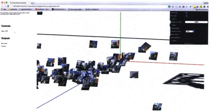
Figure 2.12 (a) A cluster of original camera positions extracted from publicly uploaded images in 2009.
C 127.0.0.1 <
14
ft- low~
N
Figure 2.12 (b) Camera frustums in the original rotation, translation, and position accompanied by image thumbnail.
Ain
2.4 User Response
The results and proposal for this research begins a conversation where gathering public and/or private data can inform how we understand the effective or ineffective use of public spaces, whether or not the design of a built environment actually conforms to the original design
intention. The tools developed for this research offers facilities management and designers, city management, and historians the ability to test and verify hypotheses for built environments long after construction. The following sections describe feedback and commentary from some of the use case personas.
2.4.1 Facilities Management Feedback and Evaluation
A software application built for this research proves itself useful when actual users need a program because the tool fits their goals and hopefully makes their work easier to perform. For the MIT Environment, Health, and Safety (EHS) office, they currently do not have a way to quickly assess the population density of an area on campus other than to send a person to
physically be present at major campus events and then perform a head count. With access to the WiFi access point data, mapping the number of connected devices to an access point by
latitude and longitude allows the MIT EHS staff member to estimate the number of people connected by their mobile devices in any WiFi enabled area.
Based on discussions with MIT EHS, they find the software application useful for the following features that would allow the staff to:
" Get the maximum number of people at any location at a large and small scale.
" Schedule activities.
" Track visitor/crowd flow during MIT and non-MIT events (i.e. 4th of July).
" To have a diagnostic tool that EHS (and any other institution) do not currently possess because it does not exist.
* Good to know where people gather and don't gather on campus.
* For real-life emergencies, get a fine granularity on the number of individuals in an area.
* Discover how long people exit buildings during fire drills. The current process is done manually by undertaking a head count with a stopwatch, but people do not exit the building from the same door and keeping track of everyone can be challenging.
Other comments from MIT EHS include how the application's usefulness can serve MIT Facilities in terms of resource and emergency management. Additionally, using the data for predictive analytics, or to anticipate when crowds will gather at a campus location is another distinctive attribute that MIT EHS would need at their disposal. MIT EHS also mentioned that the use of images would help validate the information received via dispatch. Their main goal is to be able to quickly assess the number of people in any area on MIT's campus at different levels of granularity.
The software application presented to EHS was based on static data from September - October 2014 and was cleaned for production. Another version is currently in progress, this time to visualize and analyze near real-time data at the request of EHS staff for use in emergency management at MIT.
2.4.2 A Historian's Feedback and Evaluation
Upon discussing the results of this research with Professor Howard Burns, a visiting MIT Professor and former Professor in the History of Architecture at Harvard University, he
mentioned how "useful this research is for historians [in terms of extracting the original camera pose and seeing what the user frames in their photographs]" and referred to how the 18th century Italian artist, Giovanni Battista Piranesi, created perspective drawings of architecture that influenced architects and architectural works during the Italian Renaissance (Figure 2.14). In a similar manner, learning from the eye of the public about the built environment can play a role in how architects and city planners design today (Figure 2.15).
Figure 2.14 The Colosseumg, etching, 1757.
9 By Giovanni Battista Piranesi - R.S. Johnson fine art, Public Domain,
https://commons.wikimedia.org/w/index.php?curid=5765775
--Figure 2.15 Simmons Hall, publicly uploaded photo.
Analyzing many publicly uploaded photos provide building managers, designers, historians, and city management the ability to see what the general community finds important or iconic about places of interest -- thereby allowing future designs to accommodate new criteria based on community data.
Chapter 3
Exploratory Data Analysis
3.1 Introduction
This research relies on data mining and extrapolating information from three public and private web-based data sources: photographs from Flickr, an online repository of user-uploaded public photos; MIT WiFi data gathered from the servers of the MIT Information Systems and
Technology (IS&T) Department; and public text from the accompanying captions on gathered photographs. The indoor and outdoor spaces of MIT's Stata Center building, Simmons Hall dormitory, and Boston's Copley Square, all serve as the main subjects for data mining and analysis. A key characteristic with the image, WiFi, and text datasets are the methods of unique exploratory techniques for describing and summarizing each dataset. Additionally, where
something is recorded is of primary interest, the datasets herein share the component of location and time of when and where the record had occurred. Do people photograph Stata Center more in the Spring or Summer time? Is there a seasonal pattern? Can image clusters reveal why individuals prefer to photograph one building facade versus another? What is the likelihood that people will occupy classroom 34-144 versus Building 34-123 at 2pm on a
Thursday? How many pictures are taken at any given year? Is there a trend to taking pictures of
Stata Center or Copley Square? This chapter interprets, analyzes, creates assumptions, and sets alternative perspectives in order to answer the questions above. Table 3.1 summarizes the buildings explored and the corresponding datasets available for this research.
Building Image (EXIF) Text WiFi
Stata Center 0 0 0
Simmons Hall 0 0 0
Copley Square 0 0 X
0 = Available X = Unavailable
Table 3.1 Buildings and datasets explored.
3.2 Descriptive Analysis of Stata Center through WiFi Access Points and Crowd-Sourced Images
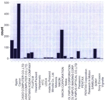
When a picture is taken, a digital camera tags each photo with hidden information, or EXIF (Exchangeable Image File Format) metadata. Information such as the date and time when the photo was taken, shutter speed, lens aperture, focal length, make and model of the camera, and sometimes geolocation along with other camera parameters consist of EXIF data. Extracting the cameras make and model from a photograph can reveal the population of individuals taking exterior images of Stata Center. Figure 3.1 shows the camera types that people use to
photograph the building. Nearly 500 images are taken with a Canon camera, while Nikon takes second place, and Apple iPhone's take third. Furthermore, Figure 3.2 lists a sample of camera makes and associated models which reveals that the majority of individuals photograph with DSLR cameras such as the Nikon D Series and Canon EOS series. What does this information say about the type of individuals documenting Stata Center? That the images are rarely taken by casual users with a mobile phone device? That individuals with professional cameras are purposely seeking out geometrically interesting subjects to photograph than a casual user? We can also assume that users with professional cameras probably spend more time composing a
3.2.1 What Types of Devices Photograph MIT?
At any rate, the majority of pictures reveal that their owners create photographs with professional type cameras that require a level of customization and creative control. It's important to keep in mind that the dataset only represents those who have taken pictures of Stata Center and uploaded to Flickr, and does not account for the individuals who have decided to also photograph the building but either uploaded to another social networking site or not at all. The pictures data mined for this research represents a sample in time from a database that is frequently receiving new images from users beyond the date that the random sample of images were data mined. The Stata Center local image dataset, for example, has its most recent image from May 2015.
500- 400- 300- 200-SWW<1= _ u g22t-i- ai< 00 L)~ F=0' < Q e~o L
A ecc'
6 zLFigure 3.1 A count of camera types used to photograph Stata Center as extracted from each image's EXIF tag. 100 0
~~1
i
0 zo 0. 0"Apple\ttPhone 3GS"
"Panasontc\tNC-ZS8"
"NIKON CORPORATION\tNIKON 07668" "CanoantCanon EDS DIGITAL REBEL XT" "Panasontc\tMC-LZ2" "Panasontc\tDOC-ZS3" "Panasontc\tDNC-ZS8" "Canon\tCanan ECS SD" "NIKON CORP0RATION\tNIKON 096" "Canon\tCaoon ECS 40" "NIKON CORPORATION\tNIKON D48X" "Canon\tCanon EOS 70" "SONY\tDSLR.A238" "-\t-" "NIKON CORPORATION\tNIKON 080" "PENTAX Corporaton\tPENTAX K1iD" "Nokta\tN97"
"Canon\tCanwn EOS DIGITAL REBEL XTI" "Canon\tCanon DIGITAL IXUS 55"
"Canon\tCanon PowerShot SDIOOO" "nade by Polarotd\t6M Digital Camera" "Canof\tCanon DIGITAL IXUS 86 IS" "Canon\tCanon EOS DIGITAL REBEL XTi"
"NIKON C0RPORATION\tNIKON D20"
"EASTMAN KODAK COMPMY\tKODAK Z748 ZOOM DIGITAL CAMERA" "Apple\tiPhone"
"FUJIFILH\tFtnePtx A6808"
"Apple\tiPhone 3GS"
"NIKON\tCOOLPIX S9"
"NIKON CORPORATION\tNIKON D48X"
"made by Polarotd\Mt Digital Camera"
"- \t."0
"SONY\tDSC-P10"
"Canon\tCanon EOS 480" "Canon\tCanon PewerShot 595"
"NIKON CORPORATION\tNIKON 070"
"EASTMN KODAK CONPANY\tKODAK Z812 IS ZOOM DIGITAL CAMERA"
Figure 3.2 A list of camera makes and models used.
3.2.2 Raw and Relative Frequency of Documenting Stata Center
Based on Table 3.2 and Figure 3.3, a trend of taking pictures of Stata Center increases since 2002 and reaches a peak in 2010 with 280 photographs. This raw frequency of 280
photographs, however, does not indicate how large or small the 280 photographs are. In that case, the relative frequency describes the percentage or proportion of individuals who took photographs within the sample population, so 22% of individuals in the sample population of 1,230. It's interesting to note that in the years of the Great Recession during 2007-2009, this is when pictures of Stata Center began an upward trend as Boston experienced a decline in tourism'0. The data helps to ask certain questions: Did individuals have more time to spare and dedicate to photography? This research does not answer such questions, but speculates the possibilities for trends evidenced in the data.
[1] (3] [5] (7] [9] [11] [13] [15] [17] [19] [21] [23] (25] [27] [29] [31] [33] [35] [37]
Year Raw Frequency Relative frequency 2002 8 0.006504065 2003 6 0.004878049 2004 2 0.001626016 2005 4 0.003252033 2006 111 0.0902439 2007 168 0.1365854 2008 175 0.1422764 2009 180 0.1463415 2010 280 0.2276423 2011 55 0.04471545 2012 124 0.100813 2013 66 0.05365854 2014 45 0.03658537 2015 6 0.004878049
Table 3.2 Raw and relative frequency of Images taken of Stata Center since 2002
Raw Frequency Relative Fiuquency
I I 1 1
2 4 6 8 Year
10 12 14
Figure 3.3 Raw and relative frequency plot of photos taken at Stata Center since 2002. 8-I
I
0 d 12- a-0 2005 2010 Year 20153.2.3 Stata Center in Time Series
Looking further, Figure 3.4 breaks down the number of pictures taken by year and month. From the year 2004 to 2009, the number of pictures taken of Stata Center is relatively low in the winter months of December to February, then begins to increase around spring time and slowly declines until summer begins. Stata Center in the summer months of June to August experience the most pictures taken of itself until the trend declines towards the Fall season with a much smaller peak. With the full effect of the four seasons in New England, weather appears to play a significant role in the spikes and troughs for each year's trend line. The seasonal pattern repeats itself with some similarity for the years 2010-2015, the exception are the summer months which is much lower than the previous graph for the years 2004-2009.
Crowd-Sourced Pictures of Stats Center, 2004-2009
-0- 2004-s- 2007 -~200-0--200 -*-2006 -o- 2009 2 4 6 8 10 12 Month (a)
Crowd-Sourced Pictures of Stat. Center, 2010-2015 0 02 I-2 0 a 2 4 8 8 10 12 Month (b)
Figure 3.4 (a) Number of pictures taken by year and month from 2004-2009. (b) Images from 2010-2015.
Stata Center opened to the public in 2004, curiously enough there were images taken prior to the opening day. As Figure 3.4a shows, photos between 2002-2004 are thinly dispersed across that time frame in contrast to the years after 2004 with a minimum of one photo taken and a
maximum of 8 photos on September 6, 2004. Figure 3.4b shows how Stata Center is becoming quite popular amongst photographers as the years progress. The year 2007 is when Stata begins to pick up traffic and the weekends of July and August become popular months and days for a photo shoot. The trend continues with an average amount of 3 pictures taken in a day per month in 2007 and a maximum of 12 pictures taken on one day during that entire year. As for what days people visit Stata Center the most for a photograph, Table 3.3 shows the number of pictures taken for any given day throughout 2007. Figure 3.5 presents a heat map of all the image activities within Stata Center.
-- 2010 -- - 2013
-- 2011 -4- 2014
-- 2012 ---- 2016
Day of Week Image Count
Sun 33
Mon 23
Tues 15
Table 3.3 Image count for the year 2007.
Both Sundays and Saturdays are the most frequented days throughout the week and declines slowly by Monday, then begins to pick up again on Thursdays up until the start of the weekend. The years of 2008 throughout 2010 contains a steady trend with an average number of pictures taken in those years respectively, then noticeably declines by the year 2011 onward.
Cabndar H. Map of Image Activity, 2002-2004
2002 GERA Wa f-"
rJ
I
I
['V HnV
_ _ 2=0JYr7
HI
F'
44'
A f' I
20FLFIJ
ii
H
F':621,
j" Fe MW, Apt U"A Ag sop (W WV on
(a)
Thurs 29
Fri 21
I, -1 T
IIF
LLa
AAt-4
-I K q-clI
LLA-FCalendar Heat Map of Image Activity, 2013-2015
2013
2014 20
10
2015
Figur 3.5 Awq Ma A Aug SOP ct NDui Do
Calendar heat map of image activities from the year 2002-2015 as seen in Figures a, b, and c.
....
Figure 3.6 (b) Gathering the crowd-sourced images to create a 3D point cloud model. The model is an accumulation of images since the year 2002.
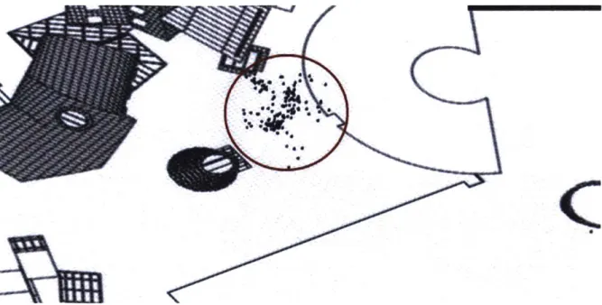
3.2.4 Spatial Point Pattern Analysis of Stata Center
This section introduces the spatial distribution of cameras that were used to take pictures around Stata Center (Figures 3.6a and 3.6b). The distribution does not follow a regular pattern, but a pattern of clusters labeled as regions A, B, and C that appear around the building since the year 2002. This pattern repeatedly appears in those regions over time and rarely in others. The formation of a cluster typically occurs when there is an attraction". One side of the building's facade is valued in some way and/or an accessible path to that area makes it convenient for people to enter and pause for a picture (Figure 3.7). If the latter were true,
however, then why don't the majority of people photograph other facades? With the construction of the Sean Collier Memorial sculpture in Spring 2015 (seen to the right of region A in Figure 3.7), time and a new image dataset beyond the one used for this research will tell if the
sculpture has created a new attraction point and spawned the formation of yet another cluster.
Figures 3.8 and 3.9 shows a screenshot of the custom research tool developed to plot the extracted camera positions from photographs.
113
II-Figure 3.7 Camera clusters that occur around Stata Center since the year 2002.
-1
or
0"
Figure 3.8 A roof plan of Stata Center and the calculated camera positions from 2D images taken by the general public since 2002.
Figure 3.9 Cluster of camera objects and original images shown in the calculated rotation, translation, and position of each shot taken by a user.
4
j
(b). Images seen in Cluster B
'#
a4
a a
The visualization of clustered camera frustums demonstrates a qualitative way of
acknowledging that individuals gather at particular locations to photograph Stata Center. By extracting the translation coordinates (X, Y, Z) of each camera location, we can confirm the number of cluster formations that occur around the building with a quantitative approach. Given a set of observations (camera coordinates), the aim is to partition the n observations into clusters, k, such that (k < n) S = {S1,S2, ..Sk} where S, are the cluster sum of squares (see
Chapter 5.2.4 on clustering optimization problems solved using K-means clustering, an unsupervised machine learning algorithm). The fundamental question is how to determine the value, k, in order to create the number of clusters. The "elbow criterion" is used to determine the optimal value of k, where the sum of squares are low and increasing k would start to have diminishing returns, in this case, the optimal number of clusters is k = 3 (Figure 3.11).
8
Wr4 E (a Go CLZ
1 2 3 4 5 6 Number of ClustersFigure 3.11 Determining the optimal number of clusters, k.
53
0
0
Using k=3, Figure 3.12 confirms the qualitative observation of clusters formed around Stata Center into a quantitative one, where each data point falls into a group formation. With the three cluster formations confirmed, forming observations about the particular dataset can now
become a discussion for answering where and possibly why individuals photograph the building from within the three clusters since the year 2004.
2D representation of the Cluster solution
2
4
0D-C 0 E 0 0 CJ4
-15 -10 -5 0 Component 1 These two comDonents exolain 95.38 % of the ooint variabilitv.Figure 3.12 Cluster solution.
Individuals tend to climb the stairs to photograph the building in cluster A as illustrated in Figure 3.7, stand near the outdoor auditorium in Cluster C, or pause anywhere along the stretch of Stata Center on Vassar Street as seen in Cluster B. Figure 3.10 displays the photographs taken in the aforementioned clusters Cluster A and/or C is a prime location for the MIT Information Office to construct information signage or promote events to targeted visitors, for example. MIT Facilities can focus their maintenance efforts toward "photogenic" sections of a building which
tourism flows and discover what city icons do tourists like to keep as memories -- helping to target and allocate spending on iconic landmarks.
Notice the cluster formations around Stata again, Figure 3.13 shows a map of a green
space/courtyard adjacent to Stata Center. Despite the greenery and the number of benches and picnic tables lining the west and north side of the courtyard, the majority of individuals do not take photographs from the grassy area. Typically, a grassy courtyard is an invitation for individual leisure -- holding picnics, casual sports, gathering of friends, reading, and other activities. Perhaps the community uses the grassy courtyard but not the photographers whose intent is to photograph the building. Individuals, then, have a strong preference to capture Stata Center from very specific locations.
N
ent. U' $7 S~ims I ftt ot TV ~ io~rA
'61 O"amim at VAI~Ogii
r
-4 ( AThis section of Chapter 3 analyzes data points from the derived camera coordinates from outdoor public images of Stata Center. The next section focuses on indoor data points by analyzing the number of connected devices to MIT's WiFi access points, offering a glimpse at the indoor vs. outdoor relationships within the building and surrounding areas.
3.3. MIT through WIFI Access Points
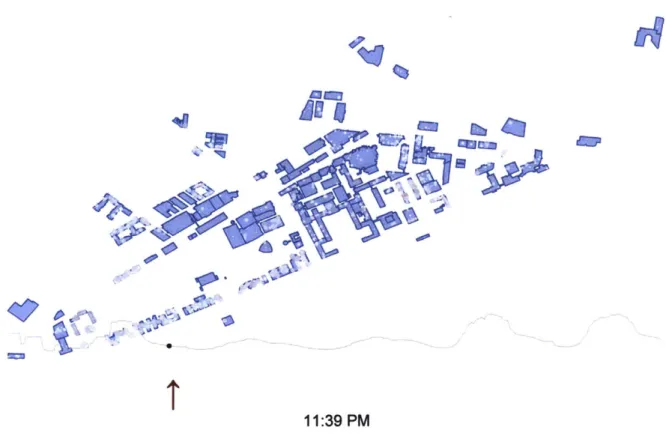
Each WiFi access point around MIT's campus, records the number of connected devices to itself along with a timestamp. Extracting the recorded data from MIT IS&T's server at 10 minute intervals and feeding the information into the web for visualization, shows the following patterns around campus below. Take note of the peaks and troughs in the graph below each map indicating the level of activity and community presence. High levels of connected devices glow as red circles while gray circles show areas with low traffic (Figure 3.14):
'4
A~4
* ~ N
I
8:14 AM0
W,pi
0
-IK
0 V 'I4w
104
44
1%) N) -ai4
1t --7) W, 0 CD'4
4.' /I
d.
'I
' 4.4
4?
he Nr'4
it4#o4
4s
f-Jo-u
4
g
~*1 C', CD-u
C-:~
*
I
An,
I
0.ka
I -)1 *~ S V, 4%
4
U
-u 406 ifAt
'U
w
,;iF
4
I
2t
i%~
'k/
02 a. V"'4
V
hr
44~
1
K
0
pv
) 02 a. SviO'A
C~) CD
1:i
~77~
urn
0
p
0-VP5
'N 4t~~II
a-we I4p
a / 'I
ai~
IV
'94
ev.
i. 024-v
4yA
,lip
Ip
a 024-4N
t
11:39 PM
Figure 3.14 The number of connected devices to a WiFi access point throughout several days at MIT.
Overall, the MIT community begins to go online creating volumes of high traffic around 9am on
the far eastern side of campus where the Sloan School of Business is located. Pockets of high traffic start to appear in just one hour around I Oam around the middle of campus near Stata Center and towards the Stratton Student Center. The campus bustles with even more traffic at noon with highly concentrated spots at Stata Center up until around 3pm, where the WiFi
activity is not nearly as high in concentrations but still fairly crowded between 4pm and 8pm. At
8pm, the far eastern side of campus loses its mid-high traffic and has fewer connected devices.
Around 9pm, the majority of the MIT community migrates toward the west side of campus in low
concentrations while parts of mid and west campus continue on with activity, and later wanes with the exception of the MIT's Muddy Charles Pub. Approaching midnight, mid-high WiFi traffic disappears completely leaving only low concentrations of people connected to online activity
throughout the night only to repeat the cycle again beginning at 8am.
In Figure 3.15, the plot shows a correlation matrix between the number of connected devices and geographic location in latitude and longitude. Creating the plot seeks to answer the
A
Mama
following question, is there a correlation, or statistical relationship, between the number of connected devices and geographic location? In other words, do the number of devices and their owners appear in certain locations because of better connectivity more than other access points around campus? According to the results, the plot shows very little correlation (see Appendix C for the estimation of correlation) between time and latitude and longitude, 0.08, to be exact. A result of 1 (dark blue) indicates a strong correlation between variables and 0 (white) otherwise. As the data suggests, people do not move around campus to seek better WiFi connection. As expected however, there exists a strong dependence between latitude and longitude variables as well as itself.
0.8
wiata.count
.6
.2
Figure 3.15 Cross-correlation between longitude and latitude with the number of connected devices.
3.3.1 Stata Center's WiFi Activity
Zooming into the Stata Center building, what does the crowd activity inside of Stata look like? When can facility managers or designers anticipate crowds to happen? Is there a dependent
from September 2014 to April 2015, offering a glimpse into crowd activity, or anonymous logging of devices recorded every 25 minutes by every WiFi Access Point around campus. At this point, the campus WiFi dataset has been trimmed to focus on Stata Center in this section and its values do not differentiate whether a device is a stationary computer sitting on a desk or a mobile device belonging to someone, but as the analysis in this section shows, the activity of individuals connecting to MIT's WiFi network fluctuates over time.
An overall picture of WiFi access points within Stata Center itself can be seen in Figure 3.16a and Figure 3.16b where connected device activity occur.
A
Ar
Google~o
Figure 3.16 (b)
The dataset in this section is from September to October 2014. At the beginning of the school year, peak activity occurs with a minimum average of nine people connected at any time of the day. In the top diagram of Figure 3.17(a), there are some outliers in the data -- a total count reaching up to 400 connected devices on Friday and Monday in September. The outlier most likely suggests that a major event occurred in Stata Center around that time, which was on September 26 and 29 around 5pm and 7pm respectively. To clarify the distribution of points, the bottom plot in Figure 3.17(b) shows darker or dense points at the bottom of the graph and