HTML, CSS, Bootstrap, Javascript and
jQuery
Meher Krishna Patel
Created on : Octorber, 2017 Last updated : October, 2018Table of contents
Table of contents i 1 HTML 1 1.1 Introduction. . . 1 1.2 First code . . . 1 1.3 Basic tags . . . 2 1.4 Attributes . . . 41.4.1 Attribute ‘name’ and ‘value’. . . 4
1.4.2 Core attributes . . . 4 1.5 Tables . . . 5 1.6 Text formatting. . . 6 1.7 Images . . . 6 1.8 Lists . . . 8 1.9 Links. . . 8 1.10 Forms . . . 10
2 Cascading Style Sheets (CSS) 15 2.1 Introduction. . . 15 2.1.1 Inline CSS. . . 15 2.1.2 Embedded CSS . . . 15 2.1.3 External CSS . . . 16 2.2 Basic CSS Selectors . . . 17 2.3 Hierarchy . . . 18 2.4 More selectors. . . 20 2.4.1 Attribute selector. . . 20 2.5 More properties . . . 21 3 Bootstrap 22 3.1 Introduction. . . 22 3.2 Setup . . . 22
3.2.1 Download and include files . . . 22
3.2.2 Add CDN . . . 23 3.2.3 Check setup. . . 23 3.3 Grid system . . . 24 3.3.1 Example. . . 25 3.3.2 Nested columns . . . 26 3.3.3 Offset . . . 26 3.4 Components. . . 27 3.4.1 Labels . . . 28 3.4.2 Buttons . . . 29 3.4.3 Forms . . . 29 3.4.4 Horizontal form . . . 30 3.4.5 Form elements . . . 33
Table of contents
3.4.6 Control size . . . 35
3.4.7 More buttons . . . 37
3.4.8 Input group . . . 39
3.4.9 Navigation bar (navbar) . . . 42
4 JavaScript 45 4.1 Introduction. . . 45
4.2 First code . . . 45
4.2.1 JavaScript in HTML file . . . 45
4.3 Keywords, Datatypes, Variables and Operators . . . 46
4.3.1 Keywords . . . 46
4.3.2 Datatypes . . . 47
4.3.3 Variables . . . 47
4.3.4 Operators . . . 48
4.3.5 String to number conversion. . . 49
4.3.6 Convert to integer . . . 49
4.3.7 Convert to float. . . 50
4.3.8 Math . . . 50
4.3.9 String . . . 50
4.3.10 Arrays . . . 50
4.4 Control structure, loops and functions . . . 51
4.4.1 If-else . . . 51 4.4.2 Switch-case-default . . . 52 4.4.3 For loop . . . 52 4.4.4 While loop . . . 52 4.4.5 do-while . . . 53 4.4.6 for-in loop . . . 53
4.4.7 Continue and break . . . 53
4.4.8 Functions . . . 54 4.5 Event handling . . . 54 4.6 Conclusion . . . 55 5 jQuery 56 5.1 Introduction. . . 56 5.1.1 Requirements . . . 56 5.1.2 Add contents . . . 57 5.2 jQuery examples . . . 58
5.2.1 Add jQuery code . . . 58
5.2.2 jQuery in separate file . . . 60
5.2.3 Get input from user . . . 61
5.3 Selectors . . . 64
5.3.1 Select elements . . . 64
5.3.2 Filters . . . 67
5.4 Operations . . . 69
Chapter 1
HTML
1.1 Introduction
In this chapter, various component of HTML are discussed to design a web page. The basic structure for an HTML page is shown below.
• Entries inside the /< . . . /> are known as tags. Most of the tags has an opening and closing e.g. <head> (opening head) and </head> (closing head). Some of the tags do not have closing tags e.g. <!DOCTYPE . . . > and <br />. We need to write the HTML codes inside the tags.
• The comments are written between ‘<!–’ and ‘–>’.
• Here Line 1 gives the details of the ‘HTML version’ to the web-browser. The ‘html’ tells it is version 5. • The ‘head’ tag (Lines 3-5) contains the header related tags e.g. ‘title for the page’ and ‘links for the css files’
etc.
• The ‘body’ tag (7-11) contains the actual HTML code which is displayed on the web-browser. Also, we add all the JavaScript related codes just before the closing body tag (</body>).
1 <!DOCTYPE html> <!-- tells browser above the html version --> 2 <html> <!-- beginning of the html document -->
3 <head>
4 <!-- header related tags e.g. title, links etc. --> 5 </head>
6
7 <body>
8 <!-- actual html document here --> 9
10 <!-- add JavaScript files here --> 11 </body>
12 </html>
1.2 First code
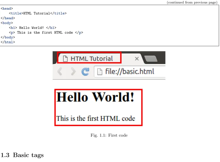
In below code, the message “Hello World” is displayed on the HTML page. TheFig. 1.1 is the resultant HTML page.
• The title (Line 4) appears on the top of the browser.
• The tag <h1> is called ‘header’ tag, which has the larger size than the normal text (see the size of ‘Hello World!’).
• The tag <p> is called the ‘paragraph’ tag, which can be used to write the paragraphs. <!DOCTYPE html>
<html>
1.3. Basic tags
(continued from previous page)
<head>
<title>HTML Tutorial</title> </head>
<body>
<h1> Hello World! </h1>
<p> This is the first HTML code </p> </body>
</html>
Fig. 1.1: First code
1.3 Basic tags
• TheTable 1.1shows the list of tags which are required for writing the basic ‘HTML’ codes i.e. without any style e.g. bold, italics and numbering etc.
Table 1.1: List of basic tags
Tag Description Example
h1, . . . , h6 Header tag h1 to h6 <h2> Hi </h2> p paragraphs (Line changes at the end) <p> Hi </p>
span No line change after span <span>Hi</span> Bye. div make division between contents <div> . . . </div>
a hyperlink seeSection 1.9
center Move content to center <center> Hi </center> br Line break (no closing tag) <br /> or <br> hr horizontal line (no closing tag) <hr /> or <hr> pre preserve formatting <pre> . . . . </pre>
table insert table seeSection 1.5
• Let’s see the example of each of these tags,
Note: All the new codes are added below the previous codes in the ‘body’ tag. Therefore only newly added codes are shown in the tutorial.
<h2> Heading 2 </h2> <h6> Heading 6 </h6>
Chapter 1. HTML
(continued from previous page)
<p> This is paragraph </p> <span> This is span.</span>
<span> The 'br' tag is used after span to break the line </span> <br/>
<div style="color:blue;">
The 'div' tag can be used for formatting the tags inside it at once using 'style' and 'classes'␣
˓→etc.
<p> This paragraph is inside the 'div' tag </p> <span> This span is inside the 'div' tag </span> <br/>
</div> <center>
<h3> Heading 3 is centered</h3>
<p><span> Centered span inside the paragraph.</span><p> </center>
Two horizontal line is drawn using two 'hr' tag. <hr />
<hr>
<pre> 'pre' tag preserve the formatting (good for writing codes) # Python code
x = 2 y = 3 print(x+y) </pre>
• Fig. 1.2is the output of above code. Read the text to understand each tag,
1.4. Attributes
1.4 Attributes
InFig. 1.2, we saw an example of attribute (i.e. style) which changed the color of all the elements to ‘blue’ inside the ‘div’ tag.
1.4.1 Attribute ‘name’ and ‘value’
• Attribute is defined inside the opening part of a ‘tag’. For example, in the below code, the attribute ‘style’ is defined inside the ‘div’ tag.
<div style="color:blue;"> </div>
• An attribute has two parts i.e. ‘name’ and ‘value’. For example, in the above code, name and value of the attribute are ‘style’ and ‘blue’ respectively.
1.4.2 Core attributes
Below are the three core attributes which are used frequently in web design.
• id : The ‘id’ is the unique name which can be given to any tag. This is very useful in distinguishing the element with other elements.
<p id='para1'> This is paragraph with id 'para1' </p> <p id='para2'> This is paragraph with id 'para2' </p>
• class : The attribute ‘class’ can be used with multiple tags. This is very useful in making groups in HTML design.
<p class="c_blue"> This is paragraph with class 'blue'</p> <span class="c_blue"> This is span with class 'blue'</span>
• style : We already see the example of style attribute, which can be used to change the formatting of the text in HTML design. We can specify various styles which are discussed inChapter 2.
<p style="font-weight:bold; color:red;">Style attribute is used to bold and color</p>
Note: Above three attributes are used with ‘CSS (cascading style sheet)’ and JavaScript/jQuery, which are the very handy tools to enhance the look and functionalities of the web-page respectively. The CSS is discussed in Chapter 2, whereas JavaScript and jQuery are discussed inChapter 4andChapter 5respectively.
• Also we can define multiple attributes for one tag as shown below,
<p class="my_class" id="para_with_class" style="color:green"> Multiple attributes </p> • The other useful attributes are listed inTable 1.2
Table 1.2: List of attributes
Name Values Description
id user defined names <p id=’p_1’> Hi </p> class user defined names <p class=’p_class’> Hi </p>
style CSS styles <p style=”color:red; font-weight:bold;”> Hi </p> align left, right, center horizontal alignment
width numeric value or % value width of images and tables etc. height numeric value height of images and tables etc.
Chapter 1. HTML
1.5 Tables
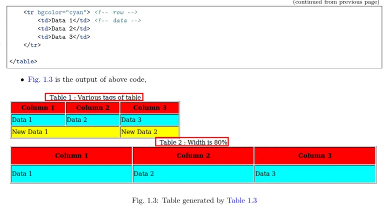
In this section, we will learn to draw tables along with some attributes which are discussed inTable 1.2. Table 1.3 shows the list of tags available to create the table, which are used inListing 1.1.
Table 1.3: Tags and attributes for creating tables Tag Description
table beginning and end of table
tr row of table
th header cell
td data cell
Attributes
rowspan number of rows to merge colspan number of columns to merge border width of border
cellpadding width of whitespace between two border cellspacing width of whitespace within a border bgcolor background color
bordercolor color of border
width width of table (numeric or %) height height of table (numeric) caption caption for table
• Some of the attributes ofTable 1.3are used in below example,
Listing 1.1: Table with border and color 1 <!-- border - color, width and height -->
2 <table border="1" bordercolor="black" width="450" height="100"> 3 <caption>Table 1 : Various tags of table</caption>
4 <tr bgcolor="red" > <!-- row --> 5 <th>Column 1</th> <!-- header --> 6 <th>Column 2</th>
7 <th>Column 3</th> 8 </tr>
9
10 <tr bgcolor="cyan"> <!-- background color --> 11 <td>Data 1</td> <!-- data -->
12 <td>Data 2</td> 13 <td>Data 3</td> 14 </tr>
15
16 <tr bgcolor="yellow"> <!-- row -->
17 <td colspan="2">New Data 1</td> <!-- column span --> 18 <td>New Data 2</td> <!-- data -->
19 </tr> 20 </table> 21 22 23 24 <!-- width in % -->
25 <table border="1" bordercolor="black" width="80%" height="100"> 26 <caption> Table 2 : Width is 80%</caption>
27 <tr bgcolor="red" > 28 <th>Column 1</th> 29 <th>Column 2</th> 30 <th>Column 3</th> 31 </tr> 32
1.6. Text formatting
(continued from previous page)
33 <tr bgcolor="cyan"> <!-- row --> 34 <td>Data 1</td> <!-- data --> 35 <td>Data 2</td> 36 <td>Data 3</td> 37 </tr> 38 39 </table>
• Fig. 1.3is the output of above code,
Fig. 1.3: Table generated by Table 1.3
1.6 Text formatting
In this section, we will see some of the text formatting options (seeTable 1.4) e.g. bold, italic, subscript and strike etc.
Table 1.4: Text formatting Tag Description
b bold
i italic
u, ins underline strike, del strike sup superscript sub subscript big big size text small small size text
• Below are the some of the examples of text formatting, whose results are shown inFig. 1.4,
<!-- Text formatting -->
<p>This is <b>bold</b> text</p>
<p>This is <strike>striked</strike> text</p> <p>This is <sub>subscript</sub> text</p>
1.7 Images
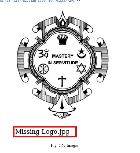
Image tag has two important attribues i.e. ‘src’ and ‘alt’ as described below,
• src : tells the location of ‘image’ file e.g. in Line 2 the image ‘logo.jpg’ will be searched inside the folder ‘img’.
Chapter 1. HTML
Fig. 1.4: Text formatting
• alt : is the ‘alternate text’ which is displayed if image is not found. For example, in Line 6, the name of the image is incorrectly written i.e. ‘logoa’ (instead of ‘logo’), therefore the value of ‘alt’ i.e. ‘Missing Logo.jpg’ will be displayed as shown inFig. 1.5.
1 <!-- Images -->
2 <img src="img/logo.jpg" alt="Logo.jpg" width="20%"/> 3
4 <br/> <br/> 5
6 <img src="img/logoa.jpg" alt="Missing Logo.jpg" width="20%"/>
Fig. 1.5: Images
1.8. Lists
1.8 Lists
There are three type of lists in HTML,
• Unordered list : bullet are used in it (see Lines 2 and 9) • Ordered list : numbers are used in it (see Lines 15, 22 and 28)
• Definition list : This can be used for writing definitions in HTML (see Line 35) 1 <!-- Lists -->
2 <!-- unordered list --> 3 <ul> Unordered List 4 <li>Pen</li> 5 <li>Pencil</li> 6 <li>Eraser</li> 7 </ul>
8
9 <ul type="circle"> Change bullets : 'square', 'circle' or 'disc' 10 <li>Pen</li> 11 <li>Pencil</li> 12 <li>Eraser</li> 13 </ul> 14 15 <!-- ordered list --> 16 <ol> Ordered List 17 <li>Pen</li> 18 <li>Pencil</li> 19 <li>Eraser</li> 20 </ol>
21
22 <ol type='i'> Change style : 'i', 'I', '1', 'a' or 'A' 23 <li>Pen</li>
24 <li>Pencil</li> 25 <li>Eraser</li> 26 </ol>
27
28 <ol type='i' start="5"> Start from 'v' 29 <li>Pen</li> 30 <li>Pencil</li> 31 <li>Eraser</li> 32 </ol> 33 34 <!-- Definition list --> 35 <dl> 36 <dt> <h4>HTML Definition List</h4> </dt> 37 <dd> HTML is easy </dd> 38 <dd> HTML is good </dd> 39 <dl>
The outputs of above codes are shown inFig. 1.6,
1.9 Links
<!-- links -->
<p>Go to paragraph with<a href="#para1"> id='para1'</a></p> <a href="http://pythondsp.readthedocs.io"> PythonDSP </a> <br>
<p><a href="js.html" target="_self"> JavaScript Tutorial</a> in same window.</p> <p><a href="js.html" target="_blank"> JavaScript Tutorial</a> in new Window.</p>
Chapter 1. HTML
1.10. Forms
(continued from previous page)
<p><a href="http://pythondsp.readthedocs.io/pdf">Download PDF, DOC or Zip Files</a></p> <p><a href="mailto:[email protected]">Email me</a></p>
<p><a href="mailto:[email protected]?subject=Feedback&body=Your feedback here">Feeback email</a></p>
Note: We can change the color of the links using ‘alink (active link)’, ‘link’ and ‘vlink (visited link’, by defining these attributes in the ‘body tag’ as shown below,
<body alink="green" link="blue" vlink="red">
1.10 Forms
Forms can have different types of controls to collect the input-data from users, which are listed below and shown inTable 1.5, • Text input • Text area • Radio button • Checkbox • Select box • File select • Buttons
• Submit and reset buttons • Hidden input
Chapter 1. HTML
Table 1.5: List of control inputs and their attributes
Control Attributes Values Description
Input : text type text, password
value user-defined initial value in the area name user-defined name send to server size numeric value width of the text area
maxlength numeric value maximum number of characters Input : radio type radio
name user-defined name send to server
value user-defined value value of the button if selected
checked check the button by default
Input : check box type checkbox
name user-defined name send to server value user-defined value value of the box if selected
checked check the box by default
Input : button type button trigger client side script
submit submit the form and run ‘action’
reset reset form
image create image button method get, post get or post method
action user-defined action to perform on submit
Input : hidden type hidden will not display on html, but can be used for sending information to server
Selection box name user-defined name send to server
size numeric value enables scroll (default dropdown) multiple numeric value select multiple items
value user-defined value value of the item if selected
selected select item by default
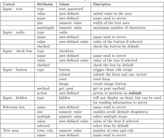
Text area rows, cols numeric value number of rows and cols name user-defined name send to server • Below are the exmaple of the control inputs described inTable 1.5
<!-- Forms -->
<form>
<h4>Text input </h4>
Name : <input type="text" name="user_name" size="4" value="e.g. meher21" maxlength="10"><br> Password : <input type="password" name="user_pass" ><br>
<h4> Radio button: name should be same</h4> <input type="radio" name="r_gender"> Male <input type="radio" name="r_gender"> Female
<input type="radio" name="r_gender" checked> Infant <h4> Check box : name should be different</h4> <input type="checkbox" name="c_male" checked> Male <input type="checkbox" name="c_female"> Female <input type="checkbox" name="c_infant"> Infant <h4> Select box : drop-down</h4>
<select name="s_box">
<option value="s_male">Male</option>
<option value="s_female" selected>Female</option> <option value="s_infant">Infant</option>
</select>
<h4> Select box : scroll</h4>
1.10. Forms
(continued from previous page)
<select name="s_box" size="4" multiple>
<option value="s_male" selected>Male</option> <option value="s_female" selected>Female</option> <option value="s_infant">Infant 1</option>
<option value="s_infant" selected>Infant 2</option> <option value="s_infant">Infant 3</option>
<option value="s_infant">Infant 4</option> </select>
<h4> Text area</h4>
<textarea rows="10" cols="80" name="txt_area">Initial Text x = 2
y = 3
</textarea> <!-- formatting work as pre -->
</form>
Fig. 1.7is the output of above code,
• Below is the code which shows the working of various buttons. Note that method and action are defined in this form, which will be triggered on ‘submit’ button. Lastly, ‘hidden’ option is used in this example. <form method="get|post" action="jquery.html">
<h4> Buttons and Hidden</h4>
Name : <input type="text" name="user_name" size="4" value="Meher" maxlength="16"><br> Password : <input type="password" name="user_pass" ><br>
<input type="button" onclick="alert('Hello')" name="b_alert" value="Say Hello"/><br> <input type="submit" name="b_submit" value="Go to jQuery"/>
<input type="reset" name="b_reset" value="Reset"/><br> <input type="hidden" name="h_data" value="html_tutorial"> </form>
Chapter 1. HTML
1.10. Forms
Chapter 2
Cascading Style Sheets (CSS)
2.1 Introduction
CSS is used to enhance the look of the web page. InSection 1.4.2, we saw the attribute ‘style’, which is used for changing the color of the text. Let’s rewrite the example of ‘style’ as shown in next section.
2.1.1 Inline CSS
• Below code is an example of ‘inline CSS’, where the styles are defined inside the individual tags. 1 <!-- css.html --> 2 3 <!DOCTYPE html> 4 <html> 5 <head> 6 <title>CSS Tutorial</title> 7 8 </head> 9 <body> 10
11 <h3 style="color:blue"> Heading 1 </h3> 12 <h3 style="color:blue"> Heading 3 </h3> 13 <h3 style="color:blue"> Heading 3 </h3> 14
15 </body> 16 </html>
In the above code, we have three ‘headings’ with font-color as ‘blue’. Suppose, we want to change the color to red, then we must go to to individual ‘h3’ tag and then change the color. This is easy in this case, but if we have 100 headings in 5 different ‘html’ files, then this process is not very handy. In such cases, CSS can be quite useful as shown in next section.
2.1.2 Embedded CSS
In the below code, the style is embedded inside the ‘style’ tag as shown in Lines 8-17. Here, we have defined two classes i.e. ‘h3_blue (Lines 21-23)’ and ‘h3_red (Lines 26-28)’. Then, the selectors at Lines 9 and 13 targets the class ‘h3_blue’ & ‘h3_red’, and change the color to blue and red respectively. In this chapter, we will discuss the selectors (e.g. h3.h3_blue) in more details.
Note:
2.1. Introduction
• CSS has three parts,
– Selectorse.g. p, h3.h3_blue – Propertiese.g. color – Valuesof properties e.g. red
1 <!-- css.html --> 2 3 <!DOCTYPE html> 4 <html> 5 <head> 6 <title>CSS Tutorial</title> 7
8 <style type="text/css">
9 h3.h3_blue{ /*change color to blue*/
10 color: blue;
11 }
12
13 h3.h3_red{ /*change color to red*/
14 color:red; 15 } 16 </style> 17 18 </head> 19 <body> 20
21 <h3 class='h3_blue'> Heading 1 </h3> 22 <h3 class='h3_blue'> Heading 3 </h3> 23 <h3 class='h3_blue'> Heading 3 </h3> 24
25
26 <h3 class='h3_red'> Heading 1 </h3> 27 <h3 class='h3_red'> Heading 3 </h3> 28 <h3 class='h3_red'> Heading 3 </h3> 29
30 </body> 31 </html>
• Below is the output of above code,
2.1.3 External CSS
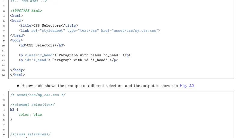
We can write the ‘CSS’ code in different file and then import the file into ‘html’ document as shown in this section. In this way, we can manage the files easily.
• The ‘CSS’ code is saved in the file ‘my_css.css’ which is saved inside the folder ‘asset/css’.
/* asset/css/my_css.css */ h3.h3_blue{ color: blue; } h3.h3_red{ color:red; }
• Next, we need to import the CSS file into the ‘html’ file as shown in Line 7. 1 <!-- css.html -->
2
Chapter 2. Cascading Style Sheets (CSS)
Fig. 2.1: Embedded CSS
(continued from previous page)
3 <!DOCTYPE html> 4 <html>
5 <head>
6 <title>CSS Tutorial</title>
7 <link rel="stylesheet" type="text/css" href="asset/css/my_css.css"> 8 </head>
9 <body> 10
11 <h3 class='h3_blue'> Heading 1 </h3> 12 <h3 class='h3_blue'> Heading 3 </h3> 13 <h3 class='h3_blue'> Heading 3 </h3> 14
15
16 <h3 class='h3_red'> Heading 1 </h3> 17 <h3 class='h3_red'> Heading 3 </h3> 18 <h3 class='h3_red'> Heading 3 </h3> 19
20 </body> 21 </html>
2.2 Basic CSS Selectors
There are three types of selectors in CSS,
• Element : can be selected using it’s name e.g. ‘p’, ‘div’ and ‘h1’ etc. • Class : can be selected using ‘.className’ operator e.g. ‘.h3_blue’. • ID : can be selected using ‘#idName’ e.g. ‘#my_para’.
2.3. Hierarchy 1 <!-- css.html --> 2 3 <!DOCTYPE html> 4 <html> 5 <head> 6 <title>CSS Selectors</title>
7 <link rel="stylesheet" type="text/css" href="asset/css/my_css.css"> 8 </head>
9 <body>
10 <h3>CSS Selectors</h3> 11
12 <p class='c_head'> Paragraph with class 'c_head' </p> 13 <p id='i_head'> Paragraph with id 'i_head' </p> 14
15 </body> 16 </html>
• Below code shows the example of different selectors, and the output is shown inFig. 2.2 1 /* asset/css/my_css.css */ 2 3 /*element selection*/ 4 h3 { 5 color: blue; 6 } 7 8 9 /*class selection*/ 10 .c_head{ 11 font-family: cursive; 12 color: orange; 13 } 14 15 16 /*id selection*/ 17 #i_head{ 18 font-variant: small-caps; 19 color: red; 20 }
Fig. 2.2: Selectors : element, class and id
2.3 Hierarchy
In previous section, we saw the example of selectors. In this section, we will understand the hierarchy of the styling-operations.
Chapter 2. Cascading Style Sheets (CSS)
• Priority level :
– ID (highest priority) – Class
– Element
• If two CSS has same priority, then CSS rule at the last will be applicable. • Below is the html code with following tags,
– ‘p’ tag
– ‘p’ tag with class ‘c_head’
– ‘p’ tag with class ‘c_head’ and id ‘i_head’ 1 <!-- css.html --> 2 3 <!DOCTYPE html> 4 <html> 5 <head> 6 <title>CSS Selectors</title>
7 <link rel="stylesheet" type="text/css" href="asset/css/my_css.css"> 8 </head>
9 <body>
10 <p>Paragraph</p> 11
12 <p class='c_head'> Paragraph with class 'c_head' </p>
13 <p class='c_head' id='i_head'> Paragraph with class 'c_head' and id 'i_head' </p> 14
15 </body> 16 </html>
Below is the CSS code. Let’s understand the formatting of all three ‘p’ tags individually. The results are shown inFig. 2.3.
• ‘p’ tag at Line 13 of html : Since, ‘id’ has highest priority, therefore CSS rule for #i_head’ (Line 12) will not be overridden by Line 24; hence the color is red. Line 13 has ‘p’ tag, therefore ‘font-variant’ rule will be applied by Line 17. Also, this tag has class ‘c_head’, therefore ‘font’ will be set to ‘cursive’. Hence, the line is “all-caps with font-cursive in red color”.
• ‘p’ tag at Line 12 of html : Similarly, the ‘head’ tag has higher priority than ‘element’ therefore color of this line is oranage and font-family is ‘cursive’. Also, Line 17 will make it all caps
• ‘p’ tag at Line 10 of html : Color defined at Line 18 will be overridden by Line 24; hence the color will be blue. Also, Line 17 will make it all caps.
1 /* asset/css/my_css.css */ 2
3 /*class selection*/ 4 .c_head{
5 font-family: cursive;
6 color: orange; /*override the blue color*/ 7 } 8 9 10 /*id selection*/ 11 #i_head{ 12 color: red; 13 } 14 15 /*element selection*/ 16 p { 17 font-variant: small-caps; 18 color: blue; 19 } 20 21
2.4. More selectors
(continued from previous page)
22 /*element selection*/ 23 p {
24 color: green; 25 }
Fig. 2.3: Priority level for CSS rule
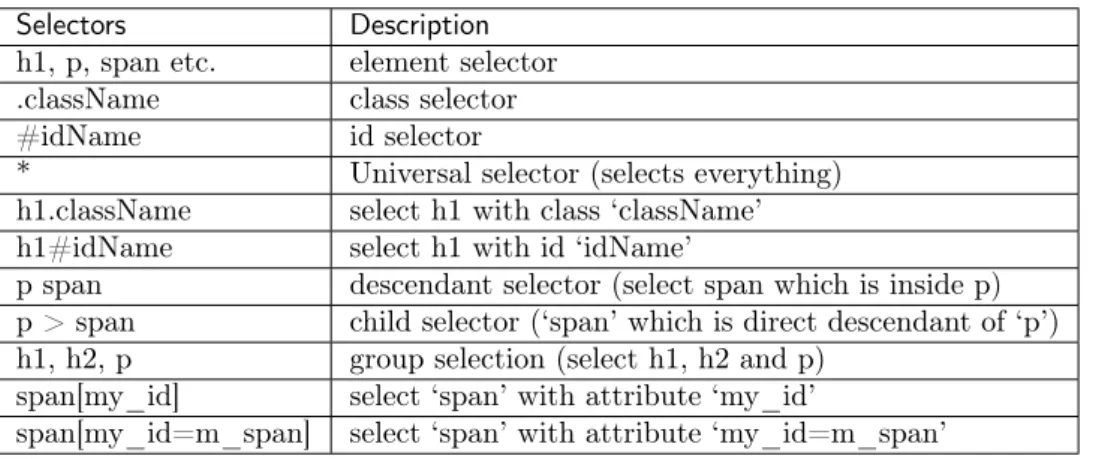
2.4 More selectors
Table 2.1 shows the combinations of selectors to target the various elements of the HTML. Also, some of the example of ‘Attribute selector’ is shown in this section.
Table 2.1: List of selectors
Selectors Description
h1, p, span etc. element selector .className class selector
#idName id selector
* Universal selector (selects everything) h1.className select h1 with class ‘className’ h1#idName select h1 with id ‘idName’
p span descendant selector (select span which is inside p) p > span child selector (‘span’ which is direct descendant of ‘p’) h1, h2, p group selection (select h1, h2 and p)
span[my_id] select ‘span’ with attribute ‘my_id’
span[my_id=m_span] select ‘span’ with attribute ‘my_id=m_span’
2.4.1 Attribute selector
• Add below code at the end of the html file. In these lines ‘custom attributes’ are added (i.e. my_id).
<!-- css.html -->
<span my_id='m_span'> Span with attribute 'my_id' with value 'm_span' </span> <br>
<span my_id='m_span2'> Span with attribute 'my_id' with value 'm_span2' </span> • These custom attributes can be selected as below,
/*attribute selection*/
span[my_id] { /* select 'span' with attribute 'my_id' */
color: green; font-weight: bold
Chapter 2. Cascading Style Sheets (CSS)
(continued from previous page)
}
span[my_id=m_span] { /* select 'span' with attribute 'my_id = m_span' */
color: red; }
2.5 More properties
Table 2.2shows the some more important properties which can be used in CSS, Table 2.2: More CSS properties
Property Syntax Description/possible values
size 20% size = 20%
20px 20 pixel
2em 2*font-size
2mm, 2cm, 2in 2 mm, cm and inch
color names e.g. red, blue, green
hex code (#RRGGBB or #RGB) #FFF000 or #FFF
rgb(num, num, num) rgb(0, 0, 255) or rgb(20%, 10%, 70%)
link a:link a:link {color: red}
a:hover a:visited a:active
Font font-family serif, cursive
font-style normal, italic, oblique
font-variant normal, small-caps
font-weight normal, bold, bolder, lighter, 100-900 font-size 10px, small, medium, large etc.
Text color red, #FFF
letter-spacing 10px
word-spacing 10 px
text-align right, left, center
text-decoration underline, overline, line-through, none text-transform capitalize, uppercase, lowercase, none
white-space pre, normal, nowrap
text-shadow text-shadow:5px 5px 8px red;
Image border ‘1px’, or ‘1px solid blue’
height, width 100px, 20%
Border border-style solid, dashed, dotted, double, none etc. border-top-style
border-bottom-style border-left-style border-right-style
border-width 4px, 4pt
border-bottom-width similarly use ‘top’, ‘left’, ‘right’ border (shortcut) 1px solid blue’
Margin margin, margin-left etc.
Padding padding (top, bottom, left, right) ‘10px 10px 2px 2px’ or ‘10px 2px’ padding-right, padding-left etc.
Chapter 3
Bootstrap
3.1 Introduction
One of the problem with basic HTML design is that the webpage may look different in different browser or device (e.g. mobile, tablet and laptop). Therefore, we may need to modify the code according to browser or device. The problem can be easily resolved by using Bootstrap.
Bootstrap is a framework which uses HTML, CSS and JavaScript for the web design. It is supported by all the major browsers e.g. Firefox, Opera and Chrome etc. Further, Bootstrap includes several predefined classes for easy layouts e.g. dropdown buttons, navigation bar and alerts etc. Lastly, it is responsive in nature i.e. the layout changes automatically according to the device e.g. mobile or laptop etc.
3.2 Setup
Bootstrap needs atleast 3 files for its operation which can bedownloaded from the Bootstrap website. • bootstrap.css (Line 7) : This file contains various CSS for bootstrap.
• bootstrap.js (Line 16) : This file contains various JavaScript functionalities e.g. dropdown and alerts etc. • jQuery.js (Line 17) : This file is the jQuery library which can be downloaded from the ‘jQuery’ website.
It is required for proper working of ‘bootstrap.js’.
3.2.1 Download and include files
These files are downloaded and saved inside the ‘asset’ folder. Next, we need to include these files in the HTML document as below, 1 <!DOCTYPE html> 2 <html> 3 <head> 4 <title>Bootstrap Tutorial</title> 5 6 <!-- CSS -->
7 <link href="asset/css/bootstrap.min.css" rel="stylesheet"> 8 <!-- Add Custom CSS below -->
9 10 </head> 11 <body> 12 13 14 <!-- Javascript -->
15 <!-- put jQuery.js before bootstrap.min.js; and then add custom jquery -->
Chapter 3. Bootstrap
(continued from previous page)
16 <script src="asset/js/jquery-3.3.1.min.js"></script> 17 <script src="asset/js/bootstrap.min.js"></script> 18 </body>
19 </html>
3.2.2 Add CDN
Another way to include the files is CDN. In this method, we need not to download the files, but provide the links to these files, as shown in Lines 8, 17 and 19 of below code. Note that, in this case the code will not work in offline mode. 1 <!DOCTYPE html> 2 <html> 3 <head> 4 <title>Bootstrap Tutorial</title> 5 6 <!-- CSS -->
7 <!-- Latest compiled and minified CSS -->
8 <link rel="stylesheet" href="https://maxcdn.bootstrapcdn.com/bootstrap/3.3.7/css/bootstrap.min.css"␣
˓→integrity="sha384-BVYiiSIFeK1dGmJRAkycuHAHRg32OmUcww7on3RYdg4Va+PmSTsz/K68vbdEjh4u" crossorigin= ˓→"anonymous">
9 <!-- Add Custom CSS below --> 10 11 </head> 12 <body> 13 14 15 <!-- Javascript --> 16 <!-- jQuery -->
17 <script src="https://ajax.googleapis.com/ajax/libs/jquery/3.3.1/jquery.min.js"></script> 18 <!-- Latest compiled and minified JavaScript -->
19 <script src="https://maxcdn.bootstrapcdn.com/bootstrap/3.3.7/js/bootstrap.min.js" integrity=
"sha384-˓→Tc5IQib027qvyjSMfHjOMaLkfuWVxZxUPnCJA7l2mCWNIpG9mGCD8wGNIcPD7Txa" crossorigin="anonymous"></script>
20 </body> 21 </html>
Note: In this tutorial, we have used the first method i.e. download the files and include in the html document.
3.2.3 Check setup
Let’s write our first code to check the correct setup of the Bootstrap.
Note: We need not to memorize the code for creating the ‘dropdown’ button. All the templates are available on theBootstrap website. Copy and paste the code from there and the modify the code according to need as shown in this tutorial. 1 <!DOCTYPE html> 2 <html> 3 <head> 4 <title>Bootstrap Tutorial</title> 5 6 <!-- CSS -->
7 <link href="asset/css/bootstrap.min.css" rel="stylesheet"> 8 <!-- Add Custom CSS below -->
3.3. Grid system
(continued from previous page)
9
10 </head> 11 <body> 12
13 <div class="dropdown">
14 <button class="btn btn-success dropdown-toggle" type="button" id="dropdownMenu1" data-toggle=
˓→"dropdown" aria-haspopup="true" aria-expanded="true">
15 Dropdown
16 <span class="caret"></span> 17 </button>
18 <ul class="dropdown-menu" aria-labelledby="dropdownMenu1"> 19 <li><a href="#">Action</a></li>
20 <li><a href="#">Another action</a></li> 21 <li><a href="#">Something else here</a></li> 22 <li role="separator" class="divider"></li> 23 <li><a href="#">Separated link</a></li> 24 </ul>
25 </div> 26
27 <!-- Javascript -->
28 <!-- put jQuery.js before bootstrap.min.js; and then add custom jquery --> 29 <script src="asset/js/jquery-3.3.1.min.js"></script>
30 <script src="asset/js/bootstrap.min.js"></script> 31 </body>
32 </html>
The resultant web page is shown inFig. 3.1,
Fig. 3.1: Click on the ‘Dropdown’ button
3.3 Grid system
Bootstrap divides the each row into 12 columns. Then following commands can be used to specify the width the columns
• col-lg-4 : It will select 4 columns. Choose any number between 1-12. The ‘lg’ stand for large screen (e.g. large computer screen).
• col-md-5 : ‘md’ = medium screen • col-sm-3 : ‘sm’ = small screen • col-xs-3 : ‘xs’ = extra small screen
Chapter 3. Bootstrap
3.3.1 Example
Below is an example of grid system. Read the content of the Lines 13-16 to understand it. The resultant webpage is shown inFig. 3.2.
Note:
• For easy visualization, in the below code the CSS code (Lines 9-21) is used to fill the columns with colors and border.
• The columns (Lines 28-30) should be defined inside the class ‘row’ (Line 27). • Also, sum of the widths of individual columns should not be greater than 12.
• Lastly, if we use ‘col-md-4’ without defining the ‘lg’, ‘sm’ and ‘xs’, then ‘md’ rule will be applicable to higher size screen ‘lg’, but not on the lower size screen ‘sm’ and ‘xs’. Similary, if we use ‘sm’ without defining the ‘lg’, ‘md’ and ‘xs’, then rule will be applicable to higher size screen i.e. ‘lg’ and ‘md’ but not on ‘xs’ 1 <!DOCTYPE html> 2 <html> 3 <head> 4 <title>Bootstrap Tutorial</title> 5 6 <!-- CSS -->
7 <link href="asset/css/bootstrap.min.css" rel="stylesheet"> 8 <!-- Add Custom CSS below -->
9 <style type="text/css">
10 .col-xs-1, .col-xs-2, .col-xs-3, .col-xs-4, .col-xs-5, .col-xs-6, .col-xs-7, .col-xs-8, 11 .col-sm-1, .col-sm-2, .col-sm-3, .col-sm-4, .col-sm-5, .col-sm-6, .col-sm-7, .col-sm-8, 12 .col-md-1, .col-md-2, .col-md-3, .col-md-4, .col-md-5, .col-md-6, .col-md-7, .col-md-8, 13 .col-lg-1, .col-lg-2, .col-lg-3, .col-lg-4, .col-lg-5, .col-lg-6, .col-lg-7, .col-lg-8 {
14 background-color: green;
15 color: white;
16 font-weight: bold;
17 border: 1px solid red;
18 height: 3em; /*height of the box*/
19 text-align: center; /*vertical center the text*/
20 } 21 </style> 22 23 </head> 24 25 <body> 26
27 <div class="row">
28 <div class="col-md-2 col-xs-4">col-md-2, col-xs-4</div> 29 <div class="col-md-6 col-xs-4">col-md-6, col-xs-4</div> 30 <div class="col-md-4 col-xs-4">col-md-4, col-xs-4</div> 31 </div>
32
33
34 <!-- Javascript -->
35 <!-- put jQuery.js before bootstrap.min.js; and then add custom jquery --> 36 <script src="asset/js/jquery-3.3.1.min.js"></script>
37 <script src="asset/js/bootstrap.min.js"></script> 38 </body>
39 </html>
3.3. Grid system
Fig. 3.3: Equal grid-size (i.e. 4) for ‘extra small’ and ‘small’ screen
3.3.2 Nested columns
We can further divide a column into small columns by defining a class ‘row (Line 30)’ inside the ‘column’ (Line 29), as shown in Lines 29-34. 1 <!DOCTYPE html> 2 <html> 3 <head> 4 <title>Bootstrap Tutorial</title> 5 6 <!-- CSS -->
7 <link href="asset/css/bootstrap.min.css" rel="stylesheet"> 8 <!-- Add Custom CSS below -->
9 <style type="text/css">
10 .col-xs-1, .col-xs-2, .col-xs-3, .col-xs-4, .col-xs-5, .col-xs-6, .col-xs-7, .col-xs-8, 11 .col-sm-1, .col-sm-2, .col-sm-3, .col-sm-4, .col-sm-5, .col-sm-6, .col-sm-7, .col-sm-8, 12 .col-md-1, .col-md-2, .col-md-3, .col-md-4, .col-md-5, .col-md-6, .col-md-7, .col-md-8, 13 .col-lg-1, .col-lg-2, .col-lg-3, .col-lg-4, .col-lg-5, .col-lg-6, .col-lg-7, .col-lg-8 {
14 background-color: green;
15 color: white;
16 font-weight: bold;
17 border: 1px solid red;
18 height: 3em; /*height of the box*/
19 text-align: center; /*vertical center the text*/
20 } 21 </style> 22 23 </head> 24 25 <body> 26
27 <div class="row">
28 <div class="col-md-2 col-xs-4">col-md-2, col-xs-4</div> 29 <div class="col-md-6 col-xs-4">
30 <div class="row">
31 <div class="col-xs-6">col-xs-6</div> 32 <div class="col-xs-6">col-xs-6</div>
33 </div>
34 </div>
35 <div class="col-md-4 col-xs-4">col-md-4, col-xs-4</div> 36 </div>
37
38
39 <!-- Javascript -->
40 <!-- put jQuery.js before bootstrap.min.js; and then add custom jquery --> 41 <script src="asset/js/jquery-3.3.1.min.js"></script>
42 <script src="asset/js/bootstrap.min.js"></script> 43 </body>
44 </html>
3.3.3 Offset
Chapter 3. Bootstrap 1 <!DOCTYPE html> 2 <html> 3 <head> 4 <title>Bootstrap Tutorial</title> 5 6 <!-- CSS -->
7 <link href="asset/css/bootstrap.min.css" rel="stylesheet"> 8 <!-- Add Custom CSS below -->
9 <style type="text/css">
10 .col-xs-1, .col-xs-2, .col-xs-3, .col-xs-4, .col-xs-5, .col-xs-6, .col-xs-7, .col-xs-8, 11 .col-sm-1, .col-sm-2, .col-sm-3, .col-sm-4, .col-sm-5, .col-sm-6, .col-sm-7, .col-sm-8, 12 .col-md-1, .col-md-2, .col-md-3, .col-md-4, .col-md-5, .col-md-6, .col-md-7, .col-md-8, 13 .col-lg-1, .col-lg-2, .col-lg-3, .col-lg-4, .col-lg-5, .col-lg-6, .col-lg-7, .col-lg-8 {
14 background-color: green;
15 color: white;
16 font-weight: bold;
17 border: 1px solid red;
18 height: 3em; /*height of the box*/
19 text-align: center; /*vertical center the text*/
20 } 21 </style> 22 </head> 23 24 <body> 25
26 <div class="row">
27 <div class="col-md-offset-2 col-md-2">col-md-2</div> 28 <div class="col-md-8">col-md-8</div>
29 </div> 30
31
32 <!-- Javascript -->
33 <!-- put jQuery.js before bootstrap.min.js; and then add custom jquery --> 34 <script src="asset/js/jquery-3.3.1.min.js"></script>
35 <script src="asset/js/bootstrap.min.js"></script> 36 </body>
37 </html>
Fig. 3.4: Offset
3.4 Components
Once we understand the ‘html’, ‘css’ and ‘Bootstrap-grid’ understood, then the use of Bootstrap-components are straightforward. Just copy and paste the code from the Bootstrap website and modify it according to the requirement.
In this section, we will use following template. <!DOCTYPE html>
<html> <head>
<title>Bootstrap Tutorial</title>
<!-- CSS -->
<link href="asset/css/bootstrap.min.css" rel="stylesheet">
<!-- Add Custom CSS below -->
</head>
3.4. Components
(continued from previous page)
<body>
<!-- Javascript -->
<!-- put jQuery.js before bootstrap.min.js; and then add custom jquery -->
<script src="asset/js/jquery-3.3.1.min.js"></script> <script src="asset/js/bootstrap.min.js"></script> </body>
</html>
3.4.1 Labels
• The class ‘label’ is used to create the label (Line 11).
• The class ‘label-info’ sets the color of the label to ‘blue’ (Line 11).
• The size of the ‘labels’ can be changes using ‘element’ tags (e.g. ‘h3’ in Line 11) outside the ‘span’ tag (Line 11).
Note: Bootstrap provides 6 color option, • danger • default • info • primary • success • warning 1 <!DOCTYPE html> 2 <html> 3 <head> 4 <title>Bootstrap Tutorial</title> 5 <!-- CSS -->
6 <link href="asset/css/bootstrap.min.css" rel="stylesheet"> 7 <!-- Add Custom CSS below -->
8 </head> 9
10 <body>
11 <h3>Example heading <span class="label label-info">New</span></h3> 12 <hr>
13
14 <!-- Javascript -->
15 <!-- put jQuery.js before bootstrap.min.js; and then add custom jquery --> 16 <script src="asset/js/jquery-3.3.1.min.js"></script>
17 <script src="asset/js/bootstrap.min.js"></script> 18 </body>
19 </html>
• Fig. 3.5is the output of above code,
Chapter 3. Bootstrap
Note: All the codes will be added in the ‘body’ tag, and the new code will be inserted below the previous codes. Therefore full HTML code is not added in the tutorial.
3.4.2 Buttons
The element ‘button’ can be used to create the button in Bootstrap as shown below, Note:
• We can use ‘lg’, ‘md’ and ‘xs’ etc. to set the size of the button.
• In Line 3, a glyphicon is added (i.e. trash sign). More glyphicon can be found on theBoostrap-webpage. <h3> Buttons </h3>
<button type="button" class="btn btn-primary">Sign in</button>
<button type="button" class="btn btn-danger"> Delete <span class="glyphicon glyphicon-trash"><span></
˓→button>
<button type="submit" class="btn btn-lg btn-success">Submit</button> <button type="submit" class="btn btn-md btn-success">Submit</button> <button type="submit" class="btn btn-sm btn-success">Submit</button>
• Fig. 3.6is the output of above code,
Fig. 3.6: Buttons
3.4.3 Forms
In this section, 4 types of forms are added, 3.4.3.1 Basic form
Output of below code is shown inFig. 3.7, <h2> Basic form </h2>
<div class="row">
<div class="col-sm-5" style="background: pink"> <div class="panel-body">
<form role="form">
<div class="form-group">
<label for="exampleInputEmail1">Email address</label>
<input class="form-control" id="exampleInputEmail1" placeholder="Enter email" type="email"> </div>
<div class="form-group">
<label for="exampleInputPassword1">Password</label>
<input class="form-control" id="exampleInputPassword1" placeholder="Password" type="password ˓→">
</div>
3.4. Components
(continued from previous page)
<div class="form-group">
<label for="exampleInputFile">File input</label> <input id="exampleInputFile" type="file">
<p class="help-block">Example block-level help text here.</p> </div>
<div class="checkbox"> <label>
<input type="checkbox"> Check me out </label>
</div>
<button type="submit" class="btn btn-info">Submit</button> </form>
</div> </div> </div> <br><br>
Fig. 3.7: Basic form
3.4.4 Horizontal form
Output of below code is shown inFig. 3.8, <h3> Horizontal form </h3>
<div class="row">
Chapter 3. Bootstrap
(continued from previous page)
<div class="col-sm-5" style="background: pink"> <div class="panel-body">
<form class="form-horizontal" role="form"> <div class="form-group">
<label for="inputEmail1" class="col-lg-2 col-sm-2 control-label">Email</label> <div class="col-lg-10">
<input class="form-control" id="inputEmail1" placeholder="Email" type="email"> <p class="help-block">Example block-level help text here.</p>
</div> </div>
<div class="form-group">
<label for="inputPassword1" class="col-lg-2 col-sm-2 control-label">Password</label> <div class="col-lg-10">
<input class="form-control" id="inputPassword1" placeholder="Password" type="password"> </div>
</div>
<div class="form-group">
<div class="col-lg-offset-2 col-lg-10"> <div class="checkbox">
<label>
<input type="checkbox"> Remember me </label>
</div> </div> </div>
<div class="form-group">
<div class="col-lg-offset-2 col-lg-10">
<button type="submit" class="btn btn-danger">Sign in</button> </div> </div> </form> </div> </div> </div> 3.4.4.1 Inline form
Output of below code is shown inFig. 3.9, <h2> Inline form </h2>
<div class="row">
<div class="col-sm-5" style="background: pink"> <div class="panel-body">
<form class="form-inline" role="form"> <div class="form-group">
<label class="sr-only" for="exampleInputEmail2">Email address</label>
<input class="form-control" id="exampleInputEmail2" placeholder="Enter email" type="email"> </div>
<div class="form-group">
<label class="sr-only" for="exampleInputPassword2">Password</label>
<input class="form-control" id="exampleInputPassword2" placeholder="Password" type="password ˓→">
</div>
<div class="checkbox"> <label>
<input type="checkbox"> Remember me </label>
</div>
<button type="submit" class="btn btn-success">Sign in</button> </form>
3.4. Components
Fig. 3.8: Horizontal form
(continued from previous page)
</div> </div> </div> <br><br>
Fig. 3.9: Inline form
3.4.4.2 Modal form
Modal form appears in the pop-up window. Output of below code is shown inFig. 3.10,
<!-- model form -->
<h3> Modal form </h3> <div class="row">
<div class="col-sm-5" style="background: pink">
Chapter 3. Bootstrap
(continued from previous page)
<div class="panel-body">
<!-- button to generate model form -->
<a href="#myModal" data-toggle="modal" class="btn btn-xs btn-success"> Form in Modal
</a>
<!-- model form settings -->
<div aria-hidden="true" aria-labelledby="myModalLabel" role="dialog" tabindex="-1" id="myModal"␣
˓→class="modal fade">
<div class="modal-dialog"> <div class="modal-content">
<div class="modal-header">
<button aria-hidden="true" data-dismiss="modal" class="close" type="button">×</
˓→button>
<h4 class="modal-title">Form Tittle</h4> </div>
<div class="modal-body">
<!-- actual form -->
<form role="form">
<div class="form-group">
<label for="exampleInputEmail1">Email address</label>
<input class="form-control" id="exampleInputEmail3" placeholder="Enter email ˓→" type="email">
</div>
<div class="form-group">
<label for="exampleInputPassword1">Password</label>
<input class="form-control" id="exampleInputPassword3" placeholder="Password ˓→" type="password">
</div>
<div class="form-group">
<label for="exampleInputFile">File input</label> <input id="exampleInputFile3" type="file">
<p class="help-block">Example block-level help text here.</p> </div>
<div class="checkbox"> <label>
<input type="checkbox"> Check me out </label>
</div>
<button type="submit" class="btn btn-default">Submit</button> </form>
<!-- actual form ends -->
</div> </div> </div> </div> </div> </div> </div> <hr>
3.4.5 Form elements
3.4. Components
Fig. 3.10: Modal form
<!-- Form elements -->
<h3> Form elements </h3> <div class="row">
<div class="col-sm-5" style="background: pink"> <div class="panel-body">
<form class="form-horizontal tasi-form" method="get"> <div class="form-group">
<label class="col-sm-2 col-sm-2 control-label">Default</label> <div class="col-sm-10">
<input class="form-control" type="text"> </div>
</div>
<div class="form-group">
<label class="col-sm-2 col-sm-2 control-label">Help text</label> <div class="col-sm-10">
<input class="form-control" type="text">
<span class="help-block">A block of help text that breaks onto a new line and may␣
˓→extend beyond one line.</span>
</div> </div>
<div class="form-group">
<label class="col-sm-2 col-sm-2 control-label">Rounder</label> <div class="col-sm-10">
<input class="form-control round-input" type="text"> </div>
</div>
<div class="form-group">
<label class="col-sm-2 col-sm-2 control-label">Input focus</label>
Chapter 3. Bootstrap
(continued from previous page)
<div class="col-sm-10">
<input class="form-control" id="focusedInput" value="This is focused..." type="text"> </div>
</div>
<div class="form-group">
<label class="col-sm-2 col-sm-2 control-label">Disabled</label> <div class="col-sm-10">
<input class="form-control" id="disabledInput" placeholder="Disabled input here..."␣
˓→disabled="disabled" type="text">
</div> </div>
<div class="form-group">
<label class="col-sm-2 col-sm-2 control-label">Placeholder</label> <div class="col-sm-10">
<input class="form-control" placeholder="placeholder" type="text"> </div>
</div>
<div class="form-group">
<label class="col-sm-2 col-sm-2 control-label">Password</label> <div class="col-sm-10">
<input class="form-control" placeholder="" type="password"> </div>
</div>
<div class="form-group">
<label class="col-lg-2 col-sm-2 control-label">Static control</label> <div class="col-lg-10">
<p class="form-control-static">[email protected]</p> </div> </div> </form> </div> </div> </div>
3.4.6 Control size
Output of below code is shown inFig. 3.12,
<!-- Control size -->
<h3>Control size</h3> <div class="row">
<div class="col-sm-5" style="background: pink"> <div class="panel-body">
<form class="form-horizontal tasi-form" method="get"> <div class="form-group">
<label class="col-sm-2 control-label col-lg-2" for="inputSuccess">Control sizing</label> <div class="col-lg-10">
<input class="form-control input-lg m-bot15" placeholder=".input-lg" type="text"> <input class="form-control m-bot15" placeholder="Default input" type="text"> <input class="form-control input-sm m-bot15" placeholder=".input-sm" type="text"> <select class="form-control input-lg m-bot15">
<option selected="selected">Option 1</option> <option>Option 2</option>
<option>Option 3</option> </select>
<select class="form-control m-bot15">
<option selected="selected">Option 1</option> <option>Option 2</option>
3.4. Components
Chapter 3. Bootstrap
(continued from previous page)
<option>Option 3</option> </select>
<select class="form-control input-sm m-bot15"> <option selected="selected">Option 1</option> <option>Option 2</option> <option>Option 3</option> </select> </div> </div> </form> </div> </div> </div>
Fig. 3.12: Form elements
3.4.7 More buttons
Output of below code is shown inFig. 3.13, <h3>Buttons</h3>
<div class="row">
<div class="col-sm-12" style="background: pink"> <div class="panel-body">
<form class="form-horizontal tasi-form" method="get"> <div class="form-group">
<label class="col-sm-2 control-label col-lg-2" for="inputSuccess">Checkboxes and␣
˓→radios</label>
<div class="col-lg-10"> <div class="checkbox">
<label>
<input value="" type="checkbox">
Option one is this and that—be sure to include why it's great </label>
</div>
<div class="checkbox">
3.4. Components
(continued from previous page)
<label>
<input value="" type="checkbox">
Option one is this and that—be sure to include why it's great option one </label>
</div>
<div class="radio"> <label>
<input name="optionsRadios" id="optionsRadios1" value="option1" checked=
˓→"checked" type="radio">
Option one is this and that—be sure to include why it's great </label>
</div>
<div class="radio"> <label>
<input name="optionsRadios" id="optionsRadios2" value="option2" type=
˓→"radio">
Option two can be something else and selecting it will deselect option␣
˓→one
</label> </div> </div> </div>
<div class="form-group">
<label class="col-sm-2 control-label col-lg-2" for="inputSuccess">Inline checkboxes</
˓→label>
<div class="col-lg-10">
<label class="checkbox-inline">
<input id="inlineCheckbox1" value="option1" type="checkbox"> 1 </label>
<label class="checkbox-inline">
<input id="inlineCheckbox2" value="option2" type="checkbox"> 2 </label>
<label class="checkbox-inline">
<input id="inlineCheckbox3" value="option3" type="checkbox"> 3 </label>
</div> </div>
<div class="form-group">
<label class="col-sm-2 control-label col-lg-2" for="inputSuccess">Selects</label> <div class="col-lg-10">
<select id="select-dropdown-num" class="form-control m-bot15"> <option selected="selected">1</option>
<option>2</option> <option>3</option> <option>4</option> <option>5</option> </select>
<select multiple="multiple" class="form-control"> <option>1</option> <option>2</option> <option>3</option> <option>4</option> <option>5</option> </select> </div> </div>
Chapter 3. Bootstrap
(continued from previous page)
<div class="form-group">
<label class="col-sm-2 control-label col-lg-2" for="inputSuccess">Column sizing</
˓→label>
<div class="col-lg-10"> <div class="row">
<div class="col-lg-2">
<input class="form-control" placeholder=".col-lg-2" type="text"> </div>
<div class="col-lg-3">
<input class="form-control" placeholder=".col-lg-3" type="text"> </div>
<div class="col-lg-4">
<input class="form-control" placeholder=".col-lg-4" type="text"> </div> </div> </div> </div> </form> </div> </div> </div> Fig. 3.13: Buttons
3.4.8 Input group
Output of below code is shown inFig. 3.14,
<!-- Input groups -->
<h3>Input groups</h3> <div class="row">
<div class="col-sm-12" style="background: pink"> <div class="panel-body">
<form class="form-horizontal tasi-form" method="get"> <div class="form-group">
<label class="col-sm-2 control-label col-lg-2">Basic examples</label> <div class="col-lg-10">
<div class="input-group m-bot15">
<span class="input-group-addon">@</span>
<input class="form-control" placeholder="Username" type="text"> </div>
3.4. Components
(continued from previous page)
<div class="input-group m-bot15">
<input class="form-control" type="text"> <span class="input-group-addon">.00</span> </div>
<div class="input-group m-bot15">
<span class="input-group-addon">$</span> <input class="form-control" type="text"> <span class="input-group-addon">.00</span> </div>
</div> </div>
<div class="form-group">
<label class="col-sm-2 control-label col-lg-2">Sizing</label> <div class="col-lg-10">
<div class="input-group input-group-lg m-bot15"> <span class="input-group-addon">@</span>
<input class="form-control input-lg" placeholder="Username" type="text"> </div>
<div class="input-group m-bot15">
<span class="input-group-addon">@</span>
<input class="form-control" placeholder="Username" type="text"> </div>
<div class="input-group input-group-sm m-bot15"> <span class="input-group-addon">@</span>
<input class="form-control" placeholder="Username" type="text"> </div>
</div> </div>
<div class="form-group">
<label class="col-sm-2 control-label col-lg-2">Checkboxe and radio</label> <div class="col-lg-10">
<div class="input-group m-bot15"> <span class="input-group-addon">
<input type="checkbox"> </span>
<input class="form-control" type="text"> </div>
<div class="input-group m-bot15"> <span class="input-group-addon">
<input type="radio"> </span>
<input class="form-control" type="text"> </div>
</div> </div>
<div class="form-group">
<label class="col-sm-2 control-label col-lg-2">Button addons</label> <div class="col-lg-10">
<div class="input-group m-bot15"> <span class="input-group-btn">
<button class="btn btn-white" type="button">Go!</button> </span>
<input class="form-control" type="text"> </div>
Chapter 3. Bootstrap
(continued from previous page)
<div class="input-group m-bot15">
<input class="form-control" type="text"> <span class="input-group-btn">
<button class="btn btn-white" type="button">Go!</button> </span>
</div>
<div class="input-group m-bot15"> <div class="input-group-btn">
<button type="button" class="btn btn-white dropdown-toggle" data-toggle="dropdown ˓→">Action <span class="caret"></span></button>
<ul class="dropdown-menu">
<li><a href="#">Action</a></li>
<li><a href="#">Another action</a></li> <li><a href="#">Something else here</a></li> <li class="divider"></li>
<li><a href="#">Separated link</a></li> </ul>
</div>
<input class="form-control" type="text"> </div>
<div class="input-group m-bot15">
<input class="form-control" type="text"> <div class="input-group-btn">
<button type="button" class="btn btn-white dropdown-toggle" data-toggle="dropdown ˓→">Action <span class="caret"></span></button>
<ul class="dropdown-menu pull-right"> <li><a href="#">Action</a></li>
<li><a href="#">Another action</a></li> <li><a href="#">Something else here</a></li> <li class="divider"></li>
<li><a href="#">Separated link</a></li> </ul>
</div> </div> </div> </div>
<div class="form-group">
<label class="col-sm-2 control-label col-lg-2">Segmented buttons</label> <div class="col-lg-10">
<div class="input-group m-bot15"> <div class="input-group-btn">
<button tabindex="-1" class="btn btn-white" type="button">Action</button>
<button tabindex="-1" data-toggle="dropdown" class="btn btn-white dropdown-toggle ˓→" type="button">
<span class="caret"></span> </button>
<ul role="menu" class="dropdown-menu"> <li><a href="#">Action</a></li>
<li><a href="#">Another action</a></li> <li><a href="#">Something else here</a></li> <li class="divider"></li>
<li><a href="#">Separated link</a></li> </ul>
</div>
<input class="form-control" type="text"> </div>
3.4. Components
(continued from previous page)
<div class="input-group m-bot15">
<input class="form-control" type="text"> <div class="input-group-btn">
<button tabindex="-1" class="btn btn-white" type="button">Action</button>
<button tabindex="-1" data-toggle="dropdown" class="btn btn-white dropdown-toggle ˓→" type="button">
<span class="caret"></span> </button>
<ul role="menu" class="dropdown-menu pull-right"> <li><a href="#">Action</a></li>
<li><a href="#">Another action</a></li> <li><a href="#">Something else here</a></li> <li class="divider"></li>
<li><a href="#">Separated link</a></li> </ul> </div> </div> </div> </div> </form> </div> </div> </div>
Fig. 3.14: Input groups
3.4.9 Navigation bar (navbar)
For navbar, one more ‘css’ file is added at Line 8. This CSS will create the space at the top for the ‘navbar’ so that it will not overlap with the contents of the HTML page. Further, Lines 13-44 adds various links to the navbar. Lastly, we can add HTML content below Line 46.
Output of below code is shown inFig. 3.15, 1 <!DOCTYPE html>
2 <html> 3 <head>