HAL Id: hal-01022251
https://hal-enac.archives-ouvertes.fr/hal-01022251
Submitted on 23 Jul 2014
HAL is a multi-disciplinary open access
archive for the deposit and dissemination of
sci-entific research documents, whether they are
pub-lished or not. The documents may come from
teaching and research institutions in France or
abroad, or from public or private research centers.
L’archive ouverte pluridisciplinaire HAL, est
destinée au dépôt et à la diffusion de documents
scientifiques de niveau recherche, publiés ou non,
émanant des établissements d’enseignement et de
recherche français ou étrangers, des laboratoires
publics ou privés.
Visual analysis to support exploration of recorded UAV
data
Christophe Hurter, Christian Colongo, Dominique Bernard, Benjamin
Tissoires
To cite this version:
Christophe Hurter, Christian Colongo, Dominique Bernard, Benjamin Tissoires. Visual analysis to
support exploration of recorded UAV data. HUMOUS 2010, Conference on Humans Operating
Un-manned Systems, Apr 2010, Toulouse, France. pp xxx. �hal-01022251�
Visual analysis to support exploration of recorded UAV
data
Christophe Hurter1, Christian Colongo2, Dominique Bernard2,, Benjamin Tissoires1
1
DSNA/DTI R&D, ENAC and IRIT/IHCS, 7 av E. Belin 31055 Toulouse [email protected], [email protected] 2
ISAE, 10 av. Edouard Belin - BP 54032 - 31055 TOULOUSE Cedex 4 [email protected], [email protected]
Abstract. Developments and improvements of UAV features are an awkward
and difficult challenge. This activity requires precise tools and evaluation methods to analyze the UAV parameters. Therefore large quantity of data must be monitored and analyzed. In this paper, we present results of the produced visualizations with FromDaDy when exploring the recorded data of an UAV. FromDaDy is a visualization tool that tackles the challenge of representing, and interacting with numerous data. Together with a finely tuned mix between design customization and simple interactions, users can filter, remove and add data in an iterative manner until they extract a set of relevant information, thus formulating complex queries. The produced visualizations give a good insight of available information and then assess the performance of the recorded flight.
Keywords: dataset exploration, information visualization, unmanned vehicle
data.
1. Introduction
Thanks to the recent progress in computer power, data storage, and in recording technologies, data of various kinds are collected in growing amounts. This is especially true when dealing with real-time recording of Unmanned Aerial Vehicle (UAV). The analysis of such data is an issue due to their size. The cognitive workload while performing information retrieval, exploration and analysis is usually high. Users need efficient visualization 5 to optimize the use of human perception skills, and then, to speed up the analysis process. The ability of the human being to acquire insight into multivariate data can be immensely enhanced by the opportunity to view data in graphic form. This process is called an externalization because it extracts a mental image into a physical device (often a drawing) 1. The simplest externalization
of a multivariate database is a scatterplot. A scatterplot is a two dimensions graph (e.g. speeds of an aircraft on the Y axis and time on the Y axis). It helps to understand the data structure and the relation between data dimensions. The design choices widely influence the externalization quality while, for instance, monitoring UAV parameters 8. This quality is the amount of relevant information that a human can perceive with a graph. The design of a graph is a set of two data dimensions for the two graph axis and a set of visual variable 1 (size, color, texture, shape, orientation). The human acquisition of insight into multivariable data can also be enhanced if user can graphically interact with data. The most efficient manipulation is the direct manipulation since the user interprets visual entities as tangible objects 4. In order to perform an efficient exploration of a dataset, users need tools that support data exploration with easy construction of queries and rapid feedback (response time < 100ms) 11. Dynamic queries 1 have proven its usefulness in meeting these goals. Another important paradigm for the data exploration is the data selection. It allows selecting a sub-set of relevant data. The main problem is to effectively explicit the queries. One powerful technique is the brushing 2. Brushing is an available feature in many data visualization systems. It is a mechanism to interactively select subsets of the dataset so that they become highlighted. Traditionally, brushes have been defined in screen space via methods such as painting and range selection rectangles.
Based on these previous considerations, we have developed FromDaDy 7 (which
stands for “FROM DAta to DisplaY”), a visualization tool that tackles the challenge
of representing, and interacting with numerous data. FromDaDy employs a simple paradigm to explore multidimensional data based on scatterplots, brushing, pick and drop, juxtaposed views and rapid visual configurations. The fundamental new aspect of FromDaDy compared to existing visualization systems, is to enable users to spread data across views. Together with a finely tuned mix between design customization and simple interactions, users can filter, remove and add data in an iterative manner until they extract a set of relevant information, thus formulating complex queries.
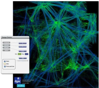
Fig. 1. One day’s record of traffic over France. The color gradient from green to blue represents
the ascending altitude of aircraft (green being the lowest and blue the highest altitude). Thus, the French coastline is revealed here as a consequence of sightseeing in light aircraft and the straight blue lines represent high altitude flight routes.
2. How does FromDaDy work ?
First, the user select displayed dimension in the database description. Second, the user
setup the visual properties based on Bertin’s visual variables (position, size, color,
shape). Third, the user can interact with the displayed data with the brush, pick and drop paradigm. These simple interactions techniques allow the iterative exploration of a database; hence allow answering complex queries in a multivariate database.
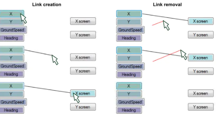
Link creation Link removal
Fig. 2. Link creation and removal.
FromDaDy uses the data flow model, through a tool that enables a user to draw connections between data dimensions and visual variables 4 , thus specifying a visual
configuration. For instance, in the left hand image of Erreur ! Source du renvoi
introuvable., the user connected the longitude with the X axis of the view and the latitude with the Y axis of the view. The user also connected the altitude field of the database to the color of the lines. The resulting connections produce a vertical representation of a one-day traffic record over France (Fig. 1). The user can also remove a connection by drawing a line that cut an existing connection (Fig. 2). Finally, the user can double-click on axis X or Y of a view to make the field selection menu appear, and change the mapping for that axis (Fig. 3).
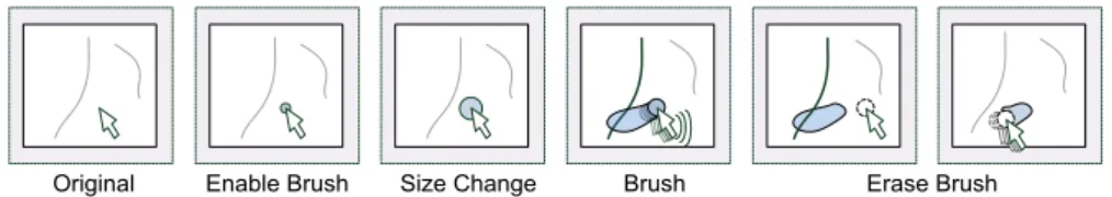
To select a subset, the user uses the brushing technique. Brushing is an interaction
that allows the user to “brush” graphical entities, using a size-configurable or
shape-configurable area which is stuck to the mouse. Each entity touched by the area during the mouse movement is selected (Fig. 4).
Erase Brush Original Enable Brush Size Change Brush
Fig. 4: The brushing interaction allows the user to select trajectories by brushing them with a size configurable tool.
Thanks to the brushing technique, the user can select and highlight part of the displayed data. By hitting the space bar, the user can extract previously selected data and attach them to the mouse cursor (beginning of following figure). By default, the selected data are picked: they are removed from the view, and appear in a “fly-over” view. When the user hits the space bar a second time, a drop occurs in the cell under the cursor. If there is an empty cell under the cursor, the software creates a new view with the selected data. If the user presses the space bar while moving over a cell with an existing view, FromDaDy adds the selected data to this view (Fig. 5).
1. Impementation
FromDaDy is written in C# with the .net framework 3.0 for the interface implementation and uses DirectX 10 for the GP-GPU usage. The GPU usage is widely inspired from the well-known GPU techniques 6. These techniques mainly consist in the use of the render-to-texture techniques combined with an appropriate fragment and geometry shaders to achieve the collision of the points of the tracks and the brushed area. Thus, FromDaDy can display up to 5 million points in real time (framerates of over 20 FPS) with current generation of computer and a modern graphic card (8800GTX).
3. analysis of Unmanned Aerial Vehicle recording
Development and improvement of UAV features is an awkward and difficult challenge. This activity requires precise tools and evaluation methods to analyze the UAV parameters. Therefore a huge quantity of data must be monitored and analyzed: servo-controlled loops, speed, altitude, orders, batteries’ power, GPS positions. FromDaDy has already been used to analyze days of recorded aircraft trails. FromDaDy unveiled unexpected information: radar errors areas, transponders’ errors (onboard transmission system that sends the altitude and identification of the aircraft), Radar test points, local hubs (dense areas). In this section, we present results of the produced visualization with FromDaDy when exploring recorded data of an UAV. This will give a good insight of available information and then assess the performance of the flight.
2. The UAV data
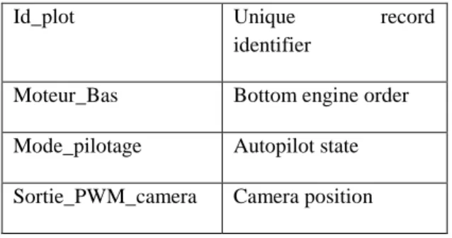
The recorded data are composed of manifold attributes (32 monitored fields). The following table details the most important ones.
Tetc Filtered UAV’s pitch
Tet Pitch order
Hp Filtered Altitude
Position X Longitude of the UAV
Id_plot Unique record identifier
Moteur_Bas Bottom engine order
Mode_pilotage Autopilot state Sortie_PWM_camera Camera position
3. Visual analysis
In order to explore the recorded data, we applied the Keim 9 and Shneiderman 12
mantra:”overview first, details on demand”. These data contains the recorded UAV
positions organized within a sequence of Way Points (WP). The Fig. 6 shows a top view (latitude and longitude) of the recorded positions, with a different color for each
WP’s segment. This first step in the data exploration is very important since it validates the dataset’s integrity: the UAV recorded trail is conform to the actual UAV
positions, the location of each waypoints is also visually checked.
Way Point 1
Way Point 2
Way Point 3
Optimal trail
Fig. 6: Single UAV trail with Way Points and optimal trails.
This overview highlights some trails erroneous behaviors. The UAV performed two
positions’ overshooting at the second and third WP. Deeper analysis will explain this
In the following images, no scales are displayed, but the user can interactively explore the displayed value since an information box is attached to the mouse pointer and gives the pointed value.
4. 2D graph
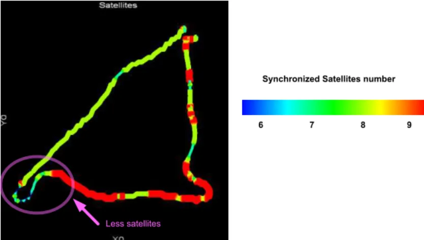
With a top view of the UAV trail, the user can use the color to visually code relevant fields of the dataset. For instance, Fig. 7 shows the number of satellites synchronized with the NavSat system. And then the user discovers that during each steering, the number of satellite decreases. When hoovering over the most interesting points of the graph, the user can read the exact values which indicate a minimum of 4 satellites to a maximum of 7 synchronized satellites. This visualization is relevant since it indicates that the UAV can face geographical positioning issues when it changes direction. Further investigation must be done to figure out exactly the reason of this satellite loss.
Less satellites
Synchronized Satellites number
6 7 8 9
Fig. 7 :Top view with a color scale of synchronized satellites.
Another interesting visualization is a top view with colors indicating the UAV speed. Since the UAV have a constant pitch, its speed should remain constant. Variations should only occur when steering or adjusting the altitude of the UAV. But Fig. 8 clearly indicates that the UAV had high speed values when going from North to South and low speed values when flying from South to North. This graph clearly indicates that during the recording the wind blew from the North and then altered the UAV trail.
UAV speed m/s
0 1 2 3 4 5 6 7 Estimated
wind direction
Fig. 8 : Top view with a color scale of UAV speeds.
5. Time series
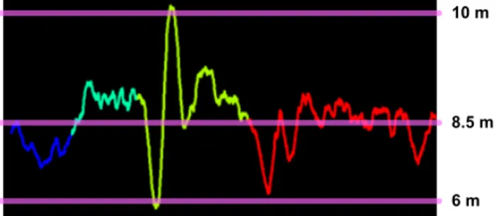
The user wanted to investigate the evolution of the altitude during the recording. Therefore the time series of the altitude values over time displays some artifacts. Fig. 9 shows the time series of the recorded altitudes and exhibits strong variation at every WP. The colors scale is the same as in Fig. 6. This time series indicates a quick altitude loss when the UAV passes each WP. This phenomenon is related to the UAV change in direction and the decreasing of its lift. This graph also shows the strong altitude correction which produces oscillations.
10 m
8.5 m
6 m
Fig. 9 :Time series of the altitude evolution over time. Color codes the WP numbers. Fig. 10 shows the same altitude time series, color visually coding motor actions on the elevator. This visualization confirms that too strong actions were performed on the elevator which produces altitude oscillations.
Elevator values
- Min Value 0 + Max Value
Fig. 10 :Time series of the altitude evolution over time. Color codes motor actions on the UAV elevator.
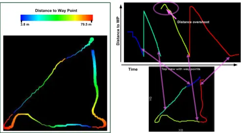
Fig. 10 and Fig. 9 show that the altitude loss when turning should be anticipated in order to optimize the UAV trail. In the Fig. 6 (the top view), the second WP was overshot. To help understand this behavior, Fig. 11 shows a time series of the distance evolution to each WP. When the UAV reaches each a WP (distance is null), its distance is reset to the distance to the next WP. This distance evolution within the same WP section should be monotone (only decreasing values), but it is not the case. In the two first WP segments, the distance to the next WP decreases, but in the 2nd and the 3rd segment, this distance kept on increasing after the UAV reached the WP. The UAV did not anticipate enough the required steering. The steering actions should have been initiated before the UAV reached a 5 meters distance to the WP.
Distance to Way Point
3.8 m 79.5 m Distance overshoot D is ta n c e to W P Time
Fig. 11: Time series of the distances evolution to the next WP. Color codes the WP number.
Generally speaking, each recorded dimension must be validated in order to remove outliers and errors. Fig. 12 shows the time series of the evolution of the autopilot orders. It shows numerous errors since the recorded flight was fully automatic. This
analysis software allows the user to select them (with the brushing paradigm) and remove them.
Time
Brush to select and remove outliers
Va
lu
e
Fig. 12 : Outliers in the autopilot time series. Color codes the WP number.
6. Parallel exploration
The graph analysis allows visualizing the threshold detection efficiency. For instance, Fig. 13 shows the real measures of the pitches values and their threshold filtering. This visualization helps to setup correct threshold value.
Mesured UAV pitch Filtered UAV pitch
Fig. 13: Time series of the UAV pitches evolution. Left figure shows the actual pitches values, right figures shows the filtered values (threshold usage).
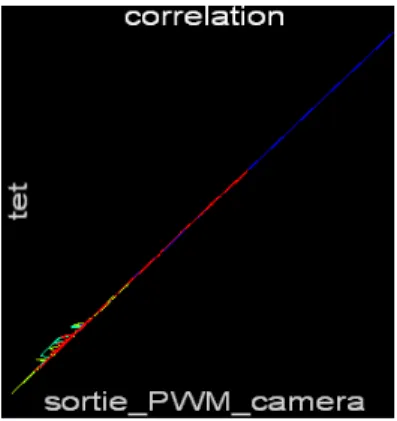
7. Correlation
One of the main activities when performing data exploration is seeking fields correlation. To do so, we usually use the matrix scatter plot 2 visualization that displays all the available 2D graph regarding the fields in the Data Base. Since the visual configuration is easy to setup with FromDaDy, the user can very quickly swap from one visual configuration to another. Fig. 14 shows an actual correlation between
tet (UAV pitch) and sortie_PWM_camera (the camera pitch). The feedback loop
system tries to maintain the embedded camera horizontal; therefore the motor actions (sortie_PWM_camera) must be correlated to the actual UAV pitch, which is the case in Fig. 14.
Fig. 14 : correlation between the UAV pitches and the camera pitches.
4. Conclusion
FromDady is an accurate, quick and easy to use visualization software. From it, the user can extract a set of relevant information that answers complex queries. This software stems from innovative research and development in the HCI (Human Computer Interaction) and the InfoVis (Information Visualization) fields. It aims at improving the bandwidth between the visualized data and the perceived information. To do so, it uses a minimalist interface: a desktop with a matrix of cells (views navigation), and a dimension-to-visual variables connection tool (to setup the design of the views). Its interactions are also minimalist: brushing, picking, and dropping. Nevertheless the combination of these interactions enables numerous functions and helps users to quickly setup the visualization and thus speed-up the exploration process.
In this paper, we used FromDaDy as a design configuration tool to produce relevant visualizations. It helps to get insight of the dataset, to find out correlation, outliers, and erroneous data. It also helps to find some tuning in the UAV behavior: anticipation of steering orders. FromDaDy also helps to unveil the wind direction and its alterations on the UAV trail. As a future work, we plan to explore records of multiple trails. This will give a good overview of available information and will help to compare trails, to sort them, thus unveiling unexpected information. Finally we also plan to explore merged data from UAV flight records and human operator with physiological recorded parameters.
5. REFERENCES