Automating Data Visualization through
Recommendation
by
Kevin Zeng Hu
S.M., Massachusetts Institute of Technology (2015)
S.B., Massachusetts Institute of Technology (2013) Submitted to the Program in Media Arts and Sciences,
School of Architecture and Planning,
in partial fulfillment of the requirements for the degree of Doctor of Philosophy in Media Arts and Sciences
at the
MASSACHUSETTS INSTITUTE OF TECHNOLOGY June 2019
@Massachusetts
Institute of Technology 2019. All rights reserved.Signature redacted
A u th or ... : ...
Program in ia Arts and Sciences Z7)7 )f;ay//713, 2019 Certified by...Signatureredacted
Cesar Hidalgo Associate Professor of Media Arts and Sciences MIT Media Lab
/
cThesis S_pervisorAccepted by...
Signature redacted
MASSACHUSETTS INSTITUTE . TodfKVlachover
OF TECHNOLOGY Icoe
Academic Head
Automating Data Visualization through Recommendation by
Kevin Zeng Hu
Submitted to the Program in Media Arts and Sciences, School of Architecture and Planning,
on May 13, 2019, in partial fulfillment of the requirements for the degree of
Doctor of Philosophy in Media Arts and Sciences
Abstract
Demand for data visualization has exploded in recent years with the increasing avail-ability and use of data across domains. Traditional visualization techniques require users to manually specify visual encodings of data through code or clicks. While man-ual specification is necessary to create bespoke visman-ualizations, it renders visman-ualization inaccessible to those without technical backgrounds. As a result, visualization recom-mender systems, which automatically generate results for users to search and select, have gained popularity. Here, I present systems, methods, and data repositories to contextualize and improve visualization recommender systems.
The first contribution is DIVE, a publicly available and open source system that combines rule-based recommender systems with manual specification. DIVE inte-grates state-of-the-art data model inference, visualization, statistical analysis, and storytelling capabilities into a unified workflow. In a controlled experiment, we show that DIVE significantly improves task performance among a group of 67 professional data scientists. Over 15K users have uploaded 7.5K datasets to DIVE since its release.
In response to the limitations of rule-based recommender systems, VizML is a ma-chine learning-based method for visualization recommendation. VizML uses neural networks trained on a large corpus of datasetvisualization pairs to predict visualiza-tion design choices, such as visualizavisualiza-tion type and axis encoding, with an accuracy of over 85%, exceeding that of base rates and baseline models. Benchmarking with a crowdsourced test set, we show that our model achieves human-level performance when predicting consensus visualization type.
To support learned visualization systems, VizNet is a large-scale visualization learn-ing and benchmarklearn-ing repository consistlearn-ing of over 31M real-world datasets. To demonstrate VizNet's utility as a platform for conducting crowdsourced experiments
with ecologically valid data, we replicate a prior perceptual effectiveness study, and demonstrate how a metric of visualization effectiveness can be learned from experi-mental results. Our results suggest a promising method for efficiently crowdsourcing the annotationsnecessary to train and evaluate machine learning-based visualization recommendation at scale.
Enabled by the availability of real-world data, Sherlock is a deep learning approach to semantic type detection. We train Sherlock on 686K data columns retrieved from the VizNet corpus by matching 78 semantic types from DBpedia to column headers. We characterize each matched column with 1, 588 features describing the statistical properties, character distributions, word embeddings, and paragraph vectors of col-umn values. A multi-input neural network achieves a support-weighted F1 score of
0.89, exceeding that of a decision tree baseline, dictionary and regular expression
benchmarks, and the consensus of crowdsourced annotations.
I conclude by discussing three opportunities for future research. The first describes
design considerations for mixed-initiative interactions in AI-infused visualization sys-tems such as DIVE. The second reviews recent work on statistical validity of insights derived from visualization recommenders, which is an especially important consider-ation with learned systems such as VizML. Lastly, I assess the benefits of learning visualization design from non-experts then present experimental evidence towards measuring the gaps between expert and non-expert judgment.
Thesis Supervisor: C6sar Hidalgo
Title: Associate Professor of Media Arts and Sciences, MIT Media Lab
Automating Data Visualization through Recommendation by
Kevin Zeng Hu
The following people served as readers for this thesis:
ThesisReadgSignature
redacted
Tim Kraska Associate Professor of Electrical Engineering and Computer Science MIT Computer Science and Artificial Intelligence Laboratory
Thesis Reader
//1
ZQSignature redacted
Assistant Professor ofrvind Satyanarayan Electrical Eng neering and Computer Science MIT Computer Science and Artificial Intelligence Laboratory
Acknowledgments
My time at the MIT Media Lab began in January 2012 when I started as an
under-graduate intern under Shahar Ronen. Shahar was a student in the Collective Learning (nee Macro Connections) group led by the charismatic and brilliant Professor Cesar Hidalgo. Little did I know at the time that Cesar would become the greatest teacher of my life. He taught me how to conduct research, showed me how to write, and supported me through challenging times.
I have been extremely indebted to many teachers throughout and beyond MIT. The
members of my doctoral thesis committee, Tim Kraska and Arvind Satyanarayan, together with
Qagatay
Demiralp, encouraged me to pursue challenging questions and showed me how to communicate research to a broader visualization and machine learning community.Although I cannot repay the debt I owe to my teachers, I tried to pay it forward by mentoring undergraduate interns over the years. Helping them learn and grow and start amazing careers has been a privilege.
I am also grateful for a diverse group of peers and collaborators. Throughout its
multiple generations of students, the Collective Learning group was my family at the lab. Thank you Cristian Jara Figueroa, Tarik Roukny Ornia, Flavio Pinheiro, Diana Orghian, Sanjay Guruprasad, Deepak Jagdish, Mary Kaltenberg, and many others. Beyond the group, it has been a privilege to work with talented peers at the Media Lab and MIT more broadly, like Michiel Bakker, Madelon Hulsebos, Owais Khan, Travis Rich, and Alexis Hope.
This journey would have been much more challenging, and definitely less enjoyable, without good company along the way. Though I'm lucky to call my peers some of my best friends, my research would not have been possible without friends from all
walks of life. There are three groups of friends I'd like to thank in particular. Suite
C, we've known each other for almost a decade and I look forward to the decades to
come. Funfetti, you were my first friends at the Media Lab and made it into a home. Revengers, I couldn't ask for better friends to travel the world with.
Above all, I am thankful for my family. But because of them, I'm not the first Dr. Hu. That honor goes to my father, Haoran Hu, an man of extraordinary vision and discipline. He taught me that it is possible to achieve one's dreams - but only through hard work. Nor am I the second Dr. Hu. Caroline Hu is one of few people that is world-class at three things: science, art, and being a great Siss. While our height difference has inverted since childhood, I will always look up to her.
Most of all, as I write this on Mother's Day 2019, I am grateful to my late mother, Ping Zeng Hu. Mama Hu taught me all that is worth knowing in this life: how to learn, how to love, and how to be happy. She deserves all the credit for Dr. Hu #3.
Contents
Abstract
1 Introduction
1.1 Problem . . . .
1.2 Approach . . . .
1.3 Outline and Contributions . . . .
1.4 Prior Publications and Collaboration . . . .
2 Related Work
2.1 Visualization Systems ... 2.1.1 Dataset-Specific Systems . . . . 2.1.2 Dataset-Agnostic Systems . . . . 2.2 Visualization Recommenders . . . . 2.2.1 Data Query Recommenders . . . . 2.2.2 Rule-based Recommenders . . . .
2.2.3 Machine Learning-based Recommenders . . .
2.3 Data Collection From and For Visualization Research
2.3.1 Graphical Perception . . . .
2.3.2 Data Collection for Visualization Research . .
2.3.3 Machine Learning Corpora . . . .
2.4 Semantic Type Detection . . . .
2 19 20 21 23 26 28 . . . . . 29 . . . . . 29 . . . . . 31 . . . . . 33 . . . . . 34 . . . . . 34 . . . . . 35 . . . . . 37 . . . . . 38 . . . . . 39 . . . . . 39 . . . . . 39
2.4.1 M atching-based . . . . 2.4.2 Data-driven . . . . 2.5 Sum m ary . . . . 3 DIV 3.1 3.2 U sage Scenario . . . . Design Considerations . . . .
3.2.1 Discretize Workflow into Tasks Grouped by Ordered Modes .
3.2.2 Hierarchically Distinguish Between Navigation, Configuration,
and R esults . . . .
3.2.3 Organize Input Components into Tightly-Coupled Hierarchies
3.2.4 Combine Populated Defaults with Incremental Selection . . .
3.2.5 Distinguish Recommendation Types . . . .
3.3 System Description . . . .
3.3.1 Datasets: Upload and Inspect . . . .
3.3.2 Visualize: Explore and Drill-down . . . .
3.3.3 Analysis: Aggregation, Correlation, Comparison,
3.3.4 Stories: Compose and Share . . . . 3.4 Architecture and Implementation . . . .
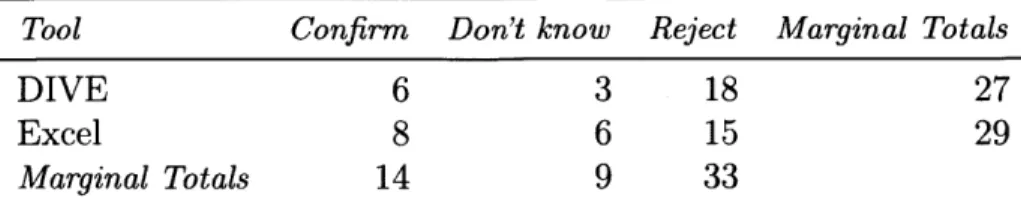
3.5 Evaluation: DIVE Versus Excel . . . .
3.5.1 Participant Description . . . .
3.5.2 Experimental Procedure . . . .
3.5.3 Experiment Results . . . .
and Regression
3.5.4 Qualitative Participant Feedback
E 40 41 42 43 45 47 47 48 49 49 49 51 51 53 54 55 55 56 57 57 61 64
3.5.5 Experimental Results Summary . . . .
3.6 Summary and Future Work . . . .
4 VizML
4.1 Problem Formulation . . . . 4.1.1 Modeling Design Choice Recommendation 4.2 D ata . . . .
4.2.1 Collection and Cleaning . . . . 4.2.2 Data Description . . . . 4.2.3 Feature Extraction . . . . 4.2.4 Design Choice Extraction . . . .
4.3 M ethods . . . . 4.3.1 Feature Processing . . . . 4.3.2 Prediction Tasks . . . . 4.3.3 Neural Network and Baseline Models . . .
4.4 Evaluating Performance . . . . 4.4.1 Interpreting Feature Importances . . . . . 4.5 Benchmarking with Crowdsourced Effectiveness
4.5.1 Modeling and Measuring Effectiveness 4.5.2 Data Preparation . . . . 4.6 Crowdsourced Evaluation Procedure . . . .
4.6.1 Benchmarking Procedure . . . . 4.6.2 Benchmarking Results . . . . 4.7 D iscussion . . . . 64 65 67 . . . . . 69 . . . . . 71 . . . . 72 . . . . 73 . . . . 75 . . . . 77 . . . . 79 . . . . 79 . . . . 81 . . . . 81 . . . . 83 . . . . 84 . . . . 87 . . . . 90 . . . . 90 . . . . 92 . . . . 93 . . . . 95 . . . . 96 . . . . 99
4.8 Future W ork . . . . 5 VizNet 5.1 D ata . . . . 5.1.1 C orpora . . . . 5.1.2 Characterization . . . . 5.2 Experiment Design . . . .
5.2.1 Replication of Kim and Heer (2018) . . . .
5.2.2 D atasets . . . . 5.2.3 Visual Encodings . . . . 5.2.4 T asks . . . . 5.2.5 Procedure . . . . 5.2.6 Participants . . . . 5.3 R esults . . . .
5.3.1 Comparing Subject Performance . . . .
5.3.2 Extending with an Outlier Detection Task
5.3.3 Learning a Model to Predict Effectiveness
5.3.4 Lim itations . . . . 5.4 Discussion . . . .
5.5 Summary and Future Work
6 Sherlock 6.1 RelatedW ork . . . . 6.2 Data . . . . . . . . 1 2 0 123 126 129 100 102 104 104 105 107 108 108 109 110 110 111 112 112 113 115 116 118
6.2.1 Data Collection . . . . 129
6.2.2 Feature Extraction . . . . 130
6.2.3 Filtering and Preprocessing . . . . 132
6.3 Methods . . . . 133
6.3.1 Sherlock: A Multi-input Neural Network . . . . 133
6.3.2 Benchmarks . . . . 135
6.3.3 Training and Evaluation . . . . 138
6.4 Results . . . . 138
6.4.1 Benchmark Results . . . . 138
6.4.2 Performance for Individual Types . . . . 140
6.4.3 Contribution by Feature Category . . . . 141
6.4.4 Feature Importances . . . . 141
6.4.5 Rejection Curves . . . . 143
6.5 Discussion . . . . 144
6.6 Summary and Future Work . . . . 144
7 Conclusion 148 7.1 Review of Contributions . . . . 148
7.2 Future Work . . . . 150
7.2.1 Mixed-Initiative Interactions . . . . 151
7.2.2 Statistical Validity of Visual Analysis . . . . 156
7.2.3 Experts versus Non-experts . . . . 157
List of Figures
1-1 Example specification for a 2D scatterplot visualizing two columns of the classic automobile dataset [142]. . . . . 22 1-2 Creating a visualization in Vega-Lite and Tableau. . . . . 22
1-3 Graphical Outline of the Thesis . . . . 24
3-1 Four stages of a data exploration workflow in DIVE: (A) Datasets, (B) Visualize, (C) Analysis, and (D) Stories. . . . . 43
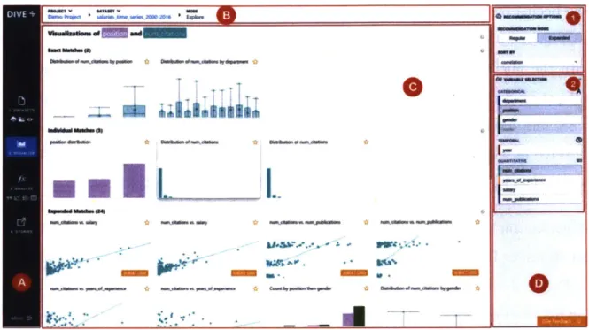
3-2 The DIVE user interface. The left navigation bar labeled (A) is used to
navigate between modes and modify project properties. The top nav-igation bar labeled (B) marks the current user state (project, dataset, and mode) and lets users switch projects or datasets. The main pane labeled (C) displays the main results of the mode. The right selection menu (D) lets users change mode-specific parameters (D1) or selecting fields (D2). All other modes in DIVE follow this hierarchical four-section layout, though some modes do not include a selection menu
(D ). . . . . 4 5
3-3 Map of the four user stages (rows) and associated tasks (cells) in DIVE.
Tasks are connected by an arrow if they are connected by an action.
A complete, linear use case of DIVE would begin on the top-left [1.
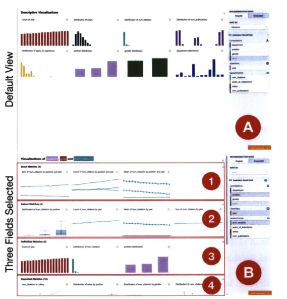
Datasets > Upload] task and progress downwards through modes, to-wards the bottom-center [4. Stories > Story] task. . . . . 47 3-4 Recommended visualizations in the Explore mode, as fields
incremen-tally selected. (A) shows the default view when a user first navigates to Explore, while (B), show recommended visualizations if three fields (position, year, salary) are selected. The sections marked (BI), (B2), (B3), and (B4) contain exact, subset, individual, and expanded m atches, respectively. . . . . 50 3-5 Inspect mode table view showing the following inferred field properties:
(A) name, (B) ID or univariate descriptive visualization, (C) statistical
properties, (D) field color and selectors for changing the color or field type, and (E) data sample. . . . . 52
3-6 Three-stage visualization recommendation system. Given a user data
model and user field selection, the system first enumerate visualization specifications, then materializes the specifications and filters based on effectiveness and expressiveness criteria, and finally scores the
visual-izations. . . . . 53
3-7 DIVE system diagram. . . . . 56
4-1 A diagram of the data processing and analysis flow in VizML, starting from (1) the original Plotly Community Feed API endpoints, proceed-ing to (2) the deduplicated dataset-visualization pairs, (3a) features describing each individual column, pair of columns, and dataset, (3b) the design choices extracted from visualizations, (4) task-specific mod-els trained on these features, and (5) potential recommended design choices. . . . . 67
4-2 Example specification for a 2D scatterplot visualizing two columns of the Cars dataset. .. . ... . . . .. . . 69
4-3 Creating visualizations is a process of making design choices, which can be recommended by a system or specified by an analyst. . . . . . 70
4-4 Basic setup of learning models to recommend design choices with a corpus of datasets and corresponding design choices. . . . . 72
4-5 Creating a scatterplot in the Plotly schema using the Plotly Chart Builder and the Plotly Python Library. . . . . 73
4-6 Screenshot of the Plotly Community Feed [132]. . . . . 74
4-7 Distribution of plots per user, visualized on a log-linear scale . . . . . 75
4-8 Distribution of dataset dimensions in the Plotly corpus. . . . . 76
4-9 Extracting features from the Automobile MPG dataset. [142] . . . . . 77
4-10 Extracting design choices from a dual-axis scatterplot visualizing three columns of the MPG dataset. . . . . 77
4-11 Marginal contribution to neural network accuracy by feature set, for each task. Baseline accuracies are shown as solid and dashed lines for naive Bayes (NB), K-nearest neighbors (KNN), logistic regression (LR), and random forest (RF). HSA = Has Shared Axis, ISA = Is Shared X-axis or Y-Axis and XY = Is on X-axis or Y-axis. . . . . 85
4-12 Experiment flow. The original user-generated visualizations are high-lighted in blue, while we generated the visualizations of the remaining types. After crowdsourced evaluation, we have a set of votes for the best visualization type of that dataset. We calculate confidence inter-vals for model scores through bootstrapping. . . . . 94 4-13 Distribution of Gini coefficients for the visualization type prediction
tasks. Higher Gini indicates stronger consensus. . . . . 97
4-14 Consensus-Adjusted Recommendation Score of three ML-based, two rule-based, and two human predictors when predicting consensus visu-alization type. Error bars show 95% bootstrapped confidence intervals, with 10' bootstraps. The mean minimum achievable score is the lower dashed line, while the highest achieved CARS is the upper dotted line. 98
5-1 VizNet enables data scientists and visualization researchers to aggre-gate data, enumerate visual encodings, and crowdsource effectiveness evaluations. . . . . 102
5-2 Summary statistics (top) and distributions (bottom) of the four source corpora and the VizNet IM corpus. In the top table, we report the median number of rows and columns. The Distribution column in-cludes the top three most frequent column distributions. Distributions
are abbreviated as Norm = normal, L-N = log-normal, Pow = power law, Exp = exponential, Unif = uniform, and Und = undefined. The
bottom part of the figure contains distributions describing columns, datasets, and the entire corpus. The bars outlined in red represent three column datasets and the subset which contain one categorical and two quantitative fields. The clustering of three column (C=1,
Q=2) datasets is shown in more detail in Figure 5-5. . . . . 106
5-4 Bootstrapped means and 95% confidence intervals for error rates (left) and log response times (right) across tasks and visual encodings for Kim and Heer (2018) original data, and our replication on VizNet. We reuse the original color encoding of Kim and Heer (2018). Shading indicates a statistically significant difference. . . . . 114
5-5 Two-dimensional t-SNE projection of datasets with one categorical and
two quantitative columns, evenly sampled from Kim and Heer (2018) and the four corpora within VizNet, with a perplexity of 75. . . . . . 116 5-6 Observed log response times (in seconds) vs. those predicted by a
gradient boosted regression tree. The dotted diagonal line denotes a perfect relationship between observation and prediction . . . . 117
5-7 Training R2 and 5-fold cross-validation R2 as the number of training
exam ples increases. . . . . 118 5-8 Performance curves obtained by semi-supervised active learning and
supervised learning over 10 iterations. . . . . 122
6-1 Data processing and analysis flow starting from (1) a corpus of real-world datasets, proceeding to (2) feature extraction, (3) mapping from the features to ground truth semantic types from column headers, and then moving to (4) model training and prediction. . . . . 123 6-2 Data types detected by Tableau Desktop 2018.3 for a dataset of country
capitals, with and without headers. . . . . 125 6-3 Number of columns per semantic type extracted from VizNet after
filtering out the types with less than 1K columns and more than 15% of columns not present in the GloVe dictionary. . . . . 134 6-4 Architecture and hyperparameters of feature-specific subnetworks and
prim ary network. . . . . 135 6-5 Examples of dictionary entries and a learned regular expression for the
grades type. . . . . 136 6-6 Rejection curves showing performance while rejecting all but the top
x% highest confidence samples. . . . . 143
7-1 Mean visualization value across three visualizations for crowdsourced workers and experts. . . . . 159
List of Tables
2.1 Comparison of machine learning-based visualization recommendation systems. The major differences are that of learning task definition, and the quantity (Ndata) and quality (generation and training data) of the
training data. . . . . 37
3.1 Count of participants that corrected their false prior beliefs about the gender wage gap. . . . . 62 3.2 Count of participants that corrected their false prior beliefs about the
department with the largest fraction of women. . . . . 62
4.1 Single-column and pairwise-column features used to describe datasets in V izM L . . . . 80
4.2 16 Aggregation functions used to aggregate single- and
pairwise-column features into 841 dataset-level features. . . . . 81
4.3 Design choice prediction accuracies for five models, averaged over 5-fold cross-validation. The standard error of the mean was < 0.1% for all results. Results are reported for the neural network (NN) and four baseline models: naive Bayes (NB), K-nearest neighbors (KNN), logis-tic regression (LR), and random forest (RF). Features are separated into four categories: dimensions (D), types (T), values (V), and names
(N). N,, is the size of the training set before resampling, d is the
number of features, and C is the number of outcome classes. HSA = Has Shared Axis, ISA = Is Shared X-axis or Y-Axis, and XY = Is on X-axis or Y-axis. . . . . 86
4.4 Top-10 feature importances determined by mean decrease impurity for the top performing random forest models. The second column in the visualization-level importances table describes how each feature was aggregated, using the abbreviations in Table 4.2. Colors represent different feature groupings: dimensions (m), type ( ), statistical [Q]
(m), statistical [C] (m), sequence (m), scale of variation (m), outlier
(m), unique (m), name (m), and pairwise-relationship (m). . . . . . 88
6.2 Description of the 27 global statistical features. Asterisks (*) denote
features included in Venetis et al. [186]. . . . . 131
6.3 78 semantic types included in this study. . . . . 133
6.4 Support-weighted F1 score, runtime at prediction, and size of Sherlock and four benchmarks. . . . . 139
6.5 Top five and bottom five types by F1 score . . . . 140
6.7 Examples of low precision and low recall types. . . . . 140
6.9 Performance contribution of isolated feature sets. . . . . 141
6.10 Top-10 features for the decision tree model. "Score" denotes normal-ized gini im purity. . . . . 142
Chapter 1
Introduction
The ability to take data - to be able to understand it, to process it, to extract value from it, to visualize it, to communicate it - that's going to be a hugely important skill in the next decades...because now we really do have essentially free and ubiquitous data. So the complementary scarce factor is the ability to understand that data and extract value from it. The McKinsey Quarterly
HAL VARIAN, 2009
Data is increasingly abundant and complex. As of 2012, 2.5 million terabytes of data were generated daily [112]. By 2020, an estimated 1.7 megabytes of data will be
generated per person every second [37]. This exponential growth in data is driven
by the decreasing cost of data acquisition and storage across industries. Healthcare
providers such as Kaiser Permanente generate electronic health records about millions of patient outcomes. Users of social media platforms such as Twitter share over half a billion tweets per day. Commercial enterprises such as Walmart collect petabytes of customer behavior data every hour [77,85,112].
The growing supply of data is matched with a commensurate demand for deriving value from data. Across scales - from individuals to organizations to the public sphere
- data is increasingly used to improve understanding of systems and the communica-tion of informacommunica-tion, in the service of making timely and effective decisions. Embracing data pays off: manufacturing firms that adopt data-driven decision making are sta-tistically more productive, and adoption of data analytics has a positive interaction effect on market performance [17,38].
prac-tices for deriving value from data, such as natural language processing, information retrieval, or machine learning. Data visualization, which leverages the human visual system by encoding information with the visual properties of graphical marks, is one such practice [11,30,191]. Researchers have demonstrated the utility of visualization for supporting exploratory data analysis tasks such as detecting patterns and finding outliers [181] and communicative tasks such as authoring narratives [158]. Across in-dustries, from journalism to healthcareto the enterprise, interpreting and authoring visualizations is becoming an essential skill [169].
1.1 Problem
Technical users can draw on an abundance of tools for authoring visualizations. Visu-alization toolkits [46,59] provide a variety of mechanisms for creating visuVisu-alizations, such as subclassing a hierarchy of visualization widgets. Visualization grammars, such as D3 and Vega, allow visualization creation through the composition of primi-tives [15,154]. Both toolkits and grammars permit the creation of highly customized visualizations and have seen widespread adoption, but they require programming ex-perience. Vector drawing tools like Adobe Illustrator are popular for creating static visualizations, but often have steep learning curves.
Users without programming expertise resort to using tools that have limited flexibility. Visualization tools that are tailored to a specific dataset are increasingly common, but do not let users visualize their own data [148,165,205] . Chart typologies [195]
such as ManyEyes and charts -within Excel let users quickly create visualizations, but restrict users to a small set of chart types [114,188]. Interactive visualization design tools such as Tableau and Plotly provide drag-and-drop interactions for custom visualization design [130,173]. However, manually specifying visualizations can be
ihttps://nytimes.com/elections/2012/results/president/scenarios.html
2
https://projects.fivethirtyeight. com/world-cup-comparisons 3
https: //ourworldindata. org/grapher/gini- index-around-2015-1990-2015-
tedious and requires design and analysis expertise, which is not feasible when one is working with a limited amount of time.
As data visualization has begun to be adopted by new communities, the practice has reached users without the technical background, time, or resources to use exist-ing technologies [14,86]. These users, who are often domain experts like journalists, healthcare practitioners, and business decision-makers, require visualization author-ing tools that can be used without the programmauthor-ing expertise or time needed for manual specification. The absence of tools addressing this need leads to users relying on others with technical background, creating "hacky" solutions in existing tools, or not working with data at all.
1.2 Approach
The gap between need and capability motivates the guiding question of this thesis: how do we make data visualization systems more accessible to a broader audience, without compromising power? Note that manual specification of visualizations is repetitive because many design decisions are already dictated by visualization best practices and the constraints of the tool being used. As a result, visualization may lend itself to automation. In particular, this thesis focuses on automating components of the visualization workflow through visualization recommendation, which automat-ically identifies and interactively recommends visualizations that are relevant to a specific task and dataset.
Data visualization communicates information by representing data with visual ele-ments. These representations are specified using encodings that map from data to the retinal properties (e.g., position, length, or color) of graphical marks (e.g., points, lines, or rectangles) [11, 20]. For example, to create a scatterplot showing the rela-tionship between fuel efficiency (MPG) and horsepower (Hp) in an automobile dataset, an analyst would encode each pair of data points with the position of a circle on a
2D plane, while also specifying other retinal properties such as size and color: chevrolet chevelle 18 8 307 130 3504 12 70 US buick skylark 320 8 350 3693 11.5 70 US chevy s-10 31 4 119 82 2720 19.4 82 US 50° 40-Mark Circle Y' Position (x) 112.5px 0 Position (y) 127.2px 20 Size (diameter) 2px
c6 Stroke Color Orange Q.Fill Color White
- O o 10 1so 200
Figure 1-1: Example speci-fication for a 2D scatterplot visualizing two columns of the classic automobile dataset [142].
This simple scatterplot is specified with the Vega-lite [153] grammar by selecting a mark type and fields to be encoded along the x- and y-axes, and in Tableau [173]
by placing the two columns onto the respective column and row shelves, as shown
in Figure 1-2. But as the complexity of a visualization increases, manually specifying encodings can quickly become prohibitively expensive in terms of time and energy.
Vega-Lite .mark": "point-• .encoding: { -x": { field": "Hp, "type: quantitative-y": ( "field": *MPG". "type": "quantitative" } Tableau M Mur * Hpo * ;G\,,drag "I ekm Rw= }
Figure 1-2: Creating a visu-alization in Vega-Lite and Tableau.
Visualization recommendation aims to reduce the cost of creating visualizations by automatically suggesting the choices that maximize the effectiveness of a given visual-ization. The effectiveness of a visualization can be defined by informational measures such as efficiency, accuracy, and memorability [13,208], or emotive measures such as engagement [47,75]. Prior research also shows that effectiveness is informed by low-level perceptual principles [30,60,99,144] and dataset properties [78,151], in ad-dition to contextual factors such as the task [6,78,150], aesthetics [24], domain [71], audience [163], and medium [116,156].
Research progress on visualization recommenders demands developments on three complementary but separate fronts of data, methods, and systems. Understanding the relationship between user data, context, task, and visualization effectiveness re-quires experimental and observational data. Modeling the relationship between data and visualization demands work on the methods for conceptualizing and develop-ing recommender systems. Finally, presentdevelop-ing recommended results to users requires research on designing the systems around recommendations.
1.3 Outline and Contributions
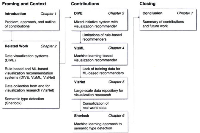
This thesis consists of seven chapters, as depicted in Figure 1-3. CHAPTER 2 describes prior work on data visualization systems (§2.1), visualization recommendation (§2.2), data from and for visualization research (§2.3), and semantic type detection (§2.4). This survey of the literature provides context for the four main contributions of the thesis, along with the systems, methods, and data fronts, as described in CHAPTERS 3 through 6.
The challenges of manual specification motivated the creation of DIVE, a web-based system that integrates state-of-the-art data exploration features into a single tool. DIVE contributes a mixed-initiative interaction scheme that combines recommenda-tion with point-and-click manual specificarecommenda-tion, and a consistent visual language that unifies different stages of the data exploration workflow. CHAPTER 3 describes the usage (§3.1), design considerations (§3.2), system design (§3.3), and implementation (§3.4) of DIVE. We evaluated DIVE by conducting a controlled experiment with 67 professional data scientists from two large U.S. consulting firms (§3.5). Our results show that, without prior training, DIVE users were significantly faster than experi-enced Excel users at completing predefined data visualization and analysis tasks, and were also more likely to correct false prior beliefs. Over 15K users have uploaded
Framing and Context
Introduction Chapter 1
Problem, approach, and outline of contributions
Related Work Chapter 2
Data visualization systems
(DIVE)
Rule-based and ML-based visualization recommendation systems (DIVE, VizML, VizNet) Data collection from and for visualization research (VizNet) Semantic type detection (Sherlock)
Contributions
DIVE Chapter 3
Mixed-initiative system with visualization recommender Limitations of rule-based recommenders VizML Chapter 4 Machine leaming-based visualization recommender
Lack of training data for ML-based recommenders
VizNet Chapter 5
Large-scale data repository for visualization reseearch
Consolidation of real-world data
Sherlock Chapter 6
Machine learning approach to
semantic type detection
Closing
Conclusion Chapter 7
Summary of contributions and future work
Figure 1-3: Graphical Outline of the Thesis
of DIVE, it was limited by its underlying rule-based recommendation scheme, which did not provide meaningful recommendations for unseen datasets, instead producing an overwhelming quantity of recommendations for multiple selected fields.
The limitations of rule-based recommender systems led to VizML, a machine learning-based approach to visualization recommendation using data from a popular online platform. In CHAPTER 4, we first formulate the visualization recommendation prob-lem (§4.1). Then, we identify five key design choices made by analysts while creating visualizations, such as selecting a visualization type and choosing to encode a column along the x- or y-axis. We train models to predict these design choices (§5.2) using one million dataset-visualization pairs collected from a popular online visualization platform (§5.1). Neural networks predict these design choices with a high accuracy when compared with baseline models (§4.4). We report and interpret the importances
of features extracted from one of these baseline models. To evaluate the generalizabil-ity and uncertainty of our approach, we benchmark with a crowdsourced test set, and show that the performance of our model is comparable to human performance when predicting consensus visualization type, and exceeds that of other visualization rec-ommender systems (§4.5). While the performance of VizML is promising, the quality of learned models ultimately depends on the quality and quantity of the underlying training data. The data used in current ML-based recommender systems fall short in one of these two dimensions.
The lack of high-quality training data in sufficient quantities motivated the creation of VizNet, a large-scale corpus of over 31 million datasets compiled from open data repositories and online visualization galleries. On average, these datasets comprise 17 records over 3 dimensions and across the corpus, and we find 51% of the dimensions record categorical data, 44% quantitative, and only 5% temporal
(§5.1).
VizNet provides the necessary common baseline for comparing visualization design techniques and developing benchmark models and algorithms for automating visual analysis. To demonstrate VizNet's utility as a platform for conducting online crowdsourced experiments at scale, we replicate a prior study assessing the influence of user task and data distribution on visual encoding effectiveness, and extend it by considering an additional task: outlier detection (§§5.2, 5.3). To contend with running such studies at scale, we demonstrate how a metric of perceptual effectiveness can be learned from the experimental results and show its predictive power across test datasets (§5.3). By facilitating research with ecologically valid data, VizNet can be useful not only for visualization research, but also for data systems research broadly.Correctly detecting the semantic type of data columns is crucial for data science tasks such as automated data cleaning, schema matching, and data discovery. The importance of correct semantic types coupled with the data made available through VizNet enabled Sherlock, a deep learning approach to semantic type detection. We
train Sherlock on 686,765 data columns retrieved from the VizNet corpus by match-ing 78 semantic types from DBpedia to the column headers. We characterize each matched column with 1, 588 features describing the statistical properties, character distributions, word embeddings, and paragraph vectors of the column values (§6.2). These features are used to train a multi-input neural network (§6.3). The neural net-work achieves a support-weighted F1 score of 0.89, exceeding that of a decision tree
baseline, dictionary and regular expression benchmarks, and the consensus of crowd-sourced annotations (§6.4). The high performance of our approach, coupled with its apparent robustness to dirty data, encourages future research in using real-world data to train learned data science systems components.
To close, CHAPTER 7 summarizes the contributions of this thesis (§7.1). We discuss limitations of these contributions and recent research developments, before highlight-ing four promishighlight-ing directions for future research related to visualization recommen-dation (§7.2). Systems like DIVE require a balance between agency and automation, leading to questions regarding the design of mixed-initiative interfaces, deskilling users, and the interpretability of recommender systems (§7.2.1). As learned systems are adopted in more and more real-world contexts, it is increasingly important to ensure the statistical validity of visual analysis with recommender systems (§7.2.2). The scalability of learned systems like VizML and repositories like VizNet depend on harvesting training data from non-experts, raising open questions about the validity of non-expert judgment compared with expert judgment (§7.2.3).
1.4 Prior Publications and Collaboration
This majority of this thesis consists of peer-reviewed work of which I am the primary or co-primary author. But each contribution was the result of a larger effort from many collaborators, especially my advisor Professor Cesar Hidalgo, who supported each project with resources and guidance. DIVE was published at ACM SIGMOD 2018
Workshop on Human-in-the-Loop Data Analytics [66], VizML was published at
ACM CHI 2019 [64], VizNet was published at ACM CHI 2019 [65], and Sherlock was
published at ACM KDD 2019 [67]. All projects were the result of an large and diverse group of collaborators. To reflect the collective contribution of all contributors, this thesis uses the plural pronoun "we."
Chapter 2
Related Work
This thesis is grounded in four bodies of related work:
1. Visualization Systems (§2.1) describes prior systems for visualization creation,
authoring, and exploration through manipulation of a graphical interface. Such systems motivate and inform the current thesis in general, and the development
of DIVE (CHAPTER 3) in particular.
2. Visualization Recommenders (§2.2) surveys rule-based and machine learning-based methods for visualization recommendation. The former rule-learning-based proaches inform the recommendation system underlying DIVE, while both
ap-proaches motivate VizML (CHAPTER 4).
3. Data Collection From and For Visualization Research (§2.3) reflects on the state
of data collected from graphical perception studies. The utility and scarcity of this data prompt the creation of data repositories intended for visualization
research, such as VizNet (CHAPTER 5).
4. Semantic Type Detection (§2.4) surveys rule-based and data-driven approaches for detecting semantic types. Building on the strengths of prior approaches, Sherlock (CHAPTER 6) is then evaluated against benchmarks exemplifying these approaches.
The goal of this section is to contextualize each thesis contribution by characterizing each body of prior work, identifying gaps in knowledge, and describing the movements in the field.
2.1 Visualization Systems
To enable visualization creation, researchers have developed two bodies of prior work. The first consists of programming toolkits and libraries that enable custom visual-ization design. While programming toolkits and libraries for visualvisual-ization have seen widespread adoption, this thesis is informed primarily by systems that allow visual-ization creation through manipulation of a graphical interface.
These systems can be categorized according to dataset specificity and by task. The first category of dataset-specific systems 1) investigate new visualization and interac-tion techniques and 2) enable exploratory analysis. The second category of
dataset-agnostic systems allow 1) authoring, 2) exploratory analysis, and 3) broadly accessible
visualization creation.
2.1.1 Dataset-Specific Systems
Data can be used to measure and describe extremely diverse phenomena, from film reviews to baby name trends. Developing systems to visualize these types of hetero-geneous inputs is challenging. One way to tackle this heterogeneity is to introduce constraints: dataset-specific systems are tailored to specific datasets and, as a result, specific domains. Focusing on specific datasets grants a fixed data model: the space of the objects, attributes, and relationships is fully specified. As a result, dataset-specific systems provide controlled environments for investigating new visualization and interaction techniques as well as for enabling rich exploratory analysis within a chosen domain.
Task: Investigating New Visualization and Interaction Techniques
Seminal data visualization research systems from the mid 1990s such as FilmFinder [5], Table Lens [143], and Seesoft [45] focus on specific data models: film review, tabu-lar baseball statistics, and lines of code data, respectively. By constraining the data model, these "classic" research systems demonstrated the utility of novel visualiza-tion and interacvisualiza-tion techniques such as tightly coupled query components, direct manipulation, and the integration of context with details. Many of these principles and techniques are now ubiquitous in visualization systems intended to accomplish different tasks for a wider variety of data models.
Task: Exploratory Analysis
Driven by the concurrent rise of personal computing, Internet access, and in-browser visualization libraries, web-based visualizations [59] emerged in the mid 2000s. Name Voyager [192] visualizes the trends of baby names over the past century and through-out all 50 U.S. states. Sense.us [62] enabled collaborative visual analysis of census data. Journalistic outlets such as the New York Times graphics department published
U.S. election results1, Box Office Receipts2, and the American Time Use Survey.
As barriers to creating interactive visualizations have decreased, web-based visualiza-tions have become the dominant paradigm for creating, sharing, and consuming in-teractive visualizations. Data tools are centered around specific datasets and themes, such as the Observatory of Economic Complexity [165] for international trade and DataUSA 4 for US census data. Our World in Data aggregates visualizations and
lhttps://www.nytimes. com/elections/2008/results/president/votes.html 2https://www.nytimes.com/interactive/2008/02/23/movies/20080223_REVENUEGRAPHIC. html 3 https://www.nytimes.com/interactive/2009/07/31/business/20080801-metrics-graphic.html 4https://datausa.io
narratives relating to global development time series data. Similarly, Gapminder
[50]
provides interactive bubble charts to explore development data. Personally, I con-tributed to Pantheon [205] and the Global Language Network [148], two bespoke visualization systems enabling the exploration of datasets related to historical cul-tural production and the connections between language groups.Systems for exploring specific datasets have become indispensable. However, creating such systems requires knowledge of software engineering, a specific data domain, and visualization best practices. As a result, users who wish to visualize their own datasets frequently rely on dataset-agnostic systems that allow users to upload their own data.
2.1.2 Dataset-Agnostic Systems
By relaxing the constraint on datasets, data-agnostic systems do not make such strict
data model assumptions because they accommodate user-uploaded data. Instead, data-agnostic systems are typically constrained to tidy [194] tabular data in which the rows represent observations across the attributes represented by columns. Proceeding from this assumption about semantics - the correspondences between data values and real-world concepts - three categories of data-agnostic systems have emerged.
Task: Accessible Visualization Creation
Chart typologies let users select from pre-defined visualization types, such as scat-terplots and bar charts, and map data values to the encoding channels of these vi-sualizations. A ubiquitous example is the chart template functionality in Microsoft Excel [114]. Similar functionality is present in popular web-based tools such as Web IBM ManyEyes [188], Raw Graphs [111], and Plot.ly Chart Studio [130]. Although chart typologies permit rapid visualizations, they typically support a limited number
of visualization types and customizable parameters.
Instead of constraining users to selecting chart templates, systems based on shelf configuration let users specify encodings through drag-and-drop interactions. Three popular shelf configuration tools include the business intelligence tools tool Tableau (formerly known as Polaris [173]), Spotfire [4], and Qlik Sense [137]. Drag-and-drop interactions are easy to use but do not permit fine-grained specification of a mark style and are still limited in configurability.
Task: Authoring
In response, interactive visual design tools such as Lyra [152], Charticulator [146], and Data Illustrator [100] provide fine-grained control of the visual properties of graphical marks. Built upon data binding models, defined conceptual frameworks such as the Vega specification [154], and constraint-based layout algorithms, these state-of-the-art systems provide the expressiveness needed to create complex visualizations without having to program. Advances in interactive visual design tools address the use case of authoring customized visualizations, while recommender systems facilitate exploring simple visualizations.
Task: Exploratory Analysis
The complete manual specification of visual encodings may be necessary to create customized visualizations. However, for many common use cases, such as prelimi-nary data visualization and creating basic visualizations, the speed and breadth of exploration are more important than customizability. In these cases, visualization rec-ommender systems propose to automatically suggest visualizations for users to search and select, leading to the development of mixed-initiative systems that balance user
interactions with automated recommendation [63].
Prior mixed-initiative systems present a gallery of visualizations with varied under-lying data and visual encodings. For example, VizDeck [128] presents users with a ranked list of 1D and 2D visualizations that a user can vote up or down. VizDeck incorporates user votes to update visualization ranks. Small Multiples, Large Sin-gles [183] presents a main visualization and a grid of small multiples that are variants of the main visualization. Users explore recommendations by specifying data queries or visual encodings. Keshif [203] lets users interact with web-based dashboards com-posed of linked visualizations.
Extending these gallery approaches, recent work utilizes increased computational re-sources to recommend related views that include unselected fields. Voyager [199] and Voyager 2 [200], along with the underlying Compass recommender engine
[198],
recommend visualizations involving user-selected fields and one non-selected field. Explore in Google Sheets [52] provides similar recommendations that "look ahead" one field. DIVE is inspired by Voyager 2, and aims to extend its mixed-initiative visualization approach to other parts of the data exploration pipeline. That said,
DIVE also extends this line of work by including more non-selected fields in
recom-mendations, incorporating semantic types into recomrecom-mendations, and introducing a distinction between exact, subset, and expanded recommendations.
2.2 Visualization Recommenders
Underlying mixed-initiative visualization systems are visualization recommenders that either suggest data queries (selecting what data to visualize) or visual encodings (how to visualize the selected data) in response to uploaded data [198]. Recommenders are also categorized into rule-based approaches that encode the best practices through hand-crafted rule sets and machine learning-based approaches that learn recommen-dations directly from data.
2.2.1 Data Query Recommenders
Data query recommenders vary widely in their approach. Rank-by-feature frame-work [159] and Scagnostics [196] present predefined sets of visualizations, such as 2D scatter plots of column pairs, that are ranked by the statistical properties of underly-ing data. Pre-defined visualizations provide effective overviews of data but can omit meaningful relationships or visualizations. To address this problem of false negatives, Zenvisage [162] and VizDeck [128] enumerate "all possible" visualizations. For ex-ample, VizDeck creates 2D scatterplots between all column pairs, which is tractable for small datasets but grows exponentially with the number of columns. In response, recent systems such as SeeDB [107], MuVE [43], and Data Polygamy [27] optimize statistical "utility" functions that serve as proxies for "interestingness" or "relevance." Though specifying data queries is crucial to visualization, it is a distinct task from visual encoding recommendation, which is the focus of VizML. Orthogonal to the distinction between data query and visual encoding recommenders is the dimension of rule-based versus machine learning-based systems. Rule-based systems encode visualization best practices as hard-coded if-then statements and weights. In contrast, ML-based systems learn the relationship between input data and output visualization.
2.2.2 Rule-based Recommenders
Most visual encoding recommenders implement guidelines that are informed by the seminal work of Bertin [11] and Cleveland and McGill [30]. This approach is
exem-plified by Mackinlay's APT [105] - the ur-recommender system - which enumerates,
filters, and scores visualizations using expressiveness and perceptual effectiveness cri-teria. The closely related SAGE [149], BOZ [21], and Show Me [106] support more data, encoding, and task types. Recently, hybrid systems such as Voyager [198-200],
Explore in Google Sheets [52,187], and VizDeck [128] have combined visual encoding rules with the recommendation of visualizations that include non-selected columns. Though effective for many use cases, these systems suffer from three major limita-tions. First, visualization is a complex process that may require modelling non-linear
relationships that are difficult to capture with simple rules. Second, crafting rule sets is a costly process that relies on expert judgment, especially as visualization best practices continue to evolve with research advances. Lastly, as the dimension of input data increases, the combinatorial nature of the rules result in an explosion of possible recommendations.
2.2.3 Machine Learning-based Recommenders
The guidelines encoded by rule-based systems are often derived from experimental findings and expert experience. Therefore, through an indirect manner, heuristics distill the best practices learned from another analyst's experience of creating and consuming visualizations. Instead of aggregating the best practices learned from data and representing them in a system with rules, ML-based systems propose training models that learn directly from data and can be embedded into systems as is.
Developed to map JSON-encoded data directly to Vega-Lite visualization specifica-tions, Data2Vis [36] uses a neural machine translation approach to create a sequence-to-sequence model. The model is trained using 4,300 automatically generated Vega-Lite examples, consisting of 1-3 variables that are generated from 11 distinct datasets. Model predictions are qualitatively validated by examining the visualizations gener-ated from 24 common datasets.
Taking a hybrid approach, DeepEye [103] combines rule-based visualization gener-ation with models trained to classify a visualizgener-ation as "good" or "bad" and rank
lists of these visualizations. The DeepEye corpus consists of 33,412 bivariate visu-alizations of columns drawn from 42 public datasets. Here, 100 students annotated these visualizations as good/bad, and compared 285,236 pairs. These annotations, combined with 14 features for each column pair, train a decision tree for classification and a ranking neural network [18] for the "learning to rank" task.
Conceptualizing data visualization as a constraint solving problem, Draco-Learn [119] learns trade-offs between the constraints in Draco, a formal model that represents vi-sualizations as logical facts and design guidelines as hard and soft constraints. Con-straint weights are learned using a ranking support vector machine trained on ranked pairs of visualizations that are harvested from graphical perception studies [78,150]. Draco then recommends visualizations that satisfy these constraints by solving a combinatorial optimization problem.
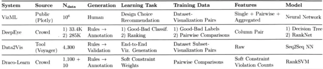
VizML differs from these systems in three major respects. A tabular comparison of the ML-based visualization recommendation systems is shown in Table 2.1. In terms of the learning task, DeepEye learns how to classify and rank visualizations, Data2Vis learns an end-to-end generation model, and Draco-Learn learns the weights of soft constraints. By learning to predict design choices, VizML models are easier to quantitatively validate, provide interpretable measures of feature importance, and can be more easily integrated into visualization systems.
In terms of data quantity, the VizML training corpus is orders of magnitude larger than that of DeepEye and Data2Vis. The size of our corpus permits the use of 1) large feature sets that capture many aspects of a dataset and 2) high-capacity models such as deep neural networks.
The third major difference is one of data quality. In contrast to the few datasets used to train the three existing systems, the datasets used to train VizML models are ex-tremely diverse in shape, structure, and distribution. Furthermore, the visualizations
System Source Ndata Generation Learning Task Training Data Features Model
VizML Public 10i Human Design Choice Dataset- Single + Pairwise + Neural Network
(Plotly) Recommendation Visualization Pairs Aggregated
DeepEve Crowd 1) 33.4K Rules-* 1) Good-Bad Classif. 1) Good-Bad Labels ColumnPair 1) Decision Tree
2) 285K Annotation 2) Ranking 2) Pairwise Comparisons 2) RankNet
Data2Vis Tool 4300 Rules - End-to-End Dataset Subset- Raw Seq2Seq NN
(Voyager) Validation Viz. Generation Visualization Pairs
Draco-Learn Crowd 1,100+ Rules -+ Soft Constraint Pairwise Comparisons Soft Constraint RankSVM
10 Annotation Weights Violation Counts
Table 2.1: Comparison of machine learning-based visualization recommendation sys-tems. The major differences are that of learning task definition, and the quantity
(Ndata) and quality (generation and training data) of the training data.
used by other ML-based recommender systems are generated by rule-based systems and evaluated under controlled settings. The corpus used by VizML is the result of real visual analysis by analysts on their own datasets.
However, VizML faces two major limitations. First, these three ML-based systems recommend both data queries and visual encodings, while VizML only recommends the latter. Second, in this paper, we do not create an application that employs our visualization model. Design considerations for user-facing systems that productively and properly employ ML-based visualization recommendations are important, but beyond the scope of this paper.
2.3 Data Collection From and For Visualization Research
Rule-based visualization recommender systems encode visualization best practices that are informed by the results of graphical perception studies. The data harvested from these studies are increasingly used to train and benchmark learned visualization systems. However, these studies are typically conducted on single datasets with small size and variety, making them difficult to generalize. Data repositories for
visualiza-tion research address the need for centralized data to scale and generalize research,
2.3.1 Graphical Perception
The visual encoding of data is central to information visualization. Earlier stud-ies have analyzed how different choices of visual encodings such as position, size, color, and shape influence graphical perception [30], the decoding of data presented in graphs. Through human subjects experiments, researchers have investigated the effects of visual encoding on the ability to read and make judgments about the data represented in visualizations [30,58,82,92,164,167,168,179]. Consequently, prior re-search has provided rankings of visual variables by user performance for nominal, ordinal, and numerical data [30,92, 104,105,161]. Researchers have also studied how design parameters beyond visual encoding variables, such as aspect ratio [28,57,176], size [29,60,88], chart variation [84,178], and axis labeling [177], impact the effective-ness of visualizations. Previous studies have evaluated how user task, data types, and distributions influence the effectiveness of charts [150] and visual encoding vari-ables [78].
In current practice, graphical perception experiments are typically conducted on single datasets that are of a small size and variety, lacking the characteristics of real-world data. Studies based on ad hoc datasets may provide useful results but are inherently partial and difficult to generalize, reproduce, and compare against. VizNet provides a corpus of real-world tables from diverse domains to make it easier for researchers to run visualization design evaluation studies at scale. VizNet is sufficiently rich both in size and variety to satisfy the data needs of a substantial number of experimental designs, facilitating the comparison of and reasoning about the results from different experiments on a common baseline.
2.3.2 Data Collection for Visualization Research
Although researchers recognize the need for data collection and generation to facilitate evaluation across a broad range of real datasets [155,157], little effort has been made to create centralized corpora for data visualization research. Beagle [10] has been used to scrape over 41, 000 visualizations from the web. Similarly, the MassVis [13] database was compiled by scraping over 5,000 visualizations from the web and par-tially annotating them. Lee et al. [160] recently extracted and classified 4.8 million figures from articles on PubMed Central. However, these datasets do not include the raw data represented by the visualizations, limiting their utility for generalized and reproducible visualization research.
2.3.3 Machine Learning Corpora
Recent developments of large-scale data repositories have been instrumental in foster-ing machine learnfoster-ing research. Access to rich, voluminous data is crucial for develop-ing successful machine learndevelop-ing models and for compardevelop-ing different approaches usdevelop-ing a common baseline. To this end, researchers have created centralized data repositories for training, testing, and benchmarking models across many tasks. Publicly available repositories such as ImageNet [35], SUN [202], COCO [96], and so forth, are one of the main drivers behind the rapid advances in deep learning. VizNet is informed and inspired by the digital experimentation capabilities of large-scale data repositories in machine learning research.
2.4 Semantic Type Detection
Compared with basic atomic types (e.g., strings and numbers), semantic types (e.g., date-time and e-mail address) provide richer and finer-grained descriptions of the
![Figure 1-1: Example speci- speci-fication for a 2D scatterplot visualizing two columns of the classic automobile dataset [142].](https://thumb-eu.123doks.com/thumbv2/123doknet/14134475.469517/22.917.102.535.178.414/figure-example-fication-scatterplot-visualizing-columns-classic-automobile.webp)