HAL Id: hal-00828795
https://hal.archives-ouvertes.fr/hal-00828795
Submitted on 6 Sep 2013
HAL is a multi-disciplinary open access
archive for the deposit and dissemination of
sci-entific research documents, whether they are
pub-lished or not. The documents may come from
teaching and research institutions in France or
abroad, or from public or private research centers.
L’archive ouverte pluridisciplinaire HAL, est
destinée au dépôt et à la diffusion de documents
scientifiques de niveau recherche, publiés ou non,
émanant des établissements d’enseignement et de
recherche français ou étrangers, des laboratoires
publics ou privés.
Visual Analysis of Complex Networks for Business
Intelligence with Gephi
Sébastien Heymann, Bénédicte Le Grand
To cite this version:
Sébastien Heymann, Bénédicte Le Grand. Visual Analysis of Complex Networks for Business
In-telligence with Gephi. 1st International Symposium on Visualisation and Business InIn-telligence, in
conjunction with the 17th International Conference Information Visualisation, Jul 2013, London,
United Kingdom. pp.307-312, �10.1109/IV.2013.39�. �hal-00828795�
Visual Analysis of Complex Networks for Business Intelligence with Gephi
S´ebastien Heymann, B´en´edicte Le Grand
LIP
6 -
CNRS- Universit´e Pierre et Marie Curie,
CRI- Universit´e Paris 1 Panth´eon – Sorbonne
[email protected], [email protected]
Abstract
Platforms which combine data mining algorithms and interactive visualizations play a key role in the discovery process from complex networks data, e.g. Web and Online Social Networks data. Here we illustrate the use of Gephi, an open source software for networks visual exploration, for the visual analysis of Business Intelligence data mod-eled as complex networks.
1
Problem Statement
1.1
Context
The recent availability of a vast amount of data from Online Social Networks (OSN) and from the Web have opened promising perspectives for the field of Business In-telligence (BI), in particular for the monitoring of brand e-reputation and for the management of customer relation-ships. The methods developed for the analysis of social ties and Web linkage can also be applied to study the activities in organizations and their evolution over time. Who works with whom? Who works on what? Where? And how does the activity evolve?
Activities within companies can be modeled as complex networks of individuals who may work on various projects at different locations. A network (also called graph) is made of a set of entities, called nodes, and a set of relation-ships between entities, called links. Even when such data is available, extracting valuable information and convey-ing insights through interactive visualization is challeng-ing. Analysts indeed usually deal with four dimensions made of social, topical, geographical, and temporal data.
The process involved from data collection to informa-tion discovery requires a complete tool chain to acquire and parse data, filter, mine, then represent it and finally refine the visualizations interactively [12]. Nowadays, companies have access to a large choice of methods and correspond-ing tools for each step. These methods usually come from the fields of Social Network Analysis (SNA), Scientomet-rics and Web mining. However their combination remains problematic because the large variety of methods makes the selection difficult. Analysts must also learn how to use
each new method properly, verify how to transfer data and intermediate results from one tool to another, check the in-tegrity of the deployed processing chain to assess the va-lidity of results, and eventually use the processing chain.
Moreover, this process is usually not static but dynamic: one rarely knows in advance which methods are relevant for the data under study. Hence it implies many trials and errors using various methods before discovering new in-formation. Visualization may indeed reveal the need to acquire more data, or filter it in another way ; interacting with it may require to change visual variables and aesthet-ics. Computing basic statistics and proceeding to an early visual exploration of data before performing more specific analysis can thus provide relevant hypotheses to start with.
1.2
Visual Data Mining Tools
The research community started to address these issues by creating software which combine both statistical and visualization analysis. The first tool which received a wide attention was Pajek [3] for the analysis of social networks, but more are now available. Well-known open source tools include Cytoscape for biological networks [17], Sci2 Tool for scientometric studies [6], Tulip for information visu-alization [1], and Gephi that we introduced in a previous paper [2]. These tools are made for the integration of algo-rithms in a unified way, capable of using algorithm results as inputs of other algorithms, and with a remarkable effort to maintain the source code over time.
1.3
Goal of the Paper
Despite the existence of other visualization tools, Gephi has been widely adopted by the research community1, but
its use so far has been mostly limited to experts in complex networks and visualization. In this paper we target non-expert users and illustrate the use of Gephi for the visual analysis of networks, where networks are extracted from various dimensions of data. This is particularly interesting in the context of BI [21], as it allows users who are not experts in complex networks visualization to manipulate
1[2] is cited 225 times according to Google Scholar in February 2013, and the 0.8.1 version of the software has been downloaded 134,000 times, see https://launchpad.net/gephi/+download.
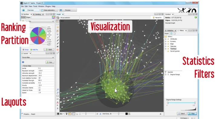
Figure 1: Overview of Gephi 0.8.
data and make decisions.
2
Gephi
Gephi is an open source software for the visual explo-ration of networks. While various software exist to visu-alize and analyze networks, Gephi is particularly suited for networks with node properties, which is the kind of networks usually available in BI. Properties are key-value pairs associated to each node or each link. For example, members of a social network may have attributes such as gender, language, and age.
Gephi software is generic. Any kind of network can be analyzed, like communication (e.g. email) and finan-cial networks, OSN (e.g. Twitter, Facebook), data center networks (i.e. connections between machines), document networks, and more.
Gephi has been designed to facilitate the non-linear pro-cess of information discovery. In particular, it is focused on the visualization of the network using node-link dia-grams(in which nodes are represented by discs and links by lines), real-time interaction with data (e.g. node group-ing, filtergroup-ing, use of statistical results in the visualization), and the building of a visual language (the mapping of data variables to visual variables was theorized in [4], [9]). This language makes use of colors and sizes to create informa-tive visuals, which aim at being the network equivalent of
geographical maps [7].
A typical visual analysis with Gephi follows the well established mantra of Visual Information Seek-ing: ”Overview First, Zoom and Filter, Details-on-Demand” [18]. The objective is to reveal visual saliencies of interest for the analyst, i.e. elements which perceptually stand out from the remainder of the elements and grab the attention of the observer [14]. Such saliences may chal-lenge current hypotheses and raise new questions. The an-alyst then changes the visualization accordingly, to eventu-ally select a picture which clearly reveals an issue, or which supports an hypothesis.
In Gephi, users have to interact with the visualization in real-time to position nodes in a two or three dimensional space using layout algorithms, or by manually moving nodes (see Figure 1). They use node properties to change their colors and sizes, in order to find groups and detect significant nodes (i.e. individuals in the case of social net-works). The goal is to study the correlation of node proper-ties and network structure by using visual patterns. Classic data mining algorithms of Social Network Analysis, such as the Louvain community detection algorithm [5], or the betweenness centrality measure [8], can be computed at any time and their results integrated in the visualization through visual features. The network can also be filtered according to nodes and links properties.
performance, code modularity, and community of develop-ers and usdevelop-ers. The Gephi user interface is focused on the creation of network visuals in real-time. The key innova-tion is to ease the interacinnova-tion with the network, as users can literally play with its visual representation. By playing, we mean experimenting various visual configurations to see the outcome of any action instantaneously, for instance by playing with force-directed layouts to shape the network structure. Such algorithms are usually described as spring embedders [15] due to the way the forces are computed. These layouts rely on a physical metaphor to position the nodes according to the position of the others. Roughly speaking, connected nodes tend to be closer, while discon-nected nodes tend to be more distant. More precisely, they compute repulsive forces between all nodes, but also at-tractive forces among adjacent nodes. Each layout iteration calculates the forces applied on each node, and updates its position. The visualization is refreshed at each iteration, thus providing real-time feedback to users. Some layouts are implemented with no stopping condition. Users can thus tweak the layout parameters in real-time until they de-cide to stop its execution. Interaction while calculating lay-out is made technically possible by using multi-threading processing, and by using the GPU for rendering the visual-ization.
These features enable the visual exploratory analysis of networks. The approach of Exploratory Data Analysis [20] emphasizes the importance of curiosity and serendipity (i.e. discoveries made while searching for something else) to data analysis. The main benefit is to generate novel questions and research hypotheses. After having outlined the main features of Gephi that makes it particularly suit-able for the visual exploration of data, we provide a general methodology for its use in the context of BI through use cases in the following section.
3
Case Studies
3.1
Network Conceptualization of Data
Many companies store data in tabular formats where lines are entities and columns dimensions, see Table 1. The first step towards network analysis is to conceptualize data as a network. The network is hence a particular view on the data, and one must decides the roles played by the data dimensions: they may correspond either to node, link, node property, or link property. Many ways are possible depend-ing on the analysis to be performed. We illustrate this issue on an example in the area of Human Resources.
Let a listing of each sales representative, their sales vol-ume, their status in the company, and the products they have sold. This data is stored in a table of columns la-beled respectively sales representative, sales volume,
sta-tus, recruiter, products, as illustrated on Table 1. One can extract: the network of ”who recruited whom”; the net-work of products connected by a common sales represen-tative; the network of sales representatives connected by two common products. Network representation should be chosen according to initial goals. Gephi can be used once a network has been extracted from original data.
Table 1: Example of company data.
sales rep. sales vol. status recruiter products John 3500 Executive A Carla 18000 Manager John A, B Simon 1040 Associate Carla
Celine 7300 Associate John A, B Winston 24000 Manager Diana A Diana 2700 Associate Carla
3.2
Social Network Analysis
Social network analysis consists in the study of the con-nectivity between individuals, groups or organizations. Be-sides customer data collected by companies, the analysis of digital traces of social activity on the Web, online social networks and other information systems is of strategic in-terest e.g. for market research, brand monitoring, and for the analysis of the Return On Investment of communica-tion campaigns.
We take the example of Web data from the e-Diaspora research project [11] to illustrate our methodology in this context. This project aims at studying the usages of the Web by migrants communities. A migrant site is a website created or managed by migrants or that is related to mi-grations or diasporas. This may be for example a personal site or blog, the site of an association, a portal / forum, an institutional site. After the collection of the initial cor-pus of websites, researchers annotate each website using properties defined manually, and an automatic detection of the website’s main language is performed. The dataset contains both websites (nodes), hyperlinks between them (links), and properties of the websites (i.e. node proper-ties). Then the network is visually analyzed using Gephi. The following analysis is performed on the network of websites of the Moroccan diaspora.
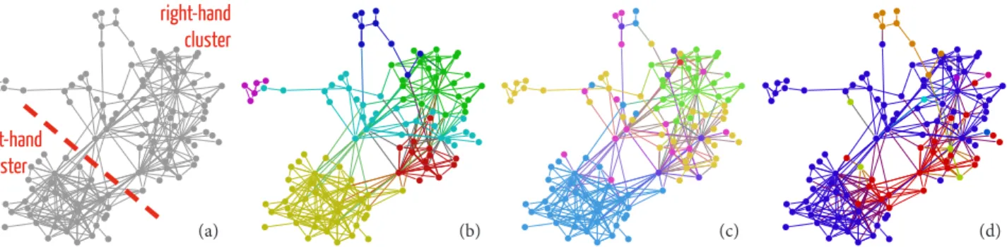
We loaded this network in Gephi and applied the ForceAtlas layout to get an overview of the network struc-ture, see Figure 2 (a). We observe that it is clearly divided into two main clusters2of nodes (on the bottom-left and on the top-right) with a few nodes connecting these clusters.
To validate this observation, we applied the Louvain modularity algorithm (resolution=1), which automatically
(a) (b) (c) (d) left-hand
cluster
right-hand cluster
Figure 2: Giant component (i.e. connected component of the largest number of nodes) of the network of Moroccan migrants websites (e-Diaspora): (a) graph laid out using the ForceAtlas algorithm; (b) colors mapped to Louvain modularity commu-nities (resolution=1); (c) colors mapped to website categories (blue=blog, green=institutional, orange=NGO, ...); (d) colors mapped to languages (blue=French, red=English, orange=Spanish, ...). Links colors correspond to source node colors.
detects non-overlapping communities that are finally rep-resented with different colors. Intuitively, it shows how the network is divided naturally into groups of nodes with dense connections within each group and sparser connec-tions between different groups. We see in Figure 2 (b) that the left-hand cluster is clearly detected. Sub-clusters are also detected in the right-hand cluster (the resolution parameter may be modified to find different sub-clusters), however Louvain algorithm provides no justification on the existence of these clusters. The algorithm may indeed de-tect communities in networks with no community struc-ture, which is one of its limits.
We would like to explain why these clusters exist, and why some nodes act as bridges between them. We thus studied the correlation between node properties and visual patterns. We mapped the property called website category to node colors, see Figure 2 (c). We observe that the left-hand cluster corresponds very clearly to websites classi-fied as blogs (in blue). This trivial grouping supports the hypothesis that blogs tend to be more connected to other blogs than to the remainder of the websites. However there is no trivial grouping for the right-hand cluster. So we mapped the property of website main language to node colors, see Figure 2 (d). We observe that the websites of both left-hand and right-hand clusters are mostly written in French (in blue), but the clusters also contain some web-sites written in English (in red). A sub-cluster (in red) in the right cluster is also confirmed; it corresponds to the red cluster detected by the Louvain algorithm. Finally, we observe that one of the websites connecting the two clus-ters is written in English, and it is connected to the other websites in English. Hence this observation supports the hypotheses that the existence of hyperlinks between web-sites is correlated to webweb-sites language, and that the salient website seems to play a key role for websites written in
English.
In conclusion, we have outlined how Gephi can be used to generate relevant hypotheses for the study of social net-works. The detection of central nodes and other advanced visual queries, like network filtering, are also possible but we do not present them here due to space constraints.
3.3
Topical Network Analysis
The analysis of topical (or semantic) networks consists in studying the connectivity between descriptors over a set of entities. Typical topical networks are co-occurrences of keywords describing a set of documents. Users can analyze such networks using the approach described in the previous section. For instance, Grauwin and Jensen used Gephi to map the research carried out in a scientific institution using bibliometric data gathered from the Web Of Science [13]. In this dataset, each scientific article is described by a set of keywords. The co-keywords network is thus a set of nodes representing keywords, and a set of links representing articles described by pairs of keywords. The Louvain algorithm is computed to detect keyword groupings, and the visualization is used to evaluate their relevance.
3.4
Geographical Network Analysis
Geospatial BI relies on integrating Geographic Infor-mation Systems (GIS) with BI technologies. Gephi pro-vides a basic combination of network and geospatial an-alytics. If node properties include latitude and longitude coordinates, geographical projections (e.g. Mercator pro-jection) can be applied with the GeoLayout plugin. Nodes are thus positioned according to their geographical coor-dinates. Networks can then be exported to KMZ files for further analysis on GIS software using the ExportToEarth plugin.
Figure 3: Screenshot of Gephi 0.8 showing the time-varying network of Twitter users. The sparkline chart on the timeline background at the bottom of the Figure corresponds to the number of observed links (here tweets) each day. Nodes are geolocated and positioned according to the Mercator projection.
We applied a Mercator projection to the network of Twitter users who tweeted about COFA Online Gateway3,
an Australian platform for teaching e-learning. The tweets talking about it have been manually collected using the Twitter Timeline and search engine from October 26, 2011 to January 11, 2012. Users have been geolocated man-ually. Then we built the network of these users, where links exist when a user mentions another user in a tweet during this period. The network has been visualized using Gephi, see Figure 3. We discovered that these users are mostly located in south-east of Australia, in Great Britain and in the United Stated, but we have found no visual evi-dence of spatial proximity of mentions on this dataset. We also collected tweet timestamps to study the evolution of the network. The next section outlines an analysis of this time-varying network.
3.5
Time-Varying Network Analysis
Gephi has incorporated features to study time-varying networks, where nodes and links appear and disappear over time. Most of the time-varying networks we have encoun-tered so far are encoded using three different techniques. The first one consists in a series of networks (usually called snapshots) representing the state of the network at differ-ent momdiffer-ents of time. The second technique consists in a series of changes (usually called stream), like the addition
and removal of nodes and links. The last technique consists in a network where nodes and links existence is bound to time intervals (i.e. selection of time points).
Gephi internally encodes time-varying networks using time intervals, for which the time unit is either a number or a date. Additionally, node and link property values are also bound to time intervals. Users can thus study the evolution of network structures over time, but also the evolution of node and link properties.
The Gephi user interface provides a timeline component to select a time interval for which a sub-network (of nodes and links which appear at least once during this interval) is computed and displayed. Moreover, basic statistical prop-erties can be computed over time given a time interval (e.g. value for each day): the number of nodes, links, graph den-sity, average degree and individual node degree. The result may be integrated using a sparkline chart [19] in the time-linebackground: this feature helps users focus on specific moments of the evolution of the time-varying network, like bursts of connections or changes in graph density. Finally, the selected time interval can be animated: users can make it slide as the corresponding network is being displayed, ei-ther manually or automatically by calibrating the speed and frame-rate. Users may apply a layout during the animation to update nodes position.
COFA Online network introduced in the previous section. This study was part of an analysis of the COFA Online au-dience on social media.
Conclusions and Future Work
We have illustrated the use of the Gephi open source software with a global and generic approach for the visual analysis of complex networks using Gephi, to successfully discover relevant information on various types of data used for BI. However this approach is known to be limited by the number of nodes to be displayed, by hardware capabil-ities like screen sizes and computing resources, and by the readability of graph layouts.
We are currently investigating the centered approach, which is a promising alternative for BI: users visualize lo-cal views of the network around a given node or a given set of nodes, which may be the result of a search query. The main benefit is to reduce the number of displayed elements, to ease the navigation from node to node, and to focus only on interesting sets of nodes. Promising results have already been obtained, for instance on the detection of communi-ties, but not coupled yet to visualization tools [10]. We plan to work on a visualization software to navigate in large graph databases from a node-centric point of view.
Acknowledgements
We are thankful to Dana Diminescu, Matthieu Renault, and Mathieu Jacomy for the initial study of the Moroc-can blogosphere; to Daniel Bernardes, Cezary Bartosiak, and Mathieu Bastian for the implementation of the timeline component in Gephi; to Simon McIntyre for the disclosure of materials about the COFA Online study.
References
[1] D. Auber. Tulip - a huge graph visualization frame-work. Graph Drawing Software, pages 105–126, 2004.
[2] M. Bastian, S. Heymann, and M. Jacomy. Gephi: An open source software for exploring and manipulating networks. In Proc. AAAI International Conference on Weblogs and Social Media (ICWSM’09), 2009. [3] V. Batagelj and A. Mrvar. Pajek-program for large
network analysis. Connections, 21(2):47–57, 1998. [4] J. Bertin. Semiology of graphics: diagrams,
net-works, maps. 1983.
[5] V. D. Blondel, J.-L. Guillaume, R. Lambiotte, and E. Lefebvre. Fast unfolding of communities in large networks. Journal of Statistical Mechanics: Theory and Experiment, 2008(10):P10008, 2008.
[6] K. B¨orner. Plug-and-play macroscopes. Communica-tions of the ACM, 54(3):60–69, 2011.
[7] K. W. Boyack, R. Klavans, and K. B¨orner. Mapping the backbone of science. Scientometrics, 64(3):351– 374, 2005.
[8] U. Brandes. A faster algorithm for betweenness centrality. Journal of Mathematical Sociology, 25(2):163–177, 2001.
[9] W. S. Cleveland and R. McGill. Graphical percep-tion: Theory, experimentation, and application to the development of graphical methods. Journal of the American Statistical Association, 79(387):531–554, 1984.
[10] M. Danisch, J.-L. Guillaume, and B. L. Grand. To-wards multi-ego-centered communities: a node sim-ilarity approach. Int. J. of Web Based Communities, 2012.
[11] D. Diminescu. Digital methods for the exploration, analysis and mapping of e-diasporas. Social Science Information, 51(4):451–458, 2012.
[12] B. J. Fry. Computational information design. PhD thesis, Massachusetts Institute of Technology, 2004. [13] S. Grauwin and P. Jensen. Mapping scientific
institu-tions. Scientometrics, 89(3):943–954, 2011.
[14] C. G. Healey, K. S. Booth, and J. T. Enns. High-speed visual estimation using preattentive processing. ACM Transactions on Computer-Human Interaction (TOCHI), 3(2):107–135, 1996.
[15] S. G. Kobourov. Force-directed drawing algorithms. In Handbook of Graph Drawing and Visualization. CRC Press, 2012.
[16] A. Noack. Modularity clustering is force-directed layout. Physical Review E, 79(2):026102, 2009. [17] P. Shannon, A. Markiel, O. Ozier, N. S. Baliga, J. T.
Wang, D. Ramage, N. Amin, B. Schwikowski, and T. Ideker. Cytoscape: a software environment for integrated models of biomolecular interaction net-works. Genome research, 13(11):2498–2504, 2003. [18] B. Shneiderman. The eyes have it: A task by data
type taxonomy for information visualizations. In Vi-sual Languages, 1996. Proceedings., IEEE Sympo-sium on, pages 336–343. IEEE, 1996.
[19] E. R. Tufte. Beautiful evidence, volume 23. Graphics Press Cheshire, CT, 2006.
[20] J. W. Tukey. Exploratory data analysis. Reading, MA, 231, 1977.
[21] G. J. Wills. Nicheworks: Interactive visualization of very large graphs. Journal Of Computational And Graphical Statistics, 8(2):190, 1999.