HAL Id: hal-00904545
https://hal-enac.archives-ouvertes.fr/hal-00904545
Submitted on 14 Nov 2013
HAL is a multi-disciplinary open access
archive for the deposit and dissemination of
sci-entific research documents, whether they are
pub-lished or not. The documents may come from
teaching and research institutions in France or
abroad, or from public or private research centers.
L’archive ouverte pluridisciplinaire HAL, est
destinée au dépôt et à la diffusion de documents
scientifiques de niveau recherche, publiés ou non,
émanant des établissements d’enseignement et de
recherche français ou étrangers, des laboratoires
publics ou privés.
The dataflow model : a characterization and a data
exploration tool
Christophe Hurter
To cite this version:
Christophe Hurter. The dataflow model : a characterization and a data exploration tool. INFOVIS
2009, IEEE Information Visualization Conference, Oct 2009, Atlantic City, United States.
�hal-00904545�
The dataflow model: a characterization and a data exploration tool
Christophe HURTERDSNA/DTI R&D, ENAC and IRIT/IHCS France 1 PROBLEM ADDRESSED
Current Air Traffic Control (ATC) activities employ two kinds of visualization systems: real-time traffic views, which are used by Air Traffic Controllers (ATCos) to monitor aircraft positions, and data analysis systems, used by experts to analyze past traffic recording (e.g. conflict analysis or traffic workload forecast). Both types of systems employ complex and dynamic visualizations, displaying hundreds of data that must be understandable with the minimum of cognitive workload.
The first part of the thesis addresses the visual design issue. As traffic increases together with safety concerns, ATC requires new kinds of visualizations. However the lack of efficient methods to analyze and understand why a particular visualization “works” spoils the design process. Since designers have difficulties to analyze previous systems, they are not able to improve effectively them, or to communicate accurately about design considerations. Visualization analysis can be done by characterizing them. In the InfoVis field, existing characterizing tools are based on the dataflow model that takes as input raw data and produces visualizations with transformation functions. Even if this model is able to build most of the existing classes of visualization, we show in the following that it is not able to characterize them fully, especially ecological designs that allow emerging information.
The second part of the thesis addresses data exploration issues. Current visualization systems are not appropriate for visualization and interaction with flight trajectories. The problem we address is to find a way to express simply and accurately queries for traffic trajectories, given the constraints of size and uncertainty of datasets.
2 METHODOLOGY AND PLAN OF RESEARCH
Our goal is to perform an accurate visualization evaluation. We want to answer these questions: “What is the visible information?”, “What are the phenomena/mechanisms that make them visible?”, ”How to format an accurate and exhaustive description of a visualization?”
The first step of this work is to gather enough ATC visualization to cover the largest design space. Then we propose to apply available characterization models, to assess if they are suitable and if the need arises, to improve them. This characterisation must be done with objective and formal assessments. The designer should be able to use this characterisation to list the available information, to compare the differences between views, to understand them, and to communicate with accurate statements.
The second part is dedicated to the data exploration. We will assess existing tools to visualize and interact with ATC data and design our own software taking into account the specificities of ATC data.
2.1 Related works
Data scale analysis [13] and graphic semiology [3] are the first formal tools to perform visual analysis of an image. Steven introduced the data scale analysis: each data has a type depending on its semantic: Nominal, Ordered, Interval, Ratio. The Semiology of Graphics was introduced by Bertin. Visualizations use seven visual variables that form the most basic elements of
graphic composition. These are position (the spatial variables), size, value (luminosity), texture, orientation, shape, and hue.
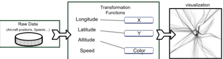
Card, Mackinlay and Shneiderman [5] created a dataflow model (Figure 1) which describes visualizations as a data-processing sequence from the raw data to the view. This model is the foundation of a compact and precise characterization [5].
Latitude Longitude Altitude Speed X Y Color visualization Raw Data (Aircraft positions, Speeds…)
Transformation Functions
Figure 1 : Schematic Dataflow of Information Visualization Different kinds of description tools do exist all based on this dataflow model. Bertin [3] proposes a graphical characterisation, Baudel [4] and Wilkinson [15] used a textual format. Card and Mackinlay [6] (C&M) use a table to describe visualizations. C&M characterization is compact, formatted and may allow the direct comparison of visualization with the comparison of their table. 3 DESCRIPTION OF PROGRESS TO DATE
To back up our research we apply it to a specific field that of the Air Traffic Controller. The main task for an ATCo is to maintain a safe distance between aircraft. To be compatible with this task, the process to retrieve information from visualization must not be cognitively costly. Especially in this field, the precise analysis of visualization is useful to list the visually available information, and to forecast the resulting cognitive workload.
Figure 2 : Radar comets
ODS coded information Visual code
Aircraft position Position
ageing of each position Size
Aircraft speed Size (comet length)
Aircraft tendency (left, right) Comet curvature
Aircraft acceleration Regular/irregular point spacing
Aircraft entity Gestalt (proximity and size)
Table 1 : information coded with a Radar comet As an example, in the radar view, comets display the position of aircraft. The design of the comet is built with squares (Figure 2), whose size varies with the proximity in time of the aircraft‟s position: the biggest square displays the latest position of the aircraft, whereas the smallest square displays the least recent aircraft position. The positions of the aircraft merge through the effect of Gestalt continuity, in which a line emerges with its particular characteristics (curve, regularity of the texture formed by the points, …); thus this design codes a lot of information (Table 1).
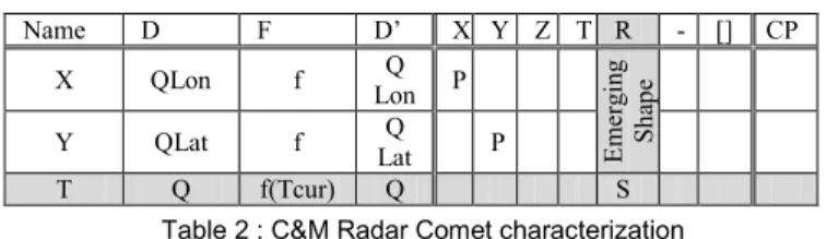
3.1 The Card and Mackinlay model improvements We tried to apply the C&M model to different kinds of ATC visualization [7] [8]. We assessed their effectiveness in exhibiting visual properties. As an example, we studied the radar comet. We introduced the concept of current time (Tcur: the time when the image is displayed). The size of the square is linearly proportional to current time with respect to its aging. The grey row and column are two additional items from the original C&M model (Table 2). However, we discovered that the characterization cannot integrate controllers‟ perception of the evolution of the aircraft‟s most recent positions (speed, evolution of speed and direction). For instance, in Figure 2, the shape of the comet indicates that the plane has turned 90° to the right and that it has accelerated (the variation of the dot spacing). These data are important for the ATCo. The comet curvature and the aircraft acceleration can not be characterized with the C&M model because they constitute emerging information (there is no raw data called „curvature‟ to produce a curving comet with the dataflow model). In Table 1, italic script represents emerging information.
Name D F D‟ X Y Z T R - [] CP X QLon f Q Lon P Emerg in g S h ap e Y QLat f Q Lat P T Q f(Tcur) Q S
Table 2 : C&M Radar Comet characterization 3.2 Characterization results
Whereas Card and Mackinlay depicted some InfoVis visualizations [6] without explicitly demonstrating how to use their model, we have shown the practical effectiveness of the C&M model when characterising the radar comet [7]. Although the C&M tables make visualization amenable to analysis as well as to comparison, this model does not allow essential information to be highlighted for designers, and does not allow any exhaustive comparison of different designs. We extended this model with the characterization of emerging data. The emerging process stems from the embedded time in the radar plot positions. The time can be easily derived into speed and acceleration. We analyzed this feature in a workshop [9].
3.3 Data exploration
Formulating queries about trajectories in a declarative, textual-language based manner, such as a SQL, is hard. Even if it is possible to select trajectories that flow over specific locations, it is very difficult to specify features like “select trajectories where this part of the trajectory is straight” or “where this part has a constant climbing rate”… Thus, visual analysis remains the only way to detect relevant trajectory features efficiently. Current visualization systems are not appropriate for visualization and interaction with flight trajectories.
Trajectories are numerous and tangle: one-day's traffic over France for example, represents some 20,000 trajectories (Figure 3). In addition to the data size problem, users have to deal with a dataset that contains many errors and uncertainties: recording is done in a periodic manner, but a plot can be missed, or have erroneous values because of physical problems that occurred at the time of recording. The problem we addressed is to find a way to express these queries, simply and accurately, given the constraints of size and uncertainty of the datasets.
We have developed FromDaDy [10] (FROM DAta to DisplaY), a visualization tool that tackles the challenge of representing, and interacting with numerous trajectories involving uncertainties. FromDaDy employs a simple paradigm to explore
multidimensional data based on scatterplots, brushing, pick and drop [12], juxtaposed views and rapid visual configuration. The fundamental new aspect of FromDaDy compared to existing visualization systems [1] [14], is to enable users to spread data
across views. Together with a finely tuned mix between design
customization and simple interaction, users can filter, remove and add trajectories in an iterated manner until they extract a set of relevant data, thus formulating complex queries.
Figure 3 : One-day’s record of traffic over France. The color
gradient from green to blue represents the ascending altitude of aircraft (green being the lowest and blue the highest altitude). 4 FUTURE WORK
We plan to push forward our investigation with emerging information and to find out how and why visualizations that use ecological design produce emerging data and are easier to understand. We also plan to improve FromDaDy with the use of different kinds of datasets.
REFERENCES
[1] C.Ahlberg. Spotfire: an information exploration environment.
SIGMOD Rec. 25, 4 (Dec. 1996), 25-29.
[2] A. Treisman, A., Vieira, A., & Hayes. Automatic and preattentive processing. American Journal of Psychology 1992, 105, 341-362. [3] J. Bertin, Graphics and Graphic Information Processing de Gruyter
Press, Berlin, 1977.
[4] T. Baudel, Canonical Representation of Data-Linear Visualizations and its Applications, ILOG Technical report 02-002. 2002. [5] S.K. Card, J. Mackinlay, B. Shneiderman, Information Visualization
Readings in Information Visualization: Using Vision to Think. Morgan Kaufman 1998.
[6] S.K. Card, J.D. Mackinlay, The Structure of the Information Visualization Design Space. In Proc. Information Visualization Symposium '97.
[7] C. Hurter, S. Conversy: Towards Characterizing Visualizations. DSV-IS 2008.
[8] C. Hurter, S. Conversy, V. Kapp, An Infovis approach to compare ATC comets ICRAT 2008.
[9] C. Hurter, S. Conversy, JL Vinot. Temporal data visualizations for Air Traffic Controllers. Interacting with temporal data CHI 09 Workshop.
[10] C. Hurter, B. Tissoires, S. Conversy. FromDaDy: spreading aircraft trajectories across views to support iterative queries. Conditionally accepted at InfoVis 09.
[11] K. Koffka, Principles of Gestalt psychology Routledge 1935. [12] Rekimoto, J. Pick-and-drop: a direct manipulation technique for
multiple computer environments. UIST '97. New York.
[13] S.S., Stevens, On the theory of scales of measurement. Science,1946. [14] C. Stolte, P. Hanrahan. Polaris: A System for Query, Analysis and
Visualization of Multi-Dimensional Relational Databases. InfoVis00 [15] L. Wilkinson, The grammar of Graphics. New York: Springer