Computational, Statistical and Graph-Theoretical
Methods for Disease Mapping and Cluster
Detection
by
Shannon Christine Wieland
B.S., B.A., Ohio State University, 1999Submitted to the Harvard-MIT Division of Health Sciences and Technology in partial fulfillment of the requirements for the degree of
DOCTOR OF PHILOSOPHY
in the field of
MATHEMATICS AND MEDICAL ENGINEERING
at the
MASSACHUSETTS INSTITUTE OF TECHNOLOGY
September 2007
@Shannon Wieland, 2007. All rights reserved.
The author hereby grants to MIT permission to reproduce and to distribute publicly paper and electronic copies of this thesis document in whole or in part in any medium now known or
hereafter created.
Author ... .- ...
Department of Mathematics Harvard-M ivision of Health Sciences and Technology
1 t /1 August 9, 2007
C ertified by ... ...
Kenneth Mandl, M.D. Thesis Supervisor, Assistant Professor of Pediatrics Certified by... Accepted by.. Accepted by.. Accepted by.. MASSACHUSETTS INSTITUTE.1 OF TEOHNOLOGY
OCT
0
A
2007
LIBRARIES
Bonnie Berger, Ph.D. Thesis SupervisorjPrgfessor oApplied Mathematics...
e ...
Alar Toomre, Ph.D. ,hairperson, Applied Mathematics Committee .. .. .. . .. .. .. .. .. .. .. .. . . . . .. .
iDavid Jerison, Ph.D.
Chairperson, Department Committee on Graduate Students . . .. .. . .. .. . .. .. .. .. .. .. .. .. .. . .. .. .. . .. . .
M/
Martha L. Gray, Ph.D. Edward Hood Taplin Pr essor of Medical and Electrical Engineering Director, Harvard-MIT Division of Health Sciences and Technology
Computational, Statistical and Graph-Theoretical Methods
for Disease Mapping and Cluster Detection
by
Shannon Christine Wieland
Submitted to the Department of Applied Mathematics and the Harvard-MIT Division of Health Sciences and Technology
on May 18, 2007, ini partial fulfillment of the requirements for the degree of
Doctorate in Applied Mathematics and Medical Engineering
Abstract
Epidemiology, the study of disease risk factors in populations, emerged between the 16th and 19th centuries in response to terrifying epidemics of infectious diseases such as yellow fever, cholera and bubonic plague. Traditional epidemiological studies have led to modifications in hygiene, diet, and many other practices that have profoundly altered the dynamic between humans and diseases.
In this thesis, we develop mathematical techniques to address modern challenges, including emerging diseases such as SARS and West Nile virus, the threat of bioterror-ism, and stringent legislation protecting patient privacy. Within spatial epidemiology, one problem is to map the risk of disease across space (i.e., disease mapping), and another is to analyze the data for clustering. We propose a general technique, car-tograms created from exact patient location data, that can address both of these problems. We also develop a graph-theoretical method to detect spatial clusters of any shape based on Euclidean minimum spanning trees. For mapping applications, we present an optimal strategy for mapping patient locations that preserves both privacy and spatial patterns within the data. For real-time disease surveillance, in which the goal is early detection of outbreaks based on time-series data, we intro-duce a generalized additive model that maintains constant specificity on various time scales.
Thesis Supervisor: Kenneth D. Mandl Title: Assistant Professor
Thesis Supervisor: Bonnie A. Berger Title: Professor
Acknowledgments
Foremost, I would like to thank my parents Sharon and David Merritt and Frank and Linda McDonald for looking after every aspect of my development throughout my life, and in particular for planning, encouraging, and sacrificing for my education. My parents-in-law Dennis and Ronnye Wieland have also been wonderfully supportive of my studies and career goals. I am indebted to my husband Aaron Wieland for his constant encouragement and for making my graduate school years happy ones, and to my daughters Bailey and Gwyneth for giving me firm deadlines, which undoubtedly sped along the process.
I am also extremely grateful for the mentorship of my Ph.D. advisors, Bonnie Berger and Kenneth Mandl. In addition to introducing me to graph theory and algorithms, Professor Berger has provided guidance during the past five years in many areas, from my coursework to planning my professional life. I am also grateful for her rare example of combining motherhood with a successful academic career. Professor Mandl introduced me to the fields of spatial epidemiology and health surveillance, and has taught me a great deal about envisioning, choosing, and collaborating on projects. I am thankful for his singular regard for my best interests, and also for his endless supply of witty and hilarious comments.
In addition to Professors Berger and Mandl, who helped develop all the ideas presented in this thesis, John Brownstein has been a helpful mentor and worked closely with me on three of the chapters of my thesis. I also collaborated with Chris Cassa on privacy protection and with Lucy Hadden, Karen Olson, and Athos Bousvaros on cartograms. I would also like to thank Daniel Kleitman for serving on my thesis committee and for his helpful comments.
I am also thankful to many other people who have enriched my intellectual life. These include my undergraduate advisor at Ohio State University, Sherwin Singer, and Edward Marcotte at the University of Texas at Austin. I have had many useful and fun conversations with several colleagues at MIT and Harvard, including Brad Friedman, Lenore Cowen, Michael Baym, Gopal Ramachandran, Clark Freifeld, Gil
Alterovitz, and Ronald Rivest, and many of their suggestions were helpful in my thesis.
I am also extremely grateful to my daughters' child care providers at the MIT Technology Children's Center, a talented and caring group of teachers who have been essential to our family: Michelle Zapatka, Alki Ikonomou, Ariel Brower, Susan Robin-son, Julia Tompkins, Kettelyne Destin, Maria Bonilla, Francesca Foster and Tyhise Garay. I would also like to acknowledge the helpful and kind administrative staff at MIT and HST, especially Linda Okun, Michele Gallarelli, Andrew Kiss, Patrice Macaluso, Domingo Altarejos, Cathy Modica and Kathleen Dickey.
I am also thankful for grant support from the National Library of Medicine, the
Medical Scientist Training Program, the MIT Health Sciences and Technology Bioin-formatics and Integrative Genomics Program, the MIT Department of Mathematics, and the MIT Childcare Scholarship Fund from the MIT Center for Work, Life, and Family.
Contents
1 Introduction
2 Density-equalizing Euclidean minimum spanning trees for the de-tection of all disease cluster shapes
2.1 Introduction ...
2.2 EMST Cluster Detection... 2.2.1 Cartogram Construction ... 2.2.2 Potential Clusters ...
2.2.3 Statistical Significance . . . . 2.3 R esults . . . . 2.3.1 West Nile Virus, New York City, 1999. . 2.3.2 Inhalational Anthrax, Sverdlovsk, Russia, 2.3.3 Circular Clusters, Boston, Massachusetts
1979.
2.3.4 Rectangular Clusters, Boston, Massachusetts . . 2.3.5 Arbitrary Shapes ...
2.4 D iscussion . . . .
3 Cartograms for Mapping and Analyzing Event Disease Data 3.1 Introduction ... ... ... ... .... ...
3.2 Event Cartograms ...
3.2.1 D ata . . . . 3.2.2 Event cartogram construction . . . . 3.2.3 Mapping the disease risk . . . ..
. . . . 25 . . . . 27 . . . . . 27 . . . . 28 . . . . . 33 ... . 34 . . . . 34 . . . . 35 . . . . 37 . . . . 39 ... . 40 . . . . 41
3.3 Examples ...
3.3.1 Simulated Distributions ...
3.3.2 Pediatric Inflammatory Bowel Disease, Massachusetts, 1995-2006 3.4 Discussion . ... ...
4 Optimal anomymization of patient spatial data
4.1 Introduction ... 4.2 Methods ... 4.3 Example ...
4.3.1 New York county census blocks ... 4.3.2 Sensitivity analysis . ... 4.4 Discussion ...
5 Automated real time constant-specificity surveillance f breaks
5.1 Introduction . . . ...
5.2 Methods . . . . ... 5.2.1 Data . ...
5.2.2 Time series algorithms . ...
5.2.3 Model predictions based on historical data . 5.2.4 Detecting variability in the specificity ... 5.2.5 Simulated outbreaks ...
5.2.6 Estimating sensitivity, specificity, and timeliness 5.2.7 Comparing outbreak detection among models 5.3 Results ...
5.3.1 Evaluation of specificity trends over time . .
or disease out-83
83 85
of detection
5.3.2 Comparison of sensitivity and timeliness of new and traditional methods ... ... 5.3.3 Temporal sensitivity trends . . . . . . . . . . ..
5.4 Discussion ... 5.5 Conclusions . ... 94 97 98 105
List of Figures
1-1 Die Seuche by A. Paul Weber, depicting the bubonic plague entering a city. Image courtesy of the National Library of Medicine. ... 19 1-2 The English physician John Snow created a dot map showing that
cholera victims lived close to one public water pump, which was the source of the outbreak. Images courtesy of the National Library of
Medicine. ... 20
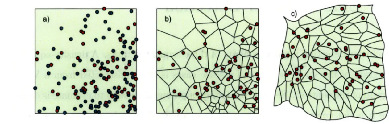
2-1 Construction of the Voronoi diagram cartogram. a) One hundred cases (green) and 50 controls (red) are distributed on a map. b) The case locations are superimposed on the Voronoi diagram constructed from the controls. c) A density-equalizing cartogram of the Voronoi diagram distorts the original map so that all Voronoi regions have the same area. New case locations are assigned on the cartogram by randomly plotting each case within its corresponding Voronoi region. . ... . . 28
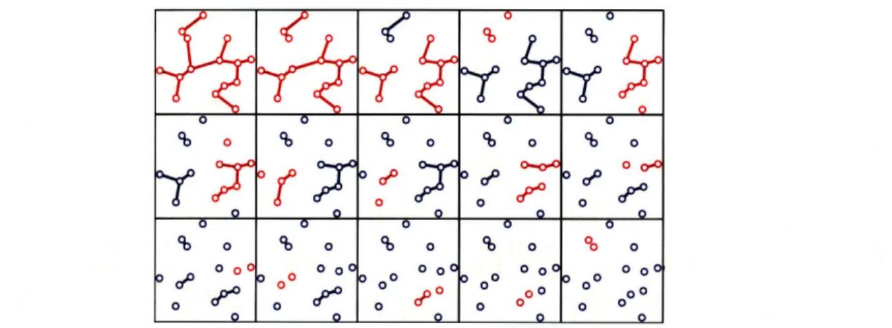
2-2 Procedure to locate potential clusters illustrated on a set of 15 cases. The EMST is first constructed (top left). This is a tree connecting each case (circle) that minimizes the total summed edge distance. At each step, the longest remaining edge is deleted, forming two new connected components (red). Components that were unchanged from the previous step are shown in blue. The connected components are in one-to-one correspondence with the set of potential clusters. . ... . . 30
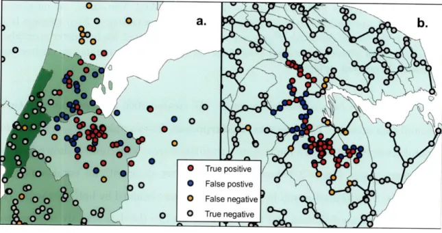
2-3 Detection of 1999 New York West Nile virus cases by SaTScan and the EMST method. a) A typical data set consisting of the 56 West
Nile virus cases (red and orange) and 400 background cases (blue and gray) are shown on a map of Connecticut, New Jersey and New York. Only part of the map is shown for clarity. The West Nile virus case locations have been randomly skewed for privacy [1]. The most likely cluster identified by SaTScan is shown (red and blue). The green shad-ing represents the density of controls in each county. b) The Voronoi diagram cartogram of part of the study area is shown along with the transformed case locations. Although the Voronoi diagram cartogram regions are not shown, the distortion of county boundaries induced by the cartogram transformation is apparent. The minimum spanning tree (black edges) connects the most likely cluster identified by the EMST method (red and blue). The control density varies by less than 2.0% over the entire map. ... 36
2-4 SaTScan and EMST Detection of 1979 Sverdlovsk anthrax outbreak. a) A representative data set of 63 anthrax cases (red and orange) and 400 uniformly distributed background cases (blue and gray) is shown, along with the most likely cluster determined by SaTScan (red and blue). b) The EMST method most likely cluster (red and blue) is shown for the same data set, connected by the minimum spanning tree of the cartogram-transformed cases (black edges). . ... 38
2-5 Equally detectable potential clusters of various shapes. A most likely cluster of 35 points selected from among the Boston circular cluster data sets, along with its minimum spanning tree, is shown in the upper left. Seven other configurations of 35 points, having minimum spanning trees with exactly the same weight, are also shown. Subject to the constraint imposed by the definition of a potential cluster above, all eight clusters have equivalent detectability by the EMST method. If embedded as potential clusters in a Boston data set of 500 total cases, all would achieve the same p-value of 0.0001. ... . . . 41
3-1 Applications of cartograms to spatial epidemiology. ... 47
3-2 Example of a Voronoi tesselation. Left: One thousand points are dis-tributed on a map. Right: The Voronoi tesselation of the points divides the map into 1000 regions. Each region consists of the portion of the map closest to one point. The density structure is preserved in the tesselated map; regions of small Voronoi cell area correspond to high
point density. ... 50
3-3 Dot maps and cartograms of three hypothetical disease distributions. Dot maps of 5,000 controls (blue) and 2,500 cases (red) are shown in the left column (a, c and e). The controls are distributed in proportion to the underlying population. The cases are distributed to illustrate constant relative risk (a), risk increasing linearly by a factor of four from north to south (c), and a localized cluster with a three-fold in-crease in relative risk in Iowa and neighboring states (e). The right column (b, d and f) shows the cartogram-transformed case locations for the three distributions. ... 61
3-4 Isopleth surfaces estimating the relative risk of three hypothetical dis-ease distributions on standard maps (a,c and e) and cartograms (b,d and f). The exact locations of the cases and controls are shown in figure 3-3. The case distributions illustrate constant risk (a and b), a four-fold increase in risk from south to north (c and d) and a cluster of three-fold risk increase centered in Iowa (e and f). The patterns are obscured on the standard maps because of the presence of high relative risk artifacts, but are clear on the cartograms. . ... 62
3-5 Pediatric inflammatory bowel disease risk in Massachusetts, 1995-2006. a) A standard map of the study area. b) A cartogram was constructed from the Voronoi diagram of the 7988 control locations. The 901 IBD cases were randomly placed within the cartogram regions correspond-ing to their original locations on the Voronoi diagram. An isopleth relative risk surface was calculated from the transformed case loca-tions using kernel methods. Original case and control localoca-tions are not shown to protect patients' privacy. . ... 63
4-1 Schematic of transition probabilities. A patient found at each location may transition to any other location. In this simple example, there are three locations (represented by houses) and nine transition probabili-ties (represented by arrows). The probabiliprobabili-ties are variables solved by
linear programming. ... ... 68
4-2 Total population of each census block group in New York County, NY, according to the 2000 census. ... ... 74
4-3 Transition probabilities for the optimal strategy to de-identify s < 20. 000 patients from New York County, New York with a maximum re-identification probability of . Transition probabilities from three
of the 988 census blocks are shown, illustrating a few of the many possible transition distributions. The shading in region j represents the value of the probability Pij of transitions into the region. a) Patients in one census block (purple asterisk) may remain there, or they may transition to one of several nearby blocks. b) All patients originally in one census block (purple asterisk) are assigned to one neighboring block. c) Patients are re-assigned from one block (purple asterisk) to one of four nearby census blocks. No patients are re-assigned to the original census block (i.e. Pii = 0). ... 75
4-4 Histogram of the distance between original and de-identified locations for an individual randomly chosen from the population, under the op-timal strategy to de-identify a set of s < 20, 000 patients in New York County, New York to a probability of 2 ... . ... 76
4-5 Relationship between the re-identification probability, the number s
of patients, and the expected transition distance for the optimal LP strategy to de-identify patients by census block group in New York county, New York. As the level of privacy protection decreases, patients are moved a smaller distance in expectation. Aggregation by zip code (green diamond) and first three zip code digits (magenta circle) are suboptimal strategies ... ... 77
4-6 Aggregation of patients in New York County, New York by zip code and by first three zip code digits. Top) Census block groups have been aggregated by zip codes. Each census block group was assigned to the zip code containing its centroid. The expected distance moved by a randomly selected member of the population is 519 m, and the max-imum probability that an individual is among a set of s de-identified patients is -. Bottom) Census block groups are aggregated by the first three zip code digits. The expected distance moved is 3.866 km, and the re-identification probability is S . .. . . . .. . . . . 81
5-1 Emergency department visits for respiratory presenting complaints, August 1, 1992 - July 30, 2004. Daily time series showing the number of patients presenting with respiratory complaints to the emergency department during a 12 year period. . ... 86
5-2 Evaluating variability in specificity on three time scales. Plots of p-values for the chi-square test over various time scales for the five com-parison models over a range of mean specificity values from 0.50 to 0.99, as well as p-values for the expectation-variance model. Top: cal-endar year of study. Middle: month of year. Bottom: day of week. The expectation-variance model has a p-value over 0.05 for the entire range of mean specificity values for all three time scales, so the null hypothesis of constant specificity is not rejected. All plots not shown are highly significant (p < 0.001) for non-constancy. . ... 95
5-3 Average specificity trends over time. Average specificity for each cal-endar year, month, and day of week for the five comparison methods during the study period. Data shown were recorded for each model implemented at 85% mean specificity. Similar trends were observed for all methods at 97% mean specificity (data not shown). . ... 96
5-4 Seasonal sensitivity trends. Average sensitivity for each month of the study period for the autoregressive (left), trimmed seasonal (center), and expectation-variance (right) models when applied to data contain-ing a superimposed spike outbreak of 10 additional patients durcontain-ing one day. Data shown were collected at a mean specificity of 97%. The sen-sitivity of the trimmed seasonal and autoregression models is higher during the winter than during the summer. Sensitivity is higher dur-ing the summer than durdur-ing the winter for the expectation-variance model. July receiver-operator (ROC) curves lie below February ROC curves for all three models (insets). Similar trends were observed for flat and linear outbreaks. ... 99 5-5 Seasonal trends in the mean and variance of ED visits. Mean number
of ED visits (left axis, solid blue line) and mean variance in ED visits (right axis, dashed green line) as a function of the day of year. Data were smoothed using 5-day and 11-day moving averages, respectively. The ED utilization mean and variance are highest in the winter and lowest during the summer. ... 102
List of Tables
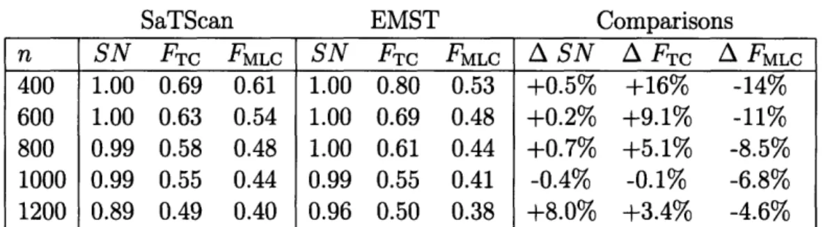
2.1 SaTScan and EMST method applied to West Nile virus. n, number of background cases added to cluster cases; SN, average sensitivity; FTC, average fraction of true cluster detected; FMLC, average fraction of most likely cluster coinciding with the true cluster (averaged over data sets for which a significant cluster was found); A, percent difference. 35 2.2 SaTScan and EMST method applied to anthrax. n, number of
back-ground cases added to cluster cases; SN, average sensitivity; FTC, av-erage fraction of true cluster detected; FMLC, avav-erage fraction of most likely cluster coinciding with the true cluster (averaged over data sets for which a significant cluster was found); A, percent difference. . . . 37 2.3 SaTScan and EMST method applied to circular clusters. r, radius of
cluster in kilometers; d, relative cluster density; m, mean cluster size;
SN, average sensitivity; FTC, average fraction of true cluster detected;
FMLC, average fraction of most likely cluster coinciding with the true cluster (averaged over data sets for which a significant cluster was found); A, percent difference. ... 39 2.4 SaTScan and EMST method applied to rectangular clusters. r, ratio
of cluster height to width; d, relative cluster density; SN, average sen-sitivity; FTC, average fraction of true cluster detected; FMLC, average fraction of most likely cluster coinciding with the true cluster (averaged over data sets for which a significant cluster was found); A, percent
5.1 ROC curve areas for traditional and expectation-variance detection models applied to three different types of outbreaks superimposed on
respiratory visits to an urban pediatric ED, August 1998 - July 2004. 97 5.2 Mean lag in detecting outbreaks of five additional patients per day
su-perimposed on the pediatric ED respiratory visits, August 1998 - July 2004. Detection lag calculations exclude undetected outbreaks. Hence the sensitivity of the method must be considered when interpreting the detection lag. ... ... ... 97
Chapter 1
Introduction
Terrifying epidemics have swept through populations throughout human history. Most famous among these is the bubonic plague, which spread in every direction from the Gobi desert in China in the 1320's, devastating parts of Asia and Africa. The plague reached Cyprus in 1347 and killed about one third of the European popu-lation in only two years [2]. In recent history, 500 million people contracted "Spanish
Figure 1-1: Die Seuche by A. Paul Weber, depicting the bubonic plague entering a city. Image courtesy of the National Library of Medicine.
at Camp Funston in Kansas. In late August, three nearly simultaneous outbreaks in Boston, Massachusetts, Freetown, Sierra Leone, and Brest, France signaled the start of a global pandemic which claimed at least thirty million lives [4]. The fear inspired by uncontrollable and fatal epidemics, such as the plague, yellow fever, cholera, and influenza, was a driving force for early advances in the field of spatial epidemiology.
The first disease dot maps were published by a young surgeon named Valentine Seaman in 1798, showing the locations of yellow fever victims in New York City. Sea-man created the maps to support his theory that yellow fever was caused by "putrid effluvia," which was ultimately disproved [5]. An English surgeon named John Snow is often credited with founding the field of spatial epidemiology for his 1854 study of cholera in London (see figure 1-2). At the time, frequent outbreaks of cholera, resulting in severe diarrhea and death due to dehydration, were generally thought to be caused by "miasma" in the air. Snow, who happened to live close to the epicenter of a large outbreak occurring in late August, 1854, correctly theorized that cholera was spread through contaminated water. He plotted the cases, revealing that they clustered around one pump on Broad street. Seven days into the outbreak, he
pre-(a) John Snow, 1847. (b) Map of cholera cases in London, 1854.
Figure 1-2: The English physician John Snow created a dot map showing that cholera victims lived close to one public water pump, which was the source of the outbreak. Images courtesy of the National Library of Medicine.
K
--:-I
,
V~ i ~.~li~ ~a~II i~ ;j ::: e \ t:i.~ I.1- ~ ` /\7
j1>
·
1·"I NNaPa::-·· ~ ~ ' s --·sented his findings to the local Board of Guardians. The pump handle was removed, ending the epidemic. The map was used to support Snow's theory in a subsequent publication "On the mode of communication of cholera" [6]. Snow's success showed the potential power of spatial methods in epidemiology: his finding not only saved lives, but also gave new insight into the transmission of a poorly understood disease. From the earliest disease dot maps, methods in spatial epidemiology have evolved to include a range of statistical and graphical techniques encompassing several distinct areas of study. Disease mapping explores spatial variations in disease risk, taking into account variations in the underlying at-risk population. Disease clustering studies investigate whether or not cases tend to cluster together more than expected, or seek to find localized subsets of patients comprising clusters. Ecological analysis investigates the relationship between the distribution of cases and environmental risk factors [7].
Despite its long and productive history, there are several challenges still facing the field of spatial epidemiology. These include the need to rapidly detect emerging diseases, such as Severe Acute Respiratory Syndrome and West Nile Virus, and bioter-rorism events, such as the dissemination of anthrax through the United States postal service in 2001. There is also an increased public awareness of issues surrounding pa-tient privacy, and more stringent legislation protecting privacy of papa-tient-identifiable information, including geographic identifiers. Furthermore, there are recent advances in geographical information systems and cartography methods that can be leveraged for spatial epidemiology.
In this thesis, we respond to these new challenges and advances with several re-lated projects. In chapter 2, we create a new graph-theoretical method to detect spatial clusters of any shape. Existing disease cluster detection methods cannot de-tect clusters of all shapes and sizes, or identify highly irregular sets that overestimate the true extent of the cluster. We introduce a graph-theoretical method for de-tecting arbitrarily-shaped clusters based on the Euclidean minimum spanning tree of cartogram-transformed case locations, which overcomes these shortcomings. The method is illustrated using several clusters, including historical data sets from West
Nile virus and inhalational anthrax outbreaks. Sensitivity and accuracy comparisons with the prevailing cluster detection method show that the method performs simi-larly on approximately circular historical clusters, and it greatly improves detection for non-circular clusters.
The use of cartograms based on exact location data, developed for this method, is explored in other contexts in chapter 3. Density-equalizing cartograms of disease case locations are used to adjust for variation in the underlying at-risk population for the purposes of visual representation and statistical analysis of disease risk. The use of cartograms has been limited to analyzing count data in a small number of settings. We show how to create and interpret cartograms from exact location data collected using various types of traditional epidemiological studies. For mapping applications, there is a simple relationship between cartogram case density and disease risk; for analysis, the cartogram simplifies the null distribution of constant disease risk, enabling the
use of a variety of well-advanced statistical methods.
In chapter 4 we develop an optimal strategy for balancing the need for patient privacy with the need to share information about the spatial distributions of diseases for research and health surveillance. Ethical and legal mandates protect the privacy of patient data collected for medical care and research. Accidental disclosures sometimes occur, either because the guardians of the data do not anticipate a method of linking a released data set to individuals, or because of methodological flaws in the procedures used to ensure privacy. The prevailing solution, releasing data aggregated by large areas, usually preserves privacy but suffers from substantial information loss. We develop an alternative de-identification strategy to move individual locations based on linear programming. The method guarantees that privacy is protected. It moves patients in an optimal manner to ensure they move the minimal possible distance for the level of privacy protection. Thus the de-identified set is ideal for subsequent cluster detection or disease mapping studies. We illustrate how to de-identify patients
in New York county, New York, showing that privacy is guaranteed while moving patients very short distances.
for surveillance in real time. Detection of abnormal disease patterns is based on a difference between patterns observed, and those predicted by models of historical data. The usefulness of outbreak detection strategies depends on their specificity; the false alarm rate affects the interpretation of alarms. We evaluate the specificity of four traditional models: autoregressive, Serfling, trimmed seasonal, and wavelet-based. We apply each to 12 years of emergency department visits for respiratory infection syndromes at a pediatric hospital, finding that the specificity of the four models was almost always a non-constant function of the day of the week, month, and year of the study (p < 0.05). We develop an outbreak detection method, called the expectation-variance model, based on generalized additive modeling to achieve a constant specificity by accounting for not only the expected number of visits, but also the variance of the number of visits. The expectation-variance model achieves constant specificity on all three time scales, as well as earlier detection and improved sensitivity compared to traditional methods in most circumstances. Modeling the variance of visit patterns enables real-time detection with known, constant specificity at all times. With constant specificity, public health practitioners can better interpret the alarms and better evaluate the cost-effectiveness of surveillance systems.
Chapter 2
Density-equalizing Euclidean
minimum spanning trees for the
detection of all disease cluster
shapes
2.1
Introduction
Tests for the detection of disease clusters [8] are essential tools for identifying emer-gent infections and elucidating demographic and environmental factors influencing diseases. The shapes of these clusters are unpredictable [9, 10, 11, 12, 13]. However, the prevailing cluster detection method, a scan statistic that applies a likelihood ratio test to a large number of overlapping circles in a study region, reports only circular clusters [14, 15]. Straightforward extensions of the circular scan statistic, such as an elliptical scan [16] and a rectangular scan [17], are also limited to detecting specific outbreak shapes.
Originally published as: Wieland SC, Brownstein JS, Berger B, Mandl KD. Density-equalizing Euclidean minimum spanning trees for the detection of all disease cluster shapes. Proceedings of the National Academy of Sciences. May 22, 2007.
Few methods aim to detect clusters of arbitrary shape. One class of methods based on graph theory has recently emerged to address this problem [18, 19, 20, 21]. However, these have several limitations: they are restricted to clusters that fit inside a circular region of fixed size [18], they attempt to examine a set of potential clusters too large to exhaustively search [19], they have poor specificity [20], or have yet to be implemented or evaluated [21].
In addition to the difficulties inherent in any disease cluster detection method,
such as accounting for the underlying population density and controlling the level of
significance given multiple potential clusters of various sizes and in various locations, arbitrary shape cluster detection presents particular challenges. As more shapes are considered, the statistical power declines, and the computational running time may become unreasonable for typical problem sizes [18]. Furthermore, if the exact case locations are available, then considering every conceivable shape is problematic; it is always possible to draw a bizarrely shaped region of infinitesimally small total area that includes every case. This problem surfaces when data are aggregated into small regions. Indeed, one study identified excessively large clusters with highly irregular shapes having greater likelihood ratios than the inserted clusters which were the detection targets [20].
In this study, we address these challenges by removing the notion of shape from consideration, and replacing it with a mathematical formalization of potential clusters based on intercase distances. We introduce a method to locate clusters of any shape based on Euclidean minimum spanning trees (EMST's), which have previously found application in heuristic methods to divide other kinds of data into a pre-determined number of subsets [22, 23]. Application of the method to synthetic, West Nile virus, and anthrax data sets show that sensitivity and accuracy are substantially improved compared to the circular scan statistic method applied to non-circular clusters, which likely include the majority of real disease clusters.
2.2
EMST Cluster Detection
Our cluster detection method consists of three sequential tasks. A density-equalizing cartogram of the study region and disease cases is first constructed from a Voronoi diagram of the controls. Second, the family of potential clusters to evaluate is defined, since it is not computationally feasible to consider all 2n subsets of n cases. Third, the statistical significance of each potential cluster is evaluated. We address each of these tasks below.
2.2.1
Cartogram Construction
We begin with the precise spatial coordinates of a set of disease cases and controls, and a map of the study area. We first create a Voronoi diagram of the control locations, which subdivides the study area into the regions closest to each control location [24] (see figure 2-1). The density of controls within each Voronoi region is simply the number of controls in the region, which may be more than one if multiple controls can occur at the same location, divided by the region's area. We use this density function to create a density-equalizing cartogram of the Voronoi diagram. Cartograms have previously been used for aggregate data to test for clustering of several diseases [25, 26, 27, 28, 29]. To construct one, each point on the original map is essentially magnified or demagnified according to its local density. The result is a distorted map on which the density of controls is constant everywhere. Each case is placed on the cartogram at a random location within the region corresponding to its original Voronoi region, and all subsequent analyses are performed using these new case locations. Under the null hypothesis of constant relative risk, the new locations of the cases on the Voronoi diagram cartogram are uniformly and independently distributed. We use a diffusion-based cartogram construction algorithm [29], although other contiguous cartogram algorithms may also be suitable.
Figure 2-1: Construction of the Voronoi diagram cartogram. a) One hundred cases (green) and 50 controls (red) are distributed on a map. b) The case locations are superimposed on the Voronoi diagram constructed from the controls. c) A density-equalizing cartogram of the Voronoi diagram distorts the original map so that all Voronoi regions have the same area. New case locations are assigned on the cartogram by randomly plotting each case within its corresponding Voronoi region.
2.2.2
Potential Clusters
We call a potential cluster a subset of points S satisfying the property that every subset of S is "closer" to at least one other point in S than to any other point outside of S. To formalize this definition, we begin by defining the distance p(X, Y) between two sets X and Y to be the smallest distance separating the sets:
minaExp(a, b) if X ý 0 and Y'$ (
p(X, Y)= bEY (2.1)
o00 otherwise
where p(x, y) is the Euclidean distance between two points. We also define the internal distance of a nonempty set S to be the maximum distance between any two nonempty subsets of S whose union is S:
p(S)
=
max p(X, Y)
(2.2)
XUY=S
We formally define a potential cluster as follows:
Definition Let V be a nonempty set of cases of a disease. A potential cluster is a
Note that the entire set V is a potential cluster, as are the sets {v} for every v E V.
If v is the nearest neighbor of w and w is the nearest of v, then {v, w} is a potential cluster.
We wish to consider every potential cluster in V, but it is not straightforward from the definition how to locate potential clusters, nor how many of them are present. Progress was made toward finding potential clusters in a different application in bioinformatics [23] using the minimum spanning tree of V, a connected graph T spanning a set of points having minimal total weight
w (T) = E w(e)
(2.3)
eEE(T)
where E(T) denotes the set of edges of T, and the weight w(e) of an edge e is in this case the Euclidean distance between the endpoints of e. (For a detailed review of graph theoretical definitions, see [30].) Given a set V of n points, every potential cluster is a connected subgraph of the EMST T of V [23]. However, even for small epidemiological data sets, the number of connected subgraphs may be extremely large; EMST's of 50 and 75 random points have approximately 106 and 108 connected subgraphs, respectively.
We prove that it is not necessary to consider all connected subgraphs of T to find the potential clusters. Remarkably, there are at most 2n - 1 potential clusters, of which n are trivial sets consisting of only one vertex. Furthermore, the potential clusters may be quickly found from an EMST using a greedy edge deletion procedure. After constructing an EMST of the set of cartogram case locations V, we iteratively delete the longest remaining edge of T. At each iteration we consider the two newly emergent connected components, each of which is a potential cluster. In this way, we evaluate all n - 1 nontrivial potential clusters for statistical significance using a test
described below (see Figure 2-2).
We prove that this procedure identifies the set of potential clusters by showing that that potential clusters, characterized by the definition above, are in one-to-one correspondence with a small class of subsets of an EMST T. For w > 0, we define
Figure 2-2: Procedure to locate potential clusters illustrated on a set of 15 cases. The EMST is first constructed (top left). This is a tree connecting each case (circle) that minimizes the total summed edge distance. At each step, the longest remaining edge is deleted, forming two new connected components (red). Components that were unchanged from the previous step are shown in blue. The connected components are in one-to-one correspondence with the set of potential clusters.
T, to be the graph derived from T by deleting all edges of T having weight greater than w. We label the n - 1 edges of T in order of decreasing weight, so that w(el) >
w(e2) _ ... · w(en-1) > 0. If the edge weights are distinct, then there are n distinct
graphs T,; these are the graphs T = Tw(el) D T(e,,) D ... · Tw(e,_) 2 To. Tw(ek+l) is formed from Tw(ek) by deleting one edge, which splits one connected component of Tw(ek) into two components. Thus Tw(ek+l) has k + 1 connected components, k - 1 of
which are present in Tw(ek), and two of which are newly created. There are 2n - 1
total distinct connected components among all the graphs T, (see Figure 2-2). If the edge weights are not distinct, then a variation of this argument shows that 2n - 1
is an upper bound on the number of distinct connected components. The following characterizes the connected components:
Lemma 2.2.1 Let V be a nonempty set of points in a plane (representing cases of
a disease). Let T be a Euclidean minimum spanning tree of V, S a nonempty subset of V, and Ts the subgraph of T induced by S. The set S is a potential cluster if and only if Ts is a connected component of To or of Tw(ek) for some k.
The proof is made easier by two simple lemmas.
Lemma 2.2.2 Let Ts be a connected subgraph of T with vertex set S. Then p(S)
0 0 0 0 0
S o o o ° o o 8o o o
00 o0 0 00 0o 0 o Q0 0
0 ' 00
o000
00 0 00
000 000
0 0 o o 0 00 0 00
oo o0 00(Eq. 2.2) is equal to the maximum weight of an edge in Ts if ISI > 1, and 0 otherwise.
Proof: If ISI = 1, then S = {x} and
p(S) = max p(X, Y) = p({x}, {x}) = p(x, x) = 0.
80xcs OCYCS
XUY=S
If ISI > 1, let e = (vi, v2) be an edge of maximum weight in Ts. Ts - e has two
components with vertex sets V1 and V2. We first show that p(Vi, V2) = w(e), where
w(e) is the weight of e. We have
p(Vi, V2) = min p(x, y) < p(vl, v2).
1Y V2
Assume the inequality is strict, so there exist wl
C
V1 and w2 E V2 with p(wi, w2) <p(v1, v2). The graph T- e+ (wl, w2) is a spanning tree of V having lower weight than
T, which is a contradiction. Hence p(Vi, V2) = w(e).
We now show that p(S) = w(e). Since
p(S) = agxcsmax p(X, Y) _ p(Vi, V2) = w(e),
0XYCS
XUY=S
we need only prove that p(S) 5 w(e). This is true if p(X, Y) < w(e) for every X and Y satisfying the conditions 0 C X C S, 0 C Y C S and X U Y = S. Let X and Y be arbitrary sets satisfying these conditions. If X and Y share a common element, then
p(X, Y) = 0 < w(e). If X and Y have no common element, then since they partition the vertices of Ts into two nonempty sets, there exists some edge f = (x, y) of Ts
spanning X and Y. We have
p(X, Y) = min p(a, b) 5 p(x, y) = w(f) < w(e).
aEX
bEY
Hence p(S) = w(e).
the minimum weight of an edge in T spanning the cut (S, V - S).
Proof: Let e = (vl, v2) be an edge of T of minimum weight spanning (S, V - S). We
have
p(S, V - S) = min p(a, b) < p(vaES 1, v2) = w(e).
bEV-S
It suffices to prove that p(S, V - S) > w(e), which holds if p(a, b) > w(e) for every a E S and b E V - S. Suppose there exist some a C S and b
e
V - S for which p(a, b) < w(e). The edge (a, b) must not be in T since e has minimum weight ofall edges spanning (S, V - S). The graph T + (a, b) therefore contains exactly one cycle, and the cycle contains some edge f z (a, b) spanning (S, V - S). The graph T+(a, b)- f is a spanning tree of V, and w(T+(a, b)- f) = w(T)+w ((a, b))-w(f) < w(T) + w(e) - w(e) - w(T), contradicting the minimality of the weight of T. Hence
p(a, b) > w(e) for every a S and be V - S, and so p(S, V - S) > w(e).
Proof of Lemma 2.2.1: We first show that every potential cluster induces a
con-nected component of To or of Tw(,,) for some k. Equivalently, we show that if a subgraph H of T is not a connected component of Tw(ek) or of To, then the vertex set of H is not a potential cluster. Xu et al. [23] showed that every potential cluster induces a connected subgraph of T, so that if H is not connected, then its vertex set is not a potential cluster. Suppose H is a connected subgraph of T which is not a connected component of Tw(,,) for any k, or of To. H must have at least one edge; let
ej be an edge of H of maximal weight. Let C be the connected component of Tw(ej) containing ej. Since H is a connected subgraph of Tw(ej) containing ej, H C C We refer interchangeably to a graph and its vertex set to simplify notation. There exists some edge e
C
T spanning H and C - H, and since e E C, w(e) < w(ej). By lemma2.2.2, p(H) = w(ej), and by lemma 2.2.3, p(H, V-H) < p(H, C-H) < w(e) < w(ej).
Hence p(H, V - H) < p(H) and H is not a potential cluster.
To finish the proof, we must show that every connected component of T(e,,) for any
k or To is a potential cluster. This is trivial for Tw(,,) = T or for To, whose components
are the individual vertices. Let Ts be a connected component of Tw(,,)
#
T withsome edge e E T spanning S and V - S. Since the edge is not in Tw( k), w(e) > w(ek).
This is true for every spanning edge, so by lemma 2.2.3, p(S, V - S) > w(ek). Hence p(S) < p(S, V - S), and so S is a potential cluster.
Note that the proof does not rely on the uniqueness of T, so degenerate EMST's do not affect the ability of the method to capture all potential clusters. If the set of cases V are continuously distributed on the cartogram, as in the present study, then in theory the EMST is unique with probability 1. However, degenerate EMST's may occur with extremely low probability due to the inability of computers to support arbitrary precision.
2.2.3
Statistical Significance
In order to assign a p-value to any potential cluster, a test statistic is required, along with its distribution under the null hypothesis Ho of independently, uniformly distributed cases on the cartogram. Let E be a potential cluster generated under Ho, and let S be an observed potential cluster. We define
Ps = Pr {w(E) < w(S)
I
card(E) = card(S)}, (2.4)where w is the weight of the potential cluster subgraph, and card denotes the number of cases. Ps is the p-value corresponding to the observed candidate cluster weight, conditioned on the number of cases in S. Because cases in a true cluster are closer together than expected, the weight w(S) of a potential cluster S corresponding to a hot-spot is likely to be smaller than a random EMST potential cluster subgraph containing the same number of cases. Consequently, a hot-spot should have a low value of Ps. We define the test statistic P to be the minimum value of Ps over the set of nontrivial potential clusters containing at most half of the cases. Monte Carlo techniques are used to fit Ps as a function of w(S) to a Gaussian distribution for each possible value of card(S). The null distribution of P is subsequently estimated, again by Monte Carlo, and a cutoff value corresponding to the desired level of significance
The most significant cluster is reported, but the method could easily be modified to report all significant clusters without affecting the asymptotic running time.
2.3
Results
We applied the SaTScan circular scan statistic [15] and EMST method to several types of data sets, finding that the EMST method was substantially better able to detect non-circular clusters. The SaTScan Bernoulli model was used with a maximum geographic window size containing 50% of the cases for each data set. For each method and data set, the most significant cluster with a p-value of at most 0.05 computed using 9,999 Monte Carlo replications was reported; thus the specificity, defined as the probability of reporting no significant cluster in data generated under the null hypothesis, was 0.95 for both methods and all data sets. The sensitivity, equal to the fraction of clusters that were detected, was calculated for each data set and method. To quantify the extent of overlap between the most likely cluster and the actual cluster, we defined two other measures. We defined FTC to be the fraction of true cluster cases that were correctly found in the most likely cluster, and FMLC to be the fraction of cases in the most likely cluster that coincided with the true cluster.
2.3.1
West Nile Virus, New York City, 1999
The EMST method and SaTScan had similar performance detecting a 1999 outbreak of West Nile virus in New York City [31]. This was encouraging because the 56 cases appear to have an approximately circular distribution (see Figure 2-3), suggesting an advantage for the circular scan statistic. We defined a study area consisting of Connecticut, New Jersey and New York, and generated 10,000 controls within the map distributed in proportion to 2000 U.S. census county population data. In order to evaluate the methods, we required data sets with both outbreak and non-outbreak cases. In addition to the West Nile virus cases, we generated 400, 600, 800, 1000 or 1200 additional non-outbreak background cases distributed according to the underly-ing population distribution. As the number of background cases increased, the West
n SN FTC FMLC SN FTC FMLC A SN A FT A FMLC 400 1.00 0.69 0.61 1.00 0.80 0.53 +0.5% +16% -14% 600 1.00 0.63 0.54 1.00 0.69 0.48 +0.2% +9.1% -11% 800 0.99 0.58 0.48 1.00 0.61 0.44 +0.7% +5.1% -8.5% 1000 0.99 0.55 0.44 0.99 0.55 0.41 -0.4% -0.1% -6.8% 1200 0.89 0.49 0.40 0.96 0.50 0.38 +8.0% +3.4% -4.6%
Table 2.1: SaTScan and EMST method applied to West Nile virus. n, number of background cases added to cluster cases; SN, average sensitivity; FTC, average frac-tion of true cluster detected; FMLC, average fracfrac-tion of most likely cluster coinciding with the true cluster (averaged over data sets for which a significant cluster was found); A, percent difference.
Nile virus cluster became harder to detect. We created 1000 data sets for each back-ground case number. The data sets could represent, for example, emergency visits for neurological symptoms in a multi-state surveillance area, with controls drawn from all emergency visits. Figure 2-3 shows a typical data set along with its Voronoi diagram cartogram transformation and the most likely cluster obtained by both methods. The results of applying SaTScan and the EMST method to the data sets are summarized in Table 2.1.
Both methods displayed similar comparative performance for all numbers of back-ground cases. The sensitivity of both methods declined from 1.0 for 400 backback-ground cases to 0.96 and 0.89 for 1200 background cases for the EMST method and SaTScan, respectively. The percent change in FTC of the EMST method compared to SaTScan varied from -0.4% to 16%, and the percent change in FTC varied from -14% to -6.8%.
2.3.2
Inhalational Anthrax, Sverdlovsk, Russia, 1979
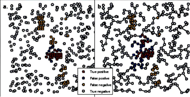
The EMST method had greater accuracy than SaTScan when applied to a highly non-circular outbreak of 62 cases of inhalational anthrax occurring in Sverdlovsk, Russia in 1979 [9]. Because we lacked spatial references for the data necessary to geocode the case locations, we used a uniform distribution within a square study region to generate 10,000 controls. The set of cases consisted of 400, 600, 800, 1000, or 1200
Figure 2-3: Detection of 1999 New York West Nile virus cases by SaTScan and the EMST method. a) A typical data set consisting of the 56 West Nile virus cases (red and orange) and 400 background cases (blue and gray) are shown on a map of Connecticut, New Jersey and New York. Only part of the map is shown for clarity. The West Nile virus case locations have been randomly skewed for privacy [1]. The most likely cluster identified by SaTScan is shown (red and blue). The green shading represents the density of controls in each county. b) The Voronoi diagram cartogram of part of the study area is shown along with the transformed case locations. Although the Voronoi diagram cartogram regions are not shown, the distortion of county boundaries induced by the cartogram transformation is apparent. The minimum spanning tree (black edges) connects the most likely cluster identified by the EMST method (red and blue). The control density varies by less than 2.0% over the entire map.
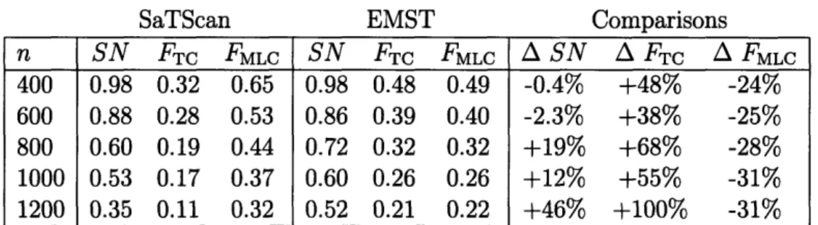
n SN FTC FMLC SN FTC FMLC A SN A FTc A FMLc 400 0.98 0.32 0.65 0.98 0.48 0.49 -0.4% +48% -24% 600 0.88 0.28 0.53 0.86 0.39 0.40 -2.3% +38% -25% 800 0.60 0.19 0.44 0.72 0.32 0.32 +19% +68% -28% 1000 0.53 0.17 0.37 0.60 0.26 0.26 +12% +55% -31% 1200 0.35 0.11 0.32 0.52 0.21 0.22 +46% +100% -31%
Table 2.2: SaTScan and EMST method applied to anthrax. n, number of background cases added to cluster cases; SN, average sensitivity; FTrc, average fraction of true cluster detected; FMLC, average fraction of most likely cluster coinciding with the true cluster (averaged over data sets for which a significant cluster was found); A, percent difference.
uniformly distributed background cases, in addition to the anthrax case locations. These could represent, for example, visits for respiratory complaints to an emergency department, with controls drawn from all visits. For each number of background cases, 1000 data sets were generated. A typical data set is shown in Figure 2-4, along with the most likely cluster detected by SaTScan and the EMST method. The mean sensitivity, FTC, and FMLC are summarized in Table 2.2.
The EMST method had comparable or greater sensitivity than SaTScan for all background population sizes, and it correctly identified a greater fraction of the an-thrax cases (FTC) for all background population sizes. Both methods' sensitivity declined as more background cases were added: from 0.98 to 0.52 for the EMST method, and from 0.98 to 0.35 for SaTScan. The EMST method had a lower value of FMLC than SaTScan, indicating that it overestimated the cluster to a greater extent than SaTScan. However, the percent decline in FMLC incurred by using the EMST method instead of SaTScan was about half of the gain in FTC.
2.3.3
Circular Clusters, Boston, Massachusetts
We also compared the ability of the EMST method and SaTScan to detect circular clusters. Because the circular scan statistic is optimized to detect circular clusters, we were surprised to find that the EMST method was as sensitive as SaTScan. The study area consisted of the 59 zip codes within 10 km of Boston, Massachusetts. Ten
Figure 2-4: SaTScan and EMST Detection of 1979 Sverdlovsk anthrax outbreak. a) A representative data set of 63 anthrax cases (red and orange) and 400 uniformly distributed background cases (blue and gray) is shown, along with the most likely cluster determined by SaTScan (red and blue). b) The EMST method most likely cluster (red and blue) is shown for the same data set, connected by the minimum spanning tree of the cartogram-transformed cases (black edges).
thousand controls were distributed on the map in proportion to zip code population data from the 2000 U.S. census. Data sets of 500 total cases were created, each containing a synthetic circular cluster in a random location with a radius of 1, 2 or 3 km. placed within the study region. We defined the relative cluster density to be the case density within the cluster divided by the case density outside the cluster. This ratio varied from 2 to 5 in the data sets. For each combination of outbreak radius and relative cluster density, 1000 data sets were created.
For small clusters containing on average fewer than 35 cases, the EMST method had greater sensitivity. However, it is likely that stochastic effects caused such clus-ters to have non-circular shapes in general. Indeed, the smaller the cluster, the more pronounced the EMST method's relative improvement in sensitivity. For larger clus-ters, the EMST method had similar sensitivity to SaTScan (0.1% less to 4.1% greater) and similar values of FTC (3.4% less to 0.4% greater). However, SaTScan always had a greater value of FMLC, indicating that it located large circular clusters with greater
r d m SN FTC FMLC SN FTC FMLC A SN A FT A FMLC 1 2 8.2 0.03 0.03 0.39 0.07 0.06 0.22 +112 +128 -42 1 3 12.9 0.23 0.21 0.75 0.29 0.26 0.54 +25 +26 -28 1 4 16.3 0.45 0.41 0.84 0.49 0.45 0.66 +7.1 +8.3 -21 1 5 20.8 0.65 0.61 0.89 0.69 0.65 0.73 +5.7 +6.4 -17 2 2 33.7 0.30 0.25 0.79 0.39 0.30 0.59 +27 +20 -25 2 3 50.1 0.79 0.73 0.91 0.81 0.73 0.76 +2.3 -0.3 -17 2 4 64.4 0.94 0.89 0.94 0.95 0.90 0.82 +1.1 +0.4 -13 2 5 75.7 0.99 0.95 0.96 0.99 0.95 0.86 0.0 -0.3 -10 3 2 79.5 0.74 0.65 0.86 0.77 0.63 0.72 +4.1 -3.4 -17 3 3 108.9 0.98 0.93 0.95 0.99 0.92 0.82 +0.8 -2.0 -13 3 4 133.0 1.00 0.97 0.97 1.00 0.96 0.88 -0.1 -1.1 -9.8 3 5 153.8 1.00 0.98 0.98 1.00 0.97 0.91 0.0 -0.8 -7.3 Table 2.3: SaTScan and EMST method applied to circular clusters. r, radius of cluster in kilometers; d, relative cluster density; m, mean cluster size; SN, average sensitivity; FTC, average fraction of true cluster detected; FMLC, average fraction of most likely cluster coinciding with the true cluster (averaged over data sets for which a significant cluster was found); A, percent difference.
overall accuracy than the EMST method. Table 2.3 summarizes the results.
2.3.4
Rectangular Clusters, Boston, Massachusetts
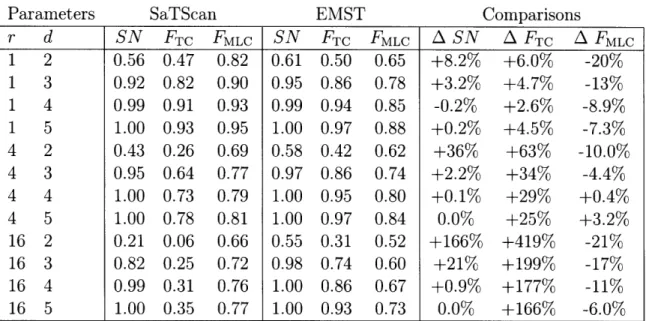
In a study of rectangular clusters, we found that the EMST method had greater sensitivity than SaTScan. Sets of 500 cases containing artificial rectangular clusters having a height-to-width ratio of 1, 4 or 16, and relative cluster density between 2 and 5 were generated within the same study region as above, and 10,000 controls were distributed in proportion to the background population as above. The cluster area was fixed at 20 km2, and 1000 data sets were generated for each combination of
parameters by randomly placing a rectangular cluster within the study region map. The results are summarized in Table 2.4.
In general, the EMST method had greater sensitivity than SaTScan (0.2% less to 166% greater), with the greatest percent increase in sensitivity when the cluster signal strength was weak or the height-to-width ratio was large. The EMST method captured a greater extent of the true cluster (FTC) than SaTScan for all cluster types
r d SN FTC FMLC SN FTC FMLC
A
SN A FTCAFMLC
1 2 0.56 0.47 0.82 0.61 0.50 0.65 +8.2% +6.0% -20% 1 3 0.92 0.82 0.90 0.95 0.86 0.78 +3.2% +4.7% -13% 1 4 0.99 0.91 0.93 0.99 0.94 0.85 -0.2% +2.6% -8.9% 1 5 1.00 0.93 0.95 1.00 0.97 0.88 +0.2% +4.5% -7.3% 4 2 0.43 0.26 0.69 0.58 0.42 0.62 +36% +63% -10.0% 4 3 0.95 0.64 0.77 0.97 0.86 0.74 +2.2% +34% -4.4% 4 4 1.00 0.73 0.79 1.00 0.95 0.80 +0.1% +29% +0.4% 4 5 1.00 0.78 0.81 1.00 0.97 0.84 0.0% +25% +3.2% 16 2 0.21 0.06 0.66 0.55 0.31 0.52 +166% +419% -21% 16 3 0.82 0.25 0.72 0.98 0.74 0.60 +21% +199% -17% 16 4 0.99 0.31 0.76 1.00 0.86 0.67 +0.9% +177% -11% 16 5 1.00 0.35 0.77 1.00 0.93 0.73 0.0% +166% -6.0% Table 2.4: SaTScan and EMST method applied to rectangular clusters. r, ratio of cluster height to width; d, relative cluster density; SN, average sensitivity; FTC, average fraction of true cluster detected; FMLC, average fraction of most likely cluster coinciding with the true cluster (averaged over data sets for which a significant cluster was found); A, percent difference.(2.6% to 419% greater). For most cluster types, there was a parallel decline in the fraction FMLC of the most likely cluster coinciding with the true cluster (20% less to +3.2% greater).
2.3.5
Arbitrary Shapes
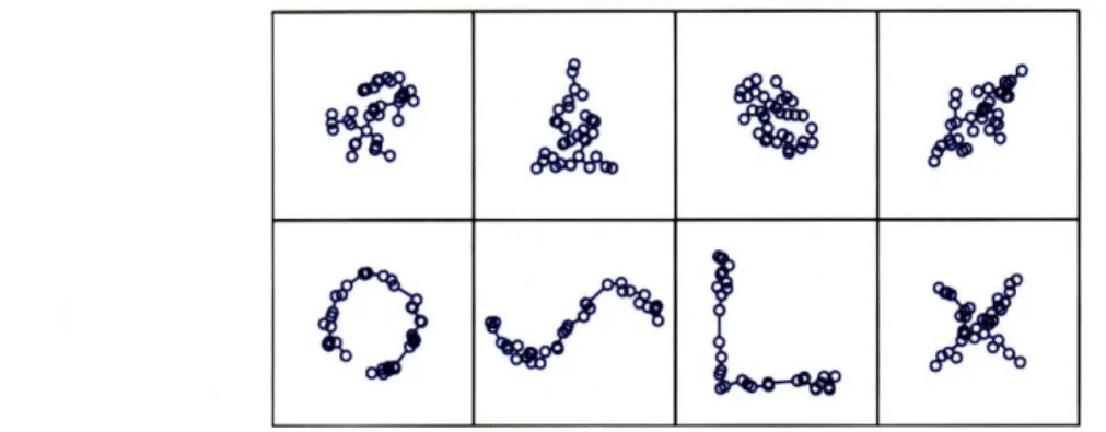
It is possible to gain insight into the EMST method's performance on other cluster shapes without additional intensive computer simulations. The EMST test statistic depends only on the cartogram, the total number of cases, and the cardinality and weight of a potential cluster. Hence, we can extrapolate the p-value obtained for one potential cluster to others having different shapes, but the same number of cases and weight. To illustrate this, we selected one most likely cluster of 35 cases from one of the Boston analysis data sets. The EMST method assigned a p-value of 0.0001 to this potential cluster. Figure 2-5 shows several configurations of potential clusters having the same number of cases and EMST weight, but very different shapes. If embedded
as potential clusters within a Boston data set of 500 total cases, they would each
Figure 2-5: Equally detectable potential clusters of various shapes. A most likely cluster of 35 points selected from among the Boston circular cluster data sets, along with its minimum spanning tree, is shown in the upper left. Seven other configu-rations of 35 points, having minimum spanning trees with exactly the same weight, are also shown. Subject to the constraint imposed by the definition of a potential cluster above, all eight clusters have equivalent detectability by the EMST method. If embedded as potential clusters in a Boston data set of 500 total cases, all would achieve the same p-value of 0.0001.
achieve the same p-value of 0.0001. In fact, any potential cluster of 35 cases of any shape can be scaled in size to have the same weight, illustrating that the method can capture an infinite array of regular and irregular shapes.
2.4
Discussion
We find that the EMST method is a powerful and accurate alternative to the circular scan statistic for non-circular clusters. At a specificity of 95%, the method had com-parable sensitivity to SaTScan applied to large synthetic circular clusters and to an approximately circular West Nile virus outbreak. When applied to small circular clus-ters, synthetic rectangular clusclus-ters, and a highly irregular anthrax cluster, the EMST method had greater sensitivity. Although SaTScan had better accuracy detecting large circular clusters, the EMST method had comparable or superior accuracy for all other cluster types. The EMST method is also able to detect a large variety of shapes, including highly irregular ones.
In addition to accurately locating clusters of any shape and size, the EMST method has two unique properties. First, its test statistic is based only on the weight