Changes in Single Family Housing Prices due to
the Planning and Construction of Interstate 476 in Pennsylvania
by
Noriko Komiyama Bachelor of Economics (1999)
University of Tokyo
Submitted to the Department of Urban Studies and Planning in Partial Fulfillment of the Requirements for the Degree of
Master in City Planning at the
Massachusetts Institute of Technology June 2004
@ 2004 Noriko Komiyama All rights reserved
Th uthor hereby grn* to MT Prr~k~ to repoduoe and to distribut P b Per and elacTronic copcs of this thesis document in whole or In pa4
Signature of Author...'... ... . ...
Department of Urban Studies and Planning May 20, 2004
C ertified by ... '' ... . .
Henry Pollakowski Visiting Scholar, Center for Real Estate
Thesis Supervisor
A ccepted b y ... ... ... ... ...
Professor Dennis Frenchman Chair, MCP Committee
MASSACHUSES INSifUT E
JUN 2
1
2004
ROTCH
Changes in Single Family Housing Prices due to
the Planning and Construction of Interstate 476 in Pennsylvania
by
Nonko Komiyama Bachelor of Economics (1999)
University of Tokyo
Submitted to the Department of Urban Studies and Planning on May 20, 2004 in Partial Fulfillment of the Requirements for
the Degree of Master in City Planning
Abstract
It has been suggested in various studies that increasing accessibility to a transportation network would influence local property values and their pattern of change over time. This thesis examines the capitalization into single-family housing prices of the construction investment for Interstate 476 (1-476), which had faced public opposition for more than two decades. While the majority of previous capitalization studies have been limited to the areas adjacent to transportation facilities, this thesis analyzes the effect over time of increased accessibility on a larger part of the Philadelphia Metropolitan Statistical Area (MSA). Repeat sale single-family home price indices for zip codes covering the five counties in the greater Philadelphia area for
18 years are used. I find that the area within 7,500m of 1-476 had higher annual appreciation
rates than the entire Philadelphia MSA by 0.3% - 2.6% between 1989 and 1994. The higher
appreciation began after all the necessary construction approvals were obtained in 1987 and lasted two years after the opening of the last section of the highway.
Thesis Supervisor: Henry Pollakowski Title: Visiting Scholar
Acknowledgement
I would like to thank Case Shiller Weiss, Inc for providing access to the repeat sales
single-family home price indices. I am also most appreciative of Professor William Wheaton and Henry Pollakowski at MIT for their continuous and sincere advice. Lastly, I am grateful to my parents in Tokyo, Japan, who have encouraged and motivated me in every respect.
Table of Contents
L ist of Tables ... . ---... 6
List of Figures... . ---...- 7
Chapter 1: Introduction... ... 8
Chapter 2: Review of Past Studies ... 12
Chapter 3: Characteristics of the Studied Area... 17
3-1: General Overview of the Studied Area ... 17
3-2: Land Use Pattern in the Five Counties ... 19
3-3: Socioeconomic Characteristics of the Five Counties...24
3-3-1: Population and Population Density since the 1960s... 24
3-3-2: Housing Units and Density since 1960s ... 26
3-3-3: Median Household Income... ....28
3-3-4: Suburbanization and Development...29
3-3-4: Summary of the Five Counties ... 33
Chapter 4: Description of the Project ... 34
4-1: Location of the Route and the Surrounding Highway Network ... 34
4-2: Planning History of 1-476 ... 36
Chapter 5: Data and its Overall Trend... 42
5-1: Description of the Data ... ... 42
5-2: Overall Trend of the Home Price Index... 44
Chapter 6: Model and Results ... ... 49
6-1: M odel ...---... 49
6 -2 : R esu lt ... .-- - -- -. --... 50
Chapter 7: Conclusion and Limitation... 55
A ppendix ...--- . .. -.. ---... 57
(A ) C onsum er Price Index ... 57 (B) MSA Index, Annual MSA Index, Inflation Adjusted MSA Index and Annual
Appreciation Rate of Inflation Adjusted MSA Index ... 58
(C) Summary Statistics of the Dataset and the Regression Results: Zone 1 ... 59
(D) Summary Statistics of the Dataset and the Regression Results: Zone 2 ... 60
(E) Summary Statistics of the Dataset and the Regression Results: Zone 3 ... 61
(F) Summary Statistics of the Dataset and the Regression Results: Zone 4 ... 62
(G) Distance from the Closest Interchange ... 63
List of Tables
Table 1: Land Use by County in 2000 (Square miles) ... 21
Table 2: Population Density by County ... 25
Table 3: Number of Housing Units and its Density (per square mile)...27
Table 4: Median Household Income and its Change Rate ... 29
Table 5: Full and Part Time Employment by County... 32
Table 6: Percentage of Workers Commuting to Philadelphia by County of Residence, 1960 - 1980 ...-. - - 33
Table 7: Ratio of Local Workers to Philadelphia Commuters by County of Residence 33 Table 8: Coefficients for Independent Variables and the 95% Confidence Interval ... 53
List of Figures
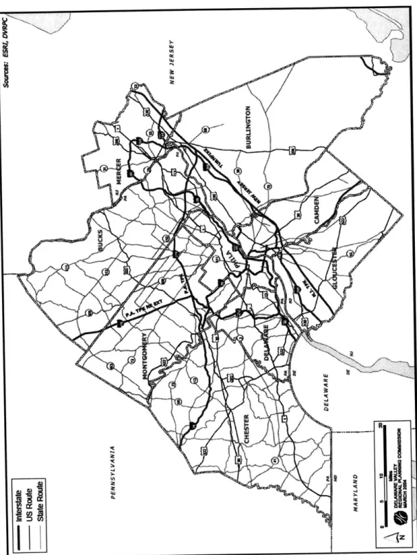
Figure 1: Counties and Highway Network in the Studied Area... 18
Figure 2: Composition of Land Use by County in 2000 ... 21
Figure 3: Population by County, 1960 -2000 ... 24
Figure 4: Population Change Rate by County... 25
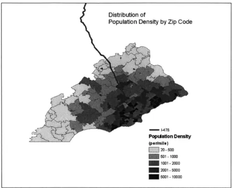
Figure 5: Population Density by Zip Code (2000)...26
Figure 6: Density of Housing Units by Zip Code (2000)... 27
Figure 7: Median Household Income by Zip Code (2000)... 28
Figure 8: Development by County Subdivision: Single-family, Multi-family, and Commercial and Industrial Development (1970 - 1980)... 30
Figure 9: Highway Network in the Studied Area ... 35
Figure 10: Timeline of the project... 40
Figure 11: D ata C overage... .43
Figure 12: M ap of the zones... 45
Figure 13: Trend of the Inflation Adjusted price Index by Zone... 46
Figure 14 : Appreciation Gap between MSA and Zone 2 ... 53
Chapter 1: Introduction
It has been suggested in various studies that increasing accessibility to a transportation network would influence local property values and their pattern of change. In traditional urban economics theories, accessibility to a city center determines a large part of land and housing values. On the other hand, in a developed economy, where the basic transportation infrastructure has been developed to a large extent, public opposition to new transportation infrastructure development from the viewpoints of environmental protection and/or the use of public funds has usually become more frequent. In some situations, the construction of new transportation infrastructure itself needs to be reconsidered or even canceled. The public sector or the developer is required to make a stronger case for the project, and sometimes such evaluation and negotiation processes require a longer time than was originally planned.
When we consider the advantages and disadvantages of a transportation investment, there can be several different types of impact of the investment which would influence the local settings, such as the economic impact, the environmental impact and the social impact. The economic impact would include the opening of new shopping centers around highway networks, the increase in sales by the local businesses, the direct positive impact from the construction activities, and the increase in accessibility to the downtown. In terms of the environmental impact, there would be, for example, noise and/or air pollution caused by the new railroad station or the new highway, loss of the natural environment, and a decrease of noise and/or air pollution if a new transit railway decreases the traffic on the local streets. The social impact would include induced travel, which is increases in vehicle miles of travel caused by increases in highway capacity, and the change in the urban development pattern due to the change in the commuting and living patterns.
focus on the capitalization of the investment on 1-476 on the single-family housing price in the Philadelphia MSA. Evaluating the level of capitalization of public investment has several implications for policy formation. Huang (1994) categorized such implications into the following three: 1) "evaluating the efficiency of proposed public investment", 2) "identifying value-capture opportunities to fund public infrastructure", and 3) "determining whether public transit infrastructure can stimulate land use changes that advance planning goals." I will explain these three implications more in detail below, reflecting Huang's arguments.
First of all, measuring the capitalization effect can be used to evaluate the efficiency of the investment, but there are several points we have to be careful about in interpreting the capitalization effect. For example, since there are other possible markets which could be influenced by the transportation infrastructure than the real estate market, such as the sales of the local businesses, the capitalization in the real estate market may be underestimated. In addition, the capitalization reflects only the private benefits produced by public infrastructure, and, therefore, if the public infrastructure is developed as a real public good, such benefit would not be capitalized in the local property values.
Value-capture is a concept to tax away the private benefit obtained unexpectedly
by the development of public infrastructure. There are in general two major value-capture
techniques: 1) "fees or taxes assessed on benefiting properties"; and 2) "joint venture/joint investment techniques in which the government takes a direct ownership or development interest in benefiting properties" (Huang 1994). While the second technique tends to be exposed to the criticism from the general public as excessive public participation, it is usually not feasible to introduce a value-capture tax. Therefore, "joint development strategies, special benefit assessment districts, and user-charge systems directly tied to
facility cost are alternatives that can be implemented today."
The third merit proposed earlier in this chapter would best explain the importance of this study. Classic urban theory considers that highly accessible locations will be occupied by the land uses which are willing to pay the highest premium for that amenity, which is usually commercial development and high-rise residential development. Therefore, it is possible to assume that the capitalization level could explain the future land use changes. In order to utilize the result of capitalization measurement for this purpose, however, there is necessary but lacking information, one of which is regional estimates of effects of transportation improvements. In other words, many past studies only cover the area immediately surrounding the transportation infrastructure and cannot be applied to regional planning. This study, on the other hand, covers five counties in the Commonwealth of Pennsylvania.
The primary aim of this study is to determine whether or not there is a certain economic impact regarding planning, announcing, postponing, and/or constructing 1-476, which would be capitalized in the local property in the adjacent neighborhoods, and in the larger region surrounding those neighborhoods, by means of repeat sale single-family home price index histories for the zip codes in Philadelphia MSA. It is my interest to examine the economic impact of 1-476 both locally and regionally over time. Vuchic (1999) classified the highway transportation system into three categories: 1) Category C - "urban streets, which serve primarily local traffic accessing the served area"; 2) Category B - "arterials, some of which are partially grade separated multilane roadways serving mostly through traffic"; and 3) Category A - "freeways or divided, controlled-aceess highways, which serve only through traffic." 1-476 was planned as a part of the circumferential highway in metropolitan Philadelphia, in order to serve the regional traffic demand, rather than solely
the local demand. Therefore, 1-476 is considered to be in Category B, and this characteristic of 1-476 may lead to a different capitalization effect from Category A or Category C highways.
In the next chapter, I will review previous studies on capitalization of transportation investments. In Chapter 3, the neighborhood characteristics of the studied area are explained, and in Chapter 4, the historical aspect of the planning and construction of 1-476 will be introduced. Data and data processing will be shown in Chapter 5, and Chapter 6 will explain the model and the results. The analysis and the interpretation of the results will be discussed in Chapter 7 along with the limitation of the data availability.
Chapter 2: Review of Past Studies
This chapter will provide an overview of the past studies on capitalization of transportation investments in residential properties.
Huang (1994) summarized the two major techniques which are used to study the property value effects of fixed-location, public infrastructure: 1) hedonic price modeling based on cross-sectional data, and 2) analysis of longitudinal data on property value changes over time. Hedonic price modeling became popular after the late 1960s. Since then, regardless of Huang's classification, hedonic price modeling technique has been commonly adopted not only to cross-sectional analysis but also for longitudinal analysis, when the time series data is available for the price and characteristics of the individual properties. Such studies include Gatzlaff and Smith (1993), which examined the impact of the Miami Metrorail on the residential property values near station locations. Their study is also interesting because it, in particular, tried to identify whether or not the announcement effect of the railroad investment exists and, if so, what that effect was. We have to notice that the overall settings are quite different between the Miami Metrorail and 1-476, because the former significantly underperformed ridership expectations, and the latter is already going through a high congestion during the peak hours, after a decade since its completion. However, it is one of the few studies to analyze the announcement effect. Their study did not identify any significant announcement effects capitalized in the local residential property values near the stations.
According to Huang (1994), longitudinal studies usually divide samples into proximity zones or into experimental and control categories. Constructing a repeat sales index is also a commonly used methodology. The combination of these techniques is seen in Smersh and Smith (2000). This study is also interesting in that it chose a bridge to connect the city center and more suburban areas as a studied transportation infrastructure,
and could estimate the capitalization of the increased accessibility on one side of the river very clearly. They showed that the increased accessibility to the downtown brought by the construction of the Dames Point Bridge over the St. Johns River in Jacksonville, Florida resulted in a positive impact on housing values on one side of the river, while the increased traffic congestion and crime on the other side of the bridge resulted in a lower increase in housing prices in the area than in the entire city.
In terms of the explanatory variables incorporated in major studies, distance from the closest railroad station or from the highway interchange is the most commonly used. The distance variable is typically used in hedonic specification models as one of the explanatory variable(s). For example, Strand and Vagnes (2001) used the hedonic model with distance from the nearest railroad track in Oslo as an explanatory variable and showed that the proximity to the railroad has a stronger negative effect within 100m of the line, in comparison with the entire studied area.
Different approaches to measure the change in accessibility include travel time and travel cost savings. For example, Voith (1992) measured the premium of accessibility using the access time by highway, which had a strong negative effect on the local housing price.
While it is assumed that the level of capitalization of transportation investment varies depending on location even in the same year, the time when the investment was done is also considered to lead to a different level of capitalization. For example, as Boarnet and Chalermpong (2000) stated, studies of effects of highways on nearby land and house values date back to the beginning of the Interstate Highway program. Furthermore, Huang (1994) concluded that the early studies, from the 1950s and the 1960s, showed significantly large impact near highway interchanges, while the results from the later studies are ambivalent. Citing both Giuliano (1989) and Huang (1994), Boarnet and Chalermpong (2000) mentioned that as the highway system was developed in many urban areas, the value of
access to any particular highway has been reduced because accessibility is now generally good throughout the highway network in most United States cities. Huang (1994) also noted that the possible reason for the decreasing capitalization of highway investment might be that more recent studies has tended to focus on single-family residential property, and contemporary homeowners may be more sensitive to the negative externalities of highways - noise and congestion- than other potential land users. These interpretations raise the possibility of finding a relatively small capitalization impact from this study.
Giuliano (1989), on the other hand, listed five more possible reasons which may have led to the smaller capitalization effect of transportation investment. Weinstein and Clower (1999)
stated this inclination as "several [confounding factors] have been identified that have forced researchers to acknowledge that transportation costs and accessibility are much less important than location theory predicts." The additional five factors suggested by Giuliano
(1989) are: 1) the decentralization economic activities and the decline of relative
differences in accessibility, 2) high relocation costs, 3) necessity of relatively large lots for community development and the possibility of biased land selections by unique preference of decision-makers, 4) structural economic change toward service-orientation and globalization, and 5) local public policies such as tax, zoning, and financial assistance.
On the other hand, looking at several studies on the same transportation investment at different times is also appropriate to consider. For example, several studies have been done of San Francisco's Bay Area Rapid Transit (BART) from early 1970s late 1990s. All the studies use different data and methodologies, and therefore are not comparative. However, simply comparing the results is still interesting. Weinstein and Clower (1999) introduced ten different studies. Some of those studies concluded that BART had noticeable impacts only on property values in a handful of the studied neighborhoods. Other studies concluded that BART had encouraged the decentralization in the Bay Area which suggested downward pressure on inner-city property values, and there was one study which showed a premium on homes with good access to the BART system. Concerning the last study,
Weinstein and Clower (1999) stressed, citing Giuliano (1986), that "the real contribution of this particular study, however, may be that it identified an effect two decades after BART service began; in other words, there probably is a significant time lag involved in the capitalization of transportation improvements."
In addition, the capitalization study of transportation investments is not confined to studying single-family housing prices. Though recently single-family housing is the most commonly studied property, there are studies of other types of properties. They include land prices, especially in the former studies, and studies on apartment rent, which would make it possible to look at the capitalization trend in the center city, where single-family housing is scarce and multi-family housing development is more densely done than suburban areas. For example, Benjamin and Sirmans (1994) looked at the change in apartment rent in Washingon D.C. according to the distance from the Metrorail stations and showed its
adverse effect on apartment rent.
While there are relatively more studies on capitalization of transit system investments in local property values than highway investments, studying a highway investment is still interesting. This is true because the primary benefit of a highway development project is not always limited to the local neighborhood, but is for a larger region, though the negative effect is assumed to be limited to the adjacent neighborhood from the newly developed highway as well as the negative effect of other forms of transportation investments.
Overall, the results of the past studies are difficult to generalize because they all depend on individual demographic, social and economic conditions, data to be used and methodology to be employed. However, to derive a general impact of transportation investments is not the only interest for these studies. It is, rather, important to establish methodologies which would best fit to each different context in order to analyze economic
impacts of transportation investment. In addition, a careful look at the studies introduced above shows that they all examined transportation investments either in city centers or in such transportation facilities going toward city centers. We may expect slightly different results from analyzing a transportation investment designed as a part of a circumferential highway to serve for a wider region than the city center only.
Chapter 3: Characteristics of the Studied Area
3-1: General Overview of the Studied Area
The area studied in this paper consists of five counties in the Commonwealth of Pennsylvania: Bucks, Chester, Delaware, Montgomery and Philadelphia, which are shown in Figure 1. The studied highway is a part of 1-476, which is the section between the interchange of Interstate 95 (1-95) and that of Interstate 276 (1-276). This section is often called the Blue Route, and it cuts through almost the center of the Delaware and the Montgomery counties.
(Source) Delaware Valley Regional Planning Commission
Looking back on the development processes in the five counties, Delaware Valley Regional Planning Commission (DVRPC) (1976) provides an overview. Philadelphia was a pre-eminent center for the region's economy by 1900. At that time, it served not only as the center for shipbuilding, sugar and petroleum refining, textile, clothing, machinery and locomotive production, but as a port to connect the region with the world. Secondary cities, such as Chester, also had their major industry, but they were typically engaged in a single-large-industry and usually serving for the nearby region only. Much smaller towns included satellite communities of the city of Philadelphia, such as Darby, Yeadon, and Landsdowne. Other small towns which grew certain manufacturing industry served as agricultural collection and shipping points and retail centers for consumer goods. There were a few towns, such as Swarthmore, Collegeville and Princeton, which had been already known as higher education centers. The industrialization in the suburban Philadelphia and surrounding areas was encouraged largely by highway and rail construction along with the motorization that accelerated after 1920s. As a result, there was a rapid population growth especially in the previously agricultural suburban counties, i.e., Delaware and Montgomery counties, whose population increased by 196.1% and 91.2% respectively between 1990 and
1930, while Philadelphia's growth rate started to slow down considerably. By 1950,
urbanization already had swallowed up much of the eastern Delaware County and parts of the eastern Montgomery County. In addition, the suburban growth was promoted with the emergence of county seats, such as Doylestown, Norristown, West Chester, Media, Woodbury and Mount Holly, and new towns, such as Levittown. However, Philadelphia's role as a center with variety of industries continued until recently, even though its industry profile has shifted toward more service oriented by now. I will describe the demographic and socio-economic characteristics of the studied area and their changes until now more in detail in the following sections in this chapter.
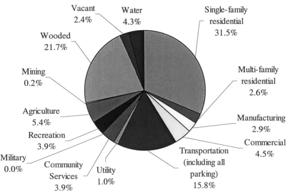
3-2: Land Use Pattern in the Five Counties
Montgomery, Chester and Bucks Counties have large total areas, but they are also covered heavily with woods, whose ratio is around 20% for Montgomery County, and 30% for the rest of the two, and for Chester and Bucks counties, agricultural land use is also around
30%. On the other hand, single family residential area occupies the highest ratio in
Delaware County, which is 31.5%, and the total residential land use exceeds 30% in Delaware and Montgomery counties, while it stays around 20% in Chester and Bucks counties.
Table 1: Land Use by County in 2000 (Square miles)
Transportation
Single-family Multi-family Manufac- (including all Community Land Use Total (sq.mi.) residential residential turing Commercial parking) Utility Services Delaware County 190.72 59.99 4.96 5.53 8.64 30.08 1.81 7.50
Montgomery County 487.31 130.63 8.82 11.44 16.06 62.94 5.53 12.48 Chester County 759.48 125.60 5.81 4.36 12.67 55.16 3.28 7.04
Bucks County 621.81 115.67 6.68 9.26 15.29 56.42 6.09 7.00
Philadelphia 142.581 33.90 8.33 7.72 8.68 44.61 1.24 5.83 Land Use Military Recreation Agriculture Mining Wooded Vacant Water
Delaware County 0.02 7.42 10.29 0.45 41.38 4.49 8.17
Montgomery County 1.32 21.77 91.73 1.42 98.40 17.87 6.89
Chester County 0.00 11.80 297.26 1.88 208.69 18.77 7.14
Bucks County 0.99 12.78 164.40 3.17 181.39 23.23 19.44
Philadelphia 1.64 6.16 0.59 0.00 9.19 6.24 8.44
(Source) Delaware Valley Regional Planning Conunission
Figure 2: Composition of Land Use by County in 2000
L-and Use in Delaware County Vacant 2.4% Wooded 21.7% Mining 0.2% Agriculture 5.4% Recreation 3.9% Military 0.0% Community utility Services 1.0% 3.9% Water 4.3% Single-family residential 31.5% Transportation (including all parking) 15.8% Multi-family residential 2.6% Manufacturing 2.9% Commercial 4.5%
I/
Land Use in Montgomery Water Vacant 1.4% 3.7%
)
County Single-family residential 26.8% Wooded 20.2% Mining 0.3% Agriculture 18.8% Recreation 4 4I
Military Community 0.3% Services 2.6% Utility 1.1% Multi-family residential 1.8% Manufacturing 2.3% Commercial 3.3% Transportation (including all parking) 12.9%Land Use in Chester County
Single-family
Vacant Water residential
-2.5% 16.5% Wooded 27.5% Mining 0.2% Multi-family residential 0.8% Manufacturing 0.6% Comnercial 1.7% Transportation (including all parking) retaitv 7.3% Agriculture 39.1% 0.0%
4
.Land Use in Bucks Water 3.1% County Single-family residential 18.6% Multi-family residential 1.1% Manufacturing 1.5% Comnercial 2.5% Transportation (including all parking) 'Y 9.1% fo Community Services tr 1.1% Mining 0.5% Wooded 6.4% Mining riculture 0.0% 0.4% Recreation 4.3% Military 1.2% Community Services 4.1%3 and Use Vacant 4.4% in Philadelphia County Water 5.9% Single-family residential 23.8% Multi-family residential 5.8% Manufacturing 5.4% Commercial 6.1% _0 Transportation 0.9% (including all parking) 31.3%
(Source) Delaware Valley Regional Planning Commission Vacant
3.7%
Wooded
29.2%
3-3: Socioeconomic Characteristics of the Five Counties 3-3-1: Population and Population Density since the 1960s
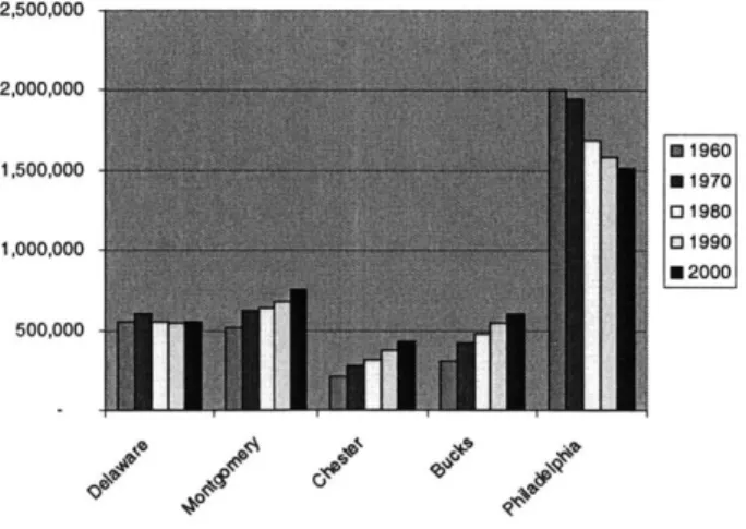
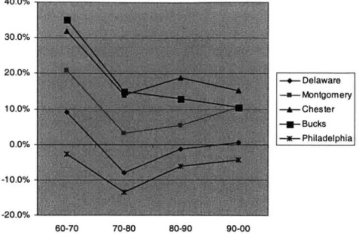
Of the five counties, Philadelphia County has the largest population. However, it is
the only county which kept loosing population since the 1960s, and its decrease was especially rapid during the 1970s, when the decreasing rate was 13.4%. On the other hand, Bucks, Chester and Montgomery Counties had a large increase in population over the past 40 years. Delaware County, where most of the studied segment of 1-476 in this paper runs, had a relatively small population change in the same time period with the population of approximately 550,000. Seen from the population density data, this small population increase in Delaware County can be attributed partially to the fact that Delaware County was already more densely populated than the rest of the counties except for Philadelphia County. Delaware County has maintained approximately 3,000 residents per square mile over the past 40 years. On the other hand, Chester County and Bucks County have the lowest population density among the five counties, even after the relatively fast increase in the population.
Figure 3: Population by County, 1960 -2000
2,500,000 2,000,000 0 1960 1,500,000 N 1970 01980 1,000,000 031990 N 2000 500,000
Figure 4: Population Change Rate by County 40.0% 30.0% 20.0% -- Delaware -a-Montgomery 10.0% --- Chester -u-Bucks 0.0% -m- Philadelphia -10.0% -20.0% 60-70 70-80 80-90 90-00
(Source) U.S. Census Bureau
Table 2: Population Density by County
County 1960 1970 1980 1990 2000 Delaware 3,003 3,276 3,013 2,973 2,990 Montgomery 1,069 1,292 1,332 1,404 1,553 Chester 279 367 419 498 573 Bucks 508 686 789 891 984 Philadelphia 14,824 14,435 12,497+ 11,737 11,234
Figure 5: Population Density by Zip Code (2000)
(Source) U.S. Census Bureau
3-3-2: Housing Units and Density since 1960s
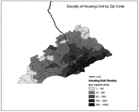
The different characteristics of the population change and population density are also reflected in the trend in the housing market. Obviously, Delaware County, especially the eastern part, has the highest concentration of housing units of all the counties except for Philadelphia. In addition, residential developments occurred in the four suburban counties and this observation of the development pattern can be seen in Figure 8, which will be analyzed later in this chapter.
Figure 6: Density of Housing Units by Zip Code (2000)
(Source) U.S. Census Bureau
Table 3: Number of Housing Units and its Density (per square mile) Housing Units County 1960 1970 1980 1990 2000 Delaware 162,030 185,366 201,479 211,024 216,978 Montgomery 153,085 193,679 232,570 265,897 297,434 Chester 58,974 80,473 110,183 139,597 163,773 Bucks 89,483 122,220 165,429 199,934 225,498 Philadelphia 649,033 674,223 685,629 674,899 661,958
Housing Units per Squre Mile
County 1960 1970 1980 1990 2000 Delaware 880 1,006 1,094 1,146 1,178 Montgomery 317 401 481 550 616 Chester 78 106 146 185 217 Bucks 147 201 272 329 371 Philadelphia 4,804 4,991 5,075 4,996 4,900
3-3-3: Median Household Income
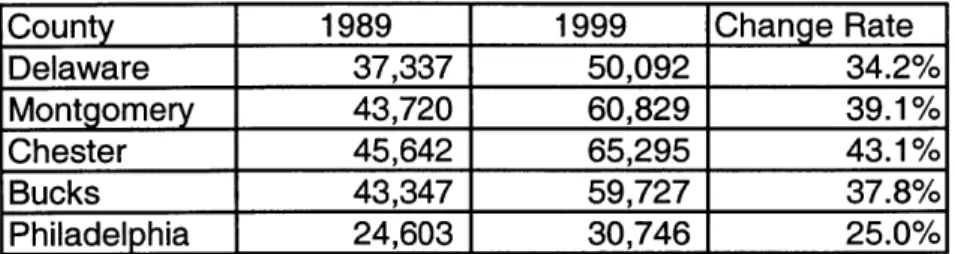
Turning to the income level, the four counties except for Philadelphia County showed much higher increase than Philadelphia County, all of which were over 30% in the nominal terms from 1989 to 1999. On Figure 7, we identify the relatively high concentration of high income areas in the western and the northern areas of 1-476. In these areas, we see relatively quiet neighborhood with less density and larger lots than in the rest of the region.
Figure 7: Median Household Income by Zip Code (2000)
Table 4: Median Household Income and its Change Rate
County 1989 1999 Change Rate
Delaware 37,337 50,092 34.2%
Montgomery 43,720 60,829 39.1%
Chester 45,642 65,295 43.1%
Bucks 43,347 59,727 37.8%
Philadelphia 24,603 30,746 25.0%
(Source) Delaware Valley Regional Planning Commission
3-3-4: Suburbanization and Development
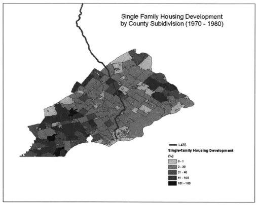
The trends of population, population density, and income level suggest the suburbanization described in the historic overview of metropolitan Philadelphia. Looking at the development which went on from 1960 to 1970 provides another piece of evidence of the suburbanization, which was reported by DVRPC in 1982. Single-family housing development is concentrated largely in Chester County and the fringe area of the four suburban counties. Multi-family housing development is scattered a little more than single-family housing development, but it is concentrated more in the central part of Montgomery County and the western part of the Delaware County than other parts of the region. Commercial and industrial development is observed more in the eastern half of metropolitan Philadelphia, including the northern and the western areas of the Blue Route. Delaware County, which experienced the least residential development of all the counties except the Philadelphia County, has a higher concentration of commercial and industrial development, while the highest category, which stands for an increase higher than 100%, is only observed in the two more rural counties, i.e., Bucks County and Chester County.
Summarizing this study of development, DVRPC concluded that "analysis at the regional level reveals a clear pattern of scattered development on the urban fringe. [...] New development was especially intense in the more rural counties of Bucks, [and]
Chester."2
Figure 8: Development by County Subdivision: Single-family, Multi-family, and Commercial and Industrial Development (1970 - 1980)
(Source) Delaware Valley Regional Development Commission
Employment and commuting patterns also support the trend of suburbanization. While the Philadelphia County has lost almost 25% of its full- and part-time employment since 1970, the rest of the four counties have increased it more than 90%. The importance of Philadelphia County decreased, while employment increased in the suburban areas following the population increase. For example, as is seen in the Table 5, for the three counties, Delaware, Montgomery and Bucks, the importance of Philadelphia
as the employment center decreased over the 20-year period from 1960 and 1980. However, Philadelphia remained an important source of employment for Chester County, which experienced a large employment increase and residential development at the same time. Table 6 shows the commuting patterns in the four suburban counties. The ratio of local workers to commuters to Philadelphia increased only in Chester County in the 20-year period from 1960 to 1980, as is seen in Table 7.
Table 5: Full and Part Time Employment by County
Total Full and Part Time Employment Percent
Geography 19701 19801 19901 2000 1970-1980 1980-1990 1990-2000
Bucks 140,174 203,001 274,692 325,081 45% 35% 18%
Chester 114,150 149,743 215,265 285,209 31% 44% 32%
Delaware 195,709 220,551 262,046 277,950 13% 19% 6%
Montgomery 327,961 409,456 517,916 600,727 25% 26% 16%
Total of the 4 counties 777,994 982,751 1,269,919 1,488,967 26% 29% 17%
Philadelphia 1,049,053 866,187 842,115 792,1121 -17% -3% -6%
Table 6: Percentage of Workers Commuting to Philadelphia by County of Residence, 1960 -1980 County 1960 1970 1980 Delaware 37.1% 33.5% 27.8% Montgomery 28.1% 22.9% 18.7% Chester 7.0% 7.6% 8.0% Bucks 23.2% 20.5% 16.0%
(Source) Summers, "Economic Development within the Philadelphia metropolitan Area"
Table 7: Ratio of Local Workers to Philadelphia Commuters by County of Residence
County 1960 1970 1980
Delaware 1.6 1.7 2.1
Montgomery 2.3 3.0 3.7
Chester 11.4 9.3 8.6
Bucks 2.7 3.1 4.1
(Source) Summers, "Economic Development within the Philadelphia metropolitan Area" 3-3-4: Summary of the Five Counties
In summary, the development in the Delaware Valley region occurred more in the fringe area than in Philadelphia County, and changes in population, population density and housing units all suggest the ongoing suburbanization in the area. However, Bucks and Chester counties, which experienced a high rate of development, also have a high rate of agricultural land use, which differentiates them from more urbanized counties, Delaware and Montgomery Counties. Suburbanization also moved wealthy people outside of central Philadelphia, and the studied area around 1-476, especially the northern and the western part of the section, has a higher concentration of higher income population.
Chapter 4: Description of the Project
4-1: Location of the Route and the Surrounding Highway Network
1-476 has been the longest three-digit interstate highway in the United States since
1996, when the legislation was passed to incorporate Pennsylvania Route 9, commonly
known as the Northeast Extension, into 1-476, resulting in a total length of 129.6 miles. It runs from 1-95, in the southwest of Philadelphia, through Interstate 81, in the northwest of Scranton. The highway studied in this paper is the 21.5 mile section of 1-476 which is between 1-95 in the south and 1-276, the Chemical Road, in the north. It is called "the Blue Route" due to the color given to this section of the highway on the planning map when the several options of the route were considered for an approval by the Pennsylvania Department of Transportation (PennDOT) in the 1950s. As shown in Figure 9, in the northern part of the Blue Route, runs 1-76 from west to east, and at Valley Forge, 1-276 leaves from 1-76 and runs to the east until it joins the New Jersey Turnpike after crossing with 1-95 in Pennsylvania and Interstate 293 in New Jersey. In addition to the three interstate highways, 1-85, 1-76 and 1-276, several state highways cross the Blue Route, including U.S. 30, which is referred to as the Main Line, U.S. 1, the Baltimore Pike, and the MacDade Boulevard.
Figure 9: Highway Network in the Studied Area
4-2: Planning History of 1-476
The economic impact of the planning and construction of the Blue Route is of interest due to its long planning process involving the federal government, the regional transportation office, the local residents and the several different local opponents. The first idea of constructing a north-south highway in this region appeared in the 1920s, in response to the limited capacity of the existing north-south highways, including Pennsylvania Route
320, Pennsylvania Route 252, and Pennsylvania Route 420, which were constructed in the 1680s by Pennsylvania's first settlers for the convenience of the local farmers in that area. In addition to alleviating the excess traffic on those previously existing routes, the new expressway was intended to form a circumferential highway surrounding Philadelphia in order to decrease the traffic going into the central part of metropolitan Philadelphia. The alignment of the Blue Route was first proposed in the toll road plan in 1954. Not only was the proposed expressway expected to decrease the traffic in Pennsylvania, but it would also construct a link connecting the Philadelphia International Airport, the Chester area, where the long standing shipbuilding industry had collapsed after World War II, and the Pennsylvania Turnpike.
The designation of the alignment of the Blue Route was influenced largely by the transition of the federal transportation policy.
When the Federal-Aid Highway Act of 1956 was signed by President Eisenhower, the National System of Interstate and Defense Highways, the plan of constructing a 41,000 mile highway network across the nation, was launched as the largest public works program yet undertaken. The act intensified the previously adopted highway network system based on the Federal-Aid Highway Act of 1944, and the Mid-county Expressway became a part of the network. Accordingly, the 90 percent of the construction cost would be eligible for the federal interstate highway funds allocated to PennDOT by the Federal Highway
Administration (FHWA)3. After the rejection of the initially proposed alignment of the expressway in 1957, which was the shortest alternative but required substantial takings in the already densely developed residential areas in Springfield Township, the Blue Route was proposed to the U.S. Bureau of Public Roads in 1963 and it was officially approved in
1965. The point of this alignment was that, while the northern two-thirds segment of the
approved route was identical with the previously rejected route, the Blue Route avoided major residential relocations and community disruptions at the cost of passing through the three watersheds, the Ithan, Darby, and Crum Creeks. This point later provoked a major discussion over the cost and the benefit of this highway construction project, facing the increasing awareness of the environmental problems and the establishment of the relevant federal laws to protect nature.
The construction of the Blue Route started in 1967 and the two sections, which added up to 5.1 miles, were completed by 1969. However, the completed sections, which did not connect with any surrounding roads, sat unused for more than two decades, because the protection of the environment started to be legally required. The first installation of regulation regarding environmental protection was Section 4(f) of the Department of Transportation Act of 1966, which required the preservation of natural areas. "It prohibited the use of land for a transportation project from a park, recreation area, wildlife and waterfowl refuge, or historic site unless there was no feasible and prudent alternative to the area."4 Following this act, the Federal-Aid Highway Act of 1968 first required public hearing on economic, social and environmental effects of proposed highway projects, while repeating the above requirement of the Department of Transportation Act of 1966 to clarify that the provision would be also applied to highways,. This requirement of public hearing was intensified in 1969 by Policy and Procedure Memorandum 20-8 "Public Hearings and
3 Transportation Advisory Committee (1979)
Location Approval." It replaced the former one-hearing process with a two-hearing process. The new process was composed of the first "corridor public hearing" and the second "highway public hearing" focusing on the need and location of the highway and on the specific location and design of the highway respectively. In addition, the National Environmental Policy Act of 1969 and the accompanying Environmental Quality Improvement Act of 1970 provided another major hurdle for the construction of the Blue Route. The two acts required an Environmental Impact Statements (EIS) for federal actions significantly affecting the quality of the human environment. In other words, these two acts made any highway construction project infeasible without the federal government's final decision and comments from all relating agencies reflected in the EIS. The newly adopted requirements were retrospectively applied, and the drafts of EIS and the evaluation of all possible alternatives based on Section 4(f) of the Department of Transportation Act of 1966 were prepared in 1976 and the final versions were submitted to FHWA in 1978. The EIS reported that the project would be very disruptive to the watersheds the expressway would pass. Without more intensive consideration of preservation of the environment, the project could not be continued any more at this point.
Meanwhile, Robert Edgar, the congressman representing most of Delaware County, formed an advisory committee chaired by Professor Vukan Vuchic at University of Pennsylvania, in order to reevaluate the project, assess its feasibility and propose possible modification of the plan. The committee reported, in February 1979, that the expressway would be necessary but considering the surrounding urban setting and the federal environmental requirement, downscaling and redesign would be recommended. One of the major suggestions in this report was the number of lanes of the Blue Route. Even though the route was originally planned to be six lanes for the entire length, the report suggested having the southern part of the route be four lanes, warning that providing too much capacity for the route would result in the overflow of the traffic and more serious traffic congestion in turn. At the same time, the federal government refused to approve the
previously submitted EIS and required a further consideration of the scale of the project, intersecting public transit lines and so on. Responding to the federal government's requirement and considering the advisory committee's suggestion, an addendum of EIS statements was submitted and approved by March 1981, with the conditions of 1) appointing an environmental monitor to assure compliance with commitments in the EIS, and 2) convening another Task Force to include officials of Swarthmore College to minimize impacts on that institution. 5 Though there were still remaining suits filed by opponents of several townships, since they would have prevented the entire project from being processed, the site of the Blue Route was divided into six sections in order to facilitate design and construction. The project finally started to the design stage beginning in the southern sections of the route. The entire route was segmented to the following six sections from south to north.
Section 100: From 1-95 to MacDade
Section 200: From MacDade to Baltimore Pike Section 300: From Baltimore Pike to U.S. 1
Section 400: From U.S. 1 to Pennsylvania State Route 3 Section 500: From Pennsylvania State Route 3 to U.S. 30 Section 600: From U.S. 30 to 1-76
Figure 10 is the timeline of the design and the construction of each section summarized from "Blue Route Monitor," the quarterly publication by Kidde Consultants, Inc., the appointed environmental monitor.
Figure 10: Timeline of the project 11982 1983 1984 1985 1986 1987 1988 1989 1990 1991 1992 Sectbn100 <--> Sectbn200 < < > Sectbn300 > Sectbn400 C Sectbn500 C > S ectbn600 C > 4 4 4 > D esin Stages
F4=======Fom C onstructbn to H ighw ay 0 pening (Source) Created by author based on the information from Blue Route Monitor
The design of each section received an approval of the PennDOT one by one in
1985 (Section 100) and in 1987 (the remaining five sections) and those sections moved into
the construction stage following the approval. The two-year-gap of receiving the approval was due to the continuing law suits filed by the opponents and, at the same time, the section
100 faced another law suit during the construction period questioning the validity of the
design approval. Because of this piecemeal construction process, the highway opening was also realized at several steps: between 1-76 and Germantown Pike in 1979; a part of Section
100 (between 1-95 and MacDade Boulevard) in 1987; the remaining part of Section 100 to all sections 200 - 600 in 1991; the connection of Pennsylvania Route 6 and 1-276 in 1992.
To summarize this chapter, even though the initial alignment of the expressway was well announced to the public in the 1950s, the design and the construction process either moved very slowly or went back and forth almost until the actual opening of the major sections of the route, due to the public's increasing concern and awareness about the
natural environment. Since there must have been different levels of public perception about the reality of the construction of the new route depending on the progress of the project, it is my interest to analyze when and where the changes in the local property values would, if any, be observed.
In addition, this project provides an interesting opportunity to observe how the effect of a transportation project at the regional level would impact the nearby neighborhoods. This is important because the major purpose of the Blue Route was to alleviate the excess traffic on the local roads running parallel to the Blue Route, and to have the traffic going south bypass central Philadelphia, rather than to only benefit local neighborhoods. Due to the wide geographic coverage of the data to be introduced in the next chapter, this paper can analyze not only the local benefit but the benefit for the wider region.
As an example of the possible local benefit, Summers and Luce (1987) suggest in "Economic Development Within the Philadelphia Metropolitan Area" the possible local benefit of this highway project for Delaware County as follows, focusing on the nature of the location of high-tech industry:
Major highway systems (or improvements to older, regional arteries) have very often associated with concentrations of high-tech firms. [...] The status of the 202 Corridor as a major center of employment and growth in the region is likely not only to continue, but will be enhanced if and when the Blue Route is completed.
Therefore, this paper examines the location and timing of the construction of the Blue Route, considering the combined potential benefit both at the regional and at the local level.
Chapter 5: Data and its Overall Trend
5-1: Description of the Data
The data to be used in this study are the Repeat Sales Single-family Home Price Index histories for Philadelphia MSA, which were obtained from Case Shiller Weiss, Inc (CSW). The data are composed of a price index for each of the zip codes within the Philadelphia MSA and a composite Index for the entire Philadelphia MSA. These indices were developed by CSW in order to overcome the drawbacks of the commonly used "median sales price" to measure price movement in the housing market. The "median sales price" only reflects the price change of "median price" of all the sales which occurred in a given place during a given period of time. Therefore, it always faces a possible bias which would be caused by the change of the characteristics of the homes sold, i.e., if, for some reason, there are more sales of cheaper houses than other periods of time, the decline in the median price would not reflect a relative price change during that particular period of time, but would merely reflect the fact that there were more transactions at the lower price range. A "true" measure of appreciation/depreciation would be based exclusively on observed increases and decreases in the value of specific properties. All single-family homes and condominiums that sell in a given month or quarter are screened for previous sales of the same property, and because of this process of constructing the index, this is called "repeat sales". In other words, repeat sales price index is the method of holding the quality of samples constant. (Case and Shiller, 1989)
The Repeat Sales Single-family Home Price Index for the entire Philadelphia MSA, which will be hereafter called the MSA Index, is a quarterly compilation of data which covers from the first quarter of 1981 through the second quarter of 2003. The base period of time is the first quarter or six months of 1990, which is set to be 100. In order to convert this MSA Index into an annual index, I took the average of the four quarterly indices for the corresponding year, which is called hereafter Annual MSA index, except for the year 2003,
which I omitted due to the lack of the last two quarters.
The Repeat Sales Single-family Home Price Index for each zip code in Philadelphia
MSA contained 63 zip codes in the Commonwealth of Pennsylvania and 55 zip codes in the State of New Jersey. I chose only the 63 indices in the Commonwealth of Pennsylvania. The zip codes cover the following region in Philadelphia MSA.
Figure 11: Data Coverage
The 63 indices are semi-annual until the end of June 2003, 27 of which start from the second six months of 1980, 21 of which start from the first six months of 1981, 1 of which starts from the first six months of 1983, and 14 of which start from the first six months of 1984. In order again to obtain an annual index for each zip code, I took the average of the two semi-annual indices for each year, which is hereafter called the Annual Zip Code Index,
omitting the year 1980 due to the lack of the first six months.
After obtaining the Annual MSA index and the Annual Zip Code Index, I adjusted the two indices for inflation based on the consumer price index for Philadelphia-Wilmington-Atlantic cities provided by U.S. Census Bureau, which are hereafter called the Inflation Adjusted Annual MSA Index and the Inflation Adjusted Annual Zip Code Index.
Finally, I calculated the annual appreciation rate for both Inflation Adjusted Annual
MSA Index and the Inflation Adjusted Annual Zip Code Index. As a result, all the
appreciation rates at least cover from 1985 through 2002 and these 18 years will be the focus of this study.
5-2: Overall Trend of the Home Price Index
In order to see the overall trend of the Home Price Indices in the Philadelphia MSA, the following four zones are created based on the location of zip codes:
Zone 1: the area composed of the 9 zip codes adjacent to 1-476;
Zone 2: the area composed of the 19 zip codes within 7,500m from the nearest interchange of 1-476 (which includes Zone 2);
Zone 3: the area composed of the 44 zip codes more than 7,500m away from the nearest interchange of 1-476;
Zone 4: the area composed of the 36 zip codes more than 10,000m away from the nearest interchange of 1-476 (which includes Zone 3).
Figure 12: Map of the zones
Figure 13 shows the Inflation Adjusted MSA Index and the Inflation Adjusted Zip
Code Index in each zone, respectively. As a basis to compare the four zones, the Inflation Adjusted MSA Index is shown in the graphs for each of the four zones. Basically, all zip codes experience a rapid price increase during the late 1980s and after the late 1990s, and the housing price remains relatively stable or even decrease from early to the late 1990s, when adjusted with inflation. This flat curve during the early to the late 1990s is commonly observed in many housing markets in the U.S.A, and is not unique in Philadelphia MSA. Furthermore, it is clear that the data set is not designed to measure the distance effect as is often seen in many former studies by means of micro data. This is assumed because even the shortest distance is over 900m, while usually the threshold distance is around 100m, when
the distance from the nearest interchange of 1-476 to the center point of each zip code was calculated by means of the GIS technique found in ArcView,. The distance calculated here is found in Appendix (G).
Figure 13: Trend of the Inflation Adjusted price Index by Zone
Inflation Adjusted Price Index in Zone 1
100 90 80 80- 19008 70 -U.--19010 70 19026 60 19063 *-19064 50 -.- 19083 40 19086 - 19428 30 - 19462 .- 4-MSA 20 10 0 1984 1985 1986 1987 1988 1989 1990 1991 1992 1993 1994 1995 1996 1997 1998 1999 2000 20012002
Inflation Adjusted Price Index in Zone 2 100 90 80 70 60 50 40 30 20 10 0 A Cb S R, N 11,
Inflation Adjusted Price Index in Zone 3
1984 1985 1986 1987 1988 1989 1990 1991 1992 1993 1994 1995 1996 1997 1998 1999 2000 2001 2002 -- 18940 -U-18966 18974 ---- 18976 +19001 -019002 -+-19006 - 19007 - 19012 -- 19014 19020 19021 -ye-19023 -*-19025 -- 19030 -- 19032 -- 19038 - 19040 -.- 19044 -a-19046 -*-19047 -M-19050 -a-19053 -4-19054 -- 19055 - 19056 - 19057 -*-19067 -a-19075 -s-19090 -*-19095 -a-19111 19114 -- 19115 - 19116 -19118 19119 -a- 19120 -*-19128 -*-19136 -I-19149 -- 19151 -- 19152 - 19154 -0-M SA - 19008 --- 19010 19026 x 19063 -: 19064 - 19083 19086 -19428 19462 19015 19018 --- 19034 -*-- 19036 - 19070 -- 4--- 19082 -19096 -19401 - 19422 a--19444
Inflation Adjusted Price Index in Zone 4 1984 1985 1986 1987 1988 1989 1990 1991 1992 1993 1994 1995 1996 1997 1998 1999 2000 2001 2002 -+- 18940 -a- 18966 18974 --- 18976 -- 19001 -- 19002 -+- 19006 - 19007 -- 19012 19020 19021 -&-19025 -.- 19030 - 19038 - 19040 -- 19044 --a- 19046 -*- 19047 -*-19053 -e-19054 -4-19055 - 19056 -19057 -*--19067 -i-19090 -- 19095 -- 19111 19114 -- 19115 - 19116 19119 --- 19120 -x-19136 -n-19149 -+-19152 - 19154 --- MSA
The next chapter will develop a model which examines the timing when the price indices behave differently in comparison to the overall trend in the Philadelphia MSA.
Chapter 6: Model and Results
6-1: Model
This chapter examines how differently the single-family housing prices behave in each zone, which was created in Chapter 5 (Figure 12), and how much the difference is related to the planning and the construction of 1-476 between 1985 and 2002. The four zones are again shown below:
Zone 1: the area composed of the 9 zip codes adjacent to 1-476;
Zone 2: the area composed of the 19 zip codes within 7,500m from the nearest interchange of 1-476 (which includes Zone 2);
Zone 3: the area composed of the 44 zip codes more than 7,500m away from the nearest interchange of 1-476;
Zone 4: the area composed of the 36 zip codes more than 10,000m away from the nearest interchange of 1-476 (which includes Zone 3).
The estimation strategy employed measures the patterns over time of the deviation of the Inflation Adjusted Annual Zip Code Index relative to the Inflation Adjusted Annual
MSA Index. This allows us to compare sections of Philadelphia MSA nearest to the highway
to others. In addition, the year dummy variables measure the price appreciation which occurs in the corresponding year in addition to that in the base year, 1985.
Yzip,eat -a+bD 19 6
,
+CD
1987+
d 198+ +r D2+eYi,yeat = The appreciation rate of the Inflation Adjusted Annual Zip Code Index minus Inflation Adjusted Annual MSA Index and
DX=
Year dummy variable, which is 1 in year x and 0 otherwiseThe data begins in 1985 and ends in 2002. Therefore the data cover all the construction period after the necessary approvals were issued in 1987, but do not cover the major negotiation process for the planning of 1-476 with the local residents and institutions which mainly went on in the late 1970s, the start of the construction in Section 100 in 1981, or the initial construction of the two short sections, which sat unused for more than two decades.
6-2: Result
Table 8 and Table 9 show the coefficients of the explanatory variables and the 95% confidence interval for each year dummy variable, respectively. Figure 14 shows the estimated difference in the price appreciation in each zone from Philadelphia MSA. The values in Figure 14 are calculated as the sum of the year dummy variables and the constant
term. The detail of the regression results including the sample size, the adjusted R squared, and standard deviation are presented in Appendix (C) to Appendix (F).
Of all the four zones, Zone 2 showed the most interesting result. In Zone 2, which is
composed of the 19 zip codes within 7,500m of the highway, the home price increased more than the entire Philadelphia MSA by 0.3 % to 2.6% between 1988 and 1994. The statistical significance of the result is the highest in this zone of all the four zones, and all the results during this period of time are significant at the 5% significance level. The adjusted R squared is 0.2641.
If we turn to look at Zone 1, we observe the similar, but weaker results of the same
trend. In Zone 1, which is composed of 9 zip codes which are adjacent to the highway and include at least one interchange, it is observed that the appreciation rates are higher than the entire Philadelphia MSA by 0.4% to 2.4% from 1988 to 1994. The statistical significance varies each year during this time, but all the years except for 1988, 1991 and 1992 are significant at the 5% significance level. The adjusted R squared is 0.2595.