HAL Id: halshs-01945918
https://halshs.archives-ouvertes.fr/halshs-01945918
Preprint submitted on 5 Dec 2018
HAL is a multi-disciplinary open access archive for the deposit and dissemination of sci-entific research documents, whether they are pub-lished or not. The documents may come from teaching and research institutions in France or abroad, or from public or private research centers.
L’archive ouverte pluridisciplinaire HAL, est destinée au dépôt et à la diffusion de documents scientifiques de niveau recherche, publiés ou non, émanant des établissements d’enseignement et de recherche français ou étrangers, des laboratoires publics ou privés.
Spatial Inequality in Mortality in France over the Past
Two Centuries
Florian Bonnet, Hippolyte d’Albis
To cite this version:
Florian Bonnet, Hippolyte d’Albis. Spatial Inequality in Mortality in France over the Past Two Centuries. 2018. �halshs-01945918�
WORKING PAPER N° 2018 – 53
Spatial Inequality in Mortality in France over the Past Two Centuries
Florian Bonnet Hippolyte d’Albis
JEL Codes: Keywords:
P
ARIS-
JOURDANS
CIENCESE
CONOMIQUES48, BD JOURDAN – E.N.S. – 75014 PARIS
TÉL. : 33(0) 1 80 52 16 00=
www.pse.ens.fr
CENTRE NATIONAL DE LA RECHERCHE SCIENTIFIQUE – ECOLE DES HAUTES ETUDES EN SCIENCES SOCIALES
ÉCOLE DES PONTS PARISTECH – ECOLE NORMALE SUPÉRIEURE
Spatial Inequality in Mortality in France over the Past Two
Centuries
∗
Florian Bonnet
†Hippolyte d’Albis
‡November 23, 2018
Abstract
This article analyzes the evolution of spatial inequalities in mortality across 90 French territorial units since 1806. Using a new database, we identify a period from 1881 to 1980 when inequalities rapidly shrank while life expectancy rose. This century of convergence across territories was mainly due to the fall in infant mortality. Since 1980, spatial inequalities have levelled out or occasionally widened, due mainly to differences in life expectancy among the elderly. The geography of mortality also changed radically during the century of convergence. Whereas in the 19th century high mortality occurred mainly in larger cities and along a line from North-west to South-east France, it is now concentrated in the North, and Paris and Lyon currently enjoy an urban advantage.
∗We thank M. Barbieri, R. Edwards, L. Kesztenbaum and H. Pifarr´e i Arolas for their comments. †Universit´e Paris 1 Panth´eon-Sorbonne, Paris School of Economics, florian.bonnet@psemail.eu
‡Paris School of Economics, CNRS. Corresponding author. 48 Boulevard Jourdan. 75014 Paris. Tel: 33180521609. Email:
1
Introduction
Since 1790, France has been subdivided into d´epartements, geographical units whose boundaries have changed little over time. In 2014, the difference in life expectancy at birth between women living in the top d´epartement (Aisne) and the bottom one (Savoie) was 3 years 10 months. This gap may seem large, especially for a country where equality figures in the national motto, and public health and welfare policies are among the most exten-sive in the world. This article puts that gap into perspective by following the development of life expectancy inequalities between French d´epartements over the last two centuries.
Most research on spatial inequalities of mortality concerns recent periods and reveals either a levelling out or an increase in inequality. In Germany, for example, Kibele’s (2012) regional mortality analysis for 1990-2006 shows that the inequality index has barely varied since 1995. This is due to two countervailing trends: increased inequality in the West German L¨ander, and convergence to the national mean in the L¨ander of the former GDR. One can see also Brown and Rees (2006) for Yorkshire, Ezzati et al. (2008) for US counties, Joseph et al. (2009), for Canada, G¨achter and Theurl (2011) for Austria, Barbieri and Ouellette (2012) for Canada and the United States, and Janssen et al. (2016) for the Netherlands. In the United Kingdom, Illsley and Le Grand (1993) include a further dimension with an analysis of spatial inequalities at various ages, showing that inequalities of mortality have reduced among younger people and increased among the oldest. In France, Daguet (2006), Barbieri (2013) and Breton et al. (2017) also reveal a stabilisation in the widest gap in female life expectancy between d´epartements since 2000 and a widening of the male gap since 1995.
These recent developments differ greatly from those in the historical record. In France, Bonneuil (1997) reconstitutes d´epartement life expectancies for 1806-1906, showing that the standard deviation of female life expectancy at birth fell throughout the 19th century, with the notable exception of 1851 and 1870. Vallin and Mesl´e (2005) use his reconstitution to show that d´epartement convergence was rapid in the closing decades of the 19th century. This pioneering work, however, only marginally examined the development of spatial inequalities. Indeed, the long-term historical trends could not be analyzed because of the lack of data for 1906-1975.
This article uses a new database, presented in Bonnet (2018b), which reconstitutes annual life tables for each French d´epartement and both sexes for 1901-2014. This period includes the two World Wars, for which the author uses data from new sources on civilian and military deaths and those in deportation. Combining this new base with Bonneuil’s (1997), we have analyzed the development of life expectancy inequalities between French d´epartements since 1806.
Our first contribution is to characterize the development of inequalities over time and date the three main phases identified. The period from 1806 to 1880 alternates divergence and convergence between regions and rises and falls in national life expectancy. The 1881-1980 period we call the “century of convergence”, a fortunate time when inequality shrank and life expectancy rose. Both occurred regularly except for the years of the two World Wars. The third period, 1981-2014, returns to an alternation of convergence and divergence along with a general rise in life expectancy. This alternation also figures in Vallin and Mesl´e’s research (2005), where they hypothesize and identify “Matthew effect” years of divergence when rising life expectancy occurs mainly in those areas where longevity is already highest. Age-group analysis also shows that developments in infant mortality account for most of the reduction in spatial inequalities over the century of convergence. At
present, it is basically inequalities among the oldest people that account for spatial inequalities.
Our second contribution is a geographical analysis of areas of high mortality. We take a number of areas similar in life expectancy profile that have experienced notable change over these two centuries. One striking example is the Northern d´epartements in France: they were well ahead in the 19th century but are now well below the national mean. Conversely, the Seine d´epartement, containing Paris, long suffered an “urban penalty” (Haines, 2001) which has become an “urban advantage” since the 1930s.
Section 2 presents the data and indicators used and describes the main concepts used. Section 3 presents our results and Section 4 concludes.
2
Data and Method
We analyze the dynamics of spatial inequalities in life expectancy in France since 1806. The indicator most commonly used in the literature is life expectancy at birth, calculated from current life tables. Other indicators may also be used. Edwards and Tuljapurkar (2005) use life expectancy at age 10 so as to eliminate the effects of infant mortality. Standardised (Brown and Rees, 2006) or raw mortality rates are also sometimes used in order to eliminate differences between population age structures. In this article, we use life expectancy at various ages that we have calculated from current life tables for French d´epartements. We do not analyze inequalities within d´epartements but focus on inequalities between d´epartements. So life expectancy at a given age shows the number of years of life left for an average individual living in a given d´epartement.
2.1
Data Sources
We use data from Bonneuil (1997) for 1806-1900 and from Bonnet (2018b) for 1901-2014.
Bonneuil (1997) calculates current life tables for women for each French d´epartement. These tables are given in five-year age-groups from 0 to 85, and for five-year periods in 1806-1906. Note that deaths and censuses by age-groups are only available from 1856. For 1806-1855, Bonneuil estimates life expectancies using the Ledermann model. He takes life tables and age pyramids for 1856-1906 and total births and deaths for 1806-1906. This gives differing life expectancies at birth for the d´epartements but life tables with an identical internal structure: differences in death rates by age are frozen at the 1856 value. Given this limitation, we only use life expectancies at birth for 1806-1856 and entire life tables for 1856-1901.
For 1901-2014 we have life expectancies, mortality rates and population figures at 1 January of each year, for women and men, calculated by Bonnet (2018b), mainly using the Human Mortality Database protocol. The raw data he compiled came from the archives of the French statistical agencies. This database contains previously unavailable information on mortality during the first half of the 20th century. It complements the d´epartementdatabase in Daguet (2006), which covers the census years during the 1954-1999 period.
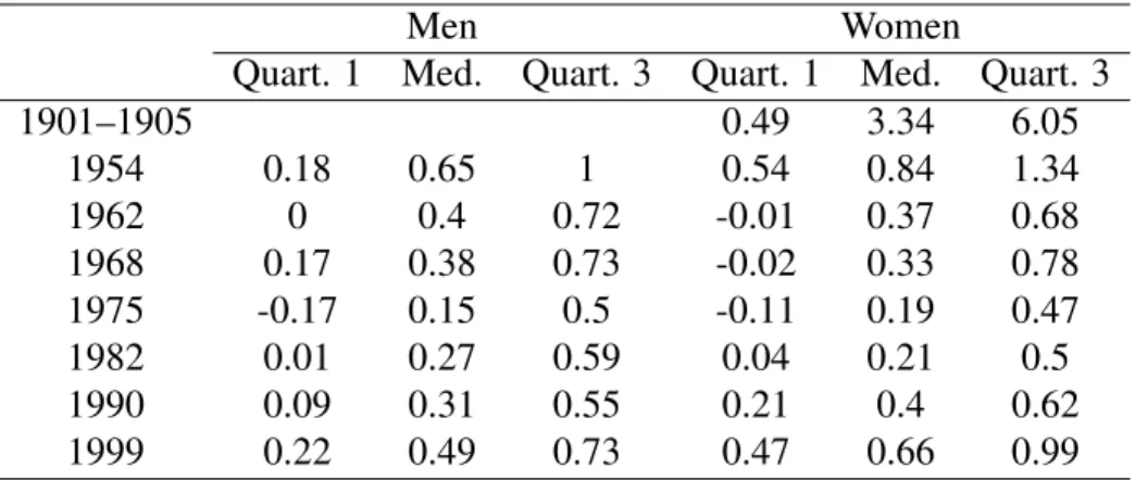
In order to aggregate these databases, an analysis was made of the differences in life expectancy at birth between Bonnet (2018b) and Bonneuil (1997) and Daguet (2006). This involved Bonneuil’s data on 1901-1905, where d´epartement life expectancies are available in both sources. The comparison with Daguet (2006) concerned 1954-1999. Table 1 shows the differences observed for the two periods. For 1901-1905, these
differences are quite large, and life expectancies are on average lower in Bonneuil. For the later period, the differences are small. Life expectancies are slightly lower in Daguet.
Table1here.
The two sources used for this study do not present the same variables for mortality rates by age, because Bonneuil (1997) does not give mortality rates above age 90. The Bonnet (2018b) database shows than in 1901-1905 the number of survivors beyond 90 was small (from 0.2% to 2%, depending on year and d´epartement), and the mortality rates for ages 85 to 90 vary little and are close to 75%. Consequently a mortality rate of 100% was applied to the 90-95 age-group for the years before 1901.
2.2
Geographical Scope
This article examines inequalities in life expectancy between French metropolitan d´epartements. The overseas d´epartementshave not been included because their demographic statistics are much more recent and cannot be extrapolated backwards. In this article, we use the term “national” to describe the situation in metropolitan France.
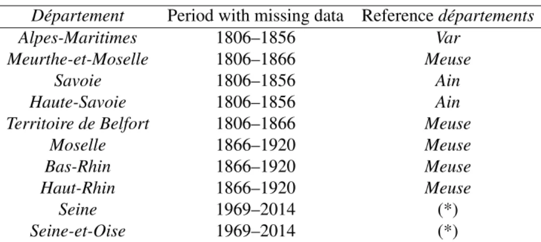
The number and boundaries of the French metropolitan d´epartements have generally varied little since they were created in 1790. What few modifications there have been are due to changes in France’s eastern border and a recent reorganization of the Paris region. In order to have a consistent comparison over time, we have applied the classification of 90 d´epartements valid in 1967 (see map in Appendix A1). This required reconstituting the life tables for some d´epartements that were absent in certain census years. We used an adjacent d´epartement, called a reference d´epartement.
The life tables of the reference d´epartements were used to re-estimate those of the missing d´epartements. The fit between the tables of each pair of d´epartements was analyzed for the closest year for which the data are available. Then specific ratios were calculated and applied to the life tables of the reference d´epartement for the missing years. In formal terms, l(x) is the number of survivors at age x, indexed by r for the reference d´epartementor m for the missing d´epartement and t∗ for the reference year or t for the estimated year.
The following formula is applied:
100, 000 − lmt (x) 100, 000 − lr m(x) = 100, 000 − l t∗ m(x) 100, 000 − lmr∗(x) (1)
from which is calculated the number of survivors in each d´epartement that is lacking a year’s figures. This is used to calculate the corresponding life expectancy.
Table2shows the 10 d´epartements for which data are lacking and the reference d´epartement used for each one.
Table2here.
Three d´epartements in South-eastern France (Alpes-Maritimes, Haute-Savoie and Savoie) were only created in 1860 when they were transferred to France. So for Alpes-Maritimes, with Var as its reference d´epartement,
ratios for mortality rates at each age in the two d´epartements for 1861 and 1866 were calculated and then applied to the Var 1856 life tables to estimate those of Alpes-Maritimes for that year.
In the case of the two d´epartements created in 1871 from the territory not annexed by Germany (Meurthe-et-Moselleand Territoire de Belfort), the same procedure was used to reconstitute data up to 1866. For the three d´epartements that were German until the First World War (Bas-Rhin, Haut-Rhin and Moselle), the same was done up to 1900. After that date we have the annual data in Bonnet (2018b) for deaths and population by age. The same assumption is made of stable ratios between missing d´epartement and reference d´epartement, but only for those variables. Then the corresponding life expectancies were calculated.
As a result of their large populations, the two d´epartements of the Paris region (Seine and Seine-et-Oise) were divided into seven in 1968. The deaths and population by age in the new d´epartements were allocated to the old d´epartements in the proportions observed in 1968, the year for which both sets of data are available. This ensures consistency in the data since the totals do not change. The corresponding life expectancies were then calculated.
None of these reconstituted data have any effect on the results given below. The results remain unchanged when the d´epartements that required data reconstitution are excluded.
2.3
Indicators of Inequality
There are a large number of indicators that measure inequality in general and inequality in mortality in partic-ular. Mackenbach and Kunst (1987) show that each indicator provides different information. Indicators based on extreme points (gap or ratio between the best-placed and worst-placed individuals) or an interquantile range (gap or ratio between the best-placed x% and (100 − x)% worst-placed) differ from indicators that use the en-tire distribution such as the Gini coefficient or the concentration index. Dissimilarity indices show how much would need to be redistributed among groups for mortality to be the same for all. For example, d’Albis et al. (2014) use the Kullback-Leibler divergence to analyze differences in mortality rates at each age.
In this article two main types of indicator are used. One simple indicator is the Gini coefficient. Another series of indicators are used to analyze specific sections of the d´epartement life expectancy distribution. By aggregating all the d´epartement life expectancies, the sum of “total years lived” is defined and a proportion is calculated for a number of d´epartements ranked by life expectancy. So the top decile (designated P90-100) contains the 10% of d´epartements with the highest life expectancy, the second decile (P80-90) the next 10% and so on. To obtain indicators of inequality similar to those used to analyze spatial disparities, these proportions are compared with what they would be in an even distribution. If the proportion of total years lived by the top 10% is 15% (as opposed to 10% in an even distribution), then the inequality indicator is 50%. This means that the 10% of d´epartements with the highest life expectancy have 50% more years of life than they would have if these years were evenly distributed across France. This calculation makes it possible to have homogeneous values for all the inequality indicators, each for a specific interval of the distribution curve.
The question of whether to weight the d´epartements in calculating inequalities is not an easy one. French d´epartementshave relatively similar surface areas but widely varying population densities. In 1901, for exam-ple, the estimated density in Basses-Alpes (now Alpes-de-Haute-Provence) was 16 people per square kilometer, compared with 7,500 in Seine. Weighting d´epartements by their population assumes that what matters is the
general welfare of individuals, with no emphasis on less populated areas. Conversely, not to apply weighting can be justified for the purposes of public policy, where territorial and political issues prevail. In this article, we have chosen to give unweighted indicators, with each decile comprising 9 d´epartements, and the d´epartement mean does not correspond to the national mean. Weighted indicators are only given if notable differences emerge.
2.4
Convergence Indicators
Our analysis of convergence is essentially graphical, showing the variation of these inequality indicators over time. Any reduction in inequality corresponds to a convergence between d´epartements and an increase to a divergence. These graphical analyzes could be supplemented by econometric sigma-convergence analyses (G¨achter and Theurl, 2011, Janssen et al., 2016), but these estimates are usually unnecessary. Our approach differs, however, from beta-convergence analyses, where a regression is run between the variation in mortality between two dates and the initial mortality figures. This sort of regression depends too much on the choice of start date.
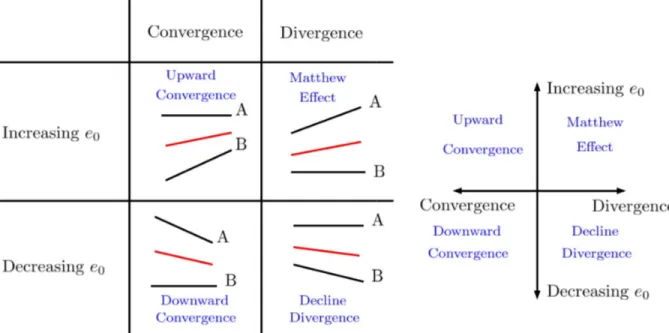
Any analysis of convergence that does not take account of demographic changes during the period would be simplistic and lead to absurdities. For example, while it is desirable that the d´epartements with the lowest life expectancies should converge by catching up, this is not so if the top d´epartements reduce their life expectancy. An illustration would be two d´epartements, A and B, where A has the highest and B the lowest life expectancy. There are four possible scenarios for changes in A and B’s life expectancies. Figure1presents them by changes in inequality (convergence and divergence) and changes in average life expectancy (rising or falling).
Figure1here.
The first convergence scenario (“upward convergence”) shows a catch-up phase in which B reduces the gap with A by improving its life expectancy. This sort of convergence sees greater consistency across France and a general rise in life expectancy. The second scenario (“downward convergence”) involves a fall in average life expectancy. This would occur if A had a falling life expectancy. This type of convergence is observed particularly in war time.
The first divergence scenario sees a greater rise in A’s life expectancy than in B’s. This is “Matthew effect” divergence, by which “to him who has will more be given” (Merton, 1968). It may be that advances in technology or medicine are first enjoyed by the more favoured, who thus widen their advance, but the less favoured may catch up later. Vallin and Mesl´e (2005) describe this alternation between phases of divergence and convergence. The second divergence scenario (“decline divergence”) sees increased inequality and falling average life expectancy. This may occur in particular during epidemics.
3
Results
3.1
The Three Phases of the Reduction of Spatial Inequalities
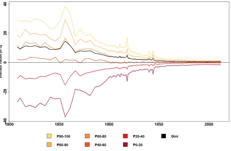
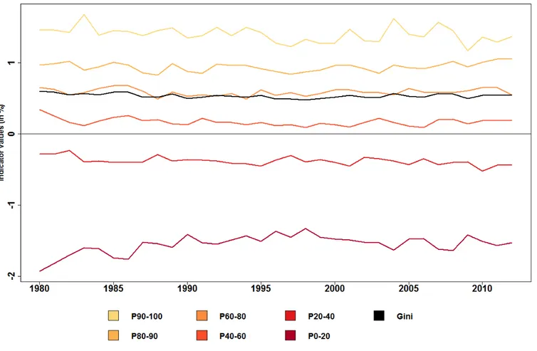
First the variations in spatial inequalities in life expectancy since 1806 are analyzed. We use the Gini index and the relative share of each decile in the distribution. Figure2shows these indicators over time, calculated for women with no population-weighting of d´epartements. This is the only graph that can be calculated for the whole period, because from 1806 to 1900 no data are available for d´epartement male life expectancy or female population.
Figure2here.
Figure2shows that spatial inequalities in life expectancy have fallen sharply since 1806. The Gini index has fallen from 0.105 to 0.005 in 2014. There is no clear trend in the first half of the 19th century and the fall starts in around 1860 with brief interruptions during the three wars between France and Germany. The absolute range in life expectancy between the top and bottom d´epartements shrank from 39 years 1 month in 1856 to 3 years 10 months in 2014. The indicators calculated for the various distribution deciles show that the catching up process was highly effective for the 18 d´epartements with the lowest life expectancy (P0-20 in Figure2). In 1856, they had nearly 40% fewer life years than in an ideal even distribution, compared with 17% in the early 20th century and 1.5% in 2014.
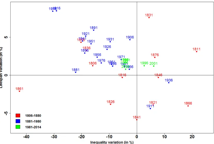
From 1901, the data from Bonnet (2018b) can be used to test the robustness of these indicators by analysing spatial inequalities in life expectancy for men and weighting the d´epartements by population. The results for the Gini index are given in Appendix A2. The values of the indicators differ but the general trend is unchanged. As explained above, it would be simplistic to analyze variations in inequalities in life expectancy without taking account of the development mean life expectancy in France as a whole. For that reason, variations in the Gini index and life expectancy in France were calculated for each five-year period from 1806 to 2014. Point 1806, for example, represents the variations between the two five-year periods 1806-1810 and 1811-1815. The pairs of points obtained for each period are plotted on a four-quadrant diagram (Figure3). Quadrant II (upper left), for example, contains periods where there is both a reduction in inequalities and a rise in life expectancy.
Figure3here.
Figure3can be used to identify three phases in the reduction of spatial inequalities in life expectancy. The first phase, 1806-1880, displays non-convergence. In Figure3the points from this phase are scattered across the four quadrants. During this period mean life expectancy and inequality went up and down with no real trend perceptible. This came to an end in about 1880, after which life expectancy increased continuously, except for the two World Wars. This marks the second phase, 1881-1980, which may be called the century of convergence. In Figure 3 all these points lie in Quadrant II, except for those affected by the two World Wars, 1911 and 1936. The temporary rise in inequalities during the wars is due to the highly varied exposure of regions to the fighting. For example, in 1944, 40% of deaths in Calvados were due to the bombing associated with
the Normandy landings (Bonnet, 2018a). This century of convergence generally involved a virtuous process whereby inequalities shrink and at the same time mean life expectancy increases. Note that this reduction in inequality began nearly 50 years before the introduction of public insurance systems for illness, old age and death . This noteworthy convergence came to an end in about 1980. There then followed a phase during which mean life expectancy continued to rise while inequalities stopped shrinking. Indeed they even widened from 1996 to 2005, a case of “Matthew effect” divergence (Quadrant I of Figure3).
Finer analysis of variations in life expectancy inequality since 1980 shows a specific pattern in the least-favoured d´epartements. Figure4repeats Figure2with a focus on 1980-2014. It can be seen that inequalities are indeed much smaller than before. The mean life expectancy in the bottom two deciles is 1.8% less than an even distribution, and the top decile mean is 1.3% higher. However, the curve showing the relative position of the bottom two deciles, which rises until 1995, levels out and even falls from 1996 to 2005.
Figure4here.
The evolution of French spatial inequalities that we reveal can be compared with the evolution of inequal-ities at the international level and between American states. In the first case, we used data from the United Nations Population Division, available for the period 1950-2015, and analyzed the inequalities between the 201 geographical units for the female population. The results are the same depending on whether the geo-graphical units are weighted or not by the population: inequalities decline over the entire period. These results are different from the French case: there has been no rise in inequality over the recent period. In the second case, we used data from the US Mortality Database, available for the period 1959-2015, and analyzed the inequalities between the 51 American states, for the female population. The evolution of spatial inequalities in mortality seems in this case similar to the one observed in the French case: inequalities initially decreased and then increased. The minimum is reached in 1982 with regard to the Gini index. Thus, in the recent pe-riod, these results seem to indicate different developments with regard to international inequalities and internal inequalities.
3.2
Infant Mortality and Spatial Inequalities
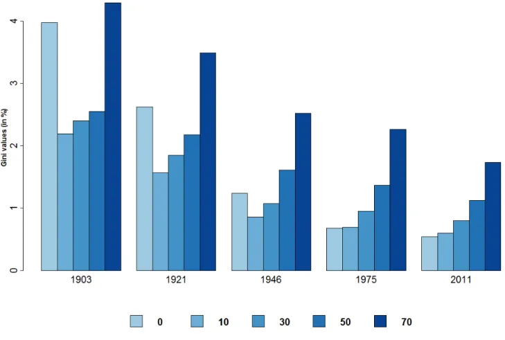
Next we analyze the role of the various age-groups in the reduction of spatial inequalities. It examines inequal-ities in life expectancy calculated at selected ages (0, 10, 30, 50 and 70) in 1901–2014. Figure5shows the Gini index for life expectancies by reference age and date.
Figure5here.
Figure5 shows a reduction in spatial inequalities over the century whatever the reference age. However, the reduction is greater at lower ages. The age profile of spatial inequalities changes from a U-shape to a rising curve. At present, spatial inequalities are 3 times greater for life expectancy at age 70 than at birth. Two main conclusions may be drawn from this.
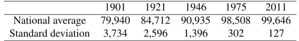
First, the reduction in infant mortality played a key role in the fall in spatial inequalities. From 1901 to 2014 the reduction of the Gini index is 85% for life expectancy at birth and 65% at age 10 (the age used by Edwards and Tuljapurkar, 2005 for their international comparisons). The trend in survival rates at age 10 confirms this. Table3shows that the number of survivors per 100,000 live births rose substantially, from less than 80,000 to nearly 99,650. Not least, the inequalities between d´epartements (as measured by standard deviation) shrank considerably.
Table3here.
Second, spatial inequalities at present are mainly due to differences in mortality among the oldest groups. For a given population, the epidemiological transition (Omran, 1971) causes greater variance at higher ages and lesser at lower ages (Robine, 2001). This study shows that it also affects spatial inequalities.
Interestingly, Figure 5also shows that the trend to smaller inequalities appears to differ by reference age. Whereas the Gini index for life expectancy at birth stops falling in the 1980s, that at age 70 has fallen steadily since 1900. To put this in perspective, life expectancy at age 70 has also risen sharply during this period. It is not credible to use the same age for the start of old age when making historical comparisons (Bourdelais, 1993, d’Albis and Collard, 2013). We use Ryder’s criterion (1975), defining old age as beginning when someone has a life expectancy of 10 remaining years. For each year since 1900 the age was calculated at which national life expectancy was 10 years. Then the Gini index was calculated for remaining years of life in each d´epartement at that age. Figure6shows the curve of the Gini index calculated in that way and also for a set age of 70. The two curves cross in the year when national life expectancy in France was 10 years. It can be seen that the pattern is quite different and that convergence was achieved much sooner with the new Gini index. The reduction in spatial inequalities among the oldest groups stops in the early 1980s and inequalities appear to have widened again since the 1990s.
Figure6here.
3.3
Major Changes in the Geography of Longevity in France
Next we analyze variations in the d´epartement distribution in order to identify particular patterns in certain areas.
The data for the 90 d´epartements contain a mass of information that must be systematised if the main developments are to be understood. In order to establish homogeneous geographical areas and classify these by life expectancy, cluster analysis was used. This is designed to place d´epartements in classes as homogeneous as possible with regard to life expectancy during a given period. The point is to minimize variance within each class and maximize it between classes. Consequently, each class does not necessarily comprise the same number of d´epartements.
For this analysis we chose to break the data into three classes so as to identify the major trends. We applied clustering to d´epartements for four sub-periods.
The first is the non-convergence phase 1806-1880. We then divided our century of convergence into two, 1881-1921 and 1922-1980. The fourth period is that of fairly settled inequalities, 1981-2014. Life expectancy data are smoothed by a moving five-year average and the years of the two World Wars are removed. To ensure that longer life expectancy does not overweight the later years, we use relative life expectancy, dividing the d´epartementfigure by the national one for each year.
Figures7,8,9and10show maps of the French d´epartements for each sub-period. Green d´epartements are in the “top” group, where life expectancy is highest. Blue d´epartements are in the “medium” group and red d´epartementsin the “bottom” group. The graph next to each map shows the relative life expectancy of each group over the sub-period.
The 1806-1880 period sees France cut in two by a “high mortality diagonal” from Bretagne to the Alps. On either side are the d´epartements in the top group. This is the whole of North-east France, except for Seine(including Paris) and the whole of South-west France. High mortality is concentrated at the ends of the diagonal, in Bretagne and the Alps. The graph shows that at the start of the period the bottom group had a mean life expectancy 30% below the national mean. It also shows that inequalities between the groups began falling in 1861.
Figure7here.
The 1881-1920 period shows no great difference from the previous one, except that central France joins the top group. High mortality is still at the ends of the diagonal in Bretagne and the Alps. Convergence is marked, as the bottom d´epartements rapidly catch up, rising from 30% below the national mean to 4% at the end of the period.
Figure8here.
Major changes occur in 1921-1980. The whole of Northern France, previously in the top group, now contains the d´epartements where mortality is highest. All the d´epartements along the Channel join Bretagne in the bottom group. Conversely the top group covers a wide area from central to South-west France. Note that convergence between the groups continues to progress apace.
Figure9here.
The final period, 1981-2014, shows a France once again cut in two, this time by a line from North-east to South, similar to the diagonale du vide (“empty diagonal”) of low population density areas (Gravier, 1947, Oliveau et Doignon, 2016, Breton et al., 2017). The geography of French longevity has totally changed from what it was in the 19th century. The North of France, especially along the Belgian border, is now a high-mortality area, including d´epartements like Nord, Ardennes and Moselle that once had the highest life expectancy (Fol, 2012, Lam´enie 2016). The only exception in the Northern half of France is the Seine d´epartement, which has moved from the middle group to the top group. The graph for this period now shows no convergence between groups. Indeed the bottom group diverges slightly in 1995-2005. However, the gap
between groups is small compared with what it was two centuries before. The bottom group’s mean life ex-pectancy is now 2% below the national mean, and the top group’s does not exceed 1% above.
Figure10here.
The main changes over the last two centuries have affected the urban d´epartements, containing the major cities, and the d´epartements of Northern France. Their contrasting experience underlies the changing map of French mortality.
The emblematic urban d´epartement is Seine, comprising Paris. Figure11shows its life expectancy relative to the national mean from 1806 on. From 1856, when mortality-by-age data become more reliable, we break down this difference into age-groups (0-5, 5-20, 20-40, 40-65 and 65+). We do this by sequentially replacing d´epartementmortality rates for each age-group by those of the French national mean. We do not use Arriaga (1984)’s method to improve clarity. Differences are smoothed over 5 years for the same reason.
Figure11here.
In the 19th century, life expectancy in Paris was well below the national mean: 18% below in 1816. Haines (2001) calls this the “urban penalty”, which he explains mainly by the spread of infectious disease, made easier by the 2.5-fold increase in population density from 1851 to 1901 (Bonnet, 2018c). Pioneering research by Preston and Van de Walle (1978) shows that the urban penalty in the d´epartements like Seine (Paris), Rhˆone (Lyon) and Bouches-du-Rhˆone (Marseille) was due to the quality of drinking water. This finding has been expanded by Kesztenbaum and Rosenthal (2017), who show how the gradual extension of sewer systems reduced the high mortality Paris suffered from at that time. Figure 11 confirms the link between density, mortality and poor sanitation by showing that most of this urban penalty in the 19th century comes from high mortality in the 0-5 age-group.
Seine’s relative life expectancy improves throughout the 20th century: it catches up with national mortality rates and from the 1940s begins to enjoy an “urban advantage”. This advantage has steadily risen since the 1990s and by 2014 was 0.84% above, equal to 10 months of life expectancy. The urban advantage of modern major cities is due to a number of factors (Vlahov et al., 2005). These cities are home to those with the highest incomes and have the best healthcare facilities (Wen et al., 2003), to the benefit of poorer people via the distribution of health expenditure (Montgomery et al., 2013). Cities also generally have more highly educated residents (Glaeser, 1999, Florida, 2002), and the gap with rural areas is increasing (Berry and Glaeser, 2005). Finally, Figure11shows that the urban advantage is due to lower mortality among the oldest residents, and in recent years in the 40-65 age-group.
Other d´epartements that include major French cities have similar figures to Seine. Rhˆone (Lyon) saw its penalty become an advantage in the 1940s (cf. Appendix Figure 15). However, France’s fourth largest city, Lille, has gone the other way. It has followed the other d´epartements of Northern and North-east France severely affected by the region’s industrial decline (Zukin, 1985). Figure 12 shows relative life expectancy over time in Nord, which contains the city of Lille, and Figure16 in the Appendix that of neighbouring Pas-de-Calais. Nord enjoyed a favourable position throughout the 19th century, except for the decade around the
Franco-Prussian war, 1866-1876. This was mainly due to lower infant mortality than other regions. Starting in the 1930s, its position slipped: life expectancy in Nord fell below the national mean, increasingly so until the mid-1970s, when the gap was 2.5%, some 2 years. At present this gap seems to be shrinking but is still wide. It is no longer due to infant mortality, which is now insignificant in all regions, but rather to mortality after age 40. The impact of the 40-65 age-group is noticeable, accounting for 25% of the total despite extremely low mortality rates at those ages.
Figure12here.
Conclusion
We have shown in this article that inequalities of mortality across French d´epartements have considerably narrowed over the last two centuries. This trend includes a century of convergence beginning in around 1880. Only the two World Wars temporarily halted the trend. The century of convergence occurred in parallel with an increase in national mean life expectancy, in a virtuous process whereby the d´epartements with the lowest life expectancy gradually caught up with the others. At present the gap between top and bottom d´epartements is only 3 years 9 months, whereas it was nearly 40 years in the middle of the 19th century. However, during the last 40 years, spatial inequalities of mortality have levelled out, indeed slightly increased in 1995-2005. This is due to the worsening relative position of the bottom two deciles of d´epartement life expectancy. Our analysis shows that during this period, the top group of d´epartements had improving mortality rates, unlike the bottom group. But although spatial inequalities continue to exist and are not reducing, this is nothing like the position in the years after the French Revolution.
Our spatial analysis identifies the shifts in France’s demographic map over these two centuries. Although the South-west has remained an area of low mortality and Bretagne one of high mortality, other regions have moved about. We have analyzed two types of d´epartement that have moved in opposite directions. The urban d´epartements, hit by an “urban penalty” until the Second World War, now enjoy an “urban advantage”, and their residents live on average 1% longer than the national mean. Conversely, the d´epartements in Northern France, particularly Nord and Pas-de-Calais, now have life expectancies some 2% shorter than the mean. The gap is due to higher mortality among the over-65s and the 40-65 age-group. This observation is especially remarkable because these areas were ahead of the others throughout the 19th century, with life expectancies varying from 4% to 6% above the national mean.
The demographic data at our disposal have enabled us to characterize the variations in spatial inequalities of mortality from 1806 to 2014. This is a crucial matter because inequalities in life expectancy between regions cannot be justified by public policy: there is no reason some people should die younger than others according to the d´epartement where they live. Health is one of an individual’s set of capabilities, like income, that enable them to attain their personal goals. Public authorities are thus duty bound to seek to reduce these spatial inequalities. At present this means improving health in the d´epartements of Northern France. For that purpose it is essential to examine the determining factors behind spatial inequalities in life expectancy. It would be
useful to correlate our databases with epidemiological databases in order to have causes of death within the same spatial boundaries we have used. Similarly, historical socio-economic databases would be invaluable for understanding the patterns in inequalities of mortality, and thus give some perspective to recent research by Currie and Thulliez (2018).
References
Arriaga, E. E. (1984). Measuring and Explaining the Change in Life Expectancies. Demography 21(1), 83–96. Barbieri, M. (2013). La mortalit´e d´epartementale en France. Population 68(3), 433–479.
Barbieri, M. and N. Ouellette (2012). La d´emographie du Canada et des Etats-Unis des ann´ees 1980 aux ann´ees 2000. Population 67(2), 221–328.
Berry, C. R. and E. L. Glaeser (2005). The Divergence of Human Capital Levels across Cities. Papers in Regional Science 84(3), 407–444.
Bonnet, F. (2018a). Beyond the Exodus of May-June 1940: Internal Migrations in France during the Second World War. mimeo.
Bonnet, F. (2018b). Computations of French Lifetables by D´epartement, 1901–2014. mimeo. Bonnet, F. (2018c). Spatial Distribution of Populations by Age, 1851–2014. mimeo.
Bonneuil, N. (1997). Transformation of the French Demographic Landscape 1806-1906. Oxford England Clarendon Press.
Bourdelais, P. (1993). L’Age de la vieillesse. Odile Jacob.
Breton, D., M. Barbieri, H. d’Albis, and M. Mazuy (2017). L’´evolution d´emographique r´ecente de la France : de forts contrastes d´epartementaux. Population 72(4), 583–651.
Brown, D. and P. Rees (2006). Trends in Local and Small Area Mortality and Morbidity in Yorkshire and the Humber: Monitoring Health Inequalities. Regional Studies 40(5), 437–458.
Currie, J., H. Schwandt, and J. Thuilliez (2018). Pauvret´e, Egalit´e, Mortalit´e: Mortality (in) Equality in France and the United States. Technical report, National Bureau of Economic Research.
Daguet, F. (2006). Dans quelles r´egions meurt-on le plus tard au d´ebut du XXI`eme si`ecle ? Insee premi`ere(1114).
d’Albis, H. and F. Collard (2013). Age Groups and the Measure of Population Aging. Demographic Re-search 29, 617–640.
d’Albis, H., L. J. Esso, and H. Pifarr´e i Arolas (2014). Persistent Differences in Mortality Patterns across Industrialized Countries. PloS one 9(9), e106176.
Edwards, R. D. and S. Tuljapurkar (2005). Inequality in Life Spans and a New Perspective on Mortality Convergence across Industrialized Countries. Population and Development Review 31(4), 645–674.
Ezzati, M., A. B. Friedman, S. C. Kulkarni, and C. J. Murray (2008). The Reversal of Fortunes: Trends in County Mortality and Cross-County Mortality Disparities in the United States. PLoS Med 5(4), e66.
Florida, R. (2002). The Economic Geography of Talent. Annals of the Association of American geogra-phers 92(4), 743–755.
Fol, S. (2012). Urban Shrinkage and Socio-Spatial Disparities: Are the Remedies Worse than the Disease? Built Environment 38(2), 259–275.
G¨achter, M. and E. Theurl (2011). Health Status Convergence at the Local Level: Empirical Evidence from Austria. International Journal for Equity in Health 10(1), 34.
Glaeser, E. L. (1999). Learning in Cities. Journal of Urban Economics 46(2), 254–277.
Gravier, J.-F. (1947). Paris et le d´esert franc¸ais: d´ecentralisation, ´equipement, population. Flammarion. Haines, M. R. (2001). The Urban Mortality Transition in the United States, 1800–1940. Annales de
D´emographie Historique 1, 33–64.
Illsley, R. and J. Le Grand (1993). Regional Inequalities in Mortality. Journal of Epidemiology and Community Health 47(6), 444–449.
Janssen, F., A. van den Hende, J. A. de Beer, and L. J. van Wissen (2016). Sigma and Beta Convergence in Regional Mortality: A Case Study of the Netherlands. Demographic Research 35, 81–116.
Joseph, K., L. Huang, S. Dzakpasu, and C. Mc Court (2009). Regional Disparities in Infant Mortality in Canada: a Reversal of Egalitarian Trends. BMC Public Health 9(1), 4.
Kesztenbaum, L. and J.-L. Rosenthal (2017). Sewers’ Diffusion and the Decline of Mortality: The Case of Paris, 1880–1914. Journal of Urban Economics 98, 174–186.
Kibele, E. U. (2012). Regional mortality differences in Germany. Springer Science & Business Media.
Lam´enie, B. (2016). Les territoires industriels face aux effets cumul´es du d´eclin d´emographique et ´economique: quelles perspectives avec la m´etropolisation?. l’exemple des ardennes. Espace populations soci´et´es. Space populations societies(2015/3-2016/1).
Mackenbach, J. P. and A. E. Kunst (1997). Measuring the Magnitude of Socio-economic Inequalities in Health: an Overview of Available Measures Illustrated with two Examples from Europe. Social Science & Medicine 44(6), 757–771.
Merton, R. K. (1968). The Matthew Effect in Science: The Reward and Communication Systems of Science Are Considered. Science 159(3810), 56–63.
Oliveau, S. and Y. Doignon (2016). La diagonale se vide? Analyse spatiale exploratoire des d´ecroissances d´emographiques en France m´etropolitaine depuis 50 ans. Cybergeo: European Journal of Geography. Omran, A. R. (1971). The Epidemiologic Transition: a Theory of the Epidemiology of Population Change.
Preston, S. H. and E. Van de Walle (1978). Urban French mortality in the 19th century. Population studies 32(2), 275–297.
Robine, J.-M. (2001). Red´efinir les phases de la transition ´epid´emiologique `a travers l’´etude de la dispersion des dur´ees de vie: le cas de la france. Population (french edition), 199–221.
Ryder, N. B. (1975). Notes on Stationary Populations. Population Index, 3–28.
Vallin, J. and F. Mesl´e (2005). Convergences and Divergences: an Analytical Framework of National and Sub-National Trends in Life Expectancy. Genus 61(1), 83–124.
Vlahov, D., S. Galea, and N. Freudenberg (2005). The Urban Health ”Advantage”. Journal of Urban Health 82(1), 1–4.
Zukin, S. (1985). The Regional Challenge to French Industrial Policy. International Journal of Urban and Regional Research 9(3), 352–367.
Appendices
A1: Map of the 90 French D´epartements in 1967
Figure13here.
A2: Inequalities by Sex over the 1901-2014 Period, with D´epartements Weighted and
Unweighted by Population
The Gini index shows a reduction in spatial inequalities of mortality since 1901 irrespective of sex or population weighting. It can be seen that inequalities have been reduced more for women than men, with a gap of some 7 points. Note also the various crises that have affected the sexes differently. The First World War temporarily increased inequalities among men but not women. Conversely, the Spanish influenza epidemic of 1919-1920 increased inequalities for both sexes, as did the Second World War. Bonnet (2018b) points out, however, that the data for the two World Wars are not entirely reliable, especially for men.
Figure14here.
A3: Difference in Life Expectancy between Rhˆone and French National Mean,
1806-2014
The “urban penalty” for Rhˆone d´epartement, important in the 19th century – it reached 14% around 1850s – fell sharply to insignificant levels in the 1940s. Since then the d´epartement has enjoyed an “urban advantage” due at present to lower mortality above age 65 and to a lesser extent in the 40-65 age-group. Calculations were made for female life expectancy smoothed over 5 years. The weight of each age-group was isolated by sequentially replacing d´epartement mortality rates for each group by those of the national mean.
Figure15here.
A4: Difference in Life Expectancy between Pas-de-Calais and French National Mean,
1806-2014
Until the start of the 20th century, the Pas-de-Calais d´epartement had a life expectancy above the French national mean. Since then it has suffered from worse mortality by some 2%. In the last 40 years this gap has levelled out and is entirely due to higher mortality among those aged 40 and above.
Table 1: DIFFERENCES IN LIFE EXPECTANCIES AT BIRTH (IN %): BONNEUIL-BONNET 1901–1906;
DAGUET-BONNET 1954–1999
Men Women
Quart. 1 Med. Quart. 3 Quart. 1 Med. Quart. 3
1901–1905 0.49 3.34 6.05 1954 0.18 0.65 1 0.54 0.84 1.34 1962 0 0.4 0.72 -0.01 0.37 0.68 1968 0.17 0.38 0.73 -0.02 0.33 0.78 1975 -0.17 0.15 0.5 -0.11 0.19 0.47 1982 0.01 0.27 0.59 0.04 0.21 0.5 1990 0.09 0.31 0.55 0.21 0.4 0.62 1999 0.22 0.49 0.73 0.47 0.66 0.99
Table 2: DEPARTEMENTS WITH MISSING DATA
D´epartement Period with missing data Reference d´epartements
Alpes-Maritimes 1806–1856 Var
Meurthe-et-Moselle 1806–1866 Meuse
Savoie 1806–1856 Ain
Haute-Savoie 1806–1856 Ain
Territoire de Belfort 1806–1866 Meuse
Moselle 1866–1920 Meuse
Bas-Rhin 1866–1920 Meuse
Haut-Rhin 1866–1920 Meuse
Seine 1969–2014 (*)
Seine-et-Oise 1969–2014 (*)
Notes: Reference d´epartements are d´epartements used to estimates values for missing d´epartements. (*) Sum of Essonne, Hauts-de-Seine, Seine-Saint-Denis, Val-de-Marne, Val d’Oise, Paris, Yvelines.
Figure 1: DIVERGENCE AND CONVERGENCE PERIODS: THEORETICAL CLASSIFICATION
Notes: Convergence is a decrease in life expectancy inequalities between d´epartements. Increasing in e0is an increase of national
Figure 2: SPATIAL INEQUALITIES, 1806–2014
Notes: P90-100 means the share of life expectancy lived by the 10% of d´epartements with the highest values (compared with a uniform life expectancy for all d´epartements). All inequality indicators are non-weighted by population, for women. Sample includes 90 d´epartements.
Figure 3: THE THREE PHASES OF THE CONVERGENCE PROCESS, 1806–2014
Notes: Variation of the national life expectancy for year 1806 is the variation of life expectancy between the 1806–1810 quinquennial period and the 1811–1815 one. We used the quadriennal period 2011–2014 for the 2006 point. Gini indicator is non-weighted by population, for women. Sample includes 90 d´epartements.
Figure 4: SPATIAL INEQUALITIES, 1980–2014
Notes: P90-100 means the share of life expectancy lived by the 10% of d´epartements with the highest values (compared with a uniform life expectancy for all d´epartements). All inequality indicators are non-weighted by population, for women. Sample includes 90 d´epartements.
Figure 5: GINI INDEXES BY AGE AND DATE
Notes: “10” means the Gini of the life expectancies at age 10. Gini is non-weighted by population, for women. Sample includes 90 d´epartements.
Table 3: NUMBER OF SURVIVORS AT AGE10FOR100,000BIRTHS
1901 1921 1946 1975 2011
National average 79,940 84,712 90,935 98,508 99,646
Standard deviation 3,734 2,596 1,396 302 127
Figure 6: GINI INDEX AT AGE 70AND COMPUTED USINGRYDER’S CRITERION
Notes: Ryder’s criterion is the Gini of life expectancies at a moving age defined such as the remaining life expectancy at the national level is 10 years. Age 70 means the Gini of departmental life expectancy at age 70. Gini is non-weighted by population, for women. Sample includes 90 d´epartements.
Figure 7: INEQUALITY CLUSTERING, 1806–1880
Notes: The green and red classes contain d´epartements with the highest and lowest life expectancy respectively. Clustering compu-tations based on 5-year smoothed life expectancy. Sample includes 90 d´epartements.
Figure 8: INEQUALITY CLUSTERING, 1881–1925
Notes: The green and red classes contain d´epartements with the highest and lowest life expectancy respectively. Clustering compu-tations based on 5-year smoothed life expectancy, and without war values (1914–1918). Sample includes 90 d´epartements.
Figure 9: INEQUALITY CLUSTERING, 1926–1980
Notes: The green and red classes contain d´epartements with the highest and lowest life expectancy respectively. Clustering compu-tations based on 5-year smoothed life expectancy, and without war values (1939–1945). Sample includes 90 d´epartements.
Figure 10: INEQUALITY CLUSTERING, 1981–2014
Notes: The green and red classes contain d´epartements with the highest and lowest life expectancy respectively. Clustering compu-tations based on 5-year smoothed life expectancy. Sample includes 90 d´epartements.
Figure 11: DIFFERENCES IN LIFE EXPECTANCY BETWEEN SEINE AND FRANCE, 1806–2014
Notes: Difference of life expectancy between Seine and France split according to the weight of each group. The split begins in 1851 since there are no reliable lifetables before this date.
Figure 12: DIFFERENCES IN LIFE EXPECTANCY BETWEEN NORD AND FRANCE, 1806–2014
Notes: Difference of life expectancy between Nord and France split according to the weight of each group. The split begins in 1851 since there are no reliable lifetables before this date.
Figure 13: MAP OF THE90 FRENCH DEPARTEMENTS IN´ 1967
Figure 14: GINI INDICATORS FOR MEN/WOMEN -WEIGHTED/UNWEIGHTED SPECIFICATIONS, 1901–2014
Notes: “M - Weighted” means Gini Indicator of spatial inequalities for men, d´epartements weighted by population. “F - Weighted” is the same specification for women. Sample includes 90 d´epartements.
Figure 15: DIFFERENCES IN LIFE EXPECTANCY BETWEEN RHONE AND FRANCEˆ , 1806–2014
Notes: Difference of life expextancy between Rhˆone and France split according to the weight of each group. The split begins in 1851 since there is no reliable lifetables before this date.
Figure 16: DIFFERENCES IN LIFE EXPECTANCY BETWEEN PAS-DE-CALAIS AND FRANCE, 1806–2014
Notes: Difference of life expectancy between Pas-de-Calais and France split according to the weight of each group. The split begins in 1851 since there is no reliable lifetables before this date.