HAL Id: hal-01322526
https://hal.archives-ouvertes.fr/hal-01322526
Submitted on 30 May 2016
HAL is a multi-disciplinary open access
archive for the deposit and dissemination of
sci-entific research documents, whether they are
pub-lished or not. The documents may come from
teaching and research institutions in France or
abroad, or from public or private research centers.
L’archive ouverte pluridisciplinaire HAL, est
destinée au dépôt et à la diffusion de documents
scientifiques de niveau recherche, publiés ou non,
émanant des établissements d’enseignement et de
recherche français ou étrangers, des laboratoires
publics ou privés.
Distributed under a Creative Commons Attribution - NonCommercial - NoDerivatives| 4.0
International License
Sensor Data Visualisation: A Composition-Based
Approach to Support Domain Variability
Ivan Logre, Sébastien Mosser, Philippe Collet, Michel Riveill
To cite this version:
Ivan Logre, Sébastien Mosser, Philippe Collet, Michel Riveill.
Sensor Data Visualisation: A
Composition-Based Approach to Support Domain Variability. European Conference on Modelling
Foundations and Applications (ECMFA 2014), Jul 2014, York, United Kingdom.
pp.101-116,
�10.1007/978-3-319-09195-2_7�. �hal-01322526�
Sensor Data Visualisation: a Composition-based
Approach to Support Domain Variability
Ivan Logre, S´ebastien Mosser, Philippe Collet, and Michel Riveill
Universit´e Nice – Sophia Antipolis CNRS, I3S, UMR 7271 06900 Sophia Antipolis, France
{logre,mosser,collet,riveill}@i3s.unice.fr
Abstract. In the context of the Internet of Things, sensors are sur-rounding our environment. These small pieces of electronics are inserted in everyday life’s elements (e.g., cars, doors, radiators, smartphones) and continuously collect information about their environment. One of the biggest challenges is to support the development of accurate monitoring dashboard to visualise such data. The one-size-fits-all paradigm does not apply in this context, as user’s roles are variable and impact the way data should be visualised: a building manager does not need to work on the same data as classical users. This paper presents an approach based on model composition techniques to support the development of such monitoring dashboards, taking into account the domain variabil-ity. This variability is supported at both implementation and modelling levels. The results are validated on a case study named SmartCampus, involving sensors deployed in a real academic campus.
Keywords: Variability, Data visualisation, Sensors, Model composition
1
Introduction
Sensors are everywhere. The Internet of Things (IoT) paradigm relies on a world of interconnected objects, able to communicate between each others and collect data about their context. Day after day cars, smartphones and buildings collect information about our living environment, generating zettabytes of sensed data. The Gartner group predicts up to 26 billions of things connected to the Internet by 2020. Intechno Consulting estimates that this market will generate up to 180 billions of euros worldwide. Being able to exploit and interpret these data means to keep control of this mass of information. Considering data obtained from sensors, there is a need to ease the design of monitoring dashboards as raw data remain useless for a user [1]. Aggregating the correlated data into accurate visualisation interfaces allows humans to interpret them, transforming raw values into meaningful information.
Such dashboards support users while interpreting these data, allowing one to take decisions based on the sensed data. The main challenge to tackle is then
to support the intrinsic variability of this domain. This variability is twofold and thus triggers two concurrent challenges: (i) each user wants to use a dash-board dedicated to her very own needs, and (ii) visualisation libraries used at runtime provide different visualisation widgets to be used to implement such dashboards. In this context, model-driven engineering approaches can support the first challenge by capturing concepts used by the dashboard designers and providing appropriate tool support. To tackle the second challenge, Software Product Lines (SPLs) are defined as “a set of software-intensive systems that share a common, managed set of features and that are developed from a common set of core assets in a prescribed way” [2]. SPL engineering is based on the idea that the reusable artefacts encapsulate common and variable aspects of a family of software systems [3, 2]. As a consequence, SPLs provide a way to model widget variability, relying on strong logical foundations and configuration support.
The contribution of this paper is to describe a tool-supported approach en-abling the mass customisation of dashboards. The approach relies on a dedicated meta-model that captures the concepts used to design a dashboard. The vari-ability of the different visualisation libraries is captured using feature models, expressed according to the concepts defined in the meta-model. The tool support implements the link between the meta-model and the feature models, supporting users while designing dashboards and ensuring code generation to reach runtime environments.
We describe in Sec. 2 the SmartCampus project, which relies on sensors deployment in a real academic campus. This project serves both as motivation and application for our work. Sec. 3 describes the Ptah meta-model, used to support a user while designing a monitoring dashboard. Sec. 4 describes the method used to capture the variability of a given visualisation library, and how visualisation libraries are composed. Sec. 5 describes the benefits of the ap-proach based on a scenario extracted from the SmartCampus use case. Finally, Sec. 6 discusses related work, and Sec. 7 concludes this paper by exposing some perspectives for further researches.
2
Motivations & Running Example
This section describes the SmartCampus project as a motivating example for our contribution. It illustrates the two main challenges this paper addresses: (i) how one can design a monitoring dashboard at the right level of abstraction and (ii) how such a dashboard can be realised with respect to the existing libraries at the implementation level.
2.1 The SmartCampus Project
The University of Nice-Sophia Antipolis is exploiting a new campus named SophiaTech1, located in the Sophia Antipolis technology park. The ultimate
1
goal of this project is to consider sensors deployed in buildings as an open plat-form to let final users (i.e., students, professors, administrative staff) build their own innovative services on top of the collected (open) data. This SmartCampus project was started in September 2013 and involves a team of 18 persons. The development effort is focused on data visualisation, data collection and scalabil-ity issues. We consider here this project as an use case in order to bring actual visualisation needs from a real world problem.
The objective of the project is to develop a middleware acting as a mediation layer between sensors deployed in buildings and developers who want to develop innovative services based on these data. The functional analysis phase (ended in December 2013) relied on a survey and users interviews to identify prototypical scenarios to be used as relevant validation test cases. As a result, the following three scenarios were identified:
– Parking lot occupation. The campus contains five different parking lots, with different occupation rates. Final users complained about the difficulty to find an available parking place. With respect to environmental constraints, the occupation rate of each lot is aggregated based on data collected from sonar sensors (located on arbour overhanging the cars) and counters based on infra-red rays located at the entry and exit portals of each lot. But if users only want to know where to park their car on the morning, the estate department of the University aims at aggregating statistics to analyse the occupation rates of each parking and take decisions based on these data. – Crowd monitoring. The food court of the campus is currently under-sized,
leading to long queues during rush hours. Students have identified the need to estimate the waiting time in the cafeteria and the restaurant. The im-plementation of such a crowd monitoring system is possible with a simple image processing algorithm analysing the video stream of a webcam. Based on the very same technological stack, additional counters can be deployed to measure people traffic in different places, e.g., library, main corridors. – Heating regulation. The heating system of the campus suffered from
regu-lation issues when initially started. As a consequence, data collected from temperature sensors deployed in the buildings had to be aggregated and visu-alised in dashboard, of which an example is depicted in Fig. 1, as a support for the technical team fixing the steam stream throughput in the different pipes. These sensors can now be used to assess the temperature in the build-ings, identifying open doors or windows during winter and optimising the heating effort distribution in the building by comparing the occupancy and temperature of rooms.
2.2 Challenges
The implementation of these use cases in the SmartCampus context triggers two major issues: (i) there were almost as many dashboards needed as inter-viewed users and (ii) at the implementation level, developing such dashboards is error-prone and time-consuming.
(a) Sensors overview (b) Zoom on a specific floor Fig. 1. Mockup of an heating regulation dashboard, designed by campus’ users
Designing Multiple Dashboards (C1). Based on the interviews conducted
during the analysis phase, we identified the tremendous variability of monitor-ing dashboards. Actually, SmartCampus is a prototypical example of an open-data platform: the availability of open-data about the environment empowers the end users, allowing each one to design a dashboard based on her very own needs. Unfortunately, if tools used to mockup dashboards are usable by end-users (e.g., Balsamiq2
, see Fig. 1), they cannot be used to generate executable dashboards. Moreover the implementation of such dashboards requires technological skills (e.g., web programming knowledge) that slowed down or even stopped the de-velopment effort. Users also experiment a gap between the expression of their functional needs and the organisation of the corresponding data and visualisa-tions into a well-formed dashboard. As a consequence, the first challenge is to support the mass customisation of monitoring dashboards, at the appropriate level of abstraction.
Handling the technological variability (C2). The implementation of such
dashboards is a complex task. Even if we have restricted the technological stack to web-based interface (it is one of the assumptions made by the SmartCampus Description of Work document), many widget libraries can be used to implement these dashboards, e.g., AmCharts3, Highcharts4, D3.js5. These libraries are
het-erogeneous, and offer different widgets with their own specificities. For example, (i) AmChart offers 58 different widgets, (ii) Highchart offers 54 widgets and 13 additional widgets dedicated to large datasets (named Highstock), and (iii) D3.js offers 133 widgets. The effervescence around the big data and open data paradigms fosters the frequent publication of new tools and widget libraries to support data visualisation. Moreover, even if we consider a single library, the evolution of the widget referential must be handled. For example, the D3.js li-brary is based on a community of users, and new widgets are frequently added
2 http://balsamiq.com 3 http://www.amcharts.com 4 http://www.highcharts.com 5 http://d3js.org
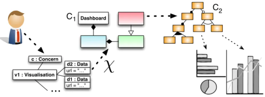
Dashboard url = "…" d1 : Data v1 : Visualisation url = "…" d2 : Data c : Concern
...
C1 C2Fig. 2. Global overview of the approach
to the library by external contributors. This proliferation of visualisation solu-tions has become an obstacle to efficient choices during the design of monitoring dashboards, thus our second challenge is to handle the variability of the offered amount of solutions.
The contribution of this paper is to address these two challenges, as depicted in Fig. 2. The user interacts with a model to describe what she wanted to visualise (C1), and variability models are exploited to support the selection of
concrete widgets among the existing ones, including code generation (C2).
3
Supporting Dashboard Design Variability (C
1)
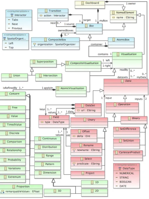
This section describes a meta-model that tackles the first challenge identified in Sec. 2: “How one can design a monitoring dashboard according to her very own needs?”. To address this challenge, the key idea is to tame the complexity of dashboard design using a dedicated meta-model. This meta-model allows a user to focus on the way she wants to compose her data, and does not require implementation knowledge. It focuses on the different visualisation concerns one can apply to a given datasets, and is not bound to any concrete library imple-mentation. Thus, at this level of abstraction, the user is completely free to work. The binding with existing visualisation libraries, as well as the introduction of new libraries with respect to this meta-model corresponds to C2(see Sec. 4).
Restricting the domain to its essence, a designers works according to three dimensions while designing a dashboard: (i) the data involved in the dashboard according to her monitoring needs (i.e., “What am I visualising”), (ii) the dif-ferent visualisation concerns applied to these data (i.e., “How do I visualise it?”) and finally (iii) the spatial and temporal layout of the dashboard (i.e., “Where and when do I visualise it?”).
We consider here a prototypical example extracted from the SmartCampus analysis: heat regulation in corridors. For a given corridor, one wants to exploit a temperature sensor to identify issues in the regulation of the heated air streams. Nevertheless, the temperature is impacted by the presence of people: a group of
(a) Charts juxtaposition (120 LoC) (b) Charts intersection (80 LoC) Fig. 3. Two alternative dashboards realising part of the “heat regulation” use case.
people chatting in the hallway increases the air temperature, and people exiting or entering the hallway through the external doors lower it. Thus, one needs to correlate the data collected from the air temperature sensor and the presence counter one to properly analyse the data. This can be done in multiple ways with respect to the user habits, as depicted in Fig. 3 using the AmCharts library. These two datasets can be visualised as charts displayed side by side (Fig. 3a), or the two datasets can be composed in the same chart (Fig. 3b). Considering that working at the implementation level is not acceptable for the SmartCampus users (due to a lack of programming knowledge), a dedicated meta-model is provided to focus on the level of abstraction expected by the users. This meta-model is named Ptah6
and depicted in Fig. 3. We describe the concept it defines according to the three dimensions identified at the beginning of this section.
“What am I visualising?”. At this level, the user focuses on the data sets she wants to visualise. Based on the state of practice in the IoT domain, we con-sider in Ptah that data collected from a given sensor are available as a resource published at a dedicated URL, following the REST paradigm. The DataSet concept allows one to refer to such an URL while modelling a dashboard. Meta-data about the collected information are defined by the Field concept: a user expresses that the temperature DataSet is indexed by a Field named ttemp
typed as a Date, and contains a value (another Field) named temp typed as a Numerical value. If the underlying data format supports meta-data definition (e.g., the SensorML standard published by the OGC [4]), it is possible to au-tomatically infer from the dataset description the different Fields it contains. Even if it does not happen in this example due to its simplicity, a user often needs to adapt the data she wants to visualise, e.g., selecting only an excerpt or inter-secting a given dataset with another one. To support this task, and considering that the definition of datasets in Ptah is very close to relational algebra, we rei-fied in the meta-model the six classical operators available in database querying
6
systems: (i) projection, (ii) selection, (iii) renaming, (iv) set difference, (v) set union, and (vi) Cartesian product. Considering a mobile sensor (e.g., a smart-phone) collecting both geographical location and Wi-Fi signal strength [5] in the campus according to time, one can rely on the previous “classical” relation operators to compose these data in order to bind the signal strength to a given location. A domain-dedicated operator supports clock synchronisation between datasets (i.e., the Offset operator is used to modify a time-based key). Thus, to realise the heat regulation use case, a user have to model two datasets: one linked to the presence counter resource, (pds) and a second one linked to the
temperature sensor resource (θds).
θk = (name : t, type : Date) pk= (name : t, type : Date)
θv= (name : temp, type : N um) pv= (name : count, type : N um)
θds= (key : {θk}, vals : {θv}, . . . ) pds= (key : {pk}, vals : {pv}, . . . )
“How do I visualise it?”. At this level, the user focuses on the different vi-sualisation concerns she wants to compose to the previously modelled datasets. From an abstract point of view, a visualisation is defined as a concern (i.e., an intention) to be applied to given datasets. The vocabulary used for the con-cerns is inspired by the Data Visualisation Catalogue7, a functional reference for
data journalism activities. One may notice that these concerns are not directly linked to concrete elements such as Line Chart or Pie Chart. At this level of abstraction, the user works on intentions instead of concrete representations. An inference engine is used to bind user’s intentions to concrete widgets (see Sec. 4). For example, a user expresses intentions such as Threshold to identify special values (e.g., temperature exceeding 30◦C) in the datasets, 2D to work on two-dimensional charts. When the user does not know exactly which con-cern apply to the datasets, a Free concon-cern is used to act as a free variable in logical programming: the inference engine used to bind the concern sets to a concrete widget will unify the Free intention with any concrete widget. In the heating regulation use case, the user wants to visualise a 2D representation, as she is interested by the detection of time-based patterns and more specifically Extremum detection (visθ). As the presence counter collects discrete values, she
also specifies that she wants to visualise it as a Discrete dataset (visp).
visθ= (data : {θds}, concerns : {2D, Extremum})
visp= (data : {pds}, concerns : {2D, Extremum, Discrete})
Atomic visualisations can also be composed together to built value-added visu-alisations. For example, the visualisation depicted in Fig. 3b is semantically the Superposition of the two previously created visualisations, more specifically an Intersection. Indeed, the Ptah meta-model contains several composition operators that support the creation of CompositeVisualisation, e.g.,:
– Superposition (abstract ). The visualisations are superposed, the left operand being stacked under the right one.
7
– Union. This operator also performs a Superposition and keep the integrity of the datasets to visualise both entirely.
– Intersection. This operator performs a Superposition and process the datasets to only keep data within common time range.
“Where and when do I visualise it?”. Finally, the different visualisation must be composed together from a layout point of view. The Ptah meta-model allows a user to compose visualisation spatially as Boxes (where, [6]), and to arrange several Boxes together in a sequence of execution (when). Thus, the dashboard depicted in Fig. 3a contains two Boxes (one for each visualisation), composed in a CompositeBox that uses the Left spatial organiser. The dash-board depicted in Fig. 3b contains only one box, bound to the intersection of the two previously created visualisations.
Fig. 3a = BoxC(Left , {Box(visθ), Box(visp)})
Fig. 3b = Box(visθ∩ visp)
Complex dashboards like the one depicted in Fig. 1 requires Transition from one box to another one. For example, in the heating regulation use case, a tab system is used to switch from the global overview dashboard to the floor-based one. This is supported in Ptah through the definition of Transition that holds a given Interactor, e.g., Next (replacing the current element by the targeted one), Tabs (supporting the user while going back and forth).
4
Handling the Technological Variability (C
2)
The Ptah meta-model was designed as flexible as possible: the concepts defined in this meta-model are intrinsically freed from technical concerns such as concrete widget implementations. As a consequence, there is no immediate link between the meta-classes and concrete widgets. Thus, if one wants to generate concrete visualisation code from a Ptah model, each concept from Ptah must be asso-ciated to an implementation pattern that supports it. The challenge addressed here is twofold: (i) there is a tremendous number of available visualisation li-braries and (ii) the relationship between concrete widgets and Ptah concepts is not a simple one-to-one mapping.
Actually, when the user builds a visualisation in Ptah, she is following a kind of configuration process to obtain a visualisation product, just like in SPLs. Con-sidering a variability model of a given domain, one can configure a product of the SPL by selecting needed features [7]. The general idea is that the reusable artefacts encapsulate common and variable aspects of a family of software sys-tems in a manner that facilitates planned and systematic reuse. In our case each Concern concept defined in Ptah is clearly a feature, and each concrete product satisfies (or not) such features. Thus, it is possible to rely on variability modelling techniques and existing configuration tools (formally based on propo-sitional logic and SAT-solving algorithms) to support the realisation of a Ptah model at the concrete level.
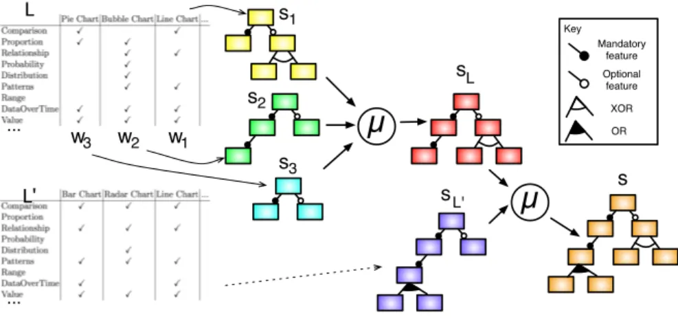
µ
L L'µ
Key Mandatory feature Optional feature XOR OR s1 s2 s3 sL sL' s w1 w2 w3 ... ...Fig. 5. Merge process used to build the variability model
The main difficulty is now to build the associated variability model. To sup-port this task, we used a tool-assisted methodology that relies on Feature Models (FMs) [8, 9] to model variability, and a merging operator (denoted as µ), depicted in Fig. 5 on these feature models [10]. The key idea of this methodology is to focus on the different products available, i.e., each widget provided by a given library L, and to characterise it using the terms of the targeted meta-model, ensuring by construction the consistency of features with the selected elements in the meta-model. As a result, we obtain a variability matrix describing each concrete widget {w1, . . . , wn} ∈ L using Ptah concepts. Each widget descriptor
wi is considered as an asset and is associated to a FM si that can only derive
a single product: wi. This technique is directly inspired from the construction
of feature models from product descriptions [11]. The set of FMs {s1, . . . , sn}
is then merged using the µ operator, which implements a “merge with strict union” [10]. Being automatic, this operation facilitates the addition or edition of a widget description.. Formally, this operator ensures that given two FMs s and s0, the result of µ(s, s0) can be used to derive the products modelled by s and the ones modelled by s0, without any additions or restrictions. As a consequence, the result of µ(s1, µ(s2, ...)) = sL implements, together with the widget descriptors,
the product line that exactly models all the widgets available in L. To introduce a new library L0 in the product line, the same process is applied to produce sL0,
and the resulting product line is eventually obtained as s = µ(sL, sL0).
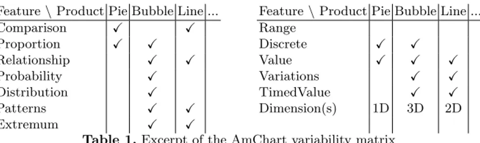
We consider here the AmCharts visualisation library. According to its demon-stration web page, it defines 58 concrete widgets8. Each widget was analysed
according to the Ptah concepts, and an excerpt of the resulting comparison matrix is represented in Tab. 1. Based on this matrix exported as a CSV file,
8
Feature \ Product Pie Bubble Line ... Comparison X X Proportion X X Relationship X X Probability X Distribution X Patterns X X Extremum X X
Feature \ Product Pie Bubble Line ... Range Discrete X X Value X X X Variations X X TimedValue X X Dimension(s) 1D 3D 2D Table 1. Excerpt of the AmChart variability matrix
fm1 = FM(widget:Name Comparison Proportion Value Discrete Dimension; Name:"Pie Chart"; Dimension:1D;)
//...
fm10 = FM(widget:Name Comparison Relationship Patterns DataOverTime Value Discrete Variations Dimension; Name:"Step Chart"; Dimension:2D;)
// ...
amCharts = merge sunion fm_*
Fig. 6. Excerpt of the Familiar code used to model the AmChart library.
each column is translated into a tool-ready representation of each descriptor, using the Familiar language [12] (see Fig. 6).
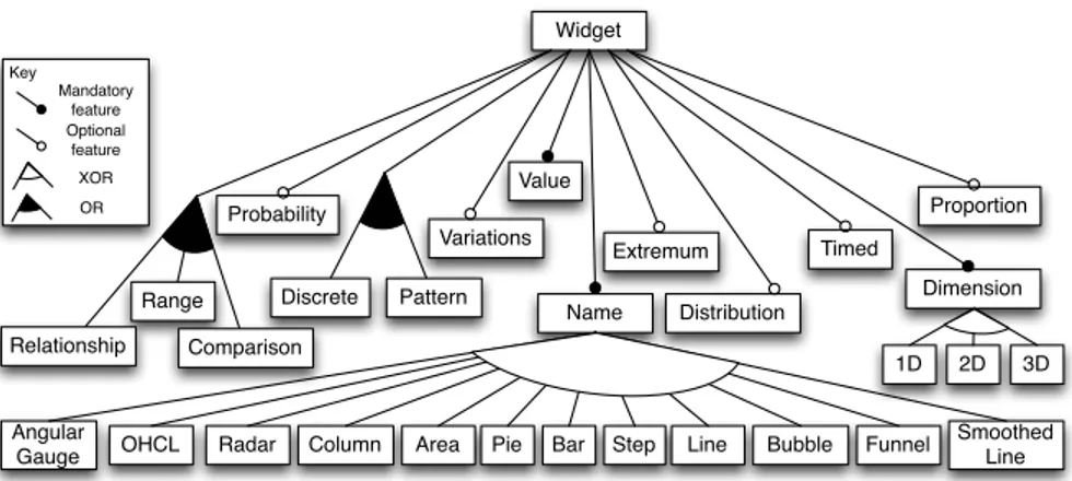
The resulting feature model, based on a simplified version of the AmCharts that only contains 12 widgets is depicted as a feature diagram in Fig. 7 (31 additional constraints not shown). This model is then exploited to support the user while defining models conforms to the Ptah meta-model. For example, the visualisation visθrefers to the features 2D and Extremum. While configuring the
AmCharts feature model with the selection of these two features, the configu-ration engine results in four potential candidates to realise this intention: Line chart, Smoothed Line, Bar chart or a Column chart, i.e., 33% of the initial prod-uct set. Considering that the second visualisation visp refers in addition to the
feature Discrete, leading to cut the widget dedicated to continuous data and resulting to only offer a Bar chart or a Column chart, i.e., 13% of the initial widget set. This example illustrates the reduction of possibilities induced by the use of a feature model related to the Ptah meta model.
5
Validation
The validation of the contribution described in this paper relies on a prototype implemented in Java. It provides a semi-automated support for the presented approach, according to the following steps: (i) the user expresses a dashboard composition using the Ptah meta-model, (ii) the tool search for an equivalent solution handled by a library, interacting with the user to select concrete widgets
Widget Name Relationship Range Distribution Comparison Value Probability OHCL Pie Key Mandatory feature Optional feature XOR OR Discrete Pattern Timed Bar Step Radar Column Area
Angular Gauge
Smoothed Line Line Bubble Funnel
Dimension 3D 1D 2D Proportion Extremum Variations
Fig. 7. Feature diagram generated by Familiar tool
(a) Juxtaposition of line charts (b) Superposition on a column chart
(c) Juxtaposition of column charts (d) Superposition on a line chart Fig. 8. Possible visualisation of three temperature data sets
and finally the tool (iii) automatically generate the corresponding and executable code in HTML/CSS and JavaScript.
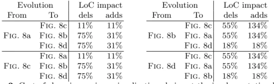
The following example illustrates the benefits of our contribution in compar-ison with the required manual manipulations needed while using the solutions provided by the state of practice. Considering a fixed number of data set (here
Evolution LoC impact From To dels adds Fig. 8a Fig. 8c 11% 11% Fig. 8b 75% 31% Fig. 8d 75% 31% Fig. 8c Fig. 8a 11% 11% Fig. 8b 75% 31% Fig. 8d 75% 31%
Evolution LoC impact From To dels adds Fig. 8b Fig. 8c 55% 134% Fig. 8a 55% 134% Fig. 8d 18% 18% Fig. 8d Fig. 8c 55% 134% Fig. 8a 55% 134% Fig. 8b 18% 18% Table 2. Cost of changing a given visualisation choice at the implementation level
three different temperature sensors), the user want to prototype several dash-boards in order to chose the final one she is going to use to monitor her system. We consider here only the AmCharts library, and more specifically only two types of widgets among the 58 available in this library: (i) Line charts and (ii) Column charts. We represent in Fig. 8 four different prototype associated to these three datasets.
We describe in Tab. 2 the cost of transforming one dashboard into another one, in terms of code instructions. It illustrate the time-consuming aspect of a prototyping process, even on this limited scenario. For example, in order to prototype the figure Fig. 8a, giving that the code of Fig. 8b is already available, one needs to remove 54,84% of the existing instructions and add 134,41% of new code. Even between two representations that looks close to each other (e.g., Fig. 8a and Fig. 8c), up to 11% of the code needs to be changed.
The concrete dashboards depicted in Fig. 8 can be classified into two cate-gories:(i) visualising three graphs at a time (Fig. 8a and Fig. 8c) or (ii) compar-ing the three datasets on the very same graph (Fig. 8b andFig. 8d). Inside each categories, the main difference between the two dashboards is the discrete rep-resentation of the data sets, leading to a line-based reprep-resentation (continuous) or a column-based one (discrete). Thus, at the Ptah level, the only difference between these elements are the layout and the visualisation concerns applied to each data sets, which corresponds exactly to the semantics expected at the user level. Then, one can represent and generate these different visualizations with a 14 elements model for Fig. 8a and Fig. 8c, and a 12 elements model for Fig. 8b and Fig. 8d.9
6
Related Work
The Interaction Flow Modeling Language (IFML, [13]) is a standard of the OMG dedicated to model and generate front-end applications and human-computer interactions. IFML’s purpose is to model front-end of applications composed of several layers, supporting the compositions required in such domain and the links with other layers of the application. In comparison, Ptah is dedicated to the
9
design of monitoring dashboards thus our approach focuses on sensor data visual-isations and related specific compositions. Both approaches are complementary, as our composition model can reify the IFML concept of ViewComponent in order to handle this specific type of visualisation, and we could use IFML ex-pressiveness in terms of events and user actions to define dashboard transitions. The CAMELEON Reference Framework (CRF, [14]) offers a methodology for human-computer interfaces design and generation. Our meta-model can be seen as a specialised implementation of the abstract visualisation layer described in CRF, allowing one to design complex data visualisations that are not yet sup-ported by UsiComp [15] (reference implementation of the CRF). Indeed, the support in UsiXML is currently more focused on form-based interfaces, which are not completely adapted to sensor data visualisation. The concept of mashups as “composed applications” has reach the user interfaces domain [16]. This way of composing User Interfaces (UIs) suffers from a lack of globalisation of their composition process, mainly focused on spatial arrangement and connection be-tween data and widgets, where the Ptah meta-model brings useful concepts to handle the goal through visualisation concerns. Work on spatial composition in mashups is nonetheless an inspiration for further work. COntext sensitive Multi-target widgETs (COMETs, [17]) model abstract interactors that can be composed to design UIs. The effort has been placed on the context adaptation of those form interface elements. Such an approach complements ours, handling the context awareness part as we focus on the proper design of resulting interfaces and the link with real world solutions, provided that COMETs could represent composite widgets.
Software product lines engineering techniques [2, 3] have been used in many domains, but only a few works considered them in the context of UIs. Blouin et al. use aspect-oriented techniques coupled with feature selections based on the context change at runtime so that dynamic adaptations of UIs can be re-alised [18]. Variability modeling and SPL techniques are also used to cover the whole development of Rich Internet Applications, including UIs components [19]. However, it only captures the UI relations to the rest of the web architectures, not the fine-grained selection of widgets. As for the construction of the feature models from the widgets description, the followed approach is directly inspired from Acher et al. work where the authors automatically extract a feature model from tabular data describing wiki engines [11]. This approach seems the best suited to our needs as other extraction techniques deal with different software artifacts such as source code [20], some models [21], or feature combinations [22]. Besides, the merge operation on feature models that we use in our approach is itself based on the results of She et. al. on reverse engineering feature models [23].
7
Conclusions & Perspectives
In this paper, we described a tool-supported approach used to tame the com-plexity of monitoring dashboard design. Based on a set of concrete scenarios ex-tracted from a real deployment of sensors in an academic campus, we proposed
a meta-model to support the design of monitoring dashboard, so that one can specify the what, how, when and where with no implementation knowledge.As the meta-model has been defined to meet business requirements of dashboard designers, it seems reusable for sensor data visualization in other contexts.We also proposed a variability model to facilitate the configuration of user-specific dashboard product from the obtained dashboard model. Then, code generation mechanisms are used to obtain a concrete dashboard executed at runtime, based on user’s intention expressed at the model level.
In order to complete this work, we aim at using goal models, such as task trees employed in the Human-Computer Interaction community, as an entry point to define the scenario the user wants to perform. From this representation of her intention, we plan to extract constraints and guidance about the design of a model, conforming to our meta-model and adapted to her goals. This up-stream work seems necessary before choosing the final concrete syntax of Ptah and integrating all parts in a tool, on which we plan to perform an empirical validation of the construction time using our approach.As perspectives, we also plan to use feature models to represent the variability of possible customisation of each widget, extracting this knowledge from the library API, and allowing the user to choose a configuration from those models. These parameter requirements will impact the design of the composition model, implying a bottom-up approach in contrary to the contribution of this paper, which can be seen as top-down. In conclusion, we aim at dealing at the same time with both capacities, leading us to define bidirectional links between our models, and thus providing a better support for tailored visualisation dashboard development.
Acknowledgements. Authors want to thanks Simon Urli for his expertise with Fa-miliar and the SmartCampus team: Romain Alexandre, Mireille Blay-Fornarino, Cecile Camilieri, Adrien Casanova, Cyril Cecchinel, Joel Colinet, Thomas Di’Me-co, Fabien Foerster, Mathieu Jimenez, Laura Martellotto, Jean Oudot, J´erome Rancati, Marie-Catherine Turchini and Guillaume Zanotti.
References
1. Few, S.: Information Dashboard Design. O’Reilly (2006)
2. Pohl, K., B¨ockle, G., van der Linden, F.J.: Software Product Line Engineering: Foundations, Principles and Techniques. Springer-Verlag (2005)
3. Clements, P., Northrop, L.M.: Software Product Lines : Practices and Patterns. Addison-Wesley Professional (2001)
4. Botts, M., Robin, A.: OpenGIS Sensor Model Language (SensorML) Implementa-tion SpecificaImplementa-tion. Technical report, OGC (July 2007)
5. Haderer, N., Rouvoy, R., Seinturier, L.: Dynamic Deployment of Sensing Exper-iments in the Wild Using Smartphones. In Dowling, J., Ta¨ıani, F., eds.: DAIS. Volume 7891 of Lecture Notes in Computer Science., Springer (2013) 43–56 6. Brel, C., Pinna-D´ery, A.M., Faron-Zucker, C., Renevier, P., Riveill, M.:
Onto-Compo: An Ontology-Based Interactive System To Compose Applications. In: Seventh International Conference on Web Information Systems and Technolo-gies(WEBIST 2011), short paper. , Springer-Verlag (May 2011) 322–327
7. Svahnberg, M., van Gurp, J., Bosch, J.: A taxonomy of variability realization techniques: Research articles. Softw. Pract. Exper. 35(8) (2005) 705–754
8. Kang, K., Kim, S., Lee, J., Kim, K., Shin, E., Huh, M.: Form: A feature-oriented reuse method with domain-specific reference architectures. Annals of Software Engineering 5(1) (1998) 143–168
9. Batory, D.: Feature models, grammars, and propositional formulas. In: Proc. of SPLC’2005. Volume 3714 of LNCS., Springer (2005) 7–20
10. Acher, M., Collet, P., Lahire, P., France, R.B.: Composing feature models. In van den Brand, M., Gasevic, D., Gray, J., eds.: SLE. Volume 5969 of Lecture Notes in Computer Science., Springer (2009) 62–81
11. Acher, M., Cleve, A., Perrouin, G., Heymans, P., Vanbeneden, C., Collet, P., Lahire, P.: On extracting feature models from product descriptions. In Eisenecker, U.W., Apel, S., Gnesi, S., eds.: VaMoS, ACM (2012) 45–54
12. Acher, M., Collet, P., Lahire, P., France, R.B.: Familiar: A domain-specific language for large scale management of feature models. Sci. Comput. Program. 78(6) (2013) 657–681
13. Rossi, G.: Web modeling languages strike back. IEEE Internet Computing 17(4) (2013) 4–6
14. Calvary, G., Coutaz, J., Thevenin, D., Limbourg, Q., Bouillon, L., Vanderdonckt, J.: A unifying reference framework for multi-target user interfaces. Interacting with Computers 15(3) (2003) 289–308
15. Garc´ıa Frey, A., Ceret, E., Dupuy-Chessa, S., Calvary, G., Gabillon, Y.: Usicomp: an extensible model-driven composer. In: EICS. (2012) 263–268
16. Wilson, S., Daniel, F., Jugel, U., Soi, S.: Orchestrated user interface mashups using w3c widgets. In Harth, A., Koch, N., eds.: Current Trends in Web Engineering. Volume 7059 of Lecture Notes in Computer Science. Springer Berlin Heidelberg (2012) 49–61
17. Demeure, A., Calvary, G., Coninx, K.: Comet(s), a software architecture style and an interactors toolkit for plastic user interfaces. In: DSV-IS. (2008) 225–237 18. Blouin, A., Morin, B., Beaudoux, O., Nain, G., Albers, P., J´ez´equel, J.M.:
Com-bining aspect-oriented modeling with property-based reasoning to improve user interface adaptation. In: Proceedings of the 3rd ACM SIGCHI Symposium on En-gineering Interactive Computing Systems. EICS ’11, New York, NY, USA, ACM (2011) 85–94
19. Meli´a, S., G´omez, J., P´erez, S., D´ıaz, O.: Architectural and technological variability in rich internet applications. IEEE Internet Computing 14(3) (2010) 24–32 20. Xue, Y.: Reengineering legacy software products into software product line based
on automatic variability analysis. In: Proceedings of the 33rd International Con-ference on Software Engineering. ICSE ’11, New York, NY, USA, ACM (2011) 1114–1117
21. Zhang, X., Haugen, Ø., Møller-Pedersen, B.: Model comparison to synthesize a model-driven software product line. In de Almeida, E.S., Kishi, T., Schwanninger, C., John, I., Schmid, K., eds.: SPLC, IEEE (2011) 90–99
22. Haslinger, E.N., Lopez-Herrejon, R.E., Egyed, A.: On extracting feature models from sets of valid feature combinations. In: Proceedings of the 16th International Conference on Fundamental Approaches to Software Engineering. FASE’13, Berlin, Heidelberg, Springer-Verlag (2013) 53–67
23. She, S., Lotufo, R., Berger, T., Wasowski, A., Czarnecki, K.: Reverse engineering feature models. In Taylor, R.N., Gall, H., Medvidovic, N., eds.: ICSE, ACM (2011) 461–470