Publisher’s version / Version de l'éditeur:
Color Research and Application, 39, 3, pp. 263-274, 2014-06-01
READ THESE TERMS AND CONDITIONS CAREFULLY BEFORE USING THIS WEBSITE.
https://nrc-publications.canada.ca/eng/copyright
Vous avez des questions? Nous pouvons vous aider. Pour communiquer directement avec un auteur, consultez la première page de la revue dans laquelle son article a été publié afin de trouver ses coordonnées. Si vous n’arrivez pas à les repérer, communiquez avec nous à [email protected].
Questions? Contact the NRC Publications Archive team at
[email protected]. If you wish to email the authors directly, please see the first page of the publication for their contact information.
Archives des publications du CNRC
This publication could be one of several versions: author’s original, accepted manuscript or the publisher’s version. / La version de cette publication peut être l’une des suivantes : la version prépublication de l’auteur, la version acceptée du manuscrit ou la version de l’éditeur.
For the publisher’s version, please access the DOI link below./ Pour consulter la version de l’éditeur, utilisez le lien DOI ci-dessous.
https://doi.org/10.1002/col.21811
Access and use of this website and the material on it are subject to the Terms and Conditions set forth at
Chromaticity-matched but spectrally different light source effects on
simple and complex color judgments
Veitch, Jennifer A.; Whitehead, Lorne A.; Mossman, Michele; Pilditch, Toby
D.
https://publications-cnrc.canada.ca/fra/droits
L’accès à ce site Web et l’utilisation de son contenu sont assujettis aux conditions présentées dans le site LISEZ CES CONDITIONS ATTENTIVEMENT AVANT D’UTILISER CE SITE WEB.
NRC Publications Record / Notice d'Archives des publications de CNRC: https://nrc-publications.canada.ca/eng/view/object/?id=e00d419b-a729-44f1-9b06-a28c3e43e332 https://publications-cnrc.canada.ca/fra/voir/objet/?id=e00d419b-a729-44f1-9b06-a28c3e43e332
This is an author version of the paper originally published in Color Research and Application. Please cite as:
Veitch, J. A., Whitehead, L. A., Mossman, M., & Pilditch, T. D. (2014). Chromaticity-matched but spectrally different light source effects on simple and complex color judgments. Color Research & Application, 39(3), 263-274. doi:10.1002/col.21811. © 2013, National Research Council Canada and Wiley Periodicals, Inc.
Jennifer A. Veitch*, Lorne A. Whitehead**, Michele Mossman**, and Toby D. Pilditch*,
* National Research Council – Construction, 1200 Montreal Road, Bldg M-24,
Ottawa, ON K1A 0R6, Canada.
Correspondence should be sent to the first author at: [email protected].
** University of British Columbia, Department of Physics and Astronomy
Vancouver, BC, Canada
Currently at University College London, Division of Psychology and Language Sciences, London, UK
Abstract
As light-emitting diode (LED) light sources mature, lighting designers will be able to deliver white light with a variety of spectral power distributions and a variety of color rendering properties. This experiment examined the effects of three spectral power distributions (SPDs) that were matched in illuminance and chromaticity on three measures of color perception: one objective (performance on the Farnsworth-Munsell 100 hue test) and two subjective (judgments of the attractiveness of one’s own skin, and preferences for the saturation of printed images). The three SPDs were a quartz-halogen (QH) lamp and two LED sources that were matched to the QH lamp in terms of both illuminance and chromaticity; the three light sources were nominally CCT=3500 K, x=0.40, y=0.39 and ~ 400 lx. LED A used three channels (red, green, blue), and had very poor color rendering (Ra= 18). LED B used four channels (red, amber, cyan, white)
and had very good color rendering (Ra= 96, whereas the QH had Ra = 98). Secondary
hypotheses addressed the effects of age and skin and eye color on the dependent measures. As expected, LED A delivered very different color perceptions on all measures when compared to QH; LED B did not differ from QH. The results show that it is possible for LED sources to match the familiar incandescent sources. However, although it is possible to deliver what
appear to be millions of colors with a three-chip (RGB) device, there is the risk of creating a very poor luminous environment.
1.0 Introduction
The adequacy with which any given light source permits accurate color judgments is known as color rendering. The metric by which this is judged at present is the CIE general color rendering index 1(R
a). Rais a proxy for, but not perfectly equivalent to, a light source’s ability to
faithfully render object colors. By definition, for color temperatures below 5000 K, a Planckian radiator (also known as a blackbody radiator and very closely approximated by incandescent lamps) provides perfect color rendering (CRI (Ra) = 100). With the advent of fluorescent lamps,
designers were faced with an economic trade-off – achieving a higher color rendering index required the use of more expensive phosphors and also limited the luminous efficacy to some extent. As solid-state light sources (particularly light-emitting diodes, LEDs) develop it is
possible that achieving high color rendering may become easier to achieve, but it will still come at the cost of reduced luminous efficacy of radiation. In other words, luminaire designers will be able to deliver white light with LEDs with a variety of spectral distributions having a wide range of color rendering quality.
The adequacy of common color rendering metrics to describe the performance of LEDs is a hot topic among both scientists and manufacturers 2. This experiment did not address that
question, which primarily concerns objective ways to describe the properties of light sources. The focus in the present paper is the predictive power of those properties in relation to viewers. Specifically, this experiment examined the effects of varying spectral power distributions that were matched in illuminance and chromaticity on color perception, both objective and
subjective.
This experiment is a comparison of two LED light sources against the familiar quartz-halogen (incandescent) lamp. The two LED sources were matched with the quartz-quartz-halogen lamp in terms of illuminance (Y) and chromaticity (x,y) and hence also correlated color
temperature (CCT). One LED source had commonly-available red-green-blue (RGB) LEDs and provided poor color rendering. The other LED source had four LEDs and was designed to closely match the spectral power distribution of the quartz-halogen lamp, and thus provided a high color rendering index. The principal hypothesis was that all color perception measures should be poorer under the RGB source than under the two matched sources; the other two sources should deliver the same performance on all measures..
We focused on three types of color perception. The most objective of these is
performance on a standard test of color discrimination, the Farnsworth-Munsell 100-hue (FM-100) test. This involves arranging rows of scrambled hues into the correct chromatic spectrum. Boyce and Simon 3conducted experiments similar to the present investigation, comparing
performance on this task under various fluorescent lamps and other light sources. Better performance was associated with light sources possessing higher CRI values and larger gamut areas, but the technology of the day did not permit the matching of chromaticity values. More recently, Royer, Houser, and Wilkerson 4used this task to study color discrimination under four
2700 K light sources, one of which was an RGB LED. Total error scores on the Farnsworth-Munsell test showed worse performance for the RGB source than for the other sources; the scores for two fluorescent and a tungsten-halogen lamp did not differ from one another despite having very different spectra and CRI values. These authors concluded that none of the color metrics that they examined provides a good prediction of color discrimination under what they call “highly structured spectra”.
We considered that fine judgments of color discrimination are relatively rare in daily life, and added two other assessments of the adequacy of color perception under these light sources. These assessments aimed at more complex color judgments. The first of these was a judgment of the color appearance of one’s own skin. Veitch, Tiller et al. 5asked participants to
compare the appearance of their two hands side by side, viewed simultaneously under two different light sources. Participants preferred the light source with relatively richer red than green
spectral content, a finding consistent with results reported at the same time by Quellman and Boyce 6.
The second subjective evaluation addresses the desired level of saturation required for a printed image to have the expected appearance. This is a relative judgment in which the quartz-halogen source is the baseline and the expectation is that one LED source will be similar to the baseline and the other will differ. As far as we are aware, this is the first time such a task has been studied.
Two secondary hypotheses were derived from the literature. Boyce and Simons 3found
age to be a significant influence on color discrimination, with older participants performing worse than younger people. This experiment sought to replicate this finding by testing two groups of participants: those aged 30 and under, or 40 and older. We also asked participants to report their eye color, taking a correlational approach to replicating differences previously reported between color preferences among blue-eyed versus brown-eyed individuals 7,8.
2.0 Method
2.1 Participants
There were 45 participants, 26 in the young group (14 men and 12 women) and 19 in the old group (10 men and 9 women). All self-reported having normal or corrected-to-normal vision and wore necessary correction lenses during the experiment. So far as we are aware, none had cataracts nor had had cataract surgery. All participants passed a pre-experiment color vision test using the Ishihara plates. Forty of the participants reported being right-handed, meaning that they looked at their left hands during the skin appearance judgments. The frequencies of various skin and eye colors (self-rated by participants) are shown in Table I.
Participants received either two course credits or a cash payment of $30 as a reward for their participation, which took approximately two hours. The protocol was approved by the research ethics boards of both the host university and the National Research Council of Canada.
Table I. The frequency of occurrence of skin and eye color categories by participant and and sex groups.
Young Old Total
Variable Category Female Male Female Male N
Skin Pale pink or ivory 3 4 2 1 10
Colours Rose 5 2 4 4 15 Yellowy-olive 3 2 1 2 8 Browny-red 1 2 1 2 6 Yellow-brown 0 2 1 0 3 Brown-black 0 2 1 0 3 Eye Blue 2 1 3 2 8 Colours Grey 1 1 0 0 2 Green 3 1 1 2 7 Light brown 1 3 1 1 6 Brown or black 5 8 5 4 22
Note. Participants reported their own eye colours. The experimenter rated the skin colours using a procedure developed during previous research5.
2.2 Setting
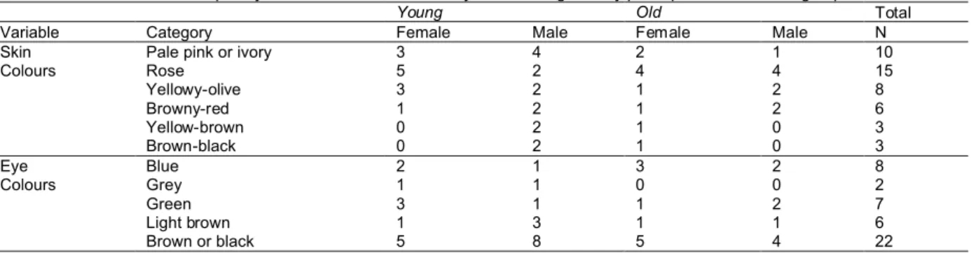
The experiment took place in a windowless room on a university campus in central Canada. Figure 1 shows a photograph of the apparatus in the room during the pre-test
calibration. Participants were seated in front of the light booth, which was lit directly but diffusely from the custom-built luminaire on top (see below, Figure 1). During testing the ambient light in the room was provided indirectly from an identical custom luminaire, shown at left in Figure 1 on top of the grey support. During the pre-test phases of consent, color vision testing and
demographics, the overhead room light, consisting of recessed 2’ x 4’ fluorescent troffers with prismatic lenses, 3500 K 80 CRI T8 lamps and electronic ballasts, was on.
2.3 Apparatus and Lighting Conditions
All tasks were viewed in a plywood light booth with dimensions 60 cm wide x 60 cm deep and 87.5 cm high, set on a table. The interior of the booth was painted a neutral grey with reflectance 0.40 and the table was covered with a polyester fabric of the same reflectance.
The three spectra were generated from a custom luminaire designed and built for this
experiment. Two identical luminaires were built; one was used to light the tasks directly and one to provide indirect illumination in the room during the session. The direct luminaire was mounted on top of the light booth to provide direct illumination. The light source was not visible to the participant because it was higher than the line of sight into the booth; in addition there was a layer of diffusing fabric and a matte black grid (used to adjust the illuminance to the target value, 400 lx) under the luminaire. During the preparation phase, a grid of luminance measurements were made on the floor of the booth to ensure that the distribution was uniform to within
approximately ±10% across the table surface.
The three spectra were matched in terms of CIE x,y chromaticity (and hence also correlated color temperature) 9, but had very different spectral power distributions and color
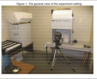
metrics. Table II summarizes the color metrics and Figure 2 displays the spectral power distributions. Appendix A contains the spectral power distributions in 5 nm bands (for readers who may wish to calculate other color metrics). The spectral measurements were taken using a Photo Research PR705 spectroradiometer that had been calibrated at the NRC Institute for National Measurement Standards two months prior to the measurements reported here. The PR705 reproducibility at that time was higher in the short wavelengths (3.84% at 380 nm, 1.38 % at 402 nm) than over the rest of the spectrum (generally between 0.50% and 0.70% from 406 to 780 nm). The measurements reported here were taken from a spectral reflectance target sitting in the center of the light booth (i.e., a horizontal measurement). We chose a horizontal measurement as being more easily replicated from one measurement occasion to another. Both Table II and Figure 2 display average results over five measurements taken over a 15 minute period.
Table II. Metrics for the light sources, measured in the light booth.
CCT x y CRI (Ra) R9 CQS GAI Δuv E (lx) Quartz-Halogen (QH) 3581 0.402 0.391 98 96 98 94 0.0010 400 LED A 3781 0.394 0.393 18 -217 45 117 0.0037 388
LED B 3622 0.399 0.388 96 88 95 99 0.0004 398
Note. All color values are based on spectroradiometric measurements of a horizontal reflectance standard placed in the light booth. The NIST CQS simulator, version 7.5a 22 was used to calculate CCT, x,y chromaticity, CRI, CQS, R9, and Duv. L*a*b* values from the NIST spreadsheet were the inputs for the GAI calculation, which was based on the 8 Ra samples and an equal-energy source reference spectrum using a Matlab script supplied by Jost-Boissard 23
The baseline condition was created using four filtered quartz halogen 50 W bipin lamps with a combination of gel and dichroic filters (henceforth labeled QH) designed to match as closely as possible the spectral distribution of a 3500 K Planckian radiator when powered at ~ 13.5 V. The back of each lamp was painted with black paint to prevent light leakage through the IR
transmitting reflector. There were two LED sources, one with poor color rendering as expressed with a low Ra(labeled LED A) and one with excellent color rendering as expressed with a high
Ra(labeled LED B). LED A used red, green and blue Luxeon Rebel LEDs having peak
wavelengths of 650 nm, 530 nm, and 465 nm respectively. LED B used four Luxeon Rebel LEDs: two non phosphor LEDs with peak wavelength of 650 nm and 515 nm, and two internal phosphor LEDs –phosphor amber and 4000 K phosphor white (phosphor-coated) to produce very good color rendering. When tested during the luminaire construction, the chromaticity of the three sources was very well matched x = 0.40, y = 0.39, and thus CCT = 3500 K. Table II shows values derived from spectroradiometric measurements of a reflectance target placed in the light booth prior to data collection. The light arriving on the target within the booth showed small variations between the three sources (Table II), presumably because of slight coloration arising from inter-reflections from the painted surfaces- but they were very small in comparison
to the spectral differences.
The spectral output of the light sources was tested on several
occasions. The luminaires were
constructed in one location (where they were tested) and then commercially transported a long distance to the city were the experiment was conducted, where the light booth was constructed and they were tested again. Minor voltage adjustments were made at this time to match the performance that had been measured during luminaire construction. The light booth was transported across the city by the research team to the data collection site. The spectral measurements were repeated and minor voltage adjustments made to the LEDs to match the earlier readings. We also examined performance over time and determined that within one experimental session, output stabilized following ~8 min of on time. This was built into the experimental protocol so that participants did not make color judgment responses until the light source to be judged had been on for at least 8 min. Spectral measurements were not possible during the data collection period, but illuminance was continuous monitored to ensure that the overall light output remained within the target range. At the conclusion of data collection, when the apparatus was returned to the laboratory, where it was checked again and found to match acceptably with the pre-experimental results.
2.4 Measures
The FM-100 test is designed to determine one’s ability to
discriminate between hues 10. There are a total of 85 hues split into
4 rows of spectra; each row contains a fixed pilot hue at each end of the row, with movable hue blocks that are to be sorted into an ordered progression e.g. from red to green. Scores are based on the total error (TES) from incorrect ordering of hues in comparison to the correct spectrum, with larger differences being penalized more heavily. A completely correct spectrum will yield a TES of 0, while each incorrect hue increases the error rate, varying from +2 error points (misplaced with adjacent hue) to +84 points (misplaced with hue from opposite end of
Figure 2. Spectral power distributions of the three light sources.
spectrum), cumulating each incorrect placement into the TES. A nominally “good” score is between 0 and 16 TES, “average” lies between 20 and 100, whilst “poor” scores are 100+.
Hues in a row are presented in a random order prior to the participant sorting them. We generated unique random orders for each row for each time of presentation.
FM-100 test performance is subject to practice effects 11,12, and therefore the order of
successive testing must be selected carefully. Participants completed this test four times. The first time was a practice session, completed under room lighting (3500 K, CRI = 80 from T8 lamps). We had time to provide only one practice round, but otherwise controlled for the
confounding effect of practice by randomizing the subsequent order of presentation of the three experimental light sources.
It is also important to realize that the FM-100 test is designed to be performed under daylight or CIE Illuminant C (6500 K) and at an illuminance level of 250 lx or more. Although our experiment was performed within the recommended illuminance range, because we used a lower color temperature, the scores from this task in the present experiment are interesting for their relative values, not as absolute scores to be compared to the normative values for this task.
Participants placed their non-dominant hand with the ring finger flat down on a small mark indicated on the table surface. The participant then evaluated the appearance of their own skin, using four semantic differential scales: natural/unnatural, colorful/colorless, unhealthy/healthy, and
pleasing/displeasing. These were presented on paper separated by a line that was 128 mm in length and on which the participant made a mark to indicate the degree to which the
appearance of their hand fell between the anchors. The score for each rating was the position of the mark on the line, measured in mm from the left anchor (i.e., with a possible range from 0 to 128).
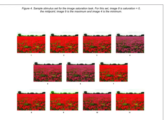
This task was developed for this experiment; as far as we know it has not been employed elsewhere. Each item in this task is a set of 11 versions of a color photographic image of a real scene, adjusted with software (PhotoShop) to have varying degrees of color saturation, ranging from near
monochrome at one extreme, to disturbingly over-saturated at the opposite extreme. The images were freely available (copyright-free) downloads from the Internet. There were six sets of images, chosen to provide a wide range of different colors in scenes of nature (e.g., trees with autumn colors; gardens in full bloom). Each set of 11 saturation levels for one image was printed in random order (to prevent any bias in choices related to position) on one sheet of high-quality paper, one set to a page. There was one booklet, meaning that all participants saw the same images. The printer was a Xerox Phaser 7760DX color (CMYK) laser printer. Figure 3 shows the six base images and Figure 4 shows a sample of one page. Table III characterizes the images according to the normalized red, green, and blue channel values for the midpoint image of each set. We used these values to give composite characterizations of whole images.
2.4.2 Complex color task.
Table III. Normalized RGB channels for the base images. Image Red Green Blue Dominant Colour Beach 0.3366 0.5247 0.6829 Blue Fern 0.3493 0.4353 0.2299 Green Autumn Forest 0.4586 0.319 0.1569 Red Fruit Bowl 0.6239 0.4603 0.356 Red Poppy Field 0.7034 0.3255 0.2574 Red Forest 0.4189 0.4138 0.187 Red & Green Note. For each image, we used a Matlab script to average the levels for each channel for each pixel, normalized to the maximum of 255.
Figure 4. Sample stimulus set for the image saturation task. For this set, image 8 is saturation = 0, the midpoint; image 9 is the maximum and image 4 is the minimum.
The participant’s task was to look at the 11 images in the set on one page and to identify which images looked most correct to them. The image selected under the quartz halogen lamp served as the baseline; analyses examined the difference in saturation preferred under the two LED sources. We predicted that for LED A, people would prefer images with lower saturation values than for QH and LED B, but that this effect would be larger for the images that were dominantly red.
Questionnaires were completed using pen and paper on the table surface in the light booth during the adaptation times for each lighting condition (36 minutes in total, 12 minutes for each light source; see below). (This also ensured that each light source had at least a 12-minute warm-up period in which to stabilize light output.)
Participants reported their age, sex, need for visual correction and skin and eye colors. Personality questionnaires to fill the rest of the adaptation times were chosen for their possible relevance to the hypotheses. These were the Survey of Personal Influence in Common
Environments (SPICE) 13, the Person-Surroundings Scale (PS) 14, the Environmental Sensitivity
Scale (ES) 15and the Arousal-Seeking Scale (AS) 15, and the Environmental Response
Inventory (ERI) 16. The SPICE and ERI questionnaires are both very long, and had too much
missing data to be useful; they were excluded from analyses.
2.5 Procedure
Experimental sessions were scheduled in morning, early afternoon, and late afternoon slots. Age and sex were counterbalanced across schedule slots to avoid any biasing effects of fatigue over the day. Data collection occurred over a six-week period in winter 2011; older
participants (who were more difficult to recruit) tended to participate in the later sessions. Participants were tested individually, all by the same experimenter.
Participants received a general description of the session as an investigation of light source effects on color judgments, and then signed a consent form while seated at the table beside the light booth. The color vision test followed, using a set of pseudo-isochromatic plates
17. Participants then completed the FM-100 test under room lighting. The scores from this
practice session were recorded but not used in subsequent analyses.
The experimenter turned on one of the three light sources at this point, ensuring that both luminaires were on with the same light source. The room lights were turned off. The order of presentation of light sources was counterbalanced across sessions and times of day. Participant assignment to a presentation order was random.
Shifting to sit in front of the light booth, participants began to work on the questionnaire booklet during the 12-minute adaptation period that also warmed up the light source.
Participants were given a small amount of freedom of choice on the length of their adaptation time, in order to facilitate completion of test tasks during a single adaptation time period. The maximum allowed extension was three minutes. Each testing block followed the same pattern after the adaptation period: the FM-100 test, the color saturation task, and the complex color judgments. The questionnaire booklet included pages for the color saturation task and the complex color judgments.
Scoring the Farnsworth-Munsell task occurred after the session. The experimenter photographed the racks as they were completed; the order of the tiles was entered later into a spreadsheet from the photographs. After taking the photographs, the experimenter placed the tiles in new random orders for the start of the next testing block.
At the end of the block, the experimenter asked the participant to close their eyes while he changed the light source. Changing from the LEDs to the QH source involved using two types of switch, which might have provided an auditory signal that some changes were different from others. For this reason we added a dummy switch to the luminaires so that all changes sounded the same to the participants.
At the conclusion of the three testing blocks, participants were debriefed concerning the purpose of the experiment. We asked that they keep the details confidential in order to avoid biasing subsequent participants.
3.0 Results
3.1 FM-100 Test
The experimental design was a 3 (light source) x 2 (age) mixed with-between subjects design. We examined each dependent measure separately. For the Farnsworth-Munsell 100 hue test the dependent measure was the total error score (TES). We examined planned comparisons between QH and LED A and QH and LED B. Table IV shows the descriptive statistics for the light sources by age group and collapsed across light source and age group. There was one statistically significant effect, a main effect for the comparison of QH versus LED A (F (1,43) = 68.54, p=.000, η2
partial= .61). As shown by the means in Table IV, color
discrimination performance was better under QH than under LED A. There was no difference in performance between QH and LED B.
Table IV. Means and standard deviations for TES scores, by age group and light source. Young (N=26) Old (N=19) Light Source QH 48.16 (30.28) 78.74 (58.71) 61.07 (46.53) LED A 96.00 (40.82) 115.78 (51.20) 104.36 (46.01) LED B 49.69 (31.82) 67.37 (56.76) 57.16 (44.40) Age Group 64.62 (40.83) 87.30 (58.49)
We repeated the analyses using the square-root transform of the TES scores; this is often used to improve the normality of the distribution. The pattern of results held, with only the main effect for the contrast of QH versus LED A reaching statistical significance.
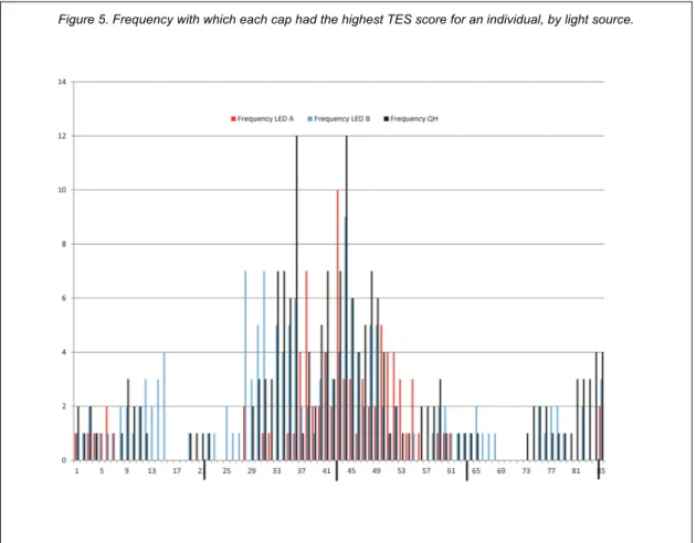
To better understand the errors we examined the individual data for each of the 85 caps for the three light sources. Figure 5 shows the frequency with which each cap had the highest error score for an individual participant (thus, the maximum possible score for any given cap was 45, the total sample size). There were many ties between caps; therefore the total frequency is higher than 45. The highest frequency for all light sources occurred in the set of caps that were blue-green, although the errors for LED A were shifted towards blue shades.
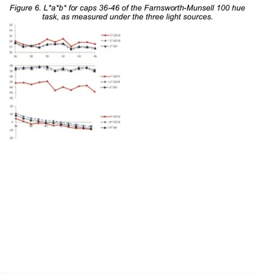
We made detailed photometric measurements of a white reference and selected caps, focusing primarily on those between 36 and 46, where the greatest frequency of errors
occurred. From these we calculated the CIE x,y values and from these the color coordinates in CIE L*a*b* color space.
Figure 6. L*a*b* for caps 36-46 of the Farnsworth-Munsell 100 hue task, as measured under the three light sources.
The data (Figure 6) show that LED A differs dramatically from both QH and LED B, particularly in the a* (green-red) dimension, as might be expected from the light source spectral power distributions (see Figure 2). This has the greatest effect on caps 41 and 46.
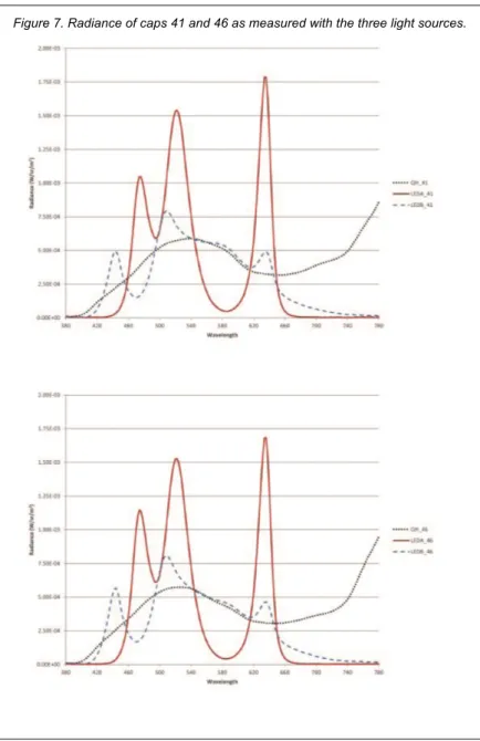
Another way to examine this effect is to look at the spectral power distributions. Figure 7 shows this radiance of caps 41 and 46 as measured under the three light sources.
Despite having been designed to have equivalent x, y chromaticity coordinates and color temperatures, these three light sources differ enough that it is not possible to perceive the colors of the Farnsworth-Munsell caps in the order in which they were designed to sit.
Figure 7. Radiance of caps 41 and 46 as measured with the three light sources.
3.2 Complex Color Judgments
For the complex color judgments there were four semantic differential ratings: naturalness, attractiveness, pleasingness, and healthiness. We coded the items so that the lower numbers indicated poorer ratings, and then calculated an average score for each light source that was the average of the four items. The internal consistency reliability of this scale was acceptable, Cronbach’s alpha = 0.76 (assessed for the QH condition, that being the baseline). One person had skipped answering for LED B, so the sample size of older participants numbered 18.
The analysis model for these judgments was a 3 (light source) by 2 (age) mixed
between-within ANOVA. We examined two single-degree-of-freedom planned comparisons: QH versus LED A and QH versus LED B, both as main effects and their interactions with age. The descriptive statistics for the six cells of this matrix are shown in Table V. There was one statistically significant effect, the main effect contrasting QH and LED A (F(1,42) = 34.22,
p=.000, η2
partial= 0.49. People judged their hands to be less desirable when viewed under LED A
than under the QH lamp; ratings under LED B and the QH lamp did not differ from one another. There was no significant effect of age, nor any significant interaction of age with lamp type. Expressed in terms of the anchor words, LED A left their hands just slightly over the border between bad and good appearance (the midpoint of the scale is 64).
Table V. Means and standard deviations for complex colour judgements. Young (N=26) Old (N=18) Light Source QH 92.38 (14.65) 93.38 (21.71) 92.78 (17.64) LED A 73.51 (20.23) 65.64 (30.02) 70.29 (24.69) LED B 91.19 (19.90) 93.76 (21.12) 92.24 (20.20) Age Group 85.69 (20.16) 84.26 (27.57)
Note. The complex colour judgement scores have minimum 0 and maximum 128.
3.3 Image Saturation Judgments
The images were scored on a scale from -5 to +5, indicating which of the 11 variations was judged to have a more correct appearance; 0 was the saturation value of the originally downloaded Internet image. We analyzed these scores in a 3 (light source) x 6 (image) x 2 (age group) analysis of variance. As before, for light source there were two 1-df planned
comparisons: QH vs. LED A and QH vs. LED B. For the image factor there were five degrees of freedom, and we tested five planned comparisons chosen on the basis of the dominant colors of the images (see Table III). These planned comparisons were beach versus fern (dominantly blue versus dominantly green), fern versus poppy field (dominantly green versus dominantly red), autumn forest versus forest (dominantly red versus bimodal red/green), fruit bowl versus poppy (multicolor versus dominantly red), and beach versus poppy field (dominantly blue versus dominantly red). We predicted that lower saturations would be desired for the images with high red content, and that this effect would be larger for LED A than for QH because of the large red peak in its SPD. As before, we expected no differences between QH and LED B. We also predicted that slightly higher saturation values would be preferred by older participants.
Table VI shows the statistically significant effects, which were observed for the contrast of QH versus LED A, image contrasts between pairs of highly-saturated images, and their interactions. Most notably, there were no statistically significant effects involving the comparison between QH and LED B. For a repeated-measures analysis (where effect sizes are larger than for between-subjects experiments because within-subjects variation is excluded by the
experimental design) the effect sizes are large for the image main effects, medium for the lamp main effect, and small-medium for the interactions.
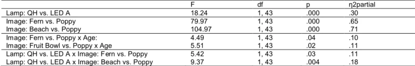
Table VI. Statistically significant ANOVA results for image saturation judgements.
F df p η2partial
Lamp: QH vs. LED A 18.24 1, 43 .000 .30
Image: Fern vs. Poppy 79.97 1, 43 .000 .65 Image: Beach vs. Poppy 104.97 1, 43 .000 .71 Image: Fern vs. Poppy x Age: 4.49 1, 43 .04 .10 Image: Fruit Bowl vs. Poppy x Age 5.51 1, 43 .02 .11 Lamp: QH vs. LED A x Image: Fern vs. Poppy 5.42 1, 43 .03 .11 Lamp: QH vs. LED A x Image: Beach vs. Poppy 9.37 1, 43 .004 .18
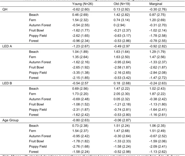
Means and standard deviations relating to these effects are shown in Table VII. Overall, as predicted, participants judged the images to have a more correct appearance with lower saturation under LED A (M = -0.92) than under QH (M = -0.30). They also wanted the
dominantly red image of the poppy field to be less saturated than either the beach or the fern, particularly under LED A (beach M = 1.29, fern M = 1.47, poppy field M = -2.84) as compared to
QH (beach M = 0.87, fern M = 1.20, poppy field M = -1.78). This also is consistent with the predictions.
Table VII. Means and standard deviations for image saturation scores by light source and age. Young (N=26) Old (N=19) Marginal
QH -0.62 (2.60) 0.13 (2.92) -0.30 (2.76) Beach 0.46 (2.69) 1.42 (2.82) 0.87 (2.75) Fern 1.54 (2.32) 0.74 (3.14) 1.20 (2.69) Autumn Forest -0.54 (2.55) 0 (2.94) -0.31 (2.70) Fruit Bowl -1.62 (1.77) -0.21 (2.37) -1.02 (2.14) Poppy Field -2.62 (1.65) -0.63 (3.17) -1.78 (2.58) Forest -0.96 (2.34) -0.53 (2.86) -0.78 (2.55) LED A -1.23 (2.67) -0.49 (2.97 -0.92 (2.82) Beach 1.04 (1.89) 1.63 (1.64) 1.29 (1.79) Fern 1.35 (2.64) 1.63 (2.50) 1.47 (2.56) Autumn Forest -1.62 (2.16) -0.95 (2.64) -1.33 (2.37) Fruit Bowl -2.65 (1.92) -2.58 (1.87) -2.62 (1.87) Poppy Field -3.35 (1.38) -2.16 (2.65) -2.84 (2.08) Forest -2.15 (1.85) -0.53 (3.42) -1.47 (2.72) LED B -0.54 (2.57 0.18 (2.68) -0.24 (2.63) Beach 0.69 (2.56) 1.47 (2.22) 1.02 (2.43) Fern 1.73 (2.20) 2.05 (2.30) 1.87 (2.22) Autumn Forest -0.69 (2.48) 0.05 (2.32) -0.38 (2.42) Fruit Bowl -1.08 (1.52) -1.21 (2.18) -1.13 (1.80) Poppy Field -2.31 (1.87) -0.74 (2.81) -1.64 (2.41) Forest -1.62 (2.42) -0.53 (2.80) -1.16 (2.61) Age Group -0.80 (2.63) -0.06 (2.87) Beach 0.73 (2.38) 1.51 (2.24) 1.06 (2.35) Fern 1.54 (2.37) 1.47 (2.68) 1.51 (2.49) Autumn Forest -0.95 (2.42) -0.30 (2.64) -0.67 (2.52) Fruit Bowl -1.78 (1.82) -1.33 (2.33) -1.59 (2.06) Poppy Field -2.76 (1.68) -1.58 (2.24) -2.09 (2.41) Forest -1.58 (2.24) -0.52 (2.98) -1.13 (2.62) Note. Means with standard deviations in parentheses of preferred image saturation scores on scale from -5 to +5. 0 was the image saturation in Photoshop of the image as downloaded from the Internet.
Age interacted with two of the image effects: for young people the contrast of fern versus poppy showed a larger mean difference than for older people (young people, fern M = 1.54, poppy M = -2.76; older people, fern M = 1.47, poppy M = -1.58) and similarly the contrast between the fruit bowl and the poppy interacted with age (young people, fruit bowl M = -1.78, poppy field M = -2.76; older people, fruit bowl M = -1.33, poppy M = -1.58). These age
interactions were not accompanied by an overall main effect for age, as had been predicted (Age effect F (1, 43) = 3.21, p = .08).
3.4 Individual Differences
There were five individual difference variables. Three were personality scales that participants completed during the adaptation periods. These measured arousal and stimulus-seeking tendencies (AST); environmental sensitivity (ES) and the belief that a person’s
surroundings influence behavior (PS). We also recorded each individual’s skin color, as rated by the experimenter, and asked them to report their eye color.
The AST, ES, and PS scales were scored according to their developers’ instructions. AST and ES showed very good internal consistency reliability (Table VIII), whereas PS was merely acceptable. We performed median splits for the three scales, forming groups high and low on each concept based on their scores in relation to the median for the whole sample.
We hypothesized that people who are more sensitive to their environments might have stronger reactions to the difference in color rendering between the light sources (particularly for the LED A – QH comparison). We then repeated all the above analyses for TES scores,
complex color judgments, and image saturation judgments, one at a time, using AST, ES, and PS in turn as the grouping variable in place of age. This provided us with tests of the main effects of the personality variables and the interactions with light source and (for the image saturation task) image. There were no statistically significant interactions or main effects on any of the outcomes.
Table VIII. Descriptives statistics of personality scales.
Scale # items Cronbach’s alpha Median M (SD) Min Max Arousal and stimulus -seeking (AST) 40 .87 0.78 0.74 (0.85) -1.10 2.35 Environmental Sensitivity (ES) 25 .84 3.72 3.87 (0.78) 2.14 5.63 Person-Surroundings (PS) 18 .55 4.42 4.43 (0.56) 3.11 5.39 Note. AST is scored on a scale from -4 through +4. ES and PS are on scales from 1-7.
The notion that eye color might influence color judgments emerged from experiments by Whissell 7,8, who tested the hypothesis that dark-eyed individuals might prefer red shades. We
included eye color as an exploratory variable. From the five categories we gave to participants, we formed two categories of roughly equal size for analysis (light, N=23, dark brown or black, N-22). Of all the tests for TES, complex color, and image saturation, there were two statistically significant three-way interactions, both involving the image comparison between the autumn forest and the forest. Table IX shows the test statistics, and Figure 8 shows the mean image saturation scores relating to these contrasts. The figure suggests that the one anomalous mean, the image saturation judgment for the autumn forest under the QH lamp viewed by people with light eye colors, drives the statistically significant interactions. We know of no theoretical reason to explain this finding.
Table IX. Significant interactions of Image x Lamp x Eye Colour.
Contrast F df p η2partial
Lamp: LED A vs. QH x Image (Autumn Forest x Forest) x Eye Colour 8.08 1, 43 .007 .16 Lamp: LED B vs. QH x Image (Autumn Forest x Forest) x Eye Colour 5.10 1, 43 .029 .11
The skin color analyses were more
complex. We collapsed the original categories into four: ivory/pale pink; rose; yellow; red/brown. For these analyses we used three planned
comparisons, comparing ivory/pale pink to rose; rose to yellow; and yellow to red/brown. We did not expect differences between these groups for the image saturation or TES scores, but did expect that complex color judgments would be influenced by skin color. We expected the mean difference between QH and LED A to be larger for more red-skinned individuals because LED A would exaggerate those tones.
Figure 8. Mean image saturation scores for autumn forest and fern forest scenes, by lamp type and iris colour.
There were no statistically significant effects involving skin color and the TES scores and image saturation judgments. As expected, the QH vs. LED A contrast interacted with skin color in the contrast between the yellow and red-toned individuals (F (1, 40) = 4.28, p < .045, η2
partial=
.10). For yellow-skinned individuals, the mean for QH was 83.32 (SD = 18.26) and for LED A, 69.93 (21.13). For red/brown-skinned individuals, the mean for QH was 102.97 (SD = 8.07) and for LED A, 65.97 (15.12). We conducted two post-hoc tests on these means, comparing the means within lamp type for yellow and red/brown-skinned participants. Interestingly, and
contrary to our expectation, yellow-skinned participants rated their skin appearance worse under the QH lamp that did the red/brown-skinned individuals (F (1, 41) = 6.50, p < .015, η2
partial= .14).
As a between-groups comparison, this is a moderate effect size.
4.0 Discussion and Conclusions
Color researchers are well aware, but the general public (and probably some lighting practitioners) is not, that metamerism is both friend and foe. Metamerism, the phenomenon whereby stimuli that are spectrally different appear perceptually the same, allows red-green-blue illuminants (such as LEDs) to produce “millions of colors” on computer and TV screens. That is the friendly side; the unfriendly side is illustrated by the results of this experiment. We created two spectra from LED sources that were metameric with the quartz-halogen baseline; in this case they were matched for x,y chromaticity and hence also CCT. As our results illustrate, such spectra can be good matches (as in the case of LED B) or poor ones (LED A). The same pattern of results held for an objective measure of color discrimination, the Farnsworth-Munsell 100 hue test, and for two perceptual judgments: the appearance of one’s own skin, and the correctness of printed image color saturation. In all these cases, LED A was shown to be deficient in comparison to QH and LED B. This finding is consistent with that of Royer et al. 4,
who compared fluorescent, halogen, and RGB LEDs at a nominal 2700 K.
As has been noted, a light source with good color rendering should reveal a range of colors, should enable fine discrimination between similar colors, and should provide a natural appearance to objects 18. This experiment included outcome measures addressing these three
considerations, and showed consistent results across all three. LED A had a very peaky, red-dominant spectral power distribution and very low emissions in the green region. This resulted in difficulties discriminating green tones in the FM-100 test. On average, participants rated their hands as being less attractive under LED A. This effect was larger for participants with red-brown skin, consistent with Quellman and Boyce 6. LED A also lowered the desired saturation
value for images with high red content. Future experiments (and other researchers) should consider using a similar set of outcome measures to provide a rounded evaluation of the color performance of illuminants incorporating the full range of objective and subjective indicators.
We did not observe all of the expected age effects. The yellowing of the lens is known to adversely affect FM-100 test performance 3,19,20. The mean difference between our old and
young participants was in the expected direction (Table IV), but was not statistically significant. Two factors would have reduced the statistical power for this comparison: the unequal group sizes (19 old vs. 26 young participants in our experiment), and the fact that our older
participants were not as old as those in previous investigations. We accepted people as young as 40 in our “old” sample, but this is probably not sufficiently old to detect the effect.
Although we did not observe any interactions of light source with age, age did interact with the image contrasts in a predictable way. For contrasts involving the very red poppy field (compared to the fern forest or the fruit bowl), the older participants reported that a relatively higher saturation made the poppy field look correct. This is consistent with the imaging literature
21. Here too we might have had a stronger result with a larger sample of older participants.
It is generally true that light sources with better color rendering properties are less energy-efficient. Furthermore, there is increasing pressure to reduce lighting energy use, and to
this end there has been a steady reduction in illuminance recommendations for interior lighting. There is a risk that lighting quality could degrade, if light sources and levels are chosen to meet energy use goals alone. Our aim in this experiment was to develop and validate a method for studying aspects of color perception that we could then apply to studying the trade-off between illuminance and color rendering properties. We intend to pursue this question further.
The results of the present contrasts, taken together with Royer et al. 4provide a
cautionary message for LED light source developers. Although it is possible to deliver what appear to be millions of colors with a three-chip (RGB) device, there is the risk of creating a very poor environment of oversaturated colors. The discontinuous (“highly structured”, as Royer et al. phrased it) RGB output can produce decidedly unattractive object appearances. However, carefully chosen combinations of LEDs, as in our LED B, can produce spectra that have only slightly reduced luminous efficacy of radiation and are very well matched to the familiar incandescent sources.
Acknowledgements
This investigation forms part of the NRC-IRC project Solid-State Lighting for the Office of the Future (NRCC Project # B3249). This phase was supported financially by Natural
Resources Canada – EcoEnergy Technology & Innovation Fund, Natural Resources Canada – Office of Energy Efficiency, BC Hydro, the National Research Council of Canada, the Natural Sciences and Engineering Research Council of Canada, and 3M. Toby Pilditch contributed to the investigation as part of a work placement towards a B.Sc. degree in Psychology with Professional Placement from the University of Cardiff, Wales.
The authors are grateful to Benjamin Birt, Greg Burns, Erhan Dikel, Mary Gick, Derek Ludwig, Sandra Mancini, Guy Newsham, Radu Postole, and Andrew Strang for their
contributions and to Morad Atif and Trevor Nightingale for their support.
References
1. Commission Internationale de l'Eclairage (CIE). Method of measuring and specifying colour rendering properties of light sources. Vienna, Austria: CIE; 1995.
2. Wright M. Color-quality standards bodies need to consider the broad user base. LEDs Magazine 2012, February:76.
3. Boyce PR, Simons RH. Hue discrimination and light sources. Lighting Research and Technology 1977;9(3):125-140.
4. Royer MP, Houser KW, Wilkerson AM. Color discrimination capability under highly structured spectra. Color Research and Application 2011;in press.
5. Veitch JA, Tiller DK, Pasini IC, Arsenault CD, Jaekel RR, Svec JM. The effects of fluorescent lighting filters on skin appearance and visual performance. Journal of the Illuminating Engineering Society 2002;31(1):40-60.
6. Quellman EM, Boyce PR. The light source color preferences of people of different skin tones. Journal of the Illuminating Engineering Society 2002;31(1):109-116.
7. Whissell CM. Sex, eye-color, and aesthetic ratings of colors. Perceptual and Motor Skills 1980;51(3, Pt 1):1012-1014.
8. Whissell CM. Aesthetic judgment of shapes: Eye color, complexity, and first- and second-order symmetry as predictors. Perceptual and Motor Skills 1980;51(2):395-401. 9. Commission Internationale de l'Eclairage (CIE). Colorimetry. Vienna, Austria: CIE; 2004
10. Farnsworth D. The Farnsworth-Munsell 100-hue test for the examination of color discrimination: Manual. New Windsor, NY: Munsell Color; 1957.
11. Hardy KJ, Craven BJ, Foster DH, Scarpello JHB. Extent and duration of practice effects on performance with the Farnsworth-Munsell 100-Hue test. Ophthalmic and
Physiological Optics 1994;14(3):306-309.
12. Breton ME, Fletcher DE, Krupin T. Influence of serial practice on Farnsworth-Munsell 100-hue scores: The learning effect. Applied Optics 1988;27(6):1038-1044.
13. Gifford R, Eso SJ. The survey of personal influence in common environments.
Unpublished document. Victoria, B.C.: University of Victoria, Department of Psychology.; 1988.
14. Veitch JA, Gifford R. Assessing beliefs about lighting effects on health, performance, mood, and social behavior. Environment & Behavior 1996;28(4):446-470.
15. Mehrabian A, Russell JA, editors. An approach to environmental psychology. Cambridge, MA: The MIT Press; 1974.
16. McKechnie GE. Manual for the Environmental Response Inventory. Palo Alto, CA: Consulting Psychologists' Press.; 1974.
17. Waggoner TL. Pseudoisochromatic places Ishihara compatible color vision test. Gulf Breeze, FL: T. L. Waggoner Inc.; 2005.
18. Rea MS, Freyssinier-Nova JP. Color rendering: A tale of two metrics. Color Research & Application 2008;33(3):192-202.
19. Beirne RO, McIlreavy L, Zlatkova MB. The effect of age-related lens yellowing on Farnsworth-Munsell 100 hue error score. Ophthalmic and Physiological Optics 2008;28(5):448-456.
20. Kinnear PR, Sahraie A. New Farnsworth-Munsell 100 hue test norms of normal observers for each year of age 5-22 and for age decades 30-70. British Journal of Ophthalmology 2002;86(12):1408-1411.
21. Beke L, Kutas G, Kwak Y, Sung GY, Park DS, Bodrogi P. Color preference of aged observers compared to young observers. Color Research and Application
2008;33(5):381-394.
22. Ohno Y, Davis W. NIST CQS simulator. 7.5a. Gaithersburg, MD: National Institute for Standards and Technology; 2010.
23. Jost-Boissard S, Fontoynont M, Blanc-Gonnet J. Perceived lighting quality of LED sources for the presentation of fruit and vegetables. Journal of Modern Optics 2009;56(13):1420-1432.
Appendix A
Spectral Data for the Three Light Sources
Table AI. Normalized spectral power distributions for the three light sources in 5 nm bands.
WL (nm) QH LED A LED B WL (nm) QH LED A LED B
380 3.4618E-04 1.0256E-04 2.8737E-04 585 1.3963E-02 1.8039E-03 2.3233E-02
385 2.7141E-04 1.6093E-04 4.0355E-04 590 1.4194E-02 2.1417E-03 2.3789E-02
390 3.5778E-04 3.9345E-04 3.4543E-04 595 1.4370E-02 2.6948E-03 2.4023E-02
395 4.5838E-04 7.3283E-05 3.4733E-04 600 1.4519E-02 4.3414E-03 2.4233E-02
400 6.5635E-04 1.3969E-04 1.6544E-04 605 1.4670E-02 6.1369E-03 2.4325E-02
405 1.1028E-03 1.9107E-05 2.5917E-04 610 1.4798E-02 1.0993E-02 2.4513E-02
410 1.7072E-03 2.1220E-04 6.0009E-04 615 1.4867E-02 1.6481E-02 2.4742E-02
415 2.5313E-03 5.0709E-06 1.0700E-03 620 1.4963E-02 3.1547E-02 2.5934E-02
420 3.3465E-03 1.4334E-05 2.8564E-03 625 1.5120E-02 5.0358E-02 2.7934E-02
425 4.0551E-03 5.8587E-05 4.8993E-03 630 1.5305E-02 8.8042E-02 3.2566E-02
430 4.6559E-03 2.0113E-04 9.3621E-03 635 1.5404E-02 1.1024E-01 3.5547E-02
435 5.1869E-03 3.4945E-04 1.3204E-02 640 1.5497E-02 9.5217E-02 3.4290E-02
440 5.7083E-03 6.5808E-04 1.9756E-02 645 1.5593E-02 5.7839E-02 2.7993E-02
445 6.2102E-03 1.3480E-03 2.1323E-02 650 1.5673E-02 1.9106E-02 1.8654E-02
450 6.6745E-03 3.0745E-03 1.6111E-02 655 1.5805E-02 9.5445E-03 1.5329E-02
455 7.0317E-03 5.0122E-03 1.1898E-02 660 1.5918E-02 3.6337E-03 1.2487E-02
460 7.3819E-03 1.0857E-02 8.1467E-03 665 1.6074E-02 2.0192E-03 1.1171E-02
465 7.7009E-03 1.6842E-02 6.8112E-03 670 1.6224E-02 9.1141E-04 9.6023E-03
470 7.9796E-03 2.7847E-02 5.6069E-03 675 1.6369E-02 6.3308E-04 8.7366E-03
475 8.1898E-03 3.0826E-02 5.6157E-03 680 1.6488E-02 4.7393E-04 7.4895E-03
480 8.4187E-03 2.6468E-02 6.7467E-03 685 1.6729E-02 3.3229E-04 6.8247E-03
485 8.6533E-03 2.1508E-02 8.2013E-03 690 1.6927E-02 2.3886E-04 5.8709E-03
490 8.9131E-03 1.6726E-02 1.1438E-02 695 1.7179E-02 1.7192E-04 5.2899E-03
495 9.1298E-03 1.4922E-02 1.4368E-02 700 1.7430E-02 2.2894E-04 4.5650E-03
500 9.3625E-03 1.5661E-02 1.8895E-02 705 1.7638E-02 2.6248E-04 4.1001E-03
505 9.6159E-03 1.8673E-02 2.1296E-02 710 1.7880E-02 1.4529E-04 3.4697E-03
510 9.8769E-03 2.5920E-02 2.2493E-02 715 1.8107E-02 4.0910E-05 3.0826E-03
515 1.0107E-02 3.1595E-02 2.1753E-02 720 1.8327E-02 1.2956E-04 2.6456E-03
520 1.0363E-02 3.7294E-02 2.0189E-02 725 1.8570E-02 1.4642E-04 2.3860E-03
525 1.0642E-02 3.7752E-02 1.9395E-02 730 1.8824E-02 1.8983E-04 2.0181E-03
530 1.0951E-02 3.3378E-02 1.8666E-02 735 1.9043E-02 9.2711E-05 1.7957E-03
535 1.1258E-02 2.8365E-02 1.8427E-02 740 1.9260E-02 4.2506E-05 1.5563E-03
540 1.1554E-02 2.0819E-02 1.8268E-02 745 1.9542E-02 1.2220E-04 1.4274E-03
545 1.1805E-02 1.6441E-02 1.8386E-02 750 1.9812E-02 1.7023E-04 1.1572E-03
550 1.2067E-02 1.1512E-02 1.8795E-02 755 2.0162E-02 1.0748E-04 1.1304E-03
555 1.2344E-02 8.8766E-03 1.9201E-02 760 2.0476E-02 1.4877E-04 9.2518E-04
560 1.2633E-02 6.0346E-03 1.9912E-02 765 2.0875E-02 1.0017E-04 9.4124E-04
565 1.2915E-02 4.6245E-03 2.0497E-02 770 2.1216E-02 3.2178E-04 7.6553E-04
570 1.3205E-02 3.1870E-03 2.1383E-02 775 2.1600E-02 1.7944E-04 6.8896E-04
575 1.3484E-02 2.4922E-03 2.2004E-02 780 2.1989E-02 3.2956E-04 5.9454E-04
580 1.3747E-02 1.8999E-03 2.2791E-02
Note. The spectral data are normalized to sum to 1 for each light source. The 2-nm data are available on request. The
measurements were taken using a calibrated Photo Research PR705 looking at a spectral reflectance target sitting in the center of the light booth (i.e., a horizontal measurement). These are average results over five measurements taken over a 15 minute period.