Rappel :
Bootstrap est une collection d'outils utiles à la création du design (graphisme, animation et
interactions avec la page dans le navigateur ... etc. ...) de sites et d'applications web. C'est un
ensemble qui contient des codes HTML et CSS, des formulaires, boutons, outils de navigation et
autres éléments interactifs, ainsi que des extensions JavaScript en option. C'est l'un des projets les
plus populaires sur la plate-forme de gestion de développement GitHub.
Historique
Avant l'arrivée de Bootstrap, plusieurs bibliothèques existaient, ce qui menait à des incohérences et à
un coût de maintenance élevé.
Cette plate-forme a été conçue par deux développeurs faisant partie de la mouvance de
développeurs qui gravitent autour de Twitter, Mark Otto et Jacob Thornton1 et avait le nom de
Twitter Blueprint en 20102.
Le premier déploiement à échelle réelle eut lieu lors de la première hackweek organisée par
Twitter3.
En août 2011, Twitter place Bootstrap sous licence open source. En février 2012, Bootstrap est le
projet le plus populaire sur GitHub4.
Généralités
Bootstrap est compatible avec les dernières versions des navigateurs majeurs, mais peut fonctionner
de manière dégradée sur des navigateurs plus anciens.
Depuis la version 2, le framework adopte la conception de sites web adaptatifs5, permettant aux
projets utilisant Bootstrap de s'adapter dynamiquement au format des supports depuis lesquels ils
sont accédés (PC, tablette, smartphone).
Fonctionnalités
Fonctionnement
La modularité de Bootstrap consiste en une série de feuilles de styles LESS (à partir de la version 4
SASS) qui implémentent différents composants du toolkit6. Une feuille de style principale
(bootstrap.less) englobe les feuilles de style des composants. Les développeurs peuvent alors
sélectionner les composants dont ils ont besoin en modifiant cette feuille principale. L'utilisation de
LESS permet la manipulation de variables, de fonctions, d'opérateurs, sélecteurs6…
Depuis la version 2, Bootstrap dispose d'une option supplémentaire de « personnalisation ».
Le système de grille et le style adaptatif sont standardisés sur une grille de 940 pixels de large, que
les développeurs peuvent adapter. Ces définitions sont déclinées en quatre variations qui peuvent
être utilisées dans différents formats et supports : téléphones (portrait et paysage), tablette et PC
(haute et basse résolution). Ces déclinaisons adaptent automatiquement l'affichage de la page3.
Containers
Containers are the most basic layout element in Bootstrap and are required when
using our default grid system. Choose from a responsive, fixed-width container
(meaning its
max-widthchanges at each breakpoint) or fluid-width (meaning
it’s
100%wide all the time).
While containers can be nested, most layouts do not require a nested container.
<div class="container"><!-- Content here --> </div>
Use
.container-fluidfor a full width container, spanning the entire width of the
viewport.
<div class="container-fluid"> ...
</div>
Responsive breakpoints
Since Bootstrap is developed to be mobile first, we use a handful of
media queries
to
create sensible breakpoints for our layouts and interfaces. These breakpoints are
mostly based on minimum viewport widths and allow us to scale up elements as the
viewport changes.
Bootstrap primarily uses the following media query ranges—or breakpoints—in our
source Sass files for our layout, grid system, and components.
// Extra small devices (portrait phones, less than 576px)
// No media query for `xs` since this is the default in Bootstrap // Small devices (landscape phones, 576px and up)
@media (min-width: 576px) { ... }
// Medium devices (tablets, 768px and up) @media (min-width: 768px) { ... }
// Large devices (desktops, 992px and up) @media (min-width: 992px) { ... }
// Extra large devices (large desktops, 1200px and up) @media (min-width: 1200px) { ... }
Since we write our source CSS in Sass, all our media queries are available via Sass
mixins:
// No media query necessary for xs breakpoint as it's effectively `@media (min-width: 0) { ... }`
@include media-breakpoint-up(sm) { ... } @include media-breakpoint-up(md) { ... }
@include media-breakpoint-up(lg) { ... } @include media-breakpoint-up(xl) { ... }
// Example: Hide starting at `min-width: 0`, and then show at the `sm` breakpoint .custom-class { display: none; } @include media-breakpoint-up(sm) { .custom-class { display: block; } }
We occasionally use media queries that go in the other direction (the given screen
size or smaller):
// Extra small devices (portrait phones, less than 576px) @media (max-width: 575.98px) { ... }
// Small devices (landscape phones, less than 768px) @media (max-width: 767.98px) { ... }
// Medium devices (tablets, less than 992px) @media (max-width: 991.98px) { ... }
// Large devices (desktops, less than 1200px) @media (max-width: 1199.98px) { ... }
// Extra large devices (large desktops)
// No media query since the extra-large breakpoint has no upper bound on its width
Note that since browsers do not currently support
range context queries
, we work
around the limitations of
min- and max- prefixesand viewports with fractional widths
(which can occur under certain conditions on high-dpi devices, for instance) by using
values with higher precision for these comparisons.
Once again, these media queries are also available via Sass mixins:
@include media-breakpoint-down(xs) { ... }@include media-breakpoint-down(sm) { ... } @include media-breakpoint-down(md) { ... } @include media-breakpoint-down(lg) { ... }
// No media query necessary for xl breakpoint as it has no upper bound on its width
// Example: Style from medium breakpoint and down @include media-breakpoint-down(md) {
.custom-class { display: block; }
}
There are also media queries and mixins for targeting a single segment of screen
sizes using the minimum and maximum breakpoint widths.
// Extra small devices (portrait phones, less than 576px) @media (max-width: 575.98px) { ... }
// Small devices (landscape phones, 576px and up)
@media (min-width: 576px) and (max-width: 767.98px) { ... } // Medium devices (tablets, 768px and up)
@media (min-width: 768px) and (max-width: 991.98px) { ... } // Large devices (desktops, 992px and up)
@media (min-width: 992px) and (max-width: 1199.98px) { ... } // Extra large devices (large desktops, 1200px and up)
@media (min-width: 1200px) { ... }
These media queries are also available via Sass mixins:
@include media-breakpoint-only(xs) { ... }@include media-breakpoint-only(sm) { ... } @include media-breakpoint-only(md) { ... } @include media-breakpoint-only(lg) { ... } @include media-breakpoint-only(xl) { ... }
Similarly, media queries may span multiple breakpoint widths:
// Example// Apply styles starting from medium devices and up to extra large devices @media (min-width: 768px) and (max-width: 1199.98px) { ... }
The Sass mixin for targeting the same screen size range would be:
@include media-breakpoint-between(md, xl) { ... }Z-index
Several Bootstrap components utilize
z-index, the CSS property that helps control
layout by providing a third axis to arrange content. We utilize a default z-index scale
in Bootstrap that’s been designed to properly layer navigation, tooltips and popovers,
modals, and more.
These higher values start at an arbitrary number, high and specific enough to ideally
avoid conflicts. We need a standard set of these across our layered components—
tooltips, popovers, navbars, dropdowns, modals—so we can be reasonably consistent
in the behaviors. There’s no reason we couldn’t have used
100+ or
500+.
We don’t encourage customization of these individual values; should you change
one, you likely need to change them all.
$zindex-dropdown: 1000 !default; $zindex-sticky: 1020 !default; $zindex-fixed: 1030 !default; $zindex-modal-backdrop: 1040 !default; $zindex-modal: 1050 !default; $zindex-popover: 1060 !default; $zindex-tooltip: 1070 !default;
To handle overlapping borders within components (e.g., buttons and inputs in input
groups), we use low single digit
z-indexvalues of
1,
2, and
3for default, hover, and
active states. On hover/focus/active, we bring a particular element to the forefront
with a higher
z-indexvalue to show their border over the sibling elements.
Typography
Documentation and examples for Bootstrap typography, including global settings,
headings, body text, lists, and more.
Global settings
Bootstrap sets basic global display, typography, and link styles. When more control is
needed, check out the
textual utility classes
.
Use a
native font stack
that selects the best
font-familyfor each OS and device.
For a more inclusive and accessible type scale, we assume the browser default
root
font-size(typically 16px) so visitors can customize their browser defaults as
needed.
Use the
$font-family-base,
$font-size-base, and
$line-height-baseattributes as
our typographic base applied to the
<body>.
Set the global link color via
$link-colorand apply link underlines only on
:hover.
Use
$body-bgto set a
background-coloron the
<body>(
#fffby default).
These styles can be found within
_reboot.scss, and the global variables are defined
in
_variables.scss. Make sure to set
$font-size-basein
rem.
Headings
All HTML headings,
<h1>through
<h6>, are available.
Heading
Example
<h1></h1>h1. Bootstrap heading
<h2></h2>h2. Bootstrap heading
<h3></h3>h3. Bootstrap heading
<h4></h4>h4. Bootstrap heading
<h5></h5>h5. Bootstrap heading
<h6></h6>h6. Bootstrap heading
<h1>h1. Bootstrap heading</h1> <h2>h2. Bootstrap heading</h2><h3>h3. Bootstrap heading</h3> <h4>h4. Bootstrap heading</h4> <h5>h5. Bootstrap heading</h5> <h6>h6. Bootstrap heading</h6>
.h1
through
.h6classes are also available, for when you want to match the font
styling of a heading but cannot use the associated HTML element.
h1. Bootstrap heading
h2. Bootstrap heading
h3. Bootstrap heading
h4. Bootstrap heading
h5. Bootstrap heading
h6. Bootstrap heading
<p class="h1">h1. Bootstrap heading</p> <p class="h2">h2. Bootstrap heading</p> <p class="h3">h3. Bootstrap heading</p> <p class="h4">h4. Bootstrap heading</p> <p class="h5">h5. Bootstrap heading</p> <p class="h6">h6. Bootstrap heading</p>
Customizing headings
Use the included utility classes to recreate the small secondary heading text from
Bootstrap 3.
Fancy display heading
With faded secondary text
<h3>Fancy display heading
<small class="text-muted">With faded secondary text</small> </h3>
Display headings
Traditional heading elements are designed to work best in the meat of your page
content. When you need a heading to stand out, consider using a display heading—
a larger, slightly more opinionated heading style.
Display 1
Display 2
Display 3
Display 4
<h1 class="display-1">Display 1</h1> <h1 class="display-2">Display 2</h1> <h1 class="display-3">Display 3</h1> <h1 class="display-4">Display 4</h1>
Lead
Make a paragraph stand out by adding
.lead.
Vivamus sagittis lacus vel augue laoreet rutrum faucibus dolor auctor. Duis mollis, est
non commodo luctus.
<p class="lead">
Vivamus sagittis lacus vel augue laoreet rutrum faucibus dolor auctor. Duis mollis, est non commodo luctus.
</p>
Inline text elements
Styling for common inline HTML5 elements.
You can use the mark tag to highlight text.
This line of text is meant to be treated as deleted text.
This line of text is meant to be treated as no longer accurate.
This line of text is meant to be treated as an addition to the document.
This line of text will render as underlined
This line of text is meant to be treated as fine print.
This line rendered as bold text.
This line rendered as italicized text.
<p>You can use the mark tag to <mark>highlight</mark> text.</p>
<p><del>This line of text is meant to be treated as deleted text.</del></p> <p><s>This line of text is meant to be treated as no longer accurate.</s></p> <p><ins>This line of text is meant to be treated as an addition to the document.</ins></p>
<p><u>This line of text will render as underlined</u></p>
<p><small>This line of text is meant to be treated as fine print.</small></p> <p><strong>This line rendered as bold text.</strong></p>
.mark
and
.smallclasses are also available to apply the same styles
as
<mark>and
<small>while avoiding any unwanted semantic implications that the
tags would bring.
While not shown above, feel free to use
<b>and
<i>in HTML5.
<b>is meant to
highlight words or phrases without conveying additional importance while
<i>is
mostly for voice, technical terms, etc.
Text utilities
Change text alignment, transform, style, weight, and color with our
text
utilities
and
color utilities
.
Abbreviations
Stylized implementation of HTML’s
<abbr>element for abbreviations and acronyms to
show the expanded version on hover. Abbreviations have a default underline and
gain a help cursor to provide additional context on hover and to users of assistive
technologies.
Add
.initialismto an abbreviation for a slightly smaller font-size.
attr
HTML
<p><abbr title="attribute">attr</abbr></p>
<p><abbr title="HyperText Markup Language" class="initialism">HTML</abbr></p>
Blockquotes
For quoting blocks of content from another source within your document.
Wrap
<blockquote class="blockquote">around any HTML as the quote.
Lorem ipsum dolor sit amet, consectetur adipiscing elit. Integer posuere erat a ante.
<blockquote class="blockquote"><p class="mb-0">Lorem ipsum dolor sit amet, consectetur adipiscing elit. Integer posuere erat a ante.</p>
</blockquote>
Naming a source
Add a
<footer class="blockquote-footer">for identifying the source. Wrap the
name of the source work in
<cite>.
Someone famous in Source Title
<blockquote class="blockquote"><p class="mb-0">Lorem ipsum dolor sit amet, consectetur adipiscing elit. Integer posuere erat a ante.</p>
<footer class="blockquote-footer">Someone famous in <cite title="Source Title">Source Title</cite></footer>
</blockquote>
Alignment
Use text utilities as needed to change the alignment of your blockquote.
Lorem ipsum dolor sit amet, consectetur adipiscing elit. Integer posuere erat a ante.
Someone famous in Source Title
<blockquote class="blockquote text-center">
<p class="mb-0">Lorem ipsum dolor sit amet, consectetur adipiscing elit. Integer posuere erat a ante.</p>
<footer class="blockquote-footer">Someone famous in <cite title="Source Title">Source Title</cite></footer>
</blockquote>
Lorem ipsum dolor sit amet, consectetur adipiscing elit. Integer posuere erat a ante.
Someone famous in Source Title
<blockquote class="blockquote text-right">
<p class="mb-0">Lorem ipsum dolor sit amet, consectetur adipiscing elit. Integer posuere erat a ante.</p>
<footer class="blockquote-footer">Someone famous in <cite title="Source Title">Source Title</cite></footer>
</blockquote>
Lists
Unstyled
Remove the default
list-styleand left margin on list items (immediate children
only). This only applies to immediate children list items, meaning you will need to
add the class for any nested lists as well.
Lorem ipsum dolor sit amet
Consectetur adipiscing elit
Integer molestie lorem at massa
Facilisis in pretium nisl aliquet
Nulla volutpat aliquam velit
oPhasellus iaculis neque
oPurus sodales ultricies
o
Vestibulum laoreet porttitor sem
oAc tristique libero volutpat at
Faucibus porta lacus fringilla vel
Aenean sit amet erat nunc
Eget porttitor lorem
<ul class="list-unstyled">
<li>Lorem ipsum dolor sit amet</li> <li>Consectetur adipiscing elit</li> <li>Integer molestie lorem at massa</li> <li>Facilisis in pretium nisl aliquet</li> <li>Nulla volutpat aliquam velit
<ul>
<li>Phasellus iaculis neque</li> <li>Purus sodales ultricies</li>
<li>Vestibulum laoreet porttitor sem</li> <li>Ac tristique libero volutpat at</li> </ul>
</li>
<li>Faucibus porta lacus fringilla vel</li> <li>Aenean sit amet erat nunc</li>
<li>Eget porttitor lorem</li> </ul>
Inline
Remove a list’s bullets and apply some light
marginwith a combination of two
classes,
.list-inlineand
.list-inline-item.
Lorem ipsum
Phasellus iaculis
Nulla volutpat
<ul class="list-inline">
<li class="list-inline-item">Lorem ipsum</li> <li class="list-inline-item">Phasellus iaculis</li> <li class="list-inline-item">Nulla volutpat</li> </ul>
Description list alignment
Align terms and descriptions horizontally by using our grid system’s predefined
classes (or semantic mixins). For longer terms, you can optionally add a
.text-truncate
class to truncate the text with an ellipsis.
Description lists
A description list is perfect for defining terms.
Euismod
Vestibulum id ligula porta felis euismod semper eget lacinia odio sem nec elit.
Donec id elit non mi porta gravida at eget metus.
Malesuada porta
Etiam porta sem malesuada magna mollis euismod.
Truncated term is truncated
Fusce dapibus, tellus ac cursus commodo, tortor mauris condimentum nibh, ut
fermentum massa justo sit amet risus.
Nesting
Nested definition list
Aenean posuere, tortor sed cursus feugiat, nunc augue blandit nunc.
<dl class="row"><dt class="col-sm-3">Description lists</dt>
<dd class="col-sm-9">A description list is perfect for defining terms.</dd> <dt class="col-sm-3">Euismod</dt>
<dd class="col-sm-9">
<p>Vestibulum id ligula porta felis euismod semper eget lacinia odio sem nec elit.</p>
<p>Donec id elit non mi porta gravida at eget metus.</p> </dd>
<dt class="col-sm-3">Malesuada porta</dt>
<dd class="col-sm-9">Etiam porta sem malesuada magna mollis euismod.</dd> <dt class="col-sm-3 text-truncate">Truncated term is truncated</dt>
<dd class="col-sm-9">Fusce dapibus, tellus ac cursus commodo, tortor mauris condimentum nibh, ut fermentum massa justo sit amet risus.</dd>
<dt class="col-sm-3">Nesting</dt> <dd class="col-sm-9">
<dl class="row">
<dt class="col-sm-4">Nested definition list</dt>
<dd class="col-sm-8">Aenean posuere, tortor sed cursus feugiat, nunc augue blandit nunc.</dd>
</dl> </dd> </dl>
Responsive typography
Responsive typography refers to scaling text and components by simply adjusting the
root element’s
font-sizewithin a series of media queries. Bootstrap doesn’t do this
for you, but it’s fairly easy to add if you need it.
Here’s an example of it in practice. Choose whatever
font-sizes and media queries
you wish.
html { font-size: 1rem; } @include media-breakpoint-up(sm) { html { font-size: 1.2rem; } }@include media-breakpoint-up(md) { html { font-size: 1.4rem; } } @include media-breakpoint-up(lg) { html { font-size: 1.6rem; } }
Code
Documentation and examples for displaying inline and multiline blocks of code with
Bootstrap.
Inline code
Wrap inline snippets of code with
<code>. Be sure to escape HTML angle brackets.
For example,
<section>should be wrapped as inline.
For example, <code><section></code> should be wrapped as inline.
Code blocks
Use
<pre>s for multiple lines of code. Once again, be sure to escape any angle
brackets in the code for proper rendering. You may optionally add the
.pre-scrollable
class, which will set a max-height of 340px and provide a y-axis scrollbar.
<p>Sample text here...</p><p>And another line of sample text here...</p>
<pre><code><p>Sample text here...</p>
<p>And another line of sample text here...</p> </code></pre>
Variables
For indicating variables use the
<var>tag.
y = mx + b
<var>y</var> = <var>m</var><var>x</var> + <var>b</var>
User input
Use the
<kbd>to indicate input that is typically entered via keyboard.
To switch directories, type cd followed by the name of the directory.
To edit settings, press
ctrl + ,To switch directories, type <kbd>cd</kbd> followed by the name of the directory.<br>
To edit settings, press <kbd><kbd>ctrl</kbd> + <kbd>,</kbd></kbd>
Sample output
For indicating sample output from a program use the
<samp>tag.
This text is meant to be treated as sample output from a computer program.
<samp>This text is meant to be treated as sample output from a computerprogram.</samp>
Images
Documentation and examples for opting images into responsive behavior (so they
never become larger than their parent elements) and add lightweight styles to
them—all via classes.
Responsive images
Images in Bootstrap are made responsive with
.img-fluid.
max-width:100%;
and
height: auto;are applied to the image so that it scales with the parent
element.
<img src="..." class="img-fluid" alt="Responsive image">
SVG images and IE 10
In Internet Explorer 10, SVG images with
.img-fluidare disproportionately sized. To
fix this, add
width: 100% \9;where necessary. This fix improperly sizes other image
formats, so Bootstrap doesn’t apply it automatically.
Image thumbnails
In addition to our
border-radius utilities
, you can use
.img-thumbnailto give an
image a rounded 1px border appearance.
<img src="..." alt="..." class="img-thumbnail">
Aligning images
Align images with the
helper float classes
or
text alignment classes
.
block-level
<img src="..." class="rounded float-left" alt="..."> <img src="..." class="rounded float-right" alt="..."> <img src="..." class="rounded mx-auto d-block" alt="..."> <div class="text-center">
<img src="..." class="rounded" alt="..."> </div>
Picture
If you are using the
<picture>element to specify multiple
<source>elements for a
specific
<img>, make sure to add the
.img-*classes to the
<img>and not to
the
<picture>tag.
<picture><source srcset="..." type="image/svg+xml">
<img src="..." class="img-fluid img-thumbnail" alt="..."> </picture>
Tables
Documentation and examples for opt-in styling of tables (given their prevalent use in
JavaScript plugins) with Bootstrap.
Examples
Due to the widespread use of tables across third-party widgets like calendars and
date pickers, we’ve designed our tables to be opt-in. Just add the base
class
.tableto any
<table>, then extend with custom styles or our various included
modifier classes.
Using the most basic table markup, here’s how
.table-based tables look in
Bootstrap. All table styles are inherited in Bootstrap 4, meaning any nested tables
will be styled in the same manner as the parent.
#
First
Last
Handle
1 Mark
Otto
@mdo
2 Jacob
Thornton
@fat
3 Larry
the Bird
<table class="table"> <thead>
<tr>
<th scope="col">#</th> <th scope="col">First</th> <th scope="col">Last</th> <th scope="col">Handle</th> </tr>
<tbody> <tr> <th scope="row">1</th> <td>Mark</td> <td>Otto</td> <td>@mdo</td> </tr> <tr> <th scope="row">2</th> <td>Jacob</td> <td>Thornton</td> <td>@fat</td> </tr> <tr> <th scope="row">3</th> <td>Larry</td> <td>the Bird</td> <td>@twitter</td> </tr> </tbody> </table>
You can also invert the colors—with light text on dark backgrounds—with
.table-dark
.
#
First
Last
Handle
1 Mark
Otto
@mdo
2 Jacob
Thornton
@fat
3 Larry
the Bird
<table class="table table-dark"> <thead>
<tr>
<th scope="col">#</th> <th scope="col">First</th> <th scope="col">Last</th> <th scope="col">Handle</th> </tr> </thead> <tbody> <tr> <th scope="row">1</th> <td>Mark</td> <td>Otto</td> <td>@mdo</td> </tr> <tr> <th scope="row">2</th> <td>Jacob</td> <td>Thornton</td> <td>@fat</td> </tr> <tr> <th scope="row">3</th>
<td>Larry</td> <td>the Bird</td> <td>@twitter</td> </tr> </tbody> </table>
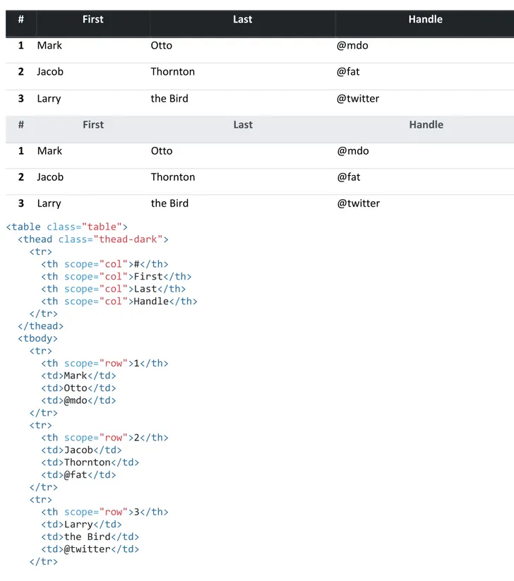
Table head options
Similar to tables and dark tables, use the modifier classes
.thead-lightor
.thead-dark
to make
<thead>s appear light or dark gray.
#
First
Last
Handle
1 Mark
Otto
@mdo
2 Jacob
Thornton
@fat
3 Larry
the Bird
#
First
Last
Handle
1 Mark
Otto
@mdo
2 Jacob
Thornton
@fat
3 Larry
the Bird
<table class="table">
<thead class="thead-dark"> <tr>
<th scope="col">#</th> <th scope="col">First</th> <th scope="col">Last</th> <th scope="col">Handle</th> </tr> </thead> <tbody> <tr> <th scope="row">1</th> <td>Mark</td> <td>Otto</td> <td>@mdo</td> </tr> <tr> <th scope="row">2</th> <td>Jacob</td> <td>Thornton</td> <td>@fat</td> </tr> <tr> <th scope="row">3</th> <td>Larry</td> <td>the Bird</td> <td>@twitter</td> </tr>
</tbody> </table>
<table class="table">
<thead class="thead-light"> <tr>
<th scope="col">#</th> <th scope="col">First</th> <th scope="col">Last</th> <th scope="col">Handle</th> </tr> </thead> <tbody> <tr> <th scope="row">1</th> <td>Mark</td> <td>Otto</td> <td>@mdo</td> </tr> <tr> <th scope="row">2</th> <td>Jacob</td> <td>Thornton</td> <td>@fat</td> </tr> <tr> <th scope="row">3</th> <td>Larry</td> <td>the Bird</td> <td>@twitter</td> </tr> </tbody> </table>
Striped rows
Use
.table-stripedto add zebra-striping to any table row within the
<tbody>.
#
First
Last
Handle
1 Mark
Otto
@mdo
2 Jacob
Thornton
@fat
3 Larry
the Bird
<table class="table table-striped"> <thead>
<tr>
<th scope="col">#</th> <th scope="col">First</th> <th scope="col">Last</th> <th scope="col">Handle</th> </tr>
</thead> <tbody> <tr>
<th scope="row">1</th> <td>Mark</td> <td>Otto</td> <td>@mdo</td> </tr> <tr> <th scope="row">2</th> <td>Jacob</td> <td>Thornton</td> <td>@fat</td> </tr> <tr> <th scope="row">3</th> <td>Larry</td> <td>the Bird</td> <td>@twitter</td> </tr> </tbody> </table>
#
First
Last
Handle
1 Mark
Otto
@mdo
2 Jacob
Thornton
@fat
3 Larry
the Bird
<table class="table table-striped table-dark"> <thead>
<tr>
<th scope="col">#</th> <th scope="col">First</th> <th scope="col">Last</th> <th scope="col">Handle</th> </tr> </thead> <tbody> <tr> <th scope="row">1</th> <td>Mark</td> <td>Otto</td> <td>@mdo</td> </tr> <tr> <th scope="row">2</th> <td>Jacob</td> <td>Thornton</td> <td>@fat</td> </tr> <tr> <th scope="row">3</th> <td>Larry</td> <td>the Bird</td> <td>@twitter</td> </tr> </tbody> </table>
Bordered table
Add
.table-borderedfor borders on all sides of the table and cells.
#
First
Last
Handle
1 Mark
Otto
@mdo
2 Jacob
Thornton
@fat
3 Larry the Bird
<table class="table table-bordered"> <thead>
<tr>
<th scope="col">#</th> <th scope="col">First</th> <th scope="col">Last</th> <th scope="col">Handle</th> </tr> </thead> <tbody> <tr> <th scope="row">1</th> <td>Mark</td> <td>Otto</td> <td>@mdo</td> </tr> <tr> <th scope="row">2</th> <td>Jacob</td> <td>Thornton</td> <td>@fat</td> </tr> <tr> <th scope="row">3</th>
<td colspan="2">Larry the Bird</td> <td>@twitter</td>
</tr> </tbody> </table>
#
First
Last
Handle
1 Mark
Otto
@mdo
2 Jacob
Thornton
@fat
3 Larry the Bird
<table class="table table-bordered table-dark"> <thead>
<tr>
<th scope="col">#</th> <th scope="col">First</th>
<th scope="col">Last</th> <th scope="col">Handle</th> </tr> </thead> <tbody> <tr> <th scope="row">1</th> <td>Mark</td> <td>Otto</td> <td>@mdo</td> </tr> <tr> <th scope="row">2</th> <td>Jacob</td> <td>Thornton</td> <td>@fat</td> </tr> <tr> <th scope="row">3</th>
<td colspan="2">Larry the Bird</td> <td>@twitter</td>
</tr> </tbody> </table>
Borderless table
Add
.table-borderlessfor a table without borders.
#
First
Last
Handle
1 Mark
Otto
@mdo
2 Jacob
Thornton
@fat
3 Larry the Bird
<table class="table table-borderless"> <thead>
<tr>
<th scope="col">#</th> <th scope="col">First</th> <th scope="col">Last</th> <th scope="col">Handle</th> </tr> </thead> <tbody> <tr> <th scope="row">1</th> <td>Mark</td> <td>Otto</td> <td>@mdo</td> </tr> <tr> <th scope="row">2</th> <td>Jacob</td> <td>Thornton</td>
<td>@fat</td> </tr>
<tr>
<th scope="row">3</th>
<td colspan="2">Larry the Bird</td> <td>@twitter</td>
</tr> </tbody> </table>
.table-borderless
can also be used on dark tables.
#
First
Last
Handle
1 Mark
Otto
@mdo
2 Jacob
Thornton
@fat
3 Larry the Bird
<table class="table table-borderless table-dark"> <thead>
<tr>
<th scope="col">#</th> <th scope="col">First</th> <th scope="col">Last</th> <th scope="col">Handle</th> </tr> </thead> <tbody> <tr> <th scope="row">1</th> <td>Mark</td> <td>Otto</td> <td>@mdo</td> </tr> <tr> <th scope="row">2</th> <td>Jacob</td> <td>Thornton</td> <td>@fat</td> </tr> <tr> <th scope="row">3</th>
<td colspan="2">Larry the Bird</td> <td>@twitter</td>
</tr> </tbody> </table>
Hoverable rows
#
First
Last
Handle
1 Mark
Otto
@mdo
2 Jacob
Thornton
@fat
3 Larry the Bird
<table class="table table-hover"> <thead>
<tr>
<th scope="col">#</th> <th scope="col">First</th> <th scope="col">Last</th> <th scope="col">Handle</th> </tr> </thead> <tbody> <tr> <th scope="row">1</th> <td>Mark</td> <td>Otto</td> <td>@mdo</td> </tr> <tr> <th scope="row">2</th> <td>Jacob</td> <td>Thornton</td> <td>@fat</td> </tr> <tr> <th scope="row">3</th>
<td colspan="2">Larry the Bird</td> <td>@twitter</td>
</tr> </tbody> </table>
#
First
Last
Handle
1 Mark
Otto
@mdo
2 Jacob
Thornton
@fat
3 Larry the Bird
<table class="table table-hover table-dark"> <thead>
<tr>
<th scope="col">#</th> <th scope="col">First</th> <th scope="col">Last</th> <th scope="col">Handle</th> </tr>
</thead> <tbody> <tr>
<th scope="row">1</th> <td>Mark</td> <td>Otto</td> <td>@mdo</td> </tr> <tr> <th scope="row">2</th> <td>Jacob</td> <td>Thornton</td> <td>@fat</td> </tr> <tr> <th scope="row">3</th>
<td colspan="2">Larry the Bird</td> <td>@twitter</td>
</tr> </tbody> </table>
Small table
Add
.table-smto make tables more compact by cutting cell padding in half.
#
First
Last
Handle
1 Mark
Otto
@mdo
2 Jacob
Thornton
@fat
3 Larry the Bird
<table class="table table-sm"> <thead>
<tr>
<th scope="col">#</th> <th scope="col">First</th> <th scope="col">Last</th> <th scope="col">Handle</th> </tr> </thead> <tbody> <tr> <th scope="row">1</th> <td>Mark</td> <td>Otto</td> <td>@mdo</td> </tr> <tr> <th scope="row">2</th> <td>Jacob</td> <td>Thornton</td> <td>@fat</td> </tr> <tr> <th scope="row">3</th>
<td colspan="2">Larry the Bird</td> <td>@twitter</td>
</tr> </tbody> </table>
#
First
Last
Handle
1 Mark
Otto
@mdo
2 Jacob
Thornton
@fat
3 Larry the Bird
<table class="table table-sm table-dark"> <thead>
<tr>
<th scope="col">#</th> <th scope="col">First</th> <th scope="col">Last</th> <th scope="col">Handle</th> </tr> </thead> <tbody> <tr> <th scope="row">1</th> <td>Mark</td> <td>Otto</td> <td>@mdo</td> </tr> <tr> <th scope="row">2</th> <td>Jacob</td> <td>Thornton</td> <td>@fat</td> </tr> <tr> <th scope="row">3</th>
<td colspan="2">Larry the Bird</td> <td>@twitter</td>
</tr> </tbody> </table>
Contextual classes
Use contextual classes to color table rows or individual cells.
Class
Heading
Heading
Active
Cell
Cell
Default
Cell
Cell
Class
Heading
Heading
Secondary
Cell
Cell
Success
Cell
Cell
Danger
Cell
Cell
Warning
Cell
Cell
Info
Cell
Cell
Light
Cell
Cell
Dark
Cell
Cell
<!-- On rows --> <tr class="table-active">...</tr> <tr class="table-primary">...</tr> <tr class="table-secondary">...</tr> <tr class="table-success">...</tr> <tr class="table-danger">...</tr> <tr class="table-warning">...</tr> <tr class="table-info">...</tr> <tr class="table-light">...</tr> <tr class="table-dark">...</tr> <!-- On cells (`td` or `th`) --> <tr> <td class="table-active">...</td> <td class="table-primary">...</td> <td class="table-secondary">...</td> <td class="table-success">...</td> <td class="table-danger">...</td> <td class="table-warning">...</td> <td class="table-info">...</td> <td class="table-light">...</td> <td class="table-dark">...</td> </tr>
Regular table background variants are not available with the dark table, however, you
may use
text or background utilities
to achieve similar styles.
#
Heading
Heading
1
Cell
Cell
2
Cell
Cell
3
Cell
Cell
#
Heading
Heading
5
Cell
Cell
6
Cell
Cell
7
Cell
Cell
8
Cell
Cell
9
Cell
Cell
<!-- On rows --> <tr class="bg-primary">...</tr> <tr class="bg-success">...</tr> <tr class="bg-warning">...</tr> <tr class="bg-danger">...</tr> <tr class="bg-info">...</tr> <!-- On cells (`td` or `th`) --> <tr> <td class="bg-primary">...</td> <td class="bg-success">...</td> <td class="bg-warning">...</td> <td class="bg-danger">...</td> <td class="bg-info">...</td> </tr>Conveying meaning to assistive technologies
Using color to add meaning only provides a visual indication, which will not be
conveyed to users of assistive technologies – such as screen readers. Ensure that
information denoted by the color is either obvious from the content itself (e.g. the
visible text), or is included through alternative means, such as additional text hidden
with the
.sr-onlyclass.
Create responsive tables by wrapping any
.tablewith
.table-responsive{-sm|-md|-lg|-xl}
, making the table scroll horizontally at each
max-widthbreakpoint of up to
(but not including) 576px, 768px, 992px, and 1120px, respectively.
Note that since browsers do not currently support
range context queries
, we work
around the limitations of
min- and max- prefixesand viewports with fractional widths
(which can occur under certain conditions on high-dpi devices, for instance) by using
values with higher precision for these comparisons.
Captions
A
<caption>functions like a heading for a table. It helps users with screen readers to
find a table and understand what it’s about and decide if they want to read it.
List of users
#
First
Last
Handle
1 Mark
Otto
@mdo
2 Jacob
Thornton
@fat
3 Larry
the Bird
<table class="table">
<caption>List of users</caption> <thead>
<tr>
<th scope="col">#</th> <th scope="col">First</th> <th scope="col">Last</th> <th scope="col">Handle</th> </tr> </thead> <tbody> <tr> <th scope="row">1</th> <td>Mark</td> <td>Otto</td> <td>@mdo</td> </tr> <tr> <th scope="row">2</th> <td>Jacob</td> <td>Thornton</td> <td>@fat</td> </tr> <tr> <th scope="row">3</th> <td>Larry</td> <td>the Bird</td> <td>@twitter</td> </tr> </tbody> </table>
Responsive tables
Responsive tables allow tables to be scrolled horizontally with ease. Make any table
responsive across all viewports by wrapping a
.tablewith
.table-responsive. Or, pick
a maximum breakpoint with which to have a responsive table up to by using
.table-responsive{-sm|-md|-lg|-xl}
.
Vertical clipping/truncation
Responsive tables make use of
overflow-y: hidden, which clips off any content that
goes beyond the bottom or top edges of the table. In particular, this can clip off
dropdown menus and other third-party widgets.
Always responsive
Across every breakpoint, use
.table-responsivefor horizontally scrolling tables.
# Heading
Heading
Heading
Heading
Heading
Heading
Heading
Heading
Heading
1 Cell
Cell
Cell
Cell
Cell
Cell
Cell
Cell
Cell
2 Cell
Cell
Cell
Cell
Cell
Cell
Cell
Cell
Cell
3 Cell
Cell
Cell
Cell
Cell
Cell
Cell
Cell
Cell
<div class="table-responsive"> <table class="table">
... </table> </div>
Breakpoint specific
Use
.table-responsive{-sm|-md|-lg|-xl}as needed to create responsive tables up to
a particular breakpoint. From that breakpoint and up, the table will behave normally
and not scroll horizontally.
These tables may appear broken until their responsive styles apply at specific
viewport widths.
# Heading
Heading
Heading
Heading
Heading
Heading
Heading
Heading
1 Cell
Cell
Cell
Cell
Cell
Cell
Cell
Cell
2 Cell
Cell
Cell
Cell
Cell
Cell
Cell
Cell
3 Cell
Cell
Cell
Cell
Cell
Cell
Cell
Cell
<div class="table-responsive-sm"> <table class="table">
... </table> </div>
#
Heading
Heading
Heading
Heading
Heading
Heading
Heading
Heading
1 Cell
Cell
Cell
Cell
Cell
Cell
Cell
Cell
2 Cell
Cell
Cell
Cell
Cell
Cell
Cell
Cell
3 Cell
Cell
Cell
Cell
Cell
Cell
Cell
Cell
<div class="table-responsive-md"><table class="table"> ...
</table> </div>
#
Heading
Heading
Heading
Heading
Heading
Heading
Heading
Heading
1 Cell
Cell
Cell
Cell
Cell
Cell
Cell
Cell
2 Cell
Cell
Cell
Cell
Cell
Cell
Cell
Cell
3 Cell
Cell
Cell
Cell
Cell
Cell
Cell
Cell
<div class="table-responsive-lg"> <table class="table">
... </table> </div>
#
Heading
Heading
Heading
Heading
Heading
Heading
Heading
Heading
1 Cell
Cell
Cell
Cell
Cell
Cell
Cell
Cell
2 Cell
Cell
Cell
Cell
Cell
Cell
Cell
Cell
3 Cell
Cell
Cell
Cell
Cell
Cell
Cell
Cell
<div class="table-responsive-xl"> <table class="table">
... </table> </div>
Figures
Documentation and examples for displaying related images and text with the figure
component in Bootstrap.
Anytime you need to display a piece of content—like an image with an optional
caption, consider using a
<figure>.
Use the included
.figure,
.figure-imgand
.figure-captionclasses to provide some
baseline styles for the HTML5
<figure>and
<figcaption>elements. Images in figures
have no explicit size, so be sure to add the
.img-fluidclass to your
<img>to make it
responsive.
A caption for the above image.
<figure class="figure"><img src=".../400x300" class="figure-img img-fluid rounded" alt="A generic square placeholder image with rounded corners in a figure.">
<figcaption class="figure-caption">A caption for the above image.</figcaption> </figure>
Aligning the figure’s caption is easy with our
text utilities
.
A caption for the above image.
<figure class="figure">
<img src=".../400x300" class="figure-img img-fluid rounded" alt="A generic square placeholder image with rounded corners in a figure.">
<figcaption class="figure-caption text-right">A caption for the above image.</figcaption>