Adaptive Color in Dynamic Mapping:
A Method for Predictable Color Modifications
by Didier Bardon
Graduate of Ecole Nationnale Supdrieure des Arts D6coratifs Paris, France, (1980).
Submitted to the Media Arts and Sciences Section, School of Architecture and Planning in Partial Fulfillment of the Requirements for the Degree of
MASTER OF SCIENCE IN VISUAL STUDIES at the Massachusetts Institute of Technology June, 1992
@ Massachusetts Institute of Technology 1992, All rights reserved
Author
Didier Bardon
Media Arts and Science May 8, 1992
Certified b Muriel R. Cooper
Professor of Visual Studies Thesis Supervisor
Accepted by ,
Stephen Benton, CQaihm'an ' !;-w
Departmental Committee on Graduate Studies
Rotab
MASSACHUSETTS INSTITUTE OF TFCHNOtOGY
AUG 0 6 1992
MITLibraries
Document Services Room 14-0551 77 Massachusetts Avenue Cambridge, MA 02139 Ph: 617.253.2800 Email: [email protected] http://libraries.mit.edu/docsDISCLAIMER OF QUALITY
Due to the condition of the original material, there are unavoidable
flaws in this reproduction. We have made every effort possible to
provide you with the best copy available. If you are dissatisfied with
this product and find it unusable, please contact Document Services as
soon as possible.
Thank you.
Both the Library and Archives versions of the
Bardon, Didier thesis contain only grayscale
images. A color copy is not available.
Adaptive Color in Dynamic Mapping:
A Method for Predictable Color Modifications
By Didier Bardon
Submitted to the Media Arts and Sciences section on May 8, 1992, Scool of
Architecture and Planning in partial fulfillment of the requirements for the Degree of Master of Science in Visual Studies.
Abstract
Graphic display of information is becoming increasingly interactive and dynamic. The images that are offered can evolve, in real time, rapidly. The graphic control
that insures the effectiveness of these dynamic images needs to be pursued throughout the course of their evolution. Automated graphic control modules should be made capable of maintaining graphic quality as users interact with the display.
In this work, a method for managing color in dynamic images is proposed. It enables color to play several roles concurrently, in the dynamic image. Examples are: perform semantic tasks like identification and grouping of graphic objects, create perceptual levels in the image and maintain discernability among objects as they evolve. This method is based on the dynamic relationship that exists between the image and the color space that underlies it. The global color configuration in the image is represented by its mapping into the Munsell color space. This
representation is used to guide color choices and modifications with predictable visual effects.
The method of color management is implemented in a graphic application system which simulates the images and interactions that dynamic mapping
environments can be expected to offer. The system main goal is to help obtain the visual knowledge that should underlay the method of color management.
Thesis Supervisor: Muriel R. Cooper Title: Professor of Visual Studies
Adaptive Color in Dynamic Mapping:
A Method for Predictable Color Modifications
by Didier Bardon
The following people have served as readers for this thesis.
Walter Bender
Principal Research Scientist MIT Media Laboratory
Debra A. Adams
Member of Research Staff
Xerox Corporation/Palo Alto Research Center
Robert A. Morris
Professor of Mathematics and Computer Science University of Massachusetts at Boston
Acknowledgments
I am grateful to my advisor Muriel Cooper for her continuous support and for helping me expand the scope of my design experience. I want to thank Henry Lieberman and Ron MacNeil for their very helpful involvement in pushing this work further. Anne Russell, Linda Peterson, and Amy Freeman provided continuous help and encouragement.
My readers, Debra Adams, Walter Bender and Bob Morris suggestions and feedback will continue helping me in the work to come.
John Grabowsky, undergraduate researcher, made an important contribution to this work, by implementing and optimizing the control of Munsell normalized bitmaps, by turning ideas into demos in a record time and by his insightful, active involvement.
My experience at the lab was greatly enriched by my fellow grad students, Michelle Fineblum, Grace Colby, Laura Scholl, David Young, Steve Librande, David Small, Bob Sabiston. The new crew, Karen Donahue, Craig Kanarick, Alan Turransky, BC Krishna and Louis Weitzman was just as fun and supportive.
Louis Weitzman and Craig Kanarick provided critical help and coaching for the English grammar and writing style. Brian Anderson was always available for countless explanations and trouble shooting during the final hours.
Bob Sabiston, David Small and David Young build a flexible and powerful computer graphic platform for the VLW without which the research presented in this thesis couldn't have been conducted.
I wish to thank the administration of the Media Laboratory and of the Institute for allowing me to continue my studies despite an interruption of several months due to health problems.
Finally, I wish to thank my parents, Denise and Roger, my sister Sophie and my brother Regis for their support from an ocean away and for accepting such a long absence so gracefully.
Table of Content
Abstract
1. Introduction
2. Dynamic mapping environments
1. Dynamic maps, two sources of evolution 2. An example of dynamic mapping environment
3. Graphic design requirements of dynamic mapping environments
Interaction with dynamic mapping environment Visual ordering
Rapid extraction of information
Global approach to graphic quality maintenance
3. Color in dynamic mapping
1. The lessons of recent color perception research
Potentials Warnings
2. Graphic design opportunities of color in the electronic medium
The graphic design experience
Theory of opponent colors and dynamic mapping Color in the electronic medium
3. The dynamic relationship image/color space
Color relationships and color space
Representing the evolving "image color situation"
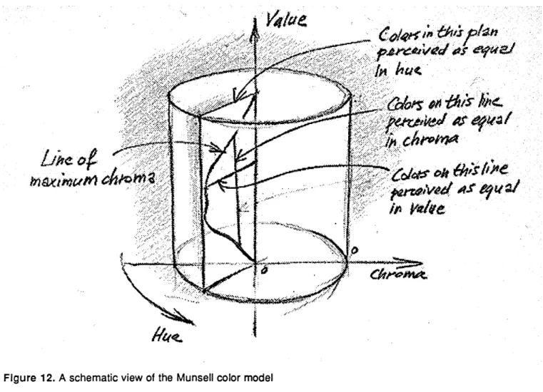
4. The Munsell color space
Conformity with the human visual system Consistent color distribution
4. The color management method
1. Overview2. Color containers
Definition
A vehicle and a controller
Color containers and bitmap based images Carrier of the semantic structure
3. Color zones in the Munsell color space
Definition Perceptual levels Adaptive image
4. Knowledge relevant to the color management method
Predictable visual operations Knowledge Acquisition
5
.The graphic experimentation system
5.1. OverviewPurpose
A prototype of dynamic image
The control of color in the dynamic image Visual knowledge acquisition
5.2. Implementation
System components The basic data structures The map structure
The Munsell color range selector The implementation of color zones
6. The visual experimentation
6.1. The visual experimentation setup.
6.2. ExamplesExample 1, value restriction only
Example 2, value and chroma restrictions
Example 3, restriction on the three dimensions of color
3. Evaluation of the experimentation findings
7.
Conclusion
Chapter 1. Introduction
"La couleur, suivant les physiciens est une propri6t6 de la lumibre, par laquelle elle produit, selon les diff6rentes configurations & vitesses de ses particules, des vibrations sur le nerf optique, qui 6tant propag6es jusqu'au sensorium, affectent tame de diff6rentes sensations."
Diderot, Encyclopedie, Tome IX, Partie 1l *
1. Dynamic maps, two sources of evolution
Dynamic Mapping Environments can be defined by comparison to traditional printed maps. A printed map offers a static presentation of a limited number of information sets. The choice of information is related to the theme of the map and only a limited number of problems can be helped by a single map. The limited graphical capacity of printed maps reduces the quantity of information that can be presented and fosters specialization of their purpose.
Dynamic maps in the electronic medium are not burdened by the same limitations. It is not clear if the graphic capacity is larger for maps displayed on high resolution CRTs than for the printed ones, but the amount of information that can be accessed and displayed electronically is independent of that graphic
capacity. Precisely, dynamic maps can be composed in real time and can offer relevant selections of information out of large information bases. This is an important aspect of dynamic mapping. The choice of information being presented can be made to help solve a particular current problem. Then, the choice can be automaticaly modified to follow the decision making process, as answers to queries bring about other, more focused queries. This research approaches dynamic maps as dynamic graphic interfaces with large topographically structured information bases.
Information always evolves with time. If printed maps become obsolete with the passing of time, electronic maps can easily reflect the evolution of
information. The evolution of information results in a constant or periodical updating of the values in the geographic data base. Some of evolutions need to be reflected on the display in real time. Examples include air traffic control, forest fire monitoring, medical monitoring. Other applications that do not require real time, can display information in accelerated time for a better understanding. Examples are: economical exchanges, population movements or environmental
Figure 1a.
Figure lb. The image evoloves according to fulfill the current information need. Color copies of this
thesis can be found at the Visible Language Workshop, Media Laboratory, E15-443
pollution monitoring. In real or virtual time, the ability of the dynamic maps to reflect the evolutions in their underlying information is the second aspect of dynamic mapping that determine our understanding of this kind of electronic display.
Thus, images that will be produced by Dynamic Mapping Environments will be the result of two distinct sources of change. First, the evolving information need of the decision maker. Second, the evolution of the information contained in the underlying information base. We use this understanding of the nature of dynamic maps to define the graphic environment that will support such displays, and to describe the graphic problems that need to be solved if the expectations set forth here are to be fulfilled.
2. An example of dynamic mapping environment
The following is a description of a concrete example of a Dynamic Information Display in use. In this example we will consider only the visual effects of the interaction between the decision maker and the display and the visual effect of the interaction between the underlying information system and the display. Issues concerning the user interface will not be taken into account; as fundamental as they are to dynamic information displays, they are not within the scope of this study. Figure 1 presents a graphic simulation of this example produced on the experimental system developed during this research.
Let us imagine that the officials in charge during the forest fires at
Yellowstone National Park (1990) had used a Dynamic Mapping Application as a support to the management of the crisis. Along the unfolding of events a
succession of diverse problems had to be solved that demanded different kinds of information. In most of the cases the common thread of this information was their relation to the topographic structure of the Yellowstone National Park. Decisions had to be made in the domain of security, manpower allocation, water supply allocation, etc. To look at the current situation in terms of security, officials using a Dynamic Mapping Display would have wanted :o be presented with a
visualization of the location of built-up areas, the location of isolated dwellings, the location and capacity of medical facilities, the road system, the current location and extent of the fires, etc. With the help of such a display imminent crisis could have been discovered and rated by level of emergency (this rating would be entered into the system by the user and reflected visually by the display) (figure 1 a). Then, with these facts in hand, the decisions concerning the
allocation or reallocation of man power and equipment could have been
addressed. New queries would have caused the composition of a modified image. Most of the graphic representations of information sets in the previous state of the display would have been faded into the graphic context while other sets, relevant to the new problem would have been brought into the foreground, i.e., current location of fire fighting unit, location and current state of water supplies etc... (figure 1b). This is an example of the double source of image evolution that will be characteristic of dynamic maps. The display is modified both by the evolving focus of interest of the user and by the underlying system constantly making the display up to date with the current state of the information base.
3. A method of color management and an experimental system
The visual evolution described in the forest fire example, as simple as it may appear, requires the real time control of several graphic aspects of the dynamic image. The transfer of graphic objects sets between visual proeminence and visual ressess is acheived by modifying their colors. The challenge of automatizing such visual processes resides in producing color modifications which intentions are acurately perceived by the viewer. In addition, color modifications have to be made without jeopardizing the semantic use of color in the image, i.e.,
contributions to the expression of objects grouping and identity. Such visual modifications of the dynamic image will be possible only if all the color relationships in theimage are represented and controlled.
This work proposes a method of management of the color ressources in the dynamic image. It is based on the existing relationship between an image and a perceptually consistant color space. The color of every object in the image maps to a three component vector in the color space. For reasons that will be developed further, the method represents the color relationships of the image into the
perceptually consistent Munsell color model.
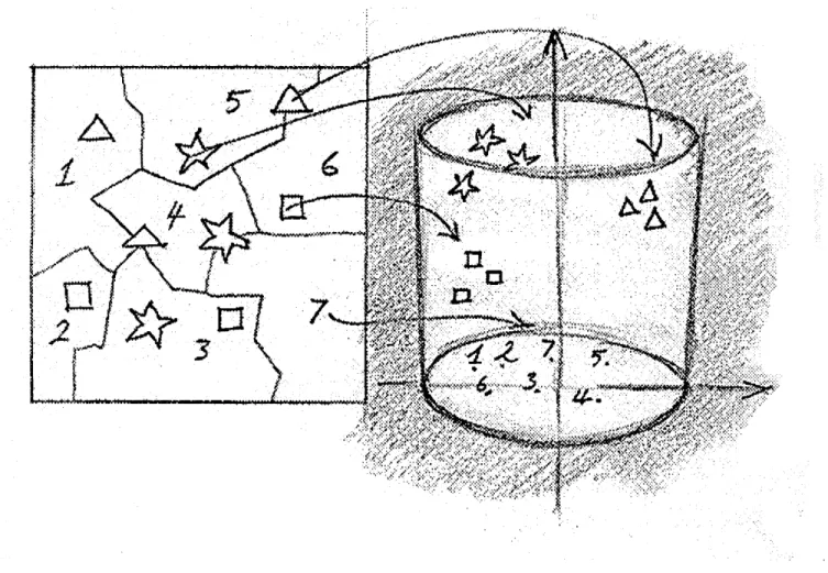
The method of color management is implemented in an experimental computer graphic application. The color relationships in a prototype dynamic mapping image are controlled through an interface with the Munsell color space. Visual experiments are performed with the purpose of acquiring the graphic knowledge that is necessary to automate the management method. Figure 2 presents a schematic of the systems components. Color relationships in the image are controlled with a set of interactive tools. The color relationships and the effect
Figure 2. System components
of the color modifications can be visualized in the map graphic simulation. The color relationships in the image and the use of the color ressources made by the image are visible in a 3-d viewport where the Munsell space is represented.
In the following chapters, a definition of Dynamic Mapping Environments will be presented. This understanding will help derive a set of graphic design requirements for this new kind of images. they take into account the particular kind of interactions that they can be expected to support, and the specificity of the visual enviroment offered by the electronic medium. Then the color management
method will be presented. The experimental system wil be described in detail. A series of visual experiments will be presented and evaluated. It will be seen that the management method allows the three components of color to be used as three
Figure 3. The map graphic simulation with the Munsell color range selector that is used for the control of its color relationships.
Chapter 2.
Dynamic mapping environment
"... a mingling of colour and form each with its separate existence, but each blended into common life which is called a picture by the force of the inner need."
Kandinsky on painting.
1. Introduction
New graphic problems
Recent geographic information systems are proposing visual presentations of topographically structured data using state-of-the-art computer graphics. These
systems elicit the vast potential of the computer generated image for the visual presentation of information and for computer based assistance to decision making. But so far, technological limitations have kept the amount of dynamics and
interactivity proposed by computer visual application at a low level. With the rapid evolution of graphic computing, it can be expected that in the very near future, these systems will be better called Dynamic Mapping Environments. They
will be used as visual interfaces to large geographic data bases. User queries will determine the composition of the display. The display will also reflect, in real time, the evolution of the data base itself.
With such dynamic, interactive displays, new graphic design problems are emerging. The evolution of the image can no longer be a pre-scripted sequence of events where the graphic conflicts created by the changes are foreseen and dealt with in advance. When the image evolves through user interaction or automatic update of the underlying information base, unwanted graphic complexity may appear. Graphic elements may become indiscernible, their meaning in the image may be lost. To prevent a degradation of the image to occur as users interact with it, its evolution must be supported by graphic control modules that eliminate graphic conflicts as much as possible. When conflicts do occur, the control
modules should be able to detect and solve them. An example of such a module is the Adaptive Text demonstration developed at the Visible Language Workshop, where text labels moving on a complex map background are able to maintain their legibility and a consistent color appearance by adapting to the graphic conditions found at every new locations in the map. [Ishizaki, 1990] [Bardon, 1991].
A global approach to graphic control
The Adaptive Text demonstration solves graphic problem locally as they occur throughout the evolution of the dynamic image. This local approach is likely to play an important role in the graphic control of dynamic mapping image.
Nevertheless, it cannot be expected to address the several kind of design problems posed by the control of such dynamic images. In this work, a global approach is proposed. The approach consists of controlling the dynamic image in all its elements and in their interactions. This attitude is in line with the basic principles of graphic design. These principles state that all the elements of an image have to be integrated into a functioning whole. The appearance and visual weight of each element has to be consistent with its role in the image.
In addition to the problems of graphic quality maintenance presented above, a graphic control module has to insure that the dynamic image remains easily understandable at all instants of the interaction, and that the semantic operations that are the essence of static and dynamic mapping are possible. Three class of tasks can be isolated, that have to be performed concurrently, while a dynamic mapping image is being used: Semantic tasks, Visual ordering tasks, Graphic
quality maintenance tasks.
These tasks have to be performed concurrently by carefully using the limited number of visual variables available: shape, size, texture, orientation, value (when color is not available), color.
The issues related to the assignment of semantic tasks to the five visual variables have been thoroughly researched. Bertin, in his seminal work, gives a
classification of the visual variables in view of their competence in performing semantic tasks. He assigns a limited role to color, in comparison to the other variables. Color can efficiently perform tasks of association and selection [Bertin,
1972]. But, this is considering only the semantic tasks. In this work, it is believed that color can be assigned a role in performing tasks of visual ordering
and graphic quality maintenance in addition to its limited role in the performance of semantic tasks.
Value
Visua
Orderi.g
Color
Chroma
Hue
Graphic
Quality
Maintenance
Shape
Size
Orientation
Semantic Tasks
Texture
Figure 4. The three components of color can be assigned different tasks in the dynamic image. Value and chroma can be used for the graphically related tasks. Hue can be assigned a iimited role in performing semantic tasks.
Hypothesis
The hypothesis, that is at the base of the research presented in this thesis, states that the three components of color, in a perceptually consistent color space, hue, value, and chroma (saturation), can be treated as three independent visual variables. These three color components can be assigned roles in the three categories of tasks related to the control of dynamic mapping displays. The diagram of figure 4 illustrates the assignments of tasks that is proposed by the hypothesis. Value and saturation are assigned roles in the two graphically related tasks: visual ordering and graphic quality maintenance. Hue is assigned the role in performing semantic tasks that usually belongs to color as a whole in static
mapping: association and selection.
Such a multiple role for color in dynamic mapping is possible only if a control of all the colors in the image, and of their relationships, is available. The
validation of the hypothesis needs a method for the management of color usage in the dynamic image that seeks to control the global color situation at all times. The method that is proposed here is based on the pre-existing relationships that exists between an image and the color space that supports it. The method uses this relationship to represent the color situation in the image, to organize and control it. It will be explained how the method helps resolve the conflicts inherent to using color to perform three kinds of tasks concurrently.
Adaptive Color in Dynamic Mapping
Tasks
Visual Variables
2. Graphic design requirements of dynamic mapping environments
Interaction with a dynamic mapping environment
In view of the example presented in the previous section, the type of interaction that will take place with dynamic mapping displays can be described and its visual consequences on the dynamic image can be assessed. The interaction with a dynamic mapping is a dialog between decision maker and an information-rich image. This dialog can take place only in the information contained in the image can be extracted easily and rapidly by the decision maker. As a result of this assessment, two main graphic design requirements will be established: first, a visual ordering has to be instated in the image, second, a global approach to the problem of graphic quality maintenance will be taken.
In the example above, users of dynamic mapping display make decisions by comparing different sets of information within an informational context. As the decision making progresses, the display passes through successive states. At every new state, a new information situation is presented to the user. This new image is part of the dialog that is taking place between the user and the geographic display. The information contained in the image should be recoverable rapidly by the user in order to avoid breaking the dialog. The traditional way of encoding information in printed maps requires too much interpretation time to allow the speed and immediacy that seems to be necessary to the type of interaction described in the forest fire monitoring example. The methods that will be used to visually encode information in dynamic mapping will have to be chosen in accordance with this need for rapid information extraction.
The type of images that supports such a decision making process is complex by nature. The graphic objects contained in the image are divided into groups that must be quickly identified by the user. Some groups denote information sets that are involved in the user's current concern. Other groups denote sets that are part of the informational context. All these objects appear over a topographical background which, itself, contains important information. It seems that information needs to be represented at least on three different visual levels: a
foreground, a context and a background. By instating a visual order of that kind in
the image, the user will be able to quickly discriminate between the groups, and an overwhelming visual complexity will be avoided.
At every new state of the display, the graphic objects in it will assume modified appearance to reflect the evolution of their role in the dialog. Their colors will be affected as well as their locations. As the display evolves, multiple
successive modifications of the objects graphic attributes may occur. A
degradation of the image quality can be caused by such a complex, unpredictable evolution. For example: the appearance of distinct objects might become too similar or the color of objects might become too close the color of their
background, causing visual confusion and losses in discernibility. In this work, this kind of basic graphic problems will be referred to as graphic quality maintenance problems. The visual framework within which the evolution of the display will take place should allow the dynamic modifications of graphic objects to happen with a minimum of conflicts. It will be shown how a global approach to solving problem of graphic quality maintenance will help create such a
framework.
Rapid extraction of information
Rapid extraction of information helps support a dialog between a user and a dynamic display by preserving the continuity of the interaction. As stated above, a constant clarity of the image will be maintained despite image evolution by an appropriate visual ordering. The continuity of the dialog through time will be maintained by allowing the user to rapidly extract from the image the information contained in it. That continuity is to be maintained if a dialog is to take place at all.
The method of visually encoding information is a principal factor that affects the speed of information recovery from an image. In static or dynamic mapping, information is visually encoded by making careful use of the six available visual variables, i.e., size, value, texture, color, orientation and shape [Bertin, 1982]. Each one of these variables is assigned a precise role in the image. These roles are related to the varying abilities of the human visual system to perceive differences in a given visual variable. The extensive work of Bertin in these matters offers
sound guidelines for assigning the correct roles to visual variables in an image. In his work, each one of the six visual variables (retinal variables) are studied, and the information encoding tasks that they can perform best is determined. For instance, shape is able to convey order and quantity, and to perform tasks of
selection. Color is assigned a more restricted role. Only tasks of association and selection can be performed well [Bertin, 1983].
Information can be extracted very quickly from images providing that the visual variables are used appropriately. In his work, Bertin describes two different categories of images. The "images to be read" that he qualifies as polysemic, and
the "images to be seen" that he qualifies as monosemic. To extract information from a polysemic image, the viewer has to interpret a visual code. This
interpretation time (this reading of the image) should be avoided as much as possible to maintain the dialog with the dynamic images. Conversely, information
doesn't need to be extracted from a monosemic image, it is immediately perceived without requiring an effort of interpretation (the information is seen, not read). This situation is ideal to support an efficient dialog between a user and a dynamic
mapping display.
It is important to note that Bertin's monosemic images are composed in very specific graphic situations. It is not clear yet if images with such efficiency can be composed in a dynamic environment. Nevertheless, Bertin's finding have to be brought to bear to help achieve the requirement of rapid information extraction. An ideal dynamic display will offer monosemic presentations of information at every new state of the interaction.
Figure 5. Using color to establish visual ordering in graphic design. The effect of depth in the image is reinforced by giving a bright saturated red to the boat in the foreground. Less saturated colors are used in the background. The headline is the brightest object in the poster.
Visual ordering
Establishing a visual ordering in an image is a basic graphic design practice. It is present in all images that achieve a clear communication. Visual ordering makes the semantic structure of the image visually explicit by giving to each of its elements a visual weight appropriate to its role. At the first glance, the viewer is informed about the structure of the image content. The parsing of the image's elements is helped in very much the same way good enunciation and rhythm of a lecturer helps the listener parse a speech. Usually without his or her knowing, the viewer will be able to immediately grasp the meaning of a visually ordered image (figure 5). If visual ordering is absent, the confusion and the effort necessary to sort the elements turns the viewer away from the image. It is important to notice that the images that are designed for competitive communication environments like advertising images most often show very efficient visual ordering. Since no one really wants to look at an advertisement, this kind of image is usually
designed to be crystal clear. The communication environment offered by dynamic images is also, for other reasons, very demanding. The difficulty does not reside in competition but in evolution. The dialog that these images should support between themselves and their user implies a constant clarity of the image despite frequent changes. Visual ordering, by making the image semantic structure visually explicit will contribute to that clarity.
As stated in the previous section, the purpose of visual ordering in dynamic maps will be to help the user to immediately identify the different components of the image, i.e., foreground, context and background. Several perceptual levels will have to be created in the image. The groups of objects in the same categories will be given the same level of salience by adjusting some of their graphic attributes in the same way. As a simple example, the objects included in the background could all be given a lower brightness. With such a similarity, they would be perceived to be in the same category, providing that this range of brightness would be given only to background objects. A background perceptual level would be created by the simple fact of reserving a certain range of brightness for a given group of objects. Brightness is not the only visual variable that can be used to perform such a task. In this work, it will be shown how color, with its three components, can be put to use to achieve visual ordering.
Delicate problems have to be solved to create perceptual levels that will help the dialog we described earlier. The viewer needs to quickly recognize that some objects belong to a given level. But also, the user needs to make visual
comparisons between objects at the same level as well as comparisons between
objects at that level and objects at other levels. As an example of such a situation, the forest fire monitoring display might be considered again. At a given instant of the interaction, the icons representing the fires and the icons representing the water supply might be part of the same level, the foreground. The user will need to make visual assessment within this level: Which fires are the most active? -Near which water supply is this fire located? -What is the capacity of this water supply? Also the user may need to make visual assessment between the
foreground level and the context level: What are the built-up areas in close proximity to this active fire? -On which road is this water supply located? (This assumes that, at this instant, build up area and road systems are represented at the context level).
Adjusting the visual levels in the image, i.e., establishing the correct visual ordering, to make these multi-leveled visual assessments possible requires a delicate control of the display's visual variables, in real time. For example, an optimal perceptual distance between levels has to be determined. If the distance between levels is too narrow, confusion between levels will occur. If it is too wide, it can be foreseen that visual comparisons across levels will be difficult; if the amount of contrast between levels is too wide, the contrasts between objects within a level become difficult to perceive and visual comparisons across levels are hampered. This optimal distance may vary with the different visual situation offered by the evolving display. The method of color management that is
proposed offers a framework within which a delicate control of color relationships will help create the visual levels that will structure the dynamic image.
Global approach to graphic quality maintenance
In a dynamic visual environment, the clarity of the communication is not only dependent on a semantically well structured image. All the elements of the image should be discernible at all time and their appearance should vary only for
semantic reasons. It has been stated above that these basic features will be offered by dynamic images only if a deliberate effort is made to implement them.
Losses in discernibility occur when variations in the location or the color of graphic objects cause them to appear too close to the color of their underlying background or the neighboring objects. An objects can be perfectly discernible in one region of the background but can recede into it when moved into another region. This receding is the consequence of the change in location and not of a deliberate semantic operation like changing the object from foreground to context
level. Such a confusing effect is due to a lack of planning in the usage of color value in the image. It occurs when the color assigned to graphic objects and the colors used in the background are allowed to be similar. This lack of planning has the effect of limiting the possibilities of information expression in dynamic images. To counterbalance such a misuse of color, most of color variations must
be devoted to discernibility maintenance instead of being used for semantic visual operations.
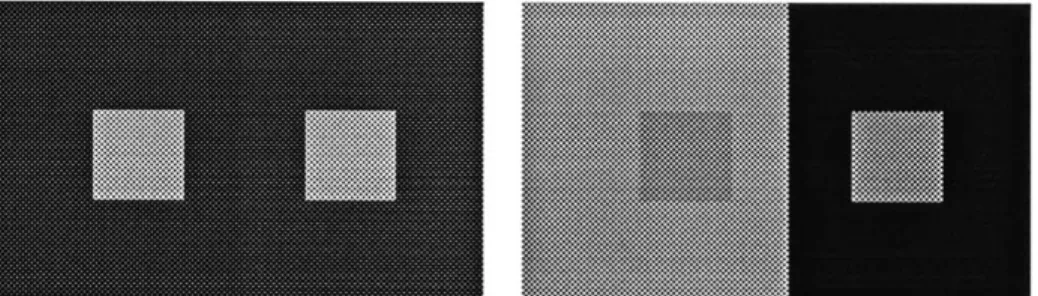
Losses in the constancy of the object's color appearance are also the consequence of changes in the object's locations but also of the object's colors. But the determining factor here is the variation of color caused by simultaneous contrast effects. A color is never perceived in isolation. It is a well known fact that our perception of a color is affected by the colors that surround it. In fact, an absolute appearance for a given physical color (for instance, the color produced on a CRT screen by a given RGB triplet) does not exist. The appearance of a given physical color can only be relative, and will change each time its surroundings are changed [Albers, 1972]. The management of color usage in dynamic mapping has to be designed in view of this inevitable phenomenon. When color is used as a visual variable to express information, variation of its appearance caused by simultaneous contrast effects can be sources of confusion. An object perceived as bright in a darker environment will be perceived darker in a lighter one. A blue object will be perceived purple-ish on a green background and greenish in a red background. These uncontrolled variations are liable to interfere with the establishing of visual levels as well as the usage of color to perform tasks of association or selection.
The problems of discernibility and appearance constancy maintenance can be addressed with two radically different but complementary approaches. The problems can be solved when and where they occur in the display, a local approach, or the likelihood of their occurrence can be reduced by an efficient management of color, a global approach. As stated in the introduction, this work concentrates on the global approach. With the local approach, graphic objects are treated like individual, autonomous agents. The means of detecting graphic conflicts provoked by a new situation are given to them as well as the means of reacting appropriately to these conflicts. For instance, in the work of Ishizaki, simple icons are able to adjust their color for appearance constancy by performing an analysis of their immediate surroundings at their new location [Ishizaki, 1991]. This approach makes an interesting use of the possibilities of real time computing but cannot be the only strategy used to maintain discernibility and appearance
simple icons are able to adjust their color for appearance constancy by performing an analysis of their immediate surroundings at their new location [Ishizaki, 1991]. This approach makes an interesting use of the possibilities of real time computing but cannot be the only strategy used to maintain discernibility and appearance consistency in the image. Resolving graphic conflicts by acting locally in many locations in the image might become computationally expensive and might result in a lot of unnecessary conflict detection work. It assumes that graphic objects in the dynamic image must be these rugged entities able to adapt to any bad visual situation. Relying on a local approach only would be overseeing the fact that, at the global level, the visual variables of the image can be controlled to avoid most of the conflicting situations. The two approach can be seen as complementary. The global management of color use can provide a framework for color variations where graphic conflicts are potentially rare, and the local approach can provide adjustment when graphic conflicts cannot be avoided.
The global approach to discernibility and appearance constancy maintenance is closely related to the establishing of perceptual levels in the image. Discernibility and constancy can be maintained as a consequence of the presence of perceptual levels in the image. It is possible if the distribution of contrast across the perceptual levels is such that graphic conflicts between objects at different levels do not occur. As an example, the interactions between a topographical background and a group of icons displayed over it can be considered. The topographical background is displayed within a range of contrast that will put a lot of its features at the same brightness level used for the icons (figure 6).
Figure 6. Graphic conflicts are prevented by a good contrast distribution
Conflicts will occur when icons are moved close to or above these features. Such a situation amounts to a misuse of the range of brightness available to the image. By comparing the two parts of figure 6, it can be seen that the topographical features of the background can be visually expressed by using a much narrower range of contrast. In the right side image, these background features can be clearly
Adaptive Color in Dynamic Mapping
...
...
...
-id...
...
seen by the viewer but do not compete with the text label. Precisely, the contrast between the background features does not compete with the contrast between the icon and the background features. In the right side image, the contrast distribution created two distinct visual levels. The icons can be easily visually parsed into a visual level distinct from the background. Icons can be moved across the
background without suffering visual competition from the background features. It is easy to see how this simple example can be extended to an image with more perceptual levels. The example of figure 6 shows that the discernibility of the graphic objects is maintained as a direct consequence of the brightness
distribution in the image; no background location has a level of brightness close to the brightness of the icons.
The appearance constancy of the graphic objects is maintained for less obvious reasons. The contrast distribution makes the color variations caused by simultaneous contrast effects negligible compared to the color variations used in the image for semantic operations. The magnitude of simultaneous contrast effect increases with the perceptual distance between the two colors influencing each other. If an icon is moved across a background that contains areas differentiated by a lot of contrast, the appearance of the icon's color will change a lot each time the icon passes from one area to the other. If the contrast in the background is kept to the optimal level, the minimum level where features can be perceived easily, the contrast between areas will be much lower. As a consequence, the changes in
appearance of the icon's color will be much smaller (figure 7). If the color variations and the color contrasts used in the image to perform semantic
operations are comparatively bigger, simultaneous contrast aberrations can become negligible. The relative relationship between color variations due to
simultaneous contrast effects and the color variations due to semantic operations in the system is one of the guiding criteria for the control of the distribution of contrast in the image.
...
Figure 7. Constancy of color appearance is also helped by a lower contrast in the background.
Perceptual levels are key to efficient dynamic images
The establishing of appropriate perceptual levels in the dynamic image will help achieve two of the three main graphic design requirements presented above, i.e., visual ordering and maintenance of objects discernibility and appearance
constancy. These two requirements have to be achieved first since they both contribute to supplying a basic, well designed visual environment for the dynamic presentation of information. The requirement of rapid information extraction which is related to information visual encoding methods will be achievable only in such a controlled visual framework. In this thesis, the research work
concentrates on the means of creating perceptual levels that support the dynamic presentation of information.
The purpose of the proposed method of color management is to allow color, as a visual variable with three degrees of freedom, to be used for the creation of these perceptual levels, in addition to its traditional role in conveying association and selection. The requirements of an automatic color management module will be determined in view of this specific purpose.
From the requirements described in the previous sections can be deduced the principles that will determine the characteristics of the appropriate perceptual levels. Within one level the amount of allowed contrast should be the minimum necessary to visually differentiate between the objects belonging to that same level.
The perceptual distance between levels should be wide enough that clearly distinct levels are obtained and that no inter-level conflicts are possible. But to be optimal, it should be narrow enough to allow inter-level visual comparison. Finally, to prevent confusion due to simultaneous contrast aberration, the
magnitude of color variations used for semantic operations must be such that color variations due to simultaneous contrast become negligible These principles are interrelated and it will be shown further in this work that they are at the basis of the visual knowledge that has to be acquired to build efficient dynamic mapping environments.
Chapter 3.
Color in dynamic mapping
"Je suis contre la couleur qui camoufle I'incomp6tence etje reste contre tant que 'on croira qu'elle suffit pour representer un ordre..."
Jacques Bertin, La Graphique et le Traitement Graphique de l'Information.
1. The teaching of recent color research
Potentials
Color is becoming increasingly available in the electronic visual environment. As a consequence, the research community is turning its attention more than ever on the elaboration of sound principles for the effective use of color in electronic displays. In view of the literature, it appears that all researchers agree that few principles of good color use are available to the display designer. Also, in view of
the current use of color in interfaces and visual applications, it can be seen that a misuse of color can have disastrous effects. The confusion and the strain that can result from the misuse defeats the purpose of adding color of the interface in the
first place, which is to bring more speed, clarity and safety. Nevertheless, all researchers, to different extents, agree on the existence of the potential of color as
an important visual variable for the representation of information.
In this work, it is believed that color holds an important potential as a major visual variable for in dynamic mapping. Several established facts are at the basis of this potential. They are related to the properties of human color perception. - The human visual system is capable of performing parallel search of color targets in a display [Cowan, 1988] [Davidoff, 1991]. The experimenters asked subjects to find a targets of a given color in an image, among other colored, distracting objects. The experiments showed that subjects were able to find the targets very rapidly, without needing to scan the image. In other words, the human visual system is able to process the color information contained in the field of vision without addressing every part of the display in sequence (figure 8). For other visual variable like shape, more attention from the subjects therefore more time is required to perform the search.
* Tasks of identification using color stimuli can be completed by subjects with levels of performances as good as for achromatic visual stimuli like shape [Christ, 1975]. Comparative experiments were performed, where subjects were asked to identify targets in visual displays. Target were differentiated either by shape, alphanumeric symbols or color. In these experiments, color yielded always similar or better accuracy of identification than shape. Alphanumeric symbols would yield better results in some cases but for most of the cases, performance were similar to color.
Figure 8. Find the red icons
- The same series of experiments presented by Christ also established that performance with color is independent of image complexity. When the
complexity of the image presented to the subjects increased, the efficiency of the achromatic variables (shape, alphanumeric symbols) decreased when the
efficiency of color remained constant. Also, color as a redundant variable (when used in correlation with an achromatic variable) was proven to significantly raise the level of performance.
* Color has been proven to convey grouping of objects within displays [Cowan, 1988]. In an image containing many graphic objects, the objects that have the same color will be perceived by the subject simultaneously. This is a consequence
of the ability of our visual system to perform parallel search of color stimuli. It
therefore, cognitively easy for a subject to recognize the objects of a same color as belonging to the same group.
These facts can be related to the design requirements for dynamic mapping environments proposed in the previous chapter. The ability of the human visual system to perform parallel search of the visual field for color stimuli is a feature that is crucial to dynamic images. With parallel search, complex displays of the kind described in the forest fire example become plausible. In such a visual environment a viewer has to be able to accurately perceive different groups of objects or single objects among numerous distracters. Parallel search indicates that this is a demand that can be safely made. Also, parallel search brings plausibility to the requirement of rapid information retrieval. Parallel search alleviates or greatly reduces the need for a visual scan of the display, thus participating to the speed of information retrieval.
The fact that the performance of color as an identifying variable is independent of the image complexity is also a crucial feature. In dynamic mapping, the display evolves with the unfolding of a problem solving process, and its complexity may greatly vary through the course of a session. It appears that color is a visual variable very appropriate for that kind of display. On its own or combined with shape or other achromatic variable (as a redundant variable [Christ, 1985]), it has the
potential to maintain constant the level of efficiency in the display despite variations in its complexity.
In this work, it is believed that these features of the human processing of color information give to color a special status as a visual variable for information presentation. It will be seen further that, despite its limitations for supporting semantic tasks, color will be able to play a structural role in the dynamic image. To the features of parallel search and independence of image complexity must be added the fact that color is the basic component of the electronic image (pixels illumination is specified in terms of color values). This combination enables color to play a major role in the structuring of the dynamic image. It can contribute to the building of a safe visual framework, where achromatic visual variables, along with color, will be used to perform many semantic operations.
Warnings
Two opposite attitudes can be seen in the research community toward the evaluation of the usability of color as a visual variable to present information. The first attitude is conservative and recommends that color should be involved in a limited number
of tasks, using the few established principles available. The second attitude tends to see color in the electronic medium as able to achieve more than in the traditional media, and seek to bring out that potential. In this research, the second attitude is adopted. It is believed that the conditions of color availability and controllability offered by high resolution electronic displays are unprecedented and that some risks have to be taken, at the research level, to make full use of the new possibilities. Nevertheless, the warnings given by the research community cannot be lost from sight and are presented here.
Cowan, in his article "Colour Psychophysics and Display Technology: Avoiding the Wrong Answers and Finding the Right Questions" [Cowan, 1988], very usefully summarizes the misunderstandings and ambiguities that appear when display designers look toward psychophysics for guidance in color usage.
A misunderstanding that seems to be frequent in display design is to rely on facts established through psychophysical experimentation to make design decisions about color. Cowan points out that, most of the time, nothing guarantees that the validity of the result can be generalized beyond the experimental visual conditions within which they were obtained. In devising their experiments, psychophysicist create very specific visual conditions in order to isolate variables and make their study possible. Most of the time, the experimental visual conditions are too simplified to be comparable to the visual environments that display designers have to build. Cowan gives strong warnings against these easy generalizations. He suggests that more experimentation has to be conducted that takes into account the real visual conditions of the task to be studied.
This tendency in the field of display design to carelessly generalize experimental results can be explained in part by the scarcity of established principles of color usage in electronic displays. Display designers have to rely for the most part on a limited set of rules of thumb. Cowan accepts that these rules have a limited effectiveness. He warns that no psychophysical experimentation come in their support, and as a consequence, they are not quantitative, which greatly limits the extent of their usage.
The clairvoyant review of Cowan brings to light the need for more
psychophysical research to provide display designers with the means to use the full potential of the new possibilities of color in the electronic medium. His concluding
statement defines a research agenda that goes toward this goal. "Understanding the psychophysical basis for these rules, and the process of making them quantitative, is the largest question facing psychophysicists in the human factors community"
[Cowan, 1988].
Warnings come also from the field of information presentation design. Bertin made a thorough study of the relative competence of the different visual variables in achieving semantic tasks. He gives precise guidelines for the usage of color in expressing information. He shows that in information presentation design it is usual to make too strong a demand on color or to misunderstand its possibilities. He warns that the different characteristics of the three dimensions of color, hue,
saturation, value, have to be clearly understood to make an efficient use of this variable. For instance, the fact that at equal saturation, colors of different hues have different values, and conversely the fact that equiluminant colors have different
saturation, have harmful consequences on the ability of color to express order or quantity Even though perceptually consistent color models, like Munsell's, are based on this understanding, many users of color are still unaware of its implications in information design. In his classification of the visual variables available for information expression, Bertin proposes a limited role for color. Only tasks related to association and selection can be performed safely with color. By "association", Bertin means that a color can be associated to a given entity, the color then represent this entity in the display. The viewer can efficiently find and identify an objects by its color or a group of objects by the objects similar color. Selection is the corollary of association, i.e., viewer can efficiently differentiate objects if they have different color. In Bertin's view, this limited competence attributed to color insures that the tasks that are assigned to it make the best use of the characteristics of human color perception.
As stated above, the attitude taken in this research toward the competence of color as a major visual variable is not conservative. Nevertheless, it will be seen further that the limited competence of color for semantic tasks is accepted. It is with tasks related to visual ordering and graphic quality maintenance that the author is willing to take risks. The main goal of this research is to demonstrate that, with an appropriate management method, color is able to play a structural role in the
dynamic map (visual ordering and graphic quality maintenance) concurrently with a limited involvement in semantic tasks.
2. Graphic design opportunities of color in the electronic medium
The graphic design experience
In the recent years, the computer became an image machine. The new ability of the computer to support sophisticated visual communication set the community of human factor research on a collision course with the field of graphic design. Human factor experts have been rarely involved with print or video media. Conversely, as long as the electronic visual environment offered only textual interfaces with a limited amount of color, graphic designers were not asked to participate to the design of the electronic image. Currently, state of the art computer graphics can support complex images where purely ergonomic issues are woven with problems of visual communication. The visual design problem that have to be solved go far beyond the selection of a correct set of color for a multiple-window interface. As a consequence, graphic designer and human factor experts find themselves
addressing the same kind of problems, but their attitudes are very different. Human factor research tends to study tasks in isolation, in very carefully designed experiments. Many subjects are submitted to the experiments, and the results obtained can be interpreted with statistical methods. The facts that are uncovered have the reliability that such a sound process give them, but as it was mentioned in the previous section, the visual conditions in which the experiments are performed are too simplified. The results cannot be directly adapted to the complex visual situations encountered in visual communication.
The experience of graphic design supplies the mans of orchestrating complex visual situations. In the field of graphic design, images are composed, with multiple elements, to achieve a given communication goal. The knowledge that is used doesn't concern the behavior of an isolated stimuli in performing a given task, but the relationship between several concurrent stimuli. In becoming an expert in his field, the graphic designer builds an experience in managing the visual variables in an image. In doing so, he is used to address both semantic and ergonomic issues. A well designed image or a well design publication presents this necessary articulation between semantic and ergonomic aspects. Information is communicated easily because a good solution to the ergonomic problems allows a message to be parsed effortlessly; ideally, the parsing process is not noticed by the viewer.
Another aspect of the design experience that can help the many display design projects to come is the ability of graphic designer to adapt their principles to the different visual media they have to use. A daily newspaper, printed everyday, in one color, on newsprint, is radically different from a corporate annual report,
printed in six color on luxury offset paper (extremes are considered for the sake of arguments). Yet the designer is able to grasp the differences in both the "human interface" aspects and the technical aspects. In both cases, the designer is able to bring the most out of the human and visual characteristics of each medium. Medium-independent principles are applied and medium-dependent principles are developed. From the standpoint of graphic design, the electronic display is yet another visual medium with its human and technical aspects. Medium-independent graphic design principles are still valid (an example is the need for visual ordering in the image), medium-dependent principles have to be developed, for example the need for a method of management of the infinite source of color that is available.
The human factors community is admitting the lack of established principles for color use at the electronic visual interface. It is alsc asserted that the rules of thumb that are used currently are backed by graphic design principles and a superficial understanding of the human perception of color. The principles that can be derived from these rules are qualified as "sketchy" [Cowan, 1988], and a call for sound quantified principles is made. In this research, it is believed that the graphic design experience can make a wider contribution than supplying limited solutions while quantified principles are developed. Useful images can be so complex that this quantification effort may stumble on a combinatorial explosion. Despite the facts that graphic design principles are difficult to quantify and design decision making is hard to automate, the graphic design experience will have to play an important role in the visual design of electronic displays.
Theory of opponent colors and dynamic mapping
The theory of opponent color is one of the few established facts concerning human color perception that can be relied upon by the display designer [Cowan,1988]. A
simplified account of the theory would state that the retinal input from the three types of cones is combined into three opponent channel, an achromatic channel through which pure brightness differences are perceived, and two chromatic
channels though which differences along red/green and yellow/blue axis are perceived. Achromatic and chromatic channels have different perceptual behavior:
The chromatic channels are less responsive to high spatial and temporal frequencies than the achromatic one [Cowan, 1988]. Cowan signals the three rules of thumb that can be derived from these established facts:
- Where detailed shape information is important, indicate it using significant change in luminance (or brightness).
. Hue and saturation will fill in to achromatic edges. These effect is particularly strong in blues and yellows.
- Flicker is most salient for display color that strongly excites the achromatic channel.
These rules of thumb are certainly usable and reliable but more advantages for display design can be obtained from the particularity of the human visual system accounted for by the theory of opponent colors. Where a human factors expert might see isolated abilities and limitations of the human visual system, a graphic designer sees an opportunity for image control.
From the stand point of visual design, the theory of opponent colors has two important consequences:
. The different behavior of achromatic and chromatic channels concerning response to spatial frequencies (boundaries recognition) offer an opportunity for the control of the relative salience of the graphic objects in the image. The salience of the boundary between two colored surfaces can be controlled by varying the color value of both colors. This amounts to controlling the involvement of the achromatic
channel in differentiating between the two areas. There exist a continuum between the equiluminance of both colors, i.e., very low salience, and high color value contrast, i.e., high level of salience. Of course, the correlation between the value contrast scale and the salience scale is not established. Nevertheless, this feature of the human visual system, combined with the controllability of color in the electronic environment can be used to establish visual levels in the electronic map and to help perform tasks of graphic quality maintenance.
* The strong differentiation between the perception of the achromatic and chromatic information contained in color supports the ability of humans to perceive color along three quasi independent dimensions, i.e., the value, hue and chroma dimensions of perceptually consistent color models. The achromatic channel
accounts for the color value dimension. The two chromatic channels account for the hue dimension. They also account for the chroma dimension with the spectral purity of the color input. This has a very important consequence in the usage of color as a visual variable. A variation along one of the three dimensions of color will be perceived independently from the two other. A dark red that is lightened is still perceived as red. A dark color that varies from a blue hue to a purple hue is still perceived as dark, etc.... As a consequence, it becomes possible to assign different roles in the image to the different dimensions of color. Color becomes a visual
Visual Variables
Value
Visual
Ord.ering
Color
Chroma
Hue
Graphic Quality
Maintenance
Shape
Size
Orientation
Semantic Tasks
Texture
Figure 9. Tasks assignment to the visual variables for dynamic mapping.
variable with three degrees of freedom and supplies the display designer with more opportunity for dynamic image control.
These considerations are at the basis of the design hypothesis that is made in this work. It is hypothesized that visual levels can be established in the dynamic mapping image and graphic quality can be maintained using principally the value and chroma component of color. Further, it is hypothesized that simultaneously,
semantic tasks can be performed using principally the hue component (figure 9).
The method of color management that is proposed seeks to help create the visual frame work that will make this control possible.
Color in the electronic mediwn
Two features of color that are specific to the electronic medium are important opportunities for image control in Dynamic Mapping Environments. Color in the electronic medium offers unprecedented availability and controllability.
High resolution CRT displays with 24-bit frame buffers offer to graphic
applications a virtually continuous gamut of color covering a wide part of the visible spectrum. Even though it may seem obvious, it is important to point out that at any point of its running time, a graphic application can make use of any color in the gamut. In building images for a computer supported mapping applications, there is no need to carefully pre-select a set of colors, as it is the case in the printing
medium. The design effort resides in managing the use of a virtually unlimited source of color. This availability of a wide gamut of color allow the visual designer to think about color choices in terms of dynamics. At any point in time the color of
Adaptive Color in Dynamic Mapping