The Constant Atlas: Mapping Public Data for Individuals and Their Cities
By
Jia Zhang
B.F.A. Rhode Island School of Design M.F.A. Parsons
M.S. MIT
Submitted to the Program in Media Arts and Sciences, School of Architecture and Planning, in partial fulfillment of the requirements for the degree of
Doctor of Philosophy in Media Arts and Sciences at the
MASSACHUSETTS INSTITUTE OF TECHNOLOGY June 2018
Massachusetts Institute of Technology, 2018. All rights reserved.
________Signature redacted
Author___________________Program in Media
Jia Zhang Arts and Sciences
May 4, 2018
CertifiedSignature
redacted
As Accepted by MASSACHUSETTS INSTITUTE OF TECHNOLOGYJUN 2 /
2018LIBRARIES
Ethan Zuckermaniate Professor of the Practice in Media Arts and Sciences Program in Media Arts and Sciences Thesis Supervisor
Signature redacted"
Todd Machover Academic Head Program in Media Arts and Sciences
The Constant Atlas: Mapping Public Data for Individuals and Their Cities By
Jia Zhang
Submitted to the Program in Media Arts and Sciences, School of Architecture and Planning on May 11, 2018 in Partial Fulfillment of the Requirements for the Degree of
Doctor of Philosophy in Media Arts and Sciences
Abstract
Over the past ten years the ability of institutions and businesses to capture, aggregate, and process an individual's data has grown significantly as digital technology has increasingly integrated into our daily lives. In the urban informatics context and in computational social science, projects use data collected about our behavior in the urban environment to solve problems including traffic congestion and public safety, the creation of targeted advertising, and the development of entire neighborhoods. Some projects using aggregate data may ultimately benefit individuals by making improvements to their environment at large. Although individuals are the source of aggregate information, an individual citizen often does not directly engage with the data collected about them.
The research contained in this dissertation explores a series of visualization
experiments concerning direct engagement between citizens and public datasets such as the U.S.Census. In order for such visualizations to be effective, they not only have to efficiently communicate data, but must also be intuitive, evocative, and utilize narratives presented from the user's perspective. In this dissertation I address the question: How can we design
visualizations which inform daily interaction between individuals and public data about their environment?
To answer this question, the dissertation introduces 4 sets of maps: (1) the Powers Map and Scopes Map contextualizes Census data(American Community Survey) by invoking changes in scale, (2) the Sightline Map and Cross Section Map use a person's physical experiences to orient Census data, (3) the Filtered Satellite Maps give qualitative comparisons of conditions described by Census tables, and (4) the Personal History Map leverages an individual's geospatial history to filter Census data. These 4 map groups share the goal of allowing us, as individuals, to use public data to design our own experiences within our environments and to make use of public data directly on our own behalf.
Thesis Supervisor: Ethan Zuckerman
The Constant Atlas: Mapping Public Data for Individuals and Their Cities
By
Jia Zhang
The following people served as members of the dissertation committee:
\Signature
redacted
Thesis Reader __________
Sarah Williams Associate Professor of Technology and Urban Planning MIT, Cambridge
The following people served as members of the dissertation committee:
Signature redacted
Thesis Reader __
Acknowledgements
This process would not be possible without the three inspiring and supportive mentors on my committee. I am deeply grateful for the time and effort you have given to this project.
Thank you to Ethan for being a tireless advocate for my work, and for being generous and insightful with your thoughts. You ability to crystallize my thoughts by drawing connections between ideas is endlessly helpful and never fails to amaze me. Thank you for including me in the civic family. Most importantly, thank you for being an incredibly kind advisor and friend.
Thank you to my reader Sarah for being a critical, honest, knowledgeable, funny, and warm presence throughout this process. I have learned and still have a great deal to learn from the inspiring work you do.
Thank you to my reader Sep for creating the beautiful works of art that introduced me to data visualization, and for giving me this opportunity to be a part of the Media Lab.
Thank you to my dear friend Elyse Graham, for being my meticulous editor and unofficial English teacher. Thank you for your expertise, your stories, and for having a sense of humor about how I write.
Over the past few years, I have been lucky to have the chance to work with members of the Civic Media and Social Computing groups at the Media Lab and also to share this experience with the incredible women in my dissertation working group. Jacqueline, Laura, Jen, and Cindy, thank you for offering your valuable critique, and camaraderie. Thank you to Yonatan Cohen, Neil Freeman, Darius Kazemi, and Allison Parrish for creating work that have inspired me, and for being so generous with your time and ideas.
I could not have completed this process without the support of Keira and Linda from the MAS office, your patience and knowledge were central to my experience.
Thank you Eric Ross Finkelstein for always being honest, working for what you believe in and for inspiring me to do the same. Thank you for being my partner in this wonderful life you have
built for us so that I can follow through on this experience.
Finally, words cannot express how grateful I am for my mom, dad, and grandparents. It is my greatest fortune to have grown up surrounded by the most thoughtful and hardworking people I
Table of Contents
Chapter 1 Introduction Chapter 2 Background
Chapter 3 Powers Map and Scopes Map
Chapter 4 Cross Sections Map and Sightlines Map Chapter 5 Satellite Comparisons Map
Chapter 6 Personal Tracking Chapter 7 Conclusion References Figures 9 14 66 72 84 104 122 131 136
Chapter 1 Introduction
The distribution of the U.S. Census and mandatory participation in the Census became law upon the 1787 signing of the U.S. Constitution. Beginning in 1790 the Census has been collected - with few exceptions - every ten years'. As the backbone of the Federal Statistical System, the Census has the goal of counting, at regular intervals, every single person residing in the United States. When it was first conceived, the Census served two main functions: (1) to provide a statistical foundation for governance in a representative democracy in which the population of each state has accurate representation in the Federal Government, and (2) to enable the federal government to tax states in proportion to the general population2.
Over its 220 year history, the questions and categories that the Census contains have evolved continually to reflect changing cultural and political climates. For the example, the definition of race on Census forms has changed almost every time the Census has circulated. The artist Josh Begley's "Race Box" is a visualization of this change3. The project consists of a series of
snapshots of the racial category question as it has appeared on the Census from 1790 to today (2010 is the date of the most recent decennial Census). In this work, Begley displays the cut-out question box about "Race" from each census form to show how the government has historically recognized race.
1 Anderson, The American Census
2 From the census.gov site
Raceboyorg
The Census since
17--a01 2000 4 ~Th ~ ~d -# NOTE: P1... .. oe 0., uW-e. 7 .8 IW~d LWA - -YC hp*4=~. .797 7k AM*. 1 p.hC4i..U. 1 AM tO .. T... f~p -M %_W.. 40 ~ 0 0 0 S
(O78AM7-M1.b 0Wki7--0 AWe.KpimI &iiq .71.,'C
ow~-* bw=7-m
S-mt.-tWw.7 1800
_____ -- _____ 11 . 4" M/o
77 Uf Z
-U --17.71790
Figure 1: (left) The "Race" category on the four most recent decennial Census forms(years 1980, 1990, 2000, 2010).
Figure 2: (right) The "Race" category on the three earliest decennial Census forms( years 1790,1800,181 0).
Until 1970, the Census was conducted by a team of Census takers that visited each home and filled out Census forms by asking questions of the residents. In 1970 the Census became, for the first time, self-enumerated: the new forms asked residents to fill out and mail in the forms themselves. When many Americans set a pen to the Census forms for the first time, some of them struggled to categorize themselves. For example, one of the questions that the form asked was "Relationship to Head of Household". The question gave the resident options to define his or her relationship as "Wife of head", "Son or daughter of head", "Other relative", "Roomer, boarder, lodger", "Patient or inmate", or "Other not related to head". Married women discovered, for the first time, that they were not able to self-identify as the heads of their own households. In
the subsequent Census of 1980, likely due to public feedback, the "Wife of Head" option was changed instead to "Husband/Wife".4
Amid all the other changes that occurred between one Census and another, the rewording of this category may seem like an insignificant detail. However, this is an example that tells the story of the difference between how we are counted and how we count ourselves.
Our ability to self-identify, as distinguished from being identified, in aggregate data is an especially important concept today in the context of so many projects that leverage big data to make decisions for us. Though more and more automated methods of data collection aggregate from our devices, our online behavior, and our consumer patterns arise, we are no longer asked to identify ourselves in the data collected from us. Yet how datasets make us available to be seen determines many aspects of our daily lives, from what advertising we see to what types of businesses are placed where we live. As a result, it is now more important than ever to
understand how we can engage with aggregated data in thoughtful ways in order to better understand how particular datasets establish lenses through which we are seen, and also how we can make use of public datasets for our personal benefit.
I argue that we can derive two major benefits from enabling individuals to make use of data that is aggregated from them. First, doing so allows individuals to better understand how forms of data collection that are omnipresent in their social environment frame their physical
environment. Second, doing so will demonstrate the value of understanding large public
datasets, such as the Census'American Community Survey, in the context of everyday life. But in order to enable individuals to make use of this data, we must design tools that value
individual concerns and perspectives, and that makes a primary goal of enhancing awareness of our environmental context.
In this dissertation, I examine how we can build relationships between individuals and aggregate data such as the American Community Survey (Census). I do so by creating a series of
interactive maps that focus on creating representations of Census data that are qualitative, experiential, and personal. In this series of maps, quantitative data from the Census is
re-contextualized by juxtapositions of satellite imagery, scaled through animation, and re-presented through the physical experiences of place. The goal of these maps is to develop a foundation for a future in which every individual has ability to use Census data - or other large, aggregated data sets - to be a useful tool in his or her everyday life.
Chapter two provides background to my dissertation. It discusses the works that I have made in preparation for this dissertation, and introduces concepts derived from my mapmaking
experience that are central to my current research. The first section of this chapter reviews the youarehere project5, explains the methodologies and source materials used, and provides an assessment of the project and the lessons learned. The second section introduces concepts in critical cartography and data humanism, a emerging concept within data visualization which focuses on the narrative design and personalization aspects of data, and explores how these concepts can be applied to future visualization and mapmaking practices. The set of practices embedded in critical cartography and humanistic data visualization, as well as the lessons learned from the youarehere project, inform the works that represent the bulk of this dissertation.
In chapter three I introduce two maps that I created to deal with variations of scale within Census data. In them, I contextualize data of a location by visualizing its relationship with its immediate surroundings, as well as to the whole country.
Chapter four discusses two ways of using experiences to orient the data of the city: by
movement and sight. For each type of orientation, the chapter discusses relevant work and then demonstrate a prototype that addresses the importance of visualizing data in the context of daily experiences in the city such as seeing and walking.
Chapter five discusses projects that use data to search for and make comparisons between places. These projects are organized into four broad categories according to the data they use: markets and demographics, images, physical characteristics, and the combining of datasets in location intelligence. It concludes with a pair of maps in which public data is juxtaposed with satellite images, and a discussion of the implications of using data to search for similar places.
Chapter six contains the final set of maps which deals directly with an individual's geospatial patterns - the paths they personally take in everyday life - and how these can be visualized through Census data. In addition, this chapter discusses projects and ideas that relate to the
practice of quantification. It presents a series of experiments that use Census data for self-quantification.
The concluding chapter discusses design principles emerging from the series of maps produced for this dissertation and also future directions for work that involves the production of an
Chapter 2
You are here
"It is a truism to say that how we design cities depends on how we understand them."
- Bill Hillier Space is the Machine
maps about faq contact
New: Fault Lines in Los Angeles (Oct 29) Income Disparity and Proximity in Colorado Springs (Apr 20) ... more
You Are Here is a study of place.
Every day for the next year, we will make a map of a city in which we have lived.
Each of these maps will be an aggregation of thousands of microstories, tracing the narratives of our collective
experience. We will make maps of the little things that make up life - from the trees we hug, to the places where we crashed our bikes, to the benches where we fell in love.
Over time, we will grow this to 100 different maps of 100 different cities, creating an atlas of human experience.
We hope that by showing these stories, we empower people to make their city - and therefore the world - a
more beautiful place.
You Are Here is a project of the Social Computing Group at the MIT Media Lab. For more information, please read our frequently asked questions.
In early 2014, the Social Computing Group initiated the "youarehere" project with the intention of creating one map of a one city everyday over the course of a year. Our team at the Social Computing Group was diverse and included computer scientists, architects, and designers.6 Despite our different disciplines, we agreed that in order to build future interventions that
improved the environment around ourselves and others, we had to first understand the diversity of factors that made each place unique. Our collective goal was to use this prescribed daily mapping exercise to open up new lines of inquiry in how data can be used to describe places that we lived, and places that we hoped to learn about. We theorized that mapping places with
relevant data would allow us to see patterns in which we and those living in the mapped communities could intervene to remedy the issues that the data revealed. For example, by creating a map of bicycle accidents, and also representing the conditions under which they occurred, we could then identify area in which bike lanes would be the most beneficial7.
Through this endeavor, I came to understand the work of mapmaking in way that did not fit into traditional cartographic education, yet was intuitive at the same time.
There are many different ways for a person to know a place, with or without data. Geo-epistemology, or how people know the things they know about the physical environment, is made of both first hand and data-centered knowledge.8 Every tool people use to navigate places, whether it is human memory or a GPS device, shapes how they interact with those places. For our "youarehere" team, web-based maps that communicated various datasets related to everyday life was a way to bridge two ways of knowing: the way residents already understood the places they lived, and the broader context offered through introducing a data set. In the instance of the coffee shop map, local residents know where the coffee shops are,
6 Initial youarehere team: Yonatan Cohen, Wesam Manassra, Pranav Ramkrishnan, Steve Rife.
7 Bike Crashes Map by Pranav Ramkrishnan
but mapping the "watershed" of those shops help people think about whether they gravitate to what's closest, what's enroute to work, what allows them to make choices based on functionality or taste.
There are also many different ways that planners and theorists make sense of a place. In "What is a City?", sociologist Lewis Mumford saw the city as a social institution where the organization of physical features must be made not only to satisfy the housing and transportation needs of the population, but also serve to strengthen the dynamic relationships found within
neighborhoods and communities.9 The view that a city is a social system and should be treated as such is not unique to Mumford.
When Kevin Lynch conducted his landmark study in 1960 of how citizens perceive Boston, he formulated a language of nodes, links, and edges with which planners and residents alike can use to articulate and frame their perception of neighborhoods.0 Through this system where nodes are places of interest, links are connections, and edges meant barriers, Lynch's language for the city highlighted the close relationship between physical barriers and conceptual ones. Today, using data about the time it takes to get from one point to another (transit efficiency), we could see what Lynch described, that the physical connectivity of places drives our idea of neighborhood boundaries. Places that are geographically close together but difficult to travel between feel like they are in separated places.
For Jane Jacobs, liveliness, a central condition for livability, was driven by physical, social, and temporal diversity.11 The opening and closing hours of a bookstore could be the anchor to many
complementary businesses, and might indicate how active an area remains at night. The mixed
9 Mumford, "What is a City?"
10 Lynch, The Image of the City
uses for a public park throughout the day could be a reflection of the diversity of nearby building uses, or the diversity of uses for an area could be an indicator for new urban interventions such as public parklets (the where to place map).12
Both Lynch and Jacobs, mentioned above, framed their descriptions and studies of the city as a living system. In mapping data to communicate a data-centered understanding of cities, our maps were design for those who lived in or might want to visit neighborhoods rather than those who built them. Therefore, we realized that when making maps for those living in this system, the task of mapping data for citizens is to clarify the roles they take on in that system as individual participants in the places they live.
Drawing on the experiences and ideas of both theorists and our own roles as residents, we took datasets that would either express particular aspects of our daily lives (such as the safety of commuting by bike), or provided opportunities for comparisons between places or time periods within the city's history (such as the diagnosis for diseases for a city's hospitals and the
registration of businesses). Over the course of the year, we were able to codify the making of these maps into more formal methodologies for using data to describe cities. The following section describes the maps we produced, the data we used, and the lessons we learned.
Maps
The maps we made covered topics such access to foods, the location of noise complaints, and the opening hours of businesses, as well as the physical structure of cities. Below is an
overview of the themes and data sources we took on.
c5~
Awake Hest Mde of 26 Ctis 1 67 1% City's Ssale jie Diagnoses ht Haspi Bike Sh, Inchier. Sciti:! C 5 SIt p
&
tImmigration by Set Income Diaparity income b) S bway 4 cities nd PrOOimity a C;Tie
Births New York Grci iti1roiona Companies 1. ci-firs NoietCtpatss 2 cities Permanent Vcse 17 cities
School icat"o, Schoos sod Potts
14 cities New York
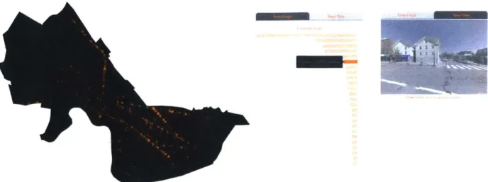
Figure 4: The map thumbnails from the youarehere.cc homepage shows the diverse forms that our maps took. Children 12 cidles Neighborhood Connected ness New York Hospitals by Condition New Y-k Menus 11 cities
hic cle Crashe, BAk, " H.rg
21 etics lu s
Themes
Among the many themes our team addressed through youarehere, I worked specifically with two groups of topics. The first considered impacts on our daily quality of life, which included food, noise, and our commutes. The second group included topics that described relationships between areas, for example the differences between areas as seen through income, or the growth of cities as seen through business registration records. Both the daily impact and the systematic view of public datasets continue to be central in the maps I have continued to make for this dissertation.
Two particularly relevant examples of the types of maps that I pursued independently are the "Noise Complaint" map and the "Fault Lines" map. The "Noise Complaints" map is a
visualization of New York City's noise complaints categorized by human and machine noise. New York City is full both of noise and also complaints that report noise (image below). In mapping noise, I saw that it was not enough to simply plot the locations of complaints, but also to have the complaints reflect something of the city. By color coding the complaints by whether they were caused by machines or humans, we can see how different Manhattan is from the other boroughs in the city. Additionally, we see the geographic concentration of machine noise in blue versus the more persistent human noises in red.
In the "Fault Lines" map, I highlighted a city's internal borders by visualizing the distinct differences between adjacent block groups in Los Angeles and other cities (image below). Diversity and geographical proximity make cities complex places where differences are
constantly being negotiated. The map is a directory of liminal spaces within the city; places that mark considerable statistical difference between adjacent urban areas in the categories of education, race, transportation, income, and occupancy. Through this visualization, we can see how some areas - specifically Census block groups - exist in isolation from neighboring block
groups in terms of certain aspects of the data, and also where more homogeneous areas are within a city.
Fault Lines Lo-4eIs'.
FagilinS "Vot"gII dl ( be-wnf bkkocIkfQu lo n
- 9- -JL L r i1 ) ' E i L! S1 q1 / ell' -.t-~ -L -, r? I-;L' jL 1 'I - Ilighe~ l~. - - ~ ~ P2
/I
r
-P describes a 15 % difference inresidents whose highest level of education is a Associate's
I-IA
Figure 5: The Fault Lines Map highlighting attainment.
neighboring areas with the biggest differences in educational
Figure 6: "Noise Complaints Map" of New York City.
Data
For the purposes of "youarehere" and projects going forward in this dissertation, all the data used come from sources and platforms that are visible to the public (see appendix of data sources). Public data refers to datasets that are directly open for use and analysis with no restrictions, or information that is in the public domain. In the context of this project, examples are datasets found on open data portals hosted by a branch of the government, as well as PDF files that are published by the government. Private data refers to data that have been obtained through APIs or through publicly visible websites. Relevant examples here are datasets on the travel time between two points obtained from the Google Directions API, and listings in the classifieds website Craigslist. While both the quantity and quality of publically available geospatial data has improved in recent years with the development of open mapping data
networks such as Open Street Maps community, our devices still utilize largely proprietary data: the Google and Apple mapping platforms.
The openness of datasets was crucial to our project. As we experienced first hand, both public and private data have varying degrees of openness. In the case of public data, we considered openness as defined by the five star scale from Tim Berners-Lee, includes the online availability and licensing, structure (is it structured to be machine readable?), format (is it structured in a proprietary format?), the use of URIs (Uniform Resource Identifiers for easy reference as metadata), and context(for linking to other data).1314 These factors contributed to our selection of datasets and map subjects. For example, we were able to map the health data of New York
13 The Open Knowledge Foundation's definition of Open Data 14 The 5 Stars are from Berners-Lee's 5stardata.info
City and State because of a recent publication of well documented records. The accessibility of the datasets at times determined what we prioritized in mapping and allow more open datasets to be easily and readily mapped. It was an important lesson that the openness of data is not an end, but rather a crucial part of its quality, and the determining factor on its power.
For APIs and website data that are private, a similar scale as above could be used to assess their openness. In our context, the openness of private APIs were expressed in the limitations in the terms of use (availability, cost and licensing), the accessibility of data (structure), the
flexibility of methods/programing languages allowed to access the data (format), the use of codes and entity names that are transferable between datasets, and the way data is linked to other relevant information. These limitations often determined the extent to which we are able to map a subject. For example, the granularity of locations (the grid) we can use to map
connections between places is dependent on the number of queries we can make over a reasonable period of time (i.e., how many queries we were able to make using a free API key).
Public Data Sources
We use three main sources of data, the U.S. Census, the open data portals hosted by individual states and cities, and the enigma.io public data platform. For Census data, which we used to get population density, age and other general demographic factors, we used the Social Explorer exporter as well as the government's own American Fact Finder. We were able to obtain different types of public datasets for New York City from the city's open data portal. Taking advantage of the comprehensiveness of the city's open data project, we used the available datasets in the portal as a guide to search for and request similar datasets from other cities.15
The enigma.io platform was useful in obtaining datasets that are otherwise scattered across different government agencies, such as business registrations, immigration, and visa data.
Private Data Sources
Private data sources are acquired using either APIs or web scrapers.
APIs included:
Google Addresses
Used to label locations with their street names to make the map metadata more easily readable. Incidents such as bike crashes or 311 calls which had latitude and longitude that required this process.
URL: https://developers.google.com/maps/documentation/geolocation/intro
Google Streetview
Streetview images were used to look at colors, parking, trees on the street, as well as to visualize marathon routes along streets.
URL: https://developers.google.com/maps/documentation/streetview/intro
Factual and Google Places
Factual is a location intelligence company that provided us with business listings and opening hours. We also used Google Places to determine some opening hours.
UR L: https://my.factual. com/data/t/places, https://cloud.google.com/maps-platform/
Google Directions
Google directions was used extensively to determine the time-distance, best mode of transportation, and connectivity between places.
URL: https://developers.google.com/maps/documentation/directions/intro
Web Scrapers (written by me): Craigslist
Used to obtain listings for 20 major cities to compare the jobs, housing, dating, and for sale sections.
Used to obtain menus for restaurants in the city to visualize what dishes and ingredients were found in each city.
Yelp
Used to obtain reviews to determine whether restaurants were reviewed by local or visiting users.
Units of Measurement and Their Representations
A significant outcome of our mapping project was knowledge of how cities can be represented through various datasets and where existing datasets fail us. Cartographers are familiar with the modifiable areal unit problem (MAUP). MAUP is a common issue encountered by cartographers and statisticians in the determination of proper scale of representation and tabulation for a particular dataset.16 When data is combined into larger units in the process of aggregation, the ways in which discrete points are grouped has the potential to distort the final representation of that data. A common example that those who do not work with cartography regularly would be familiar with is gerrymandering, in which boundaries with particular voting demographics are manipulated by grouping them in a highly specific way so that the resulting areas create advantages for a particular political party. As mapmakers with varying backgrounds outside of cartography, we also encountered the same issues of statistical bias inevitably caused by spatial aggregation in resolution (or scale) and zoning.
We explored this issue in the context of mapping cities and found a comparative and critical approach to discussing units of measurement and their representations. As a first step, we created multiple preliminary representations for the same data for initial assessment. The visualizations we tested included markers, sheds (heatmaps), areas (choropleths, dot density, heatmap grids), and edges (boundaries of administrative areas and physical streets).
Less Frequent More Frequent Transparency Size 0
0
0
Figure 7: Diagram of the markers we used for maps.
Geometric markers were used when a entry in the data described a specific coordinate (location of a single bicycle crash) rather than an area (the number of crashes in a neighborhood). 17
For data where geographical areas such as zip codes, census blocks, or neighborhoods are clearly defined by the data and assigned values, we used choropleth maps. We also used dot density representations when data is of a nature where it is appropriate, such as in the case of
populations and households (but not in the case of bicycle crashes). To aggregate data that are not aligned with administrative boundaries (bicycle crashes), we employed hexagon or square grids to create heatmaps. When data is available, shading was added to area maps to create sheds that indicate an additional dimension. For example, within an area that is serviced by the same subway station, the area is shaded according to the amount of time it took to reach that station.
17
Grid
Choropleth
Shed
Edge
Figure 8: Diagram of the area visualizations we used for maps.
Edges were used in two ways. The first is to highlight differences between two areas by drawing attention to their shared boundary (income discrepancy map). The second is to use physical
features such as streets to summarize data. For example, we created a histogram to provide an
overview of safety by street by mapping the bicycle crashes to specific streets and highlighting the most dangerous streets.
In the process of visualizing the same dataset in a variety of ways, we found that
communicating a dataset clearly often required a hybrid interface design where data can be view at different scales and both qualitatively and quantitatively. Using the bicycle crashes maps (below) again as an example, we create three particular views of data to compose the map. The
first plots the dataset itself to locate the crashes (left), the second to provide an overview by
summarizing the number of crashes by street (center), and the third to give a qualitative view of
Figure 9: The Bicycle Crashes Map contains three different views of data, geospatial, summary, and image.
From mapping each dataset, we came away with the understanding of the various units of measurement imposed on places. Among the units of measurement we encountered within our data, below are ones we found particularly useful in capturing the experience of cities in the process of applying data to maps.
Spatial dimensions of Measurement
Technology has historically changed our perceptions of distance.18 Quotidian technologies, from social networks to news coverage to ridesharing, constantly alter our perception of proximity and the level of complexity we encounter in a place. Understanding the differing demarcations and measurements on space made by these technologies is a significant part of studying how we make use of places.
* Digital neighborhoods are areas in a city that have concentrations of geo-located social media activity. Studies have found that common culture and language connects different parts of the city that are otherwise physically distant. 19
18 Virilio, Speed and Politics
* Historical units are formed around common heritage such as architectural character or cultural legacy. These are important in many cases, such as the historical connection of a neighborhood that has been fractured by the building of a highway, or the impacts legacy of zoning on a particular development.20
* Real estate units are based on the naming conventions d6rived from real estate trends of areas that have seen population and price increases and demographic shifts. These naming conventions are subjective, constructed primarily for commercial purposes, and are often highly contentious.21
- Time-distance based units are determined by the walking, transit, and driving ranges using time distance rather than physical distance. These take into consideration the infrastructure of roads and transportation, which are unlikely to change in short terms. Time-distance, in conjunction with cost-distance, describe the ease with which one is able to travel between two neighborhoods, cities, and even countries. The social, cultural, or financial connection between two places often defy the physical distance between them. The walkability of an area often determines the connectivity of amenities within that area and ultimately contribute to the liveliness of its streets.
- Amenities- determined units are formed by a division of different entities such as coffee shops, supermarkets, and houses of worship. The proportion of different types of amenities are a highly visible way to characterize an area.22
20 Spaan, NYPL Space and Time Directory
21 Woodruff and Wallace, Bostonography
Temporal Dimensions of Measurement
Some datasets have temporal dimensions that are important to the characterization of places. Temporal units can be described by cycles of activity and hibernation as well as by extended periods of change. Ephemeral units can be no less important than ones with more permanence. For example, sides of streets can be divided as separate units because of how places behave differently according to the quality of light they receive. Our team discovered this first hand when walking down Newbury Street in Boston on a sunny fall day and saw that pedestrians and shoppers congregated on one side and shifted with the sun. 23
In hourly, daily cycles and weekly cycles, the flow of people and quality of light change the immediate landscape of the city, while in seasonal cycles, the physical qualities of the city change in terms of weather, greenery, tourism and annual events. In even longer periods of gentrification and renewal, demographic shifts occur along with the economics and physical growth and decline of the city. Infrastructures for transit transforms neighborhoods but require many years for the transformation to be complete. While a small public garden is planted in a day and changes as the flowers bloom, its impact on the traffic in a neighborhood can be seen over months or years. The transit infrastructure drastically alters the image of the city, while the garden only the moods of those who walk by.
These episodic and rhythmic cycles are driven by both nature and human activity.2 4 In some
cases, changes to our environment occur at such a gradual pace that we do not readily sense it
23 We later found relevant technical work that deals with quantifying sunlight density. Mapping the
Shadows of New York City, published by Bus and White of the New York Times, with research conducted by Silva and Doraiswamy from Tandon School of Engineering at New York University
without mediation.25 Data allows us to map both the trajectory of business growth in an area over a long period of time, and also map smaller cycles of activity reflected by the opening and closing hours of the businesses that populate an area throughout the day. The health of a place as described by the longer trajectory of progress and its daily cycles of activity are
interdependent and equally crucial to our understanding of a place.26 These temporal and often
ephemeral qualities in data brings new dimensions to the traditionally static form. These temporal units of measurement also provide groundwork for the visualizations for individuals over time.
Measurements Summary
Temporal and spatial units of measurement can be combined to provide a more evocative picture of a place. Utilizing the relationship between datasets, scales, and perspectives is an important aspect in describing a place with layers and nuance. Qualities of place are dependent as much on the activity of its inhabitants as it is on physical structures. This intersection of individual will and infrastructure is a unique opportunity for the filtering of aggregate datasets through unique perspectives and stories.
25 Lynch, What Time is this Place? P.184-187
Spatial
Metiopolitan Statistical Area
- Sightl i ics Census Tract -Neighborhood ---- Daily GCInunut N Zipcode ---... N 11 ,1 'II) 2-1 1c-4 )sl ~ i I'd 4 4 24rl~ Ho \. i \ ki~ i t P2, .4 isi >4 Block Group tio n I k 14 1 1 A (I44 M\ Mil 4 I 1 1 Census Block -Block
Figure 10: A overview of spatial and temporal units as they are matched to experience
Assessment
Over the course of the year, we distilled what we learned firsthand and tested established design principles to construct a design pattern with which we can build future visualizations. Five initial and central principles that I continue to work with are explained below.
1. It should be easy to go from the micro to the macro, from the entire city view to the view
of the individual home/place and back again.
We started with the popular mantra "Overview, zoom, details on demand" from Ben
Shneiderman's landmark 1996 paper on visualization tasks.27 When working with data of the city, we needed to go between different scales to better understand the data in the visualization
process itself. We confirmed the significance of Shneiderman's mantra by observing our users in the lab when we demonstrated new maps. From these user observations, we saw that interactions with scales are often nonlinear, and users often go back and forth between overviews and small details. To make this type of interaction possible, we established the second and third principles.
2. Information elements should be navigation elements and vice/versa.
To aid the smooth transition between scales and views of data, it was crucial that almost every visual element on screen had an interactive function. Most commonly seen on our maps are the use of histograms, markers, and other parts of the information display as filters.
3. The visualization should give several different views into the data: e.g. the map, a
ranking/histogram, and a qualitative view when possible.
Demonstrated previously in the Bike Crashes map, we presented multiple views of the same data within each map. In most cases, this meant having a direct translation of the data onto maps, a summary view to communicate patterns and trends, as well as a qualitative view that gave the user an idea of what areas look like physically.
4. The visualization should aesthetically evoke the underlying data.
We struggled initially with visual design. It is difficult to build visual coherence out of many
mapmakers and varying subject matters. After discussions and design reviews of early maps, we arrived at the notion that visualizations should give some indication for the subject matter through its aesthetic. For example, maps of trees were green, and maps on migration included
motion. We used the subject matter as a primary visual design constraint and chose to simplify all other elements in design.
Storytelling is at the heart of our project to communicate a sense of place through daily
mapping. Although each visualization implicates a specific perspective, it is not always the case that the framing and editorial choices are made clear to the viewer. We knew that the best way to make our data structuring and visualization processes transparent was to integrate elements of them into the maps. We felt that how we arrived at the final map was a big part of the story we wanted to tell. For example, when possible we used histograms we relied on during data cleaning as a part of the final interface. However, the level of transparency we were able to achieve visually did not always reach our standards. For all maps, we included a text
explanation linked from the subtitle of the map. The text for each map closely follows a template that answered three questions: What the map shows, why we made it, and how we made it. This template was our way to demonstrate that our motivations for every map were closely tied to our design decisions.
More telling were perhaps the principles we believed to be valuable, but struggled to realize. There were two main goals that we were unable to fully achieve reach with our maps. These challenges are central to the questions I have taken on what I hope to address in the
dissertation research.
1. Make each map tell a story by re-orienting the viewer's knowledge of the city.
We wanted each map to be able to answer a question specific to the user. We wanted to turn the reading of our maps into an active encounter where the maps can serve as tools for the user to find data. We learned that interactivity doesn't always guarantee it can be useful as a tool to navigate data Reframing maps from artifacts with positions of authority into objects to critique and think with was a difficult challenge.
2. Use the cumulative power of interactions with maps over time to build relationships between individuals and their environment through data.
We were able to cover a wide range of topics with the roughly 150 maps we published over the course of this project. Internally, the process of mapmaking generated new ideas. For example, the connectivity of neighborhoods led us to think more deeply about transportation and explore the best modes of transportation between neighborhoods. However, we did not communicate these connections between maps to our users. We used a simple database structure to hold our maps and listed maps by city or by theme. This straightforward organization was oriented
towards searching and referencing, but not storytelling across maps.
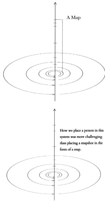
The subsequent work is partially inspired by turning these last two principles into goals. Both of these goals indicated to me that rather than considering a map as a snapshot in the system of measurements we had framed to describe the city, I would instead be considering maps based on the experience of an individual user or resident.
j
.
A
MapHow we place a person in this sysem was more challenging than placing a snapshot in the
form of a map.
Figure 11 - 12: We initially used the system of measurements we framed to create maps that described the city at different spatial and temporal levels. Going forward, I will be using the similar framework to discuss the experiences of an individual rather than a map.
The Census
The maps at the center of my dissertation are based on data from the US Census. Throughout this dissertation, I have made use of Census data from three main outputs: the decennial
Census, the American Community Survey, and the Public Use Microdata Sample (PUMS) of the American Community Survey.
The decennial Census is required of every person living in the United States and includes basic questions such as age, race, and gender. The American Community Survey, which is not comprehensive of the population, surveys a sample of 3.5 million Americans on a yearly basis. The survey contains detailed questions on both persons living in a household, and questions on characteristics of housing. The survey asks questions about a person's quality of life including a person's profession, income, education, commuting time, marital status, and health insurance status. Data from the American Community Survey is used as a primary dataset in all of the maps contained in this dissertation.
The PUMS is an untabulated sample of the American Community Survey. This sample
preserves individual responses and is not summarized by geography. The PUMS dataset is only used in the @censusAmericans Twitter bot.
The Census is the foundation for many private data enterprises. According to the 2017 Hamilton Project report on government data, public (government collected) data has always been used to ground private data collected by business or non-governmental organizations. For example, the American Community Survey has been used by businesses in the process of relocating or planning expansions to look at skill markets, age groups, and economic indicators associated with potential locations. In the age of big data, the collection and analysis of data are constantly ongoing. Scalability, the ability to predict and target data insights with precision, and the speed
of the turnaround are prized characteristics of data collection and processing. Within this context, the Census is distinguished by being comprehensive, consistent, and credible.
We can see, in the distribution and subsequent wider use of Census data, as well as its
development of the American Community Survey, how the Census has changed technologically over the years, as well as the impact of those changes. The development of the Topologically Integrated Geographic Encoding and Referencing(TIGER) system and the use of GIS software in the 1980s allowed the Census Bureau to administer, tabulate, and distribute results using uniform maps. In the 1990s, Census data began to be distributed on the internet via the
American Factfinder, a web interface for retrieving Census data that is still in operation today. As digital dissemination became the default method of accessing Census data, the potential of digital aggregation to improve methods of collection gave rise to plans for a rolling Census. The result, the American Community Survey, is a detailed survey that is sent out on a rolling basis every month to gather information on 3.5 million Americans every year. It was established as a country-wide program only in 2005.
As problematic as self-enumeration can be, there is also great comfort in being counted by our own definitions and in our own terms. Many private datasets do not afford us with such agency, collecting data instead from the automated output of our devices, transactions, and behavior online and in the physical world. The ability to define explicitly how we are counted and included as a part of the American public is important. This distinction makes the Census a unique public good.
Public goods have two defining characteristics, non-rivalry and non-excludability. Non-rivalry means that use by one person does not diminish the ability of others to share the same benefits of the public good. Non-excludability means that its utilization cannot be limited to specific parties. Census data, which is made publically available for use by many parties at the same
time, and distributed as a free resource should - in theory- fulfill criteria of the definition. However, as it is currently utilized - by businesses and institutions rather than individuals - the Census falls short of its potential to provide contextual knowledge of places in the United States to everyone with the same level of accessibility.
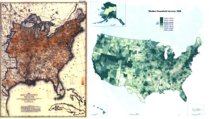
As a public good, the Census could potentially benefit individuals by enabling them to provide data that grounds decision-making for local governments and businesses. Census data is presented to users as datasets, and also as maps in the Census atlas. The first official Census map gave data for the year 1850; the most recent gave data for the year 2010. The information design in these maps has largely remained the same in the official Census atlases throughout this time. Below left is a Census of wealth distribution from the 1870 atlas, and on the right is the
"Median Household Income" map of 201 0's atlas.
RWbn HNuwehoud'em IM
Figure 13: (Left) Census map of wealth distribution, 1870.
Figure 14: (Left) Census map of "Median Household Income", 2010.
Innovative and humanistic ways to communicating Census data can often be found in work produced with specific users in mind. For investigative journalists, there is the Census Reporter
project, which "helps journalists navigate and understand information from the U.S. Census bureau." For New Yorkers, the local public radio station WNYC uses the Census as the lens to discusses the changes occurring in different parts of the city in the "Your Anecdotal Census" series, covering a different county in the New York area (ncluding parts of New Jersey and Connecticut that are adjacent.)
As a part of the "Your Anecdotal Census" radio show, local leaders, residents and demographic experts discuss changes in where they live based on their differing knowledge and expertise. A common conversation on the show starts with a listener calling in to describe a particular phenomenon that he/she has witness first hand while living in the county, and Census data experts responding to the listener's observations by contextualizing it with data and trends in found in Census data. The conversations are engaging because they originate from a local resident's unique perspective and become ways to ground the conversation on what larger trends in data show.
Design principles of maps for people
As the medium of our information consumption shifts from paper and TV to computer, tablet, and smartphone, interactive visualization has become an increasing part of the way we consume that information. Visualizations of such data as stock market trends and weather forecasts have long been a part of our daily diet of information, but they are increasingly
ubiquitous.
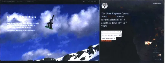
During the past election cycle, visualizations of forecast data in the form of confidence
barometers and electoral maps were also added to the front pages of major publications. Front and center on election night 2016 was the New York Time's forecasting needle, which swung wildly as votes were counted. As the night went on, the needle twitched its way across the
screen from a 80% Clinton victory to a 95% Trump one (image below). The needle graphic, highly criticized by readers and dubbed "a realtime panic meter", became known for its ability both to reflect and to cause anxiety in voters. However, by the time it returned a year later for senate races, the needle itself had become an election night staple and the subject of
discussion for readers.28
Cha t
of WIb* PfEntdcwy Poputar vote .a'ln
IL 7~
>95% Trump Clnton +1.3
Figure 15: The election needle that was first used
Pohential track ass: watches: Wa ngs:
Day 1-4 & Day 45 bte~ine TiiipSianll ia igi mIe doom
Ekebwani veo
3M6 Trump
on the night of the presidential election in 2016.
Figure 16: The Hurricane forecasting cone used by the National Hurricane Center to forecast the paths of storms. 29
The needle is significant because it symbolizes a turn in the way we represent data with graphics. The reason the needle shifted back and forth so dramatically and frequently over the course of the night was the result an important editorial decision made on the part of the Times. The Times purposefully designed their graphic to directly reflect the uncertainty of the real-time
28 The New York Times needle was first published in 2016, and reused in December 2017
29 The cone of uncertainty describes the evolution of the amount of uncertainty over the course of an
data. In their design discussion, the editors referenced a more familiar representation of uncertainty, weather forecasts. They point out that the cone of uncertainty, commonly used in describing the paths of hurricanes is an indispensible part of our visual language. The needle is, in essence, a graphical interpretation of the same cone. Representing nuance, uncertainty, and subverting the objectivity traditionally attributed to charts and graphs is a new and necessary challenge in the visualization of data outside of our weather system and elections as well.
Data humanism and Critical Practices in Cartography
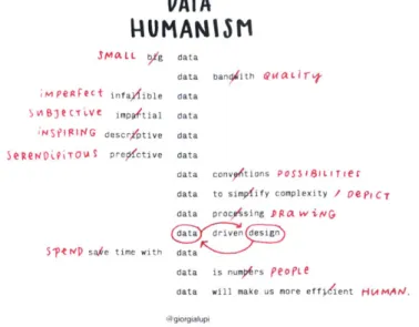
Data humanism, a term that the visualization expert Georgia Lupi has written and spoken at length about, encompasses some crucial new values emerging in the field of information visualization.
"Every act of perception is necessarily a highly directed and selective affair, whether
the guiding principles are conscious or inadvertent." -Martin Kemp
Data humanism describes the reorientation of the data visualization field from its main task of simply communicating data to connecting knowledge to behaviors and people. The term can best be summarized as the drawing by Lupi below.
DATA
WUMANrIM
SMO.LL b/g datadata ban ith eoaLiT-iMpegreCt infay/ible data
SOS~t('T Ve imp tial data
;NSIpNG descr/ptive data
Se Neio ,PITOUI preglctive data
data convyptions POSS 1 81L T ieg
data to simpfify complexity / P C T
data procAsing P Pot w NG ndesign S14eVD sahe time with data
data is numors peOete
data will make us more effi6'ient HVMAI/J
@giorgialup
Figure 17: A drawing accompanies Lupi's original article on the concept of Data Humanism. 30
Figure 18: Wood's map of pumpkins on front porches in Everything Sings, a atlas of his Boylan Heights neighborhood in Raleigh, North Carolina
The ideas found in Lupi's list are similar to those explored in critical cartography and
experimental geography. Both data humanism and critical cartography present highly personal and subjective ways to deal with data. Experimental geography deals with the notion that
30 From Lupi's Medium article: Data Humanism. the Revolution will be Visualized.
cultural production is inextricably tied to the physical production of space.31 By building experiences (films, performances, music, instructions), spaces (observatories, ditches, walls, windows, etc.) or tools (augmented reality, maps, GPS applications) that alter our perspective of the built environment, works in this field have the potential to bring forth conditions
(preconceived notions and behaviors) that otherwise go unquestioned. Particularly relevant to the work at hand are the maps of critical cartographer Denis Wood, the idea of "geographical intimacy", and the Situationist concept of the d6rive.
The themes of small, qualitative, imperfect, and human data are especially resonant in Wood's work. Wood's atlas Everything Sings demonstrates the highly selective nature of maps by using formal cartographic language to depict his hometown with idiosyncratic data. In doing so, the top down viewpoint that give traditional maps so much power is subverted by the content. More important to my research, Wood's topics are vernacular, the maps evocative and memorable because they are driven by a slowly formed familiarity with place that is based on first hand experience. Wood's Everything Sings and Lupi's data humanism definition use mapping or visualization to provide a critical lens for people to view their highly personal relationship with their experiential and conceptual environment. 32
In mapping and visualizations, the critical lens also highlights the fact that data never speaks for itself. It speaks through a prescribed narrative and from a specific perspective. Both are dictated by the author of the visualization or map. The following sections will further explore perspective (and personalization) and narrative as digital texts shift from being determined by authors to being shaped by readers.
31 Thompson, Kastner, and Paglen in Experimental Geography
Personalization of aggregate data
It's been said time and again that we have unprecedented access to public data as citizens. However, how well we digest such data is still a point of contention. In this dissertation, I propose that one way for users to understand aggregate data is to create ways of connecting large datasets to personal experience. This means both allowing users to find themselves in the data, to make use of the data by posing their unique questions to it, and having repeated
encounters with the dataset over time. The idea of the d6rive, which stems from experimental geography practices, further illustrates the power of making personal connections to large phenomenon.
For the Situationists, experiencing the city through daily acts such as walking can be a way to change one's mindset and one's perspective of a familiar environment. The practice of a d6rive, developed by Guy Debord and the Situationists,33 asks urban residents to become conceptually
untethered to daily purpose by physically becoming lost. It asks its participants to take long unplanned walks and be directed by physical and social encounters as they occur rather than to fulfill specific functions in their day. The practice is a purposeful disruption of the behaviors that are imposed on residents of a city through the city's physical infrastructure. In the context of interacting with data, a d6rive among a dataset can be a series of links that takes the user along an unexpected journey.
The discovery that a traveler makes in the process of a d6rive is, above all, self discovery, as in theory she will end in the place she is most interested in finding. The d6rive can be made both through a space on foot, or through a dataset online. For example, a online d6rive for me
33 Ideas that also draw on Benjamin's Arcade Project and his description of the French tradition of the
through Wikipedia might start at at Wayne County, Tennessee, and travel through Roman Catholic Women priests, before landing inevitably in Anna Wintour.34 At a glance, we could see wikipedia as its 5,608,851 English articles.35 The path through the 20 or so articles between Wayne County and Anna Wintour does not give the user an overview of the size and scope of Wikipedia as simple set of numbers would. Nonetheless, it informs the reader in a memorable way of the significance of what is contained and the reasons for its being. The significance of Wikipedia in the abstract, and its subjective experience to a given reader are better expressed by a walk on the ground than the view from 30,000 feet.
Current efforts to make personalizations a reality include two major groups of examples. The first is the personalization of web articles for readers that are made by digital publications such as the New York Times, a feat that was not possible in print newspapers. The other is the suite of tools and visualizations associated with the "quantified self" movement, a collective pursuit of self measurement takes forms ranging from wearable devices to daily drawing exercises.
Personalized Interfaces for Readers
In recent graphical output of several major news institutions, personalization aspects of interactive graphics are growing more prevalent. These are interactive graphics that are designed to change depending on the input or characteristics of individual readers. These graphics use information solicited from the user or the user's computer as a lens through which users can understand either complex data or very general data. They also aim to increase the
34 An exercise for those who would like to discover their true interests: Use the "random article" feature of Wikipedia as the starting point. Click on outlinks from the article that interests you and within 20 clicks
you will land on something you are not only extremely interested in, but also deeply familiar with.
memorability of data through engaging personal beliefs of the reader. There are three types of interactions that reflect an aspect of the reader to increase engagement.
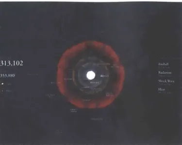
The first type of user-input places the reader physically at the center of national stories by using IP address geolocation to filter the story's data and create content for the reader's location. It is the most automated, least visible, and perhaps most intrusive of the three. Geolocation is used when comprehensive datasets with national coverage may only be of interests in local slices. For example, in "The Best and Worst Places to Grow Up: How Your Area Compares", instead of providing a national ranking of best and worst places, the county you are located in is the starting point of the story. In the Outrider Foundation's interactive visualization effects of nuclear weapons, the user's location is used as the center of the blast, making the affected areas and population counts immediately relatable and more intuitively understandable.
The Best and Worst Places to Grow Up: How Your Area Compares U04."
OGvn wto ON up In som s m a 0 Wceh gon a XM Vma n m. Pu, t um if thupw u nre. uauwnwweu
lEk E INLM -E9Mfk
Manhattan is very bad for income mobility for children in poor families. It Is better than only about 7 percent of counties.
Figure 19: "The Best and Worst Places to Grow Up: How Your Area Compares" geolocates the user as a starting point for the story.
Figure 20: Outrider Foundation's interactive visualization effects of nuclear weapons.
A second type of interactive visualization solicits input from readers based on their knowledge of the story topic before presenting readers with the correct information. In the most popular case, the New York Times' "You Draw It: How family Income Predicts Children's College
Chances" (figures below) prompted readers to draw a trend line of how income correlates with the probability of college attendance on the top of the story page, before being shown the actual data. What Times editors found was that this not only increased the amount of engagement with the story itself, the response to the content was also stronger. Follow-up articles reported that readers were able to remember how important a factor income is in the attainment of higher education because many were surprised by the difference between their guesses and the actual trendline. The format of having the user guess at a phenomenon before informing them of the facts has since been repeatedly used on other subjects, as shown below.