HAL Id: hal-01133595
https://hal.inria.fr/hal-01133595
Submitted on 20 Apr 2020
HAL is a multi-disciplinary open access
archive for the deposit and dissemination of
sci-entific research documents, whether they are
pub-lished or not. The documents may come from
teaching and research institutions in France or
abroad, or from public or private research centers.
L’archive ouverte pluridisciplinaire HAL, est
destinée au dépôt et à la diffusion de documents
scientifiques de niveau recherche, publiés ou non,
émanant des établissements d’enseignement et de
recherche français ou étrangers, des laboratoires
publics ou privés.
Storytelling in Information Visualizations: Does it
Engage Users to Explore Data?
Jeremy Boy, Françoise Détienne, Jean-Daniel Fekete
To cite this version:
Jeremy Boy, Françoise Détienne, Jean-Daniel Fekete.
Storytelling in Information
Visualiza-tions:
Does it Engage Users to Explore Data?.
CHI 2015, Apr 2015, Seoul, South Korea.
Storytelling in Information Visualizations:
Does it Engage Users to Explore Data?
Jeremy Boy
Inria, Telecom ParisTech,
EnsadLab
Saclay, Paris
[email protected]
Franc¸oise Detienne
CNRS, Telecom ParisTech
Paris
[email protected]
Jean-Daniel Fekete
Inria
Saclay
[email protected]
ABSTRACTWe present the results of three web-based field experiments, in which we evaluate the impact of using initial narrative vi-sualization techniques and storytelling on user-engagement with exploratory information visualizations. We conducted these experiments on a popular news and opinion outlet, and on a popular visualization gallery website. While data-journalism exposes visualizations to a large public, we do not know how effectively this public makes sense of interactive graphics, and in particular if people explore them to gain ad-ditional insight to that provided by the journalists. In contrast to our hypotheses, our results indicate that augmenting ex-ploratory visualizations with introductory ‘stories’ does not seem to increase user-engagement in exploration.
Author Keywords
Narrative visualization; storytelling; social data analysis; engagement
ACM Classification Keywords
H.5.m. Information Interfaces and Presentation (e.g. HCI): Miscellaneous
INTRODUCTION
In this article, our interest is to assess whether augmenting ex-ploratory information visualizations with initial narrative vi-sualization techniques and storytelling can help engage users in exploration. Many online data graphics use narrative de-sign elements to explain a given dataset in a straightforward and compelling way. According to New York Times graphic editors Mike Bostock and Shan Carter [5], these explanatory graphicsare preferable for data-journalism, as they have the advantage of exposing up-front what the main insights from the data are, without making people “have to work for them.” However, most only provide limited interactivity [24, Fig.7], which reduces the potential for personal extraction of insight. In essence and by definition, Information visualization (In-fovis) is interactive and exploratory. Thus, finding ways to
2015 Association for Computing Machinery. ACM acknowledges that this contribu-tion was authored or co-authored by an employee, contractor or affiliate of a nacontribu-tional government. As such, the Government retains a nonexclusive, royalty-free right to publish or reproduce this article, or to allow others to do so, for Government purposes only.
CHI 2015, April 18 - 23 2015, Seoul, Republic of Korea. Copyright c 2015 ACM 978-1-4503-3145-6/15/04$15.00. http://dx.doi.org/10.1145/2702123.2702452
make exploratory graphics more accessible and engaging to people is important, because if open/public/civic data is to truly empower people, then these people should be able to use appropriate tools to gain their own insights and knowledge— not only that provided by journalists in articles written or de-signed from a specific perspective. Here, we explore the po-tential of narrative visualization techniques and storytelling to trigger this desired user-engagement. By engagement, we specifically mean a user’s investment in the exploration of a visualization. We present the results of three web-based field experiments, in which we compare user-behavior on a series of exploratory visualization webpages we designed that either included an initial ‘story’, or did not.
After the background section of this article, we describe the design of our first experiment, present our analysis of user-behavior, and discuss our results. In Section 4, we present the design of our two follow-up experiments, and discuss our re-sults. Finally, in Section 5, we conclude with the implications of these results, and give perspectives for future work.
BACKGROUND
One of the main purposes of Infovis is insight [18], which is usually gained through data exploration. Yet, to trigger an exploratory behavior, North suggests that users need to have initial questions; after that, they can go “beyond those initial questions in depth and unexpectedness” [18]. Exploratory be-havior is related to question articulation in what Marchionini calls “information seeking” [16], where the process of ques-tion articulaques-tion, interacques-tion with the query system, and re-flective consideration of the outcome is the basis for “infor-mation tasks” [16]. An infor“infor-mation task is “the manifestation of an information seeker’s problem and is what drives infor-mation seeking actions.”However, exploring an information-rich environment is rarely a single task activity, but rather a process in which each new action is the result of a set of in-tricate decision points derived from the previous action [25]. Toms describes this information interaction [25] process as a loop that cycles until a satisfactory amount of information is retrieved and integrated. According to Toms, users can initi-ate the interaction either by formulating a goal, or simply by deciding to examine a body of information. They then select or query a subset of this information, and scan it. When a cue is detected, they stop to examine the data, and if it is rel-evant, they extract and integrate it. Users can then recycle in multiple, nonlinear ways through each step.
While these models nicely conceptualize the process of ex-ploring an interactive-information-rich environment, they as-sume that users have a relatively clear initial intent or ques-tions in mind, and that they are capable of formulating appro-priate queries using the interface. However, in the context of an online exploratory visualization, where viewers may not have specific background knowledge about the data or about visualization systems, question articulation and data querying may be problematic. As such, designers and researchers [12, 15, 17, 23, 24] have suggested that storytelling can be used to trigger user-interaction and exploration, as it can provide the preliminary questions [24].
Narrative Visualizations
Hullman & Diakoplous define narrative information visual-izations as “a style of visualization that often explores the in-terplay between aspects of both explorative and communica-tive visualization. They typically rely on a combination of persuasive, rhetorical techniques to convey an intended story to users as well as exploratory, dialectic strategies aimed at providing the user with control over the insights she gains from interaction”[15]. This interplay raises a tension previ-ously identified by Segel & Heer between author-driven and reader-driven scenarios [24]. Author-driven scenarios follow a linear structure intended by the author. In their most ex-treme incarnation, they provide no interaction. On the con-trary, reader-driven scenarios give control to the person re-ceiving the information by providing an open system, and allowing free interaction. Note that interactive narrative vi-sualizations rarely fall directly into either of these categories, but rather somewhere along a spectrum between the two. In this article, we investigate whether author-driven scenarios can help initiate reader-driven ones.
Segel & Heer also propose a design space for narrative de-sign elements [24, Fig.7], and identify three common struc-tures of interactive narrative visualizations: the Martini Glass structure, the Interactive Slideshow, and the Drill-Down story. Here, we focus on the first two. The Martini Glass has a two-stage structure: first, the user goes through a relatively heavily author-driven scenario, in which the visualization is introduced through the use of text, annotations, nicely crafted animations, or interesting and evocative views. Second, when the author’s intended narrative is complete, the user is put in charge and can actively explore the visualization following whichever path s/he considers most interesting. Thus, the authoring segment should function as a “jumping off point for the reader’s interaction” [24]. The Interactive Slideshow structure follows a standard slideshow format, and allows for mid-narrative interaction within each slide. These may fol-low the Martini Glass structure by presenting the author’s intended story before inviting the user to interact with the display. Thus, this structure is more balanced between the author- and reader-driven approaches.
While these frameworks are very useful for matters of de-sign, it is still unclear whether the use of narrative visualiza-tion techniques in an introductory author-driven scenario can effectively lead to user engagement in a later more reader-driven scenario. Segel & Heer report some results of the
de-ployment of a narrative visualization (The Minneasota Em-ployment Explorer) [24], but the intent of the study was to create and measure social engagement in the annotation of data with personal stories, rather than personal engagement in the exploration of provided data. Although we agree with Segel & Heer that an author-driven scenario is likely to help users articulate initial questions for exploration, we question whether it is sufficient for going “beyond those initial ques-tions in depth and unexpectedness” [18].
User-Centered Metrics and Behavior
Measuring a user’s level of engagement in the exploration of data is a complex matter, specially when it comes to online mass-media. Acquiring the necessary qualitative information is impractical, if not impossible. As such, we need to find appropriate behavioral proxies that can describe an analytical and/or exploratory intent.
Gotz & Wen have modeled patterns of user-behavior in terms of analytic actions [14]. They identify four common patterns: Scan, Flip, Swap, and Drill-Down. A Scan pattern describes an iterative set of inspection actions of similar data objects, and indicates a user’s intent to compare attributes of these objects. A Flip pattern describes an iterative set of changes in filter constraints, and indicates a user’s intent to compare multiple sets of the data. A Swap pattern describes an itera-tive set of rearrangements of the order in which dimensions of the data are presented, and indicates a user’s intent to find cor-relations between various dimensions. Finally, a Drill-Down patterndescribes an iterative set of filter operations on or-thogonal dimensions of the data, and indicates a user’s intent to narrow the analytic focus to a targeted subset of the data. From a broader perspective, Rodden et al. have proposed a set of user-centered metrics for Web analytics, which they categorize in the HEART framework: Happiness, Engage-ment, Adoption, Retention, and Task success [21]. Some of these metrics are attitudinal and subjective, and do not fit our present needs. Others however, are behavioral and seem ad-equate for assessing a user’s involvement with the webpage. Typically, Engagement is measured with metrics such as fre-quency, intensity, and depth of interaction.
While choosing appropriate metrics is essential for reveal-ing underlyreveal-ing qualitative traits, these need to be related to a goal, and must be identifiable through different signals [21]. Here, our goal is to see whether augmenting exploratory in-formation visualizations with initial narrative visualization techniques and storytelling can help engage users in explo-ration; we use low-level user-activity traces as signals, and we focus on analytic actions (which we refer to as semantic operations), and engagement—typically depth of interaction, which we interpret as the number of interactions a user per-forms that have a direct and perceivable impact on the display.
CASE 1: THE CO2POLLUTION EXPLORER
In the rest of this article, we describe the design and results of our three field experiments. For each, we created a specific exploratory visualization webpage with two versions: one that included an introductory narrative component, which told a short ‘story’ about the topic and context of the data,
provided initial insights and unanswered questions, and in-troduced the different visual encodings; and another that did not. Each version, which we respectively refer to as the Sto-rytelling (ST) version and the no-ST version, was alternately assigned to new browser connections; returning connections were reassigned the same version using a Cookie. Thus, our experimental design was between-subjects.
By comparing user-behavior between versions, we seek to determine whether augmenting such a visualization with an introductory ‘story’ can help engage users in exploration. Our first field experiment was conducted with the CO2 Pol-lution Explorer [1], which was first published in English
onvisualizing.org, a popular online visualization gallery,
then in French on Mediapart, a popular French news and
opinion outlet. The visualization was referenced as one
of the “Best of the visualisation web... January 2014” on
visualisingdata.com, and was curated in the “Visualizing
Highlights: March 2014” onvisualizing.org. It was also
picked up by bloggers onreddit.com, citylab.com, vari-ous other sites, and social media. Altogether, the webpage received roughly four thousand unique browser connections between January and June 2014.
Design
The CO2Pollution Explorer presented a dataset on the yearly evolution of CO2 emissions in different countries of the
OECD. The two main graphical components were a CO2
Pol-lution Map [6], showing the emission of each country as an animated smoke cloud, and a line graph, showing the evo-lution of emissions over time. The narrative component in the ST version was designed as a heavily author-driven (al-though “user-directed”) slideshow with messaging, that in-cluded five stimulating default views (or sections). These were sequenced using a set of stepper-buttons, which trig-gered various animated transitions [24, Fig.7]. Each section followed the general layout shown in Fig.1a, and interactions were limited to clicking on the stepper-buttons and hovering over the graphic—this displayed an inspector with country names and/or total CO2emissions. This design was directly inspired by many well accepted and highly acclaimed NY-Times graphics [22]. After the narrative component, the web-page ‘opened up’ (similarly to the Martini Glass structure) to an Explore section, which included only a small amount of messaging, and introduced several extra interactive features that visitors could freely use to explore the dataset. This sec-tion followed the layout shown in Fig.1b, and was what visi-tors assigned to the no-ST version were shown.
Metrics
Using the categories of interaction described by Yi et al. [27] and inspired by Gotz & Wen’s analytic actions [14], we cre-ated the following taxonomy of semantic operations users could perform with the CO2Pollution Explorer. Each level corresponds to one or several low-level interactions with spe-cific features of the interface (presented in brackets).
• inspect: show the specifics of the data [hover line graph, hover line graph dot, hover map]
• connect: show related items [hover list]
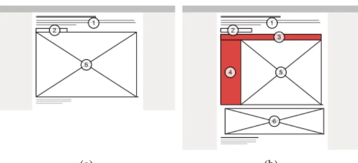
1 2 5 (a) 1 2 5 6 4 3 (b)
Figure 1: General layouts for sections in the narrative compo-nent (a), and for the Explore section (b). 1) short descriptive paragraph (messaging), 2) stepper-buttons (to navigate be-tween sections—only in the ST version), 3) query-buttons, 4) list of country names and query checkboxes, 5) main graphic, and 6) secondary graphic. Additional interactive features in the Explore section are highlighted in red.
• select: mark something to keep track of it [click line graph, click line graph dot, click map, click list label]
• filter: show something conditionally [click list checkbox, click “Show All Countries/Remove All Countries” button] • explore: show something else [click query-button] • narrate: show a different section [click stepper-button] To make sense of the four thousand sessions we collected, we performed some initial filtering and manipulations: 1) Since the webpage was designed for desktop browsers, we removed all mobile device connections. While displayable on such de-vices, the visualization offered certain interactive capabilities that touch displays do not handle (e. g., hovering). In addi-tion, mobile device displays are generally smaller than desk-top ones, and we could not assert that the visualization fully fitted the screen resolution, or that if it did, it would not be too small to read and interact with. 2) While several sessions were those of returning browser connections, we considered each of them individually. Return is a good indicator for user-engagement [21]. However, analyzing aggregated sessions would have created major outliers for other metrics such as uptime or depth of interaction. In addition, while it may be conceivable that certain users opened the page, read or ex-plored it for a moment, then turned to another activity, only to later come back and finish their exploration, our traces do not show whether users remembered what they had previously done or that they were not distracted by some external fac-tor. In line with this, we also set a ten minute threshold for inactivity within sessions. Each session in which two con-secutive traces were separated by ten or more minutes were split in two. 3) We removed all browser connections that had arrived to the webpage through social media and per-sonal blogs. This allowed us to categorize two different vis-itor populations: on the one hand, we had visvis-itors coming from visualization gallery websites, which we consider to be a visualization-savvy population, and on the other hand, we had visitors coming from Mediapart, which we consider to be an information-savvy population, but with a priori no par-ticular interest in visualizations—since Mediapart very rarely publishes interactive data-graphics. 4) Finally, several of the browser connections in our traces were ours, as we had orig-inally used the live version for debugging and demoing.
Un-fortunately, we had no direct method for removing these ses-sions, since UUIDs were random and anonymous. However, we never communicated the URL directly, and it was hard to guess or remember. Therefore, to filter out our own ses-sions, we removed all connections that had no previous page URL. In the end, this procedure resulted in a subset of 2975 sessions.
To obtain practical metrics, we coded the visitor-activity traces in the following way: 1) We attributed session IDs to each returning session and computed the uptime of all ses-sions. We also separated out the time visitors in the ST ver-sion spent in the narrative component and the time they spent in the Explore section. 2) We counted the total amount of click and hover interactions, and extracted all meaningful in-teractions. We define meaningful hover interactions as hover interactions that affect the display (e. g., an inspector overlay) and that last longer than 250ms, so that the user can perceive its effect on the display;and meaningful click interactions as click interactions that occur on interactive features of the dis-play (i. e., not random clicks anywhere on the disdis-play). We then added these meaningful interactions to get a total mean-ingful interactionscount per session. 3) We separated out the different semantic operations, and we repeated the interac-tions coding procedure for the Explore section alone (in the ST version). This provided us with comparable values for identical settings in both versions. 4) Finally, we coded the sections visitors inspected in the ST version in a dichotomous way: inspected sections were coded 1 and all others 0; and we controlled for linear sequencing of these sections by looking for the pattern [1, 2, 3, 4, 5, Explore] and coding 1 when matched, and 0 otherwise.
Hypotheses
Our analysis was driven by two qualitative hypotheses. The first was that the narrative component should effectively im-merse users in the ST version,resulting in the fact that they should read through the whole ‘story’ at least once in a lin-ear fashion, and the second, that the presence of this narra-tive component should effecnarra-tively engage users in the explo-ration of the data,resulting in higher user-activity levels in the Explore section of the ST version than in the whole no-ST version. However, verifying such qualitative hypotheses in a web-based field experiment is impractical. Therefore, we operationalized them with the following six quantitative hypotheses:
• H1.1 (whole webpage): Visitors in the ST version spend more time on the webpage than those in the no-ST version, • H1.2 (whole webpage): Visitors in the ST version perform more meaningful interactions with the webpage than visi-tors in the no-ST version,
• H2.1 (ST version only): A majority of visitors in the ST version inspect all six sections of the webpage,
• H2.2 (ST version only): A majority of visitors in the ST version inspect the six sections in a linear fashion, • H3.1 (Explore section only): Visitors in the ST version
spend more time in the Explore section than visitors in the no-ST version, and
• H3.2 (Explore section only): Visitors in the ST version perform more semantic operations in the Explore section than visitors in the no-ST version.
We conducted separate analyses for the two populations men-tioned above; each was composed of three phases. First, we looked at the general differences between the ST and the no-ST versions. Then, we inspected the ways in which visitors in the ST version inspected the narrative component. Finally, we compared the ways in which visitors behaved in the Explore section between versions.
Results
In the following subsections, we present the results for the information-savvy population (1270 sessions). In the subse-quent Discussion section, we simply report the similarities and discrepancies we found with the visualization-savvy pop-ulation (1705 sessions). With respect to the concerns and rec-ommendations in [4, 9, 11], we base all our analyses and dis-cussions on estimation, i. e., effect sizes with confidence in-tervals (95% CI). Effect sizes are reported as ratios between values for the ST version and values for the no-ST version. All point estimates and 95% CI are based on 10000 percentile bootstrap replicates of the statistic applied to the data [7].
Whole Web-Page Analysis
The first part of our analysis focused on standard aggregated Web analytics (i. e., total uptime and click-count). We be-gan by inspecting the webpage’s uptime in both versions. We applied a logarithmic (log) transformation to the data in an attempt to normalize their distributions. Nevertheless, the dashed histogram in Fig. 2 shows a bimodal distribution, and the one in Fig. 3 is skewed. To explain this, we looked at the day of the week and the time of the day at which visitors con-nected to the webpage, expecting that during working hours, sessions would be shorter. This was not the case. Pursuing, we considered that the abnormality of the distributions might be due to bouncing behaviors. The Google Analytics Help page [13] defines bounce rate as the percentage of single-page visits. While this definition is not directly applicable in our case, since we use a single dynamic page, we inter-pret this metric as the percentage of visitors who perform no click interaction on the page—since seeing different pages of a website boils down to clicking on a series of hyperlinks1. We emphasize that this interpretation strictly concerns the ab-sence of click interactions, since hover interactions may be incidental.
[step 1] 19.2% of sessions in the ST version and 14.6% in the no-ST version showed a bouncing behavior. The geometric mean (GM) durations of these sessions were 9.5 seconds (s) and 17.9s, respectively. We expected this to be the result of returning users who had already read the story and/or seen the visualization. However, the return IDs showed that 88/122 (71.9%) bounces occurred in first-time connections in the ST version, and 65/93 (70.4%) in the no-ST version.
1In some cases, the bounce rate is not a “negative” metric: visitors
may just find the information they need on the first page without having to perform an interaction. However, in our case, the amount of information readily available on page-load is quite low.
[step 2] We removed all bounced sessions from further analy-sis, and plotted the uptime distributions again. The solid his-tograms in Figs. 2 and 3 show that they are now near-normal.
2 4 6 8 10 12 14
0
40
80
120
Log second units
Fr
equency
Figure 2: Log uptime distribution in the ST version.
2 4 6 8 10 12 14
0
40
80
120
Log second units
Fr
equency
Figure 3: Log uptime distribution in the no-ST version. In both of these Figures, dashed histograms represent distri-butions before removal of bounced session, and solid his-tograms represent distributions after removal.
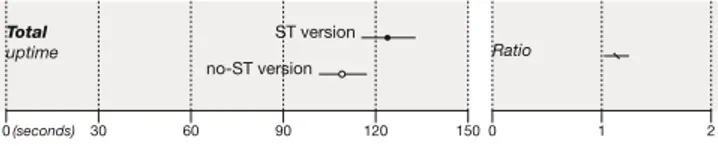
[step 3] We then compared uptime in both versions. Fig. 4 provides evidence that visitors in the ST version spent more time on the webpage (GM = 123.8s, 95% CI [115.3, 132.9]) than visitors in the no-ST version (GM = 101.6s, 95% CI [101.6, 117.1]), since the ratio is above 1.
0(seconds) 30 60 90 120 150 0 1 2
Ratio
Total
uptime ST version
no-ST version
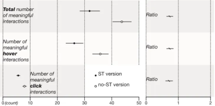
Figure 4: Geometric mean uptime with 95% CI and ratio. [step 4] Next, we turned to the number of meaningful interac-tions. Visitors performed on average 42.7 meaningful inter-actions, 95% CI [39.3, 46.3] in the ST version, and 43.7, 95% CI [40.3, 47.3] in the no-ST version (Fig. 5). This provides no real evidence of a difference between versions.
[step 5] We then conducted separate comparisons of the meaningful hover and click interactions. Fig. 5 provides little evidence that visitors in the no-ST version performed more meaningful hover interactions. However, it provides good ev-idence that visitors in the ST version performed more mean-ingful click interactions.
Narrative Framework Analysis
The second part of our analysis focused on the narrative framework, and the way visitors in the ST version navigated through the different sections of the narrative component and the Explore section.
[step 6] We began by looking at the number of sections vis-itors had inspected. In all sessions, visvis-itors saw more than one section; in 77.5%, they saw the Explore section; and in 71.7%, they saw all six sections. Similarly to the bounce rate, we expected that the sessions in which visitors did not inspect
0(count) 10 20 30 40 50 0 1 2 Total number of meaningful interactions Ratio Ratio Ratio Number of meaningful hover interactions Number of meaningful click interactions ST version no-ST version
Figure 5: [steps 4 and 5] Meaningful interaction means with 95% CI and ratios for the whole webpage.
all sections would be returning visits, where visitors would have already seen some (if not all) of the content. However, the return IDs showed that 125/145 (86,2%) of these sessions were first-timers.
[step 7] We removed all sessions in which all six sections had not been inspected from further analysis, and turned to the number of sessions in which the narrative component and the Explore section had been inspected in a linear fashion. Only 130/367 (35.4%) met this requirement.
Explore Section Analysis
The last part of our analysis focused on comparing visitors’ behavior in the Explore section between versions. Remember that in the no-ST version, visitors were only shown the Ex-plore section, so the time they spent and the interactions they performed in this section are the same as those for the whole webpage [steps 1 through 5].
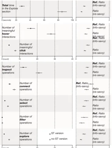
[step 8] We began by looking at the time visitors spent in the Explore section. These durations were normally distributed (once log transformed) for both versions, and their geometric means and 95% CI (Fig. 6) provide good evidence that visi-tors in the no-ST version spent twice as much time in Explore section as visitors in the ST version did (108.8s>54s).
0(seconds)20 40 60 80 100 120 0 1 2 Ratio Total time in the Explore section ST version no-ST version
Figure 6: Geometric mean time spent in the Explore section with 95% CI and ratio.
[step 9] Next, we compared the amount of meaningful in-teractions. Fig. 7 provides good evidence that visitors in the no-ST version performed more hover and click interactions than visitors in the ST version.
[step 10] After that, we turned to the semantic operations vis-itors performed. We did not consider narrate operations here, as they were not available in the no-ST version. A summary is given in Fig. 8. All CI and effect sizes, except for connect operations, provide good evidence that visitors in the no-ST version performed more semantic operations than visitors in
0(count) 10 20 30 40 50 0 1 2 Total number of meaningful interactions Number of meaningful hover interactions Number of meaningful click interactions Ratio Ratio Ratio ST version no-ST version
Figure 7: Meaningful interaction means with 95% CI and ra-tios for the Explore section alone.
the ST version. The figure also provides good evidence that in both versions, visitors mainly performed inspect operations. However, the most surprising finding here is that nearly no visitor at all performed filter operations.
5 10 15 20 25 0(count) 30 0 1 2 0.5 0.75 0.25 1 0 (count) 0 1 2 Number of connect operations Number of inspect operations Ratio Ratio Ratio Number of select operations Number of filter operations Ratio Ratio Number of explore operations ST version no-ST version
Figure 8: Semantic operation means with 95% CI and ratios for the Explore section alone. The numbers of filter opera-tions are plotted with a different scale, as they are very small.
Discussion
H1.1 is confirmed by our results [step 3]. However, the 20% bounce rate in the ST version [step 1] might indicate a cer-tain miscomprehension of the purpose of the stepper-buttons: visitors may not have realized that it was possible to display other content. While we did not pilot-test the usability of these buttons per se, we did show the ST version to several people before publishing the webpage (including our editor at Mediapart), and the stepper was not an issue. Thus, another explanation, when considering the 15% bounce rate in the no-ST version and the fact that most bounces in both versions were first-time sessions, might simply be that visitors had trouble displaying the webpage; one visitor reported this, and attributed it to the browser extension Ad Block Plus (ABP). H1.2 is only partially confirmed, as visitors in the ST version only performed more click interactions [step5]. Although
these two conclusions seem rather obvious (since there was more content in the ST version), and it may be argued that on this level, the two versions are difficult to compare, this infor-mation can be valuable for a publisher, who may simply want to know what format will increase the uptime and click-count of his/her article.
H2.1 is also confirmed [step 6]. To estimate whether these visitors actually read the textual content of the narrative com-ponent, we conducted a post-hoc analysis to determine their word per minute (wpm) score. wpm is a standard metric for reading speed [8, p.78], and according to [20], the average French reader’s score is between 200 and 250 wpm. Visitors spent roughly 78s (GM) in the narrative component, where there were altogether 269 words to read. Their average wpm is thus 207, which makes it plausible to assume that they read the story, even if they spent extra time inspecting the graphics. H2.2 however, is not confirmed [step 7]. This reinforces our idea of a possible miscomprehension of the purpose of the stepper-buttons. These may not have been explicit enough to convey the idea of a linear narrative(P1)2.
H3.1 and H3.2 are not confirmed either [steps 8 and 10]. It should be noted however, that the interaction counts in the no-ST version are likely to include erroneous interactions, i. e., interactions that visitors performed just to get used to the interface, without any specific analytical intent. Neverthe-less, we consider these negligible, since the only operations that visitors in the ST version could have gotten ‘used to’ in the narrative component were inspect operations; and, even though the evidence is low, it seems visitors in the no-ST ver-sion performed altogether more hover interactions [step 5]. Overall, these results invalidate our qualitative hypotheses: the narrative component did not immerse visitors in the way we expected it to, since they did not inspect the ‘story’ in a linear fashion; and it did not increase visitors’ engagement in exploration in the Explore section. This suggest that aug-menting an exploratory visualization with initial narrative vi-sualization techniques and storytelling does not increase user-engagement in exploration. Nevertheless, it does not mean that visitors in the ST version retrieved less information from the webpage than visitors in the no-ST version did: our results simply do not account for this. In fact, since the narrative component provided several important insights, it is possible that visitors in the ST version actually got more information out of the webpage. However, this was information we pro-vided, not personal insight.
As visitors in both versions mainly performed inspect opera-tions [step 12], it seems that the Scan pattern was predom-inant [14], and that visitors’ main analytical intent was to simply compare the specific amounts of CO2emitted by the countries displayed by default at a single point in time. A possible explanation for this limited exploratory behavior af-ter having inspected the narrative component in the ST ver-sion is that visitors may have considered the information
pre-2We point out possible design or usability problems uncovered by
our analysis in this section, and discuss how we fixed them for our follow-up experiment in the next section.
sented in the ‘story’ to be sufficient (P2). Alternatively, it may be that our design of the narrative component was not compelling enough to help them articulate questions about the data(P3), and did not sufficiently ‘train’ them to use the interactive features of the Explore section(P4). It is also pos-sible that visitors did not perceive the dataset as being rich
enough for them to spend extra time exploring it(P5)—one
visitor commented that “the graphic is interesting, but it lacks a key piece of information necessary to a political solution for the reduction of greenhouse gases: the emission rate per capita!” [1, on Mediapart]. Visitors may have indeed had too much a priori knowledge of the topic. A final explanation we can think of is that the visualization itself may not have been appealing enough. Toms reports that “the interface must ra-tionally and emora-tionally engage the user for satisfactory res-olution of the goal. [...] content alone is not sufficient” [25]. The interactive features of the CO2 Pollution Explorer may not have been explicit enough or may have been perceived as too limited(P6)—as suggested by the general absence of filteroperations [step 11].
Nevertheless, the webpage did generate some interesting de-bate in the Comments sections of the websites it was picked up by—typically oncitylab.com, visitors discussed “who’s responsible for cleaning up our past?”, as well as possible so-lutions for the future, such as “a Manhattan Project for clean energy production” [1, oncitylab.com]; but unfortunately, it is impossible to tell which version these people had seen. Finally, while we had expected that the behavior of the visualization-savvy population would be different, specially concerning interactive-behavior, it was overall very similar; uptime was slightly shorter and interactions count smaller, but the general trends were the same—as illustrated by the ratio comparisons in Fig. 9, with the minor exception of the num-ber of connect operations, for which there is good evidence here that visitors in the no-ST version performed more.
CASES 2 & 3: THE ECONOMIC RETURN ON EDUCATION EXPLORER AND THE NUCLEAR POWER GRID
To ensure these unexpected results were not confounded by the possible design or usability problems pointed out in the previous section, we conducted a follow-up study with two other exploratory visualization webpages—The Economic Return on Education Explorer [2] and the Nuclear Power Grid [3]—for which we recreated the two alternately as-signed versions (ST and no-ST), thus respecting the between-subjects experimental design. In these, we attempted to solve the listed problems, which we summarize below. For each, we give a design rationale and the solution we adopted. P1. A minority of visitors inspected the six sections in a lin-ear fashion. Rationale: People should be aware that the step-per corresponds to a linear sequencing of the sections of the ‘story.’ Solution: We added a mention beneath the descrip-tive paragraph of the first slide to tell people that each step corresponds to a section of the ‘story,’ and that they can read through section using the stepper-buttons.
P2. The narrative component may have provided too many insights, which may have hindered visitors’ incentive to
ex-10 20 30 40 10 20 30 40 20 40 60 80 100 0(count) 0 1 2 0(count) 0 1 2 0(seconds) 0 1 2 Number of connect operations Number of inspect operations Number of filter operations Ref. Ratio (info-savvy) Ref. Ratio (info-savvy) Ref. Ratio (info-savvy) Ratio (vis-savvy) Ratio (vis-savvy) Ratio (vis-savvy) Ratio (vis-savvy) Ratio (vis-savvy) Ref. Ratio (info-savvy) Ref. Ratio (info-savvy) Number of explore operations Number of select operations Number of meaningful hover interactions Number of meaningful click interactions Ref. Ratio (info-savvy) Ratio (vis-savvy) Ratio (vis-savvy) Ratio (vis-savvy) Ref. Ratio (info-savvy) Ref. Ratio (info-savvy) Total time in the Explore section ST version no-ST version
Figure 9: Activity comparisons between versions for the visualization-savvy (vis-savvy) population in the Explore section alone. Ratios for the information-savvy (info-savvy) population are also shown for reference.
plore the visualization. Rationale: To foster exploration, the ‘story’ should serve as a means, a “jumping-off point,” not as an end. Solution: We told the ‘story’ from a specific per-spective, creating a particular theme, which left more room for discovery of important insights outside of the theme. P3. Visitors may have been unable to articulate initial ques-tions about the data, even with the help of the narrative com-ponent. Rationale: People need explicit help to articulate questions if they are not familiar with the data. Solution: We added explicit questions in the Explore section for visitors to answer.
P4. Visitors may not have been sufficiently ‘trained’ to use the interactive features of the Explore section. Rationale: The narrative component should also provide an explicit tu-torial for the visualization. Solution: We added a bolded in-struction for each new interactive feature made available in the narrative component.
P5. The data may not have been rich enough for visitors to truly engage in exploration. Rationale: The dataset should hold the promise of finding interesting information for people to engage in information interaction. Solution: We used a
richer dataset for one of the new webpages, and a simpler dataset for the other to act as a baseline.
P6. Visitors may have considered that the interactive po-tential of the interface was too limited. Rationale: People should find the interface appealing, and should be able to eas-ily distinguish and use its different interactive features. Solu-tion: On the richer dataset webpage, we added several inter-active features, including direct manipulation of data objects. We emphasize that these problems and design solutions are not necessarily new, nor are they standard. We simply point them out here, as we believed they might have confounded our previous results.
Like the CO2 Pollution Explorer, we published both new
webpages first in English on visualizing.org, then in
French on Mediapart. The Economic Return on Education Explorer was soon exhibited in the “Visualizing Highlights: August 2014” onvisualizing.org, and it received a total of roughly 1300 unique browser connections in one weekend. Unfortunately, the Nuclear Power Grid did not meet the same success; it received only 119 browser connections from Me-diapart, and 131 from visualization galleries.
Design
The Economic Return on Education Explorer (which we re-fer to as the richer visualization) used a rich dataset on the lifetime costs and benefits of investing in different levels of education in the OECD area; its main graphical component was an interactive stacked bar chart. There were four sections in the narrative component in the ST version, which followed the layout shown in Fig.1a; the Explore section followed a similar layout to Fig.1b, except it included only one graphic. The Nuclear Power Grid (which we refer to as the simpler vi-sualization) used a simple dataset on nuclear energy produc-tion and consumpproduc-tion in the OECD area; its main graphical component was a table in which each cell contained a numeric value, a bar chart, a pie chart, and an illustration of a cooling tower. There were three sections in the narrative component, and the layouts were again the same, except that the Explore section did not include the list (Fig.1b(4)), and query-buttons (Fig.1b(3)) were replaced by a drop-down menu.
Metrics
We created the following taxonomies of semantic operations for each visualization:
Semantic Operations for the Richer Visualization
• inspect: show the specifics of the data, [hover label, hover stacked bars]
• filter: show something conditionally, [click list checkbox, click “Show All Countries/Remove All Countries” button] • explore: show something else, [click query-button] • reconfigure: show a different arrangement, [click stacked
bars]
• narrate: show a different section, [click stepper-button]
Semantic Operations for the Simpler Visualization
• inspect: show the specifics of the data, [hover background bar, hover pie chart]
• reconfigure: show a different arrangement, [select from drop-down menu]
• narrate: show a different section, [click stepper-button] Since we received fewer visits for the simpler visualization, and since our previous results had shown that there was no important difference in trends between the information-savvy and the visualization-savvy populations, we aggregated the data of both populations for the two visualizations. We per-formed all initial filtering and coding in the exact same way as in the CO2Pollution Explorer case; in the end, we kept sub-sets of 1178 sessions for the richer visualization, and of 160 sessions for the simpler visualization. While this last number is quite small compared to those of the other cases, it is still big enough for estimation of user-behavior.
Hypotheses
We maintained the same qualitative hypotheses as for the CO2 Pollution Explorer, and thus the same quantitative hy-potheses. However, the purpose of having created two new webpages was to see whether the richness of the dataset might affect the impact of the narrative component on user-engagement in exploration. Thus, we added a third quali-tative hypothesis: the impact of the narrative component on user-engagement in exploration should be more pronounced when the visualization presents a richer dataset,resulting in higher user-activity levels in the Explore section of the richer visualization than in that of the simpler visualization.
Results
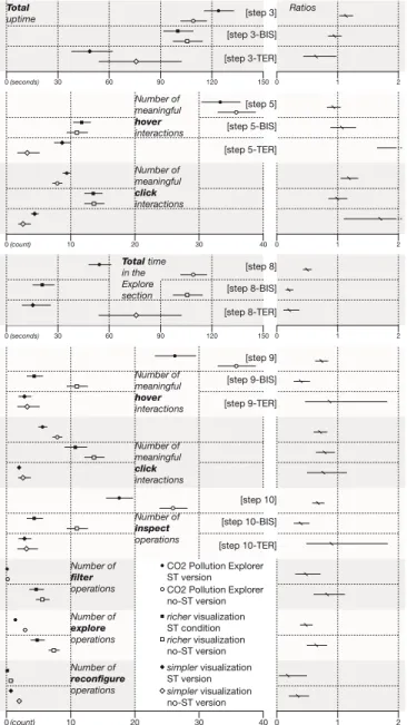
For both webpages, we conducted the exact same analysis as before. We began by removing all bounced sessions—27.9% in the richer visualization case, and 33.1% in the other—, and plotted all results of the whole webpage and Explore sec-tion analyses [steps 3 to 5 and 8 to 10] in Fig. 10. These are compared to those of the information-savvy population in the CO2Pollution Explorer case.
Narrative Framework of the Richer Visualization Analysis
[step 6-BIS] In 92.2% of all sessions, visitors saw more than one section; in 57.4%, they saw the Explore section; and in 53.7%, they saw all five sections. The return IDs showed that 157/191 (82.2%) sessions in which visitors did not inspect all sections were first-time connections.
[step 7-BIS] We removed these sessions from further anal-ysis ([steps 7-BIS to 10-BIS]). In 91/222 (40.9%) remaining sessions, visitors inspected all four sections and the Explore section in a linear fashion.
Narrative Framework of the Simpler Visualization Analysis
[step 6-TER] In all sessions, visitors saw more than one sec-tion; in 80%, they saw the Explore secsec-tion; and in 75.7%, they saw all four sections. The return IDs showed that 4/17 (23.5%) sessions in which visitors did not inspect all sections were first-time connections.
[step 7-TER] We removed these sessions from further anal-ysis ([steps 7-TER to 10-TER]). In 22/53 (41.5%) remaining sessions, visitors inspected all three sections and the Explore section in a linear fashion.
10 20 30 40 0 (count) 0 1 2 10 20 30 40 0 (count) 0 1 2 30 60 90 120 150 0 (seconds) 30 60 90 120 150 0 (seconds) 0 1 2 0 1 2 Number of inspect operations Number of filter operations Number of explore operations Number of reconfigure operations Total uptime [step 3] [step 3-BIS] [step 3-TER] [step 5] [step 5-BIS] [step 5-TER] [step 8] [step 8-BIS] [step 8-TER] [step 9] [step 9-BIS] [step 9-TER] [step 10] [step 10-BIS] [step 10-TER] Ratios Number of meaningful hover interactions Number of meaningful hover interactions Number of meaningful click interactions Number of meaningful click interactions simpler visualization no-ST version simpler visualization ST version richer visualization no-ST version richer visualization ST condition CO2 Pollution Explorer no-ST version CO2 Pollution Explorer ST version Total time
in the Explore section
Figure 10: Activity comparisons between versions for the richer and simpler visualizations. Values for the CO2 Pol-lution Explorer are also shown for reference.
Discussion
In the richer visualization case, none of the ‘whole webpage’ and ‘Explore section only’ hypotheses are confirmed (H1.1, H1.2, H3.1, H3.2). In fact, there is even no evidence of a difference in total uptime, or in number of meaningful hover and click interactions between versions on the whole web-page level—as attested by the ratio 95% CI that all overlap 1 [steps 3-BIS, and 5-BIS] (Fig. 10).
In the simpler visualization case, none of the ‘whole web-page’ and ‘Explore section only’ hypotheses are confirmed either, with the exception of H1.2. However, these results are to be considered cautiously, since they show a lot of variabil-ity in the data—as attested by the very wide 95% CI. This
can be attributed to the smaller sample size. Nevertheless, since we are not directly interested in effect sizes, but rather in simply seeing if there is a difference between versions, the ratio 95% CI that do not overlap 1 (Fig. 10) provide sufficient information for our needs. Overall, visitors spent the least amount of time and performed the least amount of interac-tions in this case, be it on the whole webpage level or in the Explore section alone—this was expected, as the dataset and interactive potential of the visualization were not as rich as in the other cases.
Finally, in both cases, H2.1 is confirmed, but H2.2 is not. While the percentages of sessions in which visitors inspected all sections of the narrative component in a linear fashion are higher than in the CO2Pollution Explorer case, they are still below 50%.
Overall, these results invalidate once again our two main qualitative hypotheses, and confirm those of the CO2 Pollu-tion Explorer: the narrative components did not immerse vis-itors in the way we expected them to in either cases; and they did not increase visitors’ engagement in exploration in the Explore sections. Furthermore, while there is evidence that visitors of the richer visualization performed more meaning-ful click interactions in the Explore section than visitors of the simpler visualization did—which seems normal, since there were many more clickable features in the richer visualization; there is no real evidence that they spent more time there, or that they performed more meaningful hover interactions—as shown by the 95% CI for the analysis of the Explore sections of the ST versions in [steps 8-BIS, 8-TER, 9-BIS and 9-TER] (Fig. 10). Thus, there is no real evidence that the narrative component in the richer visualization case had a bigger effect on user-engagement in exploration than the one in the sim-pler visualization case—this invalidates our third qualitative hypothesis. However, from a broader perspective, confirming this third hypothesis would have been pointless, since each of our experiments have shown that including a narrative com-ponent does not increase user-engagement in exploration.
CONCLUSION
In this article, we have shown that augmenting exploratory information visualizations with initial narrative visualization techniques and storytelling does not help engage users in ex-ploration. Nevertheless, our results are not entirely negative. The CO2Pollution Explorer and the Economic Return on Ed-ucation Explorer were successful webpages that did engage people in a certain way: both received a relatively high num-ber of visits, and the average uptime was well-above web standards, whatever the version. They were also curated in referential online visualization galleries. Thus, beyond the spectrum of this study, it is important that the concept of en-gagement in Infovis be better defined. Here, we consider it from a behavioral perspective as an investment in exploration, which may lead to insight. However, engagement can also be considered from an emotional perspective as an aesthetic experience, as is done with certain casual information visual-izations[19, 26].
Ultimately, our goal is to understand how to engage people with exploratory visualizations on the web. While this study
may have failed due to the simple fact that people have a limited attention span on the internet, and that if they read through an introductory narrative component, they will not spend extra time exploring a visualization, we still claim that ‘pushing’ observations, unanswered questions, and themes from a narratorial point of view in the form of an introduc-tory ‘sintroduc-tory’ does not seem to encourage people to dig further for personal insights. In the future, we will continue to inves-tigate new/other strategies for fostering exploratory behavior (like the one taken by the Game-y Infographics [10]) to allow switching from author-driven visualizations to reader-driven ones on the web.
ACKNOWLEDGEMENTS
The authors would like to thank Sophie Dufau, journalist and editor at Mediapart, for publishing the visualizations; all readers of Mediapart who took part in these experiments; Pierre Dragicevic for sharing his R code for calculating 95% CI, and for his help with the analysis of the collected data; Petra Isenberg for proof-reading this article; and Google for the Research Award that funded this work.
REFERENCES
1. The CO2Pollution Explorer. On Mediapart:
http://blogs.mediapart.fr/blog/la-redaction- de-mediapart/180314/co2-la-carte-de-la-pollution-mondiale; on visualizing.org: http://visualizing.org/visualizations/where-are-big-polluters-1971; on citylab.com:http: //www.citylab.com/work/2014/03/map-historys-biggest-greenhouse-gas-polluters/8657/.
2. The Economic Return on Education Explorer. On
Mediapart:
http://blogs.mediapart.fr/blog/la-
redaction-de-mediapart/180914/les-diplomes-est-ce-que-ca-paye; on visualizing.org:
http://visualizing.org/visualizations/there-financial-interest-investing-longer-studies.
3. The Nuclear Power Grid. On Mediapart:http://blogs.
mediapart.fr/blog/la-redaction-de-mediapart/
190914/le-poids-du-nucleaire-dans-le-monde; on
visualizing.org:http://visualizing.org/
visualizations/what-part-nuclear-energy.
4. American Psychological Association. The Publication manual of the American psychological association (6th ed.). Washington, DC, 2010.
5. Bertini, E., and Stefaner, M. Data Stories #22.
http://tiny.cc/datastories.
6. Boy, J., and Fekete, J.-D. The CO2Pollution Map: Lessons Learned from Designing a Visualization that Bridges the Gap between Visual Communication and Information Visualization [Poster paper]. In Proc. of
IEEE VIS’14(Nov. 2014).
7. Canty, A., and Ripley, B. Boostrap Functions, 2014. 8. Carver, R. The Causes of High and Low Reading
Achievement. Taylor & Francis, 2000.
9. Cumming, G. The new statistics: Why and how. Psychological science 25, 1 (2014), 7–29.
10. Diakopoulos, N., Kivran-Swaine, F., and Naaman, M. Playable data: Characterizing the design space of game-y infographics. In Proc. of CHI’11 (2011), 1717–1726.
11. Dragicevic, P., Chevalier, F., and Huot, S. Running an hci experiment in multiple parallel universes. In CHI ’14 Extended Abstracts(2014), 607–618.
12. Franchi, F. On visual storytelling and new languages in
journalism.http://www.brainpickings.org/2012/02/
06/francesco-franchi-visual-storytelling/.
13. Google analytics.https://support.google.com/
analytics/answer/1009409?hl=en.
14. Gotz, D., and Wen, Z. Behavior-driven visualization recommendation. IUI ’09, ACM (New York, NY, USA, 2009), 315–324.
15. Hullman, J., and Diakopoulos, N. Visualization rhetoric: Framing effects in narrative visualization. IEEE TVCG 17, 12 (Dec. 2011), 2231–2240.
16. Marchionini, G. Information Seeking in Electronic Environments. Cambridge Series on Human-Computer Interaction. Cambridge University Press, 1997. 17. Murray, S. Engaging audiences with data visualization.
http://www.oreilly.com/pub/e/2584.
18. North, C. Toward measuring visualization insight. IEEE CG&A 26, 3 (2006), 6–9.
19. Pousman, Z., Stasko, J., and Mateas, M. Casual information visualization: Depictions of data in everyday life. IEEE TVCG 13, 6 (Nov. 2007), 1145–1152.
20. Richaudeau, F. M´ethode de Lecture rapide. Retz, 2004. 21. Rodden, K., Hutchinson, H., and Fu, X. Measuring the
user experience on a large scale: User-centered metrics for web applications. In Proc. of CHI’10 (2010). 22. Rooze, M. Interactive News Graphics.
http://tinyurl.com/NYTimes-collection.
23. Satyanarayan, A., and Heer, J. Authoring narrative visualizations with ellipsis. Proc. EuroVis’14 (2014). 24. Segel, E., and Heer, J. Narrative visualization: Telling
stories with data. IEEE TVCG 16, 6 (Nov. 2010), 1139–1148.
25. Toms, E. G. Information interaction: Providing a framework for information architecture. J. Am. Soc. Inf. Sci. Technol. 53, 10 (Aug. 2002), 855–862.
26. Wood, J., Isenberg, P., Isenberg, T., Dykes, J.,
Boukhelifa, N., and Slingsby, A. Sketchy rendering for information visualization. IEEE TVCG 18, 12 (2012), 2749–2758.
27. Yi, J. S., Kang, Y. a., Stasko, J., and Jacko, J. A. Toward a deeper understanding of the role of interaction in information visualization. IEEE TVCG 13, 6 (2007), 1224–1231.