HAL Id: hal-02099418
https://hal.archives-ouvertes.fr/hal-02099418
Submitted on 14 Apr 2019
HAL is a multi-disciplinary open access
archive for the deposit and dissemination of
sci-entific research documents, whether they are
pub-lished or not. The documents may come from
teaching and research institutions in France or
abroad, or from public or private research centers.
L’archive ouverte pluridisciplinaire HAL, est
destinée au dépôt et à la diffusion de documents
scientifiques de niveau recherche, publiés ou non,
émanant des établissements d’enseignement et de
recherche français ou étrangers, des laboratoires
publics ou privés.
Prototyping Immersive Analytics: Experiments with
Design Students
Adrien Fonnet, Yannick Prié, Gregoire Cliquet
To cite this version:
Adrien Fonnet, Yannick Prié, Gregoire Cliquet. Prototyping Immersive Analytics: Experiments with
Design Students. Workshop on Immersive Analytics ”Interaction Design and Prototyping for
Immer-sive Analytics” at CHI 2019, May 2019, Glasgow, United Kingdom. �hal-02099418�
Experiments with Design Students
Adrien Fonnet
adrien.fonnet@univ-nantes.fr
LS2N UMR 6004 CNRS University of Nantes Nantes, France
Yannick Prié
yannick.prie@univ-nantes.fr
LS2N UMR 6004 CNRS University of Nantes Nantes, France
Grégoire Cliquet
g.cliquet@lecolededesign.com READI Design Lab
Nantes, France
ABSTRACT
Immersive analytics is an emerging field of research that explores the use of immersive technologies for data analysis. We argue that immersion is different from the simple use of 3D graphics and therefore requires new methods of representation and interaction with the data. We believe in the benefits of interdisciplinarity, especially with design, to help shape this new field. We describe two workshops that we have organized with design students, and we share lessons learned and key findings. KEYWORDS
immersive analytics, multi-dimensional data, 3D glyphs, immersive interaction, prototyping, design, workshops, physicalization
Permission to make digital or hard copies of all or part of this work for personal or classroom use is granted without fee provided that copies are not made or distributed for profit or commercial advantage and that copies bear this notice and the full citation on the first page. Copyrights for components of this work owned by others than the author(s) must be honored. Abstracting with credit is permitted. To copy otherwise, or republish, to post on servers or to redistribute to lists, requires prior specific permission and/or a fee. Request permissions from permissions@acm.org.
Glasgow ’19, May 04–09, 2019, Glasgow, UK
© 2019 Copyright held by the owner/author(s). Publication rights licensed to ACM. ACM ISBN 978-1-4503-9999-9/18/06...$15.00
Prototyping Immersive Analytics: Experiments with Design Students Glasgow ’19, May 04–09, 2019, Glasgow, UK
ACM Reference Format:
Adrien Fonnet, Yannick Prié, and Grégoire Cliquet. 2019. Prototyping Immersive Analytics: Experiments with Design Students. In Glasgow ’19: Workshop on Immersive Analytics: Interaction Design and Prototyping for Immersive Analytics, May 04–09, 2019, Glasgow, UK .ACM, New York, NY, USA, 6 pages. https://doi.org/10.1145/1122445. 1122456
INTRODUCTION
Immersive Analytics is an emerging research field focusing on the "use of engaging, embodied analysis tools to support data understanding and decision making." [6]. However, the use of 3D is still criticized, specifically for multi-dimensional data [11], and no definitive study confirms the benefits of IA systems over non-immersive ones [2, 7, 10]. Yet, immersion-based systems are not only based on 3D representations, but also on user embodiment [4]. We argue that it is crucial to define new ways of representing and interacting with data within immersive environments, by going beyond simple adaptations of 2D representations and WIMP interfaces to fit in immersion. Such systems require a user-centric approach for their development, as well as creative thinking to provide innovative solutions. We believe designers could help us imaging those novel approaches, hence our decision to carry out immersive analytics design workshops with design students.
RESEARCH THROUGH DESIGN
Relations between the worlds of research and design have undergone different stages since the 1960s [5]. But France has long remained on the sidelines of issues that pose the relationship between design "as a practice" and design "as a discipline". The evolution of academic research towards interdisciplinarity has nevertheless made it possible in recent years to introduce design into research. Among the different streams of research that can be referred to, two approaches stand out: Design research that studies the process of designing artifacts and / or services and research through design as a project discipline that would allow significant contributions in research. In the latter case, the produced object questions the research formally, functionally, aesthetically, ergonomically, etc. but also, as Chamberlain et al. [3] state, "designers create artifacts that often encapsulate knowledge emerging from research studies". Some quotes mentioned by Cross [5] can illustrate the relationship between research and design: "Scientists try to identify the components of existing structures, designers try to shape the components of new structures" [1]. "Science is analytic; design is constructive" [9]. In this study, we adopted a project research approach. "A type of ’active’ research, located and engaged in the field of a project-grounded research, the project being the equivalent for us of the "field" of social sciences and the "laboratory" of experimental research" [8]. The very exploratory and prospective nature of Immersive Analytics invites designers to explore imaginaries and concepts that question the subject rather than restrict the scope of possibilities to acceptable technical solutions.
FIRST WORKSHOP Presentation
The first workshop was conducted in early 2018, from the 16th to the 24th of January, resulting in 7 working days. 15 students from the Design School of Nantes participated, 10 of them were from the Virtual Reality (VR) course and 5 of them from the Information Design (ID) course. To benefit from these different backgrounds, students were grouped by (2 VR students and 1 ID student).
Figure 1: Number of datapoints and distance from the user considering a human scale were the two criteria used to
define the conditions students were going to explore.
The goal of the workshop was to imagine and prototype an immersive analytics system for multi-dimensional data analysis, i.e. define visual mappings1and the associated interactions. Three
con-1We use this term since it is the most commonly
know in the InfoVis community, even if it can be limiting for multi-sensory IA.
straints were imposed to the students: 1/ the visualization must show 6 different attributes at once, 2/ two conditions number of datapoints x distane (see figure 1) had to be selected, and adequate repre-sentations designed for them, and 3/ an interaction means to switch between both reprerepre-sentations had to be designed.
The two dataset proposed to the student were extracted from the kaggle webiste2. The first one
2https://www.kaggle.com/
was focusing on the metadata of Kickstarter’s projects, and the second on the sales and ratings of video games. Both datasets presented various type of data, e.g. numerical, nominal, or text, and had over 10 attributes.
Planning
This workshop focused on 3 main phases. First, students had 2 days to think about two visualizations, and share their work through drawings. At the end of this phase, the work was presented to 4 professors, two from the Nantes University and two from the Design school, resulting in one of the students’ proposal to be selected to be worked upon for the rest of the week. Second, the next four days, students had to create paper prototypes to physicalize their visualizations and iterate their designs based on their findings. The last day was left for preparing the final restitution and create a stop motion video presenting a use case of their system.
Lessons learned
Figure 2: Physical representation of the mineral visualization, in the "closed" configuration (blocks could be expended
to reach a deeper level of data reading).
The main goal for this workshop was to limit professors’ input to a minimum for two reasons: 1/ let the students free to innovate without pre-conceived ideas, and 2/ observe how design students worked to discover if there were differences compared to DataViz or HCI researchers. Moreover, we were willing to see if the use of physicalization was beneficial to help prototyping IA systems and in particular if it was useful to push students towards other sensory modalities such as haptics.
The lack of direction from professors, combined with an unfortunate schedule for students, i.e. the workshop was close to an important deadline for their graduation, led to a lack of creativity. Moreover, the use of physicalization was seen as a heavy constraint ("how are we going to paper prototype our
Prototyping Immersive Analytics: Experiments with Design Students Glasgow ’19, May 04–09, 2019, Glasgow, UK idea?"), and did not really help students. Nonetheless, design students had an interesting approach when it came to prototyping IA systems, which seems to differ from usual research methods: students focused first on user experience, which led them to think about a metaphor, and only then on how to fit channels and interaction inside the metaphor. For instance, one group chose to make the data analysis process to be similar to a walk in a forest, each tree representing a kickstarter project, and to save a project for future consultation, users simply had to grab a fruit and put it in a basket. Another group used rock formations that could be divided or combined to change the reading level of the data (figure. 2). Unfortunately, those examples where not developed enough to be translated into proofs of concept.
This first workshop left us with the intuition that design students have a slightly different approach about designing IA systems but need to be much more challenged to reach practical solutions. Therefore, we designed the second workshop so as to try and to provide such an environment. SECOND WORKSHOP
Presentation
Figure 3: A mobile chair to be represented in the immersive environment, equipped with Vive trackers (one the chair, one on the tablet).
The second workshop was conducted from 28th of May to 1st of June covering a full working week. 9 students from the first year of VR practice master participated in it, this time working individually.
The goal remained similar to the first workshop, i.e. imagining, defining, and prototyping an IA system to explore and analyze multi-dimensional data. However, only the kickstarter dataset was proposed, and additional constraints were added regarding interactions, i.e. a mobile chair had to be integrated in the system (cf. figure. 3) and the immersive technology to use was a VR headset. Planning
The week was divided into 6 phases: 1/ Introduction, 2/ Data mapping definition, 3/ Interactions definition, 4/ Scenario, 5/ Cycle through step 2 to 4, and 6/ Proof of concept. The first 5 steps occupied the first 3 days, while the remaining 2 days were for completing the proof of concept.
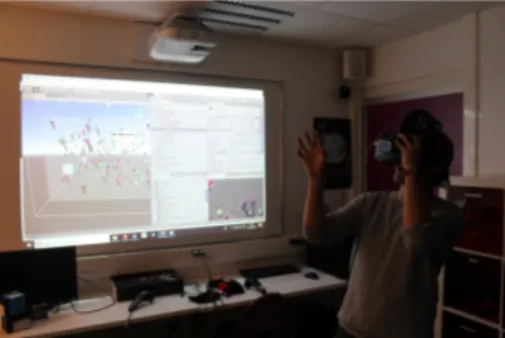
A dataviz expert and a design professor remained with the students during the full week, both to bring assistance and to challenge their proposals (cf. figure. 4). Additionally, two restitution sessions allowed to evaluate the works. The first session was at the end of step 5, while the second was at the end of the week (cf. figure. 5).
Figure 4: Work session from the first day
of the second workshop. Lessons learned
Similarly to the first workshop, we were looking for the approaches design students were using to prototype IA systems, so as to spot similarities and differences with researchers. This time students were heavily supported, and better courses about IA were provided at the beginning of the workshop.
As in the first workshop, students used metaphors as starting points for data representations. Inspirations were multiple, e.g. a flower garden, the outer space, a city, or floating islands. Then, channels were extracted from the metaphors, e.g. for the flower garden metaphor, some channels were the height of the flower, the size of the bulb, the height of the tutor, the smell of the flower. Finally, links to attributes were fully described, providing the complete visual mapping which is an improvement from the first workshop. With regards to interaction, metaphors were still present for navigation, e.g. using a space ship for the outer-space metaphor, but disappeared for other interactions which were treated in a more classical way, e.g. filtering, or recording, using the mobile chair tablet as a screen to mimic a touch interface.
Figure 5: Student presenting its work during the final restitution, here showing
his demo using the HTC Vive and Leap Motion.
Moreover, the use of 3D sketching solutions such as Tilt Brush and Google Blocks were explored to quickly test the viability of the various channels. Indeed, visualizations could be quickly prototyped, allowing to evaluate datapoints’ representations in immersive condition, i.e. with occlusion, different vision angles and distances, etc. Any issue that arose led to brainstorm solutions, the flexibility of the tools allowing direct testing, resulting in a better design at the end of the VR session.
CONCLUSIONS
If those two workshops did not provide us with innovative ways of representing or interacting with data, there are nonetheless three main takeaways we can take from them.
First, it is critical to provide a thorough introduction to data analysis to participants of the workshops. Indeed, the results of the second workshop were much better than those of the first one. It is clear from the feedback from both workshops that an introduction to data analysis, coupled with expert support, really helped students to find better and usable solutions.
Figure 6: HaVRest, final POC from one student of the second workshop, representing Kickstarter’s projects with
flower pots.
Second, it is important to use immersive rapid prototyping tool. Those tools allow easy under-standing between all actors by providing a direct experience of the presented idea. The required level of abstraction is greatly diminished resulting in better productivity and understanding. Moreover, the flexibility of those tools allows for on the fly modifications, making the iterative loop extremely fast. However, those tools remain generic and therefore suffer from some limitations for our utilization: no channel besides the visual channel could be explored, and a few actions where fastidious to perform such as duplicating a lot of datapoints, or changing drastically the scale of the visualizations .
Last, designers and DataViz/HCI researchers seem to give value to the same elements, but not with the same weight. Indeed, we discovered that designers first focus on representations through the choice of their metaphors, then extract channels, and possible interactions, to finally link attributes and tasks to those. In general, Dataviz/HCI researchers go the other way around, by focusing first on attributes and tasks, choosing the most adequate channels and interactions, resulting in a representation. Designers start from sensitivity to go towards practicality, while researchers go the opposite way. It is true that focusing on sensitivity first will likely diminish solutions’ practicality,
Prototyping Immersive Analytics: Experiments with Design Students Glasgow ’19, May 04–09, 2019, Glasgow, UK this is why it is usually not considered. However, immersive environments impact users differently than applications on 2D screens, so we could argue there is some value in engaging users through more sensible IA representations. For instance, when we were put into the POC of the garden flower metaphor (cf. figure. 6), we had this thought: "its great to be here, I want to explore this world", something that hardly happens for 2D screens data visualizations.
ACKNOWLEDGMENTS
We would like to thanks Arnaud Leroi for his implication in the workshops organization and participa-tion as a design professor and expert. This work is part of the IDEA project (Immersive Data Exploraparticipa-tion and Analysis) funded by the Pays de la Loire French region through West Creative Industries program. REFERENCES
[1] Christopher Alexander. 1964. Notes on the synthesis of form. Harvard University Press. 216 pages.
[2] Benjamin Bach, Ronell Sicat, Johanna Beyer, Maxime Cordeil, and Hanspeter Pfister. 2018. The Hologram in My Hand: How Effective is Interactive Exploration of 3D Visualizations in Immersive Tangible Augmented Reality? IEEE Transactions on Visualization and Computer Graphics24, 1 (jan 2018), 457–467. https://doi.org/10.1109/TVCG.2017.2745941
[3] Paul Chamberlain, Peter Gardner, and Rebecca Lawton. 2007. Shape of Things to Come. In Design Research Now. Birkhäuser Basel, Basel, 99–116. https://doi.org/10.1007/978-3-7643-8472-2_7
[4] Grégoire Cliquet, Matthieu Perreira, Fabien Picarougne, Yannick Prié, and Toinon Vigier. 2017. Towards HMD-based Immersive Analytics. In Immersive analytics Workshop, IEEE VIS 2017. Phoenix, USA, 1–5.
[5] Nigel Cross. 2001. Designerly Ways of Knowing: Design Discipline Versus Design Science. Design Issues 17, 3 (jul 2001), 49–55. https://doi.org/10.1162/074793601750357196
[6] Tim Dwyer, Kim Marriott, Tobias Isenberg, Karsten Klein, Nathalie Riche, and Falk Schreiber. 2018. Immersive Analytics: An Introduction. In Immersive Analytics. Springer, 12–34.
[7] Jorge A Wagner Filho, Marina F Rey, Carla MDS Freitas, and Luciana Nedel. 2017. Immersive Analytics of Dimensionally-Reduced Data Scatterplots. In Workshop on Immersive Analytics at IEEE Vis. Phoenix, USA, 1–5.
[8] A Findeli, D Brouillet, S Martin, C Moineau, and R Tarrago. 2008. Research through design and transdisciplinarity: A tentative contribution to the methodology of design research. In Swiss Design network symposium. Berne, Switzerland, 67–91. http://swissdesignnetwork.ch/src/publication/focused-current-design-research-projects-and-methods-2008/ SDN-Publication-2008{_}Focused.pdf{#}page=69
[9] S. A. Gregory. 1966. Design Science. In The Design Method. Springer US, Boston, MA, 323–330. https://doi.org/10.1007/ 978-1-4899-6331-4_35
[10] Laura Nelson, Dianne Cook, and C Cruz-Neira. 1999. Xgobi vs the c2: Results of an experiment comparing data visualization in a 3-d immersive virtual reality environment with a 2-d workstation display. Computational Statistics 1 (1999), 39–52. http://citeseerx.ist.psu.edu/viewdoc/download?doi=10.1.1.7.3228{&}rep=rep1{&}type=pdf
[11] Ben Shneiderman. 2003. Why not make interfaces better than 3D reality? IEEE Computer Graphics and Applications 23, 6 (nov 2003), 12–15. https://doi.org/10.1109/MCG.2003.1242376