HAL Id: hal-02931257
https://hal.archives-ouvertes.fr/hal-02931257v2
Submitted on 7 Sep 2020
HAL is a multi-disciplinary open access
archive for the deposit and dissemination of
sci-entific research documents, whether they are
pub-lished or not. The documents may come from
teaching and research institutions in France or
abroad, or from public or private research centers.
L’archive ouverte pluridisciplinaire HAL, est
destinée au dépôt et à la diffusion de documents
scientifiques de niveau recherche, publiés ou non,
émanant des établissements d’enseignement et de
recherche français ou étrangers, des laboratoires
publics ou privés.
Showing Data about People: A Design Space of
Anthropographics
Luiz Morais, Yvonne Jansen, Nazareno Andrade, Pierre Dragicevic
To cite this version:
Luiz Morais, Yvonne Jansen, Nazareno Andrade, Pierre Dragicevic. Showing Data about People:
A Design Space of Anthropographics. IEEE Transactions on Visualization and Computer Graphics,
Institute of Electrical and Electronics Engineers, In press. �hal-02931257v2�
Showing Data about People:
A Design Space of Anthropographics
Luiz Morais, Yvonne Jansen, Nazareno Andrade, and Pierre Dragicevic
Abstract—When showing data about people, visualization designers and data journalists often use design strategies that presumably help the audience relate to those people. The term anthropographics has been recently coined to refer to this practice and the resulting visualizations. Anthropographics is a rich and growing area, but the work so far has remained scattered. Despite preliminary empirical work and a few web essays written by practitioners, there is a lack of clear language for thinking about and communicating about anthropographics. We address this gap by introducing a conceptual framework and a design space for anthropographics. Our design space consists of seven elementary design dimensions that can be reasonably hypothesized to have some effect on prosocial feelings or behavior. It extends a previous design space and is informed by an analysis of 105 visualizations collected from newspapers, websites, and research papers. We use our conceptual framework and design space to discuss trade-offs, common design strategies, as well as future opportunities for design and research in the area of anthropographics.
Index Terms—Anthropographics, design space, empathy, compassion, prosocial behavior.
F
1
INTRODUCTION
W
HENcommunicating data about people, informationdesigners and data journalists regularly create
visual-izations1meant to foster an emotional connection with the
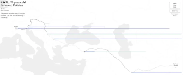
persons whose data are represented. Figure 1 shows one example where the reader can see the story and personal information of each person who died in a public mass shooting in the USA. Meanwhile, the visualization in Figure 2 conveys the hardship of the life of refugees by narrating the story of S.W.G., a 26 years old refugee who left Pakistan and spent 651 days before arriving at his final destination. Both visualizations were crafted to bring readers closer to the persons whose data are visualized.
The practice of visualizing data about people in a way that helps the audience relate has been called anthropographics [1], [2]. Boy and colleagues [1] coined this term as an abbrevia-tion for anthropomorphized data graphics—visualizaabbrevia-tions with human-shaped symbols. The meaning was then extended to “visual strategies to make the connection between data and the humans behind them more direct and, hopefully, more em-pathic” [2]. Similarly, the term data humanism was coined to refer to a range of visualization design practices intended to promote humanistic values [3]. In this article, we reconcile these different views by defining anthropographics as:
visualizations that represent data about people in a way that is intended to promote prosocial feelings (e.g., compassion or empathy) or prosocial behavior (e.g., donating or helping).
• Luiz Morais is with Universidade Federal de Campina Grande, Brazil, and Inria and Universit´e Paris-Saclay, France. E-mail: [email protected]
• Yvonne Jansen is with CNRS and Sorbonne Universit´e, France.
• Nazareno Andrade is with Universidade Federal de Campina Grande.
• Pierre Dragicevic is with Inria and Universit´e Paris-Saclay, France. Manuscript received August 15 2019; revised September 1, 2020.
1. In this article, we employ visualization in a broad sense that also includes infographics.
Like Boy and colleagues [1], this definition refers to a class of visualizations rather than a set of design strategies, and like Bertini [2], it generalizes beyond the use of human-shaped symbols. Based on findings that empathy is not necessarily conducive to helping behavior [4], the definition considers prosocial behavior as a potential design goal, as well as other prosocial feelings such as compassion, which is presumably more directly connected to prosocial behavior [4]. Prosocial feelings and behavior can be directed towards the very people represented in the visualization, or towards other people who share a connection with them (e.g., survivors, descendants, or people sharing identity characteristics).
Visualization designers have explored many strategies for creating anthropographics. A popular strategy is to use human-shaped symbols [1] (such as in Figure 1). Other strategies include the use of text annotations to make each person appear unique [1] (for example, see the top left of Figure 2), the use of visual metaphors (such as a red bar chart to symbolize blood or death), or the representation of persons as individual marks rather than aggregated data [5], [6] (such as in Figure 1). So far, only a few of these strategies have been empirically tested, and even though initial studies have been mostly inconclusive [1], [7], [8], there is an enormous potential for information visualization research.
Anthropographics is a rich and growing area, but the work so far has been scattered. As such, the visualization community presently lacks a precise language for discussing anthropographics, as well as an overview of design strategies and opportunities for design. The goal of this paper is to contribute to fill this gap by proposing a design space and conceptual framework that are meant to help researchers and practitioners reason and communicate about anthropo-graphics. We aim at providing conceptual foundations and a language to facilitate the design, critique, comparison, and empirical evaluation of anthropographics.
Fig. 1: How Many People Have Been Killed by Guns in USA Since Newtown’s attack. This visualization shows people who died due to a gun shot between the Newtown attack in 2012, and December, 2013. Each icon is a person. Sex and age are shown through the icon’s shape. Additional information about each person can be obtained by clicking on their icon.
Source:Slate[9].
Our framework extends a previously proposed design space [1]. The primary focus of this previous work was, however, on reporting empirical studies. In contrast, the present article is fully dedicated to laying out a compre-hensive design space of anthropographics. Specifically, we introduce useful basic terminology, extend and refine the earlier design space, and provide and discuss a range of illustrations and examples.
Our design space consists of seven design dimensions that can be reasonably believed to have some effect on prosocial feelings or behavior, namely: granularity, specificity, coverage, authenticity, realism, physicality, and situatedness. These dimensions were identified by examining a collection of 105 communicative visualizations that convey data about people, some of which are anthropographics and some of which are not (that is, some are conventional statistical charts). After describing the design space and the conceptual framework it is based on, we identify recurrent combinations of dimensions (that is, families of visualization designs), and discuss opportunities for future research and design.
Our conceptual framework is meant to be descriptive, generative and evaluative [10]: it has been devised to help designers think more clearly about existing and possible new designs. However, it is not meant to be prescriptive [10]: it cannot help predict what designs will work best, and cannot prescribe what designs to use. More studies are needed before any such predictive attempts can be made. Frameworks such as ours are, however, important to:
• help researchers design empirical studies to estimate the
effects that such charts have on people, and
• help designers consider different alternative designs by
making design dimensions explicit and by emphasizing differences across the continuum of each dimension. While we conceived the design space by analyzing a corpus of anthropographic visualizations, we believe its design dimensions are also relevant to consider in the context of any visualization design problem in which data about people are to be visualized.
Fig. 2: Stories Behind a Line shows stories of seven refugees who fled from their home country to a new place. This figure shows the story of an immigrant who left Pakistan towards Italy. The stroke patterns in the path correspond to different means of transport (e.g., by foot or by car); the dark blue line represents the days of stay in a city while the light blue ones
represent days of travel. Source:storiesbehindaline.com[11]
2
RELATED
WORK
In this section we discuss previous related work, both within visualization and outside.
2.1 Visual Embellishment in Visualization
Visual embellishment consists of adding non-essential im-agery to visualizations in order to make them more mem-orable, more persuasive or more engaging [12]. Visual embellishment can take different forms, such as seemingly gratuitous uses of the third dimension, but most frequently it consists of embedding pictures with charts. Although visual embellishment is a controversial practice [13], recent studies find that the inclusion of pictures can help make charts more memorable [12], [14], [15], though it can also make them more difficult to process [14], [16]. One study found that the use of pictorial symbols to represent units of data can help people remember information and can encourage them to inspect visualizations more closely, apparently without any negative impact on legibility [16]. This suggests that when showing data about people, the use of anthropomorphic symbols (as in Figures 1, 6, and 12) may have benefits on memorability and engagement without clear downsides. However, the benefits of anthropomorphic symbols on prosocial feelings or behavior have not been studied, with the exception of the study by Boy and colleagues [1] we already mentioned, and a more recent study [7].
Although past research on visual embellishment overlaps with the present work, its focus is on various possible benefits of a specific design strategy (visual embellishment). In contrast, our work is on specific benefits (promotion of prosocial feelings or behavior) of various design strategies. Again, the area of anthropographics encompasses a range of design strategies, not all of which involve the use of anthropomorphic symbols [1], [2] (see for example, Figures 2, 7, and 11). Conversely, the use of anthropomorphic symbols does not automatically make a visualization an anthropographic. For example, such symbols can be used to show how many people live in different cities or how many prefer to eat cheese over chocolate; although the use of such symbols may have several benefits such as on memorability, comprehension or engagement, it is not intended to promote prosocial feelings or behavior in these cases.
2.2 Narrative Visualization and Storytelling
Narrative media such as newspaper articles and live presen-tations are increasingly mixed with visualizations, be they static, animated, or interactive [17], [18], [19], [20]. There has been considerable interest in visualization research in trying to map strategies for telling stories with visualizations. An early study examined existing practices and identified seven genres of narrative visualization (i.e., magazine style, annotated chart, partitioned poster, flow chart, comic strip, slide show, and video) [17]. Subsequent research discussed narrative visualizations in terms of the rhetorical [21] and cinematographic [22] techniques employed, sequences and transitions [23], types of presentation they are used in [18], general design patterns [20], and workflows involved in creating them [24]. Other contributions include novel types of narrative visualizations [25], empirical studies [26] and authoring tools (e.g., [27]).
One clear area of overlap between this previous body of work and the present article is the focus on communicative visualizations. However, because not all communicative visualizations are narrative visualizations [24], our focus is in one sense broader. Our focus is also much narrower in other respects, as we are interested in visualizations that convey data about people and in techniques that are thought to promote prosocial feelings or behavior. Another area of overlap is methodological — much of the previous work on narrative visualization analyzes existing designs to derive a conceptual framework, taxonomy, or design space. The present article does this too, but again with a different focus. Our design space is also at a lower level of description than most design spaces on narrative visualization, which typically focus on rhetorical and narrative techniques.
A special case within the area of narrative visualization is the use of personal narrative visualizations [28]. Whereas personal visualizations in general are concerned with tools to help people understand data about themselves [29], personal narrative visualizations are “visual data representations that tell stories about personal experiences from the point of view of the narrator” [28]. They may be used either as memorabilia and tools of self-reflection, or with the intent to share personal information and stories with others, as done by Perin [30], [31]. Such visualizations are about people and can share some design strategies with anthropographics. However, they are only anthropographics according to our definition if their authors created them with the intent to instill compassion for themselves in others.
2.3 Work in Psychology
Although empathy and compassion have been the subject of a lot of research in psychology, they have no widely accepted definition. Most previous work however considers that empathy and compassion are different constructs [32], [33], [34]. Empathy has been defined as “the act of experiencing what you believe others are experiencing” [33], while compassion has been defined as “the feeling that arises in witnessing another’s suffering and that motivates a subsequent desire to help” [35]. We adopt these two definitions in the present article. While most visualization researchers and practitioners only use the term “empathy” in the context of anthropographics, they are likely
also concerned about compassion, and probably often use the term “empathy” to refer to compassion.
Research suggests that empathy tends to lead to behaviors to reduce one’s own suffering, while compassion tends to produce behaviors that reduce others’ suffering [35]. Similarly, compassion is a positive predictor of prosocial behavior [36], while empathy “is either not predictive or negatively predictive of prosocial actions” [34]. One finding from psychology that is directly relevant to our work is the “identifiable victim effect”, according to which people tend to empathize and donate more to vividly identifiable victims than for less identifiable individuals [37]. A related finding is the “compassion fade effect”, according to which the level of compassion towards people decreases as the number of suffering individuals increases [38]. These findings and their implications for anthropographics design will be discussed further as we introduce the dimensions of our design space.
2.4 Studies in HCI and Visualization
The field of virtual reality (VR) has explored whether im-mersive environments can affect people’s prosocial feelings and behavior. Calvert and colleagues [39] have examined whether showing a story using a VR technology vs. a monitor could affect empathy. Kandaurova and Lee [40] conducted a similar experiment in the context of charitable giving. They measured empathy, prosocial behavior (donation of time and money), and other factors such as guilt and responsibility. Overall, VR studies suggest that immersive environments can promote prosocial feelings and behavior. Closer to information visualization, Ivanov and colleagues [41] argued that showing victims of a tragedy as people in a virtual reality environment could promote empathy since “the level of fidelity [of such environments] has the potential to enable a kind of direct face-to-face relationship with visualizations”. In robot-human interaction research, anthropomorphism has also been shown to facilitate empathy [42].
In information visualization, only a handful of studies have investigated prosocial feelings or behavior. Kennedy and Hill [43] explored emotional engagement with data and visualizations, and observed that participants became com-passionate with migrants after seeing a visualization about the topic. Erlandsson and colleagues [44] investigated to what extent people allocate money according to the visualization that is presented. Participants were shown different datasets on cancer death risks, and results suggest that people tend to donate more to projects when the data is worrisome. To the best of our knowledge, only three recent studies investigated how visualization design affects prosocial feelings [1], [7], [8]. Although different anthropographic design strategies were tested, the results were mostly inconclusive. We will discuss these studies in more detail in section 6.2, using the terminology from our design space.
3
METHODOLOGY
The starting point of our work was the design space of anthropographics by Boy and colleagues [1]. We extended this design space based on an analysis of a corpus of visu-alizations, and based on data visualization and psychology research, as well as blog posts from practitioners. This section
describes how we collected our corpus of visualizations, and how we used this corpus to inform our design space.
3.1 Scope
We collected a total of 105 visualizations that convey data
about people (see a static version of our corpus on OSF2or
the interactive website3for an updated list). The collection
process started with visualization repositories (e.g.,
flowing-data.comanddataphys.org/list) and proceeded through a
snowball sampling to include blogs and newspapers. We also included visualizations from the additional material provided by Boy et al. [1]. Finally, the collection was complemented by charts found in social media, and by visualizations from our own practice. Three criteria were considered to include a visualization:
1) The visualization shows data about people: examples include statistics about people who died due to a gunshot, the path taken by refugees to escape from war, or the characteristics of women who fought breast cancer. 2) The data visualized is about real people. This condition led
us to exclude, for example, simulation-based visualiza-tions where imaginary individuals are created to convey
life expectancy data or causes of death.4
3) The visualization was published with a communicative intent. This criterion includes infographics from newspapers, for example, but excludes visualizations produced for purely analytic purposes, for which there is no commu-nicative intent.
The resulting set of 105 visualizations was compiled between October 5, 2018, and July 30, 2019. Among all visualizations, 29% are from blog posts, 27% from news-papers or magazines, 21% from project web pages, 10% from public exhibitions, 10% from books or reports, and 3% from academic papers. The collection includes both interactive and static visualizations. It also includes both anthropographics and non-anthropographics (i.e., visualizations that were likely not designed to promote prosocial feelings or behavior). Doing so allowed us to lay out a more comprehensive design space, by considering the full continuum between anthropographics and non-anthropographics.
3.2 Development of the Design Space
We started with the set of dimensions proposed by Boy et al. [1], and progressively iterated over them by characterizing each visualization from our collection according to each of the dimensions. This process helped us establish the characteristics and boundaries of each of the dimensions, and identify gaps. In parallel to defining and refining the dimensions of the design space, we developed a conceptual framework and set of elementary definitions (described in Sections 4.1 and 4.2) in order to have a firm conceptual ground on which to rest our final design space.
As our corpus contains a broader range of visualiza-tions than initially considered by Boy and colleagues, the dimensions that could not properly fit the corpus or could
2. Supplementary material on OSF:osf.io/wfgmp
3. Corpus:luizaugustomm.github.io/anthropographics
4. See, for example, Visualizing smoking risk:
www.stubbornmule.net/2010/10/visualizing-smoking-risk/
not be easily operationalized (in the sense of being difficult to define) were removed. For example, we removed unit grouping which only applies to unit visualizations and thus would not be applicable to many visualizations in our corpus (see the justifications in section 4.7). During the process, we also came up with new dimensions, partly inspired from past literature in psychology and data visualization.
After a seemingly stable set of definitions and dimensions was established and the corpus of visualizations had been fully categorized by the first author, we performed a multi-coder evaluation. We collectively wrote a code book, which the last three authors used to classify a random sample of 17 visualizations. This partial coding made apparent that some of the dimensions and their levels could be interpreted in different ways. We computed Fleiss Kappa coefficients for each dimension and found that for four out of eight initial dimensions, these were below 0.56 (moderate agreement). Consequently, we discussed difficulties and discrepancies in the coding and iterated one last time on the design space which led to the removal of one dimension and updated concept definitions. The first author then recoded all visualizations in the corpus. The codebook, the codes and
the Kappa scores are available on OSF.2
The resulting design space has a total of seven dimensions. It shares three dimensions with Boy and colleagues [1] (see section 4.7 for more details), and includes four new dimensions.
4
DESIGN
SPACE
In the next sections, we first introduce basic terminology and a conceptual framework that will serve as a foundation for our design space, and then describe and motivate each design space dimension.
4.1 General Visualization Concepts
We assume for simplicity that all datasets are flat tables [45]. A data item (or simply item) is “an individual entity that is discrete”, and which corresponds to a row in the table [45]. In our framework, a data item always corresponds either to a person or a group of persons. Meanwhile, a data attribute (or simply attribute) is “some specific property that can be measured, observed, or logged” [45]. Examples include the salary, height, or name of a person, or the average salary or height of a group of persons.
Visualizations are human-readable representations of data items and data attributes. Here too, our terminology largely follows previous literature. The main building block of a visualization is the mark, which is an element that represents a data item [45], [46], [47], [48]. A mark can either consist of a single graphical primitive (e.g., a point, line, or area [49]) or a combination thereof (e.g., a glyph or an
icon) [50]. Meanwhile, perceptual channels5are properties
of a mark that can be varied to convey the value of data attributes. Common examples include elementary graphical attributes such as size, value, color or shape [49].
5. This term generalizes the notion of visual channel [45] or visual variable [51] to non-visual data representations [52].
4.2 New Concepts
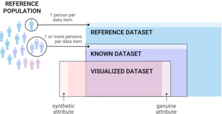
We assume that a visualization is created by a designer with an intent, i.e., a message to convey. For any such visualization, we define the reference population as the set of all persons who are the subject of the visualization’s message, i.e., all the persons the visualization designer chose to tell a story about. For example, if a visualization tells a story about WWII casualties, we can assume that the reference population is the set of all people who died due to WWII, even if not all of these people are represented in the visualization, and even if not all of these people are known. Thus, the reference population is a conceptual set, which is not necessarily fully visible in the visualization, and about which we typically can only speculate. REFERENCE DATASET REFERENCE POPULATION KNOWN DATASET VISUALIZED DATASET synthetic attribute 1 person per data item 1 or more persons
per data item
genuine attribute
Fig. 3: The three conceptual datasets we use to capture the message and information conveyed by an anthropographic.
CC-BY 4.0. Source:osf.io/zhq9x/.
In our conceptual framework, the message and the infor-mation conveyed by a visualization involve three datasets (see Figure 3). The first one, the reference dataset, is purely conceptual as it consists of all the people from the reference population – each mapped to an item, plus all of their characteristics, each mapped to an attribute. An example of a reference dataset is all migrants who died in the Middle East between 2015 and 2019, together with all the information possibly imaginable about them. In the rest we will assume that the reference dataset is given, and thus the designer has no control over it.
The known dataset is the subset of the reference dataset available to the designer, possibly aggregated in such a way that each data item corresponds to a group of people instead of a single person. It consists of a finite number of items and attributes, for example, the data about migrants who are known to have died in the Middle East between 2015 and
2019, as reported in the Missing Migrants dataset6.
Finally, the visualized dataset consists of all the infor-mation — items and attributes — that is represented in the visualization, or in other words, all the information that can potentially be extracted from the visualization. It is a subset of the known dataset with potentially extraneous information added by the designer, for example, for aesthetic reasons or for storytelling purposes. We formalize this by introducing the notions of genuine and synthetic attributes.
Genuine attributes are attributes from the visualized
dataset that originate from the known dataset. For example,
6. Missing Migrants website:missingmigrants.iom.int
a genuine attribute could be the age of the migrants who died in the Middle East between 2015 and 2019, as reported in the Missing Migrants dataset. On the other hand, synthetic attributesare attributes in the visualized dataset that do not originate from the known dataset. For example, a designer may assign an arbitrary gender to each person (through the use of a male or female silhouette) or may give them fictitious names (e.g., Figure 12). Synthetic attributes may occasionally match the attributes from the reference dataset, either by accident or because the designer made an informed guess. However, we generally cannot assume synthetic attributes to reflect reality, since they are by definition not known. Note that it is not necessarily visible in a visualization whether an attribute is genuine or synthetic.
Another way to characterize attributes is by their distinc-tiveness, which captures how much information they convey. The distinctiveness of an attribute or a set of attributes is the extent to which it allows to distinguish people or groups of people from each other. When data items are individuals, attributes with low distinctiveness are ones whose values are generally shared by many people (e.g., sex, age, or country of origin). Meanwhile, attributes with high distinctiveness are ones that few people have in common (e.g., full names or photographs). Many attributes lie somewhere in the middle of the distinctiveness continuum. When data items are groups of people (e.g., demographic groups or countries), distinctiveness refers to the extent to which the attributes allow to distinguish those groups from each other.
Finally, attributes can be represented in a visualization in two major ways. Encoded attributes are attributes from the visualized dataset that are mapped to perceptual channels. One example is mapping people’s age to the height of bars. In contrast, literal attributes are attributes from the visualized dataset that are presented either in a literal form or using written prose or numerals. One example is fully spelling out somebody’s age, e.g., with a label stating “22 years old”. Some attributes such as names or photos do not easily lend themselves to visual encoding, and thus are almost always represented as literal attributes.
The rest of this section describes the dimensions that make up our design space. We illustrate the dimensions with a series of minimalistic visualizations, all of which assume the same known dataset consisting of ten persons and four attributes: whether each person prefers cats or dogs, their gender, their name, and a photo of their face (see Table 1). The reference population contains the same ten people.
Name Gender Dogs or cats? Photograph
Yousef Male Dogs (image)
Amir Male Dogs (image)
Alana Female Dogs (image)
Olaf Male Dogs (image)
Jeremy Male Dogs (image)
Jo˜ao Male Dogs (image)
Fatima Female Cats (image)
Nadia Female Cats (image)
Asha Female Cats (image)
Michal Male Cats (image)
TABLE 1: Fictional dataset underlying the illustrations of the design space dimensions in Figure 4.
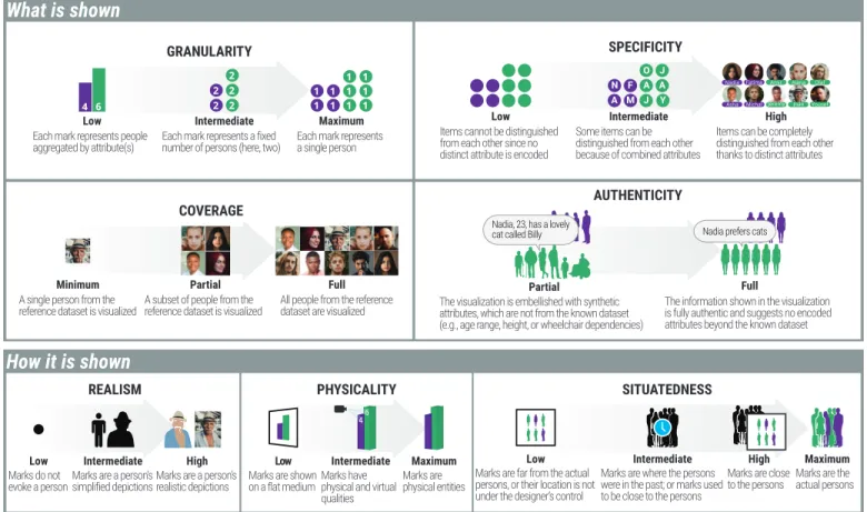
What is shown
GRANULARITY
Low
Each mark represents people aggregated by attribute(s)
Intermediate
Each mark represents a fixed number of persons (here, two)
Maximum
Each mark represents a single person
SPECIFICITY
Low
Items cannot be distinguished from each other since no distinct attribute is encoded
High
Items can be completely distinguished from each other thanks to distinct attributes
Intermediate
Some items can be distinguished from each other because of combined attributes
A M F N J Y A A J O AUTHENTICITY Full
The information shown in the visualization is fully authentic and suggests no encoded attributes beyond the known dataset
Nadia prefers cats
Partial
The visualization is embellished with synthetic attributes, which are not from the known dataset (e.g., age range, height, or wheelchair dependencies)
Nadia, 23, has a lovely cat called Billy
COVERAGE
Minimum
A single person from the reference dataset is visualized
Partial
A subset of people from the reference dataset is visualized
Full
All people from the reference dataset are visualized
How it is shown
REALISM Low Marks do not evoke a person HighMarks are a person’s realistic depictions
Intermediate
Marks are a person’s simplified depictions
PHYSICALITY
Low
Marks are shown on a flat medium Maximum Marks are physical entities Intermediate Marks have physical and virtual qualities
SITUATEDNESS
Maximum
Marks are the actual persons
High
Marks are close to the persons
Low
Marks are far from the actual persons, or their location is not under the designer’s control
Intermediate
Marks are where the persons were in the past; or marks used to be close to the persons
Fig. 4: The seven dimensions of the anthropographics design space.CC-BY 4.0. Source:osf.io/2zhjt/.
4.3 Introducing the Design Space
The dimensions of our design space fall into two broad groups. The what is shown group corresponds to dimensions concerned with the information represented in the visualiza-tion (e.g., whether all people from the reference populavisualiza-tion are represented). Meanwhile, dimensions from the how it is shown group describe the way information is represented on the visualization (e.g., whether the marks look like people).
4.4 What is Shown
There are four dimensions related to what information and how much information is presented in a visualization.
4.4.1 Granularity
Granularityrefers to the extent to which the persons in the visualized dataset are mapped to separate data items – and equivalently, to separate marks on the visualization.
In a visualization with low granularity, each mark corresponds to a group of persons who have one or more attribute values in common (see Figure 4). An example is depicted in Figure 5, where each segment of a different color represents the sum of immigrants in a period of time. Statistical charts where each mark represents a large number of people (thousands or millions) are typical examples of low-granularity visualizations. In such visualizations, length or area are commonly used to encode cardinality (for example, bar charts, bubble charts, or area charts). Position encoding is also occasionally used (for example, in line charts of population growth).
In a visualization with intermediate granularity, each mark maps to a fixed number of persons, this number being greater than one. Many so-called Isotype visualizations [53], [54] fall into this category. Figure 6 shows an example of an Isotype visualization, where each mark represents one million soldiers. Since one million is a large number, the granularity is relatively low in absolute terms, but it is higher than if people were fully aggregated according to the three categories “killed”, “wounded” or “others returning home”. While most Isotype-like designs show absolute counts, a variation over this design uses marks to show rounded percentages (that is, the counts from all marks sum up to 100 people).
In a visualization with maximum granularity, each data item corresponds to a single person. For example, the visualization in Figure 7 has maximum granularity because each data item stands for a different person who died by a gunshot in 2019.
Note that in the case of low granularity, the number of persons is typically encoded using perceptual channels, whereas in intermediate and maximum granularity, it is mapped to the number of marks.
Using visualizations that represent people as individual marks allows designers to convey specific information about each person, be them genuine attributes detailing those portrayed, or synthetic attributes to humanize the data (for example, some of the designs by Boy and colleagues [1]). There is also a belief that representing people using sin-gle marks can make readers empathize with the persons represented [6]. However, maximum granularity may have
drawbacks with large datasets: representing thousands of people as different marks demands a large space or forces the designer to reduce each mark to a speck with little details. Nonetheless, visually compelling examples of such visualiza-tions do exist, such as the unit visualizavisualiza-tions introduced by Drucker and colleagues [55].
It is still necessary to investigate in which scenarios there are relevant benefits in using visualizations with higher granularity. The only study that investigated visualizations with intermediate granularity in the context of human rights was not able to confirm the hypothesis that higher granularity leads to more empathy [1]. More studies are needed to examine the role of granularity in promoting prosocial feelings or behavior.
4.4.2 Specificity
The information specificity of a visualization (or simply specificity) corresponds to how distinctive is the entire set of attributes in the visualized dataset (see section 4.2 for the definition of distinctiveness and Figure 4 for an illustration). The more the attributes allow to distinguish between data items (either individuals or groups of people) the higher the visualization’s specificity. All attributes contribute to a visualization’s specificity, whether they are encoded or literal, and whether they are genuine or synthetic.
In a visualization with low specificity, items tend to be visually very similar to each other and most of them cannot be distinguished. The Isotype visualization in Figure 6 is an example of a low-specificity visualization, where the low distinctiveness of the visualized attributes (survival status and side) contributes to making the soldiers look rather deindividualized. The gun violence visualization (Figure 7) also has somehow low specificity, because the only visualized attribute is the location where each person died. In this case, location can be thought to have relatively low distinctiveness because there are spots on the map where more than one person might have died, which makes it hard to distinguish the victims. Had the map been higher-resolution or zoomable, specificity would have been higher.
In a visualization with intermediate specificity, at-tributes in the visualized dataset allow the reader to easily distinguish many data items from each other. A typical approach is to use glyphs to represent multidimensional data about individual people. For example, in Figure 8, the visu-alization shows six attributes. Although each attribute has low distinctiveness, once combined together, the attributes give some sense of individuality to each person.
Finally, in a visualization with high specificity, the at-tributes in the visualized dataset allow the reader to perfectly distinguish all data items. One example is shown in Figure 9, where people’s faces and other physical characteristics make each person unique. A visualization can also have high specificity when it shows a set of attributes that is so large that the data is necessarily unique to each person. In Figure 11, for example, the visualization shows the story of a child coping with an auto-immune disease. Since in our framework data items are always people or groups of people, the visualized dataset is comprised of a single data item, and thus the visualization consists of a single mark that can be thought of as an extremely complex glyph.
Fig. 5: 200 Years of Immigration to the US. This stream graph shows immigrants by region from 1820 to 2015. Each color corresponds either to the country of last residence or a region. The area represents the number of immigrants who moved to the U.S. over the years. Hovering over an area shows the total number of immigrants within a period of 10 years until
the selected date. Source:Insightful Interaction[56].
Fig. 6: The Great War 1914-18. Each Isotype mark represents 1 million soldiers. Black crosses represent soldiers who died, soldiers in red came back wounded, and soldiers in green returned without major physical injuries. The soldiers on the left are the Allies and the ones on the right belong to the
Central Power. Source:LA Worrell[57].
Fig. 7: Gun violence Chart of Deaths in 2019. Depicts all deaths caused by guns in the USA from January to June, 2019. Each red dot is a victim, and its placement indicates where the
Studies suggest that showing pictures and details of victims is linked to a higher likelihood of donating to charity [59], [60]. Although the study by Boy et al. [1] has failed to find an effect for intermediate-specificity visual-izations with intermediate granularity, it remains possible that other designs could promote prosocial feelings and behaviors. Although privacy issues often make it hard to reach high specificity in a visualization [1], it is sometimes possible to reach intermediate levels of specificity without compromising privacy, for example by showing people’s first names, age, and other non-identifiable data, as in Figure 10.
4.4.3 Coverage
Coveragecorresponds to the extent to which the visualized dataset includes the persons from the reference dataset. Although in many visualizations it may not be possible to identify with certainty the reference population considered by the designer and consequently the coverage, it remains possible to speculate, and more generally, to reason about coverage on a theoretical level.
In a minimum coverage visualization, the reference pop-ulation consists of more than one person but the visualized dataset only contains data about a single person from that population.
In a visualization with partial coverage, the visualized dataset contains data about a subset of people from the reference dataset. The people may be selected at random or chosen according to some specific attributes. For example, the visualization in Figure 10 delivers a message about women who have breast cancer in Brazil and are in remission, but only includes data about 13 of these women. Another example of a partial coverage visualization is shown in Figure 2: “The Stories Behind a Line” starts by showing six lines, each of which contains initials of a refugee. The user can click on a line to see the story of a person who left their home seeking a better life. In this example, the six individuals were presumably chosen in an arbitrary manner, and used as illustrations in order to tell a broader story about the arduous life of thousands of refugees around the world. In a full coverage visualization, the visualized dataset contains all the persons from the reference dataset. Examples are Figures 5, 6 and 7.
While full coverage is the most straightforward design choice, partial coverage is necessary when datasets are incomplete (e.g., not all bodies have been found in a disaster), or it may be an appropriate choice when visualizing rich personal data that needs to be explicitly gathered from the people, or when complete coverage may violate the privacy of the persons represented (for example, in Figure 10). A related advantage of partial and minimum coverage is that they reduce the number of marks, and thus leave space to show richer data about fewer individuals, for example, for storytelling purposes, where a more detailed profile of an individual serves to anchor the story being told. Furthermore, there is evidence suggesting that telling the story of a single suffering individual can better promote compassion than telling the story of an entire group [59]. Similarly, studies have suggested that as the number of suffering people increases, people feel less empathy for them and donate less [38]. Therefore, it is possible that visualizations with partial or minimum coverage could help observers be more
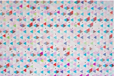
Fig. 8: Data wallpaper. Each glyph represents 6 questions answered by a visitor to a store, ranging from how they see the future of work to how they unlock their creativity. The designer initially installed an empty visualization template as a wallpaper in the store, and the store employees filled the hexagons as they were receiving visitor responses. Source:
Giorgia Lupi[61].
Fig. 9: 100% Montr´eal is composed of 100 persons from Montr´eal who have been selected to represent the city population. Depending on personal questions asked during the show, the persons moved to the left or the right of the
green circle. Source:Rimini Protokoll[62].
Fig. 10: Cancer is not always the end shows data about 13 women with breast cancer who has been in remission for years. Each flower is a woman and each part of a flower shows a characteristic of the woman such as her age or how she dealt with the treatment. Information about some women
compassionate about suffering populations. However, it remains necessary to test this hypothesis empirically.
4.4.4 Authenticity
Authenticityrefers to the proportion of genuine attributes in the visualized dataset.
A visualization with partial authenticity contains both genuine and synthetic attributes (terms are defined in sec-tion 4.2). The more visualized attributes are synthetic, the less authentic a visualization is. The illustration of authenticity in Figure 4 shows a visualization with partial authenticity where the designer gave the marks different silhouettes to make them look unique: we can see, for example, a child, and a person in a wheelchair. The designer also annotated an individual with personal information. However, none of this information is in the known dataset (shown in Table 1) which makes these attributes synthetic. A real world example of a partially authentic visualization is shown in Figure 12. The only genuine attribute is whether a person lived above or below the poverty line in 2010, whereas the name and gender of the persons are synthetic attributes that were probably used to increase information specificity and make the persons look more unique, or to increase the visual appeal of the visualization.
In a visualization with full authenticity, all visualized attributes are genuine. In Figure 4 (authenticity dimension), the visualization with full authenticity uses realistic silhou-ettes like the visualization with partial authenticity. However, only two types of silhouettes are used in the fully authentic visualization, which serve to encode gender, an attribute that is in the known dataset. We will see in section 4.5.1 that realistic silhouettes like these cannot be fully authentic unless they are those of the people represented, but in this case they can be considered as (almost) fully authentic.
While full or close-to-full authenticity is the most obvious design choice, designers sometimes use synthetic attributes in visualizations about people such as in Figure 12 or in
visualization 67in the corpus. In those examples, the
de-signers used anthropomorphic marks with different genders and ages that likely do not originate from the known dataset, possibly as an attempt to promote compassion. However, it is possible that this technique can backfire as a result of readers feeling manipulated, possibly causing them to doubt even the genuine information and the visualization as a whole. As far as we know, this technique and its possible trade-offs have never been explicitly discussed in the information visualization literature.
4.5 How it is shown
This section describes design dimensions that capture how information is represented. All of the dimensions here are properties of marks. The properties of marks are often coherent across a visualization, and thus a visualization can be characterized with respect to how its marks are represented.
4.5.1 Realism
Realismrefers to the degree of resemblance of the visualiza-tion’s marks to actual persons.
Fig. 11: Bruises: the Data We Don’t See shows the progress of a child in coping with an auto-immune disease. Each petal is a day. Red dots are platelet counts (the disease destroys them). Colors represent various events such as bleeding, medications, or positive feelings. The text around the petals
are the mother’s notes about the day. Source: Giorgia
Lupi[64].
Fig. 12: Poverty in Syria shows the proportion of children below (lighter color) or above the poverty line (darker color) in Syria, in 2010. Each mark is a fixed number of children. Hovering over a mark shows synthetic information about a person. Source: Boy et al. [1] (screenshot of the first experiment’s video from the supplementary material).
Fig. 13: A part of Famous Writers’ Sleep Habits and Literary Pro-ductivity. Detailed drawings of famous authors are combined with illustrations of the time of day at which they rose and how productive they were throughout their lifetime. Source:
Fig. 14: San Francisco Gay Men’s Chorus representing AIDS deaths until 1993. The men in white are the surviving members of the original San Francisco Gay Men’s chorus, while the persons in black with their back turned represent the
members lost to AIDS. Source:San Diego Gay and Lesbians
News[66].
A visualization with low realism represents people or groups of people using symbolic marks that are non-anthropomorphic, that is, they bear no resemblance with a human. Such marks include dots, bars, abstract glyphs, or shapes that evoke inanimate objects. Figures 5, 8, and 10 are examples of low-realism visualizations.
A visualization with intermediate realism is made of pictorial anthropomorphic marks. Examples of such marks are simple icons or human silhouettes. The visualizations from Figures 1 and 12 are also visualizations with intermediate realism, since they are composed of human-shaped icons or silhouettes.
A visualization with high realism is made of realistic anthropomorphic marks, which closely resemble an actual person. An example is shown in Figure 13, where the center of all marks feature detailed drawings of famous writers. Other examples of realistic marks include 3D avatars, physical sculptures, and even real persons, such as the data physicalizations from Figures 9 and 14.
Realism interacts with authenticity: strictly speaking, realistic marks can only be considered fully authentic if they faithfully depict the people. This is not the case in the second visualization of the “authenticity” dimension in Figure 4, where the detailed silhouettes suggest additional attributes about the persons that are unknown, such as age or body mass index. However, visualizations that use many identical realistic marks or a small set of mark types to encode genuine data are almost fully authentic, since i) the repetitions clarify that realism is used for embellishment ii) the variations across marks encode genuine data. A counter-example is
visualization 17in the corpus, which uses many different
silhouettes that could be easily interpreted as showing the actual silhouettes of the persons, although they do not.
The realism of anthropomorphic marks is best thought of as a continuum, as real persons are higher on the realism spectrum than photographs, which are themselves higher than drawings, which are in turn higher than simple icons. Designers typically use anthropomorphic marks to reinforce that the data is about real persons. It has been hypothesized that doing so could promote empathy [1], [5], [67], and that
Fig. 15: Of All the People in All the World: Stats with Rice is an installation using grains of rice to show various statistics about people where one grain corresponds to one person. This image represents every person at the Aston Villa vs. Birmingham City football match on 20 April 2008. Credit:
Jon Bounds, under CC 2.0 license. Source:Flickr.
the more realistic the marks are, the more effective they could be at promoting empathy [1]. However, none of these hypotheses and potential trade-offs between realism and perceived authenticity have been experimentally confirmed.
4.5.2 Physicality
Physicalityrefers to the degree to which a visualization’s marks are embodied in physical objects as opposed to shown on a flat display [52]. The physicality continuum is illustrated in Figure 4.
In a visualization with low physicality, the marks are shown on a flat medium, such as a computer screen or a sheet of paper. All visualizations designed for the web or for magazines (for example, Figures 6, 12, and 13) fall in this category. The visualizations from Figures 8 and 16 also have low physicality because the former is drawn on a flat wall, while the latter is shown on a wall clock with a printed background.
Visualizations with intermediate physicality are char-acterized by marks that have both physical and virtual qualities. While we could not find an example featuring data about people, examples exist for other types of datasets. For example, the Emoto installation [68] shows tweets, of which some attributes are encoded in physical shape while others are video-projected.
In visualizations with maximum physicality, the marks are physical objects or actual persons. Examples are shown in Figure 15, where the marks are grains of rice, and in Figures 9 and 14, where the marks are real persons.
Le Goc and colleagues [69] hypothesize that it is easier to empathize with people when they are represented by physical objects than when they are represented by virtual objects. Yet it is so far unknown whether using physical marks may indeed increase prosocial feelings such as empa-thy or compassion.
Fig. 16: Activity Clock shows the aggregated presence of persons in a lab from 8 AM to 8 PM during a 3-year period. Each bar is a 15-minute bin with the 10th and 90th percentile of the number of persons in that time. White dots and the color encode the median number of people in the corresponding time. Source: Morais and colleagues [70].
4.5.3 Situatedness
Situatednessrefers to how spatially close a mark’s physical
presentation [71] is — or was7— to its physical referent [46].
In the context of anthropographics, the physical referents are the persons described by the data. The situatedness continuum is illustrated in Figure 4.
In visualizations with low situatedness, which we will also refer to as non-situated, the marks are either presented far from the persons they represent, or their physical location is not under the control of the designer. This includes all visualizations designed for magazines or the web. Figures 1 and 7 are examples of non-situated visualizations because they are displayed on computer screens which are in most cases far from the represented victims.
In a visualization with intermediate situatedness, the marks are either presented at a location where the persons used to be in the past, or the marks used to be in proximity to the persons they represent. The Data Wallpaper (see Figure 8) is located at this intermediate point of the continuum because the persons who are represented in the visualization provided their personal data next to the visualization, but left the exhibition space afterward.
Visualizations with high situatedness are made of marks that are presented close to the persons they represent. An example of this point on the continuum is the Activity Clock (see Figure 16), in which the authors installed a visualization of lab presence data in the cafeteria of the lab itself. The visualization is highly situated because the people it represents are (generally) near the visualization.
Finally, there is maximum situatedness where the marks are the persons they represent. This is the most extreme point on the situatedness continuum and corresponds to physical visualizations made of real people, and showing data about those people. The show 100% (see Figure 9) is a maximally-situated visualization where the persons split themselves into groups or hold signs of different colors according to the questions they are asked.
7. As we will see, we generalize Willet and colleagues’ [46] notion of situatedness by also considering spatial relationships in the past.
Fig. 17: U.S. Gun Deaths in 2010 and 2013. Each line represents a person. The orange segment corresponds to the period lived and the gray segment represents the estimated years stolen from the person. Readers can select the dataset by choosing the year and also filter by sex, age, region, and time.
Source:Periscopic[72].
It is possible that achieving at least some degree of situatedness can, in some cases, help observers relate to the people represented. Outside of visualization, situatedness has long been thought to affect people’s emotions: memorials are often placed in a location where a significant event has affected a person or a group of persons, and memorabilia can acquire emotional power by virtue of having been touched or worn by a person [73] (both are examples of intermediate situatedness). In contrast, most visualization designs are meant to be easy to replicate and share, which maximizes the number of people who can see them but also means they have low situatedness [46].
4.6 Interactivity and Animation
We have so far assumed static visualizations. Although many visualizations are indeed static, others are dynamic, i.e., they can change under the user’s influence (interactive charts) or outside the user’s influence (animated visualizations such as in educational videos) [74]. Among the 105 visualizations in our collection, 44 are dynamic.
A dynamic visualization can be thought of as a (poten-tially very large) set of static views, each of them providing a different perspective on the data. There are three major ways in which users can explore data about people by moving from view to view.
First, dynamic visualizations can let users explore dif-ferent sets of data items — people or groups of people — over time. Figure 17, for example, shows a visualization where users can explore the persons who died by a gunshot in different years (which can be chosen by clicking on the corresponding year). Similarly, the animation from Figure 12 changes the dataset while switching from 2010 to 2016.
Second, dynamic visualizations can let users explore different sets of attributes for a given set of data items. In Figure 17, users can filter victims by sex, age, or region. This approach is useful when the number of perceptual channels is insufficient to display all attributes simultaneously: users can learn more and more about people over time. In addition, in interactive visualizations, users can focus on people’s attributes they care the most about.
Finally, dynamic visualizations can let users explore the same data — items and attributes — through different representations. In Figure 18 for example, users can smoothly transition between different representations of homelessness
data such as maps, grids, and bar charts. Drucker and colleagues have demonstrated many other examples of animated transitions between representations of different granularities with their system SandDance [55], [75].
Since the different views of a dynamic visualization may have different characteristics according to our design space, interactivity and animation can offer a way for users to dynamically navigate in the anthropographic design space, both in terms of what is shown and how it is shown. The dynamic labels of visualizations from figures 1, 7, 12, and 17, for example, increase the information specificity by showing detailed data about each individual. Another dimension that can change in dynamic visualizations is granularity. For example, the chart from Figure 18 lets users change its granularity from intermediate (every dot represents 5 persons) to low (all the dots are combined to form a bar).
4.7 Differences with Boy and Colleagues
As we mentioned previously, our design space of anthropo-graphics extends an earlier proposal by Boy et al. [1]. Our extension both broadens the original design space (that is, it captures a larger variety of designs) and sharpens it (that is, it makes finer distinction between related designs).
Boy et al’s design space had four main dimensions: • Class of visualization. This dimension distinguishes
be-tween unit and aggregate visualizations. It maps to the granularity dimension of our framework. In contrast with the original dimension, granularity sits on a continuum and distinguishes between two types of unit visualizations: those where each mark represent a single person, and those where each mark represents a fixed number of persons.
• Human shape. This dimension consists of two
sub-dimensions:
– Realism(abstract—realistic) directly maps to our realism dimension. However, our framework expands the def-inition of realism to also include more realistic marks such as photographs and real humans.
– Expressiveness(neutral—expressive). We initially included expressiveness as a “how it is shown” dimension but removed it after our multi-coder evaluation because we found it hard to define, especially when considering non-anthropomorphic marks. We also realized that the expressiveness of a visualization often arises in large part from the meaning of the dataset and can be manipulated by a variety of visual design strategies like the use of metaphors, that are hard to operationalize.
• Unit labeling. This dimension captures three types of text annotations that can be displayed on top of marks: generic, iconic and unique. In our framework, it is incorporated into the more general information specificity dimension. Unit labeling is more specifically captured by the concept of attribute distinctiveness, which formalizes Boy et al.’s notion of uniqueness and generalizes it to other types of information beyond text annotations. Among other things, distinctiveness captures the use of unique anthropomor-phic shapes, which was also discussed by Boy et al., but as part of the realism dimension which we see as orthogonal. • Unit grouping. This dimension captures the spatial layout
of the marks, such as grid-based or organic. We decided not to include this dimension in our framework because
Fig. 18: Understanding homelessness in USA. This interactive unit visualization represents the homeless population in the USA. Each dot corresponds to five homeless people. The representations can be chosen among maps, grids, bars, etc. The viewer can also explore different factors from categories such as geographic, economic, or social. Source:
Understanding Homelessness[76].
it is specific to unit visualizations and cannot be easily generalized to low-granularity visualizations. We also could not find arguments in the past literature in support of spatial layout influencing prosocial feelings or behavior. Much of these modifications to the original design space were meant to cover a wider range of designs, and thus situate anthropomorphic unit visualizations within a larger design space of visualizations of data about people. Our conceptual framework also extends the original framework in a number of other ways, including by making a useful distinction between two classes of design space dimensions: what is shown (which includes two of Boy et al.’s dimensions), and how it is shown (which includes another dimension). Our design space also introduces two additional dimensions in each category: coverage and authenticity in the “what is shown”, and physicality and situatedness in the “how it is shown”, all of which we argued are relevant dimensions to consider when designing anthropographics. Finally, like Boy et al.’s work, our design space focuses on design dimensions that could plausibly promote compassion, but it includes more extensive discussions of why this should be the case, and of the underlying trade-offs. At the same time, unlike Boy et al., our work does not contribute any empirical finding.
5
CORPUS
ANALYSIS
With a corpus of data visualizations and a design space to describe them, we now turn to reflect on the combinations of design choices we observed in our collection of 105 visualizations. Although our collection is not a random sample of all existing visualizations and is likely biased, it can still be informative as a proxy to what exists. For example, if there is a certain type of design we did not particularly emphasize during our search and yet it appears often in our collection, then this provides an indication that this design has some popularity. Conversely, if there is a design (i.e., a specific combination of dimensions) that would have caught our eye but of which we found no example, then this should be an indication that this design is at best relatively
uncommon. We also provide a website8on which the corpus
can be explored using faceted search.
5.1 Distributions of Dimension Values Maximum IntermediateLow High IntermediateLow Full Partial Minimum Full Partial High IntermediateLow Maximum IntermediateLow MaximumHigh IntermediateLow
granularity specificity coverage authenticity
realism physicality situatedness
Fig. 19: Distribution of dimension values in our corpus. Each black bar indicates the number of visualizations having
a specific value on a given design dimension.CC-BY 4.0.
Source:osf.io/ambsk/.
Figure 19 shows the distribution of dimension values in our corpus of 105 visualizations. Given our focus on anthropographics during our example collection, it is not surprising to see a high frequency of maximum-granularity visualizations, and a good number of high-specificity vi-sualizations. Meanwhile, there are uncommon dimension values that likely reflect a bias in the population of existing visualizations rather than a bias in our collection method. For example, minimum coverage and partial authenticity are design choices for which we have examples, but which do not appear to have received much attention by designers. Some other uncommon values are likely due to the higher technical difficulty and costs implied by these design choices: few visualizations in the corpus have high or maximum situ-atedness, and no visualization has intermediate physicality.
Next, we looked at the most uncommon combinations of
dimension values.9We report on the three most uncommon
combinations (all with p < .001). First, no visualization has both high realism and low specificity, reflecting the fact that when marks are realistic depictions of people (either photos or drawings), they can be easily distinguished from each other. Although realistic marks can in principle be duplicated to achieve low specificity, we have found no example of such a design. The second combination is intermediate granularity with high specificity, for which there is no occurrence either. High specificity seems hard to attain with lower levels of granularity, perhaps because attributes at the group level tend to be less distinctive. The third combination is partial coverage with low specificity, again with no occurrence in our corpus. It seems that when designers opt for partial coverage, this is is associated with the visualization of more distinctive attributes about the persons represented.
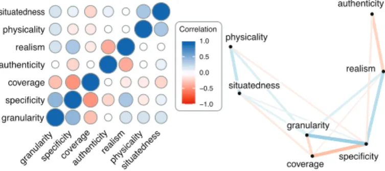
Finally, Figure 20 shows the correlations10between
dimen-sions. The highest absolute correlation is between granularity and specificity (r = 0.50). More generally, granularity, specificity, and coverage are closely related: higher specificity is usually associated with higher granularity and lower coverage. Higher realism also tends to co-occur with high
9. We first computed the expected number of visualizations having each possible pairwise combination of values, assuming independent dimensions. For example, if out ofNvisualizations,n1have low
granu-larity andn2have high specificity, we should expectn12= n1× n2/N
to have both. We then computed thep-value of the binomial test using the observed frequency as data andn12as the null hypothesis.
10. Correlations were computed by first numerically coding each dimension value (e.g., 0 for minimum, 0.5 for intermediate and 1 for full) and then computing pairwise Pearson correlations.
granularity specificity coverage authenticity realism physicality situatedness
granularityspecificitycoverageauthenticityrealismphysicalitysituatedness
Correlation −1.0 −0.5 0.0 0.5 1.0 granularity specificity coverage authenticity realism physicality situatedness
Fig. 20: Correlations between design dimensions in our corpus. The left plot is a correlation matrix, where blue circles are positive correlations and red circles are negative ones. The right plot shows the same data with a graph — the closer two nodes, the higher the absolute correlation.
CC-BY 4.0. Source:osf.io/5qrkm/.
specificity and granularity. This seems to suggest that anthro-pographic strategies (i.e., high granularity, high specificity, high realism, low coverage) are often used in combination. Similarly, the positive association between situatedness and physicality indicates that designers often explore situated anthropographics when using physical marks. Finally, higher realism tends to be associated with higher specificity as discussed before, as well as lower authenticity, due to the occasional use of realistic depictions of people as a form of decoration. All other correlations are |r| < 0.25.
5.2 Families of Visualizations
The dimensions that vary the most in our corpus are realism, granularity, and specificity. Based on this, we identified six families of common designs, grouped in two large classes: non-anthropomorphic and anthropomorphic. We also identified five atypical visualization designs. Figure 21 provides an overview of the families and how they relate.
5.2.1 Non-anthropomorphic Designs
Non-anthropomorphic visualizations are those whose marks do not resemble a human being. We break down this large class into three common families.
Statistical charts have low granularity. Their goal is to convey patterns rather than specific information about individuals. In Figure 16, for example, observations are ag-gregated in a way that does not reveal data about individuals. Though statistical charts can be low in information specificity, they can also have intermediate to high specificity, like the vi-sualization in Figure 5 which conveys rich information about each demographic group. However, having low granularity, they cannot show rich information about individuals.
Information-poor unit chartsare non-anthropomorphic
visualizations with maximum granularity but low informa-tion specificity. Each individual is visible but little infor-mation is conveyed about them (Figures 7 and 15). They are typically used when the intent is to convey numbers of people, or how people are distributed across a few attributes.
Information-rich unit charts have maximum
granular-ity and intermediate to high information specificgranular-ity. They present various data attributes — often both encoded or literal, to convey detailed information about each person. Examples are Figures 10 and 17.