HAL Id: hal-01348422
https://hal-enac.archives-ouvertes.fr/hal-01348422
Submitted on 4 Oct 2017HAL is a multi-disciplinary open access archive for the deposit and dissemination of sci-entific research documents, whether they are pub-lished or not. The documents may come from teaching and research institutions in France or abroad, or from public or private research centers.
L’archive ouverte pluridisciplinaire HAL, est destinée au dépôt et à la diffusion de documents scientifiques de niveau recherche, publiés ou non, émanant des établissements d’enseignement et de recherche français ou étrangers, des laboratoires publics ou privés.
Data Visualization for Communication and Storytelling
Sheelagh Carpendale, Nicholas Diakopoulos, Nathalie Henry Riche,
Christophe Hurter
To cite this version:
Sheelagh Carpendale, Nicholas Diakopoulos, Nathalie Henry Riche, Christophe Hurter. Data Visu-alization for Communication and Storytelling. Dagstuhl Reports, Schloss Dagstuhl–Leibniz-Zentrum fuer Informatik, 2016, Data-Driven Storytelling 16061, 6 (2), pp 1-27. �10.4230/DagRep.6.2.1�. �hal-01348422�
Data Visualization for Communication and Storytelling
Sheelagh Carpendale, University of Calgary, CA Nicholas Diakopoulos, University of Maryland, US Nathalie Henry Riche, Microsoft Research, US
Christophe Hurter, ENAC - French Civil Aviation University, FR
Close to forty researchers and practitioners descended on Schloss Dagstuhl to forge an interdisciplinary agenda on the topic of data-driven storytelling using
visualization in early February, 2016. With burgeoning research interest in understanding what makes visualization effective for communication, and with practitioners pushing the envelope of the craft of visual communication, the meeting put different modes of thinking between computer science researchers and data visualization practitioners in close proximity for a week.
Central to our vision of the convening was that the vast majority of research on data visualization to date has focused on designing and implementing novel interfaces and interactive techniques to enable data exploration. Major advances in visual analytics and big data initiatives have concentrated on integrating machine learning and analysis methods with visual representations to enable powerful exploratory analysis and data mining. But just as interactive visualization plays an important role in data analysis scenarios it is also becoming increasingly important in structuring the communication and conveyance of insights and stories in a compelling format. Visual data-driven stories have proliferated in many different forms, from animated infographics and videos, to interactive online visualizations. One domain where there has been extensive and practical progress on the question of data-driven storytelling is data journalism. News sites like FiveThirtyEight or the New York Times’ The Upshot have seen a recent surge of attention and interest as a means of communicating data-driven news to the public. By carefully structuring the information and integrating explanation to guide the consumer, journalists help lead users toward a valid interpretation of the underlying data. Because of the rapid and practical progress of data-driven storytelling in the domain of journalism, our seminar sought to put some of the top practitioners from that field together with computer science researchers to discuss the challenges and opportunities of data-driven communication.
The Dagstuhl seminar was structured to leverage the interdisciplinarity of the attendees by first tapping into a divergent design thinking process meant to
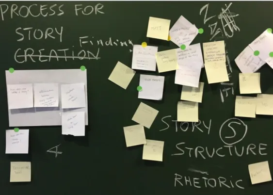
enumerate the range of issues that are relevant to data-driven stories. Hundreds of index cards and sticky notes were sacrificed as participants generated ideas (see Figure 1).
Figure 1. Converging on topical groups from hundreds of individual ideas.
We then clustered these ideas to arrived at a set of key themes, including: ● Techniques and Design Choices for Storytelling
● Exploration and Explanation ● From Analysis to Communication ● Audience
● Evaluation
● Devices and Gadgets ● Ethics
Groups of participants formed around common interests and each of these major themes were then the focus of discussion. Each work group was geared towards developing an outline and plan to produce a written chapter for a forthcoming edited book on the topic of data-driven storytelling. Some groups met for a day or two and then reformed around other topics, whereas other groups spent the entire week going deep in exploring a single topic. And as if the daytime activities weren’t enough, additional evening breakout groups formed around additional topics of interest like Education in Data Visualization, Urban Visualization, and the Technology Stack for data-driven stories.
In-between the intense, small group sessions the entire group came together daily for five-minute lightning talks on a wide array of relevant topics. These stimulating talks primed the group for approaching data-driven storytelling from different perspectives and were an entertaining and informative way to share creative ideas or results in small and easily digestible nuggets. Among the more than 25 lightning
talks, topics ranged from storytelling with timelines, to mobile visualization, the use of data comics, visual literacy, affect and color, data-story design workflows, and even the visualization of data through cuisine.
Outcomes
Our initial goal of the seminar was to have groups work intensively on their chosen topic(s) so that an outline and workplan could be developed to write a contributing chapter to a book on data-driven storytelling. The book is underway and will have contributions on each of the main themes outlined above, as well as an introductory chapter by the editors / organizers of the Dagstuhl seminar. Moreover, our creative contributors at the seminar produced other outputs as well: curated lists of example data driven stories, as well as of storytelling techniques were created and will be published online, and a blog has pulled together some of the formative impressions of participants (https://medium.com/data-driven-storytelling).
Below we briefly summarize the expected contents of each of the chapters that will form the book.
Techniques and Design Choices for Storytelling
This chapter will discuss techniques and design choices for visual storytelling grounded in a survey of over 60 examples collected from various online news sources and from award-winning visualization and infographic design work. These design choices represent a middle ground between low-level visualization and interaction techniques and high-level narrative devices or structures. The chapter will define several classes of design choices: embellishment, explanation,
exploration, navigation, story presentation, emphasis, focus, and annotation. Examples from the survey for each class of design choices will be provided. Finally, several case studies of examples from the survey that make use of multiple design choices will be developed.
Exploration and Explanation in Data-Driven Stories
This chapter will explore the differences between and integration of exploration and explanation in visual data-driven storytelling. Exploratory visualizations allow for a lot of freedom which can include changing the visual representation, the focus of what is being shown and the sequence in which the data is viewed. They allow readers to find their own stories in the data. Explanatory stories include a focused message which is usually more narrow and guides the reader often in a linear way. Advantages and disadvantages of exploration and explanation as well as dimensions that help to describe and classify data-driven stories will be developed. The space is described by identifying freedom, guidance regarding representation, focus and sequence as well as interpretation as important dimensions of data-driven storytelling and existing systems are characterized along these dimensions. Recommendations will be developed for how to integrate both aspects of exploration and explanation in data-driven stories.
This chapter will explore how tools can better support the authoring of rich and custom data stories with natural / seamless workflows. The aim is to understand the roles and limitations of analysis / authoring tools within current workflow practices and use these insights to suggest opportunities for future research and design. First, the chapter will report a summary of interviews with practitioners at the Dagstuhl seminar; these interviews aim to understand current workflow practices for analysis and authoring, the tools used to support those practices, and pain points in those processes. Then the chapter will reflect on design implications that may improve tool support for the authoring process as well as research
opportunities related to such tool support. A strong theme is the interplay between analytical and communicative phases during both creation and consumption of data-driven stories.
The Audience for Data-Driven Stories
Creators of data-driven visual stories want to be as effective as possible in
communicating their message. By carefully considering the needs of their audience, content creators can help their readers better understand their content. This
chapter will describe four separate characteristics of audience that creators should consider: expertise and familiarity with the topic, the medium, data, and data visualization; expectations about how and what the story will deliver; how the reader uses the interface such as reading, scrolling, or other interactivity; and demographic characteristics of the audience such as age, gender, education, and location. This chapter will discuss how these audience goals match the goals of the creator, be it to inform, persuade, educate, or entertain. Then it will discuss certain risks creators should recognize, such as confusing or offending the reader, or using unfamiliar jargon or technological interfaces. Case studies from a variety of fields including research, media, and government organizations will be presented.
Evaluating Data-Driven Storytelling
The study of data-driven storytelling requires specific guidelines, metrics, and methodologies reflecting their different complex aspects. Evaluation is not only essential for researchers to learn about the quality of data-driven storytelling but also for editorial rooms in media and enterprises to justify the required resources the gathering, analyzing and presentation of data. A framework will be presented that takes the different perspectives of author, audience and publisher and their correspondent criteria into account. Furthermore it connects them with the methods and metrics to provide a roadmap for what and how to measure if these resulting data-driven stories met the goals. In addition, the chapter will explore and define the constraints which might limit the metrics and methods available making it difficult to reach the goals.
Devices and Gadgets for Data Storytelling
This chapter will discuss the role of different hardware devices and media in visual data driven storytelling. The different form factors offer different affordances for data storytelling affecting their suitability to the different data storytelling settings. For example, wall displays are well suited to synchronous co-located presentation,
while watches and virtual reality headsets work better for personal consumption of pre-authored data stories.
Ethics in Data-Driven Visual Storytelling
Is the sample representative, have we thought of the bias of whoever collected or aggregated the data, can we extract a certain conclusion from the dataset, is it
implying something the data doesn’t cover, does the visual device, or the interaction, or the animation affect the interpretation that the audience can have of the story? Those are questions that anyone that has produced or edited a data-driven visual story has, or at least should have, been confronted with. After introducing the space, and the reasons and implications of ethics in this space, this chapter will look at the risks, caveats, and considerations at every step of the process, from the
collection/acquisition of the data, to the analysis, presentation, and publication. Each point will be supported by an example of a successful or flawed ethical consideration.
Conclusion
The main objective of this Dagstuhl seminar was to develop an interdisciplinary research agenda around data-driven storytelling as we seek to develop
generalizable findings and tools to support the use of visualization in
communicating information. Productive group work converged to delineate several research opportunities moving forward:
● The need for interfaces that enable the fluid movement between exploratory and communicative visualization so that storytelling workflow is seamless and powerful.
● The need to develop typologies of visual storytelling techniques and structures used in practice so that opportunities for supporting these techniques can be sought through computing approaches.
● The need to develop evaluation frameworks that can assess storytelling techniques and tools both scientifically and critically.
● The need for design frameworks that can guide the structure of visual information for experiences across different output devices, both existing and future.
● The need to understand the audience and their role in co-constructing meaning with the author of a data-driven story.
● The need for ethical frameworks that should guide tool development for visual data-driven communication.
These opportunities were productively enumerated at the Dagstuhl seminar and are in the process of being written up as chapters in our book on data-driven
storytelling that will appear in early 2017.
More information on the Dagstuhl seminar can be found at