HAL Id: hal-01523028
https://hal.inria.fr/hal-01523028
Preprint submitted on 16 May 2017
HAL is a multi-disciplinary open access
archive for the deposit and dissemination of
sci-entific research documents, whether they are
pub-lished or not. The documents may come from
teaching and research institutions in France or
abroad, or from public or private research centers.
L’archive ouverte pluridisciplinaire HAL, est
destinée au dépôt et à la diffusion de documents
scientifiques de niveau recherche, publiés ou non,
émanant des établissements d’enseignement et de
recherche français ou étrangers, des laboratoires
publics ou privés.
Visualizing Dimensionality Reduction Artifacts: An
Evaluation
Nicolas Heulot, Jean-Daniel Fekete, Michael Aupetit
To cite this version:
Nicolas Heulot, Jean-Daniel Fekete, Michael Aupetit. Visualizing Dimensionality Reduction Artifacts:
An Evaluation. 2017. �hal-01523028�
Visualizing Dimensionality Reduction Artifacts:
An Evaluation
Nicolas Heulot1,2, Jean-Daniel Fekete1, Michael Aupetit2
1Inria, France,2CEA, France
May 2015
Figure 1: Multidimensional projection artifacts are identical to geographic projections artifacts when we project the Earth on a 2D plane: (1) The orthogonal projection exhibits false neighborhoods: here, Washington appears right next to Antananarivo. (2) The Mercator projection exhibits tears: the Earth has been unfolded along the equator, leading to display Alaska far away from Russia. These artifacts always exist when projecting high-dimensional data with any dimensionality reduction technique.
Abstract
Multidimensional scaling allows visualizing high-dimensional data as 2D maps with the premise that insights in 2D reveal valid information in high-dimensions, but the resulting projections always suffer from artifacts such as false neighborhoods and tears. These artifacts can be revealed by interactively coloring the projection according to the original dissimilarities relative to a reference item. However, it is not clear if conveying these dissimilarities using color and displaying only local information really helps to overcome the projections artifacts. We conducted a controlled experiment to investigate the relevance of this interactive technique using several datasets. We com-pared the bare projection with the interactive coloring of the original dissimilarities on different visual analysis tasks involving outliers and clusters. Results indicate that the interactive coloring is effective for local tasks as it is robust to projection artifacts whereas using the bare projection alone is error prone.
Categories and Subject Descriptors(according to ACM CCS): Information Interfaces and Presentation [H.5.2]: User Interfaces—Evaluation/methodology
1. Introduction
Multidimensional data is ubiquitous: all domains including sciences and engineering need to analyze and make sense of it. Several visualization techniques are known to be effective
for data up to 10-15 dimensions, such as scatterplot matri-ces [CM88] and parallel coordinates [Ins85], but they be-come unusable when the number of dimensions grows. Data then becomes high-dimensional and fewer techniques are
ef-fective. Multidimensional scaling is one of them: it tackles the visualization problem by summarizing many dimensions into a similarity matrix that is visualized as a 2D scatter-plot called a projection: 2D distances between points in the projection are meant to preserve the original dissimilarities between data items in high-dimensions.
Projections have been mainly applied in domains where users are data scientists who want to get insights about their high-dimensional data [BSIM14]. However, the most promising applications might be in domains where users are not professional analysts but need to make decisions about high-dimensional data. The assumption being that if visual patterns visible in 2D reveal patterns in high-dimensions, then with only a short training, anyone should be able to detect these patterns.
A large number of projection algorithms [vdMPvdH08] have been designed to effectively and efficiently map a set of data items from a high-dimensional space (data-space) to a lower dimensional space (2D-space), while preserving as much information as possible. However, as good as these algorithms can be, the dimensionality reduction process nec-essarily implies a loss of information that is materialized by distortions such as topological artifacts (Figure 1). These ar-tifacts interfere with the visual analysis process and chal-lenge the interpretation and trust [CRMH12] of projections. Some existing measures quantify and can reveal arti-facts, e. g. through coloring problematic points [MCMT14]; they can also help choosing relevant projections through vi-sual quality criteria [BTK11]. However, these existing ap-proaches provide hints on possible artifacts but do not actu-ally help overcome them for analyzing data clustering.
Aupetit introduced a technique in [Aup07] that colors pro-jections according to the original dissimilarities relative to a reference item interactively selected by a pointer. This tech-nique not only reveals artifacts but additionally shows in-formation about the data-space through the color channel. However, it is not clear if visualizing dissimilarities through the color channel is effective to perform important tasks such as detection of clusters and outliers.
The background section describes the challenges of as-sessing projections quality and explain how projection arti-facts impact visual analysis tasks based on projections. We then introduce our method to visualize artifacts, and describe our experiment design and its results before concluding.
2. Background
This section presents approaches that assess projections quality and tend to take projection artifacts into account. To our knowledge, there is no controlled experiment to report on the effect of these artifacts and their counter measures but we still report on evaluations related to projections.
2.1. Projections Quality
Arguably, artifacts could be avoided or become negligible if the projection quality were good enough. Different ap-proaches exist in the literature to assess the quality of a di-mensionality reduction process [FSJ13]. Because projection algorithms are black-boxes, these approaches tend to help choosing and setting an algorithm that will provide a pro-jection that can be easily and faithfully interpreted. We can distinguish approaches that target an automatic processing of dimensionality reduction [BTK11] and other interactive approaches that provide measures and visualizations to help users explore different projection settings, such as the Dim-Stiller system [IMI∗10]. Both approaches have to define first how to measure the quality of projections, and understanding the measures is far from simple.
The quality of projections can be defined through particular visual criteria such as “outlying”, “clumpy”, “skinny” [WAG05]; it can also rely on task completion time benchmarks, such as visual clustering [BTK11]. There are many ways to define and evaluate visual clustering such as class consistency, cluster separation [SNLH09] or class den-sity [TBB∗10]. However these automated measures still do not compete with human judgment as it is hard to sum-marize visual complexity and it is very dependent on data characteristics. Moreover measures such as cluster separa-tion were proved as not reliable to judge the quality of a projection [STMT12].
A good projection mapping can be defined as one that minimizes the projection stress [Tor52], i. e. the least squares error between distances in data-space and Euclidean dis-tances in 2D space. The closer the disdis-tances are, the lower the stress is. However, each projection algorithm, and es-pecially multidimensional scaling projections, gives its own stress definition through the objective function it optimize. Once a stress measure is defined, it can be visualized either statically or interactively.
A common technique maps the stress measure optimized by the algorithm using a visual variable on each dots; usu-ally, each dot is colored depending on its stress value us-ing a color scale from yellow (low stress) to red (high stress) [BW96]. Other visual encoding techniques exist to display the stress measures such as jitter disc [BCLC97], or interpolated coloring [SvLB10]. However, visualizing the stress alone only warns users about potential issues with the position of the points, but they do not provide any hint on the nature of these issues.
2.2. Projection artifacts
Even if projection algorithms tend to preserve “most of” the important aspects of the underlying data structures ex-isting in data-space, all the 2D distances do not faithfully respect data-space distances: some points are misplaced and we call these points artifacts. We distinguish geometric arti-facts [Aup07] from topological artiarti-facts [LA11].
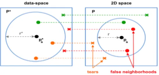
Figure 2: Model characterizing the different types of points relative to the reference point (in black). The neighborhood of the reference in the data-space is represented by a sphere of radius r∗ centered in the reference p∗s. And in the same way, its neighborhood in the 2D space is represented by a disc of radius r centered in ps. Points in the neighborhood of the reference are represented by a circle and the other by a cross. The points are either topological artifacts, i. e. false neighborhoods (in red) and tears (in orange), or well placed points (in green).
Geometric artifacts are caused by small distortions of distances such as compressions and stretching. The per-ceived 2D distances are inaccurate but neighborhoods are preserved: these artifacts do not impact directly interpreta-tion trustworthiness as clusters are neither split nor merged. When distortions are “important”, they can lead to topologi-cal artifacts: the visible neighborhood is wrong, some items seem close when they are actually far-away in data-space (false neighbors) while items that are close in data-space be-come far-away in 2D-space (tears). These artifacts are more problematic for analysis tasks: they distort 2D clustering and lead to misinterpretation.
Topological artifacts involve two important aspects: first, they are relative to a reference item or cluster. For exam-ple, a point that is a false neighbor for its 2D neighbors may also be a tear for its data-space neighbors (Figure 2). Second, topological artifacts have different levels of granularity. The definition of these artifacts relative to a reference item trans-fers relative to a reference cluster. Two distinct clusters in data-space may be projected in the same area on the pro-jection and then become false neighbors. In the same way, one cluster in data-space can be split into disconnected com-ponents in 2D space, and each component is a tear relative to the other. Splitting clusters “only” impacts interpretation trustworthiness made from the projection, but false neigh-bors also impact the visual quality of the projection by de-teriorating the visual separability of clusters. These artifacts damage the interpretability of projections at different levels depending on the considered visual analysis task.
Recently, Martins et al. [MCMT14] proposed a system with different views, each one indicating either the global stress, or false neighbors or tears according to different
scales (relative to an item or a cluster). Different measures are proposed for each type of artifacts and are represented on each view using color interpolation or bundled edges linking the original neighbors on the projection to highlight tears. These edges are colored according to the error intensity. To control the clutter of the edges, user can select a point or a set of points to focus the visualization around their rela-tive topological artifacts. This system helps understand the impact of the parameters and algorithm choices on the pro-jection quality, but it does not directly help to reveal actual clusters hidden by projection artifacts.
Using a uniform color scale, the proximity-based visual-ization[Aup07] corresponds to the interactive coloring of projections based on the original dissimilarities, that we pre-sented in Figure 3. This technique displays interactively at each point its original dissimilarity in the data-space rel-ative to a reference data item selected by the user on the projection. Distortions are indirectly visualized by contrast between 2D positions and colors representing the original dissimilarities. This technique may address visual analysis tasks such as validating outliers or visual clustering, but it displays local information relative to a reference item and its visual encoding needs to be validated. In this paper we report on a controlled experiment with the aim of evaluat-ing the effectiveness of this technique compared to the bare projection with regard to different visual analysis tasks.
2.3. Projections Evaluation
Several kinds of studies exist to compare the performances of projection algorithms [BJD81]. These studies consider a quality metric and a predefined setup of parameters to com-pare the algorithms on benchmark data sets. However, these studies do not address the human ability to interpret the re-sults of the algorithms.
Few user studies have been done on how the visualized projection are interpreted [IR11]. Recently, an evaluation on how experts and novices judge the quality of projections has been published [JML12], showing that experts are consistent in their analysis where novices are more random. The visual encoding of the projection as a 2D, 3D or SPLOM scatter-plot has also been studied [SMT13] and shows that the 2D scatterplot used with SPLOM really helps user perform ex-ploratory analysis with projections.
3. Assessing the Impact of Projection Artifacts
In this article, we want to assess how projection artifacts impact the interpretation of multidimensional scaling tech-niques, and in particular if we can overcome these artifacts using a —preferably simple— technique.
The proximity-based visualization [Aup07] is a simple technique; unlike other techniques it does not require any parameter, only the user selection of a reference point. The
Figure 3: Main questions involved by the visual analysis of projections in exploratory and confirmatory contexts (1,2). Explor-ing the projection with the interactive colorExplor-ing of the original dissimilarities gives an answer to each question (3). Indeed, the gaps in the projection colorings (from white to blue) show that there are six underlying clusters in the data (b,c,e,f,g,h). We also observe that the point at the bottom of the projection (1) seems to be actually a data outlier (a) and that the three points at the top of the projection (2) are not actually class outliers (h). The projection was obtained from the PCA of a synthetic dataset composed of 6 clusters generated from Gaussian distributions randomly centered in a 10-dimensional space. The reference point of the interactive coloring is the point with the whitest color, and is also the closest point from the mouse cursor. The whiter the color, the lower the dissimilarity to the reference in the data-space.
idea is to convey proximities in data-space using color in ad-dition to their spatial encoding. Displayed dissimilarities are relative to a reference item that implies exploring interac-tively the projection using a pointer. As this technique dis-plays original information in addition to the projection map-ping, it can help dealing with projection artifacts and help building a more reliable mental model of the proximity rela-tionships in data-space.
However it is not clear if visualizing the dissimilarities us-ing color is effective to help performus-ing visual analysis tasks on projections that present artifacts. Therefore, we designed a controlled experiment in order to assess the potential of this technique. With this experiment, we address the follow-ing research questions:
1. Can we help non specialists deal with visual analysis tasks using projections, independently of the inherent quality of these projections?
2. How do artifacts impact the visual analysis of projections? 3. Is the interactivity required by proximity-based
visualiza-tion worth its improvements in accuracy?
In the following, we refer the bare projection simply as Projectionand the proximity-based visualization [Aup07] as ProxiViz. We first describe the tasks, techniques and datasets we consider in the experiment before presenting how we as-sess projection quality for each task. We then introduce the experiment procedure and participants before presenting our hypotheses and the experiment results.
3.1. Tasks
Recently, a characterization of task sequences for the visual-ization of dimensionality-reduced data has been established from interviews with data analysts [BSIM14]. In this article, we consider multidimensional scaling techniques, therefore we focus only on cluster-oriented task sequences. Among the three task sequences proposed, we consider only the se-quences “verify clusters” and “match clusters and classes”, as the sequence “name clusters” would require participants to have prior knowledge in data. We define data outliers as particular cases of clusters: they are composed of only one data item; And class outliers are defined as mislabeled data items. We considered the following tasks and questions: Data outlier validation: for a highlighted dot on the pro-jection, participants have to choose a yes/no answer to the question “Is this a data outlier?”.
Clustering validation: for two differently colored sets of highlighted dots on the projection, participants have to choose a yes/no answer to the question “Do these two sets of points belong to the same cluster?”.
Clusters enumeration: participants have to answer the question “How many clusters can you count?” looking at the projection. They are allowed to answer 1 to 7.
Class outliers validation: for a highlighted dot on the class colored projection, participants have to choose a yes/no an-swer to the question “Is this a class outlier?”.
3.2. Techniques
We used the two following techniques:
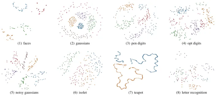
(1) faces (2) gaussians (3) pen digits (4) opt digits
(5) noisy gaussians (6) isolet (7) teapot (8) letter recognition
Figure 4: Projections of the different datasets used in the experiment. The colors represent class labels. Datasets 1-4 were considered as easy for a visual clustering task and datasets 5-8 were considered more difficult to analyze as the 2D clusters are less separated. Labels were indicated only for the class outliers validation task.
no color encoding. This visualization corresponds to a spa-tial encoding of the dissimilarity matrix. 2D distances tween points tend to respect the original dissimilarities be-tween data items.
ProxiViz is interactive and displays colors representing the original dissimilarities relative to a reference point. This in-teractive technique is a color encoding of only one row of the dissimilarity matrix. When the mouse moves over the vi-sualization area, the nearest point is interactively selected as reference[Aup07]; the color encoding of the visualization is immediately updated to display dissimilarities to the ref-erence in the data-space. We use a uniform shade of blue colorscale that vary in intensity to color the proximities (i. e. inverse dissimilarities). It starts with a white color indicating close-by items (i. e. with a null dissimilarity), then continues with blue nuances, and ends with black, indicating the farest items with maximum dissimilarity to the reference.
The original proximity-based visualization uses color to encode dissimilarities and it applies color on the Voronoi cell of each point. However the size of the Voronoi cells depends on the density of points and may vary arbitrary across the projection, which can introduce biases as this size does not encode any information.
We performed a pilot experiment with both synthetic and real datasets to choose a good visual encoding for Prox-iViz. We compared applying coloring to points, to Voronoi cells and to background using color interpolation based on the inverse-distance weighting. This interpolation used with ProxiViz displays the global proximity trends in each area of
(1) Bare projection (2) ProxiViz
Figure 5: Projection and ProxiViz as used in the experiment. The colorscale was shown to help analyzing the coloring. The gaps between colors intensity on the projection indicate gaps of dissimilarities in the data-space.
the projection while preserving the local proximity informa-tion with a shaded circle around each point (Figure 5).
For a cluster enumeration task, the results of the pilot show that ProxiViz with the color interpolation was signif-icantly more accurate that the other color encodings and overall preferred by the participants for its precision and aesthetic. We implemented the projection visualization in d3.js[BOH11] and the color interpolation using WebGL Shaders. This implementation scales up to one thousand items, so the interaction was fluid with our datasets.
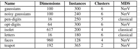
Name Dimensions Instances Clusters MDS gaussians 100 300 6 NerV noisy gaussians 100 240 6 NerV pen-digits 16 250 5 classical opt-digits 64 300 6 NerV isolet 617 200 4 classical letters 16 180 6 classical faces 960 128 4 NerV teapot 192 365 2 NerV
Figure 6: Summary of the characteristics of each dataset used in the experiment.
3.3. Datasets
We used high dimensional datasets and made sure that the ground truth (corresponding to class labels) was verified by the dissimilarity measure. More precisely, we verified that for the dissimilarities in the data-space, one cluster exists for each class label and that this cluster does not overlap with other clusters. We chose only datasets for which this criterion was verified. We then projected datasets using two different projection algorithms: classical MDS [Tor52], erV [VPN∗10], using different settings of the parameters. We vi-sually checked the clusters separability and selected the pro-jections to balance questions difficulties.
Real datasets were mainly taken from [FA10]: Pen-Based Recognition of Handwritten Digits (pen-digits), Op-tical Recognition of Handwritten Digits (opt-digits), Iso-lated Letter Speech Recognition (isolet), Letter Recogni-tion Dataset (letters), CMU Face Images Dataset (faces) and Teapot Dataset (teapot) from [ZL05]. We also generated two synthetic datasets with clusters based on Gaussian distribu-tions with random noise applied to some features of the sec-ond dataset (gaussians and noisy gaussians).
In order to justify the use of multidimensional scaling in-stead of linear projections, we favored datasets from image and signal processing as their dimensions were not directly interpretable. The two synthetical datasets helped to balance questions difficulties. More details are provided in Figure 6.
3.4. Difficulty
We visually explored each projection and detected local arti-facts. Then we set the questions and their answers manually for each task and dataset in order to balance the questions in two categories: easy and difficult. Easy questions are ques-tions that can be answered with no additional information and difficult ones involve topological artifacts or cluster sep-aration problems.
We used visual exploration and automated algorithm to suggest clusters and possible outliers using the scikit-learn library [PVG∗11]. We then selected interesting cases balanc-ing the questions difficulties:
Data outlier validation: we had to find data outliers for each dataset. Using One Class SVM [SWS∗99] and Local
Outlier Factor [BKNS00], we selected two sets of data out-liers. We visually selected one outlier at the intersection of the two sets. An easy question is when the outlier is well separated from the closest blob of points whereas a difficult one is when it is not.
Clustering validation: we had to select different clusters and cluster components for each dataset. We visually se-lected two sets of points close in 2D space and we ana-lyzed their connections using the k-nearest neighbors. Dif-ficult questions involve either tears or false neighborhoods. Clusters validation: we had to analyze the quality of clus-tering of each dataset. We verified the ground truth corre-sponding to labels by checking that each class had an under-lying cluster and that clusters did not overlap too much each other. We then categorized the questions depending on how clusters were visually separated on the projection.
Class outlier validation: we had to extract class outliers for each dataset. Using KNN Classifier [CH06] and One Class SVM [SWS∗99] on each class, we visually determined an interesting class outlier for each dataset. Difficult ques-tions involve either tears or false neighborhoods.
We tried to avoid questions that would be too easy or too hard to answer either with Projection or ProxiViz. We ex-pected that ProxiViz would be more accurate than Projec-tion on difficult quesProjec-tions and that the techniques would be equally accurate on easy questions.
3.5. Experiment design
We used a within-subjects design with no repeated measures and the following factors: Technique and Difficulty. The or-der of blocks and trials were counterbalanced using a Latin Square. We also changed the orientation and flipped the dis-play along one axis between each block for each projection. Each participant faced successively 2 blocks (one for each technique) of 24 trials (3 tasks × 8 projections) and then 2 blocks for the class outliers validation task with 8 trials each. We kept the blocks order with Projection first, because ProxiViz displays more information and users would be bi-ased when revisiting the same projection using the bare con-dition. Indeed, during the pilot session, we observed that participants recognized datasets when using ProxiViz before Projection and not when using Projection first. Introducing this order for the techniques may slightly bias our results, but we believe that considering our high level tasks, it is im-portant to avoid the observed learning effect while keeping the conditions equivalent by reusing the same projections.
In summary, the design included:
4 projections × 2 difficulties ×
4 tasks ×
2 techniques (blocks) = 64 trials per participants × 24 participants = 1,536 trials in total
3.6. Participants
The participants of our experiment are data analysts who aim at understanding underlying data structures in high-dimensional data, i. e. outliers or clusters. These data ana-lysts can be domain experts, statisticians, or data miners; they know how to interpret projections resulting from di-mensionality reduction and we made sure they were aware of their possible artifacts.
24 participants (8 women and 16 men) from 23 to 37 years old (avg. 28) from two laboratories specialized in data anal-ysis completed the evaluation. They all had a computer sci-ence background but in different domains: statistics, signal processing, image processing, machine learning, data min-ing. Their application fields were also varied in the same way that their level of expertise regarding data analysis. They rarely looked at projections but they had knowledge about projections techniques overall. They were used to static visu-alizations such as those available in different statistical anal-ysis software (matlab, R). They all had a normal vision with no color vision problems.
We did not consider recruiting novice analysts as it would have required training them to understand dimensionality re-duction and perform visual analysis of projections; still, our participants were not experts in multidimensional scaling. 3.7. Procedure
We recorded the answer and response time of each partici-pant for each question. Participartici-pants used only the mouse to interact with the system and answered questions by selecting a row in a multiple-choice form (yes/no or 1 to 7 clusters). Timing was started once a technique appeared on the screen and stopped when the participant validated the answer. Af-ter each validation, we also asked the confidence level re-garding the answer (five-points Likert scale). Between each block, the participants were free to rest a bit. We imposed a duration of 30-60 seconds maximum for each trial, for a to-tal evaluation duration of around 30 minutes, preceded by 20 minutes of presentation of the evaluation and a training. The evaluation system was run in a Chrome web-browser dis-played in full-screen resolution 1440 × 900 of a MacBook Pro display.
After a short introduction on artifacts and visual analysis, we verified that the analysts understood the techniques and agreed with our definitions of data outlier, cluster and class outlier. We trained subjects on a simple dataset for each tech-nique and task, and we let them explain their reasoning for each answer. If necessary, we explained the pitfalls of their reasoning and how they should understand the problem.
We used 6 subjects for a pilot to update the procedure of the experiment and verify results consistency. Before the study, participants filled a questionnaire eliciting demo-graphic information and to check for possible color blind-ness. After the study, participants also filled a questionnaire
of subjective preferences for the different techniques to col-lect feedback on their user experience.
3.8. Hypotheses
Our hypotheses are that ProxiViz will be more accurate than Projection overall, and even more so on difficult questions, both for local tasks involving outliers or clusters, and visual clustering tasks implying to explore the whole projection. We also hypothesize that participants will be significantly slower using the ProxiViz technique. However we do not ex-pect significant differences on easy questions for each task between ProxiViz and Projection.
Based on our experience and our three research questions introduced previously, our hypotheses were as follow: H1 For each task, we expect that ProxiViz is more effective
than Projection in terms of accuracy.
H2 For each task, we expect ProxiViz to be more effective than Projection for difficult questions and as effective as Projection for easy questions.
H3 For each task, we expect that participants will be signif-icantly faster using Projection.
4. Results
We transformed the error into a percentage of correctness: for tasks that expect a yes/no response, the correctness is either 100% or 0% if the answer is right or wrong. For clus-ters enumeration, the error is calculated as the difference be-tween the number of clusters found c and the number of clusters really present in the data c∗. We use in the sequel a percentage of correctness v based on this formula:
v= (
|c−c8−c∗∗| × 100, if c > c∗
|c−c1−c∗∗| × 100, if c ≤ c∗
(1)
Since our design is within-subject with repeated measures and that correctness do not follow a normal distribution for all tasks, we used Friedman’s test for one way analysis of variance to analyze more than two non-parametric distribu-tions, and pairwise Wilcoxon signed rank test with Bonfer-roni correction to analyze two independent non-parametric distributions. We log-transformed the response time to bet-ter fit a normal distribution and verified this assumption us-ing a Shapiro-Wilk test (p > .05). We then used the one-way repeated measure ANOVA and paired t-tests to analyze re-sponse time.
In terms of correctness, Friedman’s test reveals a signifi-cant effect of the factor Technique for each task, except for clusters enumeration. A significant effect of both Technique and Difficulty was found for each task. Overall participants obtained more good answers using ProxiViz than Projection for each task except for clusters enumeration. The details are shown in Figure 7.
Figure 7: Results of average correctness (in %), significance between factors given by Friedman’s test, and pairwise Wilcoxon signed rank test results.
In terms of response time, ANOVA reveals a significant effect of the factor Technique and no significant interaction between Technique and Difficulty. No significant differences were found in response time between easy and difficult ques-tions for each pair of technique and task. Pairwise compar-ison of the two techniques revealed that ProxiViz is signifi-cantly around 2 times slower (p < .0001) than Projection for each task, except clusters enumeration for which ProxiViz is significantly 3 times slower (p < .0001) and both on easy and difficult questions. More details are shown in Figure 8.
4.1. Confidence and User Preferences
No significant differences were found for the confidence an-swers between the two techniques. For all tasks, users felt confident except for clusters enumeration where they were neither confident nor skeptical for both technique. Low cor-relations were found between confidence and correctness, and between confidence and time.
We used these confidence results to check that difficulty levels were well calibrated and that none of the questions were too difficult or too easy to answer from the participants’ point of view. We would have expected that participants felt more confident using ProxiViz but it was not the case as they were not always able to interpret easily the coloring or to reconstruct the clustering using relative proximities gathered during exploration.
Overall ProxiViz was preferred to Projection (20 partic-ipants). 18 participants felt more confident and preferred ProxiViz for its clarity. 18 participants felt faster using Pro-jection. 21 felt that they were making correct choices using ProxiViz and 16 were satisfied by their choices. Some partic-ipants said they felt responsible for the errors because they were not able to accurately decode the additional informa-tion provided by ProxiViz.
5. Discussion
In this section, we discuss the results regarding our hypothe-ses which are overall supported.
H1: For each task, we expect that ProxiViz is more effec-tive than Projection in terms of accuracy.
For data and class outliers validation, H1 is supported as overall, ProxiViz was significantly (16%) more accurate than Projection. For clustering validation also, ProxiViz is signif-icantly (35%) more accurate than Projection. However, H1 is partially supported because for clusters enumeration Prox-iViz is not significantly more accurate than Projection.
This last result is not surprising as ProxiViz gives better insights on local information relative to one reference item. Generalizing each relative coloring to perform visual cluster-ing requires to explore the whole projection with the pointer, relying on the human memory to reconstruct the clustering,
which implies a high cognitive load. In particular, we no-ticed during the evaluation that participants felt lost on this task using ProxiViz as the dissimilarity distributions were really different from one dataset to the other. Some partici-pants felt also lost during their exploration as colors changed dramatically when moving from one reference to another.
Moreover the difference of color intensities between clus-ters was sometimes difficult to assess to delimit clusclus-ters. In particular, we noticed that some participants used the 2D positions instead of the coloring when they considered that color difference was too difficult to interpret and the 2D dis-tances good enough. This suggests that the bare projection gives a suitable overview of the data clustering.
Overall results show that participants were on average ef-fective at analyzing the colors displayed by ProxiViz (60% to 80% accurate). ProxiViz is also significantly more reli-able than Projection for outliers and clusters validation. So ProxiViz can help non-specialists deal with label matching tasks and tasks related to class structure in a confirmatory context, irrespective of the inherent quality of the projection considered. Note that we considered a dissimilarity matrix that reflected the class model, and we did not took into ac-count the inherent problem of finding and validating such dissimilarity measure.
H2: For each task, we expect ProxiViz to be more tive than Projection for difficult questions and as effec-tive as Projection for easy questions.
For data and class outliers validation, H2 was supported as ProxiViz was 30-38% more accurate than Projection on difficult questions. For clustering validation also as ProxiViz was 74% more accurate than Projection on difficult ques-tions. Furthermore, for class outlier validation, we observed that the 6% difference of correctness on easy questions be-tween ProxiViz and Projection was significant.
For clustering validation, correctness results are very low for hard questions using Projection. For this task, artifacts involved in hard questions were almost impossible to de-tect using Projection. However using ProxiViz, they were revealed and participants were able to use their finding to answer questions without having to explore, which explains that correctess results were better for hard questions than for easy questions using ProxiViz.
We noticed during the evaluation that participants had sometimes problems to recall the definition of a class out-lier and the question may have not been well expressed. For this task, participants had to verify that the highlighted point was not in the neighborhood of the other points of its class. So they had to verify that: “no, the point is not in the neighborhood of the class” to answer “yes, this is a class outlier”. Using Projection, verifying the neighborhood is quickly done and some participants may have made mis-takes because they answered too quickly, not following the right reasoning, which was clearly uneasy.
For clusters enumeration, H2 was partially supported, as ProxiViz was not less accurate than Projection on difficult questions. Nevertheless for clusters enumeration, we ob-served that the 6% difference of correctness on easy ques-tions between Projection and ProxiViz was significant. This suggest that when clusters are well separated, Projection gives a better overview of the data clustering than ProxiViz. Considering all tasks and techniques, we can notice that the highest correctness is close to 90% and the lowest cor-rectness close to 5%. This suggests that questions were nei-ther too easy nor too hard, and especially for local tasks that required a yes/no answer. These results might be improved using a longer training of participants to make them share the same visual criteria defining outliers and clusters.
Overall, our results show that ProxiViz is more robust to artifacts than Projection. For local tasks, analysts must clearly be explained the dangerous impact of artifacts. Con-versely for more global tasks involving visual clustering, it seems that the impact of artifacts is less important. The static projection is a good tradeoff to obtain an overview of the data clustering. However we still need to evaluate if other techniques that enhance the projection may improve the ac-curacy of visual clustering.
H3: For each task, we expect that participants will be significantly faster using Projection
For data outliers, class outliers and clusters validation, H3 was supported, as overall ProxiViz was significantly slower (around 2 times) than Projection on both easy and diffi-cult questions. For clusters enumeration, H3 was also sup-ported, as overall, ProxiViz was significantly slower (around 3 times) than Projection on both easy and difficult questions. Overall no significant differences were found between easy and difficult questions for each technique and task.
Exploring projections for local tasks with ProxiViz does not require a large difference of time compared with Projec-tion. Moreover this time is independent of artifacts. Prox-iViz is then worthwhile to dig into the details, as users will feel more responsible for their choices because these choices are resulting from a methodical exploration instead of an overview for which we know artifacts happen.
6. Conclusion and Future Work
In this article, we have investigated how artifacts inherent to multidimensional projections interfere with the interpre-tation of these visualizations, and the effectiveness of the ProxiViz technique to facilitate the detection and interpre-tation of these artifacts. The ProxiViz technique interac-tively colors the whole visualization when the user moves the pointer to a particular point: it shows a color-map where the intensity decreases with the dissimilarity in data-space from the focus point, conveying dissimilarity information using the color channel. We conducted a controlled exper-iment to evaluate the effectiveness of ProxiViz compared to
the bare projection with regard to different visual analysis tasks. These tasks require both local and global exploration, and involve both outliers and clusters detection.
Results show that ProxiViz is effective to perform lo-cal tasks such as label matching of outliers and clusters. Moreover this interactive technique is robust to the artifacts whereas the bare projection is not for the considered tasks. Conversely, for visual clustering tasks, results show that the impact of artifacts is less important and that projections give a suitable overview of the data clustering. The ProxiViz tech-nique is therefore a valuable interactive enhancement for projection-based systems.
Projection-based visualizations have applications in do-mains where users are not analysts but need to make im-portant decisions about high-dimensional data. One exam-ple is cargo scanning, used by customs to check the contents of freight shipping containers as quickly as possible. The scan of a container returns multidimensional information that needs to be checked against the list of goods declared to be in the container. This list of goods (e. g. toys, furniture) is translated into multidimensional information and projected over the scanned information. Some decision needs to be done about the container: let it go, fast check, or in-depth check. This decision can be critical and relies on human judgment to interpret the possible issues. Our results indi-cate that ProxiViz is suitable for this use case as is robust to projection artifacts for outlier detection.
As projection artifacts have still a significant effect on lo-cal analysis, measures and approaches that help assessing the quality of projection must be generalized in existing soft-wares that visualize high-dimensional data with projections. References
[Aup07] AUPETIT M.: Visualizing distortions and recovering topology in continuous projection techniques. Neurocomputing 70, 7-9 (2007), 1304–1330.
[BCLC97] BRODBECKD., CHALMERSM., LUNZERA., COT
-TUREP.: Domesticating bead: adapting an information visu-alization system to a financial institution. In Proceedings of the 1997 IEEE Symposium on Information Visualization (InfoVis ’97)(1997).
[BJD81] BISWASG., JAINA., DUBESR.: Evaluation of pro-jection algorithms. IEEE Transactions on Pattern Analysis and Machine Intelligence PAMI-3, 6 (1981), 701–708.
[BKNS00] BREUNIG M. M., KRIEGEL H.-P., NG R. T., SANDERJ.: Lof: identifying density-based local outliers. In Pro-ceedings of the 2000 ACM SIGMOD international conference on Management of data(2000), SIGMOD ’00, pp. 93–104. [BOH11] BOSTOCKM., OGIEVETSKYV., HEERJ.: D3:
Data-driven documents. IEEE Trans. Visualization & Comp. Graph-ics (Proc. InfoVis)(2011). URL: http://vis.stanford. edu/papers/d3.
[BSIM14] BREHMERM., SEDLMAIR M., INGRAM S., MUN
-ZNERT.: Visualizing dimensionally-reduced data: interviews with analysts and a characterization of task sequences. In Pro-ceedings of the Fifth Workshop on Beyond Time and Errors:
Novel Evaluation Methods for Visualization, BELIV 2014, Paris, France, November 10, 2014(2014), pp. 1–8.
[BTK11] BERTINIE., TATUA., KEIMD. A.: Quality metrics in high-dimensional data visualization: An overview and systemati-zation. IEEE Symposium on Information Visualization (InfoVis) 17, 12 (2011), 2203–2212.
[BW96] BENTLEYC., WARDM.: Animating multidimensional scaling to visualize n-dimensional data sets. In Proceedings IEEE Symposium on Information Visualization(1996), pp. 72 –73. [CH06] COVERT., HARTP.: Nearest neighbor pattern
classifica-tion. IEEE Trans. Inf. Theor. 13, 1 (2006), 21–27.
[CM88] CLEVELANDW. C., MCGILLM. E.: Dynamic Graph-ics for StatistGraph-ics. CRC Press, Inc., 1988.
[CRMH12] CHUANG J., RAMAGE D., MANNING C. D., HEER J.: Interpretation and trust: Designing model-driven visualizations for text analysis. In ACM Hu-man Factors in Computing Systems (CHI) (2012), pp. 443– 452. URL: http://vis.stanford.edu/papers/ designing-model-driven-vis.
[FA10] FRANK A., ASUNCION A.: UCI Machine Learning Repository. Irvine, CA: University of California, School of In-formation and Computer Sciences, 2010. URL: http:// archive.ics.uci.edu/ml/datasets/.
[FSJ13] FERNSTADS. J., SHAWJ., JOHANSSON J.: Quality-based guidance for exploratory dimensionality reduction. Infor-mation Visualization 12, 1 (2013), 44–64.
[IMI∗10] INGRAM S., MUNZNER T., IRVINE V., TORY M., BERGNERS., MÖLLERT.: Dimstiller: Workflows for dimen-sional analysis and reduction. In 2010 IEEE Symposium on Vi-sual Analytics Science and Technology (VAST)(2010), pp. 3–10. [Ins85] INSELBERGA.: The plane with parallel coordinates. The
Visual Computer 1, 2 (1985), 69–91.
[IR11] ICKEI., ROSENBERGA.: Automated measures for inter-pretable dimensionality reduction for visual classification: A user study. In Visual Analytics Science and Technology (VAST), 2011 IEEE Conference on(2011), pp. 281–282.
[JML12] JOSHUAM. LEWISLAURENS VAN DERMAATENV.
D. S.: A behavioral investigation of dimensionality reduction. Proceedings of the 34th Annual Conference of the Cognitive Sci-ence Society(2012), 671–676.
[LA11] LESPINATSS., AUPETITM.: CheckViz: Sanity Check and Topological Clues for Linear and Non-Linear Mappings. Computer Graphics Forum 30, 1 (2011), 113–125.
[MCMT14] MARTINS R. M., COIMBRA D., MINGHIM R., TELEAA.: Visual analysis of dimensionality reduction quality for parameterized projections. Computers and Graphics (2014). [PVG∗11] PEDREGOSA F., VAROQUAUX G., GRAMFORT A.,
MICHELV., THIRION B., GRISEL O., BLONDELM., PRET
-TENHOFER P., WEISS R., DUBOURG V., VANDERPLAS J., PASSOS A., COURNAPEAUD., BRUCHER M., PERROT M., DUCHESNAY E.: Scikit-learn: Machine Learning in Python . Journal of Machine Learning Research 12(2011), 2825–2830. [SMT13] SEDLMAIR M., MUNZNER T., TORYM.:
Empiri-cal guidance on scatterplot and dimension reduction technique choices. IEEE transactions on visualization and computer graph-ics 19, 12 (2013), 2634–2643.
[SNLH09] SIPSM., NEUBERTB., LEWIS J. P., HANRAHAN
P.: Selecting good views of high-dimensional data using class consistency. In Proceedings of the 11th Eurographics / IEEE - VGTC conference on Visualization(2009), EuroVis’09, Euro-graphics Association, pp. 831–838.
[STMT12] SEDLMAIRM., TATUA., MUNZNERT., TORYM.: A taxonomy of visual cluster separation factors. Comput. Graph. Forum 31, 3 (2012), 1335–1344.
[SvLB10] SCHRECKT.,VONLANDESBERGERT., BREMMS.: Techniques for precision-based visual analysis of projected data. Information Visualization 9, 3 (2010), 181–193.
[SWS∗99] SCHÖLKOPF B., WILLIAMSON R., SMOLA A., SHAWE-TAYLORJ., PLATTJ.: Support vector method for nov-elty detection. NIPS (1999).
[TBB∗10] TATUA., BAKP., BERTINIE., KEIMD., SCHNEI
-DEWINDJ.: Visual quality metrics and human perception: an initial study on 2d projections of large multidimensional data. In Proceedings of the International Conference on Advanced Visual Interfaces(2010), AVI ’10, pp. 49–56.
[Tor52] TORGERSONW.: Multidimensional scaling: I. Theory and method. Psychometrika 17, 4 (1952), 401–419.
[vdMPvdH08] VAN DERMAATENL., POSTMAE. O.,VAN DEN
HERIKH. J.: Dimensionality reduction: A comparative review, 2008.
[VPN∗10] VENNA J., PELTONEN J., NYBO K., AIDOS H., KASKIS.: Infomation retrieval perspective to nonlinear dimen-sionality reduction. Journal of Machine Learning Research 11, 1 (2010), 451–490.
[WAG05] WILKINSONL., ANANDA., GROSSMANR.: Graph-theoretic scagnostics. In IEEE Symposium on Information Visu-alization. INFOVIS 2005(2005), IEEE, pp. 157–164.
[ZL05] ZHU X., LAFFERTY J.: Harmonic mixtures: com-bining mixture models and graph-based methods for induc-tive and scalable semi-supervised learning. In Proceedings of the 22nd international conference on Machine learning(2005), pp. 1052–1059. URL: http://pages.cs.wisc.edu/ ~jerryzhu/publications.html.