HAL Id: hal-00872483
https://hal.inria.fr/hal-00872483
Submitted on 18 Feb 2014HAL is a multi-disciplinary open access archive for the deposit and dissemination of sci-entific research documents, whether they are pub-lished or not. The documents may come from
L’archive ouverte pluridisciplinaire HAL, est destinée au dépôt et à la diffusion de documents scientifiques de niveau recherche, publiés ou non, émanant des établissements d’enseignement et de
Evaluating Trace Aggregation Through Entropy
Measures for Optimal Performance Visualization of
Large Distributed Systems
Robin Lamarche-Perrin, Lucas Schnorr, Yves Demazeau, Jean-Marc Vincent
To cite this version:
Robin Lamarche-Perrin, Lucas Schnorr, Yves Demazeau, Jean-Marc Vincent. Evaluating Trace Ag-gregation Through Entropy Measures for Optimal Performance Visualization of Large Distributed Systems. [Research Report] RR-LIG-037, 2013, pp.21. �hal-00872483�
Evaluating Trace Aggregation Through
Entropy Measures for Optimal Performance
Visualization of Large Distributed Systems
Laboratoire d’Informatique de Grenoble December 10th, 2012
Robin Lamarche-Perrin
Universit´e de Grenoble
Lucas Mello Shnorr
CNRS Jean-Marc Vincent
Universit´e Joseph Fourier
Yves Demazeau
CNRS
Abstract
Large-scale distributed high-performance applications are involving an ever-increasing number of threads to explore the extreme concurrency of today’s systems. The performance analysis through visualization techniques usually suffers severe semantic limitations due, from one side, to the size of parallel applications, from another side, to the challenges to visualize large-scale traces. Most of performance visualization tools rely therefore on data aggregation in order to be able to scale. Even if this technique is frequently used, to the best of our knowledge, there has not been any real attempt to evaluate the quality of aggregated data for visualization. This paper presents an approach which fills this gap. We propose to build optimized macroscopic visualizations using measures inherited from information theory, and in particular the Kullback-Leibler divergence. These measures are used to estimate the complexity reduced and the information lost during any given data aggregation. We first illustrate the applicability of our approach by exploiting these two measures in the analysis of work stealing traces using squarified treemaps. We then report the effective scalability of our approach by visualizing known anomalies in a synthetic trace file with the behavior of one million processes, with encouraging results. Keywords: Large-scale distributed systems, performance visualization, data aggregation, multi-resolution visualization, information theory.
1
Introduction
Large-scale distributed and high-performance systems are today composed of many thousands and eventually millions of cores. The largest machine of the Top500 list, for example, has more than 1.5 million cores. Exascale supercomputers with billions of cores are expected in next years. Applications for these platforms are composed of many threads to explore the extreme concurrency. The behavior analysis of such large-scale applications is very challenging. Technical challenges are to register many data with minimal intrusion, and to centralize traces during the analysis, for instance. Semantic challenges are more important: how to extract useful insights present on several time scales, from nanoseconds to days, and space scales, from one process to many.
Performance visualization of parallel and distributed applications is a widely used analysis technique. It creates a visual representation of events so the performance analyst can visually detect patterns and anomalies in such representation. Visualization techniques may take different forms, ranging from the classical space/time views, based on Gantt-charts [24], to more non-traditional alternatives such as treemaps and graph views. Some examples of performance visualization tools include Vampir [3], Paje [7], Paraver [18], and many others [5, 25, 20].
All these performance visualization tools suffer semantic limitations, since there is too many data than what would fit on a given display [21]. Normally, such tools rely on clustering, selection and data aggregation techniques to reduce trace size and to offer a proper rendering of large traces. Clustering [16] creates groups of process by similarity, choosing one to act as the group. Since such groups are generally unrelated with the platform infrastructure, they can mislead the analysis by showing processes correlation of different semantic groups. Selection mechanisms remove data from the analysis, neglecting some behavior. Semantic aggregation [8] allows to turn raw events into macroscopic traces according to an aggregation operator (average, sum, and so on) and sometimes associated to the platform hierarchical organization [19]. Aggregation thus aims at a complexity reduction of the data by simplifying the microscopic traces into a coherent macroscopic description of the system states and dynamics.
Data aggregation is commonly used and difficult to avoid in performance visualization of large-scale traces. For example, Paraver [13] has aggregation operators to control sub-pixel rendering; Vampir [3] selects the color of a pixel based on the highest probability of a process being in an application state; and Viva [21] allows the user to spatially aggregate trace events. A
P
12
10
10
12
11
14
11
12
9
Cluster A5
5
17
2
13
6
20
19
13
Cluster B100
Aggregate11
11
11
11
11
11
11
11
11
Normalized Agg.Q'
Q
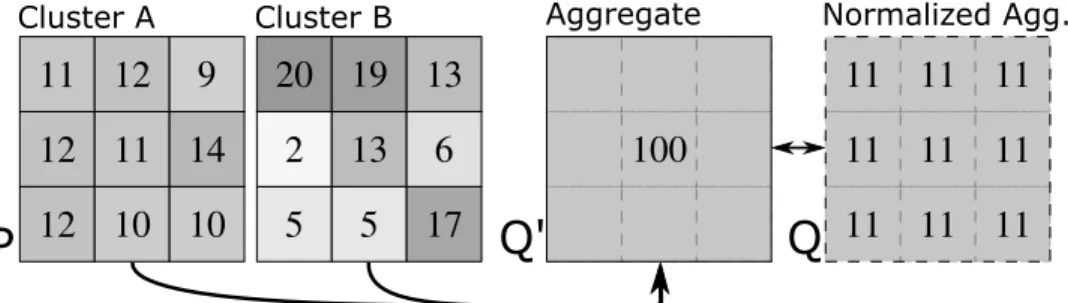
Figure 1: Aggregating cluster A leads to an interesting simplification (because inner behavior is quite homogeneous); for cluster B, however, aggregation causes severe data loss.
complete review of such tools and how they aggregated data is presented in the related work section.
Even if data aggregation is frequently used in tools, there have been very few attempts to evaluate the quality of aggregated data. Figure 1 illustrates how such evaluation is important. It presents two cluster aggregations (A and B) that lead to the same aggregated view, although with a very different behavior as input. Aggregating cluster A is a good abstraction since it simplifies an homogeneous distribution. Visualization tools should encourage such simplification. Aggregating cluster B, however, must be used with care. It leads to an information loss because the distinct inner behavior of cluster B is summarized by the aggregation. Visualization tools should warn the user when an aggregation is semantically misleading. They need to provide measures that indicate (1) when behavior may safely be aggregated to reduce the visualization complexity and (2) when behavior is, on the contrary, hidden by aggregation leading to an unwanted information loss. Such measures should be methodically provided to find the best possible aggregations for the analysis purposes.
This paper presents a novel approach to build suitable macroscopic visu-alization by evaluating the quality of data aggregation. Measures inherited from information theory, in particular the Kullback-Leibler divergence, are used to evaluate the reduced complexity and the lost information, during aggregation. We validate the approach in the analysis of work stealing traces using treemaps. To the best of our knowledge, this is the first attempt to try to evaluate trace aggregation for performance visualization. In addition, we have tested the scalability of the approach by visualizing known anomalies in a synthetic trace file with the behavior of one million processes, with encouraging results.
The remaining of this paper is organized as follows. Section 2 presents related work on trace visualization tools that show aggregated data, plus a motivation for our approach. Sections 3 and 4 presents the bulk of our work to evaluate data aggregation for trace visualization. Section 5 presents scenarios to evaluate our approach with real and synthetic traces. Section 6 closes the paper.
2
Related Work and Discussion
Data aggregation is fundamental for the scalability of performance analysis tools. Many trace reduction techniques exists in several forms [1, 11, 16, 17, 20] to try to reduce the amount of data that is going to be analyzed. Such reduction techniques are applied for technical reasons, to scale the tools, but also for semantic reasons, to try to better understand what is registered on the traces.
In a general way, trace reduction techniques can be classified in two groups: selection and aggregation. The former groups solutions that select a subset of the data according to some criteria, which can be either automatic as in clustering algorithms, or directly chosen. The latter groups all the data aggregation techniques that transforms the raw traces into another kind, whose intent is to represent the aggregated entities. An overview of hierarchical aggregation for information visualization is also available in [8].
There is always some kind of aggregation considering performance visu-alization of large traces. We adopt here the terminology [21] that groups visualization techniques and tools on three categories according to their data aggregation policies: Forbidden, when the performance visualization tool forbids data aggregation at some level, commonly to avoid an implicit data aggregation that could mislead the analysis; Implicit, when there is no way to distinguish in the visualization something that has been aggregated from raw traces – embraces also graphical aggregation done by the visualization rendering; and Explicit, when the performance analyst keeps control of the aggregation operators and the data neighborhood that is going to be aggregated and there is a way to differentiate aggregated data from raw data.
We detail here a very fine-grained analysis, where performance visualiza-tion tools can fall in more than one category if they have different aggregavisualiza-tion algorithms and techniques depending on the data dimensions.
Explicit Data Aggregation The Paje’s space/time view [7] has explicit data aggregation in the temporal dimension for application states.
Aggre-gated states are represented by slashed rectangles with the state frequency distribution within them. Non-aggregated states are represented by solid rectangles. Paraver [18] has explicit data aggregation in both space and time dimensions of the timeline view [13], effectively controlling sub-pixel rendering in an explicit manner. The user is able to select an aggregation operator for each or both dimensions combined. These are the possible aggregation operators: last, maximum, minimum not zero, random, random not zero and average. Explicit data aggregation appears in the temporal dimension of Vampir’s master timeline [3] for the communications represen-tation (arrows): a special message burst symbol [10] is tells the user that a zoom is necessary to get further details on the messages. Triva [22] and Viva [21] have explicit data aggregation for spatial and temporal dimensions, but they use alternative trace visualization techniques.
Implicit Data Aggregation Paje’s space/time view [7] has implicit data aggregation in the temporal dimension for links, events and variables. There is no way to tell if a visual object represents an aggregated data or not. Despite this, the user can inspect the objects to get more information. Vampir’s master timeline [3] has implicit data aggregation for the temporal axis and application functions, represented by horizontal bars. It chooses the color of each screen pixel according to the more frequent function on the time interval that is represented by that pixel [10]. The user has no visual feedback if an aggregation takes place or not for the representation of application functions. Vite’s timeline [5] has implicit data aggregation on spatial and temporal dimensions, since it draws everything no matter the size of the screen space dedicated to the visualization. With Jumpshot-4 [4] and its scalable slog2 trace file format, the analyst can configure how many aggregation bands are going to be used in its timeline view. These aggregation bands help the tool to read the trace files in a fast and scalable manner.
Forbidden Data Aggregation Paje’s space/time view [7] forbids data aggregation on the spatial dimension by imposing a minimum screen size limit for each monitored entity. This technique imposes the users to scroll down the window to see more processes, by that never enabling an overview of processes. Very few tools forbids data aggregation in the temporal dimension, since this forces users to an endless microscopic vision of the traces. As result, most of tools have implicit data aggregation for the temporal dimension.
2.1 Discussion
Data aggregation is used by many visualization tools. Despite that, there is very few to no research effort on the evaluation of the quality of the aggregated traces. Viva [21], for example, allows the user to do spatial and temporal aggregation, but there is no way to tell if an aggregated data has hidden some important behavior. Since aggregated levels need to be used for complexity issues, some behavior is generally overlooked at scale. Paraver [13] calculates aggregated data, both in time and space, based on different operators: average, random, and others. But again, there is no quantitative measure of information loss. That is also the case for Vampir [3] with no indication of information loss. All other tools that have no aggregation features could also benefit from evaluation quality measures of data aggregation. In many scenarios, these tools avoid the representation of aggregate data despite a very redundant behavior.
Generally, evaluating the quality of aggregated data is essential to keep trace visualization techniques meaningful at scale. Next section details our approach to create entropy-based measures for data aggregation in the context of performance analysis of parallel and distributed applications. Because such measures are available, we also propose an algorithm to provide the best aggregation available that minimizes information loss and maximizes complexity reduction.
3
Data Aggregation Evaluation
In this section, we present our approach to evaluate the quality of data aggregation through the definition of gain and loss measures inherited from information theory.
3.1 Microscopic and Aggregated Data
Let E be the set of the system processes (micro-entities). Performance visualization aims at displaying variables such as internal states, communica-tion events, for each of the processes. Given a variable v, the set of values tv♣eq✉ePE composes the microscopic description of the system (illustrated by distribution P in Fig. 1). Such a description provides the complete in-formation regarding the displayed variable. However, in many cases, it is not necessary to have all these details to fulfill the analysis purposes. A simpler – yet meaningful – aggregated description may suffice to understand and explain the system global behavior.
An aggregate A⑨ E is a macro-entity that summarizes a subset of micro-entities. Variables can be defined on aggregates in several ways [8], such as: the sum of sub-entities values (for extensive variables like computational power – see Q✶ in Fig. 1); or the weighted mean of sub-entities values (for
intensive variables such as density, states ratios and event frequencies). An aggregation A is a partition of micro-entities in aggregates. The set of
aggregated valuestv♣Aq✉APA composes the macroscopic description of the system. It simplifies the variable distribution, from the detailed micro-description (P in Fig. 1) to a synthesized one (Q✶). When comparing both descriptions, it is underlined that aggregated values are uniformly distributed over sub-entities (from Q✶ to Q). Consequently, as illustrated in Fig. 1, some aggregations are more suitable than others. For example, aggregating cluster A seems more interesting since P is close to Q, unlike cluster B. Hence, aggregations should be carefully chosen to provide accurate high-level abstractions. In particular, they should only aggregate homogeneous and redundant distributions.
3.2 Measures Specifications
The derivation of the following measures is detailed in previous work [15]. Their interest to define what are the “good” aggregations is discussed in [14]. Basically, they are based on the fact that finding a good aggregation relies on two issues. Given a set of micro-entities: (1) What gain is provided by aggregation? (2) Is a good aggregation achievable by an algorithm? Because aggregated data is easier to analyze, choosing an aggregation consists in finding a compromise between a complexity reduction (or gain) and an information loss. Once we have defined and estimated these quality measures for an aggregation A, the trade-off can be expressed as a parametrized
Information Criterion:
pIC♣Aq ✏ p ✂ gain♣Aq ✁ ♣1 ✁ pq ✂ loss♣Aq (1) pP r0, 1s is a parameter used to balance the trade-off. For p ✏ 0, maximizing the pIC is equivalent to minimizing the loss: the analyst wants to be the more precise (no aggregation). For p ✏ 1, she wants to be the simplest (full aggregation). When p varies between 0 and 1, a whole class of nested aggregations arises. The choice of this parameter is deliberately left to the user, so she can adapt the description level to her varying requirements: between the expected amount of details and the available computational resources.
Due to consistency reasons considering Eq.1, and to have a meaningful information criterion, gain and loss should be comparable and follow these algebraic properties:
Microscopic Grounding Property The quality of an aggregate should only depend on its sub-entities values, and not on its own topological prop-erties.
Sum Property [6] The quality of an aggregate should not depend on disjoint aggregates. It is essential to efficiently compare nested aggregations (see section 4).
Consistency with the Lattice The set of aggregates is a partially ordered set (lattice). If an aggregate A1 is nested in an aggregate A2, we assume that it cannot increase neither the complexity (gain♣A1q ➔ gain♣A2q) nor the information content (loss♣A1q ➔ loss♣A2q).
3.3 What is Lost?
To evaluate the goodness-of-fit of macroscopic descriptions, we need a sim-ilarity measure. Among classical ones, Kullback-Leibler (KL) divergence [12] is of high interest because of its interpretation from an information theory point of view. To trace events occurring at the microscopic level, the symbolic coding of processes id can be optimized depending on the distribution of their occurrences: A process with many events will have a short binary id, whereas a less frequent one will have a longer id. Formally, the KL divergence measures the number of bits of information that one loses by using an approximated distribution Q to find an optimal coding of
id instead of using the detailed source distribution P . In other words, KL
divergence estimates the information quantity wasted during the aggregation process. An aggregate which internal distribution is very heterogeneous has a very high divergence, indicating an important information loss.
From the KL formula [12], we define divergence of an aggregate A as follows (more details can be found in [15]):
loss♣Aq ✏ ➳ ePA v♣eq ✂ log2 ✂ v♣eq v♣Aq ✂ ⑤A⑤ ✡ (2)
3.4 What is Gained?
An aggregated description is easier to encode than a detailed one. The gain of an aggregation should then estimate the information quantity saved by using an aggregate A instead of its micro-entities: gain♣Aq ✏ ♣➦ePAQ♣eqq ✁ Q♣Aq
3.4.1 Encoding Values
One way of measuring information consists in counting the bits needed to encode the values of a description. We suppose that it is constant for each aggregate A and entity e: Q♣Aq ✏ Q♣eq ✏ q, where q depends on the data type of the entities values. Hence, for an aggregate A, we have gain♣Aq ✏ ♣⑤A⑤ ✁ 1q ✂ q. It is a basic measure, but it fits well the treemap visualization since the number of displayed entities⑤A⑤ defines the microscopic granularity of the visualization. It thus estimates the amount of computational resources needed to store and render aggregated representations. Therefore, reducing the number of encoded values improves the scalability of use.
3.4.2 Shannon Entropy [23]
Entropy is a classical complexity measure that is consistent with KL diver-gence (it is the diverdiver-gence from the uniform distribution [12]). Briefly, it evaluates the information quantity needed to encode the process identifier
for each event (and not only the value for each process). In previous work,
we used entropy for data aggregation of Geography Information System [15]. From Shannon formula [23], we defined the entropy reduction of an aggregate A as follows. In future work, we intend to apply it for performance visualization of distributed systems:
gain♣Aq ✏ ♣v♣Aq log2v♣Aqq ✁ ➳ ePA
♣v♣eq log2v♣eqq (3)
4
Finding the Best Aggregation
Complexity reduction and information loss measures allow to compare ag-gregations. Given a value of p, best aggregations are those that maximize the information criterion pIC. Clustering techniques, using gain and loss measures as distances, could find such optimal partitions. However, results may have very few meaning since processes would be aggregated regardless of their location within the system. We claim that, to be meaningful, aggre-gations should fit topological constraints. Moreover, we generally assume a
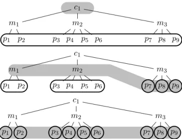
c1 m1 m2 m3 p1 p2 p3 p4 p5 p6 p7 p8 p9 c1 m1 m2 m3 p1 p2 p3 p4 p5 p6 p7 p8 p9 c1 m1 m2 m3 p1 p2 p3 p4 p5 p6 p7 p8 p9
Figure 2: Three aggregations in a hierarchy with 1 cluster, 3 machines, and 9 processes. Each gray area marks a possible aggregation and bounded nodes are the induced processes partitions: from full aggregation (case A) to no aggregation (case C), via a multi-resolution aggregation (case B).
correlation between topology and behavior. Visualization techniques, as well as data aggregation, should then be consistent with the system space. In this section, we are interested in hierarchically organized systems. We give an algorithm to find topologically-consistent aggregations that maximize the information criterion.
4.1 Aggregations within a Hierarchy
Some distributed systems, such as Grid5000 [2], have its computational resources hierarchically organized: processes grouped by machines, then by clusters, and so on. In other cases, hierarchies can be inferred from an application point of view: similarity between users in peer-to-peer systems, task distribution, geographical location of the machines, and so on. These organizations are expected to be meaningful for the system analysis in the sense that they can explain the processes behavior. As a consequence, macroscopic descriptions should be built according to such organizations.
A hierarchy is equivalent to a tree: leaves are micro-entities; nodes are aggregates; and the root represents the full aggregation. Fig. 2 presents a hierarchy of 1 cluster, 3 machines and 9 processes. The possible partitions of processes are constraint by the hierarchy. In particular, one cannot aggregate
two processes in different branches, unless she also aggregates the entire sub-trees. For example, in Fig. 2, if p1 and p4 are aggregated, so are m1 and m2 (and all the underlying processes). An aggregation is thus characterized by a cut of the tree, i.e. a set of aggregates such that each leaf belongs to one and only one aggregate of the cut (see the three cuts in Fig. 2).
We can easily show that the number of possible aggregations within a tree T verifies the recursive formula: N♣T q ✏ 1 ➧N♣Sq, where the S are the “direct subtrees” of T . Then, the number of possible aggregations within a hierarchy is much less than the total number of partitions of a set of n micro-entities, which is given by the Bell formula: B♣n 1q ✏➦n
k✏0 n k ✟
B♣nq. In particular, contrary to B, N does not directly depend on the number of micro-entities, but mostly on the number of levels. For example, N remains constant if one process is added to an existing machine, whereas B grows exponentially. Hierarchies thus allow to search for best aggregations in a very restricted space.
4.2 The Best Aggregation Algorithm
The number of possible aggregations still exponentially depends on the number of aggregates and levels. In experiments of the following section, it is respectively in the order of 103
, 1015
and 103010
. Finding best aggregations by comparing all possible aggregations can thus be impossible in practice.
Algorithm 1 – in next page – linearly depends on the number of aggregates (respectively 102
, 102
and 106
). It takes a tree with nodes labeled by gain and
loss values and returns, given a value of p, an aggregation that maximizes
the information criterion pIC. Thanks to the sum property, each branch of the tree can be independently evaluated. Thus, the algorithm becomes a classical linear search. Remark that the computation of gain and loss values for each aggregate also linearly depends on the number of aggregates, thanks to the microscopic grounding property.
In the following section, we apply this algorithm to build efficient macro-scopic representations of three distributed systems. The aggregation it provides may be used with serenity since the algorithm guarantees that aggregated values are homogeneous and that they do not conceal essential information regarding the underlying behaviors.
Algorithm 1 Finding the best aggregation.
Require: A tree T with gain and loss labels on nodes. Require: A trade-off parameter p inr0, 1s.
Ensure: An aggregation within T that maximizes pIC.
1: procedure findBestAggregation(T,p) 2: rootAggÐ troot✉
3: if T is a leaf then return rootAgg 4: for each S direct subtree of T do 5: auxÐ findBestAggregation♣S, pq 6: childAggÐ union♣childAgg, auxq
7: if rootAgg.pIC→ childAgg.pIC then return rootAgg 8: else return childAgg
5
Case Studies and Results Evaluation
We demonstrate the effectiveness of our data aggregation evaluation approach through a series of scenarios. Next subsection describes the analysis frame-work and traces. The remaining subsections present each of the scenarios: two experiments on the work stealing analysis and one scalability test with one million processes.
Analysis Framework and Trace Description
Our analysis framework is composed of open-source tools PajeNG and Viva, which implement our approach (sections 3 and 4). The Viva visual-ization tool relies on the PajeNG framework and is responsible for creating a visual representation of the traces through treemaps [20]. A treemap is an alternative technique to draw hierarchies as nested boxes, and to display node attributes (see Figures 3, 4 and 5 as examples). In our case studies, Viva’s treemaps are used to display a ratio between two states: light and dark gray (green and red) areas within processes. We have modified Viva to consider the best aggregation possible, as defined by our approach.
The first two scenarios comprise a trace analysis of the random work stealing activity of a task-based parallel application, based on KAAPI [9], executed in the Grid’5000 platform. The trace contains the time interval for task execution (Run), and the dates when processes try to randomly steal tasks from others (Steal). Process behavior are grouped by machine, cluster and site of the platform. The random work stealing algorithm of KAAPI tries to balance the working load among processes. The third scenario shows the approach scalability through a synthetic-generated trace file with the
behavior of one million processes, with two possible states: VS0 and VS1. Processes are organized by a 5-levels hierarchy. To stress our approach, we have deliberately added a heterogeneous behavior in each abstraction level.
5.1 Squarified Treemap with Entropy-based Zoom
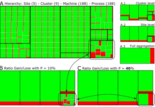
This scenario is a KAAPI parallel application composed of 188 processes, executed in the Grid’5000 platform with 9 clusters and 5 sites. The objective is to explain how the treemap works and the impact of using gain/loss measures to configure the level of detail. Fig. 3 depicts a series of treemaps, where the Steal state is represented by dark gray (or red), while the Runstate is represented by light gray (or green). Treemap A presents the ratio Run/Steal for all processes, considering the whole execution time. Treemaps A.1 (cluster level), A.2 (site) and A.3 (full aggregation) are created using spatially aggregated traces. These treemaps reveals the hierarchical structure of our system with a nested-boxes representation: A.1 indicates
A
Hierarchy: Site (5) - Cluster (9) - Machine (188) - Process (188)B
Ratio Gain/Loss with P = 10%C
Ratio Gain/Loss with P = 40%Cluster level Site level Full aggregation A.1 A.2 A.3
Figure 3: Scenario with 188 processes, grouped by 9 clusters and 5 sites (Treemaps A, A.1, A.2, and A.3 give the hierarchy) and with two values of p (Treemaps B and C); when the ratio gain/loss is 10% (treemap B), everything is aggregated but the processes whose behavior is heterogeneous.
groups of processes, A.2 groups of machines, and so on. They necessitates much less resources to be stored and rendered, but they conceal essential information regarding the variable distribution.
By looking only to treemap A of Figure 3, we can easily spot that some processes have spend a surprisingly lot of time on the Steal state, as shown in the highlighted site (dashed rectangle). As soon as we visualize at the cluster level (or at higher levels), the anomaly identification is impossible. The interpretation can be even worse. By looking directly to treemap A.1 or A.2, one can assume that all processes in the highlighted site have been stealing work more than usually, which, in that case, is an inaccurate idea. On the contrary, in the other sites, one can assume that the Steal state is caused by only one process and not, as it really is, by all processes in a reasonable way. Besides, working with treemap A is not optimal since a lot of redundant information is displayed within homogeneous sites. In particular, such per-process view can be very difficult to scale-up for much larger distributed systems, as shown in the third scenario.
By using our algorithm, we can define interesting multi-resolution views for the treemap analysis. We move the gain/loss ratio p from 0% (microscopic description, treemap A of Figure 3) to 100% (full aggregation, treemap A.3). Very quickly, for p✏ 10%, homogeneous sites are aggregated (treemap B), whereas the highlighted heterogeneous site is kept detailed at the processes level. This anomaly happens because the random work stealing is unaware of locality, leading to larger steal timings since a higher latency network is used to connect this cluster to the rest of the platform. In addition, the algorithm certifies that aggregated data is homogeneous. Thus, the performance analyst can make the right assumption about the underlying microscopic distribution without proceeding to a more detailed analysis of these aggregates. Interestingly, when we increase the gain/loss ratio up to p✏ 40% (treemap C of Figure 3), the algorithm displays the site level, indicating a site heterogeneity. With p ✏ 53.6%, the algorithm gives full aggregation (as in A.3).
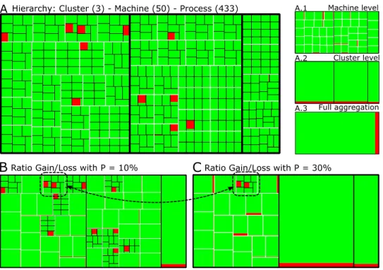
5.2 Detecting Anomalies through Heterogeneity
This scenario has work-stealing traces of an application with 433 processes, grouped by 50 machines and 3 clusters. The objective is to display anomalies that are characterized by heterogeneous behavior in the application. Figure 4 follows the same color coding of previous scenario, Steal is represented by dark gray (red color); Run by light gray (green color). Each machine of this scenario has executed at least 8 processes. Treemap A shows the behavior
considering the whole execution time; the smaller treemaps (from A.1 to A.3) show different aggregation levels.
By selecting p ✏ 10% gives treemap B of Figure 4. We can observe that all machines that possess processes with homogeneous behavior are aggregated with minimal information loss; only machines with at least one heterogeneous process are kept on their original form. With p✏ 30% as in treemap C, we can observe that even heterogeneous machines are aggregated. This is clearly a case of information loss, but this situation also shows us that there is one machine, marked by the dashed rectangle, that is more heterogeneous than the others, since it has two processes with heterogeneous behaviors. As it can be seen in Figure 4, our algorithm finds the optimal aggregation and, combined with the treemap representation, it simplifies homogeneous entities and details those with anomalies. Next scenario shows how this approach works with a trace of one million processes.
A Hierarchy: Cluster (3) - Machine (50) - Process (433) A.1 Machine level Cluster level A.2
Full aggregation A.3
B
Ratio Gain/Loss with P = 10%C
Ratio Gain/Loss with P = 30%Figure 4: Scenario with 433 processes, grouped by 50 machines and 3 clusters (treemaps A, A.1, A.2, and A.3) and with two values of P (treemaps B and C); when the ratio gain/loss is 10% (treemap B), everything is aggregated but the machines that have heterogeneous processes; when it is 30%, all machines are aggregated, except the one that has two heterogeneous processes.
5.3 Large-scale Validation
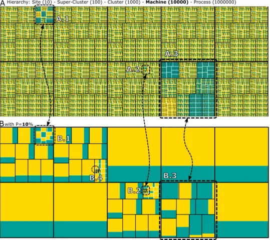
The objective of this scenario is to show how much fundamental is data aggregation evaluation at scale. Since generating large-scale traces in real platforms is very complex, we synthetically generated a trace file with the behavior of one million processes. They are grouped by machine, cluster, super-cluster and finally by site. Behavior is homogeneous, except where we have deliberately added heterogeneity: in one machine (processes behavior are heterogeneous), one cluster, one super-cluster and one site.
Since the drawing space is limited, the treemap A of Figure 5 shows the
AHierarchy: Site (10) - Super-Cluster (100) - Cluster (1000) - Machine (10000) - Process (1000000)
Bwith P=10% A.1 A.2 A.3 B.1 B.2 B.3 B.4
Figure 5: Synthetic scenario with 1 million processes, grouped by 10000 machines, 1000 clusters, 100 super-clusters and 10 sites; treemap A shows the aggregated behavior of all processes for each machine; treemap B is configured with a gain/loss ratio of 10%, detailing the heterogeneous areas.
aggregated behavior in the machine level. In such intermediate level, we can already observe some anomalies highlighted by the dashed rectangles A.1, A.2 and A.3. Looking only to treemap A, even if the other sites look similar, we cannot be completely sure they are homogeneous. Selecting a trade-off of 10% gives treemap B. Now, we are sure that other sites are quite homogeneous, and we obtain the confirmation about the heterogeneous groups: B.1, B.2 and B.3 corresponding to the same groups highlighted in the top treemap. In addition, our best aggregation algorithm also forces the treemap to display another source of heterogeneity: the processes surrounded by the dashed circle B.4. If we had access only to treemap A in the machine level, the processes behavior of this machine will be completely crushed by the data aggregation. Our algorithm makes sure that this will not happen, enabling anomalies detection even at scale. Finally, our approach take advantage from the homogeneity, giving a enormous complexity reduction for this scenario, as can be seen in treemap B, which is much simpler when compared to treemap A. If a detailed analysis of the microscopic treemap may have reveal anomalies (or heterogeneous behaviors), it would have necessitate much more computational resources. In practice, a microscopic analysis is not tractable for large-scale systems. In such cases, our approach may uncover phenomena that would otherwise go undiscovered at scale.
6
Conclusion
Large-scale parallel and distributed applications are today composed of thousands or even millions of processes. Carrying out a performance anal-ysis of such applications is very challenging, leading most of performance visualization tools to rely on some kind of trace aggregation to visualize behavior at scale. Such data aggregation is necessary because of the limited available screen space and the large amounts of events both in time and space dimensions. While used by most of performance visualization tools, there is very few to no research on the quality evaluation of aggregated traces.
In this work, we fill this gap by proposing the use of information-theory measures to evaluate the quality of trace aggregation. We assume that every aggregation consists in a compromise between a complexity reduction and an information loss. Our proposal is two-fold: a new parametrized criterion that enables the performance analyst to express the trade-off between these two measures; an algorithm to find the best spatial aggregation possible for a given trace and time interval, based on the trade-off selected by the analyst. Our work enables any hierarchical visualization technique to tell if
an aggregation is semantically safe.
We have validated our approach using different scenarios based on hierar-chical traces. We used work stealing traces of a task-based parallel application, plus a synthetic trace file with one million processes. We investigated these scenarios using a modified version of squarified treemaps, provided by the Viva visualization tool. Treemaps exploit the optimal aggregation possible, considering a trade-off selected by the analyst, as defined by our algorithm. We have shown that the method efficiently provides suitable multi-resolution treemap visualizations, reducing the analysis complexity where behavior is homogeneous, and highlighting heterogeneous behavior which is the source of application anomalies. In the synthetic scenario with a trace of one million processes, our approach was capable to highlight an heterogeneous activity in the process level of just one machine. Such identification would be very hard to do without our proposal, since the heterogeneity at this level would have stayed hidden by the aggregation. As far as we know, this is the first time that a data aggregation evaluation is carried out on such scale with indication of information loss.
We have several indications for future work. We intend to explore other complexity measures to enhance the aggregation evaluation, to apply our approach for temporal aggregation evaluation, and to extend our proposal to other alternative visualization techniques of the Viva tool.
Acknowledgment
This work is partially funded by the french SONGS project (ANR-11-INFRA-13) of the Agence Nationale de la Recherche (ANR). Some experiments presented in this paper were carried out using the Grid’5000 experimental testbed, an initiative from the French Ministry of Research.
References
[1] G. Aguilera, P. Teller, M. Taufer, and F. Wolf. A systematic multi-step methodology for performance analysis of communication traces of distributed applications based on hierarchical clustering. In International
Parallel and Distributed Processing Symposium, April 2006.
[2] R. Bolze and et. al. Grid’5000: a large scale and highly reconfigurable experimental grid testbed. International Journal of High Performance
[3] H. Brunst, D. Hackenberg, G. Juckeland, and H. Rohling. Compre-hensive performance tracking with vampir 7. In M. S. Mller, M. M. Resch, A. Schulz, and W. E. Nagel, editors, Tools for High Performance
Computing 2009, pages 17–29. Springer Berlin Heidelberg, 2010.
[4] A. Chan, W. Gropp, and E. Lusk. An efficient format for nearly constant-time access to arbitrary constant-time intervals in large trace files. Scientific
Programming, 16(2-3), 2008.
[5] K. Coulomb, M. Faverge, J. Jazeix, O. Lagrasse, J. Marcoueille, P. Noisette, A. Redondy, and C. Vuchener. Visual trace explorer (vite), 2009.
[6] I. Csisz´ar. Axiomatic Characterizations of Information Measures.
En-tropy, 10(3):261–273, 2008.
[7] J. C. de Kergommeaux, B. de Oliveira Stein, and P. E. Bernard. Paj´e, an interactive visualization tool for tuning multi-threaded parallel appli-cations. Parallel Computing, 26(10):1253–1274, 2000.
[8] N. Elmqvist and J. Fekete. Hierarchical aggregation for information visualization: Overview, techniques, and design guidelines. Visualization
and Computer Graphics, IEEE Transactions on, 16(3):439–454, 2010.
[9] T. Gautier, X. Besseron, and L. Pigeon. Kaapi: A thread scheduling runtime system for data flow computations on cluster of multi-processors. In Proceedings of the international workshop on Parallel symbolic
com-putation, pages 15–23, New York, NY, USA, 2007. ACM.
[10] G.-T. Gmbh. Vampir 7.5 User Manual. Technische Universitt Dresden, Blasewitzer Str. 43, 01307 Dresden, Germany, 2011.
[11] A. Knupfer and W. Nagel. Construction and compression of complete call graphs for post-mortem program trace analysis. In Parallel Processing,
2005. ICPP 2005. International Conference on, pages 165–172, June
2005.
[12] S. Kullback and R. Leibler. On Information and Sufficiency. A. of
Mathematical Statistics, 22(1):79–86, 1951.
[13] J. Labarta, J. Gimenez, E. Martinez, P. Gonzalez, H. Servat, G. Llort, and X. Aguilar. Scalability of visualization and tracing tools. In Proc.
[14] R. Lamarche-Perrin, Y. Demazeau, and J.-M. Vincent. How to Build the Best Macroscopic Description of your Multi-agent System? Application to News Analysis of International Relations. In Y. Demazeau and T. Ishida, editors, Advances in Practical Applications of Agents and
Multiagent Systems, volume 73 of LNCS/LNAI. Springer-Verlag Berlin,
Heidelberg, 2013. Forthcoming.
[15] R. Lamarche-Perrin, J.-M. Vincent, and Y. Demazeau. Informational Measures of Aggregation for Complex Systems Analysis. Technical Report RR-LIG-026, LIG, 2012.
[16] C. Lee, C. Mendes, and L. Kal´e. Towards scalable performance anal-ysis and visualization through data reduction. In IEEE International
Symposium on Parallel and Distributed Processing. IEEE, 2008.
[17] K. Mohror and K. L. Karavanic. Evaluating similarity-based trace reduction techniques for scalable performance analysis. In Proceedings
of the Conference on High Performance Computing Networking, Storage and Analysis, SC ’09, pages 55:1–55:12, New York, NY, USA, 2009.
ACM.
[18] V. Pillet, J. Labarta, T. Cortes, and S. Girona. Paraver: A tool to visualise and analyze parallel code. In Proceedings of Transputer and
occam Developments, WOTUG-18., volume 44 of Transputer and Occam Engineering, pages 17–31, Amsterdam, 1995. [S.l.]: IOS Press.
[19] L. M. Schnorr, G. Huard, and P. O. A. Navaux. Towards visualization scalability through time intervals and hierarchical organization of mon-itoring data. In The 9th IEEE International Symposium on Cluster
Computing and the Grid (CCGRID). IEEE Computer Society, 2009.
[20] L. M. Schnorr, G. Huard, and P. O. A. Navaux. A hierarchical aggrega-tion model to achieve visualizaaggrega-tion scalability in the analysis of parallel applications. Parallel Computing, 38(3):91 – 110, 2012.
[21] L. M. Schnorr and A. Legrand. Visualizing more performance data than what would fit on your screen. In Tools for High Performance
Computing 2012. Springer, 2012.
[22] L. M. Schnorr, A. Legrand, and J.-M. Vincent. Detection and analysis of resource usage anomalies in large distributed systems through multi-scale visualization. Concurrency and Computation: Practice and Experience, 24(15), 2012.
[23] C. Shannon. A mathematical theory of communication. Bell System
Technical Journal, 27:379–423,623–656, 1948.
[24] J. M. Wilson. Gantt charts: A centenary appreciation. European Journal
of Operational Research, 149(2):430–437, September 2003.
[25] O. Zaki, E. Lusk, W. Gropp, and D. Swider. Toward scalable per-formance visualization with jumpshot. International Journal of High