BusBuzzard and WideWorld: Decreasing the Uncertainty of
Multimodal Transportation
by
Brandon Martin-Anderson
B.S.M.E., University of Washington (2004) Submitted to the Program in Media Arts and Sciences,
School of Architecture and Planning,
in partial fulfillment of the requirements for the degree of Master of Science in Media Arts and Sciences
at the
MASSACHUSETTS INSTITUTE OF TECHNOLOGY February 2014
c
Massachusetts Institute of Technology 2014. All rights reserved.
Author
Program in Media Arts and Sciences Febraury, 2014
Certified by
Kent Larson Principal Research Scientist Program in Media Arts and Sciences Thesis Supervisor
Accepted by
Patricia Maes Associate Academic Head Program in Media Arts and Sciences
BusBuzzard and WideWorld: Decreasing the Uncertainty of Multimodal Transportation
by
Brandon Martin-Anderson
Submitted to the Program in Media Arts and Sciences, School of Architecture and Planning,
on Febraury, 2014, in partial fulfillment of the requirements for the degree of
Master of Science in Media Arts and Sciences
Abstract
Recent research has found that in some cases travel time variance is more important than mean travel time in travel mode choice. This implies shared infrastructure trans-portation modes prone to service unreliability stand at a disadvantage even if they are on average faster than automobile travel. Real-time status and historical availability statistics gleaned from vehicle instrumentation provide a natural complement to such systems, reduc-ing travel uncertainty without the infrastructural investment normally required to increase reliability. I present two projects that explore the idea that a web-work of data-producing shared infrastructure joined by user-facing traveler information systems comprise an aggre-gate transportation mode competitive with automobile transit. The first, WideWorld, is a multimodal trip planner incorporating real time bicycle share availability. The second, Bus Buzzard draws on millions of bus GPS fixes to generate probabilistic bus schedules in some cases more reliable than printed schedules.
Thesis Supervisor: Kent Larson
BusBuzzard and WideWorld: Decreasing the Uncertainty of Multimodal Transportation
by
Brandon Martin-Anderson
The following people served as readers for this thesis:
Thesis Reader
Kevin Slavin Assistant Professor Program in Media Arts and Sciences
Thesis Reader
Ethan Zuckerman Principal Research Scientist Program in Media Arts and Sciences
Contents
Abstract 3
1 Introduction and Motivation 11
1.1 Motivation . . . 12
1.1.1 Practical Usefulness . . . 12
1.1.2 Research Platform . . . 13
1.1.3 Demonstration of Open Data . . . 13
2 Previous Work 15 2.1 Communities of transparency . . . 15
2.2 Transit developers . . . 16
2.3 Transit app implementation . . . 16
2.4 Traveler information and uncertainty . . . 17
2.5 Generational shifts . . . 17 3 Implementation 19 3.1 WideWorld . . . 19 3.1.1 Backend . . . 20 3.1.2 Web frontend . . . 28 3.1.3 Android frontend . . . 30 3.2 BusBuzzard . . . 34 3.2.1 Data Collection . . . 35 3.2.2 Data Processing . . . 36 3.3 Results . . . 40 4 Discussion 43 4.1 Future Work . . . 43
4.1.1 Qualitative Improvement and Modal Shift . . . 43
4.1.2 Quantitative Improvement . . . 44
4.2 Signoff . . . 45
A History 47 A.0.1 Summary . . . 47
A.0.2 Before 1980: Institutional Sensing . . . 49
A.0.4 1993-2004: The World Wide Web . . . 52 A.0.5 2004-2008: Web 2.0 . . . 54 A.0.6 2008-present: Mobile Internet . . . 55
List of Figures
3-1 A simple transportation system, and its graph representation. . . 22
3-2 Dijkstra algorithm on simple transportation system. . . 23
3-3 A shortest path tree across a graph of street and public transit infrastructure in Seattle. Black lines represent transit links. Red lines represent pedestrian links. . . 24
3-4 WideWorld web frontend front page . . . 29
3-5 WideWorld web frontend main page . . . 30
3-6 Distribution of trip speeds within the Hubway system. . . 31
3-7 The WideWorld Android app “Nav” tab. . . 32
3-8 Geocoder dropdown . . . 32
3-9 WideWorld app directions screens. . . 34
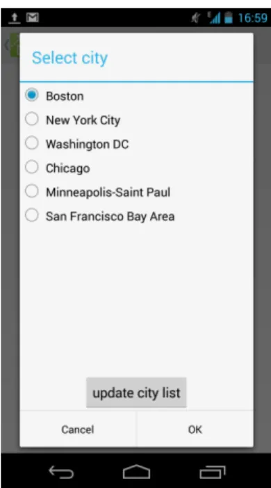
3-10 City picker option screen. . . 35
3-11 Timeline of observed passby events for the SFMTA 5 inbound at McAllister St & Webster St during fall/winter 2012. . . 38
3-12 Probabilistic schedule of wait times for the for the SFTMA 5 inbound at McAllister St & Webster St. Horizontal axis represents seconds since mid-night. Vertical axis represents wait time. . . 39
3-13 Proposed interface for displaying predicted wait times. . . 40
3-14 Request count during test period. . . 41
Chapter 1
Introduction and Motivation
This document presents two prototype transit applications: BusBuzzard and WideWorld.
BusBuzzard uses a large body of recorded vehicle locations to generate probabilistic transit schedules. BusBuzzard compiled over 250 million bus locations from the San Francisco Municipal Railway (MUNI) real time vehicle location API over a period of one year, enabling the calculation of the probability that a vehicle serving a given route will arrive within a given amount of time. Along similar lines, BusBuzzard can estimate the length of time one would have to wait to experience a given probability of arrival. For example, one might query BusBuzzard how long one would have to wait to be guaranteed an arrival 19 times out of 20. Conveying uncertainty to a broad audience is a challenge, for which I propose a simple solution.
WideWorld is a multimodal trip planner, providing directions using any combination of walking, public transit, and bikeshare in Boston, New York City, Minneapolis-St. Paul, the San Francisco Bay Area, Washington, DC, and Chicago. WideWorld provides smartphone and web interfaces through which one can send trip plan requests for specific terminus points, and receive detailed directions including, if bikeshare is selected, the current avail-ability of bicycles at the origin station and open docks at the destination station of any bikeshare legs. WideWorld uses current bikeshare availability to plan trips, and will never recommend a route featuring a leg without an origin bicycle or destination dock.
1.1
Motivation
Each project was motivated by the same three things: practical usefulness, value as a research tool, and value as demonstrations of open data.
1.1.1 Practical Usefulness
Both BusBuzzard and WideWorld were intended to address the personal problem of trans-portation in a sustainable way. In particular, both projects aim to increase the viability of public transportation by reducing research time, travel time, and the discomfort and delays associated with unreliability and uncertainty. WideWorld is focused on reducing research time by quickly delivering detailed transit directions and times. WideWorld can also reduce travel time by recommending routes featuring bikeshare, which can be difficult to incorpo-rate without real-time information. BusBuzzard can reduce the discomfort of uncertainty associated with waiting for a bus. There is evidence to suggest that real-time information reduces perceived and actual wait time [92], but it remains a question whether unreliability statistics of the type provided by BusBuzzard can do the same.
WideWorld is also envisioned as a tool for system maintainers. If widely used, it would provide real-time data on routes in high demand, potentially before travelers actually start their journeys. This information could be used to preemptively prepare bikeshare stations for sudden demand for bicycles or docks. WideWorld could also compile a large body of rider intents for use in planning future service.
More broadly, these projects are strongly informed by sustainability in both the natural and built environment. Private automobile ownership as the dominant mobility system in the United States encourages sprawling car-centered design, which is associated with increased incidence of obesity[3], low social capital [4], and depression [5]. In the natural environment, automobiles contribute to habitat loss through a number of mechanisms, including urban sprawl, pollution from emissions, global warming, and energy extraction operations [10]. The projects presented aim to combat these problems by facilitating use of other mobility
systems.
1.1.2 Research Platform
WideWorld and BusBuzzard are imagined as research platforms in two ways. First, they serve as a tool to investigate the effect of unreliability and uncertainty on mode choice. Second, as a way to collect information on multimodal travel planning and behavior.
Uncertainty The role of uncertainty in travel planning is interesting, because if uncer-tainty and unreliability are a large factors in mode choice it would be possible to design interventions based on increasing information, which would be relatively cheap, instead of expanding infrastructure, which is very expensive. There is evidence to suggest that travel time variance is an important factor in travel planning and mode choice [1]. Moreover it has been shown that perceived wait times are reduced in the presence of real time vehicle location and arrival time information [92]. No research so far has been conducted on either the role of statistical reliability information in travel planning, or concern about bikeshare availability when planning multimodal trips.
Traveler Probe WideWorld is envisioned as a tool for “reality mining” [6], whereby mobile phones collect a very large body of anonymized data from the general populace for post-hoc analysis. Whereas transit and bikeshare systems may collect data on system usage that actually occurs, WideWorld can collect information on system information that users wish to happen. Reality mining travel intent would allow the study of ways in which cities persistently fail to meet traveler needs.
1.1.3 Demonstration of Open Data
Both WideWorld and BusBuzzard rely on open data. That is, quantitative information about system state given away in real time by system maintainers in a machine-readable
format. WideWorld relies on schedule data in the open GTFS format and real-time JSON and XML APIs to access bikeshare availability. BusBuzzard collects vehicle locations from a real-time XML API maintained by the SFMUNI. The last four years have seen a blossom-ing of imaginative applications of open government data, resultblossom-ing in new periodicals [7], academic [8] and government [9] conferences, and hundreds of smartphone apps [74]. These applications are presented in the hope that they will support the system of publishing and applying open government data. For those interested in open transportation data and the growth of the open transportation a history is presented in Appendix A.
Chapter 2
Previous Work
This thesis draws on previous work in a number of fields, including civic data, open data, multimodal and multi-criteria short path planning, web-based and smartphone-based mul-timodal and real-time trip planning, third party participation, transportation data ecosys-tems, effectiveness of traveler information sysecosys-tems, decision-making under uncertainty es-pecially as it applies to path planning and mode choice, and studies of generational shifts in the use of computing and transportation infrastructure and how they’re related.
2.1
Communities of transparency
The exploration of communities of third parties developing systems atop government-produced data is explored by Rojas as “Communities of Transparency” [74]. This concept fits loosely as a special case the concepts of Benkler’s “Commons-based Peer Production” [77] describing the GNU/Linux community, and Jeff Howe’s “Crowdsourcing” [78] describ-ing collective web efforts like iStockPhoto and Wikipedia. The distinction between these efforts and public-private transit information partnership is that the “commons” used by GNU/Linux or Wikipedia is a platform for producing a shared artifact and the efforts are typically noncommercial, whereas the “commons” for transit apps is the data produced by public agencies, often applied to commercial projects. In 2009 Robinson et al. outlined in
the Yale Law Review article “Government Data and the Invisible Hand” the now standard maxim of information-mediate public-private partnerships that “Rather than struggling, as it currently does, to design sites that meet each end-user need, it should focus on creating a simple, reliable and publicly accessible infrastructure that exposes the underlying data.” [66].
2.2
Transit developers
Regarding communities of transparency in the realm of transportation: the last few years have seen the introduction of hundreds of third party traveler information systems combin-ing real-time information and multimodal path planncombin-ing. Rojas reported in 2012 that five US metropolitan areas alone have 187 apps among them. As of October 2013 a search for “transit” on the iTunes app store returns about 950 responses. The search term “MBTA” alone returns 19 iPhone apps and 71 Android apps. Despite the explosion of traveler-facing information resources and a wealth of study on advanced traveler information systems (“ATIS”) during its early years there’s a surprising lack of serious study on the impact of smartphone-based ATIS implementations.
2.3
Transit app implementation
The literature on multi-criteria and multi-modal trip planning is fairly rich. The OpenTrip-Planner routing bibliography has a good survey of the current state of the art [108]. Note in particular the contributions of Delling and Sanders to path search speedup techniques in dynamic and static graphs [79, 80]. Engineers at Google published a speedup technique for path planning on large public transit networks [81].
2.4
Traveler information and uncertainty
The study of decision-making under uncertainty is dominated by the theory of expected utility, introduced by Bernoulli in 1738 [82], expanded and rationalized by von Neumann and Morgenstern in 1947 [83], and popularized among economists by Friedman and Savage in 1952 [84]. Recently, transportation researchers have checked the applicability of the utility hypothesis theory against observed traveler behavior [85, 86] with mixed results, some finding general agreement [87], and some finding a failure by classical expected utility theory to capture actual behavior [88]. Findings about the value of amelioration of travel uncertainty with time information fall into two broad camps. On the one hand, real-time information has been shown to increase feelings of safety [89] and reduce both perceived and actual wait times[90, 91, 92]. On the other hand, several studies show that route and mode choice are very sticky; that once a traveler made up their mind, additional information is not very affective at shifting route or mode choice [93, 94, 95, 96, 97, 98, 89]. Regarding the value of real-time systems to transportation agencies, Tang et al. show that introduction of real-time traveler information on some routes is weakly associated with increases in ridership [99].
2.5
Generational shifts
Sivak et al. released a paper in 2011 synthesizing surveys and census information from a number of sources indicating that automobile use per capita among young people has dropped sharply, resulting in a historically unprecedented reduction in driving per capita beginning in about 2004 [100]. A series of reports by U.S. PIRG enumerate a number of causes, namely the rising cost of driving, graduated driver’s license laws, increasing urbanization, telecommunication technology, and (most saliently for this thesis) facilitated use of alternative transportation through technology [101, 102]. Journalists have attributed the end of the driving boom to a shift from asset-orientation to service-orientation among people born after 1980 (so-called “millennials”) [103] and shift in consumer spending away from automotive technology towards consumer electronics, which both displaces spending
and functionally replaces the car with telecommuting and online social networking [100]. Transportation apps have been shown to be a direct contributor to the reduction in driving [104], with a survey by Zipcar showing that 25% of respondents ages 18-34 drive less because of transportation apps [105].
Chapter 3
Implementation
3.1
WideWorld
WideWorld is a multimodal route planning app available as a web site and an app for An-droid handsets. WideWorld provides detailed address-to-address route directions for intra-city travel, using a user-specified combination of bikeshare, public transit, and pedestrian modes. WideWorld is available in six cities:
Chicago Divvy bikeshare and CTA transit Boston Hubway bikeshare and MBTA transit New York Citibike bikeshare and MTA subway
Washington DC Capital Bikeshare and WMATA transit
The San Francisco Bay Area Bay Area Bikeshare and BART, Caltrain, and Muni tran-sit
Minneapolis-Saint Paul Nice Ride Minnesota bikeshare with Metro transit
In each city WideWorld uses time bikeshare availability and up-to-date (but not real-time) schedules published by transit agencies in GTFS format. In particular, if an itinerary delivered to a user includes a bikeshare leg, then the latest information indicates that there
is at least one bicycle available at the start of the leg and one dock available at the end of the leg. Transit legs use scheduled times, not headway, real-time, or statistically average times.
WideWorld aims to stitch several different modes into a single cohesive mobility system by providing a sort of limited omnipotence to the traveler by filling in travel uncertainty with information. As such, the user interface philosophy of WideWorld is to be as unobtrusive as possible - always collecting information about the user’s needs with as little interaction as possible and delivering the right advice as smoothly and quickly as possible. That is, WideWorld should be informative and invisible. The ways in which these goals inform implementation choices are explained in the next section.
The WideWorld implementation is divided into web and smartphone frontends, which com-municate with the same web service backend.
3.1.1 Backend
Backend operations are divided into two components. First, a transportation database called the “transpile” is prepared from various data sources. Second, a server script is run which keeps the transpile updated with real-time information and receives, fulfils, and returns routing requests.
Routing algorithm
The transpile data structure and routing libraries implement a variant of Dijkstra’s shortest path algorithm, where each vertex u is associated with an agent state S(u) in addition to a weight w(v), and the agent state S(v) and weight w(v) of each vertex v via edge uv is a function of the edge ~uv’s transfer function and S(u). Dijkstra’s algorithm proceeds by keeping a “frontier” priority queue of reachable but unvisited vertices, and a “shortest path tree” data structure holding the shortest paths to all points already visited. At each iteration of Dijkstra’s algorithm, the lowest-weight vertex is popped from the frontier queue.
If a comparable vertex is not already attached to the shortest path tree, it is added to the tree, its adjacent vertices are calculated and added to the frontier queue, and the process repeats until some satisfactory vertex has been reached or the frontier queue is empty. This is a so-called “time-dependent” transport graph1.
The disadvantage of this approach is that it precludes or complicates the most powerful speedup techniques (namely “contraction hierarchies” for purely static graphs and “transfer patterns” for time-dependent edges with timetables). The advantage is the tremendous expressiveness necessary to model complicated travel modes. The graph must be capable of modeling, for instance, that someone can board a train only at certain times; that they can board from the street, but not if they have a rented bicycle; that if they have a rented bicycle they can travel at 10 miles per hour but if they do not they must travel at 2 miles per hour; that one can only get a bicycle from a stocked station, and only drop one off at a station with an open dock.
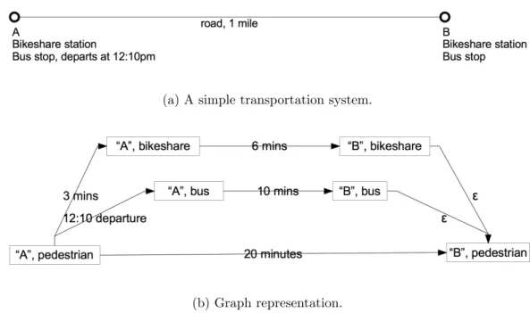
To envision how to apply this technique imagine a simple multimodal transportation system composed of two intersections, A and B, one mile apart. Each intersection has a bikeshare station. A bus leaves A at 12:10pm to arrive at B at 12:20pm (Figure 3-1).
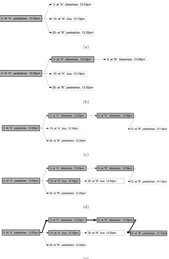
To start the algorithm, we initialize the shortest path tree with a root vertex representing the starting agent state. For example, “standing on the street at A at 12:00pm”, with a cumulative path weight of 0. Since there is a bikeshare station at intersection A, one adjacent vertex has the state “at A with a bicycle, at 12:03pm”, with a path weight of 3. Another is to board the bus, with an adjacent vertex with state “aboard the bus at A, at 12:10pm”, path weight 10. Finally, the traveler could walk one mile to B, corresponding to an adjacent vertex with state “standing on the street at B, at 12:20pm”, with a path weight of 20. All these adjacent states go into the frontier priority queue (Figure 3-2a).
Next we pop the smallest-weight vertex from the frontier, “at A with a bicycle, at 12:03pm”, and add it to the shortest path tree. We consider that it has one unvisited adjacent vertex
1
This is a slight misnomer. The graph is not time-dependent, it is state-dependent but in early imple-mentations the only component of the state vector was time, so time- and state-dependence were the same thing.
(a) A simple transportation system.
(b) Graph representation.
Figure 3-1: A simple transportation system, and its graph representation.
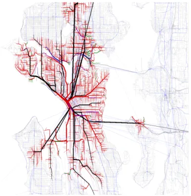
“at B with bicycle, at 12:09pm” with weight of 9. We add this to the frontier queue and iterate (Figure 3-2b). Next we pop “at B with bicycle, at 12:09pm” and add the adjacent vertex with state “at B without bicycle, at 12:10pm” and weight 10 to the frontier queue (Figure 3-2c). Next we pop the frontier queue vertex “aboard the bus at A, at 12:10pm” and add its adjacent vertex “aboard the bus at B, at 12:20pm” (weight: 20) to the frontier (Figure 3-2d). Next we pop “at B without bicycle, at 12:10pm” from the queue and add it to the tree. Since the intersection B is the destination, we could stop our breadth first search now (Figure 3-2e). If we were interested in emptying out the frontier queue to build the shortest path tree to its maximum extent, we could do so by popping out the at-B-on-bus edge and the walk-to-B edge and discarding them because a vertex equivalent to their destinations (that is, a pedestrian state at intersection B) is already in the shortest path tree. Figure 3-3 shows a shortest path tree resulting from this algorithm applied to a nontrivial transportation graph.
This is the approach implemented by open source multimodal route planning libraries Graphserver and OpenTripPlanner [108]. WideWorld uses a proprietary multimodal
rout-(a)
(b)
(c)
(d)
(e)
Figure 3-3: A shortest path tree across a graph of street and public transit infrastructure in Seattle. Black lines represent transit links. Red lines represent pedestrian links.
ing library “libgazelle” on special academic license from Embark Inc. because libgazelle’s flexibility and C-based implementation made interoperation with the WideWorld python-based server script very straightforward in a way that would have been time-consuming and complicated given OpenTripPlanner’s deeply abstracted interface-based design and compli-cated build procedures. Additionally, libgazelle is architected in such a way that writing modal extensions is very straightforward, which enables it to be quickly modified in order to recommend multimodal trips with bikeshare components.
Transportation graph
The transportation graph powering route searches is persisted in a format optimized to minimize lookup times during the routing queries. As such, the process of building it from component sources is somewhat complicated. The following process is executed separately for each of the six metropolitan areas supported to build six different transpiles.
First, recent metropolitan extracts from the OpenStreetMap database in protocol buffer format (PBF) are imported to the libgazelle transpile. At this point a python script “deis-land.py” looks for disjoint subgraphs in the OpenStreetMap road network and deletes all but the largest subgraph. This eliminates the possibility that the trip planner will be called upon to route between vertices in two different disjoint graphs.
Next, the schedules of one or more transit agencies in GTFS format are imported to the pile, followed by a linking stage where bus stops and stations are associated with nearby street intersections. Note that because a GTFS feed goes stale on a particular date specified in the feed, the transpile has to be recompiled with the latest feeds on a regular basis.
Finally, a list of bikeshare locations, along with unique identifiers which can be used later to fetch the station state, are fetched from the relevant API and linked to adjacent inter-sections. Each of the six supported bikeshare systems has a separate API instance, but the APIs fall into two easily parceable formats. New York’s Citibike, Chicago’s Divvy, and San Francisco’s Bay Area Bikeshare system all use a second-generation JSON-based API.
Boston’s Hubway, Washington DC’s Capital Bikeshare, and Minneapolis-St. Paul’s Nice Ride all use a first-generation XML API.
Real-time graph state
The main python script executes a continuously running thread for each of the six metropoli-tan areas that polls the area’s bikeshare API for system state and updates the bikeshare entries in the transpile with the current number of available bicycle and docks. At present, this is the only process linking the transpile with real-time world state, though a similar process could update transit schedules with real-time delays.
HTTP API
The main python script uses the Tornado web framework to listen for and respond to route requests. Route requests are bodyless HTTP requests with a URL in the form:
http://wideworld.media.mit.edu/INSTANCE/plan?
lat1=LAT1&lon1=LON1&lat2=LAT2&lon2=LON2&bspeed=BSPEED& transit=TRANSIT&bikeshare=BIKESHARE
Details on the request parameters follow:
name description type optional default
INSTANCE code of metro area one of (bos,nyc,wdc,chi,msp) no LON1 longitude of origin WGS84 decimal degrees no LAT1 latitude of origin WGS84 decimal degrees no LON2 longitude of destination WGS84 decimal degrees no LAT2 latitude of destination WGS84 decimal degrees no
BSPEED bicycle speed decimal meters per second yes 2.5 TRANSIT include transit in route? one of (t,f) yes t BIKESHARE include bikeshare in route? one of (t,f) yes t
API responses are carried in the HTTP response body, JSON-encoded in the following form:
RESPONSE := { p l a n :LEGARRAY, s t a t s : { p l a n n e r t i m e :FLOAT, b i k e u p d a t e :FLOAT}}
LEGARRAY := [ LEG, . . . ]
LEG := WALKLEG | TRANSITLEG
WALKLEG := { d i s t a n c e :FLOAT, l o c s :WALKLOCARRAY, mode :WALKMODE, TYPE: ” walk ”}
TRANSITLEG := { l o c s :TRANSITLOCARRAY, r o u t e l o n g n a m e : STRING, r o u t e s h o r t n a m e : STRING, t r i p i d : STRING, t y p e=” t r a n s i t ”} WALKLOCARRAY := [WALKLOC, . . . ]
WALKMODE := ” walk ” | ” b i k e s h a r e ”
WALKLOC := { b i k e s h a r e ? : BSTATION, b i k e s h a r e i d ? : INTEGER, l a t :FLOAT , l o n :FLOAT, s t r e e t 1 : STRING | n u l l , s t r e e t 2 : STRING | n u l l , t i m e : INTEGER, t y p e=”walk ”}
BSTATION := { d o c k s : INTEGER, b i k e s : INTEGER, name : STRING} TRANSLOCARRAY := [TRANSLOC, . . . ]
TRANSLOC := [ h e a d s i g n : STRING | n u l l , l a t :FLOAT, l o n :FLOAT, s t o p i d : STRING, stop name : STRING | n u l l , t i m e : INTEGER, t y p e : ” t r a n s i t ” ]
The API response contains all information to produce on the front end both the textual narrative and map overlay components of the travel itinerary.
Other roles for the server
The Tornado framework also serves static files for the WideWorld web frontend. Image resources for the scrollable maps on both the web and Android apps were originally served through the Tornado framework from the main python script, but are now served by a dedicated Tilestream-based map server from the same machine on a different port.
Server hardware
All backend server operations - routing, static web resources, and map resources - for all six supported metropolitan areas are run off of a single virtual machine running Ubuntu, which is maintained by The Media Lab’s NecSys department.
3.1.2 Web frontend
The web frontend is a minimal debugging and demonstration platform. As such it doesn’t have all the features of the Android app, and isn’t very easy to use from a mobile web browser. It is, however, fairly simple, useful for inspecting the state of the backend server without having to log into the server itself, and accessible when an Android smartphone isn’t available.
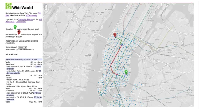
The front page of the web site, available at http://wideworld.media.mit.edu, lists links to all available metropolitan areas (Figure 3-4). Clicking on any metro area will send you to a map page for that metro area.
The main page has two panes. The left pane has a brief description of how to use the website on the top, and directions appear on the bottom. The right pane is a slideable map with two icons. The icons can be clicked and dragged. Whenever they are finished dragging, a new route request is sent to the server. When the route request is received, a textual narrative appears on the lower-left and a map overlay appears on the map (Figure 3-5). When the page initially loads the map icons are placed in default locations that are selected for each city based on the likelihood that they will produce a demonstrative multimodal route.
I’d like to note several small user interface touches. The red destination icon is filled black to make it distinguishable from the green origin icon in cases in which the user is red-green colorblind. The map is not a Google map; it is a low-saturation base map displaying OpenStreetMap data, bikeshare stations, and GTFS-based train track alignments, which is rendered using MapBox’s free TileMill software and served with MapBox’s Tilestream map
Figure 3-5: WideWorld web frontend main page
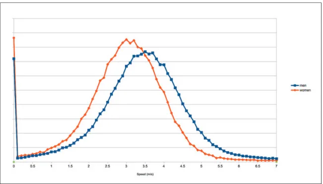
tile server. In each city, the bikeshare icons are colored according to the brand colors of that city’s bikeshare system (e.g. blue in New York City, green in Boston). The dropdown box “bike speed” features three speeds, “slower”, “average”, and “faster”, that correspond respectively to a request speed of 2.0 m/s, 3.1 m/s, and 4.5 m/s. These speeds were selected after consulting the distribution of bikeshare trip speeds, which were compiled from over 400,000 trips in Boston’s Hubway bikeshare system (Figure 3-6). Most trips have an average speed faster than 2.0 m/s; about half are faster than 3.1 m/s; few trips are faster than 4.5 m/s.
3.1.3 Android frontend
With additional care paid to ease of use at the point of decision, the Android app is intended to be the primary frontend to the WideWorld trip planner. Like the web frontend, the Android app is also very simple, with one navigation pane and one map pane. The two panes are toggled via a tabbed interface, with a few auxiliary functions accessed through a settings menu.
Figure 3-6: Distribution of trip speeds within the Hubway system.
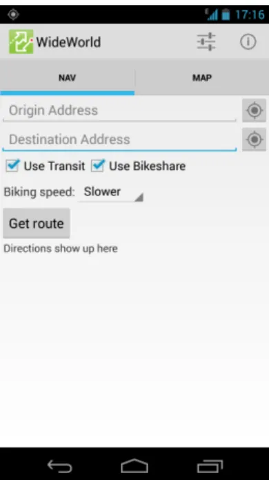
The navigation tab (Figure 3-7) has two sections: directions input and directions narrative.
There are two identical terminus UI widgets - one for the origin, and one for the destina-tion. There are three ways to specify a terminus: textual description, current location as determined by device, or point on a map.
To enter a terminus by textual description, the user presses on the text box component of the terminus widget and starts typing into the phone. With each keystroke following a delay of a fraction of a second, a request is made to Android’s built-in geocoding API to obtain a list of candidate points within the target metro area matching the textual description. Once the candidate list is obtained it appears as a drop-down box under the text (Figure 3-8a ). Because the geocoding API is so effective at geocoding half-completed placenames, sending a new geocoding request with each keystroke often means the correct candidate point is presented before the user is done typing (Figure 3-8b).
To specify the terminus should be the current location, the user selects the GPS-icon button to the right of the text box.
Figure 3-7: The WideWorld Android app “Nav” tab.
(a) Geocoder dropdown (b) Predictive geocoding
To specify the terminus using the map, the user navigates to the map tab, long-presses a point on the map, and selects from a menu whether they want the point to serve as the origin or destination.
Once a terminus is specified, the relevant widget contains a blue rectangle “terminus lozenge” with a description of the terminus. This is a quick visual indication to the user that the origin or destination terminus is understood. If the user wants to cancel the terminus point, they can hit the “x” built into the terminus lozenge.
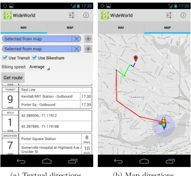
The user can also select their bicycle speed (using the same set of speeds as the web fron-tend), and whether they want to use bikeshare or transit. Once they’ve input the terminus points and selected their travel options, they can hit the “Get route” button. This sends an HTTP request to the backend, and upon receipt of the JSON response, parses it and builds a textual narrative and a map overlay.
The textual narrative consists of a vertically scrollable stack of rectangles corresponding to each leg of the narrative. The upper-left of each rectangle shows the mode - typically “WALK”, “TRANSIT”, or “BIKESHARE”. The lower-left shows the number of minutes to be spent on that leg. The right-hand section of the rectangle shows the origin and destination of that leg, with a textual representation of the origin on top, and the destination on bottom. If appropriate, additional information will be associated with the terminus points of each leg. For example, the terminus descriptions associated with transit legs show the scheduled arrival times for the vehicle. The terminus descriptions for bikeshare legs show the number of bicycles or docks currently available (Figure 3-9a). Each leg also shows up as a polyline overlay on the map color-coded by mode. Walk legs are blue, transit legs are red, and bikeshare legs are green (Figure 3-9b).
Two additional UI panes - the consent form and the city-picker - are accessible through a menu at the top of the screen. The consent form is an opt-in form that explains the research goals of WideWorld and gives the user the opportunity to participate by consenting to have their trip requests recorded by the server. The city-picker presents a list of available metropolitan areas along with a button to check the WideWorld server for new metro areas.
(a) Textual directions. (b) Map directions.
Figure 3-9: WideWorld app directions screens.
This way, WideWorld can add cities without having to update the Android app on the users’ devices. If the user selects a new city, the map is recentered and the geocoder is restricted to a bounding box around the selected city (Figure 3-10).
3.2
BusBuzzard
BusBuzzard is a project designed to generate probabilistic schedules from historical transit vehicle position data. This serves multiple goals. Most immediately, the schedules could be used directly by travelers, though the presentation of probabilistic timetable information presents an interesting design challenge that I’ll address shortly. Eventually the state-dependent path planner underlying WideWorld could use probabilistic states instead of deterministic states, with edge functions generating destination states with awareness of the probabilities involved. For example, if the official timetable guarantees a particular transfer but the empirical timetables indicate that the transfer is not likely, the path planner would not direct the traveler to attempt the transfer.
Figure 3-10: City picker option screen.
In principle, a simple timetable should suffice. In practice, reliable trip planning is more complicated. Schedule variance is not constant; typically larger during morning and evening commute hours. Schedule variance is often larger than vehicle headway; that is, a vehicle can be later for its scheduled stop than the time between two scheduled arrivals, in which case the rule of thumb is that the waiting time is the headway period. Sometimes scheduled stops are simply miscalibrated or aspirational. BusBuzzard provides a schedule backed with evidence, as opposed to a trust relationship with the publishing agency.
3.2.1 Data Collection
A script written in Node.js polled the SFMTA NextBus API every two seconds between Sat, 22 Sep 2012 20:42:44 GMT and Thu, 15 Aug 2013 21:19:25 GMT, compiling 253,338,045 vehicle locations at a rate of about ten vehicle locations per second. This includes every motor coach, trolley car, light rail train, and cable car in the San Francisco MTA system. Each vehicle position tuple fits the form: (vehicle id, route id, direction id, timestamp, latitude, longitude). The points were inserted into a Mongodb database as they arrived
from the remote API. Mongodb was selected for its support for MapReduce operations, which could potentially form the foundation for postprocessing steps on the daunting 250-million point dataset. In practice, it was easiest to use Mongodb’s export functions to produce CSVs for processing by Python scripts.
3.2.2 Data Processing
For the purpose of building probabilistic schedules, we’re more interested in arrival events -data points about when vehicle arrived at what transit stops - than vehicle positions. The conversion of vehicle positions into arrival events is a three step process: point chaining, trip assignment, and passby interpolation.
Point chaining is the process of grouping vehicle positions into a single trip. A trip is infor-mally defined as a single vehicle proceeding from the beginning to the end of a pre-defined route in a single direction. The reality is far more complicated, with vehicle entering or exiting service in the middle of a route, going off route, or proceeding in a loop. Formally a trip is a consecutive series of vehicle locations with the same vehicle id, route id, direc-tion id, and where the time interval between vehicle locadirec-tions is always under a certain threshold. The threshold value should be long enough that if it has elapsed we can assume a new trip has begun; fifteen minutes works well. Once a trip chain is constructed it is assigned a unique id.
Trip assignment is the process of matching a point chain with a trip defined by the GTFS feed valid during the trip. Point chains integrate a number of sources of noise, making an exact match between a point chain and a GTFS-specified trip impossible. Due to the computational challenges of matching a very large number of trips, a heuristic approach was adopted. In this approach all GTFS trips that share the same route id, direction id, and service id are collected into an “affinity group”. Each point chain is compared to each affinity group to see if it matches the route id, if it runs on a date served by the service id, and if it runs in the same direction. If the point chain matches the affinity group, the point chain is matched with the trip with the closest scheduled midpoint time, where the
midpoint time is the average of the time since midnight of the first and last point on the trip.
The last step is the interpolation of passby times. The Python library “Shapely” was used to project all vehicle locations onto the shape corresponding to the trip id to which they were matched. Next, all stops served by that trip were also linearly referenced against the trip’s geometry. For each consecutive pair of vehicle points, if a stop falls between them, then the time at which the vehicle would have passed it is interpolated, assuming constant speed between the two vehicle locations flanking the stop.
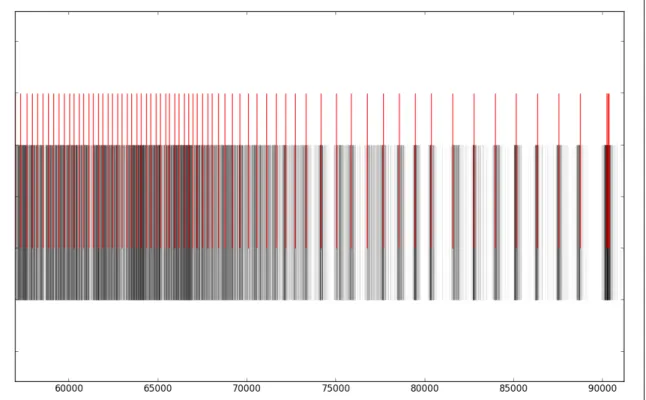
The simplest visual expression of the calculated passby data is a timeline. For example, Figure 3-11 shows all interpolated passbys on route “5” at stop with stop id “5406” in direction “0” on service period with service id “1” between about 60000 and 90000 seconds since midnight (that is, the 5 inbound at Mcallister St & Webster St during late afternoon and nighttime). A timeline of scheduled arrivals is shown on top; interpolated observed arrivals are on bottom. Even this simple format tells a story: schedule adherence is relatively low compared to the tight headway during late afternoon, meaning that the official schedule bears little relation to when a traveler should aim to show up at the stop. Likewise during the evening hours the schedule adherence is relatively high compared to the headway, at which point it behooves the traveler to check the schedule before heading to the stop.
The next step is to build a probabilistic schedule. To generate a probabilistic schedule for any given time of day, we can use the historical arrival times to find the amount of time that a person in the past had to wait for the bus starting at that time of day for a number of days on which we have data. From that set of wait times, we can interpolate the 25th, 50th, 75th, and 95th percentile of arrival times. Doing this for each successive minute throughout a day we can develop a probabilistic schedule for an entire service day.
Figure 3-12 shows just such a schedule, for the same route, direction, time range, service day, and date range as Figure 3-11. The horizontal axis is expressed in minutes since midnight. The lines show the 25th, 50th, 75th, and 95th percentile time to arrivals during the observed period. For example, at 1100 minutes since midnight (6:20pm), the 5 inbound
Figure 3-11: Timeline of observed passby events for the SFMTA 5 inbound at McAllister St & Webster St during fall/winter 2012.
arrived within 60 seconds 25 percent of the time, within 144 seconds half the time, within 325 seconds 75 percent of the time, and 5 percent of the time, it didn’t arrive for more than 767 seconds.
Figure 3-12: Probabilistic schedule of wait times for the for the SFTMA 5 inbound at McAllister St & Webster St. Horizontal axis represents seconds since midnight. Vertical axis represents wait time.
This is potentially tremendously useful both directly to travelers and as a component of an automated path planning algorithm. Most usefully this diagram doesn’t force risk-averse travelers to supply their own potentially inaccurate worst-case estimations. If one is inclined to believe in induction as a valid strategy for predicting the future, one can conclude that at 6:20 one will almost certainly catch the 5 inbound at Mcallister St & Webster St within 13 minutes, and more than likely within 2.5 minutes.
Illustrating a probabilistic schedule to the public presents a tremendous information design challenge. Predictions are rarely conveyed to the public as a range even when it is appro-priate to do so (as in, for example, economic forecasts). To turn a range prediction back into a point prediction we could ask the traveler for some indication of their risk aversion.
(a) High certainty. (b) Medium certainty.
Figure 3-13: Proposed interface for displaying predicted wait times.
For example you could ask if punctuality is very important, such as with a job interview in which case the 95th arrival wait percentile will be selected, or less important, such as with grocery shopping, which will select the 50th arrival wait percentile (Figure 3-13).
3.3
Results
WideWorld received 574 requests during the period from Fri, 16 Aug 2013 21:50:21 GMT to Sun, 06 Oct 2013 01:07:32 GMT, of which 23 encountered an error and could not return a route. The distribution of requests by metro area is shown in Figure 3-14, with each city broken into three categories - requests made by app uses who consented to allow their request data to be persisted, requests by those who did not consent, and requests by the author. Every request made from the web frontend is marked as nonconsented, because the web frontend does not have a consent form. Note that only 29 requests were logged by consented users, of which there are four. A detailed analysis of those requests is omitted
because of the ease with which they could be deanonymized.
Figure 3-14: Request count during test period.
With five users including the author, WideWorld is a spectacular failure as a data-collection platform. To speculate, we could attribute this to the short study time, the failure of the author to recognize that marketing is still important in a world dominated by viral media, and paradoxically the mainstream success of transportation apps. The novelty of WideWorld is somewhat subtle, and anyone searching the Android app store for “hubway” or “mbta” has dozens of better-established apps to choose from.
As a piece of software WideWorld is a success. Six different instances running on a single machine ran for two months, updating real-time state for every instance every minute from six different bikeshare status APIs. Android clients never reported as single crash. The median response time was precisely 1.0 seconds, with responses rarely taking over 5.0 seconds (see Figure 3-15). The author used the app nearly every day to navigate a number of multimodal trips, for which it behaved perfectly. The paucity of information
gathered leaves a number of questions unanswered. I address some potential next steps in the dicussion section.
Chapter 4
Discussion
4.1
Future Work
It remains to be seen whether these two interventions are actually effective. Experiments are needed to test effectiveness in two ways. First, do the interventions result in a modal shift? Second, do the interventions quantitatively improve travel?
4.1.1 Qualitative Improvement and Modal Shift
Ultimately we’re interested in whether the interventions influenced travelers to shift the mode of a large number of trips away from the automobile. It would be possible to ask this question through surveys, interviews, or app questionnaires. Questionnaires or in-terviews should address reasons why the interventions did or did not affect a modal change. Additionally it may be preferable to establish pre- and post- intervention modal preferences through a study designed to measure preference indirectly by, for example, offering study recipients a choice of bus tickets or gas vouchers, or by directly measuring application usage.
Some questions the experimental design would be called upon to answer:
• Did users increase usage of other modes, or did they simply eliminate trips?
• Did users feel that statements in the form “The bus has a 50% chance of arriving within 5 minutes, 95% of arriving within 15 minutes” were more useful for planning than “the scheduled arrival time is in 10 minutes”?
• Are users inclined or disinclined to transfer between modes? Even if it saves them time? How much time would it need to save them before they were interested in making a bus-bus transfer? Making a bus-bikeshare transfer?
• Does having bikeshare availability in a trip planner make them more inclined to use bikeshare as part of a multimodal journey?
• Do users continue to use the BusBuzzard/WideWorld after they feel like they’ve learned about the transportation options on their most commonly traveled routes? • Is using the BusBuzzard/WideWorld an inconvenience?
• How much time would these apps have to save before they became worthwhile to use?
4.1.2 Quantitative Improvement
WideWorld and BusBuzzard are designed to qualitatively improve transit and multimodal trips by reducing waiting time at origin and transfer stops, prevent missed vehicles, and shorten travel time with efficient directions. It is plausible that the goal of these inter-ventions - affecting a modal change by increasing perceived quality of service - would not correspond to an actual quantitative increase in quality of service. For example, travel-ers may feel better about the presence of more information without actually using it to plan their journeys. Along similar lines travelers may enjoy shorter travel times but feel so bothered by the planning process that quantitative experience is overall negative. In any case it is necessary to collect information on quantitate travel experience independently of perceived travel experience. Quantitative information would be more difficult to collect reliably. Travelers could keep a journal, or carry a phone application that journals their transit experience automatically by logging GPS and accelerometer readings.
4.2
Signoff
These projects were made, to paraphrase the open source pioneer Richard Stallman, in the hope that they will be useful, but with the recognition that they are just a starting point. The state of the union is strong, and I feel confident that the white-hot pace of innovation in the world of mobility and urban data will incorporate these concepts in the construction of a new urban system - one that raises the values of subtlety, efficiency, thoughtfulness, cleverness, and interdependence above the values of power, conformity, uniformity, linearity, and dependence enshrined by motordom. I hope that at the other side of this story we look back at a piece of heavy transportation infrastructure - an urban clover-leaf freeway interchange for example - and see it much the same way we see computer mainframes in the era of powerful handheld computing. What we have now is so much smaller, and so much more fragile, but it is the condensation of a civilization’s worth of cleverness into an artifact exponentially more subtle and more effective. The journey towards that world is well under way, and it is both exciting and intimidating to say that we are only just beginning.
Appendix A
History
A.0.1 Summary
As of 2013, every person moving around a city, regardless of travel mode, is spilling data. Every car passing over an actuated intersection, through a toll booth, or over a bridge generates a record. Wireless tollbooth passes are scanned outside tollbooths to track traffic on city streets [12, 13]. In-car GPS navigation systems keep a memory of where you’ve been, whether you ask them to or not. Most major public transportation agencies track location, door-opening events, and passenger count of vehicles in real time. Users of car-and bicycle-sharing systems generate records with each check-out car-and check-in. Every one of New York City’s five thousand shared bicycles and thirteen thousand taxi cabs logs a detailed, time-stamped GPS track [15, 16]. Even pedestrians generate movement data. One proposed1 project in London intended to track mobile phones’ movement by listening to their unique identifiers as they pass between different transceiver-equipped “smart” garbage cans [17].
The history of the Data Mobility Ecosystem could be told in two ways - sequentially, as a series of events, or longitudinally, in terms of each component conceptual thread. It’s difficult to tell the story sequentially without losing sight of the longitudinal themes, and
1
difficult to tell the story longitudinally without losing sight of that fact that at each moment in history the future was uncertain; people didn’t really know what they were building. Indeed, one of the most fascinating aspects of this history is how surprising the future would be to the people who were building it.
This history contains four longitudinal themes.
Sensor technologies The electronic sensing of vehicle movement and state, and the com-munication, storage, and data-processing technologies necessary to transmit and per-sist them. Includes early proximity sensors, digital data transmission over radio and telephone lines, GPS, and the Internet.
Data-sharing protocols Different languages and protocols for communicating mobility data between institutions.
User interface technologies Ways of communicating information to members of the public. Includes signage, kiosks, telephone systems, the progression of internet and mobile internet user interface technologies and paradigms.
Legal institutions The legal framework inside institutions for sharing and cooperating with increasingly small, numerous, and amateur third parties.
This history can also be seen as five sequential eras corresponding to the ascendant user interface technology of the time.
Institutional Sensing Before 1980. During this time most development was in sensing technologies to produce data for institutional consumption, with little attention paid to user interface technologies.
Telephone, Television 1980-1993. A period of maturation for sensing technologies and traveler information systems based on touchtone phone interfaces.
World-Wide Web 1993-2004. An era beginning with experimentation with a variety of competing technologies, from which the world-wide web emerged victorious.
Web 2.0 2004-2008. A renaissance of the web driven by the maturation of Javascript, enabling highly interactive websites.
Mobile Internet After 2008. A period starting with the introduction of the iPhone and leading to the current ubiquity of smartphones.
A.0.2 Before 1980: Institutional Sensing
Though electronic pressure plates had been applied to sensing vehicles at actuated traffic signals since the mid-1930s [18], these systems did not constitute a civic sensing network. Usually stand-alone, and eventually networked into small clusters of coordinated actuated signals [19], wide-area automatic aggregation, persistence, and analysis of mobility data was presented tremendous data processing challenges to a pen-and-paper world.
Between 1954 and 1958, London Transport, faced with a number of operations challenges2 developed a system to track buses by affixing them with a scanning plate which is registered at control points as they pass by. The system, dubbed “BESI” for “bus electronic scanning indicator”, was a seminal example of signpost automatic vehicle monitoring (“AVM”, even-tually more commonly automated vehicle location or “AVL”) technology, whereby vehicles are tracked by the automatic registration of a vehicle’s proximity to some fixed reference point. To save on cost, BESI placed the inexpensive tag on the vehicles and the more expensive scanning hardware in fixed locations, which transmitted vehicle passby events as binary messages over telephone lines to a central aggregation point. The control center could monitor vehicle operations but as of 1958 storage and analysis of vehicle data was still beyond the state of the art. In the concluding chapter of pick58 “The most logical first step will be a punched-tape record which could be transferred to punched cards for analysis in some form of computer-type equipment, for the rapid production of mileage statistics,
2
So woeful was the fog of war over the transit system operations in those data-starved days that it seemed hardly necessary to specifically state why they needed more information. From pick58, with dry finality: “It is unnecessary to enumerate the difficulties facing the bus operating staff to-day” for which they prescribe a system whereby an “increasing amount of information can be given at a central control point as to the movement of buses” thereby enabling “measures to be taken before conditions deteriorate”.
etc.”, anticipating future data collection efforts, if not the medium through which they are transacted.
Following the introduction of affordable, mass-produced electronic computers3, the city of Toronto developed the first centrally controlled traffic signal system starting with a pilot project in 1960 followed by a steady expansion to several hundred intersections before 1973 [19, 20]. Using the first affordable, mass-produced computer, the IBM 650, the Toronto project was able to marry the data production capacity of electronic sensors with the data processing of electronic computers. Though the primary goal of the project was to achieve better traffic flow through intersections, Dunn notes “The amount of traffic data available from this form of control proved a fortunate by-product.”.
Several years later in 1968 Chicago began work applying computerized data aggregation and processing to public transit AVL applications. Though motivated primarily by security concerns, the Chicago AVL project became an incubator for technology for equipment vendors and began the US Federal Government’s continued involvement in the development of AVL technology. One particular Chicago AVL project spawned the PULSE (Public Urban Locator Service) conference, a seminal event that brought together nascent AVL vendors and government administrators, and is generally considered the kickoff event for the American public transportation information technology industry [21].
The CTA AVL implementation demonstrated several technological innovations. First, the CTA moved the event reporter from a piece of fixed infrastructure (as in the London Trans-port implementation) to a radio transmitter in the vehicle4. Second, the project was the first to apply electronic computers to aggregating transit AVL data. The CTA project had at its disposal advanced technology; a GE-PAC 4020 computer with 36 kilobytes of memory and three megabytes of disk storage5 accessed via a cathode-ray tube display.
Though the US Department of Housing and Urban Development funded the development
3
Mass-produced in the sense that thousands were made, and affordable in the sense that medium-sized institutions could own or lease one.
4
This makes sense given that putting a channel for emergency communications in the vehicle was the whole point.
5
and testing of several competing AVL technologies (namely a diverse number of variations of radio triangulation) [21], the CTA AVL’s signpost technology proved an ideal balance of reliability and precision, and remained the state of the art in vehicle location until GPS receivers became cheap and reliable in the early 1990s.6 By 1980 Toronto, Los Angeles, and the New York MTA had large signpost AVL installations, and before the introduction of GPS in 1993 both Seattle and San Francisco had implemented signpost systems comprising over 1000 coaches each. [22]
The goal of civic sensing projects before 1975 was exclusively quality control and internal management. There was no recognition by the makers of the BESI, the Toronto traffic system, nor the CTA AVL system that their data could be useful to the public either through services or in raw form. Throughout the 1970s however civic data started leak-ing into applications in operations research and traveler information. In 1976 engineers at Motorola (which manufactured the radio component of CTA’s AVL system) applied data gleaned from the AVL system to an analysis of bus bunching behavior, partially as a demon-stration that AVL data could be useful for analysis [23]. In 1977 the U.S. Department of Transportation/Urban Mass Transportation Administration7 planned an AVL project in Philadelphia featuring real time bus information kiosks located at bus stops, though it’s not clear if this was ever implemented [24]. Public-facing data-driven street interventions were a primary motivation behind traffic-sensing projects, with [25] listing a number of in-ventive applications, though public-facing analysis and pre-trip traveler information had to wait for advances in user-interface technology. In 1977 Roth [21] presciently imagined the kind of devices that could exist if signpost beacons were ubiquitous and every vehicle were equipped to read them: “...a gadget in the car where one enters his destination coordinates at the beginning of the trip and at the appropriate time the gadget tells him where to make the next turn.”.
6
In some sense signpost location techniques never went away. Most smart phones locate themselves by registering proximity to a wifi access point of known location. The only difference is that whereas the CTA AVL system relied on signposts installed by the CTA, Apple and Google rely on signposts set up by the public.
7
A.0.3 1980-1993: Telephone, Television
Between 1980 and 1993 institutions began experimenting with different ways to convey automatically sensed data to the public. In 1980 Toronto installed a passenger information display in one subway station [26]. Between 1981 and 1983 the Nice transportation authority developed traveler information system kiosks at bus stops showing real-time bus locations [27, 28]. By 1983 Hamburg, Germany, Mississagua, Canada, and Salt Lake City, Utah offered dial-in interfaces whereby travellers could request the next bus arrival from an automated system[29, 30]. By 1983 Halifax had a dial-in system for requesting current bus system information [31], and London had begun experimentation with video kiosks at bus stops [32]. In 1989 San Antonio, Texas installed an AVM system with a dial-up passenger information interface [33, 34]. During this time road-side signage technology offering real-time traffic and event information to drivers transitioned from experimental to mature.
As of 1992 all interfaces to institutional data were themselves institutional - conceived, funded, and implemented by the same organizations that produced the data. Before 1992 there were essentially no channels through which non-institutional actors could reach mass audiences. One had to have significant organizational backing to install video displays at bus stops or run a telephone information line. Consequently innovation in traveler information systems had a distinctly different character and pace than the era after 1993.
A.0.4 1993-2004: The World Wide Web
The early 1990s saw several important events in close sequence. First, the internet as we know it transitioned into the early mainstream. Second, King County Metro, a large transit agency interested in technological innovation completed installation of a very large AVL system. Third, non-institutional actors began applying the early internet to sharing transit data both between between institution and to the public.
Between 1989 and 1993 Seattle Metro implemented a coach signpost AVL system in over 1300 coaches, the largest signpost-based AVL system in the US at that point, and the last
signpost system before the era of cheap and reliable GPS devices8. The most interesting feature of this system (other than its size) was the willingness of its implementors from the outset to share data with third parties. Overgaard notes [35] “In response to the internal markets for the by-products of the AVL system, we are taking steps to provide potential users with direct access to an AVL database ... accessible from the wide area network”. Further, they explain their interest in sharing these products outside the walls of Metro: “Seattle Metro is participating with the University of Washington and Washington State Department of Transportation in an exciting IVHS demonstration project for a regional data-fusion network”.
The demonstration project to which they refer is that of Daniel Dailey at the University of Washington’s Intelligent Transportation Systems group. Introduced in 1993 [37], maturing into a proposed “Self-Describing Data” (SDD) component of the broader “National Trans-portation Communications for ITS Protocol” (NTCIP) by 1998 [38], Dailey et al outlined an architecture and set of protocols for transmitting live sensor information between or-ganizations in the Seattle area. Conceived as a tool for inter-agency cooperation, Dailey’s project nevertheless leaked into the public both in the form of a demonstration applica-tion BusView9 [39], and almost as an afterthought, as the first publicly accessible real-time transit data API.
Elsewhere other non-institutional actors were experimenting with building public outlets for transit information. By 1995 more than one third-party Bulletin Board Systems (BBS) focused on commuter information was available in the San Francisco Bay area. In May 1994 by Daniel Gildea, an undergraduate at the University of California, Berkeley started the Bay Area Transit Information Project (BATIP), a comprehensive collection of Bay Area transit routes and timetables [40]. BATIP was the most reliable and up-to-date source for transit information for several Bay Area transit agencies; in some case for several years. The effectiveness of third parties enabled by the Web stands in stark contrast to the institutional
8
Metro’s technologists were aware of the new system’s impending obsolescence. “In due time, we expect we will need to invest in GPS”, they note in a 1993 report [35]. Metro replaced the signpost system with GPS in 2007 [36].
9First implemented as a standaone GIS application in 1993 and ported to a browser-based Java application
traveler information systems that preceded it.
By 2004 nearly every transit agency in the country maintained their own website, and web-based route planning applications had become commonplace at large agencies. The IT infrastructure required to maintain an effective interactive route planning webapp, however, placed it outside the means of most small transit agencies; an inequality between medium and large systems that precipitated the move towards Google Maps after 2004.
The late 90s and early 00s saw a scattering of experiments in mobile interfaces to civic data. In 1995 a consortium including IBM, Metro Transit, and The University of Wash-ington tested a smartphone application on a variety of mobile endpoints, including a Seiko MessageWatch, a Delco car radio, and portable PDA [41]. In 1996 NextBus, a company that would eventually become a major AVL vendor, proposed a pager-like piece of dedi-cated hardware to deliver real time bus updates [42], and a similar device was patented by J C Decaux in France [43]. MacLean [44] described a successful 2000 application of WAP-enabled cellular phones to real-time arrival updates. By about 2001 institutional mo-bile interfaces to traveler information systems were relatively mature within the context of available hardware, though they would have to wait for several years to see mainstream use.
A.0.5 2004-2008: Web 2.0
The Web 2.0 era was a renaissance in web development resulting from the confluence of economic recovery after the dot-com crash and a maturation of client-side scripting tech-nologies10. During this time a growing trend of taking advantage of the open architecture of interactive web sites by combining them into “mashups” lead to a wide awareness of (a) the logical architecture of a complicated, interactive web page; namely the concept of an “API” and (b) demand for useful APIs from both private and public producers of data.
In February 2004 Google released Google Maps [46], which used client-side scripting tech-niques to assemble an interactive map from component images (“map tiles”). One could
10
Paul Graham, explaining the meaning of Web 2.0 in 2005: “One ingredient of its meaning is certainly Ajax, which I can still only just bear to use without scare quotes. Basically, what ‘Ajax’ means is ‘Javascript now works.’”[45]
pan the map by clicking and dragging, or overlay the map with information - e.g. a store location, or a driving route.
The Javascript-based client-side scripting employed by Google Maps in 2005 was as deliv-ered to the client not as compiled code but as a text script; it was readable by default. By June 2005 independent developers had used Google Maps as a substrate to show crime in Chicago, and Craigslist housing advertisements in several cities in the US. In the spring of 2005, Seattle-based developer Chris Smoak built busmonster.com, a traveler information site displaying King County Metro routes and schedules atop a Google Maps [47]. Smoak was enabled by the University of Washington ITS groups’s collaboration with King County Metro, which had established protocols and for accessing Metro’s up-to-date schedules in a machine-readable format. In contrast to earlier institutional traveler information applica-tions of UW ITS’s data feeds, busmonster.com was one of the first applicaapplica-tions of an civic data API to a third party traveler information application.
At about the same time in the summer of 2005 Bibiana McHugh, a GIS manager at the Portland Trimet transit agency, imaging a similar mashup of Portland Trimet information and Google Maps, began a collaboration with engineers at Google, resulting in Google Transit [48]. Released to the public in November 2005, Google Transit relies on a steady feed of the current schedule information in a standard format drafted by Google and Trimet “GTFS” (General Transit Feed Specification). King County Metro and Bay Area Rapid Transit joined the Google Transit project soon afterward. Trimet, Metro, and BART all published their GTFS feeds to the public, deciding from the outset not to restrict access to Google, spawning a bloom of third party traveler information applications.
A.0.6 2008-present: Mobile Internet
By 2008 the protocols and technologies underlying the present civic data syndication were present in their final form, but legal structures had not yet formed to accommodate the type and number of informal, ad-hoc public-private partnerships that civic data fostered. The short period 2008 to 2013 saw a growing community of civic data developers, a backlash