Voir les donn´ees
D. Chessel
Notes de cours cssb2
Faire des repr´esentations graphiques de l’information fait partie de la fonction statistique : quelques exemples.
Table des mati`
eres
1 Introduction 2
2 Repr´esentation triangulaire 2
3 Courbes de niveaux 4
4 Tableaux 6
5 Tableaux de traits en codage flou 7
6 Tableaux de cartes 8
7 Phylog´enies 9
1
Introduction
Autant qu’il est possible, on cherchera `a voir les donn´ees.
library(lattice) data(barley)
dotchart(barley$yield)
dotplot(variety ~ yield | site, data = barley, groups = year, pch = c(1, 19), cex = 1.25, col = "black", xlab = "Barley Yield (bushels/acre) ", aspect = 0.5, layout = c(2, 3), ylab = NULL)
legend(38, 80, pch = c(1, 19), cex = 1.5, legend = levels(barley$year), bg = "white")
A Trellis dotplot, une grille de graphiques par points : la relation entre le rende-ment en orge (moyenne d’essai en blocs randomis´es) et la vari´et´e est repr´esent´ee, avec une fenˆetre par site d’exp´erimentation et un symbole par ann´ee de mesure [4][p. 9]. Il faut lire le commentaire de B. Cleveland, l’inventeur de cette figure [3]. O`u est le probl`eme ?
2
Repr´
esentation triangulaire
C’est la plus simple des repr´esentations d’une donn´ee `a trois composantes dont la somme est fix´ee (il y a alors deux dimensions, ce qui suffit sur une feuille de papier). Ce proc´ed´e graphique introduit au sch´ema g´en´eral de l’analyse des donn´ees (cartes factorielles, biplot). Pour une approche pr´ecise, voir :
Pour un aper¸cu s´emantique, on utilise http://pbil.univ-lyon1.fr/R/pps/pps066.pdf library(ade4) load(url("http://pbil.univ-lyon1.fr/R/pps/pps066.rda")) w <- cbind.data.frame(as.numeric(pps066$beer), as.numeric(pps066$wine), as.numeric(pps066$spir))
names(w) <- c("Beer", "Wine", "Spir") par(mfrow = c(2, 2))
xy <- as.data.frame(triangle.plot(w, show = FALSE, clab = 0)) pays <- dimnames(pps066$wine)[[1]]
pays <- rep(pays, 39)
ans <- dimnames(pps066$wine)[[2]] ans.q <- as.numeric(ans)
ans <- rep(ans, rep(20, 39))
triangle.class(w, as.factor(pays), show = F, clab = 1.5) triangle.plot(w, clab = 0, cpoi = 0, show = F)
s.match(xy[ans == "1961", ], xy[ans == "1999", ], clab = 0, add.p = T) s.label(xy[ans == "1961", ], clab = 1.5, add.p = T, lab = pays[1:20]) s.label(xy[ans == "1999", ], clab = 0, add.p = T, cpoi = 2)
varprofi <- unlist(lapply(split(xy, as.factor(ans)), function(x) sum(diag(var(x))))) plot(ans.q, varprofi, pch = 20, cex = 1.5, xlab = "", ylab = "")
On commentera la notion d’inertie ou variance g´en´eralis´ee apparue dans le script. Et quand il y a 4, 5, 10, 50, . . ., 500 cat´egories, on fait quoi ?
3
Courbes de niveaux
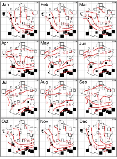
C’est un proc´ed´e de mod´elisation graphique tr`es simple. On trouvera des d´etails pratiques dans :
http://pbil.univ-lyon1.fr/R/fichestd/tdr26.pdf On exemple qui ne manque pas de sel. On a 30 villes :
library(splancs)
Le chargement a n´ecessit´e le package : sp Spatial Point Pattern Analysis Code in S-Plus
Version 2 - Spatial and Space-Time analysis
data(t3012) data(elec88)
area.plot(elec88$area)
s.label(t3012$xy, add.plot = T)
Le tableau de donn´ees contient les temp´eratures minimales moyennes par mois.
par(mfrow = c(4, 3)) for (k in 1:12) {
w <- scalewt(t3012$temp[, k])
s.value(t3012$xy, w, sub = names(t3012$temp)[k], csub = 3, cleg = 0, csize = 1.5, include.ori = F, addaxes = F, contour = elec88$contour) s.image(t3012$xy, w, kgrid = 3, image.plot = FALSE, add.plot = T) }
4
Tableaux
Le pionnier de la graphique scientifique est J. Bertin ([1, 2]). Peut-on voir les tableaux ? 182 relev´es d’avifaune pour 51 esp`eces sont ´etudi´es dans [5]. Dans un ordre quelconque :
data(rpjdl)
table.paint(rpjdl$fau, y = sample(1:182), clabel.r = 0, cleg = 0)
Question : comment ordonner les relev´es pour que la structure apparaisse ?
w <- dudi.coa(rpjdl$fau, scann = F)
table.paint(rpjdl$fau, x = w$co[, 1], y = w$li[, 1], clabel.r = 0, cleg = 0)
A consulter Bertin Graphique sur Google Images et :
http://www.sciences-po.fr/cartographie/semio/graphique_bertin2001
5
Tableaux de traits en codage flou
Une structure de donn´ees tr`es particuli`ere est associ´ee au codage flou. Un exemple [6] dans :
pbil.univ-lyon1.fr/R/querep/pps029.pdf
data(bsetal97) w = bsetal97$biol.blo ww1 = 1:sum(w)
ww0 = seq(from = 0, by = 4, len = length(w)) ww0 = rep(ww0, w) + ww1
biol.fuzzy = prep.fuzzy.var(bsetal97$biol, bsetal97$biol.blo)
17 missing data found in block 1 14 missing data found in block 2 28 missing data found in block 3 8 missing data found in block 4 5 missing data found in block 5 19 missing data found in block 6 10 missing data found in block 7
5 missing data found in block 8 2 missing data found in block 9 12 missing data found in block 10
table.value(biol.fuzzy, x = ww0, csi = 0.2, clabel.row = 0)
La figure vaut sans doute plus qu’un long discours pour poser le probl`eme de ce type de donn´ees. Voir quelques pr´ecisions dans :
pbil.univ-lyon1.fr/R/querep/qr9.pdf
6
Tableaux de cartes
Reprendre l’exemple cortes.
par(mfrow = c(4, 5)) for (k in 1:20) {
bkgnd()
s.value(xy, liz[, k], add.p = T, cleg = 0, sub = as.character(k), csub = 3, possub = "bottomleft")
}
Pour poser les questions : ? Y a-t-il une structure ? ? Qu’est-qu’on doit voir ?
? C’est significatif ?
7
Phylog´
enies
Reprendre l’exemple galabiose. Repr´esenter un arbre et un trait biologique.
phy1 <- newick2phylog(galabiose$tre) n <- galabiose$rep$oui + galabiose$rep$non trait <- galabiose$rep$oui/n
p0 <- sum(galabiose$rep$oui)/sum(galabiose$rep) trait <- (trait - p0)/sqrt(p0 * (1 - p0)/n) dotchart.phylog(phy1, trait, scal = F, cdot = 1.5)
? Y a-t-il une structure ? ? Qu’est-qu’on doit voir ? ? C’est significatif ?
Pourquoi l’article cit´e [7] ne comporte aucune p-value ? On a vu quelques exemples. On en trouvera d’autres dans :
http://pbil.univ-lyon1.fr/R/stage/stage9.pdf
Faire des repr´esentations de l’information fait partie de la fonction statistique. Ce qui permet d’ex´ecuter ou de comprendre ces repr´esentations fait partie des donn´ees `a traiter.
R´
ef´
erences
[1] J. Bertin. Semiologie graphique : Les diagrammes-Les r´eseaux-Les cartes. Gauthier-Villars, Paris, 1967.
[2] J. Bertin. La graphique et le traitement graphique de l’information. Flam-marion, Paris, 1973.
[3] W.S. Cleveland. Visualizing data. Hobart Press, Summit, New Jersey, 1993. [4] P. Murrell. R Graphics. Computer Science & Data Analysis. Chapman &
Hall/CRC, New York, 2006.
[5] R. Prodon and J.D. Lebreton. Breeding avifauna of a mediterranean succes-sion : the holm oak and cork oak series in the eastern pyr´en´ees. 1 : Analysis and modelling of the structure gradient. O¨ıkos, 37 :21–38, 1981.
[6] B. Statzner, K. Hoppenhaus, M.-F. Arens, and Ph. Richoux. Reproductive traits, habitat use and templet theory : a synthesis of world-wide data on aquatic insects. Freshwater Biology, 38 :109–135, 1997.
[7] Noriko Suzuki, Jr. Laskowski, Michael, and Yuan C. Lee. Phylogenetic ex-pression of gala1-4gal on avian glycoproteins : Glycan differentiation inscri-bed in the early history of modern birds. PNAS, 101(24) :9023–9028, 2004.