O
pen
A
rchive
T
OULOUSE
A
rchive
O
uverte (
OATAO
)
OATAO is an open access repository that collects the work of Toulouse researchers and makes it freely available over the web where possible.
This is an author-deposited version published in : http://oatao.univ-toulouse.fr/ Eprints ID : 18757
The contribution was presented at CHI 2016: http://embodimentlabs.org/shapechangingui/
To cite this version :
Serrano, Marcos and Roudaut, Anne and Irani, Pourang Challenges in
Designing Content for Non-Rectangular Displays. (2016) In: Workshop on Shape Changing UI
(CHI 2016), 7 May 2016 - 8 May 2016 (San Jose, CA, United States).
Challenges in Designing Content for
Non-Rectangular Displays
Abstract
Emerging technologies allow for the creation of non-rectangular displays with unlimited constraints in shape. However, the introduction of such displays radically deviates from the prevailing tradition of placing content on rectangular screens and raises fundamental design questions. In this position paper we present a cursory overview of results obtained from four legibility experiments on non-rectangular displays and introduce some of the big challenges to address. Author Keywords
Freeform display; non-rectangular display; visual design guidelines; text legibility.
Introduction
Recent breakthroughs in display technologies enable the design of displays with varying shapes (Figure 1). However, such novel form factors challenge many of the fundamental principles and guidelines that have been accumulated over the past decades for presenting and interacting with content. To support the practical adoption of such form factors, we need to rethink our understanding of how we display and interact with associated content.
Marcos Serrano
University of Toulouse - IRIT Toulouse, France [email protected] Anne Roudaut Bristol University Bristol, UK [email protected] Pourang Irani University of Manitoba Winnipeg, Canada [email protected]
Figure 1. Left: Examples of freeform displays developed by Sharp. Right: Freeform display usage scenarios: circular mirrors for private notifications, shapes with holes such as a cooktop displays for recipes or the back of triangular road signs as public displays
In this position paper we report on first results in our exploration of text legibility on freeform displays [2]. Our work is built on information obtained from participants in focus groups to collect usage scenarios of free-form displays (Figure 1). From these, we computed several display shape properties using an algorithm inspired from [1] and used them to build a framework that identifies different mappings of text onto a non-rectangular shape. We finally conducted a series of quantitative text legibility studies to investigate hypotheses concerning legibility for different
display shape properties.
In this position paper we extend this previous work by proposing challenges that need to be addressed to usher the adoption of such technologies
Text legibility on freeform displays
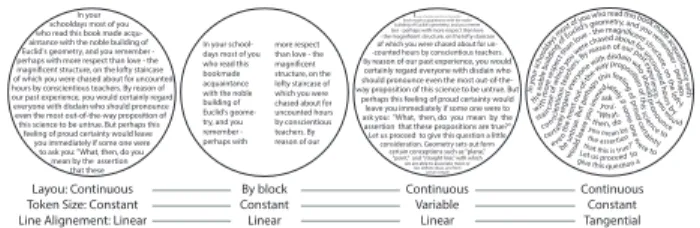
We investigated different mappings of text content onto free-form shapes [2] based on a new framework. Our framework describes three axes with increasing levels of abstraction (examples in Figure 5):
• Layout: this axis describes the general text layout, which can be continuous or by block. For example, the CHI Proceedings layout is in blocks (formatted on two columns). We could have also considered the case where the layout is not continuous (e.g. random), but this would clearly disturb text readability.
• Token size: this axis describes the size of the tokens, which can be constant or variable. E.g. the fisheye menu illustrates the case variable. It is important to note that many deformations are possible.
• Line alignment: this axis describes the line alignments in which the text fits. It could be linear, i.e. horizontal, or oriented parallel lines, or what we call tangential, i.e. following the shape. More precisely, text could follow a
vector field around the shape boundary. This is typically the case in calligrams.
Figure 5. Example of text mappings.
From our studies we provide a set of design guidelines for optimizing text legibility on non-rectangular displays:
• Both left and right irregular alignments should be avoided, as text in these are perceived to be difficult to read. Instead, symmetric shapes are preferred (Figure 2).
• Shapes with circular or sharp alignments are acceptable for presenting text: they are perceived to be easy to read (Figure 2).
• If the shape contains a hole, text should be displayed using a broken layout with two columns around the hole to prevent any impact on reading performance (Figure 3).
• Text on very sharp shapes should be avoided, as text on these is harder to read than on linear shapes. If used, such shapes should be filled with continuous text rather than tangential that impacts reading performance (Figure 4).
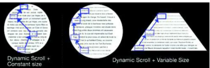
Scrolling text on freeform displays
We also investigated two different techniques for scrolling text on freeform displays: dynamic scrolling or page scrolling (Figure 6).
In your schooldays most of you who read this book made aintance with the noble building of Euclid's geometry, and you remember - perhaps with more respect than love - the magnificent structure, on the lofty staircase of which you were chased about for uncounted hours by conscientious teachers. By reason of our past experience, you would certainly regard everyone with disdain who should pronounce even the most out-of-the-way proposition of this science to be untrue. But perhaps this feeling of proud certainty would leave you immediately if some one were to ask you: "What, then, do you mean by the assertion that these
In your school-days most of you who read this bookmade acquaintance with the noble building of Euclid's geome-try, and you remember - perhaps with
more respect than love - the magnificent structure, on the lofty staircase of which you were chased about for uncounted hours by conscientious teachers. By reason of our
In your schooldays most of you who read this
book made acquaintance with the noble building of Euclid's geometry, and you remem ber - perhaps with more respect than love - the magnificent structure, on the lofty staircase
of which you were chased about for un--counted hours by conscientious teachers. By reason of our past experience, you would certainly regard everyone with disdain who should pronounce even the most out-of-the-way proposition of this science to be untrue. But
perhaps this feeling of proud certainty would leave you immediately if some one were to ask you: "What, then, do you mean by the assertion that these propositions are true?" Let us proceed to give this question a little
consideration. Geometry sets out form certain conceptions such as "plane,"
"point," and "straight line," with which we are able to associate more or
less definite ideas, and from certain simple In yo u r sch ooldays mos
t of you who read this book mad e acq u ain tan ce w ith the no ble bu ildin g of Euclid
's geometry, and you r emem b er - p e rh ap s with mo re r esp ect t han love - the magnificent st ru cture , o n the loft y stair case of w hich you were chased about for u ncou nte d hou rs b y c onscie nti ous teac hers . By r
eason of our past expe rience , you w ou ld certa inly r egard eve ryon e with disdain who should p ron o unce eve n t h e mo st ou t-of -the-way proposition o f t h is s cie nce to be u ntru e. Bu t perha ps this feeling o f pro ud c e rtain ty would le ave you im mediately if som e o n e w ere to ask y ou: " What, then, do you mean by the assertion that this is true?” Let us proceed to give this question a Layou: Continuous
Token Size: Constant Line Alignement: Linear
By block Constant Linear Continuous Variable Linear Continuous Constant Tangential Figure 2. Symmetric
display shapes favor text legibility.
Figure 4. Tangential text on sharp displays is perceived as harder to read than continuous text.
Figure 3. If the shape contains a hole, text should be displayed using a broken layout.
Figure 6. Dynamic scrolling with text of constant size (left) or variable size (right).
Our main finding is that to use dynamic scrolling on non-rectangular shapes, text should be resized so that each line contains the same amount of text. Otherwise, we should use page scroll with constant text size. Resizing text for dynamically scrolling is perceived as beautiful and clean, but resizing text with page scrolling raises mixed results. Some users disliked it because of display space loss and of varying interline spacing. Resizingtextshouldthusbe limited to dynamic scrolling.
Challenges in designing content for non-rectangular displays
Our work represents a first step in identifying text legibility concerns on non-rectangular displays. However there are many challenges yet to explore to help the design of content on non-rectangular displays. We discuss briefly these here.
Content type
A general challenge is to explore the possible mapping of UI content into a shape. We can reduce this problem intoasimplequestion:whatare the possible dispositions of a set of n tokens {t0,…tn} into a shape S? To answer
this question we need two types of information: the
token semantic, i.e. the relationship between tokens
and the mapping of tokens onto shape.
We started identifying preliminary token semantic as:
• Free: there is no intrinsic relation between the tokens and they can be placed randomly. E.g. tokens = icons of apps to place on a screen, their position does not matter.
• Sequential: the tokens have a sequential order but they can be broken into lines and columns. E.g. tokens = characters.
• Fixed in one dimension: the tokens have a sequential order but they cannot be broken into lines and columns, they are constrained to 1 dimension. E.g. a color strip in which it is important that each token is located next to its two neighbours.
• Fixed in several dimensions (2D or 3D): the tokens have a logical order in a 2D or 3D reference system. This is the typical case where tokens are pixels in an image. This could also correspond to tokens being graphical elements in a UI such as a map or a tree. Another typical case is a keyboard (tokens = keys). As for the mapping of tokens, we already explored some mappings in our framework [2] for the case of text content but other mappings can be considered when sequentiality of tokens, and orientation (reading an upside down text is difficult) are not a requirement anymore. For example it would be possible to consider a radial mapping when the token are icons.
Aside from tokens another more complex form of content are images. These raise numerous questions. For example, should images be cropped based on the underlying display shape or should images use variable shapes to fit the contained display? Furthermore, aside from the shape of images, should their position vary based on the display shape, so that they always appear as taking the most available space for any given image.
These questions could be verified using empirical support.
Interacting with non rectangular objects
Although we mainly focused on output, the emergence of non-rectangular display also raised many challenge in term of interaction. It is yet unclear how we should interact (point, flick, perform gesture, type) with something that is not rectangular anymore. In fact some shapes might have some benefit for interaction. For instance, long and narrow objects could perhaps enable other flicking mechanisms, such as using the edges of the shape to displace content. Similarly, interacting with the display workspace via operations such as zooming or reaching for off-screen content needs consideration.
Such questions merit further investigation and could impact the manner in which traditional graphical artefacts get re-engineered for non-rectangular displays.
Conclusion
This position paper presents an overview of several guidelines for presenting text on non-rectilinear displays. It also presents key challenges that require further empirical support. These include how to design tokens and images, how to interact with content and with non-rectilinear displays workspaces. Addressing such questions will present opportunities for advancing novel designs for non-rectilinear displays.
References
1. Roudaut, A., Reed, R., Hao, T., and Subramanian, S. 2014. Changibles: analyzing and designing shape changing constructive assembly. In Proc. of CHI '14. ACM, 2593-2596.
2. Serrano, M., Roudaut, A. and Irani, P. Investigating Text Legibility on Non-Rectangular Displays. In Proc. of CHI’16. ACM, 10 pages, to appear.