HAL Id: hal-00986577
https://hal.archives-ouvertes.fr/hal-00986577v2
Preprint submitted on 9 Oct 2014
HAL is a multi-disciplinary open access
archive for the deposit and dissemination of
sci-entific research documents, whether they are
pub-lished or not. The documents may come from
teaching and research institutions in France or
abroad, or from public or private research centers.
L’archive ouverte pluridisciplinaire HAL, est
destinée au dépôt et à la diffusion de documents
scientifiques de niveau recherche, publiés ou non,
émanant des établissements d’enseignement et de
recherche français ou étrangers, des laboratoires
publics ou privés.
On the visual display of audio data using stacked graphs
Mathieu Lagrange, Grégoire Lafay, Mathias Rossignol
To cite this version:
Mathieu Lagrange, Grégoire Lafay, Mathias Rossignol. On the visual display of audio data using
stacked graphs. 2014. �hal-00986577v2�
ON THE VISUAL DISPLAY OF AUDIO DATA USING STACKED GRAPHS
Mathieu Lagrange
IRCCYN CNRS
[email protected]
Grgoire Lafay
IRCCYN CNRS
[email protected]
Mathias Rossignol
Hano University
[email protected]
ABSTRACTVisualisation is an important tool for many steps of a re-search project. In this paper, we present several displays of audio data based on stacked graphs. Thanks to a careful use of layering the proposed displays concisely convey a large amount of information. Many flavours are presented, each useful for a specific type of data, from spectral and chromatic data to multi-source and multi channel data.
1. INTRODUCTION
The visual display of quantitative information [11] is at the core of the growth of human knowledge as it allows human beings to go beyond the limitation of natural languages in terms of precision and scale. This is particularly true in the scientific domain, where the above cited properties are very much needed.
Defining what is the essence of a good visual display of quantitative data is non trivial and domain specific. That said, in most scientific fields, such displays serve two ma-jors goals: 1) the routine interaction of the researcher with the data or the physical phenomenon and 2) the need of the researcher to motivate its claim to its peers. Both tasks re-quire the display to fulfill the simplicity rule both in terms of production and design. First, the display shall be com-puted and adapted according to the need of the researcher very efficiently in order to allow an effective exploration of the data. Second, the display shall be able to convey at the first glance an important qualitative aspect about the data.
This paper is about the visualisation of audio data, and audio data is originally made to be listened to. Therefore, we shall keep in mind that ”all visual projections of sounds are arbitrary and fictitious” [9]. That said, even if recorded versions of sounds can now be played back at convenience, it is still useful to represent them graphically as listening depends on time. On contrary, the visual display allows the reader to grasp a global view of the waveform at a glance. Also, the eye is less subject to stimulation fatigue and the visual display is very powerful to convey evidence as we are still fully into the print culture that since the Guten-berg invention gives an ”uncritical acceptance [to] visual metaphors and models” [7].
Permission to make digital or hard copies of all or part of this work for personal or classroom use is granted without fee provided that copies are not made or distributed for profit or commercial advantage and that copies bear this notice and the full citation on the first page.
c
2014 International Society for Music Information Retrieval.
We propose in this paper a display of audio data that is, in our opinion, intuitive and gives information about the main dimensions of sound in a compact manner us-ing stacked graphs [2]. The display can be computed very efficiently and easily1. In order to put this display into
context, an overview of the routinely used type of displays is given, respectively from the perspective of the musi-cian composer in Section 2 and the physicist in Section 3. We shall argue that the proposed display fully described in Section 4 can be thought of as the physicist’s counterpart to a notational system introduced by Schafer [9]. Moreover, the display can be straightforwardly extended to display multi source and multi channel audio as well as melodic content for the musically inclined.
2. ABOUT NOTATION
From the phonetic alphabet for speech to the musical score for music, notation consists in putting together on a one or two-dimensional space symbols describing specific sound events. In a manner probably inherited from writing, time sequencing is usually depicted from left to right in the Western musical culture. Specific to the musical score is the use of the vertical axis to depict the pitch. A musi-cal tone is therefore solely described in terms of time of appearance, duration, pitch and sometimes intensity. As such, the score is largely prescriptive and gives a tremen-dous amount of freedom to the musical performer in terms of interpretation.
In an intent to provide a more descriptive notation of musical objects, Schaeffer [8] designed a ”solf`ege des ob-ject musicaux” that extensively apprehend the description of any kind of sound object. Perhaps because of its com-plexity this notation is hardly used today. In an effort to simplify this notation, Schafer proposed a notational sys-tem that can be considered for describing any kind of sound, be it a unique event or any kind of compound. The main rationale is to split the temporal axis from left to right into 3 parts corresponding to the attack, sustain and decay. For each part, its duration, frequency (related to the notion of mass as introduced by Schaeffer), fluctuations (related to the notion of grain as introduced by Schaeffer) and dy-namics are displayed from top to bottom. Except for the frequency content that is depicted as a rough spectrogram contour, the other dimensions are described according to a specific alphabet of a few symbols. An example taken from [9] of such annotation is given on Figure 1 for the
Attack Body Decay Duration moderate non-existent slow Frequency steady low
Fluctuations transient steady-state Dynamics loud to soft
Duration ←−3 seconds −→
Figure 1: Annotation of a church bell from Schafer [9].
sound of a church bell.
3. ABOUT MEASURE
When dealing with sound as a physicist, one wants to quan-tify mechanical properties and display them precisely. As in notation, the main thing that is commonly looked for are the distribution of energy across frequency and time. The distribution of energy as a function of the modulation rate and the frequency scale of observations are less considered but important perceptually [1, 3].
Therefore, in order to display a sound on a two-dimensional plane, one has to resort to a choice or a compromise. Either timing is emphasized and frequency neglected as in the waveform display 2a or frequency is emphasized and tim-ing neglected as in the display of the Fourier spectrum 2b. A compromise can be made by considering time and fre-quency respectively as horizontal and vertical axes of the two-dimensional plane as with the popular Fourier spec-trogram. In such display, the use of a color code conveys information about energy. In most papers in signal pro-cessing, the color code ranges from blue (low energy) to red (high energy). Even though it enhances contrast, it also contradicts with the data-ink principle introduced by Tufte in [11]. Indeed, as most spectra are sparse, the display is covered by large sections of blue which are non informa-tive, see Figure 2c.
The spectrogram display is a compromise that favours frequency over time. Spectral structure can be analyzed precisely, for example harmonicity, modulations, etc. Con-versely, temporal dynamics and structure are hard to appre-ciate, as the way energy fluctuates in each sub bands has to be reconstructed from the color code.
The spectrogram is a display that is in our opinion very powerful for close inspection of a sound event that is active over a short period of time. Indeed, enlarging the time resolution quickly blurs the frequency resolution and may lead to a completely non informative display.
4. VISUALIZING SPECTRAL CONTENT USING STACKED GRAPH
In contrast, we propose in this paper to take a compro-mise that favours time over frequency. In such display, the plane is therefore organized with time and energy as respectively the horizontal and vertical axes, and the fre-quency is displayed as stacked layers displaying the level of energy across frequency sub bands of growing frequency.
(a) Waveform.
(b) Spectrum.
(c) Spectrogram.
Figure 2: Standard displays of the sound of a church bell.
We seek a display that depicts informations that are per-ceptually meaningful2. Therefore, we consider spectral
data projected on a Mel-scale [10] and each sub bands is optionally corrected for equal loudness [4] with cubic root compression.
In order to improve legibility, colors are assigned to fre-quency layers according to their ranges with a color code ranging from blue (low frequency) to yellow (high fre-quency). The blue color is often associated with large
2This step would not be meaningful for people interested in bats
vocal-izations for example. In this case, the perceptual front end can be safely disregarded.
phenomena, with the following adjectives: celestial, calm, deep, whereas the yellow color is often associated with transient phenomena that are highly energetic. Kandinsky in [6] states that ”Blue is comparable to low pitched organ sounds. Yellow becomes high pitched and can not be very deep”. The color code is then chosen to be a linear gradi-ent from blue (low frequency range) trough green (middle frequency range) to yellow (high frequency range). In this paper, the gradient follows the LCH color model specified by the Commission Internationale de l’ ´Eclairage (CIE) so that the perceived brightness appears to change uniformly across the gradient while maintaining the color saturation. This color scale was the best compromise we were able to find, though the proportion of blue and yellow is not satis-fying, leading to a graph that contains too much blue. The natural conversion in gray scale is to map blue to black and yellow to white. A black and white display can be achieved with a stress on the 3 spectral ranges, see Figure 3b.
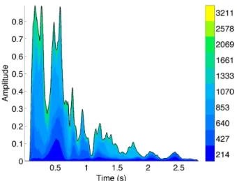
We argue that this display, termed SPectral stACK (SPACK), convey useful information about the sound. In particular, it conveys nicely, aside of fine details, the important dimen-sions retained by Schafer, see Figure 1. The musically in-clined will found the SPACK display of the musical piece ”Einstein on the beach” by Philip Glass3 on Figure 8.
5. VISUALIZING MULTI SOURCE CONTENT (SMACK)
Visualizing at the same time a large number of sound sources is hard to achieve. Most Digital Audio Workstations (DAWs) have their displays set as a vertical array of waveforms, loosing a lot of space and reducing the ability of the user to interact with different sources that are far apart in the array.
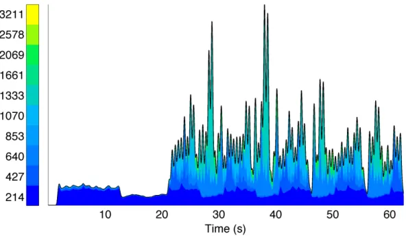
Alternatively, we propose to stack the envelope of the sources to be displayed, see Figure 4. It allows the user to quickly grasp the overall organization of the sound scene at the cost of a distortion of the envelope of sound display on top. This distortion can be minimized in many different ways [2], but we find that sorting the sources according to their overall energy is a simple and effective heuristic. An advantage of this heuristic is that the low amplitude sounds are less distorted while the high energy ones are severely distorted but the surface is still legible. Also, when dis-played in gray scale, the display keep a high data ink ratio, see Figure 4b.
While considering such a display for sound manipula-tion, one could use the bottom of the graph to put the spe-cific source to be edited. That way, the user can conve-niently edit this source without distortion of display while keeping on eye on the evolutions of the other tracks.
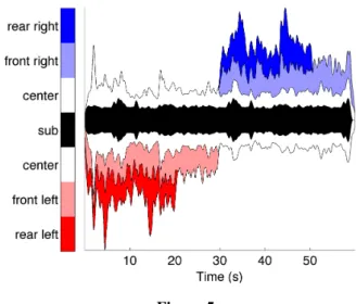
6. VISUALIZING MULTI CHANNEL CONTENT (SCACK)
Another setting where such a style of display can be useful is to display multiple channels. On Figure 5 is shown an
3The piece can be listened to at
https://www.youtube.com/watch?v=NxmTdNYDHjY
(a) Color display. The color code conveys nicely the modulation within each frequency band and the overall disappearance of the high frequency range.
(b) Black and white display. The solid line separating mid range and high range is almost confounded with the envelope, indicating a low pitched sound.
Figure 3: SPectral stACK (SPACK) display of the sound of a church bell.
arrangement of the 6 channels of a 5.1 setting. The color code is chosen in order to use hue to convey panning infor-mation and luminance to convey depth. The subwoofer is assigned to black as it is an omnidirectional source. In gray scale or black and white, the display is still legible due to the use of the vertical axis to convey panning information.
7. VISUALIZING MELODIC CONTENT
This display may also be used to represent the chroma, a feature widely used to describe musical signals. In our im-plementation, chroma is obtained by warping the spectral content of the signal into the well tempered western mu-sic scale of 12 semi-tones. In this display, termed Sound CHroma staCK (SCHACK), each chroma is described by a stacked layer of a carefully chosen color.
(a) Color display.
(b) Gray scale display.
Figure 4: Sound Multiple stACK (SMACK) display of an environmental soundscape.
To set a meaningful color map, we got our inspiration from the color-tonality association made by Scriabine [5]. Scriabine was a synesthete who extensively experimented the relationship between sounds and colors. He made an color-tonality association in which two tones which are in close proximity in the cycle of fifth are represented which similar colors. Considering that Scriabine’s choice of col-ors was subjective, and the associations he made was be-tween tones and colors and not notes and colors [5]. As a chroma is more related to the notion of note than the notion of tone, we chose a more common color set while maintaining the color mapping based on the cycle of fifths. To represent the 12 notes of the scale, we use 12 col-ors in a HSV color space (Hue, Saturation, Value), each of them having the same Saturation and Value and differ only in their Hue. The 12 colors of our HSV space are mapped onto the 12 notes of the musical scale ordered in a cycle of fifths, see Figure 6. Doing so ensures that two consec-utive chroma (ie. semi-tones in that case) are represented with distinct colors, which are helpful for a stack based
Figure 5
representation. Furthermore this color-map is adapted to illustrate both unique notes and chords.
If we consider a single note, the color-map allows us to represent the first four partials of the note, which are the octave, the Pythagorean fifth (which can be considered as the perfect fifth of the fundamental frequency to within a few comma), and double octave of the fundamental fre-quency, with similar colors having regards to their satura-tion. All the others partials are represented with distinct colors (see figure 7).
If we consider a chord, the color-map allows us to rep-resent two ”consonant” notes (fifth, fourth, major second intervals) with two closed colors in term of saturation and two ”dissonant” notes (Tritone: Diabolus in musica or mi-nor second intervals) with well distinct colors, in the case that of the spectral energy is contained in the fundamental frequency. Those notions of ”consonant” and ”dissonant” have a significant relevance to the Western tonal music the-ory. Third and sixth intervals may be also considered ”con-sonant” interval, but as the color mapping is based on the cycle of fifths, third and sixth intervals are not represented with particular colors associations.
Let us consider a musical example. Figure 9b show the schack representation of the beginning of a flute Duett composed by Georg Philipp Telemann (see figure 9a for the score). The envelop of the stacked layers clearly illus-trate that 1) the amplitude is modulated and 2) four notes (F) are played with more intensity than the other notes. The color map allows us to distinguish the third first notes (B-flat D E-flat) by identifying the broader layers, as most spectral energy is concentrated on their fundamental fre-quency and their first partial (octave). We can see that the
B-flatis maintained during the notes D E-flat as the thick-ness of the layer corresponding to B-flat remains impor-tant. As the first three notes are relatively far from each others in the cycle of fifths, they are represented with dis-tinct colors. For the fourth note (F), the fact that the layers corresponding to the two adjacent semi tones (E-flat and
Do Re Mi Fa Sol La Si Fa# Re# La# Do# Sol# tritone fifth fourth
Figure 6: Proposed mapping between HSV color space and the notes ordered in a cycle of fifths.
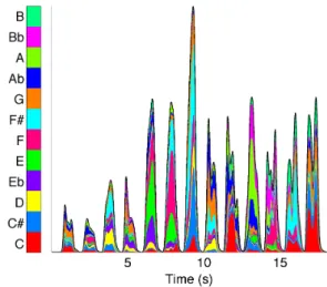
Figure 7: Sound CHroma stACK (SCHACK) representa-tion of a full musical scale of 12 semi-tones played by a flute.
the frequency analysis. For all the notes (F), we can see that the amplitude of the third partials (Pythagorean fifth, which would correspond to the note C) is important. Every time the note F is played, the red layer is broader.
Considering the first chord (E-flat/F) and the last chords (A/F), we can see that le layer of E-flat is more important for the first chord (E-flat/F) than it is for the second chord (A/F), in which the layer of A is broader.
8. DISCUSSION
We introduced in this paper an interesting set of displays. For mono channel data, the spectral and chromatic displays allows the user to display frequency related information on a time / energy plane, thus nicely conveying informa-tion about the variainforma-tion of energy trough time. For multi sources or multichannel data, the proposed displays allow the user to display a large amount of information on a
sin-gle graph.
Even though the displays are designed to be meaningful in a large set of applications, some settings are application dependent. Whether or not a compression shall be applied typically depends on the type of data to be analyzed. For speech data, it leads to much better display, whereas for many environmental sounds it may degrade the timing in-formation. An horizontal smoothing using a gaussian ker-nel is applied in order to reduce high frequency variations that would blur the visual display. The size of the kernel typically depends on the duration of the audio but also on the style of display.
9. ACKNOWLEDGMENTS
The implementation provided is based on the rastamat tool-box written by Dan Ellis. Research project partly funded by ANR-11-JS03-005-01.
10. REFERENCES
[1] Joachim Anden and Stephane Mallat. Multiscale Scat-tering for Audio Classification. In ISMIR, 2011. [2] L Byron and M Wattenberg. Stacked Graphs-Geometry
& Aesthetics. IEEE Trans. Vis. Comput. Graph., 2008. [3] Taishih Chi, Powen Ru, and Shihab Shamma. Multires-olution spectrotemporal analysis of complex sounds.
The Journal of the Acoustical Society of America, 118(2):887, 2005.
[4] Robinson DW and Dadson RS. A re-determination of the equal-loudness relations for pure tones. The
Jour-nal of the Acoustical Society of America, 7(8), 1956. [5] BM Galeyev and IL Vanechkina. Was Scriabin a
synes-thete? Leonardo, 34(4):357–361, 2001.
[6] W. Kandinsky. Concerning the spiritual in art. Dover publications, 1954.
[7] M McLuhan. The Gutenberg Galaxy. University of Toronto Press, 1963.
[8] P Schaeffer. Trait´e des objets musicaux. ´Editions Du Seuil, 1966.
[9] RM Schafer. The soundscape: Our sonic environment
and the tuning of the world. Destiny books, Rochester, Vermont, 1977.
[10] SS Stevens, J. Volkmann, and E. B. Newman. A scale for the measurement of the psychological magnitude pitch. The Journal of the Acoustical Society of
Amer-ica, 185(8), 1937.
[11] E.R. Tufte. The Visual Display of Quantitative
Figure 8: SPectral stACK (SPACK) display of the musical piece ”Einstein on the beach”.
(a)
(b)
Figure 9: Musical score (a) of the extract of a flute Duett by George Philipp Telemann (1681-1767) and corresponding Sound CHroma stACK (SCHACK) display (b).
![Figure 1: Annotation of a church bell from Schafer [9].](https://thumb-eu.123doks.com/thumbv2/123doknet/7786469.259397/3.892.461.830.77.828/figure-annotation-church-bell-schafer.webp)