HAL Id: hal-01059586
https://hal.archives-ouvertes.fr/hal-01059586
Submitted on 1 Sep 2014
HAL is a multi-disciplinary open access
archive for the deposit and dissemination of
sci-entific research documents, whether they are
pub-lished or not. The documents may come from
teaching and research institutions in France or
abroad, or from public or private research centers.
L’archive ouverte pluridisciplinaire HAL, est
destinée au dépôt et à la diffusion de documents
scientifiques de niveau recherche, publiés ou non,
émanant des établissements d’enseignement et de
recherche français ou étrangers, des laboratoires
publics ou privés.
ChromoStereoscopic rendering for trichromatic displays
Leila Schemali, Elmar Eisemann
To cite this version:
Leila Schemali, Elmar Eisemann.
ChromoStereoscopic rendering for trichromatic displays.
Non-Photorealistic Animation and Rendering, Aug 2014,
Vancouver, Canada.
pp.57-62,
�10.1145/2630397.2630398�. �hal-01059586�
ChromoStereoscopic Rendering for Trichromatic Displays
Le¨ıla Schemali1,2 Elmar Eisemann3
1Telecom ParisTech CNRS LTCI 2XtremViz 3Delft University of Technology
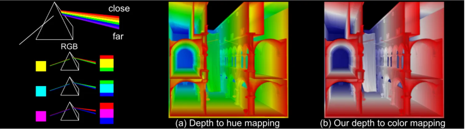
Figure 1: ChromaDepth glasses act like a prism that disperses incoming light and induces a differing depth perception for different lightR wavelengths. As most displays are limited to mixing three primaries (RGB), the depth effect can be significantly reduced, when using the usual mapping of depth to hue. Our red to white to blue mapping and shading cues achieve a significant improvement.
Abstract
The chromostereopsis phenomenom leads to a differing depth per-ception of different color hues, e.g., red is perceived slightly in front of blue. In chromostereoscopic rendering 2D images are produced that encode depth in color. While the natural chromostereopsis of our human visual system is rather low, it can be enhanced via ChromaDepth glasses, which induce chromatic aberrations in oneR eye by refracting light of different wavelengths differently, hereby offsetting the projected position slightly in one eye. Although, it might seem natural to map depth linearly to hue, which was also the basis of previous solutions, we demonstrate that such a mapping re-duces the stereoscopic effect when using standard trichromatic dis-plays or printing systems. We propose an algorithm, which enables an improved stereoscopic experience with reduced artifacts. CR Categories: I.3.3 [Computer Graphics]: Three-Dimensional Graphics and Realism—Display Algorithms;
Keywords: ChromoStereoscopy;Stereoscopic rendering
1
Introduction
Artists have made use of color to encode and induce depth percep-tion for centuries [Livingstone 2002] - a well-known example is the application of aerial perspective. In general, we tend to perceive colder colors as more distant than warm tones. One possible ex-planation is a subtle natural chromatic aberration induced by the lens of our visual system [Einthoven 1885]. Usually, this effect is rather weak, but strong enough to find applications in visualization systems [Chu et al. 2008].
Figure 2: Chromostereopsis can be due to: (a) longitunal chro-matic aberration, focus of blue shifts forward with respect to red, or (b) transverse chromatic aberration, blue shifts further toward the nasal part of the retina than red. (c) Shift in position leads to a depth impression.
This chromostereopsis phenomenon can be enhanced using spe-cialized glasses, e.g., ChromaDepth glasses. These glasses typ-R ically consist of a standard window glass for the right eye and a special prism-like holographic film for the other, which induces an increased chromatic aberration. Due to the positional shift of dif-ferent wavelengths in one eye, but not the other, disparity between the image pairs is produced that is perceived as depth. For exam-ple, a red object will be shifted to the right for the left eye, hereby, creating the illusion of this object being closer to the observer. Based on the wavelength, light is consistently refracted to induce a visible shift. Nonetheless, an LCD screen and printer can usually not synthesize arbitrary wavelengths, but only combine a limited set of base colors to produce the illusion of various hues. For screens, subpixel information in form of a red, green, and blue channel are combined. For chromostereopsis, this limitation has a significant impact and can lead to artifacts. Imagine the color yellow (actually represented via red and green), which maps to two distinct posi-tions. In this paper, we will take these observations into account to derive more effective chromostereopsis for LCD screens.
Our solution achieves an increased depth perception and reduces visual artifacts. It improves the quality of chroma-based stereo, which is interesting for several reasons. First, images are easy to produce with our solution. Second, the necessary stereo equipment is cheap. Third, the result is naturally backwards-compatible; an
observer without glasses perceives a clear and crisp image and only lacks the enhanced depth perception. Also, the image builds upon a warm-cold contrast, which makes it a suitable representation for visualization purposes [Gooch et al. 1998; Rheingans 1999]. Specifically, our contributions are: an analysis of chromostere-oscopy for RGB displays; a fast and easy-to-implement method for chromostereoscopy; enhancement techniques to improve depth per-ception; an informal user study to evaluate the quality of the results.
2
Related Work
Einthoven’s theory [1885] first described chromostereopsis induced by our eyes. On a black background, we perceive red in front of the image plane and blue behind it. The phenomenon was attributed to a different refraction index for each color of the light spectrum when a ray enters the eye. The blue projection on the retina is shifted more to the nasal part (Fig. 2(b) and (c)), known as the trans-verse chromatic aberration. This explanation is generally preferred over the longitudinal chromatic-aberration theory (Fig. 2(a)), stat-ing that the focus point in the eye appears closer for blue than for red [Simonet and Campbell 1990; Ye et al. 1991; Faubert 1994]. To exploit and amplify the natural chromostereopsis effect, special glasses have been introduced. The Chomatek Corporation devel-oped the ChromaDepth glasses, which are composed of super-R chromatic prisms. The visible light is refracted with a refraction in-dex depending on the light wavelength, enhancing the color-depth effect [Steenblick 1987; Sicking et al. 1995; Ucke 1999]. The lower wavelength, violet, is refracted toward the nasal part of the retina while higher wavelengths, red, are redirected towards the temporal part. Hereby, a disparity between the left and right retinal images is induced, which is interpreted by the human visual system as a difference in depth (Fig. 2 (c)). We can theoretically create a depth ramp by mapping depth linearly to the visible light spectrum be-tween red (close) and violet (distant). The background of the image should be black, as, otherwise, the background color will also be refracted and interferes at object boundaries (Fig. 3). Initially, two holographic films (one for each eye) were used, but this process lead to a reduced sharpness [Ucke 1999].
The chromostereoscopy along with the ChromaDepth glasses hasR been used extensively in various areas of computer graphics. For scientific visualization [Bailey and Clark 1998], for cartographic images [Toutin 1997; Petrie et al. 2001], complex graph visualiza-tion [Wallisch et al. 2002], solar physics simulavisualiza-tion data [Verwichte and Galsgaard 1998], and even marine environment [Hamid 2012]. All these previous sources suggest a linear depth-to-hue mapping (red for close, green for middle, blue for distant elements) to pro-duce chromostereoscopic images, referenced hereafter as hue map-ping. However, on a trichromatic (RGB) screen, the so-defined depth is not optimal, appears non linear, and color artifacts on the boundary can be very significant, e.g., for yellow (Fig. 3(a)). For angiography visualization, Ropinski et al. [2006] proposed a modified chromostereoscopic rendering using red, magenta and blue, from the closest to the farthest, on a black background (Fig. 3(b)). Unfortunately, magenta tends to be perceived at the same depth as red instead of between red and blue [Bailey et al. 2006]. We will analyze the reasons in this paper and propose a new color scheme that better matches the expectations.
Additionally, a chromostereopsis rendering algorithm, using non-photorealistic techniques, such as strokes and silhouette drawing, has been developped by Chu et al. [2008] for vascular visualization. They draw strokes parallel to the vessel section, varying their color from red to green to blue, on a black background. Further, they add
a white silhouette, which is not a good choice, as it is perceived at the screen depth, hereby, contradicting the stroke depth. In this work, we also optionally add shading cues at silhouettes to improve depth perception and show their benefit.
Figure 3: Colors leading to a depth ramp; a red-to-blue on a black and cyan-to-yellow ramp on a white background. Underlined col-ors lead to conflicting depth cues on trichromatic displays.
3
ChromoStereoscopy with RGB Displays
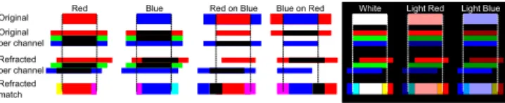
Most displays and prints are trichromatic, meaning that three prim-itive colors are mixed. Consequently, there are also only three dis-tinct shifts associated to these color primitives to induce a depth illusion (Fig. 4). The hue mapping between red and blue is only a weak approximation of different spectra, although it is true that at least blue shifts to the left, red to the right and green is mostly invariant. A red (green/blue) square on a black background will, thus, be seen close (at screen distance/far away). Nonetheless, this observation does not hold for all colors; yellow will be perceived at screen distance and show color artifacts on its boundaries; the red and green channel being independently refracted by the glasses, a similar observation can be made for cyan.
(a) Black background
(b) White background
Figure 4: Color perception on a black or white background look-ing through the left holographic foil of ChromaDepth glasses.R (a) Red shifts right, blue shifts left, green does not move. Colors combining various channels show fringing. (b) The white back-ground is decomposed in blue, green and red and mixes with the color patches. Darkened yellow and cyan do no longer show a chromostereoscopic effect.
The use of different background colors can have a strong impact on the visible depth position of a patch. If background and patch chan-nels share information (e.g., red object on a yellow background),
there is necessarily an interaction between the two. This cross talk can be strong enough to hinder the human visual system from es-tablishing correspondences between both views, leading to an an-nihilation of the entire stereoscopic effect. E.g., a cyan patch on a black background will be perceived at screen distance because cyan produces a green and blue copy. The visual system has a weakness for blue and will tend to match cyan with green, whose retinal pro-jection is not influenced by the holographic foil. A cyan patch on a white background corresponds to the inverted situation of red on a black background. In other words, it only differs in the red channel with respect to the background, hence, it will be shifted and thus be seen in front of the white background. Nonetheless, if one were to use a dark cyan patch, the matching will fail, as it induces several differently-colored borders that hinder the stereoscopic perception. On the one side a blue/cyan, on the other a pink/yellow border. In both cases, the strong differences in the green/red channel avoid a perfect match. Further, the red and blue boundary, even if matched, lie at the initial position, hence, the chromostereoscopic effect is always annihilated (Fig. 4(b)).
The screen physical sub-pixel arrangement (horizontal/vertical) does not modify the way the color fringes appear on the vertical edges of an object whose color is composed of several primaries. We observed that for a viewing distance of 60cm, red (blue) is shifted to the right (left) by an amount of around 6 pixels (1.5mm)
4
Our Depth-to-Color Mapping
To define our rendering algorithm, we will build upon the previous observations to improve upon the hue mapping. In order to avoid most interference, we choose a white or black background. In this case, the color channels will always represent extremes with respect to the object colors. For the moment, we will first investigate the case of a black background.
To cover the entire possible depth range, a red-to-blue mapping, via magenta, might seem an appropriate choice. In practice, the solution does not perform well because the red and blue channels are consistently warped. The red channel moves in one direction, the blue channel in the other, both with constant distance. Hence, it looks like two semi-transparent foils, a red one in front of a blue one. The scene mostly appears like a two-layer depth representation of transparent objects, than a consistent 3D scene (Fig. 4(a),12(c)). In order to avoid the layered impression, one could consider a tran-sition from red to blue via green, which is perceived at screen dis-tance. Unfortunately, the introduction of a green channel, while fading out the red channel can lead to matching conflicts. Before most, our human visual system matches luminance [Heckmann and Schor 1989; Legge and Yuanchao 1989; Didyk et al. 2012] and the fact that the eye is slightly more sensitive to green seems to re-sult in a mismatch when showing red and green at the same time. This observation seems to match the previous remark regarding yel-low being a bad choice because the borders decompose into red and green bands. In particular, it is evident that the hue mapping, which includes yellow, as well as cyan, thus results in artifacts and mismatches, which induce a non-monotonic depth repartition. In Fig. 3, we show various mappings for comparisons.
Our choice is to rely on a red to white gradient for nearby objects up to the screen distance. Fading in the green and the blue channel simultaneously to produce white, without reducing the red channel, improves the matching drastically. First, white will be perceived at the screen distance, just like green, but it shows actual boundaries. The inner boundaries are yellow and cyan, which are close enough to white to make a matching possible and result in the screen dis-tance. Additionally, white shows an outer red and blue boundary, but both colors are too different to be matched. When fading green
and blue, red will be dominated and the matching process will con-tinuously shift away from the red location towards the original po-sition (Fig. 5).
Figure 5: Possible interactions between red, blue and white.
We believe the reason why this shift is continuous can be ex-plained via the observation that cross fades can induce mo-tion [Kemelmacher-Shlizerman et al. 2011]. It was shown that blending two Gaussians can result in a perceived continuous shift. As the holographic foil leads to a certain blur and the matching is predominantly based on luminance, we are in a similar situation. The induced motion being mostly linear, we can assume that the depth perception will be as well.
To achieve a transition from the screen to distances further beyond, we employ a white to blue gradient. The same argumentation as be-fore holds to explain the continuous shift. Nonetheless, it is true that we initially expected the second transition to be very non-linear due to the weak blue perception of the human visual system. In prac-tice, this effect seems negligible and the process is governed rather by the absence of red and green. We, thus, compute the color by mapping the depth interval as follows. From near to half the inter-val, we attribute a hue of 0 (red), the other half is colored with a hue of 240 (blue). The transition towards white is obtained by linearly interpolating the saturation, which is set to 1 for the extremes (near and far) and 0 for the middle.
When using a white background, we need to invert our color scheme. The mapping would then result in cyan over black to yel-low. In theory, one could use a cyan/white/yellow scheme, but then the differentiation from the background is impossible. This color scheme works well in practice and performs better than the hue mapping. However, using an inverted scheme still has a signifi-cant downside with respect to the red/white/blue color scheme on a black background; it is possible to modulate the brightness lev-els of the red/white/blue scheme without significantly modifying the depth impression. Given that the inverted scheme makes use of black, such a modification would be impossible. The possibility to change the brightness levels without impacting depth perception is very useful when adding shading cues and we will explore this possibility in the next section.
5
Additional Cues
In this section, we present three ways to modify the standard map-ping from depth to color to increase the depth illusion.
5.1 Shading
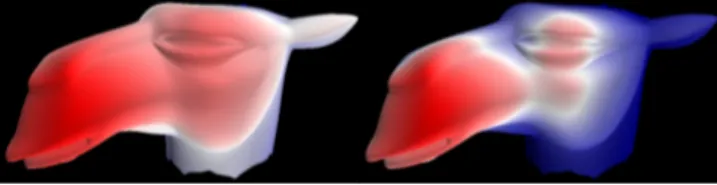
Besides binocular stereo, there are many other depth cues that help our visual system in understanding a scene [Palmer 1999]. One im-portant aspect is shading. The use of the red/white/blue color map-ping enables us to modulate the brightness of these colors according to the shading of the scene. An example, using Lambertian shading is shown in Fig. 6. Adding shading cues enhances the binocular stereo effect because feature matching during the fusion process is simplified. While the light source can be placed in any location, we found that a standard lighting from the right/left upper quadrant with respect to the view is effective.
Figure 6: Effect of shading on shape and depth perception.
5.2 Unsharp Masking
Besides shading, we introduce an additional modification that en-hances silhouettes to improve depth perception. One important ob-servation is that when not considering patches but smoothly varying color transitions, the color scheme is less crucial. The reason is that in these situations the subtle differences of neighboring pixel colors are not easily discernable. Consequently, the image observed via the holographic foil does not significantly differ, except at region boundaries. Hence, depth discontinuities are the most important depth cues, which also matches findings regarding depth percep-tion that can be induced from discontinuities in the scene [Didyk et al. 2011; Brookes and Stevens 1989; Anstis et al. 1978]. To increase depth perception at discontinuities, we make use of depth unsharp masking [Luft et al. 2006]. Hereby, we can limit the interactions between different colors and increase the impact of depth discontinuities. Adding darkened edges at discontinuities keeps boundary colors from mixing with the colors of more-distant geometry. The edges then project on a black background, leading to improved stereo matching.
Depth unsharp masking has been introduced to enhance silhou-ettes by introducing a special gradient, a so-called Cornsweet pro-file [Anstis et al. 1978], at silhouettes. The latter is produced by summing the color image and a scaled unsharp mask, which is defined by the difference between the original depth map and its Gaussian-filtered version. Usually, the scale factor is a variable that defines the strength of the effect. In our case, we keep this value equal to one. An additional change is necessary to avoid modifying the appearance of the occluding surface, but to only darken the un-derlying surface. As the unsharp mask contains negative values for the farther and positive values for the nearer surface next to a depth edge, we can achieve this goal easily by keeping only the negative values and setting all others to zero (Fig. 7). In this way, depth discontinuities, but also small features can be pronounced and the effective depth perception is increased.
The only remaining parameter of the unsharp mask is the variance of the Gaussian blur kernel. In order to avoid an overlap between the shifted projection and the surface below. When analyzing the shift, we saw that at 10 cm viewing distance from the screen, the shift equals roughly one pixel (0.25mm), as the shift is based on a refraction by the holographic foil, the displacement increases
lin-Figure 7: Depth unsharp masking: The depth discontinuities are outlined by darkening the occluded surface along the depth edge. The darkening is greater when the viewing distance increases.
early with the distance to the screen. We can thus keep the blur kernel proportional to the shift in order to achieve an adequate edge darkening (Fig. 7).
5.3 Depth Warping
In recent years, various papers have focused on the question of how to map the depth of a 3D scene appropriately for stereo vi-sualization. Besides automatic [Oskam et al. 2011] and hand-defined [Wang and Sawchuk 2008] adaptations, also manipulations based on perception start to be better understood [Didyk et al. 2011; Didyk et al. 2012]. In our context, it is also possible to warp the depth values prior to applying the color conversion. One meaning-ful warping is a histogram adjustment to spread the depth values most efficiently over the whole color range. Alternatively, the me-dian can be used to separate the scene in the area in front and behind the screen (Fig. 8).
Figure 8: Left: linear depth mapping, Right: equal number of pix-els between red/white, and white/blue for better depth-range usage.
6
Evaluation
Figure 9: Palette presented to the user study participants. We conducted an informal user study with 11 participants (age: 23– 33, mean: 28, 8 males, 3 females) with normal or corrected-to-normal vision and relied on a Samsung 2233RZ screen that was observed from 60 cm distance using the ChromaDepth glasses.R We showed several stimuli and collected the participants feedback after each one. All participants were allowed to take breaks and there was no time constraints on the evaluation.
In a first step, we used a color palette (Fig. 9). The patches vary from light red to light blue on the first row and from yellow to cyan on the second row, on a black background. This test is used to compare the previous hue-based solution with our red/white/blue color mapping for in-between depths. For both examples, we asked the participants if they were able to perceive a change in depth and if so, how the patches differ in depth. Nine out of eleven participants saw light red slightly in front of the screen and light blue slightly behind it. The other two saw all the patches at the same depth. In contrast, for the hue mapping, all participants saw all patches at the same depth. This illustrates our previous claims regarding green, yellow, and cyan on a black background to be perceived at screen distance.
In a second step, we showed several chromosterescopic examples to illustrate some of the application areas mentioned in the previous work section; a 3D scene (Fig. 1), blood vessels (Fig. 10), and a point cloud (Fig. 11).
The 3D scene (Fig. 1) was shown with our and the hue color map-ping. Asked for preference, all participants chose our over the
Figure 10: Blood vessels of the urologic system. Our mapping leads to a natural and strong stereo perception, while ared magenta blue mapping leads to abrupt discontinuities.
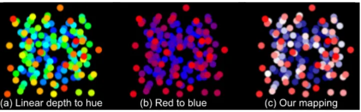
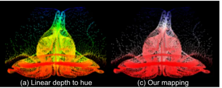
Figure 11: Point cloud in chromostereoscopy. Our mapping pro-duces a larger depth range than a hue mappping.
red/green/blue color mapping. Further, when asked about the wider depth range, ten out of eleven chose our over the hue mapping. For the blood vessel (Fig. 10), we used our, the hue-based and the red/magenta/blue mapping, as it was actually introduced for a sim-ilar purpose [Ropinski et al. 2006]. We asked the participants to identify the part of the model that appeared closest to the point of view. All participants identified the red/magenta/blue image to pro-vide the widest depth range, but all added that they could actually perceive only 2 depth layers: red and magenta in front of the screen and blue behind, making it impossible to determine which part of the model was the closest. For our color mapping, all the partici-pants identified the upper-right part of the model as being the clos-est, which also coincided with the actual 3D configuration. In con-trast, for the hue mapping, the answers differed drastically; upper right (4), the upper left (3), the bottom right (1) and the middle left (3). With this mapping, the attention of the viewer is drawn toward the yellow parts of the model [Rheingans 1999].
Finally, for the point-cloud example (Fig. 11), we asked how many distinct depth levels they could clearly differentiate. We showed them the hue, our, and a red/magenta/blue color mapping. The lat-ter was found by all participants to only contain 2 depth layers, which confirmed our earlier finding. Ten participants distinguished one more depth level for our mapping than for the hue. Only one participant identified 4 layers for the hue mapping and 3 for ours. This informal user study matches our expectations and the assump-tion that our mapping leads to a better depth percepassump-tion seems to hold. In addition, on structured models, like the 3D scene, our mapping is preferred and led to a better understanding of the 3D scene when compared to the previous hue mapping. The versatil-ity of applications of this mapping is underlined via the point cloud example, in which more depth levels could be identified, and the blood vessels illustration, in which participants performed consis-tently better in identifying structures than with previous mappings.
7
Results
Fig. 12 shows a simple model, that illustrates the increased depth range and shows that a layering impression, as for red/magenta/blue is avoided. The same holds for complex models (Fig. 13), which lead to a more continuous appearance and a better depth separation. Another application of our approach is cartography (Fig. 14), color charts are often used to encode depth in the 2D image. Although the different altitudes may be more difficult to discriminate using our instead of the hue mapping, a correspondence can be easily found between the two. Light red stands for yellow, white for green and light blue for cyan. On top of that, surface details are better perceived using lighter colors, as the luminance contrast is greater. Also, the smooth transition in our mapping avoids the layering ef-fect of the hue mapping [Rheingans 1999]. Additionally, it encodes a stereoscopic effect when viewed using ChromaDepth glasses.R This backward compatibility is an interesting feature and makes stereo glasses optional but not mandatory. The same holds for sci-entific visualization (Fig. 15), where color fringing artifacts are re-duced and a better depth discrimination is achieved.
Figure 12: (a) a 3D cone model with (b) linear depth to hue, (c) red to blue, (d) and our mapping.
Figure 13: Transversally-cut heart with a hue and our mapping.
Figure 14: Matterhorn: Our colors preserve more depth details.
8
Conclusion
We presented a novel method to produce chromostereoscopic im-ages. We introduce a novel color mapping to ensure a better depth perception which is compatible with shading computations. Using unsharp masking we can further enhance depth discontinuities and reduce cross talk between neighboring pixels. Our solution is fast
Figure 15: Air flow around ellispoid.
and easy to implement, which makes it a good candidate in various application contexts. Our solution is applicable to LCD screens, as well as printing technology and makes it possible to produce high quality output even on such devices that are theoretically incapable of producing all necessary wavelengths for a consistent depth per-ception. Our solution gives insights into the limitations of previous methods and might be key to an increased use and spread of chro-mostereoscopic images.
9
Acknowledgments
The work was partially funded by the EU FP7-323567 project Har-vest4D, the Dutch KvK program, and the Intel VCI at Saarland University. We also like to thank K. Myszkowski for bringing chro-mostereoscopy to our attention.
References
ANSTIS, S. M., HOWARD, I. P.,ANDROGERS, B. 1978. A craik-o’brien-cornsweet illusion for visual depth. Vision Research 18, 2, 213 – 217.
BAILEY, M.,ANDCLARK, D. 1998. Using chromadepth to ob-tain inexpensive single-image stereovision for scientific visual-ization. Journal of Graphics Tools 3, 3, 1–9.
BAILEY, R., GRIMM, C.,ANDDAVOLI, C. 2006. The effect of warm and cool object colors on depth ordering. In Proc. App. Perception in Graphics and Visualization, ACM, 161–161. BROOKES, A.,ANDSTEVENS, K. A. 1989. The analogy between
stereo depth and brightness. Perception 18, 5, 601–14.
CHU, A., CHAN, W.-Y., GUO, J., PANG, W.-M.,ANDHENG, P.-A. 2008. Perception-aware depth cueing for illustrative vascular visualization. In BMEI, vol. 1, 341–346.
DIDYK, P., RITSCHEL, T., EISEMANN, E., MYSZKOWSKI, K.,
ANDSEIDEL, H.-P. 2011. A perceptual model for disparity. In ACM SIGGRAPH 2011 Papers, 96:1–96:10.
DIDYK, P., RITSCHEL, T., EISEMANN, E., MYSZKOWSKI, K., SEIDEL, H.-P., AND MATUSIK, W. 2012. A luminance-contrast-aware disparity model and applications. ACM Trans. Graph. 31, 6 (Nov.), 184:1–184:10.
EINTHOVEN, W. 1885. Stereoscopie durch Farbendifferenz. Al-brecht von Graefes Archiv f¨ur Ophthalmologie 31, 3, 211–238. FAUBERT, J. 1994. Seeing depth in colour: More than just what
meets the eyes. Vision Research 34, 9, 1165 – 1186.
GOOCH, A., GOOCH, B., SHIRLEY, P.,ANDCOHEN, E. 1998. A non-photorealistic lighting model for automatic technical il-lustration. In Proceedings Computer Graphics and Interactive Techniques, ACM, 447–452.
HAMID, I. A. 2012. Chromo-Stereoscopic visualisation for dy-namic marine operations. PhD thesis, University of Plymouth. HECKMANN, T.,ANDSCHOR, C. 1989. Is edge information for
stereoacuity spatially channeled? Vision research 29, 5, 593– 607.
KEMELMACHER-SHLIZERMAN, I., SHECHTMAN, E., GARG, R.,
ANDSEITZ, S. M. 2011. Exploring photobios. ACM Trans. Graph. 30, 4 (July), 61:1–61:10.
LEGGE, G. E., ANDYUANCHAO, G. 1989. Stereopsis and con-trast. Vision Research 29, 8, 989 – 1004.
LIVINGSTONE, M. 2002. Vision and Art: The Biology of Seeing. Harry N. Abrams.
LUFT, T., COLDITZ, C., ANDDEUSSEN, O. 2006. Image en-hancement by unsharp masking the depth buffer. ACM Transac-tions on Graphics 25, 3 (jul), 1206–1213.
OSKAM, T., HORNUNG, A., BOWLES, H., MITCHELL, K.,AND
GROSS, M. 2011. OSCAM - Optimized stereoscopic camera control for interactive 3D. ACM Trans. Graph. 30, 6.
PALMER, S. E. 1999. Vision science : photons to phenomenology. MIT Press, Cambridge, Mass.
PETRIE, G., TOUTIN, T., RAMMALI, H., AND LANCHON, C. 2001. Chromo-stereoscopy: 3D stereo with orthoimages & DEM data. GeoInformatics 4, 6, 8–11.
RHEINGANS, P. 1999. Task-based color scale design. In In Proceedings Applied Image and Pattern Recognition. SPIE, vol. 3905, 35–43.
ROPINSKI, T., STEINICKE, F.,ANDHINRICHS, K. 2006. Visually supporting depth perception in angiography imaging. In Smart Graphics, Springer, 93–104.
SICKING, J., TOEPKER, T.,ANDWOJTKIEWICZ, G. 1995. The physics teacher 33, 7, 446–448.
SIMONET, P., ANDCAMPBELL, M. C. W. 1990. Effect of il-luminance on the directions of chromostereopsis and transverse chromatic aberration observed with natural pupils. Ophthalmic and Physiological Optics 10, 3, 271–279.
STEENBLICK, R. A. 1987. The chromostereoscopic process: A novel single image stereoscopic process. In True Three-Dim. Imaging Tech. and Display Tech., SPIE, vol. 0761, 27–34. TOUTIN, T. 1997. Qualitative aspects of chromo-stereoscopy for
depth perception. Photogrammetric Engineering and Remote Sensing 63, 2, 193–204.
UCKE, C. 1999. 3-D vision with chromadepth glasses. In Proceed-ings of the ICPE/GIREP-Conference, 23–28.
VERWICHTE, E.,ANDGALSGAARD, K. 1998. On the visualiza-tion of three-dimensional datasets. Solar Physics 183, 2, 445– 448.
WALLISCH, B., MEYER, W., KANITSAR, A.,ANDGRLLER, E., 2002. Information highlighting by color dependent depth per-ception with chromo-stereoscopy.
WANG, C.,ANDSAWCHUK, A. A. 2008. Disparity manipulation for stereo images and video. vol. 6803, 68031E–68031E–12. YE, M., BRADLEY, A., THIBOS, L. N.,ANDZHANG, X. 1991.
Interocular differences in transverse chromatic aberration deter-mine chromostereopsis for small pupils. Vision Research 31, 10, 1787–1796.