DIAL • 4, rue d’Enghien • 75010 Paris • Téléphone (33) 01 53 24 14 50 • Fax (33) 01 53 24 14 51 E-mail : [email protected] • Site : www.dial.prd.fr
DOCUMENT DE TRAVAIL DT/2005-07
Growth and Poverty in Burkina
Faso. A Reassessment of the
Paradox
Michael GRIMM
Isabel GÜNTHER
GROWTH AND POVERTY IN BURKINA FASO. A REASSESSMENT OF THE
PARADOX
1Michael Grimm
Department of Economics, University of Göttingen, Germany, DIAL Paris, France and DIW Berlin, Germany
[email protected] Isabel Günther
Department of Economics, University of Göttingen, Germany, [email protected]
Document de travail DIAL
Juillet 2005
ABSTRACT
Previous poverty assessments for Burkina Faso were biased due to the neglect of some important methodological issues. This led to the so-called ‘Burkinabè Growth-Poverty-Paradox’, i.e. relatively sustained macro-economic growth, but almost constant poverty. We estimate that poverty significantly decreased between 1994 and 2003 at least on the national level, i.e. growth was in contrast to what previous poverty estimates suggested ‘pro-poor’. However, we also demonstrate that between 1994 and 1998 poverty indeed increased despite a good macro-economic performance. This was due to a severe drought and a resulting profound deterioration of the purchasing power of the poor; an issue which was also overseen by previous studies.
Key words: Poverty, Pro-poor Growth, Differential Inflation, Burkina Faso. JEL Codes: D12, D63, I32, O12.
RESUME
Les analyses existantes du développement de la pauvreté en Burkina Faso ont été biaisées par l’ignorance d’aspects méthodologiques importants. Ces biais ont conduit à un paradoxe de croissance et pauvreté, c'est-à-dire une situation où une croissance macro-économique relativement soutenue n’était pas accompagnée d’une réduction de la pauvreté. Au contraire, nous estimons que la pauvreté a diminué significativement entre 1994 et 2003 au moins au niveau national, c'est-à-dire que la croissance a été, contrairement à ce que les analyses auparavant ont suggéré, ‘pro-poor’. Cependant, nous montrons également qu’entre 1994 et 1998 la pauvreté a effectivement augmenté malgré la performance macro-économique favorable. Cela a été dû à une sécheresse sévère et à une détérioration importante du pouvoir d’achat des pauvres. Cet aspect a été ignoré par les analyses précédentes.
Mots clés: Pauvreté, Croissance en faveur des pauvres, Inflation différentielle, Burkina Faso.
1 We thank Rolf Meier and Bakary Kindé for the very agreeable reception and their assistance during our mission in Burkina Faso and all
other people with whom we discussed or who shared with us their opinion on the country’s development. We also thank Lionel Demery, Philippe De Vreyer, Francisco Ferreira, Stephan Klasen, Marc Raffinot, Martin Ravallion and Jan Walliser for very useful comments and suggestions. Nevertheless, any errors remain our own responsibility.
Contents
1. INTRODUCTION ... 4
2. THE PARADOX... 5
3. GROWTH, POVERTY AND INEQUALITY TRENDS – A REVISED ASSESSMENT ... 6
3.1. Solving the paradox... 6
3.1.1. Relative price variations over time and the construction of an appropriate poverty line ... 6
3.1.2. Computation of a consistent household expenditure aggregate... 8
3.1.3. Changes in the household survey design... 9
3.2. The development of household incomes, poverty and inequality... 9
3.3. Robustness check ... 10
3.3.1. Changes in the household survey design and implications for the poverty assessment ... 10
3.3.2. Development of social indicators over the period 1994 to 2003 ... 11
4. AN ASSESSMENT OF THE PRO-POORNESS OF GROWTH ... 12
4.1. The growth-elasticity of poverty ... 13
4.2. Growth incidence curves... 13
4.3. Growth and distributional components of poverty change ... 15
5. CONCLUSION ... 17
BIBLIOGRAPHY ... 19
APPENDIX ... 21
List of tables
Table 1 : Poverty and inequality trends — Official estimates end of 2003... 6Table 2 : Poverty and inequality trends — A revised assessment... 10
Table 3 : Social Indicators, household survey based (in percentages, i.e. share of individuals) ... 12
Table 4 : Growth elasticity of poverty (Growth of GDP per capita used for growth rates) ... 13
Table 5 : Decomposition of the change in the headcount index, ∆P0... 16
List of figures
Figure 1 : Real GDP per capita (Constant CFA Francs 1985)... 5Figure 2 : Official poverty line and annual variations of cereal prices and the CPI (1994 = 100)... 7
1.
INTRODUCTIONAccording to National Accounts data, Burkina Faso has known relatively strong economic growth and good macroeconomic performance over the last decade. Real GDP per capita began to rise after the devaluation of the CFA Franc in January 1994 and growth averaged 2% per year since then2.
According to the IMF this good growth performance is, among other things, the result of the gains in competitiveness following the devaluation, the large public investment program (mainly externally financed), and the financial and structural policies (including price and trade liberalization) in the framework of stabilization and structural adjustment programs (SAP) aimed at consolidating the market orientation of the economy and maintaining macroeconomic stability (IMF, 2003).
However, despite this very good macro-economic performance, the micro-economic evidence was so far rather disappointing. Official poverty estimates, including those of the Burkinabè Statistics Office, the World Bank and UNDP, which were all derived from household survey data in 1994, 1998 and 2003, suggested that over the whole period the poverty headcount index stagnated at a high level of roughly 45%, meaning that the growth-elasticity of poverty was more or less zero3. The simultaneous
occurrence of strong positive growth and stagnating poverty would imply that inequality increased significantly. But surprisingly, this was according to the official estimates also not the case; inequality remained constant over the whole period with a Gini coefficient of 0.46. This led to the so-called ‘Burkinabè Growth-Poverty-Paradox’.
Several explanations might be given for such a paradox. First, it could be that macro-economic growth was completely disconnected from household incomes: the ‘missing linkages’ hypothesis. This would suggest that the generated additional income went completely into enterprises’ benefits, investments, and taxes, and/or outside the country and/or accrued to rather few agents not necessarily covered by the household surveys. A second explanation might be that macro-economic growth was simply over-estimated. In many developing countries―and Burkina Faso is no exception here―it is very hard to obtain reliable statistics for sector specific value added and population growth. A third explanation concerns several methodological issues related to the computation of the consumption aggregate, changes in the household survey design and the appropriate inflation of the poverty line over time. Although certainly all explanations are to some extent responsible for the ‘Burkinabe Growth-Poverty-Paradox’, we will show that the methodological issues explain by far the biggest part of it.
Our purpose is to discuss and to analyze these methodological problems in detail, to solve them as well as possible and then to offer a new growth, poverty and inequality assessment for Burkina Faso. These new estimates do not necessarily perfectly reflect the real welfare changes that occurred in Burkina Faso between 1994 and 2003, but certainly constitute a considerable improvement to previous official estimates. Given that Burkina Faso takes part in the PRSP initiative, the analysis of these issues is of strong political importance for Burkina Faso. But we think that most of the methodological problems discussed here are not at all specific to the Burkinabè case and should arise in other countries as well. In particular, we think that our results can contribute to the current debate on the driving forces behind the heterogeneity of pro-poor growth indices across countries (see e.g. Bourguignon, 2003; Klasen, 2004; Ravallion, 2004).
The reminder of this paper is organized as follows. In Section 2 we shortly describe the recent economic development in Burkina Faso and explain in detail the elements of the ‘Burkinabè Growth-Poverty-Paradox’. In Section 3, first, we solve the paradox, second, provide a new growth, poverty and inequality assessment, and third check its robustness. In Section 4, we undertake a detailed analysis of the question whether in Burkina Faso growth was pro-poor or not. Section 5 concludes.
2 Source: IAP, which stands for ‘Instrument Automatisé de Prévision’. It is a macro-economic consistency framework based on National
Accounts data developed by the Burkinabè Ministry of Economy and Development with technical assistance of the German ‘Gesellschaft für Technische Zusammenarbeit’ (GTZ). It is considered as the most reliable macro-economic data source in Burkina Faso (Ministry of Economy and Development, 1997).
2.
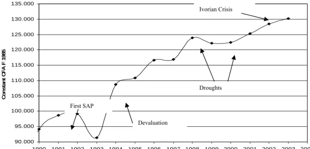
THE PARADOXFigure 1 shows the development of real GDP per capita between 1990 and 2003. Despite the efforts of structural adjustment, real GDP per capita declined between 1991 and 1993 by approximately -3.8% per year. Then in 1994, the failure of the internal adjustment strategy in several countries of the CFA Franc zone and especially in one of the most important ones⎯Côte d’Ivoire⎯led to a 50 percent devaluation of the CFA Franc parity in relation to the French Franc. After the devaluation, growth of real GDP per capita began to rise and averaged approximately 3.3% per year between 1994 and 1998. This growth was further sustained by a favourable development of the world market price for cotton and a multiplication of the sole used for cotton production.
Real GDP per capita decreased in 1998 and stagnated in 2000 due to two drought years and a deterioration in the terms of trade, but then again reached a growth rate of around 2%. Since December 2001 Burkina Faso is confronted with the adverse effects of the Ivorian crisis. However, growth in 2003 was estimated to be around 6.8% due to, among other things, a very good harvest and a relatively fast reorganisation of the country’s import and export channels (AFD, 2003). Over the whole period Burkina Faso pursued its efforts to undertake structural reforms, in particular concerning its price and trade liberalization. In May 2000 Burkina Faso established its first PRSP and reached its completion point in the HIPC II Initiative in April 2002. So, given this overall good growth performance between 1994 and 2003, even if interrupted by two severe droughts, one would expect that poverty in Burkina Faso decreased substantially during this period.
Figure 1 : Real GDP per capita (Constant CFA Francs 1985)
90.000 95.000 100.000 105.000 110.000 115.000 120.000 125.000 130.000 135.000 1990 1991 1992 1993 1994 1995 1996 1997 1998 1999 2000 2001 2002 2003 2004 C ons ta nt C F A F 1 9 8 5
Source: IAP (see Footnote 1).
Notes: 1998-2003 estimation.
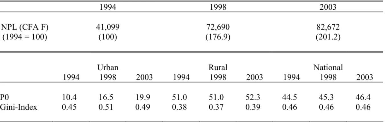
Table 1 presents the official poverty and inequality estimates as they were presented in 2003 by the Burkinabè Statistics Office (Institut National de la Statistique et de la Démographie, ‘INSD’ hereafter) and the UNDP4. These estimates are based on three household surveys or Enquêtes
Prioritaires (without a panel dimension) undertaken in 1994 (EPI), 1998 (EPII) and 2003 (EPIII),
which are similar to the World Bank’s ‘Living Standard Measurement Surveys’ (LSMS) but somewhat less detailed in certain modules. The sample size was in each round roughly 8,500 households. The numbers in Table 1 show that, despite the good macroeconomic performance, poverty did not decrease but stagnated at a level of roughly 45%. This combination of economic growth and poverty stagnation would suggest that inequality increased during the observed period.
4 For the period 1994 to 1998 also by the World Bank.
First SAP
Devaluation
Droughts Ivorian Crisis
But, and as can be seen in Table 1, inequality was estimated with a Gini coefficient of around 0.46 over the whole period, leading to the ‘Burkinabè Growth-Poverty-Paradox’.
Table 1 also shows the official poverty line used for the computation of the poverty estimates. It is striking to see the massive increase of the nominal poverty line between 1994 and 1998 and the still strong increase between 1998 and 2003. Whether this increase over time can be justified by the rise of the cost of living of the poor and how that relates to the development of the national Consumer Price Index (CPI) will be analyzed in detail in the next section. It will be shown that this analysis already solves a large part of the ‘paradox’, with the remaining puzzling part of the paradox mainly being related to the construction of the expenditure aggregate used for the poverty assessments.
Table 1 : Poverty and inequality trends — Official estimates end of 2003
1994 1998 2003 NPL (CFA F)
(1994 = 100) 41,099 (100) (176.9) 72,690 (201.2) 82,672
Urban Rural National
1994 1998 2003 1994 1998 2003 1994 1998 2003
P0 10.4 16.5 19.9 51.0 51.0 52.3 44.5 45.3 46.4
Gini-Index 0.45 0.51 0.49 0.38 0.37 0.39 0.46 0.46 0.46
Source: INSD (2003).
Notes: The National Poverty Line (NPL) is expressed on a yearly per capita basis in current CFA F prices. The Gini-Index is population weighted.
3.
GROWTH, POVERTY AND INEQUALITY TRENDS – A REVISED ASSESSMENT3.1.
Solving the paradoxIn this section we will show, that previous poverty assessments were seriously affected by three types of bias, which explain the ‘Growth-Poverty-Paradox’: high relative price variations over time, which were only imperfectly taken into account for the computation of the official national poverty line, changes in the methodology used to compute household expenditure aggregates, and changes in the household survey design.
3.1.1. Relative price variations over time and the construction of an appropriate poverty line
Figure 2 shows that the official poverty line increased between 1994 and 2003 much more than the CPI, implying that the prices of goods mainly consumed by the poor used for the computation of the poverty line increased more than the prices of goods consumed by the ‘representative urban household’ used for the computation of the CPI. More precisely, the national poverty line increased by 76.9% between 1994 and 1998 and by 13.7% between 1998 and 2003, whereas the national CPI only increased by 22.7% and 7.1% during the corresponding periods. Given that it is critical for the level and the development of poverty over time where we set the poverty line, it has to be assessed whether this inflation is justified or not.
Figure 2 : Official poverty line and annual variations of cereal prices and the CPI (1994 = 100)
Source: CPI: IAP (see Footnote 1); Cereal prices: Grain Market Price Surveillance System, Burkina Faso, Ministry of Trade; Official Poverty Line: INSD (2003).
Note: Cereal prices are annual averages.
We think that there is no doubt that poverty lines should have a major basic food component, which is much higher than the one used to construct the national CPI, which intends to reflect the consumption habits of the ‘average’ population rather than the budget shares of the poor. And indeed, in Burkina Faso the official poverty lines in all three years had a basic food component of more than 50% whereas the cereal component of the CPI was only 10%. Therefore a poverty line which is simply updated over time using the CPI would not be appropriate whenever relative prices of basic food items changed over time. In Burkina Faso the CPI only increased by 22.7% between 1994 and 1998 whereas, prices for cereals more than doubled during the same time (see Figure 2). However, between 1998 and 2003 the CPI further increased whereas now cereal food prices first decreased and then again increased but remained in 2003 below the price level of 1998. The strong increase of cereal prices between 1994 and 1998 was mainly due to the severe drought in 1997/98 which reduced cereal production in that season by more than 20% with respect to 1996/975. This drought makes 1998
somehow an ‘outlier-year’ with respect to both other surveys. Additional explanations for the inflationary surge of food staple prices were the general lack of productivity increases in cereal production accompanied by high population growth and intra-annual price fluctuations.
In other words, the sharp inflation of the poverty line between 1994 and 1998 is indeed justified given the massive price increase of cereals and given the consumption pattern of the poor. However, the further inflation of the poverty line between 1998 and 2003 cannot be justified by observed relative price changes, and was actually caused by a change of the underlying consumption basket. More precisely, the official poverty line in all three years 1994, 1998 and 2003 was based on the price of a 2,283 calorie food component, based on millet, sorghum, maize and rice prices, which are the main components of nutrition intake for poor people in Burkina Faso. Whereas this real food component was more or less appropriately inflated with the respective price index, an important drawback of the official poverty line is the fact that the non-food component was not inflated by an appropriate price index but was only calculated as a share of the nominal food component. Moreover this ratio of the non-food to the food component was even altered over time: it slightly decreased between 1994 and 1998 (from approximately 35% to 30%) and strongly increased between 1998 and 2003 (from approximately 30% to 50%). That means, that the price index implicit in the official poverty line did not correspond to a true Laspeyres-Index. Therefore, we suggest computing a new and more
5 Based on data of the Permanent Agriculture Survey (Enquête Permanente Agricole) 1995-2002.
0,0 50,0 100,0 150,0 200,0 250,0 300,0 19 93 19 94 19 95 19 96 19 97 19 98 19 99 20 00 20 01 20 02 20 03 Maize Millet Sorghum CPI Off. PL
appropriate poverty line using constant real weights of food and non-food items over the period 1994 to 2003.
To compute such a poverty line, we took the nominal value of the official poverty line for 2003, and the cereal food, other-food and non-food budget shares as they are observed in the household survey in 2003 in the 1st and 2nd quintile of the expenditure distribution. The cereal food component, which accounts for roughly 37% of per capita household expenditure, was then deflated to 1998 and to 1994 using the observed prices changes for the corresponding cereals. The remaining food and non-food component was deflated using the corresponding CPI components. Of course one could also use the official poverty line and the budget shares of 1994 or 1998 as reference points. We did this to check the robustness of our results presented in the next section and found the same poverty trends, only on a lower level. But we decided to take 2003 as the reference year because that ensures that in 2003 we have poverty estimates which are similar to those of the INSD allowing to compare retrospectively both poverty assessments over time.
3.1.2. Computation of a consistent household expenditure aggregate
All previous studies on the development of poverty in Burkina Faso used the same household expenditure aggregate, which was provided together with the raw data of the household surveys. However this aggregate is based on some assumptions and adjustments which differ from the assumptions usually made when constructing household expenditure aggregates for poverty analyses or these assumptions were simply not maintained in a consistent way over time6.
First, usually hypothetical rents for those households which own their housing are imputed (see Deaton & Zaidi, 2002). Not doing so would underestimate the welfare of these households relative to those households who rent their housing. In Burkina Faso, roughly 90% of all households do not pay any housing rent. However, the official expenditure aggregate contains imputed values only for some house owners and they are non-systematically missing for 22%, 16% and 6% of all households in 1994, 1998 and 2003 respectively. This implies that poverty was continously overestimated, but less so from survey year to survey year.
Second, usually expenditures for durables or equipment such as televisions, radios, refrigerators, motorcycles, bicycles, cars or investments into housing, land and livestock are not included in a welfare aggregate which is constructed to measure consumption and poverty for a given period of time, e.g. a year. The argument is that the utility drawn from these equipments concerns not only the period under consideration but also subsequent periods (see Deaton & Zaidi, 2002). Given the general lack of any information allowing to divide the utility over the relevant periods or to compute appropriate user costs, in most cases expenditures for durables are excluded for poverty analysis. However, in the case of Burkina Faso these expenditures were included in 1998 and 2003 with their total purchasing price, but not so in 1994. Although doing this does not have a large effect on poverty headcounts, it does increase inequality measures.
Third, in 1998 the official expenditure aggregate was increased uniformly for all households by 12.4%. The reason for that adjustment is not well documented, but it seems that this was done to obtain a household expenditure aggregate closer to the one computed in the National Accounts, given that household surveys are, in contrast to National Accounts, generally affected by seasonality (see also below). Despite the fact, that such a uniform adjustment could only hardly be justified it was in any case not done in 1994 and 2003. Of course, this adjustment led to a substantial underestimation of poverty in 1998.
In the Appendix, we briefly explain what assumptions and adjustments we made in order to eliminate these three sources of bias and to construct a consistent expenditure aggregate over time.
6 These biases and inconsistencies were recently also recognized by the World Bank and discussed in their 2004 poverty assessment
(World Bank, 2004). It should however be emphasized that the INSD first of all tried to provide current ‘snap-shot’ poverty estimates and less a comparison across time, explaining why some inconsistent assumptions might have been made.
3.1.3. Changes in the household survey design
Over the three household surveys (EPI, EPII and EPIII), the INSD has continuously improved their design, which might however have lowered the comparability of poverty estimates based on these surveys. More precisely, the survey design of the EPI versus the EPII and the EPIII differs in three major points: First, whereas the EPI was undertaken in the post-harvest period (October-January), the EPII and the EPIII were undertaken in the pre-harvest period (April-August); second, whereas the EPI has a recall period for food items of 30 days the EPII and the EPIII have a recall period for food items of 15 days, and third, the disaggregation of expenditures was continuously increased from 1994 to 2003.
To solve the comparability problem of poverty estimates based on different household survey designs the literature suggests various methods, which have however also their shortcomings and often require rather strong assumptions. The most serious problem in the Burkinabè case is certainly the issue linked to seasonality. But given that in each survey year all households have been interviewed during roughly the same period, there is no convincing method to redress this bias. To tackle the problem of the change in the recall period, it is sometimes suggested to correct this bias by using predictions obtained via auxiliary variables which are not affected by the change and whose relation with total household expenditures is stable over time (see e.g. Deaton & Drèze, 2002; Tarozzi, 2004). Finally, to redress the disaggregation bias one might include in the household expenditure aggregate only those consumption items which are unaffected by the problem (see e.g. Lanjouw & Lanjouw, 2001).
Three things prevented us to apply the above suggested methods. First, doing so, would in our case have meant in both cases to exclude basic food items, which account for a large share of total household expenditure. Second, we think that these methods introduce a new bias if the budget shares shifted between different consumption items; i.e. when the budget share for basic food items changed significantly over time, which is very likely given the problem of seasonality we could not solve. And third, whereas the proposed methods do certainly improve poverty estimates whenever we are confronted with one of the described survey design changes we think that given the complexity of the problems any corrections would have led to a further enhancement of measurement error.
Hence, we decided to compute our expenditure aggregate without any further corrections concerning changes in survey design. However, we will check the robustness of our poverty trends by estimating roughly the direction and magnitude of the resulting net effect of these three biases. This test will show that even if we assumed the most pessimistic bias resulting from the changes in survey design, the direction of our poverty estimates would still hold. Another alternative would have been to exclude the survey of 1994 and to use only the surveys of 1998 and 2003 which have a very high degree of survey comparability. However, we think one should draw on all the information available to determine what happened during the last ten years in Burkina Faso which is critical for Burkina Faso and international donors given that the country participates in the PRSP process. Only focusing on the surveys of 1998 and 2003 would tell us very little about longer-term dynamics in growth and poverty. In what follows, we present a new growth, poverty and inequality assessment for Burkina Faso using the revised household expenditure aggregate and the revised and time consistent poverty line.
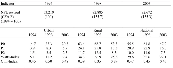
3.2.
The development of household incomes, poverty and inequalityTable 2 shows that on the national level the headcount index, P0, increased strongly between 1994 and 1998 from 55.5% to 61.8% but then decreased, also substantively, between 1998 and 2003 to 47.2%, i.e. to a level lower than in 1994. We find the same trend whether we look at P1, the poverty gap, which is the average distance of the poor to the poverty line in relation to the poverty line or at P2, the severity of poverty, which also takes into account aversion against inequality among the poor by giving more weight to the poorest of the poor7. In rural areas we find roughly the same poverty
dynamic, but on a higher level (63.4% to 68.7% to 53.3%). Although throughout all three survey years poverty in urban areas always remained significantly lower than in rural areas, we find that urban
poverty jumped from 14.7% in 1994 to 27.3% in 1998 and then decreased to 20.3% in 2003. Therefore, in contrast to rural areas and despite the fact that poverty decreased between 1998 and 2003, urban poverty in 2003 was still substantially higher than it was in 1994. All these trends hold if we look alternatively at P1 and P2 or at the Watts-Index8.
Table 2 : Poverty and inequality trends — A revised assessment
Indicator 1994 1998 2003 NPL revised (CFA F) (1994 = 100) 53,219 (100) (155.7) 82,885 (155.3) 82,672
Urban Rural National
1994 1998 2003 1994 1998 2003 1994 1998 2003 P0 14.7 27.3 20.3 63.4 68.7 53.3 55.5 61.8 47.2 P1 3.9 8.3 5.7 24.1 25.8 18.3 20.9 22.9 16.0 P2 1.5 3.5 2.3 11.7 12.5 8.3 10.0 11.0 7.3 Watts-Index 5.1 11.2 7.4 34.3 36.9 25.3 29.6 32.6 22.1 Gini-Index 0.45 0.50 0.48 0.39 0.35 0.39 0.47 0.45 0.45
Source: EPI, EPII, EPIII; computations by the authors.
Notes: The revised National Poverty Line (NPL) is calculated by the authors and expressed on a yearly per capita basis in current CFA F (see Section 3(a)). The Gini-Index is population weighted.
Between 1994 and 1998, inequality measured by the Gini-Index increased from 0.45 to 0.50 in urban areas, but decreased from 0.39 to 0.35 in rural areas and on a national level from 0.47 to 0.45. Thereafter between 1998 and 2003, inequality stagnated more or less in urban areas, increased again to 0.39 in rural areas, but remained constant on a national level, indicating a compensation of higher within group inequality by lower between group (urban/rural) inequality.
Again, the substantial decline of the purchasing power of households between 1994 and 1998 and therefore the rise in poverty is first of all caused by the strong rise in cereal prices relative to other consumption goods. This was already documented in Figure 2. Cereals (i.e. millet, sorghum, maize and rice) constituted on average between 29% (1994), 47% (1998) and 37% (2003) of total household expenditure in the two lowest quintiles of the expenditure distribution, whereas they only constituted 10% in the CPI. Such an impact of relative price swings on poverty is not specific to the Burkinabè case. Pritchett, Suharso, Sumarto and Suryahadi (2000), for instance, faced a similar problem when assessing changes in poverty in Indonesia after the 1997 crisis. Following the devaluation and the
EL Niño drought, food prices increased from 1997 to 1999 by more than 160%, while non-food items
of the CPI increased by ‘only` 81%. Similar to our case, not accounting properly for the weight of food consumption in the budget of the poor would have led to an underestimation of poverty. The authors found a difference between ‘correctly’ and CPI-deflated median expenditures of almost 10%.
3.3.
Robustness checkTo check the robustness of our results, first, we evaluate to what extent changes in survey design might have influenced our poverty assessment and, second, we confront our monetary poverty assessment with an assessment based on social non-monetary indicators.
3.3.1. Changes in the household survey design and implications for the poverty assessment
First, regarding the post and pre-harvest bias, it is hard to accurately quantify the seasonal effect on expenditure declarations without any panel data. This is especially true in our case, because the
8 The Watts Index is the population mean of the natural logarithm of the ratio of the poverty line to censored income, where the latter is
seasonal effect is mixed with the effects from the drought which Burkina Faso had to face in 1997/98. We have to distinguish the impact on net sellers from the impact on net buyers of agricultural products as well as the effect on nominal expenditures (or current expenditures) from the effects on quantities (or real expenditures) consumed. Using panel data of 1,450 rural Ethiopian households Dercon and Krishan (2000), for instance, examined differences in food consumption before and after the harvest. They show that for less wealthy households a 10% increase in food prices resulted in a similar reduction in real consumption. For the case of Burkina Faso, Reardon and Matlon (1989) have shown that fluctuations in real food consumption vary by roughly 13% over seasons for poor households, since most of seasonal production fluctuation can be compensated with purchased food. Whereas during the post-harvest season only around 10% of calories consumed are purchased, during the lean season in fact 60%-70% are purchased (Reardon & Matlon, 1989). Hence, we may assume that current or nominal expenditures decrease in the pre-harvest season by roughly 15%. The effect of higher prices―roughly 20% over seasons in Burkina Faso―and therefore the effect on real consumption should be taken into account by the poverty line.
Second, regarding the recall bias, empirical studies tend to show that longer recall periods lead to lower declared expenditures. Scott and Amenuvegbe (1990) show using the Ghanaian LSMS that for 13 frequently asked purchased items, reported expenditures fell at an average of 2.9% for every day added. Deaton (2003) reports an experiment with different recall periods in India where shortening the recall period for food items from 30 to 7 days resulted in 30% higher food consumption (or 1.1% for every day). In the case of Burkina Faso, where the share of total food expenditures for poor household amounts to roughly 60-70% the recall bias might be responsible for 12-15% lower declared consumption in 1994 compared to 1998 and 2003 (1.1% over 15 days times 0.7).
Third, in 1994 the poverty relevant consumption items (excluding durables) where disaggregated into 50 items whereas they have been disaggregated into 70 items in 1998 and 80 items in 2003. Generally it is assumed, that a higher disaggregation leads to higher declared expenditures (see e.g. Jolliffe, 2001) and therefore poverty would have been more and more underestimated over time compared to 1994. However, since most of the ‘additional’ items were only a mere disaggregation of the former―for instance ‘expenditures for diverse schooling expenditures’ in the EPI where asked in the EPII separately as ‘schooling fees’ and ‘other schooling expenditures’―this issue should have a only limited impact.
It can be seen that the above biases partly offset each other, but that it is even likely, that the latter two are in sum even a bit higher in magnitude than the first one. This implies that, despite the fact that the EPI was conducted in the post-harvest season, which might somewhat underestimate the poverty in 1994 relative to 1998 and 2003, given the recall and disaggregation bias, poverty estimates using the EPI might even be overestimated with respect to 1998 and 2003, i.e. it might in reality be lower in 1994 than calculated. Or, put differently, if we assumed that the net impact of the three biases was uniform over the whole population, we would need a more than 12% reduction in per capita consumption in 1994, i.e. the pre-/post-harvest bias would have to off-set the two latter biases by more than 12%, in order to obtain a poverty headcount for 1994 which was higher than the one observed in 1998. Therefore, the finding that poverty increased between 1994 and 1998 seems quite robust against these three sources of bias. Conversely, we would need a distributional neutral increase of household per capita expenditure in 1994 of more than 17% to offset the stated poverty reduction between 1994 and 2003. This means that the latter two biases would have to offset the pre-/post-harvest bias by more than 17% percent. The poverty trend between 1998 and 2003 is, given the very similar survey design, much less subject to a bias. All this suggests that our results are quite robust over the whole observation period.
3.3.2. Development of social indicators over the period 1994 to 2003
As shown in Table 3 our revised assessment of monetary poverty is also in line with the development of various social indicators, which were computed using the same household surveys, but which are not subject to potential seasonal, recall or disaggregation biases. For instance, enrollment rates in urban as well as in rural areas decreased between 1994 and 1998 and increased between 1998 and 2003. The share of persons living in a household where the household head suffers some serious
physical handicap increased between 1994 and 1998 and decreased afterwards. Whereas living conditions, for example electricity connection or a comfortable access to (proper) water or toilet facilities, did not improve much between 1994 and 1998 (or even deteriorated), they improved substantially between 1998 and 2003. All indicators, except primary school enrolment in rural areas, are also better in 2003 than in 1994. These results support our monetary poverty estimates and show, that despite the differences in survey design, a quite robust poverty assessment can be drawn if all three household surveys are used.
Table 3 : Social Indicators, household survey based (in percentages, i.e. share of individuals)
Urban Rural National
1994 1998 2003 1994 1998 2003 1994 1998 2003 Education Illiteracy rate 51.1 51.2 46.1 89.4 89.1 88.9 82.7 81.8 79.6 Enrolled 6 to 12 70.9 65.3 71.4 27.1 18.9 23.6 33.4 25.4 30.8 Enrolled 13 to 18 51.0 53.8 56.3 12.4 12.4 14.4 19.9 20.1 23.3 Health Handicap 4.8 5.9 3.4 5.1 5.9 2.7 5.1 5.9 2.9 Med. Consultation 45.9 50.9 71.2 37.1 42 60.7 39.5 44.2 63.0 Housing Electricity 29.7 35.7 45.6 0.7 0.4 1.0 5.4 6.3 9.3 Water 23.5 24.3 27.1 0.3 0.1 0.2 4.1 4.2 5.2 No Toilet 11.2 15.2 9.2 81.9 85.4 78.7 70.5 73.7 65.8
Source: EP I, EPII, EPIII; computations by the authors.
Notes: Illiteracy rate: share of individuals older than 18 years not knowing reading and writing in any language;
Enrolled 6 to 12: Share of children 6 to 12 years old enrolled in school; Enrolled 13 to 18: Share of children 13 to 18 years old enrolled in school; Handicap: Share of individuals living in a household where household head suffers an handicap; Share of ill persons having consulted medical services; Electricity: Share of individuals living in a household with electricity connection; Water: Share of individuals living in a household with modern water access. No Toilet: Share of individuals living in a household with no modern toilet facility.
Next and based on our new caclulations we analyze in more detail the link between growth and poverty by computing various so-called ‘measures of pro-poor growth’. In this context, special attention has again to be given to the swing of relative prices and the resulting strong nominal increase of the poverty line relative to the CPI.
4.
AN ASSESSMENT OF THE PRO-POORNESS OF GROWTHWe will not continue the debate here on whether one should use the absolute concept of pro-poor growth or rather the relative one. The absolute concept considers growth as pro-poor if growth leads to poverty reduction irrespective to what happens to the income distribution (see e.g. Ravallion, 2004). In contrast the relative concept considers growth only as pro-poor if the growth rate of the poor is higher as the average growth rate, i.e. if the poor benefit relatively more from growth than the average (see e.g. Kakwani & Pernia, 2000; McCulloch & Baulch, 2000; Klasen, 2004). We think it is always useful to consider both concepts simultanously and that the choice should be left to the policy maker depending on his specific objective9. Thus, here we base our assessment on three measurements of
pro-poor growth: on the so-called ‘growth elasiticity of poverty’, the ‘growth incidence curve’ (GIC) and on the so-called ‘poverty decomposition’, which can give insights into the pro-poorness of growth from several perspectives.
9 For instance a focus purely on the Millennium Development Goal 1, would imply to concentrate on the absolute definition of pro-poor
4.1.
The growth-elasticity of povertyThe growth-elasticity of poverty, ε, calculates how much poverty increased or decreased given a one
percent increase in GDP per capita. It can be computed by relating the relative change in poverty between t and t-1 as measured by the poverty headcount P0 to the relative change in GDP per capita in the same period:
∆ ∆ = − − 1 1 / 0 / 0 t t t t t GDP GDP P P
ε
(1) For the case of Burkina Faso, and as one can expect from the previous section, the growth-elasticity ofpoverty, was positive in the period 1994 to 1998 and negative between 1998 and 2003. More precisely, between 1994 and 1998 one percent growth of GDP per capita on the national level was accompanied by an increase of 0.9% in the poverty headcount index. In rural areas this elasticity was slightly lower (0.7%) and in urban areas much higher (5.8%) (see Table 4). In contrast, between 1998 and 2003 the respective elasticities are –2.9%, –2.7% and –3.2%, showing that during that later period macro-economic growth clearly led to poverty reduction. Over the whole period the growth elasticity of poverty is slightly negative in rural areas, i.e. macro-economic growth led to poverty reduction and slightly positive in urban areas, i.e. macro-economic growth was not sufficiently strong to reduce poverty. This shows again that the relationship between growth and poverty can enormously vary over time and space and that average elasticities derived from cross-country regressions as done by Dollar and Kray (2002) might be of limited use.
Table 4 : Growth elasticity of poverty (Growth of GDP per capita used for growth rates)
1994-1998 1998-2003 1994-2003
Urban Rural National Urban Rural National Urban Rural National
P0 5.8 0.7 0.9 -3.2 -2.7 -2.9 1.6 -0.8 -0.8
P1 7.2 -4.0 1.9 0.6 -3.7 -1.3 0.8 -3.8 -1.3
P2 8.1 -4.5 2.1 0.6 -4.4 -1.6 0.8 -4.4 -1.5
Source: Poverty Estimates: EPI, EPII and EPIII; computations by the authors. GDP per capita growth rates: IAP (see Footnote 1).
4.2.
Growth incidence curvesTo analyze the pro-poorness of growth in more detail, we also constructed the so called ‘growth incidence curves’ (GIC). These curves draw for each percentile p of the distribution of household expenditure per capita the corresponding growth rate for a given period of time. Hence, growth rates in GICs relate to household expenditures per capita observed in the household surveys and not to the aggregate measure GDP per capita. A specific point on the GIC can be computed by the following formula:
1
)
1
(
'
'
) ( 1 ) ( ) (=
+
−
− t p t p t p tL
L
g
γ
(2)where gt(p) = (yt(p)/yt-1(p)) – 1 is the growth rate in expenditure per capita y of the pth percentile, L’t(p)
is the slope of the Lorenz curve at the point p in t, and the growth rate in mean expenditure per capita, µ, is γt = (µt/µt-1) – 1. If gt(p) ≥ 0 for all p, then growth will always reduce poverty (for details, see
Ravallion & Chen, 2003).
Figure 3 shows such a set of curves for the whole observation period 1994 to 2003 and for the two sub-periods 1994 to 1998 and 1998 to 2003. We present them separately for urban and rural areas. It is important to note that these curves rely on the axiom of anonymity, i.e. they reflect only deformations of the distribution over time, but contain no information on transitions in the expenditure distributions of specific households or groups of households. We use percentile specific household price deflators
instead of the general CPI to compare per capita household expenditures over time10. This means that
we appropriately calculate the evolution of the purchasing power of different households by taking into account the different changes in the cost of living along the expenditure distribution, given households’ specific consumption patterns. Using percentile specific price deflators for the computation of the GICs seems to be particularly important in countries where we observe highly different expenditure budget shares across household groups combined with a high change in relative prices over time. Since the combination of these two characteristics also often lead to a different implicit inflation rate of the poverty line in comparison to the general CPI, this approach also ensures consistency with respect to other pro-poor growth measures which are based on headcount poverty changes.
Figure 3: Growth incidence curves, 1994-2003 Percentile and urban/rural specific price deflators used
Urban growth incidence curve, 1994-1998 Rural growth incidence curve, 1994-1998
-8 -7 -6 -5 -4 -3 -2 -1 0 1 2 3 4 5 6 7 8 A nnu al Gr o w th R a te % 0 10 20 30 40 50 60 70 80 90 100 Percentile
Grow th Incidence Curve Grow th rate in mean Mean of percentile grow th rates
-8 -7 -6 -5 -4 -3 -2 -1 0 1 2 3 4 5 6 7 8 A nnu al Gr o w th R a te % 0 10 20 30 40 50 60 70 80 90 100 Percentile
Grow th Incidence Curve Grow th rate in mean Mean of percentile grow th rates
Urban growth incidence curve, 1998-2003 Rural growth incidence curve, 1998-2003
-8 -7 -6 -5 -4 -3 -2 -1 0 1 2 3 4 5 6 7 8 A n nu al G ro w th R a te % 0 10 20 30 40 50 60 70 80 90 100 Percentile
Grow th Incidence Curve Grow th rate in mean
Mean of percentile grow th rates -8
-7 -6 -5 -4 -3 -2 -1 0 1 2 3 4 5 6 7 8 A n n u a l G ro w th R a te % 0 10 20 30 40 50 60 70 80 90 100 Percentile
Grow th Incidenc e Curve Grow th rate in mean Mean of percentile grow th rates
Urban growth incidence curve, 1994-2003 Rural growth incidence curve, 1994-2003
-8 -7 -6 -5 -4 -3 -2 -1 0 1 2 3 4 5 6 7 8 A n n u a l G ro w th R a te % 0 10 20 30 40 50 60 70 80 90 100 Percentile
Grow th Incidence Curve Grow th rate in mean Mean of percentile grow th rates
-8 -7 -6 -5 -4 -3 -2 -1 0 1 2 3 4 5 6 7 8 A n n u a l Gr o w th R a te % 0 10 20 30 40 50 60 70 80 90 100 Percentile
Grow th Incidence Curve Grow th rate in mean Mean of percentile grow th rates
Source: EP I, EP II, EP III; computations by the authors.
For the period 1994 to 1998 and for rural areas, we state that over the whole expenditure distribution per capita household expenditure decreased. This should certainly be expected given the discussion above. But what is interesting to see now is that up to the 90th decile this decline was the stronger the higher the initial level of expenditure. Only above the 90th decile the negative growth rate decreased in absolute value. So, according to the absolute definition growth was not pro-poor, independent of where we set the poverty line. However, the percentile specific growth rates of the poor are above the mean growth rate over a wide range of the distribution. So taking the relative concept of ‘pro-poor growth’, we have the somewhat ‘perverse’ result that growth was pro-poor in rural areas, because richer households had to support heavier relative declines of their expenditures than the poor. Of course, given that we speak here of negative growth rates, we should be careful with the term ‘pro-poor’.
In urban areas, the GIC looks completely different and growth is in absolute as well as in relative terms less pro-poor than in rural areas. Up to the 60th percentiles urban households did not only became relatively poorer—i.e. they had to support higher negative growth rates―than rural households but the urban GIC also always lies below the mean growth rate. However, the richest five percentiles of urban households show positive growth rates of household expenditure per capita. Given their specific consumption pattern, households in this part of the distribution were less affected by the massively increasing food prices in 1998. This particular shape of the GIC illustrates very well why inequality in urban areas increased significantly between 1994 and 1998.
Turning to the period 1998 to 2003, we have exactly the reversed version of the GICs for 1994 to 1998. In rural areas growth rates were highly positive over the whole range of the distribution, i.e. growth was pro-poor in the absolute sense, with the highest growth rates between the 30th and the 90th percentile. However, it shows a positive slope from the 10th percentile until the upper end of the expenditure distribution, implying that growth was not particularly pro-poor in relative terms. In urban areas growth rates are also positive over the whole distribution, however on a lower level than in rural areas. Finally, if we draw the GICs for the whole period 1994 to 2003, we obtain for rural areas an almost flat line. In urban areas the GIC is U-shaped with negative growth rates from the first to the 85th percentile and positive growth rates thereafter. Again, this illustrates very well the moderate decrease of poverty in rural areas and the increase of poverty and inequality in urban areas over the whole observation period (but with a falling trend after 1998).
4.3.
Growth and distributional components of poverty changeTable 5(a) shows the results of a decomposition of poverty changes into their growth and distributional components using the methodology suggested by Datt and Ravallion (1992). We can write this decomposition as:
R
z
L
P
z
L
P
z
L
P
z
L
P
P
t=
t t−
t t+
t t−
t t+
∆
[
(
µ
,
−1,
)
(
µ
−1,
−1,
)]
[
(
µ
−1,
,
)
(
µ
−1,
−1,
)]
, (3a) where P(µt,Lt,z) is the poverty measure with a mean income of µt, a Lorenz curve Lt and a poverty linez which is constant in real terms. The first component then corresponds to the change in poverty
explained by the growth effect and the second component to the change in poverty explained by the distribution effect. R is the calculated residual, representing the interaction effect of changes in the mean income and changes in inequality. Such a decomposition is path-dependent, i.e. it matters if the initial or the final period is taken as a reference year11. To ensure that such a decomposition is
consistent, the implicit price deflator of the poverty line and the one applied to deflate household expenditures should be the same. Therefore, here we deflate household expenditures with the implicit price deflator of the poverty line. This procedure yields however very similar real household expenditures to those computed above, given that the majority of the population has a consumption basket close to that retained for the poverty line.
11 In this equation the initial year of the observed period is used as the reference year. However, the magnitude of both components and the
residual depend on the decomposition path, i.e. it depends on whether the initial or the final year is taken as the reference period. In many empirical applications, first the initial and then the final year are taken as reference periods and the decomposition results are averaged over the two possible decomposition paths. However, there is no methodological necessity to do so.
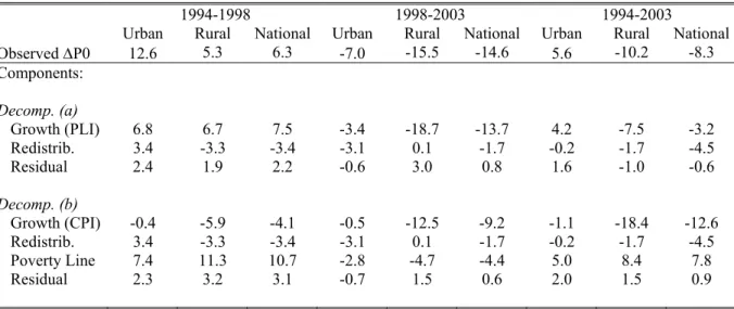
The increase of the headcount index, P0, by 6.3 percentage points on the national level between 1994 and 1998 is analytically the result of a growth effect of 7.5 percentage points, a redistribution effect of –3.4 percentage points and a non-separable interaction effect of growth and redistribution of 2.2 percentage points (residual). In other words, the distribution neutral growth rate, i.e. applying the average (negative) growth rate of household expenditures per capita to all households, would have led to an increase in poverty of 7.5 percentage points. Redistribution between households, i.e. differences in growth rates known by households, was in favor of poorer households and reduced the potential negative affect of the average growth rate alone by 3.4 percentage points in terms of the headcount index. Whereas for rural areas the decomposition yields similar results (but with a higher growth component), in urban areas both components—growth and redistribution—contributed to the rise of poverty.
Table 5 : Decomposition of the change in the headcount index, ∆P0
1994-1998 1998-2003 1994-2003
Urban Rural National Urban Rural National Urban Rural National
Observed ∆P0 12.6 5.3 6.3 -7.0 -15.5 -14.6 5.6 -10.2 -8.3 Components: Decomp. (a) Growth (PLI) 6.8 6.7 7.5 -3.4 -18.7 -13.7 4.2 -7.5 -3.2 Redistrib. 3.4 -3.3 -3.4 -3.1 0.1 -1.7 -0.2 -1.7 -4.5 Residual 2.4 1.9 2.2 -0.6 3.0 0.8 1.6 -1.0 -0.6 Decomp. (b) Growth (CPI) -0.4 -5.9 -4.1 -0.5 -12.5 -9.2 -1.1 -18.4 -12.6 Redistrib. 3.4 -3.3 -3.4 -3.1 0.1 -1.7 -0.2 -1.7 -4.5 Poverty Line 7.4 11.3 10.7 -2.8 -4.7 -4.4 5.0 8.4 7.8 Residual 2.3 3.2 3.1 -0.7 1.5 0.6 2.0 1.5 0.9
Source: EPI, EPII, EPIII; computations by the authors. CPI: IAP (see Footnote 1).
Notes: The decomposition is based on the methodology suggested by Datt and Ravallion (1992). The first decomposition (a) applies the poverty line specific deflators (PLI), which correspond here to the implicit inflator in the poverty line. Hence per capita household expenditure and the poverty line are deflated with the same deflator, keeping the poverty line constant in real terms. The second decomposition (b) shows the decomposition when expenditures are deflated with the national CPI and not with the deflator implicit in the poverty line. As a result, and if the implicit inflation of the poverty line is not equal to the inflation of the CPI, the poverty line is not constant in real terms over time (in comparison to the CPI deflated per capita household expenditure). Then a forth decomposition component has to be included, computing the poverty reduction explained by the shift of the poverty line in real terms. Residuals are computed as the change in poverty not explained by the growth, the redistribution and the poverty line components. We always use the initial period as the reference period.
For the period 1998 to 2003 the growth component as well as the redistribution component had a poverty reducing effect. Growth alone would have led to a poverty reduction by 13.7 percentage points. Redistribution, i.e. in average higher growth rates for poorer households resulted in a further poverty reduction of 1.7 percentage points. It is worth to emphasize, that a relative small redistributional component does not imply that redistribution is (or changes in inequality are) not important, but simply that not much redistribution took place during that period. This decomposition illustrates well, that obviously in rural areas the lower level of initial inequality led to a—in absolute terms—higher growth-elasticity of poverty, since we state an important growth effect and a redistribution effect of almost zero. In urban areas where initial inequality was higher, the similar growth-elasticity of poverty was mainly driven by favorable distributional changes and, in contrast, the higher initial level of inequality was here an obstacle for a further poverty reduction.
Over the whole period 1994 to 2003 and on the national level, the growth component was – 3.2 percentage points and the redistribution component was -4.5 percentage points, i.e. the effect of growth was slightly lower than the effect of heterogeneity in growth rates over households. The residual was almost zero. Looking on rural and urban areas separately, we state for both an important growth component—poverty reducing for rural areas and poverty increasing for urban areas—and a very low redistribution component. The low redistribution component shows that the poverty reducing redistribution effect on the national level stemmed mainly from a decrease of inequality between rural and urban areas.
For comparison and to document again the impact of relative price shifts on poverty, in Table 5(b) we also show a decomposition where we deflate household expenditures per capita by the (inappropriate) CPI but maintain the poverty lines, whose implicit inflation rate is different to the one of the CPI. Of course, then a third component has to be taken into account, which is the difference between the inflation of the poverty line and the inflation of the national CPI. Hence we have to compute the poverty change explained by the increase (decrease) of the poverty line in real terms (in comparison with the CPI) in a growth and distributional neutral case. This yields the following decomposition equation:
R
z
L
P
z
L
P
z
L
P
z
L
P
z
L
P
z
L
P
P
t t t t t t t t t t t t t t t t t t t+
−
+
−
+
−
=
∆
− − − − − − − − − − − − − − −)]
,
,
(
)
,
,
(
[
)]
,
,
(
)
,
,
(
[
)]
,
,
(
)
,
(
[
1 1 1 1 1 1 1 1 1 1 1 1 1 1 1µ
µ
µ
µ
µ
µ
(3b) where zt is the poverty line in the initial period and zt+1 the poverty line in the final period. Taking theperiod 1994 to 1998, one clearly sees that the massive increase in the poverty line, i.e. the amount of money necessary to buy items of first necessity, is now the main cause of the rise in poverty. In other words, would the changes in the cost of living of poor households have evolved like the CPI suggests, poverty had decreased by approximately 7.5 percentage points between 1994 and 1998: 4.1 percentage points due to growth and 3.4 percentage points due to redistribution. To our knowledge, this kind of ‘triple’ decomposition has not been done before. But to us it seems quite useful whenever the development of the price index specific to the consumption of the poor differs significantly from the development of the general CPI.
5.
CONCLUSIONPrevious poverty assessments for Burkina Faso were, due to the neglect of some important methodological issues, misleading and led to the so-called ‘Burkinabè Growth-Poverty-Paradox’, i.e. relatively sustained macro-economic growth, but more or less constant poverty and inequality indicators between 1994 and 2003. By addressing these methodological issues, in particular the computation of a consistent welfare aggregate, the proper consideration of changes in relative prices and the computation of a consistent poverty line, we show that poverty indeed decreased between 1994 and 2003 at least on the national level and in rural areas. However, in the mid-nineties when Burkina Faso started to engage in structural adjustment programs, trade and price liberalization and devaluated its currency by 50%, poverty first increased. The major force behind that poverty up-swing was the rise in food crop prices which had a strong impact on the cost of living of poor households. Even if the mentioned macro-economic events, e.g. the price liberalization, play a role in explaining this phenomenon (more in urban than in rural areas), the increase in cereal prices was first of all the consequence of the severe drought Burkina Faso had to face in 1997/98, making the year 1998 to kind of an ‘outlier’ year of Burkina Faso’s overall growth-poverty development.
Our revised poverty assessment leads to a more consistent picture of the development of household incomes, poverty and inequality measures over time and therefore solves the ‘paradox’ from the arithmetic point of view. The remaining ‘economic paradox’, i.e. that macro-economic growth did not lead to poverty reduction between 1994 and 1998, was explained and solved by addressing the issue of variations in the purchasing power of the poor relative to the non-poor. Of course, there are further factors explaining weak or missing linkages between macro-economic growth and household incomes, which are however beyond the scope of this paper. In this context it would also be important to assess in detail the reliance of the macro-economic data and the fact that National Accounts provide a flow measure for a whole year whereas household survey data gives a snapshot of household expenditures of a much shorter period.
Several implications can be derived from these revised poverty estimates. First, on the national level, Burkina Faso seems now to be on a pro-poor growth path. However, the growth-elasticity of poverty seems to be below its potential and could certainly be raised by changing the structure of growth. How this could be done is discussed in detail in Grimm and Günther (2004). However, the development on the national level also covers a huge disparity between rural and urban areas. In contrast to rural areas,
urban households were in 2003 poorer than in 1994 and in consequence special attention should be given to this sector of the economy. The phenomenon of an ‘urbanization of poverty’ is however not specific to the Burkinabè case and recent studies suggest that it becomes more and more a common feature of several African countries (see e.g. Haddad, Ruel and Garrett, 1999; Grimm, Guénard and Mesplé-Somps, 2002; Azam, 2004). Also, the rise in poverty in the mid-nineties following the drought shows that the population is despite overall decreasing poverty still very vulnerable to macro-economic and climatic shocks.
From a methodological point of view, this analysis has shown that if relative price changes and the consumption habits of the poor are not correctly taken into account, computed poverty trends might be biased and misleading. This aspect is often overseen and welfare comparisons over time are done deflating household expenditure by the national CPI or, conversely, by inflating the national poverty line by the national CPI. But in poor countries it often happens that the expenditure basket underlying the CPI is completely inappropriate for the poor, and therefore if relative prices change, the purchasing power of the poor is not correctly measured.
Finally, this study shows quite well that differential inflation rates, but also changes in survey design and inconsistent assumptions in the computation of the expenditure aggregate over time might explain a non neglectable part of the heterogeneity in growth-elasticities of poverty across countries found for instance by Ravallion (2002).
BIBLIOGRAPHY
Aalen O., (1978), « Non parametric inference for a family of counting processes ». The Annals of
Statistics, vol. 6, n° 4, pp. 701-726.
AFD (2003), « Perspectives économiques et financières des pays de la zone franc. Projections Jumbo 2003-2004 ». AFD, Paris.
Azam, J.-P. (2004), « Poverty and Growth in the WAEMU after the 1994 Devaluation ». UNU/WIDER Research Paper No. 2004/19, United Nations University, WIDER, Helsinki.
Bourguignon, F. (2003), The growth elasticity of poverty reduction: explaining heterogeneity across countries and time periods, in T. Eicher and S. Turnovsky, Growth and Inequality, Cambridge, MA: MIT Press.
Datt, G. & Ravallion, M. (1992), “Growth and redistribution components of changes in poverty measures. A decomposition with applications to Brazil and India in the 1980s”. Journal of
Development Economics, 38, 275-295.
Deaton, A. (1997). The Analysis of Household Surveys. A Micro-econometric Approach to
Development Policy. Baltimore: Johns Hopkins University Press.
Deaton, A. (1999). “Guidelines for constructing consumption aggregates for welfare analysis”. Development Studies Working Paper, Princeton University.
Deaton, A. (2003), “Measuring poverty in a growing world (or “measuring growth in a poor world”)”. NBER Working Paper 9822, NBER, Cambridge, MA.
Deaton, A. & Drèze, J. (2002), “Poverty and inequality in India, a re-examination”. Economic and
Political Weekly, September 7, 3729-3748.
Deaton, A. & Zaidi, S. (2002), Guidelines for Constructing Consumption Aggregates for Welfare
Analysis. Washington D.C.: World Bank.
Dercon, S. & Krishan, P. (2000), “Vulnerability, seasonality and poverty in Ethiopia”. Journal of
Development Studies, 36 (6), 25-53.
Dollar, D. & Kray, A. (2002), “Growth is good for the poor”. Journal of Economic Growth, 7, 195-225.
Fofack, H., Monga, C. & Tuluy, H. (2001), “Household Welfare and Poverty Dynamics in Burkina Faso: Empirical Evidence from Household Surveys”. World Bank Policy Research Working Paper No. 2590, World Bank, Washington D.C.
Foster, J.E., Greer, J. & Thorbecke, E. (1984), “A class of decomposable poverty measures”.
Econometrica, 52, 761-776.
Grimm, M., Guénard, C. & Mesplé-Somps, S. (2002), What has happened to the urban population in Côte d'Ivoire since the eighties? An analysis of monetary poverty and deprivation over 15 years of household data”. World Development, 30 (6), 1073-1095.
Grimm, M. & Günther, I. (2004), “How to achieve pro-poor growth in a poor economy. The case of Burkina Faso”. Report for the ‘Operationalizing Pro-Poor-Growth’-Project sponsored by the World Bank, DFID, AFD, GTZ, and KFW, University of Göttingen.
Haddad, L., Ruel, M.T. & Garrett, J.L. (1999), “Are urban poverty and undernutrition growing? Some newly assembled evidence”. World Development, 27 (11), 1891-1904.
IMF (2003), Burkina Faso: IMF Country Report No. 03/197. International Monetary Fund, Washington D.C.
INSD (2003), Burkina Faso: La pauvreté en 2003. Institut National de la Statistique et de la Démographie, Burkina Faso.
Jolliffe, D. (2001), “Measuring absolute and relative poverty: The sensitivity of estimated household consumption to survey design”. Journal of Economic and Social Measurement, 27, 1-23. Kakwani, N. & Pernia, E. (2000), “What is Pro-Poor Growth?” Asian Development Review, 18, 1-16. Klasen, S. (2004), “In search of the Holy Grail: How to achieve pro poor growth?” in N. Stern, I.
Kolstad and B. Tungodden (eds.), Towards Pro Poor Policies. Aid, Institutions, and
Globalization. New York: Oxford University Press, forthcoming.
Lachaud, J.-P. (2003), « Pauvreté et inégalité au Burkina Faso: Profil et dynamique ». Report prepared for the United Nations Development Program. UNDP, Ouagadougou, Burkina Faso.
Lanjouw, J.O. & Lanjouw, P. (2001), “How to compare apples and oranges: Poverty measurement based on different definition of consumption”. Review of Income and Wealth, 47 (1), 25-42. McCulloch, N. & Baulch, B. (2000), “Tracking pro-poor growth”. ID21 Insights No. 31, Institute of
Development Studies, University of Sussex.
Ministry of Economy and Development (1997), Une maquette macro-économique pour gérer
l’économie du Burkina Faso. L’Instrument Automatisé de Prévision. Tome 1, Présentation
Générale. Ministère de l’Economie et des Finances, Burkina Faso.
Pritchett, L., Suharso, Y., Sumarto, S. & Suryahadi, A. (2000), “The evolution of poverty during the crisis in Indonesia, 1996 to 1999”. Social Monitoring and Early Response Unit, Jakarta and World Bank, Washington D.C.
Ravallion, M. (2001), “Growth, inequality and poverty: Looking beyond averages”. World
Development, 29 (11), 1803-1815.
Ravallion, M. & Chen, S. (2003), “Measuring pro-poor growth”. Economic Letters, 78, 93-99.
Ravallion, M. (2004), “Pro-poor growth: A primer”. World Bank Policy Research Working Paper No. 3242, World Bank, Washington D.C.
Reardon, T. & Matlon, P. (1989), “Seasonal food insecurity and vulnerability in drought-affected regions in Burkina Faso”, in D.E. Sahn (ed.), Seasonal variability in third world agriculture.
The consequences for food security (pp. 118-136), Baltimore: Johns Hopkins University Press.
Scott, C. & Amenuvegbe, B. (1990), “Effect of recall duration on reporting of household expenditures”, Mimeo, World Bank, Washington D.C.
Tarozzi, A. (2004), “Calculating comparable statistics from incomparable surveys, with an application to poverty in India”, Mimeo, Duke University.
World Bank (2004), “Burkina Faso: Reducing poverty through sustained equitable growth”. Poverty Assessment. PREM 4, Africa Region, Report No. 29743-BUR, World Bank, Washington D.C.
APPENDIX
(a) The construction of the household expenditure aggregate
As recommended for instance by Deaton and Zaidi (2002), we included in our expenditure aggregate food consumption, i.e. food purchased from market, food that is home-produced, food received as gift or in-kind payment and food consumed outside the household. Among the non-food consumption items, we included expenditures for education, health, house ware, and transport services. We excluded taxes paid, purchase of assets (e.g. land and livestock), expenditure on durable goods (e.g. equipment such as television, radio and refrigerator, and mobile devices such as motorcycles, bicycles, and cars), investment into housing and other lumpy expenditures such as marriages. Actual housing rents were available and included in our expenditure aggregate for approximately 30% of urban and 2% of rural households. For most other households self-estimated hypothetical rents were imputed by the INSD and also included in our expenditure aggregate. However, such a hypothetical rent was still missing for 22%, 16% and 6% of households in 1994, 1998 and 2003 respectively. To approximate those missing rents regional and urban/rural averages were taken from the declared and imputed rents, since it was not possible to estimate an acceptable regression between housing features and declared rents, especially in rural areas. To obtain annual values we multiplied expenditures with a 30 days recall period by 12 and those with a 15 days recall period by 24. To obtain per capita expenditure we divided our total household expenditure aggregate by household size. For reasons of comparison with other studies, we did not use any equivalence scale; i.e. no adjustment was made for economies of scale in consumption within households and different needs by age. Finally, we applied regional deflators provided by the INSD to account for regional differences in the cost of living. All moneymetric measures are adjusted to the price level of Ouagadougou, the capital of Burkina Faso.
(b) Construction of consistent consumption price deflators
To express household expenditures observed at different points in time in real terms we need a price deflator. As emphasized in Section 3.1, the CPI would be inappropriate for this purpose, given that the underlying consumption basket is not at all representative for the majority of the population in Burkina Faso. Therefore, to be consistent with observed consumption patterns and in order to reflect correctly the relevant purchasing power of households, we computed separately for urban and rural areas percentile specific consumption price deflators. More precisely, for each percentile in the distribution of household expenditures per capita we measured the mean cereal, the mean food-non-cereal and mean non-food share in total expenditure and used these shares as weights for the price changes of cereal, food and non-food items. This procedure provides us with percentile specific price changes between the different survey years for each household, which then can be used to convert nominal expenditures into real expenditures with 1994 being the base year. The absence of detailed price series back to 1994 prevented us to derive even more refined household deflators, i.e. for each expenditure category separately (education, health, transport etc.).