HAL Id: hal-02824512
https://hal.inria.fr/hal-02824512
Submitted on 6 Jun 2020
HAL is a multi-disciplinary open access
archive for the deposit and dissemination of
sci-entific research documents, whether they are
pub-lished or not. The documents may come from
teaching and research institutions in France or
abroad, or from public or private research centers.
L’archive ouverte pluridisciplinaire HAL, est
destinée au dépôt et à la diffusion de documents
scientifiques de niveau recherche, publiés ou non,
émanant des établissements d’enseignement et de
recherche français ou étrangers, des laboratoires
publics ou privés.
Where is that Feature? Designing for Cross-Device
Software Learnability
Jessalyn Alvina, Andrea Bunt, Parmit Chilana, Sylvain Malacria, Joanna
Mcgrenere
To cite this version:
Jessalyn Alvina, Andrea Bunt, Parmit Chilana, Sylvain Malacria, Joanna Mcgrenere.
Where
is that Feature?
Designing for Cross-Device Software Learnability.
Proceedings of the ACM
Conference on Designing Interactive Systems (DIS 2020), Jul 2020, Eindhoven, Netherlands.
�10.1145/3357236.3395506�. �hal-02824512�
Where is that Feature? Designing for
Cross-Device Software Learnability
Jessalyn Alvina
1, Andrea Bunt
2, Parmit K. Chilana
3, Sylvain Malacria
4Joanna McGrenere
11
University of British Columbia, Vancouver, Canada
2
University of Manitoba, Winnipeg, Canada
3
Simon Fraser University, Burnaby, Canada
4
Inria, Univ. Lille, UMR 9189 - CRIStAL, France
1
{jalvina, joanna}@cs.ubc.ca,
2[email protected],
3[email protected],
4[email protected]
ABSTRACT
People increasingly access cross-device applications from their smartphones while on the go. Yet, they do not fully use the mobile versions for complex tasks, preferring the desktop ver-sion of the same application. We conducted a survey (N=77) to identify challenges when switching back and forth between devices. We discovered significant cross-device learnability issues, including that users often find exploring the mobile ver-sion frustrating, which leads to prematurely giving up on using the mobile version. Based on the findings, we created four design concepts as video prototypes to explore how to support cross-device learnability. The concepts vary in four key di-mensions: the device involved, automation, temporality, and learning approach. Interviews (N=20) probing the design con-cepts identified individual differences affecting cross-device learning preferences, and that users are more motivated to use device applications when offered the right cross-device learnability support. We conclude with future design directions for supporting seamless cross-device learnability.
Author Keywords
Cross-device learnability, multi-device ecosystem, research through design, survey, interview
CCS Concepts
•Human-centered computing → Empirical studies in in-teraction design; Scenario-based design;
INTRODUCTION
Mobile devices have become crucial in our everyday com-puting ecosystems: many of the tasks that were once solely supported by a desktop or laptop PC can now be done using a smartphone. In particular, accessing work-related informa-tion and completing tasks under different mobility contexts is becoming routine for many knowledge workers [40]. As
Authors’ version.
DIS ’20, July 6–10, 2020, Eindhoven, Netherlands. http://dx.doi.org/10.1145/3357236.3395506
such, not surprisingly, there is a growing trend to include more features in mobile applications that offer similar functionality to their desktop versions [2]. Despite the push towards more seamless task support across devices, users are still reluctant to fully embrace smartphones for some tasks [19]. Factors impacting their reluctance, however, are not fully understood. In a multi-device ecosystem, applications must not only en-sure the usability on each device, but also be inter-usable, i.e. support transfer learning and task continuity across devices [11]. However, the user interface, the feature set, and the inter-action style of an application version can be largely different from one device to another due to the technical characteristics of each device. These issues become particularly acute for applications such as productivity apps, often categorized as feature-richapps [31], that offer many complex features, oper-ations, and interface structures (e.g., multi-layered menus). Past studies on inter-usability have tended to focus on a single application (e.g., email [20]), categorizations of multi-device usage patterns [19, 40], or on tools to help developers build cross-device applications [13, 32, 34]. Using cross-device learnabilityas a lens, we expand the inter-usability concept to help users reconcile discrepancies between application ver-sions running on different devices. In particular, we focus on understanding how to support more seamless transfer learn-ing to enable users to discover which features exist in which device, and how to find the features within the interface. In this paper, we explored the design space of cross-device learnability support tools, grounded in empirical insights. We first conducted a survey with 77 participants (followed by in-depth interviews with 7 of them) to better understand any cross-device issues the users faced when switching back and forth between application versions on different devices. Based on the literature and the insights from the survey, we iteratively selected four design dimensions to define and broaden the de-sign space around cross-device learnability: the number of devices involved within the learning process, temporality, the level of automation, and the learning approach. We used Re-search through Design[49], an approach in interaction design research that intersects theories and technical opportunities to generate a concrete problem framing of the preferred state within the design space. We used the design dimensions to
gen-erate four design concepts to support cross-device learnability in the form of video prototypes [48]. Through an elicitation interview study with 20 participants, we solicited feedback on the potential benefits and drawbacks of the design concepts. We use this feedback to further reflect on the design space. Our paper makes the following contributions: First, we broaden the understanding of cross-device learnability issues, including that users faced substantial challenges troubleshoot-ing cross-device issues. Second, we outline four design di-mensions to explore the design space of cross-device learn-ability, with the goal of increasing feature awareness across application versions on different devices and helping users troubleshoot cross-device learnability issues. These can be used as a generative resource for creating new cross-device learning tools, as well as designing a seamless cross-device experience. Third, we offer four design concepts that probe the space, with our elicitation study showing that individual differences impact how users value different aspects within the design concepts that we offered. Finally, we discuss future design directions for supporting the design of inter-usability.
RELATED WORK
A large focus of the existing research on cross-device interac-tions has been on synchronous interacinterac-tions [3]. In this paper, we focus on asynchronous interactions (i.e., where users use the mobile version and the PC version sequentially) and learn-ability (i.e., transfer learning) across devices. We use the term cross-device to refer to asynchronous, sequential use of cross-device applications.
Supporting Learnability Within Applications
Grossman et al. [16] identified five aspects of learnability: understanding the sequence of operations for a task, aware-ness of features, locating features, understanding how to use specific tools, and finally transitioning to expert behavior. Spa-tial consistency within the interface has been shown to help users transition to experts [41, 43], enabling them to interact with the application at ease and effectively [7, 12]. Increasing feature awareness within an application can be done through automation[15]. The automation approach is usually reflec-tive, i.e., it considers users’ past activities to provide feature recommendations. Another reflective approach is to simply visualize the past activities (e.g., Patina [30]), and as such, the users have more control on what they want to discover next. Documentations or tutorials are often used to help users locate features within a GUI, which can be accessed internally (e.g., built-in help with keyword search [26]) or externally (e.g., web tutorials). In-place, contextual tutorials have been shown to be efficient [22]. In this paper, we expand the design space towards cross-device learnability support, considering the different interactions and usage across devices.
Supporting Learnability Across Applications
Davis and Wiedenbeck [9] introduced the notion of subsequent learning, i.e., learning by a user who is a novice to that spe-cific application, but has experience with similar application. Despite their prior experience, users need to relearn the new application and the process is affected by transfer learning, i.e., users draw analogies from their previous experience using
other applications to assimilate to the subsequent application. Users can draw on their previous experience to aid learning when there are strong similarities in the interfaces, operating procedures, and interaction styles. Consistent terminology and keystrokes are the most beneficial for subsequent learn-ing, followed by knowledge on operating procedures, input capabilities, and application concepts [21].
A unique opportunity in designing learnability support tools across applications is that the users are already familiar with one of the two UIs. Ramesh et al. [38] built a UI façade that mimics the UI of a known package to teach the users the ter-minologies and how to equivalently access the functionalities of a target package (e.g. a Photoshop façade to teach the users GIMP). Lafreniere and Grossman [27] gradually transform the UI of a known application into the target application by incorporating a new set of features from the target package after the users master the current set. However, these types of support for learning mainly focus on transfer learning across applications on a single device.
Supporting Learnability Across Devices
In a multi-device ecosystem, an application should not only be easy to use on any device, but also allow users to apply their knowledge learned using one device to another [11]. Transfer learning across devices faces different challenges than that across similar applications on a single device, due to differ-ences in technical characteristics (e.g. screen size, computing power, etc.), interaction paradigms (pointing v.s. touch in-teraction), and the user’s perceptual and cognitive ability in different contexts [13, 36]. Keeping the terminologies and application concepts consistent across versions may help the transfer learning across devices [11]. However, the feature subsets, interface, interaction styles, and operating procedures in each device can be largely different.
If the discrepancies between versions on different devices are big – especially in feature-rich applications, discovering and remembering which features exist in which versions most likely requires users to explore each version extensively. Fur-thermore, it is not always possible to make all the interfaces spatially consistent across device [13], and as such, the users must relearn the location each feature within the interface. This may hinder users’ discovery and exploration, especially because relative spatial organization across interfaces supports transfer learning [42]. In their study on cross-device usage, Majrashi et al. [28] also showed that users tend to recall the lo-cation of features on the PC interface, and immediately direct their gaze to the same area on the mobile interface.
Failures to easily find features in the mobile version may force users to switch to another device (e.g. PC), causing task inter-ruptions [11]. In their study on cross-device email applications, Karlson et al. [20] found following up an interrupted email-related activity on a different device was frustrating, despite the growing supports for task continuity. Our work expands the scope of investigation to a wider range of applications, from simpler applications (e.g. messaging) to feature-rich applications (e.g. productivity apps), uncovering different challenges and troubleshooting strategies as users move back and forth between application versions on different devices.
Approaches similar to learnability support tools designed for PCs have also been provided in existing mobile applications. Start-up tutorials or tips-of-the-day often pop up upon in-stalling the apps or new updates, giving a quick overview of which features are accessible in that version. However, the content may be easily forgotten or discarded if the users do not need the features in the moment [14], or even ignored in a mobile situation. Built-in help is sometimes available, through keyword search or pre-defined topics. Users may also manually internet search on how to find a certain feature in the mobile device [37]. However, the instructions are often not straightforward, hence the users must switch back and forth between views. These learnability supports operate lo-cally (e.g., mobile-only search results), and do not consider the different versions within the multi-device ecosystem.
SURVEY: CROSS-DEVICE EXPERIENCE & ISSUES
Cross-device experience is highly affected by factors such as technical constraints, interaction paradigms, context of use, and design considerations [11, 13, 36]. To better identify opportunities for design improvements, we first wanted to characterize cross-device issues that users encounter in their daily lives. To this end, we conducted a survey to investigate users’ cross-device experience when using cross-device ap-plications, as well as the specific points of breakdowns and troubleshooting strategies (if any) when switching back and forth between PC/laptop and mobile versions of an application.
Recruitment and Participants
We recruited participants who were at least 18 years old and used at least a PC/laptop and a smartphone in their daily lives. We advertised the survey on university mailing lists, Craigslist, and social networks. We received 102 responses to the adver-tisement, but only 77 completed all the required questions (48 women, 29 men, 2 preferred not to say). The majority (79.3%) were 18-34 years old; 19.5% were 35-54; 1.2% were 55-64.
Procedure
The participants completed the online survey in 15 minutes on average. The survey consisted of three parts. Part 1 collected demographic data including occupation and if their occupation involved accessing some applications or data from different devices. Part 2 asked participants about the computing devices they owned and the cross-device applications that they used on their mobile devices and PC, as categorized in [2] (see Fig. 1). The participants also filled in three Likert-scale questions for each application category: 1) frequency of use (1 to 5); 2) perceived frustration levels (“Not frustrating” to “High”); and 3) the degree to which they wished for a more seamless cross-device experience (1 to 5). Part 3 was optional: we asked the participants to share stories related to breakdowns or frus-trating issues they had encountered (if any) when switching back and forth between the PC and the mobile versions. For each story, the survey asked: 1) the context (which app, which device, etc.); 2) the tasks they were trying to perform; 3) the issue that they faced; and 4) their troubleshooting strategy. We also conducted follow-up interviews: we first went through the stories from the survey, then contacted 8 participants with the richest stories, i.e., included concrete details related to
learnability issues and/or troubleshooting strategies. 7 re-sponded. We asked them to reflect on their stories while showing us their applications. This helped us to understand the nuances in the issues and the rationale behind their trou-bleshooting strategies. These interviews lasted 20-30 minutes. Although sharing stories was optional, our survey and inter-views collected a total 68 stories reported by 55 participants (71%). We discarded 3 stories that were not related to inter-usability (e.g., forgotten passwords) and analyzed 65 stories. To analyze the frustration stories and the interview transcripts, we used Braun and Clark’s approach to thematic analysis [6]. We performed open coding and identified recurrent themes.
Key Results from the Survey
Participants were frequent mobile users
All participants were daily smartphone users. Most (88%) also used their PCs everyday. The rest used their PCs at least once per week. Almost two-thirds of the participants owned other mobile devices, including tablets (47% of the participants), smartwatches (14%), and others (36%), which they tended to use 2-3 times per week. Most participants (71%) agreed that their professional occupations involved using applications on different devices, such as PCs and smartphones. These appli-cations ranged from relatively simple ones, such as calendar or messengers, to feature-rich productivity applications.
Figure 1. Perceived frustration level and percentage of frustration sto-ries per application category reported by participants. “N/A”=the par-ticipants did not use any applications under the category across devices.
Using some cross-device applications was frustrating
The participants reported diverse perceived frustration levels across the application categories (see Fig.1). The majority of participants (90%) were content using messaging apps across devices. On the other hand, productivity, e-commerce/banking, and web apps were perceived as the most frustrating (by 47%, 46%, and 44% of participants respectively). The frustration stories were also dominated by these three categories (see Fig.1, % Stories). We suspect that the complexity of these categories (e.g., features and/or information), results in more discrepancies between the PC and the mobile versions, and hence, more challenges when users switch back and forth.
Switching from PC to smartphone versions was frustrating
The participants were mainly frustrated when switching from the PC to smartphone versions (86% of stories, as opposed to 11% for smartphone to PC and 3% for PC to tablets). The most common tasks that the participants tried to perform on their smartphone during the frustrating incidents involved manipu-lating data, including editing, formatting, adding new data, and
uploading/downloading data (42%). This was followed closely by viewing information or consuming data (41%). Other tasks included searching for routes on map apps (8%), and accessing payment on banking/e-commerce apps (6%). The majority of the frustrating incidents happened when the participants were on the go and did not have access to their PCs.
Participants went through different cross-device issues
Some stories described multiple points of frustration at the same time. We identified 75 points of frustration among all the collected stories. We then grouped them into three major categories of frustrations: learnability (51%), usability (35%), and technical (14%) frustrations. While our focus is on learn-ability frustrations, we also briefly report on the other two categories to provide a more complete picture.
Learnability Frustrations.The participants pointed out major cross-device learnability frustrations such as failing to find fea-tures (19%) and having to relearn the application due to differ-ence in UI layouts (16%) and operating procedures (16%). For example, P46 failed to edit a MS Word file on her smartphone because she could not find the ‘undo’ icon: “I needed to fill-in a grid (skills questionnaire) that was fairly short and I could potentially type up everything using a smartphone. There is no ‘undo’ feature that would correct messed up formatting changes” – this is particularly interesting since the mobile app of MS Word actually includes an ‘undo’ feature, but users must scroll the icon bar to access it1. Similarly, P8 thought
that the “Heading” feature was missing from the smartphone version of Google Doc, but during the follow-up interview, she immediately located the feature as she was showing her mobile app. P8 explained, “I have never even looked at that [Text Format] button, I had no idea how long it had been there”. P27 shared a frustration story related to setting up a group call in Skype: “Normally on the desktop I will connect to one person and then there would be a plus sign to add [the other] person to the [ongoing] call. But last time, when I was calling [on the phone], the whole screen was covered, there was no way to add another person.” During the interview, he discovered that making a group call was actually possible in his mobile version, but that it had to be set up before making the call. In the PC version, it could be done either before or after initiating call (i.e., different operating procedures). Usability Frustrations. Accessing a large amount of data on a small screen (e.g., editing a long document) requires users to navigate within the mobile interface (16%) and get used to different data rendering (11%). Sometimes they also had to switch between applications on their mobile devices, which was perceived as frustrating (7%). Participants were also affected by differences in interaction paradigms (1%), i.e. pointing-based v.s. touch-based interaction. This was particu-larly severe given that the participants were mostly using the mobile version under conditions of situational impairment [36, 46], in which touch precision may be compromised.
Technical Frustrations.Some technical frustrations mentioned in the stories included difficulties reading and typing on a small device (5%), synchronization failures (7%), privacy concerns 1Based on MS Word’s Android version, updated in September 2019
(1%), and that some applications require updates or installing several mobile applications (1%). For example, P14 reported, “The [mobile] version keeps telling me to update the app, but my smartphone is pretty full so it’s sometimes hard to update”.
Participants rarely troubleshoot cross-device issues
From 55 stories with troubleshooting strategies, we found that the most common approach was to just continue with the same device despite being frustrated (27% of stories) or switch to another device, typically a PC (26%). Some preferred to switch to another application on the same device (11%) or find a workaround manually (11%). In only 9% of stories did par-ticipants mention exploring the interface, and only one story described performing an internet search to troubleshoot. In the worst case, 11% of the stories described avoiding performing the same task again, given that they had failed. In two stories, the participants went as far as uninstalling the application. During the follow-up interview, P8 explained, “Everytime I felt [using the app] was annoying, I was on my phone, which is not the interface that is very good for troubleshooting. Often times I pressed something, it’d do something I didn’t expect, and the first thing I was wondering was if I even clicked the right button. And by the time I got back to my computer, I forgot that I was annoyed.”. This suggests that participants faced substantial difficulties troubleshooting or exploring the mobile interface due to unclear system feedback. Cross-device issues remained frustrating and potentially recurring.
Although the participants rarely troubleshoot cross-device is-sues owing to difficulties exploring, we found two strategies that suggest interesting opportunities for design:
Pre-Planning Mobile Activities.Four stories (7%) described situations in which the participants were using their PCs to plan their future mobile activities. Of particular interest, P38 had issues with data rendering for MS Excel related to her future mobile use: “When I am on road, I check my excel using [my] smartphone. However every time there were pictures and tables, it did not line up like it should. I think this is more problematic when the file is made for reporting purposes since it could relay wrong message to the ones who read it. [When on PC] I remind myself to always make space when making tables and inserting pictures, so that when I am opening it from my smartphone, each info is grouped together”. Incidental Learning.Users may discover features by chance (e.g., while doing something else), resulting in incidental learn-ing (one story). P44 shared an experience: “I could not find a way to change my username, so I just used my default user-name until I got back to my desktop. But later on I discovered it by chance while doing another task. I was an admin of a channel and I saw it when I wanted to do something else.” P2 mentioned a similar experience, although he mentioned that he often forgot how to find that feature again.
To summarize, the most salient cross-device learnability issues were related to awareness of features and locating features. One major contributing factor was the disconnect between the application version’s capabilities and the user’s expecta-tion, i.e., the features were actually accessible in the mobile version, contrary to participant assumptions. Although some
existing mobile applications provide learnability supports (e.g., built-in help), troubleshooting cross-device issues remained challenging.
DESIGNING CROSS-DEVICE LEARNABILITY TOOLS
The findings in our survey highlight the need to expand the design space towards cross-device learnability to help users manage their expectations, discover feature availability across versions, and learn how to locate available features within the interface. To explore the design space of cross-device learn-ability support, we took a Research through Design approach [49]. As in [8, 35], we wanted to explore the potential roles, forms, and values of emerging near-future technology by using more than one design vision. Past research has used a similar approach to investigate the design space of data curation and legacy [17] and supporting the decision making of keeping and discarding data [45]. Our process included two parts: selecting a set of design dimensions that captures the major concerns of our survey respondents, and generating a set of design concepts within the design space.
Design Dimensions
We clustered and mapped insights from our formative study and prior work into four design dimensions to probe. Device Involved. The survey findings indicated that users may not be motivated to learn on a mobile device with a small screen, especially when they are situationally impaired, and often prefer switching to PCs. We consider detaching the learning process from the main target device. On one end of this dimension there is one device involved, i.e. the users learn how to find a mobile feature directly on the mobile device (likewise for PC). At the other end there are two devices involved, i.e. both devices are present during the learning process and the users interact with both to learn. The middle of the spectrum represents one device with two interfaces involved, e.g. by simulating the mobile interface on the PC. Temporality. This dimension was inspired by the survey find-ings about pre-planning future mobile use and incidental learn-ing, where users solved the issues before or after the main pro-cess. Users may not be able to learn or troubleshoot effectively in a mobile context, thus cross-device learning should be sup-ported at a time that users prefer. On one end of this dimension is reflection, i.e. the users learn by looking back on their past usage (after-the-fact). At the other end is pre-planning, i.e. the users think ahead of what they might need for their future usage (before-the-fact). The middle of the spectrum represents just-in-time learning, i.e. learning only when needed. Automation. This dimension focuses on the tension between a user-triggered learning process and a system-triggered one, for example through a feature recommender. The dimension was inspired by a recurrent debate on the degree of user control needed when delegating a process to the system [4, 18, 30, 44]. This remains a key issue to explore in the context of cross-device learning, given recent and ongoing advances in machine learning and recommender system technologies [47]. Learning Approach. For the final dimension, we consider different learning approaches that have been long discussed
in HCI literature [5, 23, 39]. On one end of this dimension is passive learning, i.e. by reading or watching; at the other end is active learning, i.e. learning through self exploration. The middle of the spectrum represents a guided exploration: users follow an in-place tutorial while still quite actively trying out.
Design Concepts
We created four design concepts that vary along these de-sign dimensions. Given that cross-device learnability is an under-explored design space and building robust, seamless cross-device interactions is complex [13], we wanted to avoid jumping into implementation right away, and opted for video prototypes as the design artefacts instead. Video prototypes gave us the flexibility to explore different design visions, al-lowing us to compare different concepts in a practical and rigorous manner while avoiding biases due to implementa-tion flaws. Hence, for each concept, we created a short video prototype [48], illustrating how it works through a user sce-nario [available as supporting materials to the paper]. Similar to previous research [4, 29, 45], our main goal is to foster dialogue with participants about perceived benefits of each concept, their underlying design dimensions, under different considerations, such as the context of use and their preference, to narrow the solution space as the design process transitioned from ideation to iteration [8].
In designing the concepts, we took inspiration from existing learnability support tools that mostly focus on a single de-vice instead of cross-dede-vices (discussed in the Related Work). For each concept, we intentionally pushed the dimensions in specific directions, often exploring the extremes in new com-binations. We tailored a user scenario for each concept, taking inspiration from the stories in the survey, to help users under-stand the concept while relating it to their own multi-device experience. We used four different applications, one in each video prototype, to give participants a sense of the range of use cases. We used both PC and smartphone versions in our use cases because 1) our survey found switching from PC to smartphone versions was most frustrating; 2) prior work has shown that interacting with smartphone interfaces is more chal-lenging and significantly slower than PCs and tablets, while there is no significant difference between PCs and tablets [10].
Keyword Search Bar
With this Keyword Search Bar concept, users can type the fea-ture keyword on the search bar from both the PC and mobile device. The system gives a list of features related to the key-word, as well as feedback about their availability in the other device. For example (illustrated on Fig.2), using the Keyword Search Barto search for “color” on the mobile version gives the user a list of mobile features and a list of PC-only fea-tures related to “color”. When the user selects a search result item (e.g. “border color” in Fig.2b), the system automatically opens and points at the menu where it is located or highlights the corresponding icon on that device (Fig.2c). This concept leverages the recall ability for users who are familiar with the feature set, and want to quickly locate it in other devices. If no mobile feature related to the keyword search is found (as shown in Fig.2d), the user can tap on the items under the “computer only” feature to see the search result directly on
Figure 2. (a) Users invoke Keyword Search Bar by tapping the (?) icon. (b) Users then type the keyword (e.g. “color” in Google Slide). It displays all features related to “color” available on the mobile version and PC-only version. (c) The menu is automatically opened upon choosing a search result. (d) When no mobile feature is found (e.g., “animation” keyword), users can invoke the search process on the PC interface via the mobile device.
the PC. Both devices must be active to use this switch-device functionality. Similarly, when searching for a feature with the Keyword Search Baron PC, if the feature is also available in the mobile version and both devices are currently active, the PC interface displays an option “See on mobile”. The users can click on it to have their device open the mobile app, and see how to locate the feature on the mobile version. This eases the process of switching from one device to another.
Related to the design space, this concept has a strong emphasis on self-triggered, as the user must type the keyword. The learning process leans to passive learning, as the menu is opened for the user automatically. The concept positions in between the temporality dimension, and can be used with one device(as in Fig.2b) or two devices (as in Fig.2d).
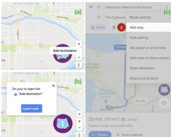
To-Learn List
Similar to a to-do list, users can add a reminder of what features they want to learn/use on a certain device, by drag-and-dropping the feature’s menu item into the To-Learn List (Fig.3a). The To-Learn List can be used on both a PC and a mobile device, with the list synchronized across device. In other words, a user can make the list on their PC to learn on their mobile phones, or vice versa. When they open the to-learn list and click on an item, a guided tutorial starts, giving step-by-step instructions (drawn on top of the interface) on how to access the feature within the interface (Fig.3c illustrates the guided tutorial on the mobile version). At each step, the system highlights the icon or the menu the user must press the icon/menu, to continue to the next step within the tutorial. The guided tutorial ends when the user can see the menu item/icon of the feature, and this item is removed from the To-Learn List. Additionally, the To-Learn List informs the user if the feature is only exclusive to a certain device, e.g. “PC only”.
This concept puts a strong emphasis on pre-planning within the temporality dimension. The concept positions in between of the learning approach as it involves a guided exploration with in-place tutorials. It also positions in between the au-tomationdimension: adding a feature to learn from one device is self-triggered, but the reminder to learn it on another device
Figure 3. (a) In Google Maps, on the PC, the user drag-and-drops the feature’s menu item to To-Learn List (the purple icon at the bottom cor-ner). (b) To-Learn List is synced across devices. (c) On the mobile, the user chooses an item in the list and a guided in-place tutorial starts. Note the conversion across different terminologies: the PC’s ‘Add destination’ becomes ‘Add stop’ on the mobile.
is automated since the user can always see how many items are on the list on the To-Learn List icon.
Peek-Through Icons
Peek-Through Iconsinform the user about the cross-device features through the PC interface, and the mobile-only features through the mobile interface. In the PC interface, similar to the hotkey information next to a menu item in most WIMP interfaces [15], Peek-Through Icons appear next to menu items (Fig.4) and in tooltips to increase peripheral awareness of features that the user often uses and exist across devices. A recommendation system interprets the user’s past usage across devices to infer features that the user will likely want to use on the mobile device. Peek-Through Icons thus make the icons appear more salient next to the recommended features, while icons for the non-recommended features appear less salient. This can be used to reduce visual clutter. The user can hover on the Peek-Through Icons to get an image preview pointing to the region where it is located on the mobile device. Peek-Through Iconsstand out from other concepts as they put a strong emphasis on reflection and system-triggered automation. It involves passive learning (image preview). They are mainly available on one device (the PC exposes cross-device features), as the Peek-Through Icons on the mobile version will only emphasize features exclusive to the mobile device.
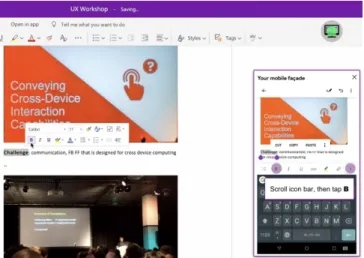
Dual-Screen Façade
The Dual-Screen Façade provides a sandbox for users to ex-plore both interfaces without the risk of losing data. When Dual-Screen Façadeis activated (by selecting an icon), an interactive mobile simulation window appears (i.e., mobile façade as shown in Fig.5). Any interaction performed on the PC interface is directly mirrored in the façade. This is partic-ularly useful to discover hidden menus or gesture shortcuts on the mobile version: while the user is interacting on the PC interface, if there is any equivalent hidden gesture shortcut on the mobile version, a textbox appears on the mobile side giving textual and visual descriptions on how to perform the hidden gestures, while the façade is simulating the gesture and
Figure 4. (a) Peek-Through Icons on mobile (the blue icon) appear next to mobile-only features. Peek-Through Icons on PC (the teal icons) ap-pear next to cross-device features in tooltips (b) and in menus (c). Users can control the saliency levels (c).
its effect. The façade is greyed out when the user selects a PC-only feature. The mirroring works both ways: invoking a feature on the façade will highlight the area within the PC interface affected by the interaction. When the user closes the façade window, it asks if the user wants to save changes. If the user chooses ‘No’, all changes made during the simulation are reverted. Unlike the other concepts that can be used in any device, Dual-Screen Façade can only be used on the PC. Related to the design space, this concept strongly emphasizes explorationand self-triggered. The concept leans towards pre-planning. Although it can only be used on a PC, it is positioned in between the device involved dimension, since the PC displays two interfaces at the same time.
Figure 5. On the PC, the user activates Dual-Screen Façade by clicking the grey icon (top-right) (here using MS OneNote). The mobile façade window appears (right): it floats on top of the PC interface and can be moved around. When the user clicks the ‘Bold’ button in the PC inter-face (in center), the mobile façade mirrors the interaction and explains how to find ‘Bold’ within the mobile interface.
ELICITATION INTERVIEW STUDY
Our next goal was to explore how our design dimensions and design concepts might impact users’ cross-device experience and learning strategies. We carried out an elicitation study where we showed video prototypes demonstrating our four design concepts in interview sessions.
Recruitment and Participants
We recruited participants (age 18+), who used both PCs and smartphones in their daily lives, and had not participated in our survey. To ensure diverse cross-device experience, we asked them to mention the names of some applications that they used on both PC and mobile devices, for example Google Doc (productivity apps) or banking apps. We advertised the study on a university mailing list, and stopped recruiting when the reactions to the design concepts saturated. In the end, we had 20 new participants (gender balanced). Nineteen were 18-34 years old; only one was 45-54. Their occupations in-cluded students with diverse majors (e.g., CS, social science), engineers, consultants, artists, and brand ambassador.
Procedure
An interview session consisted of three parts: 1) a brief intro-ductory section on the user’s current cross-device experience and their usual learning approach; 2) a main elicitation section going over each of the design concepts; and 3) a final set of questions comparing all the design concepts.
In the introductory section, we asked participants what cross-device tasks they performed in their daily lives, their strategies when learning a new application on the PC and when they switched over to a smartphone, including any issues they en-countered while switching back and forth between the two application versions. (The goal was to immerse the partici-pants into the cross-device learnability space, and reuse the cross-device issues identified by participants in this first sec-tion during the rest of the study).
Next, we showed all four video prototypes one by one, and asked participants whether something was not clear, providing printouts of each concept. Then, we probed on the participants’ first impressions, asking what they felt about different aspects of the concepts. We briefed the participants that each design concept was not specific to an application, and asked them to imagine each concept as an add-on that they could install for any app they wanted, and to convey the apps for which they would like to install the add-on.
Finally, we asked the participants to (a) reflect on and across their experiences of all concepts, (b) to sort the concepts based on their preference, and (c) to specify which design concept they would likely use in their daily lives (a participant could choose to use more than one). The interviews lasted between 60 to 80 minutes and were audio recorded. We used a the-matic analysis approach [6] to analyze the data, starting with inductive coding and then identifying recurring themes.
Key Results from the Elicitation Study
The participants in this study reported challenges and issues that were largely consistent with those in the survey. Also similar to the survey results, they found it frustrating switching
from the PC to the mobile version, yet not all participants wanted to dedicate the time to troubleshoot. As such, almost all participants (19/20) appreciated the idea of having cross-device learnability support tools in their cross-devices. Only one participant mentioned that he would rather keep his usual cross-device learning practice.
Individual differences affect preferences of design concepts
Of the four design concepts, Keyword Search Bar was the most positively perceived: 80% (16/20) of the participants reported that they would use it. To-Learn List tied with Peek-Through Icons(11/20), while Dual-Screen Façade was the least likely to be used (6/20). When examining the participants’ reported cross-device usage and learning strategies (from the first in-troductory section) as well as the reasons behind their varied preferences for the design concepts, we saw two dominant factors emerge: their current level of mobile usage and their motivation to use/learn applications thoroughly. Therefore, we clustered the participants based on these two factors. Level of mobile usage.This factor is related to the cross-device tasks that the participants often performed: a participant is classified as HIGH if they are comfortable completing a multi-step task on mobile whenever possible (e.g., P1 creating an expense report on his smartphone with Google Sheet); LOW if they prefer switching to PC immediately (or postpone the task completion if they do not have access to their PC); and in between if they complete the multi-step task on the mobile only if urgent (although not comfortable with it).
Motivation to learn thoroughly.A participant was classified as HIGH if they prefer learning thoroughly before/after using an app with external resources (e.g. online tutorials or docu-mentations); LOW if they do not dedicate time to learn; and in between if they sometimes dedicate time to exploring the interface (e.g. clicking on different menus or using tooltips). We then mapped each participant cluster to their top ranked (most preferred) design concept, as illustrated in Figure 6. In general, heavy mobile users who prioritized efficiency over thorough learning tended to choose Keyword Search Bar. Heavy mobile users who preferred thorough learning tended to choose To-Learn List. On the other hand, participants with low level of mobile usage (hence, preferred to work on their PC) tended to choose Dual-Screen Façade if they were inter-ested in learning the mobile version thoroughly, compared to Peek-Through Iconsif they were not. Only a few participants had a strong preference for one concept only, for example P1 mentioned he would only use Keyword Search Bar and no other. The majority of the participants mentioned that they would use several design concepts, highlighting how each de-sign concept could benefit them in a different context. We next describe the positive and negative points of each concept, as perceived by the participants.
Keyword Search Bar is efficient
The majority of the participants preferred to learn directly on the target device, for example learning a mobile feature with the mobile device, and to trigger the learning process them-selves. This is mainly because the majority of the participants usually do not dedicate time to learn the mobile version of
Figure 6. Clusters of participants based on their top ranked design con-cept, motivation to learn thoroughly, and their current level of mobile usage (positioning on axes is approximate, relative to each other based on qualitative analysis). P4 was an outlier as she was a thorough learner but liked the idea of cutting exploration times with Keyword Search Bar. P8 did not have any preferred design concept.
an application. They mentioned that they typically just use it directly, for example P1 said “I just installed the [mobile] app and I expect it to work as well as the desktop version. I’ll just try to figure things out as I go”. Some also mentioned concerns that they did not want the learning process to disturb their flow of activities, especially when under time constraint. As such, efficiency in discovering a mobile feature was con-sidered to be key, which is well supported by the Keyword Search Bar. This is perhaps why 16 participants reported that they would use the Keyword Search Bar, with seven par-ticipants choosing it as their favorite concept, five as their second favorite. They appreciated the just-in-time nature of it, i.e. the participants could search for a feature directly and immediately see where it was located within the menu. They also liked that the Keyword Search Bar automatically opens the menu without them having to click anything, and some mentioned that this would be really useful while situationally impaired. However, since most participants preferred to do the search directly on the target device, they mentioned that they would not use Keyword Search Bar to switch devices (e.g. from mobile to PC). Furthermore, forming a query can indeed be an issue [23], as raised by P16 who did not use a PC everyday. The Keyword Search Bar was his least preferred concept, because he would not be sure he knew what to type as a query if he did not have much exposure to the full set of features in the PC version.
To-Learn List encourages learning episodes
Some participants were highly motivated to use/learn the mo-bile versions, especially if their current occupations require mobile access to their work. For example, P14 often relied on his mobile phone to present data to clients while on the go. P9 mentioned that she managed her assignments with a document-sharing app and often had to postpone and continue a task on a different device. Despite their high motivation, not all of them had actively explored the mobile interface, since they also faced learnability issues switching back and forth between versions on different devices. As such, this type of participant, a heavy mobile user and motivated to learn how to use the mobile version, appreciated the To-Learn List concept,
with which they could plan which mobile features they wanted to discover, so that they could do more work while on the go. Since this type of participant was usually very mobile, they ap-preciated the fact that they could postpone a learning episode and continue at a more convenient time. For example, P4 explained, “Sometimes if I get too frustrated [exploring the interface] I just give up. The next time I want to use the appli-cation [again], I fall back into the same problem. So, if it’s in my to-learn list I’ll be like, oh I remember I have something I want to learn”. By contrast, the idea of postponing learning also received negative reactions. Eight participants mentioned that they would not use To-Learn List for this reason. For example, P3 said, “If I want [to learn about something], then I do it completely. After that, I already know when I need it. If I put it in [the to-learn list], I will forget”. These examples highlight individual differences within the learning process. We heard two interesting ways of appropriating To-Learn List, which are as follows.
Learning repetition. P14 suggested the idea of learning rep-etition, by making the items within the list permanent, as opposed to our current design where an item is removed from the To-Learn List once the user has seen the guided tutorial: “Maybe you can also keep this to-learn list as a notebook, so if I want to learn something I will go to that [list] and I know how to do it again. Because sometimes it’s not enough for me to learn once, I need to learn two or three times. [I want it] to be permanent so I can open it anytime”. This also opens up the potential of turning the To-Learn List into a shortcut to access personalized “favorite” features across devices. Sharing learning experiences.P17 wanted the To-Learn List to be sharable as he was maintaining a shared document with his wife, and wanted to share information about useful features with her: “Whenever I edit things, I try to use track mapping so that she knows exactly what I changed and what not, but she doesn’t know all those features. Instead of me going over and over and over again to reinforce her memory of it I can just put it [in the to-learn list] and it pops up for my wife”.This suggests that in collaborative work, users may be interested in sharing their learnability tips, in addition to content.
Peek-Through Icons encourage mobile exploration
Some participants reported that they were reluctant to explore the mobile interface when they were not sure if the feature they were looking for actually existed in the mobile version or not, especially for feature-rich applications with a lot of features buried within menus. These participants were mostly those who avoided heavy mobile use, and were more comfort-able working from PCs. They appreciated the idea of getting a holistic view of which features were accessible in which devices in one view from the PC.
These participants usually preferred Peek-Through Icons, be-cause they could receive recommendations based on their past use of the PC version and hence could get information about cross-device features that were in their interest to learn. Get-ting the preliminary information that a feature existed (or not) would encourage them to explore the mobile interface more. For example, P2 mentioned, “Sometimes, I expect the same
behavior everywhere in all devices. [The peek-through icon is] at least giving me an awareness, no, it’s not the same, these are the features only to mobile. For example, I have a bad [expectation of how the mobile app should be] for Outlook in my mind, which is very difficult to erase”. However, six participants mentioned that they would not use Peek-Through Icons, and three were indifferent about it, mainly due to visual clutter or preferred to learn the mobile version directly on the mobile. For example, P6 explained, “When I saw all of them pop up on the [interface], it seemed really overwhelming. I have a terrible memory, if I was looking up how to do this on my phone, I would want to have my phone with me so I could try it right away. So then I would need to have both, which then reduces the usefulness”.
Dual-Screen Façade Encourages Thorough Learning
The participants with high motivation to learn thoroughly tended to appreciate Dual-Screen Façade more, in particu-lar because it provided a sandbox for them to try things out. For example, P12 mentioned, “In my past experience, I would try to avoid making changes on my phone because I felt that it was very complicated. For example when I inserted [a] picture it messed up the entire format and I couldn’t figure out why and then I just gave up on [using the mobile ver-sion]”. P7 specifically appreciated the combination of textual and visual explanations of Dual-Screen Façade related to the difference in interaction paradigms: “[Selecting a word] is one of the things that really drives me crazy. When I’m trying to do that on my mobile phone, that’s a nightmare. I keep being uncertain on how to properly do that. I like [this ex-planation]”. However, as mentioned above, since most of the participants did not dedicate a specific time to learn how to use the mobile version, they perceived using Dual-Screen Façade as requiring too much effort. They mentioned that they might use Dual-Screen Façade only when they were switching to another version on a different device for the first time. Some participants also mentioned that it was hard to follow two visualizations about interactions with different paradigms.
DISCUSSION & IMPLICATIONS FOR DESIGN
We reflect on our key findings and discuss their implications to support cross-device learnability. Where possible, we provide specific implications for design.
Our work expands the understanding of how users perceive the capabilities of mobile devices [19, 20] with the insight that users often face substantial challenges troubleshooting cross-device learnability issues. Our participants from both studies reported challenges when switching from the PC to the mobile version of an application due to the discrepancies in the interface layouts, feature sets, and operating procedures. They usually assumed that the feature they were looking for was missing. This false assumption hindered the possibility of discovering the full potential of the mobile version. How-ever, when offered the right cross-device learnability support, almost all our participants reported that they would be more willing to troubleshoot and use the mobile version. As such, application designers should consider including cross-device learnability support tools within all versions.
One of the design challenges contributing to cross-device learn-ability complexities is that it is not fully possible to maintain consistency across application versions on different platforms (e.g., iOS v.s. Android) and OS versions (e.g., Android SDK 19 v.s. 27) [13]. Cross-device learnability support tools could provide a means to better communicate the inconsistencies and help the users manage their expectations.
Related to the design dimensions, we saw a strong preference towards learning directly on the target device (i.e., one de-vice involved) that is user triggered when they need it (i.e., just-in-timelearning). Users also appreciated guided explo-rationdirectly on the interface (i.e., in-place). The Keyword Search Barturned out to be the most popular design concept, in part because the participants could quickly find out about the feature’s availability on the current device, and how to locate it within the interface. However, individual differences also played into users’ preferences. Some participants who reported having dealt with task continuations across devices also appreciated learning continuation across devices (as in To-Learn List). Other participants who mainly used the PC version preferred to get suggestions of which features would be available in the other device when using the PC version (as with Peek-Through Icons). We recommend that application designers should not only make feature finding easy and effi-cient on all application versions on different devices, but also support individual differences of their target users.
In line with [33], some of the survey participants expressed reluctance to update their mobile applications. Updates have a primary effect on cross-version learnability, but also a sec-ondary effect on cross-device learnability, such as an expanded mobile feature set. Our design concepts could be extended to inform users that the feature that they are looking for is available in the latest mobile version, in order to help them decide on the urgency of applying an update.
We could push the idea of Keyword Search Bar further by letting users choose if they want to execute the feature right away as proposed by [1, 25], or rather learn how to find the feature within the UI (as described in the current Keyword Search Barconcept). This insight points to new dimensions to support expertise transfer across modality, for example between hotkeys and gesture shortcuts.
Participant comments on making learning lists permanent and sharable offers new dimensions for the design space. For example, since participants often accessed collaborative-work documents from their mobile devices, they could benefit by sharing their knowledge about application features, in addition to sharing the content. Past work has explored the possibility of sharing features across application versions on different platforms (e.g. [24]). We could push the idea further by allowing users to share information about their shortcuts or tips across devices; for example, users can share a particular feature along with customized tooltips.
We also found that many participants did not find it frustrating to switch back and forth between PC and smartphone versions of simple applications, such as messaging or audio/video call apps. It could be argued that those types of applications
inher-ently make more sense to be used on smartphones, and hence their design process likely starts with the smartphone version first (instead of the PC version). Given that it is likely to be easier for users to transition from the smartphone to the PC versions, perhaps application designers should first prototype their applications on mobile devices before moving towards the larger devices such as tablets or PCs. This could lead designers to a more seamless cross-device design that includes the mobile devices into their considerations early on. We be-lieve this could be an important shift in design practice, as our society is moving increasingly towards mobile computing.
LIMITATIONS AND FUTURE WORK
Our participant pool likely did not capture all possible cross-device issues as well as individual differences that may affect cross-device learning preferences. We used PCs and smart-phones to demonstrate the design concepts because our survey found that switching from PC to smartphone versions was most frustrating. This may also be due to the limitation of our par-ticipant pool (only 47% of parpar-ticipants owned tablets). Further investigation is required to specifically compare cross-device inter-usability issues in smartphones and tablets, considering different screen size (e.g., iPad Mini v.s. iPad Pro) and ex-ternal input devices (e.g., physical keyboards and stylus that enable more precise input capabilities).
Although each proposed design concept was designed as an independent support mechanism, many of their properties could work in combination. This would be a useful direction to explore given the individual differences we found within our elicitation study. The elicitation study with video pro-totypes provoked discussions about participants’ values and preferences while reducing biases due to technical flaw; but, further investigation while using cross-device learnability sup-port tools is needed. Future work should focus on building a cross-device learnability support tool that incorporates differ-ent positive aspects from the design concepts we proposed, to enable collecting inter-usability and cross-device interaction data in the wild. Longitudinal studies can assess how such a novel support tool will impact inter-usability over time.
CONCLUSION
Our work contributes a deeper understanding of factors that may jeopardize inter-usability within a multi-device ecosys-tem, with a focus on cross-device learnability. Drawing on our survey findings and previous work on cross-device learn-ability issues, we created four design concepts to explore the design space. By probing on different design dimensions, we elicited both common ground and contrasting attitudes to-wards cross-device learnability support tools. Our work opens possibilities for new tools that can be incorporated into cross-device applications. We see adding learnability support tools for cross-device applications as a critical and concrete step in addressing inter-usability issues within the ever-growing multi-device ecosystem.
ACKNOWLEDGMENTS
This work was supported by the Natural Sciences and Engi-neering Research Council of Canada (NSERC) and the Agence Nationale de la Recherche (Discovery, ANR-19-CE33-0006).
REFERENCES
[1] Jessalyn Alvina, Carla F. Griggio, Xiaojun Bi, and Wendy E. Mackay. 2017. CommandBoard: Creating a General-Purpose Command Gesture Input Space for Soft Keyboard. In Proceedings of the 30th Annual ACM Symposium on User Interface Software and Technology (UIST ’17). ACM, New York, NY, USA, 17–28. DOI:
http://dx.doi.org/10.1145/3126594.3126639
[2] Barry Brown, Moira McGregor, and Donald McMillan. 2014. 100 Days of iPhone Use: Understanding the Details of Mobile Device Use. In Proceedings of the 16th International Conference on Human-computer Interaction with Mobile Devices & Services (MobileHCI ’14). ACM, New York, NY, USA, 223–232. DOI:
http://dx.doi.org/10.1145/2628363.2628377
[3] Frederik Brudy, Christian Holz, Roman Rädle, Chi-Jui Wu, Steven Houben, Clemens Nylandsted Klokmose, and Nicolai Marquardt. 2019. Cross-Device Taxonomy: Survey, Opportunities and Challenges of Interactions Spanning Across Multiple Devices. In Proceedings of the 2019 CHI Conference on Human Factors in Computing Systems (CHI ’19). ACM, New York, NY, USA, Article 562, 28 pages. DOI:
http://dx.doi.org/10.1145/3290605.3300792
[4] Marion Buchenau and Jane Fulton Suri. 2000. Experience Prototyping. In Proceedings of the 3rd Conference on Designing Interactive Systems: Processes, Practices, Methods, and Techniques (DIS ’00). ACM, New York, NY, USA, 424–433. DOI:
http://dx.doi.org/10.1145/347642.347802
[5] John M. Carroll and Mary Beth Rosson. 1987. Paradox of the Active User. MIT Press, Cambridge, MA, USA, 80â ˘A ¸S111.
[6] Victoria Clarke and Virginia Braun. 2014. Thematic Analysis. Springer New York, New York, NY, 1947–1952. DOI:
http://dx.doi.org/10.1007/978-1-4614-5583-7_311
[7] Andy Cockburn, Carl Gutwin, Joey Scarr, and Sylvain Malacria. 2014. Supporting Novice to Expert
Transitions in User Interfaces. ACM Comput. Surv. 47, 2, Article 31 (Nov. 2014), 36 pages. DOI:
http://dx.doi.org/10.1145/2659796
[8] Scott Davidoff, Min Kyung Lee, Anind K. Dey, and John Zimmerman. 2007. Rapidly Exploring Application Design Through Speed Dating. In UbiComp 2007: Ubiquitous Computing, John Krumm, Gregory D. Abowd, Aruna Seneviratne, and Thomas Strang (Eds.). Springer Berlin Heidelberg, Berlin, Heidelberg, 429–446.
[9] Sid Davis and Susan Wiedenbeck. 1998. The effect of interaction style and training method on end user learning of software packages. Interacting with Computers11, 2 (12 1998), 147–172. DOI:
http://dx.doi.org/10.1016/S0953-5438(98)00026-5
[10] Marika de Bruijne and Arnaud Wijnant. 2013.
Comparing Survey Results Obtained via Mobile Devices
and Computers: An Experiment With a Mobile Web Survey on a Heterogeneous Group of Mobile Devices Versus a Computer-Assisted Web Survey. Social Science Computer Review31, 4 (2013), 482–504. DOI:
http://dx.doi.org/10.1177/0894439313483976
[11] Charles Denis and Laurent Karsenty. 2005.
Inter-Usability of Multi-Device Systems - A Conceptual Framework. 373 – 385. DOI:
http://dx.doi.org/10.1002/0470091703.ch17
[12] Alan Dix, Janet Finlay, Gregory Abowd, and Russell Beale. 2004. Human-computer Interaction (3 ed.). Prentice-Hall, Inc., Upper Saddle River, NJ, USA. 46–48 pages.
[13] Tao Dong, Elizabeth F. Churchill, and Jeffrey Nichols. 2016. Understanding the Challenges of Designing and Developing Multi-Device Experiences. In Proceedings of the 2016 ACM Conference on Designing Interactive Systems (DIS ’16). ACM, New York, NY, USA, 62–72. DOI:http://dx.doi.org/10.1145/2901790.2901851
[14] Gerhard Fischer. 2001. User Modeling in
Human-Computer Interaction. User Modeling and User-Adapted Interaction11, 1-2 (March 2001), 65–86. DOI:http://dx.doi.org/10.1023/A:1011145532042
[15] Tovi Grossman, Pierre Dragicevic, and Ravin
Balakrishnan. 2007. Strategies for Accelerating On-line Learning of Hotkeys. In Proceedings of the SIGCHI Conference on Human Factors in Computing Systems (CHI ’07). ACM, New York, NY, USA, 1591–1600. DOI:http://dx.doi.org/10.1145/1240624.1240865
[16] Tovi Grossman, George Fitzmaurice, and Ramtin Attar. 2009. A Survey of Software Learnability: Metrics, Methodologies and Guidelines. In Proceedings of the SIGCHI Conference on Human Factors in Computing Systems (CHI ’09). ACM, New York, NY, USA, 649–658. DOI:
http://dx.doi.org/10.1145/1518701.1518803
[17] Rebecca Gulotta, Alex Sciuto, Aisling Kelliher, and Jodi Forlizzi. 2015. Curatorial Agents: How Systems Shape Our Understanding of Personal and Familial Digital Information. In Proceedings of the 33rd Annual ACM Conference on Human Factors in Computing Systems (CHI ’15). ACM, New York, NY, USA, 3453–3462. DOI:http://dx.doi.org/10.1145/2702123.2702297
[18] Amy Hurst, Scott E. Hudson, and Jennifer Mankoff. 2007. Dynamic Detection of Novice vs. Skilled Use without a Task Model. In Proceedings of the SIGCHI Conference on Human Factors in Computing Systems (CHI â ˘A ´Z07). Association for Computing Machinery, New York, NY, USA, 271â ˘A ¸S280. DOI:
http://dx.doi.org/10.1145/1240624.1240669
[19] Tero Jokela, Jarno Ojala, and Thomas Olsson. 2015. A Diary Study on Combining Multiple Information Devices in Everyday Activities and Tasks. In Proceedings of the 33rd Annual ACM Conference on
Human Factors in Computing Systems (CHI ’15). ACM, New York, NY, USA, 3903–3912. DOI:
http://dx.doi.org/10.1145/2702123.2702211
[20] Amy K. Karlson, Shamsi T. Iqbal, Brian Meyers, Gonzalo Ramos, Kathy Lee, and John C. Tang. 2010. Mobile Taskflow in Context: A Screenshot Study of Smartphone Usage. In Proceedings of the SIGCHI Conference on Human Factors in Computing Systems (CHI ’10). ACM, New York, NY, USA, 2009–2018. DOI:http://dx.doi.org/10.1145/1753326.1753631
[21] Robin Kay. 2007. Learning Performance and Computer Software: An Exploration of Knowledge Transfer. Computers in Human Behavior23 (01 2007), 333–352. DOI:http://dx.doi.org/10.1016/j.chb.2004.10.029
[22] Caitlin Kelleher and Randy Pausch. 2005.
Stencils-Based Tutorials: Design and Evaluation. In Proceedings of the SIGCHI Conference on Human Factors in Computing Systems (CHI ’05). Association for Computing Machinery, New York, NY, USA, 541–550. DOI:
http://dx.doi.org/10.1145/1054972.1055047
[23] Kimia Kiani, George Cui, Andrea Bunt, Joanna McGrenere, and Parmit K. Chilana. 2019. Beyond "One-Size-Fits-All": Understanding the Diversity in How Software Newcomers Discover and Make Use of Help Resources. In Proceedings of the 2019 CHI Conference on Human Factors in Computing Systems (CHI ’19). ACM, New York, NY, USA, Article 340, 14 pages. DOI:http://dx.doi.org/10.1145/3290605.3300570
[24] Clemens N. Klokmose, James R. Eagan, Siemen Baader, Wendy Mackay, and Michel Beaudouin-Lafon. 2015. Webstrates: Shareable Dynamic Media. In Proceedings of the 28th Annual ACM Symposium on User Interface Software & Technology (UIST ’15). ACM, New York, NY, USA, 280–290. DOI:
http://dx.doi.org/10.1145/2807442.2807446
[25] Per Ola Kristensson and Shumin Zhai. 2007. Command Strokes with and Without Preview: Using Pen Gestures on Keyboard for Command Selection. In Proceedings of the SIGCHI Conference on Human Factors in
Computing Systems (CHI ’07). ACM, New York, NY, USA, 1137–1146. DOI:
http://dx.doi.org/10.1145/1240624.1240797
[26] Benjamin Lafreniere, Andrea Bunt, and Michael Terry. 2014. Task-centric Interfaces for Feature-rich Software. In Proceedings of the 26th Australian Computer-Human Interaction Conference on Designing Futures: The Future of Design (OzCHI ’14). ACM, New York, NY, USA, 49–58. DOI:
http://dx.doi.org/10.1145/2686612.2686620
[27] Ben Lafreniere and Tovi Grossman. 2018.
Blocks-to-CAD: A Cross-Application Bridge from Minecraft to 3D Modeling. In Proceedings of the 31st Annual ACM Symposium on User Interface Software and Technology (UIST ’18). ACM, New York, NY, USA, 637–648. DOI:
http://dx.doi.org/10.1145/3242587.3242602
[28] Khalid Majrashi, Margaret Hamilton, and Alexandra L. Uitdenbogerd. 2016. Correlating Cross-platform Usability Problems with Eye Tracking Patterns. In Proceedings of the 30th International BCS Human Computer Interaction Conference: Fusion! (HCI ’16). BCS Learning & Development Ltd., Swindon, UK, Article 40, 11 pages. DOI:
http://dx.doi.org/10.14236/ewic/HCI2016.40
[29] Clara Mancini, Yvonne Rogers, Arosha K. Bandara, Tony Coe, Lukasz Jedrzejczyk, Adam N. Joinson, Blaine A. Price, Keerthi Thomas, and Bashar Nuseibeh. 2010. Contravision: Exploring Users’ Reactions to Futuristic Technology. In Proceedings of the SIGCHI Conference on Human Factors in Computing Systems (CHI ’10). ACM, New York, NY, USA, 153–162. DOI:
http://dx.doi.org/10.1145/1753326.1753350
[30] Justin Matejka, Tovi Grossman, and George Fitzmaurice. 2013. Patina: Dynamic Heatmaps for Visualizing Application Usage. In Proceedings of the SIGCHI Conference on Human Factors in Computing Systems (CHI ’13). Association for Computing Machinery, New York, NY, USA, 3227–3236. DOI:
http://dx.doi.org/10.1145/2470654.2466442
[31] Joanna McGrenere, Ronald M. Baecker, and Kellogg S. Booth. 2002. An Evaluation of a Multiple Interface Design Solution for Bloated Software. In Proceedings of the SIGCHI Conference on Human Factors in
Computing Systems (CHI ’02). ACM, New York, NY, USA, 164–170. DOI:
http://dx.doi.org/10.1145/503376.503406
[32] Jan Meskens, Kris Luyten, and Karin Coninx. 2010. Jelly: A Multi-device Design Environment for Managing Consistency Across Devices. In Proceedings of the International Conference on Advanced Visual Interfaces (AVI ’10). ACM, New York, NY, USA, 289–296. DOI:
http://dx.doi.org/10.1145/1842993.1843044
[33] Andreas MÃ˝uller, Stefan Diewald, Luis Roalter, Technische UniversitÃd’t MÃijnchen, Florian Michahelles, and Matthias Kranz. 2012. Update Behavior in App Markets and Security Implications: A Case Study in Google Play. In In Proc. of the 3rd Intl. Workshop on Research in the Large. Held in
Conjunction with Mobile HCI. 3–6.
[34] Michael Nebeling and Anind K. Dey. 2016. XDBrowser: User-Defined Cross-Device Web Page Designs. In Proceedings of the 2016 CHI Conference on Human Factors in Computing Systems (CHI ’16). ACM, New York, NY, USA, 5494–5505. DOI:
http://dx.doi.org/10.1145/2858036.2858048
[35] William Odom, John Zimmerman, Scott Davidoff, Jodi Forlizzi, Anind K. Dey, and Min Kyung Lee. 2012. A Fieldwork of the Future with User Enactments. In Proceedings of the Designing Interactive Systems Conference (DIS ’12). ACM, New York, NY, USA, 338–347. DOI:
[36] Antti Oulasvirta, Sakari Tamminen, Virpi Roto, and Jaana Kuorelahti. 2005. Interaction in 4-second Bursts: The Fragmented Nature of Attentional Resources in Mobile HCI. In Proceedings of the SIGCHI Conference on Human Factors in Computing Systems (CHI ’05). ACM, New York, NY, USA, 919–928. DOI:
http://dx.doi.org/10.1145/1054972.1055101
[37] Nicole Ke Chen Pong and Sylvain Malacria. 2019. Awareness, Usage and Discovery of Swipe-Revealed Hidden Widgets in IOS. In Proceedings of the 2019 ACM International Conference on Interactive Surfaces and Spaces (ISS ’19). Association for Computing Machinery, New York, NY, USA, 193–204. DOI:
http://dx.doi.org/10.1145/3343055.3359713
[38] Vidya Ramesh, Charlie Hsu, Maneesh Agrawala, and Björn Hartmann. 2011. ShowMeHow: Translating User Interface Instructions Between Applications. In Proceedings of the 24th Annual ACM Symposium on User Interface Software and Technology (UIST ’11). ACM, New York, NY, USA, 127–134. DOI:
http://dx.doi.org/10.1145/2047196.2047212
[39] John Rieman. 1996. A Field Study of Exploratory Learning Strategies. ACM Trans. Comput.-Hum. Interact.3, 3 (Sept. 1996), 189â ˘A ¸S218. DOI:
http://dx.doi.org/10.1145/234526.234527
[40] Stephanie Santosa and Daniel Wigdor. 2013. A Field Study of Multi-device Workflows in Distributed Workspaces. In Proceedings of the 2013 ACM International Joint Conference on Pervasive and Ubiquitous Computing (UbiComp ’13). ACM, New York, NY, USA, 63–72. DOI:
http://dx.doi.org/10.1145/2493432.2493476
[41] Joey Scarr, Andy Cockburn, Carl Gutwin, and Andrea Bunt. 2012. Improving Command Selection with CommandMaps. In Proceedings of the SIGCHI Conference on Human Factors in Computing Systems (CHI ’12). ACM, New York, NY, USA, 257–266. DOI:
http://dx.doi.org/10.1145/2207676.2207713
[42] Joey Scarr, Andy Cockburn, Carl Gutwin, and Sylvain Malacria. 2013. Testing the Robustness and
Performance of Spatially Consistent Interfaces. In
Proceedings of the SIGCHI Conference on Human Factors in Computing Systems (CHI ’13). ACM, New York, NY, USA, 3139–3148. DOI:
http://dx.doi.org/10.1145/2470654.2466430
[43] Joey Scarr, Andy Cockburn, Carl Gutwin, and Philip Quinn. 2011. Dips and Ceilings: Understanding and Supporting Transitions to Expertise in User Interfaces. In Proceedings of the SIGCHI Conference on Human Factors in Computing Systems (CHI ’11). ACM, New York, NY, USA, 2741–2750. DOI:
http://dx.doi.org/10.1145/1978942.1979348
[44] Ben Shneiderman and Pattie Maes. 1997. Direct Manipulation vs. Interface Agents. interactions 4, 6 (Nov. 1997), 42–61. DOI:
http://dx.doi.org/10.1145/267505.267514
[45] Francesco Vitale, William Odom, and Joanna McGrenere. 2019. Keeping and Discarding Personal Data: Exploring a Design Space. In Proceedings of the 2019 on Designing Interactive Systems Conference (DIS ’19). ACM, New York, NY, USA, 1463–1477. DOI:
http://dx.doi.org/10.1145/3322276.3322300
[46] Jacob O Wobbrock. 2019. Situationally-induced impairments and disabilities. In Web Accessibility. Springer, 59–92.
[47] Shuai Zhang, Lina Yao, Aixin Sun, and Yi Tay. 2019. Deep Learning Based Recommender System: A Survey and New Perspectives. ACM Comput. Surv. 52, 1, Article Article 5 (Feb. 2019), 38 pages. DOI:
http://dx.doi.org/10.1145/3285029
[48] John Zimmerman. 2005. Video Sketches: Exploring Pervasive Computing Interaction Designs. IEEE Pervasive Computing4, 4 (Oct. 2005), 91–94. DOI:
http://dx.doi.org/10.1109/MPRV.2005.91
[49] John Zimmerman, Jodi Forlizzi, and Shelley Evenson. 2007. Research Through Design As a Method for Interaction Design Research in HCI. In Proceedings of the SIGCHI Conference on Human Factors in
Computing Systems (CHI ’07). ACM, New York, NY, USA, 493–502. DOI:
