HAL Id: hal-02284988
https://hal.archives-ouvertes.fr/hal-02284988
Submitted on 25 Mar 2021HAL is a multi-disciplinary open access archive for the deposit and dissemination of sci-entific research documents, whether they are pub-lished or not. The documents may come from teaching and research institutions in France or abroad, or from public or private research centers.
L’archive ouverte pluridisciplinaire HAL, est destinée au dépôt et à la diffusion de documents scientifiques de niveau recherche, publiés ou non, émanant des établissements d’enseignement et de recherche français ou étrangers, des laboratoires publics ou privés.
Protein-Level Statistical Analysis of Quantitative
Label-Free Proteomics Data with ProStaR
Samuel Wieczorek, Florence Combes, Hélène Borges, Thomas Burger
To cite this version:
Samuel Wieczorek, Florence Combes, Hélène Borges, Thomas Burger. Protein-Level Statistical Anal-ysis of Quantitative Label-Free Proteomics Data with ProStaR. Proteomics for Biomarker Discovery, pp.225-246, 2019, Methods in Molecular Biology, �10.1007/978-1-4939-9164-8_15�. �hal-02284988�
Protein-level statistical analysis of
quantitative label-free proteomics data
with ProStaR
Samuel Wieczorek1, Florence Combes1, Hélène Borges1, Thomas Burger 1,2,*
1 Univ. Grenoble Alpes, CEA, INSERM, BIG-BGE, 38000 Grenoble, France 2 CNRS, BIG-BGE, F-38000 Grenoble, France
*Corresponding author: [email protected]
Abstract
ProStaR is a software tool dedicated to differential analysis in label-free quantitative proteomics. Practically, once biological samples have been analyzed by bottom-up mass spectrometry-based proteomics, the raw mass spectrometer outputs are processed by bioinformatics tools, so as to identify peptides and quantify them, by means of precursor ion chromatogram integration. Then, it is classical to use these peptide-level pieces of information to derive the identity and quantity of the sample proteins before proceeding with refined statistical processing at protein-level, so as to bring out proteins which abundance is significantly different between different groups of samples. To achieve this statistical step, it is possible to rely on ProStaR, which allows the user to (1) load correctly formatted data, (2) clean them by means of various filters, (3) normalize the sample batches, (4) impute the missing values, (5) perform null hypothesis significance testing, (6) check the well-calibration of the resulting p-values, (7) select a subset of differentially abundant proteins according to some false discovery rate, and (8) contextualize these selected proteins into the Gene Ontology. This chapter provide a detailed protocol on how to perform these eight processing steps with ProStaR.
Key words: Statistical software; Data processing; Differential analysis; Label-free proteomics; Relative quantification.
1 Introduction
Nowadays, discovery proteomics mainly rely on liquid chromatography coupled to tandem mass spectrometry (LC-MS/MS). It is often used in a bottom-up workflow, where proteins are digested by a protease into peptides, making MS-based analysis more powerful [1]. This pipeline routinely produces huge amount of raw data, bioinformatics processing allowing it to turn into long lists of identified peptides. In addition, these peptides are classically quantified, at least in a relative way, by means of eXtracted Ion Chromatograms (XIC) computation [2]. The relative nature of the
quantification derives from the fact that a XIC amounts to the integral of an ion signal over time, which amplitude is not only correlated to peptide concentrations in the biological sample, but also to numerous physicochemical phenomena which are highly context- and peptide-dependent. As a result, peptide quantifications cannot be used to compare the abundance of different peptides within a sample, but only to compare the abundances of a same peptide within distinct yet relatively similar samples. Although there exist techniques to correct these biases and tend toward a more absolute quantification measure [3], it remains ordinary to stick to relative quantification
information to answer the majority of questions addressed by discovery proteomics.
Notably, a recurrent question in discovery proteomics is how to thoroughly select a set of putative biomarkers. Here, “biomarker” is understood in its most general meaning: a protein which difference in abundance reflects an objective difference of proteome content between the compared
conditions. Placed in a biomedical context, biomarker discovery using MS-based proteomics refers to selecting a subset of proteins (from the set of all identified and quantified proteins) whose
differences in abundance should make it possible to better understand the mechanisms underlying the different phenotypes, and/or to classify samples (e.g., healthy versus disease).
This question being ubiquitous in proteomics, numerous biostatistics tools are available in the state-of-the-art to perform this task [4, 5, 6, 7, 8, 9 and 10]. However, two views can be opposed: the first one is to aggregate the peptide-level identities and quantities at protein-level, and then to perform
the statistical analysis at protein-level. The second one is to directly work at peptide-level. It is now well-established that in theory, peptide-level processing is more reliable [11], so that it should be the default choice. However, it sometimes occurs that for a given dataset, peptide-level processing is either less adapted to the data, or too computationally demanding, so that protein-level processing routines are also necessary in the practitioner’s toolbox.
ProStaR [12]naturally provides all the necessary computational and statistical routines to perform both peptide-level and protein-level processing. This protocol is devoted to the presentation of protein-level processing only, as implemented in ProStaR version 1.14(Note 1).
2 Materials
2.1 Data type
The quantitative data should fit into a matrix-like representation where each line corresponds to a protein and each column to a sample. Within the (i-th, j-th) cell of the matrix, one reads the abundance of protein i in sample j.
2.2 Data size – number of proteins
Although strictly speaking, there is no lower or upper bound to the number of lines, it should be recalled that the statistical tools implemented in ProStaR have been chosen and tuned to fit a discovery experiment dataset with large amount of proteins, so that the result may lack of reliability on too small datasets. Conversely, very large datasets are not inherently a problem, as R algorithms are well scalable, but one should keep in mind the hardware limitations of the desktop machine on which ProStaR runs to avoid overloading.
2.3 Data size – number of samples
As for the number of samples (the columns of the dataset), it is necessary to have at least 2 conditions (or groups of samples) as it is not possible to perform relative comparison otherwise.
Moreover, it is necessary to have at least 2 samples per condition (Note 2), as otherwise, it is not possible to compute an intra-condition variance, which is a prerequisite to numerous processing.
2.4 Data format
The data table should be formatted in a tabulated file where the first line of the text file contains the column names. It is recommended to avoid special characters such as "]", "@", "$", "%", etc. that are automatically removed. Similarly, spaces in column names are replaced by dots ("."). Dot must be used as decimal separator for quantitative values. In addition to the columns containing quantitative values (see Section 2.3), the file may contain additional columns for metadata. Alternatively, if the data have already been processed by ProStaR and saved as an MSnset file [13], it is possible to directly reload them (Note 3).
2.5 Hardware requirements
ProStaR can either be installed on a desktop machine (local installation by the user) or a server (Note 4). The present protocol focuses on the former install. For the latter one, we refer to the DAPAR and ProStaR user manual [14]. Depending on the data size, a recent workstation is necessary (we advise a minimum of 8GB of RAM, although there are no strict constraints).
2.6 Software requirements
1.
The operating system must either be Linux, Mas OS X or Windows.2.
A recent version of the R software (Note 5) must be installed in a directory where the user have the read and write permissions.3.
Optionally, an IDE (integrated development environment) such as R Studio [15] may be useful to conveniently deal with the various R package installs.2.7 Software installation
To install ProStaR, enter in the R console the following instructions:
> install.packages("BiocManager") > BiocManager::install("Prostar")
Then, the following packages should be successfully installed (Note 6): MSnbase, RColorBrewer, stats, preprocessCore, Cairo, png, lattice, reshape2, gplots, pcaMethods, ggplot2, limma, knitr, tmvtnorm, norm, impute, doParallel, stringr, parallel, foreach, grDevices, graphics, openxlsx, utils, cp4p, scales, Matrix, vioplot, imp4p, highcharter, DAPARdata, siggenes, graph, lme4, readxl,
clusterProfiler, dplyr, tidyr, tidyverse, AnnotationDbi, DAPAR, rhandsontable, data.table, shinyjs, DT, shiny, shinyBS, shinyAce, htmlwidgets, webshot, R.utils, shinythemes, XML, later, vsn.
For a better experience, it is advised (but not mandatory) to install the development version of the following packages: DT and highcharter. To do so, install the devtools package and execute the following commands:
> devtools::install_github('rstudio/DT')
> devtools::install_github('jbkunst/highcharter')
3 Methods
3.1 Starting ProStaR
To launch ProStaR in a new window of the default web browser, enter in the R console (see Figures 1 and 2 as well as Table 1):
> library(Prostar) > Prostar()
3.2 Data Loading
1. To upload data from tabular file (Notes 7 and 8) (i.e. stored in a file with one of the following extensions: .txt, .csv, .tsv, .xls, or .xlsx) click on the upper menu “Data manager” then chose “Convert data”.
3. Click on the “Browse…” button and select the tabular file of interest (Note 9).
4. Once the upload is complete, indicate that it is a protein level dataset (i.e., each line of the data table should correspond to a single protein, Note 10).
5. Indicate if the data are already transformed or not. If not they will be automatically log-transformed (Note 11).
6. If the quantification software uses “0” in places of missing values, tick the last option “Replace all 0 and NaN by NA” (as in ProStaR, 0 is considered a value, not a missing value).
7. Move on to the “Data Id” tab.
8. If the dataset already contains an ID columns (a column where each cell has a unique content, which can serve as an ID for the proteins), chose “User ID” and select the appropriate column name. In any case, it is possible to use the “Auto ID” option, which create an artificial index. 9. Move on to the “Exp. and feat. data” tab.
10. Select the columns which contain the protein abundances (one column for each sample of each condition). To select several column names in a row, click-on on the first one, and click-off on the last one. Alternatively, to select several names which are not continuously displayed, use the “Ctrl” key to maintain the selection.
11. If, for each sample, a column of the dataset provides information on the identification method (e.g. by direct MS/MS evidence, or by mapping) check the corresponding tick box. Then, for each sample, select the corresponding column. If none of these pieces of information is given, or, on the contrary, if all of them are specified with a different column name, a green logo appears, indicating it is possible to proceed (however, the content of the specified columns are not checked, so that it is the user’s responsibility to select the correct ones). Otherwise (i.e. the identification method is given only for a subset of samples, or a same identification method is referenced for two different samples), then a red mark appears, indicating some corrections are mandatory.
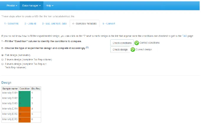
12. Move on to the “Sample metadata” tab. This tab guides the user through the definition of the experimental design.
13. Fill the empty columns with as different names as biological conditions to compare (minimum 2 conditions and 2 samples per condition) and click on “Check conditions”. If necessary, correct until the conditions are valid. When achieved, a green logo appears and the sample are reordered according to the conditions.
14. Chose the number of levels in the experimental design (either 1, 2 or 3), and fill the additional column(s) of the table (Note 12).
15. Once the design is valid (a green check logo appears), move on to the “Convert” tab (see Figure
3).
16. Provide a name to the dataset to be created and click on the “Convert” button.
17. As a result, a new MSnset structure is created and automatically loaded. This can be checked with the name of the file appearing in the upper right hand side of the screen, as a title to a new drop-down menu. So far, it only contains “Original – protein”, but other versions of the dataset will be added along the course of the processing.
3.3 Data export
As importing a new dataset from a tabular file is a tedious procedure, we advise to save the dataset as an MSnset binary file right after the conversion. This makes it possible to restart the statistical analysis from scratch if a problem occurs without having to convert the data another time. To do so: 1. Click on “Export” in the “Data manager” menu.
2. Choose MSnset as file format and provide a name to the object (Note 13).
3. Optionally, it is possible to select a subset of the column metadata to make the file smaller. 4. Click on “Download”.
5. Once the downloading is over, store the file in the appropriate directory. 6. To reload any dataset stored as an MSnset structure, refer to Note 3.
3.4 Descriptive statistics
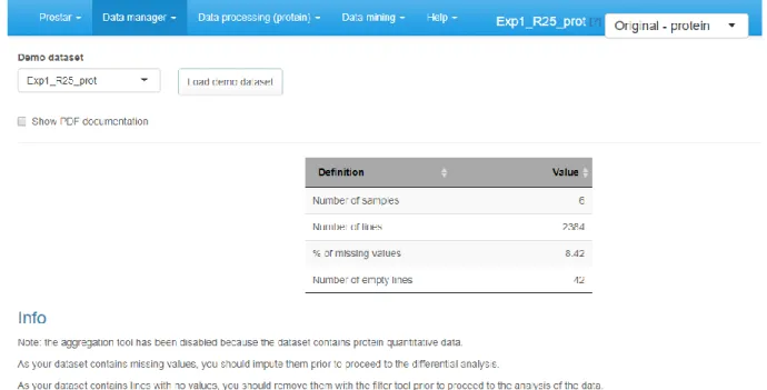
1. By clicking on “Descriptive statistics” in the “Data mining” menu, it is possible to access several tabs generating various plots (Note 14) that provides a comprehensive and quick overview of the dataset (Note 15).
2. On the first tab (named “overview”), a brief summary of the quantitative data size is provided. It roughly amounts to the data summary that is displayed along with each dataset during the loading step of the demo mode.
3. On the second tab (named “miss. values”), barplots depicts the distribution of missing values: the left hand side barplot represents the number of missing values in each sample. The different colors correspond to the different conditions (or groups, or labels). The second barplot (in the middle) displays the distribution of missing values; the red bar represents the empty protein count (i.e. the number of lines in the quantitative data that are only made of missing values). The last barplot represents the same information as the previous one, yet, condition-wise. Let us note that protein with no missing values are represented in the last barplot while not on the second one (to avoid a too large Y-scale).
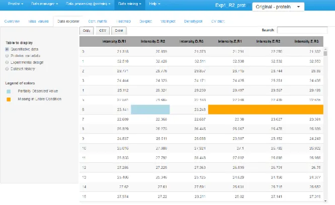
4. The third tab is the data explorer (see Figure 4): it makes it possible to view the content of the MSnSet structure. It is made of four tables, which can be displayed one at a time thanks to the radio button on the left menu. The first one, named "Quantitative data" contains quantitative values. The missing values are represented by empty cells. The second one is referred to "Protein metadata". It contains all the column dataset that are not the quantitative data. The third tab, "Replicate metadata", summarize the experimental design, as defined at the import step (see Section 3.2, Step 13). Finally, the last tab, "Dataset history", contains the logs (Note 16) of the previous processing.
5. In the fourth tab (“Corr. matrix”), it is possible to visualize to what extent the replicate samples correlates or not. The contrast of the correlation matrix can be tuned thanks to the color scale on the left hand side menu.
6. A heatmap as well as the associated dendrogram is depicted on the fifth tab. The colors represent the intensities: red for high intensities and green for low intensities. White color corresponds to missing values. The dendrogram shows a hierarchical classification of the samples, so as to check that samples are related according to the experimental design. It is possible to tune the clustering algorithm (Note 17) that produces the dendrogram by adjusting the “distance” and “linkage” parameters, as described in the hclust R function [16].
7. Tabs 6, 7 and 8 represent in a slightly different way the same information, that is the distribution of intensity values by replicates and conditions: respectively, boxplots, violin-plots and smoothed histograms (a.k.a. kernel density plots) are used. Depending on the needs, it is possible to shift from one representation to any of the others.
8. Finally, the last tabs display a density plot of the variance (within each condition) conditionally to the log-intensities (Note 18).
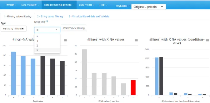
3.5 Filtering
This stage aims at filtering out proteins according to their number of missing values, as well as according to some information stored in the protein (or feature) metadata.
1. Click on “Filter data” in the “Data processing” menu.
2. On the first tab (called "Missing values", see Figure 5), select among the various options which proteins should be filtered out or not. The options are the following:
None: No filtering, the quantitative data is left unchanged (Note 19).
Whole Matrix: proteins that contain in the quantitative dataset (across all conditions) fewer non-missing values than a user-defined threshold are deleted;
For every condition: proteins that contain fewer non-missing values in each condition than a user-defined threshold are removed;
At least one condition: proteins that contain fewer non-missing values in at least one condition than a user-defined threshold are suppressed;
3. Visualize the effect of the filtering options without changing the current dataset by clicking on "Perform filtering". If the filtering does not produce the expected effect, test another one. To do so, simply choose another method in the list and click again on "Perform filtering". The plots are automatically updated. This action does not modify the dataset but offers a preview of the filtered data. Iterate this step as long as necessary.
4. Move on to the second tab (called "String based filtering"), where it is possible to filter out proteins according to information stored in the metadata.
5. Among the columns constituting the protein metadata listed in the drop-down menu, select the one containing the information (Note 20) of interest (for instance, “Contaminant” or “Reverse”, Note 21). Then, specify in each case the prefix chain of characters that identifies the proteins to filter (Note 22).
6. Click on "Perform " to remove the corresponding proteins. A new line appears in the table listing all the filters that have been applied.
7. If another filter must be applied, go back to Step 4.
8. Once all the filters have been applied, move on to the last tab (called "Visualize and Validate") to check the set of filtered out proteins. This visualization tools works similarly as the Data explorer (see Section 3.4, Step 4).
9. Finally, click on "Save filtered dataset". The information related to the type of filtering as well as to the chosen options appears in the Session log tab (“Session logs” tab from the “Session logs” option in the “Data manager” menu).
3.6 Navigating through the dataset versions.
Once the filters have been applied and the results saved, a new dataset is created. It is referred to as “Filtered – protein”, and its name appears right below “Original – protein” in the upper right drop-down menu, beside the dataset name (see upper right corner of Figure 2, as well as Section 3.2 Step 17). Unless modified, the newest created dataset is always the current dataset, i.e. the dataset on which further processing will be applied. As soon as the current dataset is modified, all the plots and
tables in ProStaR are automatically updated. Thus, as soon as a new dataset is created, we suggest to go back to the descriptive statistics menu (see Section 3.4) to check the influence of the latest processing on the data. It is possible to have a dynamic view of the processing steps by navigating back and forth in the dataset versions, so as to see the graphic evolutions (Note 23).
3.7 Normalization
The next processing step proposed by ProStaR is data normalization (see Figure 6). Its objective is to reduce the biases introduced at any preliminary stage (such as for instance batch effects).
1. Choose the normalization method among the following ones (Note 24). a. None: No normalization is applied
b. Global quantile alignment: The Quantile of the intensity distributions of all the samples are equated, as described in [17].
c. Column sums: The total intensity values of all the samples are equated. The rationale behind is to normalize according to the total amount of biological material within each sample.
d. Quantile Centering: A given quantile of the intensity distribution is used as reference (Note 25).
e. Mean Centering: sample intensity distributions are aligned on their mean intensity values (and optionally, the variance distributions are equated to one).
f. Variance Stabilizing Normalization: A wrapper to the method described in [18]. g. Loess normalization: The intensity values are normalized by means of a local
regression model [19] of the difference of intensities as function of the mean intensity value (see [20] for implementation details).
2. Then, for each normalization method, the interface is automatically updated to display the method parameters that must be tuned. Notably, for most of the methods, it is necessary to indicate whether the method should apply to the entire dataset at once, or whether each condition should be normalized independently of the others. For other parameters, which are
specific to each method, the reader is referred to ProStaR user manual, available through the “Help” section of the main menu (Note 26).
3. Click on “Perform normalization”.
4. Observe the influence of the normalization method on the graphs of the right hand side panel. Optionally, click on “Show plot options”, so as to tune the graphics for a better visualization. 5. If the result of the normalization does not correspond to the expectations, change the
normalization method or change its tuning.
6. Once the normalization is effective, click on “Save normalization”.
7. Check that a new version appears in the dataset version drop-down menu, referred to as “Normalized - Protein”.
8. Remember that at any time, it is possible to return to the menu “Descriptive statistics” to have a refined view of each step of the processing.
3.8 Imputation
In protein-level datasets, ProStaR makes it possible to have separate processing for two different types of missing values: POV (standing for Partially Observed Value) and MEC (standing for Missing in
the Entire Condition). All the missing values for a given protein in a given condition are considered
POV if and only if there is at least one observed value for this protein in this condition. Alternatively, if all the intensity values are missing for this protein in this condition, the missing values are
considered MEC (Note 27).
1. On the first tab (see Figure 7), select the algorithm to impute POV missing values. According to our expertise, we advise to select the SLSA algorithm (Giai Gianetto Q et al., submitted) but other methods are also of interest in specific situations.
2. Tune the parameters of the chosen imputation method.
3. Click on “Perform Imputation”. It will enables the next tab, on which the result of the imputation is shown.
4. Move on to the second tab and decide how to deal with MEC. As a matter of fact, it is always dangerous to impute them, as in absence of any value to rely on, the imputation is arbitrary and risks to spoil the dataset with maladjusted values. As an alternative, it is possible to (1) keep the MEC as is in the dataset, yet, it may possibly impede further processing, (2) discard them at the filter step (see Section 3.5, Step 2) so as to process them separately. However, this will make it impossible to include these proteins (and their processing) in the final statistics, such as for instance FDR.
5. If MEC are not going to be imputed, select the imputation method referred to as “None”. Otherwise, select the appropriate method. Based on our experience, we advise to use detQuantile (Note 28).
6. Tune the parameters of the MEC imputation method (Note 29).
7. Click on “Perform Imputation” and move on to the next tab (“Validate & save”).
8. Observe the influence of the chosen imputation methods on the graphs of the right hand side panel. If the result of the imputation does not correspond to the expectations, change the imputation methods or their tuning (by going back to Step 1 of this section).
9. Once the imputation is effective, click on “Save imputation”.
10. Check that a new version appears in the dataset version dropdown menu, referred to as “Imputed - Protein” (Notes 30 and 31).
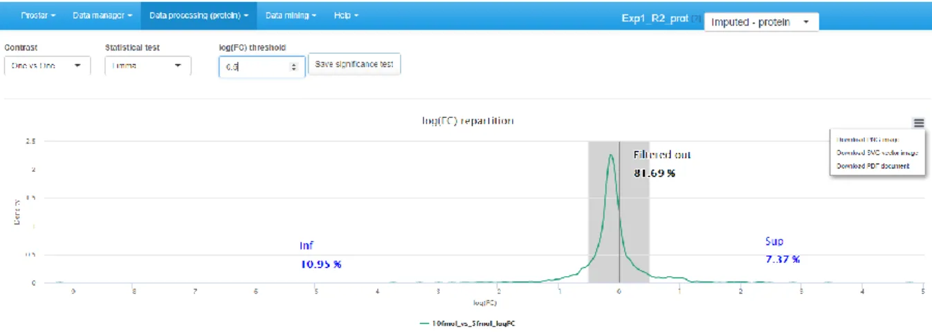
3.9 Hypothesis testing
For datasets that do not contain any missing values, or for those where these missing values have been imputed, it is possible to test whether each protein is significantly differentially abundant between the conditions . To do so, click on “Hypothesis testing” in the “Data processing” menu (see Figure 8).
1. Choose the test contrasts. In case of 2 conditions to compare, there is only one possible contrast. However, in case of N > 2 conditions, several pairwise contrasts are possible. Notably, it is possible to perform N tests of the “1vsAll” type, or N(N-1)/2 tests of the “1vs1” type.
2. Then, choose the type of statistical test, between limma [20] or t-test (either Welch or Student). This makes appear a density plot representing fold-change (FC) (as many density curves on the plot as contrasts).
3. Thanks to the FC density plot, tune the FC threshold (Note 32).
4. Run the tests and save the dataset to preserve the results (i.e. all the computed p-values). Then, this new dataset, containing the p-values and FC cut-off for the desired contrasts, can be
explored in the “Differential analysis” tabs available in the “Data mining” menu.
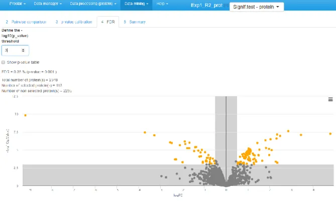
3.10 Differential analysis
If one clicks on “Differential analysis” in the “Data mining” menu, it is possible to analyze the results of all statistical tests (see Section 3.9). To do so:
1. Select a pairwise comparison of interest. The corresponding volcano plot is displayed. 2. Possibly, swap the FC axis with the corresponding tick-box, depending on layout preferences. 3. Some proteins may have an excellent p-value, while a too great proportion of their intensity
values (within the two conditions of interest in this comparison) are in fact imputed values, so that they are not trustworthy. To avoid such proteins become false discoveries, it is possible to discard them (by forcing their p-value to 1). To do so, fill in the last parameters of the right hand side menu, which are similar to the MV filtering options described in Section 3.5.
4. Click on “Perform p-value push” and move on to Tab 3, “p-value calibration”. 5. Tune the calibration method, as indicated in [21] as well as in ProStaR user manual. 6. Move on to the next tab and adjust the FDR threshold (see Figure 9).
7. Save any plot/table of interest and move on to the next tab (“Summary”) to have a comprehensive overview of the differential analysis parameters.
8. Possibly, go back to Step 1 to process another pairwise comparison. Alternatively, it is possible to continue with the current protein list so as to explore the functional profiles of the proteins found statistically differentially abundant between the compared conditions (as explained in the next section).
3.11 GO Analysis
1. To Perform a Gene Ontology (GO) enrichment analysis, click on the corresponding option in the “Data mining” menu. (We assume the reader is familiar with the interest and use of the GO terms [22]).
2. Go to the first tab (“GO setup”) and tune the “Source of protein ID” by ticking the “Select a column in dataset” radio button (Note 33).
3. Select the dataset column that contains the protein ID. 4. Indicate the type of protein ID (GeneID, Uniprot). 5. Select the organism of interest among the proposed list.
6. Select the ontology of interest (either Molecular Function, Biological Process or Cellular Component).
7. Click on “Map protein ID”.
8. Check on the right panel the list of proteins that could not be mapped in the ontology (Note 34). 9. Move on to the next tab “GO classification”, or depending on the needs, skip it to directly move
to “GO Enrichment”.
10. GO classification: choose the GO level(s) of interest and click on “Perform GO grouping” (Note 35). Once the result appears, right-click on the plots to save them. Then, depending on the needs, go to the next tab “GO Enrichment”, or directly move to the “Summary” tab.
11. GO Enrichment: choose the set of proteins that should be used as reference to perform the enrichment test (“Entire organism”, “Entire dataset”, “Custom”, Note 36) and tune the FDR threshold before clicking on the “Perform enrichment analysis” button. As with “GO classification”, save the plots of interest.
12. Move on to the “Summary” tab. It displays a table summarizing the parameters of the GO analysis.
4 Notes
1.
ProStaR versions which are posterior to 1.14 may slightly differ from what is described in this protocol. However, the general spirit of the graphical user interface remains unchanged allowing any user accustomed to an earlier version to easily adapt to a newer version.2.
With only two replicates per condition, the computations are tractable. It does not mean that statistical validity is guaranteed. Classically, 3 replicates per condition are considered a minimum in case of a controlled experiment with a small variability, mainly issuing from technical or analytical repetitions. Analysis of complex proteomes between conditions with a large biological variability requires more replicates per condition (5 to 10).3.
To reload a dataset that has previously been stored as an MSnset file, go to “Open MSnset file” in the “Data manager” menu and simply browse the file system to find the desired file.4.
Before installing the software, any user can have a quick overview by testing its demo mode (Note 7) on the following URL: http://www.prostar-proteomics.org. Any user can also test the website version on his own data, yet we do not recommend it since the server has limited computational capabilities that are shared between all the users connected at the same moment. Overloading is therefore possible, which would lead to data loss. Moreover, we are currently working on a portable version of ProStaR that could directly be downloaded for the above URL, without requiring any installation. This feature will likely be available in future versions of ProStaR.5.
We advise to use the latest version and to make regular updates, so as to guarantee the compatibility with the latest ProStaR developments.6.
If a package is still missing, it means that some problem occurred during its install, or during the install of another package it depends on. In such a case, we first advise to try again ProStaR install, by executing the commands indicated in Section 2.7. If it still does not work, then it isnecessary to manually install the corresponding packages. Depending on whether these are CRAN packages or BioConductor packages, as well as on the possible use of an IDE, the procedure will change, and we refer the reader to the corresponding documentation.
7.
Before uploading a real dataset, any user can test ProStaR thanks to the demo mode. This mode provides a direct access to the DAPARdata packages where some toy datasets are available, either in tabular or MSnset formats. Concretely, the demo mode is accessible in the “Data manager” menu: on the corresponding tab, a drop-down menu lists the datasets that are available through DAPARdata. After selecting a protein-level datasets (Note 10), click on “Load demo dataset”.8.
The DAPARdata package also contains tabular versions (in txt format) of the datasets available in the demo mode. Thus, it is also possible to test the import/export/save/load functions of ProStaR with these toy datasets. Concretely, one simply has to import them from the folder where the R packages are installed, in the following sub-folder: …\R\R-3.4.0\library\DAPARdata\extdata. Note that each dataset is also available in the MSnset format, but these datasets should not be considered to test conversion functions from/to tabular formats.9.
If the user chooses an Excel file, a drop-down menu appears and the user is asked to select thespreadsheet containing the data.
10. If the dataset under consideration is not a protein dataset (each line of the quantitative table
does not represent a protein, but for instance a peptide), do not apply the present protocol.11. ProStaR cannot process non-log-transformed data. Thus, do not cheat the software by indicating
data on their original scale are log-transformed.
12. In case of difficulty, either to choose the adapted design hierarchy or to fill the table design, it is
possible to click on the interrogation mark beside the sentence “Choose the type of experimental design and complete it accordingly”. Except for flat design, which are automatically defined, itdisplays an example of the corresponding design. It is possible to rely on this example to precisely fill the design table.
13. Alternatively, it is possible to export data as excel spreadsheets or as a zip containing text files.
This has no interest in case of a preliminary export; however, it may be useful to share a dataset once the statistical analysis is completed.14. The user can download the plots showed in ProStaR by right-clicking on the plot. A contextual
menu appears and let the user choose either "Save image as" or "Copy image". In the latter case, the user has to paste the image in appropriate software.15. It is essential to regularly go back to these tabs, so as to check that each processing step has
produced the expected results.16. Contrarily to the "Session logs" panel (see Section 3.5, Step 9), the information here does not
relate to the session: it is saved from a session to the next one.17. Computing the heatmap and the dendrogram may be very computationally demanding
depending on the dataset.18. As is, the plot is often difficult to read, as the high variances are concentrated on the lower
intensity values. However, it is possible to interactively zoom in on any part of the plot by clicking and dragging.19. This is the default option, however, we warn about such an absence of filtering: if too many
missing values remain, the statistical analysis will be spurious. Moreover, we recommend at least filtering out proteins with only missing values in all the conditions, as such proteins do not carry any trustworthy quantitative information. Finally, depending on the imputation choices with regards to MEC (See Section 3.8 as well as Note 27), it may be wise to filter out proteins whose intensity values are completely missing in at least one condition.20. To work properly, the selected column must contain information encoded as a string of
characters. For each protein, the beginning of the corresponding string is compared to a given prefix. If the prefix matches, the protein is filtered out. Otherwise, it is conserved in the protein list. Note that the filter only operates a prefix search (at the beginning of the string), not a general tag match search (anywhere in the string). Similarly, filters based on regular expressions are not implemented.21. In datasets resulting from a MaxQuant [23] search, metadata indicates under a binary form
which proteins are reversed sequences (resulting from a target-decoy approach) and which are potential contaminants. Both of them are indicated by a “+” in the corresponding column (the other proteins having a NA instead). It is thus possible to filter both reversed and contaminants out by indicating “+” as the prefix filter. However, if adequately encoded, filtering on other type of information is possible.22. If one has no idea of the prefixes, it is possible to switch to the “Data Explorer” in the
“Descriptive Statistics” menu (see Section 3.4), so as to visualize the corresponding metadata.
23. It is not possible to keep in parallel several datasets or multiple versions of a dataset at a
particular level (for instance, a dataset filtered using various rules). Thus, if one goes on with the next processing steps on an older dataset, or if one goes back to a previous step and restart it, the new results will overwrite the previously saved ones at this same step, without updating other downstream processing, leading to possible inconsistencies.
24. This list correponds to the normalization methods available in ProStaR version 1.12; future
versions will possibly propose slightly different methods.25. This normalization method should not be confused with Global quantile alignment.
26. It should be noted that the choice of a normalization method and its tuning is highly data
expertise on the normalization methods, so as to be able to choose soundly. Thus, we advise to refer to ProStaR user manual, as well as to the literature describing the normalization methods (to be found in the “Help” section of ProStaR).
27. As a result, all the missing values are either POV or MEC. Moreover, for a given protein across
several conditions, the missing values can be both POV and MEC, even though within a same condition they are all of the same type.28. The detQuantile method proposes to impute each missing value within a given sample by a
deterministic value, usually a low value. The rationale behind is that MEC values corresponds to proteins that are below the quantification limit in one condition, so that they should not be imputed according to observed values in the other conditions. Although the use of adeterministic value slightly disturb the intensity distribution, it makes the MEC values easy to spot, as they all correspond to a known numerical value.
29. If detQuantile is used, we advise to use a small quantile of the intensity distribution to define the
imputation value, for instance, 1% to 2.5%, depending on the stringency you want to apply on proteins quantified only in one condition of a pairwise comparison. In case of a dataset with too few proteins, the lower quantile may amount to instable values. In such a case, we advise to use a larger quantile value (for instance 10% or 20%) but to use a smaller multiplying factor (for instance 0.2 or smaller) so as to keep the imputation value reasonably small with respect to the detection limit. In any case, when using detQuantile, the list of imputation values for each sample appears above the graphics on the right panel.30. When exporting the data in the Microsoft Excel format, imputed values are displayed in a colored
cell so that they can easily be distinguished.31. Recall that at any moment, it is possible to go back to the “Descriptive statistics” menu to have a
refined view of each step of the processing.32. As explained in [24], we advise to tune the FC conservatively by avoiding discarding to many
proteins with it. Moreover, it is important tune the FC to a small enough value, so as to avoid discarding too many proteins. In fact, it is important to keep enough remaining proteins for the next coming FDR computation step (see Section 3.10), as (i) FDR estimation is more reliable with many proteins, (ii) FDR, which relates to a percentage, does not make sense on too few proteins.33. The “Choose a file” radio button should only be used to perform a GO analysis on a protein list
that does directly come from the quantitative dataset.34. Proteins that could not be matched will no longer be considered for GO analysis. Thus, it is the
user’s responsibility to determine whether this will significantly affect the results. If so, it may be necessary to go back to the original data and fix any issues with protein accession names.35. It may take a while, so be patient.
36. In the latter case, select the file that was preliminary prepared on purpose (see the ProStaR user
manual [14]for details).Acknowledgement
ProStaR software development was supported by grants from the “Investissement d’Avenir
Infrastructures Nationales en Biologie et Santé” program (ProFI project, ANR-10-INBS-08) and by the French National Research Agency (GRAL project, ANR-10-LABX-49-01).
References
[1] Zhang Y, Fonslow BR, Shan B et al (2013) Protein analysis by shotgun/bottom-up proteomics. Chem Rev 113(4):2343-2394. doi:10.1021/cr3003533
[2] Ong SE, Foster LJ, Mann M (2003) Mass spectrometric-based approaches in quantitative proteomics. Methods 29(2):124-130. doi:10.1016/S1046-2023(02)00303-1
[3] Schwanhäusser B, Busse D, Li N et al (2011) Global quantification of mammalian gene expression control. Nature 473(7347):337-342. doi:10.1038/nature10098
[4] Tyanova S, Temu T, Sinitcyn P et al (2016). The Perseus computational platform for comprehensive analysis of (prote) omics data. Nat Methods 13(9):731-740.
doi:10.1038/nmeth.3901
[5] Choi M, Chang CY, Clough T et al (2014) MSstats: an R package for statistical analysis of quantitative mass spectrometry-based proteomic experiments. Bioinformatics 30(17):2524-2526. doi:10.1093/bioinformatics/btu305
[6] MacLean B, Tomazela DM, Shulman N et al (2010) Skyline: an open source document editor for creating and analyzing targeted proteomics experiments. Bioinformatics 26(7):966-968. doi:10.1093/bioinformatics/btq054
[7] Zhang X, Smits AH, van Tilburg GB et al (2018) Proteome-wide identification of ubiquitin interactions using UbIA-MS. Nat Protoc 13(3):530-550. doi:10.1038/nprot.2017.147 [8] Contrino B, Miele E, Tomlinson R et al (2017). DOSCHEDA: a web application for interactive
chemoproteomics data analysis. PeerJ Computer Science 3:e129. doi:10.7717/peerj-cs.129 [9] Singh S, Hein MY, Stewart AF (2016) msVolcano: A flexible web application for visualizing
quantitative proteomics data. Proteomics 16(18):2491-2494. doi:10.1002/pmic.201600167 [10] Efstathiou G, Antonakis AN, Pavlopoulos GA et (2017) ProteoSign: an end-user online
differential proteomics statistical analysis platform. Nucleic Acids Res 45(W1):W300-W306. doi:10.1093/nar/gkx444
[11] Goeminne LJ, Argentini A, Martens L et al (2015) Summarization vs peptide-based models in label-free quantitative proteomics: performance, pitfalls, and data analysis guidelines. J Proteome Res 14(6):2457-2465. doi:10.1021/pr501223t
[12] Wieczorek S, Combes F, Lazar C et al (2017) DAPAR & ProStaR: software to perform statistical analyses in quantitative discovery proteomics. Bioinformatics. 33(1):135-136.
doi:10.1093/bioinformatics/btw580
[13] Gatto L, Lilley K (2012) MSnbase-an R/Bioconductor package for isobaric tagged mass spectrometry data visualization, processing and quantitation. Bioinformatics 28(2):288-289. doi:10.1093/bioinformatics/btr645
[14] Wieczorek S, Combes F, Burger T (2018) DAPAR and ProStaR user manual. In: Bioconductor. https://www.bioconductor.org/packages/release/bioc/vignettes/Prostar/inst/doc/Prostar_Use rManual.pdf?attredirects=0
[15] RStudio Team (2015) RStudio: Integrated Development for R. RStudio, Inc., Boston, MA. http://www.rstudio.com/
[16] http://stat.ethz.ch/R-manual/R-devel/library/stats/html/hclust.html
[17] Bolstad B (2018) preprocessCore: A collection of pre-processing functions. R package version 1.42.0. https://github.com/bmbolstad/preprocessCore.
[18] Huber W, von Heydebreck A, Sueltmann H et al (2002) Variance Stabilization Applied to Microarray Data Calibration and to the Quantification of Differential Expression. Bioinformatics 18 Suppl 1:S96-S104. doi:10.1093/bioinformatics/18.suppl_1.S96 [19] Cleveland WS (1979) Robust locally weighted regression and smoothing scatterplots. J.
American Statistical Association 74(368):829-836. doi:10.1080/01621459.1979.10481038 [20] Smyth GK (2005) Limma: linear models for microarray data. In: Gentleman R, Carey VJ, Huber
W, Irizarry RA, Dudoit S (eds) Bioinformatics and Computational Biology Solutions Using R and Bioconductor. Statistics for Biology and Health. Springer, New York, NY, p 397-420.
[21] Giai Gianetto Q, Combes F, Ramus C et al (2016) Calibration plot for proteomics: A graphical tool to visually check the assumptions underlying FDR control in quantitative
experiments. Proteomics 16(1):29-32. doi:10.1002/pmic.201500189
[22] Ashburner M, Ball CA, Blake JA et al (2000) Gene Ontology: tool for the unification of biology. Nat Genet 25(1):25-29. doi:10.1038/75556
[23] Cox J, Mann M (2008) MaxQuant enables high peptide identification rates, individualized p.p.b.-range mass accuracies and proteome-wide protein quantification. Nat
Biotechnol 26(12):1367-1372. doi:10.1038/nbt.1511
[24] Giai Gianetto Q, Couté Y, Bruley C et al (2016) Uses and misuses of the fudge factor in quantitative discovery proteomics. Proteomics 16(14):1955-1960.
Tables
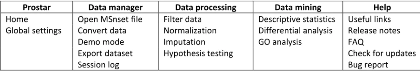
Table 1: Synoptic view of ProStaR menus (once enabled by data loading, see Figures 1 and 2).
Prostar Data manager Data processing Data mining Help
Home Open MSnset file Filter data Descriptive statistics Useful links
Global settings Convert data Normalization Differential analysis Release notes
Demo mode Imputation GO analysis FAQ
Export dataset Hypothesis testing Check for updates
Figures
Figure 2: After loading a dataset (here thanks to the demo mode, Note 7), the menus contextually appears. Table 1 provides a view of the menu contents.
Figure 6: Normalization tab. The density plot, the distortion plot and the box plot makes it possible to visualize the influence of each normalization method.
Figure 9: Volcano plot to visualize the differentially abundant proteins according to a user specified FDR.